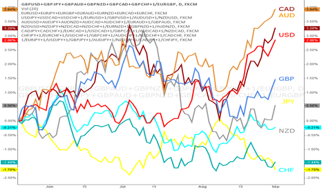
Overall Strength of the Pound Versus the Yen

I'm sure a lot of us have seen this chart 
I'm just applying his idea as I think it is a great way to view the strength of currencies relative to one another. Especially for a trader like me who is a trend trader. Here we can see the Pound (red line) in an overall strong bear trend, while the Yen (blue line) has been in a bull trend for sometime.
I have been short GBP/JPY since February 4th, with multiple positions running.
Hope this helps someone see the power and profitability of trading trends.
(Side note, I have been working with the calculations of the values, but even if it currently may not be perfect it still gives a good picture of the strength of a currency)
免责声明
这些信息和出版物并不意味着也不构成TradingView提供或认可的金融、投资、交易或其它类型的建议或背书。请在使用条款阅读更多信息。