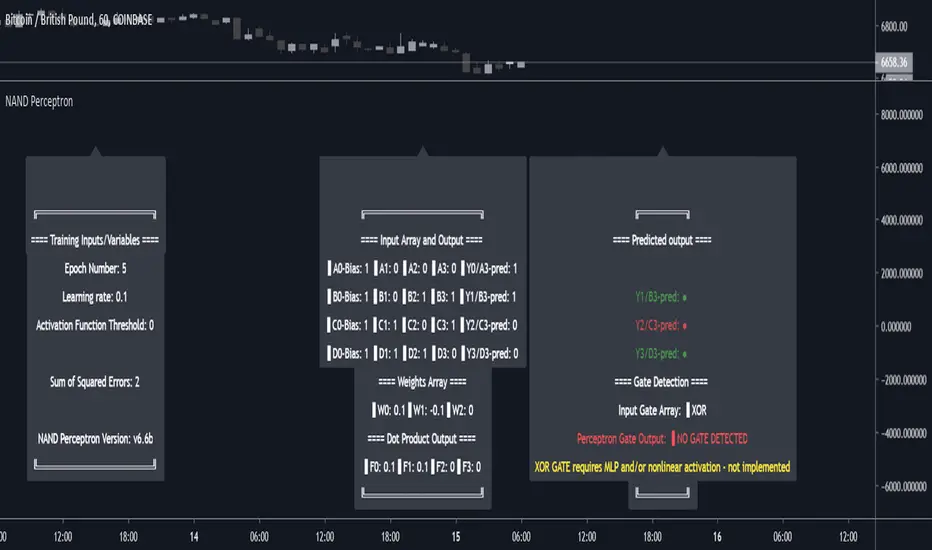
NAND PerceptronExperimental NAND Perceptron based upon Python template that aims to predict NAND Gate Outputs. A Perceptron is one of the foundational building blocks of nearly all advanced Neural Network layers and models for Algo trading and Machine Learning.
The goal behind this script was threefold:
To prove and demonstrate that an ACTUAL working neural net can be implemented in Pine, even if incomplete.
To pave the way for other traders and coders to iterate on this script and push the boundaries of Tradingview strategies and indicators.
To see if a self-contained neural network component for parameter optimization within Pinescript was hypothetically possible.
NOTE: This is a highly experimental proof of concept - this is NOT a ready-made template to include or integrate into existing strategies and indicators, yet (emphasis YET - neural networks have a lot of potential utility and potential when utilized and implemented properly).
Hardcoded NAND Gate outputs with Bias column (X0):
// NAND Gate + X0 Bias and Y-true
// X0 // X1 // X2 // Y
// 1 // 0 // 0 // 1
// 1 // 0 // 1 // 1
// 1 // 1 // 0 // 1
// 1 // 1 // 1 // 0
Column X0 is bias feature/input
Column X1 and X2 are the NAND Gate
Column Y is the y-true values for the NAND gate
yhat is the prediction at that timestep
F0,F1,F2,F3 are the Dot products of the Weights (W0,W1,W2) and the input features (X0,X1,X2)
Learning rate and activation function threshold are enabled by default as input parameters
Uncomment sections for more training iterations/epochs:
Loop optimizations would be amazing to have for a selectable length for training iterations/epochs but I'm not sure if it's possible in Pine with how this script is structured.
Error metrics and loss have not been implemented due to difficulty with script length and iterations vs epochs - I haven't been able to configure the input parameters to successfully predict the right values for all four y-true values for the NAND gate (only been able to get 3/4; If you're able to get all four predictions to be correct, let me know, please).
// //---- REFERENCE for final output
// A3 := 1, y0 true
// B3 := 1, y1 true
// C3 := 1, y2 true
// D3 := 0, y3 true
PLEASE READ: Source article/template and main code reference:
towardsdatascience.com
towardsdatascience.com
towardsdatascience.com
在脚本中搜索"algo"
Baseline-C [ID: AC-P]The "AC-P" version of jiehonglim's NNFX Baseline script is my personal customized version of the NNFX Baseline concept as part of the NNFX Algorithm stack/structure for 1D Trend Trading for Forex. Everget's JMA implementation is used for the baseline smoothing method, with optional ATR bands at 1.0x and 1.5x from the baseline.
NNFX = No Nonsense Forex
Baseline = Component of the NNFX Algorithm that consists of a single moving average
Baseline ---> Meant to be used in conjunction with ATR/C1/C2/Vol Indicator/Exit Indicator as per NNFX Algorithm setup/structure. C1 is 1st Confirmation Indicator, C2 is 2nd Confirmation Indicator.
JMA (Jurik Moving Average) is used for the baseline and slow baseline.
A slow baseline option is included, but disabled by default.
The faint orange/purple lines are 1.0x/1.5x ATR from the Baseline, and are what I use as potential TP/SL targets or to evaluate when to stay out of a trade (chop/missed entry/exit/other/ATR breach), depending on the trade setup (in conjunction with C1/C2/Vol Indicator/Exit Indicator)
This script is heavily based upon jiehonglim's NNFX Baseline script for signaling, barcoloring, and ATR.
SSL Channel option included but disabled by default (Erwinbeckers SSL component)
POC (Point of Control) from Volume Profile is included/enabled by default for both the current timeframe and 12HR timeframe
03.freeman's InfoPanel Divergence Indicator was used a reference to replace the current/previous ATR information infopanel/info draw from jiehonglim's script. I'm not sure whether I like the previous way ATR info was displayed vs how I have it currently, but it's something that is completely optional:
Specifically: I am tuning this baseline/indicator for 1D trading as part of the NNFX system, for Forex.
DO NOT USE THIS INDICATOR WITHOUT PROPER TUNING/ADJUSTMENT for your timeframe and asset class.
Note about lack of alerts:
Alerts for baseline crosses (and other crosses) have been purposefully omitted for this version upon initial publication. While getting alerts for baseline crosses under certain conditions/filtered conditions that eliminate low-importance signals and crossover whipsaw would be great, it's something I'm still looking into.
SPECIFICALLY: There are entry, exit, take profit, and continuation signal components in relation to the Baseline to the rest of the NNFX Algorithm stack (ATR/C1/C2/Vol Indicator/Exit Indicator), including but limited to the "1 candle rule" and the "7 candle rule" as per NNFX.
Implementing alerts that are significant that also factor in these rules while reducing alert spam/false signals would be ideal, but it's also the HTF/Daily chart - visually, entry/exit/continuation signal alignment is easy to spot when trading 1D - alerts may be redundant/a pursuit in diminishing returns (for now).
//-------------------------------------------------------------------
// Acknowledgements/Reference:
// jiehonglim, NNFX Baseline Script - Moving Averages
//
// Fractured, Many Moving Averages
//
// everget, Jurik Moving Average/JMA
//
// 03.freeman, InfoPanel Divergence Indicator
//
// Ggqmna Volume stops
//
// Libertus RSI Divs
//
// ChrisMoody, CM_Price-Action-Bars-Price Patterns That Work
//
// Erwinbeckers SSL Channel
//

PineStats█ OVERVIEW
PineStats is a comprehensive statistical analysis library for Pine Script v6, providing 104 functions across 6 modules. Built for quantitative traders, researchers, and indicator developers who need professional-grade statistics without reinventing the wheel.
For building mean-reversion strategies, analyzing return distributions, measuring correlations, or testing for market regimes.
█ MODULES
CORE STATISTICS (20 functions)
• Central tendency: mean, median, WMA, EMA
• Dispersion: variance, stdev, MAD, range
• Standardization: z-score, robust z-score, normalize, percentile
• Distribution shape: skewness, kurtosis
PROBABILITY DISTRIBUTIONS (17 functions)
• Normal: PDF, CDF, inverse CDF (quantile function)
• Power-law: Hill estimator, MLE alpha, survival function
• Exponential: PDF, CDF, rate estimation
• Normality testing: Jarque-Bera test
ENTROPY (9 functions)
• Shannon entropy (information theory)
• Tsallis entropy (non-extensive, fat-tail sensitive)
• Permutation entropy (ordinal patterns)
• Approximate entropy (regularity measure)
• Entropy-based regime detection
PROBABILITY (21 functions)
• Win rates and expected value
• First passage time estimation
• TP/SL probability analysis
• Conditional probability and Bayes updates
• Streak and drawdown probabilities
REGRESSION (19 functions)
• Linear regression: slope, intercept, forecast
• Goodness of fit: R², adjusted R², standard error
• Statistical tests: t-statistic, p-value, significance
• Trend analysis: strength, angle, acceleration
• Quadratic regression
CORRELATION (18 functions)
• Pearson, Spearman, Kendall correlation
• Covariance, beta, alpha (Jensen's)
• Rolling correlation analysis
• Autocorrelation and cross-correlation
• Information ratio, tracking error
█ QUICK START
import HenriqueCentieiro/PineStats/1 as stats
// Z-score for mean reversion
z = stats.zscore(close, 20)
// Test if returns are normally distributed
returns = (close - close ) / close
isGaussian = stats.is_normal(returns, 100, 0.05)
// Regression channel
= stats.linreg_channel(close, 50, 2.0)
// Correlation with benchmark
spyReturns = request.security("SPY", timeframe.period, close/close - 1)
beta = stats.beta(returns, spyReturns, 60)
█ USE CASES
✓ Mean Reversion — z-scores, percentiles, Bollinger-style analysis
✓ Regime Detection — entropy measures, correlation regimes
✓ Risk Analysis — drawdown probability, VaR via quantiles
✓ Strategy Evaluation — expected value, win rates, R:R analysis
✓ Distribution Analysis — normality tests, fat-tail detection
✓ Multi-Asset — beta, alpha, correlation, relative strength
█ NOTES
• All functions return `na` on invalid inputs
• Designed for Pine Script v6
• Fully documented in the library header
• Part of the Pine ecosystem: PineStats, PineQuant, PineCriticality, PineWavelet
█ REFERENCES
• Abramowitz & Stegun — Normal CDF approximation
• Acklam's algorithm — Inverse normal CDF
• Hill estimator — Power-law tail estimation
• Tsallis statistics — Non-extensive entropy
Full documentation in the library header.
mean(src, length)
Calculates the arithmetic mean (simple moving average) over a lookback period
Parameters:
src (float) : Source series
length (simple int) : Lookback period (must be >= 1)
Returns: Arithmetic mean of the last `length` values, or `na` if inputs invalid
wma_custom(src, length)
Calculates weighted moving average with linearly decreasing weights
Parameters:
src (float) : Source series
length (simple int) : Lookback period (must be >= 1)
Returns: Weighted moving average, or `na` if inputs invalid
ema_custom(src, length)
Calculates exponential moving average
Parameters:
src (float) : Source series
length (simple int) : Lookback period (must be >= 1)
Returns: Exponential moving average, or `na` if inputs invalid
median(src, length)
Calculates the median value over a lookback period
Parameters:
src (float) : Source series
length (simple int) : Lookback period (must be >= 1)
Returns: Median value, or `na` if inputs invalid
variance(src, length)
Calculates population variance over a lookback period
Parameters:
src (float) : Source series
length (simple int) : Lookback period (must be >= 1)
Returns: Population variance, or `na` if inputs invalid
stdev(src, length)
Calculates population standard deviation over a lookback period
Parameters:
src (float) : Source series
length (simple int) : Lookback period (must be >= 1)
Returns: Population standard deviation, or `na` if inputs invalid
mad(src, length)
Calculates Median Absolute Deviation (MAD) - robust dispersion measure
Parameters:
src (float) : Source series
length (simple int) : Lookback period (must be >= 1)
Returns: MAD value, or `na` if inputs invalid
data_range(src, length)
Calculates the range (highest - lowest) over a lookback period
Parameters:
src (float) : Source series
length (simple int) : Lookback period (must be >= 1)
Returns: Range value, or `na` if inputs invalid
zscore(src, length)
Calculates z-score (number of standard deviations from mean)
Parameters:
src (float) : Source series
length (simple int) : Lookback period for mean and stdev calculation (must be >= 2)
Returns: Z-score, or `na` if inputs invalid or stdev is zero
zscore_robust(src, length)
Calculates robust z-score using median and MAD (resistant to outliers)
Parameters:
src (float) : Source series
length (simple int) : Lookback period (must be >= 2)
Returns: Robust z-score, or `na` if inputs invalid or MAD is zero
normalize(src, length)
Normalizes value to range using min-max scaling
Parameters:
src (float) : Source series
length (simple int) : Lookback period (must be >= 1)
Returns: Normalized value in , or `na` if inputs invalid or range is zero
percentile(src, length)
Calculates percentile rank of current value within lookback window
Parameters:
src (float) : Source series
length (simple int) : Lookback period (must be >= 1)
Returns: Percentile rank (0 to 100), or `na` if inputs invalid
winsorize(src, length, lower_pct, upper_pct)
Winsorizes values by clamping to percentile bounds (reduces outlier impact)
Parameters:
src (float) : Source series
length (simple int) : Lookback period (must be >= 1)
lower_pct (simple float) : Lower percentile bound (0-100, e.g., 5 for 5th percentile)
upper_pct (simple float) : Upper percentile bound (0-100, e.g., 95 for 95th percentile)
Returns: Winsorized value clamped to bounds
skewness(src, length)
Calculates sample skewness (measure of distribution asymmetry)
Parameters:
src (float) : Source series
length (simple int) : Lookback period (must be >= 3)
Returns: Skewness value (negative = left tail, positive = right tail), or `na` if invalid
kurtosis(src, length)
Calculates excess kurtosis (measure of distribution tail heaviness)
Parameters:
src (float) : Source series
length (simple int) : Lookback period (must be >= 4)
Returns: Excess kurtosis (>0 = heavy tails, <0 = light tails), or `na` if invalid
count_valid(src, length)
Counts non-na values in lookback window (useful for data quality checks)
Parameters:
src (float) : Source series
length (simple int) : Lookback period (must be >= 1)
Returns: Count of valid (non-na) values
sum(src, length)
Calculates sum over lookback period
Parameters:
src (float) : Source series
length (simple int) : Lookback period (must be >= 1)
Returns: Sum of values, or `na` if inputs invalid
cumsum(src)
Calculates cumulative sum (running total from first bar)
Parameters:
src (float) : Source series
Returns: Cumulative sum
change(src, length)
Returns the change (difference) from n bars ago
Parameters:
src (float) : Source series
length (simple int) : Number of bars to look back (must be >= 1)
Returns: Current value minus value from `length` bars ago
roc(src, length)
Calculates Rate of Change (percentage change from n bars ago)
Parameters:
src (float) : Source series
length (simple int) : Number of bars to look back (must be >= 1)
Returns: Percentage change as decimal (0.05 = 5%), or `na` if invalid
normal_pdf_standard(x)
Calculates the standard normal probability density function (PDF)
Parameters:
x (float) : The value to evaluate
Returns: PDF value at x for standard normal N(0,1)
normal_pdf(x, mu, sigma)
Calculates the normal probability density function (PDF)
Parameters:
x (float) : The value to evaluate
mu (float) : Mean of the distribution (default: 0)
sigma (float) : Standard deviation (default: 1, must be > 0)
Returns: PDF value at x for normal N(mu, sigma²)
normal_cdf_standard(x)
Calculates the standard normal cumulative distribution function (CDF)
Parameters:
x (float) : The value to evaluate
Returns: Probability P(X <= x) for standard normal N(0,1)
@description Uses Abramowitz & Stegun approximation (formula 7.1.26), accurate to ~1.5e-7
normal_cdf(x, mu, sigma)
Calculates the normal cumulative distribution function (CDF)
Parameters:
x (float) : The value to evaluate
mu (float) : Mean of the distribution (default: 0)
sigma (float) : Standard deviation (default: 1, must be > 0)
Returns: Probability P(X <= x) for normal N(mu, sigma²)
normal_inv_standard(p)
Calculates the inverse standard normal CDF (quantile function)
Parameters:
p (float) : Probability value (must be in (0, 1))
Returns: x such that P(X <= x) = p for standard normal N(0,1)
@description Uses Acklam's algorithm, accurate to ~1.15e-9
normal_inv(p, mu, sigma)
Calculates the inverse normal CDF (quantile function)
Parameters:
p (float) : Probability value (must be in (0, 1))
mu (float) : Mean of the distribution
sigma (float) : Standard deviation (must be > 0)
Returns: x such that P(X <= x) = p for normal N(mu, sigma²)
power_law_alpha(src, length, tail_pct)
Estimates power-law exponent (alpha) using Hill estimator
Parameters:
src (float) : Source series (typically absolute returns or drawdowns)
length (simple int) : Lookback period (must be >= 10 for reliable estimates)
tail_pct (simple float) : Percentage of data to use for tail estimation (default: 0.1 = top 10%)
Returns: Estimated alpha (tail index), typically 2-4 for financial data
@description Alpha < 2 indicates infinite variance (very heavy tails)
@description Alpha < 3 indicates infinite kurtosis
@description Alpha > 4 suggests near-Gaussian behavior
power_law_alpha_mle(src, length, x_min)
Estimates power-law alpha using maximum likelihood (Clauset method)
Parameters:
src (float) : Source series (positive values expected)
length (simple int) : Lookback period (must be >= 20)
x_min (float) : Minimum threshold for power-law behavior
Returns: Estimated alpha using MLE
power_law_pdf(x, alpha, x_min)
Calculates power-law probability density (Pareto Type I)
Parameters:
x (float) : Value to evaluate (must be >= x_min)
alpha (float) : Power-law exponent (must be > 1)
x_min (float) : Minimum value / scale parameter (must be > 0)
Returns: PDF value
power_law_survival(x, alpha, x_min)
Calculates power-law survival function P(X > x)
Parameters:
x (float) : Value to evaluate (must be >= x_min)
alpha (float) : Power-law exponent (must be > 1)
x_min (float) : Minimum value / scale parameter (must be > 0)
Returns: Probability of exceeding x
power_law_ks(src, length, alpha, x_min)
Tests if data follows power-law using simplified Kolmogorov-Smirnov
Parameters:
src (float) : Source series
length (simple int) : Lookback period
alpha (float) : Estimated alpha from power_law_alpha()
x_min (float) : Threshold value
Returns: KS statistic (lower = better fit, typically < 0.1 for good fit)
is_power_law(src, length, tail_pct, ks_threshold)
Simple test if distribution appears to follow power-law
Parameters:
src (float) : Source series
length (simple int) : Lookback period
tail_pct (simple float) : Tail percentage for alpha estimation
ks_threshold (simple float) : Maximum KS statistic for acceptance (default: 0.1)
Returns: true if KS test suggests power-law fit
exp_pdf(x, lambda)
Calculates exponential probability density function
Parameters:
x (float) : Value to evaluate (must be >= 0)
lambda (float) : Rate parameter (must be > 0)
Returns: PDF value
exp_cdf(x, lambda)
Calculates exponential cumulative distribution function
Parameters:
x (float) : Value to evaluate (must be >= 0)
lambda (float) : Rate parameter (must be > 0)
Returns: Probability P(X <= x)
exp_lambda(src, length)
Estimates exponential rate parameter (lambda) using MLE
Parameters:
src (float) : Source series (positive values)
length (simple int) : Lookback period
Returns: Estimated lambda (1/mean)
jarque_bera(src, length)
Calculates Jarque-Bera test statistic for normality
Parameters:
src (float) : Source series
length (simple int) : Lookback period (must be >= 10)
Returns: JB statistic (higher = more deviation from normality)
@description Under normality, JB ~ chi-squared(2). JB > 6 suggests non-normality at 5% level
is_normal(src, length, significance)
Tests if distribution is approximately normal
Parameters:
src (float) : Source series
length (simple int) : Lookback period
significance (simple float) : Significance level (default: 0.05)
Returns: true if Jarque-Bera test does not reject normality
shannon_entropy(src, length, n_bins)
Calculates Shannon entropy from a probability distribution
Parameters:
src (float) : Source series
length (simple int) : Lookback period (must be >= 10)
n_bins (simple int) : Number of histogram bins for discretization (default: 10)
Returns: Shannon entropy in bits (log base 2)
@description Higher entropy = more randomness/uncertainty, lower = more predictability
shannon_entropy_norm(src, length, n_bins)
Calculates normalized Shannon entropy
Parameters:
src (float) : Source series
length (simple int) : Lookback period
n_bins (simple int) : Number of histogram bins
Returns: Normalized entropy where 0 = perfectly predictable, 1 = maximum randomness
tsallis_entropy(src, length, q, n_bins)
Calculates Tsallis entropy with q-parameter
Parameters:
src (float) : Source series
length (simple int) : Lookback period (must be >= 10)
q (float) : Entropic index (q=1 recovers Shannon entropy)
n_bins (simple int) : Number of histogram bins
Returns: Tsallis entropy value
@description q < 1: emphasizes rare events (fat tails)
@description q = 1: equivalent to Shannon entropy
@description q > 1: emphasizes common events
optimal_q(src, length)
Estimates optimal q parameter from kurtosis
Parameters:
src (float) : Source series
length (simple int) : Lookback period
Returns: Estimated q value that best captures the distribution's tail behavior
@description Uses relationship: q ≈ (5 + kurtosis) / (3 + kurtosis) for kurtosis > 0
tsallis_q_gaussian(x, q, beta)
Calculates Tsallis q-Gaussian probability density
Parameters:
x (float) : Value to evaluate
q (float) : Tsallis q parameter (must be < 3)
beta (float) : Width parameter (inverse temperature, must be > 0)
Returns: q-Gaussian PDF value
@description q=1 recovers standard Gaussian
permutation_entropy(src, length, order)
Calculates permutation entropy (ordinal pattern complexity)
Parameters:
src (float) : Source series
length (simple int) : Lookback period (must be >= 20)
order (simple int) : Embedding dimension / pattern length (2-5, default: 3)
Returns: Normalized permutation entropy
@description Measures complexity of temporal ordering patterns
@description 0 = perfectly predictable sequence, 1 = random
approx_entropy(src, length, m, r)
Calculates Approximate Entropy (ApEn) - regularity measure
Parameters:
src (float) : Source series
length (simple int) : Lookback period (must be >= 50)
m (simple int) : Embedding dimension (default: 2)
r (simple float) : Tolerance as fraction of stdev (default: 0.2)
Returns: Approximate entropy value (higher = more irregular/complex)
@description Lower ApEn indicates more self-similarity and predictability
entropy_regime(src, length, q, n_bins)
Detects market regime based on entropy level
Parameters:
src (float) : Source series (typically returns)
length (simple int) : Lookback period
q (float) : Tsallis q parameter (use optimal_q() or default 1.5)
n_bins (simple int) : Number of histogram bins
Returns: Regime indicator: -1 = trending (low entropy), 0 = transition, 1 = ranging (high entropy)
entropy_risk(src, length)
Calculates entropy-based risk indicator
Parameters:
src (float) : Source series (typically returns)
length (simple int) : Lookback period
Returns: Risk score where 1 = maximum divergence from Gaussian 1
hit_rate(src, length)
Calculates hit rate (probability of positive outcome) over lookback
Parameters:
src (float) : Source series (positive values count as hits)
length (simple int) : Lookback period
Returns: Hit rate as decimal
hit_rate_cond(condition, length)
Calculates hit rate for custom condition over lookback
Parameters:
condition (bool) : Boolean series (true = hit)
length (simple int) : Lookback period
Returns: Hit rate as decimal
expected_value(src, length)
Calculates expected value of a series
Parameters:
src (float) : Source series
length (simple int) : Lookback period
Returns: Expected value (mean)
expected_value_trade(win_prob, take_profit, stop_loss)
Calculates expected value for a trade with TP and SL levels
Parameters:
win_prob (float) : Probability of hitting TP (0-1)
take_profit (float) : Take profit in price units or %
stop_loss (float) : Stop loss in price units or % (positive value)
Returns: Expected value per trade
@description EV = (win_prob * TP) - ((1 - win_prob) * SL)
breakeven_winrate(take_profit, stop_loss)
Calculates breakeven win rate for given TP/SL ratio
Parameters:
take_profit (float) : Take profit distance
stop_loss (float) : Stop loss distance
Returns: Required win rate for breakeven (EV = 0)
reward_risk_ratio(take_profit, stop_loss)
Calculates the reward-to-risk ratio
Parameters:
take_profit (float) : Take profit distance
stop_loss (float) : Stop loss distance
Returns: R:R ratio
fpt_probability(src, length, target, max_bars)
Estimates probability of price reaching target within N bars
Parameters:
src (float) : Source series (typically returns)
length (simple int) : Lookback for volatility estimation
target (float) : Target move (in same units as src, e.g., % return)
max_bars (simple int) : Maximum bars to consider
Returns: Probability of reaching target within max_bars
@description Based on random walk with drift approximation
fpt_mean(src, length, target)
Estimates mean first passage time to target level
Parameters:
src (float) : Source series (typically returns)
length (simple int) : Lookback for volatility estimation
target (float) : Target move
Returns: Expected number of bars to reach target (can be infinite)
fpt_historical(src, length, target)
Counts historical bars to reach target from each point
Parameters:
src (float) : Source series (typically price or returns)
length (simple int) : Lookback period
target (float) : Target move from each starting point
Returns: Array of first passage times (na if target not reached within lookback)
tp_probability(src, length, tp_distance, sl_distance)
Estimates probability of hitting TP before SL
Parameters:
src (float) : Source series (typically returns)
length (simple int) : Lookback for estimation
tp_distance (float) : Take profit distance (positive)
sl_distance (float) : Stop loss distance (positive)
Returns: Probability of TP being hit first
trade_probability(src, length, tp_pct, sl_pct)
Calculates complete trade probability and EV analysis
Parameters:
src (float) : Source series (typically returns)
length (simple int) : Lookback period
tp_pct (float) : Take profit percentage
sl_pct (float) : Stop loss percentage
Returns: Tuple:
cond_prob(condition_a, condition_b, length)
Calculates conditional probability P(B|A) from historical data
Parameters:
condition_a (bool) : Condition A (the given condition)
condition_b (bool) : Condition B (the outcome)
length (simple int) : Lookback period
Returns: P(B|A) = P(A and B) / P(A)
bayes_update(prior, likelihood, false_positive)
Updates probability using Bayes' theorem
Parameters:
prior (float) : Prior probability P(H)
likelihood (float) : P(E|H) - probability of evidence given hypothesis
false_positive (float) : P(E|~H) - probability of evidence given hypothesis is false
Returns: Posterior probability P(H|E)
streak_prob(win_rate, streak_length)
Calculates probability of N consecutive wins given win rate
Parameters:
win_rate (float) : Single-trade win probability
streak_length (simple int) : Number of consecutive wins
Returns: Probability of streak
losing_streak_prob(win_rate, streak_length)
Calculates probability of experiencing N consecutive losses
Parameters:
win_rate (float) : Single-trade win probability
streak_length (simple int) : Number of consecutive losses
Returns: Probability of losing streak
drawdown_prob(src, length, dd_threshold)
Estimates probability of drawdown exceeding threshold
Parameters:
src (float) : Source series (returns)
length (simple int) : Lookback period
dd_threshold (float) : Drawdown threshold (as positive decimal, e.g., 0.10 = 10%)
Returns: Historical probability of exceeding drawdown threshold
prob_to_odds(prob)
Calculates odds from probability
Parameters:
prob (float) : Probability (0-1)
Returns: Odds (prob / (1 - prob))
odds_to_prob(odds)
Calculates probability from odds
Parameters:
odds (float) : Odds ratio
Returns: Probability (0-1)
implied_prob(decimal_odds)
Calculates implied probability from decimal odds (betting)
Parameters:
decimal_odds (float) : Decimal odds (e.g., 2.5 means $2.50 return per $1 bet)
Returns: Implied probability
logit(prob)
Calculates log-odds (logit) from probability
Parameters:
prob (float) : Probability (must be in (0, 1))
Returns: Log-odds
inv_logit(log_odds)
Calculates probability from log-odds (inverse logit / sigmoid)
Parameters:
log_odds (float) : Log-odds value
Returns: Probability (0-1)
linreg_slope(src, length)
Calculates linear regression slope
Parameters:
src (float) : Source series
length (simple int) : Lookback period (must be >= 2)
Returns: Slope coefficient (change per bar)
linreg_intercept(src, length)
Calculates linear regression intercept
Parameters:
src (float) : Source series
length (simple int) : Lookback period (must be >= 2)
Returns: Intercept (predicted value at oldest bar in window)
linreg_value(src, length)
Calculates predicted value at current bar using linear regression
Parameters:
src (float) : Source series
length (simple int) : Lookback period
Returns: Predicted value at current bar (end of regression line)
linreg_forecast(src, length, offset)
Forecasts value N bars ahead using linear regression
Parameters:
src (float) : Source series
length (simple int) : Lookback period for regression
offset (simple int) : Bars ahead to forecast (positive = future)
Returns: Forecasted value
linreg_channel(src, length, mult)
Calculates linear regression channel with bands
Parameters:
src (float) : Source series
length (simple int) : Lookback period
mult (simple float) : Standard deviation multiplier for bands
Returns: Tuple:
r_squared(src, length)
Calculates R-squared (coefficient of determination)
Parameters:
src (float) : Source series
length (simple int) : Lookback period
Returns: R² value where 1 = perfect linear fit
adj_r_squared(src, length)
Calculates adjusted R-squared (accounts for sample size)
Parameters:
src (float) : Source series
length (simple int) : Lookback period
Returns: Adjusted R² value
std_error(src, length)
Calculates standard error of estimate (residual standard deviation)
Parameters:
src (float) : Source series
length (simple int) : Lookback period
Returns: Standard error
residual(src, length)
Calculates residual at current bar
Parameters:
src (float) : Source series
length (simple int) : Lookback period
Returns: Residual (actual - predicted)
residuals(src, length)
Returns array of all residuals in lookback window
Parameters:
src (float) : Source series
length (simple int) : Lookback period
Returns: Array of residuals
t_statistic(src, length)
Calculates t-statistic for slope coefficient
Parameters:
src (float) : Source series
length (simple int) : Lookback period
Returns: T-statistic (slope / standard error of slope)
slope_pvalue(src, length)
Approximates p-value for slope t-test (two-tailed)
Parameters:
src (float) : Source series
length (simple int) : Lookback period
Returns: Approximate p-value
is_significant(src, length, alpha)
Tests if regression slope is statistically significant
Parameters:
src (float) : Source series
length (simple int) : Lookback period
alpha (simple float) : Significance level (default: 0.05)
Returns: true if slope is significant at alpha level
trend_strength(src, length)
Calculates normalized trend strength based on R² and slope
Parameters:
src (float) : Source series
length (simple int) : Lookback period
Returns: Trend strength where sign indicates direction
trend_angle(src, length)
Calculates trend angle in degrees
Parameters:
src (float) : Source series
length (simple int) : Lookback period
Returns: Angle in degrees (positive = uptrend, negative = downtrend)
linreg_acceleration(src, length)
Calculates trend acceleration (second derivative)
Parameters:
src (float) : Source series
length (simple int) : Lookback period for each regression
Returns: Acceleration (change in slope)
linreg_deviation(src, length)
Calculates deviation from regression line in standard error units
Parameters:
src (float) : Source series
length (simple int) : Lookback period
Returns: Deviation in standard error units (like z-score)
quadreg_coefficients(src, length)
Fits quadratic regression and returns coefficients
Parameters:
src (float) : Source series
length (simple int) : Lookback period (must be >= 4)
Returns: Tuple: for y = a*x² + b*x + c
quadreg_value(src, length)
Calculates quadratic regression value at current bar
Parameters:
src (float) : Source series
length (simple int) : Lookback period
Returns: Predicted value from quadratic fit
correlation(x, y, length)
Calculates Pearson correlation coefficient between two series
Parameters:
x (float) : First series
y (float) : Second series
length (simple int) : Lookback period (must be >= 3)
Returns: Correlation coefficient
covariance(x, y, length)
Calculates sample covariance between two series
Parameters:
x (float) : First series
y (float) : Second series
length (simple int) : Lookback period (must be >= 2)
Returns: Covariance value
beta(asset, benchmark, length)
Calculates beta coefficient (slope of regression of y on x)
Parameters:
asset (float) : Asset returns series
benchmark (float) : Benchmark returns series
length (simple int) : Lookback period
Returns: Beta coefficient
@description Beta = Cov(asset, benchmark) / Var(benchmark)
alpha(asset, benchmark, length, risk_free)
Calculates alpha (Jensen's alpha / intercept)
Parameters:
asset (float) : Asset returns series
benchmark (float) : Benchmark returns series
length (simple int) : Lookback period
risk_free (float) : Risk-free rate (default: 0)
Returns: Alpha value (excess return not explained by beta)
spearman(x, y, length)
Calculates Spearman rank correlation coefficient
Parameters:
x (float) : First series
y (float) : Second series
length (simple int) : Lookback period (must be >= 3)
Returns: Spearman correlation
@description More robust to outliers than Pearson correlation
kendall_tau(x, y, length)
Calculates Kendall's tau rank correlation (simplified)
Parameters:
x (float) : First series
y (float) : Second series
length (simple int) : Lookback period (must be >= 3)
Returns: Kendall's tau
correlation_change(x, y, length, change_period)
Calculates change in correlation over time
Parameters:
x (float) : First series
y (float) : Second series
length (simple int) : Lookback period for correlation
change_period (simple int) : Period over which to measure change
Returns: Change in correlation
correlation_regime(x, y, length, ma_length)
Detects correlation regime based on level and stability
Parameters:
x (float) : First series
y (float) : Second series
length (simple int) : Lookback period for correlation
ma_length (simple int) : Moving average length for smoothing
Returns: Regime: -1 = negative, 0 = uncorrelated, 1 = positive
correlation_stability(x, y, length, stability_length)
Calculates correlation stability (inverse of volatility)
Parameters:
x (float) : First series
y (float) : Second series
length (simple int) : Lookback for correlation
stability_length (simple int) : Lookback for stability calculation
Returns: Stability score where 1 = perfectly stable
relative_strength(asset, benchmark, length)
Calculates relative strength of asset vs benchmark
Parameters:
asset (float) : Asset price series
benchmark (float) : Benchmark price series
length (simple int) : Smoothing period
Returns: Relative strength ratio (normalized)
tracking_error(asset, benchmark, length)
Calculates tracking error (standard deviation of excess returns)
Parameters:
asset (float) : Asset returns
benchmark (float) : Benchmark returns
length (simple int) : Lookback period
Returns: Tracking error (annualize by multiplying by sqrt(252) for daily data)
information_ratio(asset, benchmark, length)
Calculates information ratio (risk-adjusted excess return)
Parameters:
asset (float) : Asset returns
benchmark (float) : Benchmark returns
length (simple int) : Lookback period
Returns: Information ratio
capture_ratio(asset, benchmark, length, up_capture)
Calculates up/down capture ratio
Parameters:
asset (float) : Asset returns
benchmark (float) : Benchmark returns
length (simple int) : Lookback period
up_capture (simple bool) : If true, calculate up capture; if false, down capture
Returns: Capture ratio
autocorrelation(src, length, lag)
Calculates autocorrelation at specified lag
Parameters:
src (float) : Source series
length (simple int) : Lookback period
lag (simple int) : Lag for autocorrelation (default: 1)
Returns: Autocorrelation at specified lag
partial_autocorr(src, length)
Calculates partial autocorrelation at lag 1
Parameters:
src (float) : Source series
length (simple int) : Lookback period
Returns: PACF at lag 1 (equals ACF at lag 1)
autocorr_test(src, length, max_lag)
Tests for significant autocorrelation (Ljung-Box inspired)
Parameters:
src (float) : Source series
length (simple int) : Lookback period
max_lag (simple int) : Maximum lag to test
Returns: Sum of squared autocorrelations (higher = more autocorrelation)
cross_correlation(x, y, length, lag)
Calculates cross-correlation at specified lag
Parameters:
x (float) : First series
y (float) : Second series (lagged)
length (simple int) : Lookback period
lag (simple int) : Lag to apply to y (positive = y leads x)
Returns: Cross-correlation at specified lag
cross_correlation_peak(x, y, length, max_lag)
Finds lag with maximum cross-correlation
Parameters:
x (float) : First series
y (float) : Second series
length (simple int) : Lookback period
max_lag (simple int) : Maximum lag to search (both directions)
Returns: Tuple:

SR Highlight - Pato WarzaDescriptionThis indicator is a high-precision tool designed to identify and visualize institutional Support and Resistance levels based on structural pivot points. Unlike standard SR indicators that clutter the chart with overlapping lines, this script uses a Smart Clustering Algorithm to merge nearby price levels into single, high-probability zones.Key FeaturesSmart Level Consolidation: Automatically detects and merges price levels that are too close to each other using volatility-based thresholds ( NYSE:ATR $), preventing "visual noise" and overlapping boxes.Strength-Based Hierarchy: Each level is calculated based on historical touches ($Strength$). The more times a price has reacted at a level, the higher its strength.The "King Level" Highlight (Strongest 🔥): The algorithm scans the entire lookback period to identify the single most respected level. This "King Level" is highlighted with a Golden/Yellow border and a fire emoji (🔥) for immediate focus on the day's key pivot.Dynamic Transparency & Layout: Designed specifically for fast-paced trading (15s, 1m, 5m), the zones extend to the left to show historical significance without obstructing the most recent price action.Fully Customizable: Adjust pivot sensitivity, loopback depth, and zone height to fit any asset (Gold, Nasdaq, Forex, or Crypto).How to UseLook for the 🔥: This represents the strongest historical level. Expect high volatility or significant reversals when price approaches this zone.Cluster Zones: Use the thickness of the boxes to gauge the "buffer zone" where price is likely to find liquidity.Trend Alignment: Use these zones in conjunction with your favorite trend indicators to find high-probability "Buy the Dip" or "Sell the Rip" opportunities.Technical Settings (Recommended)Pivot Period: 5 (Standard structural detection).Loopback Period: 300 - 900 (Depending on how much history you want to analyze).Minimum Strength: 3-5 (To filter out minor price noise).

SR Highlight - Pato Warza DescriptionThis indicator is a high-precision tool designed to identify and visualize institutional Support and Resistance levels based on structural pivot points. Unlike standard SR indicators that clutter the chart with overlapping lines, this script uses a Smart Clustering Algorithm to merge nearby price levels into single, high-probability zones.Key FeaturesSmart Level Consolidation: Automatically detects and merges price levels that are too close to each other using volatility-based thresholds ( NYSE:ATR $), preventing "visual noise" and overlapping boxes.Strength-Based Hierarchy: Each level is calculated based on historical touches ($Strength$). The more times a price has reacted at a level, the higher its strength.The "King Level" Highlight (Strongest 🔥): The algorithm scans the entire lookback period to identify the single most respected level. This "King Level" is highlighted with a Golden/Yellow border and a fire emoji (🔥) for immediate focus on the day's key pivot.Dynamic Transparency & Layout: Designed specifically for fast-paced trading (15s, 1m, 5m), the zones extend to the left to show historical significance without obstructing the most recent price action.Fully Customizable: Adjust pivot sensitivity, loopback depth, and zone height to fit any asset (Gold, Nasdaq, Forex, or Crypto).How to UseLook for the 🔥: This represents the strongest historical level. Expect high volatility or significant reversals when price approaches this zone.Cluster Zones: Use the thickness of the boxes to gauge the "buffer zone" where price is likely to find liquidity.Trend Alignment: Use these zones in conjunction with your favorite trend indicators to find high-probability "Buy the Dip" or "Sell the Rip" opportunities.Technical Settings (Recommended)Pivot Period: 5 (Standard structural detection).Loopback Period: 300 - 900 (Depending on how much history you want to analyze).Minimum Strength: 3-5 (To filter out minor price noise).

LibProfLibrary "LibProf"
Core Profiling Library.
This library provides a generic, object-oriented framework for
creating, managing, and analyzing 1D distributions (profiles) on
a customizable coordinate grid.
Unlike traditional Volume Profile libraries, `LibProf` is designed
as a **neutral Engine**. It abstracts away specific concepts
like "Price" or "Volume" in favor of mathematical primitives
("Level" and "Mass"). This allows developers to profile *any*
data series, such as Time-at-Price, Velocity, Delta, or Ticks.
Key Features:
1. **Object-Oriented Design (UDT):** Built around the `Prof`
object, encapsulating grid geometry, two generic data accumulators
(Array A & B), and cached statistical metrics. Supports full
lifecycle management: creation, cloning, clearing, and merging.
2. **Data-Agnostic Abstraction:**
- **Level (X-Axis):** Represents the coordinate system (e.g.,
Price, Time, Oscillator Value).
- **Mass (Y-Axis):** Represents the accumulated quantity
(e.g., Volume, Duration, Count).
- **Resolution (Grain):** The grid represents continuous data
discretized by a customizable resolution step size.
3. **Dual-Mode Geometry (Linear & Logarithmic):**
The engine supports seamless switching between two geometric modes:
- **Linear:** Arithmetic scaling (equal distance).
- **Logarithmic:** Geometric scaling (equal percentage), essential
for consistent density analysis across large ranges (Crypto).
Includes strict domain validation (enforcing positive bounds for log-space)
and physics-based constraints to prevent aliasing.
4. **High-Fidelity Resampling:**
Includes a sophisticated **Trapezoidal Integration Model** to
handle grid resizing and profile merging. When data is moved
between grids of different resolutions or geometries, the
library calculates the exact integral of the mass density
to ensure strict mass conservation.
5. **Dynamic Grid Management:**
- **Adapting:** Automatically expands the coordinate boundaries
to include new data points (`adapt`).
- **Resizing:** Allows changing the resolution (bins) or
boundaries on the fly, triggering the interpolation engine to
re-sample existing data accurately.
6. **Statistical Analysis (Lazy Evaluation):**
Comprehensive metrics calculated on-demand.
In Logarithmic mode, metrics adapt to use **Geometric Mean** and
**Geometric Interpolation** for maximum precision.
- **Location:** Peak (Mode), Weighted Mean (Center of Gravity), Median.
- **Dispersion:** Standard Deviation (Population), Coverage.
- **Shape:** Skewness and Excess Kurtosis.
7. **Structural Analysis:**
Includes a monotonic segmentation algorithm (configured by gapSize)
to decompose the distribution into its fundamental unimodal
segments, aiding in the detection of multi-modal distributions.
---
**DISCLAIMER**
This library is provided "AS IS" and for informational and
educational purposes only. It does not constitute financial,
investment, or trading advice.
The author assumes no liability for any errors, inaccuracies,
or omissions in the code. Using this library to build
trading indicators or strategies is entirely at your own risk.
As a developer using this library, you are solely responsible
for the rigorous testing, validation, and performance of any
scripts you create based on these functions. The author shall
not be held liable for any financial losses incurred directly
or indirectly from the use of this library or any scripts
derived from it.
create(bins, upper, lower, resolution, dynamic, isLog, coverage, gapSize)
Construct a new `Prof` object with fixed bin count & bounds.
Parameters:
bins (int) : series int number of level bins ≥ 1
upper (float) : series float upper level bound (absolute)
lower (float) : series float lower level bound (absolute)
resolution (float) : series float Smallest allowed bin size (resolution).
dynamic (bool) : series bool Flag for dynamic adaption of profile bounds
isLog (bool) : series bool Flag to enable Logarithmic bin scaling.
coverage (int) : series int Percentage of total mass to include in the Coverage Area (1..100)
gapSize (int) : series int Noise filter for segmentation. Number of allowed bins against trend.
Returns: Prof freshly initialised profile
method clone(self)
Create a deep copy of the profile.
Namespace types: Prof
Parameters:
self (Prof) : Prof Profile object to copy
Returns: Prof A new, independent copy of the profile
method merge(self, massA, massB, upper, lower)
Merges mass data from a source profile into the current profile.
If resizing is needed, it performs a high-fidelity re-binning of existing
mass using a linear interpolation model inferred from neighboring bins,
preventing aliasing artifacts and ensuring accurate mass preservation.
Namespace types: Prof
Parameters:
self (Prof) : Prof The target profile object to merge into.
massA (array) : array float The source profile's mass A bin array.
massB (array) : array float The source profile's mass B bin array.
upper (float) : series float The upper level bound of the source profile.
lower (float) : series float The lower level bound of the source profile.
Returns: Prof `self` (chaining), now containing the merged data.
method clear(self)
Reset all bin tallies while keeping configuration intact.
Namespace types: Prof
Parameters:
self (Prof) : Prof profile object
Returns: Prof cleared profile (chaining)
method addMass(self, idx, mass, useMassA)
Adds mass to a bin.
Namespace types: Prof
Parameters:
self (Prof) : Prof Profile object
idx (int) : series int Bin index
mass (float) : series float Mass to add (must be > 0)
useMassA (bool) : series bool If true, adds to Array A, otherwise Array B
method adapt(self, upper, lower)
Automatically adapts the profile's boundaries to include a given level interval.
If the level bound exceeds the current profile bounds, it triggers
the _resizeGrid method to resize the profile and re-bin existing mass.
Namespace types: Prof
Parameters:
self (Prof) : Prof The profile object.
upper (float) : series float The upper level to fit.
lower (float) : series float The lower level to fit.
Returns: Prof `self` (chaining).
method setBins(self, bins)
Sets the number of bins for the profile.
Behavior depends on the `isDynamic` flag.
- If `dynamic = true`: Works on filled profiles by re-binning to a new resolution.
- If `dynamic = false`: Only works on empty profiles to prevent accidental changes.
Namespace types: Prof
Parameters:
self (Prof) : Prof Profile object
bins (int) : series int The new number of bins
Returns: Prof `self` (chaining)
method setBounds(self, upper, lower)
Sets the level bounds for the profile.
Behavior depends on the `dynamic` flag.
- If `dynamic = true`: Works on filled profiles by re-binning existing mass
- If `dynamic = false`: Only works on empty profiles to prevent accidental changes.
Namespace types: Prof
Parameters:
self (Prof) : Prof Profile object
upper (float) : series float The new upper level bound
lower (float) : series float The new lower level bound
Returns: Prof `self` (chaining)
method setResolution(self, resolution)
Sets the minimum resolution size (granularity limit) for the profile.
If the current bin count exceeds the limit imposed by the new
resolution, the profile is automatically resized (downsampled) to fit.
Namespace types: Prof
Parameters:
self (Prof) : Prof Profile object
resolution (float) : series float The new smallest allowed bin size.
Returns: Prof `self` (chaining)
method setLog(self, isLog)
Toggles the geometry of the profile between Linear and Logarithmic.
Behavior depends on the `dynamic` flag.
- If `dynamic = true`: Mass is re-distributed (merged) into the new geometric grid.
- If `dynamic = false`: Only works on empty profiles.
Namespace types: Prof
Parameters:
self (Prof) : Prof Profile object
isLog (bool) : series bool True for Logarithmic, False for Linear.
Returns: Prof `self` (chaining)
method setCoverage(self, coverage)
Set the percentage of mass for the Coverage Area. If the value
changes, the profile is finalized again.
Namespace types: Prof
Parameters:
self (Prof) : Prof Profile object
coverage (int) : series int The new Mass Coverage Percentage (0..100)
Returns: Prof `self` (chaining)
method setGapSize(self, gapSize)
Sets the gapSize (noise filter) for segmentation.
Namespace types: Prof
Parameters:
self (Prof) : Prof Profile object
gapSize (int) : series int Number of bins allowed to violate monotonicity
Returns: Prof `self` (chaining)
method getBins(self)
Returns the current number of bins in the profile.
Namespace types: Prof
Parameters:
self (Prof) : Prof The profile object.
Returns: series int The number of bins.
method getBounds(self)
Returns the current level bounds of the profile.
Namespace types: Prof
Parameters:
self (Prof) : Prof The profile object.
Returns:
upper series float The upper level bound of the profile.
lower series float The lower level bound of the profile.
method getBinWidth(self)
Get Width of a bin.
Namespace types: Prof
Parameters:
self (Prof) : Prof Profile object
Returns: series float The width of a bin
method getBinIdx(self, level)
Get Index of a bin.
Namespace types: Prof
Parameters:
self (Prof) : Prof Profile object
level (float) : series float absolute coordinate to locate
Returns: series int bin index 0…bins‑1 (clamped)
method getBinBnds(self, idx)
Get Bounds of a bin.
Namespace types: Prof
Parameters:
self (Prof) : Prof Profile object
idx (int) : series int Bin index
Returns:
up series float The upper level bound of the bin.
lo series float The lower level bound of the bin.
method getBinMid(self, idx)
Get Mid level of a bin.
Namespace types: Prof
Parameters:
self (Prof) : Prof Profile object
idx (int) : series int Bin index
Returns: series float Mid level
method getMassA(self)
Returns a copy of the internal raw data array A (Mass A).
Namespace types: Prof
Parameters:
self (Prof) : Prof The profile object.
Returns: array The internal array for mass A.
method getMassB(self)
Returns a copy of the internal raw data array B (Mass B).
Namespace types: Prof
Parameters:
self (Prof) : Prof The profile object.
Returns: array The internal array for mass B.
method getBinMassA(self, idx)
Get Mass A of a bin.
Namespace types: Prof
Parameters:
self (Prof) : Prof Profile object
idx (int) : series int Bin index
Returns: series float mass A
method getBinMassB(self, idx)
Get Mass B of a bin.
Namespace types: Prof
Parameters:
self (Prof) : Prof Profile object
idx (int) : series int Bin index
Returns: series float mass B
method getPeak(self)
Get Peak information.
Namespace types: Prof
Parameters:
self (Prof) : Prof Profile object
Returns:
peakIndex series int The index of the Peak bin.
peakLevel. series float The mid-level of the Peak bin.
method getCoverage(self)
Get Coverage information.
Namespace types: Prof
Parameters:
self (Prof) : Prof Profile object
Returns:
covUpIndex series int The index of the upper bound bin of the Coverage Area.
covUpLevel series float The upper level bound of the Coverage Area.
covLoIndex series int The index of the lower bound bin of the Coverage Area.
covLoLevel series float The lower level bound of the Coverage Area.
method getMedian(self)
Get the profile's median level and its bin index. Calculates the value on-demand if stale.
Namespace types: Prof
Parameters:
self (Prof) : Prof Profile object.
Returns:
medianIndex series int The index of the bin containing the Median.
medianLevel series float The Median level of the profile.
method getMean(self)
Get the profile's mean and its bin index. Calculates the value on-demand if stale.
Namespace types: Prof
Parameters:
self (Prof) : Prof Profile object.
Returns:
meanIndex series int The index of the bin containing the mean.
meanLevel series float The mean of the profile.
method getStdDev(self)
Get the profile's standard deviation. Calculates the value on-demand if stale.
Namespace types: Prof
Parameters:
self (Prof) : Prof Profile object.
Returns: series float The Standard deviation of the profile.
method getSkewness(self)
Get the profile's skewness. Calculates the value on-demand if stale.
Namespace types: Prof
Parameters:
self (Prof) : Prof Profile object.
Returns: series float The Skewness of the profile.
method getKurtosis(self)
Get the profile's excess kurtosis. Calculates the value on-demand if stale.
Namespace types: Prof
Parameters:
self (Prof) : Prof Profile object.
Returns: series float The Kurtosis of the profile.
method getSegments(self)
Get the profile's fundamental unimodal segments. Calculates on-demand if stale.
Uses a pivot-based recursive algorithm configured by gapSize.
Namespace types: Prof
Parameters:
self (Prof) : Prof The profile object.
Returns: matrix A 2-column matrix where each row is an pair.
Prof
Prof Generic Profile object containing the grid and two data arrays.
Fields:
_bins (series int) : int Number of discrete containers (bins).
_upper (series float) : float Upper boundary of the domain.
_lower (series float) : float Lower boundary of the domain.
_resolution (series float) : float Smallest atomic grid unit (Resolution).
_isLog (series bool) : bool If true, the grid uses logarithmic scaling.
_logFactor (series float) : float Cached multiplier for log iteration (k = (up/lo)^(1/n)).
_logStep (series float) : float Cached natural logarithm of the factor (ln(k)) for optimized index calculation.
_dynamic (series bool) : bool Flag for dynamic resizing/resampling.
_coverage (series int) : int Target Mass Coverage Percentage (Input for Coverage).
_gapSize (series int) : int Tolerance against trend violations (Noise filter).
_maxBins (series int) : int Hard capacity limit for bins.
_massA (array) : array Generic Mass Array A.
_massB (array) : array Generic Mass Array B.
_peak (series int) : int Index of max mass (Mode).
_covUp (series int) : int Index of Coverage Upper Bound.
_covLo (series int) : int Index of Coverage Lower Bound.
_median (series float) : float Median level of distribution.
_mean (series float) : float Weighted Average Level (Center of Gravity).
_stdDev (series float) : float Population Standard Deviation.
_skewness (series float) : float Asymmetry measure.
_kurtosis (series float) : float Tail heaviness measure.
_segments (matrix) : matrix Identified unimodal segments.

StO Price Action - Daily Outside BarShort Summary
- Outside Bar indicator with multiple range calculation algorithms
- Highlights where the current range fully engulfs the previous
- Works with Daily candles in Daily, H4, and H1 timeframes only
- Highlights the current bar when it engulfs the previous bar according to the selected method
Full Description
Overview
- Identifies bars where the current period's range fully engulfs the prior period's range
- Offers three algorithms for defining the engulfing range:
- High/Low: uses absolute high and low values
- Open/Close: considers candle direction (bull/bear) and compares opens and closes
- Open/Close II: stricter version with exclusive inequalities for engulfing
- Engulfing behavior is detected automatically and highlighted for easy recognition
- Works on multiple markets but restricted to D, H4, and H1 charts for accuracy
Controls
- Year lookback (YLB) configurable to filter older bars
- Custom background color for highlighting Outside Bars
- Simple toggle interface with minimal chart clutter
Visual Representation
- Highlights engulfing bars with configurable background color
- Color transparency adjustable for clarity
Usage
- Use to identify strong market momentum or potential reversals
- Helps spot high-probability setups based on engulfing price action
Notes
- Only compatible with Daily, H4, and H1 timeframes
- Non-repainting: once an Outside Bar is drawn, it will not adjust retroactively
- Best used as a market structure reference not a direct trade signal

NVentures Liquidity Radar ProInstitutional Liquidity Radar Pro
OVERVIEW
This indicator combines three institutional trading concepts into a unified confluence scoring system: Liquidity Zones (swing-based), Order Blocks, and Fair Value Gaps. The unique value lies not in these individual concepts, but in HOW they interact through the confluence scoring algorithm to filter high-probability zones.
HOW THE CONFLUENCE SCORING WORKS
The core innovation is the calcConfluence() function that assigns a numerical score to each detected level:
1. Base Score: Every swing pivot starts with score = 1
2. Zone Overlap Detection: The algorithm iterates through all active zones within confDist * ATR proximity. Each overlapping zone adds +1 to the score
3. Order Block Proximity: If an Order Block's midpoint (top + bottom) / 2 falls within the confluence distance, +1 is added
4. HTF Validation: Using request.security(), the indicator fetches higher timeframe swing pivots. If the current zone aligns with an HTF swing within 2 * confDist * ATR_htf, a +2 bonus is awarded
Zones scoring 4+ are highlighted as high confluence - these represent areas where multiple institutional concepts converge.
HOW LIQUIDITY ZONES ARE CALCULATED
Detection: ta.pivothigh() and ta.pivotlow() with configurable lookback (default: 5 bars left/right)
Zone Width - Three modes available:
- ATR Dynamic: ATR(14) * multiplier (default 0.25)
- Fixed %: close * (percentage / 100)
- Wick Based: max(upperWick, lowerWick) * 1.5
Proximity Filter: isTooClose() prevents clustering by enforcing minimum ATR * minATRdist between zones
HOW ORDER BLOCKS ARE DETECTED
The detectBullishOB() / detectBearishOB() functions identify the last opposing candle before an impulse move:
1. Check if candle is opposing direction (bearish before bullish impulse, vice versa)
2. Validate consecutive candles in impulse direction (configurable, default: 3)
3. Volume confirmation: volume >= volMA * volMult (using 50-period SMA)
4. Minimum move validation: abs(close - close ) > ATR
This filters out weak OBs and focuses on those with institutional volume footprints.
HOW FAIR VALUE GAPS ARE DETECTED
FVGs represent price imbalances:
- Bullish FVG: low - high > ATR * fvgMinSize
- Bearish FVG: low - high > ATR * fvgMinSize
The ATR-relative sizing ensures gaps are significant relative to current volatility.
HOW SWEEP DETECTION WORKS
The checkSweep() function identifies false breakouts through wick analysis:
1. Calculate wick percentage: upperWick / totalRange or lowerWick / totalRange
2. Sweep conditions for resistance: high > zone.upper AND close < zone.price AND wickPct >= threshold
3. Sweep conditions for support: low < zone.lower AND close > zone.price AND wickPct >= threshold
A sweep indicates liquidity was grabbed without genuine continuation - often preceding reversals.
HOW FRESHNESS DECAY WORKS
The calcFreshness() function implements linear decay:
freshness = 1.0 - (age / decayBars)
freshness = max(freshness, minFresh)
This ensures old, tested zones fade visually while fresh zones remain prominent.
WHY THESE COMPONENTS WORK TOGETHER
The synergy is based on the principle that institutional activity leaves multiple footprints:
- Swing Pivots = where retail stops cluster
- Order Blocks = where institutions entered
- FVGs = where aggressive institutional orders created imbalances
- HTF Alignment = where higher timeframe participants are active
When these footprints converge at the same price level (high confluence score), the probability of significant price reaction increases.
CONFIGURATION
- Swing Detection Length: 5-8 for intraday, 8-15 for swing trading
- HTF Timeframe: One level above trading TF (e.g., D for H4)
- Min Confluence to Display: 2 for comprehensive view, 3-4 for high-probability only
- FVGs: Disabled by default for cleaner charts
STATISTICS PANEL
Displays: Active resistance/support zones, high confluence count, swept zones, active OBs, active FVGs, current ATR, selected HTF.
ALERTS
- Price approaching high confluence zone
- Liquidity sweep detected
- Bullish/Bearish Order Block formed
- Bullish/Bearish FVG detected
TECHNICAL NOTES
- Uses User-Defined Types (UDTs) for clean data structure management
- Respects Pine Script drawing limits (500 boxes/labels/lines)
- All calculations are ATR-normalized for cross-market compatibility

Institutional Volatility Expansion & Liquidity Thresholds (IVEL)Overview
The IVEL Engine is an institutional-grade volatility modeling tool designed to identify the mathematical boundaries of price delivery. Unlike retail oscillators that use fixed scales, this script utilizes dynamic ATR-based multiples to map Institutional Premium and Discount zones in real-time.
How to Use
To maximize the effectiveness of the IVEL Engine, traders should focus on Price Delivery at the extreme thresholds:
Identifying Institutional Premium (Short Setup) : When price expands into the Upper Red Zone, it has reached a mathematical exhaustion point. Seek short-side entries when price shows signs of rejection from this level back toward the Fair Value Baseline.
Identifying Institutional Discount (Long Setup) : When price reaches the Lower Green Zone, it is considered "cheap" by institutional algorithms. Look for long-side absorption or accumulation patterns within this zone.
Mean Reversion Targets: The Fair Value Baseline (Center Line) acts as the primary magnetic target. Successful trades taken at the outer thresholds should use the baseline as the first objective for profit-taking.
Alerts & Execution Strategy
The IVEL Engine is designed for automated monitoring so you don't have to watch the screen 24/7. To set up your execution workflow:
Set the Alert : Right-click the indicator and select "Add Alert." Set the condition to "Price Crossing Institutional Premium" (Upper Red) or "Price Crossing Institutional Discount" (Lower Green).
Wait for the Hit : Do not market-enter as soon as the alert fires. The alert tells you price has entered a High-Probability Liquidity Zone.
Confirm the Rejection : Once alerted, drop down to a lower timeframe (e.g., 5m or 15m) and look for a "Shift in Market Structure" or an SMT Divergence.
Execute : Enter once the rejection is confirmed, targeting the Fair Value Baseline as your primary TP1.
Methodology
The script anchors to an EMA-based baseline and projects expansion bands that adapt to current market conditions.
Value Area : The blue inner region where the majority of trading volume occurs.
Liquidity Exhaustion : The red and green outer regions where the probability of "Smart Money" reversal is highest.

Neeson bitcoin Dynamic ATR Trailing SystemNeeson bitcoin Dynamic ATR Trailing System: A Comprehensive Guide to Volatility-Adaptive Trend Following
Introduction
The Dynamic ATR Trailing System (DATR-TS) represents a sophisticated approach to trend following that transcends conventional moving average or breakout-based methodologies. Unlike standard trend-following systems that rely on price pattern recognition or fixed parameter oscillators, this system operates on the principle of volatility-adjusted position management—a nuanced approach that dynamically adapts to changing market conditions rather than imposing rigid rules on market behavior.
Originality and Innovation
Distinct Methodological Approach
What sets DATR-TS apart from hundreds of existing trend-following systems is its dual-layered conditional execution framework. While most trend-following systems fall into one of three broad categories—moving average crossovers, channel breakouts, or momentum oscillators—this system belongs to the more specialized category of volatility-normalized trailing stop systems.
Key Original Contributions:
Volatility-Threshold Signal Filtering: Most trend systems generate signals continuously, leading to overtrading during low-volatility periods. DATR-TS implements a proprietary volatility filter that requires minimum market movement before generating signals, effectively separating high-probatility trend opportunities from market noise.
Self-Contained Position State Management: Unlike traditional systems that require external position tracking, DATR-TS maintains an internal position state that prevents contradictory signals and creates a closed-loop decision framework.
Dynamic Risk Parameter Adjustment: The system doesn't use fixed percentage stops or rigid ATR multiples. Instead, it implements a responsive adjustment mechanism that widens stops during high volatility and tightens them during low volatility, creating an optimal balance between risk protection and opportunity capture.
Trader-Centric Visualization Philosophy: Beyond mere signal generation, the system provides a comprehensive visual feedback system designed to align with human cognitive patterns, reducing emotional decision-making through consistent color coding and information hierarchy.
Technical Implementation and Functionality
Core Operational Mechanism
DATR-TS implements a volatility-adjusted trend persistence model that operates on the principle that trending markets exhibit characteristic volatility signatures. The system specifically targets medium-term directional movements (typically lasting 5-20 days) rather than short-term scalping opportunities or long-term position trades.
The Four-Pillar Architecture:
Volatility Measurement and Normalization
Calculates Average True Range (ATR) over a user-defined period
Converts absolute volatility to percentage terms relative to price
Compares current volatility against user-defined thresholds to filter suboptimal conditions
Dynamic Trailing Stop Algorithm
Establishes an initial stop distance based on current volatility
Implements a four-state adjustment mechanism that responds to price action
Maintains stop position during trend continuation while allowing for trend reversal detection
Conditional Signal Generation
Generates entry signals only when price action meets both directional and volatility criteria
Produces exit signals based on trailing stop penetration
Incorporates position state awareness to prevent conflicting signals
Comprehensive Feedback System
Provides multi-layer visual information including dynamic stop lines, signal labels, and color-coded price action
Displays real-time metrics through an integrated dashboard
Offers configurable visualization options for different trading styles
Specific Trend-Following Methodology
DATR-TS employs a volatility-normalized trailing stop breakout approach, which differs significantly from common trend identification methods:
Not a moving average crossover system (like MACD or traditional MA crosses)
Not a channel breakout system (like Bollinger Band or Donchian Channel breaks)
Not a momentum oscillator system (like RSI or Stochastic trend following)
Not a price pattern recognition system (like head-and-shoulders or triangle breaks)
Instead, it belongs to the more specialized category of volatility-adjusted stop-and-reverse systems that:
Wait for market volatility to reach actionable levels
Establish positions when price confirms directional bias through stop penetration
Manage risk dynamically based on evolving market conditions
Exit positions when the trend exhausts itself through stop violation
Practical Application and Usage
Market Environment Optimization
Ideal Conditions:
Trending markets with sustained directional movement
Medium volatility environments (neither excessively calm nor chaotic)
Timeframes: 4-hour to daily charts for optimal signal quality
Instruments: Forex majors, commodity futures, equity indices
Suboptimal Conditions:
Ranging or consolidating markets
Extreme volatility events or news-driven spikes
Very short timeframes (below 1-hour)
Illiquid or highly manipulated instruments
Parameter Configuration Strategy
Core Parameter Philosophy:
ATR Length (Default: 21 periods)
Controls the system's memory of volatility
Shorter lengths increase sensitivity but may cause overtrading
Longer lengths provide smoother signals but may lag during volatility shifts
ATR Multiplier (Default: 6.3x)
Determines the initial risk buffer
Lower values (4-5x) create tighter stops for conservative trading
Higher values (6-8x) allow for larger trends but increase drawdown risk
Volatility Threshold (Default: 1.5%)
Filters out low-quality trading environments
Adjust based on market characteristics (higher for volatile markets)
Acts as a quality control mechanism for signals
Trading Workflow and Execution
Signal Interpretation and Action:
Entry Protocol:
Wait for BLUE "BUY" signal label appearance
Confirm volatility conditions meet threshold requirements
Enter long position at market or next reasonable opportunity
Set initial stop at displayed dynamic stop level
Position Management:
Monitor dynamic stop line for position adjustment
Allow profits to run while stop protects capital
No manual adjustment required—system manages stop automatically
Exit Protocol:
Exit on ORANGE "SELL" signal label appearance
Alternative exit if price hits dynamic stop level
System will generate new entry signal if conditions warrant re-entry
Risk Management Integration:
Position sizing based on distance to dynamic stop
Volatility filter prevents trades during unfavorable conditions
Clear visual feedback on current risk exposure
Built-in protection against overtrading
Philosophical Foundation and Market Theory
Core Trading Principles
DATR-TS embodies several foundational market principles:
Volatility Defines Opportunity
Markets don't trend continuously—they alternate between trending and ranging phases
Volatility provides the energy for trends to develop and sustain
By measuring and filtering volatility, we can focus on high-probability trend phases
Risk Should Be Proportional
Fixed percentage stops ignore market context
Dynamic stops that adjust with volatility provide more appropriate risk management
Position sizing should reflect current market conditions, not arbitrary rules
Simplicity Through Sophistication
Complex systems often fail in real-world conditions
A simple core algorithm with intelligent filtering outperforms complex multi-indicator approaches
Clear visual feedback reduces cognitive load and emotional interference
Trends Persist Until Proven Otherwise
Markets exhibit momentum characteristics
Once a trend establishes itself, it tends to continue
The trailing stop methodology captures this persistence while providing exit mechanisms
Mathematical and Statistical Foundation
The system operates on several statistical market observations:
Volatility Clustering Phenomenon
High volatility periods tend to follow high volatility periods
Low volatility periods tend to follow low volatility periods
By filtering for adequate volatility, we increase the probability of capturing meaningful trends
Trend Magnitude Distribution
Most trends are small to medium in magnitude
Very large trends are rare but account for disproportionate returns
The dynamic stop methodology allows capture of varying trend magnitudes
Autocorrelation in Price Movements
Price movements exhibit short-term positive autocorrelation during trends
This persistence allows trailing stops to capture continued movement
The system leverages this characteristic without requiring explicit autocorrelation calculation
Performance Characteristics and Expectations
Typical System Behavior
Signal Frequency:
Low to moderate signal generation (prevents overtrading)
Signals concentrated during trending market phases
Extended periods without signals during ranging conditions
Risk-Reward Profile:
Win rate typically 40-60% in trending conditions
Average win larger than average loss
Risk-reward ratios of 1:2 to 1:3 achievable
Drawdown Patterns:
Controlled through volatility adjustment
Larger drawdowns during extended ranging periods
Recovery typically follows when trending conditions resume
Comparison with Alternative Approaches
Versus Moving Average Systems:
Less prone to whipsaws during ranging markets
Better adaptation to changing volatility conditions
Clearer exit signals through stop levels
Versus Channel Breakout Systems:
More responsive to emerging trends
Lower false breakout probability
Dynamic risk adjustment rather than fixed parameters
Versus Momentum Oscillator Systems:
Better trend persistence capture
Less susceptible to overbought/oversold false signals
Clearer position management rules
Educational Value and Skill Development
Learning Opportunities
DATR-TS serves as more than just a trading tool—it provides educational value through:
Market Condition Awareness
Teaches traders to distinguish between trending and ranging markets
Develops understanding of volatility's role in trading opportunities
Encourages patience and selectivity in trade execution
Risk Management Discipline
Demonstrates dynamic position sizing principles
Illustrates the importance of adaptive stops
Reinforces the concept of risk-adjusted returns
Psychological Skill Development
Reduces emotional trading through clear rules
Builds patience through conditional execution
Develops discipline through systematic approach
Customization and Evolution
The system provides a foundation for further development:
Beginner Level:
Use default parameters for initial learning
Focus on signal recognition and execution discipline
Develop understanding of system behavior across market conditions
Intermediate Level:
Adjust parameters based on specific market characteristics
Combine with complementary analysis techniques
Develop personal variations based on trading style
Advanced Level:
Integrate with portfolio management systems
Develop automated execution frameworks
Create derivative systems for specialized applications
Conclusion: The Modern Trend-Following Paradigm
The Dynamic ATR Trailing System represents a significant evolution in trend-following methodology. By moving beyond simple price pattern recognition or fixed parameter oscillators, it embraces the complex reality of financial markets where volatility, trend persistence, and risk management interact dynamically.
This system doesn't claim to predict market direction or identify tops and bottoms. Instead, it provides a systematic framework for participating in trends when they emerge, managing risk appropriately as conditions change, and preserving capital during unfavorable environments.
For traders seeking a methodology that combines mathematical rigor with practical execution, adapts to changing market conditions rather than fighting against them, and provides clear, actionable information without cognitive overload, DATR-TS offers a sophisticated yet accessible approach to modern trend following.
The true value lies not in any single signal or parameter setting, but in the comprehensive philosophy of volatility-aware, risk-adjusted, conditionally-executed trend participation that the system embodies—a philosophy that aligns with how markets actually behave rather than how we might wish them to behave.

Smart Wedge Pattern [The_lurker]🔺 Smart Wedge Pattern نموذج الوتد الذكي
Advanced & Intelligent Wedge Detection Engine
This is not a traditional indicator that simply draws wedge lines — it is a comprehensive intelligent engine (system) for detecting and analyzing wedge patterns (Rising & Falling Wedge) based on price geometry, market context, and statistical quality of the pattern.
This indicator was designed to address the biggest problems in common wedge indicators:
❌ Too many false patterns
❌ Ignoring prior trend
❌ No real quality assessment for patterns
A comprehensive intelligent system that combines:
Adaptive algorithm that self-calibrates automatically according to market conditions
7 strict validation layers that filter out weak patterns and keep only the highest quality
Quality scoring system that evaluates each pattern from 0 to 100
3D visualization that makes patterns visually clear in an exceptional way
Smart targets based on Fibonacci ratios with real-time achievement tracking
The Result:
➡️ Fewer patterns
➡️ Cleaner, more accurate and reliable signals
➡️ Higher quality
➡️ Real practical use
═════════════════════════════════════════════════════════════
🎯 What Are Wedge Patterns?
1- Falling Wedge — Bullish Reversal Pattern
The falling wedge forms when price moves in a converging downward channel — meaning both the upper resistance line and the lower support line are declining, but the support line declines at a less steep angle, gradually narrowing the channel.
Why does the bullish breakout occur?
Declining highs show continuous selling pressure
But rising lows (P2 < P4) reveal that buyers are entering at higher levels
Convergence indicates decreasing bearish momentum
At a certain point, buying pressure overcomes and the breakout occurs
2- Rising Wedge — Bearish Reversal Pattern
The rising wedge is the exact opposite of the falling wedge — a converging upward channel where both lines rise, but the resistance line rises at a less steep angle.
Why does the bearish breakout occur?
Rising lows show continuous buying pressure
But declining highs (P2 > P4) reveal that sellers are entering at lower levels
Convergence indicates decreasing bullish momentum
At a certain point, selling pressure overcomes and the breakout occurs
═════════════════════════════════════════════════════════════
🧠 Adaptive Pivot System — The Heart of the Smart Indicator
The Problem with Traditional Indicators
Traditional indicators use a fixed value for pivot detection (like 5 bars left and 5 bars right). This means:
In quiet markets → Many delayed signals
In volatile markets → Few missed signals
No adaptation to the nature of each market or timeframe
The Solution: Smart Adaptation Algorithm
The indicator calculates optimal pivot sensitivity on each bar using 5 weighted factors:
Final Score = (Volatility_Score × 0.30) + (Trend_Score × 0.25) +
(Stability_Score × 0.20) + (Percentile_Context × 0.15) +
(Range_Score × 0.10)
Factor Weight How It's Calculated Why It's Important
Volatility Score 30% ATR(10) / ATR(50) Detects sudden changes in volatility
Trend Score 25% ADX(14) / 50 Trending markets need different sensitivity
Stability Score 20% StdDev(ATR) / Mean(ATR) Measures volatility consistency
Percentile Context 15% ATR / Percentile(ATR, 50) Places volatility in historical context
Range Score 10% Current_Range / Average_Range Detects unusual bars
The Result: The indicator uses low sensitivity (fewer, more important pivots) in quiet markets, and high sensitivity (more pivots, faster response) in volatile markets (more accurate pivots = correct geometric patterns).
═════════════════════════════════════════════════════════════
✅ Seven Validation Layers — Why This Indicator Is Different
Every detected pattern passes through 7 strict tests before being displayed:
1- Geometric Structure Validation
Validates:
P1 precedes P2 precedes P3 precedes P4 chronologically
Distance between each two points ≥ minimum threshold
Pattern width (P1→P4) within allowed range
Highs and lows order is correct for the wedge type
2- True Convergence Check
A true wedge must show convergence:
├── Gap at P4 < Gap at P1
├── Convergence ratio = End_Gap / Start_Gap
└── Ratio must be < defined convergence threshold (default 75%)
3- Slope Validation
For Falling Wedge:
├── Resistance line slope < 0 (declining)
├── Support line slope < 0 (declining)
└── Resistance slope < Support slope (convergence)
For Rising Wedge:
├── Resistance line slope > 0 (rising)
├── Support line slope > 0 (rising)
└── Support slope > Resistance slope (convergence)
4- Prior Trend Filter
Reversal patterns need a prior trend to reverse from:
├── Measures price movement during a defined period before P1
├── Normalizes movement using ATR for fair comparison
├── Falling wedge requires prior downtrend
└── Rising wedge requires prior uptrend
5- Channel Respect
Normal mode (close check):
└── Every close between P1 and P4 must be within wedge boundaries
Strict mode (high/low check):
├── Every high must be below resistance line (+ tolerance)
└── Every low must be above support line (- tolerance)
6- Post-P4 Validation
After the fourth point forms:
├── For falling wedge: Price doesn't break support or drop below P4
└── For rising wedge: Price doesn't break resistance or rise above P4
7- Quality Scoring System
Quality = (Convergence_Score × 0.30) + (Slope_Score × 0.25) +
(Width_Score × 0.20) + (Trend_Score × 0.15) +
(Height_Score × 0.10)
├── Convergence Score: More convergence = higher quality
├── Slope Score: Consistency of upper and lower line slopes
├── Width Score: Patterns with 40-100 bar width are ideal
├── Trend Score: Prior trend strength
└── Height Score: Pattern height relative to ATR
═════════════════════════════════════════════════════════════
✅ Pattern Lifecycle Management
The indicator doesn't just draw and disappear — it follows the complete pattern:
Pattern detection
Post-fourth point monitoring
Breakout confirmation
Target calculation
Target achievement tracking
Success or cancellation marking
❌ Pattern is automatically cancelled if:
Breakout fails
Channel is broken in reverse direction
Waiting period exceeded
═════════════════════════════════════════════════════════════
✅ Smart Targets + Success Level
After breakout:
Target is calculated based on pattern height
3 target modes:
Conservative (0.618)
Balanced (1.0)
Aggressive (1.618)
Independent Success level to measure move strength before target
═════════════════════════════════════════════════════════════
🎨 Advanced Visual Display (3D Visualization)
Three-dimensional pattern representation
Visual depth reflecting pattern size
3D target zone
Dynamic colors upon target achievement
🎨 The purpose of 3D is not decoration
But reading the pattern visually with speed and clarity
═════════════════════════════════════════════════════════════
⚙️ Key Features
✅ Automatic wedge detection
✅ Smart filtering reduces false signals
✅ Real quality assessment for each pattern
✅ Realistic and customizable targets
✅ Full support for Rising & Falling Wedge
✅ Works on all markets and timeframes
✅ Professional design and high performance
═════════════════════════════════════════════════════════════
📊 Usage Scenarios
🟢 Scalping
Timeframes: 1–15 minutes
Quality ≥ 60
Conservative targets
🔵 Day Trading
Timeframes: 15m–1h
Quality ≥ 50
Balanced targets
🟣 Swing Trading
Timeframes: 4h–Daily
Quality ≥ 40
Strict channel
Aggressive targets
🟠 Cryptocurrencies
Strict convergence
Strict channel
Quality ≥ 65
═════════════════════════════════════════════════════════════
🔔 Alerts
Falling wedge breakout ⇒ Buy
Rising wedge breakout ⇒ Sell
Any wedge breakout
═════════════════════════════════════════════════════════════
⚠️ Disclaimer
This indicator is for educational and analytical purposes only. It does not represent financial, investment, or trading advice. Use it in conjunction with your own strategy and risk management. Neither TradingView nor the developer is responsible for any financial decisions or losses.
═════════════════════════════════════════════════════════════
🔺 Smart Wedge Pattern نموذج الوتد الذكي
Advanced & Intelligent Wedge Detection Engine
ليس مؤشرًا تقليديًا يرسم خطوط وتد فقط ، بل هو محرك (نظام) ذكي متكامل لاكتشاف وتحليل نماذج الوتد (Rising & Falling Wedge) اعتمادًا على الهندسة السعرية ، السياق السوقي ، والجودة الإحصائية للنموذج.
تم تصميم هذا المؤشر لمعالجة أكبر مشكلة في مؤشرات الوتد الشائعة:
❌ كثرة النماذج الوهمية
❌ تجاهل الاتجاه السابق
❌ عدم وجود تقييم حقيقي لجودة النموذج
نظام ذكي متكامل يجمع بين:
خوارزمية تكيفية تُعاير نفسها تلقائياً حسب ظروف السوق
7 طبقات تحقق صارمة تُصفّي الأنماط الضعيفة وتُبقي فقط الأعلى جودة
نظام تسجيل جودة يُقيّم كل نموذج من 0 إلى 100
تصور ثلاثي الأبعاد يجعل الأنماط واضحة بصرياً بشكل استثنائي
أهداف ذكية مبنية على نسب فيبوناتشي مع تتبع التحقق الآني
النتيجة:
➡️ نماذج أقل
➡️ إشارات أنظف أكثر دقة وموثوقية
➡️ جودة أعلى
➡️ استخدام عملي حقيقي
═════════════════════════════════════════════════════════════
🎯 ما هي نماذج الأوتاد؟
1- الوتد الهابط (Falling Wedge) — نموذج انعكاسي صعودي
الوتد الهابط يتشكل عندما يتحرك السعر في قناة هابطة متقاربة — أي أن خط المقاومة العلوي وخط الدعم السفلي كلاهما يهبطان، لكن خط الدعم يهبط بزاوية أقل حدة، مما يُضيّق القناة تدريجياً.
لماذا يحدث الكسر الصعودي؟
القمم الهابطة تُظهر ضغطاً بيعياً مستمراً
لكن القيعان الصاعدة (P2 < P4) تكشف أن المشترين يدخلون عند مستويات أعلى
التقارب يُشير إلى تناقص الزخم الهبوطي
عند نقطة معينة، يتغلب ضغط الشراء ويحدث الكسر
2- الوتد الصاعد (Rising Wedge) — نموذج انعكاسي هبوطي
الوتد الصاعد هو عكس الهابط تماماً — قناة صاعدة متقاربة حيث يصعد كلا الخطين، لكن خط المقاومة يصعد بزاوية أقل حدة.
لماذا يحدث الكسر الهبوطي؟
القيعان الصاعدة تُظهر ضغطاً شرائياً مستمراً
لكن القمم الهابطة (P2 > P4) تكشف أن البائعين يدخلون عند مستويات أدنى
التقارب يُشير إلى تناقص الزخم الصعودي
عند نقطة معينة، يتغلب ضغط البيع ويحدث الكسر
═════════════════════════════════════════════════════════════
🧠 نظام المحاور التكيفي — قلب المؤشر الذكي
المشكلة مع المؤشرات التقليدية
المؤشرات التقليدية تستخدم قيمة ثابتة لاكتشاف المحاور (مثل 5 شموع يسار و5 شموع يمين). هذا يعني:
في الأسواق الهادئة → إشارات كثيرة ومتأخرة
في الأسواق المتقلبة → إشارات قليلة وضائعة
لا تكيف مع طبيعة كل سوق أو إطار زمني
الحل: خوارزمية التكيف الذكي
المؤشر يحسب حساسية المحور المثلى في كل شمعة باستخدام 5 عوامل مرجحة:
النتيجة النهائية = (درجة_التقلب × 0.30) + (درجة_الاتجاه × 0.25) +
(درجة_الاستقرار × 0.20) + (السياق_المئوي × 0.15) +
(درجة_النطاق × 0.10)
العامل الوزن كيف يُحسب لماذا مهم
درجة التقلب 30% ATR(10) / ATR(50) يكشف التغير المفاجئ في التقلب
درجة الاتجاه 25% ADX(14) / 50 الأسواق الاتجاهية تحتاج حساسية مختلفة
درجة الاستقرار 20% StdDev(ATR) / Mean(ATR) يقيس ثبات التقلب
السياق المئوي 15% ATR / Percentile(ATR, 50) يضع التقلب في سياقه التاريخي
درجة النطاق 10% النطاق_الحالي / متوسط_النطاق يكشف الشموع غير العادية
النتيجة: المؤشر يستخدم حساسية منخفضة (محاور أقل، أكثر أهمية) في الأسواق الهادئة، وحساسية عالية (محاور أكثر، استجابة أسرع) في الأسواق المتقلبة (محاور أدق = نماذج هندسية صحيحة).
═════════════════════════════════════════════════════════════
✅ طبقات التحقق السبع — لماذا هذا المؤشر مختلف
كل نموذج مُكتشف يمر عبر 7 اختبارات صارمة قبل عرضه:
1- التحقق من البنية الهندسية
يتحقق من:
P1 يسبق P2 يسبق P3 يسبق P4 زمنياً
المسافة بين كل نقطتين ≥ الحد الأدنى المحدد
عرض النموذج (P1→P4) ضمن النطاق المسموح
ترتيب القمم والقيعان صحيح حسب نوع الوتد
2- فحص التقارب الحقيقي
الوتد الحقيقي يجب أن يُظهر تقارباً:
├── الفجوة عند P4 < الفجوة عند P1
├── نسبة التقارب = الفجوة_النهائية / الفجوة_الابتدائية
└── النسبة يجب أن تكون < عتبة التقارب المحددة (افتراضي 75%)
3- التحقق من الميل
للوتد الهابط:
├── ميل خط المقاومة < 0 (هابط)
├── ميل خط الدعم < 0 (هابط)
└── ميل المقاومة < ميل الدعم (تقارب)
للوتد الصاعد:
├── ميل خط المقاومة > 0 (صاعد)
├── ميل خط الدعم > 0 (صاعد)
└── ميل الدعم > ميل المقاومة (تقارب)
4- فلتر الاتجاه السابق
النماذج الانعكاسية تحتاج اتجاهاً سابقاً لتنعكس منه:
├── يقيس حركة السعر خلال فترة محددة قبل P1
├── يُطبّع الحركة باستخدام ATR لمقارنة عادلة
├── الوتد الهابط يحتاج اتجاهاً هابطاً سابقاً
└── الوتد الصاعد يحتاج اتجاهاً صاعداً سابقاً
5- احترام القناة
وضع عادي (فحص الإغلاق):
└── كل إغلاق بين P1 و P4 يجب أن يكون داخل حدود الوتد
وضع صارم (فحص القمة/القاع):
├── كل قمة يجب أن تكون تحت خط المقاومة (+ نسبة تسامح)
└── كل قاع يجب أن يكون فوق خط الدعم (- نسبة تسامح)
6- التحقق بعد P4
بعد تشكل النقطة الرابعة:
├── للوتد الهابط: السعر لا يكسر خط الدعم أو ينزل تحت P4
└── للوتد الصاعد: السعر لا يكسر خط المقاومة أو يصعد فوق P4
7- نظام تسجيل الجودة
الجودة = (درجة_التقارب × 0.30) + (درجة_الميل × 0.25) +
(درجة_العرض × 0.20) + (درجة_الاتجاه × 0.15) +
(درجة_الارتفاع × 0.10)
├── درجة التقارب: كلما زاد التقارب، زادت الجودة
├── درجة الميل: تناسق ميل الخطين العلوي والسفلي
├── درجة العرض: الأنماط بعرض 40-100 شمعة مثالية
├── درجة الاتجاه: قوة الاتجاه السابق
└── درجة الارتفاع: ارتفاع النموذج نسبة لـ ATR
═════════════════════════════════════════════════════════════
✅ إدارة دورة حياة النموذج (Pattern Lifecycle)
المؤشر لا يرسم ثم يختفي، بل يتابع النموذج كاملًا:
اكتشاف النموذج
مراقبة ما بعد النقطة الرابعة
تأكيد الاختراق
حساب الهدف
تتبع الوصول للهدف
تمييز النجاح أو الإلغاء
❌ يتم إلغاء النموذج تلقائيًا إذا:
فشل في الاختراق
كُسرت القناة عكسيًا
تجاوز مدة الانتظار المحددة
═════════════════════════════════════════════════════════════
✅ أهداف ذكية + Success Level
بعد الاختراق:
يتم حساب الهدف بناءً على ارتفاع النموذج
3 أوضاع للأهداف:
Conservative (0.618)
Balanced (1.0)
Aggressive (1.618)
مستوى Success مستقل لقياس قوة الحركة قبل الهدف
═════════════════════════════════════════════════════════════
🎨 عرض بصري متقدم (3D Visualization)
تمثيل ثلاثي الأبعاد للنموذج
عمق بصري يعكس حجم النموذج
منطقة هدف ثلاثية الأبعاد
ألوان ديناميكية عند تحقق الهدف
🎨 الهدف من 3D ليس الزينة
بل قراءة النموذج بصريًا بسرعة ووضوح
═════════════════════════════════════════════════════════════
⚙️ أهم المميزات
✅ اكتشاف تلقائي للأوتاد
✅ فلترة ذكية تقلل الإشارات الوهمية
✅ تقييم جودة حقيقي لكل نموذج
✅ أهداف واقعية وقابلة للتخصيص
✅ دعم كامل لـ Rising & Falling Wedge
✅ يعمل على جميع الأسواق والفريمات
✅ تصميم احترافي وأداء عالي
═════════════════════════════════════════════════════════════
📊 سيناريوهات الاستخدام
🟢 المضاربة السريعة
أطر: 1–15 دقيقة
جودة ≥ 60
أهداف محافظة
🔵 التداول اليومي
أطر: 15د–1س
جودة ≥ 50
أهداف متوازنة
🟣 التداول المتأرجح
أطر: 4س–يومي
جودة ≥ 40
قناة صارمة
أهداف عدوانية
🟠 العملات الرقمية
تقارب صارم
قناة صارمة
جودة ≥ 65
═════════════════════════════════════════════════════════════
🔔 التنبيهات
كسر وتد هابط ⇒ شراء
كسر وتد صاعد ⇒ بيع
أي كسر وتد
═════════════════════════════════════════════════════════════
⚠️ إخلاء المسؤولية
هذا المؤشر لأغراض تعليمية وتحليلية فقط. لا يُمثل نصيحة مالية أو استثمارية أو تداولية. استخدمه بالتزامن مع استراتيجيتك الخاصة وإدارة المخاطر. لا يتحمل TradingView ولا المطور مسؤولية أي قرارات مالية أو خسائر.

RSI Trend Authority [JOAT]RSI Trend Authority - VAR-RSI with OTT Trend Detection System
Introduction
RSI Trend Authority is an open-source overlay indicator that combines Variable Index Dynamic Average (VAR) smoothed RSI with the Optimized Trend Tracker (OTT) to create a complete trend detection and signal generation system. Unlike traditional RSI which oscillates in a separate pane, this indicator scales the RSI to price and overlays it directly on your chart, making trend analysis more intuitive.
The indicator generates clear BUY and SELL signals when the smoothed RSI crosses the OTT trailing stop line, providing actionable entry points with trend confirmation.
Originality and Purpose
This indicator is NOT a simple mashup of RSI and moving averages. It is an original implementation that transforms RSI into a trend-following overlay system:
Why VAR Smoothing? Traditional RSI is noisy and produces many false signals. The Variable Index Dynamic Average (VAR) is an adaptive smoothing algorithm based on the Chande Momentum Oscillator principle. It adjusts its smoothing factor based on market conditions - responding quickly during trends and smoothing out during choppy markets. This creates an RSI that filters noise while preserving genuine momentum shifts.
Why OTT Trailing Stop? The Optimized Trend Tracker (OTT) is a percentage-based trailing stop mechanism that only moves in the direction of the trend. When VAR-RSI crosses above OTT, a bullish trend is confirmed; when it crosses below, a bearish trend is confirmed. This provides clear, actionable signals rather than subjective interpretation.
Price Scaling Innovation: By scaling RSI (0-100) to price using the formula (RSI * close / 50), the indicator overlays directly on the price chart. This allows traders to see how momentum relates to actual price levels, making trend analysis more intuitive than a separate oscillator pane.
ATR Boundaries: Optional volatility-based boundaries show when price is extended relative to its normal range, helping identify potential reversal zones.
How the components work together:
VAR smoothing removes RSI noise while preserving trend information
OTT provides a dynamic trailing stop that generates clear crossover signals
Price scaling allows direct overlay on the chart for intuitive analysis
ATR boundaries add volatility context for profit target estimation
Core Components
1. VAR-RSI (Variable Index Dynamic Average RSI)
The foundation of this indicator is the VAR smoothing algorithm applied to RSI. VAR is an adaptive moving average that adjusts its smoothing factor based on the Chande Momentum Oscillator principle:
f_var_calc(float data, int length) =>
int a = 9
float b = data > nz(data ) ? data - nz(data ) : 0.0
float c = data < nz(data ) ? nz(data ) - data : 0.0
float d = math.sum(b, a)
float e = math.sum(c, a)
float f = nz((d - e) / (d + e))
float g = math.abs(f)
float h = 2.0 / (length + 1)
float x = ta.sma(data, length)
This creates an RSI that:
Responds quickly during trending conditions
Smooths out during choppy, sideways markets
Reduces false signals compared to raw RSI
2. OTT (Optimized Trend Tracker)
The OTT acts as a dynamic trailing stop that follows the VAR-RSI:
In uptrends, OTT trails below the VAR-RSI line
In downtrends, OTT trails above the VAR-RSI line
The OTT Percent parameter controls how closely it follows
When VAR-RSI crosses above OTT, a bullish trend is confirmed. When VAR-RSI crosses below OTT, a bearish trend is confirmed.
3. Price Scaling
The RSI (0-100 scale) is converted to price scale using:
float scaleFactor = close / 50.0
float varRSIScaled = varRSI * scaleFactor
This allows the indicator to overlay directly on price, showing how momentum relates to actual price levels.
Visual Components
VAR-RSI Line (Cyan/Magenta)
The main indicator line with gradient coloring:
Cyan gradient when RSI is above 50 (bullish)
Magenta gradient when RSI is below 50 (bearish)
Line thickness of 3 for clear visibility
OTT Line (Yellow Circles)
The trailing stop line displayed as circles:
Acts as dynamic support in uptrends
Acts as dynamic resistance in downtrends
Crossovers generate trading signals
Trend Fill
The area between VAR-RSI and OTT is filled:
Cyan fill during bullish trends
Magenta fill during bearish trends
Fill transparency allows price visibility
Buy position and LONG on Dashboard with a Uptrend:
ATR Boundaries (Optional)
Dotted lines showing volatility-based price boundaries:
Upper band: Close + (ATR x Multiplier)
Lower band: Close - (ATR x Multiplier)
Color matches current trend direction
Buy/Sell Signals
Clear labels appear at signal points:
BUY label below bar when VAR-RSI crosses above OTT
SELL label above bar when VAR-RSI crosses below OTT
Additional glow circles highlight signal bars
Bar Coloring
Optional feature that colors price bars:
Cyan bars during bullish trend
Magenta bars during bearish trend
Dashboard Panel
The 8-row dashboard provides comprehensive status information:
Signal: Current position - LONG or SHORT (large text)
VAR-RSI: Current smoothed RSI value (large text)
RSI State: OVERBOUGHT, OVERSOLD, BULLISH, or BEARISH
OTT Trend: UPTREND or DOWNTREND based on OTT direction
Bars Since: Number of bars since last signal
Price: Current close price (large text)
OTT Level: Current OTT trailing stop value
Input Parameters
RSI Settings:
RSI Length: Period for RSI calculation (default: 100)
Source: Price source (default: close)
VAR Settings:
VAR Length: Adaptive smoothing period (default: 50)
OTT Settings:
OTT Period: Trailing stop calculation period (default: 30)
OTT Percent: Distance percentage for trailing stop (default: 0.2)
ATR Trend Boundaries:
Show ATR Boundaries: Toggle visibility (default: enabled)
ATR Length: Period for ATR calculation (default: 14)
ATR Multiplier: Distance multiplier (default: 2.0)
Display Options:
Show Buy/Sell Signals: Toggle signal labels (default: enabled)
Show Status Table: Toggle dashboard (default: enabled)
Table Position: Choose corner placement
Color Bars by Trend: Toggle bar coloring (default: enabled)
Color Scheme:
Bullish Color: Main bullish color (default: cyan)
Bearish Color: Main bearish color (default: magenta)
OTT Line: Trailing stop color (default: yellow)
VAR-RSI Line: Main line color (default: teal)
ATR colors for boundaries
How to Use RSI Trend Authority
Signal-Based Trading:
Enter LONG when BUY signal appears (VAR-RSI crosses above OTT)
Enter SHORT when SELL signal appears (VAR-RSI crosses below OTT)
Use the OTT line as a trailing stop reference
Trend Confirmation:
Cyan fill indicates bullish trend - favor long positions
Magenta fill indicates bearish trend - favor short positions
Check RSI State in dashboard for momentum context
Using the Dashboard:
Monitor "Bars Since" to assess signal freshness
Check RSI State for overbought/oversold warnings
Use OTT Level as a reference for stop placement
ATR Boundaries:
Price near upper ATR band in uptrend suggests extension
Price near lower ATR band in downtrend suggests extension
Boundaries help identify potential reversal zones
Parameter Optimization
For Faster Signals:
Decrease RSI Length (try 50-80)
Decrease VAR Length (try 30-40)
Decrease OTT Period (try 15-25)
For Smoother Signals:
Increase RSI Length (try 120-150)
Increase VAR Length (try 60-80)
Increase OTT Period (try 40-50)
For Tighter Stops:
Decrease OTT Percent (try 0.1-0.15)
For Wider Stops:
Increase OTT Percent (try 0.3-0.5)
Alert Conditions
Three alert conditions are available:
Buy Signal: VAR-RSI crosses above OTT
Sell Signal: VAR-RSI crosses below OTT
Trend Change: OTT direction changes
Understanding the OTT Calculation
The OTT uses a percentage-based trailing mechanism:
float farkOTT = mavgOTT * ottPercent * 0.01
float longStopCalc = mavgOTT - farkOTT
float shortStopCalc = mavgOTT + farkOTT
longStop := mavgOTT > nz(longStop ) ? math.max(longStopCalc, nz(longStop )) : longStopCalc
shortStop := mavgOTT < nz(shortStop ) ? math.min(shortStopCalc, nz(shortStop )) : shortStopCalc
This ensures the trailing stop only moves in the direction of the trend, never against it.
Best Practices
Use on 1H timeframe or higher for more reliable signals
Wait for signal confirmation before entering trades
Consider RSI State when evaluating signal quality
Use ATR boundaries for profit target estimation
The longer RSI length (100) provides smoother trend detection
Combine with support/resistance analysis for better entries
Limitations
Signals may lag during rapid price movements due to smoothing
Works best in trending markets; may whipsaw in ranges
The overlay nature means RSI values are scaled, not absolute
Default parameters are optimized for crypto and forex; adjust for other markets
Technical Notes
This indicator is written in Pine Script v6 and uses:
VAR (Variable Index Dynamic Average) for adaptive smoothing
OTT (Optimized Trend Tracker) for trailing stop calculation
ATR for volatility-based boundaries
Gradient coloring for intuitive trend visualization
The source code is open and available for review and modification.
Disclaimer
This indicator is provided for educational and informational purposes only. It is not financial advice. Trading involves substantial risk of loss. Past performance does not guarantee future results. Always conduct your own analysis and use proper risk management.
-Made with passion by officialjackofalltrades

Smart Money Flow Oscillator [MarkitTick]💡This script introduces a sophisticated method for analyzing market liquidity and institutional order flow. Unlike traditional volume indicators that treat all market activity equally, the Smart Money Flow Oscillator (SMFO) employs a Logic Flow Architecture (LFA) to filter out market noise and "churn," focusing exclusively on high-impact, high-efficiency price movements. By synthesizing price action, volume, and relative efficiency, this tool aims to visualize the accumulation and distribution activities that are often attributed to "smart money" participants.
✨ Originality and Utility
Standard indicators like On-Balance Volume (OBV) or Money Flow Index (MFI) often suffer from noise because they aggregate volume based simply on the close price relative to the previous close, regardless of the quality of the move. This script differentiates itself by introducing an "Efficiency Multiplier" and a "Momentum Threshold." It only registers volume flow when a price move is considered statistically significant and structurally efficient. This creates a cleaner signal that highlights genuine supply and demand imbalances while ignoring indecisive trading ranges. It combines the trend-following nature of cumulative delta with the mean-reverting insights of an In/Out ratio, offering a dual-mode perspective on market dynamics.
🔬 Methodology
The underlying calculation of the SMFO relies on several distinct quantitative layers:
• Efficiency Analysis
The script calculates a "Relative Efficiency" ratio for every candle. This compares the current price displacement (body size) per unit of volume against the historical average.
If price moves significantly with relatively low volume, or proportional volume, it is deemed "efficient."
If significant volume occurs with little price movement (churn/absorption), the efficiency score drops.
This score is clamped between a user-defined minimum and maximum (Efficiency Cap) to prevent outliers from distorting the data.
• Momentum Thresholding
Before adding any data to the flow, the script checks if the current price change exceeds a volatility threshold derived from the previous candle's open-close range. This acts as a gatekeeper, ensuring that only "strong" moves contribute to the oscillator.
• Variable Flow Calculation
If a move passes the threshold, the script calculates the flow value by multiplying the Typical Price and Volume (Money Flow) by the calculated Efficiency Multiplier.
Bullish Flow: Strong upward movement adds to the positive delta.
Bearish Flow: Strong downward movement adds to the negative delta.
Neutral: Bars that fail the momentum threshold contribute zero flow, effectively flattening the line during consolidation.
• Calculation Modes
Cumulative Delta Flow (CDF): Sums the flow values over a rolling period. This creates a trend-following oscillator similar to OBV but smoother and more responsive to real momentum.
In/Out Ratio: Calculates the percentage of bullish inflow relative to the total absolute flow over the period. This oscillates between 0 and 100, useful for identifying overextended conditions.
📖 How to Use
Traders can utilize this oscillator to identify trend strength and potential reversals through the following signals:
• Signal Line Crossovers
The indicator plots the main Flow line (colored gradient) and a Signal line (grey).
Bullish (Green Cloud): When the Flow line crosses above the Signal line, it suggests rising buying pressure and efficient upward movement.
Bearish (Red Cloud): When the Flow line crosses below the Signal line, it suggests dominating selling pressure.
• Divergences
The script automatically detects and plots divergences between price and the oscillator:
Regular Divergence (Solid Lines): Suggests a potential trend reversal (e.g., Price makes a Lower Low while Oscillator makes a Higher Low).
Hidden Divergence (Dashed Lines): Suggests a potential trend continuation (e.g., Price makes a Higher Low while Oscillator makes a Lower Low).
"R" labels denote Regular, and "H" labels denote Hidden divergences.
• Dashboard
A dashboard table is displayed on the chart, providing real-time metrics including the current Efficiency Multiplier, Net Flow value, and the active mode status.
• In/Out Ratio Levels
When using the Ratio mode:
Values above 50 indicate net buying pressure.
Values below 50 indicate net selling pressure.
Approaching 70 or 30 can indicate overbought or oversold conditions involving volume exhaustion.
⚙️ Inputs and Settings
Calculation Mode: Choose between "Cumulative Delta Flow" (Trend focus) or "In/Out Ratio" (Oscillator focus).
Auto-Adjust Period: If enabled, automatically sets the lookback period based on the chart timeframe (e.g., 21 for Daily, 52 for Weekly).
Manual Period: The rolling lookback length for calculations if Auto-Adjust is disabled.
Efficiency Length: The period used to calculate the average body and volume for the efficiency baseline.
Eff. Min/Max Cap: Limits the impact of the efficiency multiplier to prevent extreme skewing during anomaly candles.
Momentum Threshold: A factor determining how much price must move relative to the previous candle to be considered a "strong" move.
Show Dashboard/Divergences: Toggles for visual elements.
🔍 Deconstruction of the Underlying Scientific and Academic Framework
This indicator represents a hybrid synthesis of academic Market Microstructure theory and classical technical analysis. It utilizes an advanced algorithm to quantify "Price Impact," leveraging the following theoretical frameworks:
• 1. The Amihud Illiquidity Ratio (2002)
The core logic (calculating body / volume) functions as a dynamic implementation of Yakov Amihud’s Illiquidity Ratio. It measures price displacement per unit of volume. A high efficiency score indicates that "Smart Money" has moved the price significantly with minimal resistance, effectively highlighting liquidity gaps or institutional control.
• 2. Kyle’s Lambda (1985) & Market Depth
Drawing from Albert Kyle’s research on market microstructure, the indicator approximates Kyle's Lambda to measure the elasticity of price in response to order flow. By analyzing the "efficiency" of a move, it identifies asymmetries—specifically where price reacts disproportionately to low volume—signaling potential manipulation or specific Market Maker activity.
• 3. Wyckoff’s Law of Effort vs. Result
From a classical perspective, the algorithm codifies Richard Wyckoff’s "Effort vs. Result" logic. It acts as an oscillator that detects anomalies where "Effort" (Volume) diverges from the "Result" (Price Range), predicting potential reversals.
• 4. Quantitative Advantage: Efficiency-Weighted Volume
Unlike linear indicators such as OBV or Chaikin Money Flow—which treat all volume equally—this indicator (LFA) utilizes Efficiency-Weighted Volume. By applying the efficiency_mult factor, the algorithm filters out market noise and assigns higher weight to volume that drives structural price changes, adopting a modern quantitative approach to flow analysis.
● Disclaimer
All provided scripts and indicators are strictly for educational exploration and must not be interpreted as financial advice or a recommendation to execute trades. I expressly disclaim all liability for any financial losses or damages that may result, directly or indirectly, from the reliance on or application of these tools. Market participation carries inherent risk where past performance never guarantees future returns, leaving all investment decisions and due diligence solely at your own discretion.

Predictive ZLEMA NavigatorThis is an advanced trend-following indicator that combines Zero-Lag Exponential Moving Averages (ZLEMA) with predictive crossover analysis to identify high-probability trade entries with exceptional timing precision.
Key Features:
1. Zero-Lag Technology
Utilizes ZLEMA calculation to eliminate the inherent lag found in traditional EMAs
Provides faster response to price movements while maintaining smooth trend identification
Default periods (34/89) align with Fibonacci sequence for natural market rhythm detection
2. Predictive Crossover System
Unique algorithm forecasts upcoming Golden Cross and Death Cross events before they occur
Displays estimated bars until next crossover, giving traders advance preparation time
Helps avoid late entries by signaling trend changes up to 200 bars in advance
3. Visual Direction Arrows
Color-coded projection arrows show the momentum trajectory of both fast and slow ZLEMAs
Adjustable projection length allows customization for different trading timeframes
Instantly identifies whether trends are strengthening or weakening
4. Multi-Layer Signal Confirmation
Clear crossover points marked with circles and confirmation ticks
Dynamic fill coloring between MAs for instant trend bias recognition
Bullish signals (green/blue) and bearish signals (orange/red) prevent confusion
Performance Characteristics:
Strengths:
Reduced Whipsaws: ZLEMA's lag reduction minimizes false signals in ranging markets
Early Detection: Predictive algorithm provides 10-50 bar advance warning of trend changes
Versatile Application: Works across all timeframes (1-minute to daily) and asset classes
Visual Clarity: Clean interface prevents information overload while maintaining comprehensive data
Optimal Use Cases:
Swing trading on 4H-Daily timeframes
Trend confirmation for breakout strategies
Portfolio rotation timing based on momentum shifts
Works exceptionally well on trending assets (crypto, indices, trending stocks)
Trading Approach:
Enter long on Golden Cross confirmation with upward direction arrows
Exit or reverse on Death Cross with downward momentum projection
Use prediction labels to scale into positions before actual crossover
Combine with volume analysis for enhanced confirmation
Built-in Alert System: Automated notifications for both bullish and bearish crossovers ensure you never miss a trading opportunity.
This indicator bridges the gap between reactive and predictive trading, giving you the speed of ZLEMA with the foresight of trend projection analysis.
DISCLAIMER: This information is provided for educational purposes only and should not be considered financial, investment, or trading advice.Happy Trading

RSI Apex: Breakout & DivergenceRSI Apex: Breakout & Divergence System
RSI Apex:突破与背离交易系统
🇬🇧 English Description
RSI Apex is a comprehensive trading system designed to capture both Trend Breakouts and Market Reversals. Unlike traditional RSI indicators that rely solely on fixed levels (70/30), RSI Apex integrates Donchian Channels, Volatility Squeeze, and the Libertus Divergence Algorithm to provide high-probability signals.
🚀 Key Features
Trend Push System (Donchian Breakout):
Detects when RSI momentum is strong enough to push the upper/lower Donchian Channel bands.
Signal: Displays ▲ (Bull) or ▼ (Bear) at levels 20/80.
Libertus Divergence (No-Lag):
Uses a real-time pivot tracking algorithm to identify divergences between Price and RSI without the lag of traditional pivot points.
Signal: Displays "Div" labels at levels 30/70.
Smart Coloring (Extreme Highlight):
Green/Red: Normal Trend.
White (Extreme): When RSI breaches 70 (Overbought) or 30 (Oversold), the line turns bright White. This highlights the most volatile zones where reversals or strong continuations occur.
Volatility Squeeze Filter:
Monitors market volatility. When the Donchian Channel compresses significantly (below historical average), the background turns Purple.
Meaning: "Calm before the storm"—expect a major move soon.
🛠 How to Use
Trend Following: Enter when you see Green/Red RSI lines accompanied by ▲ / ▼ signals. This indicates a "Trend Push."
Reversal Trading: Look for "Div" signals when the RSI line is White (Extreme). This suggests momentum is fading despite price action.
Exit/Take Profit: Watch for the "Weak" label, which appears when RSI falls back into the neutral zone.
Dashboard: Monitor real-time RSI Value, Market State (Bullish/Bearish/Extreme), and Volatility (Squeeze/Expanding) in the bottom-right table.
🇨🇳 中文简介
RSI Apex 是一套旨在捕捉趋势爆发 (Breakout) 和 市场反转 (Reversal) 的综合交易系统。与仅依赖固定 70/30 线的传统 RSI 不同,本指标融合了 唐奇安通道 (Donchian Channels)、波动率挤压 (Squeeze) 以及 Libertus 无滞后背离算法,以提供高胜率的交易信号。
🚀 核心功能
强趋势推动系统 (唐奇安突破):
检测 RSI 动能是否强劲到足以推动唐奇安通道的上轨或下轨扩张。
信号: 在 20/80 轴位置显示 ▲ (多头推动) 或 ▼ (空头推动)。
Libertus 智能背离 (无滞后):
采用实时 Pivot 追踪算法,精准识别价格与 RSI 之间的背离,解决了传统背离指标的滞后问题。
信号: 在 30/70 轴位置显示 "Div" 标签。
智能变色 (极端行情高亮):
绿色/红色: 正常趋势状态。
白色 (White): 极端区域。当 RSI 突破 70 (超买) 或跌破 30 (超卖) 时,线条会强制变为醒目的亮白色,提示此处为变盘/背离高发区。
波动率挤压 (Squeeze) 过滤器:
实时监控市场波动率。当通道宽度显著收窄(低于历史平均水平)时,背景会填充为半透明紫色。
含义: “暴风雨前的宁静”——预示着大行情即将爆发,此时应空仓等待突破方向。
🛠 使用策略
顺势交易 (Trend): 当 RSI 呈现 绿色/红色 并伴随 ▲ / ▼ 信号时进场。这代表动能极强,处于主升/主跌浪。
左侧反转 (Reversal): 重点关注 RSI 线条变为 白色 (Extreme) 时出现的 "Div" 背离信号。这通常意味着价格虽创新高,但动能已耗尽。
止盈/离场: 留意 "Weak" (衰竭) 标签,它出现在 RSI 掉回中间震荡区时。
仪表盘: 右下角面板实时显示 RSI 数值、市场状态 (极值/背离/趋势) 以及波动率状态 (挤压/扩张)。

Planetary Retrograde Periods█ PLANETARY RETROGRADE PERIODS
Visualize when planets appear to move backward through the zodiac. This indicator detects and displays retrograde motion for all 8 planets that exhibit apparent retrograde motion from Earth's perspective: Mercury, Venus, Mars, Jupiter, Saturn, Uranus, Neptune, and Pluto.
Powered by the BlueprintResearch lib_ephemeris library.
█ FEATURES
• 8 Planets Supported — Mercury, Venus, Mars, Jupiter, Saturn, Uranus, Neptune, and Pluto
• Two-Phase Visualization — Distinguishes first half (speed increasing in retrograde direction) from second half (speed decreasing toward direct motion) with different transparency levels
• Future Projections — Projects upcoming retrograde periods up to 500 bars ahead on any timeframe
• Station Markers — Clear labels for Station Retrograde (℞), Midpoint (½), and Station Direct (D)
• Timezone-Aware Labels — Future date/time labels display in your selected timezone
• Alert Conditions — Set alerts for station retrograde, station direct, or any station point
• Per-Planet Colors — Customize colors for each planet individually
• Speed-Based Detection — More accurate than longitude-based methods
█ HOW TO USE
1. Select a Planet — Choose which planet to track from the dropdown (Mercury through Pluto)
2. Enable Two-Phase Display — Toggle "Show Retrograde Halves" to see first half vs. second half shading
3. Configure Future Projections — Set how many bars ahead to scan (1-500) and enable/disable date labels
4. Set Your Timezone — Choose your timezone for accurate future date/time display
5. Customize Colors — Adjust planet colors, transparency levels, and label text color to match your chart theme
6. Create Alerts — Use TradingView's alert system with the built-in conditions for station points
█ UNDERSTANDING THE DISPLAY
Background Colors:
• First Half of the Planet’s retrograde (lighter shade)
• Second Half of the Planet’s retrograde period (darker shade)
Future Projection Lines:
• ℞ (Station Retrograde) — Yellow dotted line marking when the planet will station retrograde
• ½ (Midpoint) — Shorter line in planet color marking the halfway point of the retrograde period
• D (Station Direct) — Green dotted line marking when the planet will station direct
Labels:
• Top label shows planet symbol and station type
• Bottom label shows projected date and time (optional)
█ ACCURACY
This indicator uses speed-based detection
Timing Accuracy:
• All planets (Mercury through Pluto): Within hours to ±1 day
• Future projections maintain accuracy up to 500 bars on any timeframe
• Spot tested on Daily and Weekly charts with excellent results
For Critical Applications:
Cross-reference with professional ephemeris tools such as JPL Horizons or Swiss Ephemeris for mission-critical timing.
█ TECHNICAL DETAILS
Theory: VSOP87 (Mercury through Neptune), Meeus algorithms (Pluto)
█ REFERENCES
• Meeus, Jean. "Astronomical Algorithms" (2nd Edition, 1998)
• Bretagnon & Francou. "VSOP87 Solutions" — Astronomy and Astrophysics 202 (1988)

Auction Session Ranges (AMT Edition) [ Alerts] Auction Session Ranges (AMT Edition)
► Overview
The Session Ranges ( AMT Edition) is a session-based market structure and auction analysis tool designed to visually reveal acceptance, rejection, imbalance, and continuation across the Asia, London, and New York CME trading sessions.
Unlike typical indicators, this script is grounded in Auction Market Theory (AMT) and session-based structure, focusing on how price behaves at session extremes rather than relying on lagging calculations, oscillators, or predictive algorithms. Its purpose is to highlight areas where the market has earned the right to be traded, providing traders with a clear, rules-based framework for high-probability directional trades.
Important for backtesting: To properly backtest session extremes, Interaction Lines, and Closest Opposite Extreme Lines, you must use TradingView’s replay mode, as real-time bar-by-bar progression is required to observe how the market interacts with session extremes over time.
► Key Innovations
This is not a conventional session high/low indicator. Its originality comes from several unique design elements:
Differentiates interaction from true acceptance: Price touching an extreme does not automatically indicate directional intent.
Separates directional confirmation from range-bound indecision: Only confirmed crossings beyond the Interaction Line signal actionable bias.
Tracks failed auctions and partial acceptance: No volume profile or order book data required.
Visual, rule-based trade permission: Signals are objective, minimizing subjective interpretation.
Interaction & Closest Opposite Extreme Lines: Together, these lines map how far an auction progresses after an extreme is tested, highlighting continuation, partial acceptance, or failed auctions.
► Core Concepts Explained
1. Session Highs & Lows (Solid Lines)
Plotted continuously for each CME session (Asia, London, New York).
Represent the current auction boundaries for that session.
2. True Interaction Lines (Thick Dotted Lines)
Drawn when price touches or breaks a session extreme:
Touching session high → dotted line at the low of that candle
Touching session low → dotted line at the high of that candle
Auction context:
Touching alone ≠ acceptance
Acceptance occurs only when price moves beyond the Interaction Line and holds
Trading principle:
Price has not crossed → no directional bias → do not trade
Price crosses and holds → directional bias established
3. Acceptance vs Rejection
Accepted direction: Price crosses and holds beyond the Interaction Line
Rejected direction: Price crosses the line but immediately reverses
Neutral / No-Trade: Price trapped between extreme and Interaction Line
Important: Acceptance is conditional and dynamic. Each time price crosses back over the Interaction Line, acceptance is lost.
4. New Extremes = Continuation
Once an Interaction Line is crossed, each new session extreme in that direction reinforces the trend.
Traders should only look for continuation setups along the established directional bias.
AMT interpretation:
Repeated new extremes → directional imbalance
Failure to make new extremes → potential balance or rotation
5. Closest Opposite Extreme Lines (Thin Dotted Lines)
After acceptance, the script tracks price progress toward the opposite session extreme.
Plotted only if price reaches a user-defined percentage of the session range.
Helps identify:
Full acceptance (price reaches opposite extreme)
Partial acceptance (price stalls)
Failed auctions (price cannot progress meaningfully)
Trading guidance once Closest Lines appear:
Partial acceptance: Price stalls near the Closest Line but does not fully reach the opposite extreme → bias remains valid, but the move may be weakening; consider scaling out or tightening stops.
Full acceptance: Price reaches the opposite extreme → directional auction fully confirmed; bias continues, but expect potential rotation or balance afterward.
Failed auction (cannot progress meaningfully): Price reverses before reaching the Closest Line → signals exhaustion; avoid chasing the move and treat as potential trend failure.
Note: Only relevant after Interaction Line is crossed; if price never crosses the Interaction Line, Closest Lines have no trading significance.
► Step-by-Step Usage
Wait for a session extreme
Let price interact with the session high or low.
Observe the Interaction Line
No cross → do not trade
Cross and hold → directional bias established
Trade in the direction of new extremes only
Ignore counter-trend trades unless the Interaction Line is lost
Manage risk using structure
Interaction Line acts as a dynamic invalidation level
Use Closest Lines for context
Partial acceptance → bias valid, watch for weakening
Full acceptance → bias strong, continuation likely
Failed attempt → potential exhaustion, do not chase
Useful for trade management, scaling, and expectation setting
► Price Retests & Pullbacks
Scenario:
Price crosses above the Interaction Line (e.g., from a low interaction).
Over the next 3–4 15-minute bars, price dips back toward the Interaction Line, with wicks touching it but no decisive close below.
Interpretation:
Initial Acceptance Confirmed: Bias remains valid while price holds above/below the line.
Temporary Pullback / Retest: Market is re-evaluating the auction; testing participant agreement.
Wicks Touching the Line: Partial probing or liquidity sweep; market still respects original acceptance.
Trading Implication:
Continuation bias remains intact.
Pullbacks near the Interaction Line offer lower-risk entries.
Decisive close below → acceptance lost, signaling trend failure or invalidation.
Market Psychology:
Healthy auction behavior: extreme tested → acceptance confirmed → boundary retested for liquidity → continuation.
Failure to hold above signals weak acceptance or exhaustion.
✅ Key Takeaways:
Holding above Interaction Line → bias intact, pullback = opportunity
Closing below Interaction Line → acceptance lost, bias invalidated
Wicks touching only → normal retest, still valid
► No-Trade Conditions
Avoid trading when:
Price never crosses the Interaction Line
Price remains trapped between the extreme and the Interaction Line
Market rotates without forming new extremes
These indicate balance, not directional opportunity.
► Alerts
Optional alerts trigger when price crosses an Interaction Line for:
Asia session
London session
New York session
Alerts signal possible acceptance, not automatic trade entries.
► Who This Script Is For
Best suited for traders who:
Trade session structure in futures, indices, or FX
Follow Auction Market Theory principles
Prefer objective, rules-based confirmation
Want fewer but higher-quality trade opportunities
Not intended for:
Indicator stacking
Predictive trading
High-frequency scalping without structure
► Final Notes
This script does not tell you when to buy or sell.
It shows where the market has earned the right to be traded.
Use it as a decision filter, not a prediction engine.

TAN Omni-Dash v50: Dividend Payout for Jan 2026 TradableJust a simple Momentum swing algo. It's mainly for keeping an eye out for Jan 2026 ex-divedent payouts list. This code contains top 100 most profitable payouts.

Webhook Candle Sender (OHLCV)This indicator sends OHLCV (Open, High, Low, Close, Volume) candle data via webhook on every confirmed bar close.
It is designed to integrate TradingView with an external trading or analytics system (e.g. a local Flask server, paper trading engine, or algorithmic agent).
Features:
• Sends data only on bar close (no repainting)
• Works on any symbol (stocks, crypto, forex)
• Works on any timeframe
• Outputs structured JSON suitable for APIs and bots
• Uses TradingView alert() function for webhook delivery
Typical use cases:
• Algorithmic trading research
• Paper trading systems
• Backtesting external strategies
• Educational and learning purposes
This script does NOT place trades, manage risk, or provide trading signals.
It only transmits candle data.
No financial advice is provided.

TGS By ShadTGS Levels — Tesla–W.D. Gann Strategy
TGS Levels is a price-geometry indicator designed to map algorithmic decision zones on the chart using principles inspired by W.D. Gann price geometry and Tesla 3-6-9 harmonic structure.
This indicator is not a signal generator.
It provides a structured price map to help traders understand where reactions or breakouts are statistically more likely to occur.
🔹 Core Concept
Markets do not move randomly.
They rotate and expand around harmonic price cycles.
TGS Levels automatically plots a 100-unit price cycle framework (ideal for XAUUSD / Gold) and divides each cycle into hierarchical angles used by institutional and algorithmic trading models.
🔹 Level Hierarchy (Very Important)
TGS uses four types of levels, each with a different purpose:
🔴 SUPER ANGLE (+45)
Primary decision level
Price often shows strong rejection or explosive breakout
Highest importance level
🟥 MAIN ANGLES (+27, +63, +81)
High-probability reaction zones
Used for structured pullbacks, rejections, or continuation confirmation
🟠 SECONDARY ANGLES (+18, +36, +54, +72, +90)
Context & management levels
Expect hesitation, partial profit zones, or stop-tightening areas
Not recommended for direct entries
🟡 MICRO LEVELS (+3, +6, +9)
Liquidity & compression map
Help visualize absorption, stop hunts, and consolidation
For structure awareness only
🔹 What This Indicator Is Used For
✔ Identifying where price is likely to react
✔ Understanding market structure and rotation
✔ Distinguishing rejection vs breakout zones
✔ Improving trade timing when combined with:
Volatility (ATR)
Market structure (HL / LH / BOS)
Session timing (London / New York)
🔹 What This Indicator Is NOT
❌ Not a buy/sell signal
❌ Not a prediction tool
❌ Not based on indicators like RSI or MACD
TGS Levels is a price-first framework, designed to be used with price action, volatility, and structure.
🔹 Best Use Case
Asset: XAUUSD (Gold)
Execution Timeframe: M5
Sessions: London & New York
Style: Scalping / Intraday structure trading
The same logic can be adapted to other instruments by adjusting the cycle size.
🔹 How to Trade With TGS (High-Level)
When volatility is low or falling → expect rejections at main/super angles
When volatility is expanding → expect breakouts through angles
Use oscillators (like Stochastic) only for timing, not direction
Always confirm with price behavior at the level
🔹 Final Note
TGS Levels provides a clean, non-repainting price map that stays aligned when zooming or scrolling the chart.
All levels are calculated automatically and update dynamically with price.
Levels explain behavior — reactions create opportunity.

TGS by Shad TGS Levels — Tesla–W.D. Gann Strategy
TGS Levels is a price-geometry indicator designed to map algorithmic decision zones on the chart using principles inspired by W.D. Gann price geometry and Tesla 3-6-9 harmonic structure.
This indicator is not a signal generator.
It provides a structured price map to help traders understand where reactions or breakouts are statistically more likely to occur.
🔹 Core Concept
Markets do not move randomly.
They rotate and expand around harmonic price cycles.
TGS Levels automatically plots a 100-unit price cycle framework (ideal for XAUUSD / Gold) and divides each cycle into hierarchical angles used by institutional and algorithmic trading models.
🔹 Level Hierarchy (Very Important)
TGS uses four types of levels, each with a different purpose:
🔴 SUPER ANGLE (+45)
Primary decision level
Price often shows strong rejection or explosive breakout
Highest importance level
🟥 MAIN ANGLES (+27, +63, +81)
High-probability reaction zones
Used for structured pullbacks, rejections, or continuation confirmation
🟠 SECONDARY ANGLES (+18, +36, +54, +72, +90)
Context & management levels
Expect hesitation, partial profit zones, or stop-tightening areas
Not recommended for direct entries
🟡 MICRO LEVELS (+3, +6, +9)
Liquidity & compression map
Help visualize absorption, stop hunts, and consolidation
For structure awareness only
🔹 What This Indicator Is Used For
✔ Identifying where price is likely to react
✔ Understanding market structure and rotation
✔ Distinguishing rejection vs breakout zones
✔ Improving trade timing when combined with:
Volatility (ATR)
Market structure (HL / LH / BOS)
Session timing (London / New York)
🔹 What This Indicator Is NOT
❌ Not a buy/sell signal
❌ Not a prediction tool
❌ Not based on indicators like RSI or MACD
TGS Levels is a price-first framework, designed to be used with price action, volatility, and structure.
🔹 Best Use Case
Asset: XAUUSD (Gold)
Execution Timeframe: M5
Sessions: London & New York
Style: Scalping / Intraday structure trading
The same logic can be adapted to other instruments by adjusting the cycle size.
🔹 How to Trade With TGS (High-Level)
When volatility is low or falling → expect rejections at main/super angles
When volatility is expanding → expect breakouts through angles
Use oscillators (like Stochastic) only for timing, not direction
Always confirm with price behavior at the level
🔹 Final Note
TGS Levels provides a clean, non-repainting price map that stays aligned when zooming or scrolling the chart.
All levels are calculated automatically and update dynamically with price.
Levels explain behavior — reactions create opportunity.

Quant-Action Pro: Triple Confluence EngineQuant-Action Pro: Triple Confluence Engine
Systematic Framework for Structural Price Action Analysis
Quant-Action Pro is a high-performance analytical engine designed to synchronize institutional liquidity flow with market geometry. Instead of traditional "signals," this framework identifies Structural States where three independent algorithmic layers align, providing a objective roadmap for the current price action context.
1. Core Algorithmic Matrix
The engine operates by monitoring the interaction between price and three proprietary logic layers:
A. Institutional Flow Node (SP2L) —
Logic: Monitors "Passive Liquidity Absorption" at the 20-period EMA.
Function: Identifies zones where institutional buyers/sellers are defending the trend's equilibrium. This is not a simple touch; it requires a validated "Touch-and-Hold" sequence.
B. Structural Flip Scanner (BTB) —
Logic: Detects the transition from old supply to new demand (S/R Flip).
Function: Uses a 3-phase Break-Test-Break verification to confirm that a structural breakout is backed by volume, reducing the risk of "Fake-outs."
C. Liquidity Compression Monitor (Micro Map) —
Logic: Statistical range-contraction analysis (Volatility Squeeze).
Function: Signals a High-Density State where price is coiling for an expansion move.
2. The Golden State: Triple Confluence Logic
The GOLD label represents the "Apex" of this engine. It is triggered only when the SP2L, BTB, and Micro Map layers synchronize on a single candle. In structural terms, this means:
Trend Defense (SP2L) is active.
Structural Breakout (BTB) is confirmed.
Volatility Expansion (MM) is imminent.
This Triple-Layer filtering ensures that Golden Signals only appear during periods of maximum market conviction.
3. Professional Implementation (Structural View)
MTF Trend Matrix: A built-in dashboard provides a 1H, 4H, and 1D diagnosis to ensure local setups align with the Macro Trend.
Smart Invalidation (Adaptive Trendlines): The engine draws dynamic geometry to define the current "Structural Floor/Ceiling." A decisive close beyond these lines acts as a clear Invalidation Point for the current thesis.
Mean Reversion: The system uses the 200-EMA as the primary directional filter, defining whether the market is in a "Bullish Expansion" or "Bearish Correction" state.
⚠️ Risk Disclaimer
Trading financial instruments involves significant risk. Quant-Action Pro is an educational tool designed for research and structural analysis. It does not provide financial advice. Past performance is not indicative of future results. Always use strict risk management.
