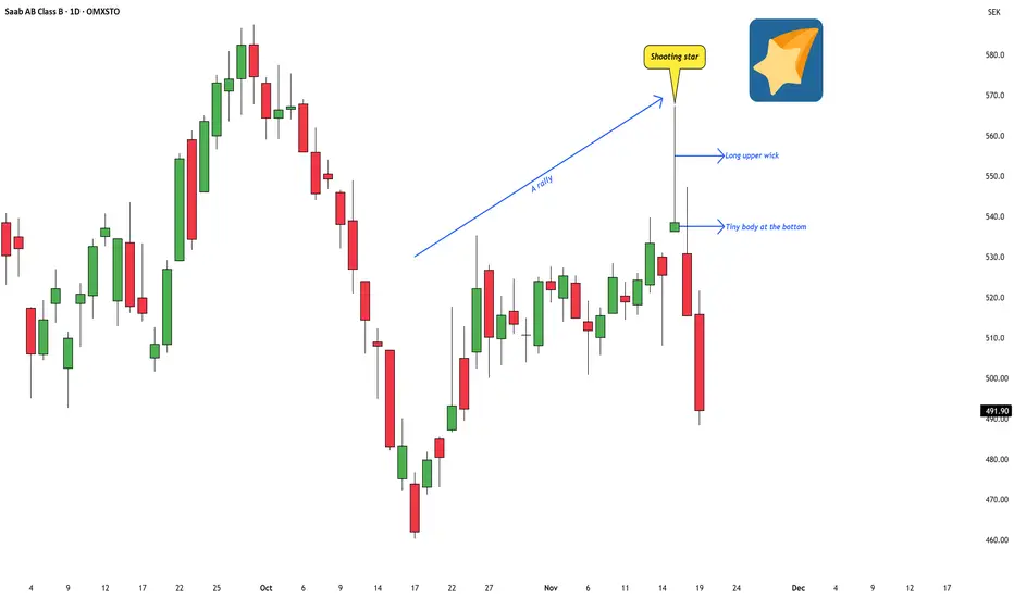
I was tracking a Swedish stock recently, and a very clean candlestick pattern popped up — a textbook shooting star.
The stock is Saab AB, a major Swedish company involved in military defense, commercial aviation, and civil security. Their operations span aircraft development, missile systems, naval platforms, surveillance systems, and a wide range of high-tech engineering services. In short, it’s one of Sweden’s core defense and aerospace names.
While going through the chart, this particular candle stood out because it matched the classic structure described in Japanese candlestick literature:
These are the key ingredients that define a shooting star.
From an educational perspective, the psychology behind this pattern is simple but powerful: the market pushed sharply higher during the session, could not sustain those higher levels, and slipped back toward the open. The candle itself captures that shift in momentum.
In classical candlestick theory, when a shooting star forms after an upswing, it often suggests that bullish strength may be fading and that the trend could be losing momentum. It doesn’t guarantee a reversal, but it does act as a visual warning sign — a moment where the advance pauses, hesitates, or becomes more vulnerable.
This post is simply to highlight how a shooting star looks on a real chart and what it typically represents in terms of market behaviour. No forecasts or trade ideas — just a clean educational example of the pattern in context.
The stock is Saab AB, a major Swedish company involved in military defense, commercial aviation, and civil security. Their operations span aircraft development, missile systems, naval platforms, surveillance systems, and a wide range of high-tech engineering services. In short, it’s one of Sweden’s core defense and aerospace names.
While going through the chart, this particular candle stood out because it matched the classic structure described in Japanese candlestick literature:
- a tiny real body near the bottom,
- a long upper wick,
- and it formed after a short-term rally.
These are the key ingredients that define a shooting star.
From an educational perspective, the psychology behind this pattern is simple but powerful: the market pushed sharply higher during the session, could not sustain those higher levels, and slipped back toward the open. The candle itself captures that shift in momentum.
In classical candlestick theory, when a shooting star forms after an upswing, it often suggests that bullish strength may be fading and that the trend could be losing momentum. It doesn’t guarantee a reversal, but it does act as a visual warning sign — a moment where the advance pauses, hesitates, or becomes more vulnerable.
This post is simply to highlight how a shooting star looks on a real chart and what it typically represents in terms of market behaviour. No forecasts or trade ideas — just a clean educational example of the pattern in context.
WaveXplorer | Elliott Wave insights
📊 X profile: @veerappa89
📊 X profile: @veerappa89
免责声明
这些信息和出版物并非旨在提供,也不构成TradingView提供或认可的任何形式的财务、投资、交易或其他类型的建议或推荐。请阅读使用条款了解更多信息。
WaveXplorer | Elliott Wave insights
📊 X profile: @veerappa89
📊 X profile: @veerappa89
免责声明
这些信息和出版物并非旨在提供,也不构成TradingView提供或认可的任何形式的财务、投资、交易或其他类型的建议或推荐。请阅读使用条款了解更多信息。