INVITE-ONLY SCRIPT
已更新 [UPRIGHT] Awesome DMI+

Hello Traders,
Today I'm releasing a spin on an 'oldie but goodie'; the Directional Movement Index (DMI).
DMI is a combination of 3 different indicators developed by the famous J. Welles Wilder. DMI has 3 different plots: the ADX, +DI, and -DI. The first is the ADX (Average Directional Index), which Wilder created in 1978 to show the strength of a trend by comparing the current price with the previous price range. The other two are the +DI (positive directional indicator) and the -DI show up as two separate lines, +DI is the difference between the highest price of the current day and the highest price of the day before, and -DI does the same calculation with the current and previous day's lows.
How does it work?
When the ADX line is above 25 (as a general rule, some traders use a different threshold, +/- 5), the trend is strong. When the +DI line is above the -DI line, the asset (stock) is moving in an uptrend, and the opposite means the asset is in a downtrend.
How is this different?
The ribbons created by the fill make it easier to see the change in direction of each plot.

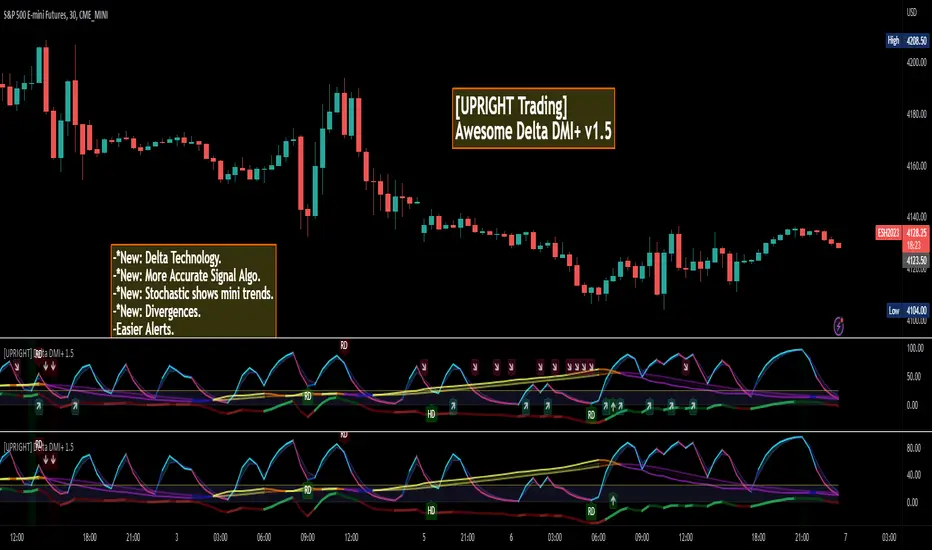
The chart should look like:

Cheers,
Mike
(UPRIGHT TRADING)
Today I'm releasing a spin on an 'oldie but goodie'; the Directional Movement Index (DMI).
DMI is a combination of 3 different indicators developed by the famous J. Welles Wilder. DMI has 3 different plots: the ADX, +DI, and -DI. The first is the ADX (Average Directional Index), which Wilder created in 1978 to show the strength of a trend by comparing the current price with the previous price range. The other two are the +DI (positive directional indicator) and the -DI show up as two separate lines, +DI is the difference between the highest price of the current day and the highest price of the day before, and -DI does the same calculation with the current and previous day's lows.
How does it work?
When the ADX line is above 25 (as a general rule, some traders use a different threshold, +/- 5), the trend is strong. When the +DI line is above the -DI line, the asset (stock) is moving in an uptrend, and the opposite means the asset is in a downtrend.
How is this different?
- Uses multiple calculations to produce signals for an indicator than normally doesn't have any.
- Multiple ADX's, +DI's, and -DI's for better accuracy and clearer direction changes.
- Ability to use 2 different background highlight signals and several buy/sell signals.
- Fully customizable (as always), ability to turn on or off any signals, change any of the colors to suit your needs.
- Added pre-filled Alerts.
The ribbons created by the fill make it easier to see the change in direction of each plot.
The chart should look like:
Cheers,
Mike
(UPRIGHT TRADING)
版本注释
Delta DMI v1.5 Update:- -*New: Delta Technology.
- -*New: More Accurate Signal Algo.
- -*New: Stochastic shows mini trends.
- -*New: Divergences.
- -Easier Alerts.
- -New layout and look.
- -New color scheme.
版本注释
--Small bug fixes and tweaks.仅限邀请脚本
只有作者授权的用户才能访问此脚本。您需要申请并获得使用许可。通常情况下,付款后即可获得许可。更多详情,请按照下方作者的说明操作,或直接联系UPRIGHTTrading。
TradingView不建议您付费购买或使用任何脚本,除非您完全信任其作者并了解其工作原理。您也可以在我们的社区脚本找到免费的开源替代方案。
作者的说明
https://uprighttrades.com to try for free.
Site: uprighttrades.com
Scripts: tradingview.com/u/UPRIGHTTrading/
Like & follow for great ideas, indicators, and to see what I've been working on to my your trading easier for you.
Scripts: tradingview.com/u/UPRIGHTTrading/
Like & follow for great ideas, indicators, and to see what I've been working on to my your trading easier for you.
免责声明
这些信息和出版物并非旨在提供,也不构成TradingView提供或认可的任何形式的财务、投资、交易或其他类型的建议或推荐。请阅读使用条款了解更多信息。
仅限邀请脚本
只有作者授权的用户才能访问此脚本。您需要申请并获得使用许可。通常情况下,付款后即可获得许可。更多详情,请按照下方作者的说明操作,或直接联系UPRIGHTTrading。
TradingView不建议您付费购买或使用任何脚本,除非您完全信任其作者并了解其工作原理。您也可以在我们的社区脚本找到免费的开源替代方案。
作者的说明
https://uprighttrades.com to try for free.
Site: uprighttrades.com
Scripts: tradingview.com/u/UPRIGHTTrading/
Like & follow for great ideas, indicators, and to see what I've been working on to my your trading easier for you.
Scripts: tradingview.com/u/UPRIGHTTrading/
Like & follow for great ideas, indicators, and to see what I've been working on to my your trading easier for you.
免责声明
这些信息和出版物并非旨在提供,也不构成TradingView提供或认可的任何形式的财务、投资、交易或其他类型的建议或推荐。请阅读使用条款了解更多信息。