INVITE-ONLY SCRIPT
The Trending Band Indicator

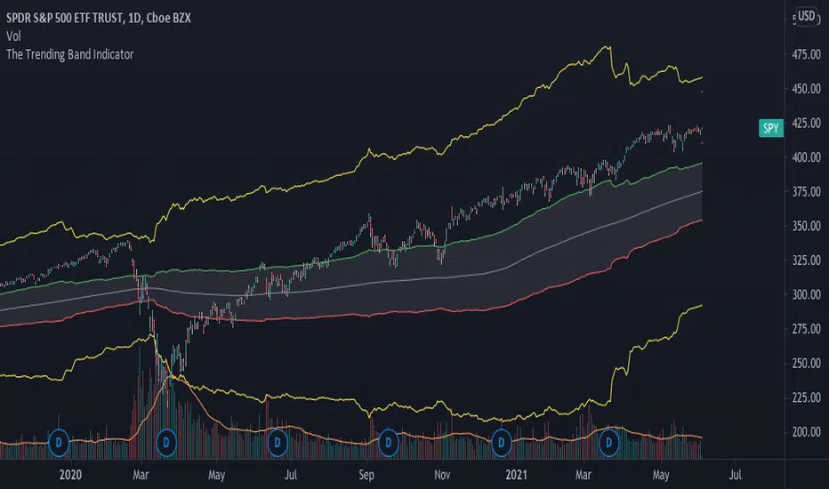
This indicator shows the trend of the market. The middle line is the 200-day moving average because it shows the long term trend of the market. However, since the market does give fake signals of going up and down through the 200-day moving average, I had to put a band on it to push through the fake signals. The first band around the middle line is 1 standard deviation of historical volatility which gives an area of cushion to prevent fake signals. The goal is if the stock is above the first top band, then the stock is in an uptrend. If the stock is below the first bottom band, then the stock is in a downtrend. If it is the middle of the first bands, then the stock is known to be rangebound.
The top most and bottom most yellow lines are 4 standard deviations of historical volatility which give an idea of where the floor and ceiling are. This helps investors and traders identify good buy and sell zones using the yellow lines to see overbought and oversold sides.
This is a great indicator for people who need help following the trend of a stock, etf , etc.
仅限邀请脚本
只有经作者批准的用户才能访问此脚本。您需要申请并获得使用权限。该权限通常在付款后授予。如需了解更多详情,请按照以下作者的说明操作,或直接联系tenpercentcreditspreads。
除非您完全信任其作者并了解脚本的工作原理,否則TradingView不建议您付费或使用脚本。您还可以在我们的社区脚本中找到免费的开源替代方案。
作者的说明
In order to get access to this indicator, send me a private message on Tradingview, email me at hello@theimpeccableinvestor or DM me on Instagram (@theimpeccableinvestor)
免责声明
这些信息和出版物并不意味着也不构成TradingView提供或认可的金融、投资、交易或其它类型的建议或背书。请在使用条款阅读更多信息。