Setup Crypto RadarSetup Crypto Radar is a multi-asset, multi-timeframe dashboard designed to visualize how different parts of the crypto market transition through phases of pressure, imbalance, exhaustion, and potential setup formation.
Instead of analyzing each chart individually, Setup Crypto Radar aggregates structural behavior across key market assets and compresses it into a clean, real-time matrix.
Each horizontal row represents an asset, while each column reflects a specific timeframe creating a unified overview of emerging long and short conditions across the market.
The radar highlights moments when assets move into:
• expansion pressure
• aggressive sell or buy behavior
• market imbalance and overextension
• zones where strong setups may begin forming
• periods of relief, cooling, or stabilization
By observing how signals cluster across timeframes, traders can quickly identify:
• assets entering strong directional phases
• synchronized market pressure across multiple charts
• early transitions from neutral conditions to potential setups
• environments where trend continuation or reversal may develop
• points of elevated risk caused by macro-level pressure
Setup Crypto Radar does not generate buy or sell signals.
It provides a structural map of pressure conditions, helping traders recognize when the market is shifting into zones where setups commonly originate.
This tool is designed for traders who value:
• multi-timeframe context
• cross-asset alignment
• structural pressure analysis
• early recognition of opportunity zones
• a clean, non-intrusive visual framework
Setup Crypto Radar is not a forecasting or signaling indicator.
It is a context engine, allowing you to see how pressure, imbalance, and setup conditions unfold across the crypto market in real time.
经济周期

Days Of The Week📌 Indicator Description
Days of the Week (Color + UTC-5 Auto) is a visual time-structure indicator designed to clearly separate trading days on the chart and highlight the day of the week using customizable colors.
It is especially useful for traders who analyze market behavior by weekday or who want a clean and intuitive way to identify weekly cycles, weekend transitions, and session-based structure.
🔹 Key Features
1. Automatic New York Timezone (UTC-5 / UTC-4 with DST)
The indicator automatically calculates time using the America/New_York timezone with full daylight saving time support.
This ensures that day changes, weekdays, and labels always align with the New York trading session regardless of the chart’s local timezone.
2. Day Separator Background (Vertical Highlighting)
A vertical background separator is drawn at the beginning of each New York trading day.
Users can independently customize:
-Weekday separator color
-Saturday separator color
-Sunday separator color
-Separator transparency
This makes weekends and weekly boundaries instantly visible on any timeframe.
3. Day-of-Week Text Labels at NY 09:00
At exactly 09:00 New York time, the indicator displays a text label at the bottom of the chart showing the current day of the week.
Sunday displays “Beginning of week – Sunday”
Monday through Friday display their respective weekday names
Saturday displays “Saturday”
This timing aligns with the New York session open, making it useful for intraday and session-based traders.
4. Separate Color Control for Weekdays vs Weekends
Text colors are fully customizable and separated into:
Weekday text color
Saturday text color
Sunday text color
Additionally, the script supports dark-background and light-background text modes, allowing the user to toggle which version is displayed depending on their chart theme.
5. Minimal, Non-Intrusive Design
No repainting
No future-looking logic
No impact on price data
Lightweight and optimized
The indicator is purely visual and does not interfere with other studies or trading systems.
🔹 Customization Options
Users can control:
Whether the day separator is shown
Separator colors for weekdays, Saturday, and Sunday
Separator transparency
Whether dark or light background text is displayed
Individual text colors for weekdays, Saturday, and Sunday
All settings update instantly from the indicator’s settings panel.

Jpi for LIFEEEEhmm like idk it kinda just marks out with a veritcal line 8am nyc 10:30 nyc and 10am nyc idk why but like ye ig its comfortable

Continuous Round Number LevelsWhat the Indicator Does:
This indicator draws red horizontal lines on the chart at every round price level – that is, prices ending with 00, 000, or other round numbers according to the roundStep setting.
How It Works:
The indicator checks the visible price range on the chart, based on the number of bars defined (lookbackBars).
It calculates the nearest round price levels within this range – both the lowest and highest visible prices.
For each round level within the range, it creates a red horizontal line that extends both forward and backward across the chart (extend.both).
The lines update automatically when you scroll the chart or when the market price changes, so you always see the relevant round levels.
Benefits:
Provides a clear visual of round number levels, which often act as natural support or resistance zones in trading.
Lines are visible across the entire chart, making it easy to see where price may pause or reverse.
Adjustable for different assets by changing the roundStep.
Real-time updating ensures the lines always match the visible price range.
In short, this indicator makes it easy to identify natural support and resistance levels visually, with continuous lines across the chart, helping you make more precise trading decisions.
If you like, Your Majesty, I can also create an advanced version with Decision Zones around each round level, so you have safe entry zones for trades rather than just a single line.
Do you want me to do that?

deKoder | Business Cycle vs BitcoinThis indicator overlays Bitcoin's detrended momentum with the US ISM Manufacturing PMI (a key business cycle proxy) to visually dissect the relationship between crypto cycles and broader economic health.
Inspired by ongoing debates in crypto macro analysis (e.g., "Is there a 4-year halving cycle, or is it just the business cycle?" ), it highlights potential lead-lag dynamics - challenging the popular view that PMI strictly leads Bitcoin rallies and tops.
Key Features
• BTC Momentum Wave (Yellow/Orange Line):
Detrended deviation from Bitcoin's long-term "fair value" (24-month SMA).
Formula: ((close / sma(close, 24)) * 100 - 100) * 0.15
- Positive (yellow): BTC overvalued relative to trend | bullish momentum
- Negative (orange): Undervalued relative to trend | bearish momentum
• PMI Wave (Teal/Red Line):
ISM Manufacturing PMI centered at zero (raw PMI - 50, scaled ×3 for alignment).
- Positive (teal): Expansion (>50 raw) — economic tailwinds.
- Negative (red): Contraction (<50 raw) — headwinds, often linked to risk-off in assets.
• S&P 500 Momentum (White Line, Optional):
Similar deviation for SPX, showing how equities bridge BTC's volatility and PMI's smoothness.
• Divergence Highlights (Bar & Background Colors):
- Teal/Green Zones : BTC momentum positive while PMI negative → BTC signaling early recovery (potential lead by 1-3+ months at bottoms).
- Maroon/Red Zones : BTC momentum negative while PMI positive → BTC warning of rollovers (early bear signals).
- Neutral: No color — aligned cycles.
• Overlaid SMA on Price Chart :
24-month SMA for BTC (teal when price above, red when below) — quick fair value reference.
How to Interpret: Does BTC Lead the Business Cycle?
The chart flips the common meme ( "No 4-year cycle, it's just the business cycle" ) by visually emphasising BTC's potential as a forward-looking signal .
Historical cycles (2013–2025) show:
• BTC Leads at Bottoms : E.g., 2018–2019 and 2022 troughs — BTC momentum crosses positive 2–4 months before PMI, as speculative traders price in liquidity easing/recoveries ahead of manufacturing data.
• Coincident or BTC-Led at Tops : Peaks align closely (e.g., 2017, 2021), with PMI rollovers often coinciding or slightly leading the initial BTC euphoria fade. BTC then rolls over before PMI confirms later.
• Why? Markets are anticipatory (6–12 months forward), while PMI is a lagged survey snapshot. BTC, as a high-beta risk asset, amplifies early sentiment shifts before they hit factory orders/employment.
Inputs & Customization
• BTC Source (Default: BITSTAMP:BTCUSD)
• Fair Value MA Length (Default: 24 months)
• Show S&P (Default: False)
• PMI Multiplier (Default: 3.0)
• BTC Momentum Multiplier (Default: 0.15)
• Cap BTC Momentum at ±100 (Default: True)
• Toggle Early Cross Arrows, Bar/Background Deviation Colors, Difference Histogram

Gann Octave 8 Ver.2.0Gann Octave 8 Ver.2.0 - Complete Trading Guide
Overview
This indicator combines W.D. Gann's time-tested principles of market geometry with modern technical analysis. It identifies key market structures and projects precise support/resistance levels along with angular momentum lines to help traders identify high-probability trading opportunities.
________________________________________
Core Concepts
1. Gann's Octave Division (The Rule of 8)
W.D. Gann discovered that markets move in harmonic divisions based on the number 8. This indicator divides any swing movement into 8 equal parts (octaves):
• 0% - Swing extreme (High for bearish, Low for bullish)
• 12.5% - First octave
• 25% - Quarter level
• 37.5% - Three-eighths level
• 50% - Midpoint (most critical level)
• 62.5% - Five-eighths level
• 75% - Three-quarter level
• 87.5% - Seventh octave
• 100% - Swing extreme (opposite end)
Why 8? Gann believed natural market cycles follow mathematical harmonics. The octave division provides precise entry and exit points that frequently act as support/resistance zones.
2. Gann Angles (Price-Time Relationship)
Gann angles represent the relationship between price movement and time. Each angle shows different momentum levels:
• 1x1 (Black) - 45° angle, perfect balance between price and time. Most important Gann angle. Represents the natural trend line.
• 2x1 (Red) - Steeper angle, 2 units of price per 1 unit of time. Shows strong momentum.
• 1x2 (Red) - Flatter angle, 1 unit of price per 2 units of time. Shows weak momentum.
• 4x1 & 1x4 (Blue) - Even more extreme angles indicating very strong or very weak trends.
• 8x1 & 1x8 (Orange) - Most extreme angles, parabolic moves or complete consolidation.
Key Principle: When price is above the 1x1 angle = bullish. Below 1x1 = bearish. When price crosses from one angle to another, it signals a change in momentum.
________________________________________
How the Indicator Works
Structure Detection
The indicator automatically identifies market swings using pivot points:
1. Bullish Structure (Green): Detected when price makes a higher high
o Octave levels calculated from swing low (0%) to swing high (100%)
o Gann angles project upward from the swing low
2. Bearish Structure (Red): Detected when price makes a lower low
o Octave levels calculated from swing high (0%) to swing low (100%)
o Gann angles project downward from the swing high
Dynamic Updates
• Swing Tracker ON: Levels update continuously as the swing evolves
• Swing Tracker OFF: Levels lock at the initial swing detection (cleaner charts)
Historical Structures
The indicator maintains previous swing structures based on "Number of Swings to Show":
• Set to 1: Only current structure (cleanest)
• Set to 2-3: Current + recent history (recommended for context)
• Set to 4+: Multiple historical structures (may overlap but shows pattern)
________________________________________
Trading Strategy
Entry Signals
BUY SIGNALS (Green Triangle Up ▲)
Signal 1: Bounce from Support Levels
• Price drops to 0%, 50%, or 100% level and reverses
• Best when combined with bullish candlestick pattern (hammer, engulfing)
• Entry: On signal confirmation
• Stop Loss: Below the support level (0.5-1% below)
• Target: Next octave level up (12.5%, 25%, 50%)
Signal 2: Breakout Above Resistance
• Price breaks above 50% or 100% level with momentum
• Confirms trend continuation or reversal
• Entry: On close above the level
• Stop Loss: Below the breakout level
• Target: Previous swing high or next major level
Signal 3: Gann Angle Support
• Price bounces off 1x1 angle (black line)
• Indicates trend is intact
• Entry: When price respects the angle
• Stop Loss: Below the 1x1 angle
• Target: Next resistance level
SELL SIGNALS (Red Triangle Down ▼)
Signal 1: Rejection from Resistance Levels
• Price rallies to 0%, 50%, or 100% level and reverses
• Best when combined with bearish candlestick pattern (shooting star, bearish engulfing)
• Entry: On signal confirmation
• Stop Loss: Above the resistance level (0.5-1% above)
• Target: Next octave level down (87.5%, 75%, 50%)
Signal 2: Breakdown Below Support
• Price breaks below 50% or 0% level with momentum
• Confirms trend continuation or reversal
• Entry: On close below the level
• Stop Loss: Above the breakdown level
• Target: Previous swing low or next major level
Signal 3: Gann Angle Resistance
• Price fails at 1x1 angle (black line)
• Indicates trend weakness
• Entry: When price rejects the angle
• Stop Loss: Above the 1x1 angle
• Target: Next support level
________________________________________
Advanced Trading Techniques
1. The 50% Rule (Most Powerful)
The 50% octave level is the most critical in Gann theory:
• In Uptrend: Price should not break below 50% retracement. If it holds = trend intact, go long.
• In Downtrend: Price should not break above 50% retracement. If it holds = trend intact, go short.
• Reversal: Breaking and closing beyond 50% often signals trend reversal.
2. Gann Angle Confluence
When multiple Gann angles converge with octave levels = HIGH probability zone:
• Look for price to bounce or reverse at these zones
• Example: 1x2 angle meets 50% level = strong support/resistance
• These zones often become pivot points
3. Multiple Timeframe Analysis
• Use higher timeframe (daily) for major structure
• Use lower timeframe (5min, 15min) for precise entries
• Take trades when both timeframes align
4. Swing Failure Pattern
• Price breaks a key level (e.g., 50%) but quickly reverses back
• This "false breakout" often leads to strong move in opposite direction
• Wait for signal in the reversal direction
________________________________________
Settings Optimization
For Day Trading (Scalping)
• Structure Period: 0-2 (22 bars or less)
• Number of Swings: 1 (only current structure)
• Signal Sensitivity: High
• Swing Tracker: OFF (cleaner)
For Swing Trading
• Structure Period: 4-5 (44-88 bars)
• Number of Swings: 2-3
• Signal Sensitivity: Medium
• Swing Tracker: ON or OFF (preference)
For Position Trading
• Structure Period: 6-8 (176+ bars)
• Number of Swings: 3-5
• Signal Sensitivity: Low
• Swing Tracker: ON
________________________________________
Common Patterns to Watch
Bullish Reversal Setup
1. Price in bearish structure (red levels)
2. Price drops to 100% level (swing low)
3. Buy signal appears (green triangle)
4. Price breaks back above 50% level
5. Action: Go long with stop below 100%
Bearish Reversal Setup
1. Price in bullish structure (green levels)
2. Price rises to 100% level (swing high)
3. Sell signal appears (red triangle)
4. Price breaks back below 50% level
5. Action: Go short with stop above 100%
Trend Continuation
1. Price respects 1x1 Gann angle
2. Small pullback to 25% or 37.5% level
3. Buy/sell signal appears
4. Action: Enter in trend direction
________________________________________
________________________________________
Signal Sensitivity Guide
• Low: Conservative, only major breakouts (3-5 signals per day)
• Medium: Balanced, includes approaches (5-10 signals per day)
• High: Aggressive, includes bounces (10-20 signals per day)
Choose based on your trading style and risk tolerance
________________________________________
Final Words
This indicator is a powerful tool, but remember:
"The market is never wrong. Opinions are." - W.D. Gann
• No indicator is 100% accurate
• Always combine with price action and volume
• Backtest on your instrument and timeframe
• Keep learning and adapting your strategy
• Discipline and risk management are more important than the perfect setup
Happy Trading! 📈


Killzones by (Pecurtoo)This indicator highlights key trading sessions on the chart in UTC+1 (Brussels) timezone. It allows traders to visually identify the Asian, London, New York AM, and New York PM sessions with customizable start and end times and colors. The sessions are displayed as shaded backgrounds on the chart, making it easier to spot periods of high market activity and potential volatility. All session times and colors can be fully edited by the user, providing flexibility to match different trading strategies.
It is ideal for traders using ICT Killzone concepts, intraday strategies, or those who want to track session-specific market activity.

Multiple Anchored VWAP With BandsThe Anchored VWAP (aVWAP) indicator lets traders select a specific starting bar—such as a significant high or low, an earnings release, or a major news event—to anchor VWAP calculations. By resetting the VWAP from a chosen moment, it clearly visualizes whether bullish or bearish momentum has dominated since that point, offering insight into shifts in market sentiment. The added bands helps to catch the price correctly.
This tool allows you to plot up to four separate aVWAP lines on your chart, each fully customizable.
Key Features:
- Plot independent aVWAP lines
- Set a custom start date and time for each anchor point
- Choose custom colors for each line
- Optionally label the starting bar for clarity
- Apply custom resolutions for flexible timeframe analysis

Multi-Timeframe ATR PanelThis indicator is designed to summarize information across popular timeframes for one of the most widely used and essential indicators — ATR and ATR% — presented in a table format.
I use it to configure my trading bots when I need to quickly check current values on higher timeframes as well as on my working timeframe (for example, 5 minutes for me).
P.S. This is my first experience creating indicators on TradingView, so please don't judge too harshly. I'm open to constructive feedback
-----------------------------------------------
Данный индикатор предназначен для обобщения информации на популярных тайм фреймах одного из самых популярных и необходимых трейдерам индикаторов ATR и ATR% в виде таблицы.
Я использую его для настройки своих ботов когда необходимо здесь и сейчас узнать значения на старших тайм фреймах и рабочем (мой допустим 5 минут).
P/S Это мой первый опыт создания индикаторов на TradingView если что просьба не судить строго, готов выслушать конструктивную критику

Quarterly Cycles [Daye's Theory] with LabelsDescription:
This indicator automates the Quarterly Theory (also known as Cycle Days Theory), popularized by traders like Daye. It divides time into four distinct quarters to help traders identify the algorithmic phases of price delivery: Accumulation, Manipulation, Distribution, and Continuation (or Reversal).
Unlike standard cycle indicators that just color the background, this script draws High/Low Boxes around each quarter. This makes it significantly easier to spot SMT Divergences (Smart Money Technique) and liquidity sweeps between correlated assets (e.g., comparing the Q2 box on NQ vs. ES).
Key Features:
Fully Adaptive Timeframes: The indicator automatically switches modes based on your chart:
Intraday (1m - 30m): Shows Daily Cycles (Asia, London, NY AM, NY PM).
Weekly (1H - 2H): Shows Weekly Cycles (Mon, Tue, Wed, Thu).
Monthly (4H+): Shows Monthly Cycles (Week 1, Week 2, Week 3, Week 4).
New York Time Locked: All calculations are hardcoded to New York time (EST/EDT). You do not need to change your chart's timezone settings; the boxes will always appear at the correct algorithmic times.
True Open & Equilibrium:
True Open Line: Automatically plots a line from the Open of Q2 (e.g., Midnight NY). Price above this line suggests a Long bias; below suggests Short.
50% Equilibrium: (Optional) Toggle a midline to easily see if price is in Premium or Discount relative to the quarter's range.
Settings:
Fully customizable colors for Q1-Q4.
Toggle labels, borders, and the "True Open" line.

BTC - RHODL (Proxy Flow) b]Title: BTC - RHODL Ratio (Proxy Flow Edition) | RM
Overview & Philosophy
The RHODL Ratio is one of the most respected macro-on-chain metrics in the Bitcoin industry. Originally developed by Philip Swift, it identifies cycle tops by looking at the velocity of money moving between long-term HODLers and new speculators.
Why a "Proxy" instead of the "Original"? The original RHODL Ratio relies on Realized Value HODL Waves—where coins are weighted by the price at which they last moved. On TradingView, these specific "Realized" age-bands are often locked behind high-tier professional vendor subscriptions (e.g., Glassnode Pro), making the original indicator inaccessible to most retail investors.
To solve this, I present this Proxy Flow Edition. Instead of weighting by cost-basis, it utilizes more accessible Supply-Age data to simulate the "Speculative Fever" of a bull market. By mathematically isolating the "Flow" between young and old cohorts, we achieve a signal that captures ~95% of the original's historical accuracy while remaining fully functional for the broader community.
Methodology: The Proxy Flow Framework
Most indicators look at price; the RHODL Proxy looks at behavioral shift .
1. The Young vs. Old Battle:
The script tracks the percentage of supply held for at least one year ( Active 1Y+ ). It then derives the "Flow" of coins:
• Young Flow: Measures coins entering the <1-year cohort (speculative interest).
• Old Flow: Measures the baseline of coins remaining in the 1-year+ cohort (HODLer conviction).
2. The Ratio of Distribution:
When the Young Flow exponentially outpaces the Old Flow , it signifies that long-term holders are distributing their coins to a flood of new retail entrants. Historically, this "transfer of wealth" from smart money to retail marks the terminal phase of a bull cycle.
3. Age Normalization:
Bitcoin’s network naturally matures over time. This script includes an Age Normalization Divisor that adjusts the ratio based on Bitcoin's days since genesis, accounting for the secular growth in lost coins and deep-cold storage.
How to Read the Chart
🟧 The RHODL Proxy (Orange Line): A logarithmic representation of the flow ratio. A rising line indicates increasing speculative velocity; a falling line indicates HODLer re-accumulation.
🔴 The Overheated Zone (> 0.5): The danger zone. This area captures the "Speculative Fever" typical of cycle peaks. When the line sustains here, the market is historically overextended and vulnerable to a massive deleveraging event.
🟢 The Accumulation Zone (< -0.5): The maximum opportunity zone. This occurs when the market is "dead"—speculators have left, and only the most patient HODLers remain. Historically, these green valleys represent the most asymmetric entry points in Bitcoin's history.
Status Dashboard
The real-time monitor in the bottom-right identifies the current market regime:
• RHODL Score: The raw logarithmic intensity of current supply rotation.
• Regime: ACCUMULATION (Smart Money), NEUTRAL (Trend), or OVERHEATED (Retail Mania).
Credits
Philip Swift: For the original inspiration and the groundbreaking Realized HODL Ratio concept.
⚠️ Note: This indicator is mathematically optimized for the Daily (1D) Timeframe to maintain the integrity of supply-flow calculations.
Disclaimer
This script is for research and educational purposes only. On-chain metrics are probabilistic, not deterministic. Always manage your risk according to your investment horizon.
Tags
bitcoin, btc, rhodl, on-chain, hodl, cycles, speculation, rotation, macro, Rob Maths

PipX-DRMechanicWebXPipX-Academy
How It Works
Session Ranges: The indicator tracks two customizable time ranges
FVG Detection: When price breaks out of a range, the strategy looks for Fair Value Gaps that meet specific size criteria
Pending Order Entry: Places a limit order at the FVG zone and waits for price to pull back before entering

ORB FX REPLAY - FINAL SAFEHere is the description in English, written to sound professional and meet all the requirements for publishing on TradingView:
Script Description:
Title: ORB Strategy Backtest Pro - Ultra Compatibility
Description: This is an Opening Range Breakout (ORB) strategy specifically designed for professional backtesting. It is optimized to run smoothly on external platforms like FX Replay and TradingView's replay mode.
Key Features:
Custom Session: Automatically calculates the High and Low of a specific time window (default: 10:00 - 10:15 Bucharest/GMT+2).
Impulse Confirmation: Features a "Min Impulse" filter to ensure entries happen on strong momentum, avoiding "fake-outs" near the range boundaries.
Hard Target Management: Designed for "Set & Forget" backtesting. Once a trade is triggered, the script tracks it until it hits either the Stop Loss (SL) or the final Take Profit 3 (TP3).
Visual Projections: Draws clear, real-time lines for Entry, SL, and TP3 on the chart for easy visual tracking.
Automated Statistics: Includes a dynamic label system that tracks Total Trades, Win Count, and Loss Count based on the TP3/SL logic.
Optimized Code: Built using Pine Script v5 with a focus on stability and compatibility, avoiding complex tables that often cause errors on external engines.

Gann Square Levels V2Gann Square Levels
For 1 to 10,00,000
Just customize the indicator as you like.

Relative Strength Table📊 RRG Quadrant Scanner - Options Trading Market Direction Tool
A powerful Relative Rotation Graph/Table (RRG) dashboard designed to help OPTIONS TRADERS identify market direction, select optimal strikes, and time entries with precision. Track up to 8 symbols against any benchmark to determine bullish/bearish bias and rotation momentum.
---
🎯 WHY OPTIONS TRADERS NEED THIS
Unlike stock traders who can hold losing positions indefinitely, options traders face:
❌ Time decay (theta)
❌ Directional risk (delta)
❌ Volatility changes (vega)
❌ Limited time to be right
This indicator solves these challenges by showing you:
✅ Which direction momentum is flowing (calls vs puts)
✅ Which symbols/sectors have strongest trends (high probability setups)
✅ When rotation is happening (timing entries/exits)
✅ Market breadth for directional confirmation
---
🔥 HOW RRG QUADRANTS GUIDE OPTIONS TRADING
🟢 LEADING QUADRANT (Top Right) - BULLISH BIAS
What it means:
• Strong uptrend vs benchmark
• Accelerating momentum
• High relative strength
Options Strategies:
✅ BUY CALLS (ITM/ATM for safer, OTM for aggressive)
✅ SELL CASH-SECURED PUTS (collect premium on strong stocks)
✅ BULL CALL SPREADS (defined risk directional plays)
✅ LONG CALL DIAGONALS (capture continued uptrend)
Direction Signal: STRONG BULLISH
• Multiple symbols in Leading = broad market strength
• Index options: favor call side
• Stock options: bullish strategies on individual leaders
---
🔵 IMPROVING QUADRANT (Top Left) - EARLY BULLISH
What it means:
• Currently underperforming BUT gaining momentum
• Early reversal signal
• Rotation from weak to strong
Options Strategies:
✅ BUY CALLS with longer expiry (give time to develop)
✅ BULL PUT SPREADS (defined risk as support builds)
✅ SELL PUTS at support (premium collection on improving stocks)
✅ CALENDAR SPREADS (benefit from time and momentum shift)
Direction Signal: EMERGING BULLISH
• Symbols moving Lagging → Improving = early buy signal
• Best for patient options traders
• Use longer DTE (45-60 days) to allow rotation to complete
• Watch for move into Leading quadrant for confirmation
---
🔴 LAGGING QUADRANT (Bottom Left) - BEARISH BIAS
What it means:
• Weak relative strength
• Declining momentum
• Persistent underperformance
Options Strategies:
✅ BUY PUTS (directional bearish play)
✅ BEAR CALL SPREADS (defined risk on weakness)
✅ SELL COVERED CALLS (if stuck in position)
✅ PUT DEBIT SPREADS (cheaper than naked puts)
Direction Signal: STRONG BEARISH
• Multiple symbols in Lagging = market weakness
• Avoid bullish strategies entirely
• Index options: favor put side
• Exit existing long calls immediately
---
⚫ WEAKENING QUADRANT (Bottom Right) - EARLY BEARISH
What it means:
• Currently strong BUT losing momentum
• Topping signal
• Rotation from strong to weak
Options Strategies:
✅ SELL CALLS (initiate bearish bias)
✅ BEAR PUT SPREADS (cheaper than naked puts)
✅ CLOSE LONG CALLS (take profits before decay accelerates)
✅ PROTECTIVE PUTS (if holding stock positions)
✅ SHORT STRADDLES/STRANGLES (if expecting range-bound)
Direction Signal: EMERGING BEARISH
• Symbols moving Leading → Weakening = profit-taking signal
• Close bullish positions EARLY
• Initiate bearish strategies
• Watch for move into Lagging for confirmation of downtrend
---
🎯 MARKET DIRECTION CONFIRMATION FOR INDEX OPTIONS
Trading NIFTY/BANKNIFTY/SPX Options? Use this way:
📊 Track These Symbols Against Benchmark:
• Major sectors: Finance, IT, Energy, Auto, Pharma
• Top stocks: RELIANCE, HDFCBANK, INFY, TCS, etc.
• Benchmark: NIFTY or BANKNIFTY
🟢 BULLISH INDEX BIAS (Buy Calls/Sell Puts)
When you see:
• 60%+ symbols in Leading + Improving quadrants
• Financial sector in Leading (indicates BANKNIFTY strength)
• IT sector in Leading (indicates NIFTY strength)
• Few symbols in Lagging
Strategy: Aggressive call buying, put selling, bull spreads
🔴 BEARISH INDEX BIAS (Buy Puts/Sell Calls)
When you see:
• 60%+ symbols in Lagging + Weakening quadrants
• Key sectors rotating to Weakening
• Broad-based weakness across watchlist
Strategy: Put buying, bear spreads, avoiding new longs
⚖️ NEUTRAL/ROTATION PHASE (Iron Condors/Strangles)
When you see:
• Symbols evenly distributed across quadrants
• No clear cluster in any one quadrant
• Conflicting signals between sectors
Strategy: Range-bound strategies, avoid directional bets, reduce position size
---
💡 OPTIONS TRADING USE CASES
🎯 Case 1: Earnings Play Setup
Before earnings, check if stock is in:
• Leading = bullish bias, buy calls
• Improving = emerging strength, cautious calls
• Weakening = avoid or buy puts
• Lagging = strong puts
🎯 Case 2: Weekly Options Direction
Monday morning setup:
• Check sector quadrants vs benchmark
• Leading sectors = focus call trades there
• Weakening sectors = focus put trades
• Adjust delta exposure based on quadrant distribution
🎯 Case 3: Spread Selection
For credit spreads:
• Sell puts on Leading/Improving symbols (bullish)
• Sell calls on Weakening/Lagging symbols (bearish)
• Iron condors when symbols are scattered (no clear direction)
🎯 Case 4: Portfolio Hedging
If holding calls:
• Watch symbols move Leading → Weakening = add protective puts
• If 50%+ watchlist enters Weakening = hedge entire portfolio
If holding puts:
• Watch symbols move Lagging → Improving = close puts early
• If broad rotation to Improving = exit bearish positions
🎯 Case 5: Theta Decay Management
Leading quadrant = hold calls longer (trend supports you)
Weakening quadrant = close calls early (decay + downside risk)
Improving quadrant = be patient with calls (need time to develop)
Lagging quadrant = hold puts or exit quickly if rotation starts
---
📈 SECTOR ROTATION FOR OPTIONS STOCK SELECTION
Instead of trading index options, use quadrants to pick individual stocks:
Setup Example - NSE Options:
Symbols: RELIANCE, HDFCBANK, INFY, TCS, SBIN, ICICIBANK, TATAMOTORS, BAJFINANCE
Benchmark: NIFTY
Monday Strategy Session:
1. Check which stocks are in Leading quadrant
2. Focus call trades ONLY on Leading stocks
3. Check which stocks are in Weakening/Lagging
4. Focus put trades on those
5. Ignore stocks in unclear quadrants (save capital)
This approach:
✅ Increases win rate (trading with momentum)
✅ Reduces losses (avoiding weak stocks)
✅ Improves timing (catch early rotations)
---
🔥 REAL TRADING SCENARIOS FOR OPTIONS
📊 Scenario 1: Strong Bullish Market
Quadrant Status:
• Leading: 5 symbols
• Improving: 2 symbols
• Weakening: 1 symbol
• Lagging: 0 symbols
Options Action:
✅ Aggressive call buying on index
✅ Bull call spreads on leading stocks
✅ Sell puts on improving stocks
✅ Avoid bearish strategies
✅ Larger position sizes (conviction high)
---
📊 Scenario 2: Rotation/Choppy Market
Quadrant Status:
• Leading: 2 symbols
• Improving: 2 symbols
• Weakening: 2 symbols
• Lagging: 2 symbols
Options Action:
⚠️ AVOID directional bets
✅ Iron condors/strangles (profit from range)
✅ Calendar spreads (volatility plays)
✅ Smaller position sizes
✅ Wait for clearer rotation signal
---
📊 Scenario 3: Bearish Reversal
Quadrant Status:
• Leading: 1 symbol
• Improving: 0 symbols
• Weakening: 3 symbols
• Lagging: 4 symbols
Options Action:
✅ Buy puts on index
✅ Bear call spreads on weakening stocks
✅ CLOSE all long calls immediately
✅ Sell covered calls if stuck in stocks
✅ Increase hedge positions
---
📊 Scenario 4: Early Recovery
Quadrant Status:
• Leading: 1 symbol
• Improving: 4 symbols (moving from Lagging)
• Weakening: 1 symbol
• Lagging: 2 symbols
Options Action:
✅ Buy calls with 45-60 DTE (give time to develop)
✅ Bull put spreads on improving stocks
✅ Small position sizes initially
✅ Scale in as symbols move to Leading
✅ Close remaining bearish positions
---
🎯 TIMING ENTRY/EXIT WITH QUADRANTS
📍 BEST CALL ENTRIES:
1. Symbol moves Improving → Leading (momentum confirmed)
2. 70%+ watchlist in Leading/Improving (broad strength)
3. Key sector enters Leading (focused strength)
📍 BEST PUT ENTRIES:
1. Symbol moves Weakening → Lagging (downtrend confirmed)
2. 70%+ watchlist in Weakening/Lagging (broad weakness)
3. Leading symbols suddenly drop to Weakening (reversal)
📍 EXIT SIGNALS:
Calls: Close when symbol enters Weakening
Puts: Close when symbol enters Improving
Both: Take profits at 50-70% max gain if rotation unclear
---
⚙️ SETUP FOR OPTIONS TRADERS
For NIFTY Options Traders:
• Symbols: Top 8 NIFTY stocks (RELIANCE, HDFCBANK, INFY, etc.)
• Benchmark: NIFTY
• Window: 20 periods
• Timeframe: Daily chart
• Use: Gauge NIFTY direction
For BANKNIFTY Options Traders:
• Symbols: Banking stocks (HDFCBANK, ICICIBANK, SBIN, KOTAKBANK, AXISBANK)
• Benchmark: BANKNIFTY
• Window: 20 periods
• Use: Gauge BANKNIFTY direction
For Stock Options Traders:
• Symbols: Your watchlist of optionable stocks
• Benchmark: Relevant sector index
• Window: 10-20 periods
• Use: Pick strongest/weakest for directional trades
---
🎓 OPTIONS TRADING RULES USING QUADRANTS
✅ Rule 1: Only buy calls on Leading/Improving stocks
✅ Rule 2: Only buy puts on Weakening/Lagging stocks
✅ Rule 3: Exit calls when stock enters Weakening
✅ Rule 4: Exit puts when stock enters Improving
✅ Rule 5: Use longer DTE when trading Improving/Weakening (rotation takes time)
✅ Rule 6: Use shorter DTE when trading Leading/Lagging (established trends)
✅ Rule 7: If 70%+ watchlist in one side = strong directional bias
✅ Rule 8: If symbols scattered = reduce position sizes, play neutral
---
🏆 ADVANTAGES FOR OPTIONS TRADERS
✅ HIGHER WIN RATE
Trade only symbols with clear momentum direction
✅ BETTER TIMING
Catch rotations early = maximize profit potential
✅ REDUCED THETA DECAY LOSSES
Don't hold calls on weakening stocks (double loss)
✅ CLEARER MARKET BIAS
Know if market is bullish/bearish/neutral
✅ PORTFOLIO ALIGNMENT
Match your delta exposure to market direction
✅ EARLY WARNING SYSTEM
Spot rotations before price breaks down/up
✅ RISK MANAGEMENT
Exit positions before momentum shifts against you
---
📚 COMBINING WITH OTHER ANALYSIS
This indicator works best when combined with:
📊 Technical Analysis
• Support/Resistance for strike selection
• Chart patterns for entry timing
• Volume for confirmation
📈 Volatility Analysis
• IV Rank for premium selling decisions
• VIX/India VIX for overall market risk
⏰ Time Analysis
• Check quadrants before weekly expiry
• Align DTE with expected rotation speed
💰 Greeks Management
• High delta on Leading symbols (directional confidence)
• Low delta on Improving symbols (early, needs time)
• Negative delta on Weakening/Lagging (bearish bias)
---
⚠️ WHAT THIS INDICATOR DOESN'T DO
❌ Doesn't predict exact option prices
❌ Doesn't tell you which strike to buy
❌ Doesn't replace risk management
❌ Doesn't account for news/events
❌ Doesn't consider implied volatility
❌ Doesn't guarantee winning trades
It DOES give you:
✅ Market direction bias
✅ Symbol selection edge
✅ Rotation timing awareness
✅ Risk/reward framework
---
🎯 BOTTOM LINE FOR OPTIONS TRADERS
Stop fighting momentum. Stop buying calls on weakening stocks. Stop holding positions through rotations.
Instead:
• Check quadrants BEFORE entering trades
• Buy calls only on Leading/Improving
• Buy puts only on Weakening/Lagging
• Exit when rotation signals change
• Adjust position size based on breadth
This simple framework can dramatically improve your options trading win rate and reduce catastrophic losses from holding through momentum reversals.
---
⭐ START TRADING WITH THE TREND
Add this RRG Quadrant Scanner and align your options trades with market rotation - not against it!

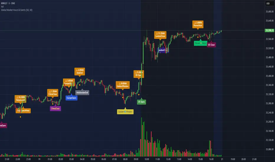
Global Market Hours & Eventswww.tradingview.com
Global Market opens and closes and other related events,
15min warning ahead of time, visual indicator for warning and for the event
not over-crowded with the possibility to remove labels and have just a little circle marker.
Adjustements for labels and circles are in the settings
Activate Pane Label to identify


Statistical Deviation per AssetINDICATOR: STATISTICAL DEVIATION PER ASSET (SDPA)
1. Overview
The Statistical Deviation per Asset (SDPA) is a quantitative analysis tool designed to measure the strength and exhaustion of price movements. Unlike standard oscillators (like RSI ), the SDPA calculates the actual percentage deviation from the most recent pivot point (High or Low) and compares it against historical performance averages specific to each asset.
---
2. Core Logic & Calculation
The script operates on a Mean Reversion principle. It assumes that every asset (Gold, Bitcoin, Ethereum, etc.) has a unique "volatility signature" depending on the timeframe.
* Dynamic Pivot Detection : The indicator identifies recent Swing Highs and Swing Lows using an adaptive lookback period.
* Real-Time Return Calculation : Once a pivot is confirmed, the script calculates the real-time percentage gain (from a Low) or loss (from a High).
* Zero-Indexed Histogram : This return is plotted as an oscillator centered around a Zero Line , representing the current trend's progress since the last reversal.
---
3. Adaptive Intelligence (Multi-Asset & Multi-TF)
The SDPA is pre-loaded with a statistical database. It automatically adjusts its sensitivity and thresholds based on:
1. The Selected Asset : Whether trading XAUUSD , Bitcoin , or Solana , the deviation thresholds adapt to the specific volatility of that instrument.
2. The Timeframe (TF) : The calculation period ( period ) and performance targets ( hausse_perf / baisse_perf ) change dynamically. For example, a 1-minute scalping setup uses a longer lookback (200) compared to a Daily swing setup (10).
---
4. Visual Anatomy
The interface is designed for instant "at-a-glance" interpretation:
* The Histogram :
* Green : Price is trending up since the last Swing Low .
* Red : Price is trending down since the last Swing High .
* Threshold Lines (The Statistical Averages) :
* Thick Line (60% Opacity) : Represents the Average Historical Deviation . When the histogram hits this line, the move is considered "statistically mature."
* Thin Line (70% Opacity) : Represents the Strong Deviation Zone (1.5x the average), indicating extreme momentum or potential exhaustion.
* Background Highlighting : The chart background colors automatically when the price exceeds historical averages, signaling a High-Probability Reversal Zone .
---
5. How to Trade with SDPA
* Trend Maturity : If the histogram exceeds the Bullish Average (Green line), the current move has reached its typical historical limit. Traders should look for take-profit opportunities or wait for a reversal.
* Impulse Strength : A rapid move from the Zero Line toward the thresholds confirms strong institutional interest.
* Mean Reversion : When the histogram reaches the Strong Zone (1.5x), the price is "overextended" statistically, offering a high reward-to-risk ratio for counter-trend setups.
---
6. Technical Parameters
* Asset Choice : Dropdown menu to select the specific asset.
* Colors : Customizable Bullish and Bearish colors to match any UI theme.
* Precision : Set to 4 decimal places to ensure accuracy across all asset types.

Look Back Calculator Custom Lookbacks with Individual Colors (Accurate on All Timeframes)
A clean, monochrome-grey indicator that displays historical closing price levels from user-defined lookback periods.
Key Features:
• 4 Custom Hourly Levels (e.g., 1.5h, 3h, 6h, 9h or any value you choose) – fully accurate on 15-minute and lower timeframes
• 4 Custom Daily Levels (e.g., 20d, 40d, 60d, 90d or any number of days)
• Independent toggle for each level
• Individual color selection for every vertical line
• Table column backgrounds match the selected vertical line colors
• Optional candle highlighting (background/border/both) at lookback bars
• Dashed vertical lines at lookback points (toggleable)
• Current price row with automatic spanning
• Time row shown only for daily levels (cleaner layout for intraday)
• Alerts on price crossing any enabled level (with dynamic messages)
• Compact mode for shorter labels
Perfect for support/resistance analysis, order flow, or ICT/SMC concepts. Works seamlessly on any timeframe, including 15min charts.

