Dual MACD CrossWhat Is This Indicator?
This indicator is a visual tool for reading changes in market momentum.
Instead of giving buy or sell orders, it helps you see when the market’s short-term behavior starts to differ from its underlying direction. Think of it as a way to observe shifts in mood rather than make automatic decisions.
What Do the Lines Mean?
You will see three visual elements:
The thin green line represents the market’s short-term momentum.
It reacts quickly to recent price changes and shows what the market is doing right now.
The thicker white line represents the market’s reference trend.
It moves more slowly and reflects the broader, more stable direction of the market.
The yellow dotted line is the zero baseline.
It does not generate signals. Its only purpose is to help you visually judge whether momentum is generally positive (above zero) or negative (below zero).
How Should This Indicator Be Read?
The key is the relationship between the green and white lines.
When the green line is above the white line, short-term momentum is stronger than the market’s reference trend.
When the green line is below the white line, short-term momentum is weaker.
The indicator is not concerned with how high or low the lines are by themselves.
What matters is how they interact.
What Do the Triangle Markers Mean?
The small triangle markers highlight moments of transition.
An upward triangle appears when the green line crosses above the white line.
This suggests that short-term momentum is beginning to outperform the broader trend.
A downward triangle appears when the green line crosses below the white line.
This suggests that momentum is weakening relative to the broader trend.
These markers are attention points, not commands. They indicate potential change, not certainty.
Why Is the Zero Line Important?
The zero line provides context.
A crossover that happens above the zero line occurs while the market is already in a relatively strong state.
A crossover below the zero line happens in a weaker environment and may represent a failed move or an early attempt at reversal.
The same crossover can mean very different things depending on its position relative to zero.
What Is This Indicator Best Used For?
This indicator is best used to:
Observe early signs of trend changes
Compare short-term momentum versus underlying direction
Confirm what you are already seeing in price action or other indicators
It is not designed to:
Predict tops or bottoms precisely
Act as a standalone buy/sell system
Measure overbought or oversold conditions
A Simple Analogy
Imagine driving a car.
The green line is how hard you are pressing the accelerator.
The white line is your current speed.
The yellow zero line is the difference between moving forward or backward.
The triangles mark moments when acceleration begins to change the car’s actual movement.
The indicator helps you notice when effort starts to translate into direction.
The Right Way to Use It
This indicator does not tell you what to do.
It encourages you to ask better questions:
Is momentum starting to lead or lag?
Is this change supported by price structure?
Does the broader context confirm or contradict this signal?
Used this way, it becomes a tool for awareness, not prediction.
If you’d like, I can also provide:
A one-paragraph version for documentation
A training script for beginners
Or a minimal tooltip-style explanation for sharing with others
指标和策略

Opening 5m % Change (09:30 NY) - All Day vs 09:30 OpenThis indicator displays the real-time percentage change relative to the US market open at 09:30 (New York time).
It captures the 09:30 opening price and continuously updates the percentage change throughout the entire trading session, even if the chart is opened after the market open.
Green = price above the 09:30 open
Red = price below the 09:30 open
The value is shown in the top-right corner of the chart, stays visible all day, and updates live with price movements.
Designed to be lightweight, reliable, and easy to read, even when multiple charts are open.
Best used on US stocks, indices, and futures during regular trading hours.

TMF | TIMINGThis indicator draws the Daily VWAP, and above the VWAP, it labels significant bars up, below the VWAP, it labels significant bars down.
Alert function is available, it goes off in the last 5 minutes of the bar when it meets the criteria of VWAP, significance, and beyond the last breakout/breakdown and the last peak/valley.
I use it for timing an entry, when I hava a bias on the higher timeframes.

Market Risk Regime Dashboard (SPX/VIX)Market Risk Regime Dashboard (SPX–VIX)
Market Risk Regime Dashboard (SPX–VIX) is a context and confirmation tool designed to classify market conditions as Risk-On, Risk-Off, or Neutral by analyzing the real-time relationship between the S&P 500 Index (SPX) and the CBOE Volatility Index (VIX).
Rather than predicting price direction, this script focuses on identifying market environment and participation conditions that often influence trade quality, position sizing, and strategy selection.
Core Concept: SPX vs VIX Risk Regimes
The indicator operates on a well-documented market relationship:
SPX reflects equity risk appetite and directional participation
VIX reflects implied volatility and risk aversion
The script classifies conditions as:
Risk-On → SPX bullish and VIX falling
Risk-Off → SPX bearish and VIX rising
Neutral → Any mixed or non-aligned condition
This alignment is visualized using:
Background color on the chart
A compact dashboard table
Optional alerts
Trend Strength via Normalized EMA Distance (n-Value)
To quantify trend strength, the script computes a normalized trend metric (“n-value”) for SPX:
A fast EMA and slow EMA are calculated on SPX
The absolute distance between the EMAs is measured
That distance is normalized by an ATR-based volatility measure
The result is a dimensionless value that expresses trend strength relative to volatility, allowing comparisons across timeframes.
Higher n-values indicate stronger directional conditions, while lower values suggest compression or range behavior.
Dashboard Display
A movable on-chart table summarizes:
SPX directional bias (Bullish / Bearish / Neutral)
VIX behavior (Rising / Falling)
SPX n-value trend strength
This allows traders to quickly assess market context without switching symbols or charts.
Strong Candle Detection (SPX)
The script identifies strong directional candles on SPX using objective criteria:
Candle body must represent a minimum percentage of total range
Close must occur near the extreme (high for bullish, low for bearish)
Direction must align with candle body
When detected:
A triangle marker is plotted
The chart bar is optionally colored
Additional alerts can trigger when strong candles align with Risk-On or Risk-Off regimes
These signals are intended to highlight initiative participation, not standalone entries.
Visual & Alert Features
Background color reflects current risk regime:
Green = Risk-On
Red = Risk-Off
Gray = Neutral
Alerts available for:
Risk-On alignment
Risk-Off alignment
Neutral conditions
Strong candles aligned with risk regime
Elevated normalized trend strength (n-value range)
Alerts can be used for situational awareness rather than execution triggers.
How Traders Typically Use This Script
Filter trades based on broader market risk context
Adjust aggressiveness or size during Risk-On vs Risk-Off regimes
Confirm directional conviction when price action aligns with volatility behavior
Avoid forcing trades during neutral or conflicting environments
This script is not a trading system and does not provide entries or exits. It is a contextual decision-support tool designed to improve alignment between price action and market risk conditions.

Trade Secrets by Pratik - Dual Intraday StrategyThe "Trade Secrets by Pratik" strategy is a high-momentum, dual-direction trading system designed to capture explosive moves after brief market pullbacks. It relies on a rigorous combination of trend-following moving averages and a strength filter.
1. Core Concept
The strategy identifies "Clean Pullbacks"—brief pauses in a strong trend where the price stays strictly away from the short-term average (10 EMA). This indicates extreme momentum, as buyers (in an uptrend) or sellers (in a downtrend) are too aggressive to allow a deeper correction.
2. Technical Filters
Trend Direction: Price must be above both 10 and 35 EMAs for Buys, and below both for Sells.
Strength Filter (RSI): Requires an RSI > 60 for Longs (to ensure high demand) and RSI < 40 for Shorts (to ensure heavy selling pressure).
3. Trade Execution
The Setup: Look for a "Floating Candle"—a Red candle for Buys or a Green candle for Sells that does not touch the 10 EMA.
The Trigger: A trade is entered only if the very next candle breaks the "Setup Candle's" high (Buy) or low (Sell).
Risk-Reward: Aim for a fixed 1:3 Ratio, ensuring that one winner covers three losing trades.
4. Safety Logic
The system includes a "No-Same-Candle-Exit" rule, preventing the script from triggering a Stop Loss on the same bar as the Entry. This filters out immediate price "whipsaws" and ensures the trade has room to develop.


SMC Post-Analysis Lab [PhenLabs]📊 SMC Post-Analysis Lab
Version: PineScript™ v6
📌 Description
The SMC Post-Analysis Lab is a dedicated hindsight analysis tool built for traders who want to understand what really happened during any historical trading period. Unlike forward-looking indicators, this tool lets you scroll back through time and instantly receive algorithmic classification of market states using Smart Money Concepts methodology.
Whether you’re reviewing a losing trade, studying a successful session, or building your pattern recognition skills, this indicator provides immediate context. The expansion-aware algorithm processes price action within your selected window and outputs clear, actionable classifications ranging from Parabolic Expansion to Consolidation Inducements.
Stop relying on subjective post-trade analysis. Let the algorithm objectively tell you whether institutional players were accumulating, distributing, or running inducements during your trades.
🚀 Points of Innovation
First indicator specifically designed for SMC-based post-trade review rather than live signal generation
Dual-mode analysis system allowing both dynamic scrollback and precise date selection
Expansion-aware classification algorithm that weighs range position against net displacement
Real-time efficiency metrics calculating directional quality of price movement
Integrated visual FVG detection within the analysis window only
Interactive table with clickable date range adjustment via chart interface
🔧 Core Components
Pivot Detection Engine: Uses configurable pivot length to identify significant swing highs and lows for structure break detection
Window Calculator: Determines active analysis zone based on either bar offset or timestamp boundaries
Data Aggregator: Tracks window open, high, low, close and counts bullish/bearish structure break events
State Classification Algorithm: Applies hierarchical logic to determine market state from six possible classifications
Visual Renderer: Draws structure breaks, FVG boxes, and window highlighting within the active zone
🔥 Key Features
Sliding Window Mode: Use the Scroll Back slider to dynamically move your analysis zone backwards through history bar-by-bar
Date Range Mode: Select specific start and end timestamps for precise session or trade review
Six Market State Classifications: Parabolic Expansion (Bull/Bear), Bullish/Bearish Order Flow, Accumulation/Distribution Reversal, and Consolidation/Inducement
Range Position Percentile: See exactly where price closed relative to the window’s high-low range as a percentage
Bull/Bear Event Counter: Quantified count of structure breaks in each direction during the analysis period
Efficiency Calculation: Net move divided by total range reveals trending quality versus chop
🎨 Visualization
Blue Window Highlight: Active analysis zone is clearly marked with blue background shading on the chart
Structure Break Lines: Dashed lines appear at each bullish or bearish structure break within the window
FVG Boxes: Fair Value Gaps automatically render as semi-transparent boxes in bullish or bearish colors
Dashboard Table: Top-right positioned table displays State, Analysis description, and Metrics in real-time
Color-Coded States: Each classification uses distinct coloring for immediate visual recognition
Interactive Tip Row: Optional help text guides users on clicking the table to adjust date range
📖 Usage Guidelines
General Configuration
Analysis Mode: Default is Sliding Window. Choose Date Range for specific timestamp analysis.
Sliding Window Settings
Scroll Back (Bars): Default 0. Increase to move window backwards into history.
Window Width (Bars): Default 100. Range 20-50 for scalping, 100+ for swing analysis.
Date Range Settings
Start Date: Select the beginning timestamp for your analysis period.
End Date: Select the ending timestamp for your analysis period.
Visual Settings
Show Help Tip: Default true. Toggle to hide instructional row in dashboard.
Bullish Color: Default teal. Customize for bullish elements.
Bearish Color: Default red. Customize for bearish elements.
SMC Parameters
Pivot Length: Default 5. Lower values (3-5) catch minor breaks. Higher values (10+) focus on major swings.
✅ Best Use Cases
Post-trade review to understand why entries succeeded or failed
Session analysis to identify institutional activity patterns
Trade journaling with objective algorithmic classifications
Pattern recognition training through historical scrollback
Identifying whether stop hunts were inducements or legitimate breaks
Comparing your real-time read versus what the algorithm detected
⚠️ Limitations
Designed for historical analysis only, not live trade signals
Classification accuracy depends on appropriate pivot length for the timeframe
FVG detection uses simple gap logic without mitigation tracking
State classification is based on window data only, not broader context
Requires manual scrolling or date input to review different periods
💡 What Makes This Unique
Purpose-Built for Review: Unlike most indicators focused on live signals, this is designed specifically for post-trade analysis
Expansion-Aware Logic: Algorithm weighs both position in range AND directional efficiency for accurate state detection
Interactive Date Control: Click the dashboard table to reveal draggable anchors for window adjustment directly on chart
🔬 How It Works
1. Window Definition:
User selects either Sliding Window or Date Range mode
System calculates which bars fall within the active analysis zone
Active zone receives blue background highlighting
2. Data Collection:
Algorithm captures window open, running high, running low, and current close
Structure breaks are detected when price crosses above last pivot high or below last pivot low
Bullish and bearish events are counted separately
3. State Classification:
Range Position calculates where close sits as percentage of high-low range
Efficiency calculates net move divided by total range
Hierarchical logic applies priority rules from Parabolic states down to Consolidation
4. Output Rendering:
Dashboard table updates with State title, Analysis description, and Metrics
Visual elements render within window only to keep chart clean
Colors reflect bullish, bearish, or neutral classification
💡 Note:
This indicator is intended for educational and review purposes. Use it to develop your understanding of Smart Money Concepts by analyzing what institutional order flow looked like during historical periods. Combine insights with your own analysis methodology for best results.

Supertrend 14-3 with Auto Fibthis strategy use the supertrend with the Auto fib levels for market analysis

RSI Divergence Strategy BTCRSI Divergence Strategy | Clean
Type: Backtestable strategy
Logic: Uses divergences between price and RSI to generate signals.
LONG: Price makes a lower low, RSI makes a higher low → bullish divergence
SHORT: Price makes a higher high, RSI makes a lower high → bearish divergence
TP / SL: Automatic, based on configurable percentage and Risk/Reward ratio.
Display:
RSI visible in a separate panel
LONG/SHORT signals indicated by small triangles in the RSI panel
Goal: Identify price reversals using relative strength (RSI) and backtest precise trades.

Squeeze + ADX + TTM [V6]Execution speed: The TradingView engine processes v6 scripts much faster.
Stability: By using standard functions like ta.sma or ta.linreg, the indicator is less prone to calculation errors on lower timeframes.
Clarity: I've reorganized the ADX calculation within a function to make it more readable if you decide to modify it later.
Daily ATR & 20%This is the daily atr value that is put in a table in upper right corner of trading view. it calculated 20% of the daily atr for a quick reference to see if the first candle is a manipulation candle.
HS:- HA+BIAS📝 Daily Bias + Heikin Ashi Step Line (Notes)
1️⃣ Indicator Purpose
Combines Daily Market Bias with Heikin Ashi Average
Displays HA average as a STEP LINE WITH BREAKS
HA line changes color based on bias
Works on any timeframe
Bias logic is always calculated from Daily data
2️⃣ Heikin Ashi Calculation
Uses Heikin Ashi candles internally
Does not change chart candles
Formula used:
HA Average = (HA Open + HA Close) / 2
Provides a smoother price reference than normal candles
3️⃣ Daily Reference Levels
Uses previous day:
High
Low
These levels define market structure
Fetched using Daily timeframe regardless of chart timeframe
4️⃣ Positive Bias Condition (Bullish)
Bias becomes POSITIVE only when both conditions are true:
Today Close > Previous Day High
Today Low > Previous Day Low
📌 Indicates strong bullish control
5️⃣ Negative Bias Condition (Bearish)
Bias becomes NEGATIVE only when both conditions are true:
Today Close < Previous Day Low
Today High < Previous Day High
📌 Indicates strong bearish control
6️⃣ Bias Hold Rule (Most Important)
Bias does NOT flip frequently
Bias remains unchanged until:
Both opposite conditions are satisfied
Prevents false signals during sideways markets
Bias Values:
+1 → Positive
-1 → Negative
0 → Neutral
7️⃣ Bias Memory Concept
Bias is stored using a state variable
Previous bias is carried forward when no condition is met
Ensures stable trend direction

Momentum Echo Oscillator [Community Edition]Concept: The Momentum Echo Oscillator (MEO) is a modern take on classical momentum oscillators. Most indicators only look at the "now". MEO introduces the concept of Momentum Echoes—historical momentum harmonics that are weighted and blended back into the current price velocity.
Why use MEO? Standard momentum tools (like ROC or RSI) can be very "jittery" or noisy. By integrating historical echoes, MEO provides a smoother, more rhythmic representation of price flow, making it easier to spot genuine trend reversals.
Key Elements:
Primary Momentum: The immediate speed of price.
Echo Harmonics: Two adjustable lookback points that act as a "memory" for the indicator, filtering out false breakouts.
Dynamic Histogram: Visualizes the gap between the Echo Engine and the Trigger Line, highlighting acceleration and deceleration.
Settings:
Echo Weight: Adjust how much "memory" you want the indicator to have.
Smoothing: Clean up the signals for higher timeframes.
This is an open-source tool for the TradingView community. Enjoy!

Laughing Grid Radar
// ═══ Row 9: 底部装饰线 ═══
table.cell(panel, 0, 9, "▄▄▄▄▄▄▄▄▄▄▄▄▄▄▄▄▄▄▄", bgcolor=c_void, text_color=c_neon_pink, text_halign=text.align_center, text_size=size.tiny)
table.merge_cells(panel, 0, 9, 1, 9)

S&D Trend Pullback StrategyThis is simple indicator for myself to alert me when in trend pullback and entry.
Use in M5 chart.
SL put 30-50pips
TP can set 30-90pips

ICT ORB Killzones by MaxN (15 / 30m)Trading session London, Asia, New York
orb 15/30 min selectable breakout zones with buy/sell signals

CCI Standard DeviationCCI Standard Deviation – Asymmetric Volatility-Adjusted Trend Filter (CCI SD)
The Commodity Channel Index (CCI), created by Donald Lambert in 1980, measures how far the typical price deviates from its statistical average to identify cyclical momentum and trend strength.
The standard formula is:
CCI = (Typical Price − SMA(Typical Price, n)) / (0.015 × Mean Deviation)
where Typical Price = (High + Low + Close)/3.
CCI is unbounded and centered around zero: sustained readings above zero indicate bullish momentum, below zero bearish. Classic interpretations often use zero-line crosses or fixed levels (±100, ±200, ±250), but these can be unreliable when CCI volatility changes across market regimes.
This indicator was developed to create a more disciplined trend-following tool that aligns with my core risk principle: “always protect to the downside.”
Starting from the standard CCI zero-line concept for trend direction, I experimented with standard deviation bands to make the oscillator volatility-adjusted. I then applied deliberate asymmetry: requiring the lower 1σ envelope (CCI − stdev) to cross above a positive threshold for bullish confirmation (high-probability entry only in robust trends), while exiting immediately on any raw CCI weakness below a negative threshold (quick downside protection). User inputs for both thresholds were added to allow fine-tuning and adaptability across different assets and timeframes.
An optional DEMA-smoothed version of the lower envelope provides additional clarity when desired.
Extreme zones
raw CCI ±240 and lower envelope > 200 or < –200 - are highlighted with background shading to flag rare acceleration or capitulation phases.
How it works
Standard CCI calculated on typical price (default length 38).
Rolling standard deviation of the CCI itself (default length 13) measures the oscillator’s recent volatility.
Lower envelope = CCI − stdev (dn).
Optional DEMA smoothing (default length 12) can be toggled.
Trend logic:
Bullish regime only when lower envelope
→ Long Threshold (default +10)
→ statistical proof of strength
Bearish/neutral immediately when raw CCI
→ Short Threshold (default –25)
→ fast downside protection
Origin and development
The indicator emerged from wanting a cleaner, more reliable CCI for trend direction. After testing volatility-adjusted versions, the asymmetric design proved superior:
it enters only high-conviction uptrends and exits rapidly on weakness, significantly reducing whipsaws while preserving trend capture.
Parameters were optimized through extensive backtests on major assets (BTC, ETH, SOL and many more Cryptos; Magnificent 7 stocks, QQQ, SPX, gold).
The defaults were selected for the best average Sortino ratio and lowest maximum drawdown across this broad universe, ensuring robustness and avoiding single-asset overfitting.
How to use it
Green triangle below bar
→ lower envelope crosses above Long Threshold
→ high-conviction bullish trend confirmed
→ enter or add to longs
Magenta triangle above bar
→ CCI crosses below Short Threshold
→ exit longs or go cash/short
While lower envelope remains above Long Threshold
→ hold bullish positions
Extreme background shading (dn >200 or CCI ±240)
→ rare high-attention zones (potential acceleration or exhaustion)
Recommended defaults
CCI length: 38
SD length: 13
Long threshold: +10
Short threshold: –25
Optional MA length: 12 (DEMA of lower envelope)
All visual elements (bar coloring, signals, background, smoothed line) are toggleable for personal preference.
This indicator is designed as a trend-strength and risk-management filter and is not intended as a standalone trading system.
Disclaimer:
This is not financial advice. Backtests are based on past results and are not indicative of future performance.

ATR 0.5x & 1x Distance (Horizontal)What this version does (no ambiguity)
Plots true horizontal dashed lines
One at ±0.5 × ATR
One at ±1.0 × ATR
Lines extend to the right (proper levels, not floating spaghetti)
ATR is calculated from the active chart timeframe
30m chart → 30m ATR
1H chart → 1H ATR
Clean, stable, no repainting tricks
Important detail (this matters for your strategy)
The lines are anchored to a reference price, which is currently configurable:
Default: close
You can change it to:
VAH
VAL
POC
Any plotted level
This is exactly what you want for:
“How far beyond value has price gone in ATR terms?”
How you’ll likely use this in practice
For your mean-reversion framework:
Anchor Reference Price = VAH or VAL
Treat:
0.5× ATR → probabilistic rejection zone
1.0× ATR → acceptance / thesis failure
No more eyeballing. No more dragging stops because “the candle looked angry.”

Volume-Weighted Fibonacci PivotThis indicator automatically plots dynamic Fibonacci retracement and extension levels based on a volume-weighted pivot point within a user-defined lookback period or date range. It intelligently calculates a central "pivot" price biased toward high-volume bars, then draws symmetric levels both upward (extensions) and downward (retracements) for balanced confluence analysis.
How It Works (Technical Methodology)
Lookback Period Determination
Multiple filter modes control the data range used for calculations:
"Last X Bars": Fixed number of recent bars (default 400, max 4999).
"Manual Date": User-specified start date.
"Interactive (Chart)": Confirmed start date via input.
"None": Full available history (falls back to max bars).
Optionally, when using "Last X Bars", calculations can pull data from a higher/lower user-selected timeframe via request.security() for multi-timeframe alignment.
A dotted vertical line marks the start point in date-based modes.
Range and Pivot Calculation
Within the selected period:
Highest high and lowest low define the full price range.
Average volume is computed across the period.
Volume-Weighted Pivot: Average close price only from bars where volume > average volume (fallback to simple midpoint if no high-volume bars).
This creates a "smart" central pivot that leans toward areas of greater participation, often aligning with institutional activity.
Fibonacci Level Generation
User-configurable ratios (default: 0.236, 0.382, 0.5, 0.618, 0.786, 1.0, 1.272, 1.414, 1.618).
Levels are calculated symmetrically around the volume-weighted pivot:
Upward: Pivot + (Range × Ratio × Correction Factor) – teal/cyan shades.
Downward: Pivot - (Range × Ratio × Correction Factor) – red shades.
Correction Factor (default 0.5): Scales level spacing for tighter/wider grids without altering ratios.
Only the user-defined number of active lines (default 9) are drawn.
Visual Construction
Central Pivot Line: Thick yellow horizontal line with label showing exact price.
Up/Down Levels: Dashed lines extended into the future, labeled with ratio direction ("Up" or "Dn").
All objects redraw only on the last bar for performance, clearing previous drawings.
Multi-Timeframe Option
When enabled with "Last X Bars":
Pulls high/low/volume data from specified timeframe.
Aligns the pivot and levels to higher-timeframe structure while displaying on current chart – ideal for intraday traders seeking HTF confluence.
How to Use
This tool provides clean, volume-aware Fibonacci grids for identifying potential support/resistance, reversal zones, and targets.
Volume-Weighted Pivot: Often acts as a strong mean reversion level or fair value area.
Upward Levels (Teal): Potential resistance/extensions in bullish moves; watch for reactions on retests.
Downward Levels (Red): Potential support/retracements in bearish moves.
Confluence: High probability when price reacts at levels aligning with other tools (order blocks, pivots, volume profile).
Correction Factor: Lower values (<0.5) for tighter grids in ranging markets; higher (>0.5) for trending markets.
Multi-Timeframe Mode: Use on lower charts (e.g., 15m) with HTF input (e.g., 4H or Daily) to project major structure levels.
Common Setups:
Pullbacks to 0.618–0.786 zones for continuation entries.
Breaks beyond 1.0–1.618 for extension targets.
Reactions near pivot line for mean reversion trades.
Adjust ratios and active line count to match your preferred Fibonacci style (classic retracement vs. extensions).
Disclaimer
This indicator is a technical analysis tool and should be used in conjunction with other forms of analysis. Past performance does not guarantee future results. Always use proper risk management.

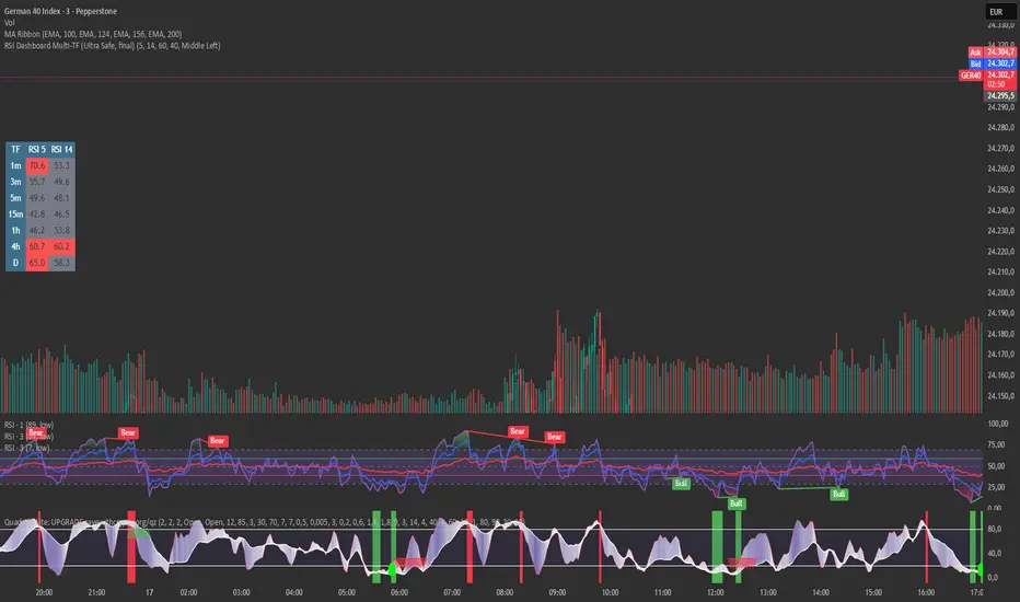
RSI Dashboard Multi-TF This script displays RSI values from multiple timeframes in a compact dashboard directly on the chart.
It is designed for traders who want to quickly identify whether the market is overbought, oversold, or neutral across different timeframes, without constantly switching chart intervals.
The dashboard shows the RSI simultaneously for the following timeframes:
- 1 minute
- 3 minutes
- 5 minutes
- 15 minutes
- 1 hour
- 4 hours
- Daily
Typical use cases:
- Scalping & intraday trading
- Multi-timeframe analysis at a glance
- Entry confirmation (e.g. pullbacks, breakouts)
- Avoiding trades against overbought or oversold market conditions
- Complementing EMA, VWAP, or price action strategies
⚙️ Notes
This dashboard is an analysis tool, not an automated trading system.
No repainting (uses request.security).
Suitable for indices, forex, crypto, and commodities.
This RSI dashboard provides a fast, clear, and visually clean market overview across multiple timeframes, making it an ideal tool for active traders who want to make efficient and well-structured trading decisions.
Easy DashboardREAD DISCLAIMER BELOW BEFORE USE
The ultimate TradingView dashboard for tracking up to 24 tickers in real-time. Stay on top of your P&L, Volatility (ATR), and Earnings countdown without ever leaving your chart.
Total Privacy: No hardcoded data. Input your holdings privately via the settings menu.
Risk Control: Built-in "traffic light" system for ATR % and Volume % to spot volatility and institutional activity.
Earnings Alerts: Automated countdowns that turn red when an Earnings Report is less than 7 days away.
Complete Wealth View: Live tracking of Daily P&L, Cash, and Total Net Worth.
Clean UI: Fully customizable positions, text sizes, and a "Minimal Mode" for a distraction-free workspace.
DISCLAIMER
IMPORTANT: READ BEFORE USE
This indicator is provided for educational and informational purposes only.
Not Financial Advice: The information, metrics, and calculations displayed by this script do not constitute financial, investment, or trading advice.
Not an Inducement: Nothing within this script should be construed as a recommendation or an inducement to buy, sell, or hold any financial instrument.
Accuracy & Risks: While every effort is made to ensure technical accuracy, trading involves significant risk of loss. Past performance is not indicative of future results.
User Responsibility: All data entered (Tickers, Quantities, Cash) is processed locally. The user is solely responsible for verifying the accuracy of the data and for any financial decisions made based on the output of this script.
Fictitious Data: All pre-entered values in this demo version are fictitious and intended for demonstration purposes only.

Malama's Universal anchored M.A.Malama's Universal Anchored M.A. (UMA+) is a highly versatile, all-in-one moving average framework that supports over 28 different calculation methods — from classic (SMA, EMA) to advanced adaptive and Ehlers-based filters (KAMA, FRAMA, MAMA/FAMA, Super Smoother, Kalman, etc.). It features an innovative Anchored Mode that resets calculations from a user-defined point (specific date/time, bars back, or the start of data), making it perfect for analyzing price action relative to key market events like earnings, FOMC news, or cycle starts.
The MA dynamically colors based on price position, includes an optional fill for trend visualization, and features a clean on-chart dashboard with crossover alerts.
Key Features
28+ Moving Average Types: Includes SMA, EMA, WMA, TMA, VWMA, HMA, ALMA, VIDYA, DEMA, TEMA, KAMA, ZLEMA, T3, Hull-like, FRAMA, McGinley Dynamic, LSMA, SMMA, Super Smoother, Laguerre Filter, Cyber Cycle, MAMA/FAMA, Reflex, Trend Reflex, Dominant Cycle, Non-Lag MA, and Kalman Filter.
Anchored Calculations: Reset the MA calculation from a specific reference point:
By Date/Time: Analyze trends starting from a specific news event.
Bars Back: Anchor to a specific recent high or low.
First Bar: Anchor to the beginning of the available data.
Visual Anchor Marker: A dashed vertical line with an anchor (⚓) icon clearly marks the reset point.
Dynamic Coloring: The line and fill change color based on whether price is Above (Bullish) or Below (Bearish) the MA.
On-Chart Dashboard: A compact, movable table displaying:
Current MA Type & Length
Real-time Value & Price Position
% Deviation from the MA
Trend Direction (UP/DOWN/FLAT)
Anchor details (if enabled)
Strategy Ideas: Stacking for Crossovers
Create your own custom crossover strategy by adding this indicator to your chart twice! Because UMA+ supports so many calculation methods, you can "stack" two instances to build unique trend-following systems:
Add UMA+ Twice: Apply the script to your chart two times.
Configure the "Fast" MA: On the first instance, select a responsive type (e.g., Hull MA or T3) with a lower length (e.g., 9 or 14).
Configure the "Slow" MA: On the second instance, select a smoother type (e.g., KAMA or Super Smoother) with a higher length (e.g., 50 or 100).
Trade the Cross: Look for the "Fast" MA line crossing the "Slow" MA line to identify potential trend reversals or entry points. This allows you to combine the responsiveness of modern filters with the stability of classic trend lines.
Why This Indicator Stands Out
Unlike standard multi-MA scripts that only switch types, UMA+ combines extreme flexibility with Anchored Analysis. This allows traders to measure trend strength and responsiveness from significant reference points rather than an arbitrary rolling window. It is exceptionally useful for:
Post-Event Analysis: See how price respects an average anchored specifically to an earnings release or Fed announcement.
Cycle Trading: Measure trends from specific cycle lows.
Lag Reduction: Utilize advanced filters like Kalman, T3, or Ehlers series to reduce lag in trending markets while maintaining smoothness.
How to Use
Choose Your MA: Select from the extensive list. Experiment with adaptive types (KAMA, VIDYA) for choppy markets or low-lag types (Hull, ZLEMA) for scalping.
Enable Anchor (Optional): Toggle "Enable Anchor" to fix the start point of the calculation. Use the "Date/Time" method to align with specific market catalysts.
Interpret the Dashboard:
Bullish Momentum: Look for "Price ABOVE," a positive Deviation %, and "Trend UP."
Reversion: Extreme deviation values may indicate price is overextended and due to snap back to the MA.
Disclaimer
This indicator is for educational and informational purposes only. It is not financial advice. Past performance does not guarantee future results. Always use proper risk management and combine with your own analysis. Trading involves substantial risk of loss.

RSI Divergence + MTF Table FinalThis is a professional, high-impact English description for your RSI Divergence + MTF Table Final script, designed to attract users on TradingView by highlighting its institutional-grade features.
Institutional RSI Divergence & MTF Confluence Heatmap
Overview
The Institutional RSI Divergence & MTF Confluence Heatmap is a professional-grade analytical tool designed for high-precision traders. It combines Automated RSI Divergence Detection with a Multi-Timeframe (MTF) Heatmap Table, allowing you to monitor market momentum across 8 different timeframes (from 1-minute to 1-day) without ever switching charts.
Key Features
🔍 Automated Divergence Detection: Instantly identifies Regular Bullish and Bearish divergences on the RSI oscillator, marking them with clear "Bull" and "Bear" labels.
📊 MTF Heatmap Grid: A real-time monitoring table that tracks RSI values across: 1m, 5m, 15m, 30m, 1h, 4h, 12h, and 1D.
🎨 Dynamic "Institutional" Color Logic: The table uses a sophisticated color-coded system to highlight extreme exhaustion and momentum:
Ultra Overbought (RSI > 90): Bright Red (Extreme Reversal Zone).
Overbought (RSI > 80): Orange (High Momentum/Caution).
Oversold (RSI < 26): Lime Green (Potential Accumulation).
Neutral: Gray (Consolidation).
🛠️ Flexible Layout Engine: Toggle between Vertical or Horizontal layouts to fit your chart workspace perfectly.
🚀 Pine Script v6 Optimized: Built with the latest TradingView engine for ultra-fast performance and minimal lag.
Trading Strategy: The Power of Confluence
Cross-Timeframe Confirmation: The strongest reversals occur when multiple timeframes (e.g., 15m, 1h, and 4h) all turn Orange/Red or Lime simultaneously. This represents a massive momentum exhaustion.
Divergence Validation: Use the table to see if a detected "Bull" divergence on your current timeframe is backed by "Oversold" conditions on higher timeframes.
Institutional Sniping: Combined with Demand/Supply zones, this script helps you "snipe" entries at the exact moment market momentum peaks or bottoms out.
Settings & Customization
Toggle Compact Mode: Display a minimal version of the table for a cleaner interface.
Custom Thresholds: Modify RSI levels to suit your specific trading style (Scalping vs. Swing Trading).
Table Position: Move the heatmap to any corner of your screen (Top Right, Bottom Left, etc.).
