Multi-TF Quarter & Session Candle Indicator-aamirlang [Beta]Key Features:
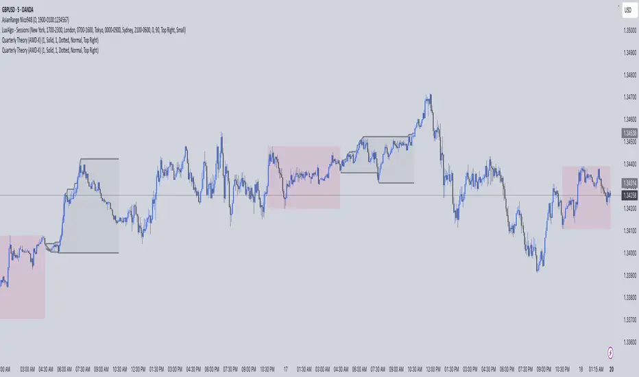
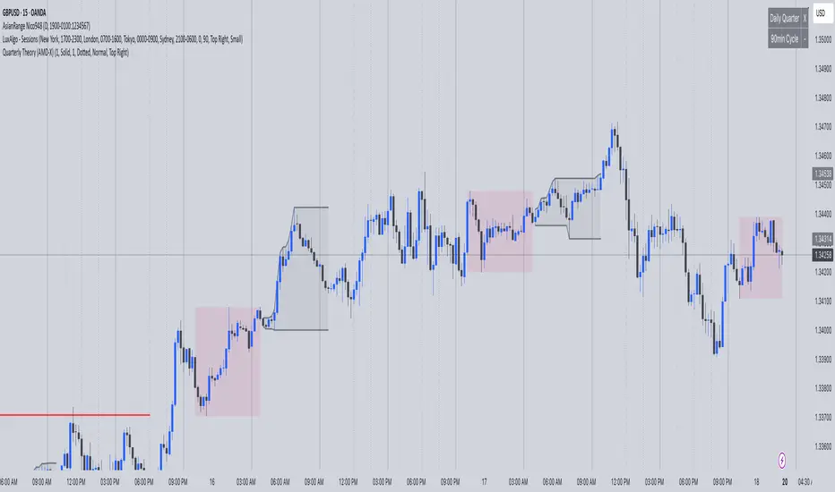
Quarter Identification: It detects 90-minute HTF candles on 5-minute charts and labels them as Q1, Q2, Q3, Q4 for clear session tracking.
Session Identification (Asia, London, NY, PM): Identifies sessions on 15-minute and 60-minute charts and labels them automatically. So that you can visually see whats happening on Higher TimeFrame.
CISD Detection: Highlights Critical Swing Directions to pinpoint potential market reversals.
Sweep Detection: Automatically draws sweeps to indicate price levels tested or broken.
Multi-Timeframe Support: Works seamlessly on 1m, 5m, 15m, 60m, Daily, Weekly, and Monthly charts.
How It Works:
If you do not see higher TF Candles please enable them from the Menu.
Detects and prints HTF candle and automatically detects Quarters and Sessions.
Automatically maps 5m to 90m (Quarter of a Session) HTF and labels Q1/Q2/Q3/Q4 to each candle so that you can visually see how a session is going on and what to expect in comming sessions.
Automatically detects a Session and labels sessions Asia/London/NY/PM.
When working in Higher TF other that 4H, It prints Daily candles by labeling them.
Other timeframes show normal candle time or standard D/W/M formatting.
CISD module identifies critical swing directions.
Sweeps are drawn automatically to highlight tested levels.
By using this Indicator:
Quickly identify session and quarter candles without manual calculations.
Detect intraday swing directions and potential reversal zones.
Visualize volatility for better risk management.
Perfect for intraday, swing, and long-term analysis.
Credits:
Credit to: @traderdaye for Quarterly theory.
and to all the beautiful people on Tradingview who contributed.
Note:
This is free and version so it may contain error or bugs please leave a comment for any bugs, suggestions and queries.
Enjoy Trading.
Quarterly

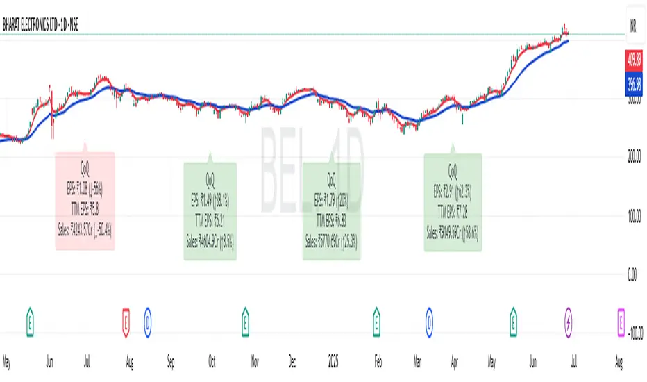
Quarterly Earnings FQ & FYQuarterly Earnings FQ & FY — Financial Metrics Tables On Chart
This indicator visually presents key quarterly and annual financial metrics directly on your TradingView chart via customizable tables. It brings fundamental analysis data into your technical charts for seamless decision-making.
Core Features:
Displays two dynamic tables for Quarterly (FQ) and Annual (FY) financial data.
Metrics include EPS, Sales, P/E ratio, Operating Margin, Return on Assets (ROA), and Return on Equity (ROE).
User-selectable visibility for each metric and their Year-over-Year (YoY) and Quarter-over-Quarter (QoQ) change percentages.
Customizable table position with dropdown settings for flexible placement anywhere on the chart.
Color customization options for headers, positive and negative changes, backgrounds, and a dark mode toggle.
Indian-style comma formatting for sales values with clear display (sales figures omit plus/minus signs for readability).
Live financial data sourced from TradingView’s financial request functions, ensuring accuracy and timeliness.
Designed for traders and investors who want quick, near real-time access to fundamental performance without leaving the chart interface.
How It Works:
The indicator fetches financial data like earnings per share, revenue, and margins each quarter and year, then displays it in neatly formatted tables. Positive and negative changes in metrics are color-coded for intuitive analysis. Sales figures are formatted specifically to show clean, localized numbers without distracting signs. Users can tweak which columns to show and where the tables appear on the screen.

QT Insights [Pro +]: PSP + TPD Alerts | [cephxs]This indicator's primary function is to highlight chart candlestick divergence with candle closes.
*A full list of the Supported Correlated Asset Pairings (CAPs) will be linked at the bottom.
There are two primary operating modes
PSP Only
All precision candles
There is a tooltip describing what each operating mode does in the indicator settings
Asset Selection
The indicator handles asset selection for divergences automatically for a large variety of asset(s) classes automatically and is ready for use Out of the Box with Major Assets like:
CME_MINI:NQ1! , CME_MINI:ES1! , CBOT_MINI:YM1!
It also works with non-futures for indices (CFD), for best functionality with no stress, we only have support for the following brokers. CAPITALCOM, VANTAGE, OANDA
It works with Forex, Crypto and Energies, also works with Metals.
The default pairings are determined by the active chart
i.e CME_MINI:NQ1! will pair with Asset 2 as CME_MINI:ES1! and Asset 3 as CBOT_MINI:YM1!
Alerts
This version has alerts, I will create a tutorial for that. You can use the alerts by adding alerts and selecting the indicator from the "Contdition" Dropdown in the Alert Creation Pop-up
Customizations
The indicator is fully customizable in the Styles tab under the settings
Play around with it and determine what works best with your aesthetic, it comes out of the box with a lot of clutter and as you can see in the showcase image, it's clean and functional, just how I like it.
*Supported CAPs
CFD
Forex:
EURUSD / GBPUSD (FOREXCOM Only)
Indices:
NAS100 / SPX500 / US 30 (CAPITALCOM / Vantage / Oanda Only)
Metals:
XAUUSD / XAGUSD
Futures
Indices:
NQ / MNQ , ES / MES , YM / MYM
Metals:
GC / MGC , SI / SIL
Crypto
BTCUSD / ETHUSD, this will work for any asset with "BTC" or "ETH" in the asset name
Note: There is support for Micro contracts automatically
Subsequent Updates Will be posted, Stay tuned.
Note: I wrote this description on the fly so there might be flaws, Regardless, made with ❤️ by cephxs

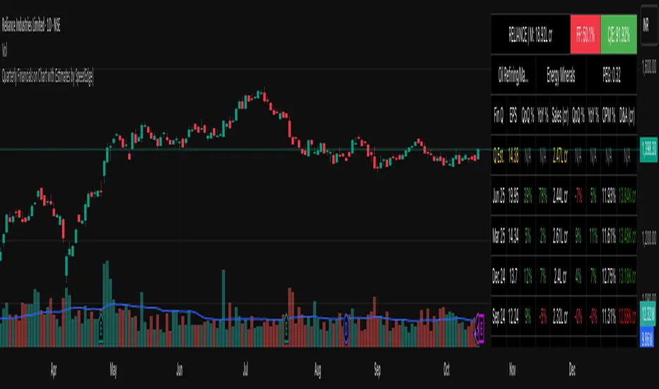
Quarterly Financials on Chart with Estimates by SpeedEdge)# Quarterly Financials on Chart with Estimates
## WHAT THIS SCRIPT DOES
This indicator displays comprehensive quarterly financial data directly on your trading chart, eliminating the need to switch between charting and fundamental analysis platforms. The script automatically fetches and organizes key financial metrics including earnings per share (EPS), revenue, operating margins, depreciation & amortization, and quarterly estimates alongside actual results for comparative analysis.
## WHY THIS COMBINATION IS ORIGINAL AND USEFUL
**The Problem Solved:** Traders conducting fundamental analysis typically need to toggle between trading charts and separate financial platforms to view quarterly results, estimates, and year-over-year comparisons. This workflow is inefficient and makes it difficult to correlate price movements with earnings announcements.
**The Solution:** This script integrates fundamental financial data directly into the price chart environment, providing:
- Side-by-side comparison of quarterly estimates versus actual results
- Automatic calculation of Quarter-over-Quarter (QoQ) and Year-over-Year (YoY) growth rates
- Color-coded visualization of financial performance trends
- Regional number formatting (Indian Crores or Global Billions/Millions)
- Key valuation metrics (Market Cap, Free Float, PEG Ratio, CFO/EBITDA) in header
**Unique Features:**
1. **Dual Number Format System**: Automatically formats financial figures in Indian Crores (Cr, K Cr, L Cr) or Global formats (M, B, T) based on user preference
2. **Estimate Integration**: Shows analyst estimates for upcoming quarters alongside historical actuals for beat/miss analysis
3. **Intelligent Growth Analysis**: Automatically calculates and color-codes quarterly and yearly growth comparisons with smart handling of missing data
4. **Context-Aware Color Coding**: Green/red visualization adapts based on metric type - growth metrics, cash flow quality indicators, and expense trends each use appropriate color logic
5. **Configurable History**: Display 4 to 20 previous quarters based on analysis needs
## HOW THE SCRIPT WORKS TECHNICALLY
### Core Methodology:
**1. Financial Data Integration:**
The script accesses quarterly and annual financial statement data from public company filings, including:
- **Earnings Estimates**: Analyst consensus forecasts for upcoming quarters
- **Quarterly Actuals**: Reported earnings per share, revenue, margins, and operating expenses
- **Key Ratios**: Shares outstanding data, valuation multiples, and cash flow metrics
All data is sourced from TradingView's fundamental database, which aggregates information from official regulatory filings (10-Q, 10-K, annual reports) filed by publicly traded companies.
**2. Historical Data Organization:**
The script employs a sophisticated data structure system that:
- Detects when new quarterly results are released by monitoring data changes
- Automatically indexes financial data by quarters relative to the current date
- Creates a chronological timeline of financial performance
- Maintains historical records for comparison calculations
- Updates dynamically as new earnings are reported
**3. Intelligent Number Formatting:**
**Indian Regional Format:**
- Converts absolute values to Crore denomination (1 Crore = 10 Million)
- Scales to Thousand Crores (K Cr) for mid-size companies
- Scales to Lakh Crores (L Cr) for large corporations
- Appropriate for analyzing Indian market stocks
**Global Standard Format:**
- Uses Million (M) for smaller companies
- Scales to Billion (B) for mid-cap and large-cap stocks
- Uses Trillion (T) for mega-cap corporations
- Thousands (K) for smaller financial figures
- Standard across US and international markets
**4. Comparative Growth Analysis:**
**Quarter-over-Quarter (QoQ) Calculations:**
The script compares each quarter's performance against the immediately preceding quarter to identify:
- Sequential growth trends
- Momentum acceleration or deceleration
- Short-term business trajectory
- Seasonal pattern changes
**Year-over-Year (YoY) Calculations:**
Compares each quarter against the same quarter from the previous year to:
- Eliminate seasonal effects
- Identify sustainable growth trends
- Normalize for business cycles
- Provide apples-to-apples comparison
Both calculations automatically handle edge cases like missing data, account for different fiscal year conventions, and provide meaningful "N/A" indicators when comparative data is unavailable.
**5. Adaptive Color Coding System:**
**Growth Metrics (EPS, Revenue):**
- Positive growth → Green shading indicates improving performance
- Negative growth → Red shading signals declining performance
- Missing data → Gray indicates insufficient information
**Quality Indicators (Free Float %):**
- Lower float (<40%) → Green indicates potentially better supply-demand dynamics
- Higher float (≥40%) → Red suggests more diluted ownership
**Cash Flow Quality (CFO/EBITDA):**
- Strong cash conversion (≥50%) → Green shows quality earnings
- Weak cash conversion (<50%) → Red flags potential accounting concerns
**Expense Trends (Depreciation & Amortization):**
- Decreasing D&A → Green indicates improving cash flow characteristics
- Increasing D&A → Red suggests rising capital intensity
- Stable D&A → Default color shows consistency
**Future Estimates:**
- Yellow coloring clearly distinguishes forward-looking estimates from historical actuals
**6. Date and Quarter Intelligence:**
The script automatically:
- Determines the current financial quarter based on real-time date
- Maps calendar months to fiscal quarters (Q1-Q4)
- Handles different fiscal year conventions globally
- Calculates quarter differentials for accurate historical lookback
- Formats display labels showing quarter-end months and years (e.g., "Mar 24", "Dec 23")
### Advanced Calculations:
**Free Float Percentage:**
Calculates the proportion of shares available for public trading relative to total shares outstanding. Lower percentages indicate more concentrated ownership, which can affect volatility and liquidity.
**Market Capitalization:**
Real-time calculation using total shares outstanding multiplied by current market price, automatically updated with each price tick and formatted according to regional preferences.
**CFO/EBITDA Cash Quality Ratio:**
Measures what percentage of accounting earnings converts to actual operating cash flow. Higher ratios indicate better earnings quality and less aggressive accounting. Industry standards vary, but 60-100% typically signals strong cash generation.
**Operating Profit Margin Tracking:**
Monitors the percentage of revenue retained as operating profit after deducting operating expenses, providing insight into operational efficiency and pricing power trends.
## HOW TO USE THIS SCRIPT
### Initial Setup:
**1. Region Configuration:**
- **India**: Select for Indian stocks - formats numbers in Crores (₹10M = 1 Cr)
- **Global**: Select for international stocks - formats in Millions/Billions
**2. Display Settings:**
- **Position**: Choose table location on chart (Top Right recommended)
- **Table Size**: Adjust based on screen resolution (Normal is default)
- **Short Labels**: Enable to condense industry/sector names for space saving
- **Lookback Quarters**: Set how many previous quarters to display (4-20, default 5)
**3. Visual Customization:**
- **Background Color**: Customize table background color and transparency
- **Text Color**: Adjust text color for visibility
- **Border/Frame Colors**: Modify table borders for preferred appearance
### Reading the Dashboard:
**Header Section (Top 3 Rows):**
**Row 1:**
- **Ticker | Mcap**: Company symbol and current market capitalization
- **FF (Free Float)**: Percentage of freely traded shares (Green < 40% is positive, Red ≥ 40%)
- **CFO/EBITDA**: Cash flow quality ratio (Green ≥ 50% is positive, Red < 50%)
**Row 2:**
- **Industry**: Company's specific industry classification
- **Sector**: Broader sector classification
- **PEG Ratio**: Price/Earnings to Growth ratio (< 1 traditionally considered undervalued)
**Data Section:**
**Column Explanations:**
1. **Fin Q**: Financial quarter (format: "Mar 24" = Q4 FY2024 ending March)
2. **EPS**: Earnings Per Share in reporting currency
3. **QoQ %**: EPS growth versus previous quarter (Green = increase, Red = decrease)
4. **YoY %**: EPS growth versus same quarter last year
5. **Sales**: Total revenue (formatted in Cr or M/B based on region)
6. **QoQ %**: Revenue growth versus previous quarter
7. **YoY %**: Revenue growth versus same quarter last year
8. **OPM %**: Operating Profit Margin percentage
9. **D&A**: Depreciation & Amortization (Green if decreasing = cash flow positive)
**Estimates Row (Yellow Text):**
- Shows "Q Est." for upcoming quarter
- Displays analyst consensus estimates for EPS and Sales
- Compare actuals against estimates after earnings release to identify beats/misses
### Trading Applications:
**Fundamental Analysis:**
- **Earnings Quality Check**: Look for consistent QoQ and YoY growth in both EPS and Sales
- **Margin Trend Analysis**: Monitor OPM % changes to assess operational efficiency
- **Estimate Comparison**: Identify stocks that consistently beat or miss estimates
- **Cash Flow Validation**: Use CFO/EBITDA ratio to verify earnings quality
**Entry/Exit Timing:**
- **Post-Earnings Analysis**: Check if stock beat estimates and by what margin
- **Trend Confirmation**: Strong YoY growth + improving margins = positive fundamentals
- **Warning Signs**: Declining margins, negative growth, or deteriorating CFO/EBITDA
**Portfolio Screening:**
- **Growth Stocks**: Look for consistent QoQ and YoY EPS/Sales growth
- **Value Stocks**: Low PEG ratios combined with positive fundamentals
- **Quality Filter**: High CFO/EBITDA ratios (>75%) indicate superior cash generation
### Interpretation Guidelines:
**Strong Fundamental Setup:**
- YoY growth > 15% in both EPS and Sales
- QoQ growth positive for 2+ consecutive quarters
- OPM % stable or improving
- CFO/EBITDA > 60%
- Actual results exceed estimates
**Concerning Signals:**
- Declining YoY growth rates
- Shrinking operating margins
- Consistently missing estimates
- CFO/EBITDA < 40%
- Increasing D&A as percentage of revenue
## IMPORTANT USAGE NOTES
**Data Limitations:**
- Financial data depends on official company filings and reporting schedules
- Some stocks may have incomplete historical data depending on listing history
- Estimates may not be available for all companies, especially smaller-cap stocks
- Data updates occur after official earnings releases, not in real-time during announcements
**Realistic Expectations:**
- This tool displays historical fundamental data for analysis - not predictive signals
- Always verify critical financial data with official company filings when making investment decisions
- Fundamental analysis should complement technical analysis, not replace it
- Past financial performance does not guarantee future results
- Earnings estimates are analyst opinions, not certainties
**Best Practices:**
- Cross-reference important data points with company investor relations pages
- Consider industry-specific metrics beyond the displayed general figures
- Use in conjunction with technical indicators for comprehensive analysis
- Monitor for data anomalies (stock splits, accounting changes, restatements) that may affect comparisons
- Understand that different accounting standards (GAAP vs IFRS) may affect international comparisons
**Regional Considerations:**
- Indian stocks: Numbers in Crores (1 Cr = 10 Million Rupees)
- Global stocks: Numbers in standard M/B/T format
- Currency conversions are not performed - data shown in reporting currency
- Fiscal year conventions vary by region (India typically uses Apr-Mar fiscal year, US uses Jan-Dec or custom fiscal years)
- Different markets have different reporting timelines and requirements
## CONFIGURATION RECOMMENDATIONS
**For Indian Stocks:**
- Region: India
- Lookback: 5-8 quarters (recommended)
- Focus on YoY growth due to seasonal business patterns in many Indian companies
**For US/Global Stocks:**
- Region: Global
- Lookback: 4-6 quarters for tech/growth stocks
- Lookback: 8-12 quarters for cyclical/industrial stocks
- Monitor QoQ trends closely for rapid-growth sectors
**For Long-term Investors:**
- Increase lookback to 12-20 quarters to see multi-year trends
- Focus on consistency rather than individual quarter volatility
- Pay close attention to CFO/EBITDA quality metric for sustainable businesses
- Look for stable or improving margins over extended periods
**For Active Traders:**
- Use 4-6 quarter lookback for recent trend focus
- Concentrate on latest QoQ trends and estimate beats/misses
- Monitor table closely before/after earnings announcements
- Compare estimate versus actual immediately post-earnings for trading opportunities
**For Swing Traders:**
- 6-8 quarter lookback provides good balance
- Focus on acceleration/deceleration in growth rates
- Use margin trends to identify operational inflection points
- Combine with technical analysis for optimal entry/exit timing
This script serves as a comprehensive fundamental analysis tool for traders and investors who want seamless chart integration of financial data without workflow interruption, enabling faster and more informed decision-making.
Quarterly Theory [@kaleboraciy]🧠 Daye Quarterly Theory is based on the idea that markets often move in repeating cycles. Each part of the cycle reflects a stage of the market
Consolidation
Manipulation
Distribution
Reversal/Continuation
This is a classic AMD-X pattern, which is widely used in SMC & ICT concepts. By spotting these phases, traders can better understand where the market might be heading next.
⭐ An important feature of this indicator is the Fibonacci levels, which are calculated in a clever way on the Q1 part of each cycle. You can use this levels for precise entries on manipulation in Q2
📖 Now I want to give brief description of each cycle:
Daily Cycle - the day can be broken down into 6 hour quarters
Q1 - 18:00 - 00:00 Asia.
Q2 - 00:00 - 06:00 London (True Open).
Q3 - 06:00 - 12:00 NY AM.
Q4 - 12:00 - 18:00 NY PM.
Pro tips:
Q2 often lines up with the session’s True Open - a key reference for directional bias.
Q3 tends to show the most directional momentum during the trading day.
Q4 is a critical zone for judging whether the day will extend the move or retrace.
Weekly Cycle - Daye determined that although the trading week is composed of 5 trading days, we should ignore Friday, and the small portion of Sunday’s price action:
Q1 - Monday
Q2 - Tuesday (True Open, Daily Candle Open Price).
Q3 - Wednesday.
Q4 - Thursday.
Pro tips:
Wednesday (Q3) often provides the week’s strongest directional movement - many trades target this zone.
Tuesday’s manipulation (Q2) may shake out weak positions or set up the directional swing - be careful
Thursday (Q4) helps confirm whether the weekly trend continues or reverses.
Monthly Cycle - considering that we have four weeks in a month, we start the cycle on the first Monday of the month (regardless of the calendar Day):
Q1 - Week 1: first Monday of the month.
Q2 - Week 2: second Monday of the month (True Open, Daily Candle Open Price).
Q3 - Week 3: third Monday of the month.
Q4 - Week 4: fourth Monday of the month.
I hope, that this awesome tool will boost your trading 💰

Quarterly Earnings - v1This script shows company fundamentals in a TradingView table: Earnings Per Share (EPS), Price-to-Earnings Ratio (P/E, TTM), Sales (in Crores), Operating Margin (OPM %), Return on Assets (ROA %), and Return on Equity (ROE %).
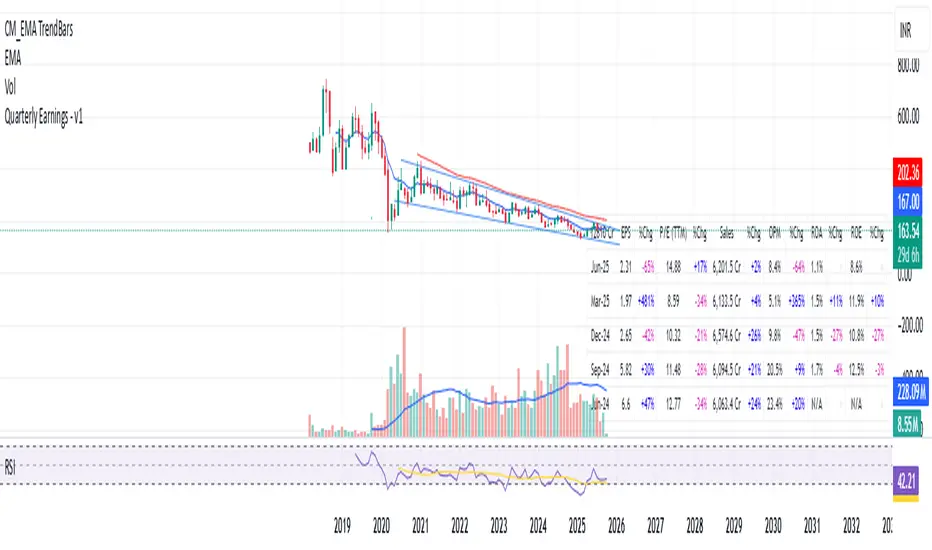
Quarterly Earnings - v1This script shows company fundamentals in a TradingView table: Earnings Per Share (EPS), Price-to-Earnings Ratio (P/E, TTM), Sales (in Crores), Operating Margin (OPM %), Return on Assets (ROA %), and Return on Equity (ROE %).
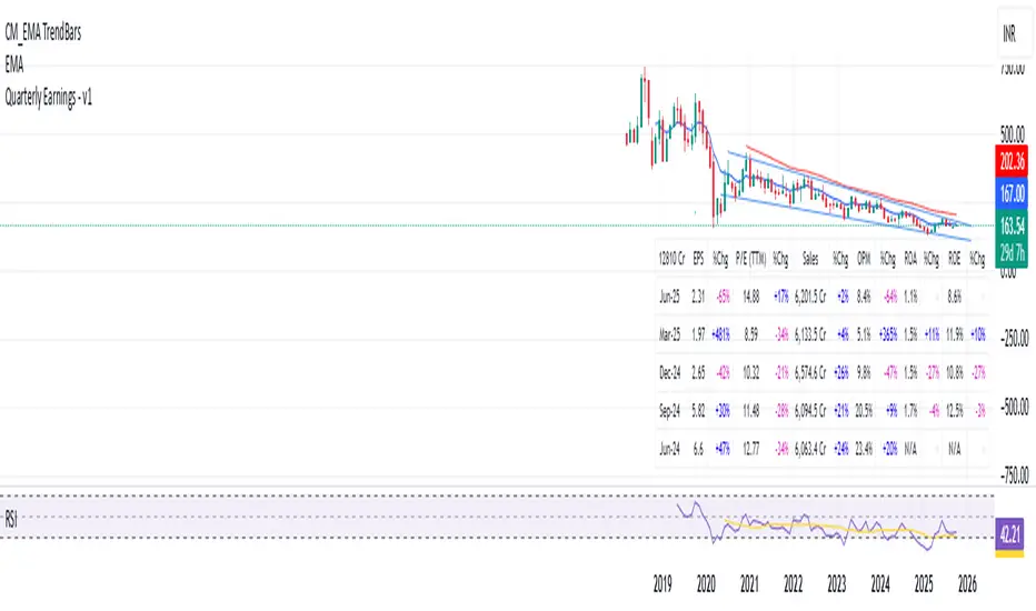
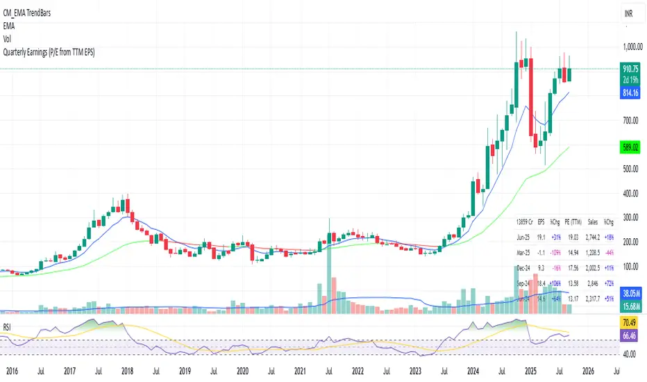
Quarterly EarningsEarnings Per Share (EPS), Price-to-Earnings Ratio (P/E, TTM), Sales (in Crores), Operating Margin (OPM %), Return on Assets (ROA %), and Return on Equity (ROE %). Each metric includes its absolute value and quarter-over-quarter or year-over-year percentage change.

Quarterly EarningsThis Pine script shows quarterly EPS, Sales, and P/E (TTM-based) in a styled table.
Distribution Quarter IndicatorThis indicator automatically draws vertical lines at the two most important distribution quarter times in the trading day:
6:00 AM NY time (Market preparation phase)
12:00 PM NY time (Midday distribution period)
Key Features:
✅ Automatic time detection - Uses NY timezone (UTC-4) for accurate timing
✅ Fully customizable lines - Choose between solid, dotted, or dashed styles
✅ Adjustable line width - Set thickness from 1-5 pixels
✅ Custom colors - Individual color settings for each time marker
✅ Optional labels - Toggle time labels on/off
✅ Historical coverage - Lines appear on all past and future data
Perfect For:
Day traders tracking distribution patterns
Scalpers identifying key time-based levels
Anyone analyzing intraday market structure around quarter periods
How to Use:
Customize line styles and colors in settings
Lines will automatically appear at the specified NY times
Use as reference points for distribution analysis
Distribution Quarter IndicatorThis indicator automatically draws vertical lines at the two most important distribution quarter times in the trading day:
6:00 AM NY time (Market preparation phase)
12:00 PM NY time (Midday distribution period)
Key Features:
✅ 15-minute timeframe only - Designed specifically for intraday distribution analysis
✅ Automatic time detection - Uses NY timezone (UTC-4) for accurate timing
✅ Fully customizable lines - Choose between solid, dotted, or dashed styles
✅ Adjustable line width - Set thickness from 1-5 pixels
✅ Custom colors - Individual color settings for each time marker
✅ Optional labels - Toggle time labels on/off
✅ Historical coverage - Lines appear on all past and future data
Perfect For:
Day traders tracking distribution patterns
Scalpers identifying key time-based levels
Anyone analyzing intraday market structure around quarter periods
How to Use:
Apply to any 15-minute chart
Customize line styles and colors in settings
Lines will automatically appear at the specified NY times
Use as reference points for distribution analysis
Note: Indicator only functions on 15-minute timeframes and includes a helpful reminder if used on other timeframes.
cd_Quarterly_cycles_SSMT_TPD_CxGeneral
This indicator is designed in line with the Quarterly Theory to display each cycle on the chart, either boxed and/or in candlestick form.
Additionally, it performs inter-cycle divergence analysis ( SSMT ) with the correlated symbol, Terminus Price Divergence ( TPD ), Precision Swing Point ( PSP ) analysis, and potential Power of Three ( PO3 ) analysis.
Special thanks to @HandlesHandled for his great indicator, which I used while preparing the cycles content.
Details & Usage:
Optional cycles available: Weekly, Daily, 90m, and Micro cycles.
Displaying/removing cycles can be controlled from the menu (cycles / candles / labels).
All selected cycles can be shown, or you can limit the number of displayed cycles (min: 2, max: 4).
The summary table can be toggled on/off and repositioned.
What’s in the summary table?
• Below the header, the correlated symbol used in the analysis is displayed (e.g., SSMT → US500).
• If available, live and previous bar results of the SSMT analysis are shown.
• Under the PSP & TPD section, results are displayed when conditions are met.
• Under Alerts, the real-time status of conditions defined in the menu is shown.
• Under Potential AMD, possible PO3 analysis results are displayed.
Analysis & Symbol Selection:
To run analyses, a correlated symbol must first be defined with the main symbol.
Default pairs are preloaded (see below), but users should adjust them according to their exchange and instruments.
If no correlated pair is defined, cycles are displayed only as boxes/candles.
Once defined pairs are opened on the chart, analyses load automatically.
Pairs listed on the same row in the menu are automatically linked, so no need to re-enter them across rows.
SSMT Analysis:
Based on the chart’s timeframe, divergences are searched across Weekly, Daily, 90m, and Micro cycles.
The code will not produce results for smaller cycles than the current timeframe.
(Example: On H1, Micro cycles will not be displayed.)
Results are obtained by comparing the highs and lows of consecutive cycles in the same period.
If one pair makes a new high/low while the other does not, this divergence is added to SSMT results.
The difference from classic SMT is that cycles are used instead of bars.
PSP & TPD Analysis:
A correlated symbol must be defined.
For PSP, timeframe options are added to the menu.
Users toggle timeframes on/off by checking/unchecking boxes.
In selected timeframes, PSP & TPD analysis is performed.
• PSP: If candlesticks differ in color (bullish/bearish) between symbols and the bar is at a high/low of the timeframe (and higher/lower than the bars before/after it), it is identified as a PSP. Divergences between pairs are interpreted as potential reversal signals.
• TPD: Once a PSP occurs, the closing price of the previous bar and the opening price of the next bar are compared. If one symbol shows continuation while the other does not, it is marked as a divergence.
Example:
Let’s assume Pair 1 and Pair 2 are selected in the menu with the H4 timeframe, and our cycle is Weekly (Box).
For Pair 1, the H4 candle at the Weekly high level:
• Is positioned at the Weekly high,
• Its high is above both the previous and the next candle,
• It closed bearish (open > close).
For Pair 2, the same H4 candle closed bullish (close > open).
→ PSP conditions are met.
For TPD, we now check the candles before and after this PSP (H4) candle on both pairs.
Comparing the previous candle’s close with the next candle’s open, we see that:
• In Pair 1, the next open is lower than the previous close,
• In Pair 2, the next open is higher than the previous close.
Pair 1 → close > open
Pair 2 → close < open
Since they are not aligned in the same direction, this is interpreted as a divergence — a potential reversal signal.
While TPD results are displayed in the summary table, whenever the conditions are met in the selected timeframes, the signals are also plotted directly on the chart. (🚦, X)
• Higher timeframe TPD example:
• Current timeframe TPD example:
Alerts:
The indicator can be conditioned based on aligned timeframes defined within the concept.
Example (assuming random active rows in the screenshot):
• Weekly Bullish SSMT → Tf2 (menu-selected) Bullish TPD → Daily Bullish SSMT.
Selecting “none” in the menu means that condition is not required.
When an alert is triggered, it will be displayed in the corresponding row of the table.
• Example with only condition 3 enabled:
Potential PO3 Analysis:
According to Quarterly Theory, price moves in cycles, and the same structures are assumed to continue in smaller timeframes.
From classical PO3 knowledge: before the main move, price first manipulates in the opposite direction to trap buyers/sellers, then makes its true move.
The cyclical sequence is:
(A)ccumulation → (M)anipulation → (D)istribution → (R)eversal / Continuation.
Within cycle candles, the first letter of each phase is displayed.
So how does the analysis work?
If the active cycle is in (M)anipulation or (D)istribution phase, and it sweeps the previous cycle’s high or low but then pulls back inside, this is flagged in the summary table as a possible PO3 signal.
In other words, it reflects the alignment of theoretical sequence with real-time price action.
Confluence with SSMT and TPD conditions further strengthens the expectation.
Final Note:
No single marking or alert carries meaning on its own — it must always be evaluated in the context of your concept knowledge.
Instead of trading purely on expectations, align bias + trend + entry confirmations to improve your success rate.
Feedback and suggestions are welcome.
Happy trading!

Sequential SMT (QT)Sequential SMT (Quarterly Theory)
Price Divergences Between Correlated Asset Pairs Across Time Quarters
This indicator identifies Sequential SMT patterns - divergences between correlated assets across consecutive time periods. When price action diverges between traditionally correlated pairs, it may signal potential reversals or distribution phases.
How It Works
The indicator divides the trading day into specific time quarters and analyzes price extremes within each period. It compares consecutive quarters to detect divergences:
Bullish Pattern: One asset makes a lower low while its correlated pair makes a higher/equal low
Bearish Pattern: One asset makes a higher high while its correlated pair makes a lower/equal high
This implementation enhances standard divergence detection by:
Analyzing multiple timeframe cycles simultaneously (dual-cycle approach)
Using both wick and body-based analysis for hidden divergences
Incorporating True Open levels as confluence filters
Providing visual quarter/cycle boundaries for context
Key Features
Dual-Cycle Detection
M5 Timeframe: Tracks Daily Cycles (6h) AND 90-minute quarters simultaneously
M1 Timeframe: Tracks 90-minute cycles AND 22.5-minute quarters simultaneously
Both cycle types run concurrently for multiple confluence levels
Divergence Analysis
Standard Patterns: Identifies divergences using full candle ranges
Hidden Patterns: Body-only analysis for concealed divergence detection
5 Configurable Correlation Pairs
Pre-configured with major correlations:
BTC/ETH (Cryptocurrency pairs)
NQ/ES (Index futures)
EUR/GBP (Forex majors)
Gold/Silver (Precious metals)
Custom pair slot
Visual Components
Quarter Boxes: Color-coded Q1-Q4 periods showing price ranges
Cycle Frames: Larger timeframe boundaries for context
SSMT Lines: Connect divergence points between quarters
True Opens: TDO (daily) and TSO (session) reference levels
Dual Labels: Period identification for each timeframe
Trading Application
This indicator is designed to identify divergence patterns that may precede reversals:
Signals are strongest when divergences occur near True Open levels
Multiple timeframe confluence increases signal reliability
Best used in conjunction with other technical analysis methods
The indicator is particularly useful for traders who:
Trade correlated asset pairs
Focus on intraday reversals
Use time-based market structure analysis
Combine multiple confluence factors for entries
Customization
Toggle individual components, adjust colors, control visual density. Configure correlation pairs to match your trading instruments. Debug panel available for detailed analysis.
Important Note
This indicator identifies divergence patterns based on mathematical relationships between correlated assets. Like all technical indicators, it should be used as part of a comprehensive trading approach with proper risk management.
---
Based on time-quarter analysis and correlation divergence concepts. Designed to help identify potential reversal zones through systematic divergence detection across multiple time cycles.
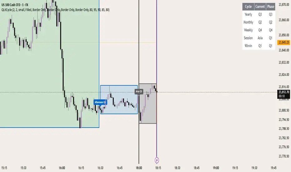
QLitCycle QuarterlyQLITCYCLE
QLitCycle is an intraday cycle visualization tool that divides each trading day into multiple segments, helping traders identify time-based patterns and recurring market behaviors. By splitting the day into distinct periods, this indicator allows for better analysis of intraday rhythms, cycle alignment, and time-specific market tendencies.
It can be applied to various markets and timeframes, but is most effective on intraday charts where precise time segmentation can reveal valuable insights.
Quarterly Cycles [EETrade]The idea of Quarterly Theory is -
Each timeframe is split into 4 "quarters", derived based on logical subdivisions:
- Year: Divided into calendar quarters (Jan-Mar, Apr-Jun, etc.).
- Tertiary (sub-year): Each year quarter is subdivided into 4 parts dynamically based on timestamp deltas.
- Month: Weekly-based logic using Sunday cutoffs and session switch time (18:00 US/Eastern).
- Week: Divided using daily boundaries starting from Sunday 18:00 (based on US futures session logic).
- Day: Split into 4 blocks (Asia, London, AM, PM) using 6-hour segments.
- Session and Macro Quarters: Session is divided further into 4 quarters of 6 hours, then each of those into 15-minute blocks for ultra-granular cycle mapping.
Where we split them into Q1, Q2, Q3 and Q4.
Usually we address
Q1 as accumulation,
Q2 as manipulation
Q3 as Distribution
Q4 as Continuation/Reversal
If we trade Q3 for example, we'd like to use price action mainly from previous Q3s.
Plus there are Semi Cycles which we can utilize
- Q1 with Q3
- Q2 with Q4
- Q3 with Q1
- Q4 with Q2
So we can also use Q1 price action when we are trading Q3
True Open Logic:
The open candle price of the second quarter is the true open for us, it will help us understand if we're on premium or discount area.
Plus this indicator providers a table to dynamically show the premium and discount
We can use this indicator to understand optimal times to trade as we'd like to trade mostly Q3

EPS and Sales Magic Indicator V2EPS and Sales Magic Indicator V2
EPS and Sales Magic Indicator V2
Short Title: EPS V2
Author: Trading_Tomm
Platform: TradingView (Pine Script v6)
License: Free for public use under fair usage guidelines
Overview
The EPS and Sales Magic Indicator V2 is a powerful stock fundamental visualization tool built specifically for TradingView users who wish to incorporate earnings intelligence directly onto their price chart. Designed and developed by Trading_Tomm, this upgraded version of the original 'EPS and Sales Magic Indicator' includes an enriched and more insightful presentation of company performance metrics — now with TTM EPS support, advanced color-coding, label sizing, and refined control options.
This indicator is tailored for retail traders, swing investors, and long-term fundamental analysts who need to view Quarter-over-Quarter (QoQ) earnings and revenue changes directly on the price chart without switching tabs or breaking focus.
What Does It Display?
The EPS and Sales Magic Indicator V2 intelligently detects quarterly financial updates and displays the following data points via labels:
1. EPS (Earnings Per Share) – Current Quarterly Value
This is the most recent Diluted EPS published by the company, fetched using TradingView’s request.financial() function.
Displayed in the format: EPS: ₹20.45
2. EPS QoQ Percentage Change
Shows the percentage change in EPS compared to the previous quarter.
Highlights improvement or decline using arrows (up for improvement, down for decline).
Displayed in the format: EPS: ₹20.45 (up 15.3 percent)
3. Sales (Revenue) – Current Quarterly Value
Fetches and displays Total Revenue of the company in ₹Crores for easier Indian-market readability.
Displayed in the format: Sales: ₹460Cr
4. Sales QoQ Percentage Change
Measures and presents the quarter-over-quarter percentage change in total revenue.
Uses arrows to indicate growth or contraction.
Displayed in the format: Sales: ₹460Cr (down 3.8 percent)
5. EPS TTM (Trailing Twelve Months)
You now get the TTM EPS — the sum of the last four quarterly EPS values.
This value provides a better long-term earnings snapshot compared to a single quarter.
Displayed in the format: TTM EPS: ₹78.12
All of these values are automatically calculated and displayed only on the bars where a new financial report is detected, keeping your chart clean and insightful.
Customization Features
This indicator is built with user control in mind, allowing you to personalize how and what you want to see:
Show EPS in Label: Enable or disable the display of EPS and EPS QoQ values.
Show Sales in Label: Toggle the visibility of revenue and sales change percentage.
Color Options for Label Themes: The label background color is automatically determined based on performance.
Green: Both EPS and Sales increased QoQ.
Red: Both decreased.
Orange: One increased and the other decreased.
Gray: Default color (if values are unavailable or mixed).
Label Text Size: Choose from Tiny, Small (default), or Normal.
Visual Design
Placement: The labels are positioned just below the candlesticks using yloc.belowbar, so they do not obstruct price action or interfere with technical indicators.
Anchor: Aligned precisely with the financial reporting bars to maintain clarity in historical comparisons.
Background Style: Clean, semi-transparent styling with soft text colors for comfortable viewing.
How It Works
The indicator relies on TradingView’s powerful request.financial() function to extract fiscal quarterly financials (FQ). Internally, it uses detection logic to identify fresh data updates by comparing current vs. previous values, arithmetic to compute QoQ percentage changes in EPS and Sales, logic to build formatted labels dynamically based on user selections, and conditional color and sizing logic to enhance interpretability.
Use Cases
For Long-Term Investors: Quickly identify if a company’s profitability and revenue are improving over time.
For Swing Traders: Combine recent earnings trends with price action to evaluate if post-result momentum has real backing.
For Technical and Fundamental Traders: Layer it with moving averages, RSI, or volume to create a hybrid analysis environment.
Limitations and Notes
Financial data is provided by TradingView’s financial API, and occasional missing values may occur for less-covered stocks.
This tool does not repaint but depends on the timing of the official financial updates.
All values are rounded and formatted to prioritize readability.
Works best on Daily or higher timeframes (weekly or monthly also supported).
License and Fair Use
This script is free to use and share under TradingView’s open-use guidelines. You may copy, fork, and build upon this indicator for personal or educational purposes, but commercial usage requires attribution to the author: Trading_Tomm.
Future Enhancements (Planned)
Addition of Net Profit (QoQ and TTM)
Inclusion of Operating Margin, Profit Margin, and Book Value
Option to switch between numeric and graphical display (table mode)
Alerts on extreme earnings deviation or sales slumps
Final Thoughts
The EPS and Sales Magic Indicator V2 represents a clean, visual, and smart way to monitor a company’s core performance from your chart screen. It helps you align fundamental strength with technical strategies and provides instant financial clarity, which is especially vital in today’s fast-moving markets.
Whether you’re preparing for an earnings season or scanning past performance to pick your next investment, this indicator saves time, enhances insights, and sharpens decisions.
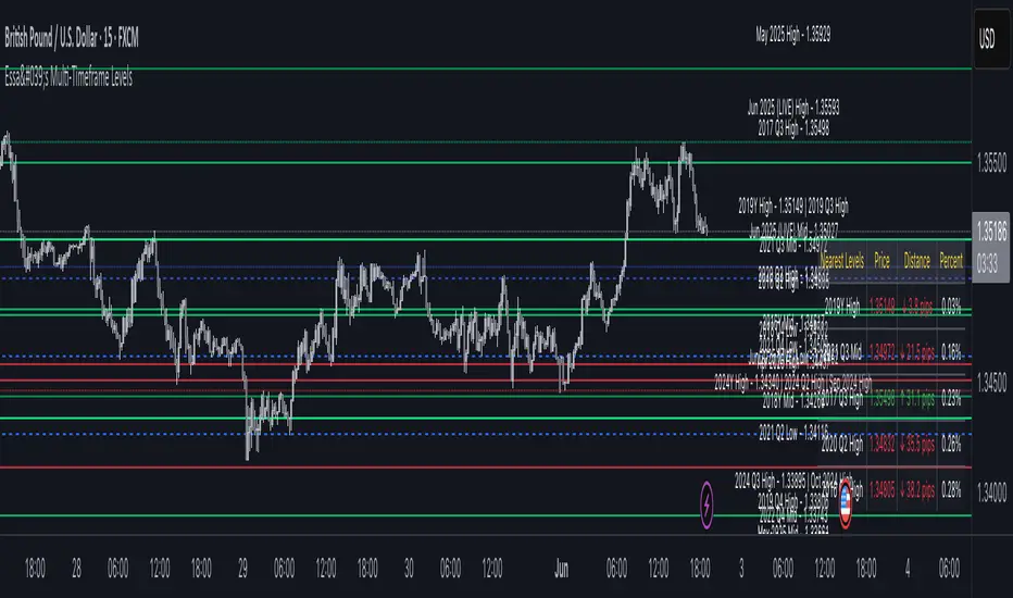
Essa - Multi-Timeframe LevelsEnhanced Multi‐Timeframe Levels
This indicator plots yearly, quarterly and monthly highs, lows and midpoints on your chart. Each level is drawn as a horizontal line with an optional label showing “ – ” (for example “Apr 2025 High – 1.2345”). If two or more timeframes share the same price (within two ticks), they are merged into a single line and the label lists each timeframe.
A distance table can be shown in any corner of the chart. It lists up to five active levels closest to the current closing price and shows for each level:
level name (e.g. “May 2025 Low”)
exact price
distance in pips or points (calculated according to the instrument’s tick size)
percentage difference relative to the close
Alerts can be enabled so that whenever price comes within a user-specified percentage of any level (for example 0.1 %), an alert fires. Once price decisively crosses a level, that level is marked as “broken” so it does not trigger again. Built-in alertcondition hooks are also provided for definite breaks of the current monthly, quarterly and yearly highs and lows.
Monthly lookback is configurable (default 6 months), and once the number of levels exceeds a cap (calculated as 20 + monthlyLookback × 3), the oldest levels are automatically removed to avoid clutter. Line widths and colours (with adjustable opacity for quarterly and monthly) can be set separately for each timeframe. Touches of each level are counted internally to allow future extension (for example visually emphasising levels with multiple touches).
Quarterly Theory ICT 05 [TradingFinder] Doubling Theory Signals🔵 Introduction
Doubling Theory is an advanced approach to price action and market structure analysis that uniquely combines time-based analysis with key Smart Money concepts such as SMT (Smart Money Technique), SSMT (Sequential SMT), Liquidity Sweep, and the Quarterly Theory ICT.
By leveraging fractal time structures and precisely identifying liquidity zones, this method aims to reveal institutional activity specifically smart money entry and exit points hidden within price movements.
At its core, the market is divided into two structural phases: Doubling 1 and Doubling 2. Each phase contains four quarters (Q1 through Q4), which follow the logic of the Quarterly Theory: Accumulation, Manipulation (Judas Swing), Distribution, and Continuation/Reversal.
These segments are anchored by the True Open, allowing for precise alignment with cyclical market behavior and providing a deeper structural interpretation of price action.
During Doubling 1, a Sequential SMT (SSMT) Divergence typically forms between two correlated assets. This time-structured divergence occurs between two swing points positioned in separate quarters (e.g., Q1 and Q2), where one asset breaks a significant low or high, while the second asset fails to confirm it. This lack of confirmation—especially when aligned with the Manipulation and Accumulation phases—often signals early smart money involvement.
Following this, the highest and lowest price points from Doubling 1 are designated as liquidity zones. As the market transitions into Doubling 2, it commonly returns to these zones in a calculated move known as a Liquidity Sweep—a sharp, engineered spike intended to trigger stop orders and pending positions. This sweep, often orchestrated by institutional players, facilitates entry into large positions with minimal slippage.
Bullish :
Bearish :
🔵 How to Use
Applying Doubling Theory requires a simultaneous understanding of temporal structure and inter-asset behavioral divergence. The method unfolds over two main phases—Doubling 1 and Doubling 2—each divided into four quarters (Q1 to Q4).
The first phase focuses on identifying a Sequential SMT (SSMT) divergence, which forms when two correlated assets (e.g., EURUSD and GBPUSD, or NQ and ES) react differently to key price levels across distinct quarters. For example, one asset may break a previous low while the other maintains structure. This misalignment—especially in Q2, the Manipulation phase—often indicates early smart money accumulation or distribution.
Once this divergence is observed, the extreme highs and lows of Doubling 1 are marked as liquidity zones. In Doubling 2, the market gravitates back toward these zones, executing a Liquidity Sweep.
This move is deliberate—designed to activate clustered stop-loss and pending orders and to exploit pockets of resting liquidity. These sweeps are typically driven by institutional forces looking to absorb liquidity and position themselves ahead of the next major price move.
The key to execution lies in the fact that, during the sweep in Doubling 2, a classic SMT divergence should also appear between the two assets. This indicates a weakening of the previous trend and adds an extra layer of confirmation.
🟣 Bullish Doubling Theory
In the bullish scenario, Doubling 1 begins with a bullish SSMT divergence, where one asset forms a lower low while the other maintains its structure. This divergence signals weakening bearish momentum and possible smart money accumulation. In Doubling 2, the market returns to the previous low and sweeps the liquidity zone—breaking below it on one asset, while the second fails to confirm, forming a bullish SMT divergence.
f this move is followed by a bullish PSP and a clear market structure break (MSB), a long entry is triggered. The stop-loss is placed just below the swept liquidity zone, while the target is set in the premium zone, anticipating a move driven by institutional buyers.
🟣 Bearish Doubling Theory
The bearish scenario follows the same structure in reverse. In Doubling 1, a bearish SSMT divergence occurs when one asset prints a higher high while the other fails to do so. This suggests distribution and weakening buying pressure. Then, in Doubling 2, the market returns to the previous high and executes a liquidity sweep, targeting trapped buyers.
A bearish SMT divergence appears, confirming the move, followed by a bearish PSP on the lower timeframe. A short position is initiated after a confirmed MSB, with the stop-loss placed
🔵 Settings
⚙️ Logical Settings
Quarterly Cycles Type : Select the time segmentation method for SMT analysis.
Available modes include : Yearly, Monthly, Weekly, Daily, 90 Minute, and Micro.
These define how the indicator divides market time into Q1–Q4 cycles.
Symbol : Choose the secondary asset to compare with the main chart asset (e.g., XAUUSD, US100, GBPUSD).
Pivot Period : Sets the sensitivity of the pivot detection algorithm. A smaller value increases responsiveness to price swings.
Pivot Sync Threshold : The maximum allowed difference (in bars) between pivots of the two assets for them to be compared.
Validity Pivot Length : Defines the time window (in bars) during which a divergence remains valid before it's considered outdated.
🎨 Display Settings
Show Cycle :Toggles the visual display of the current Quarter (Q1 to Q4) based on the selected time segmentation
Show Cycle Label : Shows the name (e.g., "Q2") of each detected Quarter on the chart.
Show Labels : Displays dynamic labels (e.g., “Q2”, “Bullish SMT”, “Sweep”) at relevant points.
Show Lines : Draws connection lines between key pivot or divergence points.
Color Settings : Allows customization of colors for bullish and bearish elements (lines, labels, and shapes)
🔔 Alert Settings
Alert Name : Custom name for the alert messages (used in TradingView’s alert system).
Message Frequenc y:
All : Every signal triggers an alert.
Once Per Bar : Alerts once per bar regardless of how many signals occur.
Per Bar Close : Only triggers when the bar closes and the signal still exists.
Time Zone Display : Choose the time zone in which alert timestamps are displayed (e.g., UTC).
Bullish SMT Divergence Alert : Enable/disable alerts specifically for bullish signals.
Bearish SMT Divergence Alert : Enable/disable alerts specifically for bearish signals
🔵 Conclusion
Doubling Theory is a powerful and structured framework within the realm of Smart Money Concepts and ICT methodology, enabling traders to detect high-probability reversal points with precision. By integrating SSMT, SMT, Liquidity Sweeps, and the Quarterly Theory into a unified system, this approach shifts the focus from reactive trading to anticipatory analysis—anchored in time, structure, and liquidity.
What makes Doubling Theory stand out is its logical synergy of time cycles, behavioral divergence, liquidity targeting, and institutional confirmation. In both bullish and bearish scenarios, it provides clearly defined entry and exit strategies, allowing traders to engage the market with confidence, controlled risk, and deeper insight into the mechanics of price manipulation and smart money footprints.

CYCLE BY RiotWolftradingDescription of the "CYCLE" Indicator
The "CYCLE" indicator is a custom Pine Script v5 script for TradingView that visualizes cyclic patterns in price action, dividing the trading day into specific sessions and 90-minute quarters (Q1-Q4). It is designed to identify and display market phases (Accumulation, Manipulation, Distribution, and Continuation/Reversal) along with key support and resistance levels within those sessions. Additionally, it allows customization of boxes, lines, labels, and colors to suit user preferences.
Main Features
Cycle Phases:
Accumulation (1900-0100): Represents the phase where large operators accumulate positions.
Manipulation (0100-0700): Identifies potential manipulative moves to mislead retail traders.
Distribution (0700-1300): The phase where large operators distribute their positions.
Continuation/Reversal (1300-1900): Indicates whether the price continues the trend or reverses.
90-Minute Quarters (Q1-Q4):
Divides each 6-hour cycle (360 minutes) into four 90-minute quarters (Q1: 00:00-01:30, Q2: 01:30-03:00, Q3: 03:00-04:30, Q4: 04:30-06:00 UTC).
Each quarter is displayed with a colored box (Q1: light purple, Q2: light blue, Q3: light gray, Q4: light pink) and labels (defaulted to black).
Support and Resistance Visualization:
Draws boxes or lines (based on settings) showing the high and low levels of each session.
Optionally displays accumulated volume at the highs and lows within the boxes.
Daily Lines and Last 3 Boxes:
How to Use the Indicator
Step 1: Add the Indicator to TradingView
Open TradingView and select the chart where you want to apply the indicator (e.g., UMG9OOR on a 5-minute timeframe, as shown in the screenshot).
Go to the Pine Editor (at the bottom of the TradingView interface).
Copy and paste the provided code.
Click Compile and then Add to Chart.
Step 2: Configure the Indicator
Click on the indicator name on the chart ("CYCLE") and select Settings (or double-click the name).
Adjust the options based on your needs:
Cycle Phases: Enable/disable phases (Accumulation, Manipulation, Distribution, Continuation/Reversal) and adjust their time slots if needed.
90-Minute Quarters: Enable/disable quarters (Q1-Q4).
Step 3: Interpret the Indicator
Identify Cycle Phases:
Observe the red boxes indicating the phases (Accumulation, Manipulation, etc.).
The high and low levels within each phase are potential support/resistance zones.
If volume is enabled, pay attention to the accumulated volume at highs and lows, as it may indicate the strength of those levels.
Use the 90-Minute Quarters (Q1-Q4):
The colored boxes (Q1-Q4) divide the day into 90-minute segments.
Each quarter shows the price range (high and low) during that period.
Use these boxes to identify price patterns within each quarter, such as breakouts or consolidations.
The labels (Q1, Q2, etc.) help you track time and anticipate potential moves in the next quarter.
Analyze Support and Resistance:
The high and low levels of each phase/quarter act as support and resistance.
Daily lines (if enabled) show key levels from the previous day, useful for planning entries/exits.
The "last 3 boxes below price" (if enabled) highlight potential support levels the price might target.
Avoid Manipulation:
During the Manipulation phase (0100-0700), be cautious of sharp moves or false breakouts.
Use the high/low levels of this phase to identify potential traps (as explained in your first question about manipulation candles).
Step 4: Trading Strategy
Entries and Exits:
Support/Resistance: Use the high/low levels of phases and quarters to set entry or exit points.
For example, if the price bounces off a Q1 support level, consider a buy.
Breakouts: If the price breaks a high/low of a quarter (e.g., Q2), wait for confirmation to enter in the direction of the breakout.
Volume: If accumulated volume is high near a key level, that level may be more significant.
Risk Management:
Place stop-loss orders below lows (for buys) or above highs (for sells) identified by the indicator.
Avoid trading during the Manipulation phase unless you have a specific strategy to handle false breakouts.
Time Context:
Use the quarters (Q1-Q4) to plan your trades based on time. For example, if Q3 is typically volatile in your market, prepare for larger moves between 03:00-04:30 UTC.
Step 5: Adjustments and Testing
Test on Different Timeframes: The indicator is set for a 5-minute timeframe (as in the screenshot), but you can test it on other timeframes (e.g., 1-minute, 15-minute) by adjusting the time slots if needed.
Adjust Colors and Styles: If the default colors are not visible on your chart, change them for better clarity.
---
📌 1. **Accumulation: Strong Institutional Activity**
- During the **accumulation phase, we see **high volume: 82.773K, which suggests strong buying interest**, likely from institutional players.
- This sets the base for the following upward move in price.
---
📌 2. **Manipulation: False Breakout with Lower Volume**
- Later, there's a manipulation phase where price breaks above previous highs, but the volume (71.814K) is **lower than during accumulation**.
- This implies that buyers are not as aggressive as before—no real demandbehind the breakout.
- It’s likely a bull trap, where smart money is selling into the breakout to exit their positions.
---
### 📌 3. Distribution: Weakness and Lack of Demand
- The market enters a distribution phase, and volume drops even further (only 7.914K).
- Price struggles to go higher, and you start seeing rejections at the top.
- This shows that demand is drying up, and smart money is offloading positions**—not accumulating anymore.
---
### 💡 Why Take the Short Here?
- Volume is not increasing with new highs—showing weak demand**.
- The manipulation volume is weaker than the accumulation volume, confirming the breakout was likely false.
- Structure starts to break down (Q levels falling), which confirms weakness.
- This creates a high-probability short setup:
- **Entry:** after confirmation of distribution and structural breakdown.
- **Stop loss:** above the manipulation high.
- **Target:** down toward previous lows or value zones.
---
### ✅ Conclusion
Since the manipulation volume failed to exceed the accumulation volume, the breakout lacked real strength. Combined with decreasing volume in the distribution phase, this indicates fading demand and supply taking control—which justifies entering a short position.

Quarterly Theory ICT 04 [TradingFinder] SSMT 4Quarter Divergence🔵 Introduction
Sequential SMT Divergence is an advanced price-action-based analytical technique rooted in the ICT (Inner Circle Trader) methodology. Its primary objective is to identify early-stage divergences between correlated assets within precise time structures. This tool not only breaks down market structure but also enables traders to detect engineered liquidity traps before the market reacts.
In simple terms, SMT (Smart Money Technique) occurs when two correlated assets—such as indices (ES and NQ), currency pairs (EURUSD and GBPUSD), or commodities (Gold and Silver)—exhibit different reactions at key price levels (swing highs or lows). This lack of alignment is often a sign of smart money manipulation and signals a lack of confirmation in the ongoing trend—hinting at an imminent reversal or at least a pause in momentum.
In its Sequential form, SMT divergences are examined through a more granular temporal lens—between intraday quarters (Q1 through Q4). When SMT appears at the transition from one quarter to another (e.g., Q1 to Q2 or Q3 to Q4), the signal becomes significantly more powerful, often aligning with a critical phase in the Quarterly Theory—a framework that segments market behavior into four distinct phases: Accumulation, Manipulation, Distribution, and Reversal/Continuation.
For instance, a Bullish SMT forms when one asset prints a new low while its correlated counterpart fails to break the corresponding low from the previous quarter. This usually indicates absorption of selling pressure and the beginning of accumulation by smart money. Conversely, a Bearish SMT arises when one asset makes a higher high, but the second asset fails to confirm, signaling distribution or a fake-out before a decline.
However, SMT alone is not enough. To confirm a true Market Structure Break (MSB), the appearance of a Precision Swing Point (PSP) is essential—a specific candlestick formation on a lower timeframe (typically 5 to 15 minutes) that reveals the entry of institutional participants. The combination of SMT and PSP provides a more accurate entry point and better understanding of premium and discount zones.
The Sequential SMT Indicator, introduced in this article, dynamically scans charts for such divergence patterns across multiple sessions. It is applicable to various markets including Forex, crypto, commodities, and indices, and shows particularly strong performance during mid-week sessions (Wednesdays and Thursdays)—when most weekly highs and lows tend to form.
Bullish Sequential SMT :
Bearish Sequential SMT :
🔵 How to Use
The Sequential SMT (SSMT) indicator is designed to detect time and structure-based divergences between two correlated assets. This divergence occurs when both assets print a similar swing (high or low) in the previous quarter (e.g., Q3), but in the current quarter (e.g., Q4), only one asset manages to break that swing level—while the other fails to reach it.
This temporal mismatch is precisely identified by the SSMT indicator and often signals smart money activity, a market phase transition, or even the presence of an engineered liquidity trap. The signal becomes especially powerful when paired with a Precision Swing Point (PSP)—a confirming candle on lower timeframes (5m–15m) that typically indicates a market structure break (MSB) and the entry of smart liquidity.
🟣 Bullish Sequential SMT
In the previous quarter, both assets form a similar swing low.
In the current quarter, one asset (e.g., EURUSD) breaks that low and trades below it.
The other asset (e.g., GBPUSD) fails to reach the same low, preserving the structure.
This time-based divergence reflects declining selling pressure, potential absorption, and often marks the end of a manipulation phase and the start of accumulation. If confirmed by a bullish PSP candle, it offers a strong long opportunity, with stop-losses defined just below the swing low.
🟣 Bearish Sequential SMT
In the previous quarter, both assets form a similar swing high.
In the current quarter, one asset (e.g., NQ) breaks above that high.
The other asset (e.g., ES) fails to reach that high, remaining below it.
This type of divergence signals weakening bullish momentum and the likelihood of distribution or a fake-out before a price drop. When followed by a bearish PSP candle, it sets up a strong shorting opportunity with targets in the discount zone and protective stops placed above the swing high.
🔵 Settings
⚙️ Logical Settings
Quarterly Cycles Type : Select the time segmentation method for SMT analysis.
Available modes include: Yearly, Monthly, Weekly, Daily, 90 Minute, and Micro.
These define how the indicator divides market time into Q1–Q4 cycles.
Symbol : Choose the secondary asset to compare with the main chart asset (e.g., XAUUSD, US100, GBPUSD).
Pivot Period : Sets the sensitivity of the pivot detection algorithm. A smaller value increases responsiveness to price swings.
Activate Max Pivot Back : When enabled, limits the maximum number of past pivots to be considered for divergence detection.
Max Pivot Back Length : Defines how many past pivots can be used (if the above toggle is active).
Pivot Sync Threshold : The maximum allowed difference (in bars) between pivots of the two assets for them to be compared.
Validity Pivot Length : Defines the time window (in bars) during which a divergence remains valid before it's considered outdated.
🎨 Display Settings
Show Cycle :Toggles the visual display of the current Quarter (Q1 to Q4) based on the selected time segmentation
Show Cycle Label : Shows the name (e.g., "Q2") of each detected Quarter on the chart.
Show Bullish SMT Line : Draws a line connecting the bullish divergence points.
Show Bullish SMT Label : Displays a label on the chart when a bullish divergence is detected.
Bullish Color : Sets the color for bullish SMT markers (label, shape, and line).
Show Bearish SMT Line : Draws a line for bearish divergence.
Show Bearish SMT Label : Displays a label when a bearish SMT divergence is found.
Bearish Color : Sets the color for bearish SMT visual elements.
🔔 Alert Settings
Alert Name : Custom name for the alert messages (used in TradingView’s alert system).
Message Frequency :
All: Every signal triggers an alert.
Once Per Bar: Alerts once per bar regardless of how many signals occur.
Per Bar Close: Only triggers when the bar closes and the signal still exists.
Time Zone Display : Choose the time zone in which alert timestamps are displayed (e.g., UTC).
Bullish SMT Divergence Alert : Enable/disable alerts specifically for bullish signals.
Bearish SMT Divergence Alert : Enable/disable alerts specifically for bearish signals
🔵 Conclusion
The Sequential SMT (SSMT) indicator is a powerful and precise tool for identifying structural divergences between correlated assets within a time-based framework. Unlike traditional divergence models that rely solely on sequential pivot comparisons, SSMT leverages Quarterly Theory, in combination with concepts like liquidity sweeps, market structure breaks (MSB) and precision swing points (PSP), to provide a deeper and more actionable view of market dynamics.
By using SSMT, traders gain not only the ability to identify where divergence occurs, but also when it matters most within the market cycle. This empowers them to anticipate major moves or traps before they fully materialize, and position themselves accordingly in high-probability trade zones.
Whether you're trading Forex, crypto, indices, or commodities, the true strength of this indicator is revealed when used in sync with the Accumulation, Manipulation, Distribution, and Reversal phases of the market. Integrated with other confluence tools and market models, SSMT can serve as a core component in a professional, rule-based, and highly personalized trading strategy.

Smart Investor - Quarterly Earnings by tarunlalwani007OVERVIEW
Smart Investor - Quarterly Earnings displays comprehensive financial data and moving averages directly on your charts. It shows quarterly/yearly earnings alongside customizable moving averages across multiple timeframes, providing both fundamental and technical analysis in one tool.
This tool is designed purely for analysis purposes. No buy or sell recommendations should be made based solely on the information it provides. Always perform your own due diligence and combine multiple sources of information for trading decisions.
FEATURES
Financial Data Analysis
Displays quarterly (FQ) and yearly (FY) financial metrics
Works with both stocks and futures contracts
Customizable metrics with comparison capabilities
Flexible table positioning options
Multi-Timeframe Moving Averages
Daily, Weekly, and Monthly moving averages adapt to chart timeframe
Support for both EMA and SMA with customizable parameters
Color-coded for easy identification of different timeframes
Company Information Display
Information tags for quick company insights
Display key financial metrics and market performance indicators
SME status identification for small/medium enterprises (only for NSE and BSE India)
FNO and lot size information for derivatives
CALCULATION METHODS
Data Sources
Financial metrics (EPS, Sales, Total Shares) are sourced directly from TradingView's financial API
Price data is obtained using appropriate request functions for the current symbol
Header and Tag Calculations
Current Values: All header and tag metrics use the latest available close price
Market Cap: Latest Close Price × Total Outstanding Shares
Free Float Market Cap: Latest Close Price × Free Float Shares
Free Float Percentage: Obtained directly from TradingView financial data
P/E Ratio: Market Cap / TTM Net Income
52-Week Performance:
Down from 52W High: ((Current Close - 52W High) / 52W High) × 100
Up from 52W Low: ((Current Close - 52W Low) / 52W Low) × 100
Table Calculations
Historical Values: Table metrics use price data from the corresponding quarter/year
Quarter-over-Quarter (QoQ) Change: ((Current Value - Previous Quarter Value) / Previous Quarter Value) × 100
Year-over-Year (YoY) Change: ((Current Value - Value from Same Quarter Last Year) / Value from Same Quarter Last Year) × 100
Quarter names are determined based on the current month: Jan/Feb → Dec, Mar/Apr/May → Mar, Jun/Jul/Aug → Jun, Sep/Oct/Nov → Sep. Each quarter is labeled with its end month and year (e.g., "Mar-2024", "Jun-2024").
Moving Average Implementation
Moving Averages: Calculated based on chart timeframe (daily, weekly, monthly)
EMA/SMA: Uses standard formulas with configurable periods
Included with financial data to provide a complete analysis tool in a single indicator
CUSTOMIZATION OPTIONS
Financial Metrics
The following metrics can be selected for both quarterly and yearly tables:
Sales (Revenue)
EPS (Earnings Per Share)
OPM (Operating Profit Margin)
P/E Ratio
PEG Ratio
Free Float (percentage and value)
Market Cap
PAT (Profit After Tax)
Display Options
Comparison Visualization: Percentage mode, dots mode, or combined
Layout: Multiple table positions, adjustable text size
Themes: Light and dark theme support
History: Display up to 8 periods of historical data
Header Information
Company description
Market capitalization
Free float information
Listing year
Return on Equity (ROE)
Industry/Sector classification
Performance relative to 52-week high/low
FNO status and lot size
HOW TO USE
Add the indicator to your chart
Configure the metrics you want to display in the settings
Position the tables where you prefer on your chart
Customize colors and display options
Adjust moving averages to match your trading style
LIMITATIONS
Financial data availability depends on what TradingView provides for each instrument
Some calculations may show NA when underlying data is unavailable
Small market cap stocks or recently listed companies may have limited historical data
Futures contracts are detected automatically but may require manual verification
TECHNICAL NOTES
Automatic futures contract detection with calculation adjustments
SME status determined using an internal database of symbols that is manually maintained and updated
Date handling adjustments near quarter boundaries ensure consistency
All financial data is sourced directly from TradingView's financial API
Company description and sector information comes directly from TradingView symbol data

Quarterly Theory ICT 02 [TradingFinder] True Open Session 90 Min🔵 Introduction
The Quarterly Theory ICT indicator is an advanced analytical system built on ICT (Inner Circle Trader) concepts and fractal time. It divides time into four quarters (Q1, Q2, Q3, Q4), and is designed based on the consistent repetition of these phases across all trading timeframes (annual, monthly, weekly, daily, and even shorter trading sessions).
Each cycle consists of four distinct phases: the first phase (Q1) is the Accumulation phase, characterized by price consolidation; the second phase (Q2), known as Manipulation or Judas Swing, is marked by initial false movements indicating a potential shift; the third phase (Q3) is Distribution, where price volatility peaks; and the fourth phase (Q4) is Continuation/Reversal, determining whether the previous trend continues or reverses.
🔵 How to Use
The central concept of this strategy is the "True Open," which refers to the actual starting point of each time cycle. The True Open is typically defined at the beginning of the second phase (Q2) of each cycle. Prices trading above or below the True Open serve as a benchmark for predicting the market's potential direction and guiding trading decisions.
The practical application of the Quarterly Theory strategy relies on accurately identifying True Open points across various timeframes.
True Open points are defined as follows :
Yearly Cycle :
Q1: January, February, March
Q2: April, May, June (True Open: April Monthly Open)
Q3: July, August, September
Q4: October, November, December
Monthly Cycle :
Q1: First Monday of the month
Q2: Second Monday of the month (True Open: Daily Candle Open price on the second Monday)
Q3: Third Monday of the month
Q4: Fourth Monday of the month
Weekly Cycle :
Q1: Monday
Q2: Tuesday (True Open: Daily Candle Open Price on Tuesday)
Q3: Wednesday
Q4: Thursday
Daily Cycle :
Q1: 18:00 - 00:00 (Asian session)
Q2: 00:00 - 06:00 (True Open: Start of London Session)
Q3: 06:00 - 12:00 (NY AM)
Q4: 12:00 - 18:00 (NY PM)
90 Min Asian Session :
Q1: 18:00 - 19:30
Q2: 19:30 - 21:00 (True Open at 19:30)
Q3: 21:00 - 22:30
Q4: 22:30 - 00:00
90 Min London Session :
Q1: 00:00 - 01:30
Q2: 01:30 - 03:00 (True Open at 01:30)
Q3: 03:00 - 04:30
Q4: 04:30 - 06:00
90 Min New York AM Session :
Q1: 06:00 - 07:30
Q2: 07:30 - 09:00 (True Open at 07:30)
Q3: 09:00 - 10:30
Q4: 10:30 - 12:00
90 Min New York PM Session :
Q1: 12:00 - 13:30
Q2: 13:30 - 15:00 (True Open at 13:30)
Q3: 15:00 - 16:30
Q4: 16:30 - 18:00
Micro Cycle (22.5-Minute Quarters) : Each 90-minute quarter is further divided into four 22.5-minute sub-segments (Micro Sessions).
True Opens in these sessions are defined as follows :
Asian Micro Session :
True Session Open : 19:30 - 19:52:30
London Micro Session :
T rue Session Open : 01:30 - 01:52:30
New York AM Micro Session :
True Session Open : 07:30 - 07:52:30
New York PM Micro Session :
True Session Open : 13:30 - 13:52:30
By accurately identifying these True Open points across various timeframes, traders can effectively forecast the market direction, analyze price movements in detail, and optimize their trading positions. Prices trading above or below these key levels serve as critical benchmarks for determining market direction and making informed trading decisions.
🔵 Setting
Show True Range : Enable or disable the display of the True Range on the chart, including the option to customize the color.
Extend True Range Line : Choose how to extend the True Range line on the chart, with the following options:
None: No line extension
Right: Extend the line to the right
Left: Extend the line to the left
Both: Extend the line in both directions (left and right)
Show Table : Determines whether the table—which summarizes the phases (Q1 to Q4)—is displayed.
Show More Info : Adds additional details to the table, such as the name of the phase (Accumulation, Manipulation, Distribution, or Continuation/Reversal) or further specifics about each cycle.
🔵 Conclusion
The Quarterly Theory ICT, by dividing time into four distinct quarters (Q1, Q2, Q3, and Q4) and emphasizing the concept of the True Open, provides a structured and repeatable framework for analyzing price action across multiple time frames.
The consistent repetition of phases—Accumulation, Manipulation (Judas Swing), Distribution, and Continuation/Reversal—allows traders to effectively identify recurring price patterns and critical market turning points. Utilizing the True Open as a benchmark, traders can more accurately determine potential directional bias, optimize trade entries and exits, and manage risk effectively.
By incorporating principles of ICT (Inner Circle Trader) and fractal time, this strategy enhances market forecasting accuracy across annual, monthly, weekly, daily, and shorter trading sessions. This systematic approach helps traders gain deeper insight into market structure and confidently execute informed trading decisions.

Quarterly Theory ICT 01 [TradingFinder] XAMD + Q1-Q4 Sessions🔵 Introduction
The Quarterly Theory ICT indicator is an advanced analytical system based on the concepts of ICT (Inner Circle Trader) and fractal time. It divides time into quarterly periods and accurately determines entry and exit points for trades by using the True Open as the starting point of each cycle. This system is applicable across various time frames including annual, monthly, weekly, daily, and even 90-minute sessions.
Time is divided into four quarters: in the first quarter (Q1), which is dedicated to the Accumulation phase, the market is in a consolidation state, laying the groundwork for a new trend; in the second quarter (Q2), allocated to the Manipulation phase (also known as Judas Swing), sudden price changes and false moves occur, marking the true starting point of a trend change; the third quarter (Q3) is dedicated to the Distribution phase, during which prices are broadly distributed and price volatility peaks; and the fourth quarter (Q4), corresponding to the Continuation/Reversal phase, either continues or reverses the previous trend.
By leveraging smart algorithms and technical analysis, this system identifies optimal price patterns and trading positions through the precise detection of stop-run and liquidity zones.
With the division of time into Q1 through Q4 and by incorporating key terms such as Quarterly Theory ICT, True Open, Accumulation, Manipulation (Judas Swing), Distribution, Continuation/Reversal, ICT, fractal time, smart algorithms, technical analysis, price patterns, trading positions, stop-run, and liquidity, this system enables traders to identify market trends and make informed trading decisions using real data and precise analysis.
♦ Important Note :
This indicator and the "Quarterly Theory ICT" concept have been developed based on material published in primary sources, notably the articles on Daye( traderdaye ) and Joshuuu . All copyright rights are reserved.
🔵 How to Use
The Quarterly Theory ICT strategy is built on dividing time into four distinct periods across various time frames such as annual, monthly, weekly, daily, and even 90-minute sessions. In this approach, time is segmented into four quarters, during which the phases of Accumulation, Manipulation (Judas Swing), Distribution, and Continuation/Reversal appear in a systematic and recurring manner.
The first segment (Q1) functions as the Accumulation phase, where the market consolidates and lays the foundation for future movement; the second segment (Q2) represents the Manipulation phase, during which prices experience sudden initial changes, and with the aid of the True Open concept, the real starting point of the market’s movement is determined; in the third segment (Q3), the Distribution phase takes place, where prices are widely dispersed and price volatility reaches its peak; and finally, the fourth segment (Q4) is recognized as the Continuation/Reversal phase, in which the previous trend either continues or reverses.
This strategy, by harnessing the concepts of fractal time and smart algorithms, enables precise analysis of price patterns across multiple time frames and, through the identification of key points such as stop-run and liquidity zones, assists traders in optimizing their trading positions. Utilizing real market data and dividing time into Q1 through Q4 allows for a comprehensive and multi-level technical analysis in which optimal entry and exit points are identified by comparing prices to the True Open.
Thus, by focusing on keywords like Quarterly Theory ICT, True Open, Accumulation, Manipulation, Distribution, Continuation/Reversal, ICT, fractal time, smart algorithms, technical analysis, price patterns, trading positions, stop-run, and liquidity, the Quarterly Theory ICT strategy acts as a coherent framework for predicting market trends and developing trading strategies.
🔵b]Settings
Cycle Display Mode: Determines whether the cycle is displayed on the chart or on the indicator panel.
Show Cycle: Enables or disables the display of the ranges corresponding to each quarter within the micro cycles (e.g., Q1/1, Q1/2, Q1/3, Q1/4, etc.).
Show Cycle Label: Toggles the display of textual labels for identifying the micro cycle phases (for example, Q1/1 or Q2/2).
Table Display Mode: Enables or disables the ability to display cycle information in a tabular format.
Show Table: Determines whether the table—which summarizes the phases (Q1 to Q4)—is displayed.
Show More Info: Adds additional details to the table, such as the name of the phase (Accumulation, Manipulation, Distribution, or Continuation/Reversal) or further specifics about each cycle.
🔵 Conclusion
Quarterly Theory ICT provides a fractal and recurring approach to analyzing price behavior by dividing time into four quarters (Q1, Q2, Q3, and Q4) and defining the True Open at the beginning of the second phase.
The Accumulation, Manipulation (Judas Swing), Distribution, and Continuation/Reversal phases repeat in each cycle, allowing traders to identify price patterns with greater precision across annual, monthly, weekly, daily, and even micro-level time frames.
Focusing on the True Open as the primary reference point enables faster recognition of potential trend changes and facilitates optimal management of trading positions. In summary, this strategy, based on ICT principles and fractal time concepts, offers a powerful framework for predicting future market movements, identifying optimal entry and exit points, and managing risk in various trading conditions.
