Volume Anomaly CandlesVolume Anomaly Candles — Hampel + RVOL (V-Anom)
This indicator colors candles in real time to highlight meaningful volume participation while filtering noise.
It combines two complementary engines:
• Hampel (robust anomaly detection): detects statistically rare volume spikes using median + MAD (robust σ).
• RVOL (Relative Volume tiers): measures volume relative to its baseline (volume / SMA(volume) and maps it into 3 intensity levels.
The goal is simple: make candles “stand out” only when volume is genuinely significant.
────────────────────────────────────────
Candle coloring logic
────────────────────────────────────────
A) Hampel Engine (Robust Volume Anomalies)
The Hampel engine computes a robust z-score on volume (hScore):
Typical volume = median(volume) over a rolling window
Deviation = |volume - median|
Robust dispersion = MAD → σ (sigma = 1.4826 * MAD)
hScore = (volume - median) / sigma
If volume is abnormally high, candles are colored as:
• Moderate anomaly
• Extreme anomaly
Important:
Hampel fires only on positive anomalies (hScore > 0), meaning volume is above the robust median.
This is intentional: it focuses on participation spikes (where activity matters most).
B) RVOL Engine (Relative Volume Levels)
RVOL is computed as:
RVOL = volume / SMA(volume, Baseline length)
Candles are colored by tier:
• Level 1: above-baseline participation
• Level 2: strong participation
• Level 3: exceptional participation
Bull/Bear colors are selected from candle direction (close ≥ open = bullish).
────────────────────────────────────────
Hampel vs RVOL priority
────────────────────────────────────────
Controlled by:
“Hampel overrides RVOL”
• ON (recommended):
If Hampel fires, Hampel colors the candle
Otherwise RVOL colors it
→ rare + significant gets priority
• OFF:
If RVOL fires, RVOL colors the candle
Otherwise Hampel colors it
→ more frequent coloring, more “active” tape
────────────────────────────────────────
Parameters and how they impact candles
────────────────────────────────────────
A) Adaptive Hampel thresholds (percentiles)
When enabled, thresholds adapt to market conditions by learning what is “rare” in recent score history.
• Adaptation window (hALen)
Higher: steadier thresholds, fewer Hampel candles, slower adaptation
Lower: faster adaptation, more Hampel candles, more sensitivity
• Moderate / Extreme percentile
Higher: more selective, fewer signals
Lower: more permissive, more signals
• Min σ floors
Higher: prevents overly permissive thresholds in quiet markets (fewer signals)
Lower: allows more signals in low-activity regimes
• Threshold smoothing (EMA)
Higher: smoother regime transitions
Lower: quicker threshold changes
B) Hampel window + static thresholds
• Window length (hLen)
Higher: more stable, macro anomaly detection
Lower: more reactive, may pick up micro-noise on very short TFs
• Moderate / Extreme σ thresholds
Higher: fewer Hampel candles, only premium spikes
Lower: more Hampel candles, denser highlighting
C) RVOL baseline + tiers
• Baseline length (rLen)
Higher: smoother RVOL, fewer tier switches
Lower: more reactive RVOL, more tier switches
• Tier thresholds (rThr1 / rThr2 / rThr3)
Higher: fewer RVOL candles (only big participation)
Lower: more RVOL candles (more active visualization)
Recommended spacing (default):
1.4 / 1.9 / 2.6
This keeps Level 1 meaningful, makes Level 2 clearly stronger than Level 1, and preserves Level 3 as rare.
D) Don’t color doji
Prevents coloring on neutral candles to reduce “false attention” bars.
────────────────────────────────────────
Practical use
────────────────────────────────────────
Use this tool as a participation overlay, not as a direction predictor:
• Breakout confirmation: stronger when the breakout candle is colored (RVOL L2/L3 or Hampel).
• Key level reactions: watch colored candles at VWAP, Kijun, FVG, range highs/lows.
• Volume events: extreme anomalies often mark important decision points.
Notes:
• Settings are in bars, not time. The same window behaves differently on M1 vs M15.
• The indicator highlights participation, not direction. Combine with structure and bias.
Disclaimer / Risk Warning
Trading involves substantial risk and is not suitable for everyone. Markets can move rapidly and unpredictably. You can lose part or all of your capital, and in leveraged products (futures, CFDs, margin, crypto derivatives), losses may exceed your initial deposit. Past performance is not indicative of future results.
This indicator is NOT financial advice.
Volume Anomaly Candles is a visual analysis tool designed to highlight relative and statistically unusual volume activity. It does not generate guaranteed buy/sell signals, does not predict direction, and should not be used as a standalone decision system.
Always confirm signals with your own analysis (market structure, key levels, risk management) and use appropriate position sizing, stop-losses, and risk controls. You are solely responsible for any trades you take based on this tool.
If you are unsure about the risks, seek independent financial advice from a licensed professional in your jurisdiction.
Made pinescript V6 by Onyx
Relative

Ultimate Major Contextual Dashboard (Multi-Asset)Overview : The Ultimate Major Dashboard is a performance-optimized market overview tool designed to provide a consolidated snapshot of the 7 major Forex pairs and Gold. It aggregates correlation, trend, momentum, and volatility data into a single, clean table, allowing users to view broader market context without switching charts.
Technical Logic & Components : This indicator utilizes a modular function to analyze EURUSD, GBPUSD, USDJPY, USDCHF, AUDUSD, USDCAD, NZDUSD, and XAUUSD across four key dimensions:
Intermarket Correlation (Pearson Coefficient): Uses ta.correlation() to compare each asset against the symbol currently on your main chart.
Logic: Values above 0.7 (Dark Green) suggest a strong positive relationship, while values below -0.7 (Dark Red) suggest inverse behavior. This is calculated over a rolling 50-period window to balance stability with current market sensitivity.
Trend Bias (EMA-200): Evaluates the long-term trend by checking price position relative to the 200-period Exponential Moving Average.
Visuals: An upward arrow (⬆) indicates price is above the EMA; a downward arrow (⬇) indicates it is below.
Momentum (RSI-14): Calculates the Relative Strength Index. The dashboard automatically highlights readings above 70 (OB) or below 30 (OS) to help identify potential momentum extremes.
Volatility (ATR-14): Displays the Average True Range as a reference for the current active range of each market, helping users compare volatility levels across the majors.
How to Interpret the Dashboard
Asset Alignment: Correlation values help identify when pairs are moving in "unison" versus when a specific currency is diverging from the group.
Directional Context: Combining the Trend (EMA) and Momentum (RSI) columns provides a quick view of whether a market is trending strongly or reaching an exhaustion point.
Volatility Benchmarking: The ATR values offer perspective on which pairs are currently the most active, assisting in market comparison based on volatility preference.
Data Handling & Customization
Multi-Symbol Sync: Data is fetched using request.security(). The calculations are synchronized with the chart's current bar state for real-time accuracy.
Dynamic TF: Users can select the analysis timeframe (60, 240, D, W) via the settings menu.
Flexibility: The dashboard position can be toggled between all four corners of the chart to avoid overlapping with price action.
Disclaimer
This tool is provided for analytical and educational purposes only. It does not generate trading signals and should not be considered financial advice.

Minervini Ultimate +VCPMinervini Ultimate Suite (SEPA Dashboard)
This indicator implements Mark Minervini's "Trend Template" criteria combined with a Volatility Contraction Pattern (VCP) detector and a custom Relative Strength rating. It is designed to help traders visualize the technical health of a stock based on stage analysis concepts.
This indicator serves as a complete Control System (Dashboard) for Mark Minervini's SEPA trading strategy. Instead of manually checking five different metrics on every chart, this indicator performs the mathematical calculations and presents the "bottom line" in a single, organized table.
1. What This Indicator Does
The goal is to ensure you never enter a trade blindly. It verifies the stock against Minervini's strict requirements:
Trend: Is the stock in a healthy Stage 2 Uptrend?
Relative Strength: Is it stronger than the general market?
Buy Risk: Is it the right time to buy, or is the price extended?
Pressure: Are institutions accumulating or distributing?
VCP: Is there a breakout opportunity (volatility contraction) right now?
2. Key Benefits
Time-Saving: Instead of drawing lines and calculating percentages manually, you get immediate visual feedback (Green/Red).
Discipline: The indicator will flag "Extended" (Red) if you attempt to buy a stock that has run up too much, saving you from late entries and unnecessary losses.
Precision Timing: The VCP feature (Blue Dots) helps you identify the "calm before the storm"—the exact moment volatility contracts, which often precedes a major breakout.
3. Indicator Parameters & Features
A. Minervini Pressure (Buying vs. Selling)
What it checks: Money flow over the last 20 days.
Calculation: Sums up volume on "Up Days" (Green) versus volume on "Down Days" (Red).
Meaning:
🟢 Buying: More money is entering than leaving. A sign of institutional accumulation.
🔴 Selling: Selling pressure dominates. The price may be rising, but without strong volume backing.
B. Buy Risk (Price Extension)
What it checks: The distance of the current price from the 50-Day Moving Average. Minervini strictly warns against "chasing" stocks.
Signals:
🟢 Low Risk: Price is within 0% – 15% of the 50MA. This is the ideal "Buy Zone".
🟡 Caution: Price is 15% – 25% away. Buy with increased caution.
🔴 Extended: Price is >25% from the MA. Do not buy. The probability of a pullback is high.
⚪ Broken: Price is below the 50MA. The short-term trend is damaged.
C. TPR - Trend Template (Trend Power Rating)
What it checks: Is the stock in a Stage 2 Uptrend?
Strict Rules (All must be true for a PASS):
Price > 50MA > 150MA > 200MA.
The 200MA is trending UP (positive slope).
Price is near the 52-Week High (within 25%).
Price is above the 52-Week Low (at least 25%).
Meaning:
🟢 PASSED: Technically healthy and ready to move.
🔴 FAILED: The trend structure is broken (e.g., MAs are entangled).
D. RPR Score (Relative Performance Rating)
What it checks: How strong the stock is compared to the general market (S&P 500 / SPY).
Calculation: Weighted performance over 3, 6, 9, and 12 months vs. the SPY. The score ranges from 1 to 99.
Meaning:
🟢 80-99: Market Leader. These are the stocks Minervini targets.
🟡 70-80: Good, but not elite.
⚪ Below 70: Laggard (weaker than the market).
E. VCP Action (Volatility Contraction Pattern)
What it checks: Monitors price tightness. It calculates the range between the highest close and lowest close over the last 5 days.
Meaning:
🔵 SQUEEZE (Blue Text + Blue Dot on Chart): The price range has contracted to less than 2.5%.
Why it matters: When a stock stops moving wildly and trades in a tight range ("Flat Line"), it indicates supply has dried up. A high-volume breakout often follows immediately.

RVOL - Relative Volume IntradayRVOL – Relative Volume (Intraday)
RVOL – Relative Volume Intraday** measures how much volume is trading *right now* compared to the **historical average volume at the same time of day**, over a user-defined number of prior sessions.
This allows traders to identify **abnormal participation**, **institutional activity**, and **high-quality momentum conditions** in real time.
Unlike simple daily RVOL, this indicator is **time-normalized**, meaning a 10:15 AM bar is only compared against 10:15 AM volume from prior days—not full-day averages.
How It Works
* Tracks **cumulative intraday volume** minute-by-minute
* Builds a rolling historical baseline using the last *N* sessions (default: 10 days)
* Calculates RVOL as:
**Current cumulative volume ÷ Average cumulative volume at the same time**
* Automatically handles:
* Session resets
* Post-midnight trading
* Missing or partial historical data
The result is a **stable, low-noise intraday RVOL reading** suitable for scalping, momentum trading, and breakout analysis.
---
### Key Features
* **Intraday-only validation** (must be ≥1-minute and <1-day timeframe)
* **Configurable lookback period** (1–55 sessions)
* **Histogram visualization** for fast readability
* **Multi-tier color grading** based on RVOL intensity
* Optional **RVOL value labels** on bars
* Robust fallback logic to prevent distorted values from missing data
---
### Color Threshold System
The histogram color changes dynamically based on RVOL strength:
* **< 1.0** → Below average participation
* **1.0 – 2.0** → Slightly elevated volume
* **2.0 – 3.0** → Strong relative volume
* **3.0 – 5.0** → High participation
* **> 5.0** → Extreme / abnormal volume
All thresholds and colors are fully customizable.
---
Best Use Cases
* Opening drive and ORB confirmation
* Momentum breakouts and continuation trades
* Detecting early institutional interest
* Filtering low-quality setups during slow sessions
* Comparing volume quality across different days and symbols
---
Notes
* Designed for **intraday trading only**
* Best results on liquid stocks and ETFs
* Shorter lookback periods respond faster but may be noisier
* Longer lookbacks provide smoother baselines but reduce sensitivity
---
This indicator is optimized for traders who care about **when** volume enters the market—not just how much.

Adaptive Trend Mapper-ATM [Arjo]Adaptive Trend Mapper (ATM) is a directional pressure indicator designed to visualize how buying and selling commitment evolves during market trends.
Instead of focusing on price direction alone, ATM maps who is exerting stronger pressure —buyers or sellers—and how that pressure expands, weakens, or compresses over time.
Idea
ATM is built around a single concept:
Directional pressure is best understood by weighting trend strength against directional imbalance .
To achieve this, the indicator transforms trend strength into two opposing pressure measures:
Bull Pressure Index
Bear Pressure Index
These indices expand, contract, and converge based on how strongly buyers or sellers are committing, rather than simply tracking momentum or price changes.
How It Works
1. Bull & Bear Pressure Indices
ATM derives two pressure curves by weighting trend strength against directional imbalance:
The Bull Pressure Index increases when upward pressure strengthens.
The Bear Pressure Index increases when downward pressure strengthens.
Both indices operate on a 0–100 scale and are designed to diverge during strong trends and converge during non-directional or compressed phases.
Optional smoothing can be applied to reduce noise and improve readability.
2. Compression / Squeeze Detection
When:
Trend strength weakens,
Bull and Bear pressure converge,
And convergence continues over time,
ATM highlights a compression zone, signaling reduced directional conviction.
These zones often precede directional expansion once pressure rebuilds.
3. Adaptive Trend Context
An adaptive smoothed price curve is displayed on the chart to provide trend context.
Color changes reflect short-term directional shifts, helping align pressure signals with price structure.
This component is contextual only and does not generate signals by itself.
4. Optional Trend Bias Reference
An optional EMA-50 can be enabled to help identify broader directional bias and align pressure behavior with the prevailing trend.
5. Step-Based Visualization
The pressure indices can be optionally step-compressed, improving clarity on fast or noisy charts by reducing minor fluctuations.
How to Use ATM
Rising Bull Pressure → strengthening buyer commitment
Rising Bear Pressure → strengthening seller commitment
Wide separation between indices → strong directional trend
Convergence with compression highlight → range or pre-breakout environment
Notes
ATM uses widely known market concepts such as trend strength, directional imbalance, and adaptive smoothing as conceptual inputs.
All calculations, pressure mapping logic, and compression detection are original implementations developed specifically for this script.
ATM is effective when used to assess participation quality, not as a standalone signal generator.
Disclaimer
This indicator is intended for analysis and educational purposes only.
It does not generate buy or sell signals.
Always apply proper risk management.
Happy Trading.

OffTheCharts SCOPEOffTheCharts SCOPE is a market structure and supply and demand analysis indicator designed to help traders read price objectively, identify meaningful areas of interest, and understand directional bias without clutter, prediction, or signal-based noise.
The indicator automatically maps supply zones, demand zones, trigger zones, break of structure events, and presents a live dashboard that summarizes current market context in real time. Its purpose is not to tell traders what to buy or sell, but to help them understand where price is reacting, where participation matters, and how structure is developing across timeframes.
Supply zones represent areas on the chart where selling pressure previously caused price to move down aggressively. These zones are identified from confirmed swing highs that occurred with sufficient market participation. When price revisits a supply zone, that area often behaves as resistance, meaning selling interest may return.
Demand zones represent areas on the chart where buying pressure previously caused price to move up aggressively. These zones are identified from confirmed swing lows that occurred with sufficient market participation. When price revisits a demand zone, that area often behaves as support, meaning buying interest may return.
Each supply and demand zone contains a Trigger Zone, abbreviated as TZ. The Trigger Zone is the midpoint of the zone. It is not a trade signal and not an entry trigger. The Trigger Zone exists as a reference level within the zone where reactions, acceptance, or rejection often become clearer. It helps define where the most meaningful decisions occur inside a zone rather than focusing only on the extreme edges.
Break of Structure, abbreviated as BOS, marks a confirmed structural change in the market. A bullish Break of Structure occurs when price breaks above a supply zone, indicating that prior selling pressure has been overcome. A bearish Break of Structure occurs when price breaks below a demand zone, indicating that prior buying pressure has failed. When a Break of Structure occurs, the original zone is removed and replaced by a fixed structure marker that stops at the exact bar where the break happened. This prevents zones from extending indefinitely after they are no longer valid.
Zones are filtered using Relative Volume, abbreviated as RVOL. Relative Volume compares the volume at the pivot candle where a zone is created to the average volume over a user-defined lookback period. If volume participation does not meet the minimum threshold, the zone is not drawn. This helps reduce noise and avoids zones formed during low participation or thin trading conditions. Zones that meet the Relative Volume threshold can optionally be tagged as High Volume, abbreviated as HV, to visually highlight areas formed during strong participation.
Each supply and demand zone is assigned a Strength score ranging from zero to one hundred. Strength is a quality metric, not a prediction. It is calculated using the relative volume at the time the zone was created, the number of times price has touched the zone, and the number of clean rejections away from the zone. Zones formed with higher participation and clean reactions tend to score higher. Zones that have been repeatedly touched or show weak follow-through tend to score lower.
The dashboard brings all of this information together into a single, real-time summary.
Bias displays the current directional context of the market based on the selected bias engine.
Confidence describes how complete that bias is based on available confirmations from structure, position, and break conditions.
Active Zone identifies which zone is currently most relevant to price. Priority is given to the zone price is currently inside. If price is not inside a zone, the nearest Trigger Zone is used instead. Active Zone displays whether Supply or Demand is active and includes the strength percentage of that zone.
Nearest Trigger Zone shows the distance from current price to the closest Trigger Zone. Distance can be displayed in points, ticks, or percentage depending on user preference.
The indicator includes two bias engines.
Classic Bias uses price position relative to Trigger Zones combined with basic market structure alignment. It is intended for general market context, directional awareness, and broader trend framing.
Sniper Bias is a stricter confirmation-based engine that follows an Anchor, Direction, and Break sequence. Anchor refers to where price is positioned relative to Trigger Zones. Direction refers to market structure based on higher highs and higher lows for bullish structure or lower highs and lower lows for bearish structure. Break refers to confirmation via a Break of Structure. When strict mode is enabled, all three conditions must be present for a bias to be considered confirmed.
The dashboard also displays whether price is currently inside a supply or demand zone, how many active zones are present, the current Relative Volume filter state, and the exact price levels of the most recent Trigger Zones.
How to use this indicator.
Begin by identifying supply and demand zones on your chart. Supply zones above price represent potential resistance areas. Demand zones below price represent potential support areas.
Next, use the dashboard to understand context. Review the current bias and confidence level. Identify which zone is marked as the Active Zone and note its strength. Observe how far price is from the nearest Trigger Zone.
Do not assume that a zone will automatically hold. Allow price to interact with the zone. Clean reactions, strong rejections, or confirmed Break of Structure events provide information about intent. Choppy or overlapping price action inside a zone suggests that patience is required.
Use the Trigger Zone as a reference level inside the zone. Reactions near the Trigger Zone often provide clearer information than reactions at the extreme edges alone.
This indicator is not designed to be used as a standalone trade signal. It is designed to provide structure, context, and situational awareness so trades can be planned with confirmation, risk management, and alignment with a broader strategy.
Settings guide.
Swing High and Swing Low Length controls how sensitive the indicator is when detecting pivots. Lower values produce more zones and more frequent structure changes. Higher values produce fewer zones that tend to be more significant.
ATR Length controls how volatility is measured. ATR stands for Average True Range. It measures how much price typically moves over a given period. In this indicator, ATR is used to scale zone width so zones adapt naturally to different market conditions. Higher ATR values result in wider zones. Lower ATR values result in narrower zones.
Zone Width controls how thick supply and demand zones are relative to ATR. Increasing this value creates wider zones. Decreasing it creates tighter zones.
Extend Right controls how far zones are visually projected into the future. This does not predict price movement. It only determines how long zones remain visible on the chart.
Relative Volume settings control how strict the participation filter is. A higher threshold requires stronger volume to create zones. A lower threshold allows more zones to appear.
Bias settings allow switching between Classic Bias and Sniper Bias. Sniper Bias can be used with strict confirmation enabled for higher-quality alignment.
Visual and dashboard settings allow customization of colors, layout, and displayed information without affecting core logic.
Trade design and intended use.
OffTheCharts SCOPE is designed primarily for intraday, short-term swing, and structure-based trading. It is well suited for traders who plan entries around support and resistance behavior, confirmation-based reversals, continuations, and break-and-retest scenarios. It can be used on lower timeframes for intraday context and on higher timeframes to define larger structural zones that guide execution on lower charts.
This indicator is not designed for high-frequency scalping, fully automated trading systems, or buy-and-hold portfolio management. It is a discretionary analysis tool intended to support decision-making, not replace it.
How to use OffTheCharts SCOPE in practice
A simple workflow is to first identify where price is trading relative to supply and demand zones. Next, check the dashboard to understand the current bias and confidence. Then observe how price behaves as it approaches or interacts with the Active Zone or Trigger Zone. Strong reactions, clean rejections, or confirmed Break of Structure events provide information about continuation or failure. Trades should be planned using confirmation, risk management, and alignment with your own strategy rather than assumption.
Notes on toggles and customization
Toggles and visual settings are provided for clarity and personal preference. Enabling or disabling visual features such as swing labels, zigzag lines, or dashboard elements does not change the underlying logic of zone creation or structure detection. Bias mode selection changes how directional context is evaluated but does not alter where zones or Trigger Zones are drawn.
Final notes and disclaimer.
This indicator is provided for educational and analytical purposes only. It does not provide buy or sell signals and does not constitute financial advice. All trading involves risk, including the potential loss of capital. Users are responsible for confirming analysis, managing risk, and following their own trading plans.
OffTheCharts SCOPE is built to emphasize structure, participation, and patience. Its goal is to help traders focus on where price matters and how the market is behaving, not to predict what price will do next.

Mini RSI+STOCH-RSI+RSI-DIVERGENCE @Marx_CapitalMini version of RSI + STOCHASTIC-RSI with RSI-Divergence detection - all in one, adjustable small table overlayed on your chart. The table box gives RSI and Stoch-RSI values and signals detected RSI divergences.
Uncheck 'Update only on bar close' in indicator settings if the box does not appear right away.

RSI + STOCH RSI - Marx_CapitalSimple RSI + STOCH RSI indicator in one pane. In addition to the standard 30/70 and 20/80 RSI levels you have three adjustable levels (eg. 0, 50, 100) to indicate STOCH RSI overbought/oversold scenarios.

Kinetic RSI [Vel + Accel] + AlertsThe Problem with Standard RSI
Most traders use the Relative Strength Index (RSI) to see if a market is "Overbought" (above 70) or "Oversold" (below 30). The problem? A strong trend can stay overbought for days, burning short sellers, or an asset can stay oversold while price continues to crash. Standard RSI tells you where the price is, but it doesn't tell you how hard it is moving.
The Solution: Kinetic RSI
This script reimagines RSI by applying basic physics concepts: Velocity and Acceleration.
Instead of asking "Is RSI below 30?", this indicator asks: "Is RSI below 35 AND did it just make a violent, high-speed turn upwards?"
It filters out lazy, drifting price action and only signals when momentum is accelerating in a new direction.
How It Works (The Math)
Velocity: We calculate the speed of the RSI change (Current RSI - Previous RSI).
Acceleration: We calculate if that speed is increasing (Current Velocity - Previous Velocity).
The Trigger: A signal is only generated if the RSI is in an extreme zone (<35 or >65) AND it has high Velocity AND positive Acceleration.
How to Trade It
1. The "Kick" Signals (Background Highlights)
🟢 Green Background (Bullish Kick): The RSI was low, but buyers stepped in aggressively. The momentum is not just positive; it is accelerating upward. This is often a "V-Bottom" catch.
🔴 Red Background (Bearish Kick): The RSI was high, but sellers slammed the price down. Momentum is accelerating downward.
2. The Line Color
Lime Line: Velocity is positive (Momentum is rising).
Fuchsia Line: Velocity is negative (Momentum is falling).
Usage: If the background flashes Green (Buy Signal), but the line turns back to Fuchsia (Red) a few bars later, the move has failed—exit the trade.
Settings & Alerts
RSI Length: Standard 14 (Adjustable).
Velocity Threshold: Controls sensitivity.
Lower (e.g., 2-3): More signals, catches smaller reversals.
Higher (e.g., 5+): Fewer signals, catches only massive "shocks" to the price.
Alerts Included: You can set alerts for "Bullish Kick," "Bearish Kick," or "Any Kick" to get notified of volatility spikes.
Best Practices
Wait for the Close: This indicator measures the closing velocity. Always wait for the bar to close to confirm the background color signal.
Trend Filtering: This works best as a "Reversal" indicator. If the market is in a super-strong uptrend, ignore the Bearish (Red) signals and only take the Bullish (Green) dips.

Relative Strength vs Index - Joe v2This Indicator compares the relative strength of a ticker versus a reference index (QQQ/SPY), offering different calculation modes to capture performance or momentum differences.
Calculation Modes
Each mode analyzes the ticker’s performance against the index in a different way:
1. Moving Averages #1 (DEFAULT)
Compares the performance of the ticker relative to the index using the percentage distance from the moving average. This absolute deviation method may result in larger swings when price is far from the MA, offering a more sensitive view of divergence.
2. Moving Averages #2
Compares the performance of the ticker relative to the index using the ratio of price to moving average. This relative ratio method provides a smoother, proportional comparison and tends to produce stable values even when prices are far from the moving average.
3. % Based
Compares the percentage change in price since the session’s start time (adjustable) for both the ticker and the index.
Use case: Quick, simple snapshot of relative performance.
4. % Based - Bar-By-Bar
It compares the percentage change of the ticker from the previous bar to the percentage change of the index from the previous bar, and expresses the result as a relative strength percentage. It essentially answers: "Did the ticker move more (up or down) than the index in this bar?"
5. Rate of Change (ROC)
Compares the rate of change over a user-defined period. Optionally normalizes using ATR ratios to adjust for volatility.
Use case: Measures price momentum relative to the index.
6. RSI (Relative Strength Index)
Compares the RSI values of the ticker and index.
Effect: Highlights differences in momentum strength, expressed as a percentage difference.
-------------------------------------------------------------------
ATR Normalization (Very Important)
You can normalize the results of any mode using the Daily ATR of the ticker. This adjusts the output to account for the ticker's volatility, helping distinguish between meaningful moves and normal noise.
This is very important as every ticker have its own daily Average True Range (Typically movement in any given day)
-------------------------------------------------------------------
Trading Ideas
This indicator should not be used as the sole signal to enter trades; it works best when combined with your other trading signals.
As shown on the chart, at the open, the ticker was stronger than the index and initially moved upward. However, this strength eventually turned into weakness, and the ticker trended downward. Always keep a chart of the index open to monitor overall market behavior alongside your ticker.
It is well known that stocks generally follow the index. However, if a stock has news or specific reasons to move independently, knowing whether it is stronger or weaker than the index provides valuable insight.
Tip: If a stock is trading stronger than the index while the index is moving downward, once the index reverses and moves upward, the stock is likely to move with even greater strength, assuming it remains correlated with the index. Monitoring both the index and the stock together helps identify these opportunities.
-------------------------------------------------------------------
Important Companion Indicator: Correlation Tracker - Jv2 (Available From my Scripts)
The Correlation Tracker is a powerful tool designed to measure, visualize, and classify the correlation between a symbol and a reference index (QQQ/SPY). It provides an intuitive and customizable way to understand whether a ticker moves with, against, or independently from the market.
It classifies correlation strength into seven categories (from strong negative to strong positive) and highlights them using color-coded visuals, labels, meters, and optional background zones.
It is another part of the same puzzle and both should be used at the same time. One measuring relative strength, and the other correlation.

Luxy Sector & Industry RS AnalyzerEver wonder why some stocks soar while others in the same sector barely move? Or why your perfectly timed entry still loses money? Possibly the answer can be found in Relative Strength.
The Luxy Sector & Industry RS Analyzer solves a critical problem that most traders overlook: picking strong stocks in strong sectors AND strong industries . It's not enough for a stock to go up - you want stocks that are crushing their competition at both the sector AND industry level. This indicator does the heavy lifting by automatically comparing your stock against its sector ETF, industry ETF, the broader market, sector leader, and industry leader, giving you a complete multi-level picture of relative performance.
What makes this different?
- Automatic sector AND industry detection - no manual setup required
- Multi-level hierarchy analysis: Market → Sector → Industry → Stock
- Multi-timeframe analysis (1 month to 1 year) in one glance
- Industry ETF mapping (30+ industries covered)
- Clear 0-100 scoring system with letter grades (A+ to F)
- Works on stocks, crypto, forex, and commodities
- Real-time updates with anti-repaint protection
Think of it as your performance dashboard - instantly showing you if you're trading a champion or a laggard at every level of the market hierarchy.
METHODOLOGY & ATTRIBUTION
This indicator is based on classical Relative Strength (RS) analysis principles from technical analysis. RS methodology compares an asset's price performance against a benchmark to identify relative outperformance or underperformance. This concept has been used by professional traders and institutions for decades.
Key Concepts Used:
Relative Strength (RS) - Classical technical analysis concept measuring comparative performance
Multi-Level Hierarchy Analysis - Market → Sector → Industry → Stock comparison
Sector Rotation Analysis - Identifying which sectors are leading or lagging the market
Industry Rotation Analysis - Identifying which industries are leading within their sectors
Multi-period Performance Analysis - Evaluating strength across multiple timeframes
Beta Calculation - Standard statistical measure of volatility relative to a benchmark
DISCLAIMER: This indicator is for educational and informational purposes only. It should not be considered financial advice or a recommendation to buy or sell. Past performance does not guarantee future results. Trading involves risk and may not be suitable for all investors. Always do your own research and consult with a financial advisor before making investment decisions.
with all rows visible - capture when stock has strong RS score (70+) so users can see what a "good" setup looks like]
WHAT THE INDICATOR SHOWS
1. AUTOMATIC ASSET TYPE DETECTION
The indicator automatically identifies what you're analyzing and adjusts accordingly:
Stocks - Compares to sector ETF (XLK, XLF, XLV, etc.) and SPY
Crypto - Compares to Total Crypto Market Cap and Bitcoin
Forex - Compares to relevant currency index (DXY, EXY, etc.)
Commodities - Compares to Gold (GLD) as benchmark
Indices - Compares to broader market indices
How it works: The indicator reads your chart's asset type and ticker, then automatically maps it to the correct sector or benchmark. For stocks, it uses intelligent sector detection (looking at the sector field) to match you with the right sector ETF. For example:
- Technology stocks get compared to XLK (Technology Select Sector SPDR)
- Financial stocks get compared to XLF (Financial Select Sector SPDR)
- Healthcare stocks get compared to XLV (Health Care Select Sector SPDR)
This happens instantly when you add the indicator to any chart - no configuration needed.
2. SECTOR & MARKET BENCHMARKS
What is a Sector ETF?
A sector ETF is an exchange-traded fund that tracks a specific industry group. For example, XLK contains all major technology companies. By comparing your stock to its sector ETF, you can see if your stock is outperforming or underperforming its peers.
The indicator shows three key comparison points:
Stock vs Sector (Benchmark)
This tells you how your stock performs compared to companies in the same industry. Positive numbers mean your stock is beating the sector average. Negative numbers mean it's lagging behind.
Stock vs Market (SPY)
This shows performance against the broader S&P 500 index. This is important because even if a stock beats its sector, the entire sector might be weak. You want stocks that beat both their sector AND the market.
Sector vs Market
This reveals "sector rotation" - whether money is flowing into or out of this sector. When this number is positive, the whole sector is hot and leading the market. This is powerful because strong sectors tend to lift all boats, making it easier to find winners.
3. MULTI-PERIOD PERFORMANCE ANALYSIS
The indicator calculates performance across four timeframes simultaneously:
1 Month (1M) - Recent short-term momentum
3 Months (3M) - Medium-term trend strength
6 Months (6M) - Longer-term positioning
1 Year (1Y) - Full-cycle performance view
Why multiple periods matter:
A stock might look great over 1 month but terrible over 6 months - that's a red flag. The best stocks show consistent strength across all timeframes . When you see positive RS (Relative Strength) values across all four periods, you've found a stock with sustained outperformance.
Each row in the table shows:
- Raw performance percentage for that period
- RS value (the difference compared to benchmark)
- Color coding: Green for positive, red for negative, white for neutral
4. SECTOR LEADER COMPARISON
The indicator automatically identifies and compares your stock to the sector leader - the dominant stock in that industry.
Sector leaders by industry:
Technology: Apple (AAPL)
Healthcare: UnitedHealth (UNH)
Financial: JPMorgan Chase (JPM)
Energy: ExxonMobil (XOM)
Consumer Discretionary: Amazon (AMZN)
Consumer Staples: Walmart (WMT)
And more...
Why this matters:
Comparing to the leader shows you if you're trading a champion or a follower. If your stock consistently beats the sector leader, you've found something special. If it's lagging the leader, you might want to trade the leader instead.
Optional Custom Leader:
You can override the automatic leader and compare to any stock you choose. This is useful if you want to benchmark against a specific competitor or reference stock.
NEW! INDUSTRY ANALYSIS (STOCKS ONLY)
The indicator now provides multi-level analysis by automatically detecting and comparing your stock to its specific industry , not just the broad sector.
Why Industry matters:
Technology sector (XLK) contains many different industries: Software, Semiconductors, Hardware, etc. A software stock might beat the broad tech sector but lag behind other software companies. Industry analysis provides this granular view.
Industry ETF Mapping (30+ industries):
Software/Applications: IGV (iShares Software ETF)
Semiconductors: SMH (VanEck Semiconductor ETF)
Biotech: IBB (iShares Biotechnology ETF)
Pharmaceuticals: XPH (SPDR Pharmaceuticals ETF)
Banks: KBE (SPDR S&P Bank ETF)
Regional Banks: KRE (SPDR Regional Banking ETF)
Oil & Gas Exploration: XOP (SPDR Oil & Gas Exploration ETF)
Homebuilders: XHB (SPDR Homebuilders ETF)
Retail: XRT (SPDR S&P Retail ETF)
Aerospace & Defense: ITA (iShares U.S. Aerospace & Defense ETF)
And many more...
Industry Leader Mapping:
The indicator also identifies the leader within each industry:
Software: Microsoft (MSFT)
Semiconductors: NVIDIA (NVDA)
Biotech: Amgen (AMGN)
Pharmaceuticals: Eli Lilly (LLY)
Banks: JPMorgan (JPM)
Oil Exploration: ConocoPhillips (COP)
And more...
New Table Rows for Stocks:
Industry ETF Performance - How the specific industry performed (green background)
Industry Leader Performance - How the top stock in the industry performed
vs Industry RS - Your stock's outperformance vs its industry ETF
Industry vs Sector RS - Is this industry hot or cold within its sector?
vs Industry Leader RS - Your stock's performance vs the industry's best
Why this is powerful:
A stock that beats both its sector AND its industry is showing strength at every level. This indicates true relative strength, not just riding sector-wide momentum.
Optional Custom Industry:
You can override automatic detection for both Industry ETF and Industry Leader in settings.
5. RS SCORE & GRADING SYSTEM (0-100)
The heart of the indicator is the RS Score - a weighted calculation that distills all the performance data into one clear number from 0 to 100.
How the score is calculated:
FOR STOCKS (with Industry data):
The indicator splits the weight between Sector (60%) and Industry (40%):
SECTOR RS (60% of total weight):
1 Month RS: 24% weight (40% × 0.6)
3 Month RS: 18% weight (30% × 0.6)
6 Month RS: 12% weight (20% × 0.6)
1 Year RS: 6% weight (10% × 0.6)
INDUSTRY RS (40% of total weight):
1 Month RS: 16% weight (40% × 0.4)
3 Month RS: 12% weight (30% × 0.4)
6 Month RS: 8% weight (20% × 0.4)
1 Year RS: 4% weight (10% × 0.4)
FOR OTHER ASSETS (Crypto, Forex, Commodities):
Uses full 100% weight on benchmark:
1 Month RS: 40% weight
3 Month RS: 30% weight
6 Month RS: 20% weight
1 Year RS: 10% weight
It starts at 50 (neutral) and adds or subtracts points based on your asset's relative strength in each period.
Bonus points:
+5 points if the sector is outperforming the market (sector rotation is bullish)
+5 points if the industry is outperforming its sector (hot industry) - STOCKS ONLY
+5 points if RS momentum is improving (getting stronger over time)
-5 points if RS momentum is declining (getting weaker)
The final score is capped between 0-100.
Letter Grade System:
90-100: A+ - Elite performer, crushing the sector
85-89: A - Excellent, strong outperformer
80-84: A- - Very good, above average
75-79: B+ - Good, solid performer
70-74: B - Above average, decent strength
65-69: B- - Slightly above average
60-64: C+ - Average, neutral strength
55-59: C - Below average
50-54: C- - Weak, slight underperformance
45-49: D+ - Concerning weakness
40-44: D - Poor, significant underperformance
0-39: F - Failing, avoid this stock
What scores mean for trading:
- RS Score above 70: Strong stocks worth considering for long positions
- RS Score 50-70: Average stocks, better opportunities elsewhere
- RS Score below 50: Weak stocks, avoid or consider for shorts
6. CONSISTENCY SCORE
This metric shows what percentage of time periods show positive RS .
For STOCKS (with Industry data):
Counts both Sector RS periods AND Industry RS periods (up to 8 total periods):
- If a stock beats both sector and industry in all 4 periods each: Consistency = 100% (8/8)
- If it beats in 6 out of 8 total periods: Consistency = 75%
- If it beats in 4 out of 8 total periods: Consistency = 50%
For OTHER ASSETS:
Counts benchmark periods only (4 total):
- If it beats benchmark in all 4 periods (1M, 3M, 6M, 1Y): Consistency = 100%
- If it beats in 3 out of 4 periods: Consistency = 75%
- If it beats in 2 out of 4 periods: Consistency = 50%
Why consistency matters:
A high RS Score with low consistency might indicate a recent spike that could fade. The best stocks show both high RS Score AND high consistency - they're strong now AND have been strong historically at both the sector AND industry level.
Look for stocks with:
Consistency above 75%: Very reliable strength across all levels
Consistency 50-75%: Decent but check other metrics
Consistency below 50%: Weak or erratic, proceed with caution
7. BETA CALCULATION (Volatility Measure)
Beta measures how much more volatile your stock is compared to its sector.
Beta > 1.2 : High volatility - stock moves more aggressively than sector (marked as "High")
Beta 0.8-1.2 : Normal volatility - moves roughly in line with sector
Beta < 0.8 : Low volatility - stock is more stable than sector (marked as "Low")
Formula used:
Beta = Correlation(Stock, Sector) × (Standard Deviation of Stock / Standard Deviation of Sector)
This uses a 20-period calculation for reliability.
How to use Beta:
- High Beta stocks offer bigger gains but also bigger risks - good for aggressive traders
- Low Beta stocks are more defensive - good for conservative positions
- Match Beta to your risk tolerance and strategy
8. DAYS ABOVE/BELOW SECTOR
This tracks consecutive periods (bars) where your stock outperforms or underperforms its sector.
Days Above Sector:
Counts how many bars in a row your stock has beaten the sector.
10+ days: Strong sustained strength (shown in bright green)
5-9 days: Building momentum (shown in yellow)
1-4 days: Early strength (shown in white)
0 days: Not currently outperforming
Days Below Sector:
Counts how many bars in a row your stock has lagged the sector.
10+ days: Sustained weakness (shown in bright red)
5-9 days: Losing momentum (shown in orange)
1-4 days: Minor weakness (shown in white)
0 days: Not underperforming (this is good!)
Why this matters:
Long streaks show trend persistence. A stock with 15+ days above sector is riding strong momentum. A stock with 15+ days below sector is in a sustained downtrend relative to peers.
9. PRICE VS 52-WEEK HIGH
Shows where current price sits relative to its 52-week high (or equivalent for your timeframe).
95%+ (green) : Stock is near all-time highs - strong positioning
80-94% (yellow) : Stock is in a pullback but still relatively strong
Below 80% : Stock has pulled back significantly from highs
Why this matters:
The strongest stocks stay near their highs. When you see a stock with high RS Score AND price near 52W high, you've found a stock with institutional support and strong buying pressure.
10. RELATIVE VOLUME
Compares current volume to the 20-period average volume.
1.5x+ (green) : High volume - significant interest and participation
Around 1.0x : Average volume - normal trading activity
Below 1.0x : Low volume - less interest or inactive period
Why volume matters:
High relative volume confirms price moves. When a stock makes a strong move on 2x or 3x normal volume, it's more likely to sustain. Low volume moves are often just noise.
11. AVERAGE RS STRENGTH
This calculates the average absolute value of all RS readings across the four timeframes.
It shows the magnitude of divergence from the sector, regardless of direction. A high number means the stock moves very differently from its sector (could be much stronger or much weaker). A low number means it tracks closely with the sector.
High Average RS: Stock has strong character, moves independently
Low Average RS: Stock follows sector closely, lacks individual strength
12. SECTOR ROTATION SIGNAL
This indicator automatically detects when a sector is experiencing bullish rotation - meaning money is flowing into the sector and it's outperforming the broader market.
Condition for bullish rotation:
Sector must be beating SPY (market) in both 1-month AND 3-month periods.
Why this matters:
Stocks in hot sectors tend to perform better because they have tailwinds from sector-wide buying. When sector rotation is bullish and your stock has a high RS Score, you've found an ideal setup.
The indicator adds +5 bonus points to the RS Score when sector rotation is bullish.
13. MOMENTUM DETECTION
The indicator compares 1-month RS to 3-month RS to detect if momentum is improving or declining.
RS Momentum Improving: 1M RS is better than 3M RS - stock is getting stronger (adds +5 to score)
RS Momentum Declining: 1M RS is worse than 3M RS - stock is getting weaker (subtracts -5 from score)
Why momentum matters:
You want to catch stocks as momentum is building, not after it's already peaked. Improving momentum suggests the strength is accelerating, not fading.
14. OVERALL ASSESSMENT & RECOMMENDATION
The indicator provides two quick summary rows:
Overall Rating:
Based on grade and RS Score, you get an instant quality rating:
Strong Leader (A/A+) - Top tier stock, crushing it
Above Average (A-/B+) - Solid performer, better than most
Average (B/B-) - Middle of the pack
Below Average (C/C+) - Struggling, watch carefully
Underperformer (D/F) - Weak stock, underperforming badly
Trading Signal:
Combines multiple factors to give setup quality:
STRONG BUY SETUP - RS Score 70+, Consistency 75+, AND sector rotation bullish. This is the perfect storm - strong stock, consistent strength, hot sector.
BULLISH - RS Score 60+, Consistency 50+. Good quality stock worth considering.
NEUTRAL - RS Score 50+. Okay but not exciting, better opportunities exist.
WEAK - RS Score 40-49. Below average, risky.
AVOID - RS Score below 40. Stay away, too weak.
IMPORTANT: These are educational signals only, not financial advice. Always do your own analysis and risk management.
KEY FEATURES
1. AUTOMATIC EVERYTHING
- Auto-detects asset type (stock, crypto, forex, commodity, index)
- Auto-maps stocks to correct sector ETF (11 sectors covered)
- Auto-maps stocks to correct industry ETF (30+ industries covered)
- Auto-identifies sector leader AND industry leader
- Auto-selects appropriate market benchmark
- Zero configuration required - just add to chart
2. MULTI-ASSET SUPPORT
Works on all asset classes:
US Stocks - Compares to sector ETFs (XLK, XLF, XLV, etc.)
Crypto - Compares to Total Crypto Market Cap
Forex - Compares to currency indices (DXY, EXY, etc.)
Commodities - Compares to Gold (GLD)
Indices - Compares to broader market benchmarks
3. FLEXIBLE DISPLAY
9 table positions (top/middle/bottom, left/center/right)
4 size options (tiny, small, normal, large)
Show/hide table completely
Real-time indicator toggle
4. TIMEFRAME FLEXIBILITY
Choose your analysis timeframe:
Chart Timeframe (default) - Uses whatever timeframe your chart is on
Fixed: 1 Hour, 4 Hours, Daily, Weekly - Forces calculations to specific timeframe
This means you can be on a 5-minute chart but analyze RS on Daily timeframe if you prefer.
5. RS SCORE FILTERING
Set a minimum RS Score threshold to only see strong stocks:
Set to 0 - Shows all stocks
Set to 70 - Only displays stocks with RS Score 70+ (strong stocks only)
Warning message displays if stock doesn't meet threshold
Perfect for screening - quickly scan multiple charts and the indicator only shows tables for stocks that pass your quality filter.
6. CUSTOM LEADER COMPARISON
Override automatic leader detection:
Compare to any ticker you choose
Benchmark against specific competitors
Use your own reference stocks
7. COMPREHENSIVE TOOLTIPS
Every input parameter and every table row has detailed tooltips explaining:
What the metric measures
How to interpret the values
What thresholds indicate strength/weakness
Why it matters for trading
Hover over any element to learn - it's like having a trading coach built in.
8. SMART ALERTS
Built-in alert system for key events:
Divergence Alerts:
Get notified when your stock diverges significantly from its sector.
Bullish Divergence: Stock beating sector by threshold percentage
Bearish Divergence: Stock losing to sector by threshold percentage
Set your threshold (default 5%) - this determines how big a divergence triggers the alert.
RS Score Alerts:
Get notified when RS Score crosses your threshold:
Crossed Above: RS Score went from below to above your threshold (bullish)
Crossed Below: RS Score dropped from above to below threshold (bearish)
Set your threshold (default 70) to focus on strong stocks.
Sector Rotation Alert:
Fires when sector shows bullish rotation (outperforming market).
HOW TO USE THE INDICATOR
FOR SWING TRADERS:
1. Add indicator to your watchlist stocks
2. Look for RS Score 70+ with Consistency 75%+
3. Check if sector rotation is bullish (bonus!)
4. Verify price is near 52W high (95%+)
5. Wait for entry setup on your chart
6. Use stop loss below key support
Example Setup:
Stock shows:
- RS Score: 82 (Grade: A-)
- Consistency: 100% (strong across all periods)
- Sector Rotation: Bullish
- Price vs 52W High: 96%
- Days Above Sector: 12 days
- Relative Volume: 1.8x
This is a textbook strong stock in a hot sector near highs - ideal for swing long.
FOR POSITION TRADERS:
1. Focus on 6-month and 1-year RS values
2. Look for sustained outperformance (Consistency 75%+)
3. Prefer lower Beta stocks (less volatility)
4. Check Days Above Sector for trend persistence
5. Monitor RS Score monthly, exit if drops below 60
FOR ACTIVE TRADERS:
1. Use on intraday timeframes (1H or 4H)
2. Set RS Score filter to 60+ for quick screening
3. Enable Divergence Alerts
4. Watch for momentum improving signal
5. Higher Beta stocks offer more movement
FOR SHORT SELLERS:
1. Look for RS Score below 40 (Grade: D or F)
2. Check for declining momentum
3. Verify Days Below Sector is increasing (10+)
4. Sector rotation should be bearish
5. Price should be well off 52W high
WHAT MAKES A PERFECT SETUP:
The holy grail combination:
RS Score: 75+ (A- or better)
Consistency: 80%+ (strong across time - beats sector AND industry)
Sector Rotation: Bullish (hot sector)
Industry vs Sector: Positive (hot industry within sector)
Days Above Sector: 10+ (sustained strength)
Momentum: Improving (getting stronger)
Price vs 52W High: 90%+ (near highs)
Relative Volume: 1.5x+ (volume confirmation)
When you find this combination, you've located a stock with every advantage in its favor - strong at the stock level, industry level, AND sector level. That's multi-level confirmation of relative strength.
IMPORTANT NOTES
Data Reliability:
All calculations use lookahead=off for anti-repaint protection
Historical values will never change
Real-time indicator toggle only affects the visual clock icon, not data reliability
All security requests are properly configured to prevent future data leakage
Sector Mapping Notes:
Sector detection uses TradingView's sector field
Some stocks may not have sector data - indicator will adapt
Sector ETFs used: XLK, XLF, XLV, XLE, XLY, XLP, XLI, XLB, XLRE, XLU, XLC
Major market ETFs (SPY, QQQ, DIA) are treated as market benchmarks, not stocks
Multi-Asset Notes:
Crypto compares to CRYPTOCAP:TOTAL (total crypto market cap)
Forex compares to relevant currency index based on base currency
Commodities compare to Gold (GLD) as primary commodity benchmark
Custom leaders can be set for any asset type
FREQUENTLY ASKED QUESTIONS
Q: What does RS Score of 75 actually mean?
A: It means your stock is strongly outperforming its sector across multiple timeframes. The score is weighted toward recent performance (1-month gets 40% weight), so 75 indicates sustained relative strength with emphasis on current momentum.
Q: My stock has high RS Score but is going down. Why?
A: RS Score measures relative performance (vs sector/market), not absolute price direction. A stock can fall 5% while its sector falls 10% - that's still positive relative strength. In bear markets or sector corrections, high RS stocks often fall less than peers.
Q: Should I only trade stocks with RS Score above 70?
A: For long positions, yes - focus on 70+ scores. These stocks have proven they can beat their sector. However, for pairs trading or relative value plays, you might also short stocks with scores below 40 while longing stocks above 70.
Q: What if my stock doesn't have a sector?
A: The indicator handles this gracefully. If no sector is detected, it will compare directly to the market (SPY for stocks). Some rows may show N/A, but the indicator will still provide useful market-relative data.
Q: Why does the sector sometimes show N/A?
A: This happens when: 1) Your asset has no sector classification, 2) The stock IS the sector ETF itself, 3) You're analyzing a non-stock asset (crypto, forex, commodity). The indicator adapts by focusing on market-relative metrics instead.
Q: Can I use this on cryptocurrencies?
A: Yes! The indicator automatically detects crypto and compares to the Total Crypto Market Cap (CRYPTOCAP:TOTAL). You can also set a custom leader like Bitcoin (BTCUSD) to compare against the dominant crypto.
Q: What's the difference between RS Score and Consistency?
A: RS Score is the weighted average of how much you're beating the sector (magnitude). Consistency is what percentage of time periods show outperformance (reliability). You want both high - that means strong AND consistent.
Q: Do the alerts repaint?
A: No. All alerts fire only on bar close (barstate.isconfirmed) and use properly configured data with lookahead=off. Once an alert fires, it's final and won't change.
Q: What timeframe should I use?
A: For swing trading: Daily or Weekly. For day trading: 1H or 4H. For position trading: Weekly. Use "Chart Timeframe" mode and switch your chart timeframe to change the analysis period easily.
Q: Why is Days Above Sector showing 0?
A: This means your stock is not currently outperforming its sector. If Days Below Sector is also 0, it means the RS is exactly neutral (very rare). Check the actual RS values to see current standing.
Q: Can I compare to a different market benchmark than SPY?
A: Currently the indicator uses SPY (S&P 500) as the default US stock market benchmark. For crypto it uses CRYPTOCAP:TOTAL, for forex it uses currency indices, etc. The benchmark auto-adjusts based on asset type.
Q: What's a good Beta value?
A: It depends on your strategy. Aggressive traders prefer Beta above 1.2 (more volatility = bigger moves). Conservative traders prefer Beta 0.8-1.0 (more stable). Beta is neutral - it's about matching your risk tolerance.
Q: How often does the table update?
A: With Real-time Indicator enabled: Every tick (constant updates). With it disabled: Only on bar close. Either way, the underlying data is identical and non-repainting - the toggle only affects update frequency and the clock icon display.
Q: My stock is showing "AVOID" but it's up 50% this year. Is the indicator wrong?
A: Not necessarily. The indicator measures RELATIVE performance. If your stock is up 50% but the sector is up 100%, your stock is actually underperforming by 50%. The indicator helps you identify when you should switch to stronger stocks in the same sector.
Q: What does "Strong Buy Setup" really mean?
A: It means three things aligned: 1) RS Score above 70 (strong stock), 2) Consistency above 75% (reliable strength), 3) Sector rotation is bullish (hot sector). This combination historically correlates with stocks that continue outperforming. However, this is NOT financial advice - always do your own analysis.
Q: Can I use this for options trading?
A: Yes! High RS Score stocks make good candidates for call options (bullish bets) while low RS Score stocks may work for puts (bearish bets). Higher Beta stocks will have more volatile options (higher premiums but more movement).
Q: Why is my crypto showing N/A for sector?
A: Cryptocurrencies don't have "sectors" like stocks do. Instead, the indicator compares crypto to the total crypto market cap. This is normal and expected behavior.
Q: What happens if I'm analyzing an ETF?
A: If you're analyzing a sector ETF (like XLK), it will compare to SPY (market). If you're analyzing SPY itself, some comparisons won't be available (can't compare SPY to itself). The indicator intelligently adapts to avoid circular comparisons.
Q: What if my stock doesn't have industry data?
A: Not all stocks are mapped to specific industries (only 30+ major industries are covered). If no industry is detected, the indicator will still work using only sector analysis. The RS Score calculation will use 100% sector weight instead of the 60%/40% split.
Q: Why does Industry vs Sector matter?
A: Industry vs Sector shows if your specific industry is hot or cold within its broader sector. For example, Semiconductors (SMH) might be outperforming Technology sector (XLK) even though both are up. This helps you find not just strong sectors, but the strongest industries within those sectors.
Q: Can I disable Industry analysis?
A: Yes! In the "Industry Analysis" settings group, you can toggle off "Show Industry Analysis in Table" to hide all industry rows. However, even when hidden, industry data still contributes to the RS Score calculation for stocks.
Q: Why is my Consistency Score lower for stocks than other assets?
A: For stocks with industry data, Consistency counts 8 periods (4 Sector + 4 Industry periods) instead of just 4. This means the bar is higher - your stock needs to beat both sector AND industry consistently. A stock that beats sector in all 4 periods but lags industry in 2 periods will show 75% consistency (6/8), not 100%.
BEST PRACTICES
Use as a screening tool - Set RS Score filter to 70+ and quickly scan your watchlist. Only strong stocks will show the table.
Combine with technical analysis - RS Score tells you WHAT to trade, your chart tells you WHEN to enter.
Check multiple timeframes - Switch between Daily and Weekly to see if strength holds across different time horizons.
Monitor sector rotation - When sector goes from bearish to bullish rotation, it's often a great time to enter stocks in that sector.
Watch Industry vs Sector - Stocks in hot industries within hot sectors have double tailwinds. Prioritize Industry vs Sector positive values.
Pay attention to consistency - High RS Score with low consistency might be a spike that fades. Look for 70%+ consistency across BOTH sector and industry.
Use the leader comparison - If your stock consistently beats both sector leader AND industry leader, you may have found the next champion.
Watch days above/below sector - Long streaks (15+ days) indicate strong trends. Look for these in conjunction with high RS Score.
Set alerts on key stocks - Enable RS Score alerts at 70 threshold to get notified when watchlist stocks become strong.
Consider Beta for position sizing - Size smaller positions in high Beta stocks, larger in low Beta stocks for balanced risk.
Exit when RS Score drops - If a stock's RS Score falls below 60, consider reducing or exiting - the strength may be fading.
Leverage industry-level insight - If Industry ETF is weak but stock is strong, that's standout strength. If Industry is hot but stock is lagging, consider switching to the industry leader instead.
SETTINGS EXPLAINED
Display Settings:
Show Performance Table - Master on/off switch for the table
Table Position - 9 positions available (corners, edges, center)
Table Size - 4 sizes (tiny, small, normal, large) for different screen sizes
Timeframe Settings:
Chart Timeframe (recommended) - Dynamic, uses whatever chart TF you're on
Fixed Timeframes - Locks analysis to 1H, 4H, Daily, or Weekly regardless of chart
Filtering Settings:
Minimum RS Score - Set threshold (0-100) for displaying table
Show Warning - When enabled, displays message if stock doesn't meet filter
Alert Settings:
Divergence Alerts - Enable alerts when stock diverges from sector
Threshold (%) - How big a divergence triggers alert (default 5%)
RS Score Alerts - Enable alerts when RS Score crosses threshold
Threshold - What RS Score level triggers alert (default 70)
Sector Analysis Settings:
Use Custom Sector ETF - Override automatic sector ETF detection
Sector ETF Symbol - Enter any sector ETF to compare against
Use Custom Sector Leader - Override automatic sector leader detection
Sector Leader Symbol - Enter any ticker as sector leader
Industry Analysis Settings:
Use Custom Industry ETF - Override automatic industry ETF detection
Industry ETF Symbol - Enter specific industry ETF (e.g., IGV, SMH)
Use Custom Industry Leader - Override automatic industry leader detection
Industry Leader Symbol - Enter specific industry leader
Show Industry Analysis - Toggle all industry rows on/off
Display Settings:
Show Real-time Indicator - Toggle clock icon in header (doesn't affect data)
WHAT THIS INDICATOR DOESN'T DO
To set proper expectations:
Does NOT provide entry/exit signals - this is a strength analyzer, not a trading system
Does NOT predict future price movement - shows current and historical relative strength
Does NOT guarantee profits - strong RS stocks can still decline
Does NOT replace your own analysis - use as one tool among many
Does NOT work on stocks with no sector data - will adapt but some rows show N/A
This indicator is a decision support tool . It helps you identify which stocks are showing relative strength so you can make more informed trading decisions. You still need your own entry strategy, risk management, and position sizing rules.
SUPPORT & CONTACT
Questions or feedback? Use the comments section below or send me a message.
If you find this indicator useful, please give it a boost and share with other traders who might benefit from relative strength analysis.
FINAL REMINDER
This indicator is a tool for analyzing relative strength - it shows you which stocks are outperforming their sector and market. It does NOT provide financial advice or trade signals. Always conduct your own research, manage your risk appropriately, and consult with a financial advisor before making investment decisions.
Past performance of relative strength does not guarantee future results. Strong stocks can become weak, and sectors rotate in and out of favor. Use this indicator as part of a comprehensive trading strategy, not as a standalone decision-making system.
Trade smart, manage risk, and may your RS Scores stay high!
If you got till here and you like my work a BOOST and a COMMENT would make me happy

Market Extreme Zones IndexThe Market Extreme Zones Index is a new mean reversion (valuation) tool focused on catching long term oversold/overbought zones. Combining an enhanced RSI with a smoothed Z-score this indicator allows traders to find oppurtunities during highly oversold/overbought zones.
I will separate the explanation into the following parts:
1. How does it work?
2. Methodologies & Concepts
3. Use cases
How does it work?
The indicator attempts to catch highly unprobable events in either direction to capture reversal points over the long term. This is done by calculating the Z-Score of an enhanced RSI.
First we need to calculate the Enhanced RSI:
For this we need to calculate 2 additional lengths:
Length1 = user defined length
Length2 = Length1/2
Length3 = √Length
Now we need to calculate 3 different RSIs:
1st RSI => uses classic user defined source and classic user defined length.
2nd RSI => uses classic user defined source and Length 2.
3rd RSI => uses RSI 2 as source and Length 2
Now calculate the divergence:
RSI_base => 2nd RSI * 3 - 1st RSI - 3rd RSI
After this we need to calculate the median of the RSI_base over √Length and make a divergence of these 2:
RSI => RSI_base*2 - median
All that remains now is the Z-score calculations:
We need:
Average RSI value
Standard Deviation = a measure of how dispersed or spread out a set of data values are from their average
Z-score = (Current Value - Average Value) / Standard Deviation
After this we just smooth the Z-score with a Weighted Moving average with √Length
Methodology & Concepts
Mean Reversion Methodology:
The methodology behind mean reversion is the theory that asset prices will eventually return to their long-term average after deviating significantly, driven by the belief that extreme moves are temporary.
Z-Score Methodology:
A Z-score, or standard score, is a statistical measure that indicates how many standard deviations a data point is from the mean of a dataset. A positive z-score means the value is above the mean, a negative score means it's below, and a score of zero means the value is equal to the mean.
You might already be able to see where I am going with this:
Z-Score could be used for the extreme moves to capture reversal points.
By applying it to the RSI rather than the Price, we get a more accurate measurement that allow us to get a banger indicator.
Use Cases
Capturing reversal points
Trend Direction
- while the main use it for mean reversion, the values can indicate whether we are in an uptrend or a downtrend.
Advantages:
Visualization:
The indicator has many plots to ensure users can easily see what the indicator signals, such as highlighting extreme conditions with background colors.
Versatility:
This indicator works across multiple assets, including the S&P500 and more, so it is not only for crypto.
Final note:
No indicator alone is perfect.
Backtests are not indicative of future performance.
Hope you enjoy Gs!
Good luck!

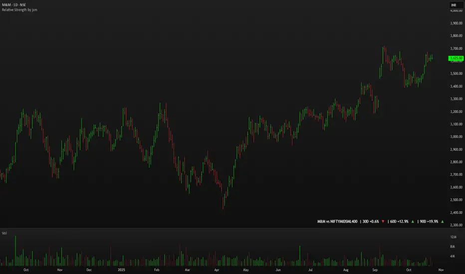
Relative Strength by jsm
1) Compare any stock against an Indian sector/index quickly and clearly.
2) Quickly gauge if your stock is outperforming or lagging its sector.
3) Instant relative strength tracker for Indian stocks & indices.
4) See 30D / 60D / 90D returns vs NIFTY, BANKNIFTY & more.
5) Smart visual tool to spot sector outperformance at a glance.
What it shows
A compact one-line readout (top-right by default):
TICKER vs INDEX | 30D +x.x% ▲ | 60D +y.y% ▼ | 90D +z.z% ▲
- +x.x% → stock return over the past 30 trading days (always uses daily bars).
- Arrow indicates relative performance vs the selected index: green ▲ = stock outperformed, red ▼ = stock underperformed, - = neutral (within tolerance).
- Percent values are shown with one decimal and a leading + for positives (e.g. +3.4%, -1.2%).
How it works
Apply the indicator to the stock chart (bottom chart in a dual-chart layout).
Choose the sector/index to compare from the “Compare with any Indian Index / Sector” dropdown. The indicator immediately calculates:
- Stock % change over 30 / 60 / 90 daily bars
- Index % change over the same periods
- Displays an arrow that reflects stock% − index% (colored only on the arrow to keep the numbers readable).
Inputs
- Pick Sector : preset list of Indian indices/sectors (no free-text by default).
- Box placement : Top/Bottom × Left/Right.
- Box Size : Tiny / Small / Normal / Large / Huge (controls font size).
- Dark Mode : toggles text color for dark/light charts.
- Show 30D / Show 60D / Show 90D : enable/disable individual periods.
- Equality tolerance (%) : small tolerance window to treat values as “equal” (shows neutral symbol).
Behavior & design choices
- Uses daily series for lookbacks (so 30D/60D/90D = 30/60/90 trading days) — works correctly on intraday charts too.
- Arrow only is colored (green/red/gray) for quick visual scanning; numbers remain neutral for readability.
- No intrusive background box by default — flat overlay that blends with your chart.
- Defaults: Bottom-right placement, Normal size, Light mode = off (so dark charts show white text).
Limitations / notes
- Not financial advice — use as a quick comparative visual, not a trade signal.
- The indicator calculates using the preset index symbols; if your broker/data feed lacks a symbol, the cell shows n/a.
- Due to TradingView table rendering, a tiny pixel gap may appear between a percent and its colored arrow (kept minimal on purpose).
Example
On SMSPHARMA chart with NSE:NIFTY selected:
SMSPHARMA vs NIFTY | 30D +13.0% ▲ | 60D +18.5% ▲ | 90D +13.5% ▲
— stock has outperformed NIFTY in all periods.
Volatility Adjusted Relative Strength (VARS) - Histogram OptionI’ve developed a new version of VARS that includes an option to toggle it into a histogram view. I recommend using a single neutral color rather than the conventional “red below 0, green above 0” scheme — because true RS analysis shouldn’t rely on color cues. The focus should be on the immediacy and persistence of RS itself to capture that initial breakout move as the most optimal RRR entry. This also provides clearer insight and visualization into how RS functions (both traditional and VARS) since RS is a static EOD metric derived from a defined timeframe.
I want to emphasize again that VARS is useful to identify low-risk entries, with relative strength calibrated to the volatility of the reference index (in this case, AMEX:SPY ). It is not used to determine my exits — those should be governed by a strict, non-discretionary framework for partial profit-taking and final exit of a position.

MACD cu RSI 7 Fibonacci color levelsMACD with RSI info
The RSI is display as value with changing color as Fibonacci levels.
MACD with RSI color 7 Fibonacci levelsMACD that contain RSI info
The color of RSI is change accordingly with Fibonacci levels, from red till green

Algorithmic Value Oscillator [CRYPTIK1]Algorithmic Value Oscillator
Introduction: What is the AVO? Welcome to the Algorithmic Value Oscillator (AVO), a powerful, modern momentum indicator that reframes the classic "overbought" and "oversold" concept. Instead of relying on a fixed lookback period like a standard RSI, the AVO measures the current price relative to a significant, higher-timeframe Value Zone .
This gives you a more contextual and structural understanding of price. The core question it answers is not just "Is the price moving up or down quickly?" but rather, " Where is the current price in relation to its recently established area of value? "
This allows traders to identify true "premium" (overbought) and "discount" (oversold) levels with greater accuracy, all presented with a clean, futuristic aesthetic designed for the modern trader.
The Core Concept: Price vs. Value The market is constantly trying to find equilibrium. The AVO is built on the principle that the high and low of a significant prior period (like the previous day or week) create a powerful area of perceived value.
The Value Zone: The range between the high and low of the selected higher timeframe.
Premium Territory (Distribution Zone): When the oscillator moves into the glowing pink/purple zone above +100, it is trading at a premium.
Discount Territory (Accumulation Zone): When the oscillator moves into the glowing teal/blue zone below -100, it is trading at a discount.
Key Features
1. Glowing Gradient Oscillator: The main oscillator line is a dynamic visual guide to momentum.
The line changes color smoothly from light blue to neon teal as bullish momentum increases.
It shifts from hot pink to bright purple as bearish momentum increases.
Multiple transparent layers create a professional "glow" effect, making the trend easy to see at a glance.
2. Dynamic Volatility Histogram: This histogram at the bottom of the indicator is a custom volatility meter. It has been engineered to be adaptive, ensuring that the visual differences between high and low volatility are always clear and dramatic, no matter your zoom level. It uses a multi-color gradient to visualize the intensity of market volatility.
3. Volatility Regime Dashboard: This simple on-screen table analyzes the histogram and provides a clear, one-word summary of the current market state: Compressing, Stable, or Expanding.
How to Use the AVO: Trading Strategies
1. Reversion Trading This is the most direct way to use the indicator.
Look for Buys: When the AVO line drops into the teal "Accumulation Zone" (below -100), the price is trading at a discount. Watch for the oscillator to form a bottom and start turning up as a signal that buying pressure is returning.
Look for Sells: When the AVO line moves into the pink "Distribution Zone" (above +100), the price is trading at a premium. Watch for the oscillator to form a peak and start turning down as a signal that selling pressure is increasing.
2. Best Practices & Settings
Timeframe Synergy: The AVO is most effective when your chart timeframe is lower than your selected "Value Zone Source." For example, if you trade on the 1-hour chart, set your Value Zone to "Previous Day."
Confirmation is Key: This indicator provides powerful context, but it should not be used in isolation. Always combine its readings with your primary analysis, such as market structure and support/resistance levels.

Benchmark Relative Performance BRPBenchmark Relative Performance (BRP) is a comprehensive technical analysis tool that compares any stock's performance against a chosen benchmark (QQQ, SPY, IWM, etc.) to identify outperformance and underperformance patterns.
Key Features:
Dual-line visualization: Shows both ticker and relative strength performance
Dynamic color coding: 5-level color system indicating performance strength
Customizable benchmark: Choose from any ticker via TradingView's symbol picker
Volume weighting: Optional volume analysis for stronger signal confirmation
Performance zones: Visual thresholds for strong/moderate performance levels
Compact info table: Real-time performance status and values
What It Shows:
Benchmark Performance Line (Blue): Shows your chosen benchmark's percentage performance
Relative Strength Line (Color-coded): Shows how much the ticker outperforms/underperforms
Fill Area: Visual gap between ticker and benchmark performance
Performance Zones: Dotted lines marking significant performance thresholds
Color System:
Green: Strong outperformance (above custom threshold)
Lime: Standard outperformance
Yellow: Neutral/Equal performance
Orange: Standard underperformance
Red: Strong underperformance (below custom threshold)
Best Used For:
Stock selection and rotation strategies
Sector/ETF relative strength analysis
Identifying momentum shifts vs benchmarks
Portfolio performance evaluation
Market timing based on relative performance
Settings:
Customizable lookback period (default: 20)
Adjustable strong performance threshold (default: 5%)
Optional volume weighting factor
Full table customization (position, colors, fonts)
Performance display (percentage or decimal)
Perfect for traders and investors who want to identify stocks showing relative strength or weakness compared to major market benchmarks.
Strict VWAP+EMA Trend Aligner with Volume Power - SUBODH BAJPAIAuthor: SUBODH BAJPAI
This indicator combines VWAP, EMA crossover, and Volume Strength filters into a single, easy-to-read system with clear signals and backtest-ready logic.
🔑 Features
• VWAP Tracking → Confirms trend bias (Above = Bullish, Below = Bearish).
• EMA 10/20 Crossovers → Detects momentum shifts (10 > 20 = Long trend).
• Volume Strength Check → Uses both Vol/VolSMA and RVOL thresholds to validate real demand/supply.
• Strict Align Mode → A Long signal triggers only when ALL conditions agree (VWAP, EMA crossover, strong volume).
• ATR-based Stop Loss & Take Profit → Built-in risk management with RR targeting and optional trailing stop.
• Smart Debounce → Prevents noisy/repeated signals by enforcing cooldown bars.
• Backtest Ready → Full strategy version available in Strategy Tester.
🎯 Usage
• Works on any timeframe (intraday → swing).
• Best used on liquid stocks, indices, or futures.
• Look for “LONG” arrows/shapes when all confirmations align.
• Use along with your own support/resistance levels or price action setups.
⚠️ Disclaimer
This script is for educational purposes only.
Not financial advice. Always validate signals with your own strategy and risk management.

RSI With TSIThis indicator combines the power of the Relative Strength Index (RSI) and the True Strength Index (TSI) into a single tool, helping traders identify both short-term and long-term momentum shifts with improved clarity and precision.
Features:
Relative Strength Index (RSI):
Adjustable period and source for RSI calculation (default: 14, close).
RSI displayed with distinct color.
Includes upper (70) and mid (50) level lines with background fill for visual emphasis.
Background fill highlights the RSI range visually.
True Strength Index (TSI):
Customizable long, short, and signal lengths.
TSI and its signal line plotted for momentum analysis.
Zero line added to quickly identify bullish or bearish zone.
📊 Why Use This Indicator?
This dual-indicator setup is excellent for:
Momentum confirmation between RSI and TSI.
Identifying early entries and trend continuations.
Spotting divergences and momentum reversals.

Price action + MA + MTF RSI + S/R Zones by GunjanPanditDescription:
This script combines multiple powerful trading tools into a unified indicator designed for trend-following and confirmation-based entries. It is built to assist traders in identifying actionable signals based on price structure, volatility, and momentum across multiple timeframes.
🔧 How It Works
✅ UT Bot Core Logic
The script uses a variation of the UT Bot (Ultimate Trend Bot) method to generate buy/sell signals.
Signals are based on ATR-filtered trailing stop levels to reduce noise and detect real trend changes.
A Buy is triggered when the price closes above the UT trailing stop.
A Sell is triggered when the price closes below it.
✅ Multi-Timeframe RSI Confirmation
RSI is calculated on a user-defined higher timeframe (default: 1 hour).
A buy signal is confirmed only if RSI is below the oversold level, and vice versa for sell signals.
This confirmation layer adds an extra filter to improve signal reliability and reduce whipsaws.
✅ Support & Resistance Zones (MTF)
The script automatically plots dynamic support and resistance zones using highs/lows from the selected higher timeframe.
These zones are visualized as shaded bands, helping users recognize key levels where price may reverse or consolidate.
✅ Visual Aids & Alerts
Buy and Sell signals are clearly labeled on the chart.
Optional RSI plot in a separate pane for visual monitoring.
Real-time alert conditions included for both Buy and Sell entries.
📈 Use Case & Recommendations
This script is best suited for:
Swing trading or intraday strategies in trending markets.
Traders who want confirmation across timeframes to filter noise.
Spotting key entry zones aligned with momentum and volatility.
Recommended to use in combination with:
Volume or trend structure analysis.
Stop-loss and take-profit risk management based on ATR or S/R zones.
inal Thoughts
This indicator is ideal for traders who value:
Multi-timeframe analysis
Visual clarity
Signal confirmation
And clean, customizable overlays for actionable trading insights.
Apex Edge - RSI Trend LinesThe Apex Edge - RSI Trend Lines indicator is a precision tool that automatically draws real-time trendlines on the RSI oscillator using confirmed pivot highs and lows. These dynamic trendlines track RSI structure in motion, helping you anticipate breakout zones, reversals, and hidden divergences.
Every time a new pivot forms, the indicator automatically re-draws the RSI trendline between the two most recent pivots — giving you an always-current view of momentum structure. You’ll instantly see when RSI begins compressing or expanding, long before price reacts.
Key Features: • Dynamic RSI trendlines drawn from the last 2 pivots
• Auto re-draws in real-time as new pivots form
• Optional "Full Extend" or "Pivot Only" modes
• Slope color-coded: green = support, red = resistance
• Built-in dotted RSI levels (30/70 default)
• Alert conditions for RSI trendline breakout signals
• Ideal for spotting divergence, compression, and early SMC confluence
This is not your average RSI — it’s a fully reactive momentum edge overlay designed to give you clarity, structure, and timing from within the oscillator itself. Perfect for traders using Smart Money Concepts, divergence setups, or algorithmic trend tracking.
⚔️ Built for precision. Built for edge. Built for Apex.

Fibo Normalized RSI & RSI RibbonPlots both standard and Z-score normalized RSI ribbons using Fibonacci-based periods. Supports adjustable normalization, optional 0–100 scaling, and multi-line visualizations for momentum and deviation analysis.
This tool is designed for traders who want to go beyond standard RSI by adding:
Statistical normalization (Z-score)
Multi-period analysis (Fibonacci structure)
Advanced divergence and exhaustion detection
It gives you both classical momentum context and mathematically rigorous deviation insight, making it ideal for:
Swing traders
Quant-inclined discretionary traders
Multi-timeframe analysts
Trend Confirmation
When both RSI and normalized RSI across short and long periods are stacked in the same direction (e.g., above 50 or with high Z-scores), the trend is likely strong.
Disagreement between the two ribbons (e.g., RSI high but normalized RSI flat) may indicate late-stage trend or false strength.
Mean Reversion Trades
Look for normalized RSI values > +2 or < -2 (i.e., ~2 standard deviations).
Cross-check with standard RSI to see if the move aligns with a traditional overbought/oversold level.
Great for fade/reversal setups when Z-score RSI is extreme but classic RSI is just beginning to turn.
Divergence Detection
Compare the slope of RSI vs. normalized RSI over same period:
If RSI is rising but normalized RSI is falling → momentum is fading despite apparent strength.
Excellent for early warnings before reversals.
Multi-Timeframe Confluence
Use short-period ribbons (e.g., 3–13) for tactical entries/exits.
Use long-period ribbons (e.g., 55–233) for macro trend bias.
Alignment across both = high-confidence zone.
