YinYang VolumeOverview:
YinYang Volume is an Advanced Volume Indicator. Regular Volume can be deceiving. It can be hard to tell how much of the Volume bar is Buy vs Sell volume, especially since the bar is green or red simply based on if it closes at a greater price than it opened. With YinYang Volume you'll be able to see how much Buy AND Sell Volume there is on each bar. Being able to see both is very useful, but the cherry on top is the Buy and Sell Moving Average Lines. These lines (White is Buy and Orange is Sell) can show who is currently winning the fight, Bulls or Bears. When the lines cross it's a shift in momentum and when combined with other technical analysis you can better understand the direction the market is moving and make an informed and educated trading decision. YinYang Volume also has Information tables, these tables display the Buy vs Sell volume on different Timeframes. This way even if you're trading on a Low Timeframe (like 15 minutes) you can see how the Buy vs Sell volume is fairing on other Timeframes.
Tutorial:
Unlike most volume indicators, including standard volume, we can see both Buy AND Sell volume for each bar. You may be wondering, well what’s the importance of this? The answer is EVERYTHING! Volume is one of the most important indicators when it comes to trading. Nothing moves without volume. However, with standard volume, the bar is either red or green simply based on if it closes greater than it opens. Now, that is pretty silly if you ask us. Let’s get into depth as to why seeing both Buy and Sell volume is important, and examples for how you can make trades with it:
In this example above, we have 2 green bars and they both have high levels of volume. This bar on the right however, has more volume than the one on the left. The issue here is, the bar on the right has MORE Sell volume than it even does have Buy volume; meanwhile the bar on the left has way more buy volume than the bar on the right with little sell volume. Without separating them and by simply looking at the price bar and regular volume bar, we would never be able to deduce this. It is crucial to understand and see how much of each volume there is as it plays a huge role in the price movements.
The white line represents the Buy Volume Moving Average and the orange line represents the Sell Volume Moving Average. These moving averages are very useful as when they cross they represent strong Buy and Sell Signals.
We’ve enabled signals which plot circles onto the MA’s to display when they’ve crossed. The white circle represents a Buy Signal and the Orange circle represents a Sell Signal. These signals are very strong, but there is a catch that comes with it. The bar right after the signal has the highest chance of a reversal so it isn’t always advised to make the trade until confirmed that the reversal didn’t happen on the following bar. If you have enough data based on other technical analysis to know the first signal is true, then use it as a way to solidify the fact that it is a good entry/exit location.
You can change the length of which the MA’s are smoothed out over. For instance, in the previous examples and by default the length is 14. However, if we are to change it to 50 for instance, it makes them a longer lasting MA that has much fewer crosses. This can be useful based on your trading style and if you prefer to stay in trades for quite awhile. As you can see, all signals with the 50 length are quite accurate and would have produced profitable trades, likely more so than at 14, but since it moves slower there's fewer signals to trade on.
Our Information Tables are there to show you the amount of Buy vs Sell %’s on 6 different Time Frames at the same time. It can be very useful to know how people are feeling on different Time Frames without you having to change your own. This way you can stay on say the 15 minute Time Frame locked in your trade and can see if the momentum of your long trade is cooling down based on higher Time Frames Buy vs Sell volume %’s.
For example, let's say you got an alert from YinYang Volume for Buy Signal on the 1 Day. You then entered a trade which you deemed a good location on the 15 minutes (after doing your own technical analysis on the 15 minute too). The Buy vs Sell Volume %’s on the 1 Day was 55% Buy and 45% Sell when you entered the trade. You are still waiting for exit confirmation on the 15 minute but you notice the Buy vs Sell Volume % on the 1 Day goes down to 52% Buy and 48% Sell. You can see the momentum changing. Even though you haven’t received confirmation for exit on the 15 minute, it may still be a good time to get out as momentum is clearly changing on the 1 Day.
We will conclude this Tutorial here. We hope you’ll get some good use out of our Volume Indicator and its ability to display unique Volume Data. If you have any Questions, Comments, Suggestions or Concerns, please don’t hesitate to contact us.
Settings:
1. Show Signals:
Toggling this setting shows when the Buy and Sell Volume MA’s cross each other. It produces a white circle when the Buy Volume Crosses over the Sell Volume (BULLISH) and an orange circle when the Sell Volume Crosses over the Buy Volume (BEARISH).
2. Length:
How far back should we average the Buy and Sell Volume Moving Averages? 14 is default has been tested and proven to work well, however you can change it if there is a different value that suits your trading style better.
3. Type:
How is the Moving Averages calculated? VWMA (Volume Weighted Moving Average) is the default as it has been tested and worked best; afterall, we are calculating volume and therefore should use a volume weighted MA calculation. However, you can change it as your options are:
VWMA, EMA and SMA
4. Information Tables:
4.1. Show Information Tables:
Our Information tables display 6 different resolutions so you can see how much Buy vs Sell volume there is as a % in multiple different Time Frames without having to change your Time Frame.
4.2. Strength:
The Buy / Sell Volume %’s displayed within your Information Tables are based on Moving Averages. The length this moving average uses is based on the Strength you select. The strengths aren’t as simple as just a length amount but are a calculation involving multiple different lengths and averages. However, the stronger the strength, generally the farther the lookback length is as an average. Your options for strength are:
Unbreakable
Very Strong
Strong
Average
Weak
Very Weak
Glass
We recommend ‘Average’ Strength, however if you find you want to see the %’s change more or less frequently you can adjust to your trading style
4.3. Res1 / Res2/ Res3 / Res4 / Res5 / Res6:
These represent the different resolutions (Time Frames) being used in your information tables and can be modified to display whatever resolution works best for your trading style. By default they are:
Res1: Current Timeframe
Res2: 15 Minute
Res3: 1 Hour
Res4: 4 Hour
Res5: 1 Day
Res6: 1 Week
Backup Res (not changeable): 5 Minute (this is only used if your Current Timeframe in Res1 is a duplicate of one of the other resolutions)
HAPPY TRADING!
在脚本中搜索" TABLE "

AIOI By TradeINski# **All IN ONE INDICATOR (AIOI) By TradeInSki**
## Contents
- 4 Moving Average.
- Combined Up and Down.
- Table.
- Inside Bar.
- Bull Snort.
- Indicator Settings Tab.
## **First things first**
- Open settings and read the following to understand better.
- Default Colour settings are best suited for dark theme.
- Default Settings is my personal preference.
- User can change few of the settings according to personal preference in settings option.
- Colour grading Green background means parameter favourable, Red not favourable for trading, “nah” background black means no sufficient data for calculation and background with other colours just for colour grading.
- Indicator should be only seen in D TF as its designed for Swing trading.
### 4 Moving Average
- 4 Different moving averages can be applied to the chart.
- **User Input**
1. Hide or Unhide option.
2. Type - SMA, EMA & WMA.
3. Source - O,H,L,C etc.
4. Period - Default 10,20,50,200.
### Combined Up & Down
- **User Input - In Settings**
1. Check/Uncheck = Combine condition or not?
2. Volume “>=” ____.
3. %Check = ___.
- Explanation - Helps to find how liquid the stock is which in turn helps in position sizing.
- On any specific day stock moved more than 5% plus Number of shares traded is more than 10Lakh .
- If all the above specified condition satisfied then plots blue colour circle below the candle.
### Table Settings
- **User Input - In Settings**
1. Position = .
2. Size = .
3. ADR = - Considers last 20 days average % move/range.
4. 52WK =
1. High/Low - Considers Just High Low Price.
2. Close - Considers Close price only.
5. Average Daily Volume = - Considers last 20 days average volume.
6. ROC = - Considers “Close” price.
7. ROC.P = - W.R.T 10 Days.
8. RVOL = - Considers last 20 days volume.
9. EMA #1, EMA #2, EMA #3 = .
### Table Plotted on Chart - Logic
1. **EMA 10**
1. 10 period Exponential Moving Average.
2. Avoid stock that are above 3%.
3. Select Stocks with Positive or -ve value.
2. **EMA 20**
1. 20 period Exponential Moving Average.
2. Prefer stocks with +ve value.
3. **EMA 50**
1. 50 period Exponential Moving Average.
**Note:** This Shows how much price of the stock is extended from moving averages in terms of percentage.
4. **ADR% - Average Daily Range**
1. Calculates Average % movement for last 20 Days as specified period is 20.
2. ___ < 2% Bad - ___ ≤ 2.5% ok - ___ ≤ 3% good - ___ > 3% best.
5. **52WH - 52 Week High**
1. Shows how far is stock from 52 week high price in % that implies -ve sign.
2. ___ > 75% Very Bad - ___ ≥ 50% bad - ___ ≥ 25% good - ___ ≥ 0% Very good.
6. **52WL - 52 Week Low**
1. Shows how far stock is moved from 52 week low price in percentage terms.
2. Avoid stock with -ve value.
3. Just by value shown can draw inference how much stock has rallied and its buying force.
7. **U/D - Up/Down Ratio**
1. Calculation Default is 20 period - In last 20 days Green day’s average volume divided by Red day average volume is the ratio shown.
2. ___< 1 bad - ___ ≤ 1.5 ok - ___ ≤ 2 good - ___ > 2 best.
8. **ROC - Rate of Change**
1. ROC is not that important can be kept in sidelines.
2. calculates the percentage change between the most recent price and the price registered a certain number of period ago. Default period is 20.
3. Output % shown vary above and below the value zero that is +ve and -ve.
4. Rising is better.
9. **R.VOL - Relative Volume**
1. Calculation - current volume - average volume in percentage terms.
2. Average volume period is 20 thats recent 20 days volume.
3. If current volume is 10K and average volume is 100K then it shows 10% and if current volume is 165K then shows 165%.
4. While scanning stocks RVOL should be less than 100% after entering and for carry forward it should be move than 100%.
5. ___ < 25% best - ___≤ 50% good - ___ ≤ 75% - ___≤ 100% % more look for other factors.10.
10. **T.VOL - Todays Volume**
1. Self Explanatory.
11. **Average Daily Volume 20 - Average daily volume**
1. Calculation is average 20 days volume that is .
2. While scanning T.VOL should be less than Average Daily Volume conditions apply.
3. If candles form + sign then above rule can be ruled out.
12. TURN - Rupee Turnover**
1. Turnover in terms of rupees.
2. Calculation price * Volume.
3. Avoid stocks less than 2.5cr that is 25M higher the better for position sizing and also helps in slippage control.
4. 1M - 10Lakhs, 10M - 1Cr, 100M - 10Cr, 1B - 100Cr.
5. Don’t think shown value is in dollar. No currency conversion needed.
### Inside Bar - I.B
- User input - In Settings
- Look Back Length = .
- That means Inside Bar is plotted in latest 25 candles.
- Explanation - If recent candles OHCL is within previous candle of latest candle then its called Inside bar, name it self say it one inside other.
- Example if todays candle OHLC in daily Time frame is within yesterday’s High and low in daily time frame.
- Logic is Volume dry up ready for expansion.
- If condition satisfied Plots White arrow below the candle.
### Bull Snort
- **User Input - In Settings**
- Position = .
- Label Colour = .
- Style = .
- Size = .
- **Explanation** - This will show you strong Buying Candles . its Called Bull Snort Candles. This Term is invented by US trader Oliver Kell, so all credits to him. In this Indicator You will see Candles which have 3 times volume of its 50 day average volume, so you can say a sudden volume spurt. Stock which are closing in 35 % of its high zone. Latest Close is above previous close.
- If this all 3 conditions are met you will see your preferred sign above candle. That is pink diamond above candle.
### Indicator Settings Tab
- After Opening Settings of the Indicator you will see 3 tab as follows.
1. Inputs.
2. Style.
3. Visibility.
- **Inputs Tab**
- There are 5 subgroups.
- Moving Averages.
- Combined Up & Down.
- Table Settings.
- Inside Bar.
- Bull Snort.
**Input Tab:** All details are mentioned above.
- **Style Tab**
- This is where we can change colour and play with other settings.
- 1, 2, 3, 4 Options are with respect to moving average. And its clearly mentioned MA01 MA02 etc etc.
- 5, 6, 7th Option is With respect to Combine Up & Down.
- Shapes - 5th Option is for plotting only Volume condition.
- Shapes - 6th Option is for plotting only %Check.
- Shapes - 7th Option is for platting if both the condition is satisfied that is Checked/Unchecked.
- 8th And 9th Option is with respect to Inside Bar.
- Shapes - 8th Option for green day.
- Shapes - 9th Option for red day.
- 10th Option - Labels - On/Off - This Plots values on the scale so better to turn it off.
- 11th Option - Tables - On/Off - This Hides or unhides table.
**Note:** OUTPUTS :- Sub group
- Precision - Default.
- Labels on price scale.
- Values in status line.
- **Visibility Tab**
- This tab helps to hide unhide in specific time frame.
- Uncheck Seconds, Minutes And hours so that when to hop to lower time frame automatically indicator hides itself.

RSI Dynamic Bands█ OVERVIEW
The "RSI Dynamic Bands" indicator is a variant of the Relative Strength Index (RSI) oscillator that brings its signals directly onto the price chart. It displays dynamic bands around the price, adjusted based on RSI levels, enabling easy identification of potential overbought or oversold conditions. The indicator also integrates a multi-timeframe RSI table, facilitating the analysis of trend strength across different timeframes.
█ CONCEPTS
The "RSI Dynamic Bands" indicator is designed to simplify the interpretation of price levels in the context of support and resistance zones, which can be correlated with other technical indicators and RSI values. Since the price itself does not display RSI values, a table showing RSI for four selected timeframes has been added, allowing traders to quickly assess trend strength across different time intervals. The most effective approach is to combine the indicator with other technical analysis tools, such as Fibonacci levels or pivot points, to confirm signals when the price approaches the bands and RSI values indicate a potential reversal.
Band Calculation
The bands are calculated based on the current closing price and RSI values, incorporating dynamic scaling to better adapt to market conditions. The formulas for the bands are as follows:
• Upper Band: close + (rsiUpper - rsi) * scaleFactor, where rsiUpper is the upper RSI level (default: 70), and scaleFactor accounts for market volatility.
• Lower Band: close + (rsiLower - rsi) * scaleFactor, where rsiLower is the lower RSI level (default: 30).
• Midline: The arithmetic average of the upper and lower bands: (upperBand + lowerBand) / 2.
Why Scaling? Without scaling, the bands would be chaotic and jagged, making them difficult to interpret. Scaling smooths the bands, making them wider during periods of high volatility and narrower during consolidation, better reflecting potential support and resistance levels.
Indicator Features
• Dynamic Price Bands: The bands adapt to market conditions, facilitating the identification of key price levels.
• Multi-Timeframe RSI Table: Displays RSI values for four selected timeframes (default: 15m, 1h, 4h, Daily), enabling comparison of trend strength across different perspectives.
• Style Customization: Users can adjust band colors, line thickness, and toggle the visibility of bands, fills, and the table.
How to Set Up the Indicator
1 — Add the "RSI Dynamic Bands" indicator to your TradingView chart.
2 — Configure parameters in the settings, such as RSI length, upper/lower levels, and scaling multiplier, to match your trading style.
3 — Enable or disable the display of bands, fills, or the RSI table based on your needs.
4 — Adjust band and table colors in the input section and line thickness in the "Style" section to better align the indicator with your chart.
█ OTHER SECTIONS
FEATURES
• RSI Length: The period for calculating RSI (default: 14).
• RSI Levels: Thresholds for overbought (default: 70) and oversold (default: 30).
• Scaling Multiplier: Adjusts bands based on market volatility (default: 0.15).
• Table Timeframes: Select four timeframes for the RSI table (default: 15m, 1h, 4h, Daily).
• Style Options: Customize band colors, fills, table, and line thickness.
HOW TO USE
Add the indicator to your chart, configure the parameters, and observe price interactions with the bands to identify potential entry and exit points. The RSI table allows you to compare RSI values across different timeframes, aiding in trading decisions. The most effective approach is to combine the indicator with other technical analysis tools, such as Fibonacci levels or pivot points, to confirm signals when the price approaches the bands and RSI values indicate a potential reversal.
Trading Strategies:
• Scalping: Use lower timeframes (e.g., 5m, 15m) in the RSI table to quickly identify short-term lows and highs. Wait for the price to approach the lower band in the RSI oversold zone, with RSI on lower timeframes starting to rise, and other tools, such as Fibonacci levels (e.g., 38.2%) or pivot points, confirming support.
• Medium-Term Trading: Focus on 1h and 4h timeframes. Look for confirmation of a low on a lower timeframe (e.g., 1h), where RSI indicates oversold conditions or starts rising, then check if RSI on a higher timeframe (e.g., 4h) confirms the trend. Confirmation from other tools, such as a Fibonacci level (e.g., 50%) or pivot point near the bands, strengthens the signal.
• Long-Term Trading: Use Daily and higher timeframes (e.g., Weekly). Wait for all relevant timeframes to confirm a low (e.g., RSI near oversold and price at the lower band), with lower timeframes (e.g., 4h) showing rising RSI. Other tools, such as Fibonacci levels (e.g., 61.8%) or pivot points near the bands, can further confirm a trend reversal signal.

Screener based on Profitunity strategy for multiple timeframes
Screener based on Profitunity strategy by Bill Williams for multiple timeframes (max 5, including chart timeframe) and customizable symbol list. The screener analyzes the Alligator and Awesome Oscillator indicators, Divergent bars and high volume bars.
The maximum allowed number of requests (symbols and timeframes) is limited to 40 requests, for example, for 10 symbols by 4 requests of different timeframes. Therefore, the indicator automatically limits the number of displayed symbols depending on the number of timeframes for each symbol, if there are more symbols than are displayed in the screener table, then the ordinal numbers are displayed to the left of the symbols, in this case you can display the next group of symbols by increasing the value by 1 in the "Show tickers from" field, if the "Group" field is enabled, or specify the symbol number by 1 more than the last symbol in the screener table. 👀 When timeframe filtering is applied, the screener table displays only the columns of those timeframes for which the filtering value is selected, which allows displaying more symbols.
For each timeframe, in the "TIMEFRAMES > Prev" field, you can enable the display of data for the previous bar relative to the last (current) one, if the market is open for the requested symbol. In the "TIMEFRAMES > Y" field, you can enable filtering depending on the location of the last five bars relative to the Alligator indicator lines, which are designated by special symbols in the screener table:
⬆️ — if the Alligator is open upwards (Lips > Teeth > Jaw) and none of the bars is closed below the Lips line;
↗️ — if one of the bars, except for the penultimate one, is closed below Lips, or two bars, except for the last one, are closed below Lips, or the Alligator is open upwards only below four bars, but none of the bars is closed below Lips;
⬇️ — if the Alligator is open downwards (Lips < Teeth < Jaw), but none of the bars is closed above Lips;
↘️ — if one of the bars, except the penultimate one, is closed above the Lips, or two bars, except the last one, are closed above the Lips, or the Alligator is open down only above four bars, but none of the bars are closed above the Lips;
➡️ — in other cases, including when the Alligator lines intersect and one of the bars is closed behind the Lips line or two bars intersect one of the Alligator lines.
In the "TIMEFRAMES > Show bar change value for TF" field, you can add a column to the right of the selected timeframe column with the percentage change between the closing price of the last bar (current) and the closing price of the previous bar ((close – previous close) / previous close * 100). Depending on the percentage value, the background color of the screener table cell will change: dark red if <= -3%; red if <= -2%, light red if <= -0.5%; dark green if >= 3%; green if >= 2%; light green if >= 0.5%.
For each timeframe, the screener table displays the symbol of the latest (current) bar, depending on the closing price relative to the bar's midpoint ((high + low) / 2) and its location relative to the Alligator indicator lines: ⎾ — the bar's closing price is above its midpoint; ⎿ — the bar's closing price is below its midpoint; ├ — the bar's closing price is equal to its midpoint; 🟢 — Bullish Divergent bar, i.e. the bar's closing price is above its midpoint, the bar's high is below all Alligator lines, the bar's low is below the previous bar's low; 🔴 — Bearish Divergent bar, i.e. the bar's closing price is below its midpoint, the bar's low is above all Alligator lines, the bar's high is above the previous bar's high. When filtering is enabled in the "TIMEFRAMES > Filtering by Divergent bar" field, the data in the screener table cells will be displayed only for those timeframes that have a Divergent bar. A high bar volume signal is also displayed — 📶/📶² if the bar volume is greater than 40%/70% of the average volume value calculated using a simple moving average (SMA) in the 140 bar interval from the last bar.
In the indicator settings in the "SYMBOL LIST" field, each ticker (for example: OANDA:SPX500USD) must be on a separate line. If the market is closed, then the data for requested symbols will be limited to the time of the last (current) bar on the chart, for example, if the current symbol was traded yesterday, and the requested symbol is traded today, when requesting data for an hourly timeframe, the last bar will be for yesterday, if the timeframe of the current chart is not higher than 1 day. Therefore, by default, a warning will be displayed on the chart instead of the screener table that if the market is open, you must wait for the screener to load (after the first price change on the current chart), or if the highest timeframe in the screener is 1 day, you will be prompted to change the timeframe on the current chart to 1 week, if the screener requests data for the timeframe of 1 week, you will be prompted to change the timeframe on the current chart to 1 month, or switch to another symbol on the current chart for which the market is open (for example: BINANCE:BTCUSDT), or disable the warning in the field "SYMBOL LIST > Do not display screener if market is close".
The number of the last columns with the color of the AO indicator that will be displayed in the screener table for each timeframe is specified in the indicator settings in the "AWESOME OSCILLATOR > Number of columns" field.
For each timeframe, the direction of the trend between the price of the highest and lowest bars in the specified range of bars from the last bar is displayed — ↑ if the trend is up (the highest bar is to the right of the lowest), or ↓ if the trend is down (the lowest bar is to the right of the highest). If there is a divergence on the AO indicator in the specified interval, the symbol ∇ is also displayed. The average volume value is also calculated in the specified interval using a simple moving average (SMA). The number of bars is set in the indicator settings in the "INTERVAL FOR HIGHEST AND LOWEST BARS > Bars count" field.
In the indicator settings in the "STYLE" field you can change the position of the screener table relative to the chart window, the background color, the color and size of the text.
***
Скринер на основе стратегии Profitunity Билла Вильямса для нескольких таймфреймов (максимум 5, включая таймфрейм графика) и настраиваемого списка символов. Скринер анализирует индикаторы Alligator и Awesome Oscillator, Дивергентные бары и бары с высоким объемом.
Максимально допустимое количество запросов (символы и таймфреймы) ограничено 40 запросами, например, для 10 символов по 4 запроса разных таймфреймов. Поэтому в индикаторе автоматически ограничивается количество отображаемых символов в зависимости от количества таймфреймов для каждого символа, если символов больше чем отображено в таблице скринера, то слева от символов отображаются порядковые номера, в таком случае можно отобразить следующую группу символов, увеличив значение на 1 в настройках индикатора поле "Show tickers from", если включено поле "Group", или указать номер символа на 1 больше, чем последний символ в таблице скринера. 👀 Когда применяется фильтрация по таймфрейму, в таблице скринера отображаются только столбцы тех таймфреймов, для которых выбрано значение фильтрации, что позволяет отображать большее количество символов.
Для каждого таймфрейма в настройках индикатора в поле "TIMEFRAMES > Prev" можно включить отображение данных для предыдущего бара относительно последнего (текущего), если для запрашиваемого символа рынок открыт. В поле "TIMEFRAMES > Y" можно включить фильтрацию, в зависимости от расположения последних пяти баров относительно линий индикатора Alligator, которые обозначаются специальными символами в таблице скринера:
⬆️ — если Alligator открыт вверх (Lips > Teeth > Jaw) и ни один из баров не закрыт ниже линии Lips;
↗️ — если один из баров, кроме предпоследнего, закрыт ниже Lips, или два бара, кроме последнего, закрыты ниже Lips, или Alligator открыт вверх только ниже четырех баров, но ни один из баров не закрыт ниже Lips;
⬇️ — если Alligator открыт вниз (Lips < Teeth < Jaw), но ни один из баров не закрыт выше Lips;
↘️ — если один из баров, кроме предпоследнего, закрыт выше Lips, или два бара, кроме последнего, закрыты выше Lips, или Alligator открыт вниз только выше четырех баров, но ни один из баров не закрыт выше Lips;
➡️ — в остальных случаях, в то числе когда линии Alligator пересекаются и один из баров закрыт за линией Lips или два бара пересекают одну из линий Alligator.
В поле "TIMEFRAMES > Show bar change value for TF" можно добавить справа от выбранного столбца таймфрейма столбец с процентным изменением между ценой закрытия последнего бара (текущего) и ценой закрытия предыдущего бара ((close – previous close) / previous close * 100). В зависимости от величины процента будет меняться цвет фона ячейки таблицы скринера: темно-красный, если <= -3%; красный, если <= -2%, светло-красный, если <= -0.5%; темно-зеленый, если >= 3%; зеленый, если >= 2%; светло-зеленый, если >= 0.5%.
Для каждого таймфрейма в таблице скринера отображается символ последнего (текущего) бара, в зависимости от цены закрытия относительно середины бара ((high + low) / 2) и расположения относительно линий индикатора Alligator: ⎾ — цена закрытия бара выше его середины; ⎿ — цена закрытия бара ниже его середины; ├ — цена закрытия бара равна его середине; 🟢 — Бычий Дивергентный бар, т.е. цена закрытия бара выше его середины, максимум бара ниже всех линий Alligator, минимум бара ниже минимума предыдущего бара; 🔴 — Медвежий Дивергентный бар, т.е. цена закрытия бара ниже его середины, минимум бара выше всех линий Alligator, максимум бара выше максимума предыдущего бара. При включении фильтрации в поле "TIMEFRAMES > Filtering by Divergent bar" данные в ячейках таблицы скринера будут отображаться только для тех таймфреймов, где есть Дивергентный бар. Также отображается сигнал высокого объема бара — 📶/📶², если объем бара больше чем на 40%/70% среднего значения объема, рассчитанного с помощью простой скользящей средней (SMA) в интервале 140 баров от последнего бара.
В настройках индикатора в поле "SYMBOL LIST" каждый тикер (например: OANDA:SPX500USD) должен быть на отдельной строке. Если рынок закрыт, то данные для запрашиваемых символов будут ограничены временем последнего (текущего) бара на графике, например, если текущий символ торговался последний день вчера, а запрашиваемый символ торгуется сегодня, при запросе данных для часового таймфрейма, последний бар будет за вчерашний день, если таймфрейм текущего графика не выше 1 дня. Поэтому по умолчанию на графике будет отображаться предупреждение вместо таблицы скринера о том, что если рынок открыт, то необходимо дождаться загрузки скринера (после первого изменения цены на текущем графике), или если в скринере самый высокий таймфрейм 1 день, то будет предложено изменить на текущем графике таймфрейм на 1 неделю, если в скринере запрашиваются данные для таймфрейма 1 неделя, то будет предложено изменить на текущем графике таймфрейм на 1 месяц, или же переключиться на другой символ на текущем графике, для которого рынок открыт (например: BINANCE:BTCUSDT), или отключить предупреждение в поле "SYMBOL LIST > Do not display screener if market is close".
Количество последних столбцов с цветом индикатора AO, которые будут отображены в таблице скринера для каждого таймфрейма, указывается в настройках индикатора в поле "AWESOME OSCILLATOR > Number of columns".
Для каждого таймфрейма отображается направление тренда между ценой самого высокого и самого низкого баров в указанном интервале баров от последнего бара — ↑, если тренд направлен вверх (самый высокий бар справа от самого низкого), или ↓, если тренд направлен вниз (самый низкий бар справа от самого высокого). Если есть дивергенция на индикаторе AO в указанном интервале, то также отображается символ — ∇. В указанном интервале также рассчитывается среднее значение объема с помощью простой скользящей средней (SMA). Количество баров устанавливается в настройках индикатора в поле "INTERVAL FOR HIGHEST AND LOWEST BARS > Bars count".
В настройках индикатора в поле "STYLE" можно изменить положение таблицы скринера относительно окна графика, цвет фона, цвет и размер текста.

Indicator: Profitability by Day & Hour (stacked, non-overlay)What it does
This tool performs a simple seasonality study on the selected symbol. It measures historical returns and summarizes them in two horizontal heatmaps:
Hours table (top) — Columns 00–23 show the average return of each clock hour, plus sample size, win rate, volatility (SD), and a t-score.
Days table (middle) — Columns 1–7 correspond to Mon–Sun with the same metrics.
Summary (bottom) — Shows the most profitable day and hour in the history loaded on your chart.
Green cells indicate higher average returns; red cells indicate lower/negative averages. The layout is centered on the screen, with the hours table above the days table for quick scanning.
How it works (methodology)
Returns: by default the indicator uses log returns ln(Ct/Ct-1) (you can switch to simple % if you prefer).
Daily aggregation (no look-ahead): day statistics are computed from completed daily closes via a higher timeframe request. Yesterday’s daily close vs. the prior day is added to the appropriate weekday bucket, preventing repaint/forward bias.
Hourly aggregation (intraday only): hour statistics are computed bar-to-bar on the current intraday timeframe and accumulated by clock hour (00–23) of the symbol’s exchange timezone.
Metrics per bucket:
Mean: average return in that bucket.
n: number of observations.
Win%: share of positive returns.
SD: standard deviation of returns (volatility proxy).
t-score: mean / SD * sqrt(n) — a quick stability signal (not a hypothesis test).
The indicator does not rely on future data and does not repaint past values.
Reading the tables
Start with the Mean row in each table: it’s color-mapped (red → yellow → green).
Check n (sample size). A bright green cell with very low n is less meaningful than a mild green cell with large n.
Use Win% and SD to judge consistency and noise.
t-score is a compact “signal-to-noise × sample size” measure; higher absolute values suggest more stable effects.
Typical observations traders look for (purely illustrative): for some equity indices, the first hour after the cash open can dominate; for FX/crypto, certain late-US or early-Asia hours sometimes stand out. Always verify on your symbol and timeframe.

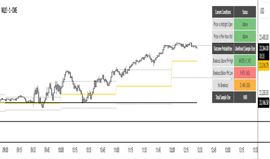
NQ Hourly Probability of PHH/PHL BreakNQ Hourly Probability of PHH/PHL Break
This indicator provides a statistical analysis of the Nasdaq 100 (NQ) on an hourly timeframe. It displays the historical probability of the current hour's candle breaking above the previous hour's high (PHH) or below the previous hour's low (PHL). The probabilities are contextual, changing based on the current hour of the day and the price's position relative to key levels.
It's made for traders who want to incorporate a data-driven approach into their intraday strategy.
________________________________________
SUMMARY
The core function of this tool is to display a real-time probability table on your chart. This table answers the question: "Based on historical data for this specific time of day and market context, what is the likelihood that price will break out of the previous hour's range?"
The indicator calculates these probabilities based on two key contextual conditions:
1. Is the current price above or below the Midnight Open price?
2. Is the current price above or below the midpoint of the previous hour's range?
By combining these conditions with the current hour, the indicator looks up the relevant historical statistics and presents them clearly.
________________________________________
FEATURES
• Probability Table: The main feature of the indicator. It displays the probability of breaking the Previous Hour High (PHH), the probability of breaking the Previous Hour Low (PHL), and the probability of the price staying within the range (No Breakout). It also shows the sample size for each statistic.
• Dynamic Color Coding: The table automatically highlights the most probable outcome in green, the second most probable in orange, and the least probable in red, allowing for a quick and easy assessment.
• Previous Hour Levels: Automatically plots the previous hour's high and low at the start of each new hour, providing key intraday levels for reference.
• Customizable Display: You have full control over the appearance, including line colors, styles, widths, and the text size of the probability table.
________________________________________
HOW TO USE
This indicator is designed for confluence, not as a standalone signal generator. It helps you frame your expectations for the current trading hour.
• Assessing Bias: If the table shows a high probability (e.g., >65%) of a breakout to the upside, you might have more confidence in looking for long opportunities or holding a long position through the PHH.
• Range-Bound Conditions: If the "No Breakout" probability is the highest, it suggests that a ranging or mean-reverting environment is more likely for that hour. You might be more cautious about chasing breakouts and instead look for trades within the previous hour's range.
• Context is Key: Always use this information in conjunction with your own analysis of market structure, order flow, and other factors.
________________________________________
IMPORTANT NOTES
• Asset Specific: The statistical data within this indicator is specifically calculated for NQ1! (Nasdaq 100 Futures). It will not be accurate for other assets like ES, BTC, or Forex pairs.
• Historical Data: These are historical probabilities and are not a guarantee of future results. Market dynamics can and do change. This tool is for educational and informational purposes to show what has happened in the past under similar conditions.
• Not Financial Advice: This script does not constitute financial advice. All trading decisions are your own responsibility.
________________________________________
USERINPUT
• Table Text Size: Adjust the size of the text in the probability table (Tiny, Small, Normal, Large).
• Show Midnight & PH Mid Lines: Toggle the visibility of the Midnight Open and Previous Hour Midpoint lines.
• Show Previous Hour High/Low Lines: Toggle the visibility of the PHH and PHL lines.
• Show Line Labels: Toggle the "phh" and "phl" text labels.
• Line Customization: Full control over the color, width, and style (Solid, Dotted, Dashed) for the high and low lines.
Top Crypto Above 28-Day AverageDescription
The “Top Crypto Above 28-Day Average” (CRYPTOTW) script scans a selectable universe of up to 120 top-capitalization cryptocurrencies (divided into customizable 40-symbol batches), then plots the count of those trading above their own 28-period simple moving average. It helps you gauge broad market strength and identify which tokens are showing momentum relative to their recent trend.
Key Features
• Batch Selection: Choose among “Top40,” “Mid40,” or “Low40” market-cap groups, or set a custom batch size (up to 40 symbols) to keep within the API limit.
• Dynamic Plot: Displays a live line chart of how many cryptos are above their 28-day MA on each bar.
• Reference Lines: Automatic horizontal lines at 25%, 50%, and 75% of your batch to provide quick visual thresholds.
• Background Coloration: The chart background shifts green/yellow/red based on whether more than 70%, 50–70%, or under 50% of the batch is above the MA.
• Optional Table: On the final bar, show a sortable table of up to 28 tickers currently above their 28-day MA, including current price, percent above MA, and “Above” status color-coding.
• Alerts:
• Strong Batch Performance: Fires when >70% of the batch is above the MA.
• Weak Batch Performance: Fires when <10 cryptos (i.e. <25%) are above the MA.
Inputs
• Show Results Table (show_table): Toggle the detailed table on/off.
• Table Position (table_position): Select one of the four corners for your table overlay.
• Max Cryptos to Display (max_display): Limit the number of rows in the results table.
• Current Batch (current_batch): Pick “Top40,” “Mid40,” or “Low40.”
• Batch Size (batch_size): Define the number of symbols (1–40) you want to include from the chosen batch.
How to Use
1. Add the CRYPTOTW indicator to any chart.
2. Select your batch and size to focus on the segment of the crypto market you follow.
3. Watch the plotted line to see the proportion of tokens with bullish momentum.
4. (Optional) Enable the results table to see exactly which tokens are outperforming their 28-day average.
5. Set alerts to be notified when the batch either overheats (strong performance) or cools off significantly.
Why It Matters
By tracking the share of assets riding their 28-day trend, you gain a macro-level view of market breadth—crucial for spotting emerging rallies or early signs of broad weakness. Whether you’re swing-trading individual altcoins or assessing overall market mood, this tool distills complex data into an intuitive, actionable signal.

PSP Candel Analyzer V2.0PSP Candle Analyzer V2.0
Multi-Symbol Candle State & Session Open Table (Replay Mode Compatible)
Indicator Overview:
The PSP Candle Analyzer V2.0 is designed for fast, visual candle direction analysis and structural comparison across multiple markets or indices in various timeframes.
It is ideal for traders who monitor several related instruments (e.g., Nasdaq, S&P 500, Dow Jones) and need quick insight into price action and candle structure divergence.
Key Features
1. Ultra-Compact, Color-Coded Table:
Displays a table in the chart corner showing the state (up, down, neutral) of each selected symbol for multiple timeframes (5m to 6h).
Each row: a timeframe.
Each column: the first letter of each symbol, colored by candle direction (bright blue = up, bright red = down, bright yellow = neutral).
Clean, minimal design for maximum readability—even on small monitors.
2. Automatic & Flexible Symbol Selection:
The indicator always includes the active chart’s symbol as the first column, automatically.
You can add 1 to 4 extra symbols in the settings (up to 5 symbols total for comparison).
3. Structural Divergence Highlighting:
If one symbol’s candle direction differs from others in a given timeframe, that row is highlighted (bright green) for fast detection of cross-market divergences.
4. Session Opening Lines (Dynamic Lines):
Dotted lines are drawn for key session opens: 6:00, 8:30, and 9:30 (New York time).
Each line’s color, length, and visibility are fully customizable.
Labels (“6:00”, “8:30”, “9:30”) appear precisely at the end of each line, matching pro indicators like NYO/TDO.
5. 100% Replay Mode Compatible:
Unlike many table-based indicators, this version is fully compatible with TradingView’s Replay Mode:
Table, colors, and lines are always updated in real time as you step through history or use auto-play.
No lags, glitches, or delayed updates—tested and verified.
6. Fully Customizable & Minimalist:
Adjust the number of symbols, table font size, color themes, session line length, and more—all from the settings panel.
Table stays compact and legible, regardless of setup.
How to Use
Add the indicator to your chart.
The active chart symbol is automatically included in the table.
Use settings to add up to 4 more symbols for cross-market analysis (e.g., CME_MINI:ES1! for S&P500, CBOT_MINI:YM1! for Dow Jones, etc).
Instantly compare candle direction for all symbols and timeframes, with divergence rows highlighted.
Session open lines with precise time labels will be drawn on your chart (fully customizable).
Other Notes
No timezone issues: Session opens (6:00, 8:30, 9:30 NY) are always aligned with official market times.
Table remains ultra-compact and non-intrusive, even on small screens.
Replay Mode problem is fully solved—the table and dynamic lines always update in sync with price and candles in historical mode.
Keywords:
Candle Analyzer, Multi-Symbol Table, Session Open Lines, Replay Compatible, NASDAQ, S&P500, Dow Jones, CME, CBOT, Candle Structure, Market Divergence, Pine Script v6, Real-Time Table, Pro Trading Tools
Feedback, bug reports, or questions? Leave a comment or DM! Happy trading!

SR Nube 1.1The SR Nube 1.1 indicator offers a comprehensive perspective on price action through the strategic combination of three key elements: a dynamic cloud based on two Volume Weighted Moving Averages (VWMA), a consistent reference Exponential Moving Average (EMA) across all timeframes, and an intuitive information table.
The Dynamic Cloud: This cloud is calculated using two VWMA with lengths that automatically adjust based on the chart's timeframe. This dynamic adaptation allows for the identification of relevant support and resistance zones across different timeframes, providing contextual insight into potential price movement. The cloud visualizes areas of volume confluence, helping traders pinpoint zones where buying or selling pressure may be significant.
The Consistent Reference EMA: An EMA with a specific length (calculated to be representative of a higher timeframe, such as 1 hour, and displayed consistently across all timeframes) is overlaid on the chart. This EMA serves as a macro trend guide and a constant visual reference point, making it easier to identify the overall market direction regardless of the active trading timeframe. Its consistency across timeframes helps maintain perspective and align trades with the dominant trend.
The Information Table: Located in the top-left corner of the chart, a concise table summarizes the current price status relative to the cloud (on the 20-minute timeframe, as a reference for the main strategy) and the price's position concerning the reference EMA (based on the 1-hour timeframe). This table provides a quick, color-coded overview of trend alignment across multiple key timeframes, which can assist traders in making more informed decisions.
Utility and Underlying Concepts:
This indicator is designed for traders seeking a tool that combines volume analysis (through the VWMA in the cloud) with a higher timeframe trend reference (the consistent EMA). The dynamic cloud helps identify potential entry and exit zones within the trading timeframe, while the reference EMA provides a directional filter. The information table simplifies the evaluation of trend confluence across multiple timeframes, potentially increasing the probability of successful trades.
The underlying strategy is based on the idea of trading in the direction of volume and in alignment with a higher timeframe trend, using the cloud to identify value areas and the EMA as a key directional filter. The information table acts as a quick visual aid for assessing this alignment.
How to Use:
Add the "SR Nube 1.1" indicator to your TradingView chart.
Observe the dynamic cloud to identify potential support and resistance zones on your trading timeframe.
Use the blue EMA as a guide for the overall market trend.
Consult the information table in the top-left corner to see the price alignment with the 20-minute cloud and the 1-hour EMA. The colors will provide a quick indication of the potential direction.
Look for confluence between the cloud signals on your trading timeframe, the price's position relative to the EMA, and the information provided in the table to identify potential entry and exit opportunities.

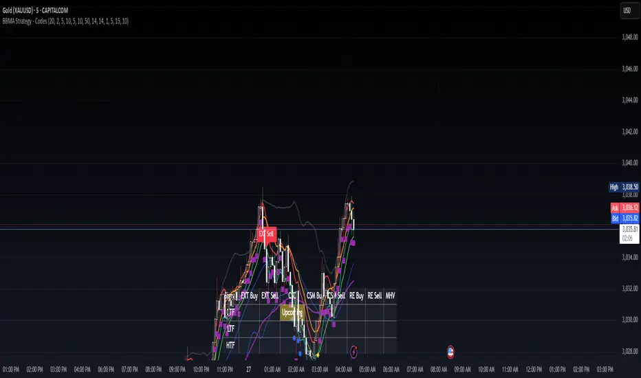
BBMA Strategy - EXT CSD CSM MHV RE CodesBINANCE:BTCUSD
Below is a detailed guide for using and interpreting the "BBMA Strategy - Enhanced EXT CSD CSM with Subplot" indicator. This guide is designed to be added to the description of the indicator when publishing it on TradingView. It provides clear instructions for users on how to apply the indicator, interpret its signals, and understand its features, including the multi-timeframe analysis and subplot table.
BBMA Strategy - Enhanced EXT CSD CSM with Subplot: User Guide
Overview
The "BBMA Strategy - Enhanced EXT CSD CSM with Subplot" is a comprehensive trading indicator built on the Bollinger Bands Moving Average (BBMA) framework. It combines multiple technical analysis tools—Bollinger Bands, Moving Averages (MAHI and MALO), EMA, ATR, volume analysis, RSI, MACD, market structure, and candlestick patterns—to identify high-probability trading setups. The indicator supports five key BBMA setups: EXT (Extreme), CSD (Consolidation), CSM (Continuation Setup Movement), RE (Re-Entry), and MHV (Market High Volatility).
This enhanced version includes:
Multi-Timeframe (MTF) Analysis: Confirms signals across a Lower Timeframe (LTF) and Higher Timeframe (HTF) for stronger trade validation.
Subplot Table: Displays signal status ("Active" or "Upcoming") and MTF confirmations in a clear table format.
Market Structure and Volume Filters: Incorporates Break of Structure (BOS), RSI divergence, and volume conditions to filter out low-probability trades.
Customizable Settings: Adjust Bollinger Bands, MA periods, timeframes, and more to suit your trading style.
This indicator is suitable for traders of all levels and can be used across various markets (e.g., forex, crypto, stocks) and timeframes (1M to 1D).
How to Use the Indicator
1. Add the Indicator to Your Chart
Open TradingView and load the chart of your chosen asset (e.g., BTCUSD, EURUSD, XAUUSD).
Go to the Pine Editor, paste the indicator code, and click "Add to Chart."
The indicator will overlay on your chart, displaying Bollinger Bands, Moving Averages, EMA, and signal labels. A subplot table will appear at the bottom of the chart.
2. Configure the Settings
The indicator provides customizable inputs to tailor it to your trading preferences. Access the settings by clicking the gear icon next to the indicator name on your chart:
Bollinger Bands Settings:
BB Period: Default is 20. Adjust the lookback period for Bollinger Bands.
BB Deviations: Default is 2. Adjust the standard deviation for the bands.
MAHI Settings (Moving Averages on High):
MAHI 5 Period: Default is 5. Period for the shorter MA on highs.
MAHI 10 Period: Default is 10. Period for the longer MA on highs.
MALO Settings (Moving Averages on Low):
MALO 5 Period: Default is 5. Period for the shorter MA on lows.
MALO 10 Period: Default is 10. Period for the longer MA on lows.
EMA Settings:
EMA Period: Default is 50. Adjust the period for the Exponential Moving Average.
ATR Settings:
ATR Period: Default is 14. Period for the Average True Range.
ATR SMA Period: Default is 14. Period for the ATR smoothing.
Timeframe Settings:
Minor HTF: Default is 1h. Select the minor higher timeframe for trend confirmation.
Major HTF: Default is 4h. Select the major higher timeframe for trend confirmation.
Lower TF for Confirmation: Default is 5m. Select the lower timeframe for signal confirmation.
Market Structure Settings:
Market Structure Lookback: Default is 10. Adjust the lookback period for swing highs/lows in market structure analysis.
3. Select Your Chart Timeframe
The indicator works on any timeframe from 1 minute (1M) to 1 day (1D).
For best results, align your chart timeframe (Current Timeframe, CTF) with the LTF and HTF settings:
Example: If CTF is 15m, set LTF to 5m and HTF to 1h or 4h.
This ensures proper multi-timeframe alignment for signal confirmation.
Indicator Components
Main Chart Elements
Bollinger Bands (BB): Plotted as three lines (upper, middle, lower) to identify volatility and potential reversal zones.
Upper Band: Blue line.
Middle Band: Black line (basis).
Lower Band: Blue line.
MAHI (Moving Averages on High): Two weighted moving averages on highs to detect trend direction.
MAHI 5: Green line.
MAHI 10: Lime line.
MALO (Moving Averages on Low): Two weighted moving averages on lows to confirm trend direction.
MALO 5: Red line.
MALO 10: Orange line.
EMA (50-period): Purple line to identify the overall trend.
Signal Labels: Appear on the chart when a setup is confirmed:
EXT Buy: Green upward arrow (reversal buy at BB lower band).
EXT Sell: Red downward arrow (reversal sell at BB upper band).
CSM Buy: Teal upward arrow (continuation buy above BB middle).
CSM Sell: Maroon downward arrow (continuation sell below BB middle).
RE Buy: Aqua upward arrow (re-entry buy between BB lower and middle).
RE Sell: Fuchsia downward arrow (re-entry sell between BB upper and middle).
MHV: Orange label (high volatility breakout after consolidation).
CSD: Yellow diamond (consolidation signal).
Subplot Table
Located at the bottom of the chart, the table summarizes signal status across three timeframes:
CTF (Current Timeframe): Shows "Active" (signal confirmed) or "Upcoming" (signal forming) for each setup.
LTF (Lower Timeframe): Displays a checkmark (✔) if the signal is confirmed on the LTF.
HTF (Higher Timeframe): Displays a checkmark (✔) if the signal is confirmed on the HTF.
Columns represent the five BBMA setups: EXT Buy, EXT Sell, CSD, CSM Buy, CSM Sell, RE Buy, RE Sell, and MHV.
Interpreting the Signals
1. EXT (Extreme) Setup
EXT Buy (Green Arrow):
Condition: Price touches or breaks below the BB lower band, closes above it, with high ATR volatility, strong volume, and additional confirmations (e.g., hammer candle, RSI oversold, MACD bullish, MAHI/MALO crossover, or bullish divergence).
Interpretation: A potential reversal buy signal. Look for confirmation in the subplot table (LTF and HTF rows).
Action: Consider a long position if LTF and HTF confirm (✔ in both rows). Use the BB middle or upper band as a target.
EXT Sell (Red Arrow):
Condition: Price touches or breaks above the BB upper band, closes below it, with high ATR volatility, strong volume, and additional confirmations (e.g., shooting star candle, RSI overbought, MACD bearish, MAHI/MALO crossunder, or bearish divergence).
Interpretation: A potential reversal sell signal.
Action: Consider a short position if LTF and HTF confirm. Use the BB middle or lower band as a target.
2. CSD (Consolidation) Setup
CSD (Yellow Diamond):
Condition: BB width is narrow (below its SMA), low ATR volatility, small candles, and no MAHI/MALO crossovers.
Interpretation: The market is consolidating, often preceding a breakout (e.g., MHV).
Action: Avoid trading during CSD unless preparing for an MHV breakout. Monitor the subplot for "Upcoming" MHV signals.
3. CSM (Continuation Setup Movement)
CSM Buy (Teal Arrow):
Condition: Price is above the BB middle, MAHI crossover, MALO crossover or MACD bullish, price above EMA 50, with additional confirmations (e.g., bullish engulfing or MACD bullish).
Interpretation: A continuation buy signal in an uptrend.
Action: Enter a long position if LTF and HTF confirm. Target the BB upper band or recent swing highs.
CSM Sell (Maroon Arrow):
Condition: Price is below the BB middle, MAHI crossunder, MALO crossunder or MACD bearish, price below EMA 50, with additional confirmations (e.g., bearish engulfing or MACD bearish).
Interpretation: A continuation sell signal in a downtrend.
Action: Enter a short position if LTF and HTF confirm. Target the BB lower band or recent swing lows.
4. RE (Re-Entry) Setup
RE Buy (Aqua Arrow):
Condition: Price is between the BB lower and middle bands, MAHI crossover, MALO crossover or MACD bullish, price above EMA 50, with additional confirmations (e.g., bullish engulfing or MACD bullish).
Interpretation: A re-entry buy signal after a pullback in an uptrend.
Action: Enter a long position if LTF and HTF confirm. Target the BB middle or upper band.
RE Sell (Fuchsia Arrow):
Condition: Price is between the BB upper and middle bands, MAHI crossunder, MALO crossunder or MACD bearish, price below EMA 50, with additional confirmations (e.g., bearish engulfing or MACD bearish).
Interpretation: A re-entry sell signal after a pullback in a downtrend.
Action: Enter a short position if LTF and HTF confirm. Target the BB middle or lower band.
5. MHV (Market High Volatility) Setup
MHV (Orange Label):
Condition: Follows a CSD signal, with expanding BB width, high ATR volatility, strong volume, and MAHI/MALO crossover or crossunder.
Interpretation: A breakout signal after consolidation, indicating high volatility and potential for a strong move.
Action: Trade in the direction of the breakout (e.g., buy if MAHI crossover, sell if MAHI crossunder). Confirm with LTF and HTF. Target significant levels like recent swing highs/lows.
6. Multi-Timeframe Confirmation
LTF Confirmation: A checkmark (✔) in the LTF row indicates the signal is also present on the lower timeframe (e.g., 5m). This adds confidence to the trade.
HTF Confirmation: A checkmark (✔) in the HTF row indicates alignment with the higher timeframe trend (e.g., 4h). This confirms the signal's strength.
Strongest Signals: Look for signals with both LTF and HTF confirmations (✔ in both rows). These have the highest probability of success.
7. Upcoming Signals
The CTF row in the subplot table may show "Upcoming" for a setup (e.g., EXT Buy: Upcoming). This indicates the setup is forming but not yet confirmed.
Action: Monitor these setups closely. They may turn "Active" on the next candle if conditions are met.
Trading Tips
Trend Alignment: Use the EMA 50 and market structure (is_uptrend) to ensure trades align with the overall trend. For example, prioritize CSM Buy signals in an uptrend.
Risk Management:
Set stop-losses below recent swing lows (for buys) or above recent swing highs (for sells).
Use the BB middle or opposite band as a target for most setups.
Avoid Overtrading: Focus on signals with LTF and HTF confirmations to filter out noise.
Timeframe Selection:
Scalping: Use 1m or 5m CTF with 1m LTF and 15m HTF.
Day Trading: Use 15m or 1h CTF with 5m LTF and 4h HTF.
Swing Trading: Use 4h or 1D CTF with 1h LTF and 1D HTF.
Backtesting: Test the indicator on historical data for your chosen asset and timeframe to understand its performance.
Alerts
The indicator includes built-in alerts for each setup:
EXT Buy/Sell: Triggers when an EXT signal is confirmed.
CSD: Triggers during consolidation.
CSM Buy/Sell: Triggers for continuation signals.
RE Buy/Sell: Triggers for re-entry signals.
MHV: Triggers for high volatility breakouts. To set up alerts:
Right-click on the chart and select "Add Alert."
Choose the condition (e.g., "BBMA EXT Buy").
Set your preferred notification method (e.g., email, SMS).
Limitations
Lagging Indicators: The indicator uses moving averages and other lagging tools, which may delay signals in fast-moving markets.
False Signals: Like all indicators, it can produce false signals, especially in choppy markets. Use LTF/HTF confirmations to filter trades.
Timeframe Dependency: Ensure your CTF, LTF, and HTF are properly aligned to avoid conflicting signals.
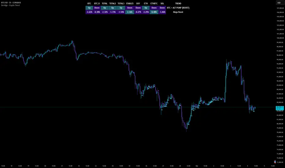
ZenAlgo - Crypto TrendThe ZenAlgo - Crypto Trend indicator is a unique tool for analyzing cryptocurrency market trends, combining data from multiple sources such as BTC , ETH , market caps, dominance metrics, and the DXY index . Unlike standalone indicators, it integrates these data points to deliver actionable insights on macro and micro market movements, helping traders better navigate complex market conditions.
Features
Multi-Asset Trend Analysis: Monitors trends across BTC , ETH , USDT dominance , DXY , SOL , ETHBTC and total market caps ( TOTAL , TOTAL2 , TOTAL3 ), providing a holistic market view.
Dynamic Labels: Real-time market conditions are summarized with labels such as "FIRE SELL," "BTC UP," or "ALT PUMP" for instant clarity.
Customizable Display: Options for dark mode, text size, and table position allow traders to personalize their experience.
Market Sentiment Table: Summarizes trends and percentage changes for multiple assets in a structured, easy-to-read table.
Composite Signals: Identifies unique states like "Mega Boost" or "Outflow" by analyzing the interplay of market trends.
Enhanced Heikin Ashi Analysis: Applies Heikin Ashi trends in a broader context, combining them with other metrics to overcome standalone limitations.
ZenAlgo Theme: A visually distinct and professional theme for enhanced usability.
Added Value: Why Is This Indicator Original/Why Shall You Pay for This Indicator?
The ZenAlgo - Crypto Trend indicator transcends the limitations of free tools in several ways:
Integrated Insights: While Heikin Ashi is freely available, this indicator applies it in tandem with market dominance, total market caps, and macroeconomic indicators like the DXY . This integration creates composite signals (e.g., "Mega Boost," "Defi Mega Boost") that standalone Heikin Ashi cannot provide.
Advanced Contextualization: Free Heikin Ashi indicators lack contextual data about dominance shifts, altcoin performance, and macroeconomic trends. Our indicator integrates these elements to give a broader market perspective.
Time-Saving: Instead of switching between multiple indicators, ZenAlgo - Crypto Trend combines them in one cohesive tool, offering a comprehensive market overview in a single glance.
Custom Features: Unlike generic Heikin Ashi indicators, this tool includes dynamic labels and a market sentiment table that summarize trends and provide immediate insights.
How It Works
1. Heikin Ashi Trend Detection
Calculates smoothed Heikin Ashi trends for BTC , ETH , USDT dominance , DXY , and total market caps ( TOTAL , TOTAL2 , TOTAL3 ).
Functionality: Heikin Ashi values are derived from the weighted average of open, high, low, and close prices. The "open" averages the previous bar's open and close, while the "close" averages the current bar's open, high, low, and close. A trend is assigned as Up (+1) or Down (-1) based on whether the close exceeds the open.
2. Market Metrics Analysis
Tracks daily percentage changes and trends for key metrics like BTC dominance and total market caps.
Outputs: Displays trends (Up/Down) and percentage changes for each asset, helping assess market strength and sentiment.
3. Composite Signal Generation
Combines individual asset trends to define broader market states such as "Mega Boost" or "Outflow."
Logic: Signals are triggered by predefined conditions, e.g., "Mega Boost" occurs when DXY trends down, market caps ( TOTAL , TOTAL2 , TOTAL3 ) trend up, and BTC dominance trends down.
4. Dynamic Labels and Sentiment Table
Displays real-time labels (e.g., "FIRE SELL," "BTC + ALT PUMP") directly on the chart for actionable insights.
A market sentiment table summarizes trends and percentage changes, with customizable display options (position, text size, theme).
Usage Examples
Spotting Bullish Momentum: Use "BTC + ALT PUMP" signals to identify synchronized bullish trends in BTC and altcoins.
Avoiding Bearish Trends: React to "CRYPTO DOWN" or "FIRE SELL" signals to minimize exposure during downturns.
Evaluating Altcoin Opportunities: Identify "ALT PUMP" or "ALTS DUMP" signals to time entries and exits in altcoin markets.
Tracking Dominance Shifts: Monitor "BTC.D UP" or "BTC.D DOWN" trends to assess shifts in market dominance between BTC and altcoins.
Macro Market Awareness: Use "Mega Boost" or "Mega Outflow" states to align with macroeconomic trends, such as dollar strength or weakness.
Seasonal Trends: Observe "ETH PUMP" or "BTC DOWN + ALT PUMP" states to understand specific altcoin or BTC-led market cycles.
Settings
ZenAlgo Theme: Enable a custom ZenAlgo visual style for improved clarity.
Table Text Size: Adjust text size (options: tiny, small, normal, large, huge) for better visibility.
Dark Mode: Toggle dark mode for improved viewing in low-light environments.
Table Position: Choose table placement (e.g., Top Left, Bottom Center) based on your preferences.
Important Notes
Synthetic and Lagging Nature of Heikin Ashi: Heikin Ashi values are synthetic and inherently lagging. They provide smoothed trends but do not represent precise entry or exit points. This indicator does not produce buy or sell signals.
Limitations in Low-Volume Markets: The indicator may underperform in low-liquidity markets or during periods of high volatility, where data discrepancies can distort trends.
Trend Reversals in Choppy Markets: In sideways or choppy markets, the composite signals may lag behind sudden reversals, potentially resulting in delayed recognition of trend changes.
False Positives During Macro News Events: Abrupt macroeconomic news or policy changes can cause the indicator to emit signals (e.g., "Mega Boost") that may not align with sustained market movements.
Dominance Metrics Sensitivity: Heavy reliance on BTC.D or TOTAL3 can sometimes result in misleading insights when these metrics are influenced by atypical events, such as large-scale liquidations or isolated token movements.
Use in Conjunction with Other Tools: While powerful, this indicator should be combined with other technical and fundamental analysis tools for a comprehensive trading strategy.
No Guaranteed Results: Trading involves risk. This tool is designed to support decision-making, not to guarantee trading success.
Uptrick: Oracle Metrics +
Introduction
Uptrick: Oracle Metrics + is a multi-dimensional trading indicator designed to consolidate various technical and risk-oriented signals into one accessible framework. It allows traders to observe market volatility, identify potential reversal points, and assess numerous performance metrics, all within a single interface.
Purpose
The main goal of this indicator is to simplify a broad array of market insights. It merges trend analysis, volatility indicators, on-chart signals, and risk-performance metrics to help traders quickly evaluate the state of a market and make more informed decisions.
Features
1. Cloud Visualization
A colored cloud overlays the chart, indicating market conditions. When the cloud narrows, it can signal upcoming breakout scenarios, as volatility compresses and price movement may accelerate. In contrast, when the cloud is wide, this could hint at an extended trend that might be nearing a pullback or retracement. Observing shifts between narrow and wide phases helps anticipate shifts in momentum.
This can be seen here:
Simple Cloud Overlay
You can also use the cloud like this: when it turns purple you sell when it turns aqua color you buy. These signals are not very accurate in ranging markets but therefore they are usually better on almost all timeframes and assets in trending markets. :
Bounces of cloud. The cloud can also be used as a type of support/resistance. In the example below you can see how the trend bounces off of the cloud. For example, you could add up to your position every time it touches the cloud and then you could fully exit when the cloud turns purple or the trend breaks below the cloud:
An example of a way you could use this indicator as a confirmation is here. In the image below, a fake signal is generated, you can eliminate this signal by waiting for the cloud to turn purple in order to have confirmation for a potential downward move:
2. Bar Coloring for Volatility and System States
Traders can choose between two bar-coloring methods:
• Volatility: Bars change color intensity based on the level of current volatility relative to a historical average. This helps in spotting abrupt changes in market behavior, where bars become more pronounced when volatility is higher. You can see the volatility information in the volatility table.
• System Score: Bars receive a color gradient determined by the indicator’s final overall score. This simplifies spotting bullish, bearish, or neutral phases without needing to inspect multiple metrics separately. The closer the final score is to zero the less the color difference between bullish and bearish is.
3. Reversion Signals and Potential Reversal Alerts
Two sets of on-chart markers help in spotting sudden shifts in momentum:
• Reversion Signals marked with the letter R: These signals combine RSI thresholds, stochastic crossovers, and EMA confirmation to identify potential reversals. RSI highlights overbought (above 70) or oversold (below 30) conditions, while stochastic crossovers confirm shifts in momentum. The EMA ensures signals align with the broader trend, reducing false positives in volatile markets. Together, these components provide a reliable way to spot potential market corrections or reversals.
• Potential Reversal Signals marked with small circles: These signals detect subtle shifts in momentum using a smoothed RSI (via TEMA) and changes in its slope. When the slope turns positive or negative near key levels, it highlights early-stage reversals. This approach helps traders identify timely entry or exit opportunities by capturing potential trend changes before they fully develop.
4. Main Metrics Table
A primary dashboard shows detailed performance measures and market analytics. Next to each value, there is a bullish or bearish arrow to hint at the current direction of that metric. The table includes the following:
• Sharpe Ratio: Offers a view of risk-adjusted returns, hinting at whether rewards outweigh the variability in price.
• Sortino Ratio: A variation of risk-adjusted return focusing more on downside risk.
• Treynor Ratio: Displays returns relative to systematic risk, referencing a user-provided beta.
• Information Ratio: Shows how the instrument is outperforming or underperforming a benchmark, scaled by tracking error.
• ROC: Rate of change in price over a specified period, reflecting momentum.
• MACD Histogram: The difference between fast and slow moving average convergence, illustrating momentum shifts.
• CMF: Chaikin Money Flow, evaluating buying or selling pressure by combining price and volume.
• Ulcer Index: A measure of drawdown intensity to gauge how severe downtrends or pullbacks have been.
• Amihud Ratio: Assesses illiquidity by comparing price impact to volume.
• Market Depth Ratio: Looks at price ranges relative to volume activity, indicating how deeply the market can absorb trades.
• S2F Ratio: Incorporates the asset’s circulating supply relative to its yearly production, sometimes referenced in markets with a defined issuance schedule.
• NVT Ratio: A network value to transactions ratio, typically applied to on-chain data.
• MVRV Ratio: Compares the asset’s market value with its realized value, highlighting overall valuation conditions.
• Autocorrelation: Shows how current price movement may be echoing previous price changes.
• Alpha: Measures excess return over what might be expected from a risk-free rate plus systematic market exposure.
• Skewness: Reveals the asymmetry of the return distribution.
• Kurtosis: Looks at whether returns have heavier or lighter tails than typical distributions.
• Max Drawdown: The largest peak-to-trough drop within a lookback window, a key measure of downside risk.
• Calmar Ratio: Evaluates returns in light of drawdowns, relating performance to the severity of pullbacks.
• Omega Ratio: Considers gains versus losses around a threshold return level to measure reward-to-risk balance.
• January Performance: A snapshot of how price behaves in January over a lookback, connected to the idea of seasonality.
• Bid-Ask Spread: Reflects the percentage difference between highest and lowest price in a period, hinting at market liquidity costs.
5. Final Score Table
After analyzing individual metrics, the indicator calculates an overall score that determines if the broader environment appears bullish, bearish, or neutral. This final score then influences optional color schemes across the chart, allowing traders to see at a glance how multiple data points combine into one stance. For those who prefer a visual “gauge,” an additional grid table can be enabled, where boxes fill with varying color intensities based on the current score. The score calculation is complex and uses a similar technique to TPI. It assigns values to each metric and then divides the score by the amount of metrics. The score is then visualized in the System Generation bar coloring option according to how intense the signal is.
Grids (visualization of how much more the score needs to be a full signal.):
6. Volatility Table
A separate table focuses on how current volatility compares with an average measure. When current volatility differs significantly from historical norms, the bars become more vividly colored. If volatility nears its average, the bars are more subdued. This helps traders know when to be cautious of sudden moves or to adapt their position sizing.
Indicator Inputs
Users can tailor numerous inputs to suit the nature of each instrument:
• Risk-Free Rate (annualized rate used for risk calculations)
• Benchmark Return (expected return of the market benchmark)
• Beta (measure of systematic risk, particularly for Treynor Ratio calculations)
• Lookback Period (window of time used for many rolling calculations)
• ROC Period (time span for the rate of change calculation)
• CMF Period (window for the Chaikin Money Flow measure)
• Ulcer Index Period (depth for the Ulcer Index reading)
• Amihud Illiquidity Period (period for measuring price impact relative to volume)
• Market Depth Ratio Period (time range for examining price breadth versus volume)
• Circulating Supply (used for the stock-to-flow calculation)
• Yearly Production (helps update the stock-to-flow ratio)
• Market Cap (overall value of the instrument, often used in ratio metrics)
• Transaction Volume (on-chain or traded volume data for NVT ratio)
• Realized Value (alternative valuation data, used in MVRV calculation)
• Threshold Return for Omega (sets a custom threshold above which returns are considered favorable)
• Bar Coloring Method (choose between volatility-based or final-score-based color themes)
• Table Text Size (adjust the display size of table entries)
• Additional parameters related to internal signals (like RSI lengths or smoothing settings) can be fine-tuned for different market behaviors. It is important to customize these fields according to the characteristics of the specific asset you are trading.
Important!
Adjust the inputs according to your current asset! The inputs under the 'Vital' section have to be adjusted so that the metrics function properly. If not well adjusted to your asset, your final score will be mixed up and System Bar coloring as well! These inputs include: Circulating Supply, Yearly Production, Market Cap, Transaction Volume, and Realized Value!
Originality and Uniqueness
Uptrick: Oracle Metrics + stands out by combining complex metrics, including calculations similar to the Trend Probability Indicator (TPI), to provide a deeper analysis of market conditions. The indicator offers multiple signals tailored to different trading scenarios, allowing users to filter and customize them manually through a variety of features. This flexibility, combined with its advanced risk and trend analysis tools, makes it a versatile solution for both momentum and long-term trading strategies.
Warnings
In some scenarios, overlapping numbers or markers may crowd the chart. A practical fix for any visual overlap is removing the indicator and then reapplying it, which generally resets the tables and color overlays.
Summary
Uptrick: Oracle Metrics + merges cloud-based analytics, bar-coloring for volatility or system state, reversion alerts, and a detailed metrics dashboard into one seamless interface. This synergy of short-term signals and long-term performance metrics aims to give traders a fuller perspective on risk, trend changes, and valuation. By tuning the inputs to each asset, traders can capture more relevant data, while the color-coded approach simplifies quick decision-making in a dynamic market environment.
Disclaimer
The Uptrick: Oracle Metrics + indicator is a tool designed to assist traders in analyzing market conditions and making informed decisions. It is not a guarantee of future performance or a substitute for independent financial advice. Trading involves significant risk, and past results do not guarantee future outcomes. Users are advised to conduct their own research, consider their financial situation, and consult with a licensed financial professional if necessary. Uptrick and its affiliates are not responsible for any financial losses incurred while using this indicator. Use at your own discretion and risk.

Asset Correlation with XAU/USD (Macroeconomics X Gold)This Pine Script calculates the correlation of economic assets with gold (XAU/USD), including indicators such as the DXY, the S&P 500, the US 10-year yield (US10Y), oil (USOIL), the USD/JPY pair, and the AUD/USD pair. The goal is to analyze the impact of these variables on the price of gold, particularly in a macroeconomic context.
Main Features:
Asset Monitoring: The script monitors 24-hour variations of six key assets (DXY, S&P 500, US10Y, USOIL, USDJPY, AUDUSD), along with the price of XAU/USD.
Percentage Change Calculation: The percentage change for each asset is calculated based on the previous day's close, compared to the most recent 5-minute close.
Direction Determination: The direction of each asset (whether the change is positive, negative, or neutral) is calculated and used to determine the potential impact on the price of gold.
Interactive Tables: The results of directions, variations, and impacts are displayed in a table on the screen, with each asset being evaluated by its weight (influence on gold) and direction. The table also includes arrows indicating the impact of each asset on the price of gold, based on the correlation between them.
Dominance: The overall dominance of gold is calculated based on the weights and directions of the assets, generating a result that reflects whether gold is trending upwards or downwards due to the other observed assets. An arrow symbol indicates whether the dominance is positive (⬆️), negative (⬇️), or neutral (—).
Table Details:
The table displays the monitored assets, their assigned weights, the direction (arrows up, down, or neutral), the percentage change of each asset, and the impact of these assets on the price of gold.
The last column shows the "dominance" overall, with the final impact of these assets on the direction of the XAU/USD price.
Usage: This script is useful for traders and analysts who want to monitor how different macroeconomic factors (such as the value of the dollar, the S&P 500, US interest rates, oil prices, and currency pairs) influence the price of gold. It provides a clear view of how these assets correlate with gold, helping to make more informed decisions in the market.
For a better view of the table, right-click on >> visual order >> bring it to the top.

Asset Corr. with BTC/USD (Macroeconomics X BTC)This indicator provides a comprehensive analysis of the correlation between multiple assets (DXY, Gold, S&P 500, US10Y, and USDT Dominance) and their potential impact on the BTC/USD price. The script calculates the 24-hour percentage variation of these assets, determines their direction (bullish, bearish, or neutral), and displays this information in a table, helping traders assess how each asset is influencing BTC.
How the Script Works:
Asset Monitoring:
The script tracks the following assets:
DXY: The U.S. Dollar Index.
Gold (XAUUSD): The price of gold in U.S. dollars.
S&P 500 (SP500): A stock market index of U.S. companies.
US10Y: U.S. 10-year treasury yield.
USDT Dominance (USDT.D): The market dominance of USDT (Tether) in the crypto market.
Variation Calculation:
The script calculates the percentage variation for each asset over the last 24 hours using the close price of the previous day and the current close price on the 5-minute chart.
Based on the variation, the script determines the direction of each asset:
Bullish (1): Positive variation.
Bearish (-1): Negative variation.
Neutral (0): No significant change.
Impact Assessment:
The script uses weighted values for each asset to calculate its potential impact on BTC. The assets are given different weights:
DXY = 3
Gold = 2
S&P 500 = 2
US10Y = 3
USDT.D = 3
The direction and correlation of each asset are assessed to determine whether they are having a positive or negative impact on BTC. This impact is represented by arrows in the table.
Table Display:
The script displays a table on the chart, providing detailed information for each asset:
Asset: The name of the asset being analyzed.
Weight (Wgt): The assigned weight of the asset.
Direction (Dir): The current direction of the asset (up, down, or neutral).
24h Variation (Var %): The percentage change of the asset over the last 24 hours.
BTC Impact: The predicted impact of each asset on BTC, based on its direction and correlation.
Dominance Calculation:
A final "Dominance" score is calculated by summing the weighted values of each asset's direction and correlation with BTC.
This result is displayed in the table, providing a clear indication of whether the overall market sentiment is bullish or bearish for BTC.
How to Use the Script:
Add the Indicator: Apply the script to any chart with a 5-minute timeframe. The indicator works by analyzing the correlation of multiple assets with BTC, so it is best used for short-term traders looking to gauge BTC's price movement based on broader market trends.
Interpret the Table: The table shows the direction, variation, and impact of each asset on BTC. The "Dominance" row at the end of the table provides an overall sentiment score, helping traders understand whether the broader market is leaning bullish or bearish on BTC.
Monitor the Correlation: By tracking the assets with the highest weights and monitoring their influence on BTC, traders can make informed decisions on potential BTC price movements.
Key Concepts:
Asset Correlation: The script monitors multiple key assets that typically influence BTC's price, including the U.S. Dollar Index, Gold, S&P 500, US10Y, and USDT Dominance.
Impact Assessment: Uses weighted calculations to assess how each asset’s direction affects BTC.
Dominance Score: Provides a summary score of overall market sentiment, helping traders understand the broader influence on BTC.
Short-Term Trading: This tool is optimized for short-term traders who want to gauge market sentiment and its effect on BTC in real time.
For a better view of the table, right-click on >> visual order >> bring it to the top.

Average Up and Down Candles Streak with Predicted Next CandleThis indicator is designed to analyze price trends by examining the patterns of up and down streaks (consecutive bullish or bearish candles) over a defined period. It uses this data to provide insights on whether the next candle is likely to be bullish or bearish, and it visually displays relevant information on the chart.
Here’s a breakdown of what the indicator does:
1. Inputs and Parameters
Period (Candles): Defines the number of candles used to calculate the average length of bullish and bearish streaks. For example, if the period is set to 20, the indicator will analyze the past 20 candles to determine average up and down streak lengths.
Bullish/Bearish Bias Signal Toggle: These options allow users to show or hide visual signals (green or red circles) when there’s a bullish or bearish bias in the trend based on the indicator’s calculations.
2. Streak Calculation
The indicator looks at each candle within the period to identify if it closed up (bullish) or down (bearish).
Up Streak: The indicator counts consecutive bullish candles. When there’s a bearish candle, it resets the up streak count.
Down Streak: Similarly, it counts consecutive bearish candles and resets when a bullish candle appears.
Averages: Over the defined period, the indicator calculates the average length of up streaks and average length of down streaks. This provides a baseline to assess whether the current streak is typical or extended.
3. Current and Average Streak Display
The indicator displays the current up and down streak lengths alongside the average streak lengths for comparison. This data appears in a table on the chart, allowing you to see at a glance:
The current streak length (for both up and down trends)
The average streak length for up and down trends over the chosen period
4. Trend Prediction for the Next Candle
Next Candle Prediction: Based on the current streak and its comparison to the average, the indicator predicts the likely direction of the next candle:
Bullish: If the current up streak is shorter than the average up streak, suggesting that the bullish trend could continue.
Bearish: If the current down streak is shorter than the average down streak, indicating that the bearish trend may continue.
Neutral: If the current streak length is near the average, which could signal an upcoming reversal.
This prediction appears in a table on the chart, labeled as “Next Candle.”
5. Previous Candle Analysis
The Previous Candle entry in the table reflects the last completed candle (directly before the current candle) to show whether it was bullish, bearish, or neutral.
This data gives a reference point for recent price action and helps validate the next candle prediction.
6. Visual Signals and Reversal Zones
Bullish/Bearish Bias Signals: The indicator can plot green circles on bullish bias and red circles on bearish bias to highlight points where the trend is likely to continue.
Reversal Zones: If the current streak length reaches or exceeds the average, it suggests the trend may be overextended, indicating a potential reversal zone. The indicator highlights these zones with shaded backgrounds (green for possible bullish reversal, red for bearish) on the chart.
Summary of What You See on the Chart
Bullish and Bearish Bias Signals: Green or red circles mark areas of expected continuation in the trend.
Reversal Zones: Shaded areas in red or green suggest that the trend might be about to reverse.
Tables:
The Next Candle prediction table displays the trend direction of the previous candle and the likely trend of the next candle.
The Streak Information table shows the current up and down streak lengths, along with their averages for easy comparison.
Practical Use
This indicator is helpful for traders aiming to understand trend momentum and potential reversals based on historical patterns. It’s particularly useful for swing trading, where knowing the typical length of bullish or bearish trends can help in timing entries and exits.
OrderFlow [Adjustable] | FractalystWhat's the indicator's purpose and functionality?
This indicator is designed to assist traders in identifying real-time probabilities of buyside and sellside liquidity .
It allows for an adjustable pivot level , enabling traders to customize the level they want to use for their entries.
By doing so, traders can evaluate whether their chosen entry point would yield a positive expected value over a large sample size, optimizing their strategy for long-term profitability.
For advanced traders looking to enhance their analysis, the indicator supports the incorporation of up to 7 higher timeframe biases .
Additionally, the higher timeframe pivot level can be adjusted according to the trader's preferences,
Offering maximum adaptability to different strategies and needs, further helping to maximize positive EV.
EV=(P(Win)×R(Win))−(P(Loss)×R(Loss))
-----
What's the purpose of these levels? What are the underlying calculations?
1. Understanding Swing highs and Swing Lows
Swing High: A Swing High is formed when there is a high with 2 lower highs to the left and right.
Swing Low: A Swing Low is formed when there is a low with 2 higher lows to the left and right.
2. Understanding the purpose and the underlying calculations behind Buyside, Sellside and Pivot levels.
3. Identifying Discount and Premium Zones.
4. Importance of Risk-Reward in Premium and Discount Ranges
----
How does the script calculate probabilities?
The script calculates the probability of each liquidity level individually. Here's the breakdown:
1. Upon the formation of a new range, the script waits for the price to reach and tap into pivot level level. Status: "⏸" - Inactive
2. Once pivot level is tapped into, the pivot status becomes activated and it waits for either liquidity side to be hit. Status: "▶" - Active
3. If the buyside liquidity is hit, the script adds to the count of successful buyside liquidity occurrences. Similarly, if the sellside is tapped, it records successful sellside liquidity occurrences.
4. Finally, the number of successful occurrences for each side is divided by the overall count individually to calculate the range probabilities.
Note: The calculations are performed independently for each directional range. A range is considered bearish if the previous breakout was through a sellside liquidity. Conversely, a range is considered bullish if the most recent breakout was through a buyside liquidity.
----
What does the multi-timeframe functionality offer?
In the adjustable version of the orderflow indicator, you can incorporate up to 7 higher timeframe probabilities directly into the table.
This feature allows you to analyze the probabilities of buyside and sellside liquidity across multiple timeframes, without the need to manually switch between them.
By viewing these higher timeframe probabilities in one place, traders can spot larger market trends and refine their entries and exits with a better understanding of the overall market context.
This multi-timeframe functionality helps traders:
1. Simplify decision-making by offering a comprehensive view of multiple timeframes at once.
2. Identify confluence between timeframes, enhancing the confidence in trade setups.
3. Adapt strategies more effectively, as the higher timeframe pivot levels can be customized to meet individual preferences and goals.
----
What are the multi-timeframe underlying calculations?
The script uses the same calculations (mentioned above) and uses security function to request the data such as price levels, bar time, probabilities and booleans from the user-input timeframe.
----
How does the Indicator Identifies Positive Expected Values?
OrderFlow indicator instantly calculates whether a trade setup has the potential for positive expected value (EV) in the long run.
To determine a positive EV setup, the indicator uses the formula:
EV=(P(Win)×R(Win))−(P(Loss)×R(Loss))
where:
P(Win) is the probability of a winning trade.
R(Win) is the reward or return for a winning trade, determined by the current risk-to-reward ratio (RR).
P(Loss) is the probability of a losing trade.
R(Loss) is the loss incurred per losing trade, typically assumed to be -1.
By calculating these values based on historical data and the current trading setup, the indicator helps you understand whether your trade has a positive expected value over a large sample size.
----
How can I know that the setup I'm going to trade with has a postive EV?
If the indicator detects that the adjusted pivot and buy/sell side probabilities have generated positive expected value (EV) in historical data, the risk-to-reward (RR) label within the range box will be colored blue and red .
If the setup does not produce positive EV, the RR label will appear gray.
This indicates that even the risk-to-reward ratio is greater than 1:1, the setup is not likely to yield a positive EV because, according to historical data, the number of losses outweighs the number of wins relative to the RR gain per winning trade.
----
What is the confidence level in the indicator, and how is it determined?
The confidence level in the indicator reflects the reliability of the probabilities calculated based on historical data. It is determined by the sample size of the probabilities used in the calculations. A larger sample size generally increases the confidence level, indicating that the probabilities are more reliable and consistent with past performance.
----
How does the confidence level affect the risk-to-reward (RR) label?
The confidence level (★) is visually represented alongside the probability label. A higher confidence level indicates that the probabilities used to determine the RR label are based on a larger and more reliable sample size.
----
How can traders use the confidence level to make better trading decisions?
Traders can use the confidence level to gauge the reliability of the probabilities and expected value (EV) calculations provided by the indicator. A confidence level above 95% is considered statistically significant and indicates that the historical data supporting the probabilities is robust. This high confidence level suggests that the probabilities are reliable and that the indicator’s recommendations are more likely to be accurate.
In data science and statistics, a confidence level above 95% generally means that there is less than a 5% chance that the observed results are due to random variation. This threshold is widely accepted in research and industry as a marker of statistical significance. Studies such as those published in the Journal of Statistical Software and the American Statistical Association support this threshold, emphasizing that a confidence level above 95% provides a strong assurance of data reliability and validity.
Conversely, a confidence level below 95% indicates that the sample size may be insufficient and that the data might be less reliable . In such cases, traders should approach the indicator’s recommendations with caution and consider additional factors or further analysis before making trading decisions.
----
How does the sample size affect the confidence level, and how does it relate to my TradingView plan?
The sample size for calculating the confidence level is directly influenced by the amount of historical data available on your charts. A larger sample size typically leads to more reliable probabilities and higher confidence levels.
Here’s how the TradingView plans affect your data access:
Essential Plan
The Essential Plan provides basic data access with a limited amount of historical data. This can lead to smaller sample sizes and lower confidence levels, which may weaken the robustness of your probability calculations. Suitable for casual traders who do not require extensive historical analysis.
Plus Plan
The Plus Plan offers more historical data than the Essential Plan, allowing for larger sample sizes and more accurate confidence levels. This enhancement improves the reliability of indicator calculations. This plan is ideal for more active traders looking to refine their strategies with better data.
Premium Plan
The Premium Plan grants access to extensive historical data, enabling the largest sample sizes and the highest confidence levels. This plan provides the most reliable data for accurate calculations, with up to 20,000 historical bars available for analysis. It is designed for serious traders who need comprehensive data for in-depth market analysis.
PRO+ Plans
The PRO+ Plans offer the most extensive historical data, allowing for the largest sample sizes and the highest confidence levels. These plans are tailored for professional traders who require advanced features and significant historical data to support their trading strategies effectively.
For many traders, the Premium Plan offers a good balance of affordability and sufficient sample size for accurate confidence levels.
----
What is the HTF probability table and how does it work?
The HTF (Higher Time Frame) probability table is a feature that allows you to view buy and sellside probabilities and their status from timeframes higher than your current chart timeframe.
Here’s how it works:
Data Request : The table requests and retrieves data from user-defined higher timeframes (HTFs) that you select.
Probability Display: It displays the buy and sellside probabilities for each of these HTFs, providing insights into the likelihood of price movements based on higher timeframe data.
Detailed Tooltips: The table includes detailed tooltips for each timeframe, offering additional context and explanations to help you understand the data better.
----
What do the different colors in the HTF probability table indicate?
The colors in the HTF probability table provide visual cues about the expected value (EV) of trading setups based on higher timeframe probabilities:
Blue: Suggests that entering a long position from the HTF user-defined pivot point, targeting buyside liquidity, is likely to result in a positive expected value (EV) based on historical data and sample size.
Red: Indicates that entering a short position from the HTF user-defined pivot point, targeting sellside liquidity, is likely to result in a positive expected value (EV) based on historical data and sample size.
Gray: Shows that neither long nor short trades from the HTF user-defined pivot point are expected to generate positive EV, suggesting that trading these setups may not be favorable.
----
How to use the indicator effectively?
For Amateur Traders:
Start Simple: Begin by focusing on one timeframe at a time with the pivot level set to the default (50%). This helps you understand the basic functionality of the indicator.
Entry and Exit Strategy: Focus on entering trades at the pivot level while targeting the higher probability side for take profit and the lower probability side for stop loss.
Use simulation or paper trading to practice this strategy.
Adjustments: Once you have a solid understanding of how the indicator works, you can start adjusting the pivot level to other values that suit your strategy.
Ensure that the RR labels are colored (blue or red) to indicate positive EV setups before executing trades.
For Advanced Traders:
1. Select Higher Timeframe Bias: Choose a higher timeframe (HTF) as your main bias. Start with the default pivot level and ensure the confidence level is above 95% to validate the probabilities.
2. Align Lower Timeframes: Switch between lower timeframes to identify which ones align with your predefined HTF bias. This helps in synchronizing your trading decisions across different timeframes.
3. Set Entries with Current Pivot Level: Use the current pivot level for trade entries. Ensure the HTF status label is active, indicating that the probabilities are valid and in play.
4. Target HTF Liquidity Level: Aim for liquidity levels that correspond to the higher timeframe, as these levels are likely to offer better trading opportunities.
5. Adjust Pivot Levels: As you gain experience, adjust the pivot levels to further optimize your strategy for high EV. Fine-tune these levels based on the aggregated data from multiple timeframes.
6. Practice on Paper Trading: Test your strategies through paper trading to eliminate discretion and refine your approach without financial risk.
7. Focus on Trade Management: Ultimately, effective trade management is crucial. Concentrate on managing your trades well to ensure long-term success. By aiming for setups that produce positive EV, you can position yourself similarly to how a casino operates.
----
🎲 Becoming the House (Gaining Edge Over the Market):
In American roulette, the house has a 5.26% edge due to the 0 and 00. This means that while players have a 47.37% chance of winning on even-money bets, the true odds are 50%. The discrepancy between the true odds and the payout ensures that, statistically, the casino will win over time.
From the Trader's Perspective: In trading, you gain an edge by focusing on setups with positive expected value (EV). If you have a 55.48% chance of winning with a 1:1 risk-to-reward ratio, your setup has a higher probability of profitability than the losing side. By consistently targeting such setups and managing your trades effectively, you create a statistical advantage, similar to the casino’s edge.
----
🎰 Applying the Concept to Trading:
Just as casinos rely on their mathematical edge, you can achieve long-term success in trading by focusing on setups with positive EV. By ensuring that your probabilities and risk-to-reward (RR) ratios are in your favor, you create an edge similar to that of the house.
And by systematically targeting trades with favorable probabilities and managing your trades effectively, you improve your chances of profitability over the long run. Which is going to help you “become the house” in your trading, leveraging statistical advantages to enhance your overall performance.
----
What makes this indicator original?
Real-Time Probability Calculations: The indicator provides real-time calculations of buy and sell probabilities based on historical data, allowing traders to assess the likelihood of positive expected value (EV) setups instantly.
Adjustable Pivot Levels: It features an adjustable pivot level that traders can modify according to their preferences, enhancing the flexibility to align with different trading strategies.
Multi-Timeframe Integration: The indicator supports up to 7 higher timeframes, displaying their probabilities and biases in a single view, which helps traders make informed decisions without switching timeframes.
Confidence Levels: It includes confidence levels based on sample sizes, offering insights into the reliability of the probabilities. Traders can gauge the strength of the data before making trades.
Dynamic EV Labels: The indicator provides color-coded EV labels that change based on the validity of the setup. Blue indicates positive EV in a long bias, red indicates positive EV in a short bias and gray signals caution, making it easier for traders to identify high-quality setups.
HTF Probability Table: The HTF probability table displays buy and sell probabilities from user-defined higher timeframes, helping traders integrate broader market context into their decision-making process.
----
Terms and Conditions | Disclaimer
Our charting tools are provided for informational and educational purposes only and should not be construed as financial, investment, or trading advice. They are not intended to forecast market movements or offer specific recommendations. Users should understand that past performance does not guarantee future results and should not base financial decisions solely on historical data.
Built-in components, features, and functionalities of our charting tools are the intellectual property of @Fractalyst use, reproduction, or distribution of these proprietary elements is prohibited.
By continuing to use our charting tools, the user acknowledges and accepts the Terms and Conditions outlined in this legal disclaimer and agrees to respect our intellectual property rights and comply with all applicable laws and regulations.

Sessions [TradingFinder] New York, London, Tokyo & Sydney ForexTiming is one of the influential factors in a trader's position. This indicator categorizes transactions into three sessions (Asia, Europe, and America). Five significant trading cities (New York, London, Frankfurt, Tokyo, and Sydney) are selectable.
I recommend using the tool on a 5-minute time frame, but it is usable on all time frames.
Settings:
• Trading sessions: Display or hide each trading session as needed.
• Color: Change the color of each box.
• Session time intervals: The default is based on the main working hours for each time interval and can be adjusted.
• Information table: Delete or display additional information table.
Information Table:
• Trading sessions
• Opening and closing times of each trading session
How to Use:
Initiating trading sessions involves entering with increased liquidity, and the market usually experiences significant movements. Many trading strategies are based on "time" and "session openings." This tool empowers traders to focus intensely on each time interval.
These trading sessions are crucial for all Forex, stock, and index traders:
The total price ceiling and floor in the Asia session (Tokyo and Sydney) are crucial for traders in the European session.
The European session starts with Frankfurt, and an hour later, London begins, collectively forming the European session.
The dashboard provides additional information, displaying hours based on UTC.
Customization options are considered in all sections so that everyone can apply their own settings.
Important: Default times are the most accurate for each region, and in most indicators, this time is not correctly selected. Therefore, the level of influence and time intervals are specified at the beginning of each session. If you are using another indicator, match its default time to the announced time and share the results with me in the comments.

YinYang MomentumOverview:
YinYang Momentum is a Price, Volume and Momentum Oscillator. Its job is to help you see swings in momentum and the strength of it. It also creates signals (Blood Diamond (Bear) and Support Cross (Bull)) where these momentum swings may occur. YinYang Momentum features 3 Price and 3 Volume 'Mountains with Ice'. There are Predictive, Regular and Confirming Mountains. You have the ability to overlay them on top of each other which helps to decipher momentum swings. The Volume Mountains are very important for showing the strength behind the Price Mountains and their Signals. If you look, you'll notice, as the 'Ice' starts to curve into the 'Mountains' it signals a potential shift in Momentum. The green Mountain is the Predictive, the Blue is the Regular and the Purple is the Confirming. You'll also notice that the Predictive Mountains movements happen first and move much more drastically. When you notice the regular starts to follow suit, there is a potential for a momentum shift. Shortly after, a signal will occur if this shift is actually happening. You can also check the Confirming Mountain for more confirmation (however, leaving the Confirming Mountain active can be a little confusing and make it harder to read signals). YinYang Momentum also features Information Tables. These tables display how the Blood Diamonds and Support Cross' are fairing on different Timeframes. This way, you'll be able to see if it's in a Bullish or Bearish state on critical Time Frames no matter what Timeframe you're trading on.
Before we move onto the tutorial, let's discuss what each of these Mountains and Ice are and how they work. All of our Mountains and Ice are calculated using the same algorithm but with varying sources, lengths and multipliers. We are essentially calculating differences in movement and then sending those differences into an EMA for the Mountain Base and SMA for the mountain Ice. The values we use for the Predictive are much lower and therefore occur much quicker as they aren’t averaged out on longer lengths/time frames; this helps to make it more of a leading Indicator which may predict momentum changes. Our Regular is over a medium length and multipliers that result in a smooth but generally also gradual movement that helps reliability; this helps it act as more of an ‘in the now’ Indication of momentum changes. Our Confirming uses lengths and multipliers that are of a higher value and longer span; this makes it more difficult to use for determining entry / exit locations as it's more of a lagging indicator, but it helps to add confirmation as to whether the momentum change has occurred and wasn't a false signal.
Tutorial:
YinYang Momentum may look like a lot is going on.. And well that’s cause there is.. But that doesn’t mean it's confusing or hard to read once you know what you’re looking for!
To make this tutorial a little easier to understand, let's turn off a few settings and dissect this indicator one thing at a time. YinYang Momentum features Price and Volume mountains. Currently in the photo above we have 2 Price Mountains and 1 Volume Mountain turned on (this is how it's set by default and how we recommend using it), however there are 3 Mountains available for both Price and Volume:
Predictive
Regular
Confirming
We are going to deactivate everything so it's the Regular Price Mountain + Ice enabled.
Now that it is just the Regular Price Mountain and Ice it is much easier to teach and understand. As you can see there are two different colors on the mountain. The dark blue is the Mountain and the light blue is the Ice.
The Ice moves before the mountain does and when the momentum happens it is larger than it (below or above). When the momentum starts to change however, the Ice curves inside of the mountain. As you can see here, where the BUY signal (red cross) is, the Ice curves into the mountain; also where the SELL signal (red circle) is, the Ice curves into the mountain. The Ice curving into the mountain is a very important leading indication that momentum is changing and the Signals (crosses and diamonds) help solidify this momentum change.
The Index levels for YinYang Momentum is a little different than most oscillators that range from 0-100. Instead YinYang Momentum’s neutral level is 0 and it ranges from -100 to 100. For these reasons, the Viable Range for Buying is -40 to -70 and the Optimal Range for Buying is -70 to -100. For Selling, the Viable Range is 40 to 70 and the Optimal Range is 70 to 100.
If you look at the example above, you can see whenever it has been in the optimal range and the signal occurred, it may potentially be an amazing time to buy or sell. However, when it is within the Viable Range it can be hit or miss. The reason for this is because we are only looking at the Regular Price Mountain and Ice. Once we turn on the Predictive Price and Regular Volume we will have a much clearer idea as to what is noise and what is a true purchase signal. Why don’t we turn on Predictive Price Mountains and Ice so you can see what we’re talking about:
So there are 2 big things that changed when we added the predictive price mountains + ice.
We can see that where the orange circle is, is just noise, it isn’t a viable buy signal.
We can see that where the red circle is, is actually a better spot to sell than the previous marked white circle slightly to the right of it.
We will explain why both above are true, but first let's explain how we were able to deduce this information.
There are 5 rules when deciphering if the signal is a true signal or just noise.
You want the predictive mountain to be decently spaced out from the regular mountain. Refer to the example above how that should look. Remember it's predictive so with parabolic movements it will get quite spaced out. If the price went up but slowly, it generally won’t be as spaced and isn’t as strong of a signal predictor.
You want the Ice to be of a decent size and to curve in on both the Predictive and Regular Mountains. Both arrows (red and white circle arrows) are pointing to Ice that does just that. The Predictive mountain is of decent size and spaced out and the Ice curves in sharply on the Predictive, before curving in sharply on the Regular and then we get both Predictive and Regular Support Cross on the Same Bar.
When you get the Signals (Predictive and Regular) the amount of bars between them matters a lot! On the same Bar is ideal, however 1-2, max 3 bars between them is acceptable. Any more than 3 bars spacing and it's too risky of a signal because that means momentum change was happening but then stopped before picking back up. This doesn’t mean it can’t be a good signal, it just means it is much more risky and we don’t recommend it.
You don’t want Signal Clustering. You can see an example of this from the picture above. Signal Clustering is where signals are back to back over and over. During this time the momentum is in a consolidation phase and easily swaps back and forth between signals. These signals are not reliable and should not be traded on. We only want to act on clear momentum based signals.
Last but certainly not least, actually, the most important! Ensure that the Mountain + Ice for both the Predictive and Regular is at the bare minimum touching (preferably inside) the Viable Range. The Optimal range is best, but most mountains don’t make it that far. Viable Range is where you will make most of your trades from. Sometimes a great signal happens with all 5 of these rules but it is only touching the Viable Range right at 40 or -40. This CAN be okay, but is also much more risky than if it was at 50 to 60 or -50 to -60.
Based on the 5 rules mentioned, take a second and look back at the photo where we initially added the Predictive Price mountains and Ice, can you decipher why the orange circle is just noise, and can you see why the red circle is a better sell location than the white circle slightly to the right of it?
Let’s bring that photo back up now and let’s discuss this:
Let's start with the orange circle:
This orange circle, without the predictive, was hard to tell if it was a good location to buy or not, but the second we turned it on we could clearly see it was just noise.
The spacing between the Predictive mountains and the Regular is almost non-existent.
There was signal clustering shortly before this signal.
Remember, there doesn’t have to be many rules broken for a signal to be either too risky or not valid at all. The safest trades are ones where it meets the requirements of all 5 rules (6 once we talk about volume, but 5 price rules).
Now, let's discuss the red circle:
This red circle, although it could have been chosen with just the regular, was much more noticeable with the predictive added on top.
It has a perfect spacing between the Predictive and the Regular all the way to the peak.
The Ice is large and both curve in very nicely towards the mountains.
The signals are within 2 bars apart from each other.
There is no signal clustering.
The Predictive is within the Viable Range and the Regular is just touching it.
For these reasons, the red circle actually would have been where you sold and not the white circle beside it.
This pretty much covers the Price Mountains, but wait! The most important Cherry on Top to your decision making process is coming next!
We have just enabled our Regular Volume Mountains and Ice (which are the black mountains + ice). As you can see, we have circled what we call the ‘Perfect Combo’. This Perfect combo is when you have all 5 Price rules met COMBINED with a high volume mountain. The Volume Mountain and Ice act as strength. They aren’t biased towards bulls or bears, they simply show strength to whatever signal is present with it.
For example, if all 5 rules are met with Price on a Blood Diamond (Bear) Signal and there is a High Volume Mountain then this is also a ‘Perfect Combo’. That Blood Diamond signal will potentially have great strength behind it. The Viable and Optimal Ranges don’t apply to volume mountains. Any volume mountain, even close to the Viable Range, is considered to be a very high mountain. High volume is when the mountain is above 0 and low volume is when it's below 0. Any signal with low volume has less of a chance of being correct, regardless of whether it abides by all 5 price rules.
You can see here that the 5 Price rules are achieved but the volume mountain is low. It is at -25. Since the 5 Price rules are right, there is still a decent amount of accuracy to this signal and the price did plummet after, but not nearly as much as it would have if the volume mountain was high with it.
We have turned our Confirming Price Mountain on here so you can get an idea of what it looks like and how it’s used. If you refer to the Support Crosses and Blood Diamonds circled in white, you’ll see that although they both received their signals on the Predictive and Regular, neither of them received it on the Confirming. This shows that these signals lost momentum shortly after. However if you look at both the red and green circles, you’ll see that they both received their confirming signals and that it helped give those signals momentum. The Confirming Price Mountain is meant to help confirm if the momentum change is still on track and the max 3 bars from the regular signal rule still applies to it. However its height within the viable and optimal range is important, just not as relevant
Before we move on to our Information Tables we want to take a second just to discuss our Volume Mountains and Ice. We haven’t had a chance yet to discuss the Predictive or Confirming Volume. When it comes to our Volume Mountains + Ice, we don’t recommend having more than 1 on at a time. The reason we have included the Predictive and Confirming is in case you find they suit your Trading Style best, not necessarily to be used the same way the Price Mountains and Ice are. The main reason for this is due to the fact that the Volume Mountains are much smaller and when overlaid on top of each other can make a confusing blur that is hard to decipher.
In this example above we have enabled both Predictive and Regular Volume just so you can understand what we are talking about. The two together can be rather confusing and actually interfere with your decision making process. For this reason, we highly recommend finding the Volume Mountain that suits your trading style best and solely sticking to that.
Our Predictive Volume Mountains and Ice may help sense volume changes before they’ve even happened. This can be very useful if your Trading Style revolves around heavy volume changes.
Our Confirming Volume Mountains and Ice are much slower and smaller, but they help show the movement of volume that has occurred already. This can be used to help see the movement of volume without fearing it may or may not happen.
Our Information Tables are there to show you valuable information on whether it is in a state of Support Cross or Blood Diamond on 6 different Time Frames at the same time. The % it shows you displays how much of a price change has occurred since that signal has happened. It is important to note, if for instance you see it is in a state of Support Cross but the % is negative, this generally means it is going to switch to Blood Diamond soon and vice versa. Therefore if you are in a trade, especially on a lower Time Frame and you are watching the 1 Day or a higher Time Frame and notice that the % is getting less and less, it may be a good time to get out.
We will conclude our Tutorial here. If you have any Questions, Concerns, Suggestions or Comments please don’t hesitate to contact us.
Settings:
1. Show Predictive to Confirmed Trendline:
The Predictive to Confirmed Trendline is very useful for seeing when the predictive (Support Cross or Blood Diamond) has hit the confirmed (It’s a strong confirmation that the trend may be shifting). This trendline also features a Moving Average which helps give you a solid marker for when the Regular / Predictive mountains cross under or over it that a momentum swing may occur. Somewhat like when the RSI crosses above/below its Moving Average it dictates momentum change, that is likewise how to interpret when it happens with the mountains and this trendline.
2. Show Price Ice and Mountains based on:
The Price Ice and Mountains are very important when it comes to deciphering signal strength. For example, When the mountains are very low (regular and predictive) and are between the 2 red line (undervalued) or even possibly below the bottom red line, and the Ice on the mountains starts to curve into the mountains and then the Predictive and Regular Support Cross occur; this is a very strong Bullish Signal. But wait, that's not all, the cherry on top is when the volume mountain (black) is ALSO high while this occurs; the Volume Mountain adds Strength to the signal. When the volume mountain is high too during this ‘Perfect Combo’ this may potentially lead to very bullish price movement occurring soon. Here is an overview of each mountain:
2.1. Predictive: Are the least reliable, but they move first and nothing will move without the predictive moving first, and getting you ready.
2.2. Regular: Are the most accurate, they don't signify strength on its own, but they sure show some momentum.
2.3. Confirming: Are slightly behind when it comes to displaying data, and therefore shouldn't be used for entry / exit, but rather to show if the trend movement has truly been confirmed or not.
When the Ice starts to curve into the Mountain, (either upward or below) it signifies possible momentum change. There are Crosses (Bull), and Diamonds (Bear) to show when they've crossed. Cross' and Diamonds balance each other out and therefore there can never be more than 1 in a row (of the same type). When the Ice and Mountain size is very large (between 40 and 70), and the predictive Ice starts to curve into its mountain, and then the predictive curves into the Regular, and the Regular Ice is curving into its Mountain, then it may have some strong weight behind that signal.\nIMPORTANT: refer to Volume tooltip below for how to increase the signal strength even more.
3. Show Volume Ice and Mountains based on:
The Volume Ice and Mountains are for giving strength to the Price's signals and Size. When there is the perfect combo (described above) AND the Volume Ice + Mountain is high, then there may be a lot of strength to that Price signals (whether it is Cross (Bull), or Diamond (Bear)).
IMPORTANT: High volume mountains, unlike Price, don't mean good or bad. Volume shows strength to the Price, and therefore if there are high Volume mountains during a Diamond (Bearish), then there may be a lot of strength to that signal and vice versa.
4. Show Information Tables:
Information tables are used to display 6 different Time Frames and whether or not each time frame is in a state of Blood Diamond (red) or Support Cross (green). They also show how much % in price has changed since the current signal happened. These are very useful for seeing how the price is fairing on different Time Frames without having to constantly change your timeframe. For instance, maybe you base your entry off the 1 day time frame but then you swing trade on the 15 minute. Well, after you’ve confirmed your entry position and are sitting on the 15 minute, you can stay on the 15 minute and see how it is fairing on the 1 day, 5 minute or whatever time frame you choose. This way you aren’t distracted from the trade at hand. All of these Time Frames can be adjusted in the Settings (GUI) to whatever resolution you wish.
5. Res1 / Res2/ Res3 / Res4 / Res5 / Res6:
These represent the different resolutions (Time Frames) being used in your information tables and can be modified to display whatever resolution works best for your trading style. By default they are:
Res1: Current Timeframe
Res2: 15 Minute
Res3: 1 Hour
Res4: 4 Hour
Res5: 1 Day
Res6: 1 Week
Backup Res (not changeable): 5 Minute (this is only used if your Current Timeframe in Res1 is a duplicate of one of the other resolutions)
HAPPY TRADING!

Goldbach Time IndicatorGoldbach Time Indicator (Minute Algebra + Core Levels)
A time-based discovery tool that maps minute arithmetic to a curated set of “Goldbach levels” (0–77) and highlights core reliable levels (29, 35, 71, 77) on any symbol/timeframe. It’s designed for session timing, event clustering, and pattern research—not price prediction.
What it shows
Three per-bar minute transforms:
Min = current minute (00–59)
Min+Hr = minute + hour (mapped, 60 → 00; valid up to 77)
Min−Hr = |minute − hour| (auto-chooses positive variant; 60 → 00)
Hit detection: marks a bar if any transform lands on an allowed Goldbach level.
Core emphasis: special tint/labels for 29, 35, 71, 77.
Optional background highlight (green for hits, blue tint when a core level is present).
Large corner readouts (optional): current Min / Min+Hr / Min−Hr with ✓ or ⭐ for core.
Detailed table: current time (your chosen timezone) + the three values and their status.
Histogram (optional): total hits and core hits under the chart.
Hover tooltips: per-bar time + which transforms hit (and whether they’re core).
Inputs & controls
Timezone Preset: UTC, New York, Tokyo, London, Sydney, or Custom UTC Offset.
Display toggles: Large number panels, Detailed table, Histogram, Horizontal reference lines.
Levels:
Standard set: 0,3,7,11,14,17,23,29,35,41,44,47,50,53,56,59,65,71,77
Core Only: show just 29, 35, 71, 77
Custom: paste your own comma-separated list (0–77)
Test Mode: assists with visual verification (e.g., consistent tooltips across all bars).
Core highlighting: stronger visual emphasis when a core level is hit.
How it helps
Session research: check if your strategy events cluster around certain minute signatures.
Timing filters: avoid entries during “no-hit” windows or focus on core hits.
Backtest guidance: the histogram and info panels make it easy to log/compare timing regimes.
Multi-market: independent of price scale—works for FX, indices, crypto, metals, single stocks.
Reading the visuals
Dots:
Yellow = Min, Lime = Min+Hr, Orange = Min−Hr, Blue = Core
Background:
Green = at least one hit, Blue tint = core level present
Tables/Panels: show current time (with timezone), raw values, and ✓/⭐ status.
Quick start
Choose your Timezone Preset (or set Custom UTC offset).
Start with Standard Levels; enable Core highlighting.
Turn on Detailed Table to confirm values match your venue/session.
(Optional) Show Histogram to see hit density; add Horizontal Lines for fixed references.
If needed, switch to Core Only or define Custom Levels to fit your hypothesis.
Notes & disclaimers
This is a time analytics overlay, not a buy/sell signal engine.
“Goldbach levels” here are a research framework (minute algebra 0–77) used for market-timing studies.
Always forward-test any timing rules with your strategy and risk plan.
Tags: timing, minute math, session research, clustering, core levels, UTC offset, macro timing, exploration
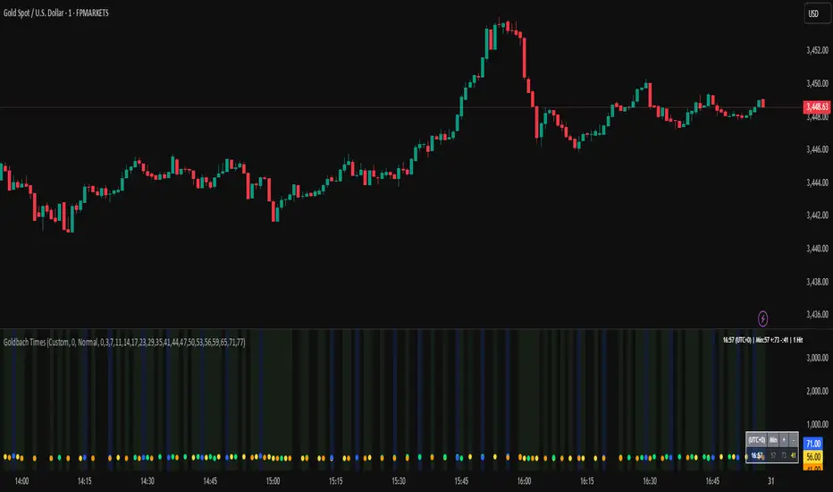
Regime Reaper | QuantEdgeB📊 Regime Reaper | QuantEdgeB
🔍 What is Regime Reaper?
Regime Reaper is QuantEdgeB’s premier regime detection engine, designed to quantify market behavior through a scientific blend of stationarity tests, trend diagnostics, and reversion signals.
Rather than guessing if a market is trending or mean-reverting, Regime Reaper mathematically determines it—blending econometrics with market momentum, volatility texture, and predictive correlation.
💡 Think of Regime Reaper as a financial MRI — probing deep statistical layers to tell you what kind of environment you're in before you make a move.
⚙️ Core Components
✅ Z-Blend Framework
At its core, Regime Reaper combines up to 15 independent signals, each normalized via Z-Scores, including:
• 🧪 Stationarity Tests: ADF, KPSS, PP Test — detecting mean-reverting pressure or randomness
• 🌀 Cycle Predictors: Hurst exponent, Fourier approximation
• 🔥 Trend Strength: ADX, Price Momentum Correlation (PMC), Relative Price Change
• 💣 Volatility Analysis: GARCH, BBW, VAM
• ⚡ Behavioral Texture: Choppiness Index, Wavelet Energy, Half-Life
Each signal is optionally enabled/disabled — allowing surgical custom blends tailored to your asset or timeframe.
✅ Z-Avg Value Engine
• All active signals are aggregated into a composite Z-Score (Z-Avg)
• This value forms the backbone of regime classification logic
• Combined with adaptive percentile thresholds for precision detection
🎯 Regime Classification Logic
🧭 Z-Avg-Based Threshold Model
Regime Reaper classifies markets into three states:
Z-Avg Score Market Regime
≥ Threshold + Percentile 🔺 Trending
≥ Threshold Only ⚖️ Neutral / Weak Trend
≤ Reversion Threshold 🔻 Mean-Reverting
These scores are colored, plotted, and displayed in a histogram view to make regime transitions immediately visible.
✅ Custom threshold values via:
• Trending Threshold
• Reverting Threshold
• Percentile Rank Comparison
📊 Dashboard Overlay (Optional)
Regime Reaper includes three live tables:
1. Metrics Panel (𝓡𝓮𝓰𝓲𝓶𝓮 𝓡𝓮𝓪𝓹𝓮𝓻)
o Displays the Z-Score of each active metric
o Highlights total Z-Blend Score
o Shows current regime stage (Trending, Reverting, Neutral)
2. Signal Scanner Table
o Explains current Z-Avg score & decision logic
o Displays thresholds for trend/revert neutrality
o Delivers a stage verdict with live updates
3. Info Panel
o Visual color-coded regime bars
o Snapshot of all 3 possible states
🎨 Visual Signal System
• Z-Avg Histogram — core value colored by regime state
• Background Coloring — lightly shades trending vs reverting periods
• Table Text Coloring — shows metric strength in live table updates
• User-Specified Color Themes — switch between Magic, Strategy, Cool, etc.
🧠 Why Use Regime Reaper?
Because knowing the market’s regime changes everything:
• Reversion strategies fail in strong trends
• Trend systems bleed during choppy reverts
• Random walks are dangerous to both
With Regime Reaper, you no longer have to guess — you measure.
💼 Ideal Use Cases
• Trend vs Mean-Reversion Filters
• System Mode Switching (Auto Toggle)
• Volatility Regime Adaptation
• Signal Confidence Boosting (by regime match)
• Portfolio Allocation Strategy Filters
🧬 Default Config
• Composite Model: All 15 metrics ON
• Trending Threshold: +0.15
• Reversion Threshold: −0.15
• Adaptive Filtering via Percentile Ranks
🧬 In Summary
Regime Reaper | QuantEdgeB is more than a filter — it's a regime recognition system built on powerful statistical indicators and dynamic Z-Score fusion. It doesn’t just observe behavior; it categorizes it.
Use it to confirm entries, time exits, suppress signals in bad regimes, or dynamically change your system logic.
📌 Trade the Right Logic in the Right Market | Powered by QuantEdgeB
🔹 Disclaimer: No indicator guarantees future performance.
🔹 Tip: Tune metric

Cross-Exchange Open Interest[nakano]## Cross-Exchange Open Interest
This Pine Script® indicator aggregates **Open Interest (OI)** across multiple exchanges and trading pairs, displaying it as a single, easy-to-understand candlestick chart. OI represents the total number of outstanding derivative contracts and is a crucial metric for gauging market sentiment and liquidity.
このPine Script®インジケーターは、複数の取引所と複数の取引ペアにわたる**オープンインタレスト (OI)** を集計し、単一の分かりやすいローソク足チャートとして表示します。OIは未決済のデリバティブ契約の総数を表し、市場のセンチメントと流動性を測る重要な指標となります。
### Key Features
* **Cross-Exchange Aggregation:** Integrates OI data from several major exchanges (e.g., Binance, OKX, BitMEX, Kraken). You can configure up to 10 exchange slots.
* **クロス取引所集計:** 複数の主要な取引所 (例: Binance, OKX, BitMEX, Kraken) からのOIデータを統合します。最大10個の取引所スロットを設定できます。
* **Multi-Pair Support:** For each exchange, you can specify multiple trading pairs (e.g., `USDT.P`, `USD.P`) separated by commas, and their OIs will be summed up.
* **複数ペアサポート:** 各取引所に対し、カンマ区切りで複数の取引ペア(例: `USDT.P`, `USD.P`)を指定し、それらのOIを合計して表示できます。
* **Flexible Asset Settings:**
* **Chart Symbol:** Automatically aggregates OI for the base asset of the current chart (e.g., BTC if on a BTCUSDT chart).
* **Custom Asset:** Allows you to manually specify a base asset (e.g., ETH, SOL) for OI aggregation.
* **柔軟な資産設定:**
* **チャートシンボルに連動:** 現在表示しているチャートの基本資産(例: BTCUSDTチャートならBTC)のOIを自動的に集計します。
* **カスタム資産:** 特定の基本資産(例: ETH, SOL)のOIを手動で指定して集計することも可能です。
* **OI Candlestick Display:** Plots the aggregated OI data as candlesticks.
* **Up/Down Candles:** OI increases are shown as "up" candles, and decreases as "down" candles, with customizable colors.
* **OIローソク足表示:** 集計されたOIデータをローソク足としてプロットします。
* **陽線/陰線:** OIが増加した場合は陽線、減少した場合は陰線として表示され、色をカスタマイズできます。
* **Bar Coloring based on OI Change:** Features the ability to change the color of the main chart's price bars based on significant OI changes.
* **Dynamic Threshold:** Calculates a dynamic threshold based on historical OI changes and a user-defined multiplier to automatically identify "significant changes" in OI.
* **Color-coded:** Highlights the main chart's bars with customizable colors when there is a large increase or decrease in OI.
* **OI変化に基づくバーカラーリング:** メインチャートの価格バーの色を、OIの大きな変化に基づいて変更する機能があります。
* **動的閾値:** 過去のOI変化を基に動的な閾値を計算し、設定した乗数に応じてOIの「大きな変化」を自動で識別します。
* **色分け:** OIの大幅な増加または減少があった場合に、メインチャートのバーをカスタマイズ可能な色でハイライトします。
* **Debug Table (Optional):** When enabled, a debug table appears on the chart, showing raw OI data, quantity-based OI, and USD-converted OI for each exchange and pair in real-time, which helps in verifying the data.
* **デバッグテーブル (オプション):** 有効にすると、各取引所・ペアごとの生OIデータ、数量ベースのOI、USD換算OIをリアルタイムで表示するデバッグテーブルがチャート上に表示され、データの確認に役立ちます。
### How to Use
This indicator helps you understand the overall trend of open positions for a specific asset across the market. An increase in OI generally indicates an influx of capital and growing market interest, while a decrease suggests the opposite. By combining price movements with OI changes, you can gain deeper insights into bullish/bearish signals and the potential for trend continuation or reversal.
このインジケーターは、特定の資産に対する市場全体の未決済ポジションの動向を把握するのに役立ちます。OIの増加は通常、市場への資金流入と関心の高まりを示し、OIの減少はその逆を示唆します。価格変動とOIの変化を組み合わせることで、市場の強気・弱気の兆候や、トレンドの継続・反転の可能性をより深く分析することが可能です。
### Settings
* **OI Candle Settings:** Configure the colors for the up and down OI candles.
* **OIローソク足設定:** OIローソク足の陽線と陰線の色を設定します。
* **Asset & Exchange Settings:**
* **Asset Source:** Choose "Chart Symbol" to link to the current chart's symbol, or "Custom" to specify the asset in "Base Asset (Custom)".
* **Slot 1-10:** Enable/disable each exchange slot and set the exchange name and comma-separated trading pairs you wish to aggregate.
* **資産と取引所の設定:**
* **資産ソース:** 「Chart Symbol」を選択すると現在のチャートのシンボルに連動し、「Custom」を選択すると「Base Asset (Custom)」で指定した資産のOIを集計します。
* **スロット 1-10:** 各スロットで取引所を有効/無効にし、取引所名と、集計したい取引ペア(カンマ区切り)を設定します。
* **Bar Coloring on OI Change:**
* **Enable Bar Coloring:** Toggles whether the main chart's bars change color based on significant OI changes.
* **Threshold Calculation Period / Multiplier:** Sets the period and multiplier for dynamic threshold calculation.
* **OI Increase Color / OI Decrease Color:** Sets the colors applied to the main chart's bars for large OI increases/decreases.
* **OI変化に基づくバーカラーリング:**
* **バーカラーリングを有効にする:** OIの大きな変化に基づいてメインチャートのバーの色を変更するかどうかを切り替えます。
* **閾値計算期間 / 乗数:** 動的な閾値計算に使用する期間と乗数を設定します。
* **OI増加時の色 / OI減少時の色:** OIの大きな増加/減少があった場合にメインチャートのバーに適用される色を設定します。
* **Debug Table Settings:**
* **Show Debug Table:** Toggles the display of the debug table and sets its position.
* **Font Size / BG Color:** Configures the font size and background color for the debug table.
* **デバッグテーブル設定:**
* **デバッグテーブルを表示:** デバッグテーブルの表示/非表示を切り替え、表示位置を設定します。
* **フォントサイズ / 背景色:** デバッグテーブルのフォントサイズと背景色を設定します。

EMI, RSI, Pivot based technical IndicatorsMulti-Indicator Trading Toolkit for Comprehensive Market Analysis
This Pine Script-based trading tool integrates multiple technical indicators to provide traders with a holistic view of market trends, volatility, and key price levels. Designed for flexibility, the script allows users to customize settings to match their trading strategy.
Key Features & Functionalities
1. Exponential Moving Averages (EMA)
Plots four configurable EMAs (default: 9, 21, 50, and 200) to identify trend direction and potential support/resistance zones.
2. Relative Strength Index (RSI)
Calculates RSI (default length: 14) to highlight overbought (70) and oversold (30) market conditions.
Customizable thresholds allow traders to adapt the RSI to different market conditions.
3. Pivot Points with Support & Resistance Levels
Computes pivot levels based on the previous day’s high, low, and close.
Includes dynamic support (S1-S5) and resistance (R1-R5) levels to assist in trade decision-making.
4. Volume-Weighted Average Price (VWAP)
Tracks the average price weighted by volume over a session, helping traders determine fair value zones.
5. Opening Range Breakout (ORB)
Identifies potential breakout opportunities based on the highest and lowest price within a user-defined opening range (5m, 15m, or 30m, etc.).
Highlights these levels to assist in trade entries and exits.
6. Multi-Timeframe RSI Analysis
Retrieves and displays RSI values from multiple timeframes (e.g., 1m, 5m, 15m, 1H, 1D).
Helps traders analyze RSI trends across different timeframes in a single view.
7. Volatility Index (VIX) Tracking
Monitors VIX data to gauge market volatility.
Displays daily percentage change and short-term variations (15 min, 1 hour), aiding in risk assessment.
8. Dynamic Table Display
Organizes key data (RSI values, VIX levels, and volatility changes) in customizable tables for an easy-to-read format.
Users can modify table position, colors, and display settings for personalized analysis.
9. Advanced Plotting for Visual Clarity
Clearly plots EMA, RSI, pivot levels, ORB levels, VWAP, and VIX movements on the chart.
Uses distinct colors and styles to enhance readability.
10. Customizable Inputs for Personalized Analysis
Provides a user-friendly input panel to modify settings, including EMA periods, RSI thresholds, ORB duration, table position, and plotting preferences.
Enables traders to tailor the script to their preferred trading style.
🧠 How the Indicators Work Together (Strategy Logic)
This script is not just a visual dashboard of common indicators — it’s a cohesive trading assistant designed to help traders make data-driven decisions through multi-layered confluence logic:
1. Trend Confirmation using EMAs:
The combination of 9/21/50/200 EMAs filters trades based on overall trend strength.
For example, long trades are considered only when the 21 EMA is above the 50 EMA and price is above the 9 EMA, confirming bullish momentum.
2. Momentum Alignment via Multi-Timeframe RSI:
Traditional RSI can give early or false signals. This script fetches RSI values from multiple timeframes (1m, 5m, 15m, 1H, 1D) to identify consistent strength or weakness across market structures.
3. Only when RSI is oversold/overbought across multiple timeframes does the signal become valid — reducing noise.
Breakout Confirmation with ORB + VWAP:
The script detects opening range breakouts (ORB) and filters them using VWAP and EMA zones to confirm whether breakouts are supported by volume and trend.
For instance, a long breakout above the ORB high is validated only when price is also above VWAP and EMAs align.
4. Volatility Context with VIX:
Incorporates VIX changes (live, 15m, 1h) to assess whether market conditions favor breakouts or consolidation.
If VIX is rising sharply, the script highlights caution zones — useful for adjusting position size or avoiding false breakouts.
5. Dynamic Signal Filtering:
Instead of triggering alerts directly, this script displays aligned conditions visually in a dynamic table.
Traders can see at a glance whether all confluence layers are in agreement, helping reduce over trading and enhance timing.
🌟 What Makes This Script Unique
✅ Strategic Integration of trend, momentum, volatility, and range-breakout concepts — not just plotted indicators.
✅ Multi-timeframe RSI logic presented in a table — letting traders spot alignment across timeframes without switching charts.
✅ Built-in volatility filter (VIX) for risk context, a feature rarely combined with ORB and trend indicators in a single script.
✅ Adaptive to all timeframes and instruments, especially useful for high-beta indices like Bank Nifty or Nasdaq.
✅ User-friendly customization, allowing traders to tailor everything from ORB window size to table position and indicator settings.
This all-in-one trading toolkit is designed for traders seeking a structured, data-driven approach to technical analysis. Whether you’re a short-term trader or a long-term investor, this script offers the flexibility and insight needed to navigate the markets effectively.

Massive Market Order Detector by GSK-VIZAG-AP-INDIA
Massive Market Order Detector by GSK-VIZAG-AP-INDIA
Purpose of the Indicator:
This indicator is designed to detect massive market orders (high-volume trades) in real-time, helping traders identify potential accumulation or distribution zones. It highlights sudden spikes in volume that exceed a calculated threshold, signaling strong buying or selling pressure.
Core Logic & Unique Aspects:
Volume Spike Detection: Compares the current volume to the average volume over a user-defined lookback period. If the volume exceeds the threshold (calculated using a multiplier), it is classified as a Massive Order.
Buy vs. Sell Order Identification: Determines whether the detected massive order is a buy (green marker) or a sell (red marker) based on candlestick price action.
Time Zone Adjustment: Allows traders to adjust the timestamp according to their local timezone, ensuring accurate interpretation of order timings.
Table Display of Recent Orders: A table is created within the chart to list the last 15 detected massive orders, showing key details such as time, volume, type (buy/sell), price, and volume percentage change.
How It Works:
The indicator calculates the average volume over a lookback period (default: 20 bars).
If the current volume exceeds the threshold (average volume × multiplier), it is marked as a Massive Order.
The order is classified as:
Massive Buy Order (MB) → If the closing price is higher than the opening price.
Massive Sell Order (MS) → If the closing price is lower than the opening price.
The detected orders are visually represented as green (MB) and red (MS) labels on the chart.
The most recent 15 massive orders are logged in a table for easy reference.
Intended Use Cases:
🔹 Scalping & Intraday Trading – Spot unusual market activity to enter or exit trades quickly.
🔹 Swing Trading – Identify strong buying or selling pressure at key support/resistance levels.
🔹 Breakout Confirmation – Validate if price breakouts are backed by significant volume.
🔹 Market Manipulation Detection – Recognize potential institutional buying/selling activity.
Input settings:
Lookback Period: Adjust the number of bars to calculate average volume.
Volume Multiplier: Set the threshold as 1/2/3 for defining a massive order.
Time Zone Offset: Modify timestamps to match your local market time.
Max Signals in Table: Control how many signals are displayed in the table.
Why Use This Indicator?
✅ Identifies smart money activity
✅ Works across multiple timeframes (5m, 15m, 1H, Daily, etc.)
✅ No repainting – Reliable real-time signals
✅ Easy-to-read visual cues & table logs
Disclaimer:
"This indicator is for educational and informational purposes only and should not be considered financial advice. Always do your own research (DYOR) and consult with a qualified financial professional before making investment decisions. Trading involves significant risk, and past performance does not guarantee future results. I am not a licensed financial advisor and hold no liability for any losses incurred. This indicator may not work in all market conditions, and results are based on backtesting or hypothetical scenarios. Use at your own discretion and ensure compliance with local regulations."
