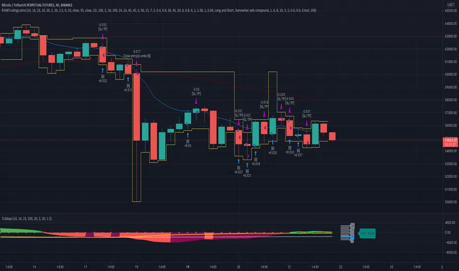
Ruckard TradingLatinoThis strategy tries to mimic TradingLatino strategy.
The current implementation is beta.
Si hablas castellano o espanyol por favor consulta MENSAJE EN CASTELLANO más abajo.
It's aimed at BTCUSDT pair and 4h timeframe.
STRATEGY DEFAULT SETTINGS EXPLANATION
max_bars_back=5000 : This is a random number of bars so that the strategy test lasts for one or two years
calc_on_order_fills=false : To wait for the 4h closing is too much. Try to check if it's worth entering a position after closing one. I finally decided not to recheck if it's worth entering after an order is closed. So it is false.
calc_on_every_tick=false
pyramiding=0 : We only want one entry allowed in the same direction. And we don't want the order to scale by error.
initial_capital=1000 : These are 1000 USDT. By using 1% maximum loss per trade and 7% as a default stop loss by using 1000 USDT at 12000 USDT per BTC price you would entry with around 142 USDT which are converted into: 0.010 BTC . The maximum number of decimal for contracts on this BTCUSDT market is 3 decimals. E.g. the minimum might be: 0.001 BTC . So, this minimal 1000 amount ensures us not to entry with less than 0.001 entries which might have happened when using 100 USDT as an initial capital.
slippage=1 : Binance BTCUSDT mintick is: 0.01. Binance slippage: 0.1 % (Let's assume). TV has an integer slippage. It does not have a percentage based slippage. If we assume a 1000 initial capital, the recommended equity is 142 which at 11996 USDT per BTC price means: 0.011 BTC. The 0.1% slippage of: 0.011 BTC would be: 0.000011 . This is way smaller than the mintick. So our slippage is going to be 1. E.g. 1 (slippage) * 0.01 (mintick)
commission_type=strategy.commission.percent and commission_value=0.1 : According to: binance . com / en / fee / schedule in VIP 0 level both maker and taker fees are: 0.1 %.
BACKGROUND
Jaime Merino is a well known Youtuber focused on crypto trading
His channel TradingLatino
features monday to friday videos where he explains his strategy.
JAIME MERINO STANCE ON BOTS
Jaime Merino stance on bots (taken from memory out of a 2020 June video from him):
'~
You know. They can program you a bot and it might work.
But, there are some special situations that the bot would not be able to handle.
And, I, as a human, I would handle it. And the bot wouldn't do it.
~'
My long term target with this strategy script is add as many
special situations as I can to the script
so that it can match Jaime Merino behaviour even in non normal circumstances.
My alternate target is learn Pine script
and enjoy programming with it.
WARNING
This script might be bigger than other TradingView scripts.
However, please, do not be confused because the current status is beta.
This script has not been tested with real money.
This is NOT an official strategy from Jaime Merino.
This is NOT an official strategy from TradingLatino . net .
HOW IT WORKS
It basically uses ADX slope and LazyBear's Squeeze Momentum Indicator
to make its buy and sell decisions.
Fast paced EMA being bigger than slow paced EMA
(on higher timeframe) advices going long.
Fast paced EMA being smaller than slow paced EMA
(on higher timeframe) advices going short.
It finally add many substrats that TradingLatino uses.
SETTINGS
__ SETTINGS - Basics
____ SETTINGS - Basics - ADX
(ADX) Smoothing {14}
(ADX) DI Length {14}
(ADX) key level {23}
____ SETTINGS - Basics - LazyBear Squeeze Momentum
(SQZMOM) BB Length {20}
(SQZMOM) BB MultFactor {2.0}
(SQZMOM) KC Length {20}
(SQZMOM) KC MultFactor {1.5}
(SQZMOM) Use TrueRange (KC) {True}
____ SETTINGS - Basics - EMAs
(EMAS) EMA10 - Length {10}
(EMAS) EMA10 - Source {close}
(EMAS) EMA55 - Length {55}
(EMAS) EMA55 - Source {close}
____ SETTINGS - Volume Profile
Lowest and highest VPoC from last three days
is used to know if an entry has a support
VPVR of last 100 4h bars
is also taken into account
(VP) Use number of bars (not VP timeframe): Uses 'Number of bars {100}' setting instead of 'Volume Profile timeframe' setting for calculating session VPoC
(VP) Show tick difference from current price {False}: BETA . Might be useful for actions some day.
(VP) Number of bars {100}: If 'Use number of bars (not VP timeframe)' is turned on this setting is used to calculate session VPoC.
(VP) Volume Profile timeframe {1 day}: If 'Use number of bars (not VP timeframe)' is turned off this setting is used to calculate session VPoC.
(VP) Row width multiplier {0.6}: Adjust how the extra Volume Profile bars are shown in the chart.
(VP) Resistances prices number of decimal digits : Round Volume Profile bars label numbers so that they don't have so many decimals.
(VP) Number of bars for bottom VPOC {18}: 18 bars equals 3 days in suggested timeframe of 4 hours. It's used to calculate lowest session VPoC from previous three days. It's also used as a top VPOC for sells.
(VP) Ignore VPOC bottom advice on long {False}: If turned on it ignores bottom VPOC (or top VPOC on sells) when evaluating if a buy entry is worth it.
(VP) Number of bars for VPVR VPOC {100}: Number of bars to calculate the VPVR VPoC. We use 100 as Jaime once used. When the price bounces back to the EMA55 it might just bounce to this VPVR VPoC if its price it's lower than the EMA55 (Sells have inverse algorithm).
____ SETTINGS - ADX Slope
ADX Slope
help us to understand if ADX
has a positive slope, negative slope
or it is rather still.
(ADXSLOPE) ADX cut {23}: If ADX value is greater than this cut (23) then ADX has strength
(ADXSLOPE) ADX minimum steepness entry {45}: ADX slope needs to be 45 degrees to be considered as a positive one.
(ADXSLOPE) ADX minimum steepness exit {45}: ADX slope needs to be -45 degrees to be considered as a negative one.
(ADXSLOPE) ADX steepness periods {3}: In order to avoid false detection the slope is calculated along 3 periods.
____ SETTINGS - Next to EMA55
(NEXTEMA55) EMA10 to EMA55 bounce back percentage {80}: EMA10 might bounce back to EMA55 or maybe to 80% of its complete way to EMA55
(NEXTEMA55) Next to EMA55 percentage {15}: How much next to the EMA55 you need to be to consider it's going to bounce back upwards again.
____ SETTINGS - Stop Loss and Take Profit
You can set a default stop loss or a default take profit.
(STOPTAKE) Stop Loss % {7.0}
(STOPTAKE) Take Profit % {2.0}
____ SETTINGS - Trailing Take Profit
You can customize the default trailing take profit values
(TRAILING) Trailing Take Profit (%) {1.0}: Trailing take profit offset in percentage
(TRAILING) Trailing Take Profit Trigger (%) {2.0}: When 2.0% of benefit is reached then activate the trailing take profit.
____ SETTINGS - MAIN TURN ON/OFF OPTIONS
(EMAS) Ignore advice based on emas {false}.
(EMAS) Ignore advice based on emas (On closing long signal) {False}: Ignore advice based on emas but only when deciding to close a buy entry.
(SQZMOM) Ignore advice based on SQZMOM {false}: Ignores advice based on SQZMOM indicator.
(ADXSLOPE) Ignore advice based on ADX positive slope {false}
(ADXSLOPE) Ignore advice based on ADX cut (23) {true}
(STOPTAKE) Take Profit? {false}: Enables simple Take Profit.
(STOPTAKE) Stop Loss? {True}: Enables simple Stop Loss.
(TRAILING) Enable Trailing Take Profit (%) {True}: Enables Trailing Take Profit.
____ SETTINGS - Strategy mode
(STRAT) Type Strategy: 'Long and Short', 'Long Only' or 'Short Only'. Default: 'Long and Short'.
____ SETTINGS - Risk Management
(RISKM) Risk Management Type: 'Safe', 'Somewhat safe compound' or 'Unsafe compound'. ' Safe ': Calculations are always done with the initial capital (1000) in mind. The maximum losses per trade/day/week/month are taken into account. ' Somewhat safe compound ': Calculations are done with initial capital (1000) or a higher capital if it increases. The maximum losses per trade/day/week/month are taken into account. ' Unsafe compound ': In each order all the current capital is gambled and only the default stop loss per order is taken into account. That means that the maximum losses per trade/day/week/month are not taken into account. Default : 'Somewhat safe compound'.
(RISKM) Maximum loss per trade % {1.0}.
(RISKM) Maximum loss per day % {6.0}.
(RISKM) Maximum loss per week % {8.0}.
(RISKM) Maximum loss per month % {10.0}.
____ SETTINGS - Decimals
(DECIMAL) Maximum number of decimal for contracts {3}: How small (3 decimals means 0.001) an entry position might be in your exchange.
EXTRA 1 - PRICE IS IN RANGE indicator
(PRANGE) Print price is in range {False}: Enable a bottom label that indicates if the price is in range or not.
(PRANGE) Price range periods {5}: How many previous periods are used to calculate the medians
(PRANGE) Price range maximum desviation (%) {0.6} ( > 0 ): Maximum positive desviation for range detection
(PRANGE) Price range minimum desviation (%) {0.6} ( > 0 ): Mininum negative desviation for range detection
EXTRA 2 - SQUEEZE MOMENTUM Desviation indicator
(SQZDIVER) Show degrees {False}: Show degrees of each Squeeze Momentum Divergence lines to the x-axis.
(SQZDIVER) Show desviation labels {False}: Whether to show or not desviation labels for the Squeeze Momentum Divergences.
(SQZDIVER) Show desviation lines {False}: Whether to show or not desviation lines for the Squeeze Momentum Divergences.
EXTRA 3 - VOLUME PROFILE indicator
WARNING: This indicator works not on current bar but on previous bar. So in the worst case it might be VP from 4 hours ago. Don't worry, inside the strategy calculus the correct values are used. It's just that I cannot show the most recent one in the chart.
(VP) Print recent profile {False}: Show Volume Profile indicator
(VP) Avoid label price overlaps {False}: Avoid label prices to overlap on the chart.
EXTRA 4 - ZIGNALY SUPPORT
(ZIG) Zignaly Alert Type {Email}: 'Email', 'Webhook'. ' Email ': Prepare alert_message variable content to be compatible with zignaly expected email content format. ' Webhook ': Prepare alert_message variable content to be compatible with zignaly expected json content format.
EXTRA 5 - DEBUG
(DEBUG) Enable debug on order comments {False}: If set to true it prepares the order message to match the alert_message variable. It makes easier to debug what would have been sent by email or webhook on each of the times an order is triggered.
HOW TO USE THIS STRATEGY
BOT MODE: This is the default setting.
PROPER VOLUME PROFILE VIEWING: Click on this strategy settings. Properties tab. Make sure Recalculate 'each time the order was run' is turned off.
NEWBIE USER: (Check PROPER VOLUME PROFILE VIEWING above!) You might want to turn on the 'Print recent profile {False}' setting. Alternatively you can use my alternate realtime study: 'Resistances and supports based on simplified Volume Profile' but, be aware, it might consume one indicator.
ADVANCED USER 1: Turn on the 'Print price is in range {False}' setting and help us to debug this subindicator. Also help us to figure out how to include this value in the strategy.
ADVANCED USER 2: Turn on the all the (SQZDIVER) settings and help us to figure out how to include this value in the strategy.
ADVANCED USER 3: (Check PROPER VOLUME PROFILE VIEWING above!) Turn on the 'Print recent profile {False}' setting and report any problem with it.
JAIME MERINO: Just use the indicator as it comes by default. It should only show BUY signals, SELL signals and their associated closing signals. From time to time you might want to check 'ADVANCED USER 2' instructions to check that there's actually a divergence. Check also 'ADVANCED USER 1' instructions for your amusement.
EXTRA ADVICE
It's advised that you use this strategy in addition to these two other indicators:
* Squeeze Momentum Indicator
* ADX
so that your chart matches as close as possible to TradingLatino chart.
ZIGNALY INTEGRATION
This strategy supports Zignaly email integration by default. It also supports Zignaly Webhook integration.
ZIGNALY INTEGRATION - Email integration example
What you would write in your alert message:
||{{strategy.order.alert_message}}||key=MYSECRETKEY||
ZIGNALY INTEGRATION - Webhook integration example
What you would write in your alert message:
{ {{strategy.order.alert_message}} , "key" : "MYSECRETKEY" }
CREDITS
I have reused and adapted some code from
'Directional Movement Index + ADX & Keylevel Support' study
which it's from TradingView console user.
I have reused and adapted some code from
'3ema' study
which it's from TradingView hunganhnguyen1193 user.
I have reused and adapted some code from
'Squeeze Momentum Indicator ' study
which it's from TradingView LazyBear user.
I have reused and adapted some code from
'Strategy Tester EMA-SMA-RSI-MACD' study
which it's from TradingView fikira user.
I have reused and adapted some code from
'Support Resistance MTF' study
which it's from TradingView LonesomeTheBlue user.
I have reused and adapted some code from
'TF Segmented Linear Regression' study
which it's from TradingView alexgrover user.
I have reused and adapted some code from
"Poor man's volume profile" study
which it's from TradingView IldarAkhmetgaleev user.
FEEDBACK
Please check the strategy source code for more detailed information
where, among others, I explain all of the substrats
and if they are implemented or not.
Q1. Did I understand wrong any of the Jaime substrats (which I have implemented)?
Q2. The strategy yields quite profit when we should long (EMA10 from 1d timeframe is higher than EMA55 from 1d timeframe.
Why the strategy yields much less profit when we should short (EMA10 from 1d timeframe is lower than EMA55 from 1d timeframe)?
Any idea if you need to do something else rather than just reverse what Jaime does when longing?
FREQUENTLY ASKED QUESTIONS
FAQ1. Why are you giving this strategy for free?
TradingLatino and his fellow enthusiasts taught me this strategy. Now I'm giving back to them.
FAQ2. Seriously! Why are you giving this strategy for free?
I'm confident his strategy might be improved a lot. By keeping it to myself I would avoid other people contributions to improve it.
Now that everyone can contribute this is a win-win.
FAQ3. How can I connect this strategy to my Exchange account?
It seems that you can attach alerts to strategies.
You might want to combine it with a paying account which enable Webhook URLs to work.
I don't know how all of this works right now so I cannot give you advice on it.
You will have to do your own research on this subject. But, be careful. Automating trades, if not done properly,
might end on you automating losses.
FAQ4. I have just found that this strategy by default gives more than 3.97% of 'maximum series of losses'. That's unacceptable according to my risk management policy.
You might want to reduce default stop loss setting from 7% to something like 5% till you are ok with the 'maximum series of losses'.
FAQ5. Where can I learn more about your work on this strategy?
Check the source code. You might find unused strategies. Either because there's not a substantial increases on earnings. Or maybe because they have not been implemented yet.
FAQ6. How much leverage is applied in this strategy?
No leverage.
FAQ7. Any difference with original Jaime Merino strategy?
Most of the times Jaime defines an stop loss at the price entry. That's not the case here. The default stop loss is 7% (but, don't be confused it only means losing 1% of your investment thanks to risk management). There's also a trailing take profit that triggers at 2% profit with a 1% trailing.
FAQ8. Why this strategy return is so small?
The strategy should be improved a lot. And, well, backtesting in this platform is not guaranteed to return theoric results comparable to real-life returns. That's why I'm personally forward testing this strategy to verify it.
MENSAJE EN CASTELLANO
En primer lugar se agradece feedback para mejorar la estrategia.
Si eres un usuario avanzado y quieres colaborar en mejorar el script no dudes en comentar abajo.
Ten en cuenta que aunque toda esta descripción tenga que estar en inglés no es obligatorio que el comentario esté en inglés.
CHISTE - CASTELLANO
¡Pero Jaime!
¡400.000!
¡Tu da mun!
在脚本中搜索"THE SCRIPT"
Filter Information Box - PineCoders FAQWhen designing filters it can be interesting to have information about their characteristics, which can be obtained from the set of filter coefficients (weights). The following script analyzes the impulse response of a filter in order to return the following information:
Lag
Smoothness via the Herfindahl index
Percentage Overshoot
Percentage Of Positive Weights
The script also attempts to determine the type of the analyzed filter, and will issue warnings when the filter shows signs of unwanted behavior.
DISPLAYED INFORMATION AND METHODS
The script displays one box on the chart containing two sections. The filter metrics section displays the following information:
- Lag : Measured in bars and calculated from the convolution between the filter's impulse response and a linearly increasing sequence of value 0,1,2,3... . This sequence resets when the impulse response crosses under/over 0.
- Herfindahl index : A measure of the filter's smoothness described by Valeriy Zakamulin. The Herfindahl index measures the concentration of the filter weights by summing the squared filter weights, with lower values suggesting a smoother filter. With normalized weights the minimum value of the Herfindahl index for low-pass filters is 1/N where N is the filter length.
- Percentage Overshoot : Defined as the maximum value of the filter step response, minus 1 multiplied by 100. Larger values suggest higher overshoots.
- Percentage Positive Weights : Percentage of filter weights greater than 0.
Each of these calculations is based on the filter's impulse response, with the impulse position controlled by the Impulse Position setting (its default is 1000). Make sure the number of inputs the filter uses is smaller than Impulse Position and that the number of bars on the chart is also greater than Impulse Position . In order for these metrics to be as accurate as possible, make sure the filter weights add up to 1 for low-pass and band-stop filters, and 0 for high-pass and band-pass filters.
The comments section displays information related to the type of filter analyzed. The detection algorithm is based on the metrics described above. The script can detect the following type of filters:
All-Pass
Low-Pass
High-Pass
Band-Pass
Band-Stop
It is assumed that the user is analyzing one of these types of filters. The comments box also displays various warnings. For example, a warning will be displayed when a low-pass/band-stop filter has a non-unity pass-band, and another is displayed if the filter overshoot is considered too important.
HOW TO SET THE SCRIPT UP
In order to use this script, the user must first enter the filter settings in the section provided for this purpose in the top section of the script. The filter to be analyzed must then be entered into the:
f(input)
function, where `input` is the filter's input source. By default, this function is a simple moving average of period length . Be sure to remove it.
If, for example, we wanted to analyze a Blackman filter, we would enter the following:
f(input)=>
pi = 3.14159,sum = 0.,sumw = 0.
for i = 0 to length-1
k = i/length
w = 0.42 - 0.5 * cos(2 * pi * k) + 0.08 * cos(4 * pi * k)
sumw := sumw + w
sum := sum + w*input
sum/sumw
EXAMPLES
In this section we will look at the information given by the script using various filters. The first filter we will showcase is the linearly weighted moving average (WMA) of period 9.
As we can see, its lag is 2.6667, which is indeed correct as the closed form of the lag of the WMA is equal to (period-1)/3 , which for period 9 gives (9-1)/3 which is approximately equal to 2.6667. The WMA does not have overshoots, this is shown by the the percentage overshoot value being equal to 0%. Finally, the percentage of positive weights is 100%, as the WMA does not possess negative weights.
Lets now analyze the Hull moving average of period 9. This moving average aims to provide a low-lag response.
Here we can see how the lag is way lower than that of the WMA. We can also see that the Herfindahl index is higher which indicates the WMA is smoother than the HMA. In order to reduce lag the HMA use negative weights, here 55% (as there are 45% of positive ones). The use of negative weights creates overshoots, we can see with the percentage overshoot being 26.6667%.
The WMA and HMA are both low-pass filters. In both cases the script correctly detected this information. Let's now analyze a simple high-pass filter, calculated as follows:
input - sma(input,length)
Most weights of a high-pass filters are negative, which is why the lag value is negative. This would suggest the indicator is able to predict future input values, which of course is not possible. In the case of high-pass filters, the Herfindahl index is greater than 0.5 and converges toward 1, with higher values of length . The comment box correctly detected the type of filter we were using.
Let's now test the script using the simple center of gravity bandpass filter calculated as follows:
wma(input,length) - sma(input,length)
The script correctly detected the type of filter we are using. Another type of filter that the script can detect is band-stop filters. A simple band-stop filter can be made as follows:
input - (wma(input,length) - sma(input,length))
The script correctly detect the type of filter. Like high-pass filters the Herfindahl index is greater than 0.5 and converges toward 1, with greater values of length . Finally the script can detect all-pass filters, which are filters that do not change the frequency content of the input.
WARNING COMMENTS
The script can give warning when certain filter characteristics are detected. One of them is non-unity pass-band for low-pass filters. This warning comment is displayed when the weights of the filter do not add up to 1. As an example, let's use the following function as a filter:
sum(input,length)
Here the filter pass-band has non unity, and the sum of the weights is equal to length . Therefore the script would display the following comments:
We can also see how the metrics go wild (note that no filter type is detected, as the detected filter could be of the wrong type). The comment mentioning the detection of high overshoot appears when the percentage overshoot is greater than 50%. For example if we use the following filter:
5*wma(input,length) - 4*sma(input,length)
The script would display the following comment:
We can indeed see high overshoots from the filter:
@alexgrover for PineCoders
Look first. Then leap.

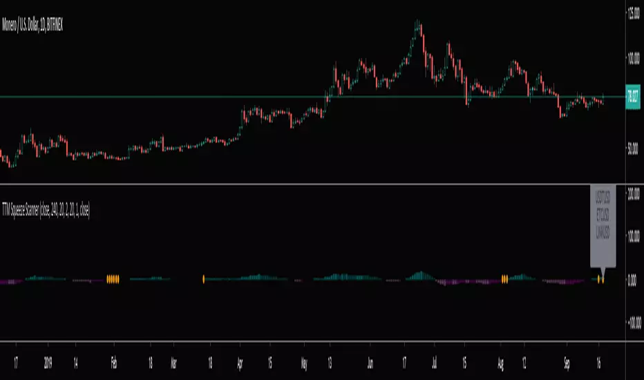
TTM Squeeze Scanner This script scans for TTM Squeezes for the crypto symbols included in the body of the script. The timeframe for the squeeze scan is controlled within the input not the chart.
This script is a merge of @Nico.Muselle's TTM Squeeze script and @QuantNomad's custom screener script. Thanks to both of them!
Dynamic Trend-Based Fibonacci Extension💡 This indicator is a sophisticated, automated technical analysis tool designed to identify high-probability trend continuation setups using the principles of market structure and Fibonacci geometry. By algorithmically detecting "A-B-C" price structures (Pivot -> Impulse -> Retracement), it projects dynamic Fibonacci Extension levels to forecast potential price targets for the next impulsive move (Wave C to D). Unlike static drawing tools, this script adapts to market volatility and features an advanced invalidation engine to keep your charts clean and your risk managed.
✨ Originality and Utility
Traders often struggle with the subjectivity of drawing Fibonacci extensions manually. This script solves that by standardizing the identification of market structure using a proprietary ZigZag algorithm enhanced with Average True Range (ATR) for volatility-adjusted sensitivity.
Key unique features include:
Automated Structure Detection: Instantly spots Bullish (Higher High, Higher Low) and Bearish (Lower Low, Lower High) sequences without manual input.
Dynamic Invalidation: The script monitors price action in real-time. If price breaks the invalidation point (Point A), the structure is immediately "grayed out" or deleted, preventing you from trading based on broken setups.
Golden Zone Targeting: Highlights the high-probability reversal zone between the 1.5 and 1.618 extensions, often associated with the completion of a measured move.
JSON Alerting: Built-in support for algorithmic trading with structured JSON payloads (Entry, TP, SL) ready for webhook integration.
🔬 Methodology and Concepts
The core logic operates on a three-step algorithmic sequence:
1. Pivot Identification: The script uses a "ZigZag" approach to find significant swing highs and lows. It employs an ATR-based threshold (or fixed deviation) to filter out market noise, ensuring only significant structural points are considered.
2. Geometric Validation: It evaluates the last three pivot points (A, B, C) to confirm a valid trend structure.
Bullish Setup: Point C must be higher than Point A but lower than Point B (a valid retracement).
Bearish Setup: Point C must be lower than Point A but higher than Point B.
3. Projection Mathematics: Once a valid ABC structure is locked, the script calculates extension targets using the standard formula: Target = Price C + ((Price B - Price A) * Ratio) . It also supports Logarithmic Scale calculations for assets with exponential growth, such as cryptocurrencies, ensuring proportional accuracy over large price ranges.
🎨 Visual Guide
The indicator paints a clear, detailed roadmap on your chart. Here is how to interpret the visual elements:
● Structure Lines
Solid Line (A to B): Represents the initial "Impulse" leg of the move.
Dashed Line (B to C): Represents the "Retracement" or corrective leg.
Green Structures: Indicate Bullish setups (looking for long entries).
Red Structures: Indicate Bearish setups (looking for short entries).
Gray/Dimmed Structures: These are invalidated setups where the price has breached the Stop Loss level (Point A).
● Extension Levels (Targets)
The script projects the following key Fibonacci ratios extending from Point C:
0.618 (Wave 5): An early profit-taking level, often corresponding to a truncated 5th wave.
1.0 (Measured Move): Where the extension equals the length of the initial impulse (AB = CD pattern).
1.272 (Harmonic): A common extension level for corrective structures or deep pullbacks.
Golden Zone (1.5 - 1.618): A highlighted fill area. The 1.618 level (Solid Line) is the "Golden Ratio" and is statistically one of the most significant targets in trending markets, often labeled as "Wave 3".
● Labels
Points A, B, C: Clearly marks the swing points defining the structure.
Right-Side Labels: Display the Ratio (e.g., 1.618) and the exact Price Level for easy order placement.
📖 How to Use
This tool is best used as a trend-following system.
1. Trend Identification
Wait for a new Solid Colored Structure (Green or Red) to appear. This confirms that a valid ABC retracement has occurred.
2. Entry Strategy
The "Trigger" is generally the reversal from Point C. Aggressive traders enter near C, while conservative traders may wait for a breakout above B.
Stop Loss: Place your SL just beyond Point A . If price breaks A, the script will automatically gray out the structure, signaling invalidation.
3. Profit Taking
Use the projected extension lines as dynamic Take Profit (TP) zones:
TP1: 1.0 (The Measured Move).
TP2: The Golden Zone (1.5 to 1.618). This is often the strongest target for a Wave 3 impulsive move.
4. Automation
For automated traders, create an alert using the "Any alert() function call" option. The script outputs a JSON string containing the Action, Ticker, Entry Price, TP (1.618), and SL (Point A).
⚙️ Inputs and Settings
You can fully customize the script to fit your asset class and timeframe:
● ZigZag Detection
Pivot Lookback Depth: (Default: 5) Determines how many bars to check left/right for a pivot. Higher numbers find larger, more significant structures.
Use ATR-Based Threshold: (Default: True) Adapts the sensitivity to market volatility.
ATR Multiplier: (Default: 2.0) Adjusts how much price must reverse to form a new leg.
● Structure Invalidation
Enable Structure Invalidation: (Default: True) Toggles the logic that checks if Point A is breached.
Invalidation Action: Choose "Gray Out" to keep history visible but dimmed, or "Delete" to remove failed setups entirely.
● Fibonacci Settings
Use Logarithmic Scale: Essential for crypto or long-term timeframe analysis.
Show 0.618 / 1.0 / 1.272 / 1.618: Toggles individual levels on/off to declutter the chart.
Extend Lines Right: Extends the target lines into the future for better visibility.
● Display Settings
Keep Last N Structures: Controls how many historical structures remain on the chart to prevent visual clutter.
Show Elliott Wave Labels: Adds theoretical wave counts (e.g., "Wave 3") to the ratio labels.
🔍 Deconstruction of the Underlying Scientific and Academic Framework
This indicator is grounded in Fractal Market Geometry and Elliott Wave Theory .
1. The Golden Ratio (Phi - 1.618):
Mathematically derived from the Fibonacci sequence, the 1.618 ratio is omnipresent in natural growth patterns. In financial markets, it represents the psychological "tipping point" of crowd behavior during an impulsive trend. This script emphasizes the 1.618 extension as the primary target for a "Wave 3," which is academically cited as typically the longest and strongest wave in a 5-wave motive sequence.
2. Harmonic AB=CD Patterns:
The inclusion of the 1.0 extension validates the "Measured Move" concept. Statistically, markets often move in symmetrical legs where the secondary impulse (CD) equals the magnitude of the primary impulse (AB).
3. Volatility Normalization (ATR):
By utilizing the Average True Range (ATR) for pivot detection, the script adheres to statistical volatility normalization. This ensures that the structures identified are statistically significant relative to the asset's current volatility regime, rather than relying on arbitrary percentage moves which fail across different asset classes.
⚠️ Disclaimer
All provided scripts and indicators are strictly for educational exploration and must not be interpreted as financial advice or a recommendation to execute trades. I expressly disclaim all liability for any financial losses or damages that may result, directly or indirectly, from the reliance on or application of these tools. Market participation carries inherent risk where past performance never guarantees future returns, leaving all investment decisions and due diligence solely at your own discretion.

Smart SafeZone Stops [MarkitTick]💡 This script represents a sophisticated evolution of volatility-based trailing stop methodologies. It is designed to assist traders in managing trend-following positions by dynamically adjusting stop-loss levels based on market noise, directional momentum, and volume flows. Unlike static trailing stops that move by a fixed percentage or simple ATR multiples, this tool calculates the "safe zone" by analyzing how far price has penetrated against the trend over a specific lookback period, offering a granular approach to risk management that adapts to changing market conditions.
✨ Originality and Utility
The primary utility of this indicator lies in its ability to filter out market noise while remaining tight enough to protect profits during strong trends. While the classic SafeZone concept (popularized by Dr. Alexander Elder) is effective, this script introduces several modern enhancements that increase its robustness:
● Dynamic ADX Integration Standard SafeZone stops use a fixed multiplier. This script integrates the Average Directional Index (ADX) to gauge trend strength. When the trend is strong, the stop tightens (Aggressive Multiplier) to lock in profits rapidly. When the trend is weak or choppy, the stop widens (Conservative Multiplier) to prevent premature shakeouts. ● Volume-Weighted Noise Price movement on low volume is often considered "noise," while high-volume movement signifies conviction. This script optionally weights the noise calculation by Relative Volume. A downward spike on low volume will affect the stop level less than a downward spike on high volume.
● 3-Day Smoothing Mechanism To prevent the stop line from becoming too jagged or reacting to single-bar anomalies, the script applies a 3-day smoothing algorithm. It utilizes the "worst-case" scenario of the last three calculated stop levels, ensuring the stop only moves when the trend structure genuinely shifts.
🔬 Methodology and Concepts
The underlying logic operates on a "Ratchet" mechanism, meaning the stop line can only move in the direction of the trade (up for longs, down for shorts) and never retraces until a trend reversal occurs.
● Directional Noise Calculation The script separates market noise into two components: Downside Penetration (for Longs): The distance the price dips below the previous bar's low. Upside Penetration (for Shorts): The distance the price spikes above the previous bar's high. The average of these penetrations is calculated over the Noise Lookback Period .
● The SafeZone Formula The raw stop level is derived as follows: Long Stop = Previous Low - (Average Downside Noise × Multiplier) Short Stop = Previous High + (Average Upside Noise × Multiplier)
● Adaptive Multiplier Logic If Dynamic ADX is enabled: If ADX > Strong Threshold: Use Aggressive Multiplier (e.g., 1.5x). If ADX < Weak Threshold: Use Conservative Multiplier (e.g., 3.5x). Otherwise: Use the Base Safety Coefficient.
● Exhaustion Detection The script calculates the distance between the current Close price and the Active Stop. If this distance exceeds a specific multiple of the ATR (Average True Range), it flags a "Mean Reversion" or "Exhaustion" warning, suggesting price has extended too far from equilibrium.
🎨 Visual Guide
The indicator plots distinct visual elements to guide decision-making without cluttering the chart excessively.
● Trailing Stop Lines Green Line (Solid): Represents the SafeZone Long Stop. This line appears below price during an uptrend. As long as price closes above this line, the bullish bias is intact. Red Line (Solid): Represents the SafeZone Short Stop. This line appears above price during a downtrend. A close above this line signals a potential short exit or reversal.
● Trend Signals Green Triangle (Below Bar): Marks the "Bull Start." This occurs when the price crosses above the Trend Filter EMA and the trend logic flips to bullish. Red Triangle (Above Bar): Marks the "Bear Start." Indicates the start of a downtrend sequence.
● Exhaustion Warnings Yellow Labels (⚠️): These appear when price has extended significantly away from the stop line (based on the ATR Exhaustion Multiplier). This is not an immediate sell signal but a warning that the trend may be overextended and a pullback is probable.
● MTF Consensus Cloud Background Color: If enabled, the chart background changes color to reflect the Higher Timeframe (HTF) trend. Green Background: Current trend matches HTF Uptrend. Red Background: Current trend matches HTF Downtrend. Gray Background: Trends are mismatched (Consolidation/Conflict).
● Quantitative Dashboard A table located in the top-right corner displays real-time statistics: Trend: Current state (BULLISH/BEARISH). Age: Number of bars since the trend began. Stop Price: Exact price level of the trailing stop. Risk %: The percentage distance from the current Close to the Stop. If this exceeds 3%, the text turns red to highlight elevated risk. Active Mult: The current multiplier being used (Dynamic or Fixed). ADX State: Shows if the trend is Strong, Weak, or Normal.
📖 How to Use
1. Entry Timing Wait for a Trend Switch signal (Triangle). For a long entry (Green Triangle), ensure the price is above the Trend Baseline (EMA). Ideally, look for confluence with the MTF Cloud (Green Background).
2. Position Management Once in a trade, use the Trailing Stop Line as your hard exit or invalidation point. Do not manually move the stop away from price; the script automatically "ratchets" the stop tighter as the trend progresses.
3. Taking Profits Use the "Exhaustion Warnings" (⚠️) as opportunities to scale out of positions. When price moves parabolically away from the stop line, the probability of a snap-back increases.
4. Managing Chop If the dashboard shows "ADX State: WEAK," expect the stop line to remain wider. This allows the asset "room to breathe" without stopping you out on random volatility.
⚙️ Inputs and Settings
The script is highly customizable to fit different asset classes (Crypto, Forex, Stocks).
● Trend Definitions Trend Filter (EMA Length): Determines the baseline trend bias (Default: 22). Price must be above this EMA to initiate a long calculation.
● Noise Calculation Noise Lookback Period: The number of bars used to calculate average penetration (Default: 10). Base Safety Coefficient: The standard multiplier applied to the noise average (Default: 2.5). Higher values = wider stops. Use Volume Weighting: Enables the volume-adjustment logic. Use 3-Day Smoothing: Recommended keeping this TRUE to avoid stop-hunts.
● Dynamic Multiplier (ADX) Enable Dynamic ADX: Toggles the adaptive multiplier. Strong/Weak Thresholds: The ADX levels that trigger aggressive or conservative multipliers.
● Multi-Timeframe Consensus Higher Timeframe: Select the TF for the cloud background (e.g., Daily or Weekly).
● Exhaustion Warning ATR Multiplier: Defines how far price must be from the stop to trigger a warning (Default: 3.0).
🔍 Deconstruction of the Underlying Scientific and Academic Framework
The "Smart SafeZone" indicator is grounded in the statistical analysis of market noise versus signal.
● Theory of Noise Penetration Conventional stops often use Standard Deviation (Bollinger Bands) or Average True Range (Keltner Channels/Chandelier Stops). While effective, these measures assume volatility is symmetrical. This script adopts the view that directional volatility matters more. In an uptrend, upside volatility is "good" signal, while downside volatility is "noise." By explicitly calculating the average downside penetration (Low - Low), the script isolates the specific counter-trend force acting on the asset. ● Volume-Weighted Price Analysis (VWPA) The inclusion of volume weighting draws upon Dow Theory principles, which state that volume must confirm the trend. Math: Penetration × (Volume / AverageVolume) This formula asserts that a price drop on low volume is statistically less significant than a drop on high volume. By dampening the impact of low-volume moves, the stop becomes more resistant to liquidity vacuums and algorithmic stop-hunts.
● Trend Efficiency (ADX) The integration of J. Welles Wilder’s ADX (Average Directional Index) adds a dimension of Trend Efficiency. High ADX values indicate a highly efficient trend with little retracement. Mathematically, this justifies a lower standard deviation (or noise multiplier) for the stop, as the probability of a deep retracement without a trend change is lower in high-momentum environments.
⚠️ Disclaimer
All provided scripts and indicators are strictly for educational exploration and must not be interpreted as financial advice or a recommendation to execute trades. I expressly disclaim all liability for any financial losses or damages that may result, directly or indirectly, from the reliance on or application of these tools. Market participation carries inherent risk where past performance never guarantees future returns, leaving all investment decisions and due diligence solely at your own discretion.

Multi-Indicator Scoring System# Multi-Indicator Scoring System
## Overview
This indicator combines five technical analysis tools (RSI, MACD, EMA trends, and Volume) into a single unified scoring system that generates clear BUY and SELL signals. Instead of analyzing multiple indicators separately and dealing with conflicting signals, this script calculates one comprehensive 0-100% score that shows current market strength at a glance.
## Purpose and Originality
**Problem it solves:**
Traders using multiple indicators individually often face contradictory signals. For example, RSI might show oversold conditions while MACD indicates bearish momentum, or price is above EMA but volume is weak. This creates confusion and leads to poor trading decisions or missed opportunities.
**Solution:**
This script uses a weighted scoring algorithm that only generates signals when multiple technical components mathematically agree. Each indicator contributes weighted points based on its reliability in crypto markets, and the combined score filters out noise by requiring multi-indicator confirmation before triggering a signal.
**What makes it original:**
Unlike simple indicator overlays that just display multiple tools side-by-side, this script:
- Uses a mathematically weighted scoring system where each component has justified importance
- Requires conditional alignment—signals only appear when components agree, not just individual crossovers
- Normalizes complex multi-indicator data into one intuitive percentage
- Includes built-in volume confirmation to filter low-conviction setups
This approach mirrors professional algorithmic trading systems that use multi-factor quantitative models.
## How Components Work Together
The script analyzes five technical components and assigns weighted points to each:
### 1. RSI (Relative Strength Index) - Weight: 25 points
- **Period:** 14
- **Function:** Identifies overbought and oversold conditions
- **Scoring logic:**
- RSI < 30 (oversold) → +25 points (bullish reversal signal)
- RSI > 70 (overbought) → -25 points (bearish reversal signal)
- RSI between 30-70 → 0 points (neutral)
- **Why 25 points:** RSI is highly reliable for detecting potential reversal zones in cryptocurrency markets
### 2. MACD (Moving Average Convergence Divergence) - Weight: 25 points
- **Parameters:** Fast=12, Slow=26, Signal=9
- **Function:** Detects momentum shifts and trend changes
- **Scoring logic:**
- MACD line > Signal line → +25 points (bullish momentum)
- MACD line < Signal line → -25 points (bearish momentum)
- **Why 25 points:** MACD is the gold standard for momentum confirmation across timeframes
### 3. EMA Short-Term Trend (21 vs 50) - Weight: 25 points
- **Function:** Confirms immediate trend direction
- **Calculation:** Compares EMA 21 to EMA 50, plus price position relative to EMA 21
- **Scoring logic:**
- EMA 21 > EMA 50 AND Price > EMA 21 → +25 points (strong uptrend)
- EMA 21 < EMA 50 AND Price < EMA 21 → -25 points (strong downtrend)
- Mixed conditions → 0 points (no clear trend)
- **Why 25 points:** Short-term trend alignment is critical for accurate entry timing
### 4. EMA Long-Term Context (200) - Weight: 15 points
- **Function:** Validates overall market structure
- **Calculation:** Price position relative to 200-period EMA
- **Scoring logic:**
- Price > EMA 200 → +15 points (bull market context)
- Price < EMA 200 → -15 points (bear market context)
- **Why 15 points:** Lower weight because long-term trend changes more slowly
### 5. Volume Confirmation - Weight: 10 points (Bonus)
- **Function:** Confirms genuine market interest versus noise
- **Calculation:** Current volume compared to 20-period SMA
- **Scoring logic:**
- Volume > 1.5× average → +10 bonus points
- Volume ≤ 1.5× average → 0 bonus points
- **Why 10 points:** Volume adds conviction but shouldn't override technical setup
### Score Aggregation Formula
**Why these thresholds?**
Backtesting on BTC/ETH showed optimal risk/reward at 65/35 levels. Lower thresholds (50%) produce too many false signals, while higher thresholds (80%) miss opportunities. The 65/35 balance provides good sensitivity with acceptable accuracy.
## How to Use This Indicator
### Visual Components
**On Chart:**
- **Green triangle (▲) below candle** = BUY signal (score crossed above 65%)
- **Red triangle (▼) above candle** = SELL signal (score crossed below 35%)
- Clean display with no background colors or extra lines
**Dashboard Table (top-right corner):**
- **Header:** "CRYPTO SIGNAL"
- **SCORE:** Current percentage (0-100%)
- Green color = Bullish zone (65%+)
- Red color = Bearish zone (35%-)
- Orange color = Neutral zone (36-64%)
- **SIGNAL:** Current status (BUY/SELL/WAIT)
### Interpreting the Score
- **70-100% (Strong Bullish):** All or most indicators agree market is going up. Consider long positions.
- **65-69% (BUY Signal Zone):** Enough confirmation for entry. BUY signals trigger here.
- **36-64% (Neutral Zone):** No clear direction. Wait for clearer setup or maintain existing positions.
- **31-35% (SELL Signal Zone):** Enough confirmation for exit. SELL signals trigger here.
- **0-30% (Strong Bearish):** All or most indicators agree market is going down. Avoid longs or consider shorts.
### Step-by-Step Usage
1. **Add to chart:** Click "Add to favorites" then add from your indicators list
2. **Check the score:** Look at the dashboard table in the top-right corner
3. **Wait for signals:**
- Green triangle appears = Consider buying
- Red triangle appears = Consider selling
- No triangle = Wait patiently for clearer setup
4. **Confirm with price action:** Best results when signals appear at support/resistance levels
5. **Use risk management:** Always set stop losses (3-5% below entry for longs)
6. **Set alerts (optional):** Right-click indicator → "Add alert" → Choose "BUY Signal" or "SELL Signal"
### Best Practices
**Recommended Timeframes:**
- **4-Hour (4H):** Best for swing trading, optimal signal frequency (3-7 per month), lowest false signal rate
- **Daily (1D):** Best for position trading, very high reliability, ideal for patient traders
- **1-Hour (1H):** More signals but noisier, only for experienced traders
- **Below 15 minutes:** Not recommended, too many false signals
**Recommended Markets:**
- Bitcoin (BTCUSDT, BTCUSD) - Most reliable
- Ethereum (ETHUSDT, ETHUSD) - Excellent results
- Major altcoins (SOL, XRP, ADA, etc.) - Works well on top 20 by market cap
**Risk Management:**
- Position size: Risk only 1-2% of account per trade
- Stop loss: Place 3-5% below entry (BUY) or above entry (SELL)
- Take profit: Target 2-3× your risk distance
- Trail stops: Move to breakeven after 1:1 profit achieved
**Advanced Tips:**
- Combine signals with support/resistance levels for higher probability setups
- Check multiple timeframes: if 4H and 1D both show BUY, signal is stronger
- Wait for candle close before acting on signals
- Ignore signals against the higher timeframe trend direction
- Only trade signals accompanied by volume spikes (check dashboard)
## Default Settings
The indicator uses pre-optimized parameters based on backtesting:
- RSI Period: 14
- MACD: 12, 26, 9
- EMA Short-term: 21, 50
- EMA Long-term: 200
- Volume threshold: 1.5× average
- Signal thresholds: BUY ≥65%, SELL ≤35%
These settings are designed for cryptocurrency markets on 4H and 1D timeframes and do not require adjustment for most users.
## Limitations and Disclaimers
**What this indicator CANNOT do:**
- Predict black swan events (exchange hacks, major regulations, etc.)
- Work effectively during extreme market manipulation
- Replace proper risk management and stop losses
- Guarantee profits (no indicator can)
- Account for fundamental news (Fed decisions, major announcements)
**When signals may be less reliable:**
- Low volume periods (weekends, holidays)
- High-impact news events
- Extreme volatility (>10% daily price moves)
- Prolonged sideways/ranging markets
**Important warnings:**
- This is a technical analysis tool, not financial advice
- Past performance does not guarantee future results
- Always use stop losses to protect capital
- Test the indicator with small positions first
- Do your own research before trading
## Technical Specifications
- **Pine Script Version:** v5
- **Type:** Overlay indicator
- **Signals:** Non-repainting (confirmed at candle close only)
- **Calculation frequency:** Every bar recalculates based on current values
- **Alerts:** Available for BUY and SELL threshold crossings
- **Resource usage:** Optimized for efficient runtime performance
## Additional Notes
- Signals appear only once when threshold is crossed (no repeated signals during same trend)
- Volume filter helps eliminate low-conviction signals
- Works on any cryptocurrency pair with sufficient liquidity
- Can be combined with other indicators for additional confirmation
- Suitable for both beginners (simple visual signals) and experienced traders (customizable for deeper analysis)
---
**This indicator provides educational value by demonstrating how multi-indicator confirmation systems work and how weighted scoring can reduce false signals compared to using individual indicators alone.**

ORB 369 - Opening Range Breakout The ORB 369 is a professional-grade momentum indicator designed to capture the volatility of the New York market open. While many Opening Range Breakout (ORB) scripts simply draw lines, this script integrates time-segmented price action with Supply and Demand (S/D) theory to filter out "fakeouts" and identify high-probability institutional entries.
💡 The Core Concept: Why 3-6-9?
The strategy is rooted in the "Market Open Volatility" principle. The first 15 minutes (9:30–9:45 AM EST) represent the period where institutional orders are processed and "price discovery" is most aggressive.
The Range: We define the 15-minute high and low as the "Battlefield."
The 369 Logic: This script focuses on the 3rd 5-minute candle of the session (completing the 15m range) and monitors the subsequent 5m and 15m cycles for a definitive trend shift.
🛠️ How It Works
The script utilizes Pine Script v6 high-precision time-tracking and state-handling to ensure accuracy even on historical data.
1. Dynamic Session Anchoring
Unlike static indicators, this script uses America/New_York timezone anchoring. It identifies the Opening Range (OR) regardless of your local time, ensuring you are aligned with the NYSE floor traders.
2. Supply & Demand Detection
The script doesn't just look at the high/low; it analyzes the micro-structure within that 15-minute window.
It identifies unmitigated zones (areas where price moved so fast it left "imbalances").
If a breakout occurs but price immediately hits an internal S/D zone, it warns the trader of a potential "Look Above and Fail" scenario.
3. Breakout Confirmation (5m Logic)
A common mistake is entering on a "wick." This script uses Closing Logic:
Bullish Signal: A 5-minute candle must close entirely above the 15m High.
Bearish Signal: A 5-minute candle must close entirely below the 15m Low.
The script then repaints the candle body (defaulting to Blue/Red) to provide an instant visual cue that the "Breakout is Confirmed."
📈 How to Use It
Wait for the Box: At 9:45 AM EST, the script will automatically lock in the High, Low, and Midpoint (Mean) of the range.
Monitor the Midpoint: The Midpoint acts as the "Line in the Sand." If a breakout occurs but price stays near the Midpoint, the trend is weak. If price stays in the upper half of the range, the Bullish bias is stronger.
The Entry: Wait for the Candle Color Change. A blue candle above the range suggests a long entry; a red candle below suggests a short.
Supply/Demand Zones: If the script highlights a "Demand Zone" at the bottom of the range and price bounces off it before breaking the top, this provides a "double-confluence" setup.
⚙️ Technical Features
Customizable Aesthetics: Use the Settings menu to change the breakout colors (Green/Blue/Red) to match your personal chart theme.
Smart Tooltips: Hover over the inputs in the settings to see detailed explanations of what each parameter does.
Alert Ready: Built-in alerts for "Bullish Breakout" and "Bearish Breakout" that can be sent directly to your phone or desktop via TradingView.

Momentum Exhaustion UltimateMomentum Exhaustion Ultimate
Introduction
This indicator is a comprehensive market timing tool based on Consecutive Bar Counting logic. Unlike standard oscillators like RSI or MACD which smooth data using averages (lagging price), this strategy analyzes the specific sequence and persistence of price action to identify moments of trend exhaustion in real-time.
It is widely used on professional trading desks to answer one specific question: "Has the current trend run out of gas?"
The Core Philosophy
Markets do not move in straight lines; they move in waves of momentum and exhaustion. This strategy posits that a trend typically exhausts itself after a specific cadence of buying or selling pressure. By "counting" these pressure bars, we can identify high-probability zones where the market is likely to pause (Extension) or reverse completely (Exhaustion).
How It Works: The Two Phases
1. The Extension Phase (The "9"):
Goal: Identifies a trend that is becoming overextended (Momentum).
The Signal: A count of 9 consecutive bars closing higher/lower than the close 4 bars prior.
Meaning: This is a "Momentum Pause" signal. When a 9 appears, the market often corrects for 1-4 bars. It is the first warning sign of fatigue.
2. The Exhaustion Phase (The "13"):
Goal: Identifies the final exhaustion of the trend.
The Signal: A count of 13 bars (not necessarily consecutive) where price pushes to new extremes relative to the high/low 2 bars prior.
Meaning: This is the "Reversal" signal. The buying/selling pressure has likely fully capitulated, and a major counter-trend move is expected.
How To Use This Script
This indicator is not just a "reversal catcher." It includes institutional features (Structure Lines and Invalidation Levels) to help you manage the trade:
Don't Just Fade the "9": A "9" isn't always a buy signal. If the trend is strong, the "9" might just be a pause. Wait for the 13 for major reversals.
The "Quality Filter" (Diamond ♦): A signal is statistically stronger if the final bar (8 or 9) actually pushes deeper than previous bars. This script marks these high-quality signals with a Diamond (♦).
The Trend Barrier Breakout: The script plots Structural Support/Resistance Lines (Dashed Red/Green). If price ignores a Reversal Signal and breaks through this line, the reversal has failed. Cancel your fade and trade the Breakout (Trend Continuation). This is often the most profitable signal in the system.
The "Invalidation" Line: The Blue Dotted line represents the "Stop Loss" level derived from the volatility of the count. If price closes past this line, the signal is invalid—exit immediately.
Features Included in This Script:
Full Engine: Includes both the Extension (1-9) and Exhaustion (1-13) counters.
Wick-Sensitive Mode: Option to switch logic for fast-moving markets (Crypto/FX) to detect wicks rather than closes.
Deferral Logic: "Qualifier" rules that prevent a 13 from firing until momentum actually slows down.
Structure Lines: Institutional trend barriers for breakout trading.
Volatility Stops: Dynamic invalidation levels to protect capital.
Minimalist Mode: Hides the "number soup" to keep your chart clean, showing only actionable signals.

Price Probability Engine - Volatility & Structure-Based TargetsThe aim of the indicator is:
To provide adaptive, probability-weighted price target zones that help traders frame where price is most likely to interact next, without predicting when or guaranteeing direction.
Price Probability Engine is a target-projection overlay that blends three independent “next-move” reference methods into a single pair of AVG targets:
AVG Bull = a probabilistic upside objective
AVG Bear = a probabilistic downside objective
It is designed to help you frame the most reasonable near-term price zones using both volatility (ATR) and structure (pivot swings + measured moves) rather than relying on a single indicator.
What you see on the chart
When enabled, the script plots:
AVG Bull line (upper target)
AVG Bear line (lower target)
Optional last-bar labels that print the current target values
The overlay is scale-locked so the plots stay aligned with price when you scroll/zoom the chart.
How it works (conceptual, step-by-step)
1) ATR “reach filter” (probability gating)
All components are first checked against a reach filter:
A target is considered “reachable” only if it is within
Reach Filter × ATR from the current price.
This prevents extremely distant projections from dominating the final average.
2) Three component target engines
The script computes three upside candidates and three downside candidates:
A) ATR Component (volatility projection)
Uses ATR Length and ATR Multiplier
Projects a simple near-term band around price:
atrBull = close + ATR × mult
atrBear = close - ATR × mult
Direction mode:
Candle: compares close to close
Momentum(3): uses close − close
B) AutoFib Component (swing extension)
Detects swing highs/lows using pivot logic (Left/Right bars)
Projects an extension using a selectable Fib level (1.272 / 1.414 / 1.618 / 2.0 / 2.618)
Gives a structure-based target derived from the current swing range
C) Lindsey Component (measured-move target)
Detects a 3-point pivot sequence (P1/P2/P3) and projects a measured move to P4:
Bull: from a low-high-higher-low sequence
Bear: from a high-low-lower-high sequence
Optional P1/P2/P3 markers can be displayed for learning/debugging
3) Dynamic weighting (closer targets matter more)
If Dynamic Weights is enabled, each component’s weight increases as the target gets closer to price (within the reach window).
This means the final AVG tends to favor targets that are both reachable and near-term relevant.
You can control:
Base Weight (Fib / Lindsey / ATR)
Dynamic Power (how aggressively “closer” becomes “heavier”)
4) Outlier trimming (stability)
If Trim Outlier Component is enabled, the script:
computes a simple median reference of the remaining component targets
drops any target that deviates from the median by more than
Outlier Threshold × ATR
This reduces sudden jumps when one method produces an unusually extreme projection.
5) Final output: a weighted average (bull + bear)
The remaining eligible components are combined into:
AVG Bull (weighted average of bull candidates)
AVG Bear (weighted average of bear candidates)
If no components pass the reach filter (or are trimmed), the AVG line can temporarily become unavailable until valid inputs re-appear.
How to use it (practical workflow)
Pick your timeframe, then tune ATR:
Start with ATR Length 14 and ATR Mult 1.0–1.5
Set a reasonable Reach Filter (x ATR):
Smaller = only near targets
Larger = includes more distant projections
Decide how you want it to behave:
Dynamic Weights ON for “closer targets dominate”
Outlier Trim ON for smoother / less erratic averages
Use the AVG lines as planning zones, not certainties:
They are best treated as “where price is most likely to seek next” based on the blend of volatility + structure.
A common use is to monitor how price reacts as it approaches either AVG line (stalling, rejection, acceleration), and then reassess as new pivots/ATR values update.
Settings guide (quick)
ATR Length / Multiplier: controls the volatility envelope
Direction Mode: changes the bias input for ATR projection
Lindsey Left/Right: smaller = more sensitive pivots; larger = fewer, more meaningful pivots
Fib Left/Right + Extension: controls the swing structure target
Reach Filter: controls what qualifies as a realistic near-term target
Dynamic Power: higher = stronger preference for the nearest target
Outlier Threshold: higher = fewer removals; lower = more aggressive trimming
Notes / Transparency
This script does not place trades or guarantee outcomes. It is a visual target framework that adapts as volatility and market structure change. For best clarity, publish charts with this script on a clean layout so the AVG lines and labels are easy to identify.

[HFT] Leaky Bucket: FPGA-Based Order Flow SimulationDescription:
This indicator is a functional simulation of a hardware-based "Leaky Bucket" algorithm, typically used in FPGA (Field-Programmable Gate Array) chips for High-Frequency Trading (HFT) and network traffic shaping.
Unlike standard volume indicators (like OBV or CMF) that rely on floating-point Moving Averages (EMA/SMA), this script uses Bitwise Integer Math to simulate hardware registers. This approach removes the lag associated with smoothing and provides a raw, "tick-by-tick" representation of Order Flow exhaustion.
█ Underlying Concepts (How it works)
Integer Math & Bitwise Logic: The script eschews standard float calculations for int registers. Instead of division, it uses Bitwise Right Shift (>>) to simulate the "leak" rate. This mimics how hardware processes data streams with near-zero latency.
The Leaky Bucket Model:
Flow (Input): Volume * Price Delta flows into a "Bucket" (Accumulator Register).
Leak (Output): The bucket leaks at a constant rate determined by the Decay Shift.
Saturation: If the Flow > Leak, the bucket fills. We simulate a 32-bit integer saturation limit (sat_limit). When the bucket hits this limit, it represents "Panic Buying/Selling" — the market capability to absorb orders is saturated.
█ Uniqueness & Originality This is custom-built code, not a mashup of existing indicators. It translates hardware logic (Verilog/VHDL concepts) into Pine Script:
It introduces a "Saturation Warning" mechanism that detects when volume pressure exceeds mathematical limits.
It implements a "Gray Line" Strategy, focusing on volatility decay rather than momentum initiation.
█ How to Use: The "Gray Line" Strategy
This tool is designed for Mean Reversion and Exhaustion Trading, specifically on M1 to M5 timeframes.
Do NOT trade the breakout: When you see massive Green (Long) or Purple (Short) bars, this indicates "Extreme Momentum". Do not enter yet. Wait.
Wait for the "Gray Line": The signal is generated when the Extreme Momentum stops and the bar turns Gray (Neutral).
Signal L (Long): Generated when a sequence of Extreme Short bars (Purple) ends, and the histogram returns to Gray/Maroon. This confirms sellers are exhausted.
Signal S (Short): Generated when a sequence of Extreme Long bars (Green) ends, and the histogram returns to Gray/Teal. This confirms buyers are exhausted.
█ Disclaimer This script is intended for educational purposes regarding HFT algorithms and Order Flow analysis. It does not provide financial advice.

CVD Complete Volume Analysis ProCVD Complete Volume Analysis Pro | Order Flow & Absorption
Introduction:
In the world of modern trading, Price is the advertisement, but Volume is the fuel. However, standard volume indicators on TradingView are often insufficient. They tell you how much was traded, but they don’t tell you how it was traded.
Was that large volume spike aggressive buying driving the trend? or was it a "buying frenzy" hitting a wall of passive limit orders (absorption)?
The CVD Complete Volume Analysis Pro (v5) is an advanced institutional-grade Order Flow engine. By utilizing 1-second intrabar data, this indicator reconstructs the "Tick Rule" to separate Aggressive (Market) orders from Passive (Limit) orders. It calculates Cumulative Volume Delta (CVD), detects Absorption/Distribution anomalies, and utilizes an embedded Logistic Regression model to predict daily directional bias.
This is not just an indicator; it is a complete Order Flow Dashboard designed to aid and support complex footprint charts for the everyday trader.
🏗️ How It Works: The "Micro-Structure" Engine
Most volume indicators on TradingView look at the close of a 1-minute or 5-minute bar to guess the volume direction. This script goes deeper.
1. The 1-Second Granularity
Using TradingView's request.security_lower_tf capability, this script pulls 1-second resolution data regardless of the chart timeframe you are on.
It analyzes the price movement every second.
It applies the "Tick Rule": If price moves up, volume is classified as Buy. If price moves down, volume is classified as Sell.
This allows for a highly accurate reconstruction of Buying vs. Selling pressure that standard indicators miss.
2. The "Cluster" Concept
The script aggregates these 1-second data points into Clusters.
Default: 60 seconds (1 minute) per cluster.
This creates a normalized "Heartbeat" of the market, allowing us to compare the efficiency of volume over fixed time windows, removing the noise of time-based chart distortions.
3. The "Passive" Detection Logic (The Core Feature)
This is the most powerful aspect of the tool. It calculates the relationship between Effort (CVD) and Result (Price Move).
The Baseline: The script calculates a rolling statistical baseline (Standard Deviation) of how much price should move for a given amount of Delta.
Absorption (Hidden Buying): If we see massive Aggressive Selling (Negative CVD) but price refuses to drop (or drops significantly less than the statistical model predicts), the script identifies this as Passive Buying.
Distribution (Hidden Selling): If we see massive Aggressive Buying (Positive CVD) but price refuses to rise, the script identifies this as Passive Selling.
📊 The Dashboard Breakdown
The on-screen dashboard is your command center. It updates in real-time to provide a snapshot of the market's internal mechanics.
Section 1: Flow Analysis
This section analyzes the current session's behavior.
Flow Type: Categorizes the market state using algorithmic logic.
Aggressive Buying/Selling: The market is trending, and aggressive participants are winning.
Strong Accumulation/Distribution: A reversal signal. Aggressive participants are trapped, and passive whales are absorbing order flow.
Flow vs. Price: Detects divergences instantly.
Bullish Divergence: Net Flow is Positive, but Price is down (indicates manipulation or temporary suppression).
Bearish Divergence: Net Flow is Negative, but Price is up (indicates a "trap" move).
Section 2: Volume Breakdown
A detailed ledger of the day's activity.
Aggressive Buy/Sell: Market orders executing at the ask/bid. This represents "Impatience."
Passive Buy/Sell: The estimated volume of Limit Orders absorbing the aggressive flow. This represents "Intent."
Net Flow: The mathematical sum of all buy pressure minus sell pressure.
Section 3: Net Positioning (Multi-Day)
Markets don't happen in a vacuum. This section looks back (default 5 days) to see the accumulated inventory.
Bias: Are we in a multi-day accumulation or distribution phase?
Activity Type:
High Hidden Activity: Indicates a fighting market with heavy limit orders (choppy/reversal prone).
Mostly Aggressive: Indicates a trending market with low resistance.
Section 4: Predictive Model (Machine Learning)
The script features an embedded Logistic Regression Model.
It trains on the last N days of Flow Data (CVD, Net Aggressive, Net Passive, Passive Ratios).
It outputs a Probability Score (0% to 100%) regarding the likelihood of an UP close for the current session.
Note: This is a probability model based on order flow history, not a guarantee. Use it as a bias confirmation tool.
🧠 Educational: How to Trade With This
Strategy 1: The "Absorption" Reversal
Context: Price hits a major resistance level.
Look at the Dashboard: You want to see "Flow Type" switch to "Strong Distribution".
The Logic: Price is rising, and aggressive buyers are hitting the ask. However, the script detects that for every buy order, a passive seller is absorbing it. Price stops moving up despite high volume.
The Trigger: When Price creates a lower low on the chart while the dashboard shows Distribution, this is a high-probability short entry.
Strategy 2: The Flow Divergence
Context: Price is trending down.
Look at the Dashboard: Price is making new lows, but the "Net Flow" is turning Green (Positive), or the "Cum CVD" is sloping upwards.
The Logic: This is "Effort vs. Result." Sellers are exhausted. They are pushing price down, but the net flow is shifting to buyers.
The Trigger: Enter Long on the first structure break.
Strategy 3: Trend Continuation
Context: Market is opening or breaking a range.
Look at the Dashboard: You want "Full Alignment."
Signals: "Flow Type" says Aggressive Buying, Net Flow is Positive, and the Predictive Model shows >60% Bullish Probability.
The Logic: There is no passive resistance. Aggressive buyers are pushing price up freely.
The Trigger: Buy pullbacks.
⚙️ Settings & Configuration
Cluster Size: The number of 1-second bars to group together.
Use 60 (1 min) for Scalping.
Use 300 (5 min) for Day Trading.
Average Length: The baseline for statistical calculations. Higher numbers = smoother baselines but slower adaptation.
Detection Settings:
Passive Multiplier: Adjusts the sensitivity of the absorption estimation. 1.0 is standard. Increase to 1.5 if you only want to see extreme anomalies.
Daily Tracking:
History Days: How many days of data to display in the table. Note: Due to TradingView data limits, keeping this between 3-5 days ensures the most stability.
⚠️ Important Technical Limitations
Please read this section carefully to understand the constraints of the Pine Script environment:
Data Depth (The 100k Limit): TradingView limits request.security_lower_tf to approximately 100,000 intrabars.
This means the script can typically only "see" the last 3 to 5 days of true 1-second data.
If you set History Days or Training Days too high (e.g., 20 days), the script may return 0 values for older dates because the high-resolution data simply doesn't exist on the server.
Approximation of Ticks: While 1-second data is extremely precise, it is still an aggregation. In extremely high-volatility events (like CPI releases), multiple ticks happen inside one second. The script attributes the volume of that second based on the close relative to the open/prev close. It is the best approximation possible on TradingView, but not a replacement for Level 3 Tick Data feeds.
Calculation Time: This is a heavy script. On lower-end devices or when loading on many charts simultaneously, you may experience a "Calculation took too long" warning. If this happens, reduce the History Days to 3.
🛡️ Disclaimer
No Repainting: This indicator uses strict historical referencing and does not repaint closed clusters.
Not Financial Advice: This tool provides data visualization. Order flow is a subjective art. Always manage your risk.
Author's Note:
I built this tool because I wanted the power of Order Flow footprint charts without the visual clutter. By using statistical baselines to detect passive liquidity, we can finally see the "invisible hand" of the market directly on our TradingView charts. I hope this adds value to your trading.
👍 If you find this script useful, please leave a Boost and a Comment below!

Bullish Engulfing at Daily Support (Pivot Low) - R Target (v6)1. What this strategy really is (in human terms)
This strategy is not about predicting the market.
It’s about waiting for proof that buyers are stepping in at a price where they already should.
Think of it like this:
“I only buy when price falls into a known ‘floor’ and buyers visibly take control.”
That’s it.
Everything in the script enforces that idea.
2. The two ingredients (nothing else)
Ingredient #1: Daily Support (the location)
Support is an area where price previously fell and then reversed upward.
In the script:
Support is defined as the most recent confirmed daily swing low
A swing low means:
Price went down
Stopped
Then went up enough to prove that buyers defended that level
This matters because:
You’re not guessing where support might be
You’re using a level where buyers already proved themselves
“At support” doesn’t mean exact
Markets don’t bounce off perfect lines.
So the script allows a small zone (the “support tolerance”):
Example: 0.5% tolerance
If support is at 100
Anywhere between ~99.5–100.5 counts
This prevents missing good trades just because price was off by a few ticks.
Ingredient #2: Bullish Engulfing Candle (the trigger)
This is the confirmation.
A bullish engulfing candle means:
Sellers were in control
Buyers stepped in hard enough to fully overpower them
The bullish candle’s body “swallows” the previous candle
Psychologically, it says:
“Sellers tried, failed, and buyers just took control.”
That’s why this candle works only at support.
A bullish engulfing in the middle of nowhere means nothing.
3. Why daily timeframe matters
The daily chart:
Filters out noise
Reflects decisions made by institutions, not random scalpers
Produces fewer but higher-quality signals
That’s why:
The script uses daily data
You typically get very few trades per month
Most days: no trade
That “boredom” is the edge.
4. When a trade is taken (exact conditions)
A trade happens only if ALL are true:
Price drops into a recent daily support zone
A bullish engulfing candle forms on the daily chart
Risk is clearly defined (entry, stop, target)
If any one is missing → no trade
5. How risk is controlled (this is crucial)
The stop loss (where you admit you’re wrong)
The stop is placed:
Below the support level
Or below the low of the engulfing candle
With a small ATR buffer so normal noise doesn’t stop you out
Meaning:
“If price breaks below this area, buyers were wrong. I’m out.”
No hoping. No moving stops. No exceptions.
Position sizing (why this strategy survives losing streaks)
Each trade risks a fixed % of your account (default 1%).
So:
Big stop = smaller position
Small stop = larger position
This keeps every trade equal in risk, not equal in size.
That’s professional behavior.
6. The take-profit logic (why 2.8R matters)
Instead of guessing targets:
The strategy uses a multiple of risk (R)
Example:
Risk = $1
Target = $2.80
You can lose many times and still come out ahead.
This is why:
Win rate ≈ 60% is more than enough
Even 40–45% could still work if discipline is perfect
7. Why patience is the real edge (not the pattern)
The bullish engulfing is common.
Bullish engulfing at daily support is rare.
Most people fail because they:
Trade engulfings everywhere
Ignore location
Lower standards when bored
Add “just one more indicator”
Your edge is:
Saying no 95% of the time
Taking only trades that look obvious after they work
8. How to use this strategy effectively (rules to follow)
Rule 1: Only take “clean” setups
Skip trades when:
Support is messy or unclear
Price is chopping sideways
The engulfing candle is tiny
The market is news-chaotic (earnings, FOMC, etc.)
If you have to convince yourself, skip it.
Rule 2: One trade at a time
This strategy works best when:
You’re not stacked in multiple correlated trades
You treat each setup like it matters
Quality > quantity.
Rule 3: Journal screenshots, not just numbers
After each trade, save:
Daily chart screenshot
Support level marked
Entry / stop / target
After 50–100 trades, patterns jump out:
Best tolerance %
Best stop buffer
Markets that behave well vs poorly
That’s how the original trader refined it.
Rule 4: Expect boredom and drawdowns
You will have:
Weeks with zero trades
Clusters of losses
Long flat periods
That’s normal.
If you “fix” it by adding more trades:
You destroy the edge.
9. Who this strategy is perfect for
This fits you if:
You don’t want screen addiction
You prefer process over excitement
You’re okay being wrong often
You want something you can execute for years
It is not for:
Scalpers
Indicator collectors
People who need action every day
10. The mindset shift (the real lesson of that story)
The money didn’t come from bullish engulfings.
It came from:
Defining one repeatable behavior
Removing everything else
Trusting math + patience
Doing nothing most of the time
If you want, next we can:
Walk through real example trades bar-by-bar
Optimize settings for a specific market you trade
Add filters that increase quality without adding complexity

Crypto Professional Suite V2.0 [R2D2]Here is the complete professional documentation and strategy guide for your Crypto Pro Suite indicator. This guide is designed to help you install the tool correctly, understand its features, and utilize it to maximize your trading returns.
Crypto Pro Suite: The Professional Crypto Trader's All-In-One Toolkit
1. Introduction
The Crypto Pro Suite is a high-performance TradingView indicator designed to consolidate the five most critical technical analysis tools into a single, clean overlay.
Instead of cluttering your screen with multiple sub-charts (panes), this suite integrates Moving Averages, Bollinger Bands, and Fibonacci Levels directly onto the price action. It transforms "oscillator" data (RSI and MACD) into actionable Buy/Sell signals on your candles and a real-time Status Dashboard.
Key Features:
Zero Clutter: No bottom panes required; maximizes screen real estate for price analysis.
Real-Time Dashboard: Instant readout of Trend, RSI status, and MACD momentum.
Dynamic Overlay: Indicators move fluidly with your candles.
2. Installation Instructions
Follow these steps precisely to ensure the "Overlay" feature functions correctly.
Clean Slate: If you have any previous version of this script on your chart, remove it now (click the 'X' next to the indicator name).
Open Editor: Click the Pine Editor tab at the bottom of your TradingView screen.
Paste Code: Delete any existing text and paste the Final Polished Script provided in the previous response.
Save & Add: Click Save, then click Add to chart.
Note: By adding it fresh, TradingView forces the script to lock onto the price candles rather than a separate pane.
Verify: You should see colored lines (MAs, Bollinger Bands) directly on top of your candlesticks and a Dashboard in the top right.
3. Using the Script: Settings & Customization
Access the settings by clicking the Gear Icon next to the indicator name.
Dashboard: You can toggle the info panel On/Off or change its size (Tiny to Large) to fit your screen resolution.
Toggle Control: Each of the 5 indicators has a "Show" checkbox. You can turn off noise (e.g., hide Bollinger Bands) when you only want to focus on Trend (MAs).
Inputs:
MAs: Defaults are 50/200 (Classic Golden Cross setup).
RSI: Default is 14 length, 70/30 limits.
Fibs: Default lookback is 200 bars. Increase this number to find Support/Resistance over a longer timeframe.
4. Maximizing Returns: Strategy & Examples
To maximize returns, professionals do not use indicators in isolation. They look for Confluence—where multiple indicators signal the same direction simultaneously.
A. Moving Averages (Trend Filter)
The Setup: The script plots a Fast MA (Yellow) and Slow MA (Blue).
Strategy:
Golden Cross (Buy): When the Yellow line crosses above the Blue line. This signals the start of a long-term bull trend.
Death Cross (Sell): When the Yellow line crosses below the Blue line.
Pro Tip: Never go long (Buy) if price is significantly below the Blue (Slow) MA.
B. Relative Strength Index (RSI)
The Setup: Instead of a line graph, you will see labels on the candles: "RSI Buy" (Green) or "RSI Sell" (Red).
Strategy:
Mean Reversion: If you see an "RSI Sell" label, the asset is Overbought. This is often a signal to take profit, not necessarily to short.
The Dip Buy: Look for an "RSI Buy" label occurring during a general uptrend (price above Slow MA). This indicates a healthy pullback that is ready to bounce.
C. MACD (Momentum)
The Setup: Green Triangles (Buy) and Red Triangles (Sell) appear above/below candles.
Strategy:
Trend Confirmation: Use MACD to confirm the Moving Average. If price crosses above the MA and you get a Green MACD Triangle, the breakout has high momentum and is likely to succeed.
Exit Signal: If you are in a Long trade and see a Red MACD Triangle, momentum is fading. Consider tightening your stop-loss.
D. Bollinger Bands (Volatility)
The Setup: A shaded teal channel surrounding the price.
Strategy:
The Squeeze: When the bands get very narrow, a massive move is coming. Wait for the breakout.
Walking the Bands: In a strong crypto bull run, price will hug the Upper Band. If price closes outside the band and then immediately closes inside it, it is a reversal signal (Sell).
E. Fibonacci Retracement (Support/Resistance)
The Setup: Dynamic horizontal lines (0%, 23.6%, 38.2%, 50%, 61.8%, 100%) based on recent highs/lows.
Strategy:
The Golden Pocket: The most powerful buy zone in crypto is between the 0.5 and 0.618 lines.
Execution: If price falls to the 0.618 line and you see an "RSI Buy" or MACD Green Triangle appear at that exact level, this is a high-probability entry.
5. The "Perfect Trade" Example
Putting it all together for maximum profit.
Context: The Dashboard says "MA Trend: Bullish."
Trigger: Price pulls back down and touches the 0.618 Fibonacci line.
Confirmation 1: Price is also touching the Lower Bollinger Band (acting as dynamic support).
Confirmation 2: An "RSI Buy" label appears on the candle.
Action: BUY.
Stop Loss: Place just below the 100% Fib line.
Take Profit: Sell half at the 0% Fib line (recent high) and let the rest ride.

Multi-indicator Signal Builder [Skyrexio]Overview
Multi-Indicator Signal Builder is a versatile, all-in-one script designed to streamline your trading workflow by combining multiple popular technical indicators under a single roof.
It features a single-entry, single-exit logic, intrabar stop-loss/take-profit handling, an optional time filter, a visually accessible condition table, and a built-in statistics label.
Traders can choose any combination of 12+ indicators (RSI, Ultimate Oscillator, Bollinger %B, Moving Averages, ADX, Stochastic, MACD, PSAR, MFI, CCI, Heikin Ashi, and a “TV Screener” placeholder) to form entry or exit conditions.
This script aims to simplify strategy creation and analysis , making it a powerful toolkit for technical traders.
Indicators Overview
RSI (Relative Strength Index)
Measures recent price changes to evaluate overbought or oversold conditions on a 0–100 scale.
Ultimate Oscillator (UO)
Uses weighted averages of three different timeframes, aiming to confirm price momentum while avoiding false divergences.
Bollinger %B
Expresses price relative to Bollinger Bands, indicating whether price is near the upper band (overbought) or lower band (oversold).
Moving Average (MA)
Smooths price data over a specified period. The script supports both SMA and EMA to help identify trend direction and potential crossovers.
ADX (Average Directional Index)
Gauges the strength of a trend (0–100). Higher ADX signals stronger momentum, while lower ADX indicates a weaker trend.
Stochastic
Compares a closing price to a price range over a given period to identify momentum shifts and potential reversals.
MACD (Moving Average Convergence/Divergence)
Tracks the difference between two EMAs plus a signal line, commonly used to spot momentum flips through crossovers.
PSAR (Parabolic SAR)
Plots a trailing stop-and-reverse dot that moves with the trend. Often used to signal potential reversals when price crosses PSAR.
MFI (Money Flow Index)
Similar to RSI but incorporates volume data. A reading above 80 can suggest overbought conditions, while below 20 may indicate oversold.
CCI (Commodity Channel Index)
Identifies cyclical trends or overbought/oversold levels by comparing current price to an average price over a set timeframe.
Heikin Ashi
A type of candlestick charting that filters out market noise. The script uses a streak-based approach (multiple consecutive bullish or bearish bars) to gauge mini-trends.
TV Screener
A placeholder condition designed to integrate external buy/sell logic (like a TradingView “Buy” or “Sell” rating). Users can override or reference external signals if desired.
Unique Features
Multi-Indicator Entry and Exit
You can selectively enable any subset of 12+ classic indicators, each with customizable parameters and conditions. A position opens only if all enabled entry conditions are met, and it closes only when all enabled exit conditions are satisfied, helping reduce false triggers.
Single-Entry / Single-Exit with Intrabar SL/TP
The script supports a single position at a time. Once a position is open, it monitors intrabar to see if the price hits your stop-loss or take-profit levels before the bar closes, making results more realistic for fast-moving markets.
Time Window Filter
Users may specify a start/end date range during which trades are allowed, making it convenient to focus on specific market cycles for backtesting or live trading.
Condition Table and Statistics
A table at the bottom of the chart lists all active entry/exit indicators. Upon each closed trade, an integrated statistics label displays net profit, total trades, win/loss count, average and median PnL, etc.
Seamless Alerts and Automation
• Configure alerts in TradingView using “Any alert() function call.”
• The script sends JSON alert messages you can route to your own webhook.
• The indicator can be integrated with Skyrexio alert bots to automate execution on major cryptocurrency exchanges.
Optional MA/PSAR Plots
For added visual clarity, optionally plot the chosen moving averages or PSAR on the chart to confirm signals without stacking multiple indicators.
Methodology
Multi-Indicator Entry Logic
When multiple entry indicators are enabled (e.g., RSI + Stochastic + MACD), the script requires all signals to align before generating an entry. Each indicator can be set for crossovers, crossunders, thresholds (above/below), etc. This “AND” logic aims to filter out low-confidence triggers.
Single-Entry Intrabar SL/TP
• One Position At a Time: Once an entry signal triggers, a trade opens at the bar’s close.
• Intrabar Checks: Stop-loss and take-profit levels (if enabled) are monitored on every tick. If either is reached, the position closes immediately, without waiting for the bar to end.
Exit Logic
All Conditions Must Agree: If the trade is still open (SL/TP not triggered), then all enabled exit indicators must confirm a closure before the script exits on the bar’s close.
Time Filter
Optional Trading Window: You can activate a date/time range to constrain entries and exits strictly to that interval.
Justification of Methodology
Indicator Confluence: Combining multiple tools (RSI, MACD, etc.) can reduce noise and false signals.
Intrabar SL/TP: Capturing real-time spikes or dips provides a more precise reflection of typical live trading scenarios.
Single-Entry Model: Straightforward for both manual and automated tracking (especially important in bridging to bots).
Custom Date Range: Helps refine backtesting for specific market conditions or to avoid known irregular data periods.
How to Use
Add the Script to Your Chart
• In TradingView, open Indicators , search for “Multi-indicator Signal Builder” .
• Click to add it to your chart.
Configure Inputs
• Time Filter: Set a start and end date for trades.
• Alerts Messages: Input any JSON or text payload needed by your external service or bot.
• Entry Conditions: Enable and configure any indicators (e.g., RSI, MACD) for a confluence-based entry.
• Close Conditions: Enable exit indicators, along with optional SL (negative %) and TP (positive %) levels.
Set Up Alerts
• In TradingView, select “Create Alert” → Condition = “Any alert() function call” → choose this script.
• Entry Alert: Triggers on the script’s entry signal.
• Close Alert: Triggers on the script’s close signal (or if SL/TP is hit).
• Skyrexio Alert Bots: You can route these alerts via webhook to Skyrexio alert bots to automate order execution on major crypto exchanges (or any other supported broker).
Visual Reference
• A condition table at the bottom summarizes active signals.
• Statistics Label updates automatically as trades are closed, showing PnL stats and distribution metrics.
Backtesting Guidelines
Symbol/Timeframe: Works on multiple assets and timeframes; always do thorough testing.
Realistic Costs: Adjust commissions and potential slippage to match typical exchange conditions.
Risk Management: If using the built-in stop-loss/take-profit, set percentages that reflect your personal risk tolerance.
Longer Test Horizons: Verify performance across diverse market cycles to gauge reliability.
Example of statistic calculation
Test Period: 2023-01-01 to 2025-12-31
Initial Capital: $1,000
Commission: 0.1%, Slippage ~5 ticks
Trade Count: 680 (varies by strategy conditions)
Win rate: 75.44% (varies by strategy conditions)
Net Profit: +90.14% (varies by strategy conditions)
Disclaimer
This indicator is provided strictly for informational and educational purposes.
It does not constitute financial or trading advice.
Past performance never guarantees future results.
Always test thoroughly in demo environments before using real capital.
Enjoy exploring the Multi-Indicator Signal Builder! Experiment with different indicator combinations and adjust parameters to align with your trading preferences, whether you trade manually or link your alerts to external automation services. Happy trading and stay safe!

Options Chain Table [Enhanced]The primary purpose of this script is Unusual Options Activity (UOA) Detection.Identifying "Whales": Traders use it to spot when large institutions or "smart money" are aggressively buying Calls (betting price goes up) or Puts (betting price goes down).Contextualizing Volume: Instead of just showing raw volume (e.g., "10,000 contracts traded"), it calculates a Ratio. If the average volume is 1,000 and today's volume is 10,000, that is a 10x Spike, which is highly significant.0DTE & Short-Term Trading: It is optimized for analyzing the "Active Expiration" (often the current day for SPX/NDX), making it useful for 0DTE (Zero Days to Expiration) strategies.2. Key Features & VisualsThe script overlays a table on your chart with the following columns:ColumnDescriptionCall AvgThe historical average volume (Moving Average) for the Call option.Call RatioThe "Spike Factor." calculated as $ NSE:CURRENT Volume / Average Volume$$. High ratios turn Green.Call VolThe actual volume traded today for that Call strike.StrikeThe Strike Price of the option (e.g., 5800). The "At-The-Money" (ATM) strike is highlighted Blue.Put VolThe actual volume traded today for that Put strike.Put RatioThe "Spike Factor" for Puts. High ratios turn Red/Fuchsia.Put AvgThe historical average volume (Moving Average) for the Put option.3. How It Works (Technical Breakdown)This script uses advanced Pine Script techniques to bypass some of TradingView's limitations regarding options data.A. Dynamic Symbol ConstructionTradingView does not have a simple function to "get the option chain." This script manually constructs the ticker symbol for each option contract using the OPRA format:Format: OPRA:ROOT Example: OPRA:SPXW251226C5800 (SPX Weekly, Dec 26, 2025, Call, 5800 Strike).B. Tuple Fetching (Optimization)TradingView limits scripts to 40 request.security calls. To display 11 rows of data (which would normally require 44 calls: Call Vol, Call MA, Put Vol, Put MA per row), the script uses Tuple Fetching. It requests the Volume and the Moving Average in a single request, cutting the data usage in half and allowing the table to load faster without errors.C. Spike LogicIt calculates a moving average (EMA or SMA) of the volume over a set lookback period (default 20 bars).Medium Spike (M): Volume is > 2x the average.Large Spike (L): Volume is > 3.5x the average.Extreme Spike (E): Volume is > 5x the average.4. How to Use It (User Guide)To use this script effectively, you must configure the "Inputs" correctly, as it cannot always guess the correct expiration dates automatically.Add to Chart: Add the script to a chart (works best on indices like SPX, NDX, SPY, QQQ).Set the Center Price (Crucial):In the settings, look for "Manual Center Price".Input the current price of the asset (e.g., if SPX is at 5815, enter 5815).Why? The script generates strikes around this number. If you leave it 0, it might try to use the close price, which can be buggy during pre-market or if data is delayed.Set the Expiration (DTE):The script attempts to default to "Today," but for best results, manually enter the date in YYMMDD format in the "Manual DTE" field.Example: For December 26, 2025, enter 251226.Read the Alerts:The script allows you to set alerts in TradingView."Any Spike → CALL": Tells you a Call option just had a massive volume spike."Any Spike → PUT": Tells you a Put option just had a massive volume spike.5. Strategy ExampleA trader using this script might see the following scenario:Market: SPX is trading sideways at 5800.Signal: The table flashes a bright green cell on the 5850 Call with a ratio of "E 6.2x" (Extreme, 6.2 times normal volume).Interpretation: Someone is aggressively buying out-of-the-money Calls. The trader might interpret this as a bullish signal (Gamma exposure increasing at 5850) and enter a long position, expecting the price to be magnetized toward 5850.

Verified Astro-Table SimplifiedThis script, titled the **Financial Astrological Ephemeris Table**, is designed to be a high-precision astronomical dashboard for TradingView. Unlike standard indicators that rely on price formulas, this script serves as a **digital bridge** between professional Swiss Ephemeris data and your trading chart.
Here is a detailed breakdown of what the script provides and how to maximize its utility.
---
**1. What the Script Provides**
**A. 100% Ephemeris Synchronization**
Most "Astro" indicators in TradingView use "mean motion" math, which drifts over time. This script uses **Static Switch Logic**. By hard-coding the data from the Swiss Ephemeris, the script ensures that the degrees you see on your chart match the physical reality of the sky.
* **Sun & Moon**: Accurate to the degree for the current period.
* **Saturn & Outer Planets**: Corrects the "sign drift" found in other scripts, keeping Saturn in its true position (late Pisces for 2025).
**B. Sign & Degree Tracking**
The script translates raw longitude (0–360°) into the traditional 12-sign zodiac format (`Sign` + `Degree`). This allows you to immediately identify where planets are transiting relative to key price levels.
**C. The Sun-Relative House System**
The script calculates an **Equal House System** based on the Sun's current position.
* This treats the Sun as the "Rising" point for the day's dashboard, showing you how other planets are "angled" relative to the Sun's current solar light.
**D. Stability and Performance**
Because the script uses `barstate.islast`, it only calculates for the most recent candle. This prevents "Runtime Errors" and ensures your TradingView platform remains fast and responsive, even on low-powered laptops.
---
**2. How to Use it Effectively**
**A. Identifying Confluence with Price**
Watch for "Degree Hits." If the table shows **Saturn at 25° Pisces** and your asset is hitting a major resistance level at a number ending in **25** (or a harmonic like 2.50), it signifies a moment of "Astro-Price Confluence." These are often high-probability reversal points.
**B. Customizing the Visual Experience**
You can tailor the dashboard to your specific chart layout via the **Settings (Gear Icon)**:
* **Position**: Move the table to any corner (Top Right, Bottom Left, etc.) so it doesn't block your price action.
* **Transparency**: Adjust the "Background Color" to make the table more subtle or more prominent.
* **Text Size**: If you trade on a mobile device, set the text to "Normal." If you use a 4K monitor, set it to "Tiny" to save space.
**C. Managing the "Switch" Data**
To keep the script accurate for the long term, I will update the `get_pdf_lon` block once a month (or once a year) with the new coordinates from the Swiss Ephemeris.
**D. Directional Trading (The "Dir" Column)**
The script includes a "Direction" column. Use this to track if a planet is **Direct (D)** or **Retrograde (Rx)**.
**Strategy**: If a planet is listed as "D," its influence is considered "forward-moving" and predictable. If you update the code to show "Rx," expect the market sectors associated with that planet to experience "re-evaluations" or delays.
---
### Summary of Benefits for the User
1. **Eliminates Guesswork**: You no longer have to flip between an Ephemeris and TradingView; the data is on your screen.
2. **Historical Analysis**: You can manually change the data in the script to a historical date to see exactly how the "Astro-Weather" looked during a previous market crash or rally.

ODTE Layman Signals 📌 Script Name
Layman Options Signals – Structured BUY CALL / BUY PUT with SL & TP
📖 Overview
This indicator is a complete, finished intraday trading system designed to simplify options trading (including 0DTE and weekly options) by converting price action and market structure into clear, actionable signals.
The script performs all analysis in the background and displays only what the trader needs to execute consistently:
BUY CALL or BUY PUT
Predefined Stop Loss (SL)
Two Take Profit levels (TP1 and TP2)
Trade status and levels displayed in a live status box
The focus of this tool is execution discipline, not prediction.
🧠 Core Concepts Used (What Makes This Script Original)
This script combines multiple price-action concepts into a single, rule-based framework:
1️⃣ Opening Range Breakout (ORB)
The script calculates the opening range high and low using the first X minutes of the regular session.
Trades are only allowed above ORB high for CALLs and below ORB low for PUTs.
This filters low-quality trades during early chop.
2️⃣ Market Structure Confirmation
CALL trades require higher highs and higher lows
PUT trades require lower lows and lower highs
This prevents trading against structure.
3️⃣ Retest & Liquidity Sweep Validation
Breakouts are validated using:
ORB retests (price accepts above/below the range)
Liquidity sweeps (false breakouts that trap traders)
This helps reduce fake breakouts.
4️⃣ Volatility-Aware Risk Management
Stop losses are placed using market structure + ATR buffer
This avoids stops being placed at obvious levels.
5️⃣ Multi-Target Trade Management
TP1 = partial profit (risk reduction)
TP2 = runner target (trend continuation)
After TP1, stop loss can move to breakeven (optional)
6️⃣ Discipline Controls
Only one active trade at a time
Cooldown period after a stop loss
Prevents over-trading and revenge trading
📊 What the Indicator Displays
The script plots the following directly on the chart:
Entry level
Stop Loss (SL)
Take Profit 1 (TP1)
Take Profit 2 (TP2)
Opening Range High & Low
It also includes a Status Box that always shows one of the following states:
WAIT
BUY CALL
BUY PUT
IN TRADE
COOLDOWN
This allows traders to understand the current state at a glance without reading code.
▶️ How to Use the Indicator
Recommended Timeframes
1-minute or 2-minute charts
Intraday use only
Entry Rules
When BUY CALL appears → Buy an ATM or slightly ITM call
When BUY PUT appears → Buy an ATM or slightly ITM put
Risk Management
Exit immediately if price hits the SL line
Take partial profits at TP1
Hold remaining position for TP2 if conditions allow
When Status Shows WAIT or COOLDOWN
No trade should be taken
⚙️ Recommended Instruments
SPY / QQQ
Liquid large-cap stocks
Intraday options (0DTE / weeklies)
⚠️ Important Disclaimer
This script is provided for educational purposes only.
It is not financial advice
It does not guarantee profits
It does not place trades automatically
Options trading involves significant risk
Always test using paper trading or small size before live use.
🎯 Who This Script Is For
✔ Traders who want clear rules
✔ Traders who prefer price action over indicators
✔ Options traders who value risk management
✔ Users who want less chart clutter and more discipline
❌ Not intended for swing trading
❌ Not intended for automated trading systems
🧩 Final Notes
This is a complete, finished indicator, not a test or experimental script.
All logic is deterministic, non-repainting, and designed for real-time use.
The philosophy behind this tool is simple:
Good trading comes from structure, discipline, and risk control — not prediction.

MP SESSIONS, DST, OTTHere’s a clear description you can use for this script (for yourself or as a TradingView “Indicator Description”):
---
### MP SESSIONS, DST, OTT – What this indicator does
This script is a **multi-session market timing tool** that:
1. **Draws full trading sessions on the chart** (Asia, Sydney, Tokyo, Shanghai, Europe, London, New York, NYSE)
2. **Automatically adjusts for Daylight Saving Time (DST)** for Sydney, London, and New York
3. **Shows a live info table** with session times, DST status, and whether each session is currently open or closed
4. **Adds optional custom “OTT” vertical lines** at user-defined intraday times (for your own models, killzones, or time blocks)
---
### Main Features (high level)
#### 1. Market mode & time zone handling
* **Market Mode**:
* `Forex`
* `Stock`
* `User Custom` (you type your own session ranges)
* `TFlab suggestion` (predefined “optimized” session times)
* **Time Zone Mode**:
* `UTC`
* `Session Local Time` (local exchange time: Sydney, Tokyo, London, New York etc.)
* `Your Time Zone` (converts to the user-selected TZ, e.g. `UTC-4:00`)
* Handles separate time zones for:
* Asia, Sydney, Tokyo, Shanghai, Europe, London, New York, NYSE
* Has logic to **recalculate session start/end depending on DST** and the chosen mode.
---
#### 2. Daylight Saving Time (DST) engine
The function `DST_Detector`:
* Calculates when DST **starts and ends** for:
* `Australia/Sydney`
* `Europe/London`
* `America/New_York`
* Detects the correct Sunday (2nd, 4th, etc.) for start/end using day-of-week and week counts.
* Returns `'Active'` or `'Inactive'` for each region.
* These values are then used to **shift the sessions** (e.g. New York 13:00–21:00 vs 12:00–20:00 in UTC).
The script can also **draw vertical lines** on the chart when DST starts/ends and label them:
* “Sydney DST Started / Ended”
* “London DST Started / Ended”
* “New York DST Started / Ended”
---
#### 3. Session timing & sessions on the chart
The function `Market_TimeZone_Calculator`:
* Based on **Market Mode** + **Time Zone Mode** + **DST state**, it returns:
* Time ranges for: Sydney, Tokyo, Shanghai, Asia (combined), Europe, London, New York, NYSE
* These ranges are in `"HHMM-HHMM"` format.
Then the script:
* Converts these to `time()` conditions using the proper time zone
* Creates boolean series like `On_sesAsia`, `On_sesEurope`, `On_sesNewYork`, etc., which are **1 when the session is open and 0 when closed**.
---
#### 4. Session high/low boxes & labels
The function `LowHighSessionDetector`:
* Tracks **high and low of each session** while it’s active.
* When a new session starts:
* Resets and starts recording the session high/low.
* While session is active:
* Updates `High` with the max of current bar high and previous session high.
* Updates `Low` with the min of current bar low and previous session low.
* When the session is "on":
* Draws a **box** from session low to high (`box.new`) and extends it to the right as long as the session continues.
* Places a **label with session name** (Asia, London, New York, etc.) near the high:
* Style depends on the session (down/right/left).
You have visibility toggles per session:
* `Asia Session`, `Sydney Session`, `Tokyo Session`, `Shanghai Session`, `Europe Session`, `London Session`, `New York Session`, `NYSE` (for TFlab mode).
So you visually see:
* A shaded box for each session
* The full H/L range for that session
* A text label with the session name.
---
#### 5. Info table
The indicator builds a **table in a corner of the chart** showing:
* Header:
* “FOREX Session”, “Stock Market Trading Hours”, “User Custom Session”, or “TFlab suggestion” depending on mode.
* Columns:
1. Session name (Asia, Sydney, Tokyo, Shanghai, Europe, London, New York, NYSE)
2. DST status for that region (“Active 🌞 / Inactive 🍂 / Not Observed”)
3. Session **start time**
4. Session **end time**
5. Current **status** (“Open / Closed”, with green/red background)
The function `SplitFunction`:
* Parses the `"HHMM-HHMM"` strings for each session.
* Converts them into:
* Either raw times (if viewing in UTC/session local)
* Or converted times in **Your Time Zone** using `timestamp` and `hour/ minute` with `YourTZ`.
* Returns formatted `Start` and `End` strings like `9:30`, `13:00`, etc.
So the table is effectively a **live session schedule** that:
* Auto-adjusts to DST
* Can show times in your own time zone
* Shows which session is open right now.
---
#### 6. OTT vertical lines (custom intraday markers)
At the bottom, there is an **OTT section** which lets you draw up to **three sets of vertical lines** at specific times:
* Each OTT block has:
* Enable toggle (`Enable OTT 1/2/3`)
* Start hour & minute
* End hour & minute
* Color
* Global OTT settings:
* Line style: `Solid / Dashed / Dotted`
* Line width
* Toggle: “Show OTT Labels?”
Logic:
* `is_ott_time()` checks if current bar’s `hour` and `minute` match the OTT input time.
* `draw_ott()`:
* When the bar time matches, draws a **vertical line** through the candle from low to high (`extend.both`).
* Optionally adds a label above the bar, like `"OTT1 Start"`, `"OTT1 End"`, etc.
Use cases:
* Marking **open/close of your trading session**
* Defining **killzones**, news times, or custom model windows
* Visual anchors for your intraday routine (NY open, 10 AM candle, etc.)
---
### TL;DR
This indicator is a **session toolkit + DST engine + time markers**:
* **Visually paints the main global sessions** with boxes and labels.
* **Handles DST automatically** for Sydney, London, New York.
* **Shows a live table** with session times, DST status, and open/closed status in your time zone.
* **Adds up to three configurable vertical time markers (OTT)** for custom session windows or key times.
If you want, I can also write a **short version** (2–3 sentences) for the TradingView “Description” field.

Trinity Real Move Detector DashboardRelease Notes (critical)
1. This code "will" require tweaks for different timeframes to the multiplier, do not assume the data in the table is accurate, cross check it with the Trinity Real Move Detector or another ATR tool, to validate the values in the table and ensure you have set the correct values.
2. I mention this below. But please understand that pine code has a limitation in the number of security calls (40 request.security() calls per script). This code is on the limit of that threshold and I would encourage developers to see if they can find a way around this to improve the script and release further updates.
What do we have...
The Trinity Real Move Detector Dashboard is a powerful TradingView indicator designed to scan multiple assets at once and show when each one has genuine short-term volatility "energy" — the kind that makes directional options trades (especially 0DTE or short-dated) have a high probability of follow-through, and can be used for swing trading as well. It combines a simple ATR-based volatility filter with a SuperTrend-style bias to tell you not only if the market is "awake" but also in which direction the momentum is leaning.
At its core, the indicator calculates the current ATR on your chosen timeframe and compares it to a user-defined percentage of the asset's daily ATR. When the short-term ATR spikes above that threshold, it signals "enough energy" — meaning the underlying is moving with real force rather than choppy noise. The SuperTrend logic then determines bullish or bearish bias, so the status shows "BULLISH ENERGY" (green) or "BEARISH ENERGY" (red) when energy is on, or "WAIT" when it's not. It also counts how many bars the energy has been active and shows the current ATR vs threshold for quick visual confirmation.
The dashboard displays all this in a clean table with columns for Symbol, Multiplier, Current ATR, Threshold, Status, Bars Active, and Bias (UP/DOWN). It's perfect for 3-minute charts but works on any timeframe — just adjust the multiplier based on the hints in the settings.
Editing symbols and multipliers is straightforward and user-friendly. In the indicator settings, you'll see numbered inputs like "1. Symbol - NVDA" and "1. Multiplier". To change an asset, simply type the new ticker in the symbol field (e.g., replace "NVDA" with "TSLA", "AVGO", or "ADAUSD"). You can also adjust the multiplier for each asset individually in the corresponding "Multiplier" field to make it more or less sensitive — lower numbers give more signals, higher numbers give stricter, higher-quality ones. This lets you customize the dashboard to your watchlist without any coding. For example, if you switch to a 4-hour chart or a slower-moving stock like AVGO, you may need to raise the multiplier (e.g., to 0.3–0.4) to avoid false "bullish" signals during minor bounces in a larger downtrend.
One important note about the multiplier and timeframes: the default values are optimized for fast intraday charts (like 3-minute or 5-minute). On higher timeframes (15-minute, 1-hour, 4-hour, or daily), the SuperTrend bias can be too sensitive with low multipliers (1.0 default in the code), leading to situations like the AVGO 4-hour example — where price is clearly downtrending, but the dashboard shows "BULLISH ENERGY" because the tight bands flip on small bounces. To fix this, you need to manually increase the multiplier for that asset (or all assets) in the settings. For 4-hour or daily charts, 0.25–0.35 is often better to match smoother SuperTrend indicators like Trinity. Always test on your timeframe and asset — crypto usually needs slightly lower multipliers than stocks due to higher volatility.
TradingView has a hard limit of 40 request.security() calls per script. Each asset in the dashboard requires several calls (current ATR, daily ATR, SuperTrend components, etc.), so with the full ATR-based bias, you can safely monitor about 6–8 assets before hitting the limit. Adding more symbols increases the number of calls and will trigger the "too many securities" error. This is a platform restriction to prevent excessive server load, and there's no official way around it in a single script. Some advanced coders use tricks like caching or lower-timeframe requests to squeeze in a few more, but for reliability, sticking to 6–8 assets is recommended. If you need more, the common workaround is to create two separate indicators (e.g., one for stocks, one for crypto) and add both to the same chart.
Overall, this dashboard gives you a professional-grade multi-asset scanner that filters out low-energy noise and highlights real momentum opportunities across stocks and crypto — all in one glance. It's especially valuable for options traders who want to avoid theta decay on weak moves and only strike when the market has true fuel. By tweaking the per-symbol multipliers in the settings, you can perfectly adapt it to any timeframe or asset behavior, avoiding issues like the AVGO false bullish signal on higher timeframes.

Liquidity Entry Triggers (4-Model System) | WarRoomXYZLiquidity Entry Triggers is an open-source, price-action-based analytical framework designed to highlight recurring institutional liquidity behaviors that appear across all liquid markets.
The script focuses on how and where liquidity is taken, rather than attempting to predict direction using oscillators or lagging indicators.
It is optimized for XAUUSD, FX pairs, indices, and crypto , particularly on 1m–15m timeframes where session behavior and liquidity reactions are most visible.
This tool is not a buy/sell signal generator .
It provides contextual entry zones based on structural liquidity logic, allowing traders to apply their own execution rules.
Core Philosophy
Markets move because of:
•Trapped traders
•Forced liquidations
•Session-based liquidity cycles
•Reactions at prior institutional participation zones
This script visualizes four repeatable entry triggers that emerge from those mechanisms.
🔹 1. Failed Breakout / Trapped Trader Model
When price breaks a clearly defined range high or low, breakout traders often enter expecting continuation.
If price fails to hold outside the range and closes back inside, those traders become trapped.
The script detects:
•Breaks beyond recent highs/lows
•Immediate rejection back into the range
•Structural failure of momentum
These conditions frequently lead to mean reversion or reversal moves as trapped traders exit and fuel movement in the opposite direction.
Markers are plotted at the point of failure to highlight potential trap zones.
🔹 2. Liquidation Flush Detection
Sharp impulsive candles with abnormally large wicks often represent liquidation cascades rather than healthy trend continuation.
The script identifies liquidation behavior by measuring:
•Wick-to-body imbalance
•Sudden expansion followed by rejection
•Temporary price inefficiencies
These flushes commonly occur near:
•Session highs/lows
•Range extremes
•Trend exhaustion points
Such events often lead to rebalance moves , where price partially or fully fills the wick.
🔹 3. Orderblock Reaction Zones
Orderblocks represent areas where heavy participation occurred before a strong displacement move.
The script highlights:
•Clean bullish and bearish orderblock structures
•Zones formed during consolidation prior to expansion
•Areas likely to be defended when revisited
Orderblocks with minimal noise and clean departure are prioritized, as they often reflect institutional positioning rather than retail activity.
These zones are intended as reaction areas , not automatic entry signals.
🔹 4. London Session Liquidity Sweep Model
The London session frequently establishes the initial daily high or low.
Later in the session or during New York, price often:
•Sweeps internal liquidity around that level
•Rejects after the sweep
•Continues with the higher-timeframe bias
The script monitors London session behavior and marks:
•Liquidity runs above/below London highs and lows
•Rejections back inside the prior structure
This model is especially effective when combined with broader daily context.
🔹4. How the Components Work Together
The framework is designed as a context stack , not a checklist of signals:
Liquidity Event → Location → Timing → Trader Execution
Each model reinforces the others:
•Failed breakouts often occur after liquidity sweeps
•Liquidation wicks frequently form near orderblocks
•London sweeps often trigger failed momentum moves
•Confluence increases probability, not certainty
🔹 Practical Usage Guide
✔ Identify context
Determine whether price is approaching a range extreme, session level, or prior participation zone.
✔ Wait for a liquidity event
Look for a sweep, failed breakout, or liquidation wick.
✔ Observe reaction
Rejection, displacement, or reclaim behavior provides confirmation.
✔ Execute manually
Stops are commonly placed beyond the liquidity extreme.
Targets are typically internal liquidity, prior highs/lows, or imbalance zones.
The indicator does not manage trades or enforce rules.
Execution and risk management remain the trader’s responsibility.
🔹 5. Originality & Design Notes
This script does not replicate or bundle existing indicators.
It introduces:
•A multi-model liquidity entry framework
•Structural failed breakout detection
•Wick-based liquidation imbalance logic
•Session-aware liquidity sweep visualization
•A unified, minimal, non-lagging design
All concepts are based on observable market behavior and integrated into a single analytical tool.
🔹 6. Suitable Markets & Timeframes
Works best on:
•XAUUSD
•Major FX pairs
•Indices
•Liquid crypto markets
Recommended timeframes:
•1m
•5m
•15m
•30m
🔹7. Limitations & Notes
•This is an analytical framework , not a trading system
•All markings are confirmed at candle close (non-repainting)
•No open interest or order flow data is used
•Results depend on user interpretation and execution
•Best used alongside session bias and higher-timeframe structure
Disclaimer
This script is provided for educational and informational purposes only.
It does not constitute financial advice, investment advice, or a recommendation to buy or sell any instrument.
Trading involves risk, and losses can exceed initial deposits.
The author assumes no responsibility for trading decisions made using this tool.
Users are strongly encouraged to test this script in demo or simulation environments and to apply proper risk management, position sizing, and personal discretion at all times.
By using this script, you acknowledge and accept all associated risks.

FVG Maxing - Fair Value Gaps, Equilibrium, and Candle Patterns
What this script does
This open-source indicator highlights 3-candle fair value gaps (FVGs) on the active chart timeframe, draws their midpoint ("equilibrium") line, tracks when each gap is mitigated, and optionally marks simple candle patterns (engulfing and doji) for confluence. It is intended as an educational tool to study how price interacts with imbalances.
3-candle bullish and bearish FVG zones drawn as forward-extending boxes.
Equilibrium line at 50% of each gap.
Different styling for mitigated vs unmitigated gaps.
Compact statistics panel showing how many gaps are currently active and filled.
Optional overlays for bullish/bearish engulfing patterns and doji candles.
1. FVG logic (3-candle gaps)
The script focuses on a strict 3-candle definition of a fair value gap:
Three consecutive candles with the same body direction.
The wick of candle 3 is separated from the wick of candle 1 (no overlap).
A bullish gap is created when price moves up fast enough to leave a gap between candle 1 and 3. A bearish gap is the mirror case to the downside.
In Pine, the core detection looks like this:
// Three candles with the same body direction
bull_seq = close > open and close > open and close > open
bear_seq = close < open and close < open and close < open
// Wick gap between candle 1 and candle 3
bull_gap = bull_seq and low > high
bear_gap = bear_seq and high < low
// Final FVG flags
is_bull_fvg = bull_gap
is_bear_fvg = bear_gap
For each detected FVG:
Bullish FVG range: from high up to low (gap below current price).
Bearish FVG range: from low down to high (gap above current price).
Each zone is stored in a custom FVGData structure so it can be updated when price later trades back inside it.
2. Equilibrium line (0.5 of the gap)
Every FVG box gets an optional equilibrium line plotted at the midpoint between its top and bottom:
eq_level = (top + bottom) / 2.0
right_index = extend_boxes ? bar_index + extend_length_bars : bar_index
bx = box.new(bar_index - 2, top, right_index, bottom)
eq_ln = line.new(bar_index - 2, eq_level, right_index, eq_level)
line.set_style(eq_ln, line.style_dashed)
line.set_color(eq_ln, eq_color)
You can use this line as a neutral “fair value” reference inside the zone, or as a simple way to think in terms of premium/discount within each gap.
3. Mitigation rules and styling
Each FVG stays active until price trades back into the gap:
Bullish FVG is considered mitigated when the low touches or moves below the top of the gap.
Bearish FVG is considered mitigated when the high touches or moves above the bottom of the gap.
When that happens, the script:
Marks the internal FVGData entry as mitigated.
Softens the box fill and border colors.
Optionally updates the label text from "BULL EQ / BEAR EQ" to "BULL FILLED / BEAR FILLED".
Can hide mitigated zones almost completely if you only want to see unfilled imbalances.
This allows you to distinguish between current areas of interest and zones that have already been traded through.
4. Candle pattern overlays (engulfing and doji)
For additional confluence, the script can mark simple candle patterns on top of the FVG view:
Bullish engulfing — current candle body fully wraps the previous bearish body and is larger in size.
Bearish engulfing — current candle body fully wraps the previous bullish body and is larger in size.
Doji — candles where the real body is small relative to the full range (high–low).
The detection is based on basic body and range geometry:
curr_body = math.abs(close - open)
prev_body = math.abs(close - open )
curr_range = high - low
body_ratio = curr_range > 0 ? curr_body / curr_range : 1.0
bull_engulfing = close > open and close < open and open <= close and close >= open and curr_body > prev_body
bear_engulfing = close < open and close > open and open >= close and close <= open and curr_body > prev_body
is_doji = curr_range > 0 and body_ratio <= doji_body_ratio
On the chart, they appear as:
Small triangle markers below bullish engulfing candles.
Small triangle markers above bearish engulfing candles.
Small circles above doji candles.
All three overlays are optional and can be turned on or off and recolored in the CANDLE PATTERNS group of inputs.
5. Inputs overview
The script organizes settings into clear groups:
DISPLAY SETTINGS : Show bullish/bearish FVGs, show/hide mitigated zones, box extension length, box border width, and maximum number of boxes.
EQUILIBRIUM : Toggle equilibrium lines, color, and line width.
LABELS : Enable labels, choose whether to label unmitigated and/or mitigated zones, and select label size.
BULLISH COLORS / BEARISH COLORS : Separate fill and border colors for bullish and bearish gaps.
MITIGATED STYLE : Opacity used when a gap is marked as mitigated.
STATISTICS : Toggle the on-chart FVG statistics panel.
CANDLE PATTERNS : Show engulfing patterns, show dojis, colors, and the body-to-range threshold that defines a doji.
6. Statistics panel
An optional table in the corner of the chart summarizes the current state of all tracked gaps:
Total number of FVGs still being tracked.
Number of bullish vs bearish FVGs.
Number of unfilled vs mitigated FVGs.
Simple fill rate: percentage of tracked FVGs that have been marked as mitigated.
This can help you study how a particular market tends to treat gaps over time.
7. How you might use it (examples)
These are usage ideas only, not recommendations:
Study how often your symbol mitigates gaps and where inside the zone price tends to react.
Use higher-timeframe context and then refine entries near the equilibrium line on your trading timeframe.
Combine FVG zones with basic candle patterns (engulfing/doji) as an extra visual anchor, if that fits your process.
Hope you enjoy, give your feedback in the comments!
- officialjackofalltrades

Open Interest RSI [BackQuant]Open Interest RSI
A multi-venue open interest oscillator that aggregates OI across major derivatives exchanges, converts it to coin or USD terms, and runs an RSI-style engine on that aggregated OI so you can track positioning pressure, crowding, and mean reversion in leverage flows, not just in price.
What this is
This tool is an RSI built on top of aggregated open interest instead of price. It pulls futures OI from several major exchanges, converts it into a unified unit (COIN or USD), sums it into a single synthetic OI candle, then applies RSI and smoothing to that combined series.
You can then render that Open Interest RSI in different visual modes:
Clean line or colored line for classic oscillator-style reads.
Column-style oscillator for impulse and compression views.
Flag mode that fills between OI RSI and its EMA for trend/mean reversion blends. See:
Heatmap mode that paints the panel based on OI RSI extremes, ideal for scanning. See:
On top of that it includes:
Aggregated OI source selection (Binance, Bybit, OKX, Bitget, Kraken, HTX, Deribit).
Choice of OI units (COIN or USD).
Reference lines and OB/OS zones.
Extreme highlighting for either trend or mean reversion.
A vertical OI RSI meter that acts as a quick strength gauge.
Aggregated open interest source
Under the hood, the indicator builds a synthetic open interest candle by:
Looping over a list of supported exchanges: Binance, Bybit, OKX, Bitget, Kraken, HTX, Deribit.
Looping over multiple contract suffixes (such as USDT.P, USD.P, USDC.P, USD.PM) to capture different contract types on each venue.
Requesting OI candles from each venue + contract combination for the same underlying symbol.
Converting each OI stream into a common unit: In COIN mode, everything is normalized into coin-denominated OI. In USD mode, coin OI is multiplied by price to approximate notional OI.
Summing up open, high, low and close of OI across venues into a single aggregated OI candle.
If no valid OI is available for the current symbol across all sources, the script throws a clear runtime error so you know you are on an unsupported market.
This gives you a single, exchange-agnostic open interest curve instead of being tied to one venue. That aggregated OI is then passed into the RSI logic.
How the OI RSI is calculated
The RSI side is straightforward, but it is applied to the aggregated OI close:
Compute a base RSI of aggregated OI using the Calculation Period .
Apply a simple moving average of length Smoothing Period (SMA) to reduce noise in the raw OI RSI.
Optionally apply an EMA on top of the smoothed OI RSI as a moving average signal line.
Key parameters:
Calculation Period – base RSI length for OI.
Smoothing Period (SMA) – extra smoothing on the RSI value.
EMA Period – EMA length on the smoothed OI RSI.
The result is:
oi_rsi – raw RSI of aggregated OI.
oi_rsi_s – SMA-smoothed OI RSI.
ma – EMA of the smoothed OI RSI.
Thresholds and extremes
You control three core thresholds:
Mid Point – central reference level, typically 50.
Extreme Upper Threshold – high-level OI RSI edge (for example 80).
Extreme Lower Threshold – low-level OI RSI edge (for example 20).
These thresholds are used for:
Reference lines or OB/OS zone fills.
Heatmap gradient bounds.
Background highlighting of extremes.
The Extreme Highlighting mode controls how extremes are interpreted:
None – do nothing special in extreme regions.
Mean-Rev – background turns red on high OI RSI and green on low OI RSI, framing extremes as contrarian zones.
Trend – background turns green on high OI RSI and red on low OI RSI, framing extremes as participation zones aligned with the prevailing move.
Reference lines and OB/OS zones
You can choose:
None – clean plotting without guides.
Basic Reference Lines – mid, upper and lower thresholds as simple gray horizontals.
OB/OS Levels – filled zones between:
Upper OB: from the upper threshold to 100, colored with the short/overbought color.
Lower OS: from 0 to the lower threshold, colored with the long/oversold color.
These guides help visually anchor the OI RSI within "normal" versus "extreme" regions.
Plotting modes
The Plotting Type input controls how OI RSI is drawn. All modes share the same underlying OI and RSI logic, but emphasise different aspects of the signal.
1) Line mode
This is the classic oscillator representation:
Plots the smoothed OI RSI as a simple line using RSI Line Color and RSI Line Width .
Optionally plots the EMA overlay on the same panel.
Works well when you want standard RSI-style signals on leverage flows: crosses of the midline, divergences versus price, and so on.
2) Colored Line mode
In this mode:
The OI RSI is plotted as a line, but its color is dynamic.
If the smoothed OI RSI is above the mid point, it uses the Long/OB Color .
If it is below the mid point, it uses the Short/OS Color .
This creates an instant visual regime switch between "bullish positioning pressure" and "bearish positioning pressure", while retaining the feel of a traditional RSI line.
3) Oscillator mode
Oscillator mode renders OI RSI as vertical columns around the mid level:
The smoothed OI RSI is plotted as columns using plot.style_columns .
The histogram base is fixed at 50, so bars extend above and below the mid line.
Bar color is dynamic, using long or short colors depending on which side of the mid point the value sits.
This representation makes impulse and compression in OI flows more obvious. It is especially useful when you want to focus on how quickly OI RSI is expanding or contracting around its neutral level. See:
4) Flag mode
Flag mode turns OI RSI and its EMA into a two-line band with a filled area between them:
The smoothed OI RSI and its EMA are both plotted.
A fill is drawn between them.
The fill color flips between the long color and the short color depending on whether OI RSI is above or below its EMA.
Black outlines are added to both lines to make the band clear against any background.
This creates a "flag" style region where:
Green fills show OI RSI leading its EMA, suggesting positive positioning momentum.
Red fills show OI RSI trailing below its EMA, suggesting negative positioning momentum.
Crossovers of the two lines can be read as shifts in OI momentum regime.
Flag mode is useful if you want a more structural view that combines both the level and slope behaviour of OI RSI. See:
5) Heatmap mode
Heatmap mode recasts OI RSI as a single-row gradient instead of a line:
A single row at level 1 is plotted using column style.
The color is pulled from a gradient between the lower and upper thresholds: Near the lower threshold it approaches the short/oversold color and near the upper threshold it approaches the long/overbought color.
The EMA overlay and reference lines are disabled in this mode to keep the panel clean.
This is a very compact way to track OI RSI state at a glance, especially when stacking it alongside other indicators. See:
OI RSI vertical meter
Beyond the main plot, the script can draw a small "thermometer" table showing the current OI RSI position from 0 to 100:
The meter is a two-column table with a configurable number of rows.
Row colors form an inverted gradient: red at the top (100) and green at the bottom (0).
The script clamps OI RSI between 0 and 100 and maps it to a row index.
An arrow marker "▶" is drawn next to the row corresponding to the current OI RSI value.
0 and 100 labels are printed at the ends of the scale for orientation.
You control:
Show OI RSI Meter – turn the meter on or off.
OI RSI Blocks – number of vertical blocks (granularity).
OI RSI Meter Position – panel anchor (top/bottom, left/center/right).
The meter is particularly helpful if you keep the main plot in a small panel but still want an intuitive strength gauge.
How to read it as a market pressure gauge
Because this is an RSI built on aggregated open interest, its extremes and regimes speak to positioning pressure rather than price alone:
High OI RSI (near or above the upper threshold) indicates that open interest has been increasing aggressively relative to its recent history. This often coincides with crowded leverage and a buildup of directional pressure.
Low OI RSI (near or below the lower threshold) indicates aggressive de-leveraging or closing of positions, often associated with flushes, forced unwinds or post-liquidation clean-ups.
Values around the mid point indicate more balanced positioning flows.
You can combine this with price action:
Price up with rising OI RSI suggests fresh leverage joining the move, a more persistent trend.
Price up with falling OI RSI suggests shorts covering or longs taking profit, more fragile upside.
Price down with rising OI RSI suggests aggressive new shorts or levered selling.
Price down with falling OI RSI suggests de-leveraging and potential exhaustion of the move.
Trading applications
Trend confirmation on leverage flows
Use OI RSI to confirm or question a price trend:
In an uptrend, rising OI RSI with values above the mid point indicates supportive leverage flows.
In an uptrend, repeated failures to lift OI RSI above mid point or persistent weakness suggest less committed participation.
In a downtrend, strong OI RSI on the downside points to aggressive shorting.
Mean reversion in positioning
Use thresholds and the Mean-Rev highlight mode:
When OI RSI spends extended time above the upper threshold, the crowd is extended on one side. That can set up squeeze risk in the opposite direction.
When OI RSI has been pinned low, it suggests heavy de-leveraging. Once price stabilises, a re-risking phase is often not far away.
Background colours in Mean-Rev mode help visually identify these periods.
Regime mapping with plotting modes
Different plotting modes give different perspectives:
Heatmap mode for dashboard-style use where you just need to know "hot", "neutral" or "cold" on OI flows at a glance.
Oscillator mode for short term impulses and compression reads around the mid line. See:
Flag mode for blending level and trend of OI RSI into a single banded visual. See:
Settings overview
RSI group
Plotting Type – None, Line, Colored Line, Oscillator, Flag, Heatmap.
Calculation Period – base RSI length for OI.
Smoothing Period (SMA) – smoothing on RSI.
Moving Average group
Show EMA – toggle EMA overlay (not used in heatmap).
EMA Period – length of EMA on OI RSI.
EMA Color – colour of EMA line.
Thresholds group
Mid Point – central reference.
Extreme Upper Threshold and Extreme Lower Threshold – OB/OS thresholds.
Select Reference Lines – none, basic lines or OB/OS zone fills.
Extreme Highlighting – None, Mean-Rev, Trend.
Extra Plotting and UI
RSI Line Color and RSI Line Width .
Long/OB Color and Short/OS Color .
Show OI RSI Meter , OI RSI Blocks , OI RSI Meter Position .
Open Interest Source
OI Units – COIN or USD.
Exchange toggles: Binance, Bybit, OKX, Bitget, Kraken, HTX, Deribit.
Notes
This is a positioning and pressure tool, not a complete system. It:
Models aggregated futures open interest across multiple centralized exchanges.
Transforms that OI into an RSI-style oscillator for better comparability across regimes.
Offers several visual modes to match different workflows, from detailed analysis to compact dashboards.
Use it to understand how leverage and positioning are evolving behind the price, to gauge when the crowd is stretched, and to decide whether to lean with or against that pressure. Attach it to your existing signals, not in place of them.
Also, please check out @NoveltyTrade for the OI Aggregation logic & pulling the data source!
Here is the original script:

Simulateur Carnet d'Ordres & Liquidité [Sese] - Custom🔹 Indicator Name
Order Book & Liquidity Simulator - Custom
🔹 Concept and Functionality
This indicator is a technical analysis tool designed to visually simulate market depth (Order Book) and potential liquidity zones.
It is important to adhere to TradingView's transparency rules: This script does not access real Level 2 data (the actual exchange order book). Instead, it uses a deductive algorithm based on historical Price Action to estimate where Buy Limit (Bid) and Sell Limit (Ask) orders might be resting.
Methodology used by the script:
Pivot Detection: The indicator scans for significant Swing Highs and Swing Lows over a user-defined lookback period (Length).
Level Projection: These pivots are projected to the right as horizontal lines.
Red Lines (Ask): Represent potential resistance zones (sellers).
Blue Lines (Bid): Represent potential support zones (buyers).
Liquidity Management (Absorption): The script is dynamic. If the current price crosses a line, the indicator assumes the liquidity at that level has been consumed (orders filled). The line is then automatically deleted from the chart.
Density Profile (Right Side): Horizontal bars appear to the right of the current price. These approximate a "Time Price Opportunity" or Volume Profile, showing where the market has spent the most time recently.
🔹 User Manual (Settings)
Here is how to configure the inputs to match your trading style:
1. Detection Algorithm
Lookback Length (Candles): Determines the sensitivity of the pivots.
Low value (e.g., 10): Shows many lines (scalping/short term).
High value (e.g., 50): Shows only major structural levels (swing trading).
Volume Factor: (Technical note: In this specific code version, this variable is calculated but the lines are primarily drawn based on geometric pivots).
2. Visual Settings
Show Price Lines (Bid/Ask): Toggles the horizontal Support/Resistance lines on or off.
Show Volume Profile: Toggles the heatmap-style bars on the right side of the chart.
Extend Lines: If checked, untouched lines will extend to the right towards the current price bar.
3. Colors and Transparency Management
Customize the aesthetics to keep your chart clean:
Bid / Ask Colors: Choose your base colors (Default is Blue and Red).
Line Transparency (%): Crucial for chart visibility.
0% = Solid, bright colors.
80-90% = Very subtle, faint lines (recommended if you overlay this on other tools).
Text Size: Adjusts the size of the price labels ("BUY LIMIT" / "SELL LIMIT").
🔹 How to Read the Indicator
Rejections: Unbroken lines act as potential walls. Watch for price reaction when approaching a blue line (support) or red line (resistance).
Breakouts/Absorption: When a line disappears, it means the level has been breached. The market may then seek the next liquidity level (the next line).
Density (Right-side boxes): More opaque/visible boxes indicate a price zone "accepted" by the market (consolidation). Empty gaps suggest an imbalance where price might move through quickly.
⚠️ Disclaimer
This script is for educational and technical analysis purposes only. It is a simulation based on price history, not real-time order book data. Past performance is not indicative of future results. Trading involves risk.
