Relative Volume Strength IndexRVSI is an alternative volume-based indicator that measures the rate of change of average OBV.
How to read a chart using it?
First signal to buy is when you see RVSI is close to green oversold levels.
Once RVSI passes above it's orange EMA, that would be the second alert of accumulation.
Be always cautious when it reaches 50 level as a random statistical correction can be expected because of "market noises".
You know it's a serious uptrend when it reaches above 75 and fluctuates there, grading behind EMA.
The best signal to sell would be a situation where you see RVSI passing below it's EMA when the whole thing is close to Red overbought level
It looks simple, but it's powerful!
I'd use RVSI in combination with price-based indicators.
在脚本中搜索"accumulation"

Cumulative VolumeThe script shows how to accumulate volume values during a defined session/period.
The input is the period to use for accumulation. "D" is the default value, useful to view data for each session.

X-volume assessment numberSee source code for more details. Src1 = distribution and Src2 = accumulation.

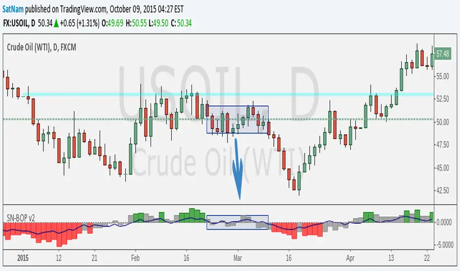
SN Smoothed Balance of Power v2Hi all,
here is an updated version of the indicator script I published yesterday.
The goal of this indicator is to try and find darkpool activity. The indicator itself is not enough to fully identify darkpool but it should be able to detect quiet accumulation. What makes this Balance of Power different from others on TV is that it is smoothed by using a moving average.
Notes:
- The values that are default are completely arbitrary except for the VWMA length (a 14-day period for the 1D chart is the norm). For instance the limit where it shows red/green I picked because it works best for the 1D chart I am using. Other TF's and charts will need tweaking of all the values you find in the options menu to get the best results.
- I modified the indicator such that it is usable on charts that do not show volume. HOWEVER, this chart is default to NYMEX: CL1!. To get different volume data this needs to be changed in the option menu.
- I am in no way an expert on darkpool/HFT trading and am merely going from the information I found on the internet. Consider this an experiment.
Credits:
- Lazybear for some of the plotting-code
- Igor Livshin for the formula
- TahaBintahir for the Symbol-code (although I'm not sure who the original author is...)
Indicators: Volume Zone Indicator & Price Zone IndicatorVolume Zone Indicator (VZO) and Price Zone Indicator (PZO) are by Waleed Aly Khalil.
Volume Zone Indicator (VZO)
------------------------------------------------------------
VZO is a leading volume oscillator that evaluates volume in relation to the direction of the net price change on each bar.
A value of 40 or above shows bullish accumulation. Low values (< 40) are bearish. Near zero or between +/- 20, the market is either in consolidation or near a break out. When VZO is near +/- 60, an end to the bull/bear run should be expected soon. If that run has been opposite to the long term price trend direction, then a reversal often will occur.
Traditional way of looking at this also works:
* +/- 40 levels are overbought / oversold
* +/- 60 levels are extreme overbought / oversold
More info:
drive.google.com
Price Zone Indicator (PZO)
------------------------------------------------------------
PZO is interpreted the same way as VZO (same formula with "close" substituted for "volume").
Chart Markings
------------------------------------------------------------
In the chart above,
* The red circles indicate a run-end (or reversal) zones (VZO +/- 60).
* Blue rectangle shows the consolidation zone (VZO betwen +/- 20)
I have been trying out VZO only for a week now, but I think this has lot of potential. Give it a try, let me know what you think.

CPR OI Toolkit - All in one indicatorThis is experimental indicator which is an extend my pre triple EMA indicator. I have been using this indicator to identify potential entry and exit for commodity market. I had used it for couple of week and it helps.
I would like to share with you. It is meant identify and analyze then plan your trade. I have developed this indicator using Google Antigravity , which is an awesome tool for developing trading indicator and strategies.
My CPR OI tool kit includes following.
Triple EMA
Stochastic - for trend catching
Previous Low/high base trial and visual indication
Price action concepts
Reversion logic.
Visual indication - buy / sell / setup initialization / exit
Visual dashboard.
---
## 🎨 Visual Signal Guide
| Marker | Meaning | Action |
|--------|---------|--------|
| 🔵 Tiny Blue Circle | Stochastic bullish setup START | Wait for EMA + breakout |
| 🟢 Green Triangle UP | **LONG ENTRY** - All conditions met | **ENTER LONG** |
| 🔴 Red Triangle DOWN | **SHORT ENTRY** | **ENTER SHORT** |
| 🟠 Orange Circle | **EXIT** - EMA1/2 cross | **CLOSE POSITION** |
| 💧 Aqua "R" | Mean reversion long | Scalp opportunity |
| 💜 Fuchsia "R" | Mean reversion short | Scalp opportunity |
---
## 💰 Open Interest Interpretation
| Status | Price vs Prev | OI Change | Meaning |
|--------|---------------|-----------|---------|
| **Long Accumulation**🟢 | ↑ | ↑ | Bulls building positions |
| **Short Accumulation**🔴 | ↓ | ↑ | Bears building positions |
| **Short Covering**🟡 | ↑ | ↓ | Bears exiting (bullish) |
| **Long Unwinding**🟠 | ↓ | ↓ | Bulls exiting (bearish) |
---
## 🔔 Alerts (All Enabled by Default)
1. "LONG Signal | Stochastic confirmed | EMA Bullish"
2. "SHORT Signal | Stochastic confirmed | EMA Bearish"
3. "EMA Alignment: BULLISH/BEARISH"
4. "Position CLOSED - Trailing Stop Hit"
---

Super AccumulatorThis indicator is designed to make Accumulation/Distribution (A/D) movements more visible and easier to interpret.
Under normal conditions, accumulation and distribution activity can be hard to spot on the chart, especially with short-term volume signals. To address this, we visualized the A/D difference as a histogram, allowing you to quickly assess buying and selling pressure.
Additionally, the histogram is combined with the SuperTrend indicator to clearly show the trend direction on the panel. Buy signals are displayed as yellow circles, sell signals as red circles, providing an immediate view of both momentum and trend direction.
When used alongside other indicators, this setup becomes a powerful tool for trend-following and volume-based strategies.
Note: This indicator is not a standalone buy/sell signal; always use it with proper risk management.

SMART MONEY SMT+BOS+ENTRYThis advanced trading indicator combines Smart Money Theory (SMT) and Break of Structure (BOS) analysis with synchronized multi-asset monitoring. The core concept identifies institutional activity by detecting discrepancies between correlated assets, revealing potential accumulation zones and reversal points before they become apparent to retail traders.
Key Features
Smart Money Detection:
Real-time divergence analysis between two selected assets (e.g., BTC/ETH, Gold/Silver, Currency pairs)
Identification of institutional accumulation/distribution patterns
Trend confirmation through structural sweeps and momentum shifts
Structural Analysis:
Break of Structure (BOS) detection with multi-factor confirmation
ATR-based candle size filtering to eliminate false breakouts
Clear structural shift identification with visual confirmation
Risk-Managed Execution:
Dual entry modes: Immediate (on BOS close) or Retest (on pullback to level)
Automated stop-loss placement at last structural extreme
Dynamic take-profit calculation based on user-defined risk/reward ratio
Support for long-only, short-only, or bidirectional trading strategies
Visual Interface
Colored arrows signaling buy/sell opportunities at optimal entry points
Real-time stop-loss and take-profit level visualization
SMT divergence markers above/below price action
Structural level indicators for clear market context
Configuration Options
Asset Pair Selection - Primary and secondary symbols for comparative analysis
Trading Direction - Long, Short, or Both directions
Swing Sensitivity - Adjustable pivot point detection period
Risk/Reward Ratio - Customizable profit targets relative to risk
BOS Confirmation Filter - Minimum candle body size requirement via ATR percentage
Optimal Application
Best performance on correlated assets (crypto pairs, commodities, indices)
Effective across multiple timeframes (M15 for entries, H4/D1 for context)
Combines well with volume profile and order flow analysis
Suitable for both discretionary and systematic trading approaches
Technical Advantages
Dual-asset synchronization for early signal detection
Multi-layer filtering system reducing false positives
Integrated risk management with visual guidance
Customizable sensitivity for different market conditions
Русская версия
Индикатор Smart Money Theory (SMT) + Break of Structure (BOS)
Обзор
Этот продвинутый торговый индикатор объединяет анализ Smart Money Theory (SMT) и Break of Structure (BOS) с синхронизированным мониторингом нескольких активов. Основная концепция выявляет активность институциональных игроков путем обнаружения расхождений между коррелирующими активами, показывая зоны накопления и точки разворота до того, как они становятся очевидными для розничных трейдеров.
Ключевые возможности
Детекция "умных денег":
Анализ дивергенций в реальном времени между двумя выбранными активами
Выявление паттернов накопления/распределения институциональными участниками
Подтверждение тренда через структурные сдвиги и изменения импульса
Структурный анализ:
Обнаружение Break of Structure (BOS) с многофакторным подтверждением
Фильтрация по размеру свечи на основе ATR для устранения ложных пробоев
Четкая идентификация структурных сдвигов с визуальным подтверждением
Управление рисками:
Два режима входа: Немедленный (при закрытии BOS) или Ретест (при откате к уровню)
Автоматическое размещение стоп-лосса на последнем структурном экстремуме
Динамический расчет тейк-профита на основе заданного риск-риворда
Поддержка лонг-стратегий, шорт-стратегий или обоих направлений
Визуальный интерфейс
Цветные стрелки, сигнализирующие о точках входа на покупку/продажу
Визуализация уровней стоп-лосса и тейк-профита в реальном времени
Маркеры SMT-дивергенций над/под ценовым действием
Индикаторы структурных уровней для четкого контекста рынка
Настройки
Выбор пары активов - Основной и вторичный символы для сравнительного анализа
Направление торговли - Лонг, Шорт или Оба направления
Чувствительность свингов - Настраиваемый период детекции точек разворота
Коэффициент риск/вознаграждение - Настраиваемые цели по прибыли относительно риска
Фильтр подтверждения BOS - Минимальный размер тела свечи в процентах от ATR
Оптимальное применение
Наилучшие результаты на коррелирующих активах (криптопары, товары, индексы)
Эффективен на различных таймфреймах (M15 для входов, H4/D1 для контекста)
Хорошо сочетается с анализом Volume Profile и ордерного потока
Подходит как для дискреционного, так и для системного трейдинга
Технические преимущества
Синхронизация двух активов для раннего обнаружения сигналов
Многоуровневая система фильтрации, снижающая ложные срабатывания
Интегрированное управление рисками с визуальным сопровождением
Настраиваемая чувствительность под разные рыночные условия

Volume Divergence Detector - COT EnhancedVolume Divergence Detector – COT Enhanced
This advanced indicator analyzes institutional vs retail money flow to uncover hidden market intent, focusing on Gold and Gold Futures.
Instead of relying on simple volume spikes, the script separates smart money (institutions, commercial hedgers, large speculators) from retail traders using a blend of:
Volume-based accumulation/distribution
Price momentum
RSI behavior
MACD divergence
Institutional-sized volume detection
Optional real CFTC Commitment of Traders (COT) data
The result is a dynamic money-flow model designed to expose who is truly controlling the market.
🔹 Institutional Flow Engine
Large-volume activity is tracked and converted into a smoothed institutional money line. Heavy volume is weighted more aggressively to highlight professional accumulation and distribution. When volume fades, flow naturally decays to avoid stale signals.
If enabled, weekly CFTC COT data is blended into the calculation (70% internal model, 30% real positioning), providing genuine futures-market confirmation for Gold.
Positive values indicate institutional buying.
Negative values indicate institutional selling.
🔹 Retail Flow Engine
Retail behavior is modeled using:
RSI momentum (retail follows trends)
MACD breakout behavior
Smaller volume spikes
Retail flow reacts faster and decays quicker, reflecting emotional trading and late entries. Extreme retail positioning often signals potential reversals.
🔹 Core Signals
The indicator automatically detects:
Institutional Takeover
When institutional flow crosses above retail.
Retail Takeover
When retail flow crosses above institutions (often a warning sign).
Bullish Setup
Institutions buying + retail selling.
Bearish Setup
Institutions selling + retail buying.
Extreme Divergence
Institutional and retail flows at opposite extremes. These zones often precede major reversals or powerful trend continuations.
Clear BUY / SELL labels appear directly on the chart, positioned dynamically using ATR to avoid candle overlap.
🔹 Visual Feedback
Background shading shows which side currently dominates
Extreme divergence adds special highlighting
Real-time labels display institutional and retail values
A built-in information table summarizes:
Institutional flow
Retail flow
Dominant side
Flow spread
Current signal
COT status
Everything updates live on the last bar.
🔹 Alerts Included
Custom alerts are provided for:
Institutional control
Retail control
Bullish setups
Bearish setups
Extreme divergence
Perfect for automation or hands-off monitoring.
⚠️ Important Notes
COT data works only on Gold Futures symbols.
Spot Gold uses volume-based estimation only.
Designed for directional bias and timing, not blind entries. Always confirm with structure and price action.
Created by xqweasdzxcv
A professional-grade money flow system built to follow smart capital instead of emotional traders.

Finger Print.Finger Print.
Isolates and Accumulates the "True" components of each candle:
- True Upper Wick (buying pressure beyond the body)
- True Body (conviction from open to close)
- True Lower Wick (selling pressure beyond the body).
By measuring each non-overlapping extension (true wicks) and the directional body separately, the indicator reveals building Pressure (wick accumulation) versus actual Conviction (body momentum) over a user-defined sum of bars.
Three cumulative lines track these Raw forces, while three Smoothing agents highlight sustained momentum and trend strength.
Dual Background Flashes highlight Historical extremes measured as Percentile given the Lookback period. Source any Component / Smoother line from Zero % Line, or Wick-to-Wick / Smoother-to-Smoother Spread – flagging unusually wide/tight conviction gaps or pressure imbalances.
The result is a clean, pressure-focused oscillator that separates noise from genuine directional force, helping traders spot Accumulation , Exhaustion , or Hidden Strength before price confirms it.

ICT Power of 3 identify the high-probability Power of 3 pattern by analyzing price behavior rather than just specific times of day. It focuses on how the market builds, traps, and then expands.
1. Accumulation (The Setup)
Logic: The script monitors volatility using the Average True Range (ATR). When volatility drops below its recent average, the script recognizes that orders are being "accumulated."
Visual: A Blue Dotted Box appears. This marks the equilibrium zone where buy and sell side liquidity is being engineered above and below the high/low of the range.
2. Manipulation (The Trap)
Logic: The script looks for a "Sweep." This is defined as price moving outside the blue accumulation box but failing to sustain that move. In the video, this is the "Judas Swing" or false breakout.
Visual: A Red Diamond appears above or below the bar. This signals that the script has detected a liquidity grab—essentially, the market has "tricked" breakout traders into the wrong side of the market.
3. Distribution (The Expansion)
Logic: This is identified through Displacement. The script calculates the average candle body size. When a candle appears that is significantly larger (based on your Displacement Multiplier), it confirms that "Smart Money" has entered the market.
Visual: A Green Triangle appears. This marks the start of the distribution phase, which is the "meat" of the move where you want to be positioned.

Micha Stocks Buyers Breakout RatingMicha Stocks Buyers Breakout Rating (ByBr)
========================================
This indicator is a custom rating system designed to identify high-probability "Buy" setups by analyzing Volume Conviction, Price Action, and Seller Exhaustion. It assigns a rating from 4 to 10 for every valid signal, helping traders filter out weak breakouts and focus on high-conviction moves.
How it Works The script uses a multi-tiered logic system to grade every green candle:
1. Volume Tiers (The Engine)
--Extreme Conviction (Rating 10): Volume is 2.5x higher than the short-term average.
--High Conviction (Rating 7-8): Volume is 1.5x higher than the short-term average.
2. Sustained Accumulation (Rating 5-6) Identifies persistent buying pressure where the last X -----bars (default 5) have all been green/up candles.
--Bonus Points The script awards extra points to the base rating for high-quality candle shapes:
--Strong Close: Price closes in the top 25% of the daily range.
--Hammer Candle: Long lower wick (rejection of lows) with a small body.
3. Seller Exhaustion (The Reversal - Rating 3-4) This logic identifies "dip buys" where sellers have lost control. It requires:
--Downtrend: Price is below the recent high.
--Confirmation: Either a "Volume Washout" (recent panic selling) or a "Supply Dry Up" (volume dropping below average).
How to Use
--------------
Look for Triangles: A triangle appears below the bar when a signal is detected.
Read the Number: The number (4-10) indicates the strength of the signal.
10: Extreme Volume Breakout (highest confidence).
7-8: Strong Volume Breakout.
4: Reversal/Dip Buy opportunity (Seller Exhaustion).
Tooltip: Hover over the label to see exactly which logic triggered the signal (e.g., "Extreme Conviction" vs "Sustained Accumulation").
Settings
----------
Short Lookback: Adjust the sensitivity of the trend detection (Default: 5).
Volume Multipliers: Adjust how strict the volume requirements are for high ratings.

BERNA (Boundary-Encoded Resonance Network Architecture)BERNA — Boundary-Encoded Resonance Network Architecture
BERNA is a research-grade indicator that estimates the remaining structural capacity of the current market regime.
Unlike trend, volatility, or momentum tools, BERNA does not measure price direction — it measures how much of the regime’s internal capacity has already been consumed.
This script implements the BERNA model published on Zenodo (Bülent Duman, 2026).
It is intentionally minimal and uses only OHLC data.
What BERNA measures
BERNA outputs a structural capacity state:
τ = Σ / Θ (normalized structural stress)
Λ = Θ − Σ (remaining structural capacity)
Interpretation:
High Λ / low τ → the regime has structural endurance
Rising τ → capacity is being consumed
τ → 1 (Λ → 0) → rupture proximity (capacity exhaustion)
This makes BERNA a forward-looking structural capacity variable, not a price oscillator.
What is inside this script
This implementation contains the following components:
Efficiency proxy (DERYA-like, but not the full public DERYA)
BERNA uses a simple microstructure efficiency proxy computed as:
E = |close − open| / (high − low)
This is conceptually “DERYA-like” but it is not the full DERYA framework.
No external/public DERYA source code is embedded here.
Standard technical primitives used
This script uses only basic primitives commonly found in technical analysis:
Absolute value and range normalization
Thresholding (regime binning)
Power transform on range (rng^p)
There is no EMA, RSI, MACD, ATR, ADX, Fisher, Kaufman, or other indicator embedded.
All computations are internal and deterministic.
3-state structural regime binning (K = 3)
The efficiency proxy E is discretized into three regimes using user thresholds:
Low efficiency
Mid efficiency
High efficiency
Each regime has its own capacity Θ and stress multiplier β.
Structural stress accumulation (Σ) and rupture proximity
Stress increment is defined as:
dΣ = β · (1 − E) · (range^p)
Σ accumulates inside a regime and is capped by Θ.
In this prototype, Σ resets on regime change by construction (regime-gated accumulation).
The rupture proximity is expressed through τ and Λ.
How to use BERNA
BERNA is designed as a regime-health and fragility overlay, not a buy/sell trigger.
Typical uses:
Detect when an ongoing move is structurally late-stage (τ high, Λ low)
Avoid initiating trades when capacity is nearly exhausted
Compare structural resilience across assets and regimes
Use alongside price/trend/volume systems for context
Do not use BERNA alone as a trading signal.
BERNA tells you “how much structure is left”, not “where price will go.”
Visuals
Efficiency (E) shows the bar-level microstructure efficiency proxy
τ shows normalized structural stress (capacity consumption)
Λ shows remaining structural capacity
Dotted lines mark warning and critical rupture proximity levels
Important notes
BERNA is not RSI, MACD, ATR, ADX, Fisher, Kaufman, or a volatility model
BERNA does not predict price direction
BERNA does not issue entry/exit signals
BERNA is a structural capacity diagnostic
This script does not embed any external/public indicator code; all logic is implemented directly in Pine.
Risk and disclaimer
This script is provided for research and analytical purposes only.
It is not financial advice and must not be used as a standalone trading system.
Markets are uncertain.
All trading decisions and risks remain entirely the responsibility of the user.
BERNA: Boundary-Encoded Resonance Network Architecture
A Structural Failure Theory of Financial Regimes Based on Endogenous Capacity Depletion
Author: Duman, Bülent
Affiliation: Independent Researcher
Reference: zenodo.org

papa experiment//@version=6
indicator("Edufx AMD", shorttitle="Edufx AMD", overlay=true)
// ───── Inputs ─────
timezone = input.string("America/New_York", "Timezone")
enableDailyCycles = input.bool(true, "Enable Daily Cycles")
colorAcc = input.color(color.new(color.gray, 80), "Accumulation")
colorManip = input.color(color.new(color.red, 80), "Manipulation")
colorDist = input.color(color.new(color.green, 80), "Distribution")
// ───── Daily Anchor (NY 8PM) ─────
var int dayStart = na
if na(dayStart) or time >= dayStart + 86400000
dayStart := timestamp(timezone, year, month, dayofmonth, 20, 0)
accEnd = dayStart + 9 * 60 * 60 * 1000
manEnd = dayStart + 15 * 60 * 60 * 1000
distEnd = dayStart + 24 * 60 * 60 * 1000
// ───── State ─────
var float accLo = na
var float accHi = na
var float manLo = na
var float manHi = na
var float disLo = na
var float disHi = na
var bool accDone = false
var bool manDone = false
var bool disDone = false
// ───── Daily AMD ─────
if enableDailyCycles
// Accumulation
if time >= dayStart and time < accEnd
accLo := na(accLo) ? low : math.min(accLo, low)
accHi := na(accHi) ? high : math.max(accHi, high)
if time >= accEnd and not accDone and not na(accLo)
box.new(dayStart, accHi, accEnd, accLo,
xloc=xloc.bar_time, bgcolor=colorAcc, border_color=colorAcc)
accDone := true
// Manipulation
if time >= accEnd and time < manEnd
manLo := na(manLo) ? low : math.min(manLo, low)
manHi := na(manHi) ? high : math.max(manHi, high)
if time >= manEnd and not manDone and not na(manLo)
box.new(accEnd, manHi, manEnd, manLo,
xloc=xloc.bar_time, bgcolor=colorManip, border_color=colorManip)
manDone := true
// Distribution
if time >= manEnd and time < distEnd
disLo := na(disLo) ? low : math.min(disLo, low)
disHi := na(disHi) ? high : math.max(disHi, high)
if time >= distEnd and not disDone and not na(disLo)
box.new(manEnd, disHi, distEnd, disLo,
xloc=xloc.bar_time, bgcolor=colorDist, border_color=colorDist)
disDone := true
// Reset
if time >= distEnd
accLo := na
accHi := na
manLo := na
manHi := na
disLo := na
disHi := na
accDone := false
manDone := false
disDone := false

Smart Money Structure | GainzAlgo📊 OVERVIEW:
================
Smart Money Structure Analysis is a professional-grade market structure and order-flow system designed to identify institutional trading behavior through volatility-adaptive logic, multi-timeframe trend alignment, and volume-based confirmation.
This indicator implements original mathematical models to detect Change of Character (CHoCH), Break of Structure (BOS), cumulative volume dynamics, and trend convergence across seven timeframes — delivering high-probability trade signals with significantly reduced noise.
Unlike basic indicator combinations, this system functions as a unified trading framework, where volatility adaptation, structure analysis, and volume confirmation continuously reinforce each other to provide precise, context-aware signals.
⭐ WHY THIS SYSTEM IS UNIQUE AND WORTHY OF PUBLICATION:
=====================================================
This is not a collection of common indicators placed together.
Smart Money Structure Analysis represents a cohesive institutional methodology, engineered so that:
- Volatility adjusts signal sensitivity in real time
- Multi-timeframe trends define directional bias
- Market structure determines timing
- Volume confirms institutional participation
- Advanced filters eliminate low-quality setups
Each component is mathematically linked to the others, creating a workflow that cannot be replicated by stacking separate indicators.
🔗 SYNERGISTIC INTEGRATION – HOW THE SYSTEM WORKS TOGETHER:
==========================================================
🧠 1. CONTEXT-AWARE VOLATILITY ADAPTATION
ATR-based volatility logic dynamically adjusts all momentum thresholds:
- Higher volatility → stronger confirmation required
- Lower volatility → sensitivity increases to capture valid moves
This prevents over-signaling in choppy markets and under-signaling during expansion phases — a core flaw in static indicators.
📐 2. MULTI-TIMEFRAME TREND CONVERGENCE ENGINE
Seven timeframes are analyzed simultaneously:
1M • 5M • 15M • 30M • 1H • 4H • 1D
Each timeframe is scored using EMA + VWAP alignment, producing a composite Trend Strength Score from -100 to +100.
The stronger the alignment across timeframes, the higher the probability of continuation — instantly visible through the real-time dashboard.
🏗️ 3. INSTITUTIONAL MARKET STRUCTURE (CHoCH & BOS)
The system automatically identifies the two core smart money concepts:
- CHoCH (Change of Character):
Signals potential trend exhaustion or reversal zones
- BOS (Break of Structure):
Confirms trend continuation and institutional commitment
Structure zones are visualized with persistent, color-coded levels and clouds, providing precise contextual timing rather than lagging signals.
📊 4. CUMULATIVE VOLUME DELTA (CVD) CONFIRMATION
CVD tracks the cumulative difference between buying and selling pressure:
- Rising CVD → accumulation
- Falling CVD → distribution
- Divergence vs price → early reversal warning
Volume participation is categorized into Low / Medium / High, adding depth beyond simple volume bars.
🛡️ 5. SIX-LAYER PROFESSIONAL SIGNAL FILTERING
Every signal must pass through up to six independent confirmation layers:
1. Volatility-adjusted momentum
2. Higher timeframe trend alignment
3. Lower timeframe conflict prevention
4. Institutional volume confirmation
5. Structural breakout validation
6. Repeated-signal restriction
This dramatically reduces false positives while preserving only high-quality institutional setups.
🧮 DETAILED CORE SYSTEMS:
========================
📏 ADAPTIVE MOMENTUM FORMULA
- Momentum Threshold = Base × (1 + (ATR ÷ Price) × 2)
- Pre-Momentum Factor = Base × (1 − (ATR ÷ Price) × 0.5)
📊 TREND STRENGTH CALCULATION
- Trend Strength = (Sum of 7 timeframe scores ÷ 7) × 100
📦 CVD LOGIC
- Close > Previous Close → Buy volume added
- Close < Previous Close → Sell volume subtracted
- Cumulative sum reveals institutional intent
🧠 STRUCTURE DETECTION
- Pivot-based swing logic
- Candle confirmation
- Configurable lookback periods
- Non-repainting visualization
🧩 ADVANCED ANALYSIS TOOLS:
==========================
🧲 LIQUIDITY ZONE DETECTION
Identifies probable retail stop-loss clusters where institutions often initiate stop hunts before true directional moves.
📦 MARKET PROFILE & ORDER FLOW IMBALANCE
Detects buy/sell dominance using volume ratios, highlighting accumulation and distribution zones before large price moves.
🔄 RSI DIVERGENCE SCANNER
Identifies bullish and bearish divergences that frequently precede structure shifts and trend reversals.
🎨 VISUAL SYSTEM & DASHBOARD:
============================
📊 SMART MONEY MATRIX
- Composite trend strength
- System confidence %
- CVD value
- Directional grid for all timeframes
📈 TREND PREDICTION MATRIX (Optional)
Forecasts short-term directional bias using trend, momentum, and volatility data.
🏷️ SIGNAL LABELS
- BUY / SELL → Fully confirmed entries
- READY → Momentum building
- BOS / CHoCH → Structure events
- FLOW / LIQ / BULL / BEAR → Advanced confirmations
⚙️ CORE FEATURES:
================
1. Multi-Timeframe Trend Convergence
2. Smart Money Structure Detection (CHoCH & BOS)
3. Adaptive Volatility-Based Momentum
4. Cumulative Volume Delta (CVD)
5. Six-Layer Signal Filtering
6. Liquidity Zone Detection
7. Order Flow & Market Profile Analysis
8. Divergence Scanner
9. Dynamic Trendlines
10. Institutional-Grade Dashboard
📘 WHO THIS INDICATOR IS FOR:
============================
- Scalpers: Noise-filtered precision on lower timeframes
- Day Traders: High-probability continuation setups
- Swing Traders: Multi-timeframe alignment & structure zones
- Reversal Traders: Divergence + CHoCH confirmation
⚠️ IMPORTANT DISCLAIMER:
========================
This indicator is a technical analysis and educational tool only.
It does not provide financial advice or trade recommendations.
Trading involves substantial risk, and losses are a natural part of trading.
Past performance does not guarantee future results.
All trading decisions remain the sole responsibility of the user.

ICT Market Regime Detector [TradeHook]🔮 Overview
The **ICT Market Regime Detector** is an advanced market condition classifier designed to identify the current market environment and provide context-aware trading guidance. Rather than generating buy/sell signals, this indicator focuses on answering the crucial question: *"What type of market am I trading in right now?"*
Understanding market regime is fundamental to successful trading. The same strategy that works brilliantly in a trending market can fail spectacularly during consolidation. This indicator automatically classifies market conditions into one of eight distinct regimes, each requiring different trading approaches.
---
🎯 Regime Classifications
The indicator identifies these market states:
| Regime | Description | Recommended Approach |
|------------------------|--------------------------------------------------|--------------------------------------|
| *STRONG TREND* |Directional momen. w/ healthy struc| Cont.entries with OTE pullbacks |
| **WEAK TREND** | Gradual drift with retracements | Conservative Order Block entries |
| **ACCUMULATION** | Institutional buying within range | Longs near range lows |
| **DISTRIBUTION** | Institutional selling within range | Shorts near range highs |
| **CONSOLIDATION** | Tight range, low volatility squeeze | Wait for breakout |
| **EXPANSION** | Volatile breakout phase | Momentum following |
| **REVERSAL** | Structural transition period | Wait for confirmation |
| **CHOPPY** | No clear edge | **Avoid trading** |
---
⚙️ How It Works
**Trend Analysis Engine**
- Calculates ADX (Average Directional Index) using Wilder's smoothing method
- Monitors +DI/-DI for directional bias
- Detects trend health via EMA alignment
- Identifies exhaustion through RSI divergence
**Volatility Analysis Engine**
- Measures current vs historical volatility ratio
- Classifies as LOW, NORMAL, HIGH, or EXTREME
- Tracks volatility expansion/contraction phases
**Range Analysis Engine**
- Calculates dynamic support/resistance boundaries
- Tracks price position within range (0-100%)
- Detects range narrowing (squeeze) and expansion patterns
**Institutional Activity Detection**
- Volume spike identification
- Absorption candle patterns (large wicks, small body)
- Displacement candles (large body, small wicks)
- Accumulation/Distribution pattern recognition
---
🛡️ Risk Management Features
**Daily Loss Limit**
- Set maximum daily loss as percentage of account
- Visual warning when approaching limit
- Alert when limit is breached
**Maximum Daily Trades**
- Configurable trade counter per session
- Prevents overtrading
- Session reset options (NY Open, London Open, etc.)
**Trading Readiness Checklist**
- Clear regime ✓/✗
- Kill zone active ✓/✗
- HTF alignment ✓/✗
- Volatility normal ✓/✗
- Loss limit OK ✓/✗
- Trades remaining ✓/✗
---
📊 Multi-Timeframe Analysis
The indicator includes 4H timeframe regime alignment to ensure lower timeframe setups align with higher timeframe bias. Trades taken with HTF alignment historically have higher probability.
---
⏰ Kill Zone Integration
Built-in ICT Kill Zone detection:
- 🌙 Asian Session (Range Building)
- 🇬🇧 London Open (Prime Execution)
- 🇺🇸 NY AM (Prime Execution)
- 🔫 Silver Bullet (10-11 AM EST)
- 🇺🇸 NY PM (Afternoon Opportunities)
Configurable UTC offset for your timezone.
---
🎨 Visual Features
- **Regime-Colored Bars** - Instantly see current market state
- **Comprehensive Dashboard** - All metrics in one panel
- **Adjustable Table Size** - Tiny/Small/Normal/Large
- **Flexible Positioning** - Place dashboard in any corner
- **Optional Regime Labels** - Mark regime changes on chart
---
⚠️ Important Notes
1. This indicator is a **decision support tool**, not a signal generator
2. Always combine with proper price action analysis
3. Past regime identification doesn't guarantee future performance
4. Risk management settings are for tracking purposes only - actual position management should be done through your broker
5. The indicator works best on liquid markets with consistent volume data
---
📚 Educational Purpose
This indicator is designed for educational purposes to help traders understand market structure and regime classification. It implements concepts from ICT (Inner Circle Trader) methodology including:
- Market structure analysis
- Kill zone timing
- Institutional activity patterns
- Multi-timeframe confluence
---
🔧 Inputs Summary
**Master Toggles**
- Enable/Disable indicator, regime detection, recommendations, risk management, alerts
**Core Settings**
- Analysis lookback periods (short/medium/long)
- ADX thresholds for trend classification
- Volatility spike multiplier
**Risk Management**
- Max daily loss percentage
- Max daily trades
- Account size for P&L calculation
- Session reset timing
**Visualization**
- Dashboard on/off and position
- Regime zones and labels
- Bar coloring
- Table text size
---
💡 Tips for Use
1. **Don't trade CHOPPY regimes** - The indicator explicitly warns when no edge exists
2. **Respect the checklist** - Trade only when multiple conditions align
3. **Adjust ADX thresholds** - Different instruments may require fine-tuning
4. **Monitor regime duration** - Fresh regime changes often present the best opportunities
5. **Use with other TradeHook indicators** - Designed to complement the MTMGBS system
⚖️ DISCLAIMER
This indicator is for **educational and informational purposes only**. It does not constitute financial advice. Trading involves substantial risk of loss and is not suitable for all investors. Past performance is not indicative of future results. Always conduct your own analysis and consult with a qualified financial advisor before making trading decisions.

ETH - Log Regression BandsETH – Log Regression Bands: Detailed Description (Math + How to Use)
Overview
This indicator plots a long-term “fair value” growth curve for ETH and surrounds it with multiple upper and lower bands. The goal is to estimate where price sits relative to a long-term trend that is best interpreted in **logarithmic (percentage) terms**, not raw dollars.
The bands create clear zones showing when ETH is historically cheap or expensive relative to that long-term curve.
---
Why use logarithms?
Price action is typically more meaningful in **percentage moves** than in absolute dollar moves.
* A move from $100 → $200 is +100%
* A move from $2000 → $2100 is only +5%
By modelling the natural logarithm of price, multiplicative growth becomes additive. That makes long-term growth easier to model and band spacing more consistent across very different price regimes.
So instead of modelling (P), the indicator models:
---
The growth model: Power-law curve
The indicator uses “time since inception” as the x-axis. However, rather than using time directly, it uses the logarithm of time:
where (t) is the number of days (or bars) since the first data point.
It then fits a straight-line model in log-log space:
Substituting back in:
Exponentiating both sides gives the curve in normal price units:
This is a **power-law** trend curve. It naturally produces a smooth, slowly bending long-term curve similar to the “log regression” curves often seen in macro crypto reports.
---
What “expanding regression” means
The model uses all data available from the beginning of the chart up to the current bar. That means:
* Early in the asset’s history the curve can change more because there are fewer points.
* Over time the curve becomes more stable as more history is included.
Important note: this does **not** repaint past bars. It simply means the current curve will update as new data comes in.
---
Measuring “typical deviation” from the curve (residual volatility)
Once the trend curve is fitted in log space, the indicator measures how far price typically wanders away from it.
At any time point:
* Actual log price is (y = \ln(P))
* Predicted log price from the curve is (\hat{y} = a + b\ln(t))
The **residual** is:
The indicator computes the standard deviation of these residuals:
This (\sigma) is a measure of typical “distance from trend” in log terms.
---
Building the bands (the key idea)
The bands are evenly spaced in **log space** using multiples of (\sigma). A band number (k) is created by shifting the log-trend up or down:
Upper band (k):
Lower band (k):
Where:
* (k) is the band number (1, 2, 3, …)
* (s) is a user-chosen spacing factor (band spacing)
* (\sigma) is the residual standard deviation
Converting back to normal price:
Upper band (k):
Lower band (k):
Why bands look like “translated copies”
Because shifting by a constant in log space equals multiplying by a constant in price space:
So the bands are the same underlying curve scaled up or down by fixed multipliers. That produces the smooth “stacked curve” look associated with macro log regression charts.
---
Optional curve shift (manual adjustment)
A manual offset can be applied in log space. This is useful if you want to align the entire structure slightly higher or lower.
Because the shift is applied to (\ln(P)), this is not an additive dollar adjustment. It scales the entire curve by a constant factor:
* Positive shift → multiplies all bands upward
* Negative shift → multiplies all bands downward
---
How to interpret the zones
The base curve represents a long-term “trend center” in log-growth terms.
* Price near the base curve → near long-term trend
* Price in upper bands → expensive relative to long-term trend
* Price in lower bands → cheap relative to long-term trend
Because the bands are built using residual volatility in log space, “cheap/expensive” is measured in a way that remains meaningful across different eras and price levels.
---
Long-term buy zones (Lower 1 and Lower 2)
**Lower 1** and **Lower 2** are intended as **long-term accumulation zones**.
When ETH trades in these zones, it is significantly below the long-term growth curve in log terms, which typically corresponds to:
* deep bear markets,
* high fear / capitulation phases,
* long accumulation periods.
A simple long-term framework many users apply:
* **Accumulate gradually when price enters Lower 1**
* **Accumulate more aggressively when price enters Lower 2**
* Reduce risk / take profits progressively in higher upper bands
These are not guarantees — they are **statistical “distance from trend” zones**, designed to help structure long-term decisions.
---
## Notes / limitations
* This indicator is a **macro trend tool**, not an intraday trading system.
* The curve is derived from historical behavior; it can shift slowly as new data arrives.
* Extremely new market regimes or structural changes can reduce reliability.
* Use alongside risk management and additional confirmation if trading.
---

CVD Complete Volume Analysis ProCVD Complete Volume Analysis Pro | Order Flow & Absorption
Introduction:
In the world of modern trading, Price is the advertisement, but Volume is the fuel. However, standard volume indicators on TradingView are often insufficient. They tell you how much was traded, but they don’t tell you how it was traded.
Was that large volume spike aggressive buying driving the trend? or was it a "buying frenzy" hitting a wall of passive limit orders (absorption)?
The CVD Complete Volume Analysis Pro (v5) is an advanced institutional-grade Order Flow engine. By utilizing 1-second intrabar data, this indicator reconstructs the "Tick Rule" to separate Aggressive (Market) orders from Passive (Limit) orders. It calculates Cumulative Volume Delta (CVD), detects Absorption/Distribution anomalies, and utilizes an embedded Logistic Regression model to predict daily directional bias.
This is not just an indicator; it is a complete Order Flow Dashboard designed to aid and support complex footprint charts for the everyday trader.
🏗️ How It Works: The "Micro-Structure" Engine
Most volume indicators on TradingView look at the close of a 1-minute or 5-minute bar to guess the volume direction. This script goes deeper.
1. The 1-Second Granularity
Using TradingView's request.security_lower_tf capability, this script pulls 1-second resolution data regardless of the chart timeframe you are on.
It analyzes the price movement every second.
It applies the "Tick Rule": If price moves up, volume is classified as Buy. If price moves down, volume is classified as Sell.
This allows for a highly accurate reconstruction of Buying vs. Selling pressure that standard indicators miss.
2. The "Cluster" Concept
The script aggregates these 1-second data points into Clusters.
Default: 60 seconds (1 minute) per cluster.
This creates a normalized "Heartbeat" of the market, allowing us to compare the efficiency of volume over fixed time windows, removing the noise of time-based chart distortions.
3. The "Passive" Detection Logic (The Core Feature)
This is the most powerful aspect of the tool. It calculates the relationship between Effort (CVD) and Result (Price Move).
The Baseline: The script calculates a rolling statistical baseline (Standard Deviation) of how much price should move for a given amount of Delta.
Absorption (Hidden Buying): If we see massive Aggressive Selling (Negative CVD) but price refuses to drop (or drops significantly less than the statistical model predicts), the script identifies this as Passive Buying.
Distribution (Hidden Selling): If we see massive Aggressive Buying (Positive CVD) but price refuses to rise, the script identifies this as Passive Selling.
📊 The Dashboard Breakdown
The on-screen dashboard is your command center. It updates in real-time to provide a snapshot of the market's internal mechanics.
Section 1: Flow Analysis
This section analyzes the current session's behavior.
Flow Type: Categorizes the market state using algorithmic logic.
Aggressive Buying/Selling: The market is trending, and aggressive participants are winning.
Strong Accumulation/Distribution: A reversal signal. Aggressive participants are trapped, and passive whales are absorbing order flow.
Flow vs. Price: Detects divergences instantly.
Bullish Divergence: Net Flow is Positive, but Price is down (indicates manipulation or temporary suppression).
Bearish Divergence: Net Flow is Negative, but Price is up (indicates a "trap" move).
Section 2: Volume Breakdown
A detailed ledger of the day's activity.
Aggressive Buy/Sell: Market orders executing at the ask/bid. This represents "Impatience."
Passive Buy/Sell: The estimated volume of Limit Orders absorbing the aggressive flow. This represents "Intent."
Net Flow: The mathematical sum of all buy pressure minus sell pressure.
Section 3: Net Positioning (Multi-Day)
Markets don't happen in a vacuum. This section looks back (default 5 days) to see the accumulated inventory.
Bias: Are we in a multi-day accumulation or distribution phase?
Activity Type:
High Hidden Activity: Indicates a fighting market with heavy limit orders (choppy/reversal prone).
Mostly Aggressive: Indicates a trending market with low resistance.
Section 4: Predictive Model (Machine Learning)
The script features an embedded Logistic Regression Model.
It trains on the last N days of Flow Data (CVD, Net Aggressive, Net Passive, Passive Ratios).
It outputs a Probability Score (0% to 100%) regarding the likelihood of an UP close for the current session.
Note: This is a probability model based on order flow history, not a guarantee. Use it as a bias confirmation tool.
🧠 Educational: How to Trade With This
Strategy 1: The "Absorption" Reversal
Context: Price hits a major resistance level.
Look at the Dashboard: You want to see "Flow Type" switch to "Strong Distribution".
The Logic: Price is rising, and aggressive buyers are hitting the ask. However, the script detects that for every buy order, a passive seller is absorbing it. Price stops moving up despite high volume.
The Trigger: When Price creates a lower low on the chart while the dashboard shows Distribution, this is a high-probability short entry.
Strategy 2: The Flow Divergence
Context: Price is trending down.
Look at the Dashboard: Price is making new lows, but the "Net Flow" is turning Green (Positive), or the "Cum CVD" is sloping upwards.
The Logic: This is "Effort vs. Result." Sellers are exhausted. They are pushing price down, but the net flow is shifting to buyers.
The Trigger: Enter Long on the first structure break.
Strategy 3: Trend Continuation
Context: Market is opening or breaking a range.
Look at the Dashboard: You want "Full Alignment."
Signals: "Flow Type" says Aggressive Buying, Net Flow is Positive, and the Predictive Model shows >60% Bullish Probability.
The Logic: There is no passive resistance. Aggressive buyers are pushing price up freely.
The Trigger: Buy pullbacks.
⚙️ Settings & Configuration
Cluster Size: The number of 1-second bars to group together.
Use 60 (1 min) for Scalping.
Use 300 (5 min) for Day Trading.
Average Length: The baseline for statistical calculations. Higher numbers = smoother baselines but slower adaptation.
Detection Settings:
Passive Multiplier: Adjusts the sensitivity of the absorption estimation. 1.0 is standard. Increase to 1.5 if you only want to see extreme anomalies.
Daily Tracking:
History Days: How many days of data to display in the table. Note: Due to TradingView data limits, keeping this between 3-5 days ensures the most stability.
⚠️ Important Technical Limitations
Please read this section carefully to understand the constraints of the Pine Script environment:
Data Depth (The 100k Limit): TradingView limits request.security_lower_tf to approximately 100,000 intrabars.
This means the script can typically only "see" the last 3 to 5 days of true 1-second data.
If you set History Days or Training Days too high (e.g., 20 days), the script may return 0 values for older dates because the high-resolution data simply doesn't exist on the server.
Approximation of Ticks: While 1-second data is extremely precise, it is still an aggregation. In extremely high-volatility events (like CPI releases), multiple ticks happen inside one second. The script attributes the volume of that second based on the close relative to the open/prev close. It is the best approximation possible on TradingView, but not a replacement for Level 3 Tick Data feeds.
Calculation Time: This is a heavy script. On lower-end devices or when loading on many charts simultaneously, you may experience a "Calculation took too long" warning. If this happens, reduce the History Days to 3.
🛡️ Disclaimer
No Repainting: This indicator uses strict historical referencing and does not repaint closed clusters.
Not Financial Advice: This tool provides data visualization. Order flow is a subjective art. Always manage your risk.
Author's Note:
I built this tool because I wanted the power of Order Flow footprint charts without the visual clutter. By using statistical baselines to detect passive liquidity, we can finally see the "invisible hand" of the market directly on our TradingView charts. I hope this adds value to your trading.
👍 If you find this script useful, please leave a Boost and a Comment below!

Multi Cycles Slope-Fit System MLMulti Cycles Predictive System : A Slope-Adaptive Ensemble
Executive Summary:
The MCPS-Slope (Multi Cycles Slope-Fit System) represents a paradigm shift from static technical analysis to adaptive, probabilistic market modeling. Unlike traditional indicators that rely on a single algorithm with fixed settings, this system deploys a "Mixture of Experts" (MoE) ensemble comprising 13 distinct cycle and trend algorithms.
Using a Gradient-Based Memory (GBM) learning engine, the system dynamically solves the "Cycle Mode" problem by real-time weighting. It aggressively curve-fits the Slope of component cycles to the Slope of the price action, rewarding algorithms that successfully predict direction while suppressing those that fail.
This is a non-repainting, adaptive oscillator designed to identify market regimes, pinpoint high-probability reversals via OB/OS logic, and visualize the aggregate consensus of advanced signal processing mathematics.
1. The Core Philosophy: Why "Slope" Matters:
In technical analysis, most traders focus on Levels (Price is above X) or Values (RSI is at 70). However, the primary driver of price action is Momentum, which is mathematically defined as the Rate of Change, or the Slope.
This script introduces a novel approach: Slope Fitting.
Instead of asking "Is the cycle high or low?", this system asks: "Is the trajectory (Slope) of this cycle matching the trajectory of the price?"
The Dual-Functionality of the Normalized Oscillator
The final output is a normalized oscillator bounded between -1.0 and +1.0. This structure serves two critical functions simultaneously:
Directional Bias (The Slope):
When the Combined Cycle line is rising (Positive Slope), the aggregate consensus of the 13 algorithms suggests bullish momentum. When falling (Negative Slope), it suggests bearish momentum. The script measures how well these slopes correlate with price action over a rolling lookback window to assign confidence weights.
Overbought / Oversold (OB/OS) Identification:
Because the output is mathematically clipped and normalized:
Approaching +1.0 (Overbought): Indicates that the top-weighted algorithms have reached their theoretical maximum amplitude. This is a statistical extreme, often preceding a mean reversion or trend exhaustion.
Approaching -1.0 (Oversold): Indicates the aggregate cycle has reached maximum bearish extension, signaling a potential accumulation zone.
Zero Line (0.0): The equilibrium point. A cross of the Zero Line is the most traditional signal of a trend shift.
2. The "Mixture of Experts" (MoE) Architecture:
Markets are dynamic. Sometimes they trend (Trend Following works), sometimes they chop (Mean Reversion works), and sometimes they cycle cleanly (Signal Processing works). No single indicator works in all regimes.
This system solves that problem by running 13 Algorithms simultaneously and voting on the outcome.
The 13 "Experts" Inside the Code:
All algorithms have been engineered to be Non-Repainting.
Ehlers Bandpass Filter: Extracts cycle components within a specific frequency bandwidth.
Schaff Trend Cycle: A double-smoothed stochastic of the MACD, excellent for cycle turning points.
Fisher Transform: Normalizes prices into a Gaussian distribution to pinpoint turning points.
Zero-Lag EMA (ZLEMA): Reduces lag to track price changes faster than standard MAs.
Coppock Curve: A momentum indicator originally designed for long-term market bottoms.
Detrended Price Oscillator (DPO): Removes trend to isolate short-term cycles.
MESA Adaptive (Sine Wave): Uses Phase accumulation to detect cycle turns.
Goertzel Algorithm: Uses Digital Signal Processing (DSP) to detect the magnitude of specific frequencies.
Hilbert Transform: Measures the instantaneous position of the cycle.
Autocorrelation: measures the correlation of the current price series with a lagged version of itself.
SSA (Simplified): Singular Spectrum Analysis approximation (Lag-compensated, non-repainting).
Wavelet (Simplified): Decomposes price into approximation and detail coefficients.
EMD (Simplified): Empirical Mode Decomposition approximation using envelope theory.
3. The Adaptive "GBM" Learning Engine
This is the "Machine Learning" component of the script. It does not use pre-trained weights; it learns live on your chart.
How it works:
Fitting Window: On every bar, the system looks back 20 days (configurable).
Slope Correlation: It calculates the correlation between the Slope of each of the 13 algorithms and the Slope of the Price.
Directional Bonus: It checks if the algorithm is pointing in the same direction as the price.
Weight Optimization:
Algorithms that match the price direction and correlation receive a higher "Fit Score."
Algorithms that diverge from price action are penalized.
A "Softmax" style temperature function and memory decay allow the weights to shift smoothly but aggressively.
The Result: If the market enters a clean sine-wave cycle, the Ehlers and Goertzel weights will spike. If the market explodes into a linear trend, ZLEMA and Schaff will take over, suppressing the cycle indicators that would otherwise call for a premature top.
4. How to Read the Interface:
The visual interface is designed for maximum information density without clutter.
The Dashboard (Bottom Left - GBM Stats)
Combined Fit: A percentage score (0-100%). High values (>70%) mean the system is "Locked In" and tracking price accurately. Low values suggest market chaos/noise.
Entropy: A measure of disorder. High entropy means the algorithms disagree (Neutral/Chop). Low entropy means the algorithms are unanimous (Strong Trend).
Top 1 / Top 3 Weight: Shows how concentrated the decision is. If Top 1 Weight is 50%, one algorithm is dominating the decision.
The Matrix (Bottom Right - Weight Table)
This table lifts the hood on the engine.
Fit Score: How well this specific algo is performing right now.
Corr/Dir: Raw correlation and Direction Match stats.
Weight: The actual percentage influence this algorithm has on the final line.
Cycle: The current value of that specific algorithm.
Regime: Identifies if the consensus is Bullish, Bearish, or Neutral.
The Chart Overlay
The Line: The Gradient-Colored line is the Weighted Ensemble Prediction.
Green: Bullish Slope.
Red: Bearish Slope.
Triangles: Zero-Cross signals (Bullish/Bearish).
"STRONG" Labels: Appears when the cycle sustains a value above +0.5 or below -0.5, indicating strong momentum.
Background Color: Changes subtly to reflect the aggregate Regime (Strong Up, Bullish, Neutral, Bearish, Strong Down).
5. Trading Strategies:
A. The Slope Reversal (OB/OS Fade)
Concept: Catching tops and bottoms using the -1/+1 normalization.
Signal: Wait for the Combined Cycle to reach extreme values (>0.8 or <-0.8).
Trigger: The entry is taken not when it hits the level, but when the Slope flips.
Short: Cycle hits +0.9, color turns from Green to Red (Slope becomes negative).
Long: Cycle hits -0.9, color turns from Red to Green (Slope becomes positive).
B. The Zero-Line Trend Join
Concept: Joining an established trend after a correction.
Signal: Price is trending, but the Cycle pulls back to the Zero line.
Trigger: A "Triangle" signal appears as the cycle crosses Zero in the direction of the higher timeframe trend.
C. Divergence Analysis
Concept: Using the "Fit Score" to identify weak moves.
Signal: Price makes a Higher High, but the Combined Cycle makes a Lower High.
Confirmation: Check the GBM Stats table. If "Combined Fit" is dropping while price is rising, the trend is decoupling from the cycle logic. This is a high-probability reversal warning.
6. Technical Configuration:
Fitting Window (Default: 20): The number of bars the ML engine looks back to judge algorithm performance. Lower (10-15) for scalping/quick adaptation. Higher (30-50) for swing trading and stability.
GBM Learning Rate (Default: 0.25): Controls how fast weights change.
High (>0.3): The system reacts instantly to new behaviors but may be "jumpy."
Low (<0.15): The system is very smooth but may lag in regime changes.
Max Single Weight (Default: 0.55): Prevents one single algorithm from completely hijacking the system, ensuring an ensemble effect remains.
Slope Lookback: The period over which the slope (velocity) is calculated.
7. Disclaimer & Notes:
Repainting: This indicator utilizes closed bar data for calculations and employs non-repainting approximations of SSA, EMD, and Wavelets. It does not repaint historical signals.
Calculations: The "ML" label refers to the adaptive weighting algorithm (Gradient-based optimization), not a neural network black box.
Risk: No indicator guarantees future performance. The "Fit Score" is a backward-looking metric of recent performance; market regimes can shift instantly. Always use proper risk management.
Author's Note
The MCPS-Slope was built to solve the frustration of "indicator shopping." Instead of switching between an RSI, a MACD, and a Stochastic depending on the day, this system mathematically determines which one is working best right now and presents you with a single, synthesized data stream.
If you find this tool useful, please leave a Boost and a Comment below!

Market Regime Guard PRO Institutional No-Trade ZonesThis dashboard automatically blocks trading on structurally dangerous market days caused by volatility compression, inside-day accumulation, rising VIX liquidation risk, EMA breakdowns, and thin liquidity traps.
Most traders lose not because their entries are bad — but because they trade on structurally dangerous market days.
This dashboard automatically blocks trading on contraction, liquidation-risk, inside-day, and volatility-trap days.
Then list what it detects:
• Inside Days (institutional absorption)
• NR7 contraction traps
• ATR volatility compression
• EMA structure breakdown
• Rising VIX liquidation risk
• News & holiday liquidity traps
Promise:
Only trade when the market structure is favorable.
Use this as your universal go/no-go trading permission system.
If it’s GREEN → Trade.
If it’s RED → Stand Aside or Be careful
Works on:
SPY, QQQ, TQQQ, NVDA, PLTR, TSLA, BTC, ES, NQ, Forex & Crypto.
🧭 How to Use the Market Regime Table
This table is your go / no-go permission system.
Start by checking it on SPY and QQQ — these represent the overall U.S. market and the Nasdaq growth complex.
• If SPY and QQQ are GREEN → market structure is favorable
• If either is RED → stand aside or reduce risk
Once the market is GREEN, you can then apply the same table to individual stocks (NVDA, PLTR, TSLA, AMD, etc.) to confirm that the stock’s structure is also favorable before taking any trades.
Rule of thumb:
Market first. Stock second.
Only trade when both are GREEN.
This one rule alone dramatically improves win rate, drawdown, and consistency.
FULL DESCRIPTION
Most traders don’t lose because their entries are bad —
They lose because they trade on structurally dangerous market days.
On these days:
• Institutions absorb liquidity
• Volatility contracts
• Fake breakouts dominate
• Stop hunts explode
• Real expansion does not occur
This indicator automatically identifies and blocks:
• Inside-day accumulation traps
• NR7 contraction traps
• Falling ATR volatility compression
• EMA structure breakdowns
• Rising VIX liquidation risk
• Thin liquidity / holiday risk
• News-day volatility traps
It gives you a clear desk-style verdict:
Status Meaning
🟢 GREEN Market structure favorable – trade normally
🔴 RED Structural danger – stand aside
This is not an entry system.
This is your permission system.
🛠 HOW TO USE
Add indicator to your chart
Check table in top-right
Trade only on GREEN days
Avoid RED days completely
📈 Personal Note
This regime filter has been instrumental in my own trading journey. After struggling during my first few years in the market, I realized that the biggest losses didn’t come from bad strategies — they came from trading on the wrong days.
Learning to stand aside on structurally dangerous market days and only trade when conditions are favorable dramatically improved my consistency and overall returns.
🧠 Why Market Regime Matters Even More for Day Traders
Most day-trader losses do not come from bad entries.
They come from:
• Choppy inside-day conditions
• Liquidity absorption
• Falling volatility (no follow-through)
• Stop-hunt behavior
• News / thin liquidity traps
Your filter directly blocks every one of these traps.
So for day traders, this tool:
• Prevents revenge trading
• Stops death-by-a-thousand-cuts days
• Filters out random chop days
• Protects capital on slow days
• Preserves psychological capital
📈 Why It Also Improves Swing Trading
For swing traders, this tool:
• Avoids entering during contraction
• Avoids entering before expansions
• Avoids bear-regime traps
• Improves follow-through probability
• Reduces drawdown
• Improves R-multiple expectancy
Which means:
Fewer trades
Higher quality trades
More profit per trade
The Universal Truth
The market does not pay you for activity.
It pays you for selectivity.
This filter improves timing, not tactics.
Your entries can be identical — your results improve simply because you’re trading on the right days.
⚠️ Disclaimer
This indicator is provided for educational and informational purposes only and does not constitute financial, investment, or trading advice.
Trading stocks, options, futures, forex, and cryptocurrencies involves substantial risk and may result in the loss of some or all of your invested capital. Past performance is not indicative of future results.
This tool does not guarantee profits and should be used as a market structure filter and risk-management aid only. Always perform your own analysis, use proper position sizing, and consult a licensed financial professional before making any trading decisions.
You are solely responsible for all trades taken using this indicator.

Cumulative Volume Delta (CVD) Suite [QuantAlgo]🟢 Overview
The Cumulative Volume Delta (CVD) Suite is a comprehensive toolkit that tracks the net difference between buying and selling pressure over time, helping traders identify significant accumulation/distribution patterns, spot divergences with price action, and confirm trend strength. By visualizing the running balance of volume flow, this indicator reveals underlying market sentiment that often precedes significant price movements.
🟢 How It Works
The indicator begins by determining the optimal timeframe for delta calculation. When auto-select is enabled, it automatically chooses a lower timeframe based on your chart period, e.g., using 1-second bars for minute charts, 5-second bars for 5-minute charts, and progressively larger intervals for higher timeframes. This granular approach captures volume flow dynamics that might be missed at the chart level.
Once the timeframe is established, the indicator calculates volume delta for each bar using directional classification:
getDelta() =>
close > open ? volume : close < open ? -volume : 0
When a bar closes higher than it opens (bullish candle), the entire volume is counted as positive delta representing buying pressure. Conversely, when a bar closes lower than its open (bearish candle), volume becomes negative delta representing selling pressure. This classification is applied to every bar in the selected lower timeframe, then aggregated upward to construct the delta for each chart bar:
array deltaValues = request.security_lower_tf(syminfo.tickerid, lowerTimeframe, getDelta())
float barDelta = 0.0
if array.size(deltaValues) > 0
for i = 0 to array.size(deltaValues) - 1
barDelta := barDelta + array.get(deltaValues, i)
This aggregation process sums all the individual delta values from the lower timeframe bars that comprise each chart bar, capturing the complete volume flow activity within that period. The resulting bar delta then feeds into the various display calculations:
rawCVD = ta.cum(barDelta) // Cumulative sum from chart start
smoothCVD = ta.sma(rawCVD, smoothingLength) // Smoothed for noise reduction
rollingCVD = math.sum(barDelta, rollingLength) // Rolling window calculation
Note: This directional bar approach differs from exchange-level orderflow CVD, which uses tick data to separate aggressive buy orders (executed at the ask price) from aggressive sell orders (executed at the bid price). While this method provides a volume flow approximation rather than pure tape-reading precision, it offers a practical and accessible way to analyze buying and selling dynamics across all timeframes and instruments without requiring specialized data feeds on TradingView.
🟢 Key Features
The indicator offers five distinct visualization modes, each designed to reveal different aspects of volume flow dynamics and cater to various trading strategies and market conditions.
1. Oscillator (Raw): Displays the true cumulative volume delta from the beginning of chart history, accompanied by an EMA signal line that helps identify trend direction and momentum shifts. When CVD crosses above the signal line, it indicates strengthening buying pressure; crosses below suggest increasing selling pressure. This mode is particularly valuable for spotting long-term accumulation/distribution phases and identifying divergences where CVD makes new highs/lows while price fails to confirm, often signaling potential reversals.
2. Oscillator (Smooth): Applies a simple moving average to the raw CVD to filter out noise while preserving the underlying trend structure, creating smoother signal line crossovers. Use this when trading trending instruments where you need confirmation of genuine volume-backed moves versus temporary volatility spikes.
3. Oscillator (Rolling): Calculates cumulative delta over only the most recent N bars (configurable window length), effectively resetting the baseline and removing the influence of distant historical data. This approach focuses exclusively on current market dynamics, making it highly responsive to recent shifts in volume pressure and particularly useful in markets that have undergone regime changes or structural shifts. This mode can be beneficial for traders when they want to analyze "what's happening now" without legacy bias from months or years of prior data affecting the readings.
4. Histogram: Renders the per-bar volume delta as individual histogram bars rather than cumulative values, showing the immediate buying or selling pressure that occurred during each specific candle. Positive (green) bars indicate that bar closed higher than it opened with buying volume, while negative (red) bars show selling volume dominance. This mode excels at identifying sudden volume surges, exhaustion points where large delta bars fail to move price, and bar-by-bar absorption patterns where one side is aggressively consuming the other's volume.
5. Candles: Transforms CVD data into OHLC candlestick format, where each candle's open represents the CVD at the start of the bar and subsequent intra-bar delta changes create the high, low, and close values. This visualization reveals the internal volume flow dynamics within each time period, showing whether buying or selling pressure dominated throughout the bar's formation and exposing intra-bar reversals or sustained directional pressure. Use candle wicks and bodies to identify volume acceptance/rejection at specific CVD levels, similar to how price candles show acceptance/rejection at price levels.
▶ Built-in Alert System: Comprehensive alerts for all display modes including bullish/bearish momentum shifts (CVD crossing signal line), buying/selling pressure detection (histogram mode), and bullish/bearish CVD candle formations. Fully customizable with exchange and timeframe placeholders.
▶ Visual Customization: Choose from 5 color presets (Classic, Aqua, Cosmic, Ember, Neon) or create your own custom color schemes. Optional price bar coloring feature overlays CVD trend colors directly onto your main chart candles, providing instant visual confirmation of volume flow and making divergences immediately apparent. Optional info label with configurable position and size displays current CVD values, data source timeframe, and mode at a glance.

Market Regime | NY Session Killzones Indicator [ApexLegion]Market Regime | NY Session Killzones Indicator
Introduction and Theoretical Background
The Market Regime | NY Session Killzones indicator is designed exclusively for New York market hours (07:00-16:00 ET). Unlike universal indicators that attempt to function across disparate global sessions, this tool employs session-specific calibration to target the distinct liquidity characteristics of the NY trading day: Pre-Market structural formation (08:00-09:30), the Morning breakout window (09:30-12:00), and the Afternoon Killzone (13:30-16:00)—periods when institutional order flow exhibits the highest concentration and most definable technical structure. By restricting its operational scope to these statistically significant time windows, the indicator focuses on signal relevance while filtering the noise inherent in lower-liquidity overnight or extended-hours trading environments.
I. TECHNICAL RATIONALE: THE PRINCIPLE OF CONTEXTUAL FUSION
1. The Limitation of Acontextual Indicators
Traditional technical indicators often fail because they treat every bar and every market session equally, applying static thresholds (e.g., RSI > 70) without regard for the underlying market structure or liquidity environment. However, institutional volume and market volatility are highly dependent on the time of day (session) and the prevailing long-term risk environment.
This indicator was developed to address this "contextual deficit" by fusing three distinct yet interdependent analytical layers:
• Time and Structure (Macro): Identifying high-probability trading windows (Killzones) and critical structural levels (Pre-Market Range, PDH/PDL).
• Volatility and Scoring (Engine): Normalizing intraday momentum against annual volatility data to create an objective, statistically grounded AI Score.
• Risk Management (Execution): Implementing dynamic, volatility-adjusted Stop Loss (SL) and Take Profit (TP) parameters based on the Average True Range (ATR).
2. The Mandate for 252-Day Normalization (Z-Score)
What makes this tool unique is its 252-day Z-Score normalization engine that transforms raw momentum readings into statistically grounded probability scores, allowing the same indicator to deliver consistent, context-aware signals across any timeframe—from 1-minute scalping to 1-hour swing trades—without manual recalibration.
THE PROBLEM OF SCALE INVARIANCE
A high Relative Strength Index (RSI) reading on a 1-minute chart has a completely different market implication than a high RSI reading on a Daily chart. Simple percentage-based thresholds (like 70 or 30) do not provide true contextual significance. A sudden spike in momentum may look extreme on a 5-minute chart, but if it is statistically insignificant compared to the overall volatility of the last year, it may be a poor signal.
THE SOLUTION: CROSS-TIMEFRAME Z-SCORE NORMALIZATION
This indicator utilizes the Pine Script function request.security to reference the Daily timeframe for calculating the mean (μ) and standard deviation (σ) of a momentum oscillator (RSI) over the past 252 trading days (one year).
The indicator then calculates the Z-Score (Z) for the current bar's raw momentum (x): Z = (x - μ) / σ
Core Implementation: float raw_rsi = ta.rsi(close, 14) // x
= request.security(syminfo.tickerid, "D",
, // σ (252 days)
lookahead=barmerge.lookahead_on)
float cur_rsi_norm = d_rsi_std != 0 ? (raw_rsi - d_rsi_mean) / d_rsi_std : 0.0 // Z
This score provides an objective measurement of current intraday momentum significance by evaluating its statistical extremity against the yearly baseline of daily momentum. This standardized approach provides the scoring engine with consistent, global contextual information, independent of the chart's current viewing timeframe.
II. CORE COMPONENTS AND TECHNICAL ANALYSIS BREAKDOWN
1. TIME AND SESSION ANALYSIS (KILLZONES AND BIAS)
The indicator visually segments the trading day based on New York (NY) trading sessions, aligning the analysis with periods of high institutional liquidity events.
Pre-Market (PRE)
• Function: Defines the range before the core market opens. This range establishes structural support and resistance levels (PMH/PML).
• Technical Implementation: Uses a dedicated Session input (ny_pre_sess). The High and Low values (pm_h_val/pm_l_val) within this session are stored and plotted for structural reference.
• Smart Extension Logic: PMH/PML lines are automatically extended until the next Pre-Market session begins, providing continuous support/resistance references overnight.
NY Killzones (AM/PM)
• Function: Highlights high-probability volatility windows where institutional liquidity is expected to be highest (e.g., NY open, lunch, NY close).
• Technical Implementation: Separate session inputs (kz_ny_am, kz_ny_pm) are utilized to draw translucent background fills, providing a clear visual cue for timing.
Market Regime Bias
• Function: Determines the initial directional premise for the trading day. The bias is confirmed when the price breaks either the Pre-Market High (PMH) or the Pre-Market Low (PML).
• Technical Implementation: Involves the comparison of the close price against the predefined structural levels (check_h for PMH, check_l for PML). The variable active_bias is set to Bullish or Bearish upon confirmed breakout.
Trend Bar Coloring
• Function: Applies a visual cue to the bars based on the established regime (Bullish=Cyan, Bearish=Red). This visual filter helps mitigate noise from counter-trend candles.
• Technical Implementation: The Pine Script barcolor() function is tied directly to the value of the determined active_bias.
2. VOLATILITY NORMALIZED SCORING ENGINE
The internal scoring mechanism accumulates points from multiple market factors to determine the strength and validity of a signal. The purpose is to apply a robust filtering mechanism before generating an entry.
The score accumulation logic is based on the following factors:
• Market Bias Alignment (+3 Points): Points are awarded for conformance with the determined active_bias (Bullish/Bearish).
• VWAP Alignment (+2 Points): Assesses the position of the current price relative to the Volume-Weighted Average Price (VWAP). Alignment suggests conformity with the average institutional transaction price.
• Volume Anomaly (+2 Points): Detects a price move accompanied by an abnormally high relative volume (odd_vol_spike). This suggests potential institutional participation or significant order flow.
• VIX Integration (+2 Points): A score derived from the CBOE VIX index, assessing overall market stability and stress. Stable VIX levels add points, while high VIX levels (stress regimes) remove points or prevent signal generation entirely.
• ML Probability Score (+3 Points): This is the core predictive engine. It utilizes a Log-Manhattan Distance Kernel to compare the current market state against historical volatility patterns. The script implements a Log-linear distance formula (log(1 + |Δ|) ). This approach mathematically dampens the impact of extreme volatility spikes (outliers), ensuring that the similarity score reflects true structural alignment rather than transient market noise.
Core Technical Logic (Z-Score Normalization)
float cur_rsi_norm = d_rsi_std != 0 ? (raw_rsi - d_rsi_mean) / d_rsi_std : 0.0
• Technical Purpose: This line calculates the Z-Score (cur_rsi_norm) of the current momentum oscillator reading (raw_rsi) by normalizing it against the mean (d_rsi_mean) and standard deviation (d_rsi_std) derived from 252 days of Daily momentum data. If the standard deviation is zero (market is perfectly flat), it safely returns 0.0 to prevent division by zero runtime errors. This allows the AI's probability score to be based on the current signal's significance within the context of the entire trading year.
3. EXECUTION AND RISK MANAGEMENT (ATR MODEL)
The indicator utilizes the Average True Range (ATR) volatility model. This helps risk management scale dynamically with market volatility by allowing users to define TP/SL distances independently based on the current ATR.
Stop Loss Multiplier (sl_mult)
• Function: Sets the Stop Loss (SL) distance as a configurable multiple of the current ATR (e.g., 1.5 × ATR).
• Technical Logic: The price level is calculated as: last_sl_price := close - (atr_val * sl_mult). The mathematical sign is reversed for short trades.
Take Profit Multiplier (tp_mult)
• Function: Sets the Take Profit (TP) distance as a configurable multiple of the current ATR (e.g., 3.0 × ATR).
• Technical Logic: The price level is calculated as: last_tp_price := close + (atr_val * tp_mult). The mathematical sign is reversed for short trades.
Structural SL Option
• Function: Provides an override to the ATR-based SL calculation. When enabled, it forces the Stop Loss to the Pre-Market High/Low (PMH/PML) level, aligning the stop with a key institutional structural boundary.
• Technical Logic: The indicator checks the use_struct_sl input. If true, the calculated last_sl_price is overridden with either pm_h_val or pm_l_val, dependent on the specific trade direction.
Trend Continuation Logic
• Function: Enables signal generation in established, strong trends (typically in the Afternoon session) based on follow-through momentum (a new high/low of the previous bar) combined with a high Signal Score, rather than exclusively relying on the initial PMH/PML breakout.
• Technical Logic: For a long signal, the is_cont_long logic specifically requires checks like active_bias == s_bull AND close > high , confirming follow-through momentum within the established regime.
Smart Snapping & Cleanup (16:00 Market Close)
• Function: To maintain chart cleanliness, all trade boxes (TP/SL), AI Prediction zones, Killzone overlays (NY AM/PM), and Liquidity lines (PDH/PDL) are automatically "snapped" and cut off precisely at 16:00 NY Time (Market Close).
• Technical Logic: When is_market_close condition is met (hour == 16 and minute == 0), the script executes cleanup logic that:
◦ Closes active trades and evaluates final P&L
◦ Snaps all TP/SL box widths to current bar
◦ Truncates AI Prediction ghost boxes at market close
◦ Cuts off NY AM/PM Killzone background fills
◦ Terminates PDH/PDL line extensions
◦ Prevents visual clutter from extending into post-market sessions
4. LIQUIDITY AND STRUCTURAL ANALYSIS
The indicator plots key structural levels that serve as high-probability magnet zones or areas of potential liquidity absorption.
• Pre-Market High/Low (PMH/PML): These are the high and low established during the configured pre-market session (ny_pre_sess). They define the primary structural breakout level for the day, often serving as the initial market inflection point or the key entry level for the morning session.
• PDH (Previous Day High): The high of the calendar day immediately preceding the current bar. This represents a key Liquidity Pool; large orders are often placed above this level, making it a frequent target for stop hunts or liquidity absorption by market makers.
• PDL (Previous Day Low): The low of the calendar day immediately preceding the current bar. This also represents a key Liquidity Pool and a high-probability reversal or accumulation point, particularly during the Killzones.
FIFO Array Management
The indicator uses FIFO (First-In-First-Out) array structures to manage liquidity lines and labels, automatically deleting the oldest objects when the count exceeds 500 to comply with drawing object limits.
5. AI PREDICTION BOX (PREDICTIVE MODEL)
Function: Analyzes AI scores and volatility to project predicted killzone ranges and duration with asymmetric directional bias.
A. DIRECTIONAL BIAS (ASYMMETRIC EXPANSION)
The prediction model calculates directional probability using the ML kernel's 252-day Normalized RSI (Z-Score) and Relative Volume (RVOL). The prediction box dynamically adjusts its range based on this probability to provide immediate visual feedback on high-probability direction.
Bullish Scenario (ml_prob > 1.0):
• Upper Range: Expands significantly (1.5x multiplier) to show the aggressive upside target
• Lower Range: Tightens (0.5x multiplier) to show the invalidation level
• Visual Intent: The box is visibly skewed upward, immediately communicating bullish bias without requiring numerical analysis.
Bearish Scenario (ml_prob < -1.0):
• Upper Range: Tightens (0.5x multiplier) to show the invalidation level
• Lower Range: Expands significantly (1.5x multiplier) to show the aggressive downside target
• Visual Intent: The box is visibly skewed downward, immediately communicating bearish bias.
Neutral Scenario (-1.0 < ml_prob < 1.0):
Both ranges use balanced multipliers, creating a symmetrical box that indicates uncertainty.
B. DYNAMIC VOLATILITY BOOSTER (SESSION-BASED ADAPTATION)
The prediction box adjusts its volatility multiplier based on the current session and market conditions to account for intraday volatility patterns.
AM Session (Morning: 07:00-12:00):
• Base Multiplier: 1.0x (Neutral Base)
• Logic: Morning sessions often contain false breakouts and noise. The base multiplier starts neutral to avoid over-projecting during consolidation.
• Trend Booster: Multiplier jumps to 1.5x when:
Price > London Session Open AND AI is Bullish (ml_prob > 0), OR
Price < London Session Open AND AI is Bearish (ml_prob < 0)
• Logic: When the London trend (typically 03:00-08:00 NY time) aligns with the AI model's directional conviction, the indicator aggressively targets higher volatility expansion. This filters for "institutional follow-through" rather than random morning chop.
PM Session (Afternoon: 13:00-16:00):
• Fixed Multiplier: 1.8x
• Logic: The PM session, particularly the 13:30-16:00 ICT Silver Bullet window, often contains the "True Move" of the day. A higher baseline multiplier is applied to emphasize this session's significance over morning noise.
Safety Floor:
A minimum range of 0.2% of the current price is enforced regardless of volatility conditions.
• Purpose: Maintains the prediction box visibility during extreme low-volatility consolidation periods where ATR might collapse to near-zero values.
Volatility Clamp Protection:
Maximum volatility is capped at three times the current ATR value. During flash crashes, circuit breaker halts, or large overnight gaps, raw volatility calculations can spike to extreme levels. This clamp prevents prediction boxes from expanding to unrealistic widths.
Technical Implementation:
f_get_ai_multipliers(float _prob) =>
float _abs_prob = math.abs(_prob)
float _range_mult = 1.0
float _dur_mult = 1.0
if _abs_prob > 30
_range_mult := 1.8
else if _abs_prob > 10
_range_mult := 1.2
else
_range_mult := 0.7
C. PRACTICAL INTERPRETATION
• Wide Upper Range + Tight Lower Range: Strong bullish conviction. The model expects significant upside with limited downside risk.
• Tight Upper Range + Wide Lower Range: Strong bearish conviction. The model expects significant downside with limited upside.
• Symmetrical Range: Neutral/uncertain market. Wait for directional confirmation before entry.
• Large Box (Extended Duration): High-confidence prediction expecting sustained movement.
• Small Box (Short Duration): Low-confidence or choppy conditions. Expect quick resolution.
III. PRACTICAL USAGE GUIDE: METHODOLOGY AND EXECUTION
A. ESTABLISHING TRADING CONTEXT (THE THREE CHECKS)
The primary goal of the dashboard is to filter out low-probability trade setups before they occur.
• Timeframe Selection: Although the core AI is normalized to the Daily context, the indicator performs optimally on intraday timeframes (e.g., 5m, 15m) where session-based volatility is most pronounced.
• PHASE Check (Timing): Always confirm the current phase. The highest probability signals typically occur within the visually highlighted NY AM/PM Killzones because this is when institutional liquidity and volume are at their peak. Signals outside these zones should be treated with skepticism.
• MARKET REGIME Check (Bias): Ensure the signal (BUY/SELL arrow) aligns with the established MARKET REGIME bias (BULLISH/BEARISH). Counter-bias signals are technically allowed if the score is high, but they represent a higher risk trade.
• VIX REGIME Check (Risk): Review the VIX REGIME for overall market stress. Periods marked DANGER (high VIX) indicate elevated volatility and market uncertainty. During DANGER regimes, reducing position size or choosing a wider SL Multiplier is advisable.
B. DASHBOARD INTERPRETATION (THE REAL-TIME STATUS DISPLAY)
The indicator features a non-intrusive dashboard that provides real-time, context-aware information based on the core analytical engines.
PHASE: (PRE-MARKET, NY-AM, LUNCH, NY-PM)
• Meaning: Indicates the current institutional session time. This is derived from the customizable session inputs.
• Interpretation: Signals generated during NY-AM or NY-PM (Killzones) are generally considered higher-probability due to increased institutional participation and liquidity.
MARKET REGIME: (BULLISH, BEARISH, NEUTRAL)
• Meaning: The established directional bias for the trading day, confirmed by the price breaking above the Pre-Market High (PMH) or below the Pre-Market Low (PML).
• Interpretation: Trading with the established regime (e.g., taking a BUY signal when the regime is BULLISH) is the primary method. NEUTRAL indicates that the PMH/PML boundary has not yet been broken, suggesting market ambiguity.
VIX REGIME: (STABLE, DANGER)
• Meaning: A measure of overall market stress and stability, based on the CBOE VIX index integration. The thresholds (20.0 and 35.0 default) are customizable by the user.
• Interpretation: STABLE indicates stable volatility, favoring momentum trades. DANGER (VIX > 35.0) indicates extreme stress; signals generated in this environment require caution and often necessitate smaller position sizing.
SIGNAL SCORE: (0 to 10+ Points)
• Meaning: The accumulated score derived from the VOLATILITY NORMALIZED AI SCORING ENGINE, factoring in bias, VWAP alignment, volume, and the Z-Score probability.
• Interpretation: The indicator generates a signal when this score meets or exceeds the Minimum Entry Score (default 3). A higher score (e.g., 7+) indicates greater statistical confluence and a stronger potential entry.
AI PROBABILITY: (Bull/Bear %)
• Meaning: Directional probability derived from the ML kernel, expressed as a percentage with Bull/Bear label.
• Interpretation: Higher absolute values (>20%) indicate stronger directional conviction from the ML model.
LIVE METRICS SECTION:
• STATUS: Shows current trade state (LONG, SHORT, or INACTIVE)
• ENTRY: Displays the entry price for active trades
• TARGET: Shows the calculated Take Profit level
• ROI | KILL ZONE:
◦ For Active Trades: Displays real-time P&L percentage during NY session hours.
◦ At Market Close (16:00 NY): Since this is a NY session-specific indicator, any active position is automatically evaluated and closed at 16:00. The final result (VALIDATED or INVALIDATED) is determined based on whether the trade reached profit or loss at market close.
◦ Result Persistence: The killzone result (VALIDATED/INVALIDATED) remains displayed on the dashboard until the next NY AM KILLZONE session begins, providing a clear performance reference for the previous trading day.
Note: If a trade is still trending at 16:00, it will be force-closed and evaluated at that moment, as the indicator operates strictly within NY trading hours.
C. SIGNAL GENERATION AND ENTRY LOGIC
The indicator generates signals based on two distinct technical setups, both of which require the accumulated SIGNAL SCORE to be above the configured Minimum Entry Score.
Breakout Entry
• Trigger Condition: Price closes beyond the Pre-Market High (PMH) or Low (PML).
• Rationale: This setup targets the initial directional movement for the day. A breakout confirms the institutional bias by decisively breaking the first major structural boundary, making the signal high-probability.
Continuation Entry
• Trigger Condition: The market is already in an established regime (e.g., BULLISH), and the price closes above the high (or below the low) of the previous bar, while the SIGNAL SCORE remains high. Requires the Allow Trend Continuation parameter to be active.
• Rationale: This setup targets follow-through trades, typically in the afternoon session, capturing momentum after the morning's direction has been confirmed. This filters for sustainability in the established trend.
Execution: Execute the trade immediately upon the close of the bar that prints the BUY or SELL signal arrow.
D. MANAGING RISK AND EXITS
1. RISK PARAMETER SELECTION
The indicator immediately draws the dynamic TP/SL zones upon entry.
• Volatility-Based (Recommended Default): By setting the SL Multiplier (e.g., 1.5) and the TP Multiplier (e.g., 3.0), the indicator enforces a constant, dynamically sized risk-to-reward ratio (e.g., 1:2 in this example). This helps that risk management scales proportionally with the current market volatility (ATR).
• Structural Override: Selecting the Use Structural SL parameter fixes the stop-loss not to the ATR calculation, but to the more significant structural level of the PMH or PML. This is utilized by traders who favor institutional entry rules where the stop is placed behind the liquidity boundary.
2. EXIT METHODS
• Hard Exit: Price hits the visual TP or SL box boundary.
• Soft Exit (Momentum Decay Filter): If the trade is active and the SIGNAL SCORE drops below the Exit Score Threshold (default 3), it indicates that the momentum supporting the trade has significantly collapsed. This serves as a momentum decay filter, prompting the user to consider a manual early exit even if the SL/TP levels have not been hit, thereby preserving capital during low-momentum consolidation.
• Market Close Auto-Exit: At 16:00 NY time, any active trade is automatically closed and classified as VALIDATED (profit) or INVALIDATED (loss) based on current price vs. entry price.
IV. PARAMETER REFERENCE AND CONFIGURATION
A. GLOBAL SETTINGS
• Language (String, Default: English): Selects the language for the dashboard and notification text. Options: English, Korean, Chinese, Spanish, Portuguese, Russian, Ukrainian, Vietnamese.
B. SESSION TIMES (3 BOX SYSTEM)
• PRE-MARKET (Session, Default: 0800-0930): Defines the session range used for Pre-Market High/Low (PMH/PML) structural calculation.
• REGULAR (Morning) (Session, Default: 0930-1200): Defines the core Morning trading session.
• AFTERNOON (PM) (Session, Default: 1300-1600): Defines the main Afternoon trading session.
• Timezone (String, Default: America/New_York): Sets the timezone for all session and time-based calculations.
C. NY KILLZONES (OVERLAYS)
• Show NY Killzones (Bool, Default: True): Toggles the translucent background fills that highlight high-probability trading times (Killzones).
• NY AM Killzone (Session, Default: 0700-1000): Defines the specific time window for the first key liquidity surge (Open overlap).
• NY PM Killzone (Session, Default: 1330-1600): Defines the afternoon liquidity window, aligned with the ICT Silver Bullet and PM Trend entry timing.
• Allow Entry in Killzones (Bool, Default: True): Enables or disables signal generation specifically during the defined Killzone hours.
• Activate AI Prediction Box (Bool, Default: True): Toggles the drawing of the predicted target range boxes on the chart.
D. CORE SCORING ENGINE
• Minimum Entry Score (Int, Default: 3): The lowest accumulated score required for a Buy/Sell signal to be generated and plotted.
• Allow Trend Continuation (Bool, Default: True): Enables the secondary entry logic that fires signals based on momentum in an established trend.
• Force Ignore Volume (Bool, Default: False): Overrides the volume checks in the scoring engine. Useful for markets where volume data is unreliable or nonexistent.
• Force Show Signals (Ignore Score) (Bool, Default: False): Debug mode that displays all signals regardless of score threshold.
• Integrate CBOE:VIX (Bool, Default: True): Enables the connection to the VIX index for market stress assessment.
• Stable VIX (<) (Float, Default: 20.0): VIX level below which market stress is considered low (increases score).
• Stress VIX (>) (Float, Default: 35.0): VIX level above which market stress is considered high (decreases score/flags DANGER).
• Use ML Probability (Bool, Default: True): Activates the volatility-normalized AI Z-Score kernel. Disabling this removes the cross-timeframe normalization filter.
• Max Learning History (Int, Default: 2000): Maximum number of bars stored in the ML training arrays.
• Normalization Lookback (252 Days) (Int, Default: 252): The number of DAILY bars used to calculate the Z-Score mean and standard deviation (representing approximately 1 year of data).
E. RISK MANAGEMENT (ATR MODEL)
• Use Structural SL (Bool, Default: False): Overrides the ATR-based Stop Loss distance to use the Pre-Market High/Low as the fixed stop level.
• Stop Loss Multiplier (x ATR) (Float, Default: 1.5): Defines the Stop Loss distance in multiples of the current Average True Range (ATR).
• Take Profit Multiplier (x ATR) (Float, Default: 3.0): Defines the Take Profit distance in multiples of the current Average True Range (ATR).
• Exit Score Threshold (<) (Int, Default: 3): The minimum score below which an active trade is flagged for a Soft Exit due to momentum collapse.
F. VISUAL SETTINGS
• Show Dashboard (Bool, Default: True): Toggles the real-time data panel.
• Show NY Killzones (Bool, Default: True): Toggles killzone background fills.
• Show TP/SL Zones (Bool, Default: True): Toggles the drawing of Take Profit and Stop Loss boxes.
• Show Pre-Market Extensions (Bool, Default: True): Extends PM High/Low lines across the entire chart for support/resistance reference.
• Activate AI Prediction Box (Bool, Default: True): Enable or disable the predictive range projection.
• Light Mode Optimization (Bool, Default: True): Toggles dashboard and plot colors for optimal visibility on white (light) chart backgrounds.
• Enforce Trend Coloring (Bool, Default: True): Forces candle colors based on Market Regime (Bullish=Cyan, Bearish=Pink) to emphasize trend direction.
• Label Size (String, Default: Normal): Options: Tiny, Small, Normal.
G. LIQUIDITY POOLS (PDH/PDL)
• Show Liquidity Lines (Bool, Default: True): Toggles the display of the Previous Day High (PDH) and Low (PDL) lines.
• Liquidity High Color (Color, Default: Green): Color setting for the PDH line.
• Liquidity Low Color (Color, Default: Red): Color setting for the PDL line.
🔔 ALERT CONFIGURATION GUIDE
The indicator is equipped with specific alert conditions.
How to Set Up an Alert:
Click the "Alert" (Clock icon) in the top TradingView toolbar.
Select "Market Regime NY Session " from the Condition dropdown menu.
Choose one of the specific trigger conditions below depending on your strategy:
🚀 Available Alert Conditions
1. BUY (Long Entry)
Trigger: Fires immediately when a confirmed Bullish Setup is detected.
Conditions: Market Bias is Bullish (or valid Continuation) + Signal Score ≥ Minimum Entry Score.
Usage: Use this alert to open new Long positions or close existing Short positions.
2. SELL (Short Entry)
Trigger: Fires immediately when a confirmed Bearish Setup is detected.
Conditions: Market Bias is Bearish (or valid Continuation) + Signal Score ≥ Minimum Entry Score.
Usage: Use this alert to open new Short positions or close existing Long positions.
V. IMPORTANT TECHNICAL LIMITATIONS
⚠️ Intraday Only (Timeframe Compatibility)
This indicator is strictly designed for Intraday Timeframes (1m to 4h).
Daily/Weekly Charts: The session logic (e.g., "09:30-16:00") cannot function on Daily bars because a single bar encompasses the entire session. Session boxes, TP/SL zones, and AI prediction boxes will NOT draw on the Daily timeframe. Only the PDH/PDL liquidity lines remain visible on Daily charts. This is expected behavior, not a limitation.
Maximum Supported Timeframe: All visual components (session boxes, killzone overlays, TP/SL zones, AI prediction boxes) are displayed up to the 4-hour timeframe. Above this timeframe, only PDH/PDL lines and the dashboard remain functional.
⚠️ Drawing Object Limit (Max 500)
A single script can display a maximum of 500 drawing objects (boxes/lines) simultaneously.
On lower timeframes (e.g., 1-minute), where many signals and session boxes are generated, older history (typically beyond 10-14 days) will automatically disappear to make room for new real-time data.
For deeper historical backtesting visualization, switch to higher timeframes (e.g., 15m, 1h).
The indicator implements FIFO array management to comply with this limit while maintaining the most recent and relevant visual data.
VI. PRACTICAL TRADING TIPS AND BEST PRACTICES
• Killzone Confirmation: The highest statistical validity is observed when a high-score signal occurs directly within a visible NY AM/PM Killzone. Use the Killzones as a strict time filter.
• Liquidity Awareness (PDH/PDL): Treat the Previous Day High (PDH) and Low (PDL) lines as magnets. If your dynamic Take Profit (TP) is placed just above PDH, consider adjusting your target slightly below PDH or utilizing the Soft Exit, as liquidity absorption at these levels often results in sudden, sharp reversals that stop out a trade just before the target is reached.
• VIX as a Position Sizer: During DANGER VIX regimes, the resulting high volatility means the ATR value will be large. It is prudent to either reduce the SL Multiplier or, more commonly, reduce the overall position size to maintain a constant currency risk exposure per trade.
• Continuation Filter Timing: Trend Continuation signals are most effective during the Afternoon (PM) session when the morning's directional breakout has had time to establish a strong, clear, and sustainable trend. Avoid using them in the initial AM session when the direction is still being contested.
• 16:00 Market Close Rule: All trades, boxes, and lines are automatically cleaned up at 16:00 NY time. This prevents overnight chart clutter and maintains visual clarity.
VII. DISCLAIMER & RISK WARNINGS
• Educational Purpose Only
This indicator, including all associated code, documentation, and visual outputs, is provided strictly for educational and informational purposes. It does not constitute financial advice, investment recommendations, or a solicitation to buy or sell any financial instruments.
• No Guarantee of Performance
Past performance is not indicative of future results. All metrics displayed on the dashboard (including "ROI" and trade results) are theoretical calculations based on historical data. These figures do not account for real-world trading factors such as slippage, liquidity gaps, spread costs, or broker commissions.
• High-Risk Warning
Trading cryptocurrencies, futures, and leveraged financial products involves a substantial risk of loss. The use of leverage can amplify both gains and losses. Users acknowledge that they are solely responsible for their trading decisions and should conduct independent due diligence before executing any trades.
• Software Limitations
The software is provided "as is" without warranty. Users should be aware that market data feeds on analysis platforms may experience latency or outages, which can affect signal generation accuracy.

SPX Iron Fly Session TrackerOverview
This indicator provides visual tracking for iron fly option structures designed for SPX 0-day-to-expiration (0DTE) intraday trading. It implements a two-phase position management system that adapts to different market conditions throughout the trading day.
This is a visualization and tracking tool only. It does not execute trades, access real options data, or calculate actual profit and loss. All displayed positions are theoretical representations based on underlying price movement.
Strategy Goal and Context
The Core Objective:
The strategy aims to have SPX price expire within your iron fly positions at end of day. When price expires inside a fly's profit zone (between the wings), that position captures maximum premium. The challenge is that price moves throughout the day, so static positioning rarely succeeds.
The Solution: Active Management
Rather than setting positions and hoping price cooperates, this approach continuously manages and repositions flies to keep price centered within your profit zones. As SPX drifts during the trading session, you add new flies at current price levels and close flies that price has moved away from.
The Goal: Multiple Profitable Expirations
By session end, you want as many flies as possible to have price expire within their center zones. This requires:
Adding new flies as price moves away from existing positions
Closing flies when price crosses beyond their optimal range
Building layered coverage in the afternoon to increase probability of capture
Adapting wing widths to time of day and volatility
The Reality: Capital and Time Intensive
This is not a passive strategy. Successful implementation requires:
Substantial capital (each fly requires margin, multiple flies compound this)
Active monitoring throughout trading sessions
Quick decision-making as positions trigger
Multiple position adjustments per session
Disciplined adherence to management rules
How This Indicator Helps:
For backtesting:
Use replay mode to study how positions would have managed on historical sessions
Test different parameter combinations to find optimal settings
Observe position behavior during various market conditions
Understand timing and frequency of position adds and closes
Validate whether your capital can support the required position count
For live session support:
Real-time visual tracking shows current position coverage
Alerts notify you immediately when new positions should be added
Position closure alerts help you manage exits promptly
Reference strike tracking shows where you're measuring movement from
History table provides audit trail of all position activity
The indicator handles the complex tracking and rule application, allowing you to focus on execution and risk management.
Key Use Cases
1. Replay Mode - Backtest and Study
Use TradingView's replay feature to validate the strategy on historical sessions:
Step through past SPX sessions bar-by-bar
See exactly when positions would have opened and closed
Count how many flies would have expired profitably
Analyze different parameter settings on the same historical data
Study position behavior during trending vs ranging conditions
Calculate approximate capital requirements for your setup
Refine your parameters before risking real capital
2. Live Session Alerts
Set up real-time notifications for active trading sessions:
Get alerted immediately when new positions trigger
Receive notifications when positions close
Alerts include strike level, wing width, and closure reason
Works on mobile, desktop, email, or webhook
Never miss a position signal during active trading
Maintain awareness even when away from screens briefly
3. Fully Customizable Parameters
Adapt every aspect to your risk tolerance and capital:
Adjust trigger distances for more or fewer position adds
Modify wing widths for different volatility environments
Change session timing to match your trading schedule
Set maximum concurrent positions to your capital limits
Fine-tune spacing to match available strike increments
Iron Fly Structure
An iron fly is a neutral options strategy with four legs:
- Short 1 ATM Call
- Short 1 ATM Put
- Long 1 OTM Call (upper wing protection)
- Long 1 OTM Put (lower wing protection)
The structure creates a defined risk zone. Maximum profit occurs when price expires at the center strike. Loss increases as price moves toward the wings (breakeven points). Maximum loss is defined and occurs beyond the wings.
Expiration Goal:
You want SPX to close inside the fly's wings. If SPX expires at the strike, you capture maximum premium. If SPX expires between the strike and either wing, you still profit (reduced). If SPX expires beyond the wings, you realize a loss (but it's defined and limited by the wings).
Two-Phase Management System
The indicator tracks positions across two distinct trading phases with different management rules:
Phase 1: TWO_GLASS - Morning Session (Default 10am-1pm ET)
Conservative positioning with active repositioning:
- Trigger new positions when price moves 7.5 points from reference strike (configurable)
- Maintain maximum 2 concurrent positions (configurable)
- 10-point spacing between position strikes (configurable)
- 40-point wing width (configurable)
- Exit rule: When two positions are active and price crosses to one strike level, close the OTHER position
This phase uses a "follow the price" approach. You're not trying to stack multiple positions yet - you're maintaining one or two flies centered on wherever price currently is. As price drifts, you add a new fly at the current level and close the old one when price moves too far away.
Phase 2: THREE_GLASS - Afternoon Session (Default 1pm-4pm ET)
Accumulation mode with layered coverage:
- Trigger new positions every 2.5 points of price movement (configurable)
- Maintain maximum 6 concurrent positions (configurable)
- 5-point spacing between strikes (configurable)
- 20-point wings early, reducing to 10 points after 3pm (configurable)
- Exit rule: Positions only close when price reaches wing extremes
This phase builds a stacked profit zone. Instead of swapping positions, you accumulate multiple flies as price moves. The goal is to have several flies active at expiration, creating a wider net to capture price. Tighter spacing and more frequent triggers create this layered coverage.
Why Two Different Phases?
Morning (Phase 1):
Earlier in the day, price has more time to move substantially. Maintaining many concurrent positions is riskier because price could trend and hit multiple wings. The strategy uses selective positioning with wider wings and active replacement.
Afternoon (Phase 2):
Closer to expiration, price movements typically compress. Time for large moves decreases. The strategy shifts to accumulation, building a net of positions to increase probability that final expiration price falls within at least one (ideally several) of your flies. Tighter wings and more positions become appropriate.
Exit Mechanisms
Strike Cross Exit (Phase 1 Only)
When two positions are active, if price moves to or beyond one position's strike level, the OTHER position closes. This keeps your coverage centered on current price action rather than maintaining positions price has moved away from.
Example: Flies at 5900 and 5910 are open. Price moves to 5910. The fly at 5900 closes because price has moved to the 5910 level. You're now positioned at current price (5910) rather than maintaining coverage at old price (5900).
Wing Extreme Exit (Both Phases)
Any position closes immediately when price touches its upper or lower wing boundary. This represents the breakeven/maximum loss point, so the position is closed to prevent further deterioration.
Dynamic Wing Adjustment
Wing widths automatically adjust based on time of day:
- Phase 1 (Morning): 40 points (customizable)
- Phase 2 Early (1pm-3pm): 20 points (customizable)
- Phase 2 Late (3pm-4pm): 10 points (customizable)
This progressive tightening reflects decreasing price movement potential as expiration approaches. Wider wings earlier provide more protection when price could move substantially. Tighter wings later allow more precise positioning when price movements typically compress.
All values are fully adjustable to match your risk parameters and observed market volatility.
Customization Guide
Every parameter can be modified to suit your trading style, risk tolerance, and capital:
Session Timing
- TWO_GLASS Start Hour: When Phase 1 begins (default: 10am ET)
- THREE_GLASS Start Hour: When Phase 2 begins (default: 1pm ET)
- Wing Width Change Hour: When wings tighten (default: 3pm ET)
- Session End Hour: When tracking stops (default: 4pm ET)
Phase 1 Parameters (Fully Adjustable)
- Trigger Distance: How far price must move from reference strike to add new position (default: 7.5, range: 0.1+)
- Fly Spacing: Distance between position strikes (default: 10, range: 1.0+)
- Wing Width: Distance from strike to wings (default: 40, range: 5.0+)
- Max Flies: Maximum concurrent positions (default: 2, range: 1-10)
Phase 2 Early Parameters (Fully Adjustable)
- Trigger Distance: Movement needed to add new position (default: 2.5, range: 0.1+)
- Fly Spacing: Distance between strikes (default: 5, range: 1.0+)
- Wing Width: Strike to wing distance (default: 20, range: 5.0+)
- Max Flies: Maximum concurrent positions (default: 6, range: 1-20)
Phase 2 Late Parameters
- Wing Width: Reduced width after 3pm (default: 10, range: 5.0+)
General Settings
- Strike Rounding: Round strikes to nearest multiple (default: 5.0, range: 1.0+)
- Bars Before Check: Bars to wait before allowing closure (default: 2, prevents premature exits)
Display Options
- Show History Table: Toggle detailed position log (default: on)
- History Table Rows: Number of positions displayed (default: 15, range: 5-30)
Alert Settings
- Enable Alerts: Toggle notifications for opens/closes (default: on)
How to Use
For Backtesting in Replay Mode:
Select a historical SPX trading session
Apply indicator to 1-5 minute timeframe
Configure your preferred parameters
Activate TradingView's replay feature
Play through the session (step-by-step or continuous)
Observe when positions open (green boxes appear)
Watch position closures (boxes turn gray)
Count how many flies would have expired with price inside (green at session end)
Note total number of position adds throughout session
Calculate approximate capital needed (positions × margin per fly)
Test different parameter combinations on same historical data
Study position behavior during trending vs ranging sessions
For Live Trading Sessions:
Apply indicator to SPX on 1-5 minute timeframe
Configure parameters based on your backtest results
Create alerts for "Iron Fly Opened" and "Iron Fly Closed"
Set alert frequency to "Once Per Bar Close"
Choose notification method (popup, mobile app, email, webhook)
Monitor the status table (top-right) for current session and reference strike
Review history table (bottom-right) for position log with timestamps
When alert triggers, use visual cues to manually place actual option orders
Execute position adds and closes as indicated by the tracker
Visual Interpretation:
Green boxes = Active positions (theoretical profit zones)
White lines (Phase 1) / Aqua lines (Phase 2) = Strike levels
Red/Blue dotted lines = Wing boundaries (breakeven/risk limits)
Gray boxes = Closed positions (historical reference)
Current SPX price line = Shows where price is relative to positions
Top-right table = Current session status, reference strike, open/closed counts
Bottom-right table = Complete position history with open/close timestamps
Alert System Details
The indicator generates detailed alert messages for position management:
Position Opened:
- Strike level where fly should be placed
- Wing width (±points from strike)
- Session phase (Phase 1 or Phase 2)
- Alert format example: "Iron Fly OPENED | Strike: 5900 | Wings: ±40 | Session: TWO_GLASS"
Position Closed:
- Strike level of fly being closed
- Closure reason (strike cross, wing extreme, etc.)
- Session phase
- Alert format example: "Iron Fly CLOSED | Strike: 5900 | Reason: Price crossed to lower fly | Session: TWO_GLASS"
Configure alerts once before market open, then receive automatic notifications as positions trigger throughout the trading session.
Parameter Optimization Suggestions
For Higher Volatility Environments:
- Increase trigger distances (e.g., Phase 1: 10-15 points, Phase 2: 3-5 points)
- Widen wing widths (e.g., Phase 1: 50-60 points, Phase 2: 25-30 points early, 15-20 late)
- Increase strike spacing to reduce position frequency
For Lower Volatility Environments:
- Decrease trigger distances (e.g., Phase 1: 5-7 points, Phase 2: 1.5-2 points)
- Tighten wing widths (e.g., Phase 1: 30-35 points, Phase 2: 15-18 points early, 8-10 late)
- Reduce strike spacing for more granular coverage
For Conservative Risk Management:
- Reduce maximum concurrent positions (Phase 1: 1, Phase 2: 3-4)
- Widen wing widths for more breathing room
- Increase bars before check to avoid whipsaws
- Use wider trigger distances to reduce position frequency
For Aggressive Positioning:
- Increase maximum concurrent positions (Phase 2: 8-10)
- Tighten trigger distances for more frequent adds
- Reduce bars before check for faster responses
- Use tighter spacing to create denser coverage
Capital Considerations:
Remember that each fly requires margin. If Phase 2 allows 6 concurrent flies and each requires $10,000 margin, you need $60,000 in available capital just for position requirements, plus additional cushion for adverse movement.
Use replay mode to count maximum concurrent positions that would have occurred on historical sessions with your parameters, then calculate total capital needed.
Practical Application
This tool provides visual guidance and management support. To implement the strategy:
Backtest thoroughly in replay mode first
Validate capital requirements for your parameter settings
Confirm you can actively monitor positions during trading hours
Use displayed positions as reference for manual order placement
Match indicator parameters to your actual option contracts
Account for real-world factors: commissions, slippage, bid-ask spreads, option availability
Implement proper position sizing based on available capital
Set up alerts before market open to catch all signals
Execute actual trades manually in your brokerage platform
Track actual results versus indicator expectations
Important Limitations
Theoretical tracking only - not an automated trading system
No access to real option prices, Greeks, or implied volatility
No profit/loss calculations or risk metrics
Does not account for time decay (theta), delta, gamma, vega changes
Assumes continuous price action - gaps or halts not handled
Designed for 0DTE SPX options - not suitable for other timeframes or instruments
Assumes option availability at all strike levels - may not reflect reality
Does not model actual option bid/ask spreads or liquidity
Assumes instant execution at desired strikes - slippage not considered
Historical replay shows theoretical behavior only - actual market conditions may differ
Does not adjust for changing implied volatility throughout session
Position count and timing may not match what's executable in real markets
Capital and Time Requirements
This strategy is resource-intensive:
Capital Requirements:
Each iron fly requires margin (varies by broker and strike width)
Multiple concurrent positions multiply capital needs
Example: 6 flies at $10,000 each = $60,000 minimum
Additional cushion needed for adverse movement
Pattern Day Trader rules may apply (requires $25,000 minimum)
Time Requirements:
Active monitoring during trading hours (typically 10am-4pm ET)
Quick response to position add/close signals
Multiple position adjustments per session possible
Cannot be passive or set-and-forget
Requires ability to place orders promptly when alerted
Use replay mode to understand the commitment level before attempting live implementation.
Risk Considerations
Iron fly trading involves substantial risk. This indicator provides visualization and management support only - it does not constitute financial advice or trading recommendations.
Options trading can result in total loss of capital. The indicator's theoretical positions do not reflect actual trading results. Backtest analysis and historical visualization do not guarantee similar future outcomes. Multiple concurrent positions multiply both profit potential and loss risk.
Always conduct independent research, understand all risks, validate capital requirements, and never trade with funds you cannot afford to lose. Consider starting with paper trading to validate execution capability before risking real capital.
Technical Notes
The indicator uses price-based triggers only. It does not:
Connect to options data feeds
Calculate theoretical option values or Greeks
Execute trades automatically
Provide specific trading signals or recommendations
Account for option-specific factors (implied volatility, time decay, bid/ask spreads)
All displayed information represents theoretical position placement based solely on underlying SPX price movement and user-configured parameters. The tool helps visualize the management framework but requires the trader to handle all actual execution and risk management decisions.
This is an educational and analytical tool for understanding iron fly position management concepts. It requires active interpretation, backtesting validation, and manual implementation by the user.
