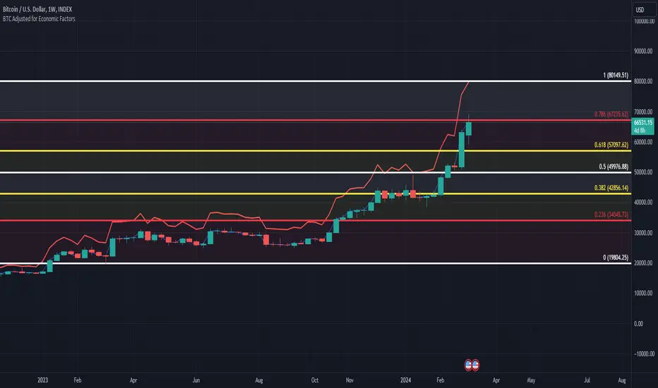
BTC/USD Inflation priced in! ~Period 2009 - 2023 (by TAS)The script creates a custom indicator titled "BTC Adjusted for Economic Factors.
Adjusted BTC Price is plotted in red, making it more prominent. The adjusted price is Bitcoin's historical closing prices adjusted for cumulative inflation over time, based on the Core Consumer Price Index (CPI) annual inflation rates from 2009 onwards.
The script calculates the adjusted price of Bitcoin by taking into account the effect of inflation on its value. It uses annual CPI rates for each year from 2009 to 2022 to calculate a cumulative inflation factor. The script assumes a placeholder inflation rate of 2.5% for 2023, indicating that this value should be updated when the actual rate is available. The script suggests adding CPI rates for additional years as they become available to maintain the accuracy of the adjustment.
Here's a breakdown of how the script works:
Core CPI Annual Inflation Rates: It starts by defining the annual inflation rates for each year from 2009 to 2022, expressed as a percentage divided by 100 to convert to a decimal.
Cumulative Inflation Calculation: The script calculates cumulative inflation starting from the year 2009 up to the current year. For each year that has passed since 2009, it multiplies the cumulative inflation factor by (1 + cpiRate), where cpiRate is the inflation rate for that year. This effectively compounds the inflation rate over time.
Adjusting Bitcoin's Price: The script then adjusts Bitcoin's closing price (close) for the calculated cumulative inflation to get the adjusted price (adjustedPrice).
Plotting the Prices: Finally, it plots both the original and the adjusted Bitcoin prices on the chart, allowing users to visually compare how inflation has theoretically impacted Bitcoin's value over time.
--------------------------------------------------------------------------------------------------
Important to notice, Fib. Retracements from the 2017 cycle top to the recent top (¬80K) doesn't look invalidated.
--------------------------------------------------------------------------------------------------
Inputs and feedback are welcome!
在脚本中搜索"bitcoin"
THISMA cbpremiumDescription:
This script is tailored for traders interested in monitoring the premium difference between the Coinbase BTCUSD pair and another selected exchange.
Key Features:
- Customizable Exchange Selection: Users can input the symbol of any other exchange to compare against Coinbase's BTCUSD pair. The default comparison is set against BITFINEX:BTCUSD.
- Real-Time Premium Calculation: The script calculates the premium or discount of Coinbase's Bitcoin price over the chosen exchange. It does this by subtracting the closing price of Bitcoin on the selected exchange from Coinbase's closing price.
- Intuitive Color Coding: The premium difference is visually represented in a histogram format. If Coinbase's price is higher, the bar is shown in a bright yellow (RGB: 236, 222, 92), indicating a premium. If it's lower, the bar is displayed in a deep blue (RGB: 46, 125, 189), signifying a discount.
Applications:
- Market Comparison: This tool is excellent for traders who want to compare Bitcoin's market value across different exchanges quickly. It helps in identifying potential arbitrage opportunities.
- Price Analysis: By understanding the premium or discount of Bitcoin on Coinbase compared to another exchange, traders can gain insights into market sentiment and potential price movements on different platforms.

WRESBAL PlusWRESBAL Plus is an improved way of looking at the same data that drives WRESBAL, which is a commonly used series on FRED.
WRESBAL is a weekly average of combined balances on FRED using inputs that are weekly averages in some cases. For example the Treasury General Account has multiple FRED series including WDTGAL (wednesday level) and WTREGEN (wednesday weekly average) There are data sets that are tracking the same metrics which are updated daily such as RRPONTSYD as opposed to WLRRAL.
This situation leads to an opportunity to create a new and improved WRESBAL with the data that is updated more frequently. WRESBAL Plus solves the problem of waiting for weekly averages to update trends.
WRESBAL plus combines data sets from FRED that are updated more frequently and are the basis for the original WRESBAL equation. WRESBAL Plus offers a signal that predicts where WRESBAL will go, and this is important when determining the direction of asset prices as they relate to liquidity. One example of an asset that closely follows WRESBAL is Bitcoin.

BTC - Hotness Index### Script Description
#### BTC - Hotness Index
This Pine Script, version 4, aims to generate a "Hotness Index" for Bitcoin (BTC) trading by utilizing a Pi Cycle Top Indicator. The script operates in a daily (`1D`) time frame and involves calculating two Simple Moving Averages (SMA) based on `close` prices:
- 111-day SMA (`D_111SMA`)
- 350-day SMA (`D_350SMA`) multiplied by 2
The primary indicator (`pi_indicator`) is derived by dividing `D_111SMA` by `D_350SMA`.
##### Sell Signal
A sell signal is plotted as a histogram if `pi_indicator` crosses above 1 (`pi_plot` variable).
##### Buy Signal
A buy signal is plotted as a histogram if `pi_indicator` crosses below 0.35 (`pi_plot_buy` variable).
##### Horizontal Lines
Two horizontal lines are included to denote the "Buy Zone" and "Sell Zone":
- "Sell Zone" at `pi_indicator` level of 1
- "Buy Zone" at `pi_indicator` level of 0.35
##### Plotting
Histogram plots are used for visualizing the signals:
- Sell signals are colored red (`RGB: 255, 59, 59`)
- Buy signals are colored green (`RGB: 82, 255, 59`)
This script provides traders a visual guide for potential buy/sell opportunities based on the Pi Cycle Top Indicator and the Hotness Index for Bitcoin. It operates under the terms of the Mozilla Public License 2.0.

SOLANA Performance & Volatility Analysis BB%Overview:
The script provides an in-depth analysis of Solana's performance and volatility. It showcases Solana's price, its inverse relationship, its own volatility, and even juxtaposes it against Bitcoin's 24-hour historical volatility. All of these are presented using the Bollinger Bands Percentage (BB%) methodology to normalise the price and volatility values between 0 and 1.
Key Components:
Inputs:
SOLANA PRICE (SOLUSD): The price of Solana.
SOLANA INVERSE (SOLUSDT.3S): The inverse of Solana's price.
SOLANA VOLATILITY (SOLUSDSHORTS): Volatility for Solana.
BITCOIN 24 HOUR HISTORICAL VOLATILITY (BVOL24H): Bitcoin's volatility over the past 24 hours.
BB Calculations:
The script uses the Bollinger Bands methodology to calculate the mean (SMA) and the standard deviation of the prices and volatilities over a certain period (default is 20 periods). The calculated upper and lower bands help in normalising the values to the range of 0 to 1.
Normalised Metrics Plotting:
For better visualisation and comparative analysis, the normalised values for:
Solana Price
Solana Inverse
Solana Volatility
Bitcoin 24hr Volatility
are plotted with steplines.
Band Plotting:
Bands are plotted at 20%, 40%, 60%, and 80% levels to serve as reference points. The area between the 40% and 60% bands is shaded to highlight the median region.
Colour Coding:
Different colours are used for easy differentiation:
Solana Price: Blue
Solana Inverse: Red
Solana Volatility: Green
Bitcoin 24hr Volatility: White
Licence & Creator:
The script adheres to the Mozilla Public Licence 2.0 and is credited to the author, "Volatility_Vibes".
Works well with Breaks and Retests with Volatility Stop

PCA-Risk IndicatorOBJECTIVE:
The objective of this indicator is to synthesize, via PCA (Principal Component Analysis), several of the most used indicators with in order to simplify the reading of any asset on any timeframe.
It is based on my Bitcoin Risk Long Term indicator, and is the evolution of another indicator that I have not published 'Average Risk Indicator'.
The idea of this indicator is to use statistics, in this case the PCA, to reduce the number of dimensions (indicator) to aggregate them in some synthetic indicators (PCX)
I invite you to dig deeper into the PCA, but that is to try to keep as much information as possible from the raw data. The signal minus the noise.
I realized this indicator a year ago, but I publish it now because I do not see the interest to keep it private.
USAGE:
Unlike the Bitcoin Risk Long Term indicator, it does not make sense to change or disable the input indicators unless you use the 'Average Indicator' function. Because each input is weighted to generate the outputs, the PCX.
I extracted several courses (Bitcoin, Gold, S&P, CAC40) on several timeframes (W, D, 4h, 1h) of Trading view and use the Excel generated for the data on which I played the PCA analysis.
The results:
explained_variance_ratio: 0.55540809 / 0.13021972 / 0.07303142 / 0.03760925
explained_variance: 11.6639671 / 2.73470717 / 1.53371209 / 0.7898212
Interpretation:
Simply put, 55% of the information contained in each indicator can be represented with PC1, +13% with PC2, +7% with PC3, +3% with PC4.
What is important to understand is that PC1, which serves as a thermometer in a way, gives a simple indication of over-buying or over-selling area better than any other indicator.
PC2, difficult to interpret, is more reactive because precedes PC1, but can give false signals.
PC3 and PC4 do not seem relevant to me.
The way I use it is to take PC1 for Risk indicator, and display PC2 with 'Area'. When PC2 turns around and PC1 arrives on extremes, it can be good points to act.
NOTES :
- It is surprising that a simple average of all the indicators gives a fairly relevant result
- With Average indicator as Risk indicator, you can combine the indicators of your choice and see the predictive power with the staining of bars.
- You can add alerts on the levels of your choice on the Risk Indicator
- If you have any idea of adding an indicator, modification, criticism, bug found: share them, it’s appreciated!
---- FR ----
OBJECTIF :
L'objectif de cet indicateur est de synthétiser, via l'ACP (Analyse en Composantes Principales), plusieurs indicateurs parmi les plus utilisés avec afin de simplifier la lecture de n'importe quel actif sur n'importe quel timeframe.
Il est inspiré de mon indicateur 'Bitcoin Risk Long Term indicator', et est l'évolution d'un autre indicateur que je n'ai pas publié 'Average Risk Indicator'.
L'idée de cet indicateur est d'utiliser les statistiques, en l'occurence l'ACP, pour réduire le nombre de dimensions (indicateur) pour les agréger dans quelques indicateurs synthétiques (PCX)
Je vous invite à creuser l'ACP, mais c'est chercher à conserver un maximum d'informations à partir de la donnée brute. Le signal moins le bruit.
J'ai réalisé cet indicateur il y a un an, mais je le publie maintenant car je ne vois pas l'intérêt de le garder privé.
UTILISATION :
Contrairement à 'Bitcoin Risk Long Term indicator', il ne fait pas sens de modifier ou désactiver les indicateurs inputs, sauf si vous utiliser la fonction 'Average Indicator'. Car chaque input est pondéré pour générer les outputs, les PCX.
J'ai extrait plusieurs cours (Bitcoin, Gold, S&P, CAC40) sur plusieurs timeframes (W, D, 4h, 1h) de Trading view et utiliser les Excel généré pour la data sur laquelle j'ai joué l'analyse ACP.
Les résultats :
explained_variance_ratio : 0.55540809 / 0.13021972 / 0.07303142 / 0.03760925
explained_variance : 11.6639671 / 2.73470717 / 1.53371209 / 0.7898212
Interprétation :
Pour faire simple, 55% de l'information contenu dans chaque indicateur peut être représenté avec PC1, +13% avec PC2, +7% avec PC3, +3% avec PC4.
Ce qui faut y comprendre c'est que le PC1, qui sert de thermomètre en quelque sorte, donne une indication simple de zone de sur-achat ou sur-vente mieux que n'importe quel autre indicateur.
PC2, difficile à interpréter, est plus réactif car précède PC1, mais peut donner des faux signaux.
PC3 et PC4 ne me semble pas pertinent.
La manière dont je m'en sert c'est de prendre PC1 pour Risk indicator, et d'afficher PC2 avec 'Region'. Lorsque PC2 se retourne et que PC1 arrive sur des extrêmes, cela peut être des bons points pour agir.
NOTES :
- Il est étonnant de constater qu'une simple moyenne de tous les indicateurs donne un résultat assez pertinent
- Avec Average indicator comme Risk indicator, vous pouvez combiner les indicateurs de vos choix et voir la force prédictive avec la coloration des bars.
- Vous pouvez ajouter des alertes sur les niveaux de votre choix sur le Risk Indicator
- Si vous avez la moindre idée d'ajout d'indicateur, modification, critique, bug trouvé : partagez-les, c'est apprécié !

YinYang RSI Volume Trend StrategyThere are many strategies that use RSI or Volume but very few that take advantage of how useful and important the two of them combined are. This strategy uses the Highs and Lows with Volume and RSI weighted calculations on top of them. You may be wondering how much of an impact Volume and RSI can have on the prices; the answer is a lot and we will discuss those with plenty of examples below, but first…
How does this strategy work?
It’s simple really, when the purchase source crosses above the inner low band (red) it creates a Buy or Long. This long has a Trailing Stop Loss band (the outer low band that's also red) that can be adjusted in the Settings. The Stop Loss is based on a % of the inner low band’s price and by default it is 0.1% lower than the inner band’s price. This Stop Loss is not only a stop loss but it can also act as a Purchase Available location.
You can get back into a trade after a stop loss / take profit has been hit when your Reset Purchase Availability After condition has been met. This can either be at Stop Loss, Entry or None.
It is advised to allow it to reset in case the stop loss was a fake out but the call was right. Sometimes it may trigger stop loss multiple times in a row, but you don’t lose much on stop loss and you gain lots when the call is right.
The Take Profit location is the basis line (white). Take Profit occurs when the Exit Source (close, open, high, low or other) crosses the basis line and then on a different bar the Exit Source crosses back over the basis line. For example, if it was a Long and the bar’s Exit Source closed above the basis line, and then 2 bars later its Exit Source closed below the basis line, Take Profit would occur. You can disable Take Profit in Settings, but it is very useful as many times the price will cross the Basis and then correct back rather than making it all the way to the opposing zone.
Longs:
If for instance your Long doesn’t need to Take Profit and instead reaches the top zone, it will close the position when it crosses above the inner top line (green).
Please note you can change the Exit Source too which is what source (close, open, high, low) it uses to end the trades.
The Shorts work the same way as the Long but just opposite, they start when the purchase source crosses under the inner upper band (green).
Shorts:
Shorts take profit when it crosses under the basis line and then crosses back.
Shorts will Stop loss when their outer upper band (green) is crossed with the Exit Source.
Short trades are completed and closed when its Exit Source crosses under the inner low red band.
So, now that you understand how the strategy works, let’s discuss why this strategy works and how it is profitable.
First we will discuss Volume as we deem it plays a much bigger role overall and in our strategy:
As I’m sure many of you know, Volume plays a huge factor in how much something moves, but it also plays a role in the strength of the movement. For instance, let’s look at two scenarios:
Bitcoin’s price goes up $1000 in 1 Day but the Volume was only 10 million
Bitcoin’s price goes up $200 in 1 Day but the Volume was 40 million
If you were to only look at the price, you’d say #1 was more important because the price moved x5 the amount as #2, but once you factor in the volume, you know this is not true. The reason why Volume plays such a huge role in Price movement is because it shows there is a large Limit Order battle going on. It means that both Bears and Bulls believe that price is a good time to Buy and Sell. This creates a strong Support and Resistance price point in this location. If we look at scenario #2, when there is high volume, especially if it is drastically larger than the average volume Bitcoin was displaying recently, what can we decipher from this? Well, the biggest take away is that the Bull’s won the battle, and that likely when that happens we will see bullish movement continuing to happen as most of the Bears Limit Orders have been fulfilled. Whereas with #2, when large price movement happens and Bitcoin goes up $1000 with low volume what can we deduce? The main takeaway is that Bull’s pressured the price up with Market Orders where they purchased the best available price, also what this means is there were very few people who were wanting to sell. This generally dictates that Whale Limit orders for Sells/Shorts are much higher up and theres room for movement, but it also means there is likely a whale that is ready to dump and crash it back down.
You may be wondering, what did this example have to do with YinYang RSI Volume Trend Strategy? Well the reason we’ve discussed this is because we use Volume multiple times to apply multiplications in our calculations to add large weight to the price when there is lots of volume (this is applied both positively and negatively). For instance, if the price drops a little and there is high volume, our strategy will move its bounds MUCH lower than the price actually dropped, and if there was low volume but the price dropped A LOT, our strategy will only move its bounds a little. We believe this reflects higher levels of price accuracy than just price alone based on the examples described above.
Don’t believe us?
Here is with Volume NOT factored in (VWMA = SMA and we remove our Volume Filter calculation):
Which produced -$2880 Profit
Here is with our Volume factored in:
Which produced $553,000 (55.3%)
As you can see, we wen’t from $-2800 profit with volume not factored to $553,000 with volume factored. That's quite a big difference! (Please note previous success does not predict future success we are simply displaying the $ amounts as example).
Now how about RSI and why does it matter in this strategy?
As I’m sure most of you are aware, RSI is one of the leading indicators used in trading. For this reason we figured it would only make sense to incorporate it into our calculations. We fiddled with RSI for quite awhile and sometimes what logically seems to be the right way to use it isn’t. Now, because of this, our RSI calculation is a little odd, but basically what we’re doing is we calculate the RSI, then turn it into a percentage (between 0-1) that can easily be multiplied to the price point we need. The price point we use is the difference between our high purchase zone and our low purchase zone. This allows us to see how much price movement there is between zones. We multiply our zone size with our RSI multiplication and we get the amount we will add +/- to our basis line (white line). This officially creates the NEW high and low purchase zones that we are actually using and displaying in our trades.
If you found that confusing, here are some examples to why it is an important calculation for this strategy:
Before RSI factored in:
Which produced 27.8% Profit
After RSI factored in:
Which produced 553% Profit
As you can see, the RSI makes not only the purchase zones more accurate, but it also greatly increases the profit the strategy is able to make. It also helps ensure an relatively linear profit slope so you know it is reliable with its trades.
This strategy can work on pretty much anything, but you should tweak the values a bit for each pair you are trading it with for best results.
We hope you can find some use out of this simple but effective strategy, if you have any questions, comments or concerns please let us know.
HAPPY TRADING!
Quantitative Trend Strategy- Uptrend longTrend Strategy #1
Indicators:
1. SMA
2. Pivot high/low functions derived from SMA
3. Step lines to plot support and resistance based on the pivot points
4. If the close is over the resistance line, green arrows plot above, and vice versa for red arrows below support.
Strategy:
1. Long Only
2. Mutable 2% TP/1.5% SL
3. 0.01% commission
4. When the close is greater than the pivot point of the sma pivot high, and the close is greater than the resistance step line, a long position is opened.
*At times, the 2% take profit may not trigger IF; the conditions for reentry are met at the time of candle closure + no exit conditions have been triggered.
5. If the position is in the green and the support step line crosses over the resistance step line, positions are exited.
How to use it and what makes it unique:
Use this strategy to trade an up-trending market using a simple moving average to determine the trend. This strategy is meant to capture a good risk/reward in a bullish market while staying active in an appropriate fashion. This strategy is unique due to it's inclusion of the step line function with statistics derived from myself.
This description tells the indicators combined to create a new strategy, with commissions and take profit/stop loss conditions included, and the process of strategy execution with a description on how to use it. If you have any questions feel free to PM me and boost if you enjoyed it. Thank you, pineUSERS!

BTC bottom top MACRO indicator based on: Cost per transaction(w)Predicting tops and bottoms in any market is a challenging task, and the Bitcoin market is no exception. Many traders and analysts use a combination of various indicators and models to help them make educated guesses about where the market might be heading. One such metric that can provide valuable insights is the Bitcoin cost per transaction indicator.
Here's how it could potentially be superior to just using price action for predicting macro tops and bottoms:
Transaction Cost as an Indicator of Network Activity: The cost per transaction on the Bitcoin network can give an indication of how much activity is taking place. When transaction costs are high, it may signal increased network usage, which often coincides with periods of market enthusiasm or FOMO (Fear of Missing Out) that can precede market tops. Conversely, lower transaction costs might indicate reduced network activity, potentially signaling a lack of investor interest that might precede market bottoms.
Reflects Real-World Use and Demand: Unlike price action, which can be influenced by speculative trading and may not always reflect the underlying fundamentals, the cost per transaction is directly tied to the use of the Bitcoin network. It offers a more fundamental approach to understanding market dynamics.
Complements Price Action Analysis: While price action can give signals about potential tops and bottoms based on historical price patterns and technical analysis, the cost per transaction can add an additional layer of information by reflecting network activity. In this way, the two can be used together to give a more complete picture of the market.
May Precede Price Changes: Changes in transaction costs could potentially precede price changes, giving advanced warning of tops and bottoms. For instance, a sudden increase in transaction costs might indicate a surge in network activity and investor interest, potentially signaling a market top. On the other hand, a decrease in transaction costs might suggest declining network activity and investor interest, potentially signaling a market bottom.
However, it's important to note that while the cost per transaction can provide valuable insights, it's not a foolproof method for predicting market tops and bottoms. Like all indicators, it should be used in conjunction with other tools and analysis methods, and traders should also consider the broader market context. As always, past performance is not indicative of future results, and all trading and investment strategies carry the risk of loss.

Open Interest All ExchangesThe indicator collects data from available exchanges based on open interest. The indicators are calculated in the amount of Bitcoin.
Below are the tickers of the exchanges that provide the data:
- BITFINEX:BTCUSD
- BITFINEX:BTCUST
- KRAKEN:BTCUSDPERP
- BITMEX:XBTUSD
- BITMEX:XBTUSDT
- BINANCE:BTCUSDTPERP
- BINANCE:BTCUSDPERP (due to low volumes and limitations of 40 requests of the request.security function, the code contains data without using the calculation)
For me, Open Interest indicators play an important role in the trading system, for this reason I share with you. I am not a financial advisor.
**Open for cooperation**
MVRV Z ScoreIndicator Overview
MVRV Z-Score is a bitcoin chart that uses blockchain analysis to identify periods where Bitcoin is extremely over or undervalued relative to its 'fair value'.
It uses three metrics:
1. Market Value: The current price of Bitcoin multiplied by the number of coins in circulation. This is like market cap in traditional markets i.e. share price multiplied by number of shares.
2. Realised Value: Rather than taking the current price of Bitcoin, Realised Value takes the price of each Bitcoin when it was last moved i.e. the last time it was sent from one wallet to another wallet. It then adds up all those individual prices and takes an average of them. It then multiplies that average price by the total number of coins in circulation.
In doing so, it strips out the short term market sentiment that we have within the Market Value metric. It can therefore be seen as a more 'true' long term measure of Bitcoin value which Market Value moves above and below depending on the market sentiment at the time.
3. Z-score (Orange): A standard deviation test that pulls out the extremes in the data between market value and realised value.
How It Can Be Used
The MVRV Z-score has historically been very effective in identifying periods where market value is moving unusually high above realised value. These periods are highlighted by the z-score (red line) entering the pink box and indicates the top of market cycles. It has been able to pick the market high of each cycle to within two weeks.
It also shows when market value is far below realised value, highlighted by z-score entering the green box. Buying Bitcoin during these periods has historically produced outsized returns.
(Bar colors shows when market is trending down or a top - strong red or trending up and bottom - strong green. Added allerts for values)
Bitcoin Price Prediction Using This Tool
MVRV Z-Score bitcoin chart is useful for predicting Bitcoin price at the extremes of market conditions. It is able to forecast where Bitcoin price may need to pull back when MVRV Z-score enters the upper red band, and also when CRYPTOCAP:BTC price may rally after spending time in the lower green band.
Historically it has picked major Bitcoin price highs to within 2 weeks.
Created By
@aweandwonder who has unfortunately since deleted the original article and his online profile.
He built on the initial work to create MVRV by Murad Mahmudov and David Puell

Active AddressesIndicator Overview
By comparing the 28 day change in price (%) with the 28 day change in active addresses (%) for Bitcoin we are able to create a short-term sentiment indicator called AASI (Active Address Sentiment Indicator).
Grey lines on the chart show the change in active addresses.
On the outer boundaries of those grey lines are standard deviation bands.
Dotted red line = upper boundary
Dotted green line = lower boundary
Orange line is the 28 day price change (%).
When the orange line reaches the upper boundary (red dotted line) it is indicating that short term market sentiment is overheated. Because the rate of increase in price is outstripping the rate of increase in active addresses.
Zooming in on the chart (left click and drag) we can see that this often corresponds with CRYPTOCAP:BTC price (blue line) stalling and/or retracing.
The opposite is true when the 28 day price change hits the lower boundary (green dotted line). Here market sentiment is overly bearish and we often see CRYPTOCAP:BTC price then increasing thereafter.
In extreme market conditions the 28 day price change (orange line) aggressively breaks out beyond the dotted red and green bands. This is typically in a major market crash or in the latter stages of a bull market. I may add additional standard deviation bands to catch these moves but for now have left them off to keep the chart clean.
Pre 2015 data is quite volatile and messy so this charts starts at 01 January 2015.
Bitcoin Price Prediction Using This Tool
Unlike many of the other Bitcoin live charts, this live chart examines lower time frames and attempts to provide a Bitcoin price prediction in terms of directional moves on weekly timeframes. So it tries to do a Bitcoin price forecast by highlighting where price may pullback or where it may bounce using price and active address data.

USDT Inflow TrackerUSDT INFLOW TRACKER
What does this script do? It looks for important inflow from USDT and write it below or above your chart.
Does it matter? Yes because Tether with planned USDT inflow highly manipulate the crypto market.
With this simple script you can study what and when something strange is going to happen on your favourite token.
HOW IT WORKS?
Pretty simple. It just continuosly check USDT (and USDC) Market Cap and verify if the last candle is way higher than last one. If it was way higher than expected it plot a green square and write a note with the total Inflow of USDT in the crypto market (not specifcially for your token)
Now you can see when an important inflow is done and start to plan your entry and exit strategy in the crypto market.
AUTOSET
With Autoset you can rely on standard values
5min TF : Inflow greater than of 15 mln (in 1 candle)
30min TF : Inflow greater than of 150 mln (in 1 candle)
60min TF : Inflow greater than of 300 mln (in 1 candle)
1Day TF : Inflow greater than of 900 mln (in 1 candle)
So you can check your favourite coin in no time looking for a good trading position
MANUAL SETTINGS
Otherwise you can set directly your Inflow to track based on your needs.
In the example below I've set to check everytime an Inflow of 25mln USDT or greater was done.
As you can see it highly influence the relative token.

BTCUSD Price prediction based on central bank liquidityIn recent months the idea that Bitcoin prices are increasingly linked to liquidity provided by central banks has gained strength. Multiple opinion leaders in the bitcoin space have shared their thoughts to explain why this is happening and why it makes sense. Some of these people I'm talking about are Preston Pysh, Dr. Jeff Ross, Steven McClurg, Lynn Alden among others.
The reality is that the correlation between market liquidity, measured as Assets held by the Federal Reserve, Bank of Japan and European Central bank, and Bitcoin prices is high. This made me wonder whether a regression between "market liquidity" and BTCUSD prices made sense in order to understand where Bitcoin prices are in relation to the liquidity in the market. After several trials I ended up fitting a polynomial regression of degree 5 between Market Liquidity and BTCUSD prices since 2013. This regression resulted in r-squared value of 90.93%. I initially visualized the results in python notebooks but then I thought it would be cool to be able to see them in real-time in tradingview.
That's where this script comes handy...
This script takes the coefficients and intercept from the polynomial regression I built and applies them to the "market_liquidity" index. In addition, it adds upper and lower bound lines to the prediction based on a 95% confidence interval. As you will see, particularly since 2020, the price of bitcoin has rarely been above or below the lines representing the 95% confidence interval. When price has actually crossed these lines it's been in moments where Bitcoin was highly overbought or oversold. Therefore this indicator could be used to understand when it's a good moment to enter or exit the market based on central bank fundamentals.
Here's the detailed step-by-step description of what the script does
1) It defines the coefficients obtained from running the regression betweeen "market liquidity" and BTCUSD. Market liquidity is defined as:
Market liquidity = FRED:WALCL + FX_IDX:JPYUSD*FRED:JPNASSETS + FX:EURUSD*FRED:ECBASSETSW - FRED:RRPONTSYD - FRED:WTREGEN
2) It defines a scale factor. The reason for this is that coefficients from the regression are very small numbers, given the huge numbers of the value of assets held by central banks. Pinescript doesn't support numbers with many decimals and rounds them to 0, so the coefficients had to be scaled up in order to be able to calculate the regression results.
3) It calculates market liquity with the formula defined above. Market liquidity is calculated in US Dollars.
4) It calculates the predicted BTCUSD price based on the coefficients and the market liquidity values.
5) It scales down the values by the same factor used to scale the coefficients up
6) It defines the standard deviation of the "potential_btcusd_price_scaled" and the actual BTCUSD prices.
7) It defines upper and lower bounds to the BTCUSD price prediction using a z-score of 1.96, which is equivalent to 95% confidence interval.
8) Lastly it plots the BTCUSD price prediction (orange) and the upper (red) and lower(green) confidence intervals.
The script can be updated as the correlation of BTCUSD to central bank assets changes (the slope values can be updated).
How to use it:
When actual BTCUSD price (blue line in the chart) crosses over the red line (upper bound) or crosses under the green line (lower bound) it should be taken as a sign that the price of BTCUSD may be overvalued or undervalued based on the value of assets held by major central banks.

Correlation prix [SP500, TESLA, BTCBefore you see this post I want to thank all the TradingView team. Every day that passes I learn better and better to use Pine script and I owe this to all those who publish and to the philosophy of TradingView. Thanks from Amos
This trading indicator compares the prices of the S&P 500 Index (SP500), Tesla (TSLA), and Bitcoin (BTC) to find correlations between them. To make the prices of SP500 and Tesla comparable to the price of Bitcoin, the indicator multiplies the closing price of Tesla by 114 and the closing price of the S&P 500 Index by 5.6.
In this way we can superimpose the prices on the BTC chart and see what happens.
Average BTC price/ tesla price = 114, so if we multiply the tesla price by 114 times we can superimpose it on the BTC price
At average BTC/SPX price = 5.6, also in this case we multiply the price of SPX by 5.6 to overlay the graph and see any correlations.
The indicator then calculates the average price between SP500 and Tesla, using the formula (SP500 + Tesla) / 2. This calculation creates a new line on the chart that represents the average price between these two assets.
The BTC_SP_TE variable is then calculated as the average of the closing price of Bitcoin and the previously calculated average price of SP500 and Tesla, using the formula (Btc + SP_TE) / 2. This calculation creates another line on the chart that represents the average price between Bitcoin and the previously calculated average between SP500 and Tesla.
The idea behind calculating these averages is to find correlations and patterns between the prices of these assets, which can help identify potential trading opportunities. By comparing the average prices of different assets, the trader can look for trends and patterns that might not be apparent when looking at each asset individually.
The indicator plots these prices on a chart and fills the area between them with either green or fuchsia, depending on which one is higher. The strategy suggests buying Bitcoin when the average price of SP500 and Tesla is higher than the current price of Bitcoin, and selling when it is lower.
To add visual cues to the trading strategy, the indicator uses the plotchar function to display a small triangle below the chart when it detects a potential buying opportunity. This is done with the following parameters:
Value: BTC_SP_TE < Btc and Btc > Btc1 and Btc1 > Btc , which is a logical expression that checks whether the average price of SP500 and Tesla is less than the current price of Bitcoin (BTC_SP_TE < Btc), and whether the current price of Bitcoin is higher than the price 10 bars ago (Btc > Btc1 ) and higher than the price on the previous bar (Btc1 > Btc ).
Text: "Moyen BTC_SP_Te", which is the text to display inside the marker.
Symbol: "▲", which is the symbol to use for the marker. In this case, it is a small triangle pointing upwards.
Location: location.belowbar, which specifies that the marker should be placed below the bar.
I hope this is an example of how to create an indicator on TradingView, remember that correlations do not always last, it is possible that when you see the graph this correspondence no longer exists, do your studies and get inspired.

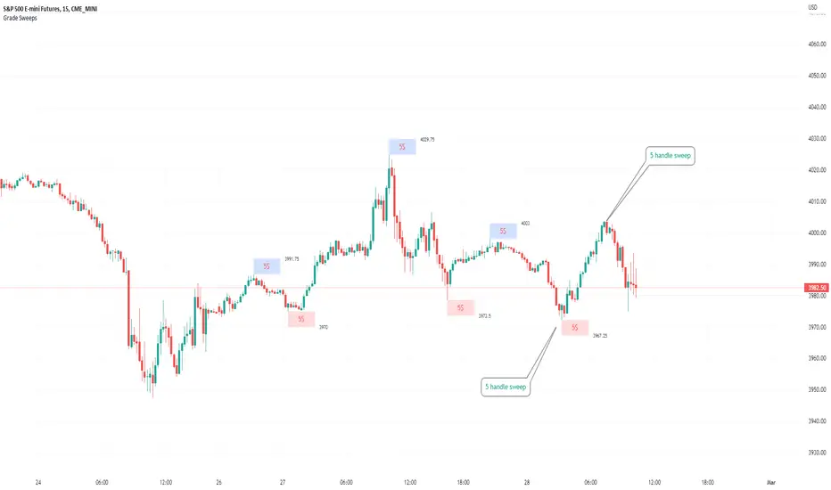
Typical Sweeps: Pivot high/low boxes. Grade sweeps, Handles/PipsTool to show typical pip-grade/ handle-grade sweep distance above pivot highs and pivot lows
-In consolidation/ranging periods (i.e. most of the time); Highs/Lows may by swept by fairly consistent distances in typical stop raids.
-Idea is from ICT teaching on typical Pip-grade sweeps in FX (10,20,30pips). Designed to work on FX, Indices, Commodities, Bitcoin.
-Above chart shows S&P; sweeping below and then above by 5 handles.
///inputs///
~choose sweep distance handles ($) or pips: will auto-calculate depending on the asset: FX= pips; Indices/stocks/commodities = handles ($)
--(2,5,10,20,30,50,100, 500, 1000)
~choose pivot lookback: larger number for more significant swing highs/lows
~choose number of historical boxes to display
~toggle on/off Pivot high boxes and Pivot low boxes independently
~extend boxes fully to the right (default is not extend)
~toggle on/off text
~text & box formatting options
Bitcoin, hourly chart; Pivot lookback = 15; $100 sweep boxes:
Eur/Usd; 15m chart; Pivot lookback = 30; 10pip sweep boxes; Boxes extended fully to the right:
VFIBs AgreementVFIBs Agreement is a custom oscillator, using Volume Weighted Fibonacci Bands (VFIBs).
The two values in yellow and teal relate to the price action and where they fall in the Fibonacci Bands for the 50 and 200 VWMAs, respectively. These values are scaled logarithmically, making it so that the 7 period moving averages of the values tend to 'stick' to the top (just above 20) or bottom (just below -20). When the background color is deep red, this indicates that there is bullish momentum and likely a bull market. The inverse, in green, represents bearish momentum or a bear market. These colors correspond to the 200 period VFIB.
The bands of the VFIBs are broken down by fibonacci values as different channels, moving alongside the mid-line above and below. The price action will go between these values, showing where it is in the extremes. This is what VFIBs agreement represents.
In order for an uptrend to begin, the two VFIBs must 'agree'. With the 50 period VFIB trending up, it doesn't matter if it keeps getting rejected by the 200 period, as we can see with Bitcoin. When the 50 period VFIB starts to pull the 200 period up or down, it could indicate an imminent reversal.
This indicator works well with any market that you would use the VFIBs in. Mid and large cap stocks, top cryptocurrencies, and indices are my top choices.

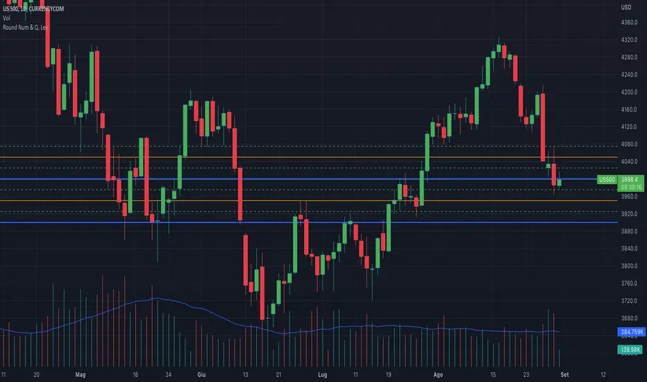
Round NumbersThis is a variation of "Round numbers above and below" indicator by BitcoinJesus-Not-Roger-Ver. I've made it two sets of lines and round number range changeable. Defaults at 100 and 500 round numbers.

Round Numbers and Quarter LevelsThis script is based on "Round Numbers Above and Below" by BitcoinJesus-Not-Roger-Ver, but unlike this script that only shows "Round Numbers" levels, my script also shows "Quarter Number" levels like 25 and 75 that are very important for those who follow the quarters theory.
Also the original script doesn't have different colors for different levels while my script has different colors and different styles for every level, this way it will be much easyer to recognize the levels at first sight.
Finally the origianl script only works with Forex while my script also works with indexes like SP500 and others.
Round Numbers are very important psychological levels in trading but also quarters levels (25 and 75) have a huge importance, so I created this script that shows all these levels with different colors and different lines style.
You can edit the color and the style of the lines as you wish and you can add all the levels you want.
In 1 hour chart 4 levels is usually enough but if you watch a daily chart then 8 levels is way better.
Features:
Personalize color to 00 round levels
Personalize color to 50 round levels
Personalize color to Quarters levels
Personalize line style to 00 round levels
Personalize line style to 50 round levels
Personalize line style to Quarters levels
Choose number of lines above and below price level (4 is default)
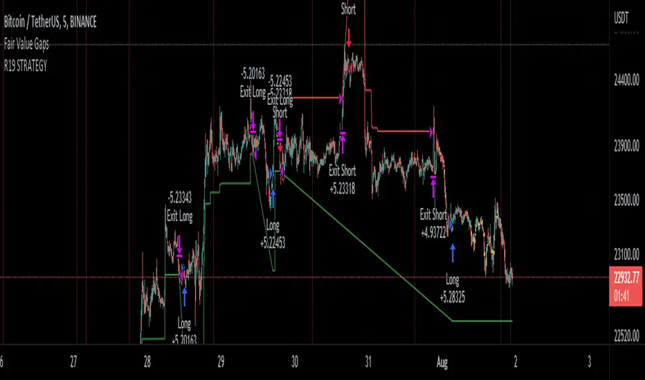
R19 STRATEGYHello again.
Let me introduce you R19 Strategy I wrote for mostly BTC long/short signals
This is an upgrated version of STRATEGY R18 F BTC strategy.
I checked this strategy on different timeframes and different assest and found it very usefull for BTC 1 Hour and 5 minutes chart.
Strategy is basically takes BTC/USDT as a main indicator, so you can apply this strategy to all cryptocurrencies as they mostly acts accordingly with BTC itself (Of course you can change main indicator to different assets if you think that there is a positive corelation with. i.e. for BTC signals you can sellect DXY index for main indicator to act for BTC long/short signals)
Default variables of the inticator is calibrated to BTC/USDT 5 minute chart. I gained above %77 success.
Strategy simply uses, ADX, MACD, SMA, Fibo, RSI combination and opens positions accordingly. Timeframe variable is very important that, strategy decides according the timeframe you've sellected but acts within the timeframe in the chart. For example, if you're on the 5 minutes chart, but you've selected 1 hour for the time frame variable, strategy looks for 1 hour MACD crossover for opening a position, but this happens in 5 minutes candle, It acts quickly and opens the position.
Strategy also uses a trailing stop loss feature. You can determine max stoploss, at which point trailing starts and at which distance trailing follows. The green and red lines will show your stoploss levels according to the position strategy enters (green for long, red for short stop loss levels). When price exceeds to the certaing levels of success, stop loss goes with the profitable price (this means, when strategy opens a position, you can put your stop loss to the green/red line in actual trading)
You can fine tune strategy to all assets.
Please write down your comments if you get more successfull about different time zones and different assets. And please tell me your fine tuning levels of this strategy as well.
See you all.
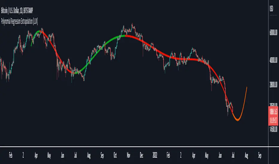
Polynomial Regression Extrapolation [LuxAlgo]This indicator fits a polynomial with a user set degree to the price using least squares and then extrapolates the result.
Settings
Length: Number of most recent price observations used to fit the model.
Extrapolate: Extrapolation horizon
Degree: Degree of the fitted polynomial
Src: Input source
Lock Fit: By default the fit and extrapolated result will readjust to any new price observation, enabling this setting allow the model to ignore new price observations, and extend the extrapolation to the most recent bar.
Usage
Polynomial regression is commonly used when a relationship between two variables can be described by a polynomial.
In technical analysis polynomial regression is commonly used to estimate underlying trends in the price as well as obtaining support/resistances. One common example being the linear regression which can be described as polynomial regression of degree 1.
Using polynomial regression for extrapolation can be considered when we assume that the underlying trend of a certain asset follows polynomial of a certain degree and that this assumption hold true for time t+1...,t+n . This is rarely the case but it can be of interest to certain users performing longer term analysis of assets such as Bitcoin.
The selection of the polynomial degree can be done considering the underlying trend of the observations we are trying to fit. In practice, it is rare to go over a degree of 3, as higher degree would tend to highlight more noisy variations.
Using a polynomial of degree 1 will return a line, and as such can be considered when the underlying trend is linear, but one could improve the fit by using an higher degree.
The chart above fits a polynomial of degree 2, this can be used to model more parabolic observations. We can see in the chart above that this improves the fit.
In the chart above a polynomial of degree 6 is used, we can see how more variations are highlighted. The extrapolation of higher degree polynomials can eventually highlight future turning points due to the nature of the polynomial, however there are no guarantee that these will reflect exact future reversals.
Details
A polynomial regression model y(t) of degree p is described by:
y(t) = β(0) + β(1)x(t) + β(2)x(t)^2 + ... + β(p)x(t)^p
The vector coefficients β are obtained such that the sum of squared error between the observations and y(t) is minimized. This can be achieved through specific iterative algorithms or directly by solving the system of equations:
β(0) + β(1)x(0) + β(2)x(0)^2 + ... + β(p)x(0)^p = y(0)
β(0) + β(1)x(1) + β(2)x(1)^2 + ... + β(p)x(1)^p = y(1)
...
β(0) + β(1)x(t-1) + β(2)x(t-1)^2 + ... + β(p)x(t-1)^p = y(t-1)
Note that solving this system of equations for higher degrees p with high x values can drastically affect the accuracy of the results. One method to circumvent this can be to subtract x by its mean.
Cipher B divergencies for Crypto (Finandy support)Hello Traders!
In times of high volatility, it is important to follow a market-neutral strategy to protect your hard-earned assets. The simple script employs common buy/sell and/or divergencies signals from the VuManChu Cipher B indicator with fixed stop losses and takes profits. The signals are filtered by a local trend of a coin of interest and the global trend of Bitcoin. These trends-filtered signals demonstrated better performance on most of the back- and forward- tests for USDT cryptocurrency futures. The strategy is based on my real experience, it's a diamond I want to share with you.
In terms of visualization if the background is red and the price is below the yellow line then only a short position can be opened. Conversely, if the price is above the yellow line AND the background is green only a long position can be opened.
Inputs from VuManChu you can find on the top. Frankly, I do not know how they can help you to improve the performance of the strategy. My inputs of the script you can find in "Trend Settings" and "TP/SL Settings" at the bottom.
The checkbox "Only divergencies" lets to broadcast only more reliable buy/sell signals for a cost of rare deals.
The checkbox "Cancel all positions if price crosses local sma?" makes additional trailing stop loss. Usually, this function increases the win rate by "smoothing" the risk/reward ratio, as a usual stop loss does.
You can tune SL/TP based on backtesting.
To connect the script to Finandy just edit "name" and "secret" to connect your webhook (see the bottom of the script).
The rule of thumb for the strategy is "only divergencies" - ON, high reward/risk (TP/SL) ratio, 5 min timeframe on chart help with performance.
Finally, I am looking forward to feedback from you. If you have some cool features for my script in your mind, do not hesitate to leave them in the comments.
Good luck!
Volume in Base CurrencyShows the volume in USD, EUR, etc (whatever the base currency is for the asset) instead of number of stocks, bitcoins, etc.
