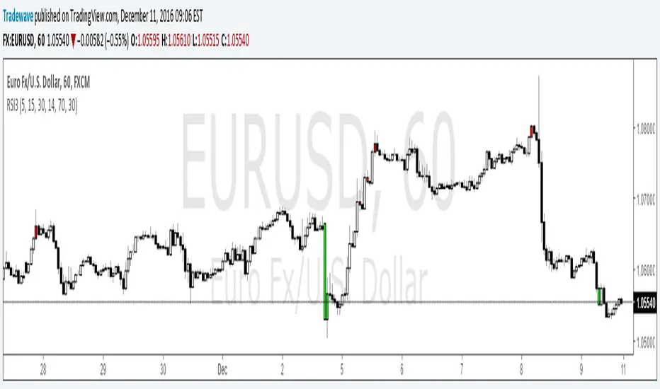
Multi Time frame RSITriple RSI Indicator.
Colors bars red when RSI is overbought across 3 time frames specified by user.
Colors bars lime when RSI is oversold across 3 time frames specified by user.
os/ob levels and RSI period can also be customized.
在脚本中搜索"liquidity"
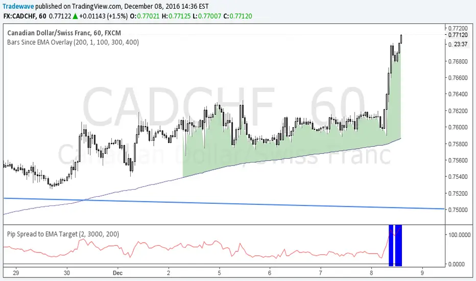
Pip Spread to EMA TargetThis script calculates the total number of pips between current close and a target EMA. There are three thresholds that can be specified to determine when that total number of pip spread exceeds a standard deviation multiple set by user. Current standard deviation thresholds on pip spread are set to 2, 2.5 and 3. A pip spread that goes above 3 standard deviations is considered very extreme. The standard deviation is calculated across a predetermined set of bars. Currently look back period for standard deviation count is set to 3000.

Pip Spread to EMA TargetCalculates the pip spread to a target EMA. When spread exceeds a standard deviation multiple set by user background area goes blue. Blue zones are extreme spreads and opportunities for a reversion to EMA Target trade.
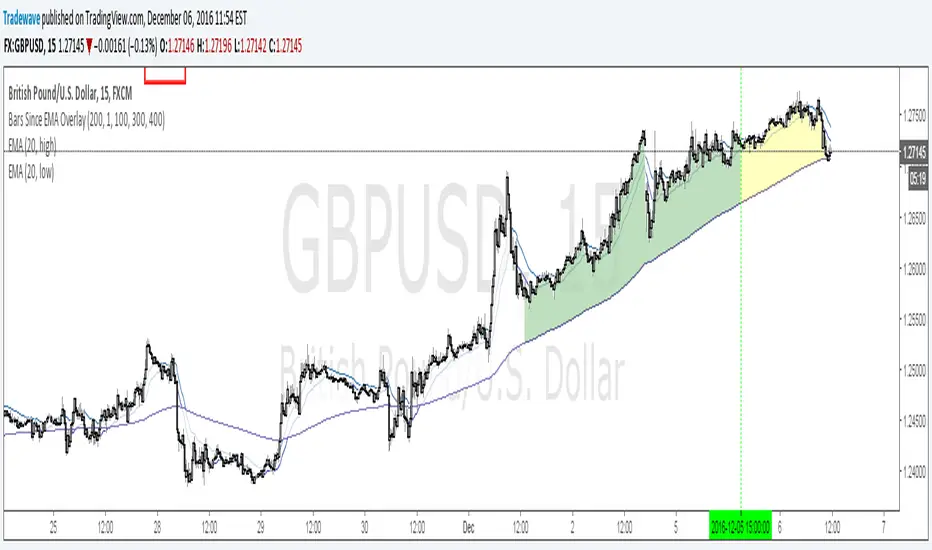
Bars Since EMA OverlayCounts number of bars since an EMA Touch or an EMA cross with close and shades the area when a threshold is exceeded. Currently supported for 3 thresholds.

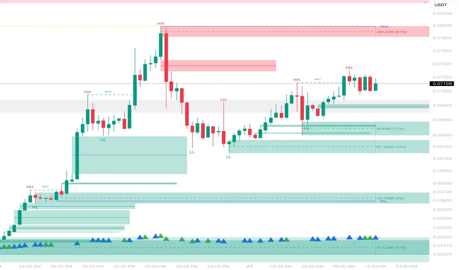
TQ's Support & Resistance(My goal creating this indicator): Provide a way to categorize and label key structures on multiple different levels so I can create a plan based on those observable facts.
The Underlying Concept / What is Momentum?
Momentum indicates transaction pressure. If the algorithm detects price is going up, that would be considered positive momentum. If the algorithm detects price is going down negative momentum would be detected.
The Momentum shown is derived from a price action pattern. Unlike my previous Support & Resistance indicator that used Super Trend, this indicator uses a unique pattern I created. On the first bar bearish momentum is detected a resistance Level is made at the highest point of the previous bullish condition. On the first bar bullish momentum is detected a support Level is made at the lowest point of the previous bearish condition. This happens on 5 different Momentum Levels, (short-term to long-term). I currently use this pattern to trade so the source code is protected.
What is Severity?
Severity is How we differentiate the importance of different Highs and Lows. If Momentum is detected on a higher level the Supply or Demand Level is updated. The Color and Size representing that Level will be shown. Demand and Supply Levels made by higher levels are more SEVERE than a demand level made by a lower level.
Technical Inputs
- to ensure the correct calculation of Support and Resistance levels change BAR_INDEX. BAR_INDEX creates a buffer at the start of the chart. For example: If you set BAR_INDEX to 300. The script will wait for 300 bars to elapse on the current chart before running. This allows the script more time to gather data. Which is needed in order for our dynamic lookback length to never return an error (Dynamic lookback length can't be negative or zero). The lower the timeframe the greater the number of bars need. For Example, if I open up a 1min chart I would enter 5000 as my BAR_INDEX since that will provide enough data to ensure the correct calculation of Support and Resistance levels. If I was on a daily chart, I would enter a lower number such as 800. Don't be afraid to play around with this.
- Toggle options (Close) or (High & Low) creates Support and Resistance Levels using the Lowest close and Highest close or using the Lowest low and Highest high.
Level Inputs
- The indicator has 5 Different Levels indicating SEVEREITY of a Supply and Demand Levels. The higher the Level the more SEVERE the Level.
Display Inputs
- You have the option to customize the Length, Width, Line Style, and Colors of all 5 different
- This indicator includes a Trend Chart. To Easily verify the current trend of any displayed by this indicator toggle on Chart On/Off. You also get the option to change the Chart Position and the size of the Trend Chart
How Trend Is being Determined?
(Close > Current Supply Level) if this statement is true technically price made a HH, so the trend is bullish.
(Close < Current Demand Level) if this statement is true technically price made a LL, so the trend is bearish.
- Fully customize how you display Market Structure on different levels. Line Length, Line Width, Line Style, and Line color can all be customized.
How it can be used?
(Examples of Different ways you can use this indicator): Easily categorize the severity of each and every Supply or Demand Level in the market (The higher Level the stronger the level)
: Quickly Determine the trend of any Level.
: Get a consistent view of a market and how different Levels are behaving but just use one chart.
: Take the discretion from hand drawing support and resistance lines out of your trading.
: Find and categorize strong levels for potential breakouts.
: Trend Analysis, use Levels to create a narrative based on observable facts from these Levels.
: Different Targets to take money off the table.
: Use Severity to differentiate between different trend line setups.
: Find Great places to move your stop loss too.

Visible Range Support and Resistance [AlgoAlpha]🌟 Introducing the Visible Range Support and Resistance 🌟
Discover key support and resistance levels with the innovative "Visible Range Support and Resistance" indicator by AlgoAlpha! 🚀📈 This advanced tool dynamically identifies significant price zones based on the visible range of your chart, providing traders with crucial insights for making informed decisions.
Key Features:
Dynamic support and resistance levels based on visible chart range 📏
User-defined resolution for tailored analysis 🎯
Clear visual representation of significant key zones 🖼️
Easy integration with any trading strategy 💼
How to Use:
🛠 Add the Indicator : Add the indicator to favourites. Adjust settings like resolution and horizontal extension to suit your trading style.
📊 Market Analysis : Identify key support and resistance zones based on the highlighted areas. These zones indicate significant price levels where the market may react.
How it Works:
The indicator segments the price range into user-defined resolutions, analyzing the highest and lowest points to establish boundaries. It calculates the frequency of price action within these segments, highlighting key levels where price movements are least concentrated (areas where price tends to pivot). Customizable settings like resolution and horizontal extension allow for tailored analysis, while the intuitive visual representation makes it easy to spot potential support and resistance zones directly on your chart.
By leveraging this indicator, you can gain deeper insights into market dynamics and improve your trading strategy with data driven support and resistance analysis. Happy trading! 💹✨

Delta Magnet Zone Extended – Selective HideLiquidity Zone Reversal — Description 🔍📊
This indicator automatically identifies liquidity zones where price previously grabbed orders, swept highs/lows, or created strong reaction points. Instead of plotting thin lines, this version converts those levels into zones, giving traders a clearer view of where the market has unfinished business and where future reactions are likely to occur.
These zones act as institutional magnets — areas where liquidity providers, algos, and larger players commonly enter or exit positions.
How It Works ⚙️💡
The script scans recent price action and detects local swing highs and lows. It then builds rectangular liquidity zones around these levels, extending them forward so you can see:
🟥 Bearish liquidity sweep zones
🟩 Bullish liquidity sweep zones
🔁 Areas where price previously failed, rejected, or consolidated
🎯 Potential reversal targets on both sides of the market
These zones update automatically as new structure forms, giving you an always-current map of market memory.
Why the 9-Day Look-Back Is Powerful (My Default) 📅✨
I personally keep the look-back set to 9 days by default because:
✔️ It captures the entire previous trading week
✔️ It maps out where SPY/QQQ/ES has already tapped liquidity
✔️ It shows the true zones institutions defended
✔️ It reveals where price is most likely to react again moving forward
Using a 9-day window gives you a clean, high-signal map of:
Last week’s highs & lows
Prior liquidity sweeps
Rejection zones
Imbalance cleanup levels
This keeps the chart minimal, powerful, and hyper-relevant to current order flow.
How Traders Use These Zones 🎯📈
Here are the most common ways traders use these liquidity zones:
1️⃣ Identify High-Probability Reversal Areas 🔄
Price often reacts strongly when returning to a past liquidity zone — especially if it previously swept stops there.
2️⃣ Confirm Breakouts or Failures 🚪➡️
Break above a bearish zone?
Momentum continuation is likely.
Reject inside a zone?
Reversal or range expansion often follows.
3️⃣ Set Targets & Stop Placement 🎯🛡️
Zones give logical:
Profit targets
Trend exhaustion points
Areas to avoid entering new trades
4️⃣ Time 0DTE Scalps With Precision ⚡
Liquidity zones tighten your expectations for:
Where SPY/QQQ will bounce
Where reversals start
Where liquidity magnets pull price by end of day
Why This Indicator Matters 🧠🔥
Liquidity drives markets.
Not indicators.
Not moving averages.
Not random levels.
This tool shows you where actual orders exist, where they were previously swept, and where institutions are most likely to step in again.
It gives you:
Cleaner charts
Higher confidence
Better strike selection
More precise entries
Stronger exits
All without noise.

Directional Pressure (maybexo)Liquidity Candles, observed in financial markets, display distinctive candlestick patterns that are noteworthy. These candles exhibit intentional price behavior aimed at triggering stop-loss orders and momentarily misleading traders. The pattern typically starts with a price movement against the current trend, activating stop-loss orders and capitalizing on liquidity from traders anticipating the prevailing trend. Subsequently, the price swiftly changes course, breaking and conclusively closing beyond the prior candle's range, often surprising unsuspecting traders.
Characteristics:
1. Liquidity Grab:
- Liquidity Candles initiate with a deliberate move against the existing trend, aimed at triggering stop-loss orders and gathering liquidity from traders who have placed stops in anticipation of the initial trend.
- Notably, the size of the wick in this liquidity grab is significant; a larger wick indicates a more substantial liquidity grab and can strengthen the indication of a potential market reversal.
2. Swift Reversal and Breakout:
- Following the liquidity grab, the price swiftly changes direction, breaking and conclusively closing above or below the previous candle's range.
3. Institutional Behavior:
- These candles are often linked to institutional trading behavior, suggesting potential involvement by significant market participants due to their distinct and deliberate price action.
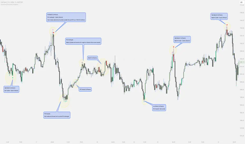
// Diamonds
1. RSI Diamonds:
The RSI Diamonds represent RSI entering either overbought or oversold levels.
These Diamonds serve as an early indication for "Spooky Diamonds" as Spooky Diamonds can only form in these conditions
2. Spooky Diamonds:
The Spooky Diamonds highlight specific candle conditions, aiding in the identification of bullish or bearish momentum in the market while considering the RSI status.
Bullish Candle Momentum: The candle size is greater than the previous candle multiplied by a user-defined factor (filterMultiplier) and the closing price is higher than the opening price. This can suggest bullish momentum.
Bearish Candle Momentum: The candle size is greater than the previous candle multiplied by the filterMultiplier, and the closing price is lower than the opening price. This can suggest bearish momentum.
Important Notes:
The Candles + Diamonds should not be used in isolation as buy or sell signals but rather as additional information for your trading strategy.
The goal of this indicator is to provide a visual representation of RSI data and potential momentum during overbought or oversold conditions.
By utilizing the diamonds and candles, you can easily identify RSI levels and their interaction with candles, aiding in decision-making within your trading strategy.
Disclaimer: Always consider your risk tolerance and conduct thorough analysis before making any trading decisions.
Inspiration Credits:
Vanitati
Mr. Casino
🧠 Rogue BTC Dominance + BTC Price MonitorLiquidity never lies.
When whales are done pumping, they exit before price tanks, often during sideways chop or fake strength.
So we build a tracker that detects:
Volume drop during uptrend (distribution phase)
Exchange inflows of coins
Rising USDT.D while price holds → stealth exit
Divergence between price & on-chain flows
👁️ Quick Use Case: BTC/USDT with USDT.D Overlay
If you see this pattern:
BTC sideways or slow uptrend
Volume declining
USDT.D rising
BTC.D holding flat
→ Liquidity Exit Detected.
Smart money is exiting quietly, waiting for retail to hold the bag.
Liquidity Stress Index (SOFR - IORB)How to use:
> +10 bps — TIGHT
−5 +10 bps — NEUTRAL
< −5 bps — LOOSE

Liquidity Sweeps (Improved)this is improved version of liqudity sweep and alert thois is my third attempt

Multi-Timeframe Sweep IndicatorsLiquidity Sweeps: Identify when price sweeps stops above/below key levels
Breakout Confirmation: Confirm breakouts across multiple timeframes
Entry Timing: Use lower timeframe sweeps for precise entries
Risk Management: Higher timeframe sweeps may indicate stronger moves
The indicator works best when combined with other analysis techniques like support/resistance levels, volume analysis, and market structure.
Liquidity Fvg IdentifierDear Traders,
This indicator is very effective and supports Price action Traders.
Swing Identification
This automatically Detect swings level and mark as per the chart Time frame. these lines can be used for support and resistance.This is represented by Yellow and Blue lines
There is an option to put Higher time frame swing levels and these are represented by Green and Red Lines. Eg: if you are trading in 5 mins and you also want 1 hour swing levels , then you can get this by selecting higher time frame 1 hour and select both Chart and Htf in the option provided.
Trade: If price is approaching where both Times frames swing lines are coinciding these levels act as strong Support and Resistance . You need to wait for proper price action to form and take Trades.
FVG
This also automatically detect Fare Value Gaps and mark as per the chart Time Frame. These can be used for reversal trades . This is represented buy purple blocks
There is an option to put higher time frame FVG and these are represented by Red Blocks. Eg : if you are trading in 15 mins and you also want 4 hours FVG, then you can get this by selecting Higher time frame 4 hours and select both chart and HTF in the option provided.
Trade: If price is approaching where both time frames FVG are coinciding , these box will act as strong support and reversal. wait for proper price action and trade can be taken.
Volume Breakout.
This will automatically detect and volume breakout of last 60 candles and plots below the candle. These can be adjusted in setting as per requirement. suppose you want for last 30 candles , you can select 30 and it will plot below candle when ever there is breakout.
Trade: When ever volume breakout is coming near swing or fvg support or resistance , this can be considered to support reversal.
Pls take your financial advisor suggesting before using taking trades .
any suggestion reach to us thru message
Thanks

Volume-Weighted Price MovementThe Volume-Weighted Price Movement (VWPM) indicator is an easy to read technical analysis tool that analyses how volume and price movement work together to drive market momentum.
How It Works
The VWPM indicator tracks two primary components:
Bullish Movement (green line): Measures the upward price movement weighted by volume. When price closes above the open, this component calculates how much buying pressure exists by multiplying the price change (close - open) by the volume of that period.
Bearish Movement (red line): Measures the downward price movement weighted by volume. When price closes below the open, this component calculates how much selling pressure exists by multiplying the price change (open - close) by the volume of that period.
Bull-Bear Difference (lime/orange line): Shows the net momentum by subtracting bearish movement from bullish movement, providing an at-a-glance view of which force is dominant.
The VWPM integrates volume data to identify whether price movements are backed by significant participation. A large price move with low volume carries less weight than the same move with high volume, providing a more accurate reflection of market strength.
A shorter lookback period makes the indicator more responsive to recent price action, while a longer period smooths out market noise for trend identification.
Interpretation
Bullish Signals
When the green line (bull movement) rises and stays above the red line
When the Bull-Bear Difference line crosses above zero and maintains positive momentum
Divergence between price making lower lows but the bull line making higher lows (hidden strength)
Bearish Signals
When the red line (bear movement) rises and stays above the green line
When the Bull-Bear Difference line crosses below zero and maintains negative momentum
Divergence between price making higher highs but the bull line making lower highs (hidden weakness)
open source, if anyone makes the script better please let me know :)

Liquidity Levels [LuxAlgo]The Peak Activity Levels indicator displays support and resistance levels from prices accompanied by significant volume. The indicator includes a histogram returning the frequency of closing prices falling between two parallel levels, each bin shows the number of bullish candles within the levels.
1. Settings
Length: Lookback for the detection of volume peaks.
Number Of Levels: Determines the number of levels to display.
Levels Color Mode: Determines how the levels should be colored. "Relative" will color the levels based on their location relative to the current price. "Random" will apply a random color to each level. "Fixed" will use a single color for each level.
Levels Style: Style of the displayed levels. Styles include solid, dashed, and dotted.
1.1 Histogram
Show Histogram: Determines whether to display the histogram or not.
Histogram Window: Lookback period of the histogram calculation.
Bins Colors: Control the color of the histogram bins.
2. Usage
The indicator can be used to display ready-to-use support and resistance. These are constructed from peaks in volume. When a peak occurs, we take the price where this peak occurred and use it as the value for our level.
If one of the levels was previously tested, we can hypothesize that the level might be used as support/resistance in the future. Additional analysis using volume can be done in order to confirm a potential bounce.
The histogram can return various information to the user. It can show if the price stayed within two levels for a long time and if the price within two levels was mostly made of bullish or bearish candles.
In the chart above, we can see that over the most recent 200 bars (determined by Histogram Window) 68 closing prices fall between levels A and B, with 27 bars being bullish.
Additionally, the width of a bin and its length can sometimes give information about the volatility of a specific price variation. If a bin is very wide but short (a low number of closing prices fallen within the levels) then we can conclude a most of the movement was done on a short amount of time.

USDT Market Cap Change [Alpha Extract]A sophisticated stablecoin market analysis tool that tracks USDT market capitalization changes across daily and 60-day periods with statistical normalization and gradient intensity visualization. Utilizing z-score methodology for overbought/oversold detection and dynamic color gradients reflecting change magnitude, this indicator delivers institutional-grade market liquidity assessment through stablecoin flow analysis. The system's dual-timeframe approach combined with statistical normalization provides comprehensive market sentiment measurement based on capital inflows and outflows from the dominant stablecoin.
🔶 Advanced Market Cap Tracking Framework
Implements daily USDT market capitalization monitoring with dual-period change calculations measuring both 1-day and 60-day net capital flows. The system retrieves real-time CRYPTOCAP:USDT data on daily timeframe resolution, calculating absolute dollar changes to quantify stablecoin supply expansion or contraction as primary market liquidity indicator.
// Core Market Cap Analysis
USDT = request.security("CRYPTOCAP:USDT", "D", close)
USDT_60D_Change = USDT - USDT
USDT_1D_Change = USDT - USDT
🔶 Dynamic Gradient Intensity System
Features sophisticated color gradient engine that intensifies visual representation based on change magnitude relative to recent extremes. The system normalizes current 60-day change against configurable lookback period maximum, applying gradient strength calculation to transition colors from neutral tones through progressively intense blues (negative) or reds (positive) based on flow direction and magnitude.
🔶 Statistical Z-Score Normalization Engine
Implements comprehensive z-score calculation framework that normalizes 60-day market cap changes using rolling mean and standard deviation for objective overbought/oversold determination. The system applies statistical normalization over configurable periods, enabling cross-temporal comparison and threshold-based regime identification independent of absolute market cap levels.
// Z-Score Normalization
Change_Mean = ta.sma(USDT_60D_Change, Normalization_Length)
Change_StdDev = ta.stdev(USDT_60D_Change, Normalization_Length)
Z_Score = Change_StdDev > 0 ? (USDT_60D_Change - Change_Mean) / Change_StdDev : 0.0
🔶 Multi-Tier Threshold Detection System
Provides four-level regime classification including standard overbought (+1.5σ), standard oversold (-1.5σ), extreme overbought (+2.5σ), and extreme oversold (-2.5σ) thresholds with configurable adjustment. The system identifies market liquidity extremes when stablecoin inflows or outflows reach statistically significant levels, indicating potential market turning points or trend exhaustion.
🔶 Dual-Timeframe Flow Visualization
Features layered area plots displaying both 60-day strategic flows and 1-day tactical movements with distinct color coding for instant flow direction assessment. The system overlays short-term daily changes on longer-term 60-day trends, enabling traders to identify divergences between tactical and strategic capital flows into or out of stablecoin reserves.
🔶 Gradient Color Psychology Framework
Implements intuitive color scheme where red gradients indicate capital inflow (bullish for crypto as USDT supply expands for buying) and blue gradients show capital outflow (bearish as USDT is redeemed). The intensity progression from pale to vivid colors communicates flow magnitude, with extreme colors signaling statistically significant liquidity events requiring attention.
🔶 Background Zone Highlighting System
Provides subtle background coloring when z-score breaches overbought or oversold thresholds, creating visual alerts without obscuring primary data. The system applies translucent red backgrounds during overbought conditions and blue during oversold states, enabling instant regime recognition across chart timeframes.
🔶 Configurable Normalization Architecture
Features adjustable gradient lookback and statistical normalization periods enabling optimization across different market cycles and trading timeframes. The system allows traders to calibrate sensitivity by modifying the window used for maximum change detection (gradient) and mean/standard deviation calculation (z-score), adapting to volatile or stable market regimes.
🔶 Market Liquidity Interpretation Framework
Tracks USDT supply changes as proxy for overall cryptocurrency market liquidity conditions, where expanding market cap indicates fresh capital entering crypto markets and contracting cap suggests capital flight. The system provides leading indicator properties as large stablecoin inflows often precede major market rallies while outflows may signal distribution phases.
🔶 Why Choose USDT Market Cap Change ?
This indicator delivers sophisticated stablecoin flow analysis through statistical normalization and gradient visualization of USDT market capitalization changes. Unlike traditional market sentiment indicators that rely on price action alone, this tool measures actual capital flows through the dominant stablecoin, providing objective assessment of market liquidity conditions. The combination of dual-timeframe tracking, z-score normalization for overbought/oversold detection, and intensity-based gradient coloring makes it essential for traders seeking macro-level market assessment and regime change detection across cryptocurrency markets. The indicator excels at identifying liquidity extremes that often precede major market reversals or trend accelerations.

ICT Candle Reading PROICT Candle Reading – Visual Clean
This indicator is designed to provide a clean and precise price reading, based on ICT and Smart Money Concepts, without cluttering the chart.
Its purpose is to help traders identify real institutional zones, understand market intention, and improve entry timing, using pure price action.
🔹 What does this indicator show?
🟢 Fair Value Gaps (FVG / Imbalances)
Detects market inefficiencies created by impulsive moves.
Displayed as clean and minimal boxes extended into the future.
Useful as mitigation, reaction, or continuation zones.
🟠 Liquidity Sweeps
Highlights liquidity grabs above recent highs or below recent lows.
Drawn using dashed horizontal lines.
Helps identify market manipulation before the true move.
🔵 Displacement Candles
Identifies candles with dominant bodies, showing institutional momentum.
Marked with small symbols to keep the chart clean.
Useful to confirm impulse starts or shifts in market intent.
🎯 Indicator Philosophy
❌ No lagging indicators
❌ No chart clutter
✅ Real ICT concepts
✅ Clean candle reading
✅ Suitable for scalping, intraday, and swing trading
⚙️ Customization
Each concept can be enabled or disabled individually.
Zone extension length is adjustable.
Optimized for 15M, 1H, and 4H timeframes.
📈 How to use
This indicator does not provide automatic buy/sell signals.
It is best used with:
Higher timeframe bias
Market structure
Session timing (London / New York)
Proper risk management
🧠 Final Notes
ICT Candle Reading – Visual Clean helps you see the market from an institutional perspective, focusing only on what truly matters: price, liquidity, and intent.

Quarterly Theory The Quarterly Theory indicator is a refined analytical tool that applies the ICT (Inner Circle Trader) framework and fractal time principles. It divides market time into structured quarterly cycles, anchored by the True Open of each period, to provide precise signals for trade entry and exit. This approach is consistently effective across all timeframes—from yearly and monthly charts down to 90-minute sessions.
The core model defines four distinct market phases within each cycle:
Q1 – Accumulation: A consolidation phase where the market builds a base for the next move.
Q2 – Manipulation (Judas Swing): Characterized by deceptive, rapid price action designed to trap traders before a true trend emerges.
Q3 – Distribution: A period of high volatility as positions are unwound and transferred.
Q4 – Continuation/Reversal: The cycle concludes with the established trend either extending or reversing.
By leveraging smart algorithms, the indicator analyzes these phases to detect critical market structures such as liquidity zones, stop-runs, and high-probability price patterns. This synthesis of Quarterly Theory, fractal timing, and liquidity analysis delivers a data-driven edge, empowering traders to decode complex market behavior and execute informed, strategic trades.

4HR JRSX Swing Bias (RB Trading)4HR JRSX Swing Bias (RB Trading)
The 4HR JRSX Swing Bias is a higher timeframe swing analysis script designed to evaluate directional pressure, momentum decay, and price acceptance on the four hour chart. It is built specifically for GBPUSD and EURUSD and is not intended for use on other markets or timeframes.
It highlights conditions where directional pressure weakens, rotates, and is then confirmed by price behavior.
Intended Use and Scope
• Timeframe: 4 hour only
• Markets: GBPUSD and EURUSD
• Style: Swing bias and rotation analysis
• Signal frequency: Intentionally low, typically 10 to 15 setups per year per pair
• Alerts: Available for confirmed setups
• Not designed for Asia session conditions
Core Framework
The script operates through a sequential three-stage process. A setup can only appear when all stages align.
Directional pressure evaluation
Momentum exhaustion and rotation
Candle-based price confirmation
This structure prevents signals from appearing during noise or low-quality market conditions.
Directional Pressure Evaluation
The first stage measures directional pressure across multiple four hour candles using a smoothed strength calculation. This step evaluates whether bullish or bearish participation is dominant over time rather than reacting to isolated price spikes.
When directional pressure is unclear or neutral, the script remains inactive.
Momentum Exhaustion and Rotation
Once directional pressure is established, the script monitors for loss of momentum. Exhaustion is identified when pressure fails to expand despite continued price movement.
This decay often appears near the later stages of a directional move and signals increased probability of rotation rather than continuation.
Price Acceptance and Confirmation
The final stage requires price to confirm the rotation through candle behavior. No intrabar logic is used.
• Buy confirmation requires either
– a bullish candle close following downside pressure exhaustion
– or a pinbar showing strong rejection of lower prices
• Sell confirmation requires either
– a bearish candle close following upside pressure exhaustion
– or a pinbar showing strong rejection of higher prices
A setup is only confirmed after the four hour candle has fully closed.
Stop and Target Reference Plotting
When a setup is confirmed, the script plots visual reference levels:
• A stop reference beyond the exhaustion zone where the setup would be invalidated
• A projected target reference calculated using a fixed 4R multiple relative to the stop distance
These levels are provided for structural planning and consistency. They do not represent predictions or guarantees.
Why the Four Hour Chart Is Required
The pressure and exhaustion calculations are tuned to higher-timeframe behavior. On lower timeframes, momentum cycles occur too rapidly and lead to frequent false rotations.
The four hour chart provides the balance required for meaningful pressure, decay, and acceptance to develop.
Session Considerations
The script is not intended for Asia session evaluation. Reduced liquidity during those hours can distort momentum behavior and reduce signal quality. Best evaluation occurs during or after London and New York participation.
Chart Presentation Guidelines
• Use the script on a clean chart
• Avoid stacking other oscillators or momentum tools
• If drawings are used, they should be limited to swing structure or key price levels
All visual elements should support understanding of the script output.
Important Notes
This script analyzes historical price behavior to identify structural swing conditions. It does not predict future price movement or ensure outcomes. Users should test the tool, understand its confirmation rules, and apply independent risk management.

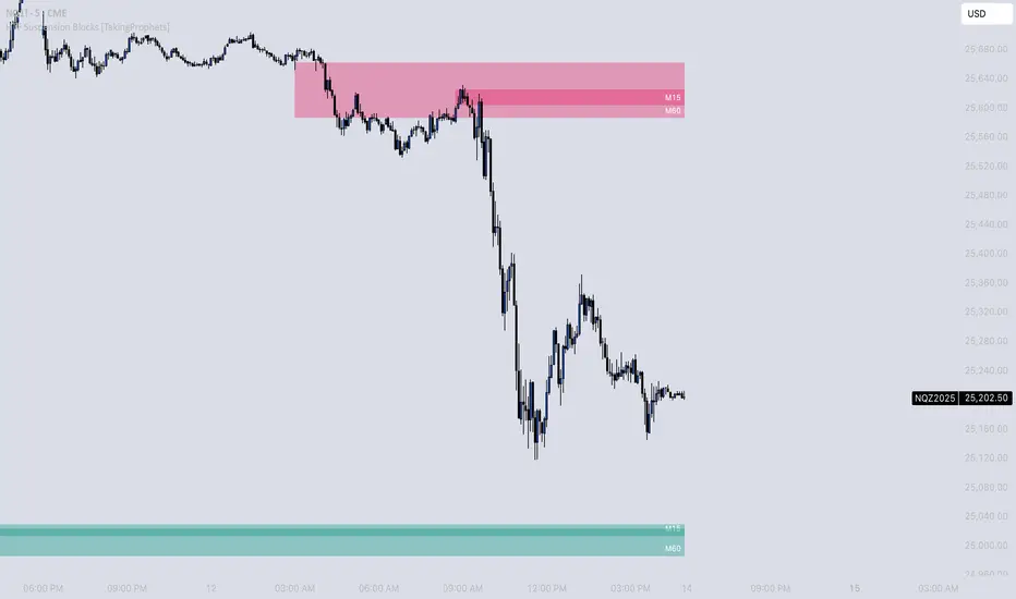
HTF Suspension Blocks [TakingProphets]-----------------------------------------------------------------------------------------------
HTF SUSPENSION BLOCKS
-----------------------------------------------------------------------------------------------
HTF Suspension Blocks bring ICT’s Suspension Block concept into a multi-timeframe workflow by detecting the 3-candle pattern on higher timeframes and projecting those zones directly onto your current execution chart.
Instead of only seeing Suspension Blocks on the timeframe they form, this script identifies valid HTF formations, draws their ranges on your lower timeframe, extends them forward, and manages invalidation automatically. You get higher-timeframe context while staying in your execution environment.
-----------------------------------------------------------------------------------------------
PURPOSE AND SCOPE
-----------------------------------------------------------------------------------------------
- Detect ICT-style Suspension Blocks on multiple higher timeframes (HTF 1 / HTF 2 / HTF 3)
- Project HTF blocks onto the current chart using bar-time anchored drawing
- Require measurable body-to-body separation defined in true ticks (instrument-aware)
- Auto-extend blocks forward in time until invalidation
- Optional Consequent Encroachment (50% equilibrium) inside each block
- Per-timeframe visibility limiting so charts stay clean and actionable
- Labels each block with the originating HTF (ex: M5 / M15 / M60)
- Alerts for:
- New HTF bullish / bearish block formation
- Price entering into any HTF bullish / bearish block
- Session-restricted alert windows (New York time)
-----------------------------------------------------------------------------------------------
WHAT IS A SUSPENSION BLOCK
-----------------------------------------------------------------------------------------------
A Suspension Block is a strict 3-candle displacement sequence defined by body-to-body gaps around a middle candle. This HTF variant uses the same model, but evaluates the pattern on a higher timeframe and then projects the zone onto your current chart.
Bullish Suspension Block logic:
- HTF Candle 1 close is BELOW HTF Candle 2 open by at least Minimum Body Separation
- HTF Candle 3 open is ABOVE HTF Candle 2 close by at least Minimum Body Separation
- HTF Candle 3 open is ABOVE HTF Candle 1 close to ensure a valid vertical span
- Block vertical span: Candle 1 close (low) to Candle 3 open (high)
- Block remains valid until price CLOSES below the block low (Candle 1 close)
Bearish Suspension Block logic (mirror conditions):
- HTF Candle 1 close is ABOVE HTF Candle 2 open by at least Minimum Body Separation
- HTF Candle 3 open is BELOW HTF Candle 2 close by at least Minimum Body Separation
- HTF Candle 3 open is BELOW HTF Candle 1 close to ensure a valid vertical span
- Block vertical span: Candle 1 close (high) to Candle 3 open (low)
- Block remains valid until price CLOSES above the block high (Candle 1 close)
All gap calculations are normalized using `syminfo.mintick` so the “ticks” setting behaves correctly across instruments.
-----------------------------------------------------------------------------------------------
GENERAL SETTINGS
-----------------------------------------------------------------------------------------------
- Minimum Body Separation (ticks)
- Minimum required body-to-body gap in HTF tick units
- Used for both:
- Candle 1 close to Candle 2 open separation
- Candle 2 close to Candle 3 open separation
- Examples:
- 0.25 = quarter-tick gap
- 1.0 = full tick gap
-----------------------------------------------------------------------------------------------
TIMEFRAMES
-----------------------------------------------------------------------------------------------
This script supports up to 3 higher timeframe sources. Each HTF has:
- Enable toggle
- Timeframe selector
- Per-timeframe Max Blocks visibility control
HTF 1 / HTF 2 / HTF 3:
- These are the timeframes the script scans for Suspension Blocks
- Blocks are drawn only when your current chart timeframe is LOWER than the selected HTF
- This prevents duplicate / redundant rendering when you’re already on the HTF or higher
Max Blocks per timeframe:
- Limits the number of most-recent blocks shown per side (bullish + bearish) for that HTF
- 0 = show all blocks for that timeframe
-----------------------------------------------------------------------------------------------
VISUALIZATION SETTINGS
-----------------------------------------------------------------------------------------------
Bullish Blocks:
- Toggle visibility
- Fill color controls opacity / emphasis
- Optional border with selectable style (Solid / Dashed / Dotted)
Bearish Blocks:
- Toggle visibility
- Fill color controls opacity / emphasis
- Optional border with selectable style (Solid / Dashed / Dotted)
Consequent Encroachment (CE):
- Optional 50% equilibrium line drawn inside each block
- Style options (Solid / Dashed / Dotted)
- Automatically extends as blocks extend
HTF Labels:
- Each block is labeled with its originating timeframe (ex: M5 / M15 / M60)
- Label styling includes:
- Text color
- Size (Tiny / Small / Normal / Large)
- Labels are intentionally hidden on non-visible blocks when visibility limiting is active
-----------------------------------------------------------------------------------------------
HOW HTF PROJECTION WORKS
-----------------------------------------------------------------------------------------------
- The script requests the last 3 candles of each selected HTF via `request.security()`
- It maps those HTF candles into the standard 3-candle Suspension Block model:
- Candle 1 = oldest
- Candle 2 = middle
- Candle 3 = most recent
- When a valid block forms:
- A box is created using `xloc.bar_time`
- The left side anchors to the HTF candle timestamp
- The right side projects forward to the current chart time
- Each HTF has its own independent storage set:
- Bull boxes, bear boxes
- High / low bounds
- CE lines
- Labels
-----------------------------------------------------------------------------------------------
BLOCK MANAGEMENT & INVALIDATION
-----------------------------------------------------------------------------------------------
- All blocks extend forward automatically to the current bar time
- Bullish invalidation:
- Block is removed when price CLOSES below the block low
- Bearish invalidation:
- Block is removed when price CLOSES above the block high
- When a block invalidates:
- The box is deleted
- Its CE line is deleted
- All stored references are removed from the set
This keeps the chart focused on active HTF zones only.
-----------------------------------------------------------------------------------------------
VISIBILITY LIMITING
-----------------------------------------------------------------------------------------------
Each timeframe’s “Max Blocks” setting controls how many blocks per side remain visible.
When Max Blocks > 0:
- The script calculates distance from current price to every stored block range
- It keeps the closest N blocks per side (bullish + bearish)
- Blocks not kept are made fully transparent:
- Hidden fill
- Hidden border
- Hidden CE line
- Hidden label text
This gives you the most relevant HTF structures near price without clutter.
-----------------------------------------------------------------------------------------------
ALERT SYSTEM
-----------------------------------------------------------------------------------------------
Alerts are optional and can be restricted to specific NY sessions.
Sessions (New York time):
- Session 1 (default: 09:30–16:00)
- Session 2 (optional)
- Session 3 (optional)
Alert types:
- HTF Bullish Block Formed
- Triggers when any enabled HTF forms a new bullish suspension block
- HTF Bearish Block Formed
- Triggers when any enabled HTF forms a new bearish suspension block
- Enter Bullish Block
- Triggers when price transitions from NOT inside any bullish HTF block to inside one
- Enter Bearish Block
- Triggers when price transitions from NOT inside any bearish HTF block to inside one
Messages:
- Fully customizable alert text inputs
- Script automatically appends ticker + current chart timeframe for context
-----------------------------------------------------------------------------------------------
BEST USE CASES
-----------------------------------------------------------------------------------------------
- Use HTF Suspension Blocks as “context zones” while executing on a lower timeframe
- Pair with ICT displacement, liquidity, PD arrays, and market structure for confluence
- Treat blocks as HTF inefficiency zones that can act as reaction points on retracements
- Use “enter block” alerts as a heads-up to shift into execution mode at HTF levels
-----------------------------------------------------------------------------------------------
DISCLAIMER
-----------------------------------------------------------------------------------------------
This indicator is provided for educational and analytical purposes only. It does not constitute financial advice. Trading involves risk, and past performance is not indicative of future results.
© TakingProphets
-----------------------------------------------------------------------------------------------
Accuracy Matrix Band PXAccuracy Matrix Band
The Accuracy Matrix Band (AMB) is a proprietary quantitative market-structure indicator developed by StoxWay, designed to evaluate directional price expansion, compression phases, and regime transitions through an integrated band and signal-line framework. The model emphasizes structural confirmation over reactive signals, aligning with disciplined, rule-based decision processes.
The indicator is constructed around adaptive price envelopes combined with an Upper and Lower Signal Line, enabling systematic identification of trend persistence, breakdown risk, and consolidation regimes.
Upside Regime Identification:
Sustained price acceptance above the upper band, accompanied by an orderly ascending sequence, is interpreted as evidence of positive directional momentum and improving trend quality. Such conditions may indicate a transition into an expansionary phase, warranting evaluation of long exposure subject to portfolio constraints and corroborative signals.
Downside Regime Identification:
Price acceptance below the lower band with a consistent descending structure reflects increasing downside pressure and potential trend deterioration. This environment may support short exposure assessment or risk reduction within existing long allocations.
Compression and Range Regimes:
When price action remains contained within the signal framework, the indicator classifies the market as being in a low-directional or equilibrium state. These regimes are typically characterized by volatility contraction and reduced trend reliability, often favoring range-based or market-neutral approaches.
The Accuracy Matrix Band is not intended to function as a standalone forecasting tool. Instead, it serves as a regime-filter and structural confirmation layer within a broader multi-factor decision framework. Its effectiveness is enhanced when integrated with complementary signals such as volatility metrics, liquidity analysis, and higher-timeframe market structure.
As with all quantitative models, the indicator is subject to regime shifts, parameter sensitivity, and changing market dynamics. Robust risk management, continuous monitoring, and adaptive recalibration remain integral to its practical deployment.
