4 EMA's in oneAnother useful script I've been experimenting with. 4 EMA's in one!
Red = 200
Orange = 100
Yellow = 50
Blue = 25
Color coded in order of their respective frequencies.
Right now it's as plain and simple as you can get. Only inputs you can change are the average values.
Will update upon request and popularity.
Happy new year and God bless!
在脚本中搜索"one一季度财报"

All indicators in one!All indicators in one!
Hull MA (2 colors) + Bollinger Bands + 6 EMA + 50 SMA + 200 SMA + Parabolic SAR + SUPER TREND (2 colors) + Doji signals (yellow)
Analyse Technique Dynamique - All In One - v1.0Based upon "ATD" strategy.
This is just a "all in one" indicator
"SAR" code provided by Chris Moody with adaptations
French resources
www.financegalaxie.fr
www.financegalaxie.fr

Fractal Adaptive Moving Average (real one)Ignore the other one (it contains some errors).
On this FRAMA you can play with length, SC and FC.
Just read on below links to understand more about this super useful moving average:
etfhq.com
etfhq.com
www.quantshare.com


VIDYA Trend StrategyOne of the most common messages I get is people reaching out asking for quantitative strategies that trade cryptocurrency. This has compelled me to write this script and article, to help provide a quantitative/technical perspective on why I believe most strategies people write for crypto fail catastrophically, and how one might build measures within their strategies that help reduce the risk of that happening. For those that don't trade crypto, know that these approaches are applicable to any market.
I will start off by qualifying up that I mainly trade stocks and ETFs, and I believe that if you trade crypto, you should only be playing with money you are okay with losing. Most published crypto strategies I have seen "work" when the market is going up, and fail catastrophically when it is not. There are far more people trying to sell you a strategy than there are people providing 5-10+ year backtest results on their strategies, with slippage and commissions included, showing how they generated alpha and beat buy/hold. I understand that this community has some really talented people that can create some really awesome things, but I am saying that the vast majority of what you find on the internet will not be strategies that create alpha over the long term.
So, why do so many of these strategies fail?
There is an assumption many people make that cryptocurrency will act just like stocks and ETFs, and it does not. ETF returns have more of a Gaussian probability distribution. Because of this, ETFs have a short term mean reverting behavior that can be capitalized on consistently. Many technical indicators are built to take advantage of this on the equities market. Many people apply them to crypto. Many of those people are drawn down 60-70% right now while there are mean reversion strategies up YTD on equities, even though the equities market is down. Crypto has many more "tail events" that occur 3-4+ standard deviations from the mean.
There is a correlation in many equities and ETF markets for how long an asset continues to do well when it is currently doing well. This is known as momentum, and that correlation and time-horizon is different for different assets. Many technical indicators are built based on this behavior, and then people apply them to cryptocurrency with little risk management assuming they behave the same and and on the same time horizon, without pulling in the statistics to verify if that is actually the case. They do not.
People do not take into account the brokerage commissions and slippage. Brokerage commissions are particularly high with cryptocurrency. The irony here isn't lost to me. When you factor in trading costs, it blows up most short-term trading strategies that might otherwise look profitable.
There is an assumption that it will "always come back" and that you "HODL" through the crash and "buy more." This is why Three Arrows Capital, a $10 billion dollar crypto hedge fund is now in bankruptcy, and no one can find the owners. This is also why many that trade crypto are drawn down 60-70% right now. There are bad risk practices in place, like thinking the martingale gambling strategy is the same as dollar cost averaging while also using those terms interchangeably. They are not the same. The 1st will blow up your trade account, and the 2nd will reduce timing risk. Many people are systematically blowing up their trade accounts/strategies by using martingale and calling it dollar cost averaging. The more risk you are exposing yourself too, the more important your risk management strategy is.
There is an odd assumption some have that you can buy anything and win with technical/quantitative analysis. Technical analysis does not tell you what you should buy, it just tells you when. If you are running a strategy that is going long on an asset that lost 80% of its value in the last year, then your strategy is probably down. That same strategy might be up on a different asset. One might consider a different methodology on choosing assets to trade.
Lastly, most strategies are over-fit, or curve-fit. The more complicated and more parameters/settings you have in your model, the more likely it is just fit to historical data and will not perform similar in live trading. This is one of the reasons why I like simple models with few parameters. They are less likely to be over-fit to historical data. If the strategy only works with 1 set of parameters, and there isn't a range of parameters around it that create alpha, then your strategy is over-fit and is probably not suitable for live trading.
So, what can I do about all of this!?
I created the VIDYA Trend Strategy to provide an example of how one might create a basic model with a basic risk management strategy that might generate long term alpha on a volatile asset, like cryptocurrency. This is one (of many) risk management strategies that can reduce the volatility of your returns when trading any asset. I chose the Variable Index Dynamic Average (VIDYA) for this example because it's calculation filters out some market noise by taking into account the volatility of the underlying asset. I chose a trend following strategy because regressions are capturing behaviors that are not just specific to the equities market.
The more volatile an asset, the more you have to back-off the short term price movement to effectively trend-follow it. Otherwise, you are constantly buying into short term trends that don't represent the trend of the asset, then they reverse and loose money. This is why I am applying a trend following strategy to a 4 hour chart and not a 4 minute chart. It is also important to note that following these long term trends on a volatile asset exposes you to additional risk. So, how might one mitigate some of that risk?
One of the ways of reducing timing risk is scaling into a trade. This is different from "doubling down" or "trippling down." It is really a basic application of dollar cost averaging to reduce timing risk, although DCA would typically happen over a longer time period. If it is really a trend you are following, it will probably still be a trend tomorrow. Trend following strategies have lower win rates because the beginning of a trend often reverses. The more volatile the asset, the more likely that is to happen. However, we can reduce risk of buying into a reversal by slowly scaling into the trend with a small % of equity per trade.
Our example "VIDYA Trend Strategy" executes this by looking at a medium-term, volatility adjusted trend on a 4 hour chart. The script scales into it with 4% of the account equity every 4-hours that the trend is still up. This means you become fully invested after 25 trades/bars. It also means that early in the trade, when you might be more likely to experience a reversal, most of your account equity is not invested and those losses are much smaller. The script sells 100% of the position when it detects a trend reversal. The slower you scale into a trade, the less volatile your equity curve will be. This model also includes slippage and commissions that you can adjust under the "settings" menu.
This fundamental concept of reducing timing risk by scaling into a trade can be applied to any market.
Disclaimer: This is not financial advice. Open-source scripts I publish in the community are largely meant to spark ideas that can be used as building blocks for part of a more robust trade management strategy. If you would like to implement a version of any script, I would recommend making significant additions/modifications to the strategy & risk management functions. If you don’t know how to program in Pine, then hire a Pine-coder. We can help!

basic fixed fraction strategyOne of the most common trading strategy is to invest a certain percentage in an asset, and keep the percentage fixed. For example you invest 2% in a stock, and as the value goes up you sell. And as the value goes down you buy. Always trying to keep the value of how much you have invested in that asset at 2%.
This works very well with assets that are stable. If you have something that fluctuates around a value, you will find yourself that each time it has gone back to the value in which you entered, you have actually gained something. With an asset that grows it also works. But in general you might find that more aggressive investments are more profitable. On the other side if there is a bubble, and you invest from the beginning using this strategy you will find yourself at the end of the bubble having gained something. Not as much as having bought all at the beginning and having sold all at the end, but still you will have sold going up, and bought going down. Plus you will have gained in the fluctuation.
Where is instead very dangerous is in stock and assets that go to zero. This because you might invest just 2% in an investment. But then as the strategy works you keep investing more as you are trying to keep 2%. You basically can lose all your money in this way (like if you were invested 100% in an asset). Very dangerous. This is why you should only use this with assets that you are sure cannot go to zero (an ETF on S & P 500 could be a good example).
So I coded this strategy on TradingView. basically it will ask you what percentage you want to invest. Then starts with entering with an order of that amount, and will then keep sitself at the same percentage. The system is discrete, as it can only buy a discrete number of contract.
Note that if you use this for cryptocurrency (where you can buy a fraction of a coin, like 0.01 btc) then you should multiply the money that you have by 10, 100, 1000 ... depending on how many digits after the comma your exchange permit you to trade.
If you are using this for forex or crypto it is quite easy that the number of order will explode. As such I added the date range taken from Allanster great script
One way to use Fixed Fractioning is to calculate the Kelly Index of an asset (which will give you a percentage), and then invest half or a quarter of the kelly in that coin, and then keep this fixed.
Another way (which goes well beyond what this script can do alone) to use the Fixed Fractioning is, if you have two assets that are anticorrelated (has a negative correlation), then investing a certain percentage of your capital in one and another percentage in another. And then each time one goes up (and the other goes down) you sell the one that is going up, and buy the one that is going down to keep the percentages fixed.
Something else, it is pretty common for people to invest around 80% of their money in an ETF that follows tha S&P500. This is why here we use 80%. Generally I have seen a more common investment strategy to be around 2%.
As everybody says: I am not responsible for your money. Study before investing.
Support and Resistance Levels [racer8]One of the oldest concepts in trading. It's here guys. Drum roll please. Support & resistance baby! 🤣
So many requests from so many people asking me to build this. Finally. It is here guys 😀 Support and Resistance is here by racer8!
Indeed, S&R is used by so many traders. It is often one of the first concepts a trader will learn. I myself, can attest to this.
So what is support and resistance? 🤔
Good question, S&R are certain price levels that are created when a peak or trough has formed. Many traders use these peaks/troughs and extend lines out from them to create support & resistance levels.
Support levels are extended out from troughs. Resistance levels from peaks.
It is often believed that price bounces between these levels due to some unknown mysterious force known as supply and demand. 🙀
If you're a reversal trader, your strategy would likely be trying to short whenever price reaches a resistance level and vice versa for support levels.
If you're a trend trader, your strategy would likely be trying to go long whenever price breaks a resistance level and vice versa for support levels.
This Indicator...
Has one setting that controls which levels are formed. Higher settings equals less levels formed, but more important ones. Don't set it too high or too low. There is an optimal setting. Setting it too high will result in very few levels and thus, too little opportunities to trade. Setting it too low means the indicator will give you insignificant levels..also bad idea. So try to find something optimal like 10 to 20 periods for instance. 👍
Enjoy and have a blast!😀
Peace, I'm out! 🙏 💥
Composite RSIOne issue with the famouse RSI indicator is that it is too sensitive in some cases and thus, might give false signals if we are eager to use those signals.
If we increase the length of the RSI, it might give too few signals which is not ideal as well.
This Composite RSI indicator was created to utilize the RSI strength, using 3 RSIs (with different length) in combination to give less signal than the original one.
You can use it like a normal RSI indicator:
- Try to find the entry when the RSI is in the overbought (RSI >= 70) and oversold (RSI <= 30) areas
- Use bullish divergence and bearish divergence on the RSI itself to signal your trade
In the example chart, I included a built-in RSI as well so you that you can compare the original one and the Composite RSI indicator.
Some extra features:
- Simple bullish and bearish divergences detection.
- Mark the RSI with green circle(s) when it is extremely overbought (over 80) and oversold (under 20)
% FROM 200-DAY MOVING AVERAGEOne of the stock market's paradoxes is that what seems too high goes higher and what seems too low goes lower. But there's a limit. Nothing goes up forever — even the best growth stocks.
Every experienced stock investor knows that at some point, what seems too high in price is in fact too high. So how do you objectively measure how high is too high?
One way is to calculate the distance from the 200-day moving average to the stock's current price on a daily chart. If the price is more than 70% to 100% above that level, maybe it's time to think about selling.
IBD founder and longtime former chair William O'Neil lists that as a sell signal in his book, "How to Make Money in Stocks," but admits he rarely uses it.
Use this script in your risk evaluation when starting a new position or thinking about selling a current position.
The percent from the 200-day moving average will be calculated and displayed in the top right of your chart. The flag symbols (⚑) will appear when a stock is >70% from its 200-day moving average line.

ONE AND ONLY ONEJDSACNOIADSJHFN LKSJDV OSJDV-dojkf sodjfposdjfgksdopvkdpfzov awsoedjfp-oedjkgf]W-EGKSApoko

Relative Strength vs SPY - real time & multi TF analysisOne of the most requested features for TradingView is the ability to include custom indicators in the stock market scanner. While I am sure this feature is coming soon (seriously TV, PLEASE) I decided to use the amazing template provided by QuantNomad (), but I wanted to allow the user to modify the table a bit better so that a multi time frame analysis approach could be used.
The recommended way to use this indicator is to apply it three times to your chart. For each instance, assign it a plotting location (left, center, right) and choose the timeframe you wish to use for the RS analysis. By default, the relative strength of all 39 pre selected stocks will be compared against SPY, on the 5 min timeframe. I personally like having this chart on the left, then the 4 hour timeframe in the center, and the daily on the right. Not only does this setup allow you to see the relative strength/weakness of 39 stocks in real time (the one on the left), but you have all the information in front of you including how the stock has been performing relative to SPY on the 4H and D charts.
To make it easiest to read, you should disable all visual elements to the chart you are applying this indicator to. By minimizing the chart and putting it by your side, you can see the bigger picture on how all your stocks are behaving relative to the market.
If you wish to change any of the stocks I have pre selected, make sure to save your chart template. Otherwise you would need to do this every time you load the indicator to your chart which would be incredibly time consuming.

72s: Adaptive Hull Moving Average+One challenging issue for beginner traders is to differentiate market conditions, whether or not the current market is giving best possibility to stack profits, as earliest, in shortest time possible, or not.
On intraday, we've seen some big actions by big banks are somewhat can be defined --or circling around-- by HMA 200 . I've been thinking on to make the visuals more conform to price dynamics (separating major movement and minor noise) to get clearer signs of when it starts to happen. So it will be easier to see in a glance when the strength starts really taken place, with less cluttered chart.
This Adaptive HMA is using the new Pine Script's feature which now support Dynamic Length arguments for several Pine functions. ( read: www.tradingview.com). It hasn't support the built-in HMA() directly, but thankfully we can use its wma() formula to construct. (Note: I tweaked a bit HMA formula already popular here by using plain int() instead of round() on its wma's length, since I find it precisely match tradingview's built-in HMA).
You can choose which aspect the Adaptive HMA period will adapt to.
In this study I present it with two options: Volume and Volatility . It will "moves" faster or slower depends on which situation the aspect is currently into. ie: When volume is generally low or volatile readings is not there, price won't move very much, so the adapting MA will slow down by dynamically lengthen the lookback period, and vice versa, and so on.
Colour-markings in the Adaptive resembles which situation explained above. In addition, I also combine it with slope calculation of the MA to help measuring trend-strength or sideway/choppy conditions.
This way when we use it as dynamic support/resistance it will be more visually-reliable.
Secondly, and more important, it might help us traders with better probability info of whether or not a trade should even worth to be made . ie: If in the mean time market won't give much movement, any profit would also only as much. In most cases, we might better save our dime for later or place it somewhere else.
HOW TO USE:
Aside from better dynamic support/resistance and clearer breakout confirmation, MA is coloured as follow:
YELLOW:
Market is in consolidation or flat. Be it sideways, choppy, or in relatively small movements. If it shows up in a trending market, it may be an earlier sign that current trend might about to change its direction, or confirming a price broke-out to another side.
LIGHT GREEN or LIGHT RED:
Tells if a trend is forming but still relatively weak (or getting weaker), as it doesn't have volume or volatility to support.
DARKER GREEN ot DARKER RED:
This is where we can expect some good and strong price movement to ride. If it's strong enough, many times it marks a start of new long-lasting major trend.
SETTINGS:
Charger:
Choose which aspect your HMA should plug itself into, thus it will adapt to it.
Minimum Period, Maximum Period:
172 - 233 is just my own setting to outmatch the static HMA 200 for intraday. I find it --in my style of trading-- best in 15m tf in almost any pair, and 15m to 1H for some stocks. It also works nicely with conventional EMA 200, sometimes as if they somewhat work hand-in-hand in defining where the price should go. But you can, ofcourse, experiment with other ranges, broader or narrower. Especially if you already have an established strategy to follow to. As you might do with:
Consolidation area threshold:
This has to do with slope calculation. The bigger the number means your MA needs bigger degree to define the market is out of flat (yellow) area. This can be useful if needed to lighten up the filter or vice-versa.
Background colouring:
Just another colouring to help highlighting the difference in market conditions.
ALERTS:
There are two alerts:
Volume Break: when volume is breaking up above average, and
Volatility Meter: when the market more likely is about to have its moment of the big wiggling brush.
USAGE:
Very very nice BUY entry to catch big up-movement if:
1. Price is above MA. (It is best when price is also not to far distance from the MA, or you can also use distance oscillator to help out too)
2. HMA's color is in darker green. Means it's on the charging plug with your chosen aspect.
3. RSI is above 50. This is to help as additional confirmation.
Clear SELL entry signal is same as above, just the opposite.
-------------------------------------------------------
Note:
Lower timeframe of course means more noise to be filtered. Depends on the instrument, you might need to tweak the settings a bit till it conform nicely and shows lots of good trades in history. Here's another example on GBPUSD 5m timeframe:
For exit/take-profit point, you can use a second faster period static HMA. Or you can also use RSI. Here's an example:
Don't get me wrong, on few occasions I found it's still best using static MA to spot fakeouts, breakouts, etc, especially ones that's been already use widely. If that's the case or price actions seems suspicious, simply put the same value for minimum and maximum period settings, and there you have the original HMA with extra features.
For developer, check in the code if you need to customise your own charger.
-------------------------------------------------------
That's it. Hopefully this Adaptive HMA+ could at least be a good sidekick to your own strategy, as it does mine. ;)

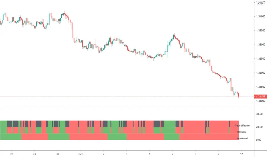
Supertrend (MTF) & Parabolic SAROne of my mixed approach strategy indicators which includes:
- Parabolic SAR
- 1 Hour Supertrend
- 4 Hour Supertrend
Whilst this script may appear slow due to the 4hr Supertrend, it does a great job of managing breakouts.
Using this indicator is simple, if the line labeled Lifetime is green then buy, if red then sell OR don't trade. So...
Green Line - This strategy is in a buy position
Red Line - This strategy is in a sell position
Any other Color - DON'T TRADE
The traders approach is simple, when all indicators are green or red, then take the trade. As soon as one indicator changes, then re-evaluate using your normal process, such as price action, to determine whether to close the trade or continue.
If you require any further information or script modifications, please message me.
PLEASE CHECK OUT MY OTHER SCRIPTS

Ichimoku & Supertrend Combined StrategyOne of my mixed approach strategy indicators which include's:
- Ichimoku using much faster settings. (ECC-11)
- Supertrend
Whilst both Supertrend and Ichimoku are quite reliable, they do sometimes provide false signals. By combining both indicators, trading when both agree, it reduces the number of false alerts.
Using this indicator is simple. If the lifetime line is green then buy. If red then sell and when black don't trade. So...
Green Line - This strategy is in a buy position
Red Line - This strategy is in a sell position
Black Line - DON'T TRADE
The trader's approach is simple, when all indicators are green or red, then take the trade. As soon as one indicator changes, then re-evaluate using your normal process, such as price action, to determine whether to close the trade or continue.
There are also some alerts for opening and closing positions.
If you wish to make some changes or discuss, please don't hesitate to message me.
Dominus US Indici - Core4 (ES,NQ,YM,RTY) - EditabileOne-liner
“Dominus US Indici ranks ES, NQ, YM, RTY at the NY open using a blended Score (return from window start + VWAP delta) to highlight the strongest long/short and give clean BUY/SELL signals.”
Short paragraph
“Dominus US Indici analyzes the four core US indices (ES, NQ, YM, RTY) from the New York open. It builds a single Score by combining momentum from the window start with distance from VWAP, ranks the indices, and flags only the top, high-quality opportunity. Optional ‘Alpha vs S1’ (beta-neutral), macro gate (DXY & US10Y), editable symbols/timezone, and a freeze snapshot keep decisions consistent.”
Bullets
Core4: ES, NQ, YM, RTY (editable).
Score = Return from start + VWAP delta (weighted).
Live table + ranking; threshold → BUY/SELL signals.
Optional Alpha vs S1 and macro filter (DXY, US10Y).
Custom window/timezone + freeze at window end.
If you want, I can add a tighter IG caption + hashtags in your Dominus style.

Adaptive Log Trend ChannelOne-line Summary / 一句话简介
EN: Adaptive log-scale trend channel using Pearson-optimized regression and deviation bands.
中文:基于皮尔逊优化回归的自适应对数趋势通道,带标准差波动带。
Full Description / 完整介绍
What it does / 功能
EN: This indicator fits a log-linear regression to price and builds a trend channel with ±k·σ deviation bands. It automatically selects the period with the highest Pearson correlation (R), ensuring the channel best matches the dominant market trend.
中文:该指标通过价格的对数线性回归拟合趋势,并在中线上下绘制 ±k·σ 偏差通道。它会自动选择皮尔逊相关系数 (R) 最高的周期,从而保证通道与主要趋势最贴合。
Why it’s useful / 适用价值
EN:
Naturally fits assets with multiplicative growth (crypto, tech stocks).
Adapts dynamically to different market regimes.
Provides CAGR estimates on Daily/Weekly charts for trend strength evaluation.
中文:
自然适用于呈现乘法增长的资产(如加密货币与科技股)。
可动态适应不同的市场阶段。
在日线/周线图上提供 趋势年化收益率 (CAGR),帮助评估趋势强度。
How it works / 工作原理
EN:
Computes log(price) → regression slope & intercept.
Draws a midline (log regression projection).
Upper & lower bands = ±k·σ in log space.
Info panel shows: Auto-Selected Period, Trend Strength (or Pearson’s R), and CAGR.
中文:
对价格取对数 → 计算回归斜率与截距。
绘制 中线(对数回归投影)。
上下轨 = 对数空间中的 ±k·σ。
信息面板显示:自动选择周期、趋势强度(或皮尔逊 R 值)、以及 CAGR 年化收益率。
Key Settings / 主要参数
EN:
Long-Term Mode: Uses extended periods (300–1200).
Deviation Multiplier (k): Controls channel width (default 2.0).
Styles: Colors, line type, and extension.
Panel Options: Toggle auto-period, Pearson’s R, and CAGR.
中文:
长期模式:采用更长周期 (300–1200)。
偏差倍数 (k):控制通道宽度(默认 2.0)。
样式:可设置颜色、线型、延长方式。
信息面板:可开关自动周期、皮尔逊 R、CAGR。
Notes / 注意事项
EN:
CAGR is only available on Daily/Weekly timeframes.
Regression-based tools may repaint as new bars form; treat it as context, not signals.
中文:
CAGR 仅在日线与周线周期可用。
回归类指标在新K线形成时可能重绘,仅用于趋势参考而非交易信号。

ONE RING 8 MA Bands with RaysCycle analysis tool ...
MAs: Eight moving averages (MA1–MA8) with customizable lengths, types (RMA, WMA, EMA, SMA), and offsets
Bands: Upper/lower bands for each MA, calculated based on final_pctX (Percentage mode) or final_ptsX (Points mode), scaled by multiplier
Rays: Forward-projected lines for bands, with customizable start points, styles (Solid, Dashed, Dotted), and lengths (up to 500 bars)
Band Choices
Manual: Uses individual inputs for band offsets
Uniform: Sets all offsets to base_pct (e.g., 0.1%) or base_pts (e.g., 0.1 points)
Linear: Scales linearly (e.g., base_pct * 1, base_pct * 2, base_pct * 3 ..., base_pct * 8)
Exponential: Scales exponentially (e.g., base_pct * 1, base_pct * 2, base_pct * 4, base_pct * 8 ..., base_pct * 128)
ATR-Based: Offsets are derived from the Average True Range (ATR), scaled by a linear factor. Dynamic bands that adapt to market conditions, useful for breakout or mean-reversion strategies. (final_pct1 = base_pct * atr, final_pct2 = base_pct * atr * 2, ..., final_pct8 = base_pct * atr * 8)
Geometric: Offsets follow a geometric progression (e.g., base_pct * r^0, base_pct * r^1, base_pct * r^2, ..., where r is a ratio like 1.5) This is less aggressive than Exponential (which uses powers of 2) and provides a smoother progression.
Example: If base_pct = 0.1, r = 1.5, then final_pct1 = 0.1%, final_pct2 = 0.15%, final_pct3 = 0.225%, ..., final_pct8 ≈ 1.71%
Harmonic: Offsets are based on harmonic flavored ratios. final_pctX = base_pct * X / (9 - X), final_ptsX = base_pts * X / (9 - X) for X = 1 to 8 This creates a harmonic-like progression where offsets increase non-linearly, ensuring MA8 bands are wider than MA1 bands, and avoids duplicating the Linear choice above.
Ex. offsets for base_pct = 0.1: MA1: ±0.0125% (0.1 * 1/8), MA2: ±0.0286% (0.1 * 2/7), MA3: ±0.05% (0.1 * 3/6), MA4: ±0.08% (0.1 * 4/5), MA5: ±0.125% (0.1 * 5/4), MA6: ±0.2% (0.1 * 6/3), MA7: ±0.35% (0.1 * 7/2), MA8: ±0.8% (0.1 * 8/1)
Square Root: Offsets grow with the square root of the band index (e.g., base_pct * sqrt(1), base_pct * sqrt(2), ..., base_pct * sqrt(8)). This creates a gradual widening, less aggressive than Linear or Exponential. Set final_pct1 = base_pct * sqrt(1), final_pct2 = base_pct * sqrt(2), ..., final_pct8 = base_pct * sqrt(8).
Example: If base_pct = 0.1, then final_pct1 = 0.1%, final_pct2 ≈ 0.141%, final_pct3 ≈ 0.173%, ..., final_pct8 ≈ 0.283%.
Fibonacci: Uses Fibonacci ratios (e.g., base_pct * 1, base_pct * 1.618, base_pct * 2.618
Percentage vs. Points Toggle:
In Percentage mode, bands are calculated as ma * (1 ± (final_pct / 100) * multiplier)
In Points mode, bands are calculated as ma ± final_pts * multiplier, where final_pts is in price units.
Threshold Setting for Slope:
Threshold setting for determining when the slope would be significant enough to call it a change in direction. Can check efficiency by setting MA1 to color on slope temporarily
Arrow table: Shows slope direction of 8 MAs using an Up or Down triangle, or shows Flat condition if no triangle.

highs&lowsone of my first strategy: highs&lows
This strategy takes the highest high and the lowest low of a specified timeframe and specified bar count.
It will then takes the average between these two extremes to create a center line.
This creates a range of high middle and low.
Then the strategy takes the current market movement
which is the direct average(no specified timeframe and specified bar count) of the current high and low.
Using this "current market movement" within the range of high middle and low it determins when to buy and then sell the asset.
*********note***************
-this strategy is (bullish)
-works good with most futures assets that have volatility/ decent movement
(might add more details if I forget any)
(work in progress)
