✨Smart Option MACD: Bullish, Bearish, Neutral Logic by AKM ✨The **Smart Option MACD: Bullish, Bearish, Neutral Logic by AKM** is an advanced indicator designed for TradingView, tailored for option traders on indices like NIFTY. It automates options trend scanning by applying MACD analysis to both Call (CE) and Put (PE) options near the ATM (At-The-Money) strike, providing actionable market states—Bullish, Bearish, or Neutral—using distinct logic for both strikes and overall market context.
***
### Core Features
- **Option Selection Logic:** The script dynamically calculates ATM, CE, and PE strike prices based on the underlying index spot price and customizable user inputs for expiry, strike distance, and OTM/ITM shift.
- **MACD on Option Prices:** For both CE and PE symbols, the indicator computes the MACD (Moving Average Convergence Divergence) and Signal lines. It uses standard MACD settings: 12-period EMA (fast), 26-period EMA (slow), and 9-period Signal.
- **Strike Status Classification:**
- AZL 🔼: Indicates MACD > 0 for that option, signifying positive momentum.
- BZL 🔽: Indicates MACD 0 & crossover up), PE is bearish (MACD<0 & crossover down).
- **Bearish:** PE is bullish & crossover up, CE is bearish & crossover down.
- **Neutral:** All other scenarios—including mixed or undefined signals.
***
### Table Output
A real-time table is displayed on the chart (top-right) with key option and market details:
- Spot price
- ATM Strike
- CE/PE strike status (momentum + crossover logic)
- Option prices
- Overall market state, color-coded for clarity
***
### How to Use This Indicator
- **Entry Signal:** Use the Bullish/Bearish status for directional trades or option strategies. Bullish calls for buying or selling upward momentum options; Bearish favors downside trades. Neutral advises caution or range-bound trades.
- **Customizability:** Expiry, strike width, OTM/ITM offset, and chart resolution are user-controlled, allowing adaptation to different market contexts.
- **Best Practice:** Use alongside price action, support/resistance zones and other indicators to confirm options momentum, as MACD is powerful yet not infallible.
***
### Who Is It For?
- **Option traders** who want to automate trend/momentum detection for CE/PE strikes instead of manual chart switching.
- **Index traders** (NIFTY, BANKNIFTY...) seeking systematic edge in intraday/positional strategies tied to option momentum.
- **Technical analysts** interested in visual, rule-based signals combining options data and classic MACD logic.
***
The Smart Option MACD indicator streamlines multi-strike, multi-option momentum analysis and presents clear actionable logic directly on your chart for enhanced decision-making. Use it as a core part of your TradingView toolkit for options-focused market views.
在脚本中搜索"price action"
Multi-Timeframe 5 EMA Static (1m,5m,15m,1h,4h,1D)Indicator Description: Multi-Timeframe EMA with Consistent Colors
This indicator plots Exponential Moving Averages (EMAs) of varying lengths on a chart across multiple timeframes. It provides traders with the ability to visualize key EMAs for different lengths and timeframes simultaneously, offering perspective on trends and support/resistance levels across multiple timeframes.
This script includes 5 EMAs (8 EMA, 21 EMA, 50 EMA, 200 EMA, and 800 EMA) and covers the following timeframes:
1-Minute
5-Minute
15-Minute
1-Hour
4-Hour
Daily
Key Features:
1. Multi-Timeframe Analysis:
The indicator calculates and displays EMAs for 6 distinct timeframes, enabling traders to spot trend dynamics, reversals, or price action alignment between lower and higher timeframes.
2. Consistent Colors:
Each EMA length is assigned a unique color across all timeframes, making it easy to identify and compare:
8 EMA: Yellow — Short-term moving average that reflects immediate price trends.
21 EMA: Dark Red — Useful for identifying short-term supportive/resistance levels and trends across timeframes.
50 EMA: Orange — Mid-range trend-following line, helpful for swing trading.
200 EMA: Black — Long-term trend measure, widely regarded as a critical line for defining market direction.
800 EMA: Violet — Ultra-long-term trend used by advanced traders for significant macro analysis.
3. EMA Calculation Based on Candle Close:
EMAs are calculated using the closing prices of candles for the respective timeframe.
Example: The 1-Minute EMA reflects price movements on every 1-minute candle close, whereas the Daily EMA reflects price movements on the daily timeframe's candle close.
4. Visual Representation:
All EMAs are plotted as smooth lines using , ensuring a clean and continuous visualization of trends.
Use Cases:
1. Trend Identification:
Lower timeframe EMAs (e.g., 8 EMA on 1-Min) reveal short-term price movements.
Higher timeframe EMAs (e.g., 200 EMA on Daily) represent macro trends, enabling traders to align their trades with larger market structures.
2. Dynamic Support and Resistance:
50 EMA and 200 EMA act as common support and resistance levels across multiple timeframes.
Traders can evaluate zones of confluence where prices interact across different timeframe EMAs.
3. Cross-Timeframe Analysis:
By spotting price alignment and interactions with EMAs across timeframes, traders can make more informed decisions about entries, exits, and trend reversals.
For example: If price is breaking above the 800 EMA on multiple timeframes, it signals a potentially major bullish move.
Why Use This Indicator?
1. Timeframe-Specific Precision:
This indicator provides precise EMA calculations tied to their specific timeframes. For example:
The 1-Minute EMA for each length shows rapid short-term price trends.
The Daily EMA for each length tracks slow-moving trends over time.
This allows traders to analyze price action both locally and globally.
2. Consistent Color Coding Across Timeframes:
The uniform coloring of EMA lengths ensures clarity and consistency during analysis. Traders can easily spot common EMA levels (e.g., 50 EMA) across multiple timeframes.
3. Support for Scalping, Swing Trading, and Long-Term Analysis:
Whether you're a scalper focusing on 1-Minute trends or a swing trader targeting Daily trends, this indicator helps align decisions across different timeframes.
How the Indicator Works:
1. Calculation Logic:
EMAs are calculated dynamically using the function, which fetches data for each specific timeframe, allowing the chart to overlay all timeframe calculations accurately. For example:
8 EMA on 5-Minute timeframe calculates the EMA based on the closing prices of the 5-Minute candles.
2. Plotting Logic:
The indicator plots all EMAs with a unique color and label for easy differentiation. For instance, each EMA (e.g., 8 EMA) is consistently displayed in the same color (Yellow) across all timeframes.
3. Line Style:
All EMAs are displayed using the setting to ensure smooth and continuous lines on the chart.
Example Visualization:
Imagine the chart with:
Yellow 8 EMA across all timeframes showing rapid, short-term trends.
Orange 50 EMA showing mid-level trends and acting as dynamic support/resistance across 1-Minute, 15-Minute, and Daily candles.
Black 200 EMA clearly defining long-term market direction for all timeframes.
Traders can identify confluence zones where the price interacts with multiple timeframe EMAs, offering actionable signals.
Indicator Parameters:
Included Timeframes:
1-Minute
5-Minute
15-Minute
1-Hour
4-Hour
Daily
Included EMA Lengths:
8 EMA
21 EMA
50 EMA
200 EMA
800 EMA
How to Use This Indicator:
Add the Pine Script Code to the TradingView Pine Script Editor.
Click "Add to Chart".
Observe EMAs calculated for:
Lengths: 8, 21, 50, 200, 800.
Timeframes: 1-Min, 5-Min, 15-Min, 1-Hour, 4-Hour, Daily.
Use consistent colors to spot interactions, trends, and confluence zones across timeframes.
Summary:
This indicator is ideal for traders wishing to analyze trends, support/resistance levels, and market alignment across multiple timeframes while maintaining clarity through consistent EMA color coding. It serves scalpers, swing traders, and long-term strategists by bridging short-term price action with broader market behavior.
Ema With VoLume RangeEMA with Volume Range – Adaptive Trend, Trailing Stops & Volume Profile Zones
This sophisticated indicator integrates three powerful trading tools in a single overlay: a classic EMA200, precision ATR-based buy/sell signals, and a unique double-zone volume profile for deep market structure analysis. Ideal for swing traders, scalpers, and volume-driven investors seeking actionable, multi-dimensional price insights.
Core Features
EMA200 (Exponential Moving Average):
Plots a customizable EMA200 (blue line) for identifying primary trend direction and dynamic support/resistance.
Exponential smoothing is enabled by default for better tracking of recent price action.
ATR-Based Trailing Stop with Buy/Sell Signals:
Uses Average True Range (ATR) to set adaptive trailing stop levels that respond to current market volatility.
Buy and Sell signals (tiny green and red labels) trigger whenever price crosses the trailing stop for precise entries and exits.
All signals are alert-enabled for automated or semi-automated trading workflows.
Adjustable ATR multiplier and lookback for tuning responsiveness.
Dual Volume Range Zones & Profile Histogram:
Automatically highlights recent high/low price zones (upper and lower) using your lookback period and zone width settings.
Each zone is split into horizontal "bins," color-coded for buy/sell dominance and highlighting the Point of Control (POC)—the price with the most traded volume.
The indicator draws live volume histograms inside each zone, supplementing them with labels that show buy vs. sell volumes and POC statistics.
Adjustable bin count, transparency, colors, and histogram granularity to fit your visual preference.
Optional midlines and fair value drift line help visualize price equilibrium and value shifts over time.
How to Use
Trend Confirmation: Align trades with the EMA200—trade long above, short below, or wait for ATR-trailing stop triggers that coincide with the EMA bias.
Signal Generation: Use the ATR trailing stop Buy/Sell signals to spot shifts in volatility-adjusted direction early.
Volume Zone Analysis: Identify where the highest concentration of buy/sell activity occurred within the customizable upper/lower zones:
Use high volume bins and POC as magnets for price, support/resistance, or to confirm breakout/failure zones.
Leverage the fair value drift line and dynamic labels to detect changes in market sentiment and volume pressure.

SMT Divergence x outofoptions🔍 SMT Divergence — Advanced Market Correlation Analysis
This was created with and approved by @outofoptions to bring you smaller SMTs based on his original SMT Divergence indicator
SMT Divergence is a sophisticated technical analysis indicator designed to identify high-probability reversal and continuation signals through intelligent correlation analysis between related markets. This powerful tool reveals hidden market dynamics by comparing price action divergences across correlated instruments, providing traders with institutional-level market insight.
🎯 Core Capabilities:
Multi-Market Analysis : Automatically compares your chart with a correlated instrument to identify divergence patterns and market inefficiencies
Smart Liquidity Detection : Advanced algorithms identify key liquidity levels and sweep patterns for enhanced signal accuracy
Dynamic Divergence Mapping : Real-time visualization of bullish and bearish divergences with customizable line styles and colors
Intelligent Signal Validation : Optional candle-based confirmation system to filter high-probability setups from noise
Automated Line Management : Smart removal of invalidated divergences to maintain clean, actionable chart analysis
📊 Professional Features:
The SMT Divergence indicator excels at revealing market structure imbalances that often precede significant price movements. By analyzing the relationship between correlated markets, it identifies when institutional money may be positioned differently than retail sentiment suggests, providing early warning signals for potential reversals.
⚙️ Advanced Customization:
Flexible correlation pair selection for any market combination
Customizable visual styling with multiple line types and color schemes
Adjustable validation criteria for different trading styles
Professional alert system with detailed message customization
Automatic cleanup of broken or invalidated divergences
🎨 Visual Excellence:
Clean, professional line drawing with customizable styling
Dynamic labeling system with size and color options
Real-time divergence tracking and management
Institutional-grade chart presentation
Optimized performance for extended analysis periods
📈 Ideal For:
Swing traders seeking high-probability reversal signals
Multi-market analysts comparing correlated instruments
Institutional-style traders using correlation analysis
Advanced technical analysts studying market structure
Those seeking early warning signals for trend changes
🔔 Smart Alerts:
Comprehensive alert system with customizable messaging allows you to stay informed of new divergences across multiple timeframes and market sessions, ensuring you never miss critical market developments.
💡 Market Intelligence:
SMT Divergence transforms complex inter-market relationships into clear, actionable signals, giving you the same analytical edge used by professional trading institutions to identify market turning points before they become obvious to retail traders.
Educational Tool: This indicator is designed for educational and analytical purposes. Divergence analysis requires understanding of market correlation principles. Always combine with proper risk management and additional analysis methods.

SuperTrend - Dynamic Lines and ChannelsSuperTrend Indicator: Comprehensive Description
Overview
The SuperTrend indicator is Pine Script V6 designed for TradingView to plot dynamic trend lines & channels across multiple timeframes (Daily, Weekly, Monthly, Quarterly, and Yearly/All-Time) to assist traders in identifying potential support, resistance, and trend continuation levels. The script calculates trendlines based on high and low prices over specified periods, projects these trendlines forward, and includes optional reflection channels and heartlines to provide additional context for price action analysis. The indicator is highly customizable, allowing users to toggle the visibility of trendlines, projections, and heartlines for each timeframe, with a focus on the DayTrade channel, which includes unique reflection channel features.
This description provides a detailed explanation of the indicator’s features, functionality, and display, with a specific focus on the DayTrade channel’s anchoring, the role of static and dynamic channels in projecting future price action, the heartline’s potential as a volume indicator, and how traders can use the indicator for line-to-line trading strategies.
Features and Functionality
1. Dynamic Trend Channels
The SuperTrend indicator calculates trend channels for five timeframes:
DayTrade Channel: Tracks daily highs and lows, updating before 12 PM each trading day.
Weekly Channel: Tracks highs and lows over a user-selected period (1, 2, or 3 weeks).
Monthly Channel: Tracks monthly highs and lows.
Quarterly Channel: Tracks highs and lows over a user-selected period (1 or 2 quarters).
Yearly/All-Time Channel: Tracks highs and lows over a user-selected period (1 to 10 years or All Time).
Each channel consists of:
Upper Trendline: Connects the high prices of the previous and current periods.
Lower Trendline: Connects the low prices of the previous and current periods.
Projections: Extends the trendlines forward based on the trend’s slope.
Heartline: A dashed line drawn at the midpoint between the upper and lower trendlines or their projections.
DayTrade Channel Anchoring
The DayTrade channel anchors its trendlines to the high and low prices of the previous and current trading days, with updates restricted to before 12 PM to capture significant price movements during the morning session, which is often more volatile due to market openings or news events. The "Show DayTrade Trend Lines" toggle enables this channel, and after 12 PM, the trendlines and projections remain static for the rest of the trading day. This static anchoring provides a consistent reference for potential support and resistance levels, allowing traders to anticipate price reactions based on historical highs and lows from the previous day and the morning session of the current day.
The static nature of the DayTrade channel after 12 PM ensures that the trendlines and projections do not shift mid-session, providing a stable framework for traders to assess whether price action respects or breaks these levels, potentially indicating trend continuation or reversal.
Static vs. Dynamic Channels
Static Channels: Once set (e.g., after 12 PM for the DayTrade channel or at the start of a new period for other timeframes), the trendlines remain fixed until the next period begins. This static behavior allows traders to use the channels as reference levels for potential price targets or reversal points, as they are based on historical price extremes.
Dynamic Projections: The projections extend the trendlines forward, providing a visual guide for potential future price action, assuming the trend’s momentum continues. When a trendline is broken (e.g., price closes above the upper projection or below the lower projection), it may suggest a breakout or reversal, prompting traders to reassess their positions.
2. Reflection Channels (DayTrade Only)
The DayTrade channel includes optional lower and upper reflection channels, which are additional trendlines positioned symmetrically around the main channel to provide extended support and resistance zones. These are controlled by the "Show Reflection Channel" dropdown.
Lower Reflection Channel:
Position: Drawn below the lower trendline at a distance equal to the range between the upper and lower trendlines.
Projection: Extends forward as a dashed line.
Heartline: A dashed line drawn at the midpoint between the lower trendline and the lower reflection trendline, controlled by the "Show Lower Reflection Heartline" toggle.
Upper Reflection Channel:
Position: Drawn above the upper trendline at the same distance as the main channel’s range.
Projection: Extends forward as a dashed line.
Heartline: A dashed line drawn at the midpoint between the upper trendline and the upper reflection trendline, controlled by the "Show Upper Reflection Heartline" toggle.
Display Control: The "Show Reflection Channel" dropdown allows users to select:
"None": No reflection channels are shown.
"Lower": Only the lower reflection channel is shown.
"Upper": Only the upper reflection channel is shown.
"Both": Both reflection channels are shown.
Purpose: Reflection channels extend the price range analysis by providing additional levels where price may react, acting as potential targets or reversal zones after breaking the main trendlines.
3. Heartlines
Each timeframe, including the DayTrade channel and its reflection channels, can display a heartline, which is a dashed line plotted at the midpoint between the upper and lower trendlines or their projections. For the DayTrade channel:
Main DayTrade Heartline: Midpoint between the upper and lower trendlines, controlled by the "Show DayTrade Heartline" toggle.
Lower Reflection Heartline: Midpoint between the lower trendline and the lower reflection trendline, controlled by the "Show Lower Reflection Heartline" toggle.
Upper Reflection Heartline: Midpoint between the upper trendline and the upper reflection trendline, controlled by the "Show Upper Reflection Heartline" toggle.
Independent Toggles: Visibility is controlled by:
"Show DayTrade Heartline": For the main DayTrade heartline.
"Show Lower Reflection Heartline": For the lower reflection heartline.
"Show Upper Reflection Heartline": For the upper reflection heartline.
Potential Volume Indicator: The heartline represents the average price level between the high and low of a period, which may correlate with areas of high trading activity or volume concentration, as these midpoints often align with price levels where buyers and sellers have historically converged. A break above or below the heartline, especially with strong momentum, may indicate a shift in market sentiment, potentially leading to accelerated price movement in the direction of the break. However, this is an observation based on the heartline’s position, not a direct measure of volume, as the script does not incorporate volume data.
4. Alerts
The script includes alert conditions for all timeframes, triggered when a candle closes fully above the upper projection or below the lower projection. For the DayTrade channel:
Upper Trend Break: Triggers when a candle closes fully above the upper projection.
Lower Trend Break: Triggers when a candle closes fully below the lower projection.
Alerts are combined across all timeframes, so a break in any timeframe triggers a general "Upper Trend Break" or "Lower Trend Break" alert with the message: "Candle closed fully above/below one or more projection lines." Alerts fire once per bar close.
5. Customization Options
The script provides extensive customization through input settings, grouped by timeframe:
DayTrade Channel:
"Show DayTrade Trend Lines": Toggle main trendlines and projections.
"Show DayTrade Heartline": Toggle main heartline.
"Show Lower Reflection Heartline": Toggle lower reflection heartline.
"Show Upper Reflection Heartline": Toggle upper reflection heartline.
"DayTrade Channel Color": Set color for trendlines.
"DayTrade Projection Channel Color": Set color for projections.
"Heartline Color": Set color for all heartlines.
"Show Reflection Channel": Dropdown to show "None," "Lower," "Upper," or "Both" reflection channels.
Other Timeframes (Weekly, Monthly, Quarterly, Yearly/All-Time):
Toggles for trendlines (e.g., "Show Weekly Trend Lines," "Show Monthly Trend Lines") and heartlines (e.g., "Show Weekly Heartline," "Show Monthly Heartline").
Period selection (e.g., "Weekly Period" for 1, 2, or 3 weeks; "Yearly Period" for 1 to 10 years or All Time).
Separate colors for trendlines (e.g., "Weekly Channel Color"), projections (e.g., "Weekly Projection Channel Color"), and heartlines (e.g., "Weekly Heartline Color").
Max Bar Difference: Limits the distance between anchor points to ensure relevance to recent price action.
Display
The indicator overlays the following elements on the chart:
Trendlines: Solid lines connecting the high and low anchor points for each timeframe, using user-specified colors (e.g., set via "DayTrade Channel Color").
Projections: Dashed lines extending from the current anchor points, indicating potential future price levels, using colors set via "DayTrade Projection Channel Color" or equivalent.
Heartlines: Dashed lines at the midpoint of each channel, using the color set via "Heartline Color" or equivalent.
Reflection Channels (DayTrade Only):
Lower reflection trendline and projection: Below the lower trendline, using the same colors as the main channel.
Upper reflection trendline and projection: Above the upper trendline, using the same colors.
Reflection heartlines: Midpoints between the main trendlines and their respective reflection trendlines, using the "Heartline Color."
Visual Clarity: Lines are only drawn if the relevant toggles (e.g., "Show DayTrade Trend Lines") are enabled and data is available. Lines are deleted when their conditions are not met to avoid clutter.
Trading Applications: Line-to-Line Trading
The SuperTrend indicator can be used to inform trading decisions by providing a framework for line-to-line trading, where traders use the trendlines, projections, and heartlines as reference points for entries, exits, and risk management. Below is a detailed explanation of how to use the DayTrade channel and its reflection channels for trading, focusing on their anchoring, static/dynamic behavior, and the heartline’s role.
1. Why DayTrade Channel Anchoring
The DayTrade channel’s anchoring to the previous day’s high/low and the current day’s high/low before 12 PM, controlled by the "Show DayTrade Trend Lines" toggle, captures significant price levels during high-volatility periods:
Previous Day High/Low: These represent key levels where price found resistance (high) or support (low) in the prior session, often acting as psychological or technical barriers in the current session.
Current Day High/Low Before 12 PM: The morning session (before 12 PM) often sees increased volatility due to market openings, news releases, or institutional activity. Anchoring to these early highs/lows ensures the channel reflects the most relevant price extremes, which are likely to influence intraday price action.
Static After 12 PM: By fixing the anchor points after 12 PM, the trendlines and projections become stable references for the afternoon session, allowing traders to anticipate price reactions at these levels without the lines shifting unexpectedly.
This anchoring makes the DayTrade channel particularly useful for intraday traders, as it provides a consistent framework based on recent price history, which can guide decisions on trend continuation or reversal.
2. Using Static Channels and Projections
The static nature of the DayTrade channel after 12 PM, enabled by "Show DayTrade Trend Lines," and the dynamic projections, set via "DayTrade Projection Channel Color," provide a structured approach to trading:
Support and Resistance:
The upper trendline and lower trendline act as dynamic support/resistance levels based on the previous and current day’s price extremes.
Traders may observe price reactions (e.g., bounces or breaks) at these levels. For example, if price approaches the lower trendline and bounces, it may indicate support, suggesting a potential long entry.
Projections as Price Targets:
The projections extend the trendlines forward, offering potential price targets if the trend continues. For instance, if price breaks above the upper trendline and continues toward the upper projection, traders might consider it a bullish continuation signal.
A candle closing fully above the upper projection or below the lower projection (triggering an alert) may indicate a breakout, prompting traders to enter in the direction of the break or reassess if the break fails.
Static Channels for Breakouts:
Because the trendlines are static after 12 PM, they serve as fixed reference points. A break above the upper trendline or its projection may suggest bullish momentum, while a break below the lower trendline or projection may indicate bearish momentum.
Traders can use these breaks to set entry points (e.g., entering a long position after a confirmed break above the upper projection) and place stop-losses below the broken level to manage risk.
3. Line-to-Line Trading Strategy
Line-to-line trading involves using the trendlines, projections, and reflection channels as sequential price targets or reversal zones:
Trading Within the Main Channel:
Long Setup: If price bounces off the lower trendline and moves toward the heartline (enabled by "Show DayTrade Heartline") or upper trendline, traders might enter a long position near the lower trendline, targeting the heartline or upper trendline for profit-taking. A stop-loss could be placed below the lower trendline to protect against a breakdown.
Short Setup: If price rejects from the upper trendline and moves toward the heartline or lower trendline, traders might enter a short position near the upper trendline, targeting the heartline or lower trendline, with a stop-loss above the upper trendline.
Trading to Reflection Channels:
If price breaks above the upper trendline and continues toward the upper reflection trendline or its projection (enabled by "Show Reflection Channel" set to "Upper" or "Both"), traders might treat this as a breakout trade, entering long with a target at the upper reflection level and a stop-loss below the upper trendline.
Similarly, a break below the lower trendline toward the lower reflection trendline or its projection (enabled by "Show Reflection Channel" set to "Lower" or "Both") could signal a short opportunity, with a target at the lower reflection level and a stop-loss above the lower trendline.
Reversal Trades:
If price reaches the upper reflection trendline and shows signs of rejection (e.g., a bearish candlestick pattern), traders might consider a short position, anticipating a move back toward the main channel’s upper trendline or heartline.
Conversely, a rejection at the lower reflection trendline could prompt a long position targeting the lower trendline or heartline.
Risk Management:
Use the heartline as a midpoint to gauge whether price is likely to continue toward the opposite trendline or reverse. For example, a failure to break above the heartline after bouncing from the lower trendline might suggest weakening bullish momentum, prompting a tighter stop-loss.
The static nature of the channels after 12 PM allows traders to set precise stop-loss and take-profit levels based on historical price levels, reducing the risk of chasing moving targets.
4. Heartline as a Volume Indicator
The heartline, controlled by toggles like "Show DayTrade Heartline," "Show Lower Reflection Heartline," and "Show Upper Reflection Heartline," may serve as an indirect proxy for areas of high trading activity:
Rationale: The heartline represents the average price between the high and low of a period, which often aligns with price levels where significant buying and selling have occurred, as these midpoints can correspond to areas of consolidation or high volume in the order book. While the script does not directly use volume data, the heartline’s position may reflect price levels where market participants have historically balanced supply and demand.
Breakout Potential: A break above or below the heartline, particularly with a strong candle (e.g., wide range or high momentum), may indicate a shift in market sentiment, potentially leading to accelerated price movement in the direction of the break. For example:
A close above the main DayTrade heartline could suggest buyers are overpowering sellers, potentially leading to a move toward the upper trendline or upper reflection channel.
A close below the heartline could indicate seller dominance, targeting the lower trendline or lower reflection channel.
Trading Application:
Traders might use heartline breaks as confirmation signals for trend continuation. For instance, after a bounce from the lower trendline, a close above the heartline could confirm bullish momentum, prompting a long entry.
The heartline can also act as a dynamic stop-loss or trailing stop level. For example, in a long trade, a trader might exit if price falls below the heartline, indicating a potential reversal.
For reflection heartlines, a break above the upper reflection heartline or below the lower reflection heartline could signal strong momentum, as these levels are further from the main channel and may require significant buying or selling pressure to breach.
5. Practical Trading Considerations
Timeframe Context: The DayTrade channel, enabled by "Show DayTrade Trend Lines," is best suited for intraday trading due to its daily anchoring and morning update behavior. Traders should consider higher timeframe channels (e.g., enabled by "Show Weekly Trend Lines" or "Show Monthly Trend Lines") for broader context, as breaks of the DayTrade channel may align with or be influenced by larger trends.
Confirmation Tools: Use additional indicators (e.g., RSI, MACD, or volume-based indicators) or candlestick patterns to confirm signals at trendlines, projections, or heartlines. The script’s alerts can help identify breakouts, but traders should verify with other technical or fundamental factors.
Risk Management: Always define risk-reward ratios before entering trades. For example, a 1:2 risk-reward ratio might involve risking a stop-loss below the lower trendline to target the heartline or upper trendline.
Market Conditions: The effectiveness of the channels and heartlines depends on market conditions (e.g., trending vs. ranging markets). In choppy markets, price may oscillate within the main channel, favoring range-bound strategies. In trending markets, breaks of projections or reflection channels may signal continuation trades.
Limitations: The indicator relies on historical price data and does not incorporate volume, news, or other external factors. Traders should use it as part of a broader strategy and avoid relying solely on its signals.
How to Use in TradingView
Add the Indicator: Copy the script into TradingView’s Pine Editor, compile it, and add it to your chart.
Configure Settings:
Enable "Show DayTrade Trend Lines" to display the main DayTrade trendlines and projections.
Use the "Show Reflection Channel" dropdown to select "Lower," "Upper," or "Both" to display reflection channels.
Toggle "Show DayTrade Heartline," "Show Lower Reflection Heartline," and "Show Upper Reflection Heartline" to control heartline visibility.
Adjust colors using "DayTrade Channel Color," "DayTrade Projection Channel Color," and "Heartline Color."
Enable other timeframes (e.g., "Show Weekly Trend Lines," "Show Monthly Trend Lines") for additional context, if desired.
Set Alerts: Configure alerts in TradingView for "Upper Trend Break" or "Lower Trend Break" to receive notifications when a candle closes fully above or below any timeframe’s projections.
Analyze the Chart:
Monitor price interactions with the trendlines, projections, and heartlines.
Look for bounces, breaks, or rejections at these levels to plan entries and exits.
Use the heartline breaks as potential confirmation of momentum shifts.
Test Strategies: Backtest line-to-line trading strategies in TradingView’s strategy tester or demo account to evaluate performance before trading with real capital.
Conclusion
The SuperTrend indicator provides a robust framework for technical analysis by plotting dynamic trend channels, projections, and heartlines across multiple timeframes, with advanced features for the DayTrade channel, including lower and upper reflection channels. The DayTrade channel’s anchoring to previous and current day highs/lows before 12 PM, enabled by "Show DayTrade Trend Lines," creates a stable reference for intraday trading, while static trendlines and dynamic projections guide traders in anticipating price movements. The heartlines, controlled by toggles like "Show DayTrade Heartline," offer potential insights into high-activity price levels, with breaks possibly indicating momentum shifts. Traders can use the indicator for line-to-line trading by targeting moves between trendlines, projections, and reflection channels, while managing risk with stop-losses and confirmations from other tools. The indicator should be used as part of a comprehensive trading plan.
Info TableOverview
The Info Table V1 is a versatile TradingView indicator tailored for intraday futures traders, particularly those focusing on MESM2 (Micro E-mini S&P 500 futures) on 1-minute charts. It presents essential market insights through two customizable tables: the Main Table for predictive and macro metrics, and the New Metrics Table for momentum and volatility indicators. Designed for high-activity sessions like 9:30 AM–11:00 AM CDT, this tool helps traders assess price alignment, sentiment, and risk in real-time. Metrics update dynamically (except weekly COT data), with optional alerts for key conditions like volatility spikes or momentum shifts.
This indicator builds on foundational concepts like linear regression for predictions and adapts open-source elements for enhanced functionality. Gradient code is adapted from TradingView's Color Library. QQE logic is adapted from LuxAlgo's QQE Weighted Oscillator, licensed under CC BY-NC-SA 4.0. The script is released under the Mozilla Public License 2.0.
Key Features
Two Customizable Tables: Positioned independently (e.g., top-right for Main, bottom-right for New Metrics) with toggle options to show/hide for a clutter-free chart.
Gradient Coloring: User-defined high/low colors (default green/red) for quick visual interpretation of extremes, such as overbought/oversold or high volatility.
Arrows for Directional Bias: In the New Metrics Table, up (↑) or down (↓) arrows appear in value cells based on metric thresholds (top/bottom 25% of range), indicating bullish/high or bearish/low conditions.
Consensus Highlighting: The New Metrics Table's title cells ("Metric" and "Value") turn green if all arrows are ↑ (strong bullish consensus), red if all are ↓ (strong bearish consensus), or gray otherwise.
Predicted Price Plot: Optional line (default blue) overlaying the ML-predicted price for visual comparison with actual price action.
Alerts: Notifications for high/low Frahm Volatility (≥8 or ≤3) and QQE Bias crosses (bullish/bearish momentum shifts).
Main Table Metrics
This table focuses on predictive, positional, and macro insights:
ML-Predicted Price: A linear regression forecast using normalized price, volume, and RSI over a customizable lookback (default 500 bars). Gradient scales from low (red) to high (green) relative to the current price ± threshold (default 100 points).
Deviation %: Percentage difference between current price and predicted price. Gradient highlights extremes (±0.5% default threshold), signaling potential overextensions.
VWAP Deviation %: Percentage difference from Volume Weighted Average Price (VWAP). Gradient indicates if price is above (green) or below (red) fair value (±0.5% default).
FRED UNRATE % Change: Percentage change in U.S. unemployment rate (via FRED data). Cell turns red for increases (economic weakness), green for decreases (strength), gray if zero or disabled.
Open Interest: Total open MESM2 futures contracts. Gradient scales from low (red) to high (green) up to a hardcoded 300,000 threshold, reflecting market participation.
COT Commercial Long/Short: Weekly Commitment of Traders data for commercial positions. Long cell green if longs > shorts (bullish institutional sentiment); Short cell red if shorts > longs (bearish); gray otherwise.
New Metrics Table Metrics
This table emphasizes technical momentum and volatility, with arrows for quick bias assessment:
QQE Bias: Smoothed RSI vs. trailing stop (default length 14, factor 4.236, smooth 5). Green for bullish (RSI > stop, ↑ arrow), red for bearish (RSI < stop, ↓ arrow), gray for neutral.
RSI: Relative Strength Index (default period 14). Gradient from oversold (red, <30 + threshold offset, ↓ arrow if ≤40) to overbought (green, >70 - offset, ↑ arrow if ≥60).
ATR Volatility: Score (1–20) based on Average True Range (default period 14, lookback 50). High scores (green, ↑ if ≥15) signal swings; low (red, ↓ if ≤5) indicate calm.
ADX Trend: Average Directional Index (default period 14). Gradient from weak (red, ↓ if ≤0.25×25 threshold) to strong trends (green, ↑ if ≥0.75×25).
Volume Momentum: Score (1–20) comparing current to historical volume (lookback 50). High (green, ↑ if ≥15) suggests pressure; low (red, ↓ if ≤5) implies weakness.
Frahm Volatility: Score (1–20) from true range over a window (default 24 hours, multiplier 9). Dynamic gradient (green/red/yellow); ↑ if ≥7.5, ↓ if ≤2.5.
Frahm Avg Candle (Ticks): Average candle size in ticks over the window. Blue gradient (or dynamic green/red/yellow); ↑ if ≥0.75 percentile, ↓ if ≤0.25.
Arrows trigger on metric-specific logic (e.g., RSI ≥60 for ↑), providing directional cues without strict color ties.
Customization Options
Adapt the indicator to your strategy:
ML Inputs: Lookback (10–5000 bars) and RSI period (2+) for prediction sensitivity—shorter for volatility, longer for trends.
Timeframes: Individual per metric (e.g., 1H for QQE Bias to match higher frames; blank for chart timeframe).
Thresholds: Adjust gradients and arrows (e.g., Deviation 0.1–5%, ADX 0–100, RSI overbought/oversold).
QQE Settings: Length, factor, and smooth for fine-tuned momentum.
Data Toggles: Enable/disable FRED, Open Interest, COT for focus (e.g., disable macro for pure intraday).
Frahm Options: Window hours (1+), scale multiplier (1–10), dynamic colors for avg candle.
Plot/Table: Line color, positions, gradients, and visibility.
Ideal Use Case
Perfect for MESM2 scalpers and trend traders. Use the Main Table for entry confirmation via predicted deviations and institutional positioning. Leverage the New Metrics Table arrows for short-term signals—enter bullish on green consensus (all ↑), avoid chop on low volatility. Set alerts to catch shifts without constant monitoring.
Why It's Valuable
Info Table V1 consolidates diverse metrics into actionable visuals, answering critical questions: Is price mispriced? Is momentum aligning? Is volatility manageable? With real-time updates, consensus highlights, and extensive customization, it enhances precision in fast markets, reducing guesswork for confident trades.
Note: Optimized for futures; some metrics (OI, COT) unavailable on non-futures symbols. Test on demo accounts. No financial advice—use at your own risk.
The provided script reuses open-source elements from TradingView's Color Library and LuxAlgo's QQE Weighted Oscillator, as noted in the script comments and description. Credits are appropriately given in both the description and code comments, satisfying the requirement for attribution.
Regarding significant improvements and proportion:
The QQE logic comprises approximately 15 lines of code in a script exceeding 400 lines, representing a small proportion (<5%).
Adaptations include integration with multi-timeframe support via request.security, user-customizable inputs for length, factor, and smooth, and application within a broader table-based indicator for momentum bias display (with color gradients, arrows, and alerts). This extends the original QQE beyond standalone oscillator use, incorporating it as one of seven metrics in the New Metrics Table for confluence analysis (e.g., consensus highlighting when all metrics align). These are functional enhancements, not mere stylistic or variable changes.
The Color Library usage is via official import (import TradingView/Color/1 as Color), leveraging built-in gradient functions without copying code, and applied to enhance visual interpretation across multiple metrics.
The script complies with the rules: reused code is minimal, significantly improved through integration and expansion, and properly credited. It qualifies for open-source publication under the Mozilla Public License 2.0, as stated.

Contrarian Market Structure BreakMarket Structure Break application was inspired and adapted from Market Structure Oscillator indicator developed by Lux Algo. So much credit to their work.
This indicator pairs nicely with the Contrarian 100 MA and can be located here:
Indicator Description: Contrarian Market Structure BreakOverview
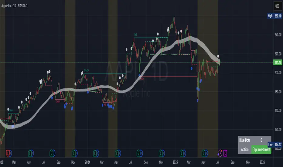
The "Contrarian Market Structure Break" indicator is a versatile tool tailored for traders seeking to identify potential reversal opportunities by analyzing market structure across multiple timeframes. Built on Institutional Concepts of Structure (ICT), this indicator detects Break of Structure (BOS) and Change of Character (CHoCH) patterns across short-term, intermediate-term, and long-term swings, plotting them with customizable lines and labels. It generates contrarian buy and sell signals when price breaks key swing levels, with a unique "Blue Dot Tracker" to monitor consecutive buy signals for trend confirmation. Optimized for the daily timeframe, this indicator is adaptable to other timeframes with proper testing, making it ideal for traders of forex, stocks, or cryptocurrencies.
How It Works
The indicator combines three key components to provide a comprehensive view of market dynamics: Multi-Timeframe Market Structure Analysis: It identifies swing highs and lows across short-term, intermediate-term, and long-term periods, plotting BOS (continuation) and CHoCH (reversal) events with customizable line styles and labels.
Contrarian Signal Generation: Buy and sell signals are triggered when the price crosses below swing lows (buy) or above swing highs (sell), indicating potential reversals in overextended markets.
Blue Dot Tracker: A unique feature that counts consecutive buy signals ("blue dots") and highlights a "Hold Investment" state with a yellow background when three or more buy signals occur, suggesting a potential trend continuation.
Signals are visualized as small circles below (buy) or above (sell) price bars, and a table in the bottom-right corner displays the blue dot count and recommended action (Hold or Flip Investment), enhancing decision-making clarity.
Mathematical Concepts Swing Detection: The indicator identifies swing highs and lows by comparing price patterns over three bars, ensuring robust detection of pivot points. A swing high occurs when the middle bar’s high is higher than the surrounding bars, and a swing low occurs when the middle bar’s low is lower.
Market Structure Logic: BOS is detected when the price breaks a prior swing high (bullish) or low (bearish) in the direction of the current trend, while CHoCH signals a potential reversal when the price breaks a swing level against the trend. These are calculated across three timeframes for a multi-dimensional perspective.
Blue Dot Tracker: This feature counts consecutive buy signals and tracks the entry price. If three or more buy signals occur without a sell signal, the indicator enters a "Hold Investment" state, marked by a yellow background, until the price exceeds the entry price or a sell signal occurs.
Entry and Exit Rules Buy Signal (Blue Dot Below Bar): Triggered when the closing price crosses below a swing low on either the intermediate-term or long-term timeframe, suggesting an oversold condition and potential reversal upward. Short-term signals can be enabled but are disabled by default to reduce noise.
Sell Signal (White Dot Above Bar): Triggered when the closing price crosses above a swing high on either the intermediate-term or long-term timeframe, indicating an overbought condition and potential reversal downward.
Blue Dot Tracker Logic: After a buy signal, the indicator increments a blue dot counter and records the entry price. If three or more consecutive buy signals occur (blueDotCount ≥ 3), the indicator enters a "Hold Investment" state, highlighted with a yellow background, suggesting a potential trend continuation. The "Hold Investment" state ends when the price exceeds the entry price or a sell signal occurs, resetting the counter.
Exit Rules: Traders can exit buy positions when a sell signal appears, the price exceeds the entry price during a "Hold Investment" state, or based on additional confirmation from BOS/CHoCH patterns or other technical analysis tools. Always use proper risk management.
Recommended Usage
The indicator is optimized for the daily timeframe, where it effectively captures significant reversal and continuation patterns in trending or ranging markets. It can be adapted to other timeframes (e.g., 1H, 4H, 15M) with careful testing of settings, particularly enabling/disabling short-term structure analysis to suit market conditions. Backtesting is recommended to optimize performance for your chosen asset and timeframe.
Customization Options Market Structure Display: Toggle short-term, intermediate-term, and long-term structures on or off, with customizable line styles (solid, dashed, dotted) and colors for bullish and bearish breaks.
Labels: Enable or disable BOS/CHoCH labels for each timeframe to reduce chart clutter.
Signal Visibility: Hide buy/sell signals if desired for a cleaner chart.
Blue Dot Tracker: Monitor the blue dot count and action (Hold or Flip Investment) via the table display, which is fully customizable in terms of position and appearance.
Why Use This Indicator?
The "Contrarian Market Structure Break" indicator offers a robust framework for identifying high-probability reversal and continuation setups using ICT principles. Its multi-timeframe analysis, clear signal visualization, and innovative Blue Dot Tracker provide traders with actionable insights into market dynamics. Whether you're a swing trader or a day trader, this indicator’s flexibility and intuitive design make it a valuable addition to your trading arsenal.
Note for TradingView Moderators
This script complies with TradingView's House Rules by providing an educational and transparent description without performance claims or guarantees. It is designed to assist traders in technical analysis and should be used alongside proper risk management and personal research. The code is original, well-documented, and includes customizable inputs and clear visual outputs to enhance the user experience.
Tips for Users:
Backtest thoroughly on your chosen asset and timeframe to validate signal reliability. Combine with other indicators or price action analysis for confirmation of entries and exits. Adjust timeframe settings and enable/disable short-term structures to match market volatility and your trading style.
Hope the "Contrarian Market Structure Break" indicator enhances your trading strategy and helps you navigate the markets with confidence! Happy trading!
Active PMI Support/Resistance Levels [EdgeTerminal]The PMI Support & Resistance indicator revolutionizes traditional technical analysis by using Pointwise Mutual Information (PMI) - a statistical measure from information theory - to objectively identify support and resistance levels. Unlike conventional methods that rely on visual pattern recognition, this indicator provides mathematically rigorous, quantifiable evidence of price levels where significant market activity occurs.
- The Mathematical Foundation: Pointwise Mutual Information
Pointwise Mutual Information measures how much more likely two events are to occur together compared to if they were statistically independent. In our context:
Event A: Volume spikes occurring (high trading activity)
Event B: Price being at specific levels
The PMI formula calculates: PMI = log(P(A,B) / (P(A) × P(B)))
Where:
P(A,B) = Probability of volume spikes occurring at specific price levels
P(A) = Probability of volume spikes occurring anywhere
P(B) = Probability of price being at specific levels
High PMI scores indicate that volume spikes and certain price levels co-occur much more frequently than random chance would predict, revealing genuine support and resistance zones.
- Why PMI Outperforms Traditional Methods
Subjective interpretation: What one trader sees as significant, another might ignore
Confirmation bias: Tendency to see patterns that confirm existing beliefs
Inconsistent criteria: No standardized definition of "significant" volume or price action
Static analysis: Doesn't adapt to changing market conditions
No strength measurement: Can't quantify how "strong" a level truly is
PMI Advantages:
✅ Objective & Quantifiable: Mathematical proof of significance, not visual guesswork
✅ Statistical Rigor: Levels backed by information theory and probability
✅ Strength Scoring: PMI scores rank levels by statistical significance
✅ Adaptive: Automatically adjusts to different market volatility regimes
✅ Eliminates Bias: Computer-calculated, removing human interpretation errors
✅ Market Structure Aware: Reveals the underlying order flow concentrations
- How It Works
Data Processing Pipeline:
Volume Analysis: Identifies volume spikes using configurable thresholds
Price Binning: Divides price range into discrete levels for analysis
Co-occurrence Calculation: Measures how often volume spikes happen at each price level
PMI Computation: Calculates statistical significance for each price level
Level Filtering: Shows only levels exceeding minimum PMI thresholds
Dynamic Updates: Refreshes levels periodically while maintaining historical traces
Visual System:
Current Levels: Bright, thick lines with PMI scores - your actionable levels
Historical Traces: Faded previous levels showing market structure evolution
Strength Tiers: Line styles indicate PMI strength (solid/dashed/dotted)
Color Coding: Green for support, red for resistance
Info Table: Real-time display of strongest levels with scores
- Indicator Settings:
Core Parameters
Lookback Period (Default: 200)
Lower (50-100): More responsive to recent price action, catches short-term levels
Higher (300-500): Focuses on major historical levels, more stable but less responsive
Best for: Day trading (100-150), Swing trading (200-300), Position trading (400-500)
Volume Spike Threshold (Default: 1.5)
Lower (1.2-1.4): More sensitive, catches smaller volume increases, more levels detected
Higher (2.0-3.0): Only major volume surges count, fewer but stronger signals
Market dependent: High-volume stocks may need higher thresholds (2.0+), low-volume stocks lower (1.2-1.3)
Price Bins (Default: 50)
Lower (20-30): Broader price zones, less precise but captures wider areas
Higher (70-100): More granular levels, precise but may be overly specific
Volatility dependent: High volatility assets benefit from more bins (70+)
Minimum PMI Score (Default: 0.5)
Lower (0.2-0.4): Shows more levels including weaker ones, comprehensive view
Higher (1.0-2.0): Only statistically strong levels, cleaner chart
Progressive filtering: Start with 0.5, increase if too cluttered
Max Levels to Show (Default: 8)
Fewer (3-5): Clean chart focusing on strongest levels only
More (10-15): Comprehensive view but may clutter chart
Strategy dependent: Scalpers prefer fewer (3-5), swing traders more (8-12)
Historical Tracking Settings
Update Frequency (Default: 20 bars)
Lower (5-10): More frequent updates, captures rapid market changes
Higher (50-100): Less frequent updates, focuses on major structural shifts
Timeframe scaling: 1-minute charts need lower frequency (5-10), daily charts higher (50+)
Show Historical Levels (Default: True)
Enables the "breadcrumb trail" effect showing evolution of support/resistance
Disable for cleaner charts focusing only on current levels
Max Historical Marks (Default: 50)
Lower (20-30): Less memory usage, shorter history
Higher (100-200): Longer historical context but more resource intensive
Fade Strength (Default: 0.8)
Lower (0.5-0.6): Historical levels more visible
Higher (0.9-0.95): Historical levels very subtle
Visual Settings
Support/Resistance Colors: Choose colors that contrast well with your chart theme Line Width: Thicker lines (3-4) for better visibility on busy charts Show PMI Scores: Toggle labels showing statistical strength Label Size: Adjust based on screen resolution and chart zoom level
- Most Effective Usage Strategies
For Day Trading:
Setup: Lookback 100-150, Volume Threshold 1.8-2.2, Update Frequency 10-15
Use PMI levels as bounce/rejection points for scalp entries
Higher PMI scores (>1.5) offer better probability setups
Watch for volume spike confirmations at levels
For Swing Trading:
Setup: Lookback 200-300, Volume Threshold 1.5-2.0, Update Frequency 20-30
Enter on pullbacks to high PMI support levels
Target next resistance level with PMI score >1.0
Hold through minor levels, exit at major PMI levels
For Position Trading:
Setup: Lookback 400-500, Volume Threshold 2.0+, Update Frequency 50+
Focus on PMI scores >2.0 for major structural levels
Use for portfolio entry/exit decisions
Combine with fundamental analysis for timing
- Trading Applications:
Entry Strategies:
PMI Bounce Trades
Price approaches high PMI support level (>1.0)
Wait for volume spike confirmation (orange triangles)
Enter long on bullish price action at the level
Stop loss just below the PMI level
Target: Next PMI resistance level
PMI Breakout Trades
Price consolidates near high PMI level
Volume increases (watch for orange triangles)
Enter on decisive break with volume
Previous resistance becomes new support
Target: Next major PMI level
PMI Rejection Trades
Price approaches PMI resistance with momentum
Watch for rejection signals and volume spikes
Enter short on failure to break through
Stop above the PMI level
Target: Next PMI support level
Risk Management:
Stop Loss Placement
Place stops 0.1-0.5% beyond PMI levels (adjust for volatility)
Higher PMI scores warrant tighter stops
Use ATR-based stops for volatile assets
Position Sizing
Larger positions at PMI levels >2.0 (highest conviction)
Smaller positions at PMI levels 0.5-1.0 (lower conviction)
Scale out at multiple PMI targets
- Key Warning Signs & What to Watch For
Red Flags:
🚨 Very Low PMI Scores (<0.3): Weak statistical significance, avoid trading
🚨 No Volume Confirmation: PMI level without recent volume spikes may be stale
🚨 Overcrowded Levels: Too many levels close together suggests poor parameter tuning
🚨 Outdated Levels: Historical traces are reference only, not tradeable
Optimization Tips:
✅ Regular Recalibration: Adjust parameters monthly based on market regime changes
✅ Volume Context: Always check for recent volume activity at PMI levels
✅ Multiple Timeframes: Confirm PMI levels across different timeframes
✅ Market Conditions: Higher thresholds during high volatility periods
Interpreting PMI Scores
PMI Score Ranges:
0.5-1.0: Moderate statistical significance, proceed with caution
1.0-1.5: Good significance, reliable for most trading strategies
1.5-2.0: Strong significance, high-confidence trade setups
2.0+: Very strong significance, institutional-grade levels
Historical Context: The historical trace system shows how support and resistance evolve over time. When current levels align with multiple historical traces, it indicates persistent market memory at those prices, significantly increasing the level's reliability.

ANDROMEDA - TrendSyncANDROMEDA - TrendSync
Pedro Canto - Portfolio Manager | CGA/CGE
OVERVIEW
Trend Sync is a multi-layered trend-following indicator designed to help traders identify high-probability trend continuation setups while avoiding low-quality entries caused by overbought or oversold market conditions.
This indicator combines the power of Moving Averages (MA), MACD , and a visual RSI-based filter to validate both trend direction and timing for entries. It's goal is simple: filter out noise and highlight only the most technically relevant buy and sell signals based on objective momentum and trend criteria.
---
WALKTHROUGH
This indicator is built for traders seeking to operate in the direction of established trends. It's core principle is to identify and validate current trend conditions, and then signal entry opportunities during pullbacks to key moving averages.
Trend identification is achieved through the alignment of two moving averages. When these MAs are crossed and angled in the same direction, they confirm that a trend is in progress. To double-confirm trend direction, the MACD histogram is used—only. When both the MAs and MACD are aligned in the same direction, then the trend is considered valid.
Once all trend criteria are met, a dynamic coloring system is activated to visually reinforce the trend across the candles and moving averages.
To avoid poor entries during market exhaustion, an RSI-based filter is used. This short-term RSI highlights overbought or oversold zones, helping traders filter trades in extreme price conditions.
Only when the trend is validated and price pulls back to one of the MAs will a buy/sell signal be triggered, aligning momentum, price action and timing into a single actionable setup.
This combination ensures that each component plays a specific role:
i) Moving Averages define the trend
ii) MACD validates it
iii) RSI filters noise
iv) Intrabar price action triggers entries
This synchronism helps improve decision-making and entry timing, especially for swing and intraday traders.
---
USE CASES
- Identifying trend continuation setups
- Filtering false signals during consolidation phases
- Avoiding trades in overbought or oversold zones
- Enhancing entry timing for both swing and intraday strategies
- Providing visual confirmation of trend strength and momentum alignment
---
KEY FEATURES
1. Dual Moving Average Setup
The indicator allows full customization of two moving averages (MA1 and MA2), supporting both EMA and SMA types. The slope of the longer MA (MA2) acts as an essential trend filter, ensuring signals are only generated when the market shows clear directional bias.
2. MACD Histogram Trend Confirmation
A classic MACD Histogram calculation is used to validate the momentum of the prevailing trend.
- Bullish Trend: Histogram > 0
- Bearish Trend: Histogram < 0
This step filters out counter-trend signals and ensures trades are aligned with momentum.
3. Intrabar Price Trigger
Unlike standard crossover systems, this indicator waits for intrabar price action to trigger entries:
- Buy Signal: Price crosses below one of the MAs during an uptrend (dip-buy logic)
- Sell Signal: Price crosses above one of the MAs during a downtrend (rally-sell logic)
This intrabar trigger improves entry timing and helps capture retracement-based opportunities.
4. RSI Visual Filter
A short-term RSI is plotted and color-coded to visually highlight overbought and oversold conditions, acting as a discretionary filter for users to avoid low-probability trades during exhaustion points.
5. Dynamic Coloring System
Bar Colors:
- Blue: Bullish trend
- Red: Bearish trend
- Orange: RSI Overbought/Oversold zones
MA Colors:
- Blue for bullish conditions
- Red for bearish conditions
- Gray for neutral/no-trend phases
6. Signal Markers and Alerts
Clear visual buy and sell markers are plotted directly on the chart.
Additionally, the indicator includes real-time alerts for both Buy and Sell signals, helping traders stay informed even when away from the screen.
---
INPUTS AND CUSTOMIZATION OPTIONS
- Moving Average Types: EMA or SMA for both MA1 and MA2.
- MACD Settings: Customizable fast, slow, and signal periods.
- RSI Settings: Source, length, and overbought/oversold levels fully adjustable.
- Color Customization: Adjust RSI zone colors to suit your chart theme.
---
DISCLAIMER
This indicator is a technical analysis tool designed for educational and informational purposes only. It should not be used as a standalone trading system. Always combine it with sound risk management, price action analysis, and, where applicable, fundamental context.
Past performance does not guarantee future results.
Smart LevelsSmart Levels - Professional Support & Resistance Indicator
🔥 ADVANCED TRUE OPENS & HIGH/LOW DETECTION SYSTEM
Smart Levels is a comprehensive technical analysis tool designed for professional traders who demand precision in identifying key market levels across multiple timeframes. This indicator automatically detects and displays critical support and resistance levels based on institutional trading concepts.
🎯 KEY FEATURES
TRUE OPENS DETECTION
Annual True Open: April 1st market opening (Q2 institutional cycle start)
Monthly Q1 & Q2 True Opens: First and second Monday of each month (customizable hours: 18:00 NY or 00:00 NY)
Weekly True Open: Every Monday at 18:00 NY (institutional week start)
Daily True Open: Midnight NY time (00:00 NY)
HIGH/LOW LEVELS IDENTIFICATION
Daily Highs & Lows: Previous day's extreme levels
Weekly Highs & Lows: Previous week's extreme levels
Monthly Highs & Lows: Previous month's extreme levels
Quarterly Highs & Lows: Previous quarter's extreme levels
Annual Highs & Lows: Previous year's extreme levels
ADVANCED CUSTOMIZATION
Master Controls: Enable/disable entire groups with one click
⚙️ Auto Scale Adjustment: Keep chart focused on price action (lines don't compress the view)
Individual Control: Each level can be configured independently
Line Styles: Solid, dashed, or dotted lines
Extension Types: Fixed displacement or last candle alignment
Color Coding: Fully customizable colors for each timeframe
PROFESSIONAL DISPLAY
Information Table: Live quarterly cycle status with color coding
Smart Labels: Price levels clearly marked with descriptive text
Multiple Positioning: Table can be positioned anywhere on chart
Clean Interface: Professional appearance with customizable text sizes
📊 INSTITUTIONAL CONCEPTS
This indicator is built on institutional trading principles:
Q1 (Accumulation): Smart money accumulation phase
Q2 (Manipulation): Price manipulation and liquidity hunting
Q3 (Distribution): Smart money distribution phase
Q4 (Continuation/Reversal): Trend continuation or major reversal
⚡ MASTER CONTROLS
🔥 DISPLAY ALL TRUE OPENS
Toggle all True Open levels on/off with a single click
📊 DISPLAY ALL HIGHS & LOWS
Toggle all High/Low levels on/off with a single click
⚙️ AUTO SCALE ADJUSTMENT (NEW FEATURE)
ON: Lines extend but don't affect chart scaling (maintains focus on price action)
OFF: Traditional behavior (lines may compress chart view)
Default: ENABLED for optimal trading experience
🛠 CONFIGURATION OPTIONS
True Open Settings (Per Timeframe)
Enable/Disable individual True Opens
Hour selection for monthly levels (18:00 NY or 00:00 NY)
Extension type: Fixed displacement or last candle alignment
Line appearance: Color, style, and width
Maximum number of lines displayed
High/Low Settings (Per Timeframe)
Enable/Disable individual High/Low pairs
Extension configuration
Separate colors for highs and lows
Line styling options
Information Table
Show/Hide information panel
Detailed view toggle
Position selection (6 options)
Text and background color customization
Text size adjustment
🎨 VISUAL FEATURES
Color-Coded Quarters: Each quarterly phase has distinct colors
Smart Positioning: Lines extend 20 candles beyond current price for clarity
Professional Labels: Clean price level identification
Memory Efficient: Automatic cleanup of old levels
Multi-Timeframe: Works on all timeframes from 1-minute to monthly
💡 TRADING APPLICATIONS
Support & Resistance
Previous High/Low levels act as natural S&R zones
True Opens often become significant pivot points
Institutional Analysis
Track quarterly cycles for macro trend analysis
Identify accumulation and distribution phases
Entry & Exit Points
Use level breaks for entry signals
Set targets at next timeframe levels
Risk Management
Place stops beyond key institutional levels
Size positions based on level confluence
🔧 TECHNICAL SPECIFICATIONS
Pine Script Version: v6
Overlay: Yes (displays directly on price chart)
Max Objects: 500 lines, 500 labels, 500 boxes
Timezone: America/New_York (institutional standard)
Performance: Optimized for all chart timeframes
Compatibility: Works with all TradingView accounts
📈 RECOMMENDED USAGE
Enable Master Controls for full functionality
Keep Auto Scale ON for optimal chart viewing
Customize colors to match your trading style
Use Information Table to track current quarterly phase
Combine with price action for high-probability setups
Smart Levels transforms complex institutional concepts into clear, actionable visual information. Whether you're scalping intraday moves or analyzing long-term trends, this indicator provides the precision levels professional traders depend on.
📊 Trade with institutional precision. Trade with Smart Levels.Tentar novamenteO Claude pode cometer erros. Confira sempre as respostas.Pesquisa Sonnet 4

Grothendieck-Teichmüller Geometric SynthesisDskyz's Grothendieck-Teichmüller Geometric Synthesis (GTGS)
THEORETICAL FOUNDATION: A SYMPHONY OF GEOMETRIES
The 🎓 GTGS is built upon a revolutionary premise: that market dynamics can be modeled as geometric and topological structures. While not a literal academic implementation—such a task would demand computational power far beyond current trading platforms—it leverages core ideas from advanced mathematical theories as powerful analogies and frameworks for its algorithms. Each component translates an abstract concept into a practical market calculation, distinguishing GTGS by identifying deeper structural patterns rather than relying on standard statistical measures.
1. Grothendieck-Teichmüller Theory: Deforming Market Structure
The Theory : Studies symmetries and deformations of geometric objects, focusing on the "absolute" structure of mathematical spaces.
Indicator Analogy : The calculate_grothendieck_field function models price action as a "deformation" from its immediate state. Using the nth root of price ratios (math.pow(price_ratio, 1.0/prime)), it measures market "shape" stretching or compression, revealing underlying tensions and potential shifts.
2. Topos Theory & Sheaf Cohomology: From Local to Global Patterns
The Theory : A framework for assembling local properties into a global picture, with cohomology measuring "obstructions" to consistency.
Indicator Analogy : The calculate_topos_coherence function uses sine waves (math.sin) to represent local price "sections." Summing these yields a "cohomology" value, quantifying price action consistency. High values indicate coherent trends; low values signal conflict and uncertainty.
3. Tropical Geometry: Simplifying Complexity
The Theory : Transforms complex multiplicative problems into simpler, additive, piecewise-linear ones using min(a, b) for addition and a + b for multiplication.
Indicator Analogy : The calculate_tropical_metric function applies tropical_add(a, b) => math.min(a, b) to identify the "lowest energy" state among recent price points, pinpointing critical support levels non-linearly.
4. Motivic Cohomology & Non-Commutative Geometry
The Theory : Studies deep arithmetic and quantum-like properties of geometric spaces.
Indicator Analogy : The motivic_rank and spectral_triple functions compute weighted sums of historical prices to capture market "arithmetic complexity" and "spectral signature." Higher values reflect structured, harmonic price movements.
5. Perfectoid Spaces & Homotopy Type Theory
The Theory : Abstract fields dealing with p-adic numbers and logical foundations of mathematics.
Indicator Analogy : The perfectoid_conv and type_coherence functions analyze price convergence and path identity, assessing the "fractal dust" of price differences and price path cohesion, adding fractal and logical analysis.
The Combination is Key : No single theory dominates. GTGS ’s Unified Field synthesizes all seven perspectives into a comprehensive score, ensuring signals reflect deep structural alignment across mathematical domains.
🎛️ INPUTS: CONFIGURING THE GEOMETRIC ENGINE
The GTGS offers a suite of customizable inputs, allowing traders to tailor its behavior to specific timeframes, market sectors, and trading styles. Below is a detailed breakdown of key input groups, their functionality, and optimization strategies, leveraging provided tooltips for precision.
Grothendieck-Teichmüller Theory Inputs
🧬 Deformation Depth (Absolute Galois) :
What It Is : Controls the depth of Galois group deformations analyzed in market structure.
How It Works : Measures price action deformations under automorphisms of the absolute Galois group, capturing market symmetries.
Optimization :
Higher Values (15-20) : Captures deeper symmetries, ideal for major trends in swing trading (4H-1D).
Lower Values (3-8) : Responsive to local deformations, suited for scalping (1-5min).
Timeframes :
Scalping (1-5min) : 3-6 for quick local shifts.
Day Trading (15min-1H) : 8-12 for balanced analysis.
Swing Trading (4H-1D) : 12-20 for deep structural trends.
Sectors :
Stocks : Use 8-12 for stable trends.
Crypto : 3-8 for volatile, short-term moves.
Forex : 12-15 for smooth, cyclical patterns.
Pro Tip : Increase in trending markets to filter noise; decrease in choppy markets for sensitivity.
🗼 Teichmüller Tower Height :
What It Is : Determines the height of the Teichmüller modular tower for hierarchical pattern detection.
How It Works : Builds modular levels to identify nested market patterns.
Optimization :
Higher Values (6-8) : Detects complex fractals, ideal for swing trading.
Lower Values (2-4) : Focuses on primary patterns, faster for scalping.
Timeframes :
Scalping : 2-3 for speed.
Day Trading : 4-5 for balanced patterns.
Swing Trading : 5-8 for deep fractals.
Sectors :
Indices : 5-8 for robust, long-term patterns.
Crypto : 2-4 for rapid shifts.
Commodities : 4-6 for cyclical trends.
Pro Tip : Higher towers reveal hidden fractals but may slow computation; adjust based on hardware.
🔢 Galois Prime Base :
What It Is : Sets the prime base for Galois field computations.
How It Works : Defines the field extension characteristic for market analysis.
Optimization :
Prime Characteristics :
2 : Binary markets (up/down).
3 : Ternary states (bull/bear/neutral).
5 : Pentagonal symmetry (Elliott waves).
7 : Heptagonal cycles (weekly patterns).
11,13,17,19 : Higher-order patterns.
Timeframes :
Scalping/Day Trading : 2 or 3 for simplicity.
Swing Trading : 5 or 7 for wave or cycle detection.
Sectors :
Forex : 5 for Elliott wave alignment.
Stocks : 7 for weekly cycle consistency.
Crypto : 3 for volatile state shifts.
Pro Tip : Use 7 for most markets; 5 for Elliott wave traders.
Topos Theory & Sheaf Cohomology Inputs
🏛️ Temporal Site Size :
What It Is : Defines the number of time points in the topological site.
How It Works : Sets the local neighborhood for sheaf computations, affecting cohomology smoothness.
Optimization :
Higher Values (30-50) : Smoother cohomology, better for trends in swing trading.
Lower Values (5-15) : Responsive, ideal for reversals in scalping.
Timeframes :
Scalping : 5-10 for quick responses.
Day Trading : 15-25 for balanced analysis.
Swing Trading : 25-50 for smooth trends.
Sectors :
Stocks : 25-35 for stable trends.
Crypto : 5-15 for volatility.
Forex : 20-30 for smooth cycles.
Pro Tip : Match site size to your average holding period in bars for optimal coherence.
📐 Sheaf Cohomology Degree :
What It Is : Sets the maximum degree of cohomology groups computed.
How It Works : Higher degrees capture complex topological obstructions.
Optimization :
Degree Meanings :
1 : Simple obstructions (basic support/resistance).
2 : Cohomological pairs (double tops/bottoms).
3 : Triple intersections (complex patterns).
4-5 : Higher-order structures (rare events).
Timeframes :
Scalping/Day Trading : 1-2 for simplicity.
Swing Trading : 3 for complex patterns.
Sectors :
Indices : 2-3 for robust patterns.
Crypto : 1-2 for rapid shifts.
Commodities : 3-4 for cyclical events.
Pro Tip : Degree 3 is optimal for most trading; higher degrees for research or rare event detection.
🌐 Grothendieck Topology :
What It Is : Chooses the Grothendieck topology for the site.
How It Works : Affects how local data integrates into global patterns.
Optimization :
Topology Characteristics :
Étale : Finest topology, captures local-global principles.
Nisnevich : A1-invariant, good for trends.
Zariski : Coarse but robust, filters noise.
Fpqc : Faithfully flat, highly sensitive.
Sectors :
Stocks : Zariski for stability.
Crypto : Étale for sensitivity.
Forex : Nisnevich for smooth trends.
Indices : Zariski for robustness.
Timeframes :
Scalping : Étale for precision.
Swing Trading : Nisnevich or Zariski for reliability.
Pro Tip : Start with Étale for precision; switch to Zariski in noisy markets.
Unified Field Configuration Inputs
⚛️ Field Coupling Constant :
What It Is : Sets the interaction strength between geometric components.
How It Works : Controls signal amplification in the unified field equation.
Optimization :
Higher Values (0.5-1.0) : Strong coupling, amplified signals for ranging markets.
Lower Values (0.001-0.1) : Subtle signals for trending markets.
Timeframes :
Scalping : 0.5-0.8 for quick, strong signals.
Swing Trading : 0.1-0.3 for trend confirmation.
Sectors :
Crypto : 0.5-1.0 for volatility.
Stocks : 0.1-0.3 for stability.
Forex : 0.3-0.5 for balance.
Pro Tip : Default 0.137 (fine structure constant) is a balanced starting point; adjust up in choppy markets.
📐 Geometric Weighting Scheme :
What It Is : Determines the framework for combining geometric components.
How It Works : Adjusts emphasis on different mathematical structures.
Optimization :
Scheme Characteristics :
Canonical : Equal weighting, balanced.
Derived : Emphasizes higher-order structures.
Motivic : Prioritizes arithmetic properties.
Spectral : Focuses on frequency domain.
Sectors :
Stocks : Canonical for balance.
Crypto : Spectral for volatility.
Forex : Derived for structured moves.
Indices : Motivic for arithmetic cycles.
Timeframes :
Day Trading : Canonical or Derived for flexibility.
Swing Trading : Motivic for long-term cycles.
Pro Tip : Start with Canonical; experiment with Spectral in volatile markets.
Dashboard and Visual Configuration Inputs
📋 Show Enhanced Dashboard, 📏 Size, 📍 Position :
What They Are : Control dashboard visibility, size, and placement.
How They Work : Display key metrics like Unified Field , Resonance , and Signal Quality .
Optimization :
Scalping : Small size, Bottom Right for minimal chart obstruction.
Swing Trading : Large size, Top Right for detailed analysis.
Sectors : Universal across markets; adjust size based on screen setup.
Pro Tip : Use Large for analysis, Small for live trading.
📐 Show Motivic Cohomology Bands, 🌊 Morphism Flow, 🔮 Future Projection, 🔷 Holographic Mesh, ⚛️ Spectral Flow :
What They Are : Toggle visual elements representing mathematical calculations.
How They Work : Provide intuitive representations of market dynamics.
Optimization :
Timeframes :
Scalping : Enable Morphism Flow and Spectral Flow for momentum.
Swing Trading : Enable all for comprehensive analysis.
Sectors :
Crypto : Emphasize Morphism Flow and Future Projection for volatility.
Stocks : Focus on Cohomology Bands for stable trends.
Pro Tip : Disable non-essential visuals in fast markets to reduce clutter.
🌫️ Field Transparency, 🔄 Web Recursion Depth, 🎨 Mesh Color Scheme :
What They Are : Adjust visual clarity, complexity, and color.
How They Work : Enhance interpretability of visual elements.
Optimization :
Transparency : 30-50 for balanced visibility; lower for analysis.
Recursion Depth : 6-8 for balanced detail; lower for older hardware.
Color Scheme :
Purple/Blue : Analytical focus.
Green/Orange : Trading momentum.
Pro Tip : Use Neon Purple for deep analysis; Neon Green for active trading.
⏱️ Minimum Bars Between Signals :
What It Is : Minimum number of bars required between consecutive signals.
How It Works : Prevents signal clustering by enforcing a cooldown period.
Optimization :
Higher Values (10-20) : Fewer signals, avoids whipsaws, suited for swing trading.
Lower Values (0-5) : More responsive, allows quick reversals, ideal for scalping.
Timeframes :
Scalping : 0-2 bars for rapid signals.
Day Trading : 3-5 bars for balance.
Swing Trading : 5-10 bars for stability.
Sectors :
Crypto : 0-3 for volatility.
Stocks : 5-10 for trend clarity.
Forex : 3-7 for cyclical moves.
Pro Tip : Increase in choppy markets to filter noise.
Hardcoded Parameters
Tropical, Motivic, Spectral, Perfectoid, Homotopy Inputs : Fixed to optimize performance but influence calculations (e.g., tropical_degree=4 for support levels, perfectoid_prime=5 for convergence).
Optimization : Experiment with codebase modifications if advanced customization is needed, but defaults are robust across markets.
🎨 ADVANCED VISUAL SYSTEM: TRADING IN A GEOMETRIC UNIVERSE
The GTTMTSF ’s visuals are direct representations of its mathematics, designed for intuitive and precise trading decisions.
Motivic Cohomology Bands :
What They Are : Dynamic bands ( H⁰ , H¹ , H² ) representing cohomological support/resistance.
Color & Meaning : Colors reflect energy levels ( H⁰ tightest, H² widest). Breaks into H¹ signal momentum; H² touches suggest reversals.
How to Trade : Use for stop-loss/profit-taking. Band bounces with Dashboard confirmation are high-probability setups.
Morphism Flow (Webbing) :
What It Is : White particle streams visualizing market momentum.
Interpretation : Dense flows indicate strong trends; sparse flows signal consolidation.
How to Trade : Follow dominant flow direction; new flows post-consolidation signal trend starts.
Future Projection Web (Fractal Grid) :
What It Is : Fibonacci-period fractal projections of support/resistance.
Color & Meaning : Three-layer lines (white shadow, glow, colored quantum) with labels showing price, topological class, anomaly strength (φ), resonance (ρ), and obstruction ( H¹ ). ⚡ marks extreme anomalies.
How to Trade : Target ⚡/● levels for entries/exits. High-anomaly levels with weakening Unified Field are reversal setups.
Holographic Mesh & Spectral Flow :
What They Are : Visuals of harmonic interference and spectral energy.
How to Trade : Bright mesh nodes or strong Spectral Flow warn of building pressure before price movement.
📊 THE GEOMETRIC DASHBOARD: YOUR MISSION CONTROL
The Dashboard translates complex mathematics into actionable intelligence.
Unified Field & Signals :
FIELD : Master value (-10 to +10), synthesizing all geometric components. Extreme readings (>5 or <-5) signal structural limits, often preceding reversals or continuations.
RESONANCE : Measures harmony between geometric field and price-volume momentum. Positive amplifies bullish moves; negative amplifies bearish moves.
SIGNAL QUALITY : Confidence meter rating alignment. Trade only STRONG or EXCEPTIONAL signals for high-probability setups.
Geometric Components :
What They Are : Breakdown of seven mathematical engines.
How to Use : Watch for convergence. A strong Unified Field is reliable when components (e.g., Grothendieck , Topos , Motivic ) align. Divergence warns of trend weakening.
Signal Performance :
What It Is : Tracks indicator signal performance.
How to Use : Assesses real-time performance to build confidence and understand system behavior.
🚀 DEVELOPMENT & UNIQUENESS: BEYOND CONVENTIONAL ANALYSIS
The GTTMTSF was developed to analyze markets as evolving geometric objects, not statistical time-series.
Why This Is Unlike Anything Else :
Theoretical Depth : Uses geometry and topology, identifying patterns invisible to statistical tools.
Holistic Synthesis : Integrates seven deep mathematical frameworks into a cohesive Unified Field .
Creative Implementation : Translates PhD-level mathematics into functional Pine Script , blending theory and practice.
Immersive Visualization : Transforms charts into dynamic geometric landscapes for intuitive market understanding.
The GTTMTSF is more than an indicator; it’s a new lens for viewing markets, for traders seeking deeper insight into hidden order within chaos.
" Where there is matter, there is geometry. " - Johannes Kepler
— Dskyz , Trade with insight. Trade with anticipation.

Relative Wave: Volatility IncludedFor the setup shown, it is best used with the following scripts I have written:
1. Indicator: Volatility Candle Based
2. Multi-Period Charts (use 2 of them): @ 30m and 1H settings
3. Relative Wave: Volatility Included.
Indicator Description: Relative Wave: Volatility Included (RW: Vol)
Pine Script v6 – Technical Overview
🔍 Purpose
The Relative Wave: Volatility Included (RW: Vol) is a custom oscillator designed to measure price position relative to dynamic upper and lower bounds that are influenced by volatility. It incorporates trend filtering, momentum smoothing, and zone detection, providing a composite view of price waves and potential reversal signals.
🧠 How It Works
1. Core Concept: Relative Position within Volatility Bands
The indicator calculates a Relative Wave Index, which measures where the current price sits between recent upper and lower bands derived from standard deviation. These bounds are sorted over a historical window to filter for sensitivity.
2. Sensitivity & Smoothing
Trend Length (Historical_Bar_Count): Defines how many bars are used to build the volatility-adjusted trend range.
Sensitivity Control: Adjusts how reactive the index is to recent price changes.
EMA Smoothing: Custom exponential moving averages are used to smooth values for fast, slow, and overall momentum.
3. Components & Visuals
RW Short-Term Fast Line: Plotted as colored circles indicating quick changes in trend.
RW Short-Term Slow Line: A smoother trend line for signal filtering.
RW Overall Momentum Line: Step-style line measuring broader directional trend.
RW Wave Line: A smoothed average of recent crests and troughs, acting as a cyclical midline reference.
Zone Lines (5/20/50/80/95): Visual thresholds often used as overbought/oversold regions.
⚙️ Key Inputs & Their Effects
Trend Length: Longer = smoother but laggy trends; shorter = more responsive but volatile.
Sensitivity: Higher values = less sensitivity; lower = more reactive.
Signal Lengths (Fast/Slow/Overall): Control the degree of smoothing for each plotted line.
Crest/Trough Lookback: Determines how crests and troughs are calculated from past wave behavior.
✅ Trade Signal Logic
The script defines bullish and bearish conditions based on the interaction of:
RW Wave direction
Overall Momentum direction
Slow Line behavior
Relative positioning (e.g., below or above 50)
Bullish Example:
RW Wave and Momentum are both rising
Values are below 50 (potential upside room)
Slow Line may be falling or just crossed upward
Bearish Example:
RW Wave and Momentum are falling
Values are above 50 (potential downside room)
Slow Line rising or crossed downward
🎨 Visual Aids & Colors
Green: Bullish momentum
Red: Bearish momentum
Blue/Purple Circles: Transition points and fast line status
White/Midrange Lines: Reference zones (like RSI levels)
📈 Best Use Cases
Identifying shifts in market direction before price breakout
Confirming trend strength using wave/momentum alignment
Spotting oversold/overbought zones with volatility context
Combining with other indicators (e.g., price action or volume)
How the Relative Wave Indicator, Volatility-Based Candle Signals, and Multi-Time Period Charts Work Together
This strategy combines three core components—Relative Wave, Volatility Candle Signals, and Multi-Time Period Analysis—to build a layered, high-probability trading framework.
🔷 1. Relative Wave Indicator (used on 3-minute chart)
The Relative Wave Indicator is a momentum and volatility-based oscillator that tracks price movement within a defined range using historical highs and lows derived from standard deviation bands. It smooths price action using fast and slow custom EMAs to identify underlying trend strength and reversals.
Key Features:
Tracks short-term wave structure
Detects momentum shifts based on rising/falling conditions
Uses color-coded momentum signals to help spot turning points early
The wave line and overall momentum line help confirm the quality of trend setups
🔶 2. Volatility Candle-Based Indicator (used on 3-minute chart)
The Volatility Candle Signal highlights significant price action based on expanding or contracting volatility. This tool helps identify moments of potential breakout or reversal by evaluating candle size, wick structure, and deviation from recent ranges.
Key Purpose:
Pinpoints actionable moments when volatility is entering or exiting the market
Works in tandem with Relative Wave to validate whether a momentum shift is strong enough to act on
🕰 3. Multi-Time Period Chart Confirmation (30-minute & 2-hour)
To avoid false signals and ensure alignment with broader market context, two higher timeframes (30m and 2h) are used as confirmation filters.
How They Integrate:
The 30-minute chart provides mid-range trend direction—ideal for intraday bias
The 2-hour chart offers broader trend context and helps avoid trading against dominant macro trends
These are used as overlays or separate indicators that mirror Relative Wave or other trend-detection tools to show whether the short-term setup aligns with bigger picture momentum
✅ Optimal Setup
Execution Timeframe: 3-minute chart
Confirmation Timeframes: 30-minute and 2-hour charts
Ideal Conditions for Trade Entry:
Relative Wave shows bullish/bearish alignment (e.g., wave and momentum lines rising with value <50 for bulls, >50 for bears)
Volatility candles indicate a breakout or reversal
Both the 30m and 2h multi-timeframe indicators confirm the trend direction or support a momentum shift
This integrated approach minimizes noise and increases confidence in each trade setup by ensuring that short-term signals are supported by volatility behavior and broader market context.

Big Whale Finder PROBig Whale Finder PRO
The Big Whale Finder PRO is an advanced technical indicator designed to detect and analyze the footprints of institutional traders (commonly referred to as "whales") in financial markets. Based on multiple proprietary detection algorithms, this indicator identifies distinct patterns of accumulation and distribution that typically occur when large market participants execute significant orders.
Theoretical Framework
The indicator builds upon established market microstructure theories and empirical research on institutional trading behavior. As Kyle (1985) demonstrated in his seminal work on market microstructure, informed traders with large positions tend to execute their orders strategically to minimize market impact. This often results in specific volume and price action patterns that the Big Whale Finder PRO is designed to detect.
Key Feature Enhancements
1. Volume Analysis Refinement
The indicator implements a dual-threshold approach to volume analysis based on research by Easley et al. (2012) on volume-based informed trading metrics. The normal threshold identifies routine institutional activity, while the extreme threshold flags exceptional events that often precede significant market moves.
2. Wickbody Ratio Analysis
Drawing from Cao et al. (2021) research on price formation and order flow imbalance, the indicator incorporates wick-to-body ratio analysis to detect potential order absorption and iceberg orders. High wick-to-body ratios often indicate hidden liquidity and resistance/support levels maintained by large players.
3. BWF-Index (Proprietary Metric)
The BWF-Index is a novel quantitative measure that combines volume anomalies, price stagnation, and candle morphology into a single metric. This approach draws from Harris's (2003) work on trading and exchanges, which suggests that institutional activity often manifests through multiple simultaneous market microstructure anomalies.
4. Zone Tracking System
Based on Wyckoff Accumulation/Distribution methodology and modern zone detection algorithms, the indicator establishes and tracks zones where institutional activity has occurred. This feature enables traders to identify potential support/resistance areas where large players have previously shown interest.
5. Trend Integration
Following Lo and MacKinlay's (1988) work on market efficiency and technical analysis, the indicator incorporates trend analysis through dual EMA comparison, providing context for volume and price patterns.
Labels and Signals Explanation
The indicator uses a system of labels to mark significant events on the chart:
🐋 (Whale Symbol): Indicates extreme volume activity that significantly exceeds normal market participation. This is often a sign of major institutional involvement and frequently precedes significant price moves. The presence of this label suggests heightened attention is warranted as a potential trend reversal or acceleration may be imminent.
A (Accumulation): Marks periods where large players are likely accumulating positions. This is characterized by high volume, minimal price movement upward, and stronger support at the lower end of the candle (larger lower wicks). Accumulation zones often form bases for future upward price movements. This pattern frequently occurs at the end of downtrends or during consolidation phases before uptrends.
D (Distribution): Identifies periods where large players are likely distributing (selling) their positions. This pattern shows high volume, minimal downward price movement, and stronger resistance at the upper end of the candle (larger upper wicks). Distribution zones often form tops before downward price movements. This pattern typically appears at the end of uptrends or during consolidation phases before downtrends.
ICE (Iceberg Order): Flags the potential presence of iceberg orders, where large orders are split into smaller visible portions to hide the true size. These are characterized by unusual wick-to-body ratios with high volume. Iceberg orders often indicate price levels that large institutions consider significant and may act as strong support or resistance areas.
Information Panel Interpretation
The information panel provides real-time analysis of market conditions:
Volume/Average Ratio: Shows how current volume compares to the historical average. Values above the threshold (default 1.5x) indicate abnormal activity that may signal institutional involvement.
BWF-Index: A proprietary metric that quantifies potential whale activity. Higher values (especially >10) indicate stronger likelihood of institutional participation. The BWF-Index combines volume anomalies, price action characteristics, and candle morphology to provide a single measure of potential whale activity.
Status: Displays the current market classification based on detected patterns:
"Major Whale Activity": Extreme volume detected, suggesting significant institutional involvement
"Accumulation": Potential buying activity by large players
"Distribution": Potential selling activity by large players
"High Volume": Above-average volume without clear accumulation/distribution patterns
"Normal": Regular market activity with no significant institutional footprints
Trend: Shows the current market trend based on EMA comparison:
"Uptrend": Fast EMA above Slow EMA, suggesting bullish momentum
"Downtrend": Fast EMA below Slow EMA, suggesting bearish momentum
"Sideways": EMAs very close together, suggesting consolidation
Zone: Indicates if the current price is in a previously identified institutional activity zone:
"In Buy Zone": Price is in an area where accumulation was previously detected
"In Sell Zone": Price is in an area where distribution was previously detected
"Neutral": Price is not in a previously identified institutional zone
Trading Recommendations
Based on the different signals and patterns, the following trading recommendations apply:
Bullish Scenarios
Accumulation (A) + Uptrend: Strong buy signal. Large players are accumulating in an established uptrend, suggesting potential continuation or acceleration.
Strategy: Consider entering long positions with stops below the accumulation zone.
Extreme Volume (🐋) + In Buy Zone + Price Above EMAs: Very bullish. Major whale activity in a previously established buying zone with positive price action.
Strategy: Aggressive buying opportunity with wider stops to accommodate volatility.
High BWF-Index (>10) + Accumulation + Downtrend Ending: Potential trend reversal signal. High institutional interest at the potential end of a downtrend.
Strategy: Early position building with tight risk management until trend confirmation.
Bearish Scenarios
Distribution (D) + Downtrend: Strong sell signal. Large players are distributing in an established downtrend, suggesting potential continuation or acceleration.
Strategy: Consider entering short positions with stops above the distribution zone.
Extreme Volume (🐋) + In Sell Zone + Price Below EMAs: Very bearish. Major whale activity in a previously established selling zone with negative price action.
Strategy: Aggressive shorting opportunity with wider stops to accommodate volatility.
High BWF-Index (>10) + Distribution + Uptrend Ending: Potential trend reversal signal. High institutional interest at the potential end of an uptrend.
Strategy: Early short position building with tight risk management until trend confirmation.
Neutral/Caution Scenarios
Iceberg Orders (ICE) + Sideways Market: Suggests significant hidden liquidity at current levels.
Strategy: Mark these levels as potential support/resistance for future reference. Consider range-trading strategies.
Conflicting Signals (e.g., Accumulation in Downtrend): Requires careful analysis.
Strategy: Wait for additional confirmation or reduce position sizing.
Multiple Extreme Volume Events (🐋) in Succession: Indicates unusual market conditions, possibly related to news events or major market shifts.
Strategy: Exercise extreme caution and potentially reduce exposure until clarity emerges.
Practical Applications
Short-Term Trading:
Use the indicator to identify institutional activity zones for potential intraday support/resistance levels
Watch for whale symbols (🐋) to anticipate potential volatility or trend changes
Combine with price action analysis for entry/exit timing
Swing Trading
Focus on accumulation/distribution patterns in conjunction with the prevailing trend
Use buy/sell zones as areas to establish or exit positions
Monitor the BWF-Index for increasing institutional interest over time
Position Trading
Track long-term whale activity to identify shifts in institutional positioning
Use multiple timeframe analysis to confirm major accumulation/distribution phases
Combine with fundamental analysis to validate potential long-term trend changes
References
Kyle, A. S. (1985). Continuous auctions and insider trading. Econometrica, 53(6), 1315-1335.
Easley, D., López de Prado, M. M., & O'Hara, M. (2012). Flow toxicity and liquidity in a high-frequency world. The Review of Financial Studies, 25(5), 1457-1493.
Cao, C., Hansch, O., & Wang, X. (2021). The information content of an open limit order book. Journal of Financial Markets, 50, 100561.
Harris, L. (2003). Trading and exchanges: Market microstructure for practitioners. Oxford University Press.
Lo, A. W., & MacKinlay, A. C. (1988). Stock market prices do not follow random walks: Evidence from a simple specification test. The Review of Financial Studies, 1(1), 41-66.
Wyckoff, R. D. (1931). The Richard D. Wyckoff method of trading and investing in stocks. Transaction Publishers.
Menkhoff, L., & Taylor, M. P. (2007). The obstinate passion of foreign exchange professionals: Technical analysis. Journal of Economic Literature, 45(4), 936-972.

DRT - Dynamic Range Indicator [TraderVlad]Dynamic Range Theory (DRT) Indicator
Decode Market Structure with Precision
Overview
Welcome to the Dynamic Range Theory (DRT), a revolutionary approach to price action analysis that transforms market chaos into a structured, actionable roadmap.
Say goodbye to confusing candlestick patterns and hello to a visually intuitive system that highlights range expansion , volume compression , and volatility squeezes .
The DRT Indicator empowers traders to anticipate breakouts, spot stealth accumulation, and ride momentum.
DRT structures price action into four key constructs:
Main Ranges: Bold candles igniting market momentum.
Inside Range Candles: Gray candles signaling consolidation within a range.
Inside Candles Below Average Volume: Pink candles marking silent accumulation.
Tight Closes: Vibrant markers of volatility contraction, priming explosive moves.
This indicator is your lens to decode the market’s hidden rhythm, making complex price action simple and tradable.
How It Works
The DRT Indicator visually organizes price action with color-coded candles and customizable settings:
Main Ranges (Blue): Identifies breakout candles that set the market’s structural foundation, displayed as blue.
Inside Range Candles (Gray): Highlights candles with closes within the Main Range, signaling momentum consolidation. Perfect for spotting setups in the simplified DRT Inside Ranges variant, where ranges with a main candle plus gray candles are marked.
Inside Candles Below Average Volume: Flags candles within the Main Range with volume below a 50-period SMA, indicating volume compression—a sign of stealth positioning by smart money.
Tight Closes (Pink): Marks non-main candles with ranges less than 60% of the 14-period ATR, highlighting volatility squeezes ready to erupt.

FordOverview
The "Ford Trading Assistant" is an indicator crafted to support traders during the fast-paced New York trading session. This tool overlays a customizable table on your chart, delivering real-time insights from key market internals—NYSE and Nasdaq Advance/Decline (A/D), Volume Difference (VOLD), and TICK—alongside a unique Trend Score and actionable trading instructions. Its innovative design blends multiple data points into a cohesive market analysis tool, offering visual clarity and contextual guidance to help traders navigate intraday momentum shifts.
Purpose and Usefulness
Unlike typical price-based indicators, the Ford Trading Assistant taps into broad market internals to reveal underlying sentiment and momentum, making it an essential companion for intraday trading in the New York session for ETFs such as SPY/QQQ/IWM and Futures Markets(ES/NQ/RTY). It’s ideal for scalpers, day traders, and swing traders looking to confirm trend strength, spot potential reversals, or avoid choppy conditions. The indicator’s dual-table interface—one for data and signals, another for instructions—provides a streamlined way to assess current market dynamics and anticipate what’s ahead, enhancing decision-making in real time.
How It Works
The indicator pulls live data from six critical market internals using a 1-second timeframe:
NYSE Advance/Decline (A/D) - Tracks the balance of advancing versus declining NYSE stocks.
Nasdaq Advance/Decline (A/D) - Monitors the same for Nasdaq stocks.
NYSE VOLD - Measures the net volume difference between buying and selling on the NYSE.
Nasdaq VOLD - Captures the equivalent for Nasdaq.
NYSE TICK - Gauges the net number of NYSE stocks ticking up versus down.
Nasdaq TICK - Reflects the same for Nasdaq.
These internals are analyzed to determine their trend state (e.g., bullish, bearish, or neutral), displayed with color-coded backgrounds and emojis for instant recognition. The indicator then:
Assesses Trend Conditions: Evaluates the alignment of internals to identify varying degrees of bullish or bearish momentum, reflected in bar colors on the chart.
Calculates a Trend Score: Combines the strength of all internals into a single, proprietary metric that summarizes market direction and intensity.
Generates Signals: Detects changing states in market internals like reversals, acceleration, exhaustion, divergence, breakouts, and mean reversion, presented with directional cues and timestamps.
A separate instruction panel interprets these conditions, delivering guidance tailored to the market’s current state—whether it’s trending strongly, leaning one way, or stuck in divergence—helping traders understand the auction’s behavior and adjust their approach.
Internal Signals and Their Role
Each internal signal plays a distinct role in confirming the market’s current state and the conditions you’re trading into:
NYSE and Nasdaq A/D: Reflects market breadth. Strong positive readings indicate widespread buying interest, while negative readings suggest broad selling pressure, helping confirm if a move has solid participation.
NYSE and Nasdaq VOLD: Tracks volume momentum. High positive values signal aggressive buying, while deep negatives point to heavy selling, validating whether price action is supported by volume.
NYSE and Nasdaq TICK: Captures short-term sentiment. Extreme values highlight overbought or oversold conditions, offering clues about potential continuation or exhaustion.
How Signals Confirm Conditions
Trend Score: A positive score suggests bullish control, a negative score indicates bearish control, and a neutral score points to indecision. It acts as a quick gauge of overall market health with a low score of -24 and a max score of +24 with calculations based on overall internal conditions.
Reversal: Warns of potential trend shifts, triggered by significant changes in momentum or conflicting internals. Useful for exiting trends or preparing for counter-moves.
Acceleration: Highlights strengthening momentum, confirming conditions for trading a trend with confidence.
Exhaustion: Flags overextended moves, signaling fading momentum—ideal for profit-taking or fading trades.
Divergence: Indicates a disconnect between price and internals, cautioning against chasing moves that lack internal support.
Breakout: Identifies sharp momentum surges, confirming conditions for high-probability breakout trades.
Mean Reversion: Signals a pullback from extremes, suggesting a return to balance for range-bound strategies.
How to Use It
Add to Chart: Apply the indicator to any symbol (e.g., SPY, QQQ) on a 1-second or higher timeframe. It displays an "Internals Table" (default bottom right) and an "Instructions" panel (top right).
Track Internals: Watch the table for real-time data, trend states, and the Trend Score. The Bar colors also reflect the strength of bullish or bearish conditions.
Read Instructions: Use the instruction panel to understand the market’s state—e.g., "Trending Bullish" suggesting buying conditions, while "Diverging" would suggests caution.
Leverage Signals: Act on signals like "Breakout" or "Exhaustion" to enter new trades, exit old trades, manage current trades or continue to remain sidelined. Adjust table settings (position, size, colors) via inputs.
Pair with Price: Combine with your favorite price tools (e.g., support/resistance) to align internals with chart setups.
Customization
Modify the lookback period (default 100 bars), table orientation (vertical/horizontal), text size, colors, and transparency to fit your workflow.
Limitations
Requires real-time NYSE/Nasdaq data, which may depend on your TradingView plan.
Signals reflect current conditions, not future predictions, and may lag in extreme volatility.
Best used alongside price analysis for a complete trading strategy.
Requires a TradingView Subscription that supports the 1s Time Frame
Why It’s Original
The Ford Trading Assistant stands apart by integrating NYSE and Nasdaq internals into a unified, trader-friendly tool with a custom Trend Score and dynamic instructions. Rather than simply mashing up existing indicators, it offers a fresh approach to interpreting market momentum, enhanced by real-time signal detection and actionable guidance—making it a standout assistant for the New York session.

RSI Support & Resistance Breakouts with OrderblocksThis tool is an overly simplified method of finding market squeeze and breakout completely based on a dynamic RSI calculation. It is designed to draw out areas of price levels where the market is pushing back against price action leaving behind instances of short term support and resistance levels you otherwise wouldn't see with the common RSI.
It uses the changes in market momentum to determine support and resistance levels in real time while offering price zone where order blocks exist in the short term.
In ranging markets we need to know a couple things.
1. External Zone - It's important to know where the highs and lows were left behind as they hold liquidity. Here you will have later price swings and more false breakouts.
2. Internal Zone - It's important to know where the highest and lowest closing values were so we can see the limitations of that squeeze. Here you will find the stronger cluster of orders often seen as orderblocks.
In this tool I've added a 200 period Smoothed Moving Average as a trend filter which causes the RSI calculation to change dynamically.
Regular Zones - without extending
The Zones draw out automatically but are often too small to work with.
To solve this problem, you can extend the zones into the future up to 40 bars.
This allows for more visibility against future price action.
--------------------------------------------
Two Types of Zones
External Zones - These zones give you positioning of the highest and lowest price traded within the ranging market. This is where liquidity will be swept and often is an ultimate breaking point for new price swings.
How to use them :
External Zones - External zones form at the top of a pullback. After this price should move back into its impulsive wave.
During the next corrective way, if price breaches the top of the previous External Zone, this is a sign of trend weakness. Expect a divergence and trend reversal.
Internal Zones - (OrderBlocks) Current price will move in relation to previous internal zones. The internal zone is where a majority of price action and trading took place. It's a stronger SQUEEZE area. Current price action will often have a hard time closing beyond the previous Internal Zones high or low. You can expect these zones to show you where the market will flip over. In these same internal zones you'll find large rejection candles.
**Important Note** Size Doesn't Matter
The size of the internal zone does not matter. It can be very small and still very powerful.
Once an internal zone has been hit a few times, its often not relevant any longer.
Order Block Zone Examples
In this image you can see the Internal Zone that was untouched had a STRONG price reaction later on.
Internal Zones that were touched multiple times had weak reactions later as price respected them less over time.
Zone Overlay Breakdown
The Zones form and update in real time until momentum has picked up and price begins to trend. However it leaves behind the elements of the inducement area and all the key levels you need to know about for future price action.
Resistance Fakeout : Later on after the zone has formed, price will return to this upper zone of price levels and cause fakeouts. A close above this zone implies the market moves long again.
Midline Equilibrium : This is simply the center of the strongest traded area. We can call this the Point of Control within the orderblock. If price expands through both extremes of this zone multiple times in the future, it eliminates the orderblock.
Support Fakeout : Just like its opposing brother, price will wick through this zone and rip back causing inducement to trap traders. You would need a clear close below this zone to be in a bearish trend.
BARCOLOR or Candle Color: (Optional)
Bars are colored under three conditions
Bullish Color = A confirmed bullish breakout of the range.
Bearish Color = A confirmed bearish breakout of the range.
Squeeze Color = Even if no box is formed a candle or candles can have a squeeze color. This means the ranging market happened within the high and low of that singular candle.
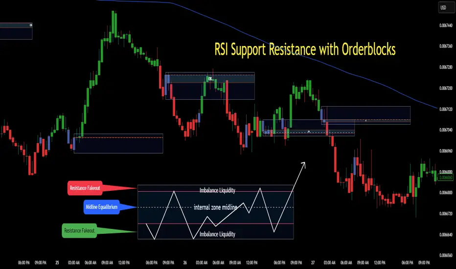
Trapped Traders Order BlocksHow It Works
The Trapped Traders Order Blocks indicator identifies specific price action patterns that suggest large market participants ("big money") have been trapped in losing positions after significant price sweeps, creating potential opportunities for reversals. The indicator detects both "bullish trap blocks" (where bearish traders are trapped) and "bearish trap blocks" (where bullish traders are trapped). Here’s the step-by-step process for each:
Bullish Trap Block (Bears Trapped):
A bearish candle (Candle A) must sweep the high of the previous candle (Candle B), meaning its high exceeds the high of the prior candle.
This bearish candle must have a longer upper wick than its lower wick, indicating rejection of higher prices.
The candle must not be a doji (i.e., it must have a significant body, defined as the body being at least 10% of the candle's range).
The next candle (Candle C) must close above the body of the bearish candle (Candle A), suggesting that price has immediately moved against the bearish sweep, potentially trapping bearish traders who entered short positions expecting a downward move.
The body of the bearish candle (Candle A) is marked as a "bullish trap block." A box is drawn around this candle's body, and a label ("Bullish Trap") is placed below it.
Bearish Trap Block (Bulls Trapped):
A bullish candle (Candle A) must sweep the low of the previous candle (Candle B), meaning its low is below the low of the prior candle.
This bullish candle must have a longer lower wick than its upper wick, indicating rejection of lower prices.
The candle must not be a doji.
The next candle (Candle C) must close below the body of the bullish candle (Candle A), suggesting that price has immediately moved against the bullish sweep, potentially trapping bullish traders who entered long positions expecting an upward move.
The body of the bullish candle (Candle A) is marked as a "bearish trap block." A box is drawn around this candle's body, and a label ("Bearish Trap") is placed above it.
Dynamic Box Extension:
For both bullish and bearish trap blocks, the box extends dynamically to the current bar unless it exceeds a user-defined age (default is 52 bars), at which point it stops at the maximum age.
Sweep Detection:
Bullish Sweep (of any trap block, bullish or bearish):
The current candle's open is above the top of the box.
The low is below the top of the box.
The close is above the top of the box.
The lower wick is longer than the upper wick (indicating rejection of lower prices).
The close is above 50% of the candle's range (ensuring a strong bullish bias).
When a bullish sweep occurs, a label ("Bullish Sweep") is placed at the low of the candle, pointing upward, and an alert is triggered.
Bearish Sweep (of any trap block, bullish or bearish):
The current candle's open is below the bottom of the box.
The high is above the bottom of the box.
The close is below the bottom of the box.
The upper wick is longer than the lower wick (indicating rejection of higher prices).
The close is below 50% of the candle's range (ensuring a strong bearish bias).
When a bearish sweep occurs, a label ("Bearish Sweep") is placed at the high of the candle, pointing downward, and an alert is triggered.
When to Be Used
The Trapped Traders Order Blocks indicator is best used in the following scenarios:
Reversal Trading:
Use this indicator to identify potential reversal points in the market. Bullish trap blocks suggest that trapped bears may unwind their short positions, leading to a potential bullish move. Bearish trap blocks suggest that trapped bulls may unwind their long positions, leading to a potential bearish move.
Look for sweeps of these blocks as confirmation of a directional move. A bullish sweep indicates a potential upward move, while a bearish sweep indicates a potential downward move.
Range-Bound Markets:
In sideways or ranging markets, trapped blocks can highlight key levels where large players have been caught off-guard. These levels often act as support or resistance, and a sweep of the block can signal a breakout or continuation in the direction of the sweep.
Confluence with Other Indicators:
Combine the trapped blocks with other technical analysis tools, such as support/resistance levels, Fibonacci retracements, or volume analysis, to increase the probability of a successful trade. For example, a bullish trap block near a strong support level with a bullish sweep can provide a high-probability setup for a long position, while a bearish trap block near a strong resistance level with a bearish sweep can signal a short opportunity.
Timeframes:
The indicator is most effective on higher timeframes such as 1-day (1D), 1-week (1W), and 1-month (1M) charts. These timeframes are more likely to capture significant moves involving large market participants, reducing noise and false signals compared to lower timeframes. While it can be used on lower timeframes (e.g., 1-hour or 4-hour), the signals may be less reliable due to increased market noise.
Logic Behind It
The logic behind the Trapped Traders Order Blocks indicator is rooted in market psychology and the behavior of large market participants ("big money"). When a large sweep candle occurs where price spikes in one direction but then quickly reverses it often indicates that traders have entered positions in the direction of the sweep, expecting a continuation. However, if the price immediately moves against them, these traders are now trapped in losing positions.
Bullish Trap Block (Bears Trapped):
A large bearish sweep candle (spiking upward but closing lower) suggests that bearish traders (bears) have entered short positions at the top of the move, expecting a downward continuation. If the next candle closes above the bearish candle's body, these bears are trapped in losing positions.
The body of the bearish candle becomes a "bullish trap block" because the trapped bears are likely to have placed their stop-loss orders or break-even exit orders just above the high of the sweep candle or within the body of the candle. As price revisits this level in the future, these trapped traders may attempt to unwind their positions by buying back their shorts, which can drive the price higher. This unwinding process often attracts new buyers, leading to a potential bullish reversal or continuation.
The bullish sweep conditions (e.g., close > box top, longer lower wick, and close above 50% of the range) ensure that the price action at the block level shows strong bullish momentum and rejection of lower prices, confirming the potential for a move higher.
Bearish Trap Block (Bulls Trapped):
A large bullish sweep candle (spiking downward but closing higher) suggests that bullish traders (bulls) have entered long positions at the bottom of the move, expecting an upward continuation. If the next candle closes below the bullish candle's body, these bulls are trapped in losing positions.
The body of the bullish candle becomes a "bearish trap block" because the trapped bulls are likely to have placed their stop-loss orders or break-even exit orders just below the low of the sweep candle or within the body of the candle. As price revisits this level in the future, these trapped traders may attempt to unwind their positions by selling their longs, which can drive the price lower. This unwinding process often attracts new sellers, leading to a potential bearish reversal or continuation.
The bearish sweep conditions (e.g., close < box bottom, longer upper wick, and close below 50% of the range) ensure that the price action at the block level shows strong bearish momentum and rejection of higher prices, confirming the potential for a move lower.
Summary
Bullish Trap Block: Occurs when bears get trapped after a bearish sweep candle is immediately followed by a bullish candle, indicating a potential reversal as trapped bears may unwind their positions.
Bearish Trap Block: Occurs when bulls get trapped after a bullish sweep candle is immediately followed by a bearish candle, indicating a potential bearish reversal.
Use Case: Ideal for identifying reversal opportunities, especially in range-bound markets or at key support/resistance levels on higher timeframes like 1D, 1W, and 1M, and can be combined with other indicators for confluence.
Logic: Large sweep candles followed by an immediate reversal suggest that big money has been trapped, and these traders may unwind their positions at break-even in the near future, driving price in the opposite direction of their initial trade.
This indicator provides a visual and actionable way to identify these trapped trader scenarios, with customizable settings for box display, sweep visuals, and alerts to help traders capitalize on these opportunities, particularly on higher timeframes where the signals are most reliable.

Invictus📝 Invictus – Probabilistic Trading Indicator
🔍 1. General Introduction
Invictus is a technical trading indicator designed to support traders by identifying potential buy and sell signals through a probabilistic and adaptive analytical approach. It aims to enhance the analytical process rather than provide explicit trading recommendations. The indicator integrates multiple analytical components—price pattern detection, momentum analysis (RSI), dynamic trend lines (Kalman Line), and volatility bands (ATR)—to offer traders a structured and contextual framework for making informed decisions.
Invictus does not guarantee profitable outcomes but seeks to enhance analytical clarity and support cautious decision-making through multiple validation layers.
⚙️ 2. Main Components
🌊 2.1. Price Pattern Detection
Invictus identifies potential market shifts by analyzing specific candlestick sequences:
Bearish Patterns (Sell): Detected when consecutive candles close below their openings, indicating increased selling pressure.
Bullish Patterns (Buy): Detected when consecutive candles close above their openings, suggesting increased buying interest.
These patterns provide historical insights rather than absolute predictions for market movements.
⚡ 2.2. Momentum Confirmation (RSI)
To improve signal clarity, Invictus employs the Relative Strength Index (RSI):
Buy Signal: RSI below a predefined threshold (e.g., 30), signaling potential oversold conditions.
Sell Signal: RSI above a threshold (e.g., 70), signaling potential overbought conditions.
RSI acts exclusively as an additional validation filter to reduce, though not eliminate, false signals derived solely from price patterns.
🌀 2.3. Kalman Dynamic Line
The Kalman Dynamic Line smooths price action and dynamically tracks trends using a Kalman filter algorithm:
Noise Reduction: Minimizes minor price fluctuations.
Trend Direction Indicator: Line slope visually represents bullish or bearish market bias.
Adaptive Support/Resistance: Adjusts continuously to market conditions.
Volatility Sensitivity: Adjustments use ATR to scale proportionally with market volatility.
This adaptive dynamic line provides clear context, aiding traders by filtering short-term volatility.
📊 2.4. Volatility Bands (ATR-based)
ATR-based volatility bands define potential breakout zones and market extremes dynamically:
Upper/Lower Bands: Positioned relative to the Kalman Line based on ATR (volatility multiplier).
Volatility Zones: Highlight potential areas of trend continuation or reversal due to significant price movements.
These bands assist traders in visually assessing significant market movements and reducing the focus on minor fluctuations.
🧠 3. Component Interaction and Validation Logic
Invictus is designed to enhance analytical clarity by integrating multiple technical components, requiring independent confirmations before signals may be considered as potentially actionable
🔗 Step 1: Pattern + RSI Validation
Initial identification of price patterns.
Signal validation through RSI conditions (oversold/overbought).
🔗 Step 2: Trend Alignment (Kalman Line)
Validated signals undergo further assessment with respect to the Kalman Dynamic Line.
Buy signals require price action above the Kalman Line; sell signals require price action below.
🔗 Step 3: Volatility Confirmation (ATR Bands)
Price action must penetrate and close beyond the corresponding volatility band.
Ensures signals align with adequate market volatility and momentum.
🔄 4. Comprehensive Decision-Making Flow
Identify price patterns (initial indication).
Confirm momentum via RSI.
Verify trend alignment using the Kalman Line.
Confirm adequate volatility via ATR bands.
💡 5. Practical Example (Buy Scenario)
Invictus signals a potential buy scenario.
Trader waits for the price to cross above the Kalman Line.
Entry consideration occurs only after a confirmed close above the upper ATR volatility band.
⚠️ 6. Important Limitations
Do not rely solely on Invictus signals; always perform broader market analysis.
Invictus performs optimally in trending markets; exercise caution in sideways or range-bound markets.
Always evaluate broader market context and the dominant trend before making decisions.
📝 7. Risk Management & Responsible Trading
Invictus serves as an analytical support tool, not a guarantee of market outcomes:
Set prudent stop-loss levels.
Apply conservative leverage, especially in volatile conditions.
Conduct thorough backtesting and practice on a demo account before live trading.
⚠️ Disclaimer: Trading involves significant risks. Invictus generates signals based on historical and technical analysis. Past performance is not indicative of future results. Responsible trading practices are strongly advised.
💡 8. Final Considerations
Invictus provides an analytical framework integrating various supportive technical methodologies designed to enhance decision-making and comprehensive analysis. Its multi-layered validation process encourages disciplined analysis and informed decision-making without implying any guarantees of profitability.
Traders should incorporate Invictus within broader strategic frameworks, consistently applying disciplined risk management and thorough market analysis.

RSI+ Crypto Smart Strategy by Ignotus ### **RSI+ Crypto Smart Strategy by Ignotus**
**Description:**
The **RSI+ Crypto Smart Strategy by Ignotus** is an advanced and visually enhanced version of the classic **Relative Strength Index (RSI)**, developed by the **Crypto Smart** community. This indicator is designed to provide traders with a clear and actionable view of market momentum, overbought/oversold conditions, and potential reversal points. With its sleek design, customizable settings, and intuitive visual signals, this tool is perfect for traders who want to align their strategies with the principles of the **Crypto Smart** methodology.
Whether you're a beginner or an experienced trader, this indicator simplifies technical analysis while offering powerful insights into market behavior. It combines traditional RSI calculations with advanced visual enhancements and natural language interpretations, making it easier than ever to interpret market conditions at a glance.
---
### **Key Features:**
1. **Enhanced RSI Visualization:**
- The RSI line dynamically changes color based on its position relative to the 50-level midpoint:
- **Green** for bullish momentum (RSI > 50).
- **Red** for bearish momentum (RSI < 50).
- Overbought (default: 70) and oversold (default: 30) levels are clearly marked with customizable colors and shaded clouds for better visibility.
2. **Customizable Settings:**
- Adjust the RSI period, overbought/oversold thresholds, and background transparency to match your trading style.
- Fine-tune pivot lookback ranges and other parameters to adapt the indicator to different timeframes and assets.
3. **Interactive Information Table:**
- A compact, easy-to-read table provides real-time data on the current RSI value, its direction (▲, ▼, →), and a natural language interpretation of market conditions.
- Choose from three text sizes (small, medium, large) to optimize readability.
4. **Natural Language Interpretations:**
- The indicator includes a detailed explanation of the RSI's current state in plain English:
- Momentum trends (bullish, bearish, or neutral).
- Overbought/oversold warnings with potential reversal alerts.
- Clear guidance on whether the market is trending or ranging.
5. **Visual Buy/Sell Signals:**
- Triangles (▲ for buy, ▼ for sell) highlight potential entry and exit points based on RSI crossovers and divergence patterns.
- Configurable alerts notify you in real-time when key signals are triggered.
6. **Improved Aesthetics:**
- Clean, modern design with customizable colors for lines, clouds, and backgrounds.
- Dynamic shading and transparency options enhance chart clarity without cluttering the workspace.
---
### **How to Use This Indicator:**
- **Overbought/Oversold Zones:** Use the RSI's overbought (above 70) and oversold (below 30) zones to identify potential reversal points. Look for confirmation from price action or other indicators before entering trades.
- **Momentum Analysis:** Monitor the RSI's position relative to the 50-level midpoint to gauge bullish or bearish momentum.
- **Trend Identification:** Combine the RSI's readings with price trends to confirm the strength and direction of the market.
- **Entry/Exit Signals:** Use the visual signals (triangles) to spot potential entry and exit points. These signals are particularly useful for swing traders and scalpers.
---
### **Why Choose RSI+ Crypto Smart Strategy?**
This indicator is more than just an RSI—it's a complete tool designed to streamline your trading process. By focusing on clarity, customization, and actionable insights, the **RSI+ Crypto Smart Strategy** empowers traders to make informed decisions quickly and confidently. Whether you're trading cryptocurrencies, stocks, or forex, this indicator adapts seamlessly to your needs.
---
### **Developed by Crypto Smart:**
The **RSI+ Crypto Smart Strategy by Ignotus** is part of the **Crypto Smart** ecosystem, a community-driven initiative aimed at providing innovative tools and strategies for traders worldwide. Our mission is to simplify technical analysis while maintaining the depth and precision required for successful trading.
If you find this indicator helpful, please leave a review and share it with fellow traders! Your feedback helps us continue developing cutting-edge tools for the trading community.
---
### **Disclaimer:**
This indicator is a technical analysis tool and should not be considered financial advice. Trading involves risk, and past performance is not indicative of future results. Always conduct your own research and consult with a financial advisor before making trading decisions. Use of this indicator is at your own risk.
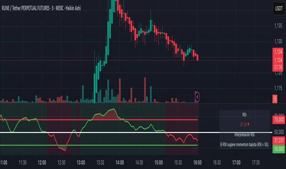
[TehThomas] - ICT Volume ImbalanceThis script is a Volume Imbalance (VI) detector and visualizer for use on the TradingView platform. The goal of the script is to automatically identify areas where there are significant imbalances in the volume of trades between consecutive candlesticks and visually highlight these areas. These imbalances can provide traders with valuable insights about the market’s current condition, often signaling potential reversal or continuation points based on price and volume action.
ICT (Inner Circle Trader) Concept of Volume Imbalances
Volume imbalances are a critical concept in the ICT trading methodology. They refer to situations where there is an unusual or significant difference in volume between two consecutive candlesticks, which might indicate institutional or large player activity. According to ICT principles, these imbalances can show us areas of market inefficiency or potential price manipulation. By identifying these imbalances, traders can gain an edge in understanding where the market is likely to move next.
Bullish and Bearish Volume Imbalances:
Bullish Volume Imbalance: This occurs when there is a strong increase in buying pressure, typically indicated by a higher volume on a candle that closes significantly above the previous one, often leaving a gap or larger price movement. The market could be preparing to push higher, and the volume shows a clear shift in buying demand.
Bearish Volume Imbalance:
Conversely, a bearish imbalance occurs when there is a strong increase in selling pressure, typically signaled by a candle that closes significantly lower than the previous one, again with higher volume. This could indicate that large players are offloading positions, and the price is likely to drop further.
Key Features and Functions of the Script
The script automates the process of detecting these volume imbalances and visually marking them on a price chart. Let’s explore its functionality in detail.
1. Inputs Section
The script allows for significant customization through its input options, which help traders adjust the detection and visualization of volume imbalances based on their individual preferences and trading style. Below are the details:
lookback (250 bars): This input specifies the number of bars (or candles) the script should look back when analyzing the volume imbalance. By setting this to 250, the user is looking at the last 250 bars on the chart to detect any significant volume imbalances. This period is adjustable between 50 to 500 bars.
volumeThreshold (1.0 multiplier): This input helps set the sensitivity for identifying volume imbalances. The script compares the volume of the current candle with the previous one, and if the current volume exceeds the previous volume by this threshold multiplier (in this case, 1.0 means at least equal to the previous volume), then it triggers an imbalance. Users can adjust the multiplier to suit different market conditions.
showBoxes (true/false): This toggle determines whether the boxes representing volume imbalances are drawn on the chart. When enabled, the script visually highlights the imbalances with colored boxes.
fillBaseColor (orange with 80% opacity): This is the color setting for the background of the imbalance boxes. A softer color (like orange with opacity) ensures the imbalance is highlighted without obscuring the price action.
borderColor (gray): The color of the border around the imbalance boxes. This adds a visual distinction to make the imbalance areas more visible.
borderWidth (1 pixel): This controls the width of the box's border to adjust how prominent it appears.
rightOffset (30 bars): This input controls how far the imbalance box extends to the right on the chart. It helps users anticipate the potential continuation of the imbalance beyond the current candle.
allowWickOverlap (true/false): This setting allows imbalances to be identified even if the wicks of the two consecutive candlesticks overlap. If set to false, only imbalances where the bodies of the candlesticks don’t overlap are considered.
showBrokenBoxes (true/false): If enabled, once a volume imbalance no longer holds true (i.e., the price breaks through the box), the box is marked as "broken." If disabled, the box is deleted when the imbalance condition no longer applies.
brokenBoxColor (red): This controls the color of the box when it is broken, which can be used as a visual cue that the imbalance was invalidated or no longer valid for analysis.
2. Volume Imbalance Function
This is the core function of the script, where the logic to detect bullish and bearish volume imbalances is implemented.
Bullish Imbalance Condition:
The first condition checks if the low of the current candle is greater than the high of the previous candle. This suggests that the market is moving upward with buying pressure.
The second condition checks whether the volume of the current candle is higher than the previous candle by the volumeThreshold multiplier. If both conditions are satisfied, a bullish imbalance is detected.
Bearish Imbalance Condition:
The first condition checks if the high of the current candle is lower than the low of the previous candle. This suggests downward price action with selling pressure.
The second condition checks whether the current volume exceeds the previous volume by the threshold
Allow Wick Overlap: If allowWickOverlap is set to true, the script will still detect imbalances if the wicks of the two candles overlap (common in volatile markets). If false, imbalances are only considered if the wicks do not overlap.
3. Box Creation and Management
When a volume imbalance is detected, the script creates a box on the chart:
The bullish imbalance box is drawn using the minimum of the open and close of the current bar as the top boundary and the maximum of the open and close of the previous bar as the bottom boundary.
Conversely, the bearish imbalance box is drawn in reverse, using the maximum of the current bar’s open and close as the top boundary and the minimum of the previous bar’s open and close as the bottom boundary.
Once the box is created, it is displayed on the chart with the specified background color, border color, and width.
4. Processing Existing Boxes
After detecting a new imbalance and drawing a box, the script checks whether the box should still remain on the chart:
If the price moves beyond the boundaries of the imbalance box, the box is marked as broken (if showBrokenBoxes is enabled), and its color is changed to red, signifying that the imbalance is no longer valid.
If the box remains intact (i.e., the price has not broken the defined boundaries), the script keeps the box extended to the right as the market continues to evolve.
5. Removing Outdated Boxes
Lastly, the script removes boxes that are older than the specified lookback period. For example, if a box was created 250 bars ago, it will be deleted after that period. This ensures the chart stays clean and only focuses on relevant imbalances.
Why This Script is Useful for Traders
This script is extremely valuable for traders, especially those following the ICT methodology, because it automates the process of detecting market inefficiencies or imbalances that might signal future price action. Here’s why it’s particularly useful:
Identifying Key Areas of Interest: Volume imbalances often point to areas where institutional or large-scale traders have entered the market. These areas could provide clues about the next significant move in the market.
Visualizing Market Structure: By automatically drawing boxes around volume imbalances, the script helps traders visually identify potential areas of support, resistance, or turning points, enabling them to make informed trading decisions.
Time Efficiency: Instead of manually analyzing each candlestick and volume spike, this script does the heavy lifting, saving traders valuable time and allowing them to focus on other aspects of their strategy.
Enhanced Trade Entries and Exits: By understanding where volume imbalances are occurring, traders can time their entries (buying during bullish imbalances and selling during bearish ones) and exits (as imbalances break) more effectively, thus improving their chances of success.
Conclusion
In summary, this script is a powerful tool for traders looking to implement volume imbalance strategies based on the ICT methodology. It automates the identification and visualization of significant imbalances in price and volume, offering traders a clear visual representation of potential market turning points. By customizing the settings, traders can tailor the script to their preferred timeframes and sensitivity, making it a flexible and effective tool for any trading strategy.
__________________________________________
Thanks for your support!
If you found this idea helpful or learned something new, drop a like 👍 and leave a comment, I’d love to hear your thoughts! 🚀
Make sure to follow me for more price action insights, free indicators, and trading guides. Let’s grow and trade smarter together! 📈
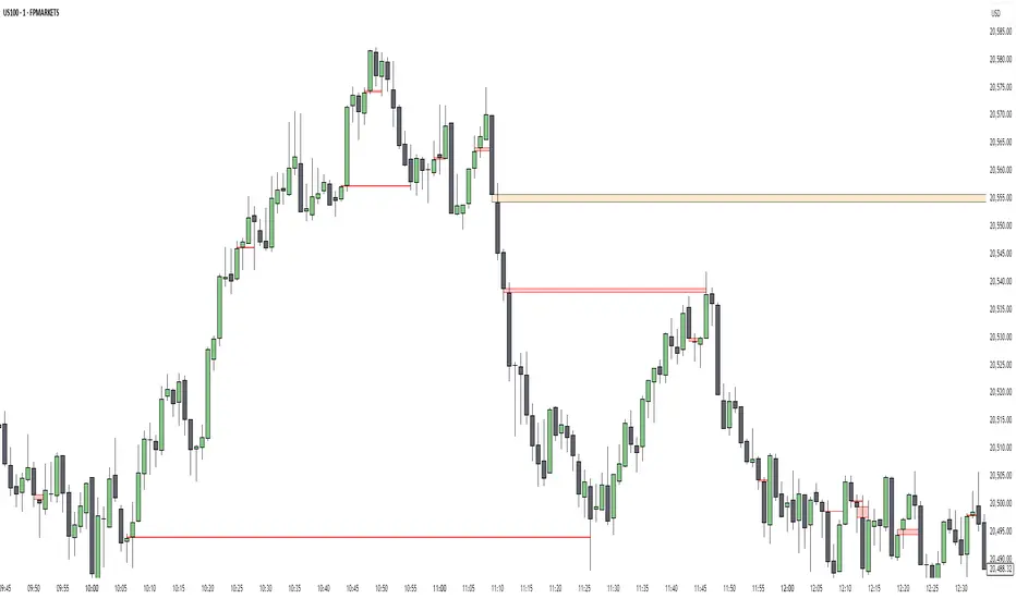
[TehThomas] - ICT VI / FVG / IFVG / Liquidity📌 Overview
This TradingView indicator is designed to help traders spot key price inefficiencies and liquidity events based on ICT (Inner Circle Trader) concepts. The script automatically highlights important areas on the chart, such as Volume Imbalances (VI), Fair Value Gaps (FVG), Inverted Fair Value Gaps (IFVG), and Liquidity Sweeps, giving traders a clear view of where price might react.
By marking these zones visually, the indicator serves as a liquidity map, showing where smart money could be targeting orders or rebalancing price action.
🔑 How the Script Works
The indicator detects four major market inefficiencies and liquidity patterns, each offering valuable insights into how price might behave:
1️⃣ Volume Imbalance (VI)
Bullish VI: When the current candle has higher volume than the previous candle in an upward move, this suggests demand is pushing the price up, creating potential buying opportunities.
Bearish VI: When the current candle has higher volume than the previous candle in a downward move, this suggests supply is pushing the price down, highlighting potential selling opportunities.
How to take trades:
Buy: Enter a long position when a bullish VI appears and the price is near a support zone or key level (such as the previous swing low or FVG).
Sell: Enter a short position when a bearish VI appears and the price is near a resistance zone or key level (such as the previous swing high or FVG).
2️⃣ Fair Value Gap (FVG)
Bullish FVG: A gap in price action where the low of the second candle is higher than the high of the first candle. Price tends to return to fill these gaps before continuing upward.
Bearish FVG: A gap in price action where the high of the second candle is lower than the low of the first candle. Price tends to return to fill these gaps before continuing downward.
How to take trades:
Buy: Enter long after a pullback into a bullish FVG zone and if price action shows signs of rejection (such as bullish candlestick patterns or strong momentum).
Sell: Enter short after a pullback into a bearish FVG zone and if price action shows signs of rejection (such as bearish candlestick patterns or strong downward momentum).
3️⃣ Inverted Fair Value Gap (IFVG)
An Inverted Fair Value Gap (IFVG) refers to a Fair Value Gap (FVG) that has already been filled or broken through by price action. Essentially, it is a gap that has been revisited by price and has now been mitigated or broken.
Example:
For Continuation: After price fills the gap, it may continue in the same direction. If price breaks through a bullish FVG and shows continuation, it may signal that the market is still in a strong uptrend.
For Reversal: If the price returns to an inverted FVG after breaching it, and then starts showing signs of reversal (e.g., reversal candlestick patterns, or a shift in momentum), this could signal an entry point in the opposite direction.
How to take trades:
Buy: Consider entering long when price returns to an IFVG zone that aligns with other bullish confluences, such as a bullish VI or liquidity sweep.
Sell: Consider entering short when price returns to a bearish IFVG zone that aligns with other bearish confluences, such as a bearish VI or liquidity sweep.
4️⃣ Liquidity Sweeps
Liquidity sweeps occur when the market temporarily breaks a key high or low to trigger stop-loss orders or lure traders into the wrong direction before reversing.
How to take trades:
Buy: If a liquidity sweep breaks a key resistance or swing high but fails to close above it, enter long when price begins to reverse in the opposite direction, ideally near a previous support or FVG zone.
Sell: If a liquidity sweep breaks a key support or swing low but fails to close below it, enter short when price begins to reverse in the opposite direction, ideally near a previous resistance or FVG zone.
🎯 Trade Setup and Confirmation Strategy
Here’s how to combine these concepts for high-probability trade setups:
Liquidity Sweeps + Volume Imbalances:
If a liquidity sweep occurs in conjunction with a volume imbalance (especially on a higher timeframe), this can act as a confirmation signal to enter the trade.
Example: A liquidity sweep breaks a previous high, but the price fails to close above it. If this happens alongside a break of a Volume imbalance (VI) , it could be a strong signal to sell.
FVG/IFVG Mitigation + Liquidity Sweeps:
Price often returns to mitigate imbalances, and when a liquidity sweep occurs near an unfilled gap, it could trigger a reversal.
Example: After an upward trend, a bearish liquidity sweep breaks a previous swing low, and price then revisits a bearish FVG and creates an IFVG, signaling an opportunity to buy.
Directional Bias (Higher Timeframe Analysis):
Always consider the higher timeframe trend to confirm trade direction. A bullish FVG or bullish VI on the lower timeframe aligns with a bullish trend on the higher timeframe.
Confluence with Key Levels:
When these patterns align with important price levels such as support, resistance, or previously identified swing highs/lows, it enhances the probability of a successful trade.
⚙️ How It Helps in Trading Strategy
The indicator assists in several aspects of trading:
Liquidity Hunts: Price often sweeps liquidity before making major moves.
Entry Confirmation: Use imbalances or sweeps as extra confluence for trade entries.
Mitigation Zones: Price frequently returns to fill inefficiencies before reversing.
Directional Bias: Bullish or bearish gaps align with the higher timeframe narrative.
🔍 ICT Concepts Included
✅Volume Imbalance (VI): High-volume inefficiencies.
✅Fair Value Gap (FVG): Standard price gaps.
✅Inverted Fair Value Gap (IFVG): Filtered large price gaps.
✅Liquidity Sweeps: Stop-hunting patterns by smart money.
⚠️ Disclaimer
This indicator is built for educational purposes and should not be considered financial advice. Trading carries risk, and no tool guarantees profits. Always use proper risk management and perform your own analysis before entering any trade.

CandelaCharts - ICT Daily Profiles Go (DPG)📝 Overview
The ICT Daily Profiles by CandelaCharts, inspired by ICT teachings, offer a pattern-driven approach to trading by identifying and analyzing the key highs and lows of intraday sessions.
This toolkit automatically highlights these ICT Daily Profiles on your charts, allowing traders to efficiently identify critical zones for analysis and informed decision-making.
Whether you're an experienced trader or just starting out, ICT Daily Profiles deliver actionable frameworks to deepen your understanding of price behavior and enhance your intraday trading performance.
📦 Features
The ICT Daily Profiles toolkit provides a robust suite of features tailored to improve trading accuracy and support informed decision-making. Its key highlights include:
Daily Profiles
Advanced Styling
Scanner
The indicator supports the following profiles:
Session I High Session II Low Bearish
Session I High Session III Low Bearish
Session II High Session III Low Bearish
Session III High Session IV Low Bearish
Session I Low Session II High Bullish
Session I Low Session III High Bullish
Session II Low Session III High Bullish
Session III Low Session IV High Bullish
⚙️ Settings
Sessions: Controls how many sessions you want to see.
History: Controls how many profiles are displayed on the chart.
Timeframe Limit: Sets the timeframe up to which profiles will be drawn.
Show OHLC Lines: Display the lines for OHLC.
Show Profile Line: Display the Daily Profile line.
Use NY Midnight Open: Controls from where a profile will start detection.
Open: Style for Open line.
High: Style for High line.
Low: Style for Low line.
Midline: Style for Profile Midline.
Label: Controls the position of the Daily Profile name.
Scanner: Display the Scanner
⚡️ Showcase
ICT (Inner Circle Trader) daily profile templates are analytical models that classify and outline common price action patterns observed throughout a trading day.
ICT Daily Profiles
Scanner
📒 Usage
The ICT Daily Profiles indicator aims to give traders a clear and actionable view of the Daily Previous, Current, and Future Profiles. This enables them to analyze market structure, predict price movements, and align their trading strategies with higher time-frame trends.
Load the indicator on the chart
Enable Scanner
See the Predicted Profiles list
Predicted Profiles represent all potential scenarios for the current day, generated by a profile detection algorithm.
By visualizing potential outcomes through Predicted Profiles, the ICT Daily Profiles indicator provides traders with a strategic edge, allowing them to remain flexible, prepared, and aligned with the most probable market movements.
🚨 Alerts
The indicator does not provide any alerts!
🔹 Notes
ICT Daily Profiles
pbs.twimg.com
⚠️ Disclaimer
Trading involves significant risk, and many participants may incur losses. The content on this site is not intended as financial advice and should not be interpreted as such. Decisions to buy, sell, hold, or trade securities, commodities, or other financial instruments carry inherent risks and are best made with guidance from qualified financial professionals. Past performance is not indicative of future results.
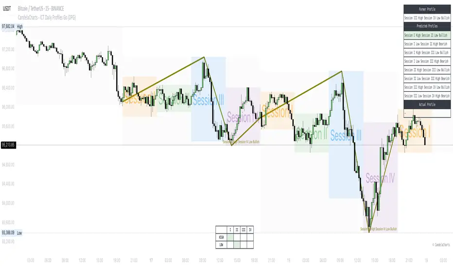
Two-Pole Oscillator [BigBeluga]
The Two-Pole Oscillator is an advanced smoothing oscillator designed to provide traders with precise market signals by leveraging deviation-based calculations combined with a unique two-pole filtering technique. It offers clear visual representation and actionable signals for smart trading decisions.
🔵Key Features:
Two-Pole Filtering: Smooths out the main oscillator signal to reduce noise, providing a cleaner and more reliable view of market momentum and trend strength.
// Two-pole smooth filter function
f_two_pole_filter(source, length) =>
var float smooth1 = na
var float smooth2 = na
alpha = 2.0 / (length + 1)
if na(smooth1)
smooth1 := source
else
smooth1 := (1 - alpha) * smooth1 + alpha * source
if na(smooth2)
smooth2 := smooth1
else
smooth2 := (1 - alpha) * smooth2 + alpha * smooth1
Deviation-Based Oscillator: Utilizes price deviations from the mean to generate dynamic signals, making it ideal for detecting overbought and oversold conditions.
float sma1 = ta.sma(close, 25)
float sma_n1 = ((close - sma1) - ta.sma(close - sma1, 25)) / ta.stdev(close - sma1, 25)
Signal Gradient Strength: Signals on the main oscillator line feature gradient coloring based on their proximity to the 0 level:
➔ Closer to 0: More transparent, indicating weaker signals.
➔ Closer to 1 or -1: Less transparent, highlighting stronger signals.
Level-Based Signal Validation: Parallel levels are plotted on the chart for each signal:
➔ If a level is crossed by price, the signal is invalidated, marked by an "X" at the invalidation point.
Trend Continuation
Invalidation Levels: Serve as potential stop-loss or trade-reversal zones, enabling traders to make more informed and disciplined trading decisions.
Dynamic Chart Plotting: Signals are plotted directly on the chart with corresponding levels, providing a comprehensive visual representation for easy interpretation.
🔵How It Works:
The oscillator calculates price deviation from a mean value and applies two-pole filtering to smooth the resulting signal.
Gradient-colored signals reflect their strength, with transparency indicating proximity to the 0 level on the oscillator scale.
Buy and sell signals are generated based on crossovers and crossunders of the oscillator line with a signal line.
If a level is crossed, the corresponding signal is marked with a "X" plotted on the chart at the crossover point.
🔵Use Cases:
Detecting overbought or oversold market conditions with a smoother, noise-free oscillator.
Using invalidation levels to set clear stop-loss or trade exit points.
Identifying strong momentum signals and filtering out weaker, less reliable ones.
Combining oscillator signals with price action for more precise trade entries and exits.
This indicator is perfect for traders seeking a refined approach to oscillator analysis, combining signal strength visualization with actionable invalidation levels to enhance trading precision and strategy.