Gauss IndicatorGauss Indicator
Class : oscillator
Trading type : any
Time frame : any
Purpose : reversal trading
Level of aggressiveness : any
About Gauss Indicator
Time series forecasting is quite a scientific task, for which specific econometrical models and methods have been developed.
Who is Gauss and Why his Curve is So Important
Johann Gauss was one of the best mathematicians of all times and he gave us a very specific curve (Gaussian Curve) to explain specifics of random variable behavior (so called Normal Distribution)
Gaussian curve has quite interesting property usually called “3 Sigmas Rule”: in a normal distribution: 68%, 95%, and 99.7% of the values lie within one, two, and three standard deviations of the mean, respectively.
But Does It Work in the Financial Markets?
Normal Distribution is extremely typical for price behavior in financial markets: FOREX, stock Market, Commodities, Cryptocurrency market.
How can we forecast future prices based on “3 Sigmas Rule”?
If we know past prices (we actually know), we can calculate Mean and Standard Deviation.
After that following “3 Sigmas Rules” we can calculate the fluctuations range for the present day with a known probability (!).
• If we add 1 sigma to mean we can get the price value that wouldn’t be exceeded with a probability of 68%.
• If we add 2 sigmas to mean we can get the price value that wouldn’t be exceeded with a probability of 95%.
• If we add 3 sigmas to mean we can get the price value that wouldn’t be exceeded with a probability of 99%.
How Can I Get This Information?
Gauss indicator is a practical implementation of “3 sigmas rule” in trading.
Gauss allows to predict the ranges of price fluctuations for the selected time frames (week, day, hour, etc) with certain probabilities: 68%, 95% and 99%.
Gauss can be used to generate Trading signals, Stop-loss parameters, Take-profit parameters, Synthetic Levels (both Support and Resistance).
Actually, ALL information you need to trade.
Structure of the Gauss Indicator
1. Three blue lines – synthetic support lines. They describe 3 different buy zones with certain probabilities of success:
- First blue line (Buy zone #1) - the price today will not fall below this mark with a probability of 68%;
- Second blue line (Buy zone #2) - the price today will not fall below this mark with a probability of 95%;
- Third blue line (Buy zone #3) - the price today will not fall below this mark with a probability of 99%.
2. Three red lines – synthetic resistance lines. They describe 3 different sell zones with certain probabilities of success:
- First red line (Sell zone #1) - the price today will not rise above this mark with a probability of 68%;
- Second red line (Sell zone #2) - the price today will not rise above this mark with a probability of 95%;
- Third red line (Sell zone #3) - the price today will not rise above this mark with a probability of 99%.
3. Green line – shows current price. When it gets close to the red/blue line sell/buy signals are generated.
Trading rules
General rules are as follows: buy at the blue lines, sell at the red lines.
Take-profits for sells are set at the nearest blue line, for buys – at the nearest red line. Stop-losses for sells are set above the last red line, for buys – below the last blue line.
在脚本中搜索"range"
Taylor True Ranges - deviationsDescription:
The Taylor True Ranges - Deviations indicator in Pine Script 5.0 computes various price levels and averages based on Taylor's trading principles. It provides insights into potential buying and selling opportunities by analyzing deviations from average price movements. The indicator calculates and visualizes critical levels such as Decline Average, Buying Under Average, Pivot Brake Sell, Rally Average, Buying High Average, and Pivot Brake Buy. These levels are derived from historical price data and help traders identify key support and resistance zones, trend reversals, and breakout points.
Key Features:
Taylor's Trading Principles: The indicator implements Taylor's methodology to analyze price movements and identify trading opportunities based on deviations from average ranges.
Multiple Price Levels: It calculates and displays various price levels, including Decline Average, Buying Under Average, Pivot Brake Sell, Rally Average, Buying High Average, and Pivot Brake Buy.
Customizable Visualization: Traders can customize the visualization by toggling the display of individual price levels and adjusting the appearance settings such as line style, color, and text size.
Daily Lookback: The indicator supports a customizable daily lookback period, allowing traders to analyze historical price movements over a specified timeframe.
Usage:
Apply the Taylor True Ranges - Deviations indicator to your chart to analyze deviations from average price movements and identify potential trading opportunities.
Customize the indicator settings, including the daily lookback period, line style, color, and text size, to suit your trading preferences and analysis requirements.
Use the calculated price levels and averages as part of your technical analysis to make informed trading decisions, including identifying support and resistance levels, trend reversals, and breakout points.
Example:
Traders can use the Taylor True Ranges - Deviations indicator to analyze deviations from average price movements and identify key support and resistance levels. For instance, observing a Pivot Brake Sell level crossing above the current price might indicate a potential selling opportunity, while a Pivot Brake Buy level crossing below the price could signal a buying opportunity.
itradesize /\ IPDA Look Back - for any timeframeThe script automatically calculates the 20-40-60 look-back periods and their premium and discount ranges.
The base concept is from ICT’s IPDA which should be applied to the daily timeframe but now you can use that same concept on the lower timeframes .
The higher the timeframes you use the more reliable it will be ( when we are talking about lower timeframes than Daily ).
- With the use of the indicator you can apply it on any timeframe with ease.
- You can customize the coloring of premium & discount, frame lines, and even the look of it.
- Hide or show the EQ levels
Below the IPDA texts the indicator shows the actual percentage of the selected range based on the current price fluctuations.
The script handles the 20-40-60 days look-back as fractals so it can be applied on lower timeframes.
The basics:
- The Interbank Price Delivery Algorithm (IPDA): The algorithm creates a shift on the daily chart every 20, 40, and 60 trading days.
- These are the IPDA look-back periods. Every 20 trading days or so there is a new liquidity pool forming on both sides of the market based on ICT concepts.
- Determine the IPDA Data Range of the land 20 trading days.
- Note the highest high & lowest low in the past 20 trading days. Identify the institutional order flow and mark the relevant PD arrays in the selected IPDA look-back period we deemed useful for our trading style.
- This is your current dealing range.
- If the price consolidates for 20 days, consider switching to a 40-day look back.
Inside this dealing range, we look for the next draw on liquidity. Is it reaching for a liquidity pool or is it looking to rebalance at a particular PD Array. This is going to the Bias.
Which IPDA data range should you use?
IPDA20 can be our Short Term range - fit for intraday traders at most
IPDA40 can be our Swing Trade range - have a clear indication of the market profile
IPDA60 can be our range for position trading - have a clear indication of the market profile

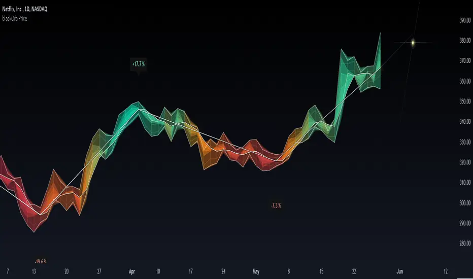
blackOrb PriceblackOrb's Aspiration: Enhancing the Functionality of Area Charts
At its core, an area chart analysis serves as the foundational structure for blackOrb Price. Area charts can be seen as an addition to conventional price charts. Unlike price line charts, which connect closing prices with lines, an area chart fills the space between high and low prices, creating a visual representation of price ranges. This approach can offer several advantages, particularly in assessing price volatility and price dynamics.
A wider area between high and low suggests high volatility, while a narrower area indicates lower volatility. The orientation of the closing price concerning the high-low range provides insights into whether buyers or sellers are exerting influence on the market.
Combined with the following elements, this chart tool can support comprehensive data-driven trading analysis:
- Integrated moving averages for price dynamic insights
- Zigzag pivot identification for price level insights
- Stochastic lookback analysis for turning point insights
- Ghost mode for comparative insights
Technical Methodology
I. Integrated Moving Averages for Price Dynamic Insights
Incorporating various MA alternatives allows traders to gain insights into not only price dynamics but also their underlying strength, which is reflected in trading activity. This strength is visually depicted by the derived price line within blackOrb's Price Area Chart.
Among the array of MA alternatives, VWMA stands out as a suitable implementation choice for integrating volume data. It goes beyond the scope of a simple moving average, considering both price and volume in its calculation, as shown in the following formula:
(C1 x V1 + C2 x V2 + ... + CN x Vn) / (V1 + V2 + ... + Vn)
II. Zigzag Pivot Identification for Price Level Insights
Zigzag Pivot Identification can be a valuable tool for recognizing possible price movements and potential turning points. It operates by pinpointing pivotal moments where prices alter their course. Essential components of this method involve comparing time units both to the left and right within a designated price dynamic phase, effectively defining the search range for pivotal points.
For instance, in the analysis below, the search is for the highest price point that hasn't been surpassed in the last 10 time units to the left and 10 time units to the right:
ta.pivothigh(10, 10)
The lookback variables analyze price points by simultaneously examining a specified number of time units before and after a potential pivot point as the central reference. A pivot is identified when a price point remains unbreached throughout this period.
Note: This method retroactively validates structures, implying that this tool may redraw or adjust its values as price data evolves. This leads to inconsistency and a lack of predictability.
III. Stochastic Lookback Analysis for Turning Point Insights
The stochastic calculation methodology of this feature centers around the following formula:
100 * (close - lowest(low, length)) / (highest(high, length) - lowest(low, length))
This key formula employs a stochastic calculation methodology that assesses the percentage deviation of the closing price from the lowest low over a specified timeframe (length), relative to the span between the highest high and the lowest low. The outcome is normalized within a range of 0 to 100, providing insights into the relative position of the closing price within the high-low range. Traders can define the specific periods over which the stochastic calculation is performed.
Based on this stochastic analysis, the indicator integrates area chart coloring, affording users the flexibility to adjust the sensitivity of area chart coloring according to customized stochastic look-back evaluation phases. Consequently, the coloration by length evaluation can mirror a comprehension of market dynamics.
Note: However, it's important to recognize that the efficacy of evaluation coloring might be compromised during periods of lateral price movement, characterized by less prominent market trends.
IV. Ghost Mode for Comparative Insights
Unveiling convergences and divergences, the Ghost Mode overlays two price charts, which can reveal price trajectories and reactions (e.g. Apple stock's potential response to the NASDAQ 100 Technology Sector Index).
Note: This approach may not capture nuanced correlations during intricate market scenarios.
Note on Usability
This tool is an intricately designed area chart, meticulously created to serve as a fundamental canvas for the seamless integration of other more granular trading indicators.
blackOrb Price can have synergies with blackOrb Candle as both indicators combined can give a bigger picture for supporting comprehensive and multifaceted data-driven trading analysis.
This indicator isn't intended for standalone trading application. Instead, it offers an alternative approach to traditional area charts, serving as a supplementary tool for orientation within broader trading strategies. Irrespective of market conditions, it can harmonize with a wider range of trading styles and instruments/trading pairs/indices like Stocks, Gold, EURUSDSPX500, GBPUSD, BTCUSD and Oil.
Inspiration and Publishing
Taking genesis from the inspirations amongst others provided by TradingView Pine Script Wizard Kodify, blackOrb Price is a multi-encompassing script meticulously forged from scratch. It aspires to furnish a comprehensive area chart approach, borne out of personal experiences and a strong dedication in supporting the trading community. We eagerly await valuable feedback to refine and further enhance this tool.
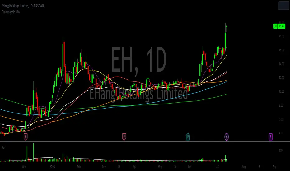
Qullamaggie Daily with ADR% and Compression RangeQullamaggie Daily
This Indicator is a Combination of Moving Averages (Simple and Exponential) as definied from Qullamaggie and used in his TC2000 Setup
Moving Averages:
- The Moving Averages are Guidelines for the current Trend and are not decive for the Entry
- They shall be a quick view and visual assistance to find strong momentum stock that are currently in a Phase of a "Flag Pattern"
ADR% 20 Day:
- Average Daily Range in % should indicate the Momentum of the Stock. It is similar but still works different as the Volalitily indicators.
- A stock is recommend to a have a ADR% above 5-6 to be considered a Momentum Leading Stock.
Consolidation Range:
- This Indicator should help to define Ranges in which the Volumen get compressed(increase) while the price movement is minimal
- A strong breakout is to be expected. The Range should be easier to be identified with this indication.
VWAP Band TrendThis indicator combines two features: VWAP bands for range trading and trends for trend-following.
The white bands offer support/resistance levels ideal for range trading: short when rejecting off the upper band, long when rejecting off the lower. Take profit either when hitting the (faint gray) midline and/or when hitting the band on the far side.
The trend analysis shows green or red ranges above or below the bands to indicate trend strength - larger swaths of green or red indicates strong trend while shorter swathes indicate weak. If the upper trend color doesn't match the lower trend color, the trend is undecided or transitioning.
Optionally, trend initiation indicators can be turned on to show above/below candles where a trend switch is taking place.
Demand VectorCreate lines based on the demand for long/short, extracted from price range.. this lines have nothing to do with volume and liquidity, its just a interpretation of price range.

Smart Money Range + Displacement🧠 How This Indicator Works
This indicator is based on Smart Money Concepts, which follow how institutions actually move the market:
Build liquidity → Take liquidity → Show intent → Move price
It does not predict the market.
It reacts only after confirmation.
1️⃣ Trend Filter (EMA) – Market Direction
What it does:
The Exponential Moving Average (EMA) shows the dominant market direction.
How it’s used:
Price above EMA → bullish bias → only BUY signals
Price below EMA → bearish bias → only SELL signals
Why it matters:
Institutions usually push price in the direction of the higher-timeframe trend.
This filter removes low-probability counter-trend trades.
2️⃣ Smart Money Range – Liquidity Zone
What it does:
The indicator calculates the highest high and lowest low over a fixed number of candles to create a trading range.
Why this range matters:
Equal highs and equal lows form inside ranges
Retail stop-loss orders accumulate at range boundaries
These areas become liquidity pools
Institutions need liquidity to enter large positions — this shows where it is.
3️⃣ Liquidity Sweep – Stop Hunt Detection
What it does:
The indicator detects when price breaks above or below the range but fails to close outside it.
What this means:
Stops above highs or below lows are triggered
Retail traders are trapped
Smart money absorbs liquidity
This is manipulation, not a real breakout.
4️⃣ Displacement Candle – Institutional Entry
What it does:
The indicator checks for a candle with a body significantly larger than recent candles.
Why displacement is important:
Large candle bodies show strong order flow
Confirms that institutions have entered the market
Filters out weak or fake moves
No displacement = no trade.
5️⃣ Trade Confirmation Logic – Final Signal
BUY Signal Conditions
Liquidity taken below the range
Strong displacement candle
Price above EMA
SELL Signal Conditions
Liquidity taken above the range
Strong displacement candle
Price below EMA
Meaning:
Only trade after liquidity is taken and real momentum appears in trend direction.
6️⃣ Signal Plotting – Clear Execution
What you see on the chart:
BUY label below the candle
SELL label above the candle
Signals appear only after candle close, ensuring no repainting.
🔁 Market Behavior This Indicator Reads
Market moves sideways (range formation)
Liquidity builds
Stops are taken (false breakout)
Displacement confirms intent
Price expands in one direction
This is how institutional trading works.
⚠️ Best Usage Guidelines
Best timeframes: 15m, 30m, 1H
Avoid major news releases
Wait for candle close
Use structure-based stop loss, not fixed pips
🎯 Why This Indicator Is Effective
Logic-based, not lag-based
No repainting
Works on Gold, BTC, Forex, Indices
Filters noise and emotional trading

ORB 369 - Opening Range Breakout The ORB 369 is a professional-grade momentum indicator designed to capture the volatility of the New York market open. While many Opening Range Breakout (ORB) scripts simply draw lines, this script integrates time-segmented price action with Supply and Demand (S/D) theory to filter out "fakeouts" and identify high-probability institutional entries.
💡 The Core Concept: Why 3-6-9?
The strategy is rooted in the "Market Open Volatility" principle. The first 15 minutes (9:30–9:45 AM EST) represent the period where institutional orders are processed and "price discovery" is most aggressive.
The Range: We define the 15-minute high and low as the "Battlefield."
The 369 Logic: This script focuses on the 3rd 5-minute candle of the session (completing the 15m range) and monitors the subsequent 5m and 15m cycles for a definitive trend shift.
🛠️ How It Works
The script utilizes Pine Script v6 high-precision time-tracking and state-handling to ensure accuracy even on historical data.
1. Dynamic Session Anchoring
Unlike static indicators, this script uses America/New_York timezone anchoring. It identifies the Opening Range (OR) regardless of your local time, ensuring you are aligned with the NYSE floor traders.
2. Supply & Demand Detection
The script doesn't just look at the high/low; it analyzes the micro-structure within that 15-minute window.
It identifies unmitigated zones (areas where price moved so fast it left "imbalances").
If a breakout occurs but price immediately hits an internal S/D zone, it warns the trader of a potential "Look Above and Fail" scenario.
3. Breakout Confirmation (5m Logic)
A common mistake is entering on a "wick." This script uses Closing Logic:
Bullish Signal: A 5-minute candle must close entirely above the 15m High.
Bearish Signal: A 5-minute candle must close entirely below the 15m Low.
The script then repaints the candle body (defaulting to Blue/Red) to provide an instant visual cue that the "Breakout is Confirmed."
📈 How to Use It
Wait for the Box: At 9:45 AM EST, the script will automatically lock in the High, Low, and Midpoint (Mean) of the range.
Monitor the Midpoint: The Midpoint acts as the "Line in the Sand." If a breakout occurs but price stays near the Midpoint, the trend is weak. If price stays in the upper half of the range, the Bullish bias is stronger.
The Entry: Wait for the Candle Color Change. A blue candle above the range suggests a long entry; a red candle below suggests a short.
Supply/Demand Zones: If the script highlights a "Demand Zone" at the bottom of the range and price bounces off it before breaking the top, this provides a "double-confluence" setup.
⚙️ Technical Features
Customizable Aesthetics: Use the Settings menu to change the breakout colors (Green/Blue/Red) to match your personal chart theme.
Smart Tooltips: Hover over the inputs in the settings to see detailed explanations of what each parameter does.
Alert Ready: Built-in alerts for "Bullish Breakout" and "Bearish Breakout" that can be sent directly to your phone or desktop via TradingView.

Dealing Range [TradeWithRon]Automatic Dealing Range is a precise single-timeframe dealing range & Fibonacci analysis tool built to objectively define Premium, Discount, EQ (50%), and high-probability retracement zones — without manual drawing.
Designed for ICT, Smart Money, and price-action traders, this indicator automatically tracks the previous period High, Low, and EQ, plots customizable Fibonacci presets (including OTE), highlights fill zones, and provides real-time premium/discount context through a dynamic data table.
Why Use This Indicator?
Automatically defines clean dealing ranges
Removes subjective Fibonacci placement
Clearly shows where price is trading in the range
Helps enforce patience & discipline
Keeps charts structured and lightweight
Core Features
Single timeframe dealing range
Manual timeframe control (Weekly, Daily, etc.)
Previous High / Low / EQ (50%)
Multiple Fibonacci presets:
-OTE
-ICT
-RON
-RANGE
-Custom
Custom fill zones between any two fib levels
Optional OTE-style retracement zones
Optional right-side closing time box
Dynamic line extension options
Stop lines when High or Low is crossed
Optional mitigated line-style change
Fully customizable styling & visibility
Premium / Discount data table
How I Trade This:
Define the Dealing Range
Select a higher timeframe (ex: Daily or Weekly)
Let the indicator plot:
Previous High
Previous Low
EQ (50%)
This becomes your active dealing range.
Respect Premium & Discount
Below 50% (EQ) → Discount → Long-side interest
Above 50% (EQ) → Premium → Short-side interest
I avoid taking trades against the range framework.
Refine with Fibonacci Presets:
Use:
OTE preset for 62–79% retracements
ICT or RON presets for expansion targets
Highlight custom fill zones where reactions are expected
The indicator defines the area — not the entry.
Execute on Lower Timeframe:
I only enter trades when price reacts in my zone with:
Market Structure Shift (MSS)
Displacement
Fair Value Gap (FVG)
Liquidity sweep into the range
Targets & Risk Management:
Partial profits near EQ (50%)
Final targets:
Previous High / Low
External liquidity
Stops beyond:
Structure invalidation
Dealing range High or Low
Best Confluences
Market Structure (BOS / MSS)
Fair Value Gaps
Liquidity Sweeps
Session Highs & Lows
Killzones (London / New York)
Markets & Timeframes
✔ Forex
✔ Indices
✔ Crypto
✔ Futures
✔ Stocks
Works on any chart, optimized for HTF → LTF execution models.
Premium / Discount Data Table
The built-in table shows:
Previous High
Previous Low
Current price position (% of range)
Live Discount / Premium classification
This keeps you aligned with HTF context at all times

OutsiderEdge - Open Range Breakout Profile EngineOverview — What is the Open Range Breakout Profile Engine?
The OutsiderEdge Open Range Breakout Profile Engine is a session-based breakout and context indicator designed to identify high-quality open-range breakouts driven by real market acceptance, while filtering early-session noise and false breaks.
Instead of relying on a fixed opening time window, this engine dynamically locks the Open Range based on volatility behavior (ATR compression). Only after volatility peaks and contracts is the range finalized. Breakout signals are then validated using strict candle structure, VWAP context, and one-shot logic.
The objective is not more trades, but fewer, structurally valid trades.
This tool is especially suited for index opens, cash sessions, and instruments where early session structure defines the intraday regime.
🔹CORE CONCEPT
Most traditional open-range systems assume:
A fixed time defines the range
Every break of that range is actionable
This engine rejects both assumptions.
Instead, it asks:
Has volatility expanded and then compressed enough for the market to define its true opening structure?
Only after that condition is met will breakout signals be allowed.
🔹FEATURES
Dynamic Open Range (ATR-Locked)
The Open Range builds while session volatility expands
ATR is tracked from session start
When ATR drops by a user-defined percentage from its session peak, the Open Range locks
After lock, OR High and OR Low no longer expand
This prevents premature ranges and breakouts that occur during unstable volatility.
Strict Breakout Validation (Acceptance-Based)
Breakouts require full candle acceptance beyond the Open Range.
Long breakout
Open above OR High
Close above OR High
Low above OR High
Short breakout
Open below OR Low
Close below OR Low
High below OR Low
Wick breaks and marginal closes are intentionally ignored.
One-Shot Signal Control
Only one signal per direction is allowed
A new signal can only occur after price fully re-enters the Open Range
This avoids signal spam, overtrading, and chasing continuation noise.
Session VWAP + Profile Gradient
Once the Open Range is locked:
A session-based VWAP is calculated
A horizontal gradient profile is drawn between VWAP and OR High / OR Low
This provides a visual distribution map showing price extension, balance, and re-anchoring behavior.
Volume Context
A volume moving average provides participation context
Helps assess whether breakouts occur with real market activity
Designed as a confirmation layer, not a hard filter
Clean, Automation-Ready Alerts
Long breakout alert
Short breakout alert
Overall breakout alert (either direction)
All alerts:
Fire on candle close
Respect OR lock logic
Respect one-shot rules
Do not repaint
🔹USAGE
Trend Days
Expect one dominant breakout
Use OR High / OR Low as structural invalidation
Use the VWAP gradient for management and scaling
Range or Failed Trend Days
Failed breakouts that re-enter the range provide regime information
Re-entry resets signal state by design
Execution Layer
Use as a primary breakout trigger
Or as confirmation on top of your own bias, structure, or HTF levels
🔹NAVIGATING MARKET CONDITIONS
Trending Sessions
ATR locks earlier
One-shot logic enforces discipline
VWAP gradient assists with trailing and scaling
Choppy or News-Driven Opens
OR may take longer to lock
Early breaks are filtered out
Patience is enforced by design
Regime Shifts
Observe acceptance relative to VWAP after OR lock
Sustained acceptance above or below VWAP often signals an intraday regime change
🔹SETTINGS SUMMARY
Session — Active trading window
ATR Length — Volatility measurement base
ATR Drop % — Determines when the Open Range locks
Volume MA Length — Participation context
Require OR Lock — Enforce structure before signals
Gradient Steps — Profile visual density
VWAP / Profile Toggle — Visual enable or disable
🔹BEST PRACTICES
Treat signals as contextual confirmations, not mechanical entries
Combine with higher-timeframe bias, session levels, and structure
Let structure define risk, not expectation
Defaults are intentionally conservative.
Fewer signals usually means higher quality.
Trading involves substantial risk.
This tool is for educational purposes only and is not financial advice.
Past performance does not guarantee future results.
You are solely responsible for your trading decisions and risk management.

Auction Session Ranges (AMT Edition) [ Alerts] Auction Session Ranges (AMT Edition)
► Overview
The Session Ranges ( AMT Edition) is a session-based market structure and auction analysis tool designed to visually reveal acceptance, rejection, imbalance, and continuation across the Asia, London, and New York CME trading sessions.
Unlike typical indicators, this script is grounded in Auction Market Theory (AMT) and session-based structure, focusing on how price behaves at session extremes rather than relying on lagging calculations, oscillators, or predictive algorithms. Its purpose is to highlight areas where the market has earned the right to be traded, providing traders with a clear, rules-based framework for high-probability directional trades.
Important for backtesting: To properly backtest session extremes, Interaction Lines, and Closest Opposite Extreme Lines, you must use TradingView’s replay mode, as real-time bar-by-bar progression is required to observe how the market interacts with session extremes over time.
► Key Innovations
This is not a conventional session high/low indicator. Its originality comes from several unique design elements:
Differentiates interaction from true acceptance: Price touching an extreme does not automatically indicate directional intent.
Separates directional confirmation from range-bound indecision: Only confirmed crossings beyond the Interaction Line signal actionable bias.
Tracks failed auctions and partial acceptance: No volume profile or order book data required.
Visual, rule-based trade permission: Signals are objective, minimizing subjective interpretation.
Interaction & Closest Opposite Extreme Lines: Together, these lines map how far an auction progresses after an extreme is tested, highlighting continuation, partial acceptance, or failed auctions.
► Core Concepts Explained
1. Session Highs & Lows (Solid Lines)
Plotted continuously for each CME session (Asia, London, New York).
Represent the current auction boundaries for that session.
2. True Interaction Lines (Thick Dotted Lines)
Drawn when price touches or breaks a session extreme:
Touching session high → dotted line at the low of that candle
Touching session low → dotted line at the high of that candle
Auction context:
Touching alone ≠ acceptance
Acceptance occurs only when price moves beyond the Interaction Line and holds
Trading principle:
Price has not crossed → no directional bias → do not trade
Price crosses and holds → directional bias established
3. Acceptance vs Rejection
Accepted direction: Price crosses and holds beyond the Interaction Line
Rejected direction: Price crosses the line but immediately reverses
Neutral / No-Trade: Price trapped between extreme and Interaction Line
Important: Acceptance is conditional and dynamic. Each time price crosses back over the Interaction Line, acceptance is lost.
4. New Extremes = Continuation
Once an Interaction Line is crossed, each new session extreme in that direction reinforces the trend.
Traders should only look for continuation setups along the established directional bias.
AMT interpretation:
Repeated new extremes → directional imbalance
Failure to make new extremes → potential balance or rotation
5. Closest Opposite Extreme Lines (Thin Dotted Lines)
After acceptance, the script tracks price progress toward the opposite session extreme.
Plotted only if price reaches a user-defined percentage of the session range.
Helps identify:
Full acceptance (price reaches opposite extreme)
Partial acceptance (price stalls)
Failed auctions (price cannot progress meaningfully)
Trading guidance once Closest Lines appear:
Partial acceptance: Price stalls near the Closest Line but does not fully reach the opposite extreme → bias remains valid, but the move may be weakening; consider scaling out or tightening stops.
Full acceptance: Price reaches the opposite extreme → directional auction fully confirmed; bias continues, but expect potential rotation or balance afterward.
Failed auction (cannot progress meaningfully): Price reverses before reaching the Closest Line → signals exhaustion; avoid chasing the move and treat as potential trend failure.
Note: Only relevant after Interaction Line is crossed; if price never crosses the Interaction Line, Closest Lines have no trading significance.
► Step-by-Step Usage
Wait for a session extreme
Let price interact with the session high or low.
Observe the Interaction Line
No cross → do not trade
Cross and hold → directional bias established
Trade in the direction of new extremes only
Ignore counter-trend trades unless the Interaction Line is lost
Manage risk using structure
Interaction Line acts as a dynamic invalidation level
Use Closest Lines for context
Partial acceptance → bias valid, watch for weakening
Full acceptance → bias strong, continuation likely
Failed attempt → potential exhaustion, do not chase
Useful for trade management, scaling, and expectation setting
► Price Retests & Pullbacks
Scenario:
Price crosses above the Interaction Line (e.g., from a low interaction).
Over the next 3–4 15-minute bars, price dips back toward the Interaction Line, with wicks touching it but no decisive close below.
Interpretation:
Initial Acceptance Confirmed: Bias remains valid while price holds above/below the line.
Temporary Pullback / Retest: Market is re-evaluating the auction; testing participant agreement.
Wicks Touching the Line: Partial probing or liquidity sweep; market still respects original acceptance.
Trading Implication:
Continuation bias remains intact.
Pullbacks near the Interaction Line offer lower-risk entries.
Decisive close below → acceptance lost, signaling trend failure or invalidation.
Market Psychology:
Healthy auction behavior: extreme tested → acceptance confirmed → boundary retested for liquidity → continuation.
Failure to hold above signals weak acceptance or exhaustion.
✅ Key Takeaways:
Holding above Interaction Line → bias intact, pullback = opportunity
Closing below Interaction Line → acceptance lost, bias invalidated
Wicks touching only → normal retest, still valid
► No-Trade Conditions
Avoid trading when:
Price never crosses the Interaction Line
Price remains trapped between the extreme and the Interaction Line
Market rotates without forming new extremes
These indicate balance, not directional opportunity.
► Alerts
Optional alerts trigger when price crosses an Interaction Line for:
Asia session
London session
New York session
Alerts signal possible acceptance, not automatic trade entries.
► Who This Script Is For
Best suited for traders who:
Trade session structure in futures, indices, or FX
Follow Auction Market Theory principles
Prefer objective, rules-based confirmation
Want fewer but higher-quality trade opportunities
Not intended for:
Indicator stacking
Predictive trading
High-frequency scalping without structure
► Final Notes
This script does not tell you when to buy or sell.
It shows where the market has earned the right to be traded.
Use it as a decision filter, not a prediction engine.

Dual Session Range Boxes with FIB Lines█ OVERVIEW
The Dual Session Range Boxes with FIB Lines indicator is a powerful tool for identifying and visualizing Range Breakout or Inside Boxes Strategy setups with dual session tracking, customizable Fibonacci extensions, and trade zone levels. Perfect for traders who focus on session-based strategies across multiple markets.
█ FEATURES
◆ DUAL SESSION RANGES
- Range 1: Defines the Range (ORB) based on a specific time window
- Range 2: Extends the Range levels throughout a second session for trade management
- Both ranges can be independently configured with preset sessions or custom times
◆ SESSION PRESETS
- Tokyo Session (00:00 - 09:00)
- London Session (08:00 - 17:00)
- New York Session (14:00 - 21:00)
- Pre Market Session (10:00 - 15:30)
- Custom Time: Define your own session windows
◆ FIBONACCI EXTENSION LEVELS
- Automatically calculated from Range 1 High/Low
- Buy Side Levels: Projected above the range (green)
- Sell Side Levels: Projected below the range (red)
- 10 customizable Fib levels with individual on/off toggles:
- 23.6%, 38.2%, 50%, 61.8%, 78.6%, 100%, 127.2%, 161.8%, 200%, 261.8%
- Special color highlighting for key levels (50%, 100%, 200%)
- All percentage values are fully editable
◆ INSIDE TRADE ZONES
- Two horizontal lines drawn inside the Range 1 box
- Configurable percentage from High/Low (default: 10%)
- Helps identify premium/discount zones within the range
◆ LABELS & DISPLAY OPTIONS
- Show/hide price values on labels
- Show/hide percentage values on labels
- Adjustable label size (Tiny, Small, Normal, Large, Huge)
- Configurable label offset (distance above lines)
- Multiple rounding options for price display:
- 0.25 (quarter points - ideal for indices)
- 0.1 (tenth points)
- 0.01 (two decimals)
◆ STYLE CUSTOMIZATION
- Independent fill and border colors for both ranges
- Adjustable border width (1-5)
- Line style options: Solid, Dashed, Dotted
- Separate color settings for:
- Buy side Fibonacci levels
- Sell side Fibonacci levels
- Trade zone lines
- Special levels (50%, 100%, 200%)
◆ HISTORICAL DATA CONTROL
- Toggle to show/hide historical sessions
- Current session always remains visible
- Clean chart view when analyzing only the active session
█ HOW TO USE
1. Set your timezone in General settings
2. Configure Range 1 to capture your desired Opening Range period
3. Configure Range 2 to define how long levels should extend
4. Adjust Fibonacci levels based on your trading strategy
5. Use Trade Zones to identify key areas within the range
6. Toggle historical data on/off based on your analysis needs
█ USE CASES
- Opening Range Breakout (ORB) strategies
- Session-based trading (London, New York, Tokyo, Pre-Market)
- Fibonacci extension targets for breakout trades
- Identifying support/resistance from session ranges
- Multi-session analysis and confluence zones
█ NOTES
- Indicator works on timeframes lower than Daily
- All times are based on the selected timezone setting
- Range 2 only activates after Range 1 completes
- Fibonacci levels extend from Range 1 start to Range 2 end
Let me know if you like to have any enhancements.
Leave a like if you like it!

HTF Ranges - AWR/AMR/AYR [bilal]📊 Overview
Professional higher timeframe range indicator for swing and position traders. Calculate Average Weekly Range (AWR), Average Monthly Range (AMR), and Average Yearly Range (AYR) with precision projection levels.
✨ Key Features
📅 Three Timeframe Modes
AWR (Average Weekly Range): Weekly swing targets - Default 4 weeks
AMR (Average Monthly Range): Monthly position targets - Default 6 months
AYR (Average Yearly Range): Yearly extremes - Default 9 years
🎯 Dual Anchor Options
Period Open: Week/Month/Year opening price
RTH Open: First RTH session (09:30 NY) of the period
📐 Projection Levels
100% Range Levels: Upper and lower targets from anchor
Fractional Levels: 33% and 66% zones for partial targets
Custom Mirrored Levels: Set any percentage (0-200%) with automatic mirroring
Example: 25% shows both 25% and 75%
Example: 150% shows both 150% and -50%
📊 Information Table
Active range type (AWR/AMR/AYR)
Average range value for selected period
Current period range and percentage used
Distance remaining to targets (up/down)
Color-coded progress (green/orange/red)
🎨 Fully Customizable
Orange theme by default (differentiates from daily indicators)
Line colors, styles (solid/dashed/dotted), and widths
Toggle labels on/off
Adjustable lookback periods for each timeframe
Independent settings for each range type
⚡ Smart Features
Lines start at actual period open (not fixed lookback)
Automatically tracks current period high/low
Works on any chart timeframe
Real-time range tracking
Alert conditions when targets reached or exceeded
🎯 Use Cases
AWR (Weekly Ranges):
Swing trade targets (3-7 day holds)
Weekly support/resistance zones
Identify weekly trend vs rotation
Compare daily moves to weekly context
AMR (Monthly Ranges):
Position trade targets (2-4 week holds)
Monthly breakout levels
Institutional-level zones
Earnings play targets
AYR (Yearly Ranges):
Major reversal zones
Long-term support/resistance
Identify macro trend strength
Annual high/low projections
💡 Trading Strategies
AWR Strategy (Swing Trading):
Week opens near AWR lower level = potential long setup
Target AWR 66% and 100% levels
Week hits AWR upper in first 2 days = watch for reversal
Use fractional levels as scale-in/scale-out points
AMR Strategy (Position Trading):
Month opens near AMR extremes = fade setup
Month breaks AMR in week 1 = expansion (trend) month
Target opposite AMR extreme for swing positions
Use 33%/66% for partial profit taking
AYR Strategy (Long-term Context):
Price near AYR extremes = major reversal zones
Breaking AYR levels = historic moves (rare)
Use for macro trend confirmation
Great for yearly forecasting and planning
📊 Range Interpretation
<33% Range Used: Early in period, room for expansion
33-66% Range Used: Normal progression
66-100% Range Used: Extended, approaching extremes
>100% Range Used: Expansion period - trending or high volatility
⚙️ Settings Guide
Lookback Periods:
AWR: 4 weeks (standard) - adjust to 8-12 for smoother average
AMR: 6 months (standard) - seasonal patterns
AYR: 9 years (standard) - captures full cycles
Anchor Type:
Period Open: Use for clean week/month/year open reference
RTH Open: Use if you only trade day session, ignores overnight gaps
Custom Levels:
25% = quartile targets
75% = three-quarter targets
80% = "danger zone" for reversals
111% = extended breakout target
🔄 Combine with ADR Indicator
Run both indicators together for complete multi-timeframe analysis:
ADR for intraday precision
AWR/AMR/AYR for swing/position context
See if today's ADR move is significant in weekly/monthly context
Multi-timeframe confluence = highest probability setups
💼 Ideal For
Swing Traders: Use AWR for 3-10 day holds
Position Traders: Use AMR for 2-8 week holds
Long-term Investors: Use AYR for macro context
Index Futures Traders: ES, NQ, YM, RTY
Multi-timeframe Analysis: Combine with daily ADR

ACR(Average Candle Range) With TargetsWhat is ACR?
The Average Candle Range (ACR) is a custom volatility metric that calculates the mean distance between the high and low of a set number of past candles. ACR focuses only on the actual candle range (high - low) of specific past candles on a chosen timeframe.
This script calculates and visualizes the Average Candle Range (ACR) over a user-defined number of candles on a custom timeframe. It displays a table of recent range values, plots dynamic bullish and bearish target levels, and marks the start of each new candle with a vertical line. All calculations update in real time as price action develops. This script was inspired by the “ICT ADR Levels - Judas x Daily Range Meter°” by toodegrees.
Key Features
Custom Timeframe Selection: Choose any timeframe (e.g., 1D, 4H, 15m) for analysis.
User-Defined Lookback: Calculate the average range across 1 to 10 previous candles.
Dynamic Targets:
Bullish Target: Current candle low + ACR.
Bearish Target: Current candle high – ACR.
Live Updates: Targets adjust intrabar as highs or lows change during the current candle.
Candle Start Markers: Vertical lines denote the open of each new candle on the selected timeframe.
Floating Range Table:
Displays the current ACR value.
Lists individual ranges for the previous five candles.
Extend Target Lines: Choose to extend bullish and bearish target levels fully across the screen.
Global Visibility Controls: Toggle on/off all visual elements (targets, vertical lines, and table) for a cleaner view.
How It Works
At each new candle on the user-selected timeframe, the script:
Draws a vertical line at the candle’s open.
Recalculates the ACR based on the inputted previous number of candles.
Plots target levels using the current candle's developing high and low values.
Limitation
Once the price has already moved a full ACR in the opposite direction from your intended trade, the associated target loses its practical value. For example, if you intended to trade long but the bearish ACR target is hit first, the bullish target is no longer a reliable reference for that session.
Use Case
This tool is designed for traders who:
Want to visualize the average movement range of candles over time.
Use higher or lower timeframe candles as structural anchors.
Require real-time range-based price levels for intraday or swing decision-making.
This script does not generate entry or exit signals. Instead, it supports range awareness and target projection based on historical candle behavior.
Key Difference from Similar Tools
While this script was inspired by “ICT ADR Levels - Judas x Daily Range Meter°” by toodegrees, it introduces a major enhancement: the ability to customize the timeframe used for calculating the range. Most ADR or candle-range tools are locked to a single timeframe (e.g., daily), but this version gives traders full control over the analysis window. This makes it adaptable to a wide range of strategies, including intraday and swing trading, across any market or asset.

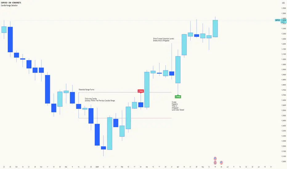
Candle Range DetectorCandle Range Detector
// Pine Script v6
// Detects candle-based ranges, mitigations, and sweeps with advanced logic
Overview
This indicator automatically detects price ranges based on candle containment, then tracks when those ranges are mitigated (broken) and when a sweep occurs. It is designed for traders who want to identify liquidity events and range breaks with precision.
How It Works
- Range Detection: A range is formed when a candle is fully contained within the previous candle (its high is lower and its low is higher). This marks a potential area of price balance or liquidity.
- Mitigation: A range is considered mitigated when price closes beyond its extension levels (configurable by normal or Fibonacci logic). This signals that the range has been invalidated or "taken out" by price action.
- Sweep Detection: After mitigation, the script watches for a sweep event: a candle that both trades through the range extreme and closes decisively beyond the log-mid of the candle itself. This is a strong sign of a liquidity grab or stop run.
- Alerts & Visuals: You can enable alerts and on-chart labels for sweeps. Only the most recent mitigated range can be swept, and each range can only be swept once.
- Timeframe Sensitivity: On weekly or monthly charts, a candle can both mitigate and sweep a range on the same bar. On lower timeframes, only one event can occur per bar.
Why It Works
- Candle containment is a robust way to identify natural price ranges and liquidity pools, as it reflects where price is consolidating or being absorbed.
- Mitigation marks the moment when a range is no longer defended, often leading to new directional moves.
- Sweeps are powerful signals of stop hunts or liquidity grabs, especially when confirmed by a close beyond the log-mid of the candle, indicating strong intent.
Visual Explanation
Tip: Use this tool to spot high-probability reversal or continuation zones, and to get alerted to key liquidity events in real time.
High and Low in a Given Date/Time RangeThis Pine Script v5 indicator plots horizontal lines at both the highest and lowest price levels reached within a user-defined date/time range.
Description:
Inputs:
The user specifies a start and an end date/time by providing the year, month, day, hour, and minute for each. These inputs are converted into timestamps based on the chart’s timezone.
How It Works:
Timestamp Conversion: The script converts the provided start and end dates/times into timestamps using the chart’s timezone.
Bar Check: It examines every bar and checks if the bar’s timestamp falls between the start and end timestamps.
Price Updates:
If a bar’s time is within the specified range, the indicator updates the highest price if the current bar's high exceeds the previously recorded high, and it updates the lowest price if the current bar's low is lower than the previously recorded low.
Drawing Lines:
A red horizontal line is drawn at the highest price, and a green horizontal line is drawn at the lowest price. Both lines start from the first bar in the range and extend dynamically to the current bar, updating as new high or low values are reached.
End of Range: Once a bar's time exceeds the end timestamp, the lines stop updating.
This tool offers a clear and straightforward way to monitor key price levels during a defined period without any extra fluff.
Relative Strength Index With Range ZoneRSI (Relative Strength Index) with 45-55 Range Zone
1. Introduction and Historical Background
The Relative Strength Index (RSI) is a momentum indicator developed in 1978 by J. Welles Wilder Jr. It measures the speed and magnitude of price changes to assess overbought and oversold conditions of an asset. This widely used oscillator ranges between 0 and 100.
Historically, the RSI was mainly used to detect trend reversals by identifying extreme levels: above 70 (overbought) and below 30 (oversold). However, its application has evolved, and new approaches refine its interpretation, such as adding a 45-55 neutral zone to identify consolidation (range) periods.
2. RSI Calculation
The RSI is calculated using the following formula:
RSI=100−(1001+RS)RSI=100−(1+RS100)
Where:
RS=Average gain over N periodsAverage loss over N periodsRS=Average loss over N periodsAverage gain over N periods
• RS (Relative Strength) is the ratio between the average gains and the average losses over N periods (typically 14 periods).
• Gains and losses are calculated based on daily price variations.
Example calculation with a 14-day period:
1. Compute daily gains and losses.
2. Take an exponential or simple moving average of these values over 14 days.
3. Apply the formula to get the RSI value.
3. Classic RSI Usage
The RSI is typically interpreted as follows:
• RSI > 70: Overbought → Possible correction or bearish reversal.
• RSI < 30: Oversold → Possible rebound or bullish reversal.
• RSI between 50 and 70: Bullish momentum.
• RSI between 30 and 50: Bearish momentum.
4. Adding the 45-55 Zone to Identify Range Phases
Adding a neutral zone between 45 and 55 helps identify consolidation periods, when price moves sideways without a strong trend.
• RSI between 45 and 55: The market is in a range, meaning neither buyers nor sellers dominate.
• RSI breaking out of this zone:
o Above 55: Indicates the start of a bullish trend.
o Below 45: Indicates the start of a bearish trend.
This zone is particularly useful for:
• Avoiding false signals by waiting for trend confirmation.
• Identifying ranging markets, favoring range trading strategies (buying at support, selling at resistance).
• Filtering trend-based entries, waiting for the RSI to exit the 45-55 zone.
5. Trading Strategies Using RSI with the 45-55 Range Zone
1. Range Trading:
• When the RSI oscillates between 45 and 55, it signals a lack of strong trend.
• Strategy:
o Identify a support and resistance level.
o Buy near support when the RSI touches 45.
o Sell near resistance when the RSI touches 55.
2. Breakout Trading:
• If the RSI exits the 45-55 zone:
o Above 55 → Buy (start of a bullish trend).
o Below 45 → Sell (start of a bearish trend).
• This breakout can be used as a confirmed entry signal.
3. Confirmation with Divergences:
• A bullish divergence (price making lower lows while RSI makes higher lows) is more relevant if the RSI moves above 55.
• A bearish divergence (price making higher highs while RSI makes lower highs) is stronger if the RSI drops below 45.
6. Conclusion
The RSI is a powerful tool for analyzing price momentum. Adding a 45-55 zone enhances its usage by clearly distinguishing:
• Consolidation phases (range markets).
• Trend beginnings when RSI breaks out of this range.
This approach improves RSI reliability by filtering out false signals and allowing traders to adapt their strategy based on market conditions.
Average Price Range Screener [KFB Quant]Average Price Range Screener
Overview:
The Average Price Range Screener is a technical analysis tool designed to provide insights into the average price volatility across multiple symbols over user-defined time periods. The indicator compares price ranges from different assets and displays them in a visual table and chart for easy reference. This can be especially helpful for traders looking to identify symbols with high or low volatility across various time frames.
Key Features:
Multiple Symbols Supported:
The script allows for analysis of up to 10 symbols, such as major cryptocurrencies and market indices. Symbols can be selected by the user and configured for tracking price volatility.
Dynamic Range Calculation:
The script calculates the average price range of each symbol over three distinct time periods (default are 30, 60, and 90 bars). The price range for each symbol is calculated as a percentage of the bar's high-to-low difference relative to its low value.
Range Visualization:
The results are visually represented using:
- A color-coded table showing the calculated average ranges of each symbol and the current chart symbol.
- A line plot that visually tracks the volatility for each symbol on the chart, with color gradients representing the range intensity from low (red/orange) to high (blue/green).
Customizable Inputs:
- Length Inputs: Users can define the time lengths (default are 30, 60, and 90 bars) for calculating average price ranges for each symbol.
- Symbol Inputs: 10 symbols can be tracked at once, with default values set to popular crypto pairs and indices.
- Color Inputs: Users can customize the color scheme for the range values displayed in the table and chart.
Real-Time Ranking:
The indicator ranks symbols by their average price range, providing a clear view of which assets are exhibiting higher volatility at any given time.
Each symbol's range value is color-coded based on its relative volatility within the selected symbols (using a gradient from low to high range).
Data Table:
The table shows the average range values for each symbol in real-time, allowing users to compare volatility across multiple assets at a glance. The table is dynamically updated as new data comes in.
Interactive Labels:
The indicator adds labels to the chart, showing the average range for each symbol. These labels adjust in real-time as the price range values change, giving users an immediate view of volatility rankings.
How to Use:
Set Time Periods: Adjust the time periods (lengths) to match your trading strategy's timeframe and volatility preference.
Symbol Selection: Add and track the price range for your preferred symbols (cryptocurrencies, stocks, indices).
Monitor Volatility: Use the visual table and plot to identify symbols with higher or lower volatility, and adjust your trading strategy accordingly.
Interpret the Table and Chart: Ranges that are color-coded from red/orange (lower volatility) to blue/green (higher volatility) allow you to quickly gauge which symbols are most volatile.
Disclaimer: This tool is provided for informational and educational purposes only and should not be considered as financial advice. Always conduct your own research and consult with a licensed financial advisor before making any investment decisions.

Consolidation Score ScreenerIn trading, a consolidation range is like a timeout after a big move in the price of a stock or symbol.
It's when the market takes a breather, neither pushing the price up nor down too hard.
Visually, it looks like the price moving sideways on a chart , with highs and lows staying within a certain range.
so this indicator is created to help myself and you decide if its a ranging market and what's the score of that consolidation range
The score ranges between 0 and 10 , where 10 is the max consolidation score , meaning this stock or the symbol is at its highest peak of consolidation .
What would you see using this indicator ?
Symbols circles , inside these circles it will print the consolidation score ..
in the middle of the indicator it will show the range of all the 20 symbols scores .
so it will give you like overall ranging value for your 20 symbols
Settings :
TimeFrame : TimeFrame input to select which time frame you want your indicator to analysis
Range length : The Range that you would want your indicator to take into consideration when doing its analysis .
Features :
20 symbols analysis
Multi timeframe capability
Enjoy .

Mxwll Liquidation Ranges - Mxwll CapitalIntroducing: Mxwll Liquidation Ranges
Mxwll Liquidation Ranges gathers data outside of TradingView to provide the highest quality, highest accuracy liquidation levels and ranges for popular crypto currencies.
Features
Real liquidation ranges and levels calculated outside of TradingView.
Real net position delta
Average leverage for long positions
Average leverage for short positions
Real number of bids for the cryptocurrency by the day
Real number of asks for the cryptocurrency by the day
Real Bid/Ask Ratio
Real Bid/Ask Delta
Real number of long market orders
Real number of short market orders
Real number of long limit orders
Real number of short limit orders
How do we obtain this data?
Using a now deprecated feature called "TradingView Pine Seeds", we are able to calculate the metrics listed above outside of TradingView and, consequently, import the data to TradingView for public use.
This means no indicators on TradingView that attempt to show liquidation levels, limit orders, net position delta, etc. can be as accurate as ours.
Why aren't other liquidation ranges indicators on TradingView as accurate as ours?
Simple: the data required to calculate liquidation levels and ranges isn't available on TradingView. No level 2 data, bids, asks, leverage information, pending limit orders, etc. This means any custom-coded indicator on TradingView attempting to use or show this information is just a guess, and is naturally inaccurate.
Mxwll Liquidation Ranges has access to all of the required data outside of TradingView, to which liquidation levels/ranges and other pertinent metrics are calculated and uploaded directly to TradingView using the Pine Seeds feature. This means that all information displayed by our indicator uses legitimate level 2 data outside of TradingView. Which means no "estimates" are required to produce this information. Consequently, unless a custom-coded indicator has access to the Pine Seeds feature and calculates liquidation levels and other level 2 data metrics outside of TradingView, then that indicator is inaccurate.
Liquidation Heatmap
The above image shows our liquidation heatmaps, which are calculated using level 2 data, in action.
Liquidation ranges are color coded. Purple/blue colored ranges indicate a lower number of net liquidations should the range be violated.
Green/yellow ranges indicate a liquidation range where the net number of liquidated positions, should the price range be violated, is substantial. Expect volatile price action around these areas and plan accordingly.
Yellow labels indicate the four highest liquidation ranges for the asset over the period.
Liquidation Levels
In addition to calculating a liquidation heatmap, Mxwll Liquidation Ranges also calculates liquidation levels by leverage. Level 2 data outside of TradingView is used.
Levels are colored coded by leverage used.
Green levels are 25x leverage liquidation areas.
Purple levels are 50x leverage liquidation areas.
Orange levels are 100x leverage liquidation areas.
Use this information to improve your trading plan and better pinpoint entries, exits, and key levels of expected volatility.
Other Metrics
Mxwll Liquidation Ranges uses level 2 data and the orderbook to calculate various metrics.
Average leverage for long positions
Average leverage for short positions
Real number of bids for the cryptocurrency by the day
Real number of asks for the cryptocurrency by the day
Real Bid/Ask Ratio
Real Bid/Ask Delta
Real number of long market orders
Real number of short market orders
Real number of long limit orders
Real number of short limit orders
How To Use
Understanding and interpreting heatmaps for predicting liquidation levels in trading can provide a significant edge. Here’s a basic guide on how to interpret these charts:
Understanding Liquidation Levels: Liquidation levels indicate where traders who are using leverage might be forced to exit their positions due to insufficient margin to cover their trades. These levels are crucial because they can trigger sudden price movements if many positions are liquidated at once.
Clusters on the Heatmap: On the heatmap, clusters of liquidation levels are represented by color-coded areas. These clusters show where significant numbers of leveraged positions are concentrated. The color intensity often indicates the density of liquidation points – darker or brighter colors suggest higher concentrations of liquidation risks.
Price Movements: By knowing where these clusters are, traders can anticipate potential price movements. For example, if a significant price drop moves the market closer to a cluster of liquidation levels, there’s an increased risk of those levels being triggered, potentially causing a sharp further drop due to cascading liquidations.
Strategic Trading: With this information, traders can strategically place their own stop losses or prepare to enter trades. Knowing where others might be forced to close their positions can help in predicting bullish or bearish movements.
Risk Management: Understanding liquidation levels helps in managing your own risk. Setting stop losses away from common liquidation points can avoid being caught in volatile price swings caused by mass liquidations.
- Mxwll Capital

Daily Range AnalysisThis indicator helps quickly identify if a stock is making a "price expansion" or a "price contraction". If today's range is larger than yesterday, then the stock is having a price expansion. This will be represented with a positive number. If today's range is smaller, the stock is making a contraction, and the indicator will display a negative number.
Indicator Features:
1. **Dark and Light Themes**: Users can choose between dark and light themes based on their preference. Dark themes are easier on the eyes in low-light conditions, reducing eye strain, while light themes are more suitable for well-lit environments.
2. **Customizable Text Colors**: Users can customize the text color for each data element displayed in the table. Customization allows users to tailor the appearance of the indicator to their liking and enhance readability.
3. **Show/Hide Data Options**: Users have the flexibility to show or hide each data element in the table individually. This feature enables users to focus on specific information they find most relevant, decluttering the chart and improving readability.
4. **Daily Range Analysis**: The script calculates and displays important metrics related to the daily price range of a financial instrument. These metrics include:
- Closing Range: Percentage indicating how close the closing price is to the daily low relative to the daily range. Helps traders assess where the closing price lies within the day's price action.
- Range Expansion: Percentage indicating the change in the daily price range compared to the previous day. Useful for identifying potential volatility shifts and trend continuation or reversal.
- StopH: Price level representing the midpoint between the day's open and close, commonly used as a reference for setting stop-loss orders.
- StopL: The low of the day, providing information about the lowest price reached during the trading session. Some traders like to use the Low of Day as a Stop Loss.
Overall, this script provides traders with essential insights into daily price movements, enabling them to make more informed trading decisions based on key price action metrics. The customization options enhance user experience and adaptability, catering to individual preferences and trading styles

NAS100 - 5 Minute Opening Range with EMAsThis indicator is designed for traders who focus on the opening range breakout strategy and use EMAs as part of their trading decisions. The script markes the first 5 min opening candle and generates Buy and Sell signals calculating EMA.
Basic features are :
User Inputs: Allows users to enable/disable alerts and choose to display Exponential Moving Averages (EMAs) for 5, 20, and 50 periods.
Opening Range Calculation: It calculates the first five minutes of the trading day, adjusting for different chart timeframes.
New Day Detection: Determines if the current bar is the first bar of a new day.
Data Storage: Utilizes arrays to store opening range highs, lows, start bars, and last bars for the last five days.
Daily Updates: Updates the stored data at the start of each new day, maintaining data for only the last five days.
Opening Range Plotting: Plots the opening ranges (high and low) for the past five days, with special plotting and filling for the current day.
EMA Calculation and Plotting: Calculates and plots EMAs (5, 20, and 50 periods) if enabled.
Alert Conditions: Sets up conditions for alerts when the price crosses above or below the current day's opening range.
Signal Generation: Generates buy and sell signals based on the relationship of the closing price to the opening range and the position of EMA5 relative to EMA50.
Signal Plotting: Plots buy and sell signals as triangles on the chart.