Fibonacci RangeFibonacci Range 50 Indicator
The Fibonacci Range 50 indicator is designed to help traders identify potential price reversal zones and breakout levels by utilizing the 50% Fibonacci retracement level as a key reference point. This indicator is particularly useful for traders who rely on technical analysis and price action to make informed trading decisions.
How It Works:
Identifies the Range – The indicator automatically detects a significant price range, typically based on the highest and lowest points of a given session (e.g., Asian session, previous day’s range, or a custom timeframe).
Plots Fibonacci Levels – The key 50% Fibonacci retracement level is calculated within this range, acting as a dynamic midpoint that often serves as a pivot zone for price movements.
Breakout & Reversal Signals –
If the price rejects the 50% level, it may indicate a trend continuation or range-bound movement.
If the price breaks above or below the range with momentum, it may signal a potential breakout trade opportunity.
Key Features:
✅ Automatic Fibonacci Level Calculation – No manual drawing required.
✅ Customizable Time Ranges – Allows traders to adjust the indicator based on their preferred trading session.
✅ Works Across Different Markets – Effective for Forex, Crypto, and Stock trading.
✅ Breakout & Reversal Strategy Integration – Can be used in conjunction with other indicators such as Moving Averages, RSI, and MACD.
Ideal For:
Intraday traders looking for high-probability setups.
Swing traders identifying potential turning points.
Traders using breakout strategies based on price action.
This indicator provides traders with clear and actionable insights to improve their trade entries, stop-loss placements, and profit targets. 🚀
在脚本中搜索"range"

Opening Range BoxIndicator Name: Opening Range Box with Extensions
Author: YanivBull
Description:
The Opening Range Box with Extensions is a powerful tool designed to visualize the trading range established during the first 30 minutes of a market session, a critical period for setting the day's trend. This indicator plots a box representing the high and low prices formed within this opening range, with dashed extension lines projecting these levels forward throughout the session.
Its primary purpose is to identify the boundaries of the initial trend at the start of trading. When these boundaries are breached, it serves as a trigger for potential trading opportunities: a breakout above the box high signals a possible long entry, while a breakdown below the box low indicates a potential short entry. The indicator also includes historical boxes for up to 5 previous days (configurable), allowing traders to analyze past opening ranges and their extensions for context and pattern recognition.
Key Features:
Customizable session start time (hour and minute) to adapt to various markets (e.g., NYSE, DAX, etc.).
Displays the current session's opening range box in blue and historical boxes in gray.
Plots dashed extension lines from the high and low of each box, limited to 500 bars or the end of the trading day.
Adjustable number of historical days (1-20, default 5).
Usage:
Set the Session Start Hour and Session Start Minute according to your market's opening time (relative to your chart's timezone, e.g., UTC+2). Watch for price action around the box boundaries—breakouts above the high or below the low can be used as signals for initiating long or short trades, respectively. Combine with other technical analysis tools for confirmation.
This indicator is ideal for day traders looking to capitalize on early session momentum and breakout strategies.

Static price-range projection by symbolThis indicator shows you a predefined range to the right of the last candle of your chart. This range is custom and can be changed for a handful of symbols that you can choose. This scale will help you determining if the market is providing a reasonable range before you enter a trade or if the market isn't actually moving as much as you might think. This is particularly useful if you are into scalping and have to consider commission or spread in your trades.
Since all symbols have different price ranges in which they move this indicator doesn't make sense to just have "a one size fits all" approach. That's why you can choose up to 6 symbols and set the range that you want to have shown for each when you pull it up on the chart. Using my default values that means for when the NQ (Nasdaq future) is on the chart you will see a range of 20 handles projected. When you change the the ES (S&P500 future) you will instead see 5 handles. While the number is different that is somewhat of an equal move in both symbols.
There also is an option to set a default price range for all other symbols that are not selected if it is needed. However the display of the scale on anything else than the 6 selected symbols can also be turned off.
There are options provided on how exactly you want to indicator to determine if the chart symbol matches one of the selected symbols.
You can enable it to make sure the exchange/broker is the exact same as selected.
It can check for only the symbol root to match the selection. Specifically for futures this means that while ES1! might be selected, anything ES (ES1!, ES2!, ESH2025, ESM2025, ESM2022, ...) will be a match to the selection)
On the painted scale it is possible to not just show this range extended into each direction once. Per default you will have 3 segments of it in each direction. This can be reduced to just 1 or increased.
If you chose a high number of segments or a large range make sure to use the "Scale price chart only" option on your chart scale to not have the symbols price candles squished together by the charts auto scaling.
And last but not least the indicator options provide some possibilities to change the appearance of the printed price range scale in case you disagree with my design.

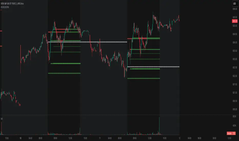
Opening Range, Initial Balance, Opening Price, Pre-market Levels### Description of the Indicator: **Opening Range, Initial Balance, Opening Price, Pre-market Levels**
This custom TradingView indicator provides a comprehensive view of key price levels for intraday trading, specifically designed to track important levels from the Opening Range (OR), Initial Balance (IB), Opening Price (OP), and Pre-market session (PM). These levels are essential for traders to gauge potential market movements and identify critical areas of support and resistance.
#### **Features:**
1. **Opening Range (OR):**
- This is the high and low of the first 30 minutes of the regular market session (09:30 - 10:00 EST).
- The OR high and low act as significant levels that may influence price movement for the rest of the day.
- The mid-level of the Opening Range (OR Mid) is also plotted to give a more detailed view of potential price action.
2. **Initial Balance (IB):**
- The Initial Balance is the range created during the first hour of market activity (09:30 - 10:30 EST).
- This range often sets the tone for the market's direction. The IB high and low, along with the IB midline, are plotted for quick reference.
3. **Opening Price (OP):**
- The opening price of the market is marked as a circle and labeled "OP."
- This level provides context for market sentiment when compared to the high and low levels.
4. **Pre-market Levels (PM):**
- The pre-market session (04:00 - 09:30 EST) has its own important levels that are calculated for the high, low, and mid range (PM High, PM Low, and PM Mid).
- These levels are plotted and are useful for traders to understand where the market stood before the regular session opened.
#### **Customization Options:**
- **Exchange Timezone:** You can choose whether to display the times in the exchange's local timezone or in your own preferred timezone.
- **Mid Levels Display:** You can toggle whether the mid levels for each range (OR, IB, PM) should be shown on the chart.
- **Level Color Change:** The colors of the plotted levels (high, low, mid) change based on whether the price is above or below the respective level, making it easy to visualize potential support and resistance.
- **Label Positions:** The position of the labels (OR, IB, OP, PM) on the chart can be customized to avoid overlap with other data points.
#### **Key Use Cases:**
- **Intraday Trend Analysis:** Use the OR and IB to identify key levels for the day, providing insights into the possible trend or range for the day.
- **Pre-market Insights:** The PM levels are crucial for understanding where the market stood during the pre-market hours and can be used as reference points during the regular session.
- **Potential Support and Resistance:** The high and low levels of the OR, IB, and PM sessions can act as potential support or resistance, which are useful for setting stop-loss and take-profit levels.
#### **How to Use:**
- Pay attention to the levels provided for OR, IB, and PM as potential entry and exit points.
- Watch for breakouts or reversals around these levels, especially when combined with other technical indicators or price action patterns.
- The mid levels offer an additional reference to assess price direction or identify possible areas of consolidation.
This indicator is perfect for day traders who rely on key intraday levels and pre-market activity to make informed trading decisions. It helps to streamline the process of identifying potential breakouts, reversals, and ranges in the market.
US10Y Yield Range Percentile | JeffreyTimmermansUS10Y Yield Range Percentile
The "US10Y Yield Range Percentile" Indicator provides insights into the relative positioning of the U.S. 10-Year Treasury Yield (US10Y) within a specified lookback period. It highlights key valuation style conditions, helping traders assess market sentiment based on yield movements.
Why is the US 10-Year Treasury Yield Important?
The U.S. 10-Year Treasury Yield (US10Y) is one of the most critical benchmarks in global finance. It reflects the cost of borrowing for the U.S. government and serves as a risk-free rate that influences interest rates across the economy.
Macroeconomic Indicator:
Rising yields suggest strong economic growth or inflationary pressures, often leading to tighter monetary policy.
Falling yields indicate economic slowdown, deflationary risks, or increased demand for safe-haven assets.
Impact on Financial Markets:
Stock Market: Higher yields reduce the attractiveness of equities, while lower yields support risk assets.
Credit Markets: A rising 10-year yield increases borrowing costs, impacting corporate debt and mortgage rates.
Global Capital Flows: US10Y is a key driver of capital allocation worldwide, affecting currency valuations and capital flows into emerging markets.
Correlation with Risk Assets (Especially Crypto):
Crypto markets, particularly Bitcoin and Ethereum, have shown a strong inverse correlation with US10Y yields.
When yields rise, risk assets tend to sell off due to tighter financial conditions.
When yields decline, liquidity flows into speculative assets, boosting stocks, crypto, and growth sectors.
Key Functions of the Indicator
Range Calculation:
Computes the highest high and lowest low over a user-defined period (default: 63 days).
Measures the current yield’s position within this range.
Range Percentile Calculation:
Determines the percentile rank of the current yield within its range.
A higher percentile indicates higher yields, often associated with Risk OFF conditions.
A lower percentile suggests lower yields, signaling Risk ON sentiment.
Optional Smoothing:
Enable/Disable: Users can enable Simple Moving Average (SMA) smoothing to reduce noise.
Default smoothing length : 10 periods (can be customized).
Threshold Levels & Background Coloring:
The background color represents the current market regime (valuation based), based on the US10Y yield percentile:
Risk ON (Bullish): When the percentile falls below the lower threshold (default: 20).
Neutrally Positive Zone (also Risk ON): Between 20 and 80 percentile.
Risk OFF (Bearish): When the percentile rises above the upper threshold (default: 80).
Important : Background Coloring is NOT a Leading Signal.
The background color provides a visual representation of valuation periods, but it is not a leading indicator for price movements. Instead, traders should focus on the orange US10Y Range Percentile line, which is the key signal within this indicator. The colors behind the line below the chart are leading. The background colors behind the price chart are more of a valuation style indications.
When the orange line enters the Danger Zone (above 80 percentile), it signals that yields are elevated, and risk assets (such as stocks and crypto) are at increased risk of reversing downward.
While the background coloring helps to visualize market conditions, price reversals tend to occur when the percentile line is in extreme zones rather than when the background color changes.
Traders should monitor the percentile line closely, as it provides a clearer signal of potential shifts in market sentiment.
Visual Elements
Range Percentile Plot:
Displays the smoothed or raw percentile value over time.
Helps identify shifts in yield positioning.
Threshold Markers & Fill Zones:
Key percentile thresholds (0, 20, 80, 100) are marked with horizontal lines.
The area between 20-80 percentile is filled to indicate the neutral zone.
Extreme zones are highlighted to emphasize significant shifts in risk sentiment.
Dynamic Labeling:
A real-time percentile label appears next to the latest data point.
Alerts & Notifications
Risk OFF to Risk ON Transition:
Alert triggers when the percentile falls below the lower threshold (yields decreasing).
Risk ON to Risk OFF Transition:
Alert triggers when the percentile rises above the upper threshold (yields increasing).
Conclusion
The crypto market is highly sensitive to macroeconomic conditions, with Bitcoin often behaving like a high-beta tech stock.
A declining US10Y yield signals looser financial conditions, increasing demand for risk assets like crypto.
A rising US10Y yield tightens liquidity, leading to sell-offs in Bitcoin, Ethereum, and altcoins.
Tracking the US10Y percentile position helps traders anticipate market shifts before they occur.
This indicator serves as a leading signal for understanding market risk appetite by tracking Treasury yield movements. A decline in yields typically favors equities and risk assets, while rising yields indicate a shift toward safety and risk aversion.
Credits
This indicator was inspired by and builds upon the work of TomasOnMarkets . While incorporating significant enhancements, it acknowledges the foundational concepts provided by this original source. Thank you for sharing your input on this important indicator. We are honored to use it and to further improve upon it.
-Jeffrey

Daily Asian RangeDaily Asian Range Indicator
This indicator is an enhanced version inspired by @toodegrees' "ICT Friday's Asian Range" indicator. While maintaining the core concepts, this version expands functionality for daily analysis and adds comprehensive customization options.
### Overview
The Asian Range indicator identifies and visualizes potential liquidity areas based on price action during the Asian session (8:00 PM - 12:00 AM ET). It plots both body and wick ranges along with multiple standard deviation levels that can serve as potential price targets or areas of interest.
### Features
- Flexible Display Options
- Choose between Body, Wick, or Both for range boxes and deviation lines
- Customizable colors, styles, and borders for all visual elements
- Historical sessions display (0-20 previous sessions)
- Advanced Standard Deviation Levels
- Multiple deviation multipliers (1.0, 1.5, 2.0, 2.3, 3.5)
- Separate visualization for body and wick-based deviations
- Clear labeling system for easy identification
- Precise Time Management
- Asian session: 8:00 PM - 12:00 AM ET
- Deviation lines extend through the following trading day
- Proper timezone handling for accuracy
### Usage
- Works on timeframes from 1 to 15 minutes
- Use the range boxes to identify key price levels from the Asian session
- Standard deviation levels can serve as potential targets or areas of interest
- Combine with other indicators for enhanced analysis
### Credits
Original concept and base implementation by @toodegrees
Enhanced and expanded by @Omarqqq
### Disclaimer
This indicator is for educational and informational purposes only. Always conduct your own analysis and use proper risk management.

CandelaCharts - OHLC Macro Range Map 📝 Overview
Elevate your candlestick analysis with the OHLC Macro Range Map!
Unlike conventional OHLC charts, this advanced indicator weaves Inner Circle Trader (ICT) principles into its design, helping you decode accumulation, manipulation, and distribution patterns—candle by candle.
ICT traders recognize manipulation through wicks that extend against the candle’s closing direction—a deliberate move to mislead participants into unfavorable positions. These deceptive movements often hint at market manipulation phases. By decoding these subtle signals, traders can anticipate the distribution phase of a candle, where price action reveals potential liquidity targets, retracement zones, and key reversal points.
These levels offer valuable insights into order flow, revealing how price interacts with them and the sequence of movements within the market.
To enhance price analysis, the tool also monitors the average duration of manipulation and distribution phases. By blending historical timing patterns with key price levels associated with these phases, traders can conduct deeper analyses and fine-tune their strategies for better decision-making.
Although grounded in historical data, this indicator does not promise that past patterns will replicate in future market conditions. Instead, it provides a data-driven framework to identify moments when candles are likely to reverse after manipulation phases or retrace following completed distributions. This empowers traders to pinpoint potential market turning points with greater accuracy.
📦 Features
This tool offers a range of powerful features to enhance your trading analysis:
Average Range Accuracy : Simplify candlestick analysis with advanced lines and labels to pinpoint manipulation, distribution, and time pivots. Graph average ranges for your chosen timeframe to navigate market volatility and uncover key support and resistance zones.
Custom Timeframe Selection : Align your analysis with your trading strategy by choosing a timeframe that highlights the candle’s manipulation, distribution, and key timing.
Real-time Data Feed : Stay updated with live candlestick stats, with each new candle updating OHLC data and performing ongoing historical calculations, even on sub-minute timeframes.
Historical Mapping : Backtest past market scenarios with ease using the historical mapping feature. Traders can revisit and analyze previous data, refine strategies, and customize label displays for journaling flexibility.
User-Friendly Interface : Designed for advanced traders, the intuitive interface allows easy navigation and customization of display settings, offering a personalized experience for data-driven analysis.
⚙️ Settings
Macros: Sets the timeframe to which will be drawn.
Lookback: Controls period length in days.
Method: Sets the desired calculation algorithm.
History: Display Macro Range Map drawings for previous sessions.
Timezone: Dsiplay the data based on the selected timezone.
Opn: Style for Open line.
Man: Style for Manipulation line.
Dis: Style for Distribution line.
Time: Style for Timeline.
Labels: Controls the size and abbreviations.
Table Position: Manage the Macro Range Map table position
⚡️ Showcase
Here’s a visual showcase of the tool in action, highlighting its key features and capabilities:
Manipilation & Distribution
Time
📒 Usage
Here’s how you can use the OHLC Macro Range Map to enhance your analysis:
Add OHLC Macro Range Map to your Tradingview chart.
Select a timeframe and customize the styles to fit your preferences.
Watch as calculated manipulation, distribution, and delivery times align with your analysis.
Combine this data with other models and insights to strengthen your trading strategy.
Example 1
By following these steps, you'll unlock powerful insights to refine and elevate your trading strategies.
🔹 Notes
On Bullish candles:
Manipulation: Open - Low
Distribution: Open - High
On Bearish candles:
Manipulation: Open - High
Distribution: Open - Low
Available calculation methods:
Mean
Median
Price patterns on OHLC Macro Range Map:
Open - -Man - +Dis
Open - -Man - Open - +Dis
Open - -Man - +Man - +Dis
Open - -Man - +Man - -Dis
Open - +Man - -Dis
Open - +Man - Open - -Dis
Open - +Man - -Man - -Dis
Open - +Man - -Man - +Dis
🚨 Alerts
The indicator does not provide any alerts!
⚠️ Disclaimer
These tools are exclusively available on the TradingView platform.
Our charting tools are intended solely for informational and educational purposes and should not be regarded as financial, investment, or trading advice. They are not designed to predict market movements or offer specific recommendations. Users should be aware that past performance is not indicative of future results and should not rely on these tools for financial decisions. By using these charting tools, the purchaser agrees that the seller and creator hold no responsibility for any decisions made based on information provided by the tools. The purchaser assumes full responsibility and liability for any actions taken and their consequences, including potential financial losses or investment outcomes that may result from the use of these products.
By purchasing, the customer acknowledges and accepts that neither the seller nor the creator is liable for any undesired outcomes stemming from the development, sale, or use of these products. Additionally, the purchaser agrees to indemnify the seller from any liability. If invited through the Friends and Family Program, the purchaser understands that any provided discount code applies only to the initial purchase of Candela's subscription. The purchaser is responsible for canceling or requesting cancellation of their subscription if they choose not to continue at the full retail price. In the event the purchaser no longer wishes to use the products, they must unsubscribe from the membership service, if applicable.
We do not offer reimbursements, refunds, or chargebacks. Once these Terms are accepted at the time of purchase, no reimbursements, refunds, or chargebacks will be issued under any circumstances.
By continuing to use these charting tools, the user confirms their understanding and acceptance of these Terms as outlined in this disclaimer.

CandelaCharts - OHLC Session Range Map 📝 Overview
Master the art of candlestick analysis with the OHLC Session Range Map!
Enhance your TradingView strategies by incorporating this advanced tool for actionable insights. Far beyond standard OHLC visuals, this innovative indicator integrates Inner Circle Trader (ICT) concepts to analyze accumulation, manipulation, and distribution, one candle at a time.
ICT traders identify manipulation through wicks that extend opposite the candle’s close—a tactic designed to mislead market participants into taking positions in the "wrong" direction. These movements often signify potential manipulation phases. By interpreting these signals, traders can anticipate a candle’s distribution phase, where the price expands to higher or lower levels. This provides valuable insights into liquidity targets, retracement zones, and potential reversals.
These levels provide critical insights into order flow, illustrating how price interacts with them and the sequence in which it unfolds.
To refine price analysis further, the tool also tracks the average timing for the completion of manipulation and distribution phases. By combining historical timing patterns with price levels tied to these phases, traders can perform more in-depth analyses and enhance their market strategies.
While rooted in historical data, this indicator does not guarantee that past patterns will repeat in future market conditions. Instead, it offers a data-driven approach to identifying moments when candles are likely to reverse after manipulation phases or retrace following completed distributions, enabling traders to spot potential turning points with greater precision.
📦 Features
This tool offers a range of powerful features to enhance your trading analysis:
Average Range Accuracy : Simplify candlestick analysis with advanced lines and labels to pinpoint manipulation, distribution, and time pivots. Graph average ranges for your chosen timeframe to navigate market volatility and uncover key support and resistance zones.
Custom Timeframe Selection : Align your analysis with your trading strategy by choosing a timeframe that highlights the candle’s manipulation, distribution, and key timing.
Real-time Data Feed : Stay updated with live candlestick stats, with each new candle updating OHLC data and performing ongoing historical calculations, even on sub-minute timeframes.
Historical Mapping : Backtest past market scenarios with ease using the historical mapping feature. Traders can revisit and analyze previous data, refine strategies, and customize label displays for journaling flexibility.
User-Friendly Interface : Designed for advanced traders, the intuitive interface allows easy navigation and customization of display settings, offering a personalized experience for data-driven analysis.
⚙️ Settings
Sessions: Sets the timeframe to which will be drawn.
Lookback: Controls period length in days.
Method: Sets the desired calculation algorithm.
History: Display Session Range Map drawings for previous sessions.
Timezone: Dsiplay the data based on the selected timezone.
Opn: Style for Open line.
Man: Style for Manipulation line.
Dis: Style for Distribution line.
Time: Style for Timeline.
Labels: Controls the size and abbreviations.
Table Position: Manage the Session Range Map table position
⚡️ Showcase
Here’s a visual showcase of the tool in action, highlighting its key features and capabilities:
Manipilation & Distribution
Time
📒 Usage
Here’s how you can use the OHLC Session Range Map to enhance your analysis:
Add OHLC Session Range Map to your Tradingview chart.
Select a timeframe and customize the styles to fit your preferences.
Watch as calculated manipulation, distribution, and delivery times align with your analysis.
Combine this data with other models and insights to strengthen your trading strategy.
Example 1
Example 2
By following these steps, you'll unlock powerful insights to refine and elevate your trading strategies.
🔹 Notes
On Bullish candles:
Manipulation: Open - Low
Distribution: Open - High
On Bearish candles:
Manipulation: Open - High
Distribution: Open - Low
Available calculation methods:
Mean
Median
Price patterns on OHLC Session Range Map:
Open - -Man - +Dis
Open - -Man - Open - +Dis
Open - -Man - +Man - +Dis
Open - -Man - +Man - -Dis
Open - +Man - -Dis
Open - +Man - Open - -Dis
Open - +Man - -Man - -Dis
Open - +Man - -Man - +Dis
🚨 Alerts
The indicator does not provide any alerts!
⚠️ Disclaimer
These tools are exclusively available on the TradingView platform.
Our charting tools are intended solely for informational and educational purposes and should not be regarded as financial, investment, or trading advice. They are not designed to predict market movements or offer specific recommendations. Users should be aware that past performance is not indicative of future results and should not rely on these tools for financial decisions. By using these charting tools, the purchaser agrees that the seller and creator hold no responsibility for any decisions made based on information provided by the tools. The purchaser assumes full responsibility and liability for any actions taken and their consequences, including potential financial losses or investment outcomes that may result from the use of these products.
By purchasing, the customer acknowledges and accepts that neither the seller nor the creator is liable for any undesired outcomes stemming from the development, sale, or use of these products. Additionally, the purchaser agrees to indemnify the seller from any liability. If invited through the Friends and Family Program, the purchaser understands that any provided discount code applies only to the initial purchase of Candela's subscription. The purchaser is responsible for canceling or requesting cancellation of their subscription if they choose not to continue at the full retail price. In the event the purchaser no longer wishes to use the products, they must unsubscribe from the membership service, if applicable.
We do not offer reimbursements, refunds, or chargebacks. Once these Terms are accepted at the time of purchase, no reimbursements, refunds, or chargebacks will be issued under any circumstances.
By continuing to use these charting tools, the user confirms their understanding and acceptance of these Terms as outlined in this disclaimer.

CandelaCharts - OHLC Range Map 📝 Overview
Explore the intricate art of candlestick analysis with the OHLC Range Map!
Elevate your TradingView experience by integrating this dynamic tool into your trading strategies with actionable insights. This cutting-edge indicator transcends standard OHLC visuals, leveraging Inner Circle Trader (ICT) concepts to dissect accumulation, manipulation, and distribution on a candle-by-candle basis.
ICT traders recognize manipulation through the wick extending opposite the candle’s close. This movement often serves to mislead market participants into taking positions in the "wrong" direction, signaling potential manipulation legs. Analysts can use these insights to anticipate a candle’s distribution phase. During distribution, price extends to higher or lower levels, offering key clues for identifying liquidity draws, potential retracements, or reversals.
These levels offer valuable insights into order flow, highlighting how price interacts with them and the sequence of its delivery.
To enhance price mapping, the tool also charts the average timing for the completion of manipulation and distribution phases. This feature empowers traders to combine historical timing patterns with the price levels associated with manipulation and distribution for a deeper analysis.
Like all tools based on historical data, this indicator does not guarantee that past patterns will replicate in future market conditions. Designed with a data-driven edge, it highlights moments when candles are likely to reverse following manipulation phases or retrace after completing defined distributions, helping analysts spot potential turning points.
📦 Features
This tool offers a range of powerful features to enhance your trading analysis:
Average Range Accuracy : Simplify candlestick analysis with advanced lines and labels to pinpoint manipulation, distribution, and time pivots. Graph average ranges for your chosen timeframe to navigate market volatility and uncover key support and resistance zones.
Custom Timeframe Selection : Align your analysis with your trading strategy by choosing a timeframe that highlights the candle’s manipulation, distribution, and key timing.
Real-time Data Feed : Stay updated with live candlestick stats, with each new candle updating OHLC data and performing ongoing historical calculations, even on sub-minute timeframes.
Historical Mapping : Backtest past market scenarios with ease using the historical mapping feature. Traders can revisit and analyze previous data, refine strategies, and customize label displays for journaling flexibility.
User-Friendly Interface : Designed for advanced traders, the intuitive interface allows easy navigation and customization of display settings, offering a personalized experience for data-driven analysis.
⚙️ Settings
Timeframe: Sets the timeframe to which will be drawn.
Period: Controls period length in days.
Algorithm: Sets the desired calculation algorithm.
History: Display Range Map drawings for previous sessions.
Timezone: Dsiplay the data based on the selected timezone.
Use NY Midnight Open: Controls from where a Range Map will start detection.
Opn: Style for Open line.
Man: Style for Manipulation line.
Dis: Style for Distribution line.
Time: Style for Timeline.
Labels: Controls the size and abbreviations.
Line Position: Manage the Range Map line position
Table Position: Manage the Range Map table position
⚡️ Showcase
Here’s a visual showcase of the tool in action, highlighting its key features and capabilities:
Manipilation & Distribution
Time
📒 Usage
Here’s how you can use the OHLC Range Map to enhance your analysis:
Add OHLC Range Map to your Tradingview chart.
Select a timeframe and customize the styles to fit your preferences.
Watch as calculated manipulation, distribution, and delivery times align with your analysis.
Combine this data with other models and insights to strengthen your trading strategy.
Example 1
Example 2
By following these steps, you'll unlock powerful insights to refine and elevate your trading strategies.
🔹 Notes
On Bullish candles:
Manipulation: Open - Low
Distribution: Open - High
On Bearish candles:
Manipulation: Open - High
Distribution: Open - Low
Available calculation methods:
Mean
Median
Price patterns on OHLC Range Map:
Open - -Man - +Dis
Open - -Man - Open - +Dis
Open - -Man - +Man - +Dis
Open - -Man - +Man - -Dis
Open - +Man - -Dis
Open - +Man - Open - -Dis
Open - +Man - -Man - -Dis
Open - +Man - -Man - +Dis
🚨 Alerts
The indicator does not provide any alerts!
⚠️ Disclaimer
These tools are exclusively available on the TradingView platform.
Our charting tools are intended solely for informational and educational purposes and should not be regarded as financial, investment, or trading advice. They are not designed to predict market movements or offer specific recommendations. Users should be aware that past performance is not indicative of future results and should not rely on these tools for financial decisions. By using these charting tools, the purchaser agrees that the seller and creator hold no responsibility for any decisions made based on information provided by the tools. The purchaser assumes full responsibility and liability for any actions taken and their consequences, including potential financial losses or investment outcomes that may result from the use of these products.
By purchasing, the customer acknowledges and accepts that neither the seller nor the creator is liable for any undesired outcomes stemming from the development, sale, or use of these products. Additionally, the purchaser agrees to indemnify the seller from any liability. If invited through the Friends and Family Program, the purchaser understands that any provided discount code applies only to the initial purchase of Candela's subscription. The purchaser is responsible for canceling or requesting cancellation of their subscription if they choose not to continue at the full retail price. In the event the purchaser no longer wishes to use the products, they must unsubscribe from the membership service, if applicable.
We do not offer reimbursements, refunds, or chargebacks. Once these Terms are accepted at the time of purchase, no reimbursements, refunds, or chargebacks will be issued under any circumstances.
By continuing to use these charting tools, the user confirms their understanding and acceptance of these Terms as outlined in this disclaimer.

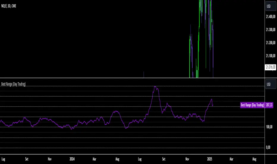
Best Range (Day Trading)The indicator is based on a formula very similar to that of the ATR. The average volatility of the last candles (a value adjustable via inputs) is calculated, and this value is then divided (a value adjustable via inputs), providing a specific value in terms of RANGE .
Its use is very straightforward. It was primarily designed for stock indices (Nasdaq & SPX). When used on the DAILY timeframe, it provides the recommended RANGE value for day trading with structural logic.
Its goal is to offer a guiding value for setting the chart to a range-based view that is optimal and as effective as possible in identifying breakouts of specific levels , helping traders avoid false breakouts or misleading structures.
We can also observe a division of levels into quartiles (25, 50, 75, 100, 125...). This helps provide reference ranges, allowing the range to be used with rounded numbers .
For example, on Nasdaq , if the indicator set on DAILY provides a value between 200 and 250, then it is advisable to visualize the chart at 200 RANGE for a more aggressive approach or at 250 RANGE for a more conservative approach.
On SPX , which is less volatile, we use increments of 25. If the indicator gives a value between 25 and 50 , then we use 25 for an aggressive approach and 50 for a conservative approach.
Obviously, this refers to FUTURES and the tick movements of MINI contracts.
Midnight Open RangeMidnight Open Range with Breakouts & Targets
This indicator helps traders identify and analyze the Midnight Open Range (12:00 AM to 12:30 AM ET) for potential trading opportunities. Key features include:
1. Automatic detection and plotting of the Midnight Open Range
2. Display of multiple historical ranges (customizable)
3. Breakout signals for range violations
4. Multiple target levels based on the range size
5. Customizable colors and styles for easy visual analysis
Perfect for traders looking to capitalize on overnight price action and early morning trends. Ideal for forex, futures, and 24-hour markets.
Note: For best results, use on lower timeframes (5-minute or less) with 24-hour chart data.

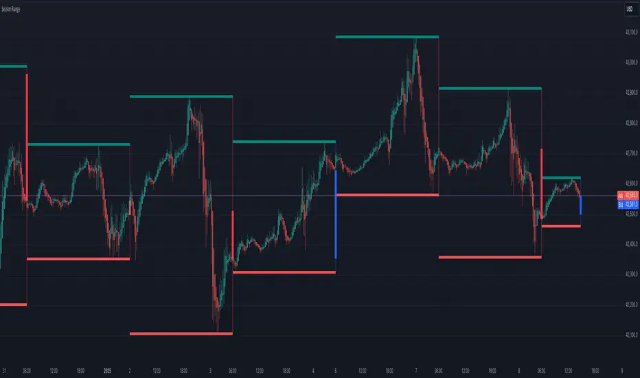
Session Range
Session Range Indicator
The Session Range Indicator is a powerful and flexible tool designed to highlight the high and low price levels of specific trading sessions. It visually marks these key levels on the chart and also displays session-specific candlesticks, helping traders to identify crucial price zones and trading opportunities.
Key Features:
- Customizable Session Timeframe:
Allows users to define the desired session timeframe, with a default setting of Daily. This ensures adaptability for analyzing various trading sessions (e.g., intraday, weekly).
- High-Low Range Highlight:
Displays the High and Low of each selected session as horizontal lines, providing a clear visual reference for support and resistance zones.
- Session Candlestick Representation:
The candlesticks corresponding to each session are distinctly marked, enabling traders to observe session-specific price action directly on the chart.
User-Friendly and Versatile:
Designed for traders of all levels, this indicator enhances decision-making by emphasizing critical price levels within the defined sessions.
Use Case:
This indicator is ideal for traders who rely on session-based analysis, such as day traders, swing traders, or those looking to incorporate session ranges into their trading strategies.
Default Settings:
- Timeframe: Daily
Users can modify the timeframe to suit their analysis needs.
With the Session Range Indicator, users gain an intuitive visualization of session dynamics, aiding in better market analysis and trade execution.
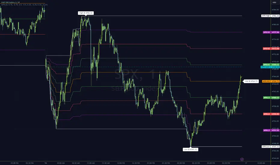
DAILY ATR LEVELSThis script is a custom technical indicator for use in TradingView, designed to display daily Average True Range (ATR) levels on the chart, along with the daily opening price. It provides a customizable way to track price levels relative to the daily ATR, which can be useful for traders looking for volatility-based price targets or ranges.
///////////////////////////////////////////////////////////////////////////////////////////////////////////////////////////////////////////////////////
Customization Options:
- Line Width: Determines the thickness of the plotted lines for the ATR levels and daily open line, ranging from 1 to 10.
- Right Offset (minutes): A time offset (in minutes) that shifts the end of the daily opening price line to the right for visual clarity.
- Line Style: The user can choose between solid, dashed, or dotted lines for all the plotted levels.
- Display Options: Users can toggle the visibility of the daily opening price line (showDayLevel), labels (showLabels), and ATR levels (showATRLevels).
- Colors: Customizable colors for the daily opening price line (dayLevelColor), labels (labelTextColor), and the ATR levels for both positive and negative values (atrLevelPlusColor and atrLevelMinusColor).
ATR Settings:
- ATR Length: Defines the number of periods (bars) to use when calculating the ATR. The default is 180, which corresponds to the ATR calculated on the daily chart using the last 180 bars.
- ATR Multiplier: Allows the user to scale the ATR levels by a multiplier (from 0.1 to 5.0), adjusting the sensitivity of the levels.
- ATR Levels: Users can toggle visibility for several predefined ATR levels, such as +25%, +50%, +75%, +100%, -25%, -50%, -75%, and -100%. These levels represent price points above or below the daily open based on the ATR.
///////////////////////////////////////////////////////////////////////////////////////////////////////////////////////////////////////////////////////
ATR Levels Calculation:
- The ATR is calculated based on the daily chart using the ta.atr() function with the specified ATR length, default is set at 180.
- The script computes multiple ATR levels above and below the daily open price, adjusting each level by 25%, 50%, 75%, and 100% of the ATR value (scaled by the ATR multiplier).
ATR Level Plotting:
- For each ATR level (positive and negative), a line is drawn across the chart at the corresponding price level.
- The color, line style, and width of these lines can be customized.
- Each ATR level also has an optional label showing the percentage level (e.g., "ATR +25%") at the specified price, which is positioned at the end of the line.
- The labels are removed from the previous bars to avoid clutter.
Workflow:
- The script first calculates the daily opening price using the request.security() function to pull the open price from the daily chart.
- It then calculates the ATR based on the selected length and multiplier.
- The start time for the daily open line is determined by the bar's timestamp at the start of the day, and the end time is adjusted using the user-defined right offset.
- After determining the relevant price levels (for the opening price and ATR levels), the script plots these levels on the chart as lines. It handles the drawing and deletion of lines to ensure that the chart remains updated in real time.
- If labels are enabled, text labels are displayed next to the ATR levels and the daily open line, providing clear markers for the user.
Practical Use:
- Volatility Analysis: This indicator is useful for identifying key price levels based on daily volatility (ATR). Traders can use it to set potential targets or support/resistance levels that are adjusted for volatility.
- Day Trading or Swing Trading: The daily opening price line helps traders quickly see where the price opened for the day, and the ATR levels give a dynamic range for the day's potential price movement.
Overall, this script is designed to provide a clear, customizable view of daily price levels in relation to the ATR, helping traders make informed decisions based on volatility and price action.

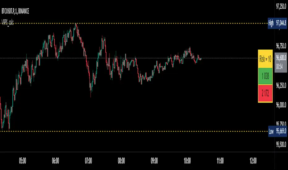
Visual Range Position Size CalculatorVisual Range Position Size Calculator
The "VR Position Size Calculator" helps traders determine the appropriate position size based on their risk tolerance and the current market conditions. Below is a detailed description of the script, its functionality, and how to use it effectively.
---
Key Features
1. Risk Calculation: The script allows users to input their desired risk in monetary terms (in the currency of the ticker). It then calculates the position sizes for both long and short trades based on this risk.
2. Dynamic High and Low Tracking: The script dynamically tracks the highest and lowest prices within the visible range of the chart, allowing for more accurate position sizing.
3. Formatted Output: The calculated values are displayed in a user-friendly table format with thousands separators for better readability.
4. Visual Indicators: Dashed lines are drawn on the chart at the high and low points of the visible range, providing a clear visual reference for traders.
5. If the risk in security price is 1% or less, the background of the cells displaying position sizes will be green for long positions and red for short positions. If the risk is between 1% and 5%, the background changes to gray, indicating that the risk may be too high for an effective trade. If the risk exceeds 5% of the price, the text also turns gray, rendering it invisible, which signifies that there is no justification for such a trade.
---
Code Explanation
The script identifies the start and end times of the visible range on the chart, ensuring calculations are based only on the data currently in view. It updates and stores the highest (hh) and lowest (ll) prices within this visible range. At the end of the range, dashed lines are drawn at the high and low prices, providing a visual cue for traders.
Users can input their risk amount, which is then used to calculate potential position sizes for both long and short trades based on the current price relative to the tracked high and low. The calculated risk values and position sizes are displayed in a table on the right side of the chart, with color coding to indicate whether the calculated position size meets specific criteria.
---
Usage Instructions
1. Add the Indicator: To use this script, copy and paste it into Pine Script editor, then add it to your chart.
2. Input Your Risk: Adjust the 'Risk in money' input to reflect your desired risk amount for trading.
3. Analyze Position Sizes: Observe the calculated position sizes for both long and short trades displayed in the table. Use this information to guide your trading decisions.
4. Visual Cues: Utilize the dashed lines on the chart to understand recent price extremes within your visible range.
Session High/Low Average & Range [1CG]The Session High/Low Average & Range indicator independently measures the average price movement from the opening price in each direction. It also displays the maximum high and low distance, called Range. Separating the averages and range into highs and lows helps analyze the volatility of the market as well as the direction.
USE EXAMPLES
Session Open
Session Close
Customization
Minimal - 1x and 2x Averages are replaced with custom lines, in order to show distance to3x.
Calculations
Average High: (high price of session - session opening price) / (session period)
Average Low: (session opening price - low price of session) / (session period)
Range High: The highest price of the last (session period)
Range Low: The lowest price of the last (session period)
INPUTS
Session
Here you can choose the hours for your session and time zone. The default is London session in New York time. Next, the session period determines how many sessions to sample from for the average and range lines, the default is 20. Lastly, you can choose the number of sessions to appear on the chart not including the current session if you are in one, 5 by default.
Lines
All of the lines allow you to change the color, width, and style. They also have a label option to choose to display the price. The bottom of the section allows you to change the location and size of the label text.
**Open Line** -Displays the opening price for the length of the session.
**Average Lines** - Displays the 1x, 2x, and 3x the average distance from open in each direction. Additionally, you can toggle a background color to highlight the area.
**Custom Lines** - Displays a customizable multiple of either the average or range. By default the first custom line displays the Range at a 1x multiplier and the second line displays an Average at a 1.5x multiplier
Display Distance
Here you can choose to display the distance from the lines to the open. This data is marked with a “Δ”. For the three Average lines this will display in the area between the line and the open in the position and size of your choice. The custom lines will have the distance information displayed on the line itself. This helps keep the data organized.

ICT Setup 03 [TradingFinder] Judas Swing NY 9:30am + CHoCH/FVG🔵 Introduction
Judas Swing is an advanced trading setup designed to identify false price movements early in the trading day. This advanced trading strategy operates on the principle that major market players, or "smart money," drive price in a certain direction during the early hours to mislead smaller traders.
This deceptive movement attracts liquidity at specific levels, allowing larger players to execute primary trades in the opposite direction, ultimately causing the price to return to its true path.
The Judas Swing setup functions within two primary time frames, tailored separately for Forex and Stock markets. In the Forex market, the setup uses the 8:15 to 8:30 AM window to identify the high and low points, followed by the 8:30 to 8:45 AM frame to execute the Judas move and identify the CISD Level break, where Order Block and Fair Value Gap (FVG) zones are subsequently detected.
In the Stock market, these time frames shift to 9:15 to 9:30 AM for identifying highs and lows and 9:30 to 9:45 AM for executing the Judas move and CISD Level break.
Concepts such as Order Block and Fair Value Gap (FVG) are crucial in this setup. An Order Block represents a chart region with a high volume of buy or sell orders placed by major financial institutions, marking significant levels where price reacts.
Fair Value Gap (FVG) refers to areas where price has moved rapidly without balance between supply and demand, highlighting zones of potential price action and future liquidity.
Bullish Setup :
Bearish Setup :
🔵 How to Use
The Judas Swing setup enables traders to pinpoint entry and exit points by utilizing Order Block and FVG concepts, helping them align with liquidity-driven moves orchestrated by smart money. This setup applies two distinct time frames for Forex and Stocks to capture early deceptive movements, offering traders optimized entry or exit moments.
🟣 Bullish Setup
In the Bullish Judas Swing setup, the first step is to identify High and Low points within the initial time frame. These levels serve as key points where price may react, forming the basis for analyzing the setup and assisting traders in anticipating future market shifts.
In the second time frame, a critical stage of the bullish setup begins. During this phase, the price may create a false break or Fake Break below the low level, a deceptive move by major players to absorb liquidity. This false move often causes smaller traders to enter positions incorrectly. After this fake-out, the price reverses upward, breaking the CISD Level, a critical point in the market structure, signaling a potential bullish trend.
Upon breaking the CISD Level and reversing upward, the indicator identifies both the Order Block and Fair Value Gap (FVG). The Order Block is an area where major players typically place large buy orders, signaling potential price support. Meanwhile, the FVG marks a region of supply-demand imbalance, signaling areas where price might react.
Ultimately, after these key zones are identified, a trader may open a buy position if the price reaches one of these critical areas—Order Block or FVG—and reacts positively. Trading at these levels enhances the chance of success due to liquidity absorption and support from smart money, marking an opportune time for entering a long position.
🟣 Bearish Setup
In the Bearish Judas Swing setup, analysis begins with marking the High and Low levels in the initial time frame. These levels serve as key zones where price could react, helping to signal possible trend reversals. Identifying these levels is essential for locating significant bearish zones and positioning traders to capitalize on downward movements.
In the second time frame, the primary bearish setup unfolds. During this stage, price may exhibit a Fake Break above the high, causing a brief move upward and misleading smaller traders into incorrect positions. After this false move, the price typically returns downward, breaking the CISD Level—a crucial bearish trend indicator.
With the CISD Level broken and a bearish trend confirmed, the indicator identifies the Order Block and Fair Value Gap (FVG). The Bearish Order Block is a region where smart money places significant sell orders, prompting a negative price reaction. The FVG denotes an area of supply-demand imbalance, signifying potential selling pressure.
When the price reaches one of these critical areas—the Bearish Order Block or FVG—and reacts downward, a trader may initiate a sell position. Entering trades at these levels, due to increased selling pressure and liquidity absorption, offers traders an advantage in profiting from price declines.
🔵 Settings
Market : The indicator allows users to choose between Forex and Stocks, automatically adjusting the time frames for the "Opening Range" and "Trading Permit" accordingly: Forex: 8:15–8:30 AM for identifying High and Low points, and 8:30–8:45 AM for capturing the Judas move and CISD Level break. Stocks: 9:15–9:30 AM for identifying High and Low points, and 9:30–9:45 AM for executing the Judas move and CISD Level break.
Refine Order Block : Enables finer adjustments to Order Block levels for more accurate price responses.
Mitigation Level OB : Allows users to set specific reaction points within an Order Block, including: Proximal: Closest level to the current price. 50% OB: Midpoint of the Order Block. Distal: Farthest level from the current price.
FVG Filter : The Judas Swing indicator includes a filter for Fair Value Gap (FVG), allowing different filtering based on FVG width: FVG Filter Type: Can be set to "Very Aggressive," "Aggressive," "Defensive," or "Very Defensive." Higher defensiveness narrows the FVG width, focusing on narrower gaps.
Mitigation Level FVG : Like the Order Block, you can set price reaction levels for FVG with options such as Proximal, 50% OB, and Distal.
CISD : The Bar Back Check option enables traders to specify the number of past candles checked for identifying the CISD Level, enhancing CISD Level accuracy on the chart.
🔵 Conclusion
The Judas Swing indicator helps traders spot reliable trading opportunities by detecting false price movements and key levels such as Order Block and FVG. With a focus on early market movements, this tool allows traders to align with major market participants, selecting entry and exit points with greater precision, thereby reducing trading risks.
Its extensive customization options enable adjustments for various market types and trading conditions, giving traders the flexibility to optimize their strategies. Based on ICT techniques and liquidity analysis, this indicator can be highly effective for those seeking precision in their entry points.
Overall, Judas Swing empowers traders to capitalize on significant market movements by leveraging price volatility. Offering precise and dependable signals, this tool presents an excellent opportunity for enhancing trading accuracy and improving performance

5-Minute Opening Range BreakoutThe 5-minute buy and sell indicator is designed to detect potential buy ("Long") and sell ("Short") signals based on the first 5 minutes of trading activity. Here's how it works:
5-Minute Opening Range: It tracks the high and low of the first 5-minute candle after the market opens. This range establishes key support and resistance levels.
Buy Signal ("Long"): When the price breaks above this range and retests the level, a "Long" signal is triggered, indicating a potential upward trend.
Sell Signal ("Short"): Conversely, if the price breaks below the range and retests, a "Short" signal is triggered, suggesting a potential downward trend.
Retests & Confirmations: The indicator waits for pullbacks or retests of the breakout levels to confirm the validity of the buy or sell signal, minimizing false entries.
Take Profit & Stop Loss: The indicator provides reasonable stop-loss and take-profit markers to guide you in managing risk and securing profits within the day.
This strategy is especially useful for traders looking to capture early market momentum, often seen in the first 5 to 15 minutes of trading. This indicator only works on the 1M timeframe.
More Updates soon!

Average True Range with Price MAATR with Price Moving Average Indicator
This custom indicator combines the Average True Range (ATR) with a Price Moving Average (MA) to help traders analyze market volatility in percent to the price.
Key Components:
Average True Range (ATR)
Price Moving Average (MA)
ATR/Price in Percent
ATR/Price in Percent
Purpose: This ratio helps traders understand the relative size of the ATR compared to the current price, providing a clearer sense of how significant the volatility is in proportion to the price level.
Calculation: ATR is divided by the current closing price and multiplied by 100 to express it as a percentage. This makes it easier to compare volatility across assets with different price ranges.
Plot: This is plotted as a percentage, making it easier to gauge whether the volatility is proportionally high or low compared to the asset's price.
Usage:
This indicator is designed to help identify the most volatile tokens, making it ideal for configuring a Grid Bot to maximize profit. By focusing on high-volatility assets, traders can capitalize on larger price swings within the grid, increasing the potential for more profitable trades.
Features:
Customizable Smoothing Method: Choose from RMA (Relative Moving Average), SMA (Simple Moving Average), EMA (Exponential Moving Average), or WMA (Weighted Moving Average) for both ATR and the Price Moving Average.
Dual Perspective: The indicator provides both volatility analysis (ATR) and trend analysis (Price MA) in a single view.
Proportional Volatility: The ATR/Price (%) ratio adds a layer of context by showing how volatile the asset is relative to its current price.

ka66: Bar Range BandsThis tool takes a bar's range, and reflects it above the high and below the low of that bar, drawing upper and lower bands around the bar. Repeated for each bar. There's an option to then multiply that range by some multiple. Use a value greater than 1 to get wider bands, and less than one to get narrower bands.
This tool stems out of my frustration from the use of dynamic bands (like Keltner Channels, or Bollinger Bands), in particular for estimating take profit points.
Dynamic bands work great for entries and stop loss, but their dynamism is less useful for a future event like taking profit, in my experience. We can use a smaller multiple, but then we can often lose out on a bigger chunk of gains unnecessarily.
The inspiration for this came from a friend explaining an ICT/SMC concept around estimating the magnitude of a trend, by calculating the Asian Session Range, and reflecting it above or below on to the New York and London sessions. He described this as standard deviation of the Asian Range, where the range can thus be multiplied by some multiple for a wider or narrower deviation.
This, in turn, also reminded me of the Measured Move concept in Technical Analysis. We then consider that the market is fractal in nature, and this is why patterns persist in most timeframes. Traders exist across the spectrum of timeframes. Thus, a single bar on a timeframe, is made up of multiple bars on a lower timeframe . In other words, when we reflect a bar's range above or below itself, in the event that in a lower timeframe, that bar fit a pattern whose take profit target could be estimated via a Measured Move , then the band's value becomes a more valid estimate of a take profit point .
Yet another way to think about it, by way of the fractal nature above, is that it is essentially a simplified dynamic support and resistance mechanism , even simpler than say the various Pivot calculations (e.g. Classical, Camarilla, etc.).
This tool in general, can also be used by those who manually backtest setups (and certainly can be used in an automated setting too!). It is a research tool in that regard, applicable to various setups.
One of the pitfalls of manual backtesting is that it requires more discipline to really determine an exit point, because it's easy to say "oh, I'll know more or less where to exit when I go live, I just want to see that the entry tends to work". From experience, this is a bad idea, because our mind subconsciously knows that we haven't got a trained reflex on where to exit. The setup may be decent, but without an exit point, we will never have truly embraced and internalised trading it. Again, I speak from experience!
Thus, to use this to research take profit/exit points:
Have a setup in mind, with all the entry rules.
Plot your setup's indicators, mark your signals.
Use this indicator to get an idea of where to exit after taking an entry based on your signal.
Credits:
@ICT_ID for providing the idea of using ranges to estimate how far a trend move might go, in particular he used the Asian Range projected on to the London and New York market sessions.
All the technicians who came up with the idea of the Measured Move.
Length True Range BarColorOverview
The indicator prints different colors on the candles for pre-determined amplitudes in relation to the simple moving average over the average true range.
Calculations
The indicated value of the simple moving average in relation to the average true range is being used to restrict the color of the candle signal to its pre-determined amplitude.
How It Works
Supposing you have a strategy where there is a need to determine the size of the acceptable signal bar in relation to the average true range, as well as size your stop and target through this range. In summary, coloring based on the size of the amplitude due to the average of the ATR, provides the ease of identifying weak signals, where there will possibly not be a sequence of movement, or identifying stretched signals where it will possibly provide a correction movement. This way you can determine an ideal size range for your input signal. Ex: Color candle signal with size of ( Candle => 2* the SMA (ATR) and <= 3* the SMA (ATR).
Inputs
Valores
Period: To determine the length of the ATR
SMA: To determine the length of the Simple Moving Average
LengthMin: Minimum amplitude size factor
LengthMax: Maximum amplitude size factor
Traço: Coloring ATR
SMA: Coloring SMA
Traço: Coloring TR
Bar Color: Coloring candle Sing
Note 1
The values of ATR, SMA and TR will normally be shown in the indicator header for a dynamic visualization of the values, and possible exceptions for candles signals outside the initially proposed factor can be compared.
Note 2
Codes made available in the PINE language reference manual were used to develop the indicator, therefore it is a practical code for trend following setup strategies not available in the community.
Relative Strength Index(RSI)- Range (60-40)Custom RSI Indicator:
The Custom RSI Indicator is a technical analysis tool designed to assess the momentum of a financial instrument's price movements within a specified range. Unlike the traditional RSI, which typically operates within a range of 0 to 100, this customized version focuses on a narrower spectrum between 40 and 60, providing clearer signals for traders.
Key Features:
Bullish and Bearish Zones: The indicator delineates between bullish and bearish sentiment. When the RSI value climbs above 60, it signals bullish momentum, indicating potential uptrends in the price. Conversely, when the RSI dips below 40, it suggests bearish sentiment, signaling potential downtrends.
Overbought and Oversold Conditions: Additionally, the Custom RSI Indicator identifies extreme market conditions. When the RSI surpasses 80 , it denotes overbought territory, suggesting that the asset may be overvalued and prone to a reversal or correction. Conversely, when the RSI falls below 30 , it indicates oversold conditions, suggesting that the asset may be undervalued and ripe for a potential rebound.
Default RSI Comparison: The Custom RSI Indicator can be compared against the traditional RSI for added context. While the customized range provides more precise signals within the 60-40 spectrum, referencing the default RSI can offer broader insights into market dynamics.
Usage:
Trend Identification: Traders can utilize the Custom RSI Indicator to identify potential trend reversals or continuations based on shifts in momentum within the specified range.
Confirmation Tool: It can serve as a confirmation tool alongside other technical indicators or price action analysis, enhancing the overall reliability of trading decisions.
Risk Management: By recognizing overbought and oversold conditions, traders can implement risk management strategies such as setting stop-loss orders or adjusting position sizes to mitigate potential losses.
Conclusion:
The Custom RSI Indicator offers traders a focused perspective on market momentum within the 60-40 range, facilitating more accurate assessments of bullish and bearish sentiment as well as identifying extreme market conditions. By incorporating this tool into their analysis, traders can make informed decisions and potentially improve their trading outcomes.

Anchored Progressive RangeIntroducing a simple script based off of the idea that ranges form from a point of origin that can be measured and produce interesting analysis indicating potential opportunities.
Specifically I use this on daily and weekly anchorage to find mid range retracements once range has developed.
Configure internal multipliers to provide potentially useful measurements between range high and mid point, as well as mid point and range low. By default it's standard .25 based multipliers but one could adjust to fib multipliers such as .615, .65, etc.
Anchored open price is plotted as continuous line as often times reversals will occur and open price will be tested on daily, weekly, monthly timeframes.
Once a bit of range is established and there's a rapid adjustment of range mid up or down, these can signal interesting breakouts. Also areas where the range stays flat due to no new high or low being printed can be indicative of consolidation, etc.
I've tested this with heikin ashi, renko, bars, line and regular candles through various markets such as futures, etfs and stocks and everything appears to anchor correctly, please feedback if experiencing otherwise.
I hope you enjoy this indicator as much as I enjoyed creating it, happy trading!
The Opening Range / First Bar By Market Mindset - Zero To EndlesThe script shows the opening range of the instrument based on different resolutions and timeframes.
Inputs :
1. Resolution
It decides the calculation frequency of the script.
In Auto resolution, Standard values have been used.
2. Timeframe
It decides the timeframe for the OHLC values.
By default, it will use the chart timeframe and so chart OHLC values.
3. Lookback
It decides the no. of ranges shown on the chart.
Middle Line can be hidden from the settings.
The script can be used for any instrument and on any timeframe.
If price is above the opening range or the middle line, a trader should look for long opportunities.
If price is below the opening range or the middle line, a trader should look for short opportunities.
A sideways or choppy move is exoected if Middle line is crossed again and again.
For trading, wait for atleast 1st bar to close. and let the opening range build up first.
Happy Trading
