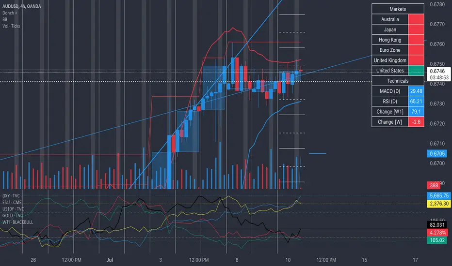
Donch +This is an indicator I made for trading Forex to help me see the bigger picture. It is meant for the 30min TF and it includes the following:
- 20 Day High | Low
- 5 Day High | Low
- 4 Hour High | L
- 4 Hour Bars
- Daily Simple Moving Averages
- Weekly Trend Line (connects last week's open to this week's open)
- Daily Trend Line (connects yesterday's open to today's open)
- Horizontal Lines at 0.25% increments (these can be useful for S/R... currency rarely moves more than 1% in a day).
- A table with information about what markets are open and technicals on the pair I am looking at.
- A slight white background fill to highlight the first hour of the US session. Knowing what session you are in is very important in day trading (in my opinion). This lets me go back and see how the US has been trading.
To keep the chart from being "too busy" (it's plenty busy lol), I use a step line and focus on 30min closes. I reference the white lines above and below closes for 4hr highs/lows and don't bother with looking at the high/low of every 30 min bar.
For the table, you will see bright green by the country for the first hour of trading in that session. It will turn to a regular green after the first hour. It will turn yellow the final hour of that session. It will turn red if that market is closed.
You can select from the settings 'inputs' tab to enable/disable any parts of this you don't find useful, for the table you'd go over to the 'style' tab and unselect it there. For example, I don't use the labels regularly. If I were to get confused about what a moving average was or something, I'd enable the labels and clarify.
Currency doesn't like to break out and likes to be stable. Keeping this in mind, you can see how the 20 day high / low and the 5 day high / low act as support and resistance (unless there is a news event to break out on.
I have alerts for the following:
- Price update every hour
- Crossing a trend line
- Crossing a moving average
- Crossing a 0.25% increment
- Making a new 4 hour, 5 day, or 20 day high/low
To enable the alerts, you would click add alert, select the indicator, and click save. To work properly, you'd want to be on the 30min TF before doing this. You will get a lot of alerts (personally I like this because I like to see how currency moves throughout the day). You will get one notification per 30 minutes but not more than that for the particular alert.
在脚本中搜索"technical"
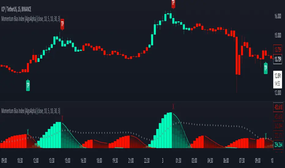
Momentum Bias Index [AlgoAlpha]Description:
The Momentum Bias Index by AlgoAlpha is designed to provide traders with a powerful tool for assessing market momentum bias. The indicator calculates the positive and negative bias of momentum to gauge which one is greater to determine the trend.
Key Features:
Comprehensive Momentum Analysis: The script aims to detect momentum-trend bias, typically when in an uptrend, the momentum oscillator will oscillate around the zero line but will have stronger positive values than negative values, similarly for a downtrend the momentum will have stronger negative values. This script aims to quantify this phenomenon.
Overlay Mode: Traders can choose to overlay the indicator on the price chart for a clear visual representation of market momentum.
Take-profit Signals: The indicator includes signals to lock in profits, they appear as labels in overlay mode and as crosses when overlay mode is off.
Impulse Boundary: The script includes an impulse boundary, the impulse boundary is a threshold to visualize significant spikes in momentum.
Standard Deviation Multiplier: Users can adjust the standard deviation multiplier to increase the noise tolerance of the impulse boundary.
Bias Length Control: Traders can customize the length for evaluating bias, enabling them to fine-tune the indicator according to their trading preferences. A higher length will give a longer-term bias in trend.
BTC Supply in Profits and Losses (BTCSPL) [AlgoAlpha]Description:
🚨The BTC Supply in Profits and Losses (BTCSPL) indicator, developed by AlgoAlpha, offers traders insights into the distribution of INDEX:BTCUSD addresses between profits and losses based on INDEX:BTCUSD on-chain data.
Features:
🔶Alpha Decay Adjustment: The indicator provides the option to adjust the data against Alpha Decay, this compensates for the reduction in clarity of the signal over time.
🔶Rolling Change Display: The indicator enables the display of the rolling change in the distribution of Bitcoin addresses between profits and losses, aiding in identifying shifts in market sentiment.
🔶BTCSPL Value Score: The indicator optionally displays a value score ranging from -1 to 1, traders can use this to carry out strategic dollar cost averaging and reverse dollar cost averaging based on the implied value of bitcoin.
🔶Reversal Signals: The indicator gives long-term reversal signals denoted as "▲" and "▼" for the price of bitcoin based on oversold and overbought conditions of the BTCSPL.
🔶Moving Average Visualization: Traders can choose to display a moving average line, allowing for better trend identification.
How to Use ☝️ (summary):
Alpha Decay Adjustment: Toggle this option to enable or disable Alpha Decay adjustment for a normalized representation of the data.
Moving Average: Toggle this option to show or hide the moving average line, helping traders identify trends.
Short-Term Trend: Enable this option to display the short-term trend based on the Aroon indicator.
Rolling Change: Choose this option to visualize the rolling change in the distribution between profits and losses.
BTCSPL Value Score: Activate this option to show the BTCSPL value score, ranging from -1 to 1, 1 implies that bitcoin is extremely cheap(buy) and -1 implies bitcoin is extremely expensive(sell).
Reversal Signals: Gives binary buy and sell signals for the long term

Volume Exhaustion [AlgoAlpha]Introducing the Volume Exhaustion by AlgoAlpha, is an innovative tool that aims to identify potential exhaustion or peaks in trading volume , which can be a key indicator for reversals or continuations in market trends 🔶.
Key Features:
Signal Plotting : A special feature is the plotting of 'Release' signals, marked by orange diamonds, indicating points where the exhaustion index crosses under its previous value and is above a certain boundary. This could signify critical market points 🚨.
Calculation Length Customization : Users can adjust the calculation and Signal lengths to suit their trading style, allowing for flexibility in analysis over different time periods. ☝️
len = input(50, "Calculation Length")
len2 = input(8, "Signal Length")
Visual Appeal : The script offers customizable colors (col for the indicator and col1 for the background) enhancing the visual clarity and user experience 💡.
col = input.color(color.white, "Indicator Color")
col1 = input.color(color.gray, "Background Color")
Advanced Volume Processing : At its core, the script utilizes a combination of Hull Moving Average (HMA) and Exponential Moving Average (EMA) applied to the volume data. This sophisticated approach helps in smoothing out the volume data and reducing lag.
sv = ta.hma(volume, len)
ssv = ta.hma(sv, len)
Volume Exhaustion Detection : The script calculates the difference between the volume and its smoothed version, normalizing this value to create an exhaustion index (fff). Positive values of this index suggest potential volume exhaustion.
f = sv-ssv
ff = (f) / (ta.ema(ta.highest(f, len) - ta.lowest(f, len), len)) * 100
fff = ff > 0 ? ff : 0
Boundary and Zero Line : The script includes a boundary line (boundary) and a zero line (zero), with the area between them filled for enhanced visual interpretation. This helps in assessing the relative position of the exhaustion index.
Customizable Background : The script colors the background of the chart for better readability and to distinguish the indicator’s area clearly.
Overall, Volume Exhaustion is designed for traders who focus on volume analysis. It provides a unique perspective on volume trends and potential exhaustion points, which can be crucial for making informed trading decisions. This script is a valuable addition for traders looking to enhance their trading experience with advanced volume analysis tools.

Squeeze & Release [AlgoAlpha]Introduction:
💡The Squeeze & Release by AlgoAlpha is an innovative tool designed to capture price volatility dynamics using a combination of EMA-based calculations and ATR principles. This script aims to provide traders with clear visual cues to spot potential market squeezes and release scenarios. Hence it is important to note that this indicator shows information on volatility, not direction.
Core Logic and Components:
🔶EMA Calculations: The script utilizes the Exponential Moving Average (EMA) in multiple ways to smooth out the data and provide indicator direction. There are specific lengths for the EMAs that users can modify as per their preference.
🔶ATR Dynamics: Average True Range (ATR) is a core component of the script. The differential between the smoothed ATR and its EMA is used to plot the main line. This differential, when represented as a percentage of the high-low range, provides insights into volatility.
🔶Squeeze and Release Detection: The script identifies and highlights squeeze and release scenarios based on the crossover and cross-under events between our main line and its smoothed version. Squeezes are potential setups where the market may be consolidating, and releases indicate a potential breakout or breakdown.
🔶Hyper Squeeze Detection: A unique feature that detects instances when the main line is rising consistently over a user-defined period. Hyper squeeze marks areas of extremely low volatility.
Visual Components:
The main line (ATR-based) changes color depending on its position relative to its EMA.
A middle line plotted at zero level which provides a quick visual cue about the main line's position. If the main line is above the zero level, it indicates that the price is squeezing on a longer time horizon, even if the indicator indicates a shorter-term release.
"𝓢" and "𝓡" characters are plotted to represent 'Squeeze' and 'Release' scenarios respectively.
Standard Deviation Bands are plotted to help users gauge the extremity and significance of the signal from the indicator, if the indicator is closer to either the upper or lower deviation bands, this means that statistically, the current value is considered to be more extreme and as it is further away from the mean where the indicator is oscillating at for the majority of the time. Thus indicating that the price has experienced an unusual amount or squeeze or release depending on the value of the indicator.
Usage Guidelines:
☝️Traders can use the script to:
Identify potential consolidation (squeeze) zones.
Gauge potential breakout or breakdown scenarios (release).
Fine-tune their entries and exits based on volatility.
Adjust the various lengths provided in the input for better customization based on individual trading styles and the asset being traded.

Best scalping toolExplanation:
This script is a comprehensive indicator that combines three essential technical analysis tools: Money Flow Index (MFI), Relative Strength Index (RSI), and Bollinger Bands (Bollinger %B). It provides insights into market conditions related to cross points of mfi,rsi and B%B.
A buy condition is created when the last candle RSI and MFI are under the bollinger bands, and then in the actual candle the RSI cross up the bollinger low band.
A sell condition is created when the last candle RSI and MFI are above the bollinger bands, and then in the actual candle the RSI cross down the bollinger high band.
Key Components:
MFI (Money Flow Index):
Utilizes the MFI indicator based on a specified length.
Overbought and oversold levels (80 and 20, respectively).
RSI (Relative Strength Index): (Adapted to the mfi chart)
Allows selection of different moving average types (SMA, EMA, etc.) for the RSI calculation.
RSI along with upper and lower bands (70 and 30).
Bollinger Bands:
Provides upper and lower Bollinger Bands based on the RSI's standard deviation.
Visualization Options:
Allows the user to choose between show the buy (green arrow) and the sell (red arrow) .
How It Works:
The indicator amalgamates these three powerful technical indicators to help traders identify potential entry or exit points. The green arrow its a buy signal and the red arrow is a sell signal.
By offering configurable settings and clear visual cues, this indicator assists traders in recognizing critical market conditions and potential trading opportunities.
Disclaimer: This indicator should be used as a tool in a broader trading strategy and not solely for making trading decisions. It's recommended to combine it with other technical or fundamental analysis for comprehensive trading decisions.

Trend Flow Profile [AlgoAlpha]Description:
The "Trend Flow Profile" indicator is a powerful tool designed to analyze and interpret the underlying trends and reversals in a financial market. It combines the concepts of Order Flow and Rate of Change (ROC) to provide valuable insights into market dynamics, momentum, and potential trade opportunities. By integrating these two components, the indicator offers a comprehensive view of market sentiment and price movements, facilitating informed trading decisions.
Rationale:
The combination of Order Flow and ROC in the "Trend Flow Profile" indicator stems from the recognition that both factors play critical roles in understanding market behavior. Order Flow represents the net buying or selling pressure in the market, while ROC measures the rate at which prices change. By merging these elements, the indicator captures the interplay between market participants' actions and the momentum of price movements, enabling traders to identify trends, spot reversals, and gauge the strength of price acceleration or deceleration.
Calculation:
The Order Flow component is computed by summing the volume when prices move up and subtracting the volume when prices move down. This cumulative measure reflects the overall order imbalance in the market, providing insights into the dominant buying or selling pressure.
The ROC component calculates the percentage change in price over a given period. It compares the current price to a previous price and expresses the change as a percentage. This measurement indicates the velocity and direction of price movement, allowing traders to assess the market's momentum.
How to Use It?
The "Trend Flow Profile" indicator offers valuable information to traders for making informed trading decisions. It enables the identification of underlying trends and potential reversals, providing a comprehensive view of market sentiment and momentum. Here are some key ways to utilize the indicator:
Spotting Trends: The indicator helps identify the prevailing market trend, whether bullish or bearish. A consistent positive (green) histogram indicates a strong uptrend, while a consistent negative (red) histogram suggests a robust downtrend.
Reversal Signals: Reversal patterns can be identified when the histogram changes color, transitioning from positive to negative (or vice versa). These reversals can signify potential turning points in the market, highlighting opportunities for counter-trend trades.
Momentum Assessment: By observing the width and intensity of the histogram, traders can assess the acceleration or deceleration of price momentum. A wider histogram suggests strong momentum, while a narrower histogram indicates a potential slowdown.
Utility:
The "Trend Flow Profile" indicator serves as a valuable tool for traders, providing several benefits. Traders can easily identify the prevailing market trend, enabling them to align their trading strategies with the dominant direction of the market. The indicator also helps spot potential reversals, allowing traders to anticipate market turning points and capture counter-trend opportunities. Additionally, the green and red histogram colors provide visual cues to determine the optimal duration of a long or short position. Following the green histogram signals when in a long position and the red histogram signals when in a short position can assist traders in managing their trades effectively. Moreover, the width and intensity of the histogram offer insights into the acceleration or deceleration of momentum. Traders can gauge the strength of price movements and adjust their trading strategies accordingly. By leveraging the "Trend Flow Profile" indicator, traders gain a comprehensive understanding of market dynamics, which enhances their decision-making and improves their overall trading outcomes.

Advanced Buy and Sell SignalsThis script for TradingView is designed for technical traders seeking a more comprehensive and discerning market analysis. The script combines buy and sell signals from multiple popular technical indicators, providing a holistic view that can be useful for short to medium-term trading strategies. It incorporates the following features:
EMA Trend Cloud:
Two Exponential Moving Averages (EMAs) are calculated: a fast EMA and a slow EMA.
A "cloud" is formed on the chart, changing color as the EMAs cross, indicating potential trend shifts.
Additional Indicators:
RSI (Relative Strength Index): Used to identify overbought or oversold conditions.
Stochastic Oscillator: Helps determine the strength or weakness of the price.
OBV (On-Balance Volume) with EMA: Combines volume and price to show how volume might be influencing price direction.
Combined Buy and Sell Signals:
Buy and sell signals are generated based on a combination of the following criteria:
Crossings of the EMAs (indicative of trend changes).
Conditions of the RSI (identifying potential market extremes).
Crossings of the Stochastic Oscillator (indicating momentum).
Crossings of the OBV with its EMA (assessing the influence of volume on price movement).
Buy signals are indicated by green triangles below the price bars, while sell signals are indicated by red triangles above the price bars.
Alerts:
The script also includes alert conditions to notify the user when potential buy or sell signals are detected.
Application:
This script is suitable for traders who utilize technical analysis and seek to confirm their trading decisions with multiple sources of information. It is particularly useful in volatile markets, where the combination of different indicators can provide more reliable insights.
Note:
It is important to remember that no script or indicator can guarantee success in trading, and one should always consider risk and conduct thorough analysis before making trading decisions.
This script is most effective when used in conjunction with fundamental analysis and a solid understanding of the market.
DiscordWebhooksLibrary🚀 Introduction
Welcome to the TradingView PineScript Library for Discord Webhook Integration! This library is designed for traders and developers who use TradingView for technical analysis and want to integrate their trading strategies with Discord notifications.
Key Features:
* Embed Creation: Easily create rich and informative embeds for your Discord messages, allowing you to send detailed trading alerts and summaries.
* Flexible Webhook Formatting: Customize your Discord messages with options for usernames, avatars, and text content, providing a personalized touch to your notifications.
* Simple Integration: Designed with simplicity in mind, this library can be integrated into your existing Pine Script trading strategies without extensive coding knowledge.
* Real-time Alerts: Utilize TradingView's alert system to send real-time trade signals and market updates to your Discord server.
Compatibility:
This library is compatible with TradingView's Pine Script version 5.
🍃 Code Snippets and Usage Examples
The following examples demonstrate how to use the Discord Webhook Integration Library in your TradingView Pine Scripts. These snippets cover various scenarios, showcasing the flexibility and utility of the library.
Example 1: Simple Alert with Markdown in Embed Description
embedDesc = "This is a **bold** and _italic_ alert message with a (replace_with_your_link)"
embedJson = createEmbedJSON("Simple Alert", embedDesc, 12345)
content = discordWebhookJSON("Alert from Captain Hook", "Captain Hook", na, embedJson)
Example 2: Multiple Embeds with Different Markdown Styles
embedDesc1 = "First alert with **bold** text"
embedDesc2 = "Second alert with _italic_ text"
embedDesc3 = "Third alert with ~~strikethrough~~"
embedJson1 = createEmbedJSON("Alert 1", embedDesc1, 654321)
embedJson2 = createEmbedJSON("Alert 2", embedDesc2, 123456)
embedJson3 = createEmbedJSON("Alert 3", embedDesc3, 111111)
embeds = embedJson1 + "," + embedJson2 + "," + embedJson3
content = discordWebhookJSON("Multiple Alerts", "Captain Hook", na, embeds)
Example 3: Complex Alert with Full Markdown Usage in Embed
embedDesc = "Alert: **Price Breakout!**\\n\\n" +
"*Symbol*: " + syminfo.ticker + "\\n" +
"*Price*: $" + str.tostring(close) + "\\n\\n" +
" (replace_with_your_link)"
embedJson = createEmbedJSON("Complex Alert", embedDesc, 16711680) // Red color
content = discordWebhookJSON("Complex Alert", "Captain Hook", na, embedJson)
Example 4: Advanced Technical Analysis Alert
rsiValue = ta.rsi(close, 14)
= ta.macd(close, 12, 26, 9)
taMessage = "RSI: " + str.tostring(rsiValue) + "\\nMACD: " + str.tostring(macdLine)
embedJson = createEmbedJSON("Technical Analysis Update", taMessage, 255) // Blue color
content = discordWebhookJSON("TA Alert", "Captain Hook", na, embedJson)
Example 5: Market Summary with Multiple Fields
counterTrend = "Your counter trend criterias"
counterTrendEmbed = createEmbedJSON(title = "Counter Trend", description = counterTrend, color = 15258703)
redFlags = "Your red flag criterias"
redFlagsEmbed = createEmbedJSON(title = "Red Flags", description = redFlags, color = 15229263)
embeds = counterTrendEmbed + "," + redFlagsEmbed
content = discordWebhookJSON(contentText = "Example of how a market analysis could look like", username = "Captain Hook", embeds = embeds)
🚨 Error Handling
Use Escape Characters Correctly: In message strings, remember to use \\n for new lines instead of \n. This ensures that the newline character is correctly interpreted in the JSON format.
It can be helpful to plot the json on the last candle
if barstate.islast
label.new(bar_index, high, text=debugMessage, color=color.red, textcolor=color.white, yloc=yloc.abovebar)
🔥 FAQs
Q1: Can I send alerts for multiple conditions?
A: Yes, you can configure multiple conditions in your script. Use separate if statements for each condition and call the discordWebhookJSON function with the relevant message for each alert.
Q2: Why is my alert not triggering?
A: Ensure your alert conditions are correct and that you've properly set up the webhook in both your script and TradingView's alert configuration. Also, check for any syntax errors in your script.
Q3: How many alerts can I send to Discord?
A: While TradingView doesn't limit the number of alerts, Discord has rate limits for webhooks. Be mindful of these limits to avoid your webhook being temporarily blocked.
Q4: Can I customize the appearance of my Discord messages?
A: Yes, the createEmbedJSON function allows you to customize your messages with titles, descriptions, colors, and more. Experiment with different parameters to achieve the desired appearance.
Q5: Is it possible to include real-time data in alerts?
A: Yes, your script can include real-time price data, indicator values, or any other real-time data available in Pine Script.
Q6: How can I contribute to the library or suggest improvements?
A: You can provide feedback, suggest improvements, or contribute to the library's development through the community channels or contact points provided in the "Support and Community" section.
formatTimeframe()
discordWebhookJSON(contentText, username, avatar_url, embeds)
Constructs a JSON string for a Discord webhook message. This string includes optional fields for content, username, avatar URL, and embeds.
Parameters:
contentText (string) : (string, optional): The main text content of the webhook message. Default is 'na'.
username (string) : (string, optional): Overrides the default username of the webhook. Default is 'na'.
avatar_url (string) : (string, optional): Overrides the default avatar URL of the webhook. Default is 'na'.
embeds (string) : (string, optional): A string containing one or more embed JSON objects. This should be formatted correctly as a JSON array. Default is 'na'.
createEmbedJSON(title, description, color, authorName, authorUrl, authorIconUrl, fields)
Creates a JSON string for a single embed object for a Discord webhook.
Parameters:
title (string) : (string, optional): The title of the embed. Default is 'na' (not applicable).
description (string) : (string, optional): The description text of the embed. Supports basic formatting. Default is 'na'.
color (int) : (int, optional): The color code of the embed, typically in decimal format. Default is 'na'.
authorName (string) : (string, optional): The name of the author to display in the embed. Default is 'na'.
authorUrl (string) : (string, optional): The URL linked to the author's name. Default is 'na'.
authorIconUrl (string) : (string, optional): The URL of the icon to display next to the author's name. Default is 'na'.
fields (string) : (string, optional): A string containing one or more field JSON objects. This should be formatted correctly as a JSON array. Default is 'na'. Note: Use the 'createEmbedFieldJSON' function to generate these JSON field strings before adding them to the array.
createEmbedFieldJSON(name, value, inline)
Creates a JSON string representing a single field object within an embed for a Discord webhook message.
Parameters:
name (string) : (string): The name of the field, acting as a title for the field content.
value (string) : (string): The value of the field, containing the actual text or information you want to display within the field.
inline (bool) : (bool, optional): A boolean flag indicating whether the field should be displayed inline with other fields. If set to true, the field will be displayed on the same line as the next field
❤️ Please, support the work with like & comment! ❤️

Chaos CypherOverview
Technically a smooth linear rate transformation, the "Chaos Cypher" drew some inspiration from the principles of Markov and chaos. Aside from price action, this combination provides a different lens through which to observe and interpret market movements. Markov models are based on the principle that future states depend only on the current state, not on the sequence of events that preceded it. Chaos theory deals with systems that are highly sensitive to initial conditions, a concept popularly referred to as the butterfly effect.
Efficient with Minimal Data: Designed to perform efficiently, the CC indicator is particularly useful in situations regardless of extensive historical data, except for obvious back testing, while still providing strength at identifying potential overbought/oversold zones and critical divergences.
Simplified Momentum Analysis: With further inspiration from the triple smoothed exponential rate, the CC actually uses linear regression for its calculations. This approach allows for a clear and more straightforward identification of deviations in momentum. The smoothing helps allow it to provide details while still operating at a fast pace due to the regression speed.
Adaptable to Various Timeframes: The transformation calculation then employed effectively narrows its scope in relation to the pace, enhancing its applicability across multiple timeframes and periods. This flexibility makes it a versatile tool suitable for various strategies and market conditions.
Fisher Transform Style Presentation: The indicator is presented in a style reminiscent of the Fisher Transform. However, this method of the script recalculates based on every individual dataset. To maintain efficiency, the adjustable length only applies to the regression rate.
The Chaos Cypher when compared to the Fisher Transform
Inversion Option for Leads: Lastly, an intriguing find when testing this script is the potential of the inversion option. This aspect proved particularly useful when searching for pullbacks on a trending market.
Conclusion
This indicator is designed to be forward-thinking and attempts to combine theoretical concepts with practicality. It has the ability to work with minimal data, adapt to various timeframes, and provide clear views of market movements. It back tested very well even when unrealistically used as a sole instrument.
"Two states differing by imperceptible amounts may eventually evolve into two considerably different states ... If, then, there is any error whatever in observing the present state—and in any real system such errors seem inevitable—an acceptable prediction of an instantaneous state in the distant future may well be impossible....In view of the inevitable inaccuracy and incompleteness of weather observations, precise very-long-range forecasting would seem to be nonexistent." -Edward Norton Lorenz

ADX Speed DerivativeThe ADX Speed Derivative (ADXSD) is a cutting-edge trading indicator meticulously crafted for trend analysis. By harnessing the power of the Average Rate Of Change (AROC) method applied to the first and second derivatives (pictured in white and purple, respectively) of the ADX oscillator, this indicator transcends conventional tools, offering traders unparalleled insights into market dynamics.
Key Features and Analysis Capabilities:
The ADXSD stands out with its ability to detect shifts in market trend directions, precisely quantify the speed and intensity of those transitions, and gauge the weakening or strengthening of prevailing trends. This comprehensive toolkit is designed for traders who demand accuracy and nuance in their technical analysis.
AROC Differentiation:
Unlike traditional ADX-based indicators, the ADXSD incorporates the AROC method, offering a nuanced perspective on trend acceleration or deceleration. The first derivative provides insight into the simplest rate of change, while the second derivative unveils the acceleration or deceleration of the trend, empowering traders with a deeper understanding of market dynamics.
Signal Precision:
This indicator excels at pinpointing potential trend reversals and transitions. Utilizing AROC on the ADX oscillator, it generates precise signals marked on the chart, giving traders timely and actionable information to make informed decisions.
Customization and Adaptability:
The ADXSD offers a range of customization options to cater to diverse trading strategies. Traders can adjust the lookback parameters to align with their risk tolerance and preferences, ensuring a personalized and adaptive approach to technical analysis.
Trend Visualization:
Incorporating a visual approach, this indicator enhances the interpretation of market trends. Traders can quickly identify shifts in trend strength and direction by observing midline crossovers, providing a visual guide for strategic decision-making.
Comprehensive Analysis:
The ADXSD serves as a comprehensive tool for traders seeking in-depth insights into market trends. It complements existing technical indicators, offering a holistic approach to market analysis.
COSTAR [SS]This idea came to me after I wrote the post about Co-Integration and pair trading. I wondered if you could use pair trading principles as a way to determine overbought and oversold conditions in a more neutral way than RSI or Stochastics.
The results were promising and this indicator resulted :-)!
About:
COSTAR provides another, more neutral way to determine whether an equity is overbought or oversold.
Instead of relying on the traditional oscillator based ways, such as using RSI, Stochastics and MFI, which can be somewhat biased and narrow sided, COSTAR attempts to take a neutral, unbiased approached to determine overbought and oversold conditions. It does this through using a co-integrated partner, or "pair" that is closely linked to the underlying equity and succeeds on both having a high correlation and a high t-statistic on the ADF test. It then references this underlying, co-integrated partner as the "benchmark" for the co-integration relationship.
How this succeeds as being "unbiased" and "neutral" is because it is responsive to underlying drivers. If there is a market catalyst or just general bullish or bearish momentum in the market, the indicator will be referencing the integrated relationship between the two pairs and referencing that as a baseline. If there is a sustained rally on the integrated partner of the underlying ticker that is holding, but the other ticker is lagging, it will indicate that the other ticker is likely to be under-valued and thus "oversold" because it is underperforming its benchmark partner.
This is in contrast to traditional approaches to determining overbought and oversold conditions, which rely completely on a single ticker, with no external reference to other tickers and no control over whether the move could potentially be a fundamental move based on an industry or sector, or whether it is a fluke or a squeeze.
The control for this giving "false" signals comes from its extent of modelling and assessment of the degree of integration of the relationship. The parameters are set by default to assess over a 1 year period, both the correlation and the integration. Anything that passes this degree of integration is likely to have a solid, co-integrated state and not likely to be a "fluke". Thus, the reliability of the assessment is augmented by the degree of statistical significance found within the relationship. The indicator is not going to prompt you to rely on a relationship that is statistically weak, and will warn you of such.
The indicator will show you all the information you require regarding the relationship and whether it is reliable or not, so you do not need to worry!
How to Use
The first step to use COSTAR is identifying which ticker has a strong relationship with the current ticker. In the main chart, you will see that SPY is overlaid with VIX. There is a strong, negative correlation between the VIX and SPY. When VIX is entered as the paired ticker, the indicator returns the data as stationary, indicating a compatible match.
Now you have 3 ways of viewing this relationship, 2 of which are going to be directly applicable to trading.
You can view them as
Price to Price Ratio (Not very useful for trading, but if you are curious)
Z-Score: Helpful for trading
Co-integration: Helpful for trading
Here is an example of all three:
Example of Z-Score Chart:
Example of Price Ratio:
Example of Co-Integration Pair:
Using for Trading
As stated above, the two best ways to use this for trading is to either use the Z-Score Chart or the Co-Integrated Pair chart.
The Z-Score chart is based off of the price ratio data and provides an assessment of both the independent and dependent data.
The co-integration shows the dependent (the ticker you are trading) in yellow and the independent (the ticker you are referencing) in teal. When teal is above yellow, you will see it is green. This means, based on your benchmark pair, there is still more up room and the ticker you are trading is actually lagging behind.
When the yellow crosses up, it will turn red. This means that your ticker is out-performing the benchmark pair and you likely will see pullback and a "regression to the mean" through re-integration.
The indicator is capable of plotting out entries and exits, which are guided by the z-score:
How Effective is it?
I created a basic strategy in Pinescript, and the back-test results vary. Trading ES1! using NQ1! as the co-integrated pair, results were around 78% effective.
With VIX, results were around 50% effective, but with a net profit.
Generally, the efficacy surpassed that of both stochastics and RSI.
I will be releasing the strategy version of this in the coming days, still just cleaning up that code and making it more "public use" friendly.
Other Applications
If you are a pair trader, you can technically use this for pair trading as well. That's essentially all this is doing :-).
Tips
If you are trading a ticker such as MSFT, AMD, KO etc., it's best to try to find an ETF or index that has that particular ticker as a large holding and use that as your benchmark. You will see on the indicator whether there is a high correlation and whether the data is indeed stationary.
If the indicator returns "Non-stationary", you can attempt to extend your regression range from 252 to 500. If this fixes the issue, ensure that the correlation is still >= 0.5 or <= -0.5. If this does not work still, you will need to find another pair, as its likely the result of incompatibility and an insignificant relationship.
To help you identify tickers with strong relationships, consider using a correlation heatmap indicator. I have one available and I think there are a couple of other similar ish ones out there. You want to make sure the relationship is stable over time (a correlation of >= 0.50 or <= -0.5 over the past 252 to 500 days).
IMPORTANT: The long and short exits delete the signal after one is signaled. Therefore, when you look back in the chart you will notice there are no signals to exit long or short. That is because they signal as they happen. This is to keep the chart clean.
'Tis all my friends!
Hope you enjoy and let me know your questions and suggestions below!
Side note:
COSTAR stands for Co-integration Statistical Analysis and Regression. ;)

Kiss Of DeathThis Pine Script code is designed to create a technical indicator on a TradingView chart known as the "Kiss of Death" signal. Here's a description of the script:
The script begins by specifying that it is intended for use with Pine Script version 5 (//@version=5) and sets the indicator's title to "Kiss of Death Signal" with indicator(title="Kiss of Death Signal", overlay=true).
The code calculates a 21-period Exponential Moving Average (EMA) of the closing prices (ema21 = ta.ema(close, 21)). The EMA is a commonly used trend-following indicator.
It also determines the lowest low of the previous two periods (prev_low = ta.lowest(low, 2)). This variable will be used in the signal condition.
The script then defines the signal condition for the "Kiss of Death" pattern. This pattern occurs when:
The current closing price is below the 21-period EMA (close < ema21).
The previous closing price is above or equal to the 21-period EMA (close >= ema21).
The current low is below the lowest low of the previous two periods (low < prev_low).
Next, it uses plot to display the 21-period EMA on the chart (plot(ema21, color=color.blue, title="21 EMA")), using a blue color.
Finally, the script utilizes plotshape to mark the points on the chart where the "Kiss of Death" signal condition is met. It places a red, downward-pointing triangle above the corresponding bars
In summary, this script provides a visual representation of the "Kiss of Death" signal on a TradingView chart, helping traders identify potential bearish reversal points based on the defined conditions. The 21-period EMA is also displayed to provide additional context.
What makes this script unique is that it specifically identifies and visualizes a specific technical pattern known as the "Kiss of Death". The "Kiss of Death" is a bearish reversal pattern that occurs when the current price falls below a specific moving average (in this case, a 21-period Exponential Moving Average or EMA) after previously being above it, and when the current low is below the lowest low of the previous two periods.
This script stands out because it provides a clear and visual representation of this particular pattern on a TradingView chart. By using a red, downward-pointing triangle above the bars, it helps traders quickly identify potential bearish reversal points based on the defined conditions.
The combination of a specific pattern, in this case the "Kiss of Death", along with a visual indicator, sets this script apart and makes it a useful tool for traders looking to identify potential bearish reversal points in their technical analysis.

PhantomFlow TrendDetectorThe TrendDetector calculates waves on the chart using the built-in ZigZag indicator and detects a trend change after the last high/low update occurs in a minimum sequence of non-updated highs/lows. This assumes a continuation of the trend for the subsequent update of the remaining high/low.
For trend determination:
When you see a pink or light yellow trend color, it means that a new trend may potentially be emerging right now, and you can join it almost at the beginning. So, if you see patterns from your trading system aligning with the TrendDetector indicator and they have the same direction, it further increases the likelihood of your plan working out.
In the case where the trend phase has a red or green color, it may indicate that the primary market impulse has already occurred, and therefore, joining the trend at this time may not be advisable.
For trade entry:
Additionally, you can use the indicator specifically for entering the market using market orders. Depending on the timeframe (the smaller the timeframe, the more confirmation candles are needed), you can open a trade when one trend replaces another at the close, for example, the second candle in the case of a 10-minute timeframe. Stop-loss can be placed under the signal candle, a local peak, or a reversal trend valley, a global peak, or a reversal trend valley. In the example above, the second option was used.
Settings
You cannot technically adjust anything in this indicator because all the logic is hardcoded. However, for a better chart visualization, after adding it to the chart, click on the three dots next to the indicator name, select "Visual order," and then "Bring to front".

VWAP Balance ZonesVWAP Balance Zones (VBZ) Is based on 3 concepts.
Many Traders use VWAP to help determine Price Trends.
Trends are typically identified by new Highs or new Lows.
Balanced is found when Supply and Demand are mostly Equal.
VBZ tracks the daily, weekly, and monthly highs and lows; Then plots the average (50%) between the VWAP and the respective extremes.
50% VWAP Zones can be considered significant since they attempt to identify the equilibrium between market participants within the current trend, serving as key reference points to consider for decision making. >While in an uptrend, Buyers may see price falling to the Hi 50% as an attractive value entry for the continuation upwards.
>While ALSO in an uptrend, Sellers may see price falling to the Hi 50% as a change in sentiment with more downwards movement on the way.
Because of these conflicting mindsets, these zones are thought to display areas of balance between buyers and sellers, which can serve as potential decision points throughout the day.
VBZ Draws Zones from the Daily (High/Low/Close) VWAPs and the Day's (High/Low/Close) extremes as seen below.
Technically speaking, an average between vwap and extreme is a single point, to make these into zones I am using multiple sources for vwap and tracking different points of the bar throughout the day (ex. Close VWAP & Daily Highest Close)
Weekly and Monthly are only displaying the Average Price between the VWAP and the (Weekly or Monthly) High/Low.
These hold up as important levels for speculation; however, since most action will be discovered at the daily zones, I am not displaying the zones for the Weekly and Monthly to keep noise to a minimum.
Unique Behaviors:
- Weekly values are hidden on the first day of the week since they are similar to the daily values on the first day of the week.
- Monthly values are hidden in the first week of the month for the same reason.

Fiboborsa+BistTitle: "Fiboborsa+Bist Indicator for TradingView"
Description: The "Fiboborsa+Bist" indicator is a powerful tool designed for TradingView users. This indicator offers a comprehensive set of technical indicators to assist you in your technical analysis and trading decisions.
Features:
Simple Moving Averages (SMA): You can enable or disable SMA with different periods (20, 50, 100, 200) to observe different timeframes and trends.
SMA Strategy: Use SMA crossovers to determine trends. Watch for the 20-period SMA crossing above the 50-period SMA for a bullish signal. For a bearish signal, observe the 50-period SMA crossing below the 100-period SMA.
Exponential Moving Averages (EMA): Similar to SMA, you can enable or disable EMA with different periods (5, 8, 14, 21, 34, 55, 89, 144, 233) for more precise trend analysis.
EMA Strategy: Use EMA crossovers and crossunders for short-term trend changes. A buy signal may occur when the 5-period EMA crosses above the 14-period EMA, while a crossunder suggests a selling opportunity.
Weighted Moving Averages (WMA): Customize WMA settings with various periods (5, 13, 21, 34, 89, 144, 233, 377, 610, 987) to suit your trading style.
WMA Strategy: Use WMA crossovers to verify trends. When the 13-period WMA crosses above the 34-period WMA, it may indicate an uptrend.
Buy and Sell Signals: The indicator provides buy and sell signals based on EMA crossovers and crossunders. Strong signals are also highlighted.
EMA Buy and Sell Strategy: Make informed trading decisions using buy and sell signals generated by EMA crossovers and crossunders.
Ichimoku Cloud: You can enable the Ichimoku Cloud for a clear visual representation of support and resistance levels.
Ichimoku Strategy: Use the Ichimoku Cloud to determine trend direction. Entering long positions is common when the price is above the cloud and considering short positions when it's below the cloud. Verify the trend with the Chikou Span.
Bollinger Bands: Easily visualize price volatility by enabling the Bollinger Bands feature.
Bollinger Bands Strategy: Bollinger Bands help you visualize price volatility. Look for potential reversal points when the price touches or crosses the upper or lower bands.
Use the "Fiboborsa+Bist" indicator to enhance your trading strategies and make informed decisions in the dynamic world of financial markets.
Additional Information:
Bollinger Bands: Bollinger Bands are a technical analysis tool used to monitor price volatility and determine overbought or oversold conditions. This indicator consists of three components:
Middle Moving Average (SMA): Typically, a 20-day SMA is used.
Upper Band: Calculated by adding two times the standard deviation to the SMA.
Lower Band: Calculated by subtracting two times the standard deviation from the SMA.
As the price moves between these two bands, it becomes possible to identify potential buying or selling points by comparing its height or low with these bands.
Ichimoku Cloud: The Ichimoku Cloud is a comprehensive indicator used for trend identification, defining support and resistance levels, and measuring trend strength. The Ichimoku Cloud comprises five key components:
Tenkan Sen (Conversion Line): Used to identify short-term trends.
Kijun Sen (Base Line): Used to identify medium-term trends.
Senkou Span A (Leading Span A): Calculated as (Tenkan Sen + Kijun Sen) / 2 and shows future support and resistance levels.
Senkou Span B (Leading Span B): Calculated as (highest high + lowest low) / 2 and indicates future support and resistance levels.
Chikou Span (Lagging Line): Enables tracking the price backward.
The Ichimoku Cloud interprets a price above the cloud as an uptrend and below the cloud as a downtrend. The Chikou Span assists in verifying the current trend.
ADDITIONAL STRATEGY WITH RSI AND MACD INDICATORS
**Strategy: Two-Stage Trading Strategy Using RSI, MACD, and Fiboborsa+Bist Indicators**
**Stage 1: Determining the Trend and Selecting the Trading Direction**
1. **Trend Identification with Fiboborsa+Bist Indicator:**
- Analyze the simple moving averages (SMA), exponential moving averages (EMA), and weighted moving averages (WMA) used with the Fiboborsa+Bist indicator. These indicators will provide information about the direction of the market trend.
2. **Identifying Overbought and Oversold Conditions with RSI:**
- Use the RSI indicator to identify overbought (70 and above) and oversold (30 and below) conditions. This helps in measuring the strength of the trend. If RSI enters the overbought zone, a downward correction is likely. If RSI enters the oversold zone, an upward correction is probable.
3. **Evaluating Momentum with MACD:**
- Examine price momentum using the MACD indicator. When the MACD line crosses above the signal line, it may indicate an increasing upward momentum. Conversely, a downward cross can suggest an increasing downward momentum.
**Stage 2: Generating Buy and Sell Signals**
4. **Combining RSI, MACD, and Fiboborsa+Bist Indicators:**
- To generate a buy signal, wait for RSI to move out of the oversold region into an uptrend and for the MACD line to cross above the signal line.
- To generate a sell signal, wait for RSI to move out of the overbought region into a downtrend and for the MACD line to cross below the signal line.
5. **Confirmation with Fiboborsa+Bist Indicator:**
- When you receive a buy or sell signal, use the Fiboborsa+Bist indicator to confirm the market trend. Confirming the trend can strengthen your trade signals.
6. **Setting Stop-Loss and Take-Profit Levels:**
- Remember to manage risk when opening buy or sell positions. Set stop-loss and take-profit levels to limit your risk.
7. **Monitor and Adjust Your Trades:**
- Continuously monitor your trade positions and adjust your strategy as per market conditions.
This two-stage trading strategy offers the ability to determine trends and generate trade signals using different indicators. However, every trading strategy involves risks, so risk management and practical application are essential. Also, it's recommended to test this strategy in a demo account before using it in a real trading account.

[blackcat] L2 Range Action Verification Index (RAVI) with 3 SMAThe Range Action Verification Index (RAVI) is a technical indicator used in trading to measure the strength of a trend. It compares two simple moving averages (SMAs) to determine the market's momentum.
To calculate RAVI, we subtract the shorter SMA from the longer SMA, and then divide the result by the longer SMA. This value is then multiplied by 100 to express it as a percentage.
The RAVI indicator helps traders identify whether the market is in a trending or range-bound phase. When the RAVI value is positive, it indicates a bullish trend, suggesting that the market is in an uptrend. Conversely, a negative RAVI value indicates a bearish trend or a downtrend.
Traders can use the RAVI indicator in several ways. Here are a few common strategies:
1. **Trend confirmation**: Traders can use RAVI to confirm the strength of a trend identified by other indicators or price patterns. If the RAVI value aligns with the direction of the trend, it provides additional confirmation.
2. **Overbought and oversold conditions**: Traders can use extreme RAVI values to identify overbought or oversold conditions in the market. When the RAVI value reaches high positive or negative levels, it suggests that the market may be due for a reversal or a retracement.
3. **Divergence**: Traders can look for divergences between the RAVI indicator and the price action. For example, if the price makes a higher high, but the RAVI value makes a lower high, it could indicate a weakening trend and a potential reversal.
As with any technical indicator, it is essential to use RAVI in conjunction with other tools and analysis techniques to make informed trading decisions. Traders should also consider factors such as market conditions, risk management, and other supporting indicators to validate their trading strategies.
In this indicator, an additional simple moving average (SMA) is introduced to consider long-term bias. This modification allows the Range Action Verification Index (RAVI) to be used as a volatility filter. By comparing the shorter SMA with this longer SMA, traders can gain insights into the market's volatility and adjust their trading strategies accordingly. This longer SMA helps provide a broader perspective on the market's trend and can be particularly useful for identifying and filtering out periods of high volatility. It is called "L2 Range Action Verification Index (RAVI) with 3 SMA". It calculates the RAVI value based on three simple moving averages (SMA). The code also includes calculations for the upper and lower bands, as well as color gradient settings. Finally, it plots the RAVI values and a midline.
It calculates the Range Action Verification Index (RAVI) using three Simple Moving Averages (SMA). The RAVI measures the difference between two SMAs divided by a third SMA, and then multiplied by 100.
The code starts with defining input parameters such as length, multiplier, and lengths for the three SMAs. Then it assigns the closing price to a variable called "price".
Next, it calculates the three SMAs using the "ta.sma" function from TradingView's built-in technical analysis library. The first SMA uses "sma1Length", the second SMA uses "sma2Length", and the third SMA uses "sma3Length".
After that, it calculates the RAVI by subtracting sma2 from sma1, dividing it by sma3, and multiplying it by 100.
Then it calculates additional values like basis (using another SMA), deviation (using standard deviation), upper band (basis + dev), and lower band (basis - dev).
Finally, it plots these values on a chart using different colors for each line. It also creates an array of gradient colors based on RSI values calculated from another indicator called ALMA. This gradient color is used to colorize the RAVI line.
Overall, this script helps visualize and analyze market trends based on moving averages and their relationship with price movements.

[blackcat] L2 Market Facilitation IndexThe Market Facilitation Index (MFI) is a technical indicator that measures the ease with which the market is able to move based on the volume traded. It was developed by Dr. Bill Williams as part of his trading system.
The MFI is calculated by taking into account the difference between the current typical price (average of high, low, and close) and the previous typical price, multiplied by the volume. This difference is then divided by the sum of volume over a specified period.
The MFI helps traders to identify periods of high or low market facilitation. High MFI values indicate that the market is facilitating trade and moving with ease, suggesting increased activity and potential trading opportunities. Conversely, low MFI values suggest a lack of market facilitation, indicating decreased activity and potential consolidation or sideways movement.
Traders can use the MFI in conjunction with other technical indicators and price analysis techniques to make informed trading decisions. It can be used to confirm trends, identify potential reversals, and assess the strength of market movements.
The Market Facilitation Index provides valuable insights into market dynamics, as it focuses on the relationship between price movement and trading volume. By incorporating volume data into its calculations, the MFI captures the impact of volume on market activity.
This indicator is particularly useful in identifying periods of market consolidation or range-bound trading. When the MFI shows low values, it suggests that market participants are hesitant and there may be a lack of clear trends. Traders can interpret this as a potential signal to avoid entering new positions or to tighten their stop-loss levels.
Conversely, when the MFI indicates high values, it signifies that the market is experiencing high levels of activity and price movement. This can be an indication of a strong trend, and traders may look for opportunities to enter positions in line with the prevailing market direction.
In addition to identifying market trends and potential reversals, the MFI can also help traders gauge the strength of price movements. By comparing the MFI values during different price swings or trends, traders can assess whether the market is experiencing increasing or decreasing levels of facilitation. This information can be valuable in determining the overall momentum and sustainability of a trend.
It's important to note that while the Market Facilitation Index can be a useful tool in technical analysis, it should not be used in isolation. Like any indicator, it has its limitations and may not always accurately reflect market conditions. Therefore, it is advisable to combine the MFI with other technical indicators, chart patterns, and fundamental analysis to gain a more comprehensive understanding of the market.
In conclusion, the Market Facilitation Index is a powerful technical indicator that measures the ease with which the market is able to move based on trading volume. It helps traders identify periods of high or low market facilitation, confirm trends, identify potential reversals, and assess the strength of market movements. However, it should be used in conjunction with other analysis methods for comprehensive market evaluation.

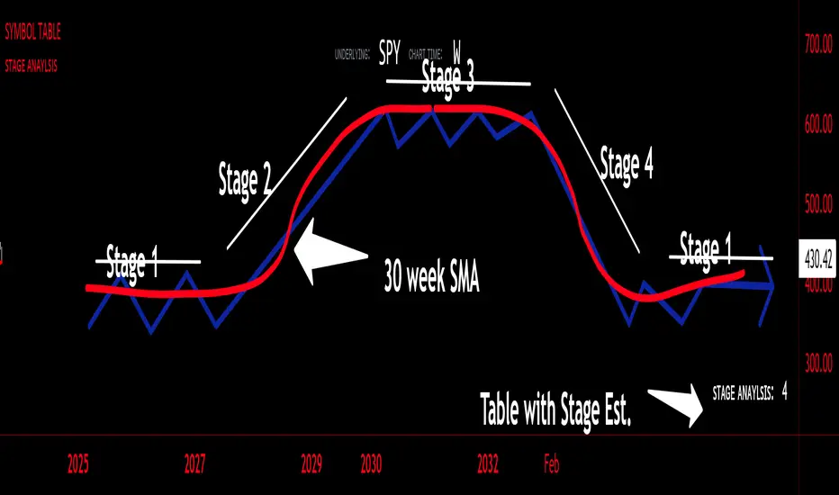
sᴛᴀɢᴇ ᴀɴᴀʏʟsɪsStage analysis is a technical analysis approach that involves categorizing a stock's price movements into different stages to help traders and investors make more informed decisions. It was popularized by Stan Weinstein in his book, "Secrets for Profiting in Bull and Bear Markets." The stages are used to identify the overall trend and to time entries and exits in the market. Here's an explanation of the typical stages in stage analysis:
1. **Stage 1: Accumulation Phase**
- In this stage, the stock is in a downtrend or has been trading sideways for an extended period.
- Volume is relatively low, indicating that institutions and smart money may be quietly accumulating shares.
- The stock may test and hold support levels, showing signs of stability.
- The goal for traders in this stage is to identify the potential for a trend reversal.
2. **Stage 2: Markup (Bull Market) Phase**
- This is the stage where the stock starts a significant uptrend.
- Volume increases as institutional and retail investors become more interested in the stock.
- Technical indicators like moving averages and trendlines confirm the uptrend.
- Traders and investors look for buying opportunities during pullbacks or consolidations within the uptrend.
3. **Stage 3: Distribution Phase**
- In this stage, the stock's price begins to show signs of weakness.
- Volume might decrease as institutions and smart money start selling their positions.
- The stock may start forming a trading range or exhibit bearish chart patterns.
- Traders should consider taking profits or reducing exposure to the stock as it may enter a downtrend.
4. **Stage 4: Markdown (Bear Market) Phase**
- This is the stage where the stock enters a significant downtrend.
- Volume may remain elevated as selling pressure dominates.
- Technical indicators confirm the downtrend.
- Traders and investors should avoid buying the stock and may consider short-selling or staying on the sidelines.
Stage analysis helps traders and investors make decisions based on the current stage of a stock's price movement. The goal is to enter during the accumulation phase or early in the markup phase and exit during the distribution phase or before the markdown phase to maximize profits and minimize losses.
=============================================================
try to just show the Stage number in a table, but always double check for yourself
Daily TrendDescription:
The "Daily Trend" script is a powerful technical analysis tool designed for TradingView. This indicator helps traders identify key support and resistance levels based on daily price data. It offers a visual representation of these levels, along with other technical indicators like Exponential Moving Averages (EMA), Supertrend, and Parabolic SAR.
Features:
Past Candle Price Levels: This script calculates and displays past daily candle price levels, including R1, R2, R3, R4, S1, S2, S3, and S4. These levels are vital for identifying potential reversals and breakout points.
Exponential Moving Average (EMA): The script includes an EMA indicator with a customizable period to help traders spot the trend direction and potential crossovers.
Supertrend Indicator: The Supertrend indicator is used to identify trend changes. It plots the Supertrend line and highlights the trend direction with color-coded regions.
Parabolic SAR: The Parabolic SAR indicator is integrated into the script to assist traders in identifying potential entry and exit points in the market.
Customizable Alerts: Traders can customize the indicator by choosing which past candle price levels and other features to display on the chart.
How to Use:
Apply the "Daily Trend" script to your TradingView chart.
Customize the indicator by enabling or disabling specific features, such as past candle price levels and EMA.
Pay attention to the color-coded regions for Supertrend and Parabolic SAR to determine the current trend direction.
Look for potential reversal or bounce signals based on the indicator's signals and the price action.
Consider using this script in conjunction with your trading strategy for enhanced technical analysis.
Risk Warning: Trading involves significant risk, and past performance is not indicative of future results. Always practice proper risk management and consider the broader context of the market before making trading decisions.

[blackcat] L2 Zero Lag Hull Moving AverageZero Lag Hull Moving Average (ZLHMA) is a technical indicator that is based on the principles of Zero Lag Hull Moving Average (HMA). It is designed to provide a smoother and more accurate representation of price trends by reducing lag and improving the responsiveness of the moving average line.
Compared to traditional moving average lines, the Zero Lag Hull Moving Average has the advantage of being able to capture price trend changes more precisely. It achieves this by utilizing a higher degree of smoothness through the use of weighted moving averages, and by incorporating the calculation method of Hull Moving Average (HMA) to further eliminate lag.
The calculation process of the Zero Lag Hull Moving Average involves two main steps. First, the Hull Moving Average (HMA) is calculated by taking the difference between two weighted moving averages applied to the price data. This helps to smooth out the price fluctuations and reduce lag. Then, the difference between two weighted moving averages is applied once again to the HMA, resulting in the Zero Lag Hull Moving Average. This final step further enhances the accuracy and timeliness of the indicator.
The Zero Lag Hull Moving Average offers several advantages for traders. Firstly, it provides a quicker response to changes in price trends, allowing traders to make more timely and informed trading decisions. This can be particularly useful in fast-moving markets where speed is crucial. Secondly, by reducing lag, the Zero Lag Hull Moving Average helps traders avoid missing important market signals and potential trading opportunities. It provides a more accurate representation of the current market conditions, enabling traders to act with greater confidence.
However, it is important to note that the Zero Lag Hull Moving Average should not be used as the sole basis for making trading decisions. It is recommended to consider other technical indicators, as well as fundamental and market analysis, to gain a comprehensive understanding of the market dynamics. Traders should also conduct thorough backtesting and validation of their trading strategies to ensure their effectiveness.
In conclusion, the Zero Lag Hull Moving Average is a powerful tool that can enhance the accuracy and responsiveness of technical analysis. By reducing lag and providing a more accurate representation of price trends, it can assist traders in making better-informed trading decisions. However, it should be used in conjunction with other indicators and analysis methods for a comprehensive approach to trading.
Please note that the information provided by blackcat1402 is for educational purposes only and should not be considered as financial advice. It is essential to conduct thorough research, backtesting, and validation before implementing any trading strategies.

ATR Based EMA Price Targets [SS]As requested...
This is a spinoff of my EMA 9/21 cross indicator with price targets.
A few of you asked for a simple EMA crossover version and that is what this is.
I have, of course, added a bit of extra functionality to it, assuming you would want to transition from another EMA indicator to this one, I tried to leave it somewhat customizable so you can get the same type of functionality as any other EMA based indicator just with the added advantage of having an ATR based assessment added on. So lets get into the details:
What it does:
Same as my EMA 9/21, simply performs a basic ATR range analysis on a ticker, calculating the average move it does on a bullish or bearish cross.
How to use it:
So there are quite a few functions of this indicator. I am going to break them down one by one, from most basic to the more complex.
Plot functions:
EMA is Customizable: The EMA is customizable. If you want the 200, 100, 50, 31, 9, whatever you want, you just have to add the desired EMA timeframe in the settings menu.
Standard Deviation Bands are an option: If you like to have standard deviation bands added to your EMA's, you can select to show the standard deviation band. It will plot the standard deviation for the desired EMA timeframe (so if it is the EMA 200, it will plot the Standard Deviation on the EMA 200).
Plotting Crossovers: You can have the indicator plot green arrows for bullish crosses and red arrows for bearish crosses. I have smoothed out this function slightly by only having it signal a crossover when it breaks and holds. I pulled this over to the alert condition functions as well, so you are not constantly being alerted when it is bouncing over and below an EMA. Only once it chooses a direction, holds and moves up or down, will it alert to a true crossover.
Plotting labels: The indicator will default to plotting the price target labels and the EMA label. You can toggle these on and off in the EMA settings menu.
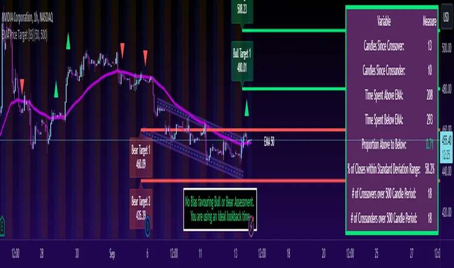
Trend Assessment Settings:
In addition to plotting the EMA itself and signaling the ATR ranges, the EMA will provide you will demographic information about the trend and price action behaviour around the EMA. You can see an example in the image below:
This will provide you with a breakdown of the statistics on the EMA over the designated lookback period, such as the number of crosses, the time above and below the EMA and the amount the EMA has remained within its standard deviation bands.
Where this is important is the proportion assessment. And what the proportion assessment is doing is its measuring the amount of time the ticker is spending either above or below the EMA.
Ideally, you should have relatively equal and uniform durations above and below. This would be a proportion of between 0.5 and 1.5 Above to Below. Now, you don't have to remember this because you can ask the indicator to do the assessment for you. It will be displayed at the bottom of your chart in a table that you can toggle on and off:
Example of a Uniform Assessment:
Example of a biased assessment:
Keep in mind, if you are using those very laggy EMAs (like the 50, 200, 100 etc.) on the daily timeframe, you aren't going to get uniformity in the data. This is because, stocks are technically already biased to the upside over time. Thus, when you are looking at the big picture, the bull bias thesis of the stock market is in play.
But for the smaller and moderate timeframes, owning to the randomness of price action, you can generally get uniformity in data representation by simply adjusting your lookback period.
To adjust your lookback period, you simply need to change the timeframe for the ATR lookback length. I suggest no less than 500 and probably no more than 1,500 candles, and work within this range. But you can use what the indicator indicates is appropriate.
Of course, all of these charts can be turned off and you are left with a clean looking EMA indicator:
And an example with the standard deviation bands toggled on:
And that, my friends, is the indicator.
Hopefully this is what you wanted, let me know if you have any suggestions.
Enjoy and safe trades!
Alxuse Supertrend 4EMA Buy and Sell for tutorialAll abilities of Supertrend, moreover :
Drawing 4 EMA band & the ability to change values, change colors, turn on/off show.
Sends Signal Sell and Buy in multi timeframe.
The ability used in the alert section and create customized alerts.
To receive valid alerts the replay section , the timeframe of the chart must be the same as the timeframe of the indicator.
Supertrend with a simple EMA Filter can improve the performance of the signals during a strong trend.
For detecting the continuation of the downward and upward trend we can use 4 EMA colors.
In the upward trend , the EMA lines are in order of green, blue, red, yellow from bottom to top.
In the downward trend, the EMA lines are in order of yellow, red, blue, green from bottom to top.
How it works:
x1 = MA1 < MA2 and MA2 < MA3 and MA3 < MA4 and ta.crossunder(MA3, MA4)
x2 = MA1 < MA2 and MA2 < MA3 and MA3 < MA4 and ta.crossunder(MA2, MA3)
x3 = MA1 < MA2 and MA2 < MA3 and MA3 < MA4 and ta.crossunder(MA1, MA2)
y1 = MA4 < MA3 and MA3 < MA2 and MA2 < MA1 and ta.crossover(MA3, MA4)
y2 = MA4 < MA3 and MA3 < MA2 and MA2 < MA1 and ta.crossover(MA2, MA3)
y3 = MA4 < MA3 and MA3 < MA2 and MA2 < MA1 and ta.crossover(MA1, MA2)
Red triangle = x1 or x2 or x3
Green triangle = y1 or y2 or y3
Long = BUY signal and followed by a Green triangle
Exit Long = SELL signal
Short = SELL signal and followed by a Red triangle
Exit Short = BUY signal
It is also possible to get help from the Stochastic RSI and MACD indicators for confirmation.
For receiving a signal with these two conditions or more conditions, i am making a video tutorial that I will release soon.
Supertrend
Definition
Supertrend is a trend-following indicator based on Average True Range (ATR). The calculation of its single line combines trend detection and volatility. It can be used to detect changes in trend direction and to position stops.
The basics
The Supertrend is a trend-following indicator. It is overlaid on the main chart and their plots indicate the current trend. A Supertrend can be used with varying periods (daily, weekly, intraday etc.) and on varying instruments.
The Supertrend has several inputs that you can adjust to match your trading strategy. Adjusting these settings allows you to make the indicator more or less sensitive to price changes.
For the Supertrend inputs, you can adjust atrLength and multiplier:
the atrLength setting is the lookback length for the ATR calculation;
multiplier is what the ATR is multiplied by to offset the bands from price.
When the price falls below the indicator curve, it turns red and indicates a downtrend. Conversely, when the price rises above the curve, the indicator turns green and indicates an uptrend. After each close above or below Supertrend, a new trend appears.
Summary
The Supertrend helps you make the right trading decisions. However, there are times when it generates false signals. Therefore, it is best to use the right combination of several indicators. Like any other indicator, Supertrend works best when used with other indicators such as MACD, Parabolic SAR, or RSI.
Exponential Moving Average
Definition
The Exponential Moving Average (EMA) is a specific type of moving average that points towards the importance of the most recent data and information from the market. The Exponential Moving Average is just like it’s name says - it’s exponential, weighting the most recent prices more than the less recent prices. The EMA can be compared and contrasted with the simple moving average.
Similar to other moving averages, the EMA is a technical indicator that produces buy and sell signals based on data that shows evidence of divergence and crossovers from general and historical averages. Additionally, the EMA tries to amplify the importance that the most recent data points play in a calculation.
It is common to use more than one EMA length at once, to provide more in-depth and focused data. For example, by choosing 10-day and 200-day moving averages, a trader is able to determine more from the results in a long-term trade, than a trader who is only analyzing one EMA length.
It’s best to use the EMA when for trending markets, as it shows uptrends and downtrends when a market is strong and weak, respectively. An experienced trader will know to look both at the line the EMA projects, as well as the rate of change that comes from each bar as it moves to the next data point. Analyzing these points and data streams correctly will help the trader determine when they should buy, sell, or switch investments from bearish to bullish or vice versa.
Short-term averages, on the other hand, is a different story when analyzing Exponential Moving Average data. It is most common for traders to quote and utilize 12- and 26-day EMAs in the short-term. This is because they are used to create specific indicators. Look into Moving Average Convergence Divergence (MACD) for more information. Similarly, the 50- and 200-day moving averages are most common for analyzing long-term trends.
Moving averages can be very useful for traders using technical analysis for profit. It is important to identify and realize, however, their shortcomings, as all moving averages tend to suffer from recurring lag. It is difficult to modify the moving average to work in your favor at times, often having the preferred time to enter or exit the market pass before the moving average even shows changes in the trend or price movement for that matter.
All of this is true, however, the EMA strives to make this easier for traders. The EMA is unique because it places more emphasis on the most recent data. Therefore, price movement and trend reversals or changes are closely monitored, allowing for the EMA to react quicker than other moving averages.
Limitations
Although using the Exponential Moving Average has a lot of advantages when analyzing market trends, it is also uncertain whether or not the use of most recent data points truly affects technical and market analysis. In addition, the EMA relies on historical data as its basis for operating and because news, events, and other information can change rapidly the indicator can misinterpret this information by weighting the current prices higher than when the event actually occurred.
Summary
The Exponential Moving Average (EMA) is a moving average and technical indicator that reflects and projects the most recent data and information from the market to a trader and relies on a base of historical data. It is one of many different types of moving averages and has an easily calculable formula.
The added features to the indicator are made for training, it is advisable to use it with caution in tradings.
