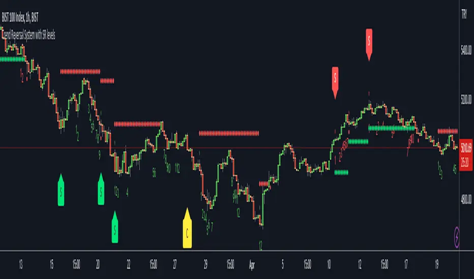
Trend Reversal System with SR levelsHello All,
This is the Trend Reversal System with Support/Resistance levels script. long time ago I published it as closed source but now I upgraded it and and published as open-source with a different name. I hope it would be useful for you all while trading/analyzing.
The script has some parts in it: Setup, Count, SR levels, Risk levels & Targets . Now lets check them:
Setup Part: it has two part, Buy or Sell Setup. one of them can be active only. Buy setup: if current close checks if current is lower/equal than the close of the 5. bar. if yes then the script increases number of buy setup. and if it reaches 9 then the script checks if current low is lower/equal than the lows of last 3. and 4. bars, or if the low of the last bar is lower/equal than the lows of last 3. and 4. bars. if yes then the script increases the buy setup by 1. if these conditions met then it puts the label 'S' , same for Sell setup. S labels on both setup are potential reversals.
Count Part: If buy or sell setup reaches the 9 then Count part starts from 1. lets see buy count: If current close is lower/equal than the low of the 3. bar and buy count is lower than 12 or low of the bar 13 is less than or equal to the close of bar 8 then buy count increase or it's completed. if it's completed then the script puts C label, and it's potential reversal. of course there are some conditions that can cancel the count buy/sell or recycle/restart.
By using Setup and Count levels the script can show Support/Resistance Levels, Risk levels & Targets. SR levels are potential reversal levels.
Lets see some example screenshots:
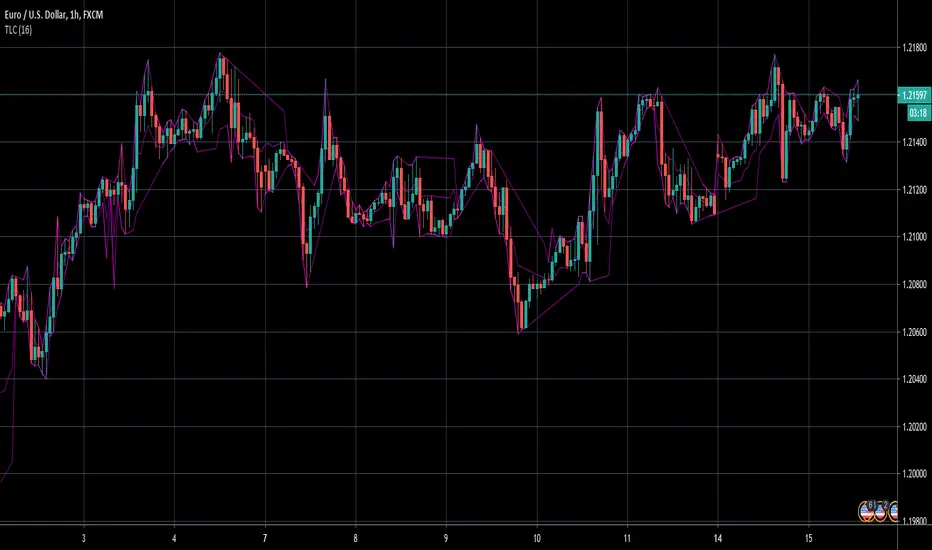
Support/Resistance levels:
Potential Reversal levels and how setup/counts are shown:
Count part can recycle and the script shows it as 'R' , ( you can see the conditions for Recycle in the script ):
Count can be cancelled and and it's shown as 'x'
If the scripts find 9 on Setup or 13 on Count then it checks if it's a good level to buy/sell and if it decides it's good level then it shows TRSSetup Buy/Sell or TRSCount Buy/Sell and also shows the target. in following example the script checks and decide it's a good level to take long position. it can be aggressive or conservative, Conservative is recommended.
Enjoy!
在脚本中搜索"trend"
Trend Counter [theEccentricTrader]█ OVERVIEW
This indicator counts the number of confirmed trend scenarios on any given candlestick chart and displays the statistics in a table, which can be repositioned and resized at the user's discretion.
█ CONCEPTS
Green and Red Candles
• A green candle is one that closes with a high price equal to or above the price it opened.
• A red candle is one that closes with a low price that is lower than the price it opened.
Swing Highs and Swing Lows
• A swing high is a green candle or series of consecutive green candles followed by a single red candle to complete the swing and form the peak.
• A swing low is a red candle or series of consecutive red candles followed by a single green candle to complete the swing and form the trough.
Peak and Trough Prices (Basic)
• The peak price of a complete swing high is the high price of either the red candle that completes the swing high or the high price of the preceding green candle, depending on which is higher.
• The trough price of a complete swing low is the low price of either the green candle that completes the swing low or the low price of the preceding red candle, depending on which is lower.
Upper Trends
• A return line uptrend is formed when the current peak price is higher than the preceding peak price.
• A downtrend is formed when the current peak price is lower than the preceding peak price.
• A double-top is formed when the current peak price is equal to the preceding peak price.
Lower Trends
• An uptrend is formed when the current trough price is higher than the preceding trough price.
• A return line downtrend is formed when the current trough price is lower than the preceding trough price.
• A double-bottom is formed when the current trough price is equal to the preceding trough price.
Muti-Part Upper and Lower Trends
• A multi-part return line uptrend begins with the formation of a new return line uptrend, or higher peak, and continues until a new downtrend, or lower peak, completes the trend.
• A multi-part downtrend begins with the formation of a new downtrend, or lower peak, and continues until a new return line uptrend, or higher peak, completes the trend.
• A multi-part uptrend begins with the formation of a new uptrend, or higher trough, and continues until a new return line downtrend, or lower trough, completes the trend.
• A multi-part return line downtrend begins with the formation of a new return line downtrend, or lower trough, and continues until a new uptrend, or higher trough, completes the trend.
█ FEATURES
Inputs
Start Date
End Date
Position
Text Size
Show Sample Period
Table
The table is colour coded, consists of seven columns and, as many as, forty-one rows. Blue cells denote the multi-part trend scenarios, green cells denote the corresponding return line uptrend and uptrend scenarios and red cells denote the corresponding downtrend and return line downtrend scenarios.
The trend scenarios are listed in the first column with their corresponding total counts to the right, in the second and fifth columns. The last row in column one, displays the sample period which can be adjusted or hidden via indicator settings.
The third and sixth columns display the trend scenarios as percentage of total 1-part trends. And columns four and seven display the total trend scenarios as percentages of the, last, or preceding trend part. For example 4-part trends as a percentages of 3-part trends. This offers more insight into what might happen next at any given point in time.
Plots
For a visual aid to this indicator please use in conjunction with my Return Line Uptrends, Downtrends, Uptrends and Return Line Downtrends indicators which can all be found on my profile page under scripts, or in community scripts under the same names. Unfortunately, I could not fit all the plots with the correct offsets into one script so I had to make a separate indicator for each trend type. I decided against labels as this would limit the visual data points to 500.
Green up-arrows, with the number of the trend part, denote return line uptrends and uptrends. Red down-arrows, with the number of the trend part, denote downtrends and return line downtrends.
█ HOW TO USE
This is intended for research purposes, strategy development and strategy optimisation. I hope it will be useful in helping to gain a better understanding of the underlying dynamics at play on any given market and timeframe.
It can, for example, give you an idea of whether the current trend will continue or fail, based on the current trend scenario and what has happened in the past under similar circumstances. Such information can be very useful when conducting top down analysis across multiple timeframes and making strategic decisions.
What you do with these statistics and how far you decide to take your research is entirely up to you, the possibilities are endless.
█ LIMITATIONS
Some higher timeframe candles on tickers with larger lookbacks such as the DXY , do not actually contain all the open, high, low and close (OHLC) data at the beginning of the chart. Instead, they use the close price for open, high and low prices. So, while we can determine whether the close price is higher or lower than the preceding close price, there is no way of knowing what actually happened intra-bar for these candles. And by default candles that close at the same price as the open price, will be counted as green. You can avoid this problem by utilising the sample period filter.
The green and red candle calculations are based solely on differences between open and close prices, as such I have made no attempt to account for green candles that gap lower and close below the close price of the preceding candle, or red candles that gap higher and close above the close price of the preceding candle. I can only recommend using 24-hour markets, if and where possible, as there are far fewer gaps and, generally, more data to work with. Alternatively, you can replace the scenarios with your own logic to account for the gap anomalies, if you are feeling up to the challenge.
It is also worth noting that the sample size will be limited to your Trading View subscription plan. Premium users get 20,000 candles worth of data, pro+ and pro users get 10,000, and basic users get 5,000. If upgrading is currently not an option, you can always keep a rolling tally of the statistics in an excel spreadsheet or something of the like.

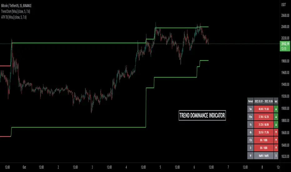
Trend Dominance Multi Timeframe [Misu]█ This indicator shows the repartition of bullish and bearish trends over a certain period in multiple timeframes. It's also showing the trending direction at the time.
█ Usages:
Trend dominance is expressed with two percentages: left is downtrend and right is uptrend. Cell colors turn green if dominance is up and red if it is down.
Knowing the trend dominance allows you to have a better overview of the market conditions.
You can use it to your advantage to favor long or short trades, reversal or breakout strategies, etc.
█ Features:
> Table colors
> Instant Trend Multitimeframe
> Trend Dominance Multitimeframe
█ Parameters:
> Length: Length is used to calculate ATR.
> Atr Multiplier: A factor used to balance the impact of the ATR on the Trend Bands calculation.
> UI Settings
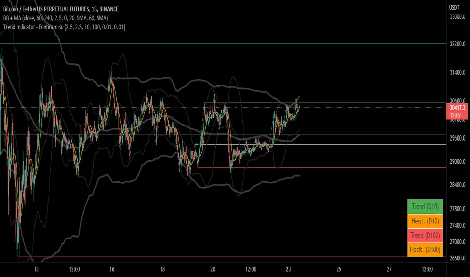
Trend Indicator (dow trending) - FontiramisuIndicator showing pivots and interpret a trend out of it.
Pivots are calculating with deviation parameter to validate with more precision.
Trending moves are calculated according to Dow Theory :
In an uptrend, if the price made a new high, the price must make a new high to confirm the trend, otherwise, it might signal a possible change in the trend.
In an uptrend, if the price made a new low, the price must make a new low to confirm the trend, otherwise, it might signal a possible change in the trend.
The indicator can show 2 trends with 2 different "Pivot Depth"
See indicator parameters.
Tab is display at the bottom right corner to show trend direction and if it is hesitating
Fontilab Library is used to code this indicator
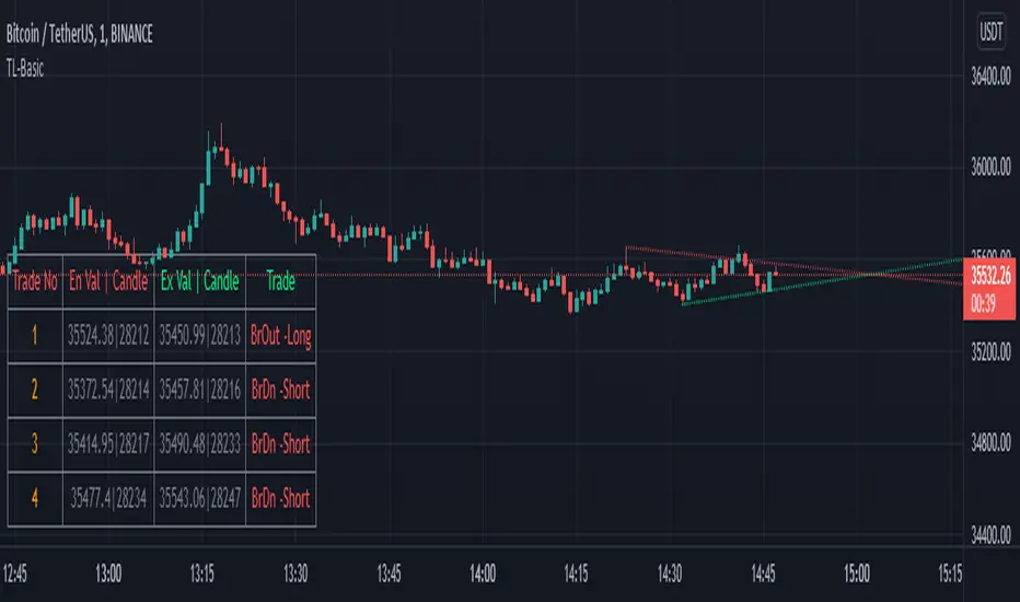
TrendLineScalping-BasicDear Traders,
Here is the thought which came to my mind on the trendline break scalping. sometimes during the trade we do plot trendlines and we do anticipate for the line to break and take a trade. with the same thing in mind I had created this basic script to help you and other to create based on the logic used in the script.
This is just a logic based script and doesn't do any kind of wonders. Hence you may use it as necessary.
Regards....
8X Trend ATR SAR Dingue V58X Trend ATR SAR Dingue V5 - This is the updated version for Pine Script 5.
8x indicator into 1 :
2x ATR indicator - 3x Trend indicator - 3x SAR indicator
Trends are helpful to spot reversal and support resistance, especially on bigger time frames.
This indicator gives you a global view of various trends all at once. You can easily turn them On or Off as to not clog the screen.
Each trend is also color-coded to visualize quickly the position of the price compared to it.
You can customize lengths, adjust line sizes, have the start of a new trend marked with a circle, fill in colors.
'Tool tips' explain other settings and if you have any questions, feel free to ask in the comments below.
Thank you for the feedback and check all my ‘Dingue’ indicators.

TrendLine ChannelsAbstract
This script provides a set of Trendline Channels which can be tighter than Donchian Channels.
This script computes the most suitable active upper and lower trendlines and updates them as soon as possible.
We can use it for breakout signals earlier than Donchian Channels.
Introduction
Channels are tools which can mark area of values of ranging markets.
Once the price leaves the original region, range traders may start admitting they are wrong and trigger trend.
Donchian Channels (misheard as Dungeon Channels) use the highest and the lowest price to define area of values.
When the price breakouts, it just like it got released from a dungeon.
However, waiting for the price making even higher or lower may be too late and risk reward ratio may be lower.
Trendlines can make the channels tighter and we can find earlier breakout signals.
Computing Trendline Channels
(1) Find the most active trendlines
In this script, a valid trendline connects two high values or two low values.
A high value means the highest value in a trading day.
A low value means the lowest value in a trading day.
In this script, every trendline does not crossover any bar but can exactly touch them.
The most flat trendline is taken. (one for upper and one for lower)
(2) Continue to use or Change a trendline
If there is a tighter trendline available, this script changes to use it.
If the previous active trendline is broken, this script re-computes the trendline available.
When this case happens, this script display with an another color.
Otherwise, this script continues using the previous trendline.
(3) Middle line
The middle line indicates the middle value between the upper and the lower.
Parameters
Length : how many days are used for computation. The default value is 16 just because 16=4*4, using binary characteristic.
x_go_on : If the previous trendline is not breakout and there are no tighter trendlines available, we continue use it.
Color Options
(1) Upper trendline (no update or tighter)
(2) Upper trendline (changed due to breakout)
(3) Middle line
(4) Lower trendline (no update or tighter)
(5) Lower trendline (changed due to breakout)
Conclusion
Trendline Channels can be tighter than Donchian Channels and evaluate earlier breakout signals.
Comparing to known auto trendline scripts, Trendline Channels is continuous.
Once a trendline is broken, Trendline Channels can instantly point out the next available one.
If you think the price movement is boring or you cannot have good risk reward ratio, you can go to an another timeframe.
Reference
How to trade with Donchian Channels
How to trade with Trendlines
SMA + Trend Strength + Trailing Stop LossThe 'SMA + Trend Strength + Trailing Stop Loss' indicator was designed for swing trading long positions over the course of days/weeks. The benefit of the indicator is to identify areas where the market of a given asset is showing signs of a strong uptrend, divergences, and fear. A 13-bar simple moving average is color coded to four colors based on 5 given conditions at a time, which are represented as a trend meter on the bottom right of the screen. A trailing stop loss indicator is included to secure your profits or limit your loss in case the market reverses on you unexpected. Please use this indicator responsibly with proper risk management, and never rely on the indicator by itself for buy and sell signals.
When the simple moving average color is green, it means that at least 4 of 5 conditions are confirming a move upwards, this is when you can take an entry into a trade based on your entry strategy. As the trend continues, the color will eventually change to yellow signaling a divergence. This is when you can use your exit strategy to find a good point to sell. It is wise not to take new positions when the color is trending yellow.
If the color changes from yellow to orange, that is a warning sign that the trend is about to change or has begun to change. Prices may have already fallen. However, sometimes the color will change from yellow back to green signaling a continuation of the trend. You can either keep holding or take a new position in this instance.
When the color is red, this signals fear in the market, you should stay out of the market at first. However, as the market consolidates and the color starts changing back to orange, this is an opportunity to take a long position at a reasonably low price.
Simple Moving Average (13-Bar) Color Explanation:
The colors change based on 5 market conditions represented in the trend meter.
Green: Strong Uptrend
Yellow: Divergence Present
Orange: Warning
Red: Fear
Trend Meter Explanation:
The trend meter draws 5 arrows indicating bullish or bearish presence.
LL = Lower Lows - Detects when the market is trending with lower lows.
HH = Higher Highs - Detects when the market is trending with higher highs.
MA = SMA Direction - A formula is used to determine the direction of the SMA.
DI = Directional Index - Identifies when upwards momentum is trending.
RSI = Relative Strength Index - Identifies when the RSI is in an uptrend state.
Note: For advanced users, this indicator has a hidden DMI(4, 4, 4) and RSI(14) indicator used to determine the last two conditions. The Directional Index is based on a DI Plus momentum moving average to determine a momentum trend and the RSI trending over 50 will constitute an uptrend signal as below 50 it will point down.
Trailing stop loss:
The trailing stop loss is determined based on the lowest price of the last 8 bars.
A gray step-line is drawn at the suggested stop activation price.
A red step-line is drawn at the suggested stop limit price.
When the price breaches the trailing stop, a red X will appear below the bar.
You can turn each of these features on or off based on your preference. Happy trading!

Trend Following with Moving AveragesHello Traders,
With the info "Trend is Your Friend ", you should not take position against the trend. This script checks multipte moving averages if they are above/below the closing price and try to find trend. The moving averages with the length 8, 13, 21, 34, 55, 89, 144, 233, 377 used. these are fibonacci numbers, but optionally you can change the lengths of each moving averages. while it's green you better take long positions, while it's red you better take short positions according to other indcators or tools.
Optionally you have "smoothing" option to get rid of whipsaws. it's enabled by default.
You have option to use following moving average types: EMA, SMA, RMA, WMA, VWMA. by default it's EMA
Also the script has "Resolution" option. with this option you can get the trend for other time frames, in following example 1h was set as for higher time frame on 15m chart:
This should not be used as buy/sell signal indicators as it's tries to find trend but not entry points, you should use other indicators (such RSI, Momentum) or other tools to find buy/sell signals.
Enjoy!

Trend Direction Force IndexThis is my own version of the famous Trend Direction Force Index and I modified the original to make my version react quickly to any trend. I have color coded the indicator to make it extremely easy to read so if it is green then buy and red then sell.
This was a custom request so if you would like more then just send me a message!
Trend Lines for RSI, CCI, Momentum, OBVHello Traders!
After publishing Trend Lines for RSI yesterday, I realized that Trend Lines for more indicators needed by the traders. so I decided to make it for four different indicators: RSI, CCI, OBV, Momentum
In the indicator options you can choose the indicator from pull-down menu.
How it works?
- On each bar it finds last 10 higher and lower Pivot Points (PP) for the indicator.
- from first bar to 10. Pivot Point it searchs if a trend line is possible
- for each PP it starts searching from the last PP .
- it checks if drawing a trend line possible or not and also it's broken or not
- if it's broken then optionally it shows broken trend lines as dotted (or you can option not to see broken lines)
- if it finds a continues trend line then it stops searhing more and draw trend line, this is done by checking angles (I did this to make the script faster, otherwise you may get error because of it needs time more than .2sec)
- the script makes this process for each PP
- then shows the trend lines
P.S. it may need 3-10 seconds when you added the script to the chart at first (because of calculations)
Trend lines for CCI:
Trend Lines for OBV
Trend Lines for Momentum:
You may want to watch how Trend Lines script works (that was made for RSI)
s3.tradingview.com
If you still didn't see Trend Lines v2 then visit:
All Comments are welcome..
Enjoy!
Trend Lines v2Hello Everyone. After working on new and better trend lines script for couple of weeks, finally I am proud to publish Trend Lines v2.
How it works?
- On each bar it finds last 10 higher and lower Pivot Points (PP).
- from first bar to 10. PP it search if a trend line is possible
- for each it starts searching from the last PP.
- it check if drawing a trend line possible or not and also it's broken or not
- if it's broken then optionally it shows broken trend lines as dotted
- if it finds a continues trend line and stop searhing more and draw trend line (I did this to make the script faster, otherwise you may get error because of it needs time more than .2sec)
- the script makes this process for each PP
optionally trend lines may be Solid or Dashed
optionally you may get rid of broken trend lines if you think it's crowded
and sometimes you may not see any trend line on the chart. this means you need to adjust the period for Pivot Points accordingly
also I made a video. if you watch this video you can see how the script works.
Important! after you add this tool to the chart you may need zoom-in and zoom-out to see all lines!
I thought a lot to make it free or not then I decided make it free and open source. you should know there is a lot of effort for this script, so if you think this is usefull please consider a donation ;)
Enjoy!

Trend LinesHello Everyone! This is my new trend lines script (after beta version that was published almost one year ago)
The idea is to find Pivot Highs (PH) and Pivot Lows(PL) first.
Then, If current PH is smaller then previous PH (means no new higher high and possible downtrend) then draw trend line using them. and also it checks previous trend line (if exits) and if current angle is smaller then don't extend previous one.
Same idea when using Pivot Lows, If current PL is higher then previous PL (means no new lower low and possible uptrend) then draw trend line using them. and also it checks previous trend line (if exits) and if current angle is smaller then don't extend previous one.
Optionally style of old trend lines drawn as dashed.
Hope you enjoy it!

Institutional Volume Trend [Structure Filter]Overview
The Institutional Volume Trend is a hybrid trend-following system designed to solve the single biggest problem in technical analysis: False Breakouts (Fakeouts).
Most trend indicators are purely price-reactive. If price moves up, they signal "Buy"—even if that move is driven by low liquidity and retail FOMO. This often leads to traders getting trapped in "chop" or weak reversals.
This script introduces a Volume-Verification Layer to market structure. It operates on a simple institutional premise: "Price advertises, Volume validates." A break of structure (BOS) is only considered a valid signal if it is backed by significant institutional volume.
Special thanks to the legendary Kıvanç Özbilgiç , whose extensive work on Supertrend and AlphaTrend concepts has paved the way for modern volatility-based trend systems. This script builds upon those foundational principles by adding a volume-weighted regime filter.
How It Works
This indicator combines two distinct engines to filter market noise:
Structure Engine (ATR Volatility):
It uses an ATR-based trailing stop mechanism (inspired by the classic Supertrend logic) to detect the underlying market structure. This creates the "Floor" (Support) and "Ceiling" (Resistance) of the current trend.
Institutional Volume Filter:
It calculates a relative volume average. If a trend change occurs without volume exceeding the average by a user-defined threshold (default 1.2x), the signal is flagged as Weak .
📖 Visual Guide: How to Interpret the Signs
This indicator communicates through Color and Labels . Here is exactly what each sign means:
1. The Ribbon Colors
🟢 Bright Green Ribbon: CONFIRMED BULLISH.
Meaning: The trend is Up AND Volume is supporting the move.
Action: Look for long entries or hold existing long positions.
🔴 Bright Red Ribbon: CONFIRMED BEARISH.
Meaning: The trend is Down AND Selling pressure is high.
Action: Look for short entries or hold existing short positions.
⚪ Gray / Dimmed Ribbon: WEAK / CHOP ZONE.
Meaning: The price has broken structure, BUT there is no volume to back it up. The market is undecided or resting.
Action: CAUTION. Do not open new trades. Wait for the color to turn Bright Green or Red.
2. The Labels
🏷️ "BOS + Vol" (Break of Structure + Volume):
Meaning: A high-probability signal. Price broke the trend line with a burst of volume.
Interpretation: This is your primary entry trigger.
🏷️ "Low Vol" (Small 'x' or Label):
Meaning: Price crossed the line, but volume was weak.
Interpretation: WARNING. This is likely a fakeout or a liquidity grab. Be very careful trusting this move.
3. The Trailing Line
The solid line running along the price is your Dynamic Stop Loss .
Bullish: As long as candles close above or touch (you choose) this line, the uptrend is valid.
Bearish: As long as candles close below or touch (you choose) this line, the downtrend is valid.
How to Use This Indicator
For Trend Following (Swing Trading)
Wait for the Flip: Look for the ribbon to flip from Red to Green (or vice versa).
Check the Validation: Ensure the ribbon is Bright Green/Red and not Gray. A "BOS + Vol" label is your confirmation.
Set the Stop: Use the plotted Trailing Structure Line as your dynamic Stop Loss.
For Scalping (1m - 15m Timeframes)
Filter the Noise: The most powerful feature for scalpers is the Gray Zone . If the market enters a low-volume drift (lunch hour or pre-market), the ribbon turns Gray. Avoid taking new entries during these periods to prevent "death by a thousand cuts."
Settings & Customization
Structure Lookback: Controls the sensitivity of the trend line. Higher numbers = fewer signals, longer trends.
Filter Low Volume (Chop): Toggle this ON to see the Gray zones. Toggle OFF if you want a standard trend view.
Volume Threshold: The multiplier required to validate a move.
1.2 (Default): Balanced.
1.5+ : Strict (Only catches massive breakouts).
1.0 : Loose (More signals, more noise).
Who Should Use This?
Breakout Traders: To distinguish between a true breakout and a "liquidity sweep."
Crypto Traders: To filter out the low-volume weekend chop.
Beginners: To learn the discipline of waiting for volume confirmation before entering a trade.
Open Source & Transparency
This script is open source to foster learning. The core logic utilizes a modified ATR trailing stop calculation combined with a boolean volume filter (volume > sma(volume) * mult). Traders are encouraged to inspect the code to understand exactly how their signals are generated.
⚠️ Disclaimer
Trading involves a high risk of losing money. This tool is designed for educational and analytical purposes only and does not constitute financial advice.
No indicator is 100% accurate. The "Volume Filter" reduces false signals but cannot eliminate them entirely.
Lag Warning: Like all trend-following tools, this indicator is reactive. It will perform best in trending markets and may produce losses in tight, sideways ranges (though the Gray filter helps mitigate this).
Risk Management: Always use a stop loss and proper position sizing. Never trade solely based on the color of a ribbon.

Impulse Trend Levels [BOSWaves]Impulse Trend Levels - Momentum-Adaptive Trend Detection with Impulse-Driven Confidence Bands
Overview
Impulse Trend Levels is a momentum-aware trend identification system that tracks directional price movement through adaptive confidence bands, where band width dynamically adjusts based on impulse strength and freshness to reflect real-time conviction in the current trend direction.
Instead of relying on fixed moving average crossovers or static band multipliers, trend state, band positioning, and zone thickness are determined through impulse detection patterns, exponential decay modeling, and volatility-normalized momentum measurement.
This creates dynamic trend boundaries that reflect actual momentum intensity rather than arbitrary technical levels - contracting during fresh impulse conditions when trend conviction is high, expanding during impulse decay periods when directional confidence weakens, and incorporating momentum freshness calculations to reveal whether trends are accelerating or deteriorating.
Price is therefore evaluated relative to bands that adapt to momentum state rather than conventional static thresholds.
Conceptual Framework
Impulse Trend Levels is founded on the principle that meaningful trend signals emerge when price momentum intensity reaches significant thresholds relative to recent volatility rather than when price simply crosses moving averages.
Traditional trend-following methods identify directional changes through price-indicator crossovers, which often ignore the underlying momentum dynamics and conviction levels that sustain those moves. This framework replaces static-threshold logic with impulse-driven band construction informed by actual momentum strength and decay characteristics.
Three core principles guide the design:
Trend direction should be determined by volatility-normalized momentum breaches, not simple price crossovers alone.
Band width must adapt to impulse freshness, reflecting real-time confidence in the current trend.
Momentum decay modeling reveals whether trends are maintaining strength or losing conviction.
This shifts trend analysis from static indicator levels into adaptive, momentum-anchored confidence boundaries.
Theoretical Foundation
The indicator combines exponential moving average smoothing, mean absolute deviation measurement, impulse detection methodology, and exponential decay tracking.
An EMA-based trend baseline provides directional reference, while Mean Absolute Deviation (MAD) offers volatility-normalized scaling for momentum measurement. Impulse detection identifies significant price movements relative to recent volatility, triggering fresh momentum readings that decay exponentially over time. Band multipliers interpolate between tight and wide settings based on calculated impulse freshness.
Four internal systems operate in tandem:
Trend Baseline Engine : Computes EMA-smoothed price levels for directional reference and band anchoring.
Volatility Measurement System : Calculates MAD to provide adaptive scaling that normalizes momentum across varying market conditions.
Impulse Detection Logic : Identifies volatility-normalized price movements exceeding threshold levels, capturing momentum intensity and direction.
Decay-Based Confidence Modeling : Applies exponential decay to impulse readings, converting raw momentum into time-weighted freshness metrics that drive band adaptation.
This design allows trend confidence to reflect actual momentum behavior rather than reacting mechanically to price formations.
How It Works
Impulse Trend Levels evaluates price through a sequence of momentum-aware processes:
Baseline Calculation : EMA smoothing of open and close creates a directional trend reference that filters short-term noise.
Volatility Normalization : MAD calculation over a specified lookback provides dynamic scaling for momentum measurement.
Raw Impulse Detection : Price change over impulse lookback divided by MAD creates volatility-normalized momentum readings.
Threshold-Based Activation : When normalized momentum exceeds threshold (1.0), impulse registers with absolute magnitude and directional sign.
Exponential Decay Application : Between impulse events, stored impulse value decays exponentially via configurable decay rate.
Freshness Conversion : Decaying impulse transforms into freshness metric (0-100%) representing current momentum conviction.
Adaptive Band Construction : Band multiplier interpolates between minimum (fresh) and maximum (stale) settings based on freshness, then scales MAD to determine band width.
Trend State Logic : Price crossing above upper band triggers bullish state; crossing below lower band triggers bearish state; state persists until opposite breach.
Signal Generation : Trend state switches from bearish to bullish produce buy signals; bullish to bearish switches produce sell signals.
Retest Identification : Price touching inner band edge after signal buffer period marks retests, with cooldown periods preventing excessive plotting.
Together, these elements form a continuously updating trend framework anchored in momentum reality.
Interpretation
Impulse Trend Levels should be interpreted as momentum-anchored trend confidence boundaries:
Bullish Trend State (Cyan) : Established when price closes above adaptive upper band, indicating upward momentum breach with associated confidence level.
Bearish Trend State (Magenta) : Established when price closes below adaptive lower band, signaling downward momentum breach with directional conviction.
Trend Cloud : Visual gradient zone displays between outer and inner band edges, with opacity reflecting current trend state and confidence.
Band Width Dynamics : Tighter bands indicate fresh impulse (high confidence), wider bands indicate impulse decay (reduced confidence).
▲ Buy Signals : Green upward triangles mark bullish trend state initiations at crossovers above upper band.
▼ Sell Signals : Red downward triangles mark bearish trend state initiations at crossovers below lower band.
✦ Retest Markers : Small diamonds identify price retouching inner band edge after sufficient buffer period from initial signal.
Retest Extension Lines : Horizontal projections from retest points extend forward, marking potential support/resistance levels.
Colored Candles : Optional bar coloring reflects current trend state for immediate visual reference. Note: The original chart candles must be disabled in chart settings for the trend-colored candles to display properly.
Impulse freshness, band width dynamics, and momentum normalization outweigh isolated price movements.
Signal Logic & Visual Cues
Impulse Trend Levels presents two primary interaction signals:
Buy Signal (▲) : Green label appears when trend state switches from bearish to bullish via upper band crossover, suggesting momentum shift to upside.
Sell Signal (▼) : Red label displays when trend state switches from bullish to bearish via lower band crossunder, indicating momentum shift to downside.
Retest detection provides secondary confirmation when price revisits inner band boundaries after signal buffer cooldown expires.
Alert generation covers trend state switches (long/short), retest occurrences, and impulse freshness decay below 50% threshold for systematic monitoring.
Strategy Integration
Impulse Trend Levels fits within momentum-informed and adaptive trend-following approaches:
Momentum-Confirmed Entries : Use band crossovers as high-probability trend initiation points where volatility-normalized momentum exceeded threshold.
Freshness-Based Position Sizing : Scale exposure based on impulse freshness - larger positions during fresh impulse periods, reduced sizing as impulse decays.
Band-Width Risk Management : Expect wider price ranges when bands expand during decay, tighter ranges when bands contract during fresh impulse.
Retest-Based Re-entry : Use inner band retests as lower-risk entry opportunities within established trends after initial signal cooldown.
Cloud-Aligned Directional Bias : Favor trades aligning with current trend state rather than counter-trend positions.
Multi-Timeframe Momentum Confirmation : Apply higher-timeframe impulse trend state to filter lower-timeframe entry precision.
Technical Implementation Details
Core Engine : EMA-based baseline with MAD volatility measurement
Impulse Model : Volatility-normalized momentum detection with directional sign capture
Decay System : Exponential decay application (0.8-0.99 range) with freshness conversion
Band Construction : Linear interpolation between min/max multipliers scaled by MAD
Visualization : Gradient-filled cloud zones with bar coloring and signal labels
Signal Logic : State-switch detection with retest buffer and cooldown mechanisms
Performance Profile : Optimized for real-time execution across all timeframes
Optimal Application Parameters
Timeframe Guidance:
1 - 5 min : Micro-trend detection for scalping with responsive impulse settings
15 - 60 min : Intraday momentum tracking with balanced decay characteristics
4H - Daily : Swing-level trend identification with sustained impulse persistence
Suggested Baseline Configuration:
Trend Length : 19
Impulse Lookback : 5
Decay Rate : 0.99
MAD Length : 20
Band Min (Fresh) : 1.5
Band Max (Stale) : 1.9
Signal Buffer Period : 10
Show Trend Cloud : Enabled
Color Bars : Enabled (requires disabling original chart candles in chart settings)
Show Buy/Sell Signals : Enabled
These suggested parameters should be used as a baseline; their effectiveness depends on the asset's volatility profile, momentum characteristics, and preferred signal frequency, so fine-tuning is expected for optimal performance.
Parameter Calibration Notes
Use the following adjustments to refine behavior without altering the core logic:
Excessive signal noise : Increase Trend Length to demand smoother baseline crossovers or increase Impulse Lookback for less reactive momentum detection.
Missed momentum shifts : Decrease Impulse Lookback to capture shorter-term momentum changes or reduce Decay Rate to allow faster impulse fade.
Bands too tight/wide : Adjust Band Min and Band Max multipliers to modify confidence zone thickness across freshness spectrum.
Impulse decays too quickly : Increase Decay Rate toward 0.99 to sustain impulse readings longer between fresh events.
Impulse decays too slowly : Decrease Decay Rate toward 0.8 for faster momentum fade and more frequent band expansion.
Unstable volatility scaling : Increase MAD Length to smooth volatility measurement and reduce sensitivity to short-term spikes.
Too many retest markers : Increase retest cooldown period (55 bars hardcoded) or increase Signal Buffer Period to space out signals.
Adjustments should be incremental and evaluated across multiple session types rather than isolated market conditions.
Performance Characteristics
High Effectiveness:
Trending markets with clear momentum phases and directional persistence
Instruments with consistent volatility characteristics where MAD scaling normalizes effectively
Momentum continuation strategies entering on fresh impulse signals
Trend-following approaches benefiting from adaptive confidence measurement
Reduced Effectiveness:
Choppy, range-bound markets with frequent whipsaw crossovers
Extremely low volatility environments where impulse threshold becomes difficult to breach
News-driven or gapped markets with discontinuous momentum patterns
Mean-reversion dominant conditions where momentum breaches quickly reverse
Consolidation and sideways price action where trend-following methodologies inherently struggle due to lack of sustained directional movement
Integration Guidelines
Confluence : Combine with BOSWaves structure, volume analysis, or traditional trend indicators
Freshness Respect : Trust signals occurring during high impulse freshness periods with contracted bands
Decay Awareness : Reduce position sizing or tighten stops as impulse decays and bands widen
Retest Utilization : Treat inner band retests as continuation confirmation rather than reversal signals
State Discipline : Maintain directional bias aligned with current trend state until opposite band breach occurs
Disclaimer
Impulse Trend Levels is a professional-grade momentum and trend analysis tool. It uses volatility-normalized impulse detection with exponential decay modeling but does not predict future price movements. Results depend on market conditions, volatility characteristics, parameter selection, and disciplined execution. BOSWaves recommends deploying this indicator within a broader analytical framework that incorporates price structure, volume context, and comprehensive risk management.

Axis-Pro System | Trend Structure + Fibonacci Pullbacks Axis-Pro System is a comprehensive Trend Following strategy designed to trade high-probability pullbacks. Unlike indicators that merely chase price, this system patiently waits for market structure alignment before seeking an entry.
The system is built on the premise of "Quality over Quantity", utilizing volatility and structure filters to avoid choppy markets (ranges) and false breakouts.
🧠 Strategy Logic
The system makes decisions based on a strict 4-step hierarchy:
Higher Timeframe (HTF) Bias:
Analyzes the trend on a higher timeframe to ensure we are trading in the direction of the dominant flow.
Structure & BOS (Break of Structure):
Identifies clear impulses that break previous highs or lows. Once a BOS is confirmed, the system "arms" the trade and waits.
Fibonacci Zone Pullback:
It does not chase the breakout. Instead, it waits for a pullback into the "Discount Zone" (Golden Zone, configurable between 0.382 and 0.618) to improve the Risk/Reward ratio.
Validation & Trigger:
Uses an ATR expansion check to filter out low-volatility periods.
Requires candle confirmation and alignment with fast EMAs before pulling the trigger.
🛡️ Risk Management
The system incorporates advanced position management using a split execution model (50/50):
Dynamic Stop Loss: Automatically calculated using an ATR multiplier or the recent Swing High/Low (whichever offers better protection).
TP1 (Take Profit 1): Closes 50% of the position at a fixed R-multiple (e.g., 1.5R) to lock in profit and moves the Stop Loss to Break-Even.
TP2 (Runner): The remaining 50% is left to run for higher targets (e.g., 3.0R) or until the trend bends, maximizing gains during strong moves.
Trailing Stop: Optional feature to trail price with a fast EMA once the first target is hit.
⚙️ Settings & Features
The script is highly customizable for different assets (Crypto, Forex, Indices):
Date Range Filter: Includes a date selector to perform precise Backtesting on specific periods (e.g., testing specifically during a Bear Market vs. Bull Market).
Auto Trendlines: Automatically draws relevant trendlines for visual support.
Quality Filters: Options to toggle the EMA 200 filter and breakout buffers.
⚠️ Disclaimer
This strategy is a tool for analysis and backtesting purposes. Past performance does not guarantee future results. It is highly recommended to test the strategy on a Demo account first and adjust parameters according to the volatility of the specific asset being traded. Always use responsible risk management.

Kalman Hull Trend Score [BackQuant]Kalman Hull Trend Score
Overview
Kalman Hull Trend Score is a trend-strength and regime-evaluation indicator that combines two ideas, Kalman filtering and Hull-style smoothing, then measures persistence of that filtered trend using a rolling score. The goal is to produce a cleaner, more stable trend read than typical moving average tools, while still reacting fast enough to be practical in live markets.
Instead of treating a moving average as a simple line you cross, this indicator turns the filtered trend into an oscillator-like score that answers: “Is the smoothed trend consistently progressing, or is it stalling and degrading?”
Core idea
The indicator is built from two components:
A Kalman-based smoothing engine that estimates price state and reduces noise adaptively.
A Hull-style construction that uses multiple Kalman passes to create a responsive, low-lag trend filter.
Once the Kalman Hull filter is built, a persistence score is calculated by comparing the current Kalman Hull value to many past values. The result is a trend score that rises in sustained trends and compresses or flips during deterioration.
Why Kalman instead of standard smoothing
Traditional moving averages apply fixed smoothing rules regardless of market conditions. A Kalman filter behaves differently, it is designed to estimate an underlying state in noisy data, adjusting how much it “trusts” new price information versus prior estimates.
This script exposes that behavior through two key controls:
Measurement Noise: how noisy the observed price is assumed to be.
Process Noise: how much the underlying state is allowed to evolve from bar to bar.
Together, these settings let you tune the balance between smoothness and responsiveness without relying on blunt averaging alone.
Kalman filter mechanics (conceptual)
Each update cycle follows the classic structure:
Prediction: assume the state continues, and expand uncertainty by process noise.
Update: compute Kalman Gain, then blend the new price observation into the estimate.
Correction: reduce uncertainty based on how much the filter accepted the new information.
When measurement noise is higher, the filter becomes more conservative, smoothing harder. When process noise is higher, the filter adapts faster to regime changes, but can become more reactive.
Check out the original script:
Kalman Hull construction
The “Hull” component is not a standard HMA built from WMAs. Instead, it recreates the Hull idea using Kalman filtering as the smoothing primitive. The structure follows the same intent as HMA, reduce lag while keeping the line smooth, but does it with Kalman passes:
Apply Kalman smoothing over multiple effective lengths.
Combine them using the Hull-style weighting logic.
Run the combined output through another Kalman pass to finalize smoothing.
The result is a Kalman Hull filter that aims to track trend with less jitter than raw price, and less lag than slow averages.
Another Kalman Hull with Supertrend
Trend scoring logic
The trend score is computed by comparing the current Kalman Hull value to past Kalman Hull values over a fixed lookback range (1 to 45 bars in this script):
If current kalmanHMA > kalmanHMA , add +1
If current kalmanHMA < kalmanHMA , add -1
This produces a persistence score rather than a simple direction signal. Strong trends where the filter keeps advancing will accumulate positive comparisons. Weak trends, chop, or reversals will cause the score to flatten, decay, or flip negative.
Interpreting the score
Read the score as trend conviction and persistence:
High positive values: bullish persistence, the filtered trend is progressing consistently.
Low positive values: trend exists but is fragile, progress is slowing.
Near zero: indecision, range behavior, frequent challenges to structure.
Negative values: bearish persistence or sustained deterioration in the filtered trend.
The rate of change matters:
Score expansion suggests trend is gaining traction.
Score compression often signals consolidation or exhaustion.
Fast flips usually accompany regime transitions.
Signal thresholds and regime transitions
User-defined thresholds convert the score into regimes:
Long threshold: score must exceed this level to confirm bullish persistence.
Short threshold: a crossunder of the score triggers bearish regime transition.
This is intentionally conservative. Long bias is maintained while the score holds above the long threshold. Short transitions are event-triggered on breakdown via crossunder, helping avoid constant flipping during minor noise.
Signals are only plotted on regime changes (first bar of the flip), keeping them clean for alerts and backtests.
Visual presentation
The indicator provides multiple layers depending on how you want to use it:
Kalman Hull Trend Score oscillator, color-coded by active regime.
Optional Kalman Hull filter plotted on the price chart for structure context.
Optional threshold reference lines for quick regime mapping.
Optional candle coloring and background shading for instant readability.
You can run it as a pure score panel or as a combined panel + on-chart trend overlay.
How to use in practice
Trend filtering
Favor long setups when the score remains above the long threshold.
Reduce directional aggression when score compresses toward zero.
Treat a short-threshold breakdown as a regime risk event, not just a signal.
Trend quality assessment
Rising score supports continuation trades and adds confidence to breakouts.
Flat or falling score warns that trend persistence is fading.
If price trends but score fails to expand, trend may be weak or liquidity-driven.
Trade management
Use the Kalman Hull line as dynamic structure reference on chart.
Use score deterioration to scale out before a full regime flip.
Use regime flips as confirmation for bias shifts rather than prediction.
Tuning guidelines
Measurement Noise
Higher: smoother filter, fewer false shifts, slower to adapt.
Lower: more responsive, more sensitive to microstructure noise.
Process Noise
Higher: adapts quicker to sudden changes, but can become twitchy.
Lower: steadier state estimate, but slower during sharp regime transitions.
A practical approach is to first tune measurement noise until the Kalman Hull line matches the “clean trend structure” you want, then adjust process noise to control how quickly it reacts when the regime genuinely changes.
Summary
Kalman Hull Trend Score transforms a Kalman-based Hull-style trend filter into a quantified persistence oscillator. By combining adaptive Kalman smoothing with low-lag Hull logic and a rolling comparison score, it provides a cleaner read on trend quality than basic moving averages or single-condition trend tools. It is best used as a regime filter, trend strength gauge, and structure-aware trade management layer.

Trend Cloud with Buy/Sell Text [wjdtks255]Indicator Title: Trend Cloud with Buy/Sell Signal Pro
Short Description
A high-probability trend-following indicator based on Supertrend dynamics, enhanced with a Volume Filter to pinpoint explosive entries while minimizing false breakouts.
Detailed Description (Overview)
The Trend Cloud with Buy/Sell Text is designed for traders who prioritize clarity and momentum. It visualizes market trends through a "Trend Cloud" system and generates real-time BUY/SELL signals only when price action is backed by significant trading volume.
Key Technical Pillars
Dynamic Trend Cloud: Fills the area between the price and the Supertrend line, providing immediate visual feedback on trend strength and potential support/resistance zones.
Smart Volume Filter: A unique logic that compares current volume against a 20-period moving average. Labels only appear when a trend shift occurs with above-average volume, filtering out weak "fakeouts."
No-Repaint Labels: Signals are calculated and fixed at the close of the candle, ensuring that the BUY/SELL text remains permanent for reliable historical backtesting and live execution.
The Alpha Hunter Strategy (How to Trade)
1. Long Entry (Buy)
Condition: The cloud turns Aqua and a "BUY" label appears below the candle.
Confirmation: Ensure the price remains above the Aqua Trend Line.
Volume Check: The indicator automatically verifies if the volume is higher than the 20-period average before displaying the label.
Exit: Exit when a "SELL" signal appears or the price closes below the Aqua line.
2. Short Entry (Sell)
Condition: The cloud turns Red and a "SELL" label appears above the candle.
Confirmation: Price should stay below the Red Trend Line.
Exit: Exit when a "BUY" signal appears or the price closes above the Red line.
Input Parameters & Optimization
ATR Period (Default: 10): Determines the sensitivity to price volatility.
ATR Factor (Default: 3.0): Controls the distance of the trend line. Increase to 3.5 - 4.0 to reduce noise in choppy markets.
Volume Filter (Toggle): When enabled, only high-momentum signals are shown.
Recommended Usage
Best Timeframes: 15m, 1h, 4h.
Asset Classes: Highly effective for Crypto (BTC/ETH) and high-volume stocks.

Volume-Adjusted CCI Trend [Alpha Extract]A sophisticated trend identification system that combines dual EMA direction analysis with volume-weighted normalization and CCI momentum filtering for comprehensive trend validation. Utilizing Volume RSI integration and standard deviation-based bands that expand and contract with volume characteristics, this indicator delivers institutional-grade trend detection with multi-layered confirmation requirements. The system's volume adjustment mechanism modulates signal sensitivity based on participation strength while CCI thresholds prevent false signals during weak momentum conditions, creating a robust trend-following framework with reduced whipsaw susceptibility.
🔶 Advanced Dual EMA Direction Engine
Implements fast and slow exponential moving average comparison to establish primary trend direction bias with configurable period parameters for timeframe optimization. The system calculates trend direction as binary +1 (bullish when fast EMA exceeds slow EMA) or -1 (bearish when slow exceeds fast), providing foundational directional input that requires additional confirmation before generating actionable trend states.
🔶 Volume-Adjusted Normalization Framework
Features sophisticated normalization calculation that measures price deviation from basis EMA, scales by standard deviation, then applies volume-weighted adjustment factor for participation-sensitive signal generation. The system calculates Volume RSI to quantify relative volume strength, converts to ratio format, and multiplies normalized deviation by volume factor scaled by impact parameter, creating signals that strengthen during high-volume confirmations and weaken during low-volume moves.
// Volume-Adjusted Normalization
Vol_Ratio = Volume_RSI / 50
Vol_Factor = 1 + (Vol_Ratio - 1) * Vol_Impact
Dev = src - Basis_EMA
Raw_Normalized = Dev / (StdDev * Multiplier)
Vol_Adjusted_Norm = Raw_Normalized * Vol_Factor
🔶 CCI Momentum Filter Integration
Implements Commodity Channel Index threshold system with configurable upper and lower bounds to validate trend strength and filter sideways market conditions. The system calculates standard CCI with adjustable length, compares against asymmetric thresholds (default +100 bullish, -50 bearish), and requires CCI confirmation in addition to EMA direction and normalized deviation before transitioning trend states, ensuring only high-conviction signals generate entries.
🔶 Multi-Layer Trend State Logic
Provides intelligent trend state machine requiring simultaneous confirmation from EMA direction, volume-adjusted normalization threshold breach, and optional CCI momentum validation. The system maintains persistent trend state that only transitions when all three conditions align, preventing premature reversals during temporary retracements or low-volume fluctuations while capturing genuine trend changes with institutional-grade confirmation requirements.
🔶 Dynamic Volume Band Architecture
Creates volatility-adjusted bands around basis EMA using standard deviation multiplied by volume factor, producing channels that widen during high-volume periods and contract during low-volume consolidations. The system applies identical volume adjustment to band calculations as normalization metric, ensuring visual envelope consistency with underlying signal logic and providing intuitive reference boundaries for trend-following price action.
🔶 Gradient Strength Visualization System
Implements color intensity modulation based on normalized signal strength relative to threshold requirements, creating visual feedback that communicates trend conviction. The system calculates strength ratio by dividing absolute normalized value by threshold, caps at 1.0, and applies gradient interpolation from muted to vivid colors, instantly conveying whether current trend exhibits marginal or strong characteristics through line and candle coloring.
🔶 Volume RSI Calculation Engine
Utilizes RSI methodology applied to volume series rather than price to quantify relative participation strength with normalization to 0.5-1.5 range for factor multiplication. The system processes volume through standard RSI calculation, divides by 50 to center around 1.0, and produces ratio values where readings above 1.0 indicate above-average volume and below 1.0 suggest below-average participation for signal adjustment purposes.
🔶 Asymmetric Threshold Configuration
Features separate positive and negative normalization thresholds with independent CCI upper and lower bounds enabling optimization for bullish versus bearish signal generation characteristics. The system defaults to symmetric normalized thresholds (±0.2) but asymmetric CCI levels (+100/-50), recognizing that bullish momentum often requires stronger confirmation than bearish reversals in typical market structures.
🔶 Comprehensive Visual Integration
Provides multi-dimensional trend visualization through color-coded basis line, volume-adjusted bands with gradient fills, trend-synchronized candle coloring, and transition signal labels. The system enables selective display toggling for each visual component while maintaining consistent color scheme and strength-based intensity across all elements for cohesive chart presentation without overwhelming information density.
🔶 Alert and Signal Framework
Generates trend change alerts when state transitions occur with all confirmation requirements satisfied, providing notifications for bullish (transition to +1) and bearish (transition to -1) signals. The system implements state change detection through comparison with previous bar trend state, ensuring single alert per transition rather than continuous notifications during sustained trends.
🔶 Performance Optimization Architecture
Employs efficient calculation methods with null value handling for Volume RSI initialization and nz() functions preventing calculation errors during early bars. The system includes intelligent state persistence maintaining previous trend during ambiguous conditions and optimized gradient calculations balancing visual quality with computational efficiency across extended historical periods.
🔶 Why Choose Volume-Adjusted CCI Trend ?
This indicator delivers sophisticated trend identification through multi-layered confirmation combining directional EMA analysis, volume-weighted normalization, and momentum validation via CCI filtering. Unlike traditional trend indicators relying solely on price-based calculations, the volume adjustment mechanism ensures signals strengthen during high-participation moves and weaken during low-volume drifts, reducing false breakouts and choppy market whipsaws. The system's requirement for simultaneous EMA direction, normalized threshold breach, and CCI momentum confirmation creates institutional-grade signal quality suitable for systematic trend-following approaches across cryptocurrency, forex, and equity markets. The volume-adjusted bands provide dynamic support/resistance references while the gradient strength visualization enables instant assessment of trend conviction for position sizing and risk management decisions.

Vortex Trend Matrix [JOAT]Vortex Trend Matrix - Multi-Factor Trend Confluence System
Introduction and Purpose
Vortex Trend Matrix is an open-source overlay indicator that combines Ichimoku-style equilibrium analysis with the Vortex Indicator to create a comprehensive trend confluence system. The core problem this indicator solves is that single trend indicators often give conflicting signals. Price might be above a moving average but momentum might be weakening.
This indicator addresses that by combining five different trend factors into a single composite score, making it easy to identify when multiple factors align for high-probability trend trades.
Why These Components Work Together
Each component measures trend from a different perspective:
1. Cloud Position - Price above/below the equilibrium cloud indicates overall trend bias. The cloud acts as dynamic support/resistance.
2. TK Relationship - Conversion line vs Base line (like Tenkan/Kijun in Ichimoku). Conversion above Base = bullish momentum.
3. Lagging Span - Current price compared to price N bars ago. Confirms whether current move has follow-through.
4. Vortex Indicator - VI+ vs VI- measures directional movement strength. Provides momentum confirmation.
5. Base Direction - Whether the base line is rising or falling. Indicates medium-term trend direction.
How the Trend Score Works
float trendScore = 0.0
// Cloud position (+2/-2)
trendScore += aboveCloud ? 2.0 : belowCloud ? -2.0 : 0.0
// TK relationship (+1/-1)
trendScore += conversionLine > baseLine ? 1.0 : conversionLine < baseLine ? -1.0 : 0.0
// Lagging span (+1/-1)
trendScore += laggingBull ? 1.0 : laggingBear ? -1.0 : 0.0
// Vortex (+1.5/-1.5)
trendScore += vortexBull ? 1.5 : vortexBear ? -1.5 : 0.0
// Base direction (+0.5/-0.5)
trendScore += baseDirection * 0.5
Score ranges from approximately -6 to +6:
- +4 or higher = STRONG BULL
- +2 to +4 = BULL
- -2 to +2 = NEUTRAL
- -4 to -2 = BEAR
- -4 or lower = STRONG BEAR
Signal Types
TK Cross Up/Down - Conversion line crosses Base line (momentum shift)
Base Direction Change - Base line changes direction (medium-term shift)
Strong Bull/Bear Trend - Score reaches +4/-4 (high confluence)
Dashboard Information
Trend - Overall status with composite score
Cloud - Price position (ABOVE/BELOW/INSIDE)
TK Cross - Conversion vs Base relationship
Lagging - Lagging span bias
Vortex - VI+/VI- relationship
VI+/VI- - Individual vortex values
How to Use This Indicator
For Trend Following:
1. Enter long when trend score reaches +4 or higher (STRONG BULL)
2. Enter short when trend score reaches -4 or lower (STRONG BEAR)
3. Use cloud as dynamic support/resistance for entries
For Momentum Timing:
1. Watch for TK Cross signals for entry timing
2. Base direction changes indicate medium-term shifts
3. Vortex confirmation adds conviction
For Risk Management:
1. Exit when trend score drops to neutral
2. Use cloud edges as stop-loss references
3. Reduce position when score weakens
Input Parameters
Conversion Period (9) - Fast equilibrium line
Base Period (26) - Slow equilibrium line
Lead Span Period (52) - Cloud projection period
Displacement (26) - Cloud and lagging span offset
Vortex Period (14) - Period for vortex calculation
VI+ Strength (1.10) - Threshold for strong bullish vortex
VI- Strength (0.90) - Threshold for strong bearish vortex
Timeframe Recommendations
4H-Daily: Best for equilibrium-based analysis
1H: Good for intraday trend following
Lower timeframes may require adjusted periods
Limitations
Equilibrium calculations have inherent lag
Cloud displacement means signals are delayed
Works best in trending markets
May whipsaw in ranging conditions
Open-Source and Disclaimer
This script is published as open-source under the Mozilla Public License 2.0 for educational purposes.
This indicator does not constitute financial advice. Trend analysis does not guarantee profitable trades. Always use proper risk management.
- Made with passion by officialjackofalltrades

Apex Trend & Liquidity Master V2.1The Apex Trend & Liquidity Master is a hybrid trading system designed to align traders with the dominant market trend while identifying key structural price levels. Unlike simple moving average crossovers or standalone support/resistance tools, this script integrates a volatility-adaptive "Trend Cloud" with a "Smart Liquidity" engine.
This integration allows the script to offer unique filtering capabilities, such as hiding counter-trend liquidity zones to reduce chart noise and focus on high-probability continuations.
How It Works
Adaptive Trend Cloud The backbone of the system is the Trend Cloud, calculated using a Hull Moving Average (HMA) base with ATR bands. The cloud expands and contracts based on market volatility.
Green Cloud: Bullish Regime. The market is trending up; look for long opportunities.
Red Cloud: Bearish Regime. The market is trending down; look for short opportunities.
Smart Liquidity Zones (with Integration) The script automatically detects Pivot Highs and Lows to draw Supply (Resistance) and Demand (Support) zones. These zones persist until price breaks through them (mitigation).
Integration Feature: A "Filter Zones by Trend" option is included in the settings. When enabled, this feature connects the Trend Cloud to the Liquidity Engine:
It will only display Demand zones when the Trend Cloud is Bullish.
It will only display Supply zones when the Trend Cloud is Bearish.
Note on Lag: Zones are based on pivots (default lookback: 10). A zone appears on the chart 10 bars after the pivot forms. These are historical structural levels.
Signal Filters Buy and Sell labels are generated when the Trend Cloud changes color, but they are filtered to ensure quality:
Volume Filter: Signals only appear if the current volume is higher than the 20-period average.
RSI Filter: Prevents buying when RSI is overbought (>70) or selling when oversold (<30).
Live HUD An on-chart dashboard provides real-time data on:
Trend Bias: Direction of the cloud.
Momentum: RSI strength (Weak/Neutral/Strong).
Volume: High vs. Low activity.
Usage Guide
Identify the Trend: Use the background fill color to determine if you should be looking for longs (Green) or shorts (Red).
Wait for Structure: Look for price to pull back into a "Smart Liquidity" zone. For example, in a Green Trend, wait for price to touch a Green Demand box.
Confirm with Momentum: Check the Dashboard. Ideally, you want to see "Strong" momentum aligning with your trade direction.
Settings: If the chart is too cluttered, enable "Filter Zones by Trend" in the settings menu to hide counter-trend boxes.
Credits & Attribution This script combines original integration logic with adapted open-source concepts:
Smart Liquidity Logic: The method for generating Supply/Demand boxes via Pivot Highs/Lows and array management is adapted from open-source logic commonly used in Smart Money Concepts (SMC) indicators, notably popularized by LuxAlgo and the broader Pine community.
Trend Logic: The volatility cloud utilizes standard Hull Moving Average (HMA) and ATR formulas.
Disclaimer This indicator is provided for educational and informational purposes only. It does not constitute financial advice. Past performance of pivot levels or trend signals does not guarantee future results.

Hybrid Strategy: Trend/ORB/MTFHybrid Strategy: Trend + ORB + Multi-Timeframe Matrix
This script is a comprehensive "Trading Manager" designed to filter out noise and identify high-probability breakout setups. It combines three powerful concepts into a single, clean chart interface: Trend Alignment, Opening Range Breakout (ORB), and Multi-Timeframe (MTF) Analysis.
It is designed to prevent "analysis paralysis" by providing a unified Dashboard that confirms if the trend is aligned across 5 different timeframes before you take a trade.
How it Works
The strategy relies on the "Golden Trio" of confluence:
1. Trend Definition (The Setup) Before looking for entries, the script analyzes the immediate trend. A bullish trend is defined as:
Price is above the Session VWAP.
The fast EMA (9) is above the slow EMA (21). (The inverse applies for bearish trends).
2. The Signal (The Trigger) The script draws the Opening Range (default: first 15 minutes of the session).
Buy Signal: Price breaks above the Opening Range High while the Trend is Bullish.
Sell Signal: Price breaks below the Opening Range Low while the Trend is Bearish.
3. The Confirmation (The Filter) A signal is only valid if the Higher Timeframe (default: 60m) agrees with the direction. If the 1m chart says "Buy" but the 60m chart is bearish, the signal is filtered out to prevent false breakouts.
Key Features
The Matrix Dashboard A zero-lag, real-time table in the corner of your screen that monitors 5 user-defined timeframes (e.g., 5m, 15m, 30m, 60m, 4H).
Trend: Checks if Price > EMA 21.
VWAP: Checks if Price > VWAP.
ORB: Checks if Price is currently above/below the Opening Range of that session.
D H/L: Warns if price is near the Daily High or Low.
PD H/L: Warns if price is near the Previous Daily High or Low.
Visual Order Blocks The script automatically identifies valid Order Blocks (sequences of consecutive candles followed by a strong explosive move).
Chart: Draws Green/Red zones extending to the right, showing where price may react.
Dashboard: Displays the exact High, Low, and Average price of the most recent Order Blocks for precision planning.
Risk Management (Trailing Stop) Once a trade is active, the script plots Chandelier Exit dots (ATR-based trailing stop) to help you manage the trade and lock in profits during trend runs.
Visual Guide (Chart Legend)
⬜ Gray Box: Represents the Opening Range (first 15 minutes). This is your "No Trade Zone." Wait for price to break out of this box.
🟢 Green Line: The Opening Range High. A break above this line signals potential Bullish momentum.
🔴 Red Line: The Opening Range Low. A break below this line signals potential Bearish momentum.
🟢 Green / 🔴 Red Zones (Boxes): These are Order Blocks.
🟢 Green Zone: A Bullish Order Block (Demand). Expect price to potentially bounce up from here.
🔴 Red Zone: A Bearish Order Block (Supply). Expect price to potentially reject down from here.
⚪ Dots (Trailing Stop):
🟢 Green Dots: These appear below price during a Bullish trend. They represent your suggested Stop Loss.
🔴 Red Dots: These appear above price during a Bearish trend.
🏷️ Buy / Sell Labels:
BUY: Triggers when Price breaks the Green Line + Trend is Bullish + HTF is Bullish.
SELL: Triggers when Price breaks the Red Line + Trend is Bearish + HTF is Bearish.
Settings
Session: Customizable RTH (Regular Trading Hours) to filter out pre-market noise.
Matrix Timeframes: 5 fixed slots to choose which timeframes you want to monitor.
Order Blocks: Adjust the sensitivity and lookback period for Order Block detection.
Risk: Customize the ATR multiplier for the trailing stop.
Disclaimer
This tool is for educational purposes only. Past performance does not guarantee future results. Always manage your risk properly.

Trendlines & SR ZonesIt's a comprehensive indicator (Pine Script v6) that represents two powerful technical analysis tools: automatic trendline detection based on pivot points and volume delta analysis with support/resistance zone identification. This overlay indicator helps traders identify potential trend directions and key price levels where significant buying or selling pressure has occurred.
Features: =
1. Price Trendlines
The indicator automatically identifies and draws trendlines based on pivot points, creating dynamic support and resistance levels.
Key Components:
Pivot Detection: Uses configurable left and right bars to identify significant pivot highs and lows
Trendline Filtering: Only draws downward-sloping resistance trendlines and upward-sloping support trendlines
Zone Creation: Creates filled zones around trendlines based on average price volatility
Automatic Management: Maintains only the 3 most recent significant trendlines to avoid chart clutter
Customization Options:
Left/Right Bars for Pivot: Adjust sensitivity of pivot detection (default: 10 bars each side)
Extension Length: Control how far trendlines extend past the second pivot (default: 50 bars)
Average Body Periods: Set the lookback period for volatility calculation (default: 100)
Tolerance Multiplier: Adjust the width of the trendline zones (default: 1.0)
Color Customization: Separate colors for high (resistance) and low (support) trendlines and their fills
2. Volume Delta % Bars
The indicator analyzes volume distribution across price levels to identify significant supply and demand zones.
Key Components:
Volume Profile Analysis: Divides the price range into rows and calculates volume delta at each level
Delta Visualization: Displays horizontal bars showing the percentage difference between buying and selling volume
Zone Identification: Automatically identifies the most significant supply and demand zones
Visual Integration: Connects volume delta bars with corresponding support/resistance zones on the price chart
Customization Options:
Lookback Period: Set the number of bars to analyze for volume (default: 200)
Price Rows: Control the granularity of the volume analysis (default: 50 rows)
Delta Sections: Adjust the number of horizontal delta bars displayed (default: 20)
Panel Appearance: Customize width, position, and direction of the delta panel
Zone Settings: Control the number of supply/demand zones and their extension (default: 3 zones)
How It Works-
Trendline Logic:
The script continuously scans for pivot highs and lows based on the specified left and right bars
When a pivot is detected, it creates a horizontal line at that price level
The script then looks for the previous pivot of the same type (high or low)
It connects these pivots with a trendline, extending it based on the user-specified setting
A parallel line is created to form a zone, with the distance based on average price volatility
The script filters out invalid trendlines (upward-sloping resistance and downward-sloping support). Only the 3 most recent trendlines are maintained to prevent chart clutter
Volume Delta Logic:
The script divides the price range over the lookback period into the specified number of rows
For each bar in the lookback period, it categorizes volume as bullish (close > open) or bearish (close < open). This volume is assigned to the appropriate price level based on the HLC3 price.
The price levels are grouped into sections, and the net delta (bullish - bearish volume) is calculated for each Horizontal bars are drawn to represent these delta percentages.
The most significant positive and negative deltas are identified and displayed as support and resistance zones. These zones are extended to the left on the price chart and connected to the delta panel with dotted lines.
Ideal Timeframes:
The indicator is versatile and can be used across multiple timeframes, but it performs optimally on specific timeframes depending on your trading style:
For Day Trading:
Optimal Timeframes: 15-minute to 1-hour charts
Why: These timeframes provide a good balance between noise reduction and sufficient volume data. The volume delta analysis is particularly effective on these timeframes as it captures intraday accumulation/distribution patterns while the trendlines remain reliable enough for intraday trading decisions.
For Swing Trading:
Optimal Timeframes: 1-hour to 4-hour charts
Why: These timeframes offer the best combination of reliable trendline formation and meaningful volume analysis. The trendlines on these timeframes are less prone to whipsaws, while the volume delta analysis captures multi-day trading sessions and institutional activity.
For Position Trading:
Optimal Timeframes: Daily and weekly charts
Why: On these higher timeframes, trendlines become extremely reliable as they represent significant market structure points. The volume delta analysis reveals longer-term accumulation and distribution patterns that can define major support and resistance zones for weeks or months.
Timeframe-Specific Adjustments:
Lower Timeframes (1-15 minutes):
Reduce left/right bars for pivots (5-8 bars)
Decrease lookback period for volume delta (50-100 bars)
Increase tolerance multiplier (1.2-1.5) to account for higher volatility
Higher Timeframes (Daily+):
Increase left/right bars for pivots (15-20 bars)
Extend lookback period for volume delta (300-500 bars)
Consider increasing the number of price rows (70-100) for more detailed volume analysis
Usage Guidelines-
For Trendline Analysis:
Use the trendlines as dynamic support and resistance levels
Price reactions at these levels can indicate potential trend continuation or reversal points
The filled zones around trendlines represent areas of price volatility or uncertainty
Consider the slope of the trendline as an indication of trend strength
For Volume Delta Analysis:
The horizontal delta bars show where buying or selling pressure has been concentrated
Green bars indicate areas where buying volume exceeded selling volume (demand)
Red bars indicate areas where selling volume exceeded buying volume (supply)
The highlighted supply and demand zones on the price chart represent significant price levels
These zones can act as future support or resistance areas as price revisits them
Customization Tips:
Trendline Sensitivity: Decrease left/right bars values to detect more pivots (more sensitive) or increase them for fewer, more significant pivots
Zone Width: Adjust the tolerance multiplier to make trendline zones wider or narrower based on your trading style
Volume Analysis: Increase the lookback period for a longer-term volume profile or decrease it for more recent activity
Visual Clarity: Adjust colors and transparency settings to match your chart theme and preferences
Conclusion:
This indicator provides traders with a comprehensive view of both trend dynamics and volume-based support/resistance levels. With these two analytical approaches, the indicator offers valuable insights for identifying potential entry and exit points, trend strength, and key price levels where significant market activity has occurred. The extensive customization options allow traders to adapt the indicator to various trading styles and timeframes, with optimal performance on 15-minute to daily charts depending on their trading horizon.
Chart Attached: NSE HINDZINC, EoD 12/12/25
DISCLAIMER: This information is provided for educational purposes only and should not be considered financial, investment, or trading advice. Please do boost if you like it. Happy Trading.
