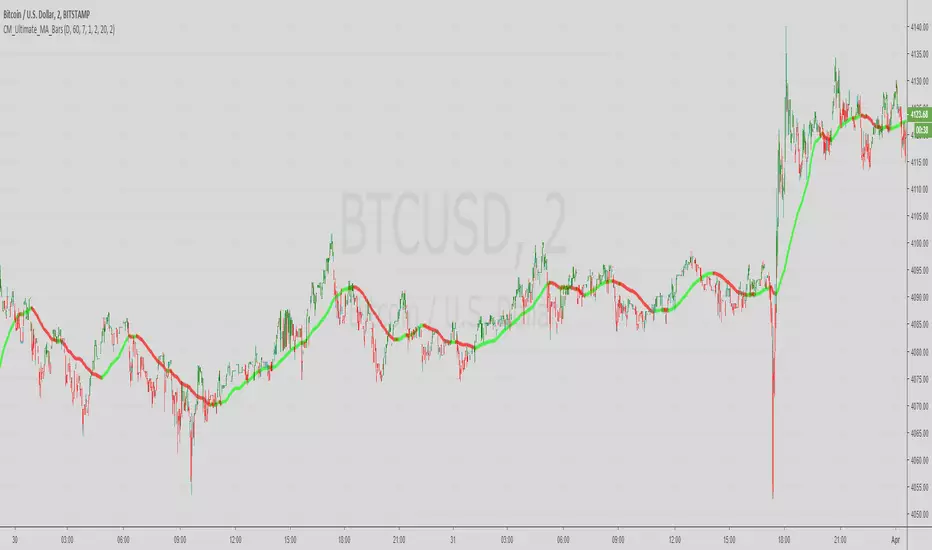
在脚本中搜索"trend"
Hull Trend with KahlmanThis is an update to the idea of
The Kahlman smoother makes the signal more precise (by one candle).


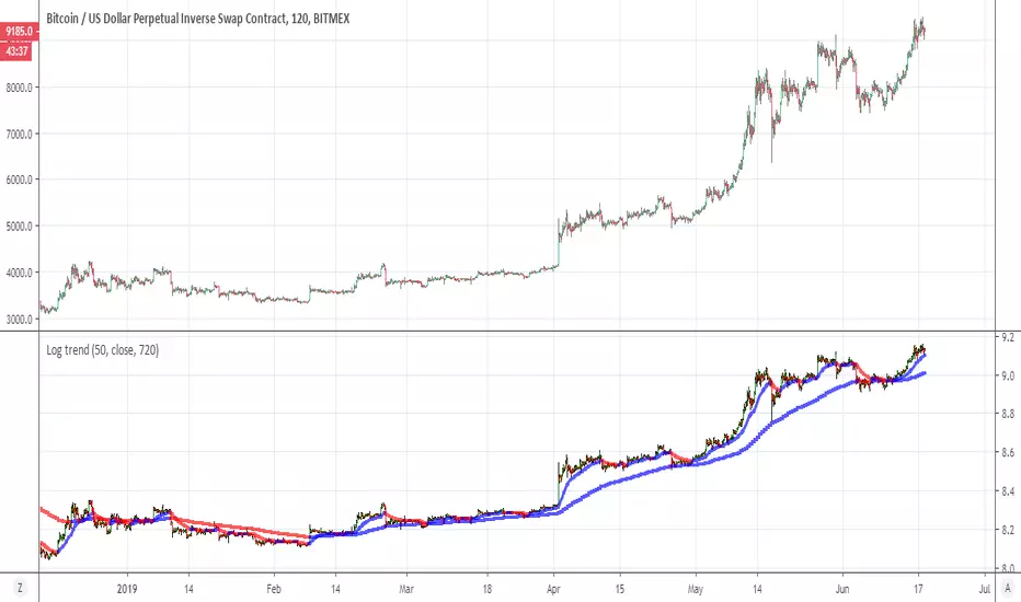
Log trendThis indicator give you the trend by log scale of the candels and the MA
blue line =bullish
red line =bearish
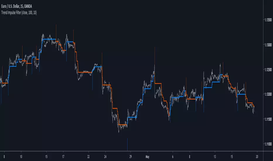
Trend Impulse FilterIntroduction
There is a lot of indicators similar to this one, however i think this one don't share the same calculation method and this is why i share it. This indicator aim to forecast price direction using an exponential filter architecture using highest and lowest information for the estimation of a smoothing variable. This filter is similar to the average Max-Min filter.
The Indicator
In the code a is equal to 1 when the price is greater or lower than any past price over length period, else a is equal to 0. The center parameter control the filtering degree of the output, when center is equal to 1 and a = 1 the indicator return the highest or lowest depending on market current trend, when center is superior to 1 the output will be smoother, however the reactivity of the indicator will still depend on the length parameter.
A color option show you the trend of the market, however the generated signals are the same that can be generated from a Donchian channel.
When highest is greater than previous highest the indicator direction will move upward, else if lowest is lower than previous lowest the indicator direction will move downward. Therefore the indicator can give information on the Donchian channels direction and provide a nice filter.
Conclusions
Adapting to highest and lowest can make an indicator adapt to the essence of trend trading, the indicator i showed can be used as source for others indicator or in MA crossover strategies. If you have a strategy using Donchian channels you may be interested in using this indicator and se how it fit in your strategy. Hope you like it.
Thanks for reading !
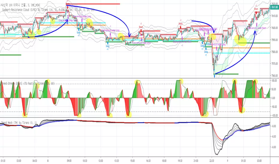
Trend Mesh (TM) for FX by Tirano안녕하세요. 다이너스티 팀의 안드레아 입니다.
기존에 티라노라는 이름으로 활동했습니다
Trend Mesh ( TM ) 소개
본 지표를 보는 방법은 단순합니다.
굵은 선이 파란색이면 상승추세이고, 붉은색이면 하락추세 입니다.
큰 타임 프레임에서 상승 추세라면, 조정시에 매수포지션을 취하는것이 유리하고 반대로 하락 추세라면 상승시에 매도포지션을 취하는것이 유리합니다.
기타 문의사항은 댓글 남겨주시면 감사하겠습니다.
Hi. this is Andreas of the Dynasty team.
Introduction to Trend Mesh ( TM )
Viewing this indicator is simple.
If the bold line is blue, it is an upward trend, while a red line is a downward trend.
If the upward trend is in a large time frame, it is advantageous to take the buy position at the time of adjustment, and if it is a downward trend, it is advantageous to take the selling position at the time of rise.
If you have any other questions, please leave a comment.
CryptoSimmons SMA and TrendThis was made trying to match the indicator Kazonomics uses on his charts.
I think it comes pretty close.
I made it by combining AK Trend indicator and Madrid Moving Average indicator.
Monotonic Trend Analysisby using Monotonic Trend Analysis script you can see if there is uptrend or downtrend. if there is no trend it goes to zero line.
You can change period and threshold values as you wish. Lower period faster response, vice versa.
If you find my works useful, please consider a donation
BTC: 16XRqyS3Vgh1knAU1tCcruqhUrVm4QWWmR
by LonesomeTheBlue

SMA Trend Bias IndicatorThis indicator is mainly used to quickly determine the trend of the market, so you can trade with the market and not against it.
This will also tell you when The Golden Cross/Death Cross has occurred.
Instantaneous Trend [Ehlers]A low lag, trend follower for higher timeframes.
This works great as a tool to filter trades from oscillators or to provide a general trend direction.
You can also trade off the color changes, though I must recommend using timeframes higher than 1H.
-DasanC
MA Cross 9 & 30 trend analysisvery good fro a simple trend analysis. 9 and 30 did work for me and I want to share.

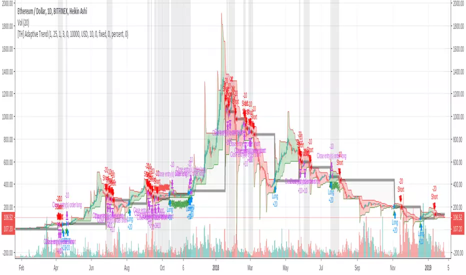
[TH] Adaptive Trend : StrategyAdaptive Trend : Strategy
*** It should be used with 'heikin ashi' chart ***
Super Trend
Basically, it is super trend strategy ( Rajandran R Supertrend )
- My idea is,
1. (scale) Factor of super trend is related with sensitivity of Up/Down trend change
2. Constant Factor cause failure of super trend strategy when market prices variance is low ( ie. high Factor ==> miss short trend )
3. By using variance measure ( like BollingerBand ) as a varying Factor, maybe we can catch short trend and long trend together
Loss Cut
The silver thick line is loss cut line & silver background means exit position status
I found that silver background is appear usually when price moves horizontally
1. It is set to open price of actual position entry ( heikin ashi chart's open price = loss cut line = (open + close)/2 )
2. If position is long
==> loss cut is executed when low price is lower than loss cut line
==> re-entry when low price is higher than loss cut line
3. If Position is short
==> loss cut is executed when high price is higher than loss cut line
==> re-entry when high price is lower than loss cut lin
Low Latency Trendline[Geo]Low latency trendline is a better and faster indicator than MAs.
It lowes high frequency wave(noise) and echoes low frequency wave(main move trend).
You can find out trend faster and have more confidence to dicide than MA indicators.
Take your own risk to use this Indicator.
PS:
I found RMTA() to help coding.
Tradingview has a good recursive function method. And RMTA has a good licence:MIT licence. Thanks to you, Alex.

LINEdicator - Trendanalysis toolThis indicator creates an trend channel based on an EMA/SMA combo and a Parabolc SAR indicator.
Watch for the peaks and the size of the red/green channel for possible trend change.
Can also be used as an Entry/Exit/Stop-Loss setting tool.

Trend Strength Index by TradingeneThe indicator shows the strength of the trend. Despite the fact that the formula is quite simple, it performs its functions well. That is its advantage.
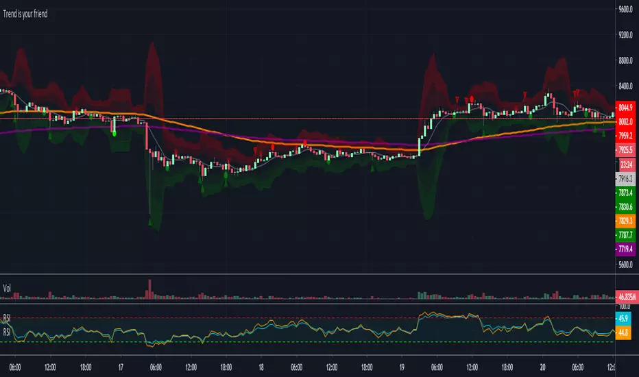
Trend is your friendThis indicator evaluates the trend based on crosses of two McGinley moving averages. It paints candles accordingly (it does not repaint), so you can see what the indicator is saying more clearly and stay in your trade until you see a period of consolidation or a reversal. You can control how far away those moving averages need to be for you to consider it a trend. If this distance is not met candles color is not changed and it shows you that the market is in a period of consolidation. I also added visualization of RSI, so you can have an easier time finding appropriate profit targets. For stop loss I would recommend placing it a couple points above or below the previous high / low that is located above / below you final target for entry. You can also use a certain percentage that works for you. I tried adding a stop loss based on ATR, but I did not like the results. Using market structure is a better choice in my opinion.
Here is a basic trading strategy for the default settings:
Wait for the indicator to start printing a series of green or red candles. After that you can enter a long or a short around moving averages. Another valid place to entry is the specific RSI zone. If we are in an uptrend buying when RSI is oversold can be beneficial as you expect market to recover. I do not recommend changing RSI from 14. Vice versa for the downtrend. It gives you an edge as you know at what price RSI will be oversold and allows you to place trades in advance. Pretty neat! You need to realize that no indicator or strategy can give you an exact entry. There will always be some margin of error. What I wanted to say is that if there is a strong trend up and you buy around your key moving averages and when RSI is oversold you entered in good places and there is a pretty good chance you will make money.
Time frame settings:
If you want to use tighter stop losses I would recommend sticking to 15m. Do not go lower. It is not worth the stress. 1h and 4h seems to be very good as well, but expect your stop losses to be wider. What I personally tend to do is display 15m, 30m and 1h and compare it. Think of it as a short, mid and long term. That way you can see things little bit better.
Examples:
1H chart BTC
4h chart EUR / USD
1D chart NASDAQ
15m chart BTC (Daytrading)
That last chart shows that even if you were longing while the trend was about to change you still had a good chance to close it with a little profit and switch to short easily. The default settings is what has worked the best for me. Feel free to change them as you see fit and do not forget to let me know if you find something that works better :)
Notes:
Either disable wick display or change it to a neutral color like gray for both green and red candles. Unfortunately pine script does not allow wick painting, so if you have red / green wicks it will look terrible. If RSI visualization makes your candles look too small you can go to settings and disable the display of individual RSI levels. You will still be able to see the zones, but the scale won't be affected.
Gann Swings Trend CounterBased on Rick Santos ' Swing Charts V1 Darvas Box V0.1'
However I have migrated script to pine version 3, customized to suite and added a higher number for the trend count

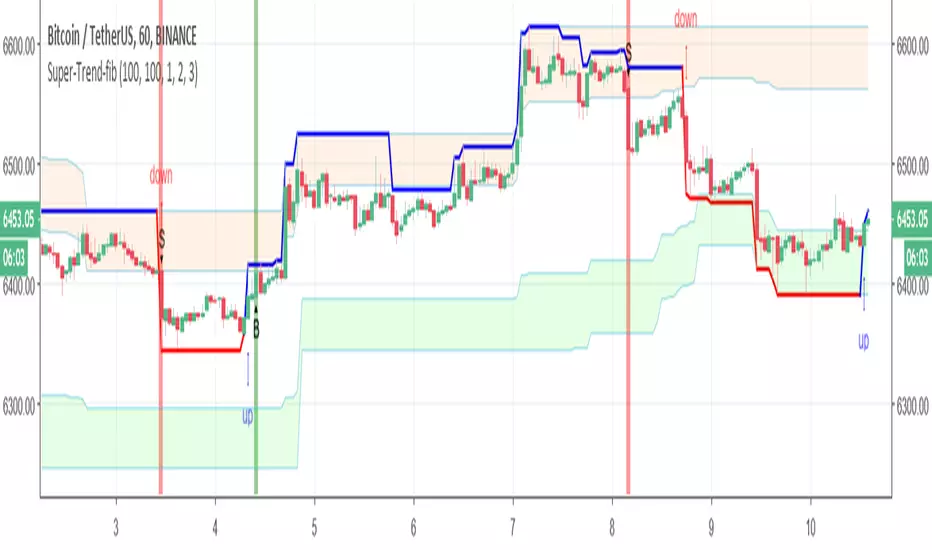
Super-Trend-fibIn this model we have fib Donchian channel with super trend alerts (B=buy) S =sell
and trailing volume system up trend alert and down trend alert
so have fun
Multiple Trend İndicator+ By BD4 different color trend show for weekly, daily and 4 hours.
red : mavilim downtrend, and mavilim below the wma21
orange : mavilim uptrend, and mavilim below the wma21
lime : mavilim downtrend, and mavilim above the wma21
green : mavilim uptrend, and mavilim above the wma21
also on the current chart; u can show current mavilim, weekly wma21, daily wma21 and 4hours wma21.
also you can add code into your frequently used indicator.
I hope this helps you.
sorry i don't know enough english for detailed description. you can try and learn more

Mavilim Multiple Trend By BDweekly mavilim line,daily mavilim line and more,within your current chart. and shows multiple mavilim trend. if u need something like this

Multiple Trend Indicatorweekly 21wma,daily 21wma and more,within your current chart. and shows multiple trend. if u need something like this

Ehlers Instantaneous TrendlineEhlers Instantaneous Trendline script.
This indicator was described by John F. Ehlers in his book "Rocket Science for Traders" (2001, Chapter 10: The Instantaneous Trendline).
Trend-Reverse Strategy
Trend-Reverse Strategy is a combination of these 2 scripts to use 5 min candle.
