Fractal & Entropy Market Dynamics with Mexican Hat WaveletThis indicator combines fractal analysis, entropy, and wavelet theory to model market dynamics using a customized approach. It integrates advanced mathematical techniques to assess the complexity and structure of price action, while also incorporating volume and price volatility.
Key Concepts and Features:
Volume-Weighted Price:
The script calculates a volume-adjusted price using a moving average of volume to give more weight to periods with higher volume. This allows the indicator to account for the impact of trading volume on price movements, enhancing its sensitivity to significant price shifts.
Mexican Hat Wavelet Approximation:
The script employs the Mexican Hat Wavelet, a mathematical tool that approximates price movements based on the Laplacian of the price series. This helps capture localized oscillations in price, acting as a filter to highlight certain price dynamics over the specified length. This wavelet is commonly used to identify key inflection points and trends in financial data.
Fractal Dimension Calculation:
The fractal dimension is calculated to quantify the market's complexity. It measures how price moves between intervals, with higher values indicating chaotic or more volatile market behavior. This dimension captures the self-similarity in price movements across different time frames, a key feature of fractals.
Shannon Entropy Calculation:
Shannon Entropy is used to measure the randomness or uncertainty in the price action. It calculates the degree of unpredictability based on the price changes, providing insight into the market's informational efficiency. Higher entropy indicates more randomness, while lower entropy suggests more predictable trends.
Custom Normalization:
The script includes a custom normalization function that processes the composite score (derived from fractal dimension and entropy). This normalization helps scale the values into a consistent range, making it easier to interpret the output. The smoothing factor and RSI-based approach ensure that the normalized value reacts smoothly to the changes in market dynamics.
Composite Score:
The composite score is a weighted combination of the fractal dimension and entropy. This score aims to provide a holistic view of the market by combining the structural complexity (fractal) and randomness (entropy) into one unified metric.
Plotting and Visuals:
The indicator plots the normalized composite score on a scale where a baseline of 50 is provided for reference. The resulting plot helps traders visualize market dynamics, with the score fluctuating based on changes in the market's fractal dimension and entropy. A score above or below the baseline of 50 indicates potential market shifts.
Use Case:
The "Enhanced Fractal and Entropy Market Dynamics with Mexican Hat Wavelet" is useful for traders looking to identify market conditions where there is a balance between price structure and randomness. By integrating wavelets, fractals, and entropy, the indicator can provide insights into market complexity, helping traders recognize potential trend reversals, periods of consolidation, or increased volatility. This can be particularly effective for those employing swing trading or trend-following strategies
在脚本中搜索"wave"

Wavemeter [theEccentricTrader]█ OVERVIEW
This indicator is a representation of my take on price action based wave cycle theory. The indicator counts the number of confirmed wave cycles, keeps a rolling tally of the average wave length, wave height and frequency, and displays the statistics in a table. The indicator also displays the current wave measurements as an optional feature.
█ CONCEPTS
Green and Red Candles
• A green candle is one that closes with a high price equal to or above the price it opened.
• A red candle is one that closes with a low price that is lower than the price it opened.
Swing Highs and Swing Lows
• A swing high is a green candle or series of consecutive green candles followed by a single red candle to complete the swing and form the peak.
• A swing low is a red candle or series of consecutive red candles followed by a single green candle to complete the swing and form the trough.
Peak and Trough Prices (Basic)
• The peak price of a complete swing high is the high price of either the red candle that completes the swing high or the high price of the preceding green candle, depending on which is higher.
• The trough price of a complete swing low is the low price of either the green candle that completes the swing low or the low price of the preceding red candle, depending on which is lower.
Historic Peaks and Troughs
The current, or most recent, peak and trough occurrences are referred to as occurrence zero. Previous peak and trough occurrences are referred to as historic and ordered numerically from right to left, with the most recent historic peak and trough occurrences being occurrence one.
Wave Cycles
A wave cycle is here defined as a complete two-part move between a swing high and a swing low, or a swing low and a swing high. As can be seen in the example above, the first swing high or swing low will set the course for the sequence of wave cycles that follow; a chart that begins with a swing low will form its first complete wave cycle upon the formation of the first complete swing high and vice versa.
Wave Length
Wave length is here measured in terms of bar distance between the start and end of a wave cycle. For example, if the current wave cycle ends on a swing low the wave length will be the difference in bars between the current swing low and current swing high. In such a case, if the current swing low completes on candle 100 and the current swing high completed on candle 95, we would simply subtract 95 from 100 to give us a wave length of 5 bars.
Average wave length is here measured in terms of total bars as a proportion as total waves. The average wavelength is calculated by dividing the total candles by the total wave cycles.
Wave Height
Wave height is here measured in terms of current range. For example, if the current peak price is 100 and the current trough price is 80, the wave height will be 20.
Amplitude
Amplitude is here measured in terms of current range divided by two. For example if the current peak price is 100 and the current trough price is 80, the amplitude would be calculated by subtracting 80 from 100 and dividing the answer by 2 to give us an amplitude of 10.
Frequency
Frequency is here measured in terms of wave cycles per second (Hertz). For example, if the total wave cycle count is 10 and the amount of time it has taken to complete these 10 cycles is 1-year (31,536,000 seconds), the frequency would be calculated by dividing 10 by 31,536,000 to give us a frequency of 0.00000032 Hz.
Range
The range is simply the difference between the current peak and current trough prices, generally expressed in terms of points or pips.
█ FEATURES
Inputs
Show Sample Period
Start Date
End Date
Position
Text Size
Show Current
Show Lines
Table
The table is colour coded, consists of two columns and, as many as, nine rows. Blue cells display the total wave cycle count and average wave measurements. Green cells display the current wave measurements. And the final row in column one, coloured black, displays the sample period. Both current wave measurements and sample period cells can be hidden at the user’s discretion.
Lines
For a visual aid to the wave cycles, I have added a blue line that traces out the waves on the chart. These lines can be hidden at the user’s discretion.
█ HOW TO USE
The indicator is intended for research purposes, strategy development and strategy optimisation. I hope it will be useful in helping to gain a better understanding of the underlying dynamics at play on any given market and timeframe.
For example, the indicator can be used to compare the current range and frequency with the average range and frequency, which can be useful for gauging current market conditions versus historic and getting a feel for how different markets and timeframes behave.
█ LIMITATIONS
Some higher timeframe candles on tickers with larger lookbacks such as the DXY , do not actually contain all the open, high, low and close (OHLC) data at the beginning of the chart. Instead, they use the close price for open, high and low prices. So, while we can determine whether the close price is higher or lower than the preceding close price, there is no way of knowing what actually happened intra-bar for these candles. And by default candles that close at the same price as the open price, will be counted as green. You can avoid this problem by utilising the sample period filter.
The green and red candle calculations are based solely on differences between open and close prices, as such I have made no attempt to account for green candles that gap lower and close below the close price of the preceding candle, or red candles that gap higher and close above the close price of the preceding candle. I can only recommend using 24-hour markets, if and where possible, as there are far fewer gaps and, generally, more data to work with. Alternatively, you can replace the scenarios with your own logic to account for the gap anomalies, if you are feeling up to the challenge.
It is also worth noting that the sample size will be limited to your Trading View subscription plan. Premium users get 20,000 candles worth of data, pro+ and pro users get 10,000, and basic users get 5,000. If upgrading is currently not an option, you can always keep a rolling tally of the statistics in an excel spreadsheet or something of the like.

Elliott Wave Oscillator Signals by DGTElliott Wave Principle , developed by Ralph Nelson Elliott, proposes that the seemingly chaotic behaviour of the different financial markets isn’t actually chaotic. In fact the markets moves in predictable, repetitive cycles or waves and can be measured and forecast using Fibonacci numbers. These waves are a result of influence on investors from outside sources primarily the current psychology of the masses at that given time. Elliott wave predicts that the prices of the a traded currency pair will evolve in waves: five impulsive waves and three corrective waves. Impulsive waves give the main direction of the market expansion and the corrective waves are in the opposite direction (corrective wave occurrences and combination corrective wave occurrences are much higher comparing to impulsive waves)
The Elliott Wave Oscillator (EWO) helps identifying where you are in the 5-3 Elliott Waves, mainly the highest/lowest values of the oscillator might indicate a potential bullish/bearish Wave 3. Mathematically expressed, EWO is the difference between a 5-period and 35-period moving average based on the close. In this study instead 35-period, Fibonacci number 34 is implemented for the slow moving average and formula becomes ewo = ema(source, 5) - ema(source, 34)
The application of the Elliott Wave theory in real time trading gets difficult because the charts look messy. This study (EWO-S) simplifies the visualization of EWO and plots labels on probable reversals/corrections. The good part is that all plotting’s are performed on the top of the price chart including a histogram (optional and supported on higher timeframes). Additionally optional Keltner Channels Cloud added to help confirming the price actions.
What to look for:
Plotted labels can be used to follow the Elliott Wave occurrences and most importantly they can be considered as signals for possible trade setup opportunities. Elliott Wave Rules and Fibonacci Retracement/Extensions are suggested to confirm the patters provided by the EWO-S
Trading success is all about following your trading strategy and the indicators should fit within your trading strategy, and not to be traded upon solely
Disclaimer : The script is for informational and educational purposes only. Use of the script does not constitutes professional and/or financial advice. You alone the sole responsibility of evaluating the script output and risks associated with the use of the script. In exchange for using the script, you agree not to hold dgtrd TradingView user liable for any possible claim for damages arising from any decision you make based on use of the script

My WaveThis is my implementation in TradingView of my modified version of the "Weis Wave".
Given the limitations of TradingView in alter past variable values, whenever the close change direction and the wave don't I sum the volume to the present wave and also to a possible future wave.
This results in columns of a mixed color within the columns of the histogram. By changing the percentage input you can and must keep this extra columns to a minimum.
You must insert two copies of the indicator on your chart and "unmerge down" one of them. On the overlayed you must * format and edit and unmark Histup and Histdown, on the unmerged down you must * format and edit and unmark BetaZigZag and stableZigZag.
You can also unmark Bar Color on both if you don't want to colour the bars according to the waves.
Trend: If the buying waves are longer than the selling waves the immediate trend is up, and vice versa.
Look out for a change in trend if in an uptrend the selling waves begin to increase in time and distance or the buying waves shorten, and vice versa.
From the volume histogram you can get the force of the buying and selling waves.
From the price waves you get the result of that force. You can also spot the "shortening of the thrust" up or down.
Comparing the two you can spot "effort without result" "ease of movement".
References: "Trades About To Happen" David H. Weis, Division 2 of the Richard D. Wyckoff Method of Trading in Stocks.
Aibuyzone Elliott Wave SuiteOverview
This study approximates Elliott-style wave structure using swing pivots. It labels primary waves (1–5), tracks subwaves (1–5) inside them, and plots future projection bands derived from the size of a recent primary leg. A small floating dashboard summarizes the current wave number, bias (bullish/bearish) based on the last leg, and a projection price range.
Note: This tool is educational. Wave detection is algorithmic and approximate; it does not identify textbook Elliott patterns or validate rule sets. Manage risk independently.
What it draws
Primary wave labels (1–5): Based on higher swing length pivots (major turns).
Subwave labels (1–5): Based on shorter swing length pivots (minor turns).
Zigzag connectors: Simple lines between the latest primary pivots for structure visualization.
Projection bands: Three dotted horizontal levels forward from the last primary pivot, using user-defined extension multipliers.
Floating dashboard:
Current Wave: Latest primary wave count (1–5).
Bias: “Bullish Leg” (last pivot was a low) or “Bearish Leg” (last pivot was a high), or “Unknown” if insufficient data.
Proj Range: Min–max of the three projection levels.
Key Inputs
Swing Structure
Primary Swing Length: Pivot left/right bars for major swings. Larger values = fewer, cleaner waves.
Subwave Swing Length: Pivot left/right bars for minor swings. Smaller values = more frequent subwave labels.
Max Saved Swing Points: Memory limit to prevent clutter.
Future Projections
Show Projection Levels: Toggle projection lines on/off.
Use Last Nth Leg For Size: Which recent primary leg to use for measuring projection distance (1 = most recent).
Extension 1 / 2 / 3: Multipliers applied to the measured leg (e.g., 1.0, 1.618, 2.0).
Style
Colors and text sizes for primary and subwave labels, and projection lines.
Dashboard
Show Dashboard: Toggle table on/off.
Dashboard Position: Top-Left / Top-Right / Bottom-Left / Bottom-Right.
How projections are computed
The script measures the price distance of a recent primary leg (from pivot A to pivot B).
If the last pivot is a low, projections extend upward; if the last pivot is a high, projections extend downward.
The three extension inputs (e.g., 1.0 / 1.618 / 2.0) are applied to that leg distance to create dotted forward levels.
The dashboard’s Proj Range displays the min–max of those three levels.
Using the study (suggested workflow)
Choose timeframe appropriate for your style (e.g., higher timeframes for cleaner structure; lower timeframes for detail).
Tune swing lengths:
Increase Primary Swing Length on noisy charts to stabilize wave counts.
Adjust Subwave Swing Length to reveal or simplify internal moves.
Read the dashboard:
Current Wave shows where the latest primary count sits (1–5).
Bias summarizes the direction of the last measured leg only; it is not a trend system.
Proj Range offers a coarse price band derived from your extensions.
Context check: Combine wave labeling with your own market context (trend, structure, volatility) before making decisions.
Risk management: Use your own stop/target methods. The projection lines are not signals.
Practical tips
Clutter control: If labels overlap on volatile symbols, try larger swing lengths or reduce label text sizes in Style.
Scaling: On very small tick sizes, increasing the internal label price offset can improve label readability.
Projection sensitivity: Changing Use Last Nth Leg can materially alter levels; confirm they match your intent.
Non-determinism across timeframes: Different timeframes and symbols will produce different pivot sequences and counts.
Limitations & important notes
Approximation: This does not enforce all Elliott rules (e.g., alternation, wave 4 overlap constraints, channeling). It only labels swings numerically.
Repainting of labels: Pivot-based waves confirm after enough bars have printed to the right of a high/low. Labels are placed when pivots confirm; they don’t predict pivots.
Not a signal generator: No entries/exits/alerts are included; add your own trade plan and risk controls.
Data sufficiency: Early bars or sparse data may show “Unknown” bias or “N/A” projections until adequate pivots exist.
Clean-chart publishing guidance (to stay compliant)
Use a chart that clearly shows this script’s outputs without unrelated indicators.
Keep the description educational. Avoid performance claims, guarantees, or language implying certainty.
Do not include links, promotions, prices, giveaways, contact details, or solicitations.
Disclose that labels and projections are algorithmic approximations and for educational use.
Risk disclosure
This script is for educational purposes only. It does not provide financial, investment, or trading advice and does not guarantee outcomes. Markets involve risk, including the potential loss of capital. Always do your own research and use independent judgment.

Moving Average Resting Point [theEccentricTrader]█ OVERVIEW
This indicator uses peak and trough prices to calculate the moving average resting point and plots it as a line on the chart. The lookback length is variable and the indicator can plot up to three lines with different lookback lengths and colors.
█ CONCEPTS
Green and Red Candles
• A green candle is one that closes with a high price equal to or above the price it opened.
• A red candle is one that closes with a low price that is lower than the price it opened.
Swing Highs and Swing Lows
• A swing high is a green candle or series of consecutive green candles followed by a single red candle to complete the swing and form the peak.
• A swing low is a red candle or series of consecutive red candles followed by a single green candle to complete the swing and form the trough.
Peak and Trough Prices (Basic)
• The peak price of a complete swing high is the high price of either the red candle that completes the swing high or the high price of the preceding green candle, depending on which is higher.
• The trough price of a complete swing low is the low price of either the green candle that completes the swing low or the low price of the preceding red candle, depending on which is lower.
Historic Peaks and Troughs
The current, or most recent, peak and trough occurrences are referred to as occurrence zero. Previous peak and trough occurrences are referred to as historic and ordered numerically from right to left, with the most recent historic peak and trough occurrences being occurrence one.
Support and Resistance
• Support refers to a price level where the demand for an asset is strong enough to prevent the price from falling further.
• Resistance refers to a price level where the supply of an asset is strong enough to prevent the price from rising further.
Support and resistance levels are important because they can help traders identify where the price of an asset might pause or reverse its direction, offering potential entry and exit points. For example, a trader might look to buy an asset when it approaches a support level , with the expectation that the price will bounce back up. Alternatively, a trader might look to sell an asset when it approaches a resistance level , with the expectation that the price will drop back down.
It's important to note that support and resistance levels are not always relevant, and the price of an asset can also break through these levels and continue moving in the same direction.
Wave Cycles
A wave cycle is here defined as a complete two-part move between a swing high and a swing low, or a swing low and a swing high. As can be seen in the example above, the first swing high or swing low will set the course for the sequence of wave cycles that follow; a chart that begins with a swing low will form its first complete wave cycle upon the formation of the first complete swing high and vice versa.
Wave Length
Wave length is here measured in terms of bar distance between the start and end of a wave cycle. For example, if the current wave cycle ends on a swing low the wave length will be the difference in bars between the current swing low and current swing high. In such a case, if the current swing low completes on candle 100 and the current swing high completed on candle 95, we would simply subtract 95 from 100 to give us a wave length of 5 bars.
Average wave length is here measured in terms of total bars as a proportion as total waves. The average wavelength is calculated by dividing the total candles by the total wave cycles.
Wave Height
Wave height is here measured in terms of current range. For example, if the current peak price is 100 and the current trough price is 80, the wave height will be 20.
Amplitude
Amplitude is here measured in terms of current range divided by two. For example if the current peak price is 100 and the current trough price is 80, the amplitude would be calculated by subtracting 80 from 100 and dividing the answer by 2 to give us an amplitude of 10.
Resting Point
The resting point is here calculated by subtracting the current trough price from the current peak price and adding the difference to the current trough price to output the price in the middle of the two prices. Essentially it is the current trough price plus the amplitude. For example, if the current peak price is 100 and the current trough price is 80, the resting point 90.
The moving average resting point is here calculated by subtracting the moving average trough price from the moving average peak price, dividing the answer by two and adding the difference to the moving average trough price.
Frequency
Frequency is here measured in terms of wave cycles per second (Hertz). For example, if the total wave cycle count is 10 and the amount of time it has taken to complete these 10 cycles is 1-year (31,536,000 seconds), the frequency would be calculated by dividing 10 by 31,536,000 to give us a frequency of 0.00000032 Hz.
Range
The range is simply the difference between the current peak and current trough prices, generally expressed in terms of points or pips.
█ FEATURES
Inputs
Show MARP 1
Show MARP 2
Show MARP 3
MARP 1 Length
MARP 2 Length
MARP 3 Length
MARP 1 Color
MARP 2 Color
MARP 3 Color
█ HOW TO USE
This indicator can be used like any other moving average indicator to analyse trend direction and momentum, identify potential support and resistance levels, or for filtering trading strategies and developing new ones.
Sine Wave TheoryThere are some ideas out there that the market is like a collection of quantum events and that it could all be broken down into sine waves. I created this script to put that to the test.
The idea is simple, I tested 3 different factors that could be put into sine wave form.
1.) Bar Change
2.) Volume Average Change
3.) Coin Flip
For the bar change, I simply allow the sine wave to move upwards or downwards if the bars have changed color in their sequence. For example, if there were 3 red bars and 1 green bar, it would not move the sine wave up or down until the green bar appeared.
For the average volume change, it was the same idea, except that the sine wave could only move up or down if the volume had moved up or below the average value of the length given for calculating the average volume.
Finally, the coin flip simply simulates flipping a coin, and allows the sine wave to move one direction or the other once it has a side that is different from the previous chosen side. For example, heads, heads, heads, tails (once it flipped to tails, this would allow it to move a direction).
The sine wave trading theory that I watched claimed that if you know the correct sine wave # (which is how large the peak is, and/or the sine wave count which is how many peaks and valleys occur) that you can successfully predict future trades. Their claims that the reason it does not look like a perfect sine wave for these events is because there is different amounts of trading going on, thus the timing will be slightly off.
I am posting this to disagree with their ideas. For example, if you select to turn on trading for coin flip and turn off bar change, you will see the coin flip did better on the default settings!
It just so happens that any setting will eventually be good, making all the sine wave variations just completely random if you win or not.
I posted this to demonstrate how silly trading sine waves is. The real trick is using cosine and tangent waves... lol j/k
I hope this helps someone avoid this scam concept.
Cyclic Smoothed RSI with Motive-Corrective Wave Indicator
This indicator uses the cyclic smoothed Relative Strength Index (cRSI) instead of the traditional Relative Strength Index (RSI). See below for more info on the benefits to the cRSI.
My key contributions
1) A Weighted Moving Average (WMA) to track the general trend of the cRSI signal. This is very helpful in determining when the equity switches from bullish to bearish, which can be used to determine buy/sell points. This is then is used to color the region between the upper and lower cRSI bands (green above, red below).
2) An attempt to detect the motive (impulse) and corrective and waves. Corrective waves are indicated A, B, C, D, E, F, G. F and G waves are not technically Elliot Waves, but the way I detect waves it is really hard to always get it right. Once and a while you could actually see G and F a second time. Motive waves are identified as s (strong) and w (weak). Strong waves have a peak above the cRSI upper band and weak waves have a peak below the upper band.
3) My own divergence indicator for bull, hidden bull, bear, and hidden bear. I was not able to replicate the TradingView style of drawing a line from peak to peak, but for this indicator I think in the end it makes the chart cleaner.
There is a latency issue with an indicator that is based on moving averages. That means they tend to trigger right after key events. Perfect timing is not possible strictly with these indicators, but they do work very well "on average." However, my implementation has minimal latency as peaks (tops/bottoms) only require one bar to detect.
As a bit of an Easter Egg, this code can be tweaked and run as a strategy to get buy/sell signals. I use this code for both my indicator and for trading strategy. Just copy and past it into a new strategy script and just change it from study to a strategy, something like this:
strategy("cRSI + Waves Strategy with VWMA overlay", overlay=overlay)
The buy/sell code is at the end and just needs to be uncommented. I make no promises or guarantees about how good it is as a strategy, but it gives you some code and ideas to work with.
Tuning
1) Volume Weighted Moving Average (VWMA): This is a “hidden strategy” feature implemented that will display the high-low bands of the VWMA on the price chart if run the code using “overlay = true”.
- If the equity does not have volume, then the VWMA will not show up. Uncheck this box and it will use the regular WMA (no volume).
- defines how far back the WMA averages price.
2) cRSI (Black line in the indicator)
- Increase to length that amount of time a band (upper/lower) stays high/low after a peak. Reduce the value to shorten the time. Just increment it up/down to see the effect.
- defines how far back the SMA averages the cRSI. This affects the purple line in the indicator.
- defines how many bars back the peak detector looks to determine if a peak has occurred. For example, a top is detected like this: current-bar down relative to the 1-bar-back, 1-bar-back up relative to 2-bars-back (look back = 1), c) 2-bars-back up relative to 3-bars-back (lookback = 2), and d) 3-bars-back up relative to 4-bars-back (lookback = 3). I hope that makes sense. There are only 2 options for this setting: 2 or 3 bars. 2 bars will be able to detect small peaks but create more “false” peaks that may not be meaningful. 3 bars will be more robust but can miss short duration peaks.
3) Waves
- The check boxes are self explanatory for which labels they turn on and off on the plot.
4) Divergence Indicators
- The check boxes are self explanatory for which labels they turn on and off on the plot.
Hints
- The most common parameter to change is the . Different stocks will have different levels of strength in their peaks. A setting of 2 may generate too many corrective waves.
- Different times scales will give you different wave counts. This is to be expected. A counter impulse wave inside a corrective wave may actually go above the cRSI WMA on a smaller time frame. You may need to increase it one or two levels to see large waves.
- Just because you see divergence (bear or hidden bear) does not mean a price is going to go down. Often price continues to rise through bears, so take note and that is normal. Bulls are usually pretty good indicators especially if you see them on C,E,G waves.
----------------------------------------------------------------------------------------------------------------------------
cyclic smoothed RSI (cRSI) indicator
----------------------------------------------------------------------------------------------------------------------------
The “core” code for the cyclic smoothed RSI (cRSI) indicator was written by Lars von Theinen and is subject to the terms of the Mozilla Public License 2.0 at mozilla.org Copyright (C) 2017 CC BY, whentotrade / Lars von Thienen. For more details on the cRSI Indicator:
The cyclic smoothed RSI indicator is an enhancement of the classic RSI, adding
1) additional smoothing according to the market vibration,
2) adaptive upper and lower bands according to the cyclic memory and
3) using the current dominant cycle length as input for the indicator.
It is much more responsive to market moves than the basic RSI. The indicator uses the dominant cycle as input to optimize signal, smoothing, and cyclic memory. To get more in-depth information on the cyclic-smoothed RSI indicator, please read Decoding The Hidden Market Rhythm - Part 1: Dynamic Cycles (2017), Chapter 4: "Fine-tuning technical indicators." You need to derive the dominant cycle as input parameter for the cycle length as described in chapter 4.
Hope this helps and good luck.

[blackcat] L1 Elliott Wave3 CatcherLevel: 1
Background
Elliott wave theory is a method of technical analysis that looks for recurring long-term price patterns that are related to persistent changes in investor sentiment and psychology. The theory identifies waves that are identified as impulse waves that form a pattern and corrective waves that counteract the larger trend.
Function
L1 Elliott Wave3 Catcher is trying to observe Elliott wave more clear with different color candles.
Key Signal
var7 --> bull reveral signal which exists along motive wave
var7-var9 --> long in green color; short in red color; retracement in fuchsia color
var26/27/28 --> they are used for wave swing low detection and long entry
Pros and Cons
Pros:
1. Exhibit Elliott waves in different color candles
2. Highlight motive wave with yellow candles
3. Detect bottom and long entry points
Cons:
1. No complete long and short entries can be obtained
2. It cannot be applied for crypto due to lack of financial() functions
Remarks
Tribute to Elliott
Readme
In real life, I am a prolific inventor. I have successfully applied for more than 60 international and regional patents in the past 12 years. But in the past two years or so, I have tried to transfer my creativity to the development of trading strategies. Tradingview is the ideal platform for me. I am selecting and contributing some of the hundreds of scripts to publish in Tradingview community. Welcome everyone to interact with me to discuss these interesting pine scripts.
The scripts posted are categorized into 5 levels according to my efforts or manhours put into these works.
Level 1 : interesting script snippets or distinctive improvement from classic indicators or strategy. Level 1 scripts can usually appear in more complex indicators as a function module or element.
Level 2 : composite indicator/strategy. By selecting or combining several independent or dependent functions or sub indicators in proper way, the composite script exhibits a resonance phenomenon which can filter out noise or fake trading signal to enhance trading confidence level.
Level 3 : comprehensive indicator/strategy. They are simple trading systems based on my strategies. They are commonly containing several or all of entry signal, close signal, stop loss, take profit, re-entry, risk management, and position sizing techniques. Even some interesting fundamental and mass psychological aspects are incorporated.
Level 4 : script snippets or functions that do not disclose source code. Interesting element that can reveal market laws and work as raw material for indicators and strategies. If you find Level 1~2 scripts are helpful, Level 4 is a private version that took me far more efforts to develop.
Level 5 : indicator/strategy that do not disclose source code. private version of Level 3 script with my accumulated script processing skills or a large number of custom functions. I had a private function library built in past two years. Level 5 scripts use many of them to achieve private trading strategy.

Weis Pip Wave jayyWhat you see here is the Weis pip wave. The Weis pip wave shows how far in price a Weis wave has traveled through the duration of a Weis wave. The Weis pip wave is used in combination with the Weis cumulative volume wave. The two waves must be set to the same "wave size" and using the same method as described by Weis.
Using the traditional Weis method simply enter the desired wave size in the box "Select Weis Wave Size". In the example shown, it is set to 5 points. Each wave for each security and each timeframe requires its own wave size. Although not the traditional method a more automatic way to set wave size would be to use ATR. This is not the true Weis method but it does give you similar waves and, importantly, without the hassle of selecting a wave size for every chart. Once the Weis wave size is set then the pip wave will be shown.
I have put a zigzag of a 5 point Weis wave on the above bar chart. I have added it to allow your eye to get a better appreciation for Weis wave pivot points. You will notice that the wave is not in straight lines connecting wave tops to bottoms this is a function of the limitations of Pinescript version 1. This script would need to be in version 4 to allow straight lines. I will elaborate on the Weis pip zigzag script.
What is a Weis wave? David Weis has been recognized as a Wyckoff method analyst he has written two books one of which, Trades About to Happen, describes the evolution of the now popular Weis wave. The method employed by Weis is to identify waves of price action and to compare the strength of the waves on characteristics of wave strength. Chief among the characteristics of strength is the cumulative volume of the wave. There are other markers that Weis uses as well for example how the actual price difference between the start of the Weis wave from start to finish. Weis also uses time, particularly when using a Renko chart. Weis specifically uses candle/bar closes to define all wave action.
David Weis did a futures.io video which is a popular source of information about his method.
Cheers jayy
PS This script was published a day ago, however, I had included some links to the website of a person that uses Weis pip waves and also a dropbox link that contains the Weis wave chart for May 27, 2020, published by David Weis. Providing those links is against TV policy and so the script was hidden by TV. This is the identical script with the identical settings but without the offending links. If you want to see the pip Weis method in practice then search Weis pip wave. I have absolutely no affiliation. If you want to see Weis chart in pdf then message me and I will give a link or the Weis pdf. Why would you want to see the Weis chart for May 27, 2020? Merely to confirm the veracity of my algorithm. You could compare my chart () from the same period to the Weis chart. Both waves are for the ES!1 4 hour chart and both for a wave size of 5.

UCS_TTM_Wave A & B & CThis is a replica of TTM Wave A B C.
The ABC Waves are comprised of various moving averages and oscillators (MACD) used to visualize the overall strength and direction of a given market across multiple time frames.
The “A Wave” measures short term relative strength and direction of a market, the “C Wave” measures longer term strength and the “B Wave” plots the same for a medium time period.
Here is the link to the ACTUAL Indicator - members.simpleroptions.com
Instruction -
Load the Indicator three times, Turn Off the Other two Waves. For eg., Wave A - Check / Wave B - Uncheck / Wave C - Uncheck. = This will plot Wave A.

Elliott Wave Pattern AnalyzerElliott Wave Pattern Analyzer
Overview
This indicator automatically detects Elliott Wave impulse patterns and diagonal formations on your chart. It analyzes price structure based on classic Elliott Wave rules and displays wave counts with confidence scores, Fibonacci projections, and invalidation levels.
Why I Built This
After reading Glenn Neely's book on Elliott Wave theory, I wanted to put my learning into practice by building something tangible. There's no better way to understand a concept than trying to code it!
I'll be honest – corrective wave patterns (zigzags, flats, triangles, combinations) were simply too complex for me to implement reliably. So instead, I focused on what I could manage: impulse waves and diagonal patterns. Maybe someday I'll tackle the corrections, but for now, this is my humble contribution.
The retracement visualization style was inspired by LuxAlgo's elegant approach – credit where credit is due!
How It Works
1. Wave Detection
The indicator uses pivot points to identify potential 5-wave structures:
WaveRuleWave 2Cannot retrace more than 100% of Wave 1Wave 3Cannot be the shortest among Waves 1, 3, 5Wave 4Should not overlap Wave 1 territory (impulse)Wave 5Completes the motive structure
2. Pattern Types
Impulse Waves
Classic 5-wave motive structure
Wave 3 typically extends (≥1.618 of Wave 1)
Strict mode enforces all Elliott rules
Diagonal Patterns
Ending diagonal (wedge-shaped)
Waves progressively contract
Lines 1-3 and 2-4 converge to an apex
Often signals trend exhaustion
3. Confidence Scoring
Each pattern receives a confidence score (0-100%) based on:
Fibonacci ratio adherence
Wave proportion relationships
Rule compliance
Structural clarity
Only patterns exceeding your threshold (default: 60%) are displayed.
4. Fibonacci Projections
After Wave 5 completion, the indicator projects potential retracement levels:
0.382, 0.500, 0.618, 0.786 of the entire impulse
5. Extension Channel
Connects Wave 0 origin to the retracement low, projecting:
0.618, 1.000, 1.272, 1.618 extensions
Optional extended levels: 2.000, 2.618, 4.236
6. Invalidation Levels
Shows the price level where the wave count becomes invalid – helping you know when your analysis is wrong.
Settings Explained
Impulse Wave Settings
Pivot Length: Sensitivity of wave detection (recommended: 5, 7, 14)
Strict Mode: Enforce all classic Elliott rules
Min Wave 3 Extension: Minimum ratio for Wave 3 (default: 1.618)
Diagonal Wave Settings
Allow Wave 4-1 Overlap: Required for valid diagonals
Extend Trendline: Project diagonal boundaries forward
Projection Settings
Fibonacci Levels: Customize retracement targets
Extension Bars: How far projections extend on chart
Pattern Management
Max Patterns: Limit displayed patterns to reduce clutter
Pattern Lifetime: Auto-remove old patterns after X bars
Use Cases
Trend Trading: Enter on Wave 3 or Wave 5 breakouts
Reversal Spotting: Diagonal completion often signals reversals
Target Setting: Use Fibonacci extensions for take-profit levels
Risk Management: Invalidation levels provide clear stop-loss references
Notes
This indicator uses pivot detection and may repaint – signals are confirmed after the specified pivot length
Designed for educational and analytical purposes, not as a signal generator
Elliott Wave analysis is subjective – this is my algorithmic interpretation
Works best on liquid markets with clear trend structure
Not financial advice – always do your own research
Re-publishing Notice
This indicator was previously blocked due to some house rule violations on my part. I've recently had time to review and fix those issues, and I'm now re-publishing a compliant version. Thanks for your patience!
Feedback Welcome
I'm still learning Elliott Wave theory myself, so if you spot any issues or have suggestions for improvement, please leave a comment. Let's learn together!
Happy trading! 📈

Weierstrass Function (Fractal Cycles)THE WEIERSTRASS FUNCTION
f(x) = ∑(n=0)^∞ a^n * cos(b^n * π * x)
The Weierstrass Function is the sum of an infinite series of cosine functions, each with increasing frequency and decreasing amplitude. This creates powerful multi-scale oscillations within the range ⬍(-2;+2), resembling a system of self-repetitive patterns. You can zoom into any part of the output and observe similar proportions, mimicking the hidden order behind the irregularity and unpredictability of financial markets.
IT DOESN’T RELY ON ANY MARKET DATA, AS THE OUTPUT IS BASED PURELY ON A MATHEMATICAL FORMULA!
This script does not provide direct buy or sell signals and should be used as a tool for analyzing the market behavior through fractal geometry. The function is often used to model complex, chaotic systems, including natural phenomena and financial markets.
APPLICATIONS:
Timing Aspect: Identifies the phases of market cycles, helping to keep awareness of frequency of turning points
Price-Modeling features: The Amplitude, frequency, and scaling settings allow the indicator to simulate the trends and oscillations. Its nowhere-differentiable nature aligns with the market's inherent uncertainty. The fractured oscillations resemble sharp jumps, noise, and dips found in volatile markets.
SETTINGS
Amplitude Factor (a): Controls the size of each wave. A higher value makes the waves larger.
Frequency Factor (b): Determines how fast the waves oscillate. A higher value creates more frequent waves.
Ability to Invert the output: Just like any cosine function it starts its journey with a decline, which is not distinctive to the behavior of most assets. The default setting is in "inverted mode".
Scale Factor: Adjusts the speed at which the oscillations grow over time.
Number of Terms (n_terms): Increases the number of waves. More terms add complexity to the pattern.

MACD Fake Filter [RH]Introducing a new indicator for the TradingView community based on the MACD indicator! This innovative tool goes beyond traditional MACD signals by analyzing positive and negative waves to determine the average height of the waves to filter false cross-over or cross-under signals during the sideways market.
There are two types of waves created by the MACD line, one is a positive wave above the "zero" line and another is a negative wave below "zero" line. Each wave has peaks. This indicator will find the average height of the positive waves' peaks and plot as a green line(by default). Vice-versa it will also find the average height of the negative waves' peaks and plot as a red line(by default).
Example :
This indicator will show labels when the MACD line crosses-under the MACD signal line above the average height of the positive waves.
Vice-versa, the indicator will show labels when the MACD line crosses-above the MACD signal line below the average height of the negative waves.
Example:
Alerts are also available for these types of cross-over and cross-under.

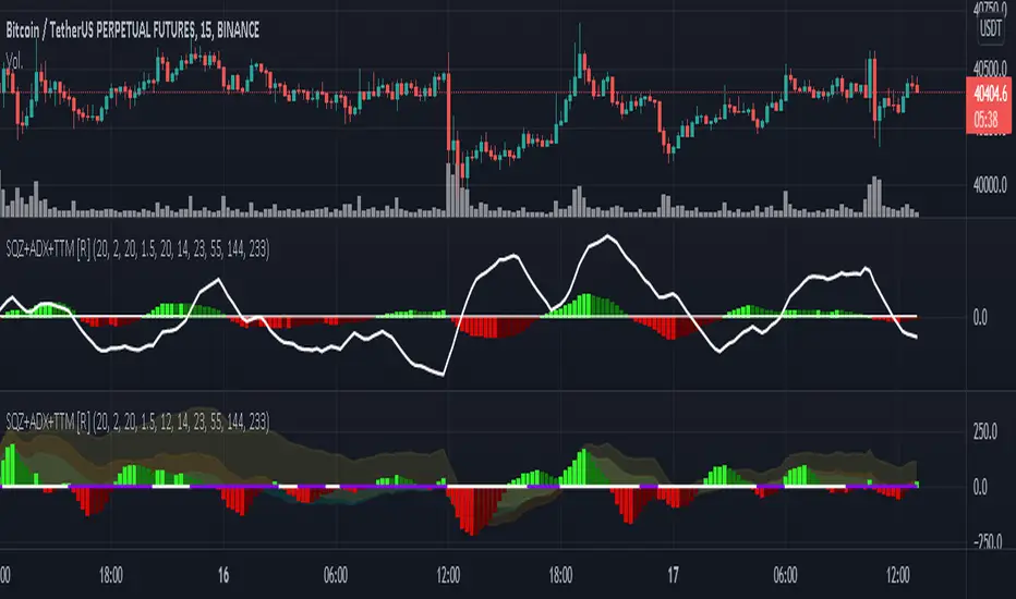
Squeeze M + ADX + TTM (Trading Latino & John Carter) by [Rolgui]About this indicator:
This indicator aims to combine two good performing strategies, which can be used separately or together, mainly for investment positions, although it can also be used for intraday trading.
Strategy 1) Squeeze Oscillator and Average Directional Index:
This strategy is taught by Jaime Aibsai, which determines market entries based on reading the direction of the price movement (Directionality of the Oscillator) along with the strength of the Oscillator (Slope of the ADX).
Both tools are configured according to Jaime Abisai's strategy, by default (note that point 23 of the ADX is represented by point 0 on the panel, to make reading easier, its interpretation is not affected). Anyway you can adjust the input data according to your interest.
*You can see this setting in the first panel.
Strategy 2) Squeeze Momentum and Trade The Market Waves:
This strategy can be consulted either in John F. Carter's books or on his website.
This market reading is based on Price Volatility (Bollinger Bands and Keltner Channels interaction) and its Trend (Exponential Moving Averages), showing entries at times when price volatility is low and taking filtering active trend using T.T.M. Waves.
To configure the indicator in the same way that Carter does, it would be enough to turn off the ADX, turn on the Squeeze Momentum signals along with the T.T.M. Waves, and importantly, change the Linear Momentum value to 12 (this configuration can be found in his book).
*You can see this setting in the second panel.
Why this indicator?
I've added and removed the above flags as I needed to query them (which became tedious for me). The main objective of having merged them into one is to make their reading more agile and comfortable and thus improve the decision-making capacity of the trader who wishes to use them.
Credits and Acknowledgments:
I would like to give credits to other authors, for the sections of code that I have used to make this technical indicator. Thanks to @LazyBear, @matetaronna, @jombie and @joren for contributing to the community and keeping their code open. It is priceless!
Feel free to combine and practice your trading with both strategies, personally, they improved my profitability and this is why I recommend researching more about them. I've been using it for crypto investing, let me know if it's worth for you on stock market!
If you have any questions or suggestions you can leave it in the comments!
Greetings!
test - autocorrelationExperimental:
finds and displays the wavelength index's of the autocorrelation wavelengths..

Fractal Resonance ComponentLazyBear's WaveTrend port has been praised for highlighting trend reversals with precision and punctuality (minimal lag). But strong "3rd Wave" trends can "embed" or saturate any oscillator flashing several premature crosses while stuck overbought/oversold. This happens when the trend stretches over a longer timescale than the oscillator's averaging window or filter time constant. Our solution: simultaneously monitor many oscillator timescales. Watch for fresh crossovers in "dominant" timescales alternating most smoothly between the overbought (red shade) and oversold (green shade) range.
Fractal Resonance Component facilitates simultaneous viewing of eight timescales that are power of 2 multiples of the chart timescale. Each timescale shows lead line, lag line, lead-lag difference, and crossover marks. Add 4 to 8 copies to your chart for a good multi-fractal read. Format * the "Timescale Multiplier" attribute of each row to be twice that of the row above for a sequence like 1, 2, 4, 8, 16, 32, 64, 128...
Fractal Resonance Component shifts its timescales along with your choice of main chart timescale:
1 minute chart: 1 minute through 128 minute (~2 hour) oscillators.
1 hour chart: 1 hour through 128 hour (~2 week) oscillators.
Daily chart: 1 day through 128 day (~4 month) oscillators.
Crossovers in different oscillator ranges tend to have different meanings:
Minor (< 75%) crossovers: small green/red dot
usually noise
Overbought/Sold crossovers (shaded 75 to 100%): black outlined dot (o)
reliable reversal indicators (when they appear alone)
Extreme Overbought (> 100%) crossovers: black outlined plus (+).
Can be a major reversal in fast markets, but usually portend the end of Elliot 3rd waves with just a small corrective (4th wave) retrace before the larger impulsive (5-wave) sequence resumes in original direction.
The final 5th-wave terminus should appear later as a lone non-extreme (black outlined circle) crossover on a slower timescale coincident with weaker (non-extreme) dot crosses on this timescale.
Careful examination of historical charts leads to many useful observations such as:
Dominant crossovers punctuating true reversals are usually in the green/red shaded ranges with black outlined dots (o) rather than minor or Extreme (+) ranges.
Due to market's fractal nature, two well-separated timescales like 1 minute and 1 hour can show dominant crosses simultaneously in opposite directions, e.g. the 1 minute showing a very short term high and the 1 hour a medium term low nearby.
Staying Nimble
Watch out for embedding on your supposedly dominant timescale -- a second cross while stuck in the overbought/oversold region suggests a stronger, longer trend than expected. Drop your eyes to a slower timescale below for the real dominant whose crossover will validate main trend reversal.
Embedding can often be predicted even at the first cross mark by checking whether the green lead line of the next slower timescale (one row below) has already hit the Overbought or especially the Extreme Overbought range but isn't close to rolling over. Fractal Resonance Bar (to be published) uses this principle to mark embedded timescales with white stripes, warning of a powerful trend wave on longer timescales you shouldn't fight until the white stripes subside.
Overnight gaps surge all timescales in ways that obscure the dominant timescale, so for shorter than daily charts, these methods work best on Futures contracts that only suffer weekend gaps.
Weis Wave Renko Panel 2 (Effort / Strength / Climax)Weis Wave Renko • Institutional HUD + Panel 2
Wyckoff / Auction Market Framework
This project consists of TWO COMPLEMENTARY INDICATORS, designed to be used together as a complete visual framework for reading Effort vs Result, Auction Direction, and Session Control, based on Wyckoff methodology and Auction Market Theory.
These tools are not trade signal generators.
They are context and decision-support instruments, built for discretionary traders who want to understand who is active, where effort is occurring, and when the auction is reaching maturity or exhaustion.
🔹 1) WEIS WAVE RENKO — INSTITUTIONAL HUD (Overlay)
📍 Location: Plotted directly on the price chart
🎯 Purpose: Fast, high-level institutional context and trade permission
The HUD answers:
“What is the current state of the auction, and is trading permitted?”
What the HUD shows:
🧠 Market Participation
Measures how much participation is present in the market:
Low Participation
Weak Participation
Active Participation
Dominant Participation
This reflects whether professional activity is present or absent, not direction alone.
📐 Auction Direction
Defines how the auction is currently resolving:
Auction Up
Auction Down
Balanced Auction
This is derived from price progression and effort alignment.
🔥 Effort (Effort vs Result)
Displays the relative strength of the current effort, normalized over recent waves:
Visual effort bar
Strength percentage (0–100)
Effort classification:
Low Effort
Increasing Effort
Strong Effort
Effort Exhaustion
This is the core Wyckoff concept: effort must produce result.
🌐 Session Control
Shows which trading session is controlling the auction:
Asia – Accumulation Phase
London – Development Phase
US RTH – Decision Phase
The dominant session is visually emphasized, while others are intentionally de-emphasized.
🔎 Market State & Trade Permission
Clearly separates structure from permission:
Structure (Neutral, Developing, Trending, Climactic Extension)
Permission
Trade Permitted
No Trade Zone
When Effort Exhaustion is detected, the HUD explicitly signals No Trade Zone.
🔹 2) WEIS WAVE RENKO — PANEL 2 (Lower Pane)
📍 Location: Dedicated lower pane below the price chart
🎯 Purpose: Detailed, continuous visualization of effort, strength, and climax
Panel 2 answers:
“How is effort evolving, and is the auction maturing or exhausting?”
What Panel 2 shows:
📊 Effort Wave (Weis-like)
Histogram of accumulated effort per directional wave
Green: Auction Up effort
Red: Auction Down effort
This reveals where real participation is building.
📈 Strength Line (0–100)
Normalized strength of the current effort wave
Same calculation used by the HUD
Enables precise comparison of effort over time
⚠️ Climax / Effort Exhaustion Marker
Triggered when effort is both strong and mature
Highlights Climactic Extension / Exhaustion
Serves as a warning, not an entry signal
🔗 HOW TO USE BOTH TOGETHER (IMPORTANT)
These indicators are designed to be used simultaneously:
Panel 2 reveals
→ how effort is building, peaking, or exhausting
HUD translates that information into
→ market state and trade permission
Typical workflow:
Panel 2 identifies rising effort or climax
HUD confirms:
Participation quality
Auction direction
Session control
Whether trading is permitted or restricted
⚠️ IMPORTANT NOTES
These tools do not generate buy or sell signals
They are contextual and structural
Best used with:
Wyckoff schematics
Auction-based execution
Market profile / volume profile
Discretionary trade management
🎯 SUMMARY
Institutional, non-lagging framework
Effort vs Result at the core
Clear separation between:
Context
Structure
Permission
Designed for professional discretionary traders

Weis Wave Renko Institutional HUD (Wyckoff/Auction) v6Weis Wave Renko • Institutional HUD + Panel 2
Wyckoff / Auction Market Framework
This project consists of TWO COMPLEMENTARY INDICATORS, designed to be used together as a complete visual framework for reading Effort vs Result, Auction Direction, and Session Control, based on Wyckoff methodology and Auction Market Theory.
These tools are not trade signal generators.
They are context and decision-support instruments, built for discretionary traders who want to understand who is active, where effort is occurring, and when the auction is reaching maturity or exhaustion.
🔹 1) WEIS WAVE RENKO — INSTITUTIONAL HUD (Overlay)
📍 Location: Plotted directly on the price chart
🎯 Purpose: Fast, high-level institutional context and trade permission
The HUD answers:
“What is the current state of the auction, and is trading permitted?”
What the HUD shows:
🧠 Market Participation
Measures how much participation is present in the market:
Low Participation
Weak Participation
Active Participation
Dominant Participation
This reflects whether professional activity is present or absent, not direction alone.
📐 Auction Direction
Defines how the auction is currently resolving:
Auction Up
Auction Down
Balanced Auction
This is derived from price progression and effort alignment.
🔥 Effort (Effort vs Result)
Displays the relative strength of the current effort, normalized over recent waves:
Visual effort bar
Strength percentage (0–100)
Effort classification:
Low Effort
Increasing Effort
Strong Effort
Effort Exhaustion
This is the core Wyckoff concept: effort must produce result.
🌐 Session Control
Shows which trading session is controlling the auction:
Asia – Accumulation Phase
London – Development Phase
US RTH – Decision Phase
The dominant session is visually emphasized, while others are intentionally de-emphasized.
🔎 Market State & Trade Permission
Clearly separates structure from permission:
Structure (Neutral, Developing, Trending, Climactic Extension)
Permission
Trade Permitted
No Trade Zone
When Effort Exhaustion is detected, the HUD explicitly signals No Trade Zone.
🔹 2) WEIS WAVE RENKO — PANEL 2 (Lower Pane)
📍 Location: Dedicated lower pane below the price chart
🎯 Purpose: Detailed, continuous visualization of effort, strength, and climax
Panel 2 answers:
“How is effort evolving, and is the auction maturing or exhausting?”
What Panel 2 shows:
📊 Effort Wave (Weis-like)
Histogram of accumulated effort per directional wave
Green: Auction Up effort
Red: Auction Down effort
This reveals where real participation is building.
📈 Strength Line (0–100)
Normalized strength of the current effort wave
Same calculation used by the HUD
Enables precise comparison of effort over time
⚠️ Climax / Effort Exhaustion Marker
Triggered when effort is both strong and mature
Highlights Climactic Extension / Exhaustion
Serves as a warning, not an entry signal
🔗 HOW TO USE BOTH TOGETHER (IMPORTANT)
These indicators are designed to be used simultaneously:
Panel 2 reveals
→ how effort is building, peaking, or exhausting
HUD translates that information into
→ market state and trade permission
Typical workflow:
Panel 2 identifies rising effort or climax
HUD confirms:
Participation quality
Auction direction
Session control
Whether trading is permitted or restricted
⚠️ IMPORTANT NOTES
These tools do not generate buy or sell signals
They are contextual and structural
Best used with:
Wyckoff schematics
Auction-based execution
Market profile / volume profile
Discretionary trade management
🎯 SUMMARY
Institutional, non-lagging framework
Effort vs Result at the core
Clear separation between:
Context
Structure
Permission
Designed for professional discretionary traders

Katz Impact Wave 🚀Overview of the Katz Impact Wave 🚀
The Katz Impact Wave is a momentum oscillator designed to visualize the battle between buyers and sellers. Instead of combining bullish and bearish pressure into a single line, it separates them into two distinct "Impact Waves."
Its primary goal is to generate clear trade signals by identifying when one side gains control, but only when the market has enough volatility to be considered "moving." This built-in filter helps to avoid signals during flat or choppy market conditions.
Indicator Components: Lines & Plots
Impact Waves & Fill
Green Wave (Total Up Impulses): This line represents the cumulative buying pressure. When this line is rising, it indicates that bulls are getting stronger.
Red Wave (Total Down Impulses): This line represents the cumulative selling pressure. When this line is rising, it indicates that bears are getting stronger.
Colored Fill: The shaded area between the two waves provides an at-a-glance view of who is in control.
Lime Fill: Bulls are dominant (Green Wave is above the Red Wave).
Red Fill: Bears are dominant (Red Wave is above the Green Wave).
Background Color
The background color provides crucial context about the market state according to the indicator's logic.
Green Background: The market is in a bullish state (Green Wave is dominant) AND the Rate of Change (ROC) filter confirms the market is actively moving.
Red Background: The market is in a bearish state (Red Wave is dominant) AND the ROC filter confirms the market is actively moving.
Gray Background: The market is considered "not moving" or is in a low-volatility chop. Signals that occur when the background is gray should be viewed with extreme caution or ignored.
Symbols & Pivot Lines
▲ Blue Triangle (Up): This is your long entry signal. It appears on the bar where the Green Wave crosses above the Red Wave while the market is moving.
▼ Orange Triangle (Down): This is your short entry signal. It appears on the bar where the Red Wave crosses above the Green Wave while the market is moving.
Pivot Lines (Solid Green/Red/White Lines): These lines mark confirmed peaks of exhaustion in momentum, not price.
Green Pivot Line: Marks a peak in the Green Wave, signaling buying momentum exhaustion. This can be a warning that the uptrend is losing steam.
Red Pivot Line: Marks a peak in the Red Wave, signaling selling momentum exhaustion. This can be a warning that the downtrend is losing steam.
▼ Yellow Triangle (Compression): This rare signal appears when buying and selling exhaustion pivots happen at the same level. It signifies a point of extreme indecision or equilibrium that often occurs before a major price expansion.
Trading Rules & Strategy
This indicator provides entry signals but does not provide explicit Take Profit or Stop Loss levels. You must use your own risk management rules.
Long Trade Rules
Entry Signal: Wait for a blue ▲ triangle to appear at the top of the indicator panel.
Confirmation: Ensure the background color is green, confirming the market is in a bullish, moving state.
Action: Enter a long (buy) trade at the open of the next candle after the signal appears.
Short Trade Rules
Entry Signal: Wait for an orange ▼ triangle to appear at the bottom of the indicator panel.
Confirmation: Ensure the background color is red, confirming the market is in a bearish, moving state.
Action: Enter a short (sell) trade at the open of the next candle after the signal appears.
Take Profit (TP) & Stop Loss (SL) Ideas
You must develop and test your own exit strategy. Here are some common approaches:
Stop Loss:
Place a stop loss below the most recent significant swing low on the price chart for a long trade, or above the recent swing high for a short trade.
Use an ATR (Average True Range) based stop, such as 2x the ATR value below your entry for a long, to account for market volatility.
Take Profit:
Opposite Signal: The simplest exit is to close your trade when the opposite signal appears (e.g., close a long trade when a short signal ▼ appears).
Momentum Exhaustion: For a long trade, consider taking partial or full profit when a green Pivot Line appears, signaling that buying momentum is peaking.
Fixed Risk/Reward: Use a predetermined risk/reward ratio (e.g., 1:1.5 or 1:2).
Disclaimer
This indicator is a tool for analysis, not a financial advisor or a guaranteed profit system. All trading and investment activities involve substantial risk. You should not risk more than you are prepared to lose. Past performance is not an indication of future results. You are solely responsible for your own trading decisions, risk management, and for backtesting this or any other tool before using it in a live trading environment. This indicator is for educational purposes only.

Elliott Wave Auto (Impulse + Correction) — stable deleteAutomatic pivot detection: The script identifies swing highs and swing lows using ta.pivothigh and ta.pivotlow.
Impulse wave labeling (1–5):
Detects 5 alternating pivots and labels them as waves 1 to 5.
Uses green/red labels for impulse and correction legs.
Connects waves with blue lines for visual clarity.
Corrective wave labeling (A–B–C):
Detects the next 3 alternating pivots after wave 5.
Labels them as A, B, C with orange lines connecting them.
Dynamic cleanup:
Stores labels and lines in arrays.
Deletes previous drawings automatically before redrawing, keeping the chart clean.
Optional pivot markers:
Plots tiny triangles for detected pivots (green for lows, red for highs).
Information table:
Displays the direction (Bullish/Bearish) and percentage move of the 1–5 impulse waves.
Pine Script v5 compliant:
Uses str.tostring() and array-based deletion to avoid tostring() or line.deleteall() errors.
If you want, I can also add an alert feature to notify you when a full impulse + corrective wave pattern completes. This makes it actionable for trading.

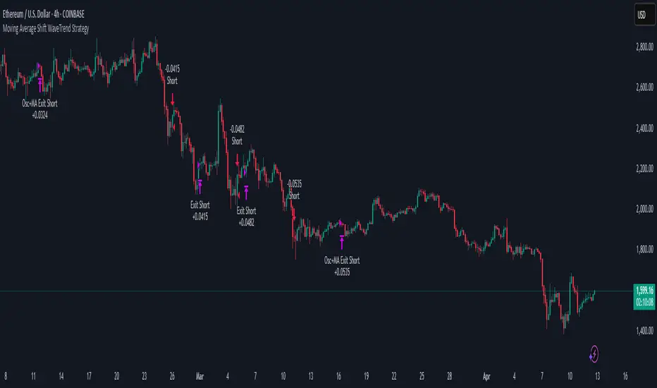
Moving Average Shift WaveTrend StrategyMoving Average Shift WaveTrend Strategy
🧭 Overview
The Moving Average Shift WaveTrend Strategy is a trend-following and momentum-based trading system designed to be overlayed on TradingView charts. It executes trades based on the confluence of multiple technical conditions—volatility, session timing, trend direction, and oscillator momentum—to deliver logical and systematic trade entries and exits.
🎯 Strategy Objectives
Enter trades aligned with the prevailing long-term trend
Exit trades on confirmed momentum reversals
Avoid false signals using session timing and volatility filters
Apply structured risk management with automatic TP, SL, and trailing stops
⚙️ Key Features
Selectable MA types: SMA, EMA, SMMA (RMA), WMA, VWMA
Dual-filter logic using a custom oscillator and moving averages
Session and volatility filters to eliminate low-quality setups
Trailing stop, configurable Take Profit / Stop Loss logic
“In-wave flag” prevents overtrading within the same trend wave
Visual clarity with color-shifting candles and entry/exit markers
📈 Trading Rules
✅ Long Entry Conditions:
Price is above the selected MA
Oscillator is positive and rising
200-period EMA indicates an uptrend
ATR exceeds its median value (sufficient volatility)
Entry occurs between 09:00–17:00 (exchange time)
Not currently in an active wave
🔻 Short Entry Conditions:
Price is below the selected MA
Oscillator is negative and falling
200-period EMA indicates a downtrend
All other long-entry conditions are inverted
❌ Exit Conditions:
Take Profit or Stop Loss is hit
Opposing signals from oscillator and MA
Trailing stop is triggered
🛡️ Risk Management Parameters
Pair: ETH/USD
Timeframe: 4H
Starting Capital: $3,000
Commission: 0.02%
Slippage: 2 pips
Risk per Trade: 2% of account equity (adjustable)
Total Trades: 224
Backtest Period: May 24, 2016 — April 7, 2025
Note: Risk parameters are fully customizable to suit your trading style and broker conditions.
🔧 Trading Parameters & Filters
Time Filter: Trades allowed only between 09:00–17:00 (exchange time)
Volatility Filter: ATR must be above its median value
Trend Filter: Long-term 200-period EMA
📊 Technical Settings
Moving Average
Type: SMA
Length: 40
Source: hl2
Oscillator
Length: 15
Threshold: 0.5
Risk Management
Take Profit: 1.5%
Stop Loss: 1.0%
Trailing Stop: 1.0%
👁️ Visual Support
MA and oscillator color changes indicate directional bias
Clear chart markers show entry and exit points
Trailing stops and risk controls are transparently managed
🚀 Strategy Improvements & Uniqueness
In-wave flag avoids repeated entries within the same trend phase
Filtering based on time, volatility, and trend ensures higher-quality trades
Dynamic high/low tracking allows precise trailing stop placement
Fully rule-based execution reduces emotional decision-making
💡 Inspirations & Attribution
This strategy is inspired by the excellent concept from:
ChartPrime – “Moving Average Shift”
It expands on the original idea with advanced trade filters and trailing logic.
Source reference:
📌 Summary
The Moving Average Shift WaveTrend Strategy offers a rule-based, reliable approach to trend trading. By combining trend and momentum filters with robust risk controls, it provides a consistent framework suitable for various market conditions and trading styles.
⚠️ Disclaimer
This script is for educational purposes only. Trading involves risk. Always use proper backtesting and risk evaluation before applying in live markets.
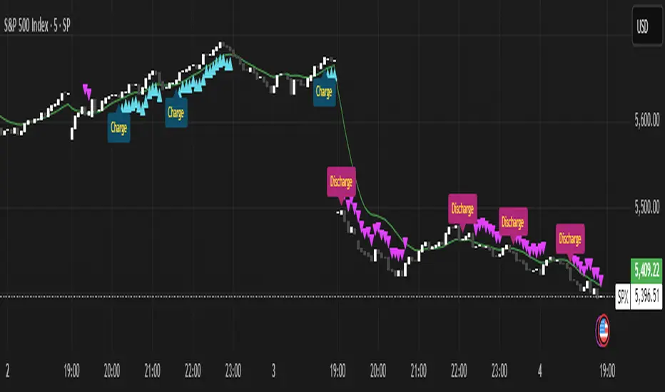
Momentum Charge Theory (MCT)-(TechnoBlooms)The Momentum Charge Theory (MCT) Indicator is an advanced physics and mathematics-inspired trend detection system designed to identify market energy shifts with precision. Unlike traditional indicators that rely on static formulas, MCT integrates entropy, volatility, kinetic energy, and wavelet transforms to map price dynamics in real time.
Built on Scientific Principles – This indicator applies quantum-inspired charge-discharge mechanics to spot early trend formations and reversals. Think of price action like an energy system: it charges (builds momentum) before an explosive move and discharges when that energy dissipates.
Core Concepts Behind MCT
1️⃣ Directional Market Entropy – Measuring Trend Strength
Entropy quantifies market randomness – is the trend structured or chaotic?
✅ A high-entropy market is uncertain (choppy price action), while a low-entropy market signals a strong directional trend.
✅ MCT normalizes entropy, allowing traders to differentiate trend acceleration from market noise.
2️⃣ Information Flow Volatility – Identifying Breakout Zones
Inspired by Econophysics, this component measures volatility based on information flow rather than simple price movements.
✅ Helps spot high-volatility breakout conditions before they occur.
✅ Filters out false breakouts caused by random market noise.
3️⃣ Kinetic Energy Momentum (KEM) – The Physics of Price Acceleration
Just like in physics, momentum is a function of mass and velocity – in trading, this translates to volume and price change.
✅ Uses kinetic energy equations to identify price acceleration zones.
✅ Helps detect momentum shifts before price visibly reacts.
4️⃣ Hilbert Transform Approximation – Slope & Trend Direction Analysis
Applies Hilbert Transforms to estimate trend angle shifts.
✅ Detects momentum decay and early reversal signals.
✅ Captures the true trend slope rather than relying on lagging moving averages.
5️⃣ Wavelet Transform – Advanced Noise Filtering & Trend Confirmation
Market movements contain multiple frequencies – wavelet transforms isolate dominant trends while removing short-term price noise.
✅ Improves trend clarity by reducing false signals.
✅ Acts as a final confirmation filter before generating Charge & Discharge signals.
Charge & Discharge – The Energy Behind Market Moves
🔹 Charge (Uptrend Activation)
A blue triangle appears below the candle when market conditions align for a strong bullish move.
📈 Indicates momentum buildup, low entropy, and trend strength confirmation.
🔸 Discharge (Downtrend Activation)
A purple triangle appears above the candle when price momentum weakens and market entropy increases.
📉 Suggests a potential trend exhaustion or reversal.
Best Use Cases for Traders
✅ Momentum Traders – Catch trend initiations before they gain full traction.
✅ Breakout Traders – Identify high-information flow zones with volatility-driven signals.
✅ Trend Followers – Avoid false signals by relying on entropy-driven confirmations.
The MCT indicator can be combined with any of your usual indicators for trend confirmation.