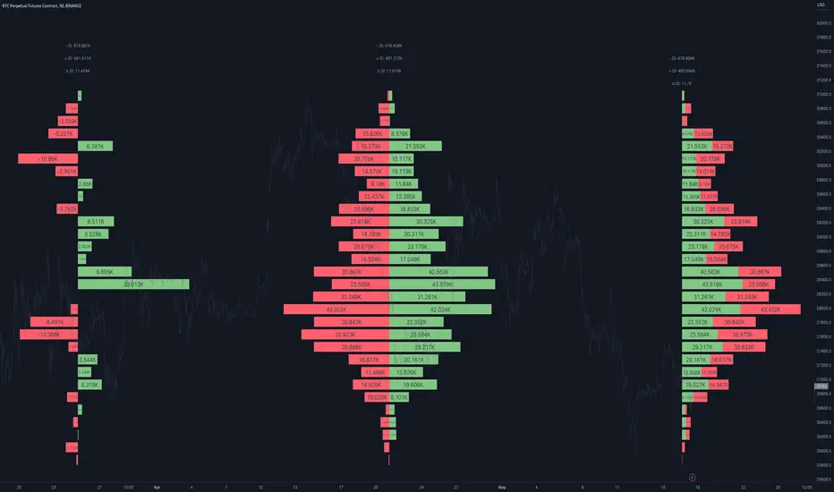
Open Interest Profile [Fixed Range] - By LeviathanThis script generates an aggregated Open Interest profile for any user-selected range and provides several other features and tools, such as OI Delta Profile, Positive Delta Levels, OI Heatmap, Range Levels, OIWAP, POC and much more.
The indicator will help you find levels of interest based on where other market participants are opening and closing their positions. This provides a deeper insight into market activity and serves as a foundation for various different trading strategies (trapped traders, supply and demand, support and resistance, liquidity gaps, imbalances,liquidation levels, etc). Additionally, this indicator can be used in conjunction with other tools such as Volume Profile.
Open Interest (OI) is a key metric in derivatives markets that refers to the total number of unsettled or open contracts. A contract is a mutual agreement between two parties to buy or sell an underlying asset at a predetermined price. Each contract consists of a long side and a short side, with one party consenting to buy (long) and the other agreeing to sell (short). The party holding the long position will profit from an increase in the asset's price, while the one holding the short position will profit from the price decline. Every long position opened requires a corresponding short position by another market participant, and vice versa. Although there might be an imbalance in the number of accounts or traders holding long and short contracts, the net value of positions held on each side remains balanced at a 1:1 ratio. For instance, an Open Interest of 100 BTC implies that there are currently 100 BTC worth of longs and 100 BTC worth of shorts open in the market. There might be more traders on one side holding smaller positions, and fewer on the other side with larger positions, but the net value of positions on both sides is equivalent - 100 BTC in longs and 100 BTC in shorts (1:1). Consider a scenario where a trader decides to open a long position for 1 BTC at a price of $30k. For this long order to be executed, a counterparty must take the opposite side of the contract by placing a short order for 1 BTC at the same price of $30k. When both long and short orders are matched and executed, the Open Interest increases by 1 BTC, indicating the introduction of this new contract to the market.
The meaning of fluctuations in Open Interest:
- OI Increase - signifies new positions entering the market (both longs and shorts).
- OI Decrease - indicates positions exiting the market (both longs and shorts).
- OI Flat - represents no change in open positions due to low activity or a large number of contract transfers (contracts changing hands instead of being closed).
Typically, we monitor Open Interest in the form of its running value, either on a chart or through OI Delta histograms that depict the net change in OI for each price bar. This indicator enhances Open Interest analysis by illustrating the distribution of changes in OI on the price axis rather than the time axis (akin to Volume Profiles). While Volume Profile displays the volume that occurred at a given price level, the Open Interest Profile offers insight into where traders were opening and closing their positions.
How to use the indicator?
1. Add the script to your chart
2. A prompt will appear, asking you to select the “Start Time” (start of the range) and the “End Time” (end of the range) by clicking anywhere on your chart.
3. Within a few seconds, a profile will be generated. If you wish to alter the selected range, you can drag the "Start Time" and "End Time" markers accordingly.
4. Enjoy the script and feel free to explore all the settings.
To learn more about each input in indicator settings, please read the provided tooltips. These can be accessed by hovering over or clicking on the ( i ) symbol next to the input.
在脚本中搜索"电脑桌面显示BTC"
Bitcoin Miner Extreme SellingThis script is for identifying extreme selling. Judging by the chart, Bitcoin miners often (not always) sell hard for two reasons: to take profit into parabolic price rises, or to stay solvent when the price is very low.
Extreme selling thus often coincides with long-term tops and bottoms in Bitcoin price. This can be a useful EXTRA data point when trying to time long-term Bitcoin spot or crypto equity investment (NOT advice, you remain responsible, etc). The difference between selling measured in BTC and in USD gives a reasonable idea of whether miners are selling to make a profit or to stay solvent.
CREDITS
The idea for using the ratio of miner outflows to reserves comes from the "Bitcoin Miner Sell Pressure" script by the pioneering capriole_charles.
The two request.security calls are identical. Another similarity is that you have to sum the outflows to make it make sense. But it doesn't make much difference, it turns out from testing, to use an average of the reserves, so I didn't. All other code is different.
The script from capriole_charles uses Bollinger bands to highlight periods when sell pressure is high, uses a rolling 30-day sum, and only uses the BTC metrics.
My script uses a configurable 2-6 week rolling sum (there's nothing magical about one month), uses different calculations, and uses BTC, USD, and composite metrics.
INPUTS
Rolling Time Basis : Determines how much data is rolled up. At the lowest level, daily data is too volatile. If you choose, e.g., 1 week, then the indicator displays the relative selling on a weekly basis. Longer time periods, obviously, are smoother but delayed, while shorter time periods are more reactive. There is no "real" time period, only an explicit interpretation.
Show Data > Outflows : Displays the relative selling data, along with a long-term moving average. You might use this option if you want to compare the "real" heights of peaks across history.
Show Data > Delta (the default): Only the difference between the relative selling and the long-term moving average is displayed, along with an average of *that*. This is more signal and less noise.
Base Currency : Configure whether the calculations use BTC or USD as the metric. This setting doesn't use the BTC price at all; it switches the data requested from INTOTHEBLOCK.
If you choose Composite (the default), the script combines BTC and USD together in a relative way (you can't simply add them, as USD is a much bigger absolute value).
In Composite mode, the peaks are coloured red if BTC selling is higher than USD, which usually indicates forced selling, and green if USD is higher, which usually indicates profit-taking. This categorisation is not perfectly accurate but it is interesting insomuch as it is derived from block data and not Bitcoin price.
In BTC or USD mode, a gradient is used to give a rough visual idea of how far from the average the current value is, and to make it look pretty.
USAGE NOTES
Because of the long-term moving averages, the length of the chart does make a difference. I recommend running the script on the longest Bitcoin chart, ticker BLX.
To use it to compare selling with pivots in crypto equities, use a split chart: one BLX with the indicator applied, and one with the equity of your choice. Sync Interval, Crosshair, Time, and Date Range, but not Symbol.

RouterOrdersIronLibrary "RouterOrdersIron"
Library for routing orders to the Binance exchange.
MsgDoLongMKT(id, symbol, balance)
Returns json for Iron to buy a symbol for the amount of the balance with market order.
Parameters:
id : ID of your Iron router.
symbol : Symbol for a trade, BTC example
balance : The amount for which to carry out the transaction.
Returns: true
MsgDoShortMKT(id, symbol, balance)
Returns json for Iron to sell a symbol for the amount of the balance with market order.
Parameters:
id : ID of your Iron router.
symbol : Symbol for a trade, BTC example
balance : The amount for which to carry out the transaction.
Returns: true
MsgDoLongLR(id, symbol, balance)
Returns json for Iron to buy a symbol for the amount of the balance. It is set at the best price and is re-set each time if a new price has risen before the application.
Parameters:
id : ID of your Iron router.
symbol : Symbol for a trade, BTC example
balance : The amount for which to carry out the transaction.
Returns: true
MsgDoShortLR(id, symbol, balance)
Returns json for Iron to sell a symbol for the amount of the balance. It is set at the best price and is re-set each time if a new price has risen before the application.
Parameters:
id : ID of your Iron router.
symbol : Symbol for a trade, BTC example
balance : The amount for which to carry out the transaction.
Returns: true
DoLongMKT(id, symbol, balance)
Buy a symbol for the amount of the balance. It is send market order to Iron.
Parameters:
id : ID of your Iron router.
symbol : Symbol for a trade, BTC example
balance : The amount for which to carry out the transaction.
Returns: true
DoShortMKT(id, symbol, balance)
Sell a symbol for the amount of the balance. It is send market order to Iron.
Parameters:
id : ID of your Iron router.
symbol : Symbol for a trade, BTC example
balance : The amount for which to carry out the transaction.
Returns: true
DoLongLR(id, symbol, balance)
Buy a symbol for the amount of the balance. It is set at the best price and is re-set each time if a new price has risen before the application.
Parameters:
id : ID of your Iron router.
symbol : Symbol for a trade, BTC example
balance : The amount for which to carry out the transaction.
Returns: true
DoShortLR(id, symbol, balance)
Sell a symbol for the amount of the balance. It is set at the best price and is re-set each time if a new price has risen before the application.
Parameters:
id : ID of your Iron router.
symbol : Symbol for a trade, BTC example
balance : The amount for which to carry out the transaction.
Returns: true
GetQty(price, balance)
Get Qty for strategy on balance
Parameters:
price : Order price
balance : The amount for which to carry out the transaction.
Returns: Qty for strategy order TV
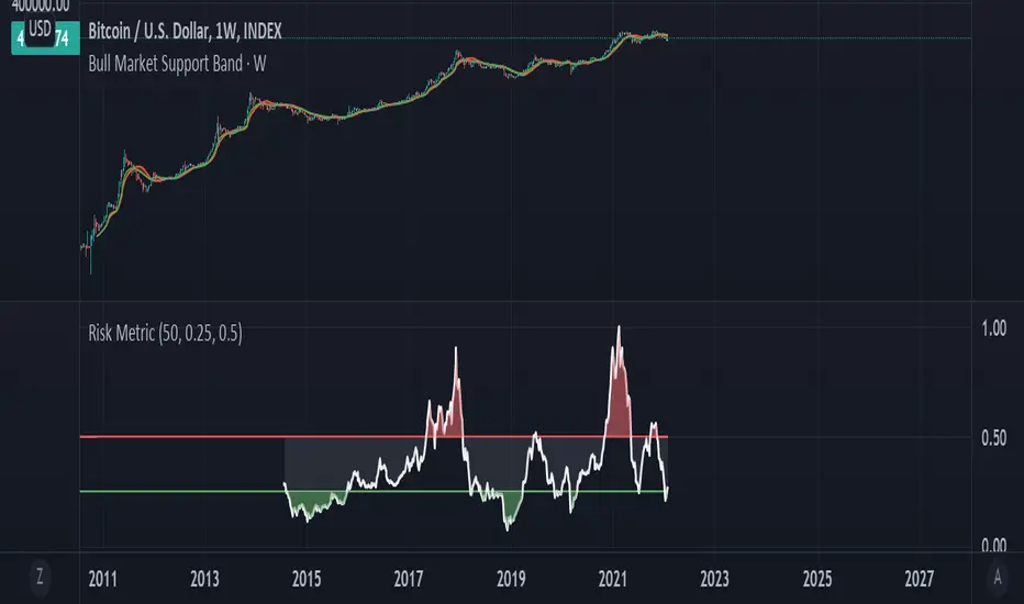
Bitcoin Risk Metric IIThesis: Bitcoin's price movements can be (dubiously) characterized by functional relationships between moving averages and standard deviations. These movements can be normalized into a risk metric through normalization functions of time. This risk metric may be able to quantify a long term "buy low, sell high" strategy.
This risk metric is the average of three normalized metrics:
1. (btc - 4 yma)/ (std dev)
2. ln(btc / 20 wma)
3. (50 dma)/(50 wma)
* btc = btc price
* yma = yearly moving average of btc, wma = weekly moving average of btc, dma = daily moving average of btc
* std dev = std dev of btc
Important note:
Historical data for this metric is only shown back until 2014, because of the nature of the 1st mentioned metric. The other two metrics produce a value back until 2011. A previous, less robust, version of metric 2 is posted on my TradingView as well.
Volume $A 1 BTC volume at 50.000 $/BTC is quite different from a 1 BTC volume at 20.000 $/BTC
It is a bit tricky to evaluate volume, especially at higher TF's, where BTC price can fluctuate a lot.
Therefore this script, where volume of the currency is multiplied by the currency's price.
Currency's can be:
- BTC
- ETH
- BNB
- TRX
- XRP
If it is not one of these currency's, the normal 'volume' will show
Some examples and differences between my 'Vol $' and regular 'Vol':
REV/BTC
s3.tradingview.com
DBC/BTC
s3.tradingview.com
AGI/ETH
s3.tradingview.com
BAX/ETH
s3.tradingview.com
ALGO/BNB
s3.tradingview.com
Cheers!

Noro's Bands Strategy v1.0Recomended:
- H1 timeframe
- Any crypto ("BTC/USD", "XRP/BTC", "Govnocoin/Govnocoin")
- Period = 20
- Color = true
Backtests (default):
"BTC/USD", BitFinex, H1, strategy = profit +7.818%
"BTC/USD", BitFinex, H1, buy and hold = profit +662%
"ETH/USD", BitFinex, H1, strategy = profit +14.189%
"ETH/USD", BitFinex, H1, buy and hold = profit +9.239%
"XRP/USD, BitFinex, H1, strategy = profit +17.342%
"XRP/USD, BitFinex, H1, buy and hold = profit +124%
"ETH/BTC", BitFinex, H1, strategy = profit +7.842%
"ETH/BTC", BitFinex, H1, buy and hold = profit +998%
"XRP/BTC", BitFinex, H1, strategy = profit -23% 0
"XRP/BTC", BitFinex, H1, buy and hold = profit -41%

Liquidity-Weighted Business Cycle (Satoshi Global Base)🌍 BTC-Affinity Global Liquidity Business Cycle (MACD Model)
This indicator models Bitcoin’s macroeconomic business cycle using a BTC-weighted global liquidity index as its foundation. It adapts a MACD-based framework to visualize expansions and contractions in fiat liquidity across major economies with high Bitcoin affinity.
🔍 What It Does:
🧠 Constructs a Global M2 Liquidity Index from the top 10 most BTC-relevant fiat currencies
(USD, EUR, JPY, GBP, INR, CNY, KRW, BRL, CAD, AUD)
— each weighted by its Bitcoin adoption score and FX-converted into USD.
📊 Applies a MACD (Moving Average Convergence Divergence) signal to the index to detect macro liquidity trends.
🟢 Plots a histogram of business cycle momentum (red = expansion, green = contraction).
🔴 Marks potential cycle peaks, useful for macro trading alignment.
⚖️ BTC Affinity-Weighted Countries:
🇺🇸 United States
🇪🇺 Eurozone
🇯🇵 Japan
🇬🇧 United Kingdom
🇮🇳 India
🇨🇳 China
🇰🇷 South Korea
🇧🇷 Brazil
🇨🇦 Canada
🇦🇺 Australia
Weights are user-adjustable to reflect evolving capital controls, regulation, and real-world BTC adoption trends.
✅ Use Cases:
Confirm macro risk-on vs risk-off regimes for BTC and crypto.
Identify ideal entry and exit zones in macro pair trades (e.g., MSTR vs MSTY).
Monitor how global monetary expansion feeds into BTC valuations.

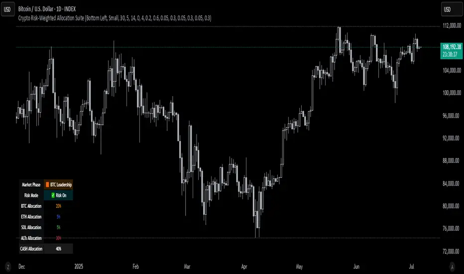
Crypto Risk-Weighted Allocation SuiteCrypto Risk-Weighted Allocation Suite
This indicator is designed to help users explore dynamic portfolio allocation frameworks for the crypto market. It calculates risk-adjusted allocation weights across major crypto sectors and cash based on multi-factor momentum and volatility signals. Best viewed on INDEX:BTCUSD 1D chart. Other charts and timeframes may give mixed signals and incoherent allocations.
🎯 How It Works
This model systematically evaluates the relative strength of:
BTC Dominance (CRYPTOCAP:BTC.D)
Represents Bitcoin’s share of the total crypto market. Rising dominance typically indicates defensive market phases or BTC-led trends.
ETH/BTC Ratio (BINANCE:ETHBTC)
Gauges Ethereum’s relative performance versus Bitcoin. This provides insight into whether ETH is leading risk appetite.
SOL/BTC Ratio (BINANCE:SOLBTC)
Measures Solana’s performance relative to Bitcoin, capturing mid-cap layer-1 strength.
Total Market Cap excluding BTC and ETH (CRYPTOCAP:TOTAL3ES)
Represents Altcoins as a broad category, reflecting appetite for higher-risk assets.
Each of these series is:
✅ Converted to a momentum slope over a configurable lookback period.
✅ Standardized into Z-scores to normalize changes relative to recent behavior.
✅ Smoothed optionally using a Hull Moving Average for cleaner signals.
✅ Divided by ATR-based volatility to create a risk-weighted score.
✅ Scaled to proportionally allocate exposure, applying user-configured minimum and maximum constraints.
🪙 Dynamic Allocation Logic
All signals are normalized to sum to 100% if fully confident.
An overall confidence factor (based on total signal strength) scales the allocation up or down.
Any residual is allocated to cash (unallocated capital) for conservative exposure.
The script automatically avoids “all-in” bias and prevents negative allocations.
📊 Outputs
The indicator displays:
Market Phase Detection (which asset class is currently leading)
Risk Mode (Risk On, Neutral, Risk Off)
Dynamic Allocations for BTC, ETH, SOL, Alts, and Cash
Optional momentum plots for transparency
🧠 Why This Is Unique
Unlike simple dominance indicators or crossovers, this model:
Integrates multiple cross-asset signals (BTC, ETH, SOL, Alts)
Adjusts exposure proportionally to signal strength
Normalizes by volatility, dynamically scaling risk
Includes configurable constraints to reflect your own risk tolerance
Provides a cash fallback allocation when conviction is low
Is entirely non-repainting and based on daily closing data
⚠️ Disclaimer
This script is provided for educational and informational purposes only.
It is not financial advice and should not be relied upon to make investment decisions.
Past performance does not guarantee future results.
Always consult a qualified financial advisor before acting on any information derived from this tool.
🛠 Recommended Use
As a framework to visualize relative momentum and risk-adjusted allocations
For research and backtesting ideas on portfolio allocation across crypto sectors
To help build your own risk management process
This script is not a turnkey strategy and should be customized to fit your goals.
✅ Enjoy exploring dynamic crypto allocations responsibly!
Currency ComparatorIndicator Description
This script helps you compare the price changes of various cryptocurrencies against each other.
While TradingView provides some pairs like ETH/BTC or BNB/BTC, it lacks support for comparing lower-market-cap coins against BTC or other currencies. That’s where this script comes in, allowing you to easily view ratios like DOGS/BTC, LSD/BTC, and more.
You can also analyze the relationship between two high-market-cap assets, such as ETH/SOL, which is often not available directly on TradingView.
Additionally, this indicator enables you to view the changes of two cryptocurrencies alongside a base currency. For example, you can observe how Bitcoin's rise impacts LSD and whether it strengthens or weakens relative to BTC.
Features
Maximized View: You can open the indicator in a maximized chart view and use it like any other chart for your technical analysis.
Customizable Comparisons: Compare any two assets with ease by configuring the indicator inputs.
Important Notes
1.Preserving Drawings:
Drawings and tools applied to the indicator chart are not tied to the indicator’s settings. This means changing the inputs won’t affect them. To avoid losing your work:
Open the chart of the base asset (e.g., LSD/USDT) where you want to analyze a specific pair (e.g., LSD/BTC).
Use the indicator there. This way, whenever you want to revisit your analysis, you only need to open the base chart (e.g., LSD/USDT) and update the indicator inputs to the desired pair (e.g., LSD/BTC).
2.Deleting the Indicator:
Removing the indicator from the chart will also delete all your drawings. If you need to keep them, do not delete the indicator.
3.Precision Settings:
By default, the indicator displays up to 12 decimal places (precision). For pairs where such precision isn’t required, you can adjust it in the settings under the "Style" section to your preferred value. If you need higher precision again, simply reset it to the default value.

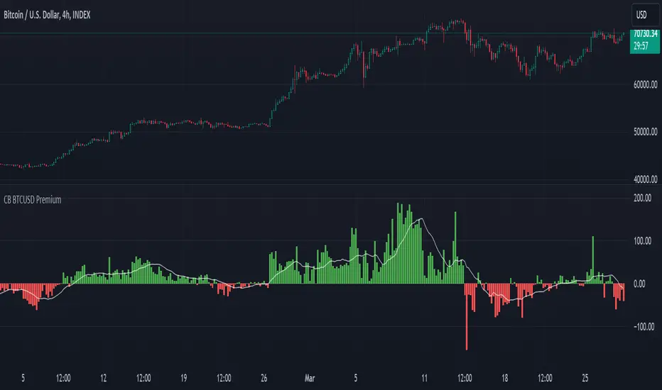
CB BTCUSD PremiumThis indicator is designed for cryptocurrency traders and analysts who wish to compare the spot price of Bitcoin (BTC) on Coinbase (BTC/USD) against Binance (BTC/USDT), highlighting the premium or discount between these two major exchanges in real-time. Additionally, it incorporates a moving average of the premium, allowing users to identify trends over their selected timeframe.
Features:
Spot Price Comparison: Calculates the real-time difference (premium or discount) between the BTC/USD spot price on Coinbase and the BTC/USDT spot price on Binance.
Premium Indicator: Displays the premium as columns on the chart, using green to indicate a premium (Coinbase > Binance) and red to indicate a discount (Coinbase < Binance).
Moving Average Trend: Includes a simple moving average (SMA) of the premium over a user-defined period, plotted as a blue line, to help users identify trends in the premium over time.
Customizable MA Period: Users can adjust the moving average period to suit their analysis needs, with a default setting of 14 periods.
Usage Instructions:
Adding the Indicator: Search for "Coinbase to Binance BTC Spot Premium with Moving Average" in the TradingView indicators and strategies library and add it to your chart.
Customizing the MA Period: To adjust the moving average period, click on the indicator's settings (gear icon) and navigate to the "Inputs" tab. Enter your desired period for the moving average.
Ideal for: Traders and analysts focusing on arbitrage opportunities, market depth analysis, and those interested in the comparative performance of BTC across different exchanges.
Note: This indicator does not constitute financial advice. It's a tool designed to provide analytical insights. Users should conduct their own research and consult with financial advisors before making investment decisions.
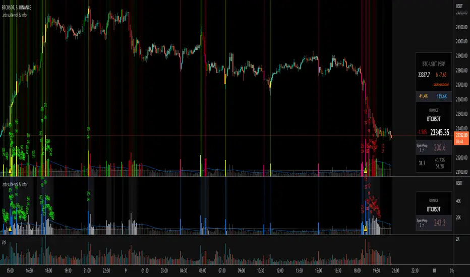
.srb suite vol & infoThe volume indicator
what can replace the built-in volume indicator and It also has some useful features.
and designed to work as overlay in the same pane with open-source indicator by default.
Regular volume Indicator
Volume SMA plot
Large Volume ! emphasize by color & mark.
Ultra Volume ! overlay marking ; x2 x4 x6 lager than regular average volume. it will help you can take the reversal
BTC-agg. Volume
4 BTC-spot & 4 BTC-PERP volume aggregated.
It might helps you don't miss out on important volume flows.
Weighted to spot trading volume when using PERP+spot volume.
If enabled, BTC-agg.Vol automatically applied when selecting BTC-pair.
Information panel (optimized for crypto-currency)
BTC-PERP price & delta (when Binance:BTCUSDT selected)
BTC dominance, Binance:BTCUSDTPERP OI
Symbol, Price, Daily up/down
ATR14 (for checking current volatility)
Recommended setup for .srb suite
tradingview | chart setting > Appearance > Top margin 0%, Bottom margin 0% for optimized screen usage
tradingview | chart setting > Appearance > Right margin 57
.srb suite vol & info --> Visual Order > Bring to Front
.srb suite vol & info --> Pin to scale > No scale (Full-screen)
USDT PremiumThis is a simple script that aggregates the USDTUSD pairs available on TradingView and shows the average price of (USDTUSD - 1).
Heavy buying of BTC on USD exchanges (read: Coinbase) will result in a positive USDT premium
Heavy selling of BTC on USD exchanges (read: Coinbase) will result in a negative USDT premium
Heavy buying of BTC on USDT exchanges result in a negative USDT premium
Heavy selling of BTC on USDT exchanges will result in a positive USDT premium
Here is a quote about USDT premiums from Zhao Dong, one of China's largest OTC traders, from the article "Chinese Bitcoin Billionaire Argues USDT Premium is Caused by USD Inflow, Not Tether Inflation":
"So let me tell you a little bit about where the plus or minus premium for usdt comes from. Right
The biggest exchange in America is coinbase, which trades in dollars. In addition to coinbase, most exchanges with large trading volume are usdt trading. Since BTC and usdt can flow freely between exchanges, the price difference is very small.
Assuming that the market is stable, there is no difference between the prices of usd and usdt. Btcusd = btcusdt
At some point the market starts to recover, goes up, and the otc money starts to come into the market. Coinbase is a compliance exchange, so the usd deposit is very smooth, while the usd deposit through usdt needs to be converted into usdt first and then deposited into the exchange, so the usdt will be slightly delayed in price transmission, so the usd exchange price is higher than the usdt exchange price. If there is a lot of dollars to buy, coinbase goes up first and usdt goes up later.
At this point, the coinbase price is higher than the usdt exchange price. If btcusd>btcusdt, because BTC is free flowing, that means usdt is in a positive premium to usd.
This arbitrage space will prompt the brick moving party to sell BTC from coinbase to usd, and then use usd to buy usdt, thus facilitating the issuance of usdt.
A negative usdt premium would prompt Tether to take back the usdt and destroy it."
Includes an option for repainting -- default value is true, meaning the script will repaint the current bar.
False = Not Repainting = Value for the current bar is not repainted, but all past values are offset by 1 bar.
True = Repainting = Value for the current bar is repainted, but all past values are correct and not offset by 1 bar.
In both cases, all of the historical values are correct, it is just a matter of whether you prefer the current bar to be realistically painted and the historical bars offset by 1, or the current bar to be repainted and the historical data to match their respective price bars.
As explained by TradingView,`f_security()` is for coders who want to offer their users a repainting/no-repainting version of the HTF data.

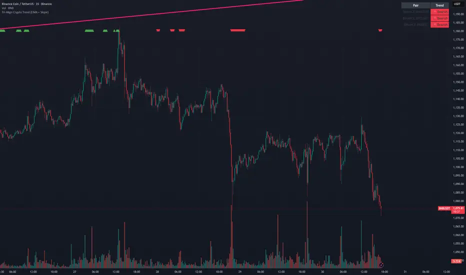
Tri-Align Crypto Trend (EMA + Slope)**Tri-Align Crypto Trend (EMA + Slope)**
Quickly see whether your coin is trending *with* Bitcoin. The indicator evaluates three pairs—**COIN/USDT**, **BTC/USDT**, and **COIN/BTC**—using a fast/slow EMA crossover plus the fast EMA’s slope. Each pair is tagged **Bullish / Bearish / Neutral** in a compact, color-coded table. Alerts fire when **all three** trends align (all bullish or all bearish).
**How to use**
1. Add the indicator to any crypto chart.
2. Set the three symbols (defaults: BNB/USDT, BTC/USDT, BNB/BTC) and optionally choose a signal timeframe.
3. Tune **Fast EMA**, **Slow EMA**, **Slope Lookback**, and **Min |Slope| %** to filter noise and require stronger momentum.
4. Create alerts: *Add alert →* choose the indicator and select **All Three Bullish**, **All Three Bearish**, or **All Three Aligned**.
**Logic**
* Bullish: `EMA_fast > EMA_slow` **and** fast EMA slope ≥ threshold
* Bearish: `EMA_fast < EMA_slow` **and** fast EMA slope ≤ −threshold
* Otherwise: Neutral
Tip: The **COIN/BTC** row reflects relative strength vs BTC—use it to avoid chasing coins that lag the benchmark. (For educational purposes; not financial advice.)
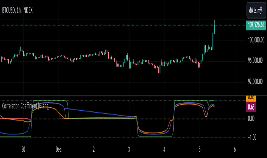
Correlation Coefficient [Giang]### **Introduction to the "Correlation Coefficient" Indicator**
#### **Idea behind the Indicator**
The "Correlation Coefficient" indicator was developed to analyze the linear relationship between Bitcoin (**BTCUSD**) and other important economic indices or financial assets, such as:
- **SPX** (S&P 500 Index): Represents the U.S. stock market.
- **DXY** (Dollar Index): Reflects the strength of the USD against major currencies.
- **SPY** (ETF representing the S&P 500): A popular trading instrument.
- **GOLD** (Gold price): A traditional safe-haven asset.
The correlation between these assets can help traders understand how Bitcoin reacts to market movements of traditional financial instruments, providing opportunities for more effective trading decisions.
Additionally, the indicator allows users to **customize asset symbols for comparison**, not limited to the default indices (SPX, DXY, SPY, GOLD). This flexibility enables traders to tailor their analysis to specific goals and portfolios.
---
#### **Significance and Use of Correlation in Trading**
**Correlation** is a measure of the linear relationship between two data series. In the context of this indicator:
- **The correlation coefficient ranges from -1 to 1**:
- **1**: Perfect positive relationship (both increase or decrease together).
- **0**: No linear relationship.
- **-1**: Perfect negative relationship (one increases while the other decreases).
- **Use in trading**:
- Identify **strong relationships or unusual divergences** between Bitcoin and other assets.
- Help determine **market sentiment**: For example, if Bitcoin has a negative correlation with DXY, traders might expect Bitcoin to rise when the USD weakens.
- Provide a foundation for hedging strategies or investments based on inter-asset relationships.
---
#### **Components of the Indicator**
The "Correlation Coefficient" indicator consists of the following key components:
1. **Main Data (BTCUSD)**:
- The closing price of Bitcoin is used as the central asset for calculations.
2. **Comparison Data**:
- Users can select different asset symbols for comparison. By default, the indicator supports:
- **SPX**: Stock market index.
- **DXY**: Dollar Index.
- **SPY**: Popular ETF.
- **GOLD**: Gold price.
3. **Correlation Coefficients**:
- Calculated between BTC and each comparison index, based on a Weighted Moving Average (WMA) over a user-defined period.
4. **Graphical Representation**:
- Displays individual correlation coefficients with each comparison index, making it easier for traders to track and analyze.
---
#### **How to Analyze and Use the Indicator**
**1. Identify Key Correlations:**
- Observe the correlation lines between BTC and the indices to determine positive or negative relationships.
- Example:
- If the **Correlation Coefficient (BTC-DXY)** sharply declines to -1, this indicates that when USD strengthens, Bitcoin tends to weaken.
**2. Analyze the Strength of Correlations:**
- **Strong Correlations**: If the coefficient is close to 1 or -1, the relationship between the two assets is very clear.
- **Weak Correlations**: If the coefficient is near 0, Bitcoin may be influenced by other factors outside the compared index.
**3. Develop Trading Strategies:**
- Use correlations to predict Bitcoin's price movements:
- If BTC has an inverse relationship with **DXY**, traders might consider selling BTC when the USD strengthens.
- If BTC and **SPX** are strongly correlated, traders can monitor the stock market to predict Bitcoin's trend.
**4. Evaluate Changes Over Time:**
- Use different timeframes (daily, weekly) to track the correlation's fluctuations.
- Look for unusual signals, such as a breakdown or shift from positive to negative relationships.
---
#### **Conclusion**
The "Correlation Coefficient" indicator is a powerful tool that helps traders analyze the relationship between Bitcoin and major financial indices. The ability to customize asset symbols for comparison makes the indicator flexible and suitable for various trading strategies. When used correctly, this indicator not only provides insights into market sentiment but also supports the development of intelligent trading strategies and optimized profits.
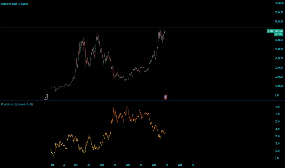
MC vs Total MCMC vs Total MC
this is an edit of StableCoin MC vs Total MC by Crypto5Max supporting muti timeframes and addition dominances
is a powerful and versatile TradingView indicator designed to help traders and analysts visualize the dominance of different types of cryptocurrencies (StableCoin, AltCoin, BTC, ETH) relative to the total market capitalization. This indicator provides a clear and concise way to monitor market trends and make informed decisions based on the dominance of specific cryptocurrency segments.
Key Features:
Customizable Time Frames: Select from a variety of time frames including 5 Min, 15 Min, 30 Min, 1HR, 2HR, 4HR, 8HR, and Daily to tailor the analysis to your needs.
Dominance Type Selection: Choose the type of market capitalization dominance you want to track - StableCoins, AltCoins, Bitcoin, or Ethereum.
Total Market Capitalization Options: Analyze the market with different total market capitalization metrics - total crypto market cap, total market cap excluding BTC, or total market cap excluding BTC and ETH.
Dynamic Label Display: A label that follows the plotted dominance line and dynamically displays the dominance percentage, providing a clear visual representation.
Invisible Background Option: Choose to have an invisible background for a cleaner chart presentation.
How It Works:
Time Frame Selection: Use the time_frame input to choose the desired time frame for your analysis.
Dominance Type Selection: Select the type of dominance to display using the mcap_type input.
Total Market Capitalization Selection: Choose the total market capitalization metric with the total_sym input.
Dominance Calculation: The indicator calculates the dominance of the selected cryptocurrency type as a percentage of the total market capitalization.
Visual Display: The chosen dominance is plotted on the chart, and a label displaying the dominance percentage is dynamically updated to follow the plotted line.
Use Cases:
Market Trend Analysis: Identify trends in the dominance of StableCoins, AltCoins, BTC, or ETH to gauge market sentiment.
Portfolio Allocation: Make informed decisions about portfolio allocation by understanding the market share of different cryptocurrency types.
Technical Analysis: Combine with other technical indicators to enhance your trading strategy and gain deeper market insights.
This indicator is essential for traders, analysts, and investors who want to stay ahead of market movements and make data-driven decisions based on the dominance of various cryptocurrency segments.
Example:
If you select "AltCoin" as the dominance type and "Total 3" as the total market capitalization, the indicator will plot the dominance of AltCoins (excluding BTC and ETH) as a percentage of the total crypto market capitalization (excluding BTC and ETH) on the selected time frame. The dynamic label will display this percentage, updating as the market evolves.
Elevate your market analysis with the MC vs Total MC indicator and gain a comprehensive view of cryptocurrency dominance trends.
Price Distance RatioThis study plots the ratio between current price and the price N days ago.
With N input that is configurable, users can find optimal long/short entries when price is in an established trend and price has diverge far from a given local peak or all time high.
With many years of stock trading the analysis indicates a connection between the distance of price and subsequent returns.
Portfolios of stocks with lower price to local highes ratios generally underperformed portfolios of stocks with higher prices to peaks reached similar N days ago.
The highest returns to previous peak are recorded when buying at the biggest dip.
For example, the purchase at 20% drawdown could generate 25% when price returns to the peak. The purchase at 50% drawdown could generate bigger, i.e. 100% return, when price returns to the peak. And the purchase at 90% drawdown could generate much bigger, i.e. 900% return, in a case the price returns to the peak.
However, buying very far below local peaks on almost all holding periods produces lower CAGR returns because of "timing adjustment". In simple words, typically the drawdown takes less time vs. further recovery.
For example:
👉 The largest BTC drawdown in 2013-2015 took 410 days (Peak-to-Valley) . And the recovery of BTC to new highs took 771 days (Valley-to-Peak) after that.
👉 The 3rd longest drawdown in BTC took 363 days (observed from December 17, 2017 to December 15, 2018). And further recovery in BTC to its new high took almost two years - 716 days .
👉The 4th longest drawdown in BTC took 162 days (observed from June 08, 2011 to November 17, 2011). And further recovery in BTC to its new high took more than a year - 469 days .
The concept of this study could recognizes at least 4 different modes of action.
👉 In a clearly established upward trend traders should be buying (following the trend) when Ratio is above 100% and reducing the size when Ratio turns below 100%.
👉 Conversely, in a clearly established downward trend traders should be shorted when Ratio is below 100% and covering when the Ratio turns back to 100%.
👉 In a sideways movement traders are advised to wait carefully if the Ratio near 100% for a long time, and take a position the trend is clear.
👉 Chartists can analyze the dynamic of the indicator - both in terms of trends and overall level. For example as it shown at the chart.
The understading of the study and rules of "timing adjustments" could genarate the awesome opportunities for stock options traders also, with strategies of selling uncovered call options and vertical call spreads.
// Many thanks to @HPotter and @Wheeelman wizards for their continious support and assistance.

Compare Crypto Bollinger Bands//This is not financial advice, I am not a financial advisor.
//What are volatility tokens?
//Volatility tokens are ERC-20 tokens that aim to track the implied volatility of crypto markets.
//Volatility tokens get their exposure to an asset’s implied volatility using FTX MOVE contracts.
//There are currently two volatility tokens: BVOL and IBVOL.
//BVOL targets tracking the daily returns of being 1x long the implied volatility of BTC
//IBVOL targets tracking the daily returns of being 1x short the implied volatility of BTC.
/////////////////////////////////////////////////////////////////
CAN USE ON ANY CRYPTO CHART AS BINANCE:BTCUSD is still the most dominant crypto, positive volatility for BTC is positive for all.
/////////////////////////////////////////////////////////////////
//The Code.
//The blue line (ChartLine) is the current chart plotted on in Bollinger
//The red line (BVOLLine) plots the implied volatility of BTC
//The green line (IBVOLLine) plot the inverse implied volatility of BTC
//The orange line (TOTALLine) plots how well the crypto market is performing on the Bolling scale. The higher the number the better.
//There are 2 horizontal lines, 0.40 at the bottom & 0.60 at the top
/////////To Buy
//1. The blue line (ChartLine) must be higher than the green line (IBVOLLine)
//2. The green line (IBVOLLine) must be higher than the red line (BVOLLine)
//3. The red line (BVOLLine) must be less than 0.40 // This also acts as a trendsetter
//4. The orange line (TOTALLine) MUST be greater than the red line. This means that the crypto market is positive.
//5.IF THE BLUE LINE (ChartLine) IS GREATER THAN THE ORANGE LINE (TOTALLine) IT MEANS YOUR CRYPTO IS OUTPERFOMING THE MARKET {good for short term explosive bars}
//6. If the orange line (TOTALLine) is higher than your current chart, say BTCUSD. And BTC is going up to. It just means BTC is going up slowly. it's fine as long as they are moving in the same position.
//5. I use this on the 4hr, 1D, 1W timeframes
///////To Exit
//1.If the blue line (ChartLine) crosses under the green line (IBVOLLine) exit{ works best on 4hr,1D, 1W to avoid fakes}
//2.If the red line crosses over the green line when long. {close positions, or watch positions} It means negative volatility is wining

Ark Crypto HeatbandThe crypto landscape is largely dominated by BTC and characterised by cyclical stages with varying degrees of mean reversion.
To understand what stage of the cycle we are currently experiencing, it is useful to examine to what degree the current BTC price has extended beyond a long term average. This is true even when analysing other crypto assets and helpful to view side by side.
This indicator uses the 1400 period daily SMA, which is broadly the 200 period weekly SMA. This can be configured, but historically has represented a baseline to which BTC commonly returns.
The graph plots current price in terms of multiples of this long term average. Traditionally, at multiples beyond 10, BTC is considered overextended with a higher likelihood of trending towards the mean thereafter. Colors indicate the extend of price extension.
The indicator specifically references BTC by default on all charts as it is designed to use BTC as general purpose indication of where crypto as a whole currently sits. Accordingly the indicator is only to be used on crypto charts.

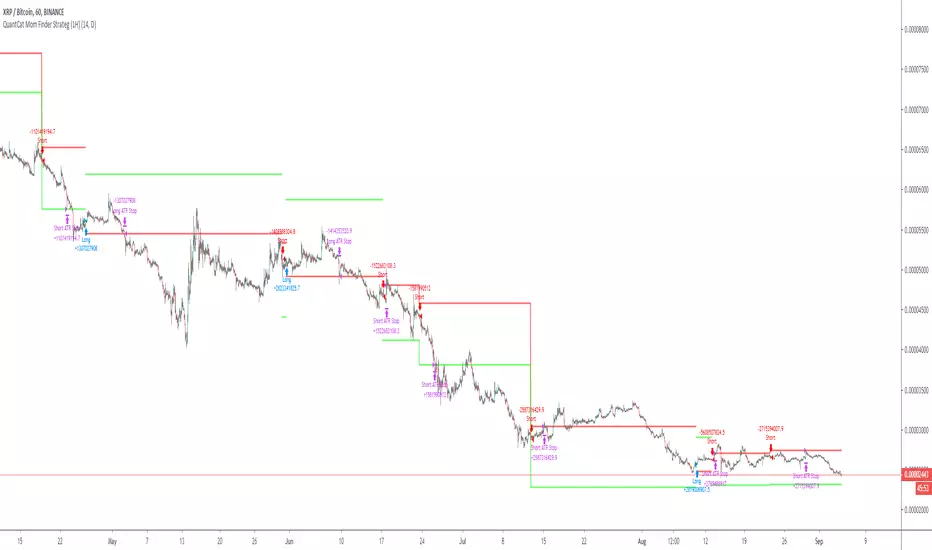
QuantCat Mom Finder Strategy (1H)QuantCat Momentum Finder Strategy
This strategy is designed to be used on the 1 hour time frame, on all x/btc pairs.
The beautiful thing is it plots the take profit, and stoploss for you for each entry- where I would say use the stoploss for sure and feel with water with how the price action is looking when in profit.
In this strategy, I actually implemented my own trading style into building the strategy. Having to replicate my own trading strategy into an algorithm, I can't make it exactly perfect to how I would trade, but what I can do is try and program the parameters that give it the absolute best chance of making a big move with a small drawdown- which replicates part of my momentum trading style. Here I am using RSI, MACD, EMA and trend filtering values to find moments where there has been a momentum change to play the rest of the move. It only picks the best entries.
There is always a 3-4 R/R move on average with with these trades, meaning 1 in 4 only need to hit to be a break even trader- where most of these strategies have about 35% hit rate.
The stoploss is so crucial to minimise any damage from huge unexpected candles, the strategies can just be used for entries as well, you don't have to stick to the exact formula- of the long and short system, but this by itself is profitable.
The system nets positive results on
-ETH/BTC
-LTC/BTC
-XRP/BTC
-ADA/BTC
-NEO/BTC etc.
We also have a free 15M strategy available too.
You can join our discord server to get live alerts for the strategy as well as speak to our devs! Link in signature below!!!
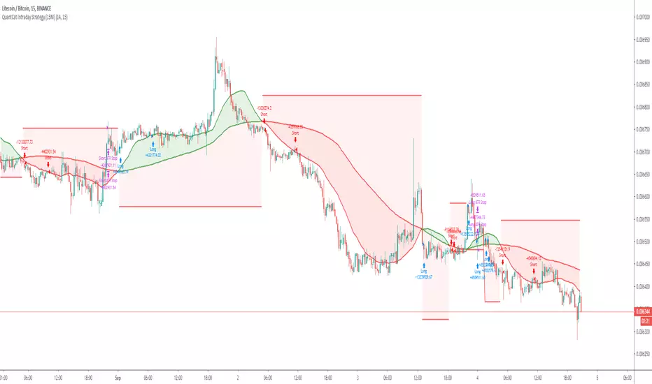
QuantCat Intraday Strategy (15M)QuantCat Intraday Strategy
This strategy is designed to be used on the 15 minute time frame, on liquid x/btc pairs and BTC/USD.
It works by having 2 moving averages, automatic stop loss calculation, and taking positions on MA crosses and MA zone bounces for confirmation.
Stoploss is so crucial to minimise any damage from huge unexpected candles, the strategies can just be used for entries as well, you don't have to stick to the exact formula- of the long and short system, but this by itself is profitable.
The system nets positive results on
-BTC/USD
-ETH/BTC
-LTC/BTC
-XRP/BTC
There is a small element of trend filtering also for the MA's, but I found adding it in actually hindered performance when testing and training the strategies unless it was using a loose value.
You can get live alerts for this strategy and speak to our developers by joining our server on discord! (Link in signature)
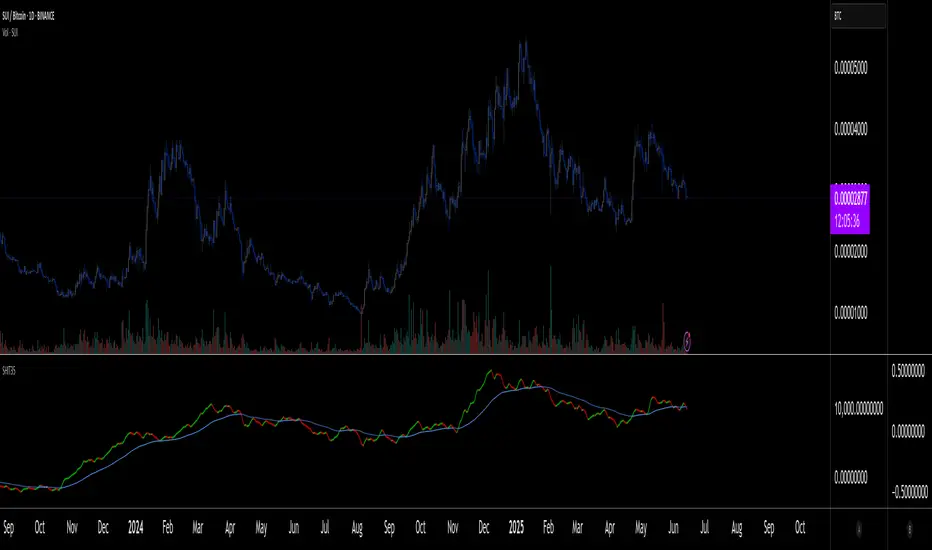
SHIT35 Alt Index (ROC or Volume) [LucF]SHIT35 is an index of 35 Binance alt/BTC pairs. It provides traders with a more reliable read of BTC pairs price movement than the often uncorrelated USD market cap standard.
Because it must read data coming from 35 markets, SHIT35 is painfully slow and should be kept hidden most of the time. Its features will hopefully seduce traders in using it nonetheless for market analysis.
Features
The Index can be calculated using 4 different modes:
1. Total of instant rate of change for all 35 markets ,
2. Cumulative total of ROCs,
3. Average of ROCs,
4. Plus/Minus volume (an aggregate OBV, if you will).
Select only one of the methods at a time to prevent confusion between modes.
An option allows showing the correlation between the Index as it is configured, and another instrument (CRYPTOCAP:TOTAL2 by default).
Markers can be used to identify abnormal movements in the Index. They are generated using Index exits from Bollinger bands.
The chart shows the Index with, from top to bottom, the default mode with BTC pairs, with USDT pairs, then mode 2 and 4 for BTC pairs.
Index Components
The Index is not weighed. The 35 instruments composing the index all have equivalents in the USDT quote currency on Binance, so you can easily change to those pairs using the Settings. Choosing another exchange or quote currency will require modifications to the list of instruments in the indicator’s code, since if one of the markets cannot be found, the indicator will not work. If the instrument exists but has no history for some bars, zero values will be used for them.
Watchlists
I have created a watchlist for the 35 markets in each of the BTC and USDT quote currencies. To import the watchlists, save the text you’ll find at these links in a file named the way you want your watchlist to be named and import them using the “Import Watchlist…” function.
BTC Watchlist: pastebin.com
USDT Watchlist: pastebin.com
Alerts
You can define alerts on any combination of markers you configure. After defining the markers you want the alert to trigger on, make sure you are on the interval you want the alert to be monitoring at, then create the alert, select the indicator, use the default alert condition and choose your triggering window (usually “Once Per Bar Close”). Once the alert is created, you can change the indicator's inputs with no effect on the alert.
Altseason IndexDescription of the "Altseason Index" Indicator
The Altseason Index is a powerful and visually minimalist tool designed to objectively identify the onset and conclusion of an "altseason" in the cryptocurrency market. Moving beyond subjective speculation, this indicator employs a clear, mathematical methodology by comparing the performance of a broad basket of altcoins against Bitcoin.
🎯 Core Concept and Utility
An "Altseason" is a market period where altcoins (cryptocurrencies other than Bitcoin) consistently yield higher returns than BTC. This indicator empowers traders and investors to:
Objectively Identify Market Cycles: Precisely pinpoint when capital is actively rotating from Bitcoin into altcoins and vice versa.
Make Data-Driven Decisions: Adjust their strategy in a timely manner: increasing exposure to altcoins during an altseason or rotating back into BTC upon its conclusion.
Avoid Emotional Pitfalls: Steer clear of FOMO (Fear Of Missing Out) and base decisions on hard data rather than market noise.
⚙️ How the Calculation Works
1. Asset Selection: The indicator tracks the performance of 15 leading altcoins across various market segments (Layer 1s, DeFi, Meme, Payments), ensuring a representative sample.
2. Performance Comparison: For each altcoin, the percentage price change over the user-defined lookback period (default: 90 days) is calculated. This performance is then compared to BTC's performance over the same period.
3. Counting the "Outperformers": The index counts the number of altcoins that have "outperformed" BTC.
4. Calculating the Index: The Altseason Index value is the percentage of altcoins in the basket that are outperforming BTC. For example, a value of 60% means that 9 out of the 15 coins performed better than Bitcoin.
🛠️ Indicator Settings
The settings are kept simple and intuitive, allowing you to customize the indicator to your strategy:
Lookback Period (days) (Default: 90):
- Defines the time horizon for the performance calculation.
- Shorter Periods (30-60 days) react faster to new trends but may produce more false signals.
- Longer Periods (90-180 days) provide smoother and more reliable signals, capturing sustained macro-trends.
Altseason Threshold (%) (Default: 75%):
- This is the key parameter that defines what index value constitutes an official "altseason."
- A threshold of 75% means an altseason is declared when at least 11 out of the 15 altcoins (75%) are outperforming BTC.
- You can increase the threshold (e.g., to 85%) for more conservative and stronger signals, or decrease it (e.g., to 65%) for earlier entries.
📊 Interpreting the Readings and Signals
The indicator uses a clear color-coding system and levels for easy interpretation:
🔴 < 30%: "BTC SEASON"
Bitcoin is dominating. The market is in risk-off mode or a state of anticipation. Growth is concentrated in BTC.
⚪ 30% - 49%: "NEUTRAL"
A transitional phase. The market is uncertain. Some alts show strength, but there is no unified trend.
🔵 50% - 74%: "BULLISH"
Growing strength in altcoins. Capital is beginning to rotate actively. This can be an early stage of an altseason.
🟢 ≥ 75% (or your custom threshold): "ALTSEASON"
The active altseason phase. The vast majority of altcoins are rising faster than BTC. This is the period of maximum potential returns for alts.
Signal Markers:
Green Dot: Signals the potential start of an altseason (the index crosses above the threshold).
Red Dot: Signals the potential end of an altseason (the index crosses below the threshold).
ℹ️ Information Panel
The chart displays two clean information panels:
1. Main Info Label:
Current index value (e.g., ⟠ 80%).
Market status (ALTSEASON, BULLISH, etc.).
The ratio of outperforming altcoins (11/15 alts).
2. Dominance & Market Cap Panel:
Alts: Altcoin Dominance (the market cap share of all coins except BTC).
BTC: Bitcoin Dominance.
Market: Total cryptocurrency market capitalization in billions of USD. This helps assess the overall market context (bullish/bearish).
💎 Conclusion
The Altseason Index is your strategic companion for navigating the crypto markets. It transforms the complex task of identifying market cycles into a simple and visual process. Use it to confirm broad market trends, identify potential entry and exit points, and, most importantly, to maintain discipline in your trading strategy by filtering out noise and emotion.
Disclaimer: This indicator is a tool for analysis and does not constitute investment advice. All trading decisions are taken at your own risk.
