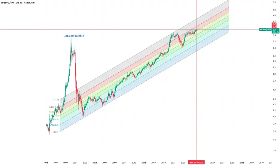
This chart compares NASDAQ to the S&P 500 (NASDAQ/SPX) on a monthly timeframe, visualized with Heikin Ashi candles and a logarithmic regression channel for long-term context. It highlights the dot-com bubble, where the ratio reached extreme overvaluation levels far above the regression mean.
Recently, many investors have been calling the current market an “AI bubble.” However, when viewed through this historical lens, the ratio still remains within the long-term growth channel and far below the excesses of the early 2000s. This perspective suggests that, at least relative to the broader market, tech doesn’t appear to be in bubble territory yet.
It would still be valuable to compare the composition of the NASDAQ today versus in 2000, as the market structure has changed dramatically — with more diversified revenue streams, profitability, and balance sheet strength. Without this data, one can only speculate. But visually, this ratio helps challenge the popular narrative of an ongoing bubble and invites a more nuanced discussion about valuation, innovation cycles, and sector dominance.
#NASDAQ #SPX #Macro #Tech #AIbubble #DotCom #LongTerm #RatioAnalysis #HeikinAshi #MarketCycle
免责声明
这些信息和出版物并不意味着也不构成TradingView提供或认可的金融、投资、交易或其它类型的建议或背书。请在使用条款阅读更多信息。