结构量化与狙击式交易 # 26-2-13|BTC · ETH · 黄金1 BTC
今天刚开始就是一段流畅的下跌趋势,而且走势稍微复杂一些,我们仔细拆解了分析。
首先能画出一条趋势线1,注意这是一条刚形成的趋势线,没有经过市场验证,具体表现为a点之前的k线并没有验证到趋势线的位置,而是中间产生了一段空间距离。之后由a点向上突破,而且a点的实体为主,没有很长的上下影线,这里属于满足硬性条件,但质量欠佳的反转位置,趋势线没经过验证,a点突破并不算明显超出趋势线,比较接近,所以这里也取决于自己的风险偏好,激进型可以判断反转,稳健型也可以再等等。
在a点突破失败之后,产生了另一条趋势线2的走势,我们会发现2是经过了市场检验的,因此2的质量高于a,且由b点向上突破,仔细观察发现,b点虽然有上影线,但影线长度其实略低于实体,所以质量还算及格,风险能接受,这里可以判断一个结构反转。
经过短暂的上涨之后,再一次产生一段回调,并形成了趋势线3,我们注意到趋势线3同样经过了市场的验证,而且由c点向上突破,c是一条完全实体的阳线,没有影线,而且明显脱离了趋势线,和a、b两个点相比,c点是展现出多方动能最强的位置。
我们对比abc三个突破点的具体细节:
a - 趋势线未验证,实体占比70%,略微突破趋势线
b - 趋势线有验证,实体占比60%,略微突破趋势线
c - 趋势线有验证,实体占比100%,明显突破趋势线
这三个点当中哪一个最好,这样对比之下一目了然。有很多人在交易中不做这样的分析和对比,判断入场点经常是基于情绪和主观判断,但我们面对的是一个客观的市场,你的主观想法市场不一定认可,但市场中客观表现出来的现象,可以推导出某种导致现象产生的原因。
就比如这里通过对比三个突破点的客观条件,我们能得出哪一个突破是最佳的,这里的对比完全参考的是盘面告诉我们的客观事实,不带有任何主观因素,之后我们也可以从盘面上看出来,当我们真正用冷静、客观的视角去分析盘面之后,市场会给到我们多大的奖励。
2 ETH
ETH和BTC展现出了高度相似的特点,这是很常见的现象。
首先也是一段流畅的下跌,而且底部产生了粉色的底部预警,我们能清晰画出一条趋势线1,之后由a点向上突破,但我们要注意到a点本身是没有实体的,是一条标准的十字星k线,这种形态的k线说明此处是多空双方激烈博弈的位置,我们在看到a之后的k线b,b虽然有了实体,但实体占整体的比例大概是50%,不能算很强势的多头动能,所以这里我们仍然只能判断为多空双方的博弈区,不能判断反转的确认。
然后我们会发现形成了一条趋势线2,并且由c点向上突破,注意c点的突破更小,而且实体占比更小,那就说明这里多空还是处于博弈阶段,不能判断反转结构,然后我们看到d点,马上形成了一根十字星小阴线,这印证了前面的推断,多空双方仍在僵持,未分胜负。然后我们看见e点,是一个实体占到了70%-80%的实体阳线,明显向上突破脱离了底部的横盘区间,因此e点才是这里空转多的结构确认位置。
我们再用前面讲的方法来对比一下这里的几个点:
a - 趋势线有验证,实体占比0%,略微突破趋势线
b - 趋势线有验证,实体占比50%,略微突破趋势线
c - 趋势线有验证,实体占比30%,略微突破趋势线
d - 趋势线有验证,实体占比5%,略微突破趋势线
e - 趋势线有验证,实体占比70%,明显突破趋势线
同样,这里的条件都是盘面展现出来的客观数据,没有带入任何个人主观意见,其中趋势线是否验证,实体占比完全是可用数据量化的结果,突破趋势线的幅度虽然不便于测量,但能用肉眼对比出明显和略微的程度,也属于一种客观的数据结果。
我们也能看见,一旦判断了最佳的入场位置,市场能带给我们多大的奖励。
另外,在e点之后有一段回调段,盘面上标记f的区域,注意到这里虽然有回调,但我们仔细观察会发现,其中的阴线都逐步在减小,说明了这里的空方动能已经处于衰竭状态(注意,多空力量的衰竭是威科夫理论中的重要分析)。
3 黄金
今天的黄金就是很典型的“有行情,无机会”。
首先我们能看见一大段的底部预警,粉色粗线标出的位置,形成一条趋势线1,由a点突破,但我们注意到趋势线1是没经过市场确认的,而且加上之前的暴跌,这里判断反转的风险是非常大的!我们尽量不要在这种突然放大的波动之后去判断行情,很容易再次发生反转。
之后形成了趋势线2,而且由b点向上突破,虽然2是一条经过验证的趋势线,但b点也是一个十字星形态,没有展现出太强的多方动能,不仅如此,b点之后连续几条k线都是小实体的十字星形态,这里也最好是放弃。
最后有一段顶部预警,而且形成了趋势线3,但我们要注意到的是c这条线,明显突然增大的下影线,和1之前的波动很像,属于突发的震荡行情,只是幅度没有1那么大,同时我们看到3被突破的位置,同样是一根实体突然增大的夸张阴线,这种波动放大的区域,我们尽量放弃。
总结
我们自己的想法是主观的,市场是客观的。
趋势线是否被验证,是客观事实。
实体占比是多少,是客观数据。
突破幅度是否明显,是客观表现。
当我们用这些客观条件去做筛选,情绪自然会退出决策。
交易不是预测,而是筛选。不是抓住所有机会,而是只做质量最高的那一个。
市场每天都有行情,也存在很多机会和陷阱,我们的本金就好像子弹一样,如果每一个机会和陷阱都去判断入场,会浪费弹药,所以我们要做一个狙击手,大多数时间都在潜伏和等待机会,很少出击,但出手必杀敌,当你学会今天讲的这种筛选逻辑之后,交易就会变得更安静。
趋势分析

确认点与随机陷阱 # 26-2-12|BTC · ETH · 黄金通过今天的行情,我们可以学到正确的复盘。
1 BTC
首先能看见一条趋势线1,之后在趋势线顶部看见了蓝线预警,之后趋势线在a点向下突破,终结了这里的上涨趋势。
关键是这个a点能不能算作多转空的结构转换,这个问题没有固定答案,我们从客观上来说,这里的确算是突破,而且a点是一根几乎没有影线的实体k线,也不是刚好落在趋势线上的情况,属于明显超出趋势线,但同时我们也注意到,前面有一根阳线,超过了a点阴线的两倍大,说明a点的下跌动能还没有看出非常强的空方动能。
所以说这个问题没有答案,这个结构转换有优点有缺点,关键取决于自己的风险偏好类型,如果是激进的交易者,当然可以判断一个多转空的确认点,如果是保守的交易者,也可以选择放弃这个机会,但是要记住:风险和收益永远成正比,你要么选择稳健保守,要么选择激进增长,这两个条件无法同时满足。
随后行情进入了一段震荡期,直到趋势线2形成之后,看见了一段顶部预警(蓝线标出位置),这里的趋势线没有问题,但问题在于后面的突破。我们能看见突破趋势线的位置,是一根影线长度超过实体两倍的k线,标准的多空博弈线,所以看见这根博弈线的时候,就应该开始警惕,这里可能是一个陷阱!随后我们发现,在3这个区域内部,形成了多个十字星、长影线的形态,说明多空双方在这个位置非常焦灼,无法分出胜负,这是一个充满未知和不确定性的位置!我们最好放弃这种机会。
果然,后面的行情再次发生了反转,这里的反转印证了上面的分析,说明这里的多头动能还没有完全衰竭。形成了一段蓝线预警段,在盘面上标出4的区域。
这个区域只有两根向上的阳线,没有足够的k线来构建趋势线,所以也无法找到一个趋势线突破的位置。这里就会有一个误区了:有很多人在复盘的时候,会对照行情走势去“反推”自己在交易中的操作,但这是一个错误的行为!就比如现在讨论的这个区域,有人会复盘看到,区域4当中,一根阴线强势反包了前一根阳线,后面带来一段很明显的下跌,然后回弹震荡,最后又继续下跌,带来很多的做空止盈范围,所以有人会判断:以后遇到这种情况,应该毫不犹豫做空。
想想自己之前的复盘过程中,有没有出现过这种根据某一段行情去改变自己交易系统规则的情况?但关键问题是,当你真的修改了这样的规则,你下次遇到了一样的行情,然后你果断参与,但下次的行情又不按这次的剧本走了。
这就是交易系统当中的一致性和纪律性,我们做交易是在一个随机的市场当中找到某些固定的规律,因为随机行情我们无法占据概率优势,但通过某种固定规律,也许能让概率偏向我们自己。这种规律,一定需要是固定的规则、以及能够重复。就比如上面遇到的情况,在区域4,发生了一个阴线反包阳线的情况,只不过之后有一段幅度比较大的下跌,你看见了,然后会眼红这里的空单利润,但你能确定每次遇到这种规律的时候,都能有这样的利润空间吗?回测过吗?有历史数据吗?这种操作多次重复下来的胜率是多少?盈亏比又是多少?
这些问题全都充满不确定性,而趋势线的突破,属于威科夫经典理论当中的分析,威科夫理论是20世纪提出,并经过了几十年的市场验证,无数交易员学习过这种方法,经得起时间的推敲和考验。
我们应该做更有把握的事。
但很多人的误区就在这,盘面上某一段行情可能是随机因素造成的,和某种形态并无关系,但这种行情过于诱人,会“误导”你,让你觉得可能下次还会发生这种情况,这就是根据结果去倒推原因的误区,我们需要的是经过验证的交易系统和纪律,需要多项回测数据来评判某个交易系统,而不是某一段特殊行情。
2 ETH
首先是区域1,产生了一段蓝线信号,但这里k线数量不足,无法画出趋势线,所以无法用趋势线理论来分析。
之后经过一段横盘震荡,形成了趋势线2,并未经过市场的多次验证,但这条趋势线也符合定义,是成立的。在a点向下突破,a点是一条实体k线,没有影线,而且我们对比BTC中的趋势线1会发现,这里没有那么悬殊的多空动能差距,所以这里的a点可以判断为一个多转空的确认点。
至于之后能不能吃到那一波空方利润,那就取决于自己的交易风格,移动止盈的策略,不同人的交易会产生不同的结果,但不管交易风格怎样,这里的结构转换点的判断确实能给我们带来不少的潜在止盈范围。
3 黄金
这个走势图我们一眼就能看出来,黄金这一天都没有太大的波动,一直是横盘整理的状态,这种时候我们应该避免交易,横盘是非常容易引起亏损的行情,任何方向都有可能,完全随机。
最后在趋势线1的位置,我们能看见顶部蓝线预警,而且趋势线向下突破,这个突破和BTC的趋势线1也很像,属于突破力度并不强的那种,严格抠定义,满足,但考虑到是否优质,需要打问号。因此这里如何判断,也取决于不同交易员的个人性格和风险偏好,无法给出统一的结论。
至于后面那一段突发的行情,是否能用这里的入场点来判断,前面已经详细解释了,这种根据随机事实去反推交易系统规则的方法是一个误区,能否吃到这一段利润,是需要一点点运气成分的。
总结
在市场中,我们要学会区分“值得参与的确认点”与“充满随机性的陷阱”,把注意力放在经过验证的方法上,而不是被偶发行情的结果所迷惑。只有这样,交易才能真正有把握,而非靠运气。
# 26-2-12 A Random Market Demands Fixed Rules1. BTC
First, we can see Trendline 1. At the top of this trendline, a blue alert line appeared. Later, the trendline was broken downward at point a, ending the uptrend here.
The key question is whether point a can be considered a multi-to-short structural reversal. There is no fixed answer. Objectively, it is indeed a breakout. Point a is a solid candle with almost no wick, and it does not land exactly on the trendline—it clearly exceeds it. However, we also notice a previous bullish candle that is more than twice the size of point a’s bearish candle, indicating that the downward momentum at a is not yet very strong.
Thus, there is no definitive answer. This structural reversal has both pros and cons, and it depends on your risk preference. Aggressive traders may consider this a confirmed multi-to-short reversal point, while conservative traders may choose to skip it. Remember: risk and reward are always proportional. You either choose steady conservatism or aggressive growth—you cannot have both.
Afterwards, the market entered a consolidation phase. When Trendline 2 was formed, a blue alert line appeared at the top. The trendline itself was fine, but the subsequent breakout raised concerns. The breakout candle had a wick more than twice the size of its body, a classic multi-vs-short battle candle. When seeing such a candle, caution is needed—this could be a trap! In region 3, multiple doji and long-wick candles appeared, showing that buyers and sellers were fighting intensely, with no clear winner. This is an area full of uncertainty, and it’s best to skip trading here.
Indeed, the market later reversed again, confirming the previous analysis. A new blue alert segment appeared in region 4.
In this area, there were only two upward candles, insufficient to form a trendline, so no breakout point could be defined. This leads to a common pitfall: many traders, during review, try to “reverse-engineer” their trades from the price action. For example, in region 4, a bearish candle engulfed the previous bullish candle, followed by a noticeable drop, retracement, and then another decline. Some might think: next time this happens, I should short without hesitation.
Reflect on your past reviews—have you ever changed your trading rules based on a single segment of price action? The problem is, if you do change your rules and then encounter a similar setup, the market may not follow the previous scenario.
This is why consistency and discipline are crucial in trading systems. Trading is about finding fixed patterns in a random market. Random price movements do not give us a probabilistic edge, but through fixed rules, probability can be tilted in our favor. These rules must be consistent and repeatable. For example, in region 4, the bearish engulfing candle may have led to a large move this time, tempting traders with profit. But can you be sure that every time this pattern occurs, it will produce such a profit? Have you backtested it? Are there historical data? What is the success rate and risk-reward ratio if this trade is repeated multiple times?
All these questions are full of uncertainty. In contrast, trendline breakouts follow Wyckoff’s classical theory, developed in the 20th century and validated by decades of market experience. Many traders have studied it—it has stood the test of time.
We should focus on trades that give us higher confidence.
The common pitfall is that a segment of price action may be caused by random factors and unrelated to any pattern. Such tempting setups can mislead traders into thinking they might repeat. This is the mistake of reverse-engineering from outcomes. We need verified trading systems and discipline, supported by multiple backtests, rather than relying on a single exceptional move.
2. ETH
In region 1, a blue alert appeared, but there were not enough candles to draw a trendline, so trendline analysis was not possible.
After a period of sideways consolidation, Trendline 2 was formed. Although it was not validated multiple times by the market, the trendline meets the definition and is considered valid. At point a, the trendline broke downward. Point a is a solid candle with no wick, and compared to BTC Trendline 1, the multi-vs-short momentum difference here is not as extreme. Therefore, a can be considered a confirmed multi-to-short reversal point.
Whether you capture the following bearish move depends on your trading style. Trailing stop strategies yield different results for different traders. Regardless, identifying the structural reversal here can provide potential exit opportunities.
3. Gold
The gold chart clearly shows little volatility for the day, with sideways consolidation throughout. During such periods, trading should be avoided. Sideways markets are prone to losses; any direction is possible, entirely random.
Finally, at Trendline 1, a top blue alert appeared, and the trendline broke downward. This breakout is similar to BTC’s Trendline 1—technically valid but not particularly strong. Judging its quality depends on the trader’s personality and risk preference, so no universal conclusion can be made.
As for subsequent sudden moves, whether this entry point could predict profits is subject to chance, as explained earlier. Using random outcomes to adjust a trading system is a common mistake.
Conclusion
In the market, we must learn to distinguish “confirmation points worth trading” from “random traps.” Focus on verified methods rather than being misled by isolated price moves. Only then can trading be confident and systematic, not reliant on luck.
#26-2-14 Market Consensus: Ignition and Follow-ThroughMost traders focus on breakouts.
Very few ask a more important question:
Is this move strong enough to create market consensus?
In large-cap markets like BTC, Gold, or major forex pairs, no single institution can move price sustainably on its own. Every directional move must begin with a test — what I call ignition — followed by confirmation from the crowd — what I call follow-through.
First, we can see a large section of blue warning signals, indicating a potential top. Then Trendline 1 is formed. This trendline has been validated by the market. It is broken downward at point d.
However, we need to pay attention to the breakout candle itself. It is almost a doji — very small body with a long lower wick. After point d, price immediately rebounds. Therefore, this cannot be considered a valid bullish-to-bearish structural shift.
Later, the upward movement forms Trendline 2, which is also validated by the market. At point e, we see a downward breakout. This time, the candle body dominates and the wicks are negligible. Here, we can identify a structural transition from bullish to bearish.
But the key question today is:
If we enter a short position here, where is the take-profit space?
This leads to today’s core concept:
Market consensus — ignition and follow-through.
There are many traders in the market: retail traders of different sizes, institutions, and companies with massive capital. Large institutions are not necessarily unified under one single opinion. Different participants may hold different views.
That is why, most of the time, price action appears disorderly and range-bound, without a clear direction.
However, sometimes we see sudden acceleration — sharp rallies or sharp drops.
In small-cap assets, such moves may indeed be driven by a single large operator. But what about large-cap instruments like Bitcoin (BTC), Gold (XAU), or major forex pairs?
In markets of this size, the impact of any single institution is negligible. Therefore, directional moves in large-cap markets are better understood as a form of market consensus — a direction recognized and supported by the majority of participants.
Only when aggressive market orders continuously absorb passive limit orders from the opposite side can price move rapidly in one direction.
Reversals do not happen instantly with a clean turn.
Instead, a portion of the opposing force begins to act first. This is a test.
I call this action “ignition.”
After ignition, we observe whether the fire spreads.
If it does not spread, conditions are not ready.
Many fake breakouts, long wicks, and deceptive moves we see on the chart are actually ignition attempts.
Why is ignition necessary?
Because in large-cap markets, pushing price requires enormous cost. It demands a large amount of aggressive orders to absorb liquidity — including newly placed passive orders during the process. Few institutions can afford to force a move alone.
At point e, we can interpret the breakdown as an ignition attempt by sellers — testing whether the market has reached a critical level where most participants are willing to align short.
If ignition triggers a chain reaction, if others follow and join the short side, then that ignition point becomes the lowest-cost entry for bears.
But then comes point f.
The long lower wick at f tells us something important. Sellers once pushed price lower, but their momentum faded. Buyers stepped in and pushed price back up toward the close, even forming a small bullish doji.
This tells us that ignition failed.
There was no follow-through.
The market is always uncertain. Reversals can occur at any time. Viewing the market through the lens of ignition and follow-through helps us understand many behaviors that otherwise seem random.
If we entered short at e, once we see f, we should immediately recognize that the ignition attempt has failed and exit quickly. The loss here is small, close to breakeven. This is flexible and scientific risk management.
This analytical framework is inspired by The Wyckoff Method, though the concepts of “ignition” and “follow-through” are my own interpretation and extension.
The same situation appears after Trendline 3. However, Trendline 3 itself was not properly validated, so the reversal probability is lower from the start.
At point g, we see a strong bearish candle breaking down — another ignition attempt by sellers.
But then at k, a bullish candle completely engulfs the previous move. Its body exceeds that of g, which tells us that not only did follow-through fail, but buyers aggressively suppressed the move.
This shows that bearish consensus is weak.
After k, even before reaching the stop-loss level, the following small bearish candles show no strong downside momentum. This confirms the hypothesis: sellers lack strength.
The correct decision here is to exit near breakeven with a small loss.
Finally, we see Trendline 4.
At point n, price breaks downward again. The logic is satisfied:
Blue warning signal
Formation of trendline
Reverse breakout
This is another ignition attempt by sellers.
But this time, we clearly observe follow-through. Larger bearish candles appear afterward. More traders and institutions accept the ignition and align with the short side.
This is where true market consensus forms.
As I said before:
We should enter at points with the highest probability of aligning with market consensus.
How far consensus carries us requires a bit of luck.
We can objectively identify ignition points from the chart.
But we cannot predict whether follow-through will occur.
However, entering at these locations gives us:
Probability advantage
Favorable risk-reward ratio
Once consensus forms, price often moves quickly and decisively.
In today’s BTC example, there were three ignition attempts.
Two failed. One succeeded.
But that one successful trade covers the losses of the previous two.
When you truly understand ignition, follow-through, and market consensus, your understanding of price action becomes deeper — closer to the essence of the market.
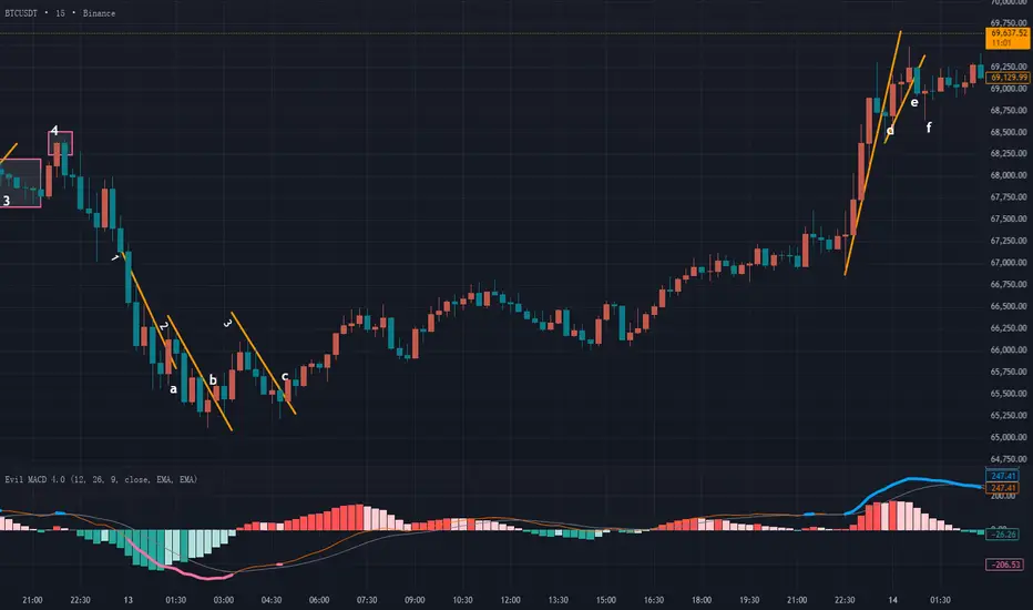
市场合力的形成:点火与跟风 # 26-2-14|BTC
首先我们可以看见一大段蓝色预警,代表潜在顶部,然后形成了一条趋势线1,而且这是一条经过验证的趋势线,由d点向下突破,但我们要注意这里突破k线本身,是一根接近十字星的形态,实体占比非常小,带有很长的下影线,而且d点之后马上反弹,这里是不能判断有效的多转空的。
之后的上涨形成了趋势线2,同样也经过了市场的验证,而且在e点向下突破,我们注意到e点是实体为主,影线可以忽略不计,这里可以判断出一个多转空的结构转换。
那今天最关键的问题就来了:如果这里空单入场,我们看不出止盈空间。这就涉及到今天要讲的重要概念:市场合力的点火与跟风。
市场上有很多交易员,有不同规模的散户,也有资金量非常大的机构、公司,资金规模大的这些机构也并不一定是受到某一个观点的统一影响,大家有可能存在不同的意见,所以我们能看出盘面上一版都处于一种无序的震荡行情当中,没有清晰的方向。
但是也会形成某一段突然的加速上涨或下跌,在小流通值的品种当中,这种某一个方向的行为的确有可能是某一个大型“操盘手”引起的,但如果是BTC、XAU或是外汇这种大流通值的品种呢?单个机构对于这么大市场的影响是可以忽略不计的,因此在这些大流通值的品种里,某一方向的行情可以理解为一种“市场合力”,也就是代表大多数交易员认可的方向,才会导致有一方的主动订单不断吃掉另一方的被动挂单,从而引起价格迅速向某一方移动。
反转的时候,也并不是直接来一个干脆的掉头,而是有一部分反向力量开始发力,做出一个“测试”,我们可以把这种行为理解成“点火”的动作,点完火之后,我们看一下这把火能不能烧起来,如果烧不起来,说明现在条件不佳,可以再等等。
大家在盘面上看见的一些假突破、插针、欺骗行为,很可能都是这里讨论的“点火”动作。为什么要存在点火?因为市值大的品种,如果要真的操盘,会付出极高的成本,因为需要大量的主动订单去吃掉被动挂单,还要对付在这个过程中新挂出来的被动订单,这个成本是很多机构都无法承担的。
这里的e点,我们就可以理解为一部分空方势力的“点火”动作,测试一下这里有没有到那个大家都认可的临界点。点火之后,市场会不会像链式反应一样一触即发,大家纷纷揭竿而起站队空方,形成一波流畅下跌,那我在这里的点火就成为了空方成本最低的一个点。
f的出现,代表了市场上多数人并不认可这种想法。f下影线很长,说明这里出现过一部分空方力量,曾经把价格推到了f的最低价位置,但是出现问题了,到了f最低点之后空方力量衰竭了,被反向的多方力量推到了收线价格位置,甚至形成了十字星的小阳线,这里说明“点火”之后没有人跟风了。
市场是永远充满未知的,随时有可能出现反转,用这种“点火”和“跟风”的方式去看待市场,我们就可以理解很多行为了。
这里如果在e点选择了空方入场点,那看见f之后也应该马上意识到点火之后出了问题,及时出场,这里产生的亏损并不大,非常接近成本线,这就是一种灵活的、科学的风险控制方法,这种分析思路也来自于《威科夫操盘法》这一经典理论,“点火”和“跟风”是我加入了一些自己对市场的理解和思考。
同样的事情发生在趋势线3之后,但趋势线3本身是没有经过市场验证的,所以这里的反转确定性本身是更低的。随后我们可以看见在g有一个实体阴线向下突破,但看这里的阴线,可以判断一个多转空信号,也就是发生了一部分空方力量的“点火”动作。
随后我们看见k这里直接一个阳线反包回去,而且仔细对比发现,k的实体超过了g,说明点火之后不仅没出现跟风的力量,反而被多方强势压制,这就说明这里的空方合力不够强大,现在很难形成有效的空方持续性,因此出现k之后,也应该警惕起来,及时止损,即便还没到止损线,在k点之后的几个小阴线,都看不出很强的空方动能,印证了前面的假设:空方缺乏力度。所以在这里最接近成本线的位置,应该判断止损小亏出局。
然后我们可以看见另一段趋势线4,而且在n点向下突破,这里也满足我们判断多转空的逻辑:蓝线预警信号、形成趋势线、趋势线被反向突破。显然,根据上面的描述,n点也属于一个空方的“点火”动作,但这里我们能明显看出之后有“跟风”,产生了更大的阴线,说明市场上有更多的交易员、机构接受了这里空方的“点火”动作,选择支持空方,于是这里形成了一波市场合力,方向是空方。
我在之前的分析里说过一句话:“我们要做的是在概率最大的位置选择跟随市场合力,但市场合力能带我们走多远,需要一点运气”。这句话的意思就是,我们可以从盘面的客观信息里看出这种“点火”动作,但点火之后是否存在“跟风”行为?我们是无法预测的,但一般在这种位置判断入场,会给到我们概率优势和盈亏比优势,因为一旦形成市场合力,会经历迅速的、大幅度的浮盈,就比如今天BTC的行情,判断的市场合力点有3个,前两个属于点火之后没有跟风,有一个是点火之后出现了空方的跟风行为,但这一个正确的入场点,止盈会盖住前面两个入场点带来的止损。
理解了这种点火与跟风的逻辑,还有市场合力的原理,你会发现对市场和行情的理解更深入,更接近本质。

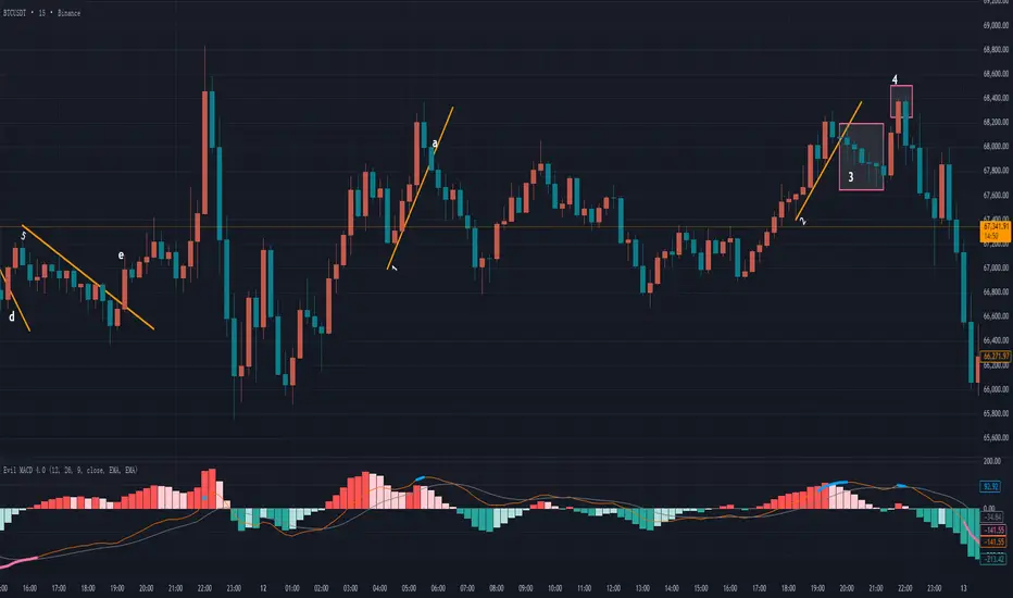
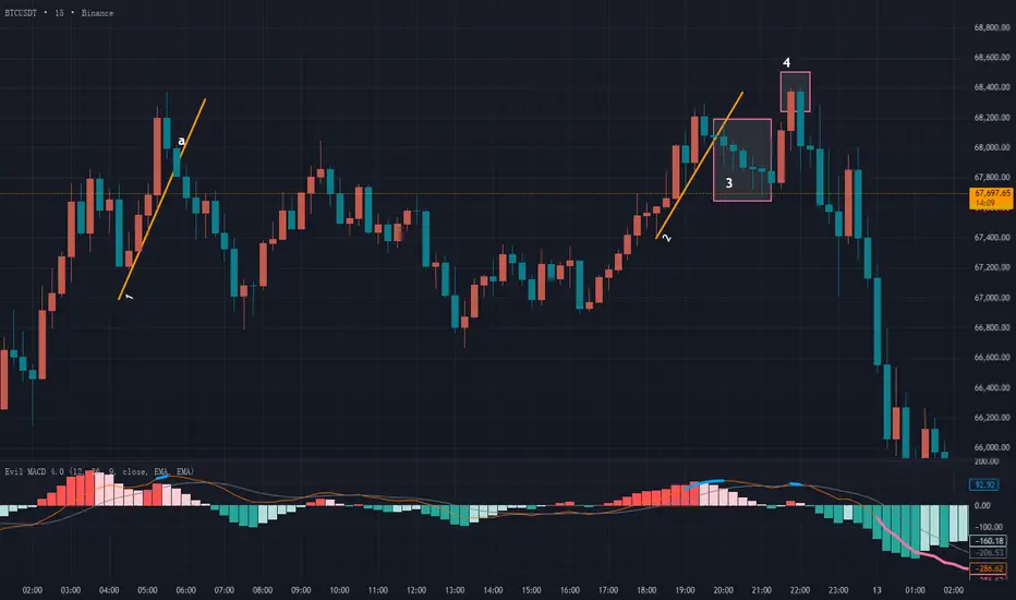
#26-2-13 Quantifying Market Structure for Sniper-Style Trading1️⃣ BTC
The session started with a clean and smooth downtrend, although the internal structure was slightly complex. Let’s break it down step by step.
First, we can draw Trendline 1. However, this trendline had not been validated by the market. Before point a, price never truly respected or tested the line — there was visible space between candles and the trendline.
Price broke above it at point a. The candle was mostly body with small wicks, technically meeting the basic breakout condition. However, the quality was mediocre:
The trendline was unverified.
The breakout was only marginal.
Price barely separated from the line.
Aggressive traders might consider this a reversal. Conservative traders would wait.
After the failure at a, Trendline 2 formed. This one had proper market validation. Therefore, its structural quality was higher.
At point b, price broke above Trendline 2. Although there was an upper wick, it was slightly smaller than the body. The breakout quality was acceptable and risk manageable. A structural reversal could be considered here.
Later, after a short rally and pullback, Trendline 3 formed — again validated by the market.
At point c, we saw a full-bodied bullish candle with no wick, clearly separating from the trendline. Compared to a and b, point c showed the strongest bullish momentum.
Let’s compare the three breakout points objectively:
a – Unvalidated trendline, 70% body, marginal breakout
b – Validated trendline, 60% body, marginal breakout
c – Validated trendline, 100% body, clear breakout
The difference becomes obvious.
Many traders do not perform this type of comparative analysis. Entry decisions are often emotional. But the market is objective. Our opinions are subjective.
When we compare structural elements using measurable conditions, we remove emotion from decision-making.
2️⃣ ETH
ETH displayed highly similar behavior to BTC — something that happens frequently.
After a smooth decline, a bottom warning appeared. Trendline 1 was formed and broken at point a.
However, candle a was a doji — no real body. A doji represents strong conflict between buyers and sellers.
Candle b had around a 50% body ratio — not strong enough to confirm reversal. This remained a battlefield zone.
Trendline 2 then formed. At c, price broke above it, but the body was even smaller than before. Momentum remained weak.
At d, another small doji confirmed continued indecision.
Only at e did we see a 70–80% full-bodied bullish candle, clearly breaking away from the consolidation zone.
That was the true structural reversal point.
Objective comparison:
a – Validated trendline, 0% body, marginal breakout
b – Validated trendline, 50% body, marginal breakout
c – Validated trendline, 30% body, marginal breakout
d – Validated trendline, 5% body, marginal breakout
e – Validated trendline, 70% body, clear breakout
All conditions above are observable and objective.
After point e, the pullback (area f) showed progressively smaller bearish candles — a sign of weakening selling pressure.
This aligns with concepts from the Wyckoff methodology, where diminishing momentum reflects exhaustion.
3️⃣ Gold
Today’s gold market was a classic example of:
“Movement without opportunity.”
After a large bottom warning, Trendline 1 formed and broke at a.
However:
The trendline was not validated.
The prior move was extremely volatile.
The breakout occurred after abnormal expansion.
These are high-risk conditions.
Trendline 2 formed and broke at b, but again, the candle was a doji. Subsequent candles remained small-bodied. No clear dominance.
Finally, Trendline 3 formed. Notice the sudden long lower wick before it — similar to the earlier volatility spike. The breakout itself came with exaggerated bearish expansion.
When volatility expands suddenly, structure quality deteriorates.
Best decision: stay out.
Summary
Our opinions are subjective.
The market is objective.
Trendline validation is objective.
Body ratio is measurable.
Breakout distance is observable.
When decisions are based on objective structure, emotion exits naturally.
Trading is not prediction.
Trading is selection.
There are opportunities and traps every day.
Capital is like ammunition.
If we fire at every signal, we waste bullets.
A disciplined trader behaves like a sniper:
Most of the time waiting.
Rarely pulling the trigger.
Only acting when structure quality is high.
When you apply this filtering logic, trading becomes quieter — and clearer.
你是交易员还是一个赌徒? # 26-2-10|BTC · ETH · 黄金1 BTC
首先能看见一个蓝线预警,代表潜在顶部,我们能看见行情形成一条趋势线1,注意趋势线1的中间,曾经被一根阴线和阳线短时间突破过,会有部分观点认为这里的趋势线不再成立。
但我们在实盘中,没有那么多标准的教科书行情,经常会遇到这种突发情况,或者稍微有一点越界的样子,怎么判断?对趋势线的理解是,它本质上是一种短期共识的表现。当这种共识还在,趋势线就有效;当共识消失,线自然会被破坏。本质上是短期内的市场认同,那我们看到趋势线1的这个小幅度破位,阴线的收线价格刚好碰到趋势线,之后的阳线没有太长下影线,属于比较干脆的向上反弹,所以这里并未构成趋势线的破坏(真正的趋势线破坏在实盘中也存在,我们以后遇到了会讲)。
这一段趋势线在a点被阴线向下突破,这里的阴线几乎都是实体,向下突破很干脆利落,因此这里是一个多转空的结构确认点。
同样,我们可以通过后面的走势看出来,在这种正确的位置选择跟随市场合力,市场会给到很大的止盈空间。
之后盘面上的走势较为复杂,这一波粉色底部预警线持续了很长时间,我们把行情拆开逐一分析。
趋势线2:趋势线很标准,没有被破坏,而且经过了市场的验证,在b点向上突破。但我们注意b这条线,小实体,而且上影线长度几乎等于实体,再加上收线价格离趋势线非常近,这里就不是一个干脆的突破,换句话说,我们无法在这里看出很强的多方动能,所以这里的机会应该放弃,继续观望。
趋势线3:果然b点之后行情继续反转,然后形成了趋势线3,底部连个十字星,这里是很多人会选择抄底的入场点,但别着急,很多人这么想,很多人不一定对。我们看见c点向上突破,但c点的问题和b点是一样的,小实体k线,上影线长度几乎和实体相同,虽然突破趋势线的幅度比起b点更多一些,但还是无法看出明显的多头动能,因此这里也是应该放弃的机会。(在《日本蜡烛图技术》一书中,把十字星作为一种反转信号看待,这种观点有一些过时,考虑到书的年代,我们在实盘中应该更灵活才对,这种经典理论仅仅是理解背后的原理,作为参考即可。)
趋势线4:c点向上突破失败之后形成了新的趋势,这条趋势线也由市场验证过,属于合格的趋势线,在d点向上突破,这个d点是满足条件的入场点,但不算太优质,原因是虽然向上突破了趋势线,且实体占优,但和此处附近的空方动能相比,没看出太大的优势,我们这种分析方法,最重要的一点就是找到市场合力改变方向的位置,所以盘面上表现出的动能非常重要。d点动能略低于附近的阴线,因此这里是否判断入场点,取决于个人的风险偏好,风偏较高,可以选择入场,风偏谨慎,也可以选择观望,没有绝对的对与错。
趋势线5:d点向上突破之后,再次反转向下,但这里我们能看出空方衰竭的k线状态了,形成了趋势线5,并且由e点向上突破,通过对比d或者e我们能发现,e的动能明显变高,一个最简单的判断方法,d是比不过附近阴线的,但e明显是更强的,所以通过对比我们能得出,e点才是这里反转动能最佳的结构转换位置。
2 ETH
很长一段时间内没看见任何反转预警信号,这种时候就不应该判断入场,因为没有反转预警的行情很有可能是一段横盘震荡。
随后在趋势线1的位置产生了底部反转信号,但我们要注意的是趋势线1并没有向上被突破,反而是在a点向下加速了,之后从a到b这一段,其实不构成趋势线,有很多人会误认为2是一条趋势线,但我们要注意a之后的k线并没有触及到2,如果按照我对趋势线的要求来看,2 这条线并不成立。
3这条线也是非常容易引起误解的,底部有信号,而且也能画出这条线,表面上看起来还经过的市场的检验,但我们很容易发现这里的行情其实不受3的压制,中间有一根大阴线直接让价格偏移了,这里的走势类似于一个三角形。在我看来,3 这条线并不够干净,我会选择放弃这种结构。
最终形成了趋势线4,我们能看出来经过了市场的检验,没有像1那种突然加速,也没有像3那样走出一个三角形的走势,随后在c点被突破,突破的阳线实体为主,几乎没有影线,而且力度超过了附近所有阴线,这里就是一个标准的空转多的机构转换点。
最后有一小段见顶信号,盘面上标记5的位置,但我们会发现这里的行情变化太迅速,导致无法画出趋势线,所以这个机会同样也应该放弃。
3 黄金
今天的黄金非常值得复盘和学习,其中包括对趋势线的理解,以及大多数人在复盘时都容易犯的一个错误。
首先能清楚看见一个粉色信号,而且形成了趋势线1,而且由a点向上突破,这个突破不同人眼中会有不同的分析,激进派会认为这里能算是一个明显的突破,而且实体为主,可以算作一个标准的空转多信号,保守派会认为a的实体略小于前一根阴线,所以还不足以判定多方动能占主导地位。这两种看法没有对与错,因为这涉及到不同人的风险偏好有区别,交易风格也不同,不管哪一种看法,只要逻辑通顺,符合自己的交易风格就是可以成立的。
然后我们注意到,a点之后产生了两个小实体阴线,实体逐渐缩小,低点逐渐抬高,这里显然是一个空方动能衰竭的具体表现,之后由b点向上发力,突破了a以及后面的两个小阴线,b点位置不管用什么思路来判断,都可以算是一个空转多的确认点了,a点的确定性如果是50%,b点的确定性至少有90%。
我们真正应该注意的是晚一些时候,顶部产生预警的这一段,我们能勉强画出一个趋势线2,但经过前面的复盘学习,我们可以看出,这里的k线反复向上跳跃,试图离开这条趋势线,形成了上下上下的震荡现象。
这里的波动几乎可以肯定是晚上要发布重要数据引起的,这也是大多数人会有的一个误区,也是非常容易犯错的地方。在网络上有很多人会为了博眼球或是证明自己,每次在发布重要数据之前或是重要会议之前,对即将发布的内容做出预测,并给出自己的提前预判。但实际上每次的市场是充满了随机性和很多不确定的,难道我们能预测鲍威尔会说“Good afternoon”还是“hello everyone”吗?其实无法确定的,每一次在这种重大数据即将揭幕的时候,很多人都喜欢去猜测,但这种行为和赌博没有区别,因为这里的波动足够大,如果猜对了会有很多的奖励,但问题是如果猜错了很可能会遇到爆仓的结果。即便一次能猜对,能保证每一次都对吗?一旦错误,后果对我们的账户来说是无法承担的。
不知道大家是否了解期权,在期权中有一个重要的数据叫隐含波动率,每当这种重大消息即将发布的时候,隐含波动率都会显著上涨,这会导致期权价格跟着上涨,不管买权还是买权都是,这种时候最好是空仓观望,不要交易,因为隐含波动率的上升会导致成本显著增加,数据公布之后波动率会直线下降,从而付出了额外的成本去购买这种潜在的预期,这是非常不划算的一件事。
虽然这里不是期权市场,但我们可以用这种思路来帮助我们正确理解和看待这种特殊的行情。新的会议内容和数据我们任何人都无法预测准确,这里是很多赌徒都爱参与的随机震荡行情,而且震荡幅度会很夸张,作为稳健的交易者,我们应该主动避让这种区域,十赌九输!
我们从盘面上的表现来看,趋势线2由a点向下突破,但注意到a点是一根小实体,长影线的形态,上下影线加起来甚至超过的实体的两倍!这种k线形态也足以说明此处多空双方处于剧烈博弈的僵持阶段,尽管随后的b点又是一根阴线,看似是选择了向下的方向,但b点也带有较长的下影线,而且此处非常临近非农数据发布时间,随时有可能会发生巨幅的波动,这种环境下,我个人更倾向于选择观望。
注意,很多人喜欢在数据公布前给出预测。但这种行情对我来说更像随机波动,我不太愿意参与。
我是站在一个稳健型职业交易者的角度给你提出的这个建议,哪个建议更好,经历多了你自然会明白。

过度管理交易的隐藏风险当一笔交易正式进场、真实风险开始暴露时,“动手调整”往往会带来一种安心感。
调整止损、减仓、移动目标位——这些行为让人感觉自己仍然掌控局势,而不是把结果完全交给市场。
但实际上,这种频繁干预的冲动,往往源自对不确定性的焦虑,而非真正有效的管理能力。同时,还有一种更隐性的偏差在发挥作用:当交易开始浮盈时,它不再只是一个交易想法,而变成“需要被保护的成果”。
下面我们将探讨过度管理交易的隐藏风险,以及三种可以有效减少这一问题的方法。
过度管理到底是什么样?
过度管理通常不会以一次重大错误的形式出现,而是由一连串“看似合理”的小决策构成。
例行回调后收紧止损。
价格暂时停滞时提前部分止盈。
因为最近几根K线显得疲弱而下调目标位。
单看每一个动作都不算冲动,甚至感觉是理性决策。
问题不在于某一次调整,而在于持续不断的“微调”模式。当你每隔几分钟就试图“优化”交易时,管理不再是执行计划,而变成对短期波动的情绪反应。
只有长期才会显现的隐性成本
过度管理带来的伤害,往往不是一次明显的大幅亏损,而是慢慢体现在长期绩效结构上。
它通常会侵蚀交易优势公式中的关键变量——平均盈利交易的大小。
相比亏损中的交易,浮盈中的交易更容易被频繁调整。原因主要有两点:
“做对”的多巴胺反馈
已经产生的利润让人产生“必须保护”的心理
久而久之,盈利单的利润空间被压缩,平均盈利下降,最终削弱整体交易优势。
另一个隐性成本是:绩效变得难以评估。
当每一笔交易都用不同方式处理时,很难判断究竟是策略本身有效,还是结果只是压力之下临时决策的产物。
三种减少过度管理的方法
1️⃣ 依据结构管理,而不是依据浮动盈亏管理
一个简单却极其有效的转变,是停止把未实现盈亏作为主要决策依据。
例如在趋势交易中,真正需要问的问题不是“今天赚了多少或亏了多少”,而是:
趋势结构是否仍然完整?
更高低点是否持续成立?
动能是否仍与原始交易逻辑一致?
市场行为是否真正发生变化?
当管理决策以市场结构为核心,而非账户盈亏时,情绪化调整会明显减少,优质交易也更有空间充分发展。
EURUSD 一小时K线图
过去表现并不代表未来结果。
2️⃣ 管理周期应与交易规划周期一致
我们都经历过这种情况:
在4小时图上布局波段交易,却盯着5分钟图来回波动。
使用低于规划周期的时间框架,是导致过度管理最常见的原因之一。
如果交易逻辑建立在日线或4小时结构上,那么5分钟图上的波动本来就充满噪音。如果用它作为管理依据,正常震荡也会被误判为风险信号。
将管理决策保持在原始规划的时间框架内,可以过滤大量不必要的干预。
交易应通过它被设计时的视角来评估,而不是被短期噪音左右。
3️⃣ 预先定义何时允许干预
并非每一笔交易都需要多次调整。很多时候,更少但更高质量的决策,反而带来更稳定的结果。
一个实用方法是提前定义哪些情况才构成调整理由,例如:
明确的结构破坏
关键价位失守
动能出现决定性转变
在这些条件之外,保持原有计划不变。
这并不是忽视市场,而是避免因为不适感而产生的频繁微调。
从“控制”到“一致性”
过度管理往往让人感觉自己更有掌控力,但实际上,它通常让结果变得更不稳定,也更难优化。
清晰的预期、基于市场行为的决策,以及更少但更有针对性的干预,不会让交易变得被动。
相反,它让交易变得可衡量。
而能够被衡量的,就能够被优化。
良好的交易管理,不在于做得更多,而在于只在真正重要的时候出手。
免责声明:
本内容仅用于信息与学习目的,不构成任何投资建议,也未考虑任何投资者的个人财务状况或投资目标。任何有关过去表现的信息均不代表未来结果或表现的可靠指标。社交媒体内容不适用于英国居民。
# 26-2-10 Market Rewards: Following Structure, Not Prediction1 BTC
First, at point 1, we can see a blue-line top warning. However, a closer look shows that due to the impact of a large bullish candle in this area, it is impossible to draw a valid trendline. Without a valid trendline, trendline-based analysis does not apply.
In addition, this kind of sudden expansion in candle body usually represents a sharp increase in strength from one side of the market, which introduces a high level of uncertainty. For this reason, it is best to stay away from such situations.
Later, trendline 2 is formed. This is a trendline that has been tested and confirmed by the market, and it is broken to the downside by a clear bearish candle. This becomes a higher-probability transition point from bullish to bearish.
It is important to note that the two doji candles before the break do not have a negative impact here. Generally speaking, if the breakout candle itself is a doji, or if the breakout is weak and followed by doji candles, the setup should be avoided. In this case, however, the situation is completely different.
The two doji candles represent disagreement and active negotiation between buyers and sellers. After that, a decisive bearish candle appears, with a strong body and almost no wicks. This indicates that after the struggle, sellers clearly won and chose a definite direction. The subsequent bullish retracement candle is only about half the size of the breakout bearish candle, further confirming that bearish market consensus is dominant at this point.
This clearly shows how much profit potential the market can offer when we choose to follow price at the correct point of market consensus.
After that, a new pink thick-line bottom warning appears, indicating a potential bottom. Price then forms a new trendline, labeled trendline 3. However, when we examine the breakout, although the candle body has some strength and is not a doji-type indecision candle, the closing price does not break clearly above the trendline. Instead, it only marginally exceeds it.
Compared with the breakout of trendline 2, it is obvious that the reversal strength here is limited and lacks conviction. This suggests that the bullish side does not hold a strong advantage at this location.
Later, another pink thick-line bottom warning appears. However, due to the influence of a suddenly enlarged bearish candle, no valid trendline can be drawn. Since trendline analysis cannot be applied here, this potential reversal should also be ignored.
2 ETH
ETH develops in a similar way to BTC, but with some differences in detail.
First, we again see a blue-line top warning, indicating a potential bearish reversal. At area 1, a sudden large bullish candle appears, making it difficult to draw a valid trendline. We continue to observe.
Soon after, a market-tested trendline 2 is formed. Several indecision candles appear near the top, and after this period of negotiation, a decisive bearish candle breaks the trendline to the downside. This becomes a relatively high-probability bearish market consensus point.
Again, we can see that when we choose the correct market consensus point, the market is capable of delivering substantial profit potential.
In contrast, trendline 3 presents a very different situation.
Later, another pink thick-line bottom warning appears, indicating a potential bottom, and a new trendline 3 is formed. When this trendline is broken, the bullish candle shows a noticeable body, but the upper and lower wicks are even more prominent. The combined wick length is clearly greater than the candle body.
This type of candle represents intense buyer–seller conflict. If we only look at this breakout in isolation, it may seem confusing. However, once we compare it with the breakout of trendline 2, the difference becomes very clear: what a clean, high-probability breakout looks like, and what a breakout still dominated by indecision and conflict looks like.
By comparing reversals at points 2 and 3, we can see that choosing the right location leads to completely different profit potential afterward. In real trading systems, this directly translates into a major difference in risk-reward ratio.
3 Gold
First, a blue-line top warning appears, indicating a potential bearish reversal. A clear trendline 1 is formed and is broken to the downside by a bearish candle with a solid body. This structure is very standard and can be considered a textbook model, so it does not require much explanation.
Price then pulls back upward and produces another blue-line warning. A new trendline 2 is formed, and after two doji candles showing buyer–seller negotiation near the top, price is again broken downward by a bearish candle. This is another textbook example.
Later, a pink thick-line bottom warning appears, marked as point 3 on the chart. However, due to a suddenly enlarged bearish candle, no valid trendline can be drawn. As a result, trendline analysis cannot be used to identify a valid entry here, and this reversal opportunity should be abandoned.
Finally, another blue top warning appears, and a clear trendline 4 is formed. Although the breakout candle is bearish with a visible body, its closing price lands right on the trendline, making the breakout weak rather than decisive. The following candle suddenly expands and contains a long lower wick, which makes it unsuitable as an entry point. Therefore, this setup should also be avoided.
It is important to note that this analysis is strictly based on the current timeframe. If we move down to a lower timeframe, new trendlines and better breakout points may appear. This is one way to search for optimal entries. However, it must be emphasized that traders should analyze and trade within the same timeframe. Mixing multiple timeframes too freely often leads to over-complication and interferes with sound decision-making.
Summary
We should note that although the breakouts at points 1 and 2 in gold look very similar structurally, the profit potential provided by the market afterward is completely different.
This is exactly what I keep emphasizing: the future path of the market is never predictable. Even if we choose a correct entry point, price may reverse at any moment, creating floating losses, or it may suddenly expand and generate significant unrealized profits. All of this is unknown.
What we can do is simply follow the market at the correct entry points. As for how far price will go, that inevitably involves a certain degree of luck. This is the correct mindset required when using any trading system. Setting rigid expectations such as “how much profit I must make” or “how many times I must multiply my capital” only leads to psychological pressure, mistakes, and distorted decision-making.
The red and blue lines mentioned in this article are used solely to mark structural positions on the chart. They do not constitute trading advice and do not represent any specific indicator or tool.

跟随市场,但无法预测 # 26-2-10|BTC · ETH · 黄金1 BTC
首先在1的位置看见了蓝线的顶部预警,但我们仔细观察就会发现,1附近由于大阳线的影响无法画出有效的趋势线,那也就无法用趋势线理论进行分析,而且这种突然增大实体的k线代表某一方力量的激烈增大,充满不确定,所以最好避开。
然后我们可以看见形成了趋势线2,这是一条经过市场检验的有效趋势线,而且被一根明显的阴线向下突破,这里就是一个确定性更高的多转空转换点。注意这里的两个十字星并没有负面影响,因为突破线并不是十字星,一般来说如果突破线是十字星,或是突破线很勉强,之后出现了十字星,都会建议放弃机会,但这里的情况完全不同,先出现两个十字星,代表多空的分歧和博弈状态,但之后出现一个肯定的、干脆的实体阴线,几乎没有影线,说明经过博弈之后空方胜出,选择了一个明确的方向,随后的小阳线反弹只有这个突破阴线的一半大小,也说明了这里的空方市场合力占优。
我们可以清晰看出,在正确的市场合力位置选择跟随之后,市场能给到多少的利润空间。
随后形成了新的底部粉色粗线预警,代表潜在的底部,对应的k线走出了一段趋势线行情,标注为趋势线3,但我们要注意这里的突破位置,虽然实体占优势,不属于十字星的博弈k线,但是收线价格并没有明显突破趋势线,而是刚好略微超出了趋势线,这种突破和前面的趋势线2突破位置相比,能明显看出这里的反转力度有限,态度不坚决,也就说明了这里的多方优势并不大。
后来又出现了一段底部的粉色粗线预警,但这里对应的k线也是由于一根突然增大的阴线影响,无法画出趋势线,无法用趋势线做分析,所以这里也是放弃的。
2 ETH
和大饼发展出了类似的走势,但细节不同。
首先也看见了蓝线标出的顶部预警,代表潜在的向下反转机会,区域1也是一个突然增加的大阳线,让这里很难画出趋势线,继续观察,稍后形成了一条经过市场检验的趋势线2,并在顶部产生了几根博弈k线,在博弈k线之后由一根坚决的阴线选择向下,因此这里也是一个确定性较高的空方市场合力点。
同样我们能看出,选择正确的市场合力点之后,市场其实能给到很多的利润空间。
和这里相比,趋势线3就很不一样了:
之后的行情又形成了一段底部粉色粗线,代表潜在底部,而且形成了趋势线3,但我们注意趋势线3被突破的位置,阳线的实体比较明显,但上下影线更明显,上下影线长度加起来明显超过了实体长度。这种k线类型属于多空博弈剧烈的情况,如果单独看这里的突破,可能会有一些不理解,但我们一旦和趋势线2的突破做一个对比,就能清晰看出什么突破才是干脆的、确定性高的,什么突破又是多空其实还在博弈阶段、确定性比较低的。
对比2和3这两个反转,我们可以看出来:选择正确的位置,后续市场带来的利润空间完全不一样,这在外面交易系统中就会给到我们区别很大的盈亏比。
3 黄金
首先是顶部蓝线预警出现,代表潜在空方反转。然后可以清晰看见一条趋势线1,并由一根实体阴线向下突破。这里的结构非常标准,属于教科书级的模型,所以不用过多解释了。
随后再次向上回调,再次产生蓝线预警,而且又产生一段新的趋势线2,而且在顶部经过两个多空博弈十字星之后,被阴线向下突破。这里也是一个教科书级别的模型。
随后出现了底部的粉色粗线预警,在盘面上标记为3,但要注意这里由于突然增大的阴线,我们无法画出任何趋势线,因此这里无法用趋势线判断一个有效的入场位置,需要放弃这里的反转机会。
最后产生了顶部的蓝色预警,在盘面上也走出来一个明显的趋势线4,这里的趋势线突破虽然是一个实体阴线,但注意收线的位置,刚好落在趋势线上,不算很强势的突破,随后的一根k线又是突然增大,而且带着很长的下影线,不适合作为入场点,所以这里是需要放弃的。但是要注意,这种分析是只针对本级别周期的判断,这里如果进入更小周期查看,很可能又存在新的趋势线和更好的突破位置,这也是一种找到最佳入场点的思路,但需要强调的是,在哪一个周期内交易,就分析哪个周期的图形,如果跨周期进行多个分析,很容易让自己的判断变得过于复杂,从而干扰正常判断。
总结
我们需要注意,黄金1和2的突破虽然模型很相似,但后续市场给的利润空间完全不同。这就是我不断强调的:市场如何发展我们永远无法预测,哪怕我们选择正确的入场点,也可能随时会遇到反转让我们产生浮亏,或者遇到行情突然增大给到我们极大的浮盈,这都是未知的情况,所以我们只能在正确的入场点选择跟随市场,至于止盈能到哪,这就需要一点点运气了。这也是我们使用交易系统的时候需要的一种正确心态,而不是我入场必须拿到多少利润,我要翻多少倍,陷入这些错误的目标里只会让自己的交易出现问题,容易犯错。
文中提到的红线、蓝线,仅用于标记图表中的结构位置,并不构成交易建议,也不代表任何具体指标或工具。
黄金:周线多空对立的 Pin Bar有时候,把视角拉回到周线,反而是最快看清市场真正变化的方式。黄金近期在周线图上连续出现两根方向相反的 Pin Bar,这样的组合在出现近期少见的「买盘动能衰竭」信号后,清楚划出了一个全新的多空交战区。
动能衰竭与市场回应
第一根 Pin Bar 是关键讯号。在一段延续性上涨之后,价格在高位出现明显拒绝,这不仅代表上方抛压浮现,更重要的是,这种价格行为已经有一段时间没有在黄金走势中出现。从实务角度来看,该根 K 线的高点在被有效突破之前,都可视为短期上方压力,因为市场已经明确表态,愿意在该区域积极卖出。
而上周形成的多头 Pin Bar,则是市场给出的回应。黄金并未顺势转弱下跌,反而吸引买盘进场,推动价格回到大方向趋势的一侧。这并不代表行情「重新开始」,但至少说明多头趋势仍在被防守,同时也为接下来行情的发展划定了相对清晰的区间边界。
黄金周线 K 线图
过往表现不代表未来结果
进一步观察日线结构
切换到日线图,可以为这场周线层级的多空对峙补充更多结构细节。此前的快速下跌在一个关键共振支撑区止稳——该区域同时包含上升中的 50 日均线,以及去年 10 月的前波高点。到目前为止,这个支撑带有效发挥作用,帮助价格企稳,并为市场提供了短期依托。
随后,黄金也形成了一个新的小级别「更高低点」,这是偏多的结构信号,表明整体趋势尚未被破坏。买方仍愿意在回调中进场,只是相较之前,态度明显更加谨慎。
不过,那一波下跌留下的压力仍未完全消散。反弹走势相对克制,而非强势推进,价格行为呈现出更多重叠而非单边延伸。换句话说,日线图当前反映的是「稳定」,但尚未体现出「充分信心」。在周线高低点已经框定大方向区间的背景下,接下来的重点将放在价格如何在该区间内运行,而不是急于预测下一次突破的发生。
黄金日线 K 线图
过往表现不代表未来结果
免责声明
本文内容仅供信息与学习用途,不构成任何投资建议,亦未考虑任何投资者的个人财务状况或投资目标。文中提及的任何历史表现,均不构成对未来结果或绩效的保证。社交媒体内容不适用于英国居民。
差价合约(CFDs)与点差交易属于高风险杠杆性金融产品,可能在短时间内造成快速亏损。**85.24% 的零售投资者账户在与该交易商进行差价合约及点差交易时出现亏损。**请务必确认您已充分理解相关产品的运作方式,并评估自己是否能够承受损失全部资金的风险。

When You Can’t Draw a Trendline, Trading Becomes GamblingWhen a market structure does not allow a valid trendline to be drawn, trading in such conditions is essentially no different from gambling.
In today’s session, the market repeatedly presented areas that looked like opportunities, but where the structure was not actually valid.
This review is not about teaching you how to enter trades.
It is about teaching you when to stay out.
1. BTC
First, we see the initial blue top warning signal, marking Area 1 (highlighted by the pink box).
This is a zone where no valid trendline can be drawn.
Pay close attention to the large bullish candle with an extremely long upper wick.
Even if a trendline could be forced onto this structure, such an extreme price move introduces randomness and instability into the market.
Although strong bearish momentum followed (the large bearish candle with a long body), this still does not justify a short entry.
This is a high-risk consolidation zone, and staying out is the best decision.
Later, a long red warning sequence appeared, indicating a potential bottom.
Price then developed Trendline 2, which was broken at point a.
First, Trendline 2 itself is not high quality.
Before point a, price formed a triangular structure that clearly deviated from the trendline.
This is a 15-minute chart — a cleaner trendline may exist on a 5-minute or lower timeframe.
The key principle here is simple:
trade only the timeframe you specialize in.
If a valid trend cannot be identified on your chosen timeframe, do not rely on lower timeframes to justify an entry.
Second, candle a has a small body with upper and lower wicks, very close to a doji.
Candle b has an even smaller body with a long lower wick.
Although price broke above Trendline 2, there is no clear bullish momentum.
Therefore, neither a nor b qualifies as an optimal reversal entry.
Later, another thick pink line appeared, indicating a potential bottom, followed by a doji and an upward break.
However, the line marked 3 does not form a valid trendline.
This line has not been properly validated by the market.
This is a very common situation: forcing a setup simply because we want to trade.
Lowering entry standards in order to participate — trading for the sake of trading — is the root cause of many losses.
The correct approach is to rely strictly on objective conditions.
When conditions are not met, the correct action is to pass.
Remaining flat and reducing stop-loss exposure is a core trading principle.
As before, while a valid trendline may exist on a lower timeframe, none is confirmed on the current timeframe.
If you want to trade, you must shift to a lower timeframe — the logic remains the same.
Only follow entries that fully align with your trading system.
2. ETH
At the beginning, we again see low-quality trend structures.
At Trendline 1, although a trendline can technically be drawn, both the first and third candles have very long wicks.
This indicates extreme behavior from both buyers and sellers.
Even with pink or blue warning signals, this type of market should be avoided.
Later, a pink bottom warning appeared.
However, in Area 2, no valid trendline can be drawn.
Line 2 simply connects two arbitrary points and does not represent a true trend.
In this case, trendline theory cannot be applied.
Trendlines 3 and 4, however, are very different.
For Trendline 3, a pink bottom warning appeared and price broke upward at point a.
Candle a still has a small body and weak bullish momentum.
By waiting briefly, a strong bullish candle b appeared.
This represents a clearer and more reliable bullish market consensus.
This is a valid system-based entry.
Whether profits were managed with a trailing stop or stopped out due to delayed stop movement, this trade falls entirely within the rules of the trading system.
Later, Trendline 4 formed, accompanied by another pink bottom warning.
Price broke upward with a strong bullish candle, once again forming a high-probability bullish consensus.
Following this setup provided significant upside potential.
3. Gold
Today, only one blue top warning signal appeared.
In Area 1, the large bullish candle reflects strong bullish momentum.
However, buying pressure suddenly disappeared, followed by several candles with long wicks — a clear sign of intense two-sided conflict.
More importantly, no valid trendline can be drawn.
The two yellow lines shown on the chart are not standard trendlines.
The inability to form a proper trendline is primarily caused by the large bullish candle.
When markets experience such sudden price expansions, directional judgment becomes extremely difficult.
Entering trades under these conditions is no different from gambling.
Protect your capital. Stay away from gambling behavior.
Summary
Today’s market clearly demonstrates the difference between entering at standard, high-quality setups and entering at forced or substandard locations.
When trades are taken from weak structures or barely valid trendlines, random market noise often triggers stop losses.
When entries are taken in alignment with true market consensus, losses are still possible — but the probability of success increases significantly.
Most importantly, the risk-to-reward profile becomes decisively favorable.

入场点的对与错# 26-2-9|BTC · ETH · 黄金画不出趋势线的行情,本质上和赌博没有区别。
今天的盘面,多次出现看似有机会、但结构并不成立的区域。
这篇复盘的重点,不是教你进场,而是教你在什么时候选择放弃。
1 BTC
首先我们看见了第一段蓝线标出的顶部预警,这里标记了一个区域1(粉色方框里),这里是无法画出趋势线的,注意那根上影线很夸张的阳线,即便能画出某根趋势线,这里的行情也会受到这种极端行情的影响,变得随机和不可控,哪怕这里在上影线之后出现了很强烈的空方动能(那根实体很长的阴线),也不能判断一个空方的入场,风险非常大的震荡位置,放弃是最佳选择。
之后盘面上出现了大段的红线预警,代表潜在的底部,行情随后发展出了趋势线2,趋势线由a点突破。
第一,趋势线2并不是质量很好的趋势,我们可以注意a点之前的那个三角形区域,这里明显在脱离趋势线,这是15分钟级别,这里有可能存在标准的趋势线走势,但这种走势很可能在5分钟或者更小的周期里面才能看出来,因此选择自己擅长的周期,如果在当前周期内交易,就先不考虑其他周期内的趋势。
第二,a是一个小实体,带上下影线的形态,很接近十字星,b是一个实体更小,下影线较长的形态,虽然是向上突破了趋势线2,但无法看出很强的多方动能,所以在a和b两个位置,都不是最佳的反转入场点。
之后又看见了一条粉色粗线,代表潜在的底部,形成一个十字星之后向上突破,这里标出3的这根线,仔细看一下并不构成趋势线,因为这根线其实没有经过市场的验证,这也是在盘面上经常出现的一种情况,我们不能因为自己想做交易,就降低判断入场点的标准,这叫为了入场而入场,很多亏损都是这种操作导致的,正确的做法应该是只看客观条件,当条件不满足的时候就放弃机会。
宁愿空仓,也要减少止损的机会,这才是正确的交易理念。
当然,这个位置和前面一样,当前周期内没有判断出趋势线,很可能在更小的周期里面又存在,那就应该去更小的周期内交易了。核心是一样的,判断符合交易系统的入场点进行跟随。
2 ETH
刚开始也出现了前面那种质量很差的趋势。比如在趋势线1的位置,虽然明显可以连成趋势线,但注意其中第一条和第三条k线都属于影线很长的k线,这里多空双方都容易走极端,这种行情虽然能画出趋势线,虽然有粉色或蓝色预警信号,但我们应该放弃。
随后又出现了粉色标出的底部预警,但我们注意区域2,同样是无法画出趋势线的,2这条线只是随意连接了两个点,是无法画出趋势的。所以这里无法用趋势线理论进行分析。
3和4这两条线就很不一样了:
趋势线3,底部出现了粉色线预警,行情由a点突破,但a是一个小实体k线,无法看出较强的多方动能,稍等待一下,马上出现了一个实体阳线b,这里就是一个确定性更高的多头市场合力,可以选择跟随,之后用移动止盈的方法止盈,或是没有及时推止损线而导致止损,不管哪种情况,这里是交易系统之内的入场点。
随后出现了趋势线4,而且产生了一段粉色预警线,代表潜在的底部反转,然后由一根实体阳线向上突破,这里同样是一个确定性更高的多头市场合力点,可以选择跟随,之后的行情给到了很多的多头空间。
3 黄金
今天只产生了一段蓝色顶部预警信号,我们仔细观察这个区域(图中标1的位置),大阳线表示强烈的多头动能,但多头进攻意愿突然消失,相继形成了几个带有长影线的形状,代表多空双方激烈博弈的过程。
更关键的一点:这里无法画出合格的趋势线,注意图中的两根黄色画线,都不属于标准的趋势线,这里画不出趋势线的原因主要是那根大阳线导致的,所以当市场出现这种突发行情的时候,我们很难判断一个正确的方向,这种时间入场和赌博有什么区别呢?珍爱生命,远离赌博。
总结
通过今天的行情分析,我们可以看出在标准的入场点和不标准的位置入场,区别有多大,当选择了一个质量欠佳、趋势线都很勉强的位置,很容易被市场随机震荡打到自己的止损,但如果选择正确的位置跟随市场合力,同样也有可能止损,但是获胜的概率明显增大,最关键的一点是盈亏比是对我们极其有利的。
Not All Breakouts Are Equal: How to Identify High-Quality MovesThrough today’s market analysis, we can deepen our understanding of market consensus and better distinguish what actually constitutes a high-quality breakout.
1️⃣ BTC
At trendline 1 and trendline 2, BTC printed two pink warning signals, indicating potential bottoming areas.
The key here is to compare the quality of the breakouts from these two trendlines.
Starting with trendline 1, upward breakout attempts appeared at both point A and point B.
However, a closer look reveals that at point A, the combined length of the upper and lower wicks exceeds the candle body. Although this is not a doji, such long wicks clearly reflect intense competition between bulls and bears.
At point B, the candle has a long lower wick. In some theories, a long lower wick is interpreted as a sign of bullish strength. However, the existence of the lower wick itself means that bears were still actively pushing price lower and at least managed to reach that level.
Therefore, whether at point A or B, neither breakout can be considered clean or decisive.
As a result, neither A nor B qualifies as a high-quality entry point.
When clear two-sided conflict appears on the chart, the correct response is to remain patient, or to reduce position size and leverage. These types of entries are suitable only for probing or trial trades, and they lack strong follow-through value.
Now looking at trendline 2:
Although this trendline was not previously tested by the market, the breakout at point C was clean and decisive, with almost no visible signs of struggle between bulls and bears.
While C does have a very small upper wick, a direct comparison with points A and B shows that the bullish strength at C is overwhelmingly dominant.
Therefore, point C represents the highest-quality entry among the three.
Additionally, from a Wyckoff perspective, we can observe that before points A and B, there was no terminal shakeout. The large bearish candle below trendline 2 can be interpreted as a Wyckoff “selling climax” or terminal shakeout, and many reversals originate from such events.
2️⃣ ETH
ETH first formed a long pink warning zone, signaling a potential upside reversal at any time.
A trendline then developed, and although it was broken upward by a small bullish candle near the end, this breakout deserves caution.
The breakout candle itself had no long wicks and appeared clean. However, within the pink boxed area ahead, we can see a large number of candles reflecting intense two-sided trading.
Price action in this area did not strictly respect the trendline; instead, price detached from it at multiple points. This suggests that the trendline did not exert strong structural pressure, reducing the significance of the subsequent breakout.
This area therefore represents a risk zone. In such situations, it is better not to rush into a position, but to observe further, or—as with BTC—to reduce leverage and position size and treat it as a trial entry.
Later, trendline 2 formed. Compared with the first trendline, price action respected this one much more closely.
There was no choppy back-and-forth like in the earlier pink box, and price did not deviate far from the trendline. As a result, trendline 2 carries greater structural validity.
When trendline 2 was broken by a strong bullish candle, this became the most attractive long opportunity.
However, another issue must be considered: such sudden, powerful breakouts significantly expand the stop-loss distance.
Therefore, even if choosing to follow this move, leverage and position size must be reduced, as market direction is never predictable and reversals can occur at any time. In trading, risk always comes first—this principle is never wrong.
Afterward, a short blue warning zone appeared, marking a potential top (highlighted by pink box 3).
Notably, no valid trendline formed here. Instead, the structure consists of a sudden large bullish candle followed by a bearish doji.
As such, this segment cannot be analyzed using trendline theory.
3️⃣ Gold
We first observe a thick pink line indicating a bottom reversal warning.
A trendline then formed and was tested by the market. At point A, price broke above the trendline. Although the candle at A has a lower wick, the candle body is larger than the wick, making the negative impact of the wick negligible.
This can be viewed as a structural transition from short to long.
However, since the upward breakout was not particularly strong—the closing price was only slightly above the trendline—whether to follow this move depends on individual risk tolerance.
More aggressive traders may choose to follow market consensus, while more conservative traders may opt to skip this opportunity.
Later, a short blue top warning appeared, followed by the formation of trendline 2.
At point B, price broke downward. The candle at B is a nearly full-body bearish candle with minimal wicks and clearly breaks the trendline, making it a high-confidence structural shift from long to short.
After entering in the direction of market consensus at B, price later reached area C, where profits should be protected.
If bearish consensus were truly strong, price would have moved quickly. Instead, area C shows two doji candles, followed by small-range candles, indicating that bearish consensus either failed to form or suddenly dissipated.
This candle behavior clearly reflects indecision or mutual disengagement between bulls and bears.
Summary
By comparing today’s market structures, we can see that randomness is always present.
Even when we correctly identify a structural shift aligned with market consensus, it does not guarantee that price will continue moving smoothly in that direction.
Remember this key principle:
We can identify market consensus—but how far that consensus will carry price is impossible to predict.

突破的质量带来不同的结果 # 26-2-6|BTC · ETH · 黄金今天的行情,是一个非常典型的案例:
同样是趋势线突破,质量却天差地别。
1 BTC
BTC在趋势线1和2的位置,给出了两段粉色预警线,代表潜在的底部。核心就是对比这两条趋势线的突破。
首先是趋势线1,在a点和b点都有向上的突破动作,但仔细对比就会发现,a点的上下影线总长度超过实体长度,虽然没有形成十字星,这种引线长度说明多空双方的博弈激烈程度。
B点虽然影线向下,在某一些理论中认为这种下影线长是多头动能的象征,但既然下影线存在,就说明空头还在尝试发力,至少曾到过下影线的最低位置,不管是a点还是b点,都不算一个特别干脆而且强有力的突破。
所以,a点和b点都不能作为质量特别好的入场点。当我们看见盘面多空双方博弈的时候,正确的做法是继续观望,或者降低仓位和杠杆。这种入场位置,只能用试错的方式去尝试,不具备太高的跟随价值。
再看到趋势线2,虽然没有经过市场的测试,我们看见趋势线2被c点突破时,非常干脆利索,根本没有多空双方博弈的痕迹,虽然C点带有很小的上影线,但我们把C点和A点B点对比一下,就会发现C点位置展现的多头力量比AB相比是碾压性优势。因此,C点才是一个质量最高的入场点。
另外,用威科夫操盘法的理论看待盘面这一段,也能发现,在A点和B点没有经过终极震仓的趋势线2下方的大阴线,就是威科夫理论中的终极震仓,很多的反转都会由这样的终极震仓开始。
2 ETH
首先形成了一大段粉色线的底部预警,代表随时可能向上反转。随后我们看见形成了一条趋势线,虽然趋势线在末端被一个小阳线向上突破。小阳线没有长上下影线,突破干脆利落。但我们要注意前方的粉色方框内出现大量多空博弈K线。附近位置的行情没有严格按照趋势线走。而是从趋势线上出现脱离,返回,说明趋势线对附近行情没有起到太大压制作用,随后的突破反转意义更小,这里是一个风险点,遇到类似情况,不应着急入场,多观察,或和BTC一样降低仓位,降低杠杆,先做试错。
随后我们可以看见形成了趋势线2,和1相比,行情表现更为服从,没有趋势线一当中粉色方框内的来回震荡行情,没有K线脱离趋势线太远,所以趋势线2更值得参考。随后我们可以看见趋势线2被一根大洋线强势突破,这里才是最值得考虑的多方机会,但要考虑另一个问题,这种突然增大的强势突破给我们带来的止损空间非常大,所以即便想跟随入场,一定要降低杠杆和仓位,以防万一,因为市场方向永远无法预测,随时可能发生反转,在交易中,风险永远放在第一位,一定不会错。
后续出现了一小段蓝线,顶部预警,用粉色方框3标出来,注意,这里没有形成有效趋势线,而是一突然增大阳线和一根十字星阴线。所以这里的行情不能用趋势线的理论分析。
3 黄金
首先我们看见粉红色的粗线,代表底部的反转预警。之后有一条趋势线,而且趋势线1经过市场检验,在A点被反向突破,虽然A点带有下影线,但下影线和实体相比,实体更大,所以这里下影线对K线的负面影响可以忽略。这里可以作为空转多的结构转换点,但考虑到向上的突破不是特别强势,因为A点收线价格刚好比趋势线高一点点,但能看出脱离趋势线了。这种情况是否需要跟随,取决于个人的风险偏好,无法统一做结论。风险偏好比较大的可以跟随市场合力风险偏好比较小的,比较稳健的,也可以放弃这个交易机会。
之后盘面上出现一小段蓝色的顶部预警,随后行情产生了趋势线2,由B点向下进行突破,B点是一条几乎没有影线的实体阴线,而且明显突破了趋势线,所以B点确定性比较高,多转空的结构转换点,在B点选择跟随市场合力,后来行情发展到区域C时,应该及时出场,先保住已获取的浮盈,避免产生止损,因为如果B点的市场合力足够强势,行情会发展比较迅速,C区域展现两个十字星的K线,随后的阴线和阳线幅度很小,说明空方的市场合力没形成,或是因其他原因突然消失。这里K线的形态显然是一种多空双方互相博弈,或者是多空双方都放弃的表现。
总结
通过对比今天的行情,我们发现市场中的随机因素很多,即便我们抓住市场合力的结构转换点,也不一定意味着行情能迅速向市场合力方向发展。记住这句话非常经典,我们能找到的是市场合力。但是这里的市场合力能带我走多远,无法预测。

26-2-5 | We Don’t Need Entries — We Need Better Stops
Based on today’s overall market behavior, one thing becomes very clear:
Moving the stop loss (trailing stop) is not about making more money —
it is about surviving in an uncertain market.
1️⃣ BTC
BTC first showed a red warning line, indicating a potential bottom area (not a confirmed reversal).
Price then broke above the trendline at point A, which structurally provided a reference for possible entry.
However, this breakout did not sustain for long.
Around area 2, strong bearish momentum quickly emerged.
If one chose to follow the entry at point A, it became necessary to dynamically adjust the stop loss as price evolved — in other words, to trail the stop in order to protect floating profits or at least secure a breakeven exit.
When market conditions show clear signs of fading momentum and strong two-sided competition,
prioritizing stop adjustment is always more important than holding and hoping.
Later, near trendline 3, another pink bottom warning appeared, followed by an upward breakout at point B.
However, the quality of this breakout was relatively weak:
The candles before point B broke the trendline very marginally, with closes nearly touching the line
The candle at point B itself was a small-bodied pin bar
The candle at point C showed a bearish pin bar with a long upper wick
These two candles clearly indicate a strong consolidation and battle between buyers and sellers, making this a low-quality entry area.
If an entry was taken here, it would again require active stop trailing to protect any unrealized gains, rather than expecting smooth continuation.
Finally, another red bottom warning appeared below trendline 4, and price broke upward at point D.
Structurally, this was a relatively clean bottom breakout, and the entry logic itself was reasonable.
The issue arose from the price action after point D:
The first candle showed an extremely long upper wick, forming a clear bearish pin bar
The second candle pushed upward but failed to break above the prior wick high
The third candle again formed a noticeable upper wick, with wick length approaching or exceeding the body
This sequence of candles suggests that bullish momentum was not dominant, and uncertainty increased significantly.
Under such conditions, trailing the stop to lock in profits and reduce drawdown risk is the more rational response.
2️⃣ ETH
ETH first displayed a continuous pink warning zone, indicating a potential bottom area.
A trendline 1 was then drawn and broken upward at point A.
However, several details are worth noting:
The candles before point A broke the trendline very weakly
The closing prices were extremely close to the trendline
The candle at point A itself was a doji-like structure with a long upper wick
This type of candle typically reflects indecision rather than trend confirmation, making it a poor entry candidate.
A trendline 2 then appeared and was broken upward at point B.
However, trendline 2 itself had not been validated by price, making its quality even lower than trendline 1.
In this case, waiting and observing remained the more reasonable choice.
If one chose to follow the breakout at point B, the stop loss would need to be moved aggressively as price progressed.
Without trailing the stop — or when using a fixed risk–reward model — the renewed bearish pressure later on would likely result in a stop-out.
A breakout also occurred at trendline 3, but the quality was again weak, with the close positioned very close to the trendline.
This setup could reasonably be skipped.
Even if entered, it carried a high probability of becoming a losing trade, depending on initial stop placement.
Finally, trendline 4 was broken upward at point C, with a relatively cleaner breakout.
However, immediately after point C, a near-doji candle appeared, with the combined wick length clearly exceeding the candle body.
This candle represents intense two-sided competition.
Upon seeing such price action, the more appropriate response is to trail the stop and protect existing profits, rather than allowing random market fluctuations to hit the original stop loss.
3️⃣ Gold
Compared to BTC and ETH, gold offered significantly higher-quality trading opportunities today.
A thick pink bottom warning zone appeared first, indicating a potential bottom area.
Price then broke above trendline 1 at point A.
Both the candle quality and the breakout structure were clearly superior to those seen in BTC and ETH, making this a more reasonable follow-entry opportunity.
Under this structure, continuous stop trailing allowed for the possibility of achieving a more favorable risk–reward outcome.
It is important to clarify that area 2 is not a valid trendline, but rather an unformed and unverified structure, drawn only to illustrate the difference between confirmed and unconfirmed trendlines.
During unformed trendline phases, price often deviates significantly.
Only after trendline 3 formed did the structure begin to stabilize. However, trendline 3 was still newly formed and had not yet been validated by the market.
When trendline 3 was broken upward, observing rather than entering was a reasonable choice.
Additionally, the breakout candle showed a clear upper wick and a near-doji structure, reflecting strong disagreement between buyers and sellers.
As such, this opportunity could also be skipped.
Summary
Today’s market action clearly demonstrates that:
Not every signal requires an entry
Not every entry will develop as expected
The market is inherently uncertain and can reverse at any time
Therefore, the primary objective in trading should always be:
Risk control, drawdown reduction, and capital preservation.
Many setups may appear tradable on the surface but lack sufficient quality.
In the absence of high-probability opportunities, staying flat is often the optimal decision.
Trading opportunities vary in quality.
By continuously filtering and refining one’s trading system and focusing only on higher-probability structures, a more sustainable long-term approach can be achieved.

推止损的重要性 # 26-2-5|BTC · ETH · 黄金通过今天市场的整体表现,可以非常清楚地看出一件事:
推止损(移动止盈)不是为了多赚,而是为了在不确定的市场中活下来。
1️⃣ BTC
BTC 先出现红色预警线,代表潜在底部区域(并非确定性反转)。随后行情在 a 点向上突破趋势线,从结构上看具备入场参考意义。
但需要注意的是,这一段突破并没有延续太久。在 位置 2 附近,市场迅速展现出较强的空方动能。
如果在 a 点判断跟随入场,那么随着行情推进,就需要动态调整止损位置,也就是通过推动止损来保护浮盈或至少争取平盘离场的机会。
在多空博弈明显、动能出现转弱迹象的阶段,优先推动止损,永远比死扛更重要。
随后在 趋势线 3 附近 再次出现粉红色底部预警,并由 b 点向上突破。
但这个突破的质量并不理想:
b 点前的 K 线突破较为勉强,收线几乎贴近趋势线
b 点自身是一根实体较小的 pinbar
b 之后的 c 点是带有长上影线的看跌 pinbar
这两根 K 线清楚地说明:此处处于明显的多空博弈阶段,并不适合作为高质量入场点。
如果在这里选择入场,同样需要依赖推止损来保护已获得的浮盈,而不是期待行情顺畅延续。
最后,在 趋势线 4 下方 再次出现红色底部预警,行情在 d 点向上突破。
从结构上看,这是一个相对清晰的底部突破,入场逻辑本身是成立的。
但问题出现在 d 点之后的 K 线表现:
第一根 K 线带有极长上影线,属于明显的看跌 pinbar
第二根 K 线实体向上,但未能覆盖前一根影线,高点被压制
第三根 K 线再次出现明显上影线,影线长度接近甚至略超实体
这一组 K 线表明:多方动能并未占据优势,不确定性显著增加。
在这种情况下,及时推动止损,锁定浮盈、降低回撤风险,是更理性的选择。
2️⃣ ETH
ETH 先出现一段连续的粉红色预警线,代表潜在底部区域。随后画出 趋势线 1,并在 a 点被向上突破。
但需要注意的是:
a 点之前的小 K 线突破非常勉强
收线价格接近趋势线
a 点自身是一根长上影线、下影线较短的十字星结构
这种 K 线形态通常代表多空博弈而非趋势确认,因此并不是理想的入场机会。
随后出现 趋势线 2,并在 b 点向上突破。
但趋势线 2 本身未经过市场验证,质量反而低于趋势线 1,因此更合理的选择仍然是观望。
如果在 b 点选择跟随入场,那么随着行情推进,必须尽快推动止损,才能在后续空方重新发力时,保住已经获得的利润。
若采用固定盈亏比而不调整止损,极容易被后续回落触发止损。
之后出现的 趋势线 3 同样存在向上突破,但突破质量偏低,收线价格贴近趋势线。
这种情况下可以选择直接放弃交易,即使入场,也有较大概率形成一笔亏损单,具体取决于初始止损位置。
最后,趋势线 4 在 C 点被向上突破,突破相对更干脆。
但 C 点之后立即出现一根接近十字星的 K 线,其上下影线长度之和明显超过实体。
这根 K 线代表的是极为激烈的多空博弈。
在看到这种信号时,更合理的应对方式是:推动止损,保护已有浮盈,而不是让市场的随机波动击穿原本的止损位。
3️⃣ 黄金
相较于 BTC 和 ETH,黄金今天给出的交易机会明显更加优质。
首先出现一段粉红色粗线的底部预警,代表潜在底部区域。
随后行情在 a 点向上突破趋势线 1,无论是 K 线质量还是突破结构,都明显优于前两个品种,因此可以作为较合理的跟随入场点。
在这种结构下,通过持续推动止损,有机会获得相对更好的盈亏比。
需要特别说明的是:
位置 2 并不是真正意义上的趋势线,只是一个尚未形成、未经验证的结构,用来区分已形成趋势线与未形成趋势线。
市场在未形成趋势线的阶段,价格往往会出现明显脱离。
直到趋势线 3 形成后,结构才逐渐清晰。但趋势线 3 同样刚刚形成,尚未经过市场验证。
当趋势线 3 被向上突破时,可以选择观望。
同时注意到突破该趋势线的 K 线带有明显上影线,接近十字星形态,反映出多空分歧仍然较大,因此这一交易机会同样可以放弃。
总结
通过今天的行情可以清楚地看到:
并不是所有信号都需要入场
并不是所有入场后的行情都会按预期发展
市场始终充满不确定性,随时可能反转
因此,交易的首要目标永远是:
控制风险、减少回撤、保护本金。
很多看似存在机会的结构,实际上质量并不理想。
在缺乏高确定性机会时,空仓观望本身就是最优解。
交易机会同样存在质量差异。
通过不断筛选、优化交易系统,只参与概率更高的结构,长期来看,才是更可持续的交易方式。
《市场结构观察 # 26-2-4|BTC · ETH · 黄金》通过今天的行情可以看出趋势线分析市场结构转换的优势。
1 BTC
首先我们注意到BTC的这一段下跌触发了Evil MACD的底部预警信号(具体为图中的粉色粗线),很多人会在这一波下跌的过程中去“猜测”底部的形成,但这是最容易犯的错误,因为市场不是靠我们“猜测”的,而是靠盘面告诉我们的事实去判断哪里构成了反转结构。
比如我们这里看见的下跌趋势1,这一段下跌是遵守趋势线1的规律在发展,虽然中间有影线穿过了趋势线,但是幅度非常小,几乎可以忽略,趋势线1成为此处大家默认的市场规则。
随后在a点向上强势突破,而且表现出了很强的动能,所以在a点的收线位置,我们才能判断出:这里的下跌结构已经转换为上涨结构了。而并不是在1这条线下跌过程中去“猜测”一个抄底的位置。
当然a点是一个接近2%的绝对涨幅,如果认为这个涨幅太大,带来的止损太大,可以根据自己的情况放弃机会,或是降低杠杆、降低仓位,分析归分析,但每个人的风险偏好是不同的,因此每个人在a点是否应该选择入场,需要看具体的交易风格偏好。总之,风险管理一定是首先考虑的问题。
随后BTC再未产生任何的顶底预警信号。
2 ETH
通过ETH今天的行情我们可以学习两个方向的预警和具体反转结构确认。
首先看见了一段底部预警信号(粉色粗线),这里的行情形成了一条趋势线1。然后被a强势向上突破,注意这里ETH和BTC表现出非常类似的走势,这在实际盘面中也很常见,因为BTC和ETH是加密市场中人气第一和第二,如果出现某些消息刺激,这两个品种存在高度关联和相似特点。
因此这里a的收线位置,也是空转多的结构确认。具体分析可以参考上面BTC的详细解读。
随后ETH产生了一段顶部预警(蓝色粗线),但是我们不能着急确认向下反转的结构,需要看到市场给的具体反馈。首先我们看见了一个大阳线,实体和上影线几乎是一样的长度,之后跟随一个小实体阳线,再之后又是一个实体和上影线差不多长度的小阳线,注意图上画的粉色方框位置,这里代表了两次上影线重合的部分,这里的影线重合就在告诉我们:价格曾经在很短的时间内,两次到达这个位置,并且两次都被空方力量成功压制住。说明了此处空方动能的强大。
随后我们观察到一个阴线b,这里就是对于前面空方动能分析的确认点。盘面给出了最终的答案:这里就是遇到了空方力量,结构转换了。
最终b点作为这一段上涨结构的反转,之后转为空方结构。
之后的ETH也再没有反转预警信号出现。
3 黄金
首先可以看见形成了一个横盘震荡区间1,在这种横盘震荡位置,我们应该以观望为主,因为不管在哪里判断入场,行情都有可能直接震荡到止损线位置,造成不必要的亏损,我们要严格遵守交易纪律,只做自己交易系统模式内的交易,并不断重复执行。
随后可以看见一大段顶部预警信号(图中的蓝线),这里就要注意趋势线的判断问题了。
首先我们可以画出一条趋势线2,但是仔细观察会发现,这条趋势线质量并非最佳,因为我们会发现k线在趋势线上呈现出“跳跃”状态,比如abc这三个点,几乎是组成了一个尖角朝上的三角形,对比一下前面BTC和ETH的趋势线,我们就能清晰看出:这里的行情并非严格遵守趋势线在发展,而是产生了一些随机跳跃的情况,这些随机跳跃其实是市场的随机波动,这里存在一些未知的动能,不知道是多方还是空方,但能看出一些“越轨”和不规律的现象,所以即便趋势线2被向下突破,也要谨慎,不能着急下结论说这里的结构确认了。
然后我们可以看见趋势线3,这条趋势线和2相比,展现出了更强的规律性,趋势线2上有一个abc组成的三角形结构,但趋势线3附近的k线没有这种情况,几乎都是沿着趋势线3在发展,最终由d向下破坏。d点可以作为一个多转空的结构确认点。
随后是趋势线4,这条趋势线和3是紧挨着的,k线验证数量并不如3(因为这里只有3根k线,无验证),随后在e点向下产生突破。e点也可以作为多转空的结构确认。
至于d和e两个点哪个对?这个问题没有明确答案,我个人认为:两个点都能算是多转空的确认点,只是d点的趋势线验证次数较多,e点的趋势线验证次数较少,但因为3和4两条线本身位置相近,所以这两个点作为结构确认都是对的。或者可以理解为,d已经确认了一次多转空结构,随后多方残余势力仍不死心,做了最后的挣扎,但已经无济于事,行情最终由e点做了双重确认,这里的确是多转空了。
总结
今天的行情我们可以清晰看出由趋势线辅助确认结构转换的重要性,在实际交易中我们不要看见某个信号就直接判断一个入场位置,而是要逐步分析市场,看懂盘面,尤其是k线的形态、以及这种形态背后传递了怎样的信息,最终得到市场的确认之后,再判断一个反转。

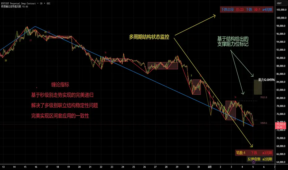
基于秒级别走势完全递归的缠论指标学过缠论的都知道,走势递归是缠论追求的最终形态。 但是走势递归在实际应用中需要处理很多的数据 。 所以目前缠论屇用的大多数是在不同周期划笔段中枢的方式,来进行对比。例如我写的第一套缠论指标,缠论结构。
而这一套走势递归版本,完全抛弃了笔段的划分。以秒级别走势为基础,逐级向上递归。以中枢划分走势,包含走势生长的三种方式,延伸/扩张/扩展。真正实现了不管在哪一个周期观察任何级别,都能保持递归结构的一致性与完整性,完美实现区间套的应用。
在这套指标里,周期只是观察的窗口。级别由a0开始,逐级递归为 ,a1--a2--a3.....
例如: a3周期,代表红色线段,1红色线段,代表一个a3级别的走势。不管是在5/30分钟周期,还是4小时周期观察,红色线段无论是其内部的结构,还是红色线段组成的结构,都是恒定不变的。不会因为观察的周期不同,而产生变化。
另外, 本指标加入了不同级别的由结构产生的支撑阻力位结构,方便辅助判断,当下是什么级别的走势,结构目标位置在什么地方。
同时 ,加入多周期结构监控,例如,当你打开5分钟周期,不仅能够看到符合当下周期的本级别结构情况,同时能看到大小级别的结构状态。比如大级别是处于上涨下跌或回踩反弹,本级别又是什么走势结构,小级别又是什么走势结构。
一个指标,打通缠论所有关节,欢迎订阅试用。
26-2-4 Review: Trendline Failure in a Ranging SessionMarket Environment: Typical Ranging Session
Today’s session is characterized by structural disorder and trend inefficiency.
This type of market often creates the illusion of opportunity, while very few setups actually meet structural requirements.
BTC
BTC displayed a classic intraday range structure.
Several apparent “trendline” formations appeared on the chart, but they share the same structural issues:
Trendline ① broke shortly after forming, without repeated market validation.
→ This behaves more like structural noise than a confirmed trend.
→ It can be seen as a structure break, but the quality of the break is low.
Trendline ② shows the same problem.
Formation time was too short and lacked testing.
→ Reversal probability at this level remains weak.
Two later zones showed bottom-type signals, but:
Candle count insufficient
No valid trendline construction
Structural criteria not met
Conclusion:
Trendline methodology offered little practical value on BTC today.
The session favored observation rather than participation.
ETH
ETH showed slightly clearer structure than BTC, but still within a rotational environment.
Trendline ①
Loss of structure at point A followed by a downside break at B.
✔ This confirmed a short-term bullish-to-bearish structural shift.
Range Zone ②
Swing development was insufficient.
No valid trendline structure.
Trendline ③
Upside break at C confirmed a bearish-to-bullish shift.
However, follow-through momentum lacked sustainability and was quickly suppressed.
Trendline ④ region saw repeated structural flips, reflecting unstable order flow.
A breakout eventually occurred at point D.
However, an important detail:
Candles D and E both printed upper wicks at nearly the same level.
This indicates:
Buying interest was present
Supply repeatedly entered at the same resistance
Momentum sustainability was uncertain
The later reversal at point F aligns with this repeated supply response.
Gold
Gold showed a similar condition to BTC — limited structural opportunity.
Trendline ① was only marginally valid.
Temporary internal violations reduce its structural strength.
The downside break candle at point A showed:
✔ A long lower wick
✔ A near-bullish pinbar structure
➡️ This represents a low-quality break and cannot serve as reliable structural confirmation.
Waiting for confirmation at point B would significantly widen the stop distance, reducing trade efficiency.
No new high-quality swing structures developed for the remainder of the session.
Summary
Today’s market characteristics:
Frequent swings
Many signals that appear valid
Most lacking structural qualification
Trendline methodology weakened under ranging conditions
In this type of environment, non-participation aligns with structural discipline.
The focus remains on waiting for clean structure to return.
《市场结构观察 # 26-2-3|BTC · ETH · 黄金》当前市场环境:典型横盘震荡日
今天整体属于结构混乱、趋势失效的一天。
这种行情最容易“看哪都像机会”,但真正符合结构规则的点并不多。
BTC
BTC 今天几乎就是标准的震荡结构。
图中出现过几次类似“趋势线”的结构,但都有共同问题:
趋势线① 刚形成就被下破,没有经过市场反复测试
→ 更像是结构噪音,不是有效趋势
→ 可以理解为一次“结构破坏”,但质量很低
趋势线② 情况相同
形成时间太短,缺少验证
→ 反转确定性不足
后面两个粉框位置虽然出现底部信号,但:
❌ K线数量不足
❌ 无法构成有效趋势线
❌ 不满足结构分析的基本条件
➡️ 结论:
BTC 今天不适合用趋势线体系交易
属于“能分析,但不值得参与”的节奏。
ETH
ETH 相比 BTC 结构稍微清晰,但仍然偏震荡。
趋势线①
a 点失守 → b 点向下突破
✔ 这是一个多转空的结构确认点
区间②
K 线不足,不能形成趋势线
→ 这里的反转信号结构支撑不够
趋势线③
c 点向上突破 = 空转多确认
但后续走势显示:
👉 反转动能持续性不足,很快再度被压制
趋势线④ 区域反复拉扯,最终由d点向上产生一个突破。
但我们一定要注意,d和e这两条K线都带着上影线,而且上影线的位置差不多,就说明行情曾经两次到过这个位置,但都遇到了很强的压力,然后被压制,那我们就能得出结论:多方反转动能存在,但多方动能反复在同一位置被空方成功压制,这一波多方动能的持续性就不算很强了,未知可能会出现突发的空放力量再次压制多方动能。这也是我们在f点看见的又一次反转的根本原因。
黄金
黄金今天和 BTC 类似 —— 机会极少
趋势线① 属于勉强成立的结构
中途曾被短暂破坏,只能算“弱趋势线”
向下突破那根 K 线a:
✔ 有长下影线
✔ 接近看涨 Pinbar 形态
➡️ 这是低质量突破
→ 不能作为有效的结构反转确认
如果等 b 点再确认,止损空间又过大,交易性价比失衡。
后续全天没有新的清晰顶底结构形成。
总结
今天的市场特征很明确:
✔ 有很多“看起来像信号”的地方
❌ 但大多不满足结构规则
❌ 趋势线体系在震荡市明显失效
这种行情里,放弃交易本身就是一种交易决策。
今天更适合做的不是进场,而是等结构重新变得干净。今天是典型的横盘震荡阶段,这种行情风格最考验技术分析,而且这种行情不是全都能用趋势线理论进行分析的。
《市场结构观察 #26-2-2|BTC · ETH · 黄金》很多人画趋势线只看“有没有突破”,但真正决定胜率的,是“突破质量”。
1 BTC
沿趋势线1的下跌,由a向上突破掉。
a带有上影线,但上影线未超过实体,可以当做趋势突破的确认,我们要注意的是后续的b、c、d,属于多空博弈的信号,如果在a点入场,就需要及时依据结构进行保护位调整,最终e代表了这里多方力度的极值。
沿趋势线2的下跌,由f向上突破掉。
但这里的f就需要格外注意!因为和a相比,f不算是一个强有力的突破,因为f的收线价很接近趋势线2,刚好比趋势线略高一点,所以f这个突破的质量非常低,不能视作强有力的多方力度。g的突破也算很弱。
另一个强有力的突破是h,但h有两个缺点:1 和f遇到了同样的强阻力位,2 实体增大突兀,持续性未知。
趋势线3是一条刚形成的趋势线,并未经过市场的验证(至少验证一次),这里的突破意义就更小,
有可能是短期发生的波动,市场合力不太明显,不能作为判断多方动能的强有力依据。
趋势线4和3是明显不一样的,4经过了市场的验证,而且被k强势突破。
但k的缺点和f非常相似,实体增大过于突兀,不确定这里多方动能的持续性,如果需要按近期低点设置止损线,会有一个非常大的止损空间,因此k最好放弃。
趋势线5,经过市场多次验证,最终被P点向上突破,P的上下影线长度可以接受,这里首次出现空方动能衰减 + 多方参与增强的结构迹象。
在2.1区间的几次突破尝试中,P点在收线位置与影线结构上表现出相对更高的突破质量。
因此,真正结构质量最高的多方信号,并不是最早的突破,而是经过多次验证后的P点。
2 ETH
首先观察到一个底部区间(粉色方框)这个底部走出了一个震荡区间,未形成任何的有效趋势线,所以这里不能用趋势线理论进行分析。
之后又是一个震荡结构,这里同样缺乏震荡箱体与有效趋势线结构,价格波动性占主导,趋势结构参考意义较低,因此趋势线分析在该阶段的适用性有限。
直到我们看见趋势线1,1是一条合格趋势线,但存在一个缺点:趋势线的末尾发生了剧烈的空转多博弈行为,具体表现就是两个实体突然增大的阴线和阳线,阳线可以认为是多方力量的暂时获胜,但多方的持续性如何还是未知,因此这里无法判断出空方是否转为多方。
最后形成了趋势线2,市场验证比1要多,没有发生剧烈的多空博弈,被缓慢突破,但我们要注意,a是一个明显的多空博弈(下影线),b、c及后续几个k线明显也属于多空小幅度博弈区,只有当d出现之后才能判断出这里的空方动能转为多方动能,多方力量开始占优。
只有当d出现后,结构才真正完成由空转多的动能转换。
3 黄金
首先我们看见了一个箱体(粉色方框),箱体是短期的震荡行情,因此不适合用趋势线进行分析。
趋势线1:由k线b向上突破,但此处的多方动能尚未形成,因为我们对比a和b两个k线,a的空方动能是明显大于b点的,所以这里还看不出由空转多的趋势转变。b点位置的多方动能持续性就存疑了。
后来有了新的回调,形成趋势线2,但趋势线2被随后的行情迅速破坏,形成斜率更大的趋势线3,直到k线d向上突破了趋势线3,这里我们对比一下c和d两根k线,d的多方动能是明显大于c的,因此d这里的多方动能,比起前面的b点是更明显的,d点的出现可以告诉我们:这里是一个高概率趋势空转多的改变。
d点的出现,才是首次动能层面的趋势反转确认,而不是前面的b点假信号。

