CapitalFlowsResearch: Sensitivity AnalysisCapitalFlowsResearch: Sensitivity Analysis — Driver–Price Beta Gauge
CapitalFlowsResearch: Sensitivity Analysis is built to answer a very specific macro question:
“How sensitive is this price to moves in that driver, right now?”
The indicator compares bar-to-bar changes in a chosen “price” asset with a chosen “driver” (such as an equity index, yield, or cross-asset benchmark), and from that relationship derives a rolling measure of effective beta. That beta is then converted into a “band width” value, representing how much the price typically moves for a standardised shock in the driver, under current conditions.
You can choose whether the driver’s moves are treated in basis points, absolute terms, or percent changes, and optionally smooth the resulting band with a configurable moving average to emphasise structural shifts over noise. The two plotted lines—current band width and its moving average—form a simple yet powerful gauge of how tightly the price is currently “geared” to the driver.
In practice, this makes Sensitivity Analysis a compact tool for:
Tracking when a contract becomes more or less responsive to a key macro factor.
Comparing sensitivity across instruments or timeframes.
Framing expected move scenarios (“if the driver does X, this should roughly do Y”).
All of this is done without exposing the detailed beta or volatility math inside the script.
投资组合管理

Position Size Tool [Riley]Automatically determine number of shares for an entry. Quantity based on a stop set at the low of day for long positions or a stop set at the high of the day for short positions. As well as inputs like account balance risk per trade. Also includes a user-defined maximum for percentage of daily dollar volume to consume with entry.

Multi-Entry Fibonacci CalculatorMulti-Entry Fibonacci Calculator
This tool is a comprehensive trade calculator designed for discretionary traders who plan to scale into positions. It automates the complex task of position sizing across up to three separate entries while ensuring your total risk exposure remains fixed. By inputting your desired entry, stop loss, and initial profit target levels, the script calculates the precise quantity for each entry and provides a dynamic, real-time view of your trade's vitals.
The primary goal of this script is to allow for disciplined risk management in multi-entry trade plans. Whether you are averaging into a position or adding on pullbacks, this tool ensures your total predefined risk is never exceeded, even if all entries are filled.
Key Features
Multi-Entry Position Sizing: Automatically calculates the share/contract size for up to three entries based on their distance from the stop loss and user-defined weights.
Fixed Risk Management: Define your total risk as a percentage of your account. The script ensures that a full stop-out across all filled entries will result in a loss equal to this predefined amount.
Dynamic Take Profit: The take-profit level automatically adjusts based on your current average entry price to preserve the original target profit amount in dollars.
Real-Time Info Panel: A customizable on-chart panel displays all critical trade data, including current quantity, average price, projected P&L, and trade status.
Visual Trade Plan: Plots all your defined price levels (entries, stop loss, take profit) directly on the chart with informative labels.
Trade State Tracking & Alerts: The script monitors the price and will trigger alerts when entries are hit, or when the stop loss or take profit levels are reached.
How to Use
Configure Account & Risk: In the settings, enter your "Account Size" and the "Risk per Trade (%)" you are willing to take on the entire position.
Set Trade Direction: Choose either "LONG" or "SHORT".
Input Price Levels: Manually enter the prices for your entries (Entry 1, 2, 3), your "Stop Loss Price," and an "Initial TP Reference." The initial TP is used to calculate the target profit in dollars.
Distribute Position Weight: Assign weights to each entry (e.g., 50% for Entry 1, 30% for Entry 2, 20% for Entry 3). The total should sum to 100.
Monitor the Trade: Use the info panel and on-chart visuals to track the trade's progress. The script will show your average price as entries are filled and update the dynamic take-profit level accordingly.
Understanding the Calculations
Weighted Position Sizing: The script calculates sizes for each entry so that if all entries are filled and the stop loss is hit, your total loss will equal your predefined risk amount. It intelligently allocates size based on the distance of each entry from the stop loss and the weight you assign to it.
Dynamic Take Profit: The "Initial TP Reference" is used only to calculate a target profit in dollars based on your first entry's size. The script then calculates a dynamic TP line on your chart. This line adjusts based on your average entry price as positions are filled, ensuring that if price reaches this level, you will realize your original target dollar profit, regardless of how many entries were filled.
On-Chart Elements
Price Lines: Blue lines for entries, a red line for the stop loss, and a green line for the dynamic take profit.
Labels: Display the calculated quantity for each entry, the total risk amount at the stop loss, and the target profit amount at the take profit.
Average Price: Yellow circles plot your live average entry price as the position is built.
Info Panel: A comprehensive table showing live trade status, current quantity, average price, and projected profit/loss. The panel changes color to green on a TP hit and red on an SL hit.

BTC Fear & Greed Incremental StrategyIMPORTANT: READ SETUP GUIDE BELOW OR IT WON'T WORK
# BTC Fear & Greed Incremental Strategy — TradeMaster AI (Pure BTC Stack)
## Strategy Overview
This advanced Bitcoin accumulation strategy is designed for long-term hodlers who want to systematically take profits during greed cycles and accumulate during fear periods, while preserving their core BTC position. Unlike traditional strategies that start with cash, this approach begins with a specified BTC allocation, making it perfect for existing Bitcoin holders who want to optimize their stack management.
## Key Features
### 🎯 **Pure BTC Stack Mode**
- Start with any amount of BTC (configurable)
- Strategy manages your existing stack, not new purchases
- Perfect for hodlers who want to optimize without timing markets
### 📊 **Fear & Greed Integration**
- Uses market sentiment data to drive buy/sell decisions
- Configurable thresholds for greed (selling) and fear (buying) triggers
- Automatic validation to ensure proper 0-100 scale data source
### 🐂 **Bull Year Optimization**
- Smart quarterly selling during bull market years (2017, 2021, 2025)
- Q1: 1% sells, Q2: 2% sells, Q3/Q4: 5% sells (configurable)
- **NO SELLING** during non-bull years - pure accumulation mode
- Preserves BTC during early bull phases, maximizes profits at peaks
### 🐻 **Bear Market Intelligence**
- Multi-regime detection: Bull, Early Bear, Deep Bear, Early Bull
- Different buying strategies based on market conditions
- Enhanced buying during deep bear markets with configurable multipliers
- Visual regime backgrounds for easy market condition identification
### 🛡️ **Risk Management**
- Minimum BTC allocation floor (prevents selling entire stack)
- Configurable position sizing for all trades
- Multiple safety checks and validation
### 📈 **Advanced Visualization**
- Clean 0-100 scale with 2 decimal precision
- Three main indicators: BTC Allocation %, Fear & Greed Index, BTC Holdings
- Real-time portfolio tracking with cash position display
- Enhanced info table showing all key metrics
## How to Use
### **Step 1: Setup**
1. Add the strategy to your BTC/USD chart (daily timeframe recommended)
2. **CRITICAL**: In settings, change the "Fear & Greed Source" from "close" to a proper 0-100 Fear & Greed indicator
---------------
I recommend Crypto Fear & Greed Index by TIA_Technology indicator
When selecting source with this indicator, look for "Crypto Fear and Greed Index:Index"
---------------
3. Set your "Starting BTC Quantity" to match your actual holdings
4. Configure your preferred "Start Date" (when you want the strategy to begin)
### **Step 2: Configure Bull Year Logic**
- Enable "Bull Year Logic" (default: enabled)
- Adjust quarterly sell percentages:
- Q1 (Jan-Mar): 1% (conservative early bull)
- Q2 (Apr-Jun): 2% (moderate mid bull)
- Q3/Q4 (Jul-Dec): 5% (aggressive peak targeting)
- Add future bull years to the list as needed
### **Step 3: Fine-tune Thresholds**
- **Greed Threshold**: 80 (sell when F&G > 80)
- **Fear Threshold**: 20 (buy when F&G < 20 in bull markets)
- **Deep Bear Fear Threshold**: 25 (enhanced buying in bear markets)
- Adjust based on your risk tolerance
### **Step 4: Risk Management**
- Set "Minimum BTC Allocation %" (default 20%) - prevents selling entire stack
- Configure sell/buy percentages based on your position size
- Enable bear market filters for enhanced timing
### **Step 5: Monitor Performance**
- **Orange Line**: Your BTC allocation percentage (target: fluctuate between 20-100%)
- **Blue Line**: Actual BTC holdings (should preserve core position)
- **Pink Line**: Fear & Greed Index (drives all decisions)
- **Table**: Real-time portfolio metrics including cash position
## Reading the Indicators
### **BTC Allocation Percentage (Orange Line)**
- **100%**: All portfolio in BTC, no cash available for buying
- **80%**: 80% BTC, 20% cash ready for fear buying
- **20%**: Minimum allocation, maximum cash position
### **Trading Signals**
- **Green Buy Signals**: Appear during fear periods with available cash
- **Red Sell Signals**: Appear during greed periods in bull years only
- **No Signals**: Either allocation limits reached or non-bull year
## Strategy Logic
### **Bull Years (2017, 2021, 2025)**
- Q1: Conservative 1% sells (preserve stack for later)
- Q2: Moderate 2% sells (gradual profit taking)
- Q3/Q4: Aggressive 5% sells (peak targeting)
- Fear buying active (accumulate on dips)
### **Non-Bull Years**
- **Zero selling** - pure accumulation mode
- Enhanced fear buying during bear markets
- Focus on rebuilding stack for next bull cycle
## Important Notes
- **This is not financial advice** - backtest thoroughly before use
- Designed for **long-term holders** (4+ year cycles)
- **Requires proper Fear & Greed data source** - validate in settings
- Best used on **daily timeframe** for major trend following
- **Cash calculations**: Use allocation % and BTC holdings to calculate available cash: `Cash = (Total Portfolio × (1 - Allocation%/100))`
## Risk Disclaimer
This strategy involves active trading and position management. Past performance does not guarantee future results. Always do your own research and never invest more than you can afford to lose. The strategy is designed for educational purposes and long-term Bitcoin accumulation thesis.
---
*Developed by Sol_Crypto for the Bitcoin community. Happy stacking! 🚀*


90% Buying Power Position Size Helper90% Buying Power Position Size Helper — Script Description
This tool calculates a recommended share size based on your available buying power and the current market price. TradingView does not provide access to live broker balances, so this script allows you to manually enter your current buying power and instantly see how many shares you can buy using a chosen percentage of it (default: 90%).
How It Works
• Enter your Buying Power ($)
• Choose the Percent to Use (e.g., 90%).
• The script divides the selected portion of your buying power by the current price of the symbol.
• A small display in the chart corner shows the recommended number of shares to buy.
Formula
shares = floor((buying_power * percent_to_use / 100) / price)
What It’s For
• Day traders who size positions based on account buying power
• Traders who want a quick way to calculate share size per trade
• Anyone who sizes entries using a fixed percentage of their account
What It Doesn’t Do
Due to TradingView limitations, the script cannot:
• Read your live buying power or broker balance
• Auto-fill orders or submit trades
• Retrieve real account data from your broker
You simply update the buying power input whenever your account changes, and the script does the rest.
Why It’s Useful
• Keeps you consistent with position sizing
• Reduces manual math during fast trading
• Prevents oversizing or undersizing trades
• Helps maintain discipline and risk control

Macro Monte Carlo 10000 Prob with BootstrapMacro Monte Carlo 10000 Prob with Bootstrap — by Wongsakon Khaisaeng
1) Core Concept: Monte Carlo as a Macro-Probabilistic Lens on Future Price Paths
The Macro Monte Carlo 10000 Prob with Bootstrap indicator is designed to view future price evolution through a probabilistic and statistically grounded lens. Instead of predicting a single deterministic outcome, it generates thousands of simulated future price paths (Monte Carlo Paths) to estimate the range of possible outcomes. By analyzing the lowest and highest values reached within each simulated path, the indicator provides a macro-level understanding of how far price could realistically decline or rally within a specified forecast horizon. This approach shifts the focus from price forecasting to probability distribution estimation, enabling more robust decision-making for systematic traders, risk managers, and options strategists.
2) Historical Data Foundation: Extracting Log Returns as the Statistical Engine
Before any simulation takes place, the indicator constructs a historical library of logarithmic returns (log returns) derived from the asset’s recent price history. The user defines the lookback window (e.g., 1000 bars), allowing the system to characterize how returns behaved across various market regimes. Log returns are used because they preserve mathematical properties essential for multiplicative price processes, making them highly suitable for probabilistic modeling. This historical dataset forms the core statistical engine from which blocks of returns will later be sampled and recombined to create forward-looking scenarios.
3) Simulation Methodology: Block Bootstrap to Preserve Market Structure
Unlike traditional Monte Carlo methods that randomize every return independently, this indicator employs Block Bootstrap—a technique that samples consecutive clusters of returns rather than isolated points. By using these blocks (e.g., 24 bars per block), the simulation preserves vital market characteristics such as volatility clustering, trending behavior, and short-term autocorrelation. Each simulated path is built by sequentially appending multiple randomly selected return blocks until the forecast horizon is reached. This method produces realistic price trajectories that reflect the inherent temporal structure of financial markets rather than artificially smoothed or over-randomized paths.
4) Macro Perspective: Tracking Path-Level Minimums and Maximums
For each simulated price path, the indicator tracks two critical values:
(1) the lowest price reached within the entire future path, and
(2) the highest price reached within the same horizon.
This macro approach focuses on the extremes—how deep a drawdown could extend, or how high a rally could potentially reach—rather than the shape of the trajectory itself. The method reflects practical concerns in risk management and trading:
How low could price fall before my stop is hit?
How high could price rise before a take-profit trigger?
By generating thousands of such paths, the indicator builds a statistical distribution of future minimums and maximums across all simulations.
5) Percentile Bands: Converting Thousands of Paths into Statistical Insight
Once all minimum and maximum values are collected, the indicator calculates key percentiles of these distributions (e.g., 10th, 50th, 90th). These percentiles represent probabilistic thresholds:
The 10th percentile of minimums suggests a price level below which only 10% of simulated future paths ever fell.
The 90th percentile of maximums indicates a level reached by only the strongest 10% of simulated rallies.
User-defined percentile settings are then applied to generate Band Low and Band High, which are plotted on the chart at the final bar. These levels form a probabilistic corridor showing where future price movements are statistically likely—or unlikely—to reach within the chosen horizon. This creates a forward-looking “probability envelope” that adapts to volatility, market structure, and historical dynamics.
6) Touch Probabilities: Estimating the Likelihood of Hitting Key Price Levels
A defining feature of the indicator is the calculation of Touch Probabilities—the probability that price will hit a certain lower or upper level at least once within the simulation window.
The lower touch level defaults to 90% of the current spot price (unless overridden).
The upper touch level defaults to 110% of spot.
The indicator then measures the percentage of paths in which:
the path’s minimum falls below or equal to the lower level → P(Touch ≤ X)
the path’s maximum rises above or equal to the upper level → P(Touch ≥ Y)
This mirrors advanced risk-management methods in trading, especially in options pricing, where the central question is often: Will price breach a barrier within a given timeframe?
These probabilities can guide decisions related to hedging, position sizing, stop-loss design, or probability-based expectations for take-profit scenarios.
7) Visual Output: Probability Bands and a Structured Summary Table
To help traders interpret results visually, the indicator plots Band Low and Band High as horizontal forward-looking reference levels at the most recent bar. This provides a quick visual sense of the statistical “territory” price is expected to explore under randomized future paths.
Additionally, a structured summary table is displayed on-chart, presenting:
symbol
number of paths, horizon, block length
spot price
percentile metrics for min/max distributions
Band Low / Band High
touch probabilities
sample counts and lookback window
This table transforms the complex underlying simulation into a clear, interpretable snapshot ideal for systematic analysis and trading decisions.
8) Practical Interpretation: A Probability-Driven Tool for Systematic Decision-Making
The purpose of this indicator is not to generate trading signals but to provide a statistical foundation for evaluating risk and opportunity. Systematic traders can use the information to answer practical questions such as:
“Is the expected downside risk greater than the upside opportunity?”
“What is the probability that price reaches my take-profit before my stop?”
“How wide should my volatility-adjusted stop-loss realistically be?”
“Does the market currently favor expansion or contraction in price range?”
The tool can also assist in options strategies (e.g., barrier options, credit spreads), portfolio risk assessment, or position sizing in trend-following and mean-reversion systems. In short, it provides a macro-probability framework that enhances decision quality by grounding expectations in simulated statistical reality rather than subjective bias.

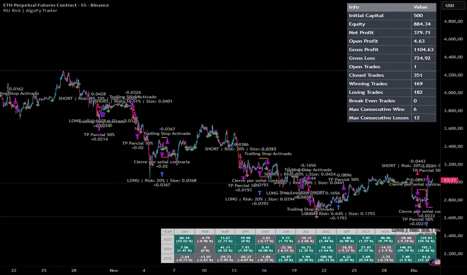
RSI Risk | AlgoFy TraderRSI Risk | AlgoFy Trader
Overview
The RSI Risk | AlgoFy Trader is a trading system that combines RSI-based entry signals with automated capital management. This strategy identifies potential momentum shifts while controlling risk through calculated position sizing.
Key Features
Dynamic Risk Management:
Fixed Risk Per Trade: Users set maximum risk percentage per trade.
Automatic Position Sizing: Calculates position size based on stop-loss distance.
Capital Protection: Limits each trade's risk to user-defined percentage.
RSI Entry System:
Momentum Detection: Uses RSI crossovers above/below defined thresholds.
Clear Signals: Provides long/short entries on momentum transitions.
Multiple Exit Layers:
Dynamic Stop Loss: Stop based on recent price structure.
Fixed Safety Stop: Optional percentage-based stop loss.
Partial Take Profit: Optional early profit-taking.
Trailing Stop: Optional dynamic profit protection.
Performance Tracking:
Trade Statistics: Tracks win/loss streaks and performance metrics.
Monthly Dashboard: Shows monthly/yearly P&L with equity views.
Trade Details: Displays risk percentage and position size.
How It Works
Signal Detection: Monitors RSI for crossover events.
Risk Calculation: Determines stop-loss based on recent volatility.
Position Sizing: Calculates exact position to match risk percentage.
Example:
Account: $10,000 | Risk: 2% ($200 max)
Stop loss at 4% distance
Position size: $5,000
Result: 4% loss on $5,000 = $200 (2% of account)
Recommended Settings
Risk: 1-2% per trade
Enable fixed stop at 3-4%
Consider trailing stop activation
This script provides disciplined RSI trading with automated risk control, adjusting exposure while maintaining strict risk limits.
Hierarchical Hidden Markov ModelHierarchical Hidden Markov Models (HHMMs) are an advanced version of standard Hidden Markov Models (HMMs). While HMMs model systems with a single layer of hidden states, each transitioning to other states based on fixed probabilities, HHMMs introduce multiple layers of hidden states. This hierarchical structure allows for more complex and nuanced modeling of systems, making HHMMs particularly useful in representing systems with nested states or regimes. In HHMMs, the hidden states are organized into levels, where each state at a higher level is defined by a set of states at a lower level. This nesting of states enables the model to capture longer-term dependencies in the time series, as each state at a higher level can represent a broader regime, and the states within it can represent finer sub-regimes. For example, in financial markets, a high-level state might represent a general market condition like high volatility, while the nested lower-level states could represent more specific conditions such as trending or oscillating within the high volatility regime.
The hierarchical nature of HHMMs is facilitated through the concept of termination probabilities. A termination probability is the probability that a given state will stop emitting observations and transition control back to its parent state. This mechanism allows the model to dynamically switch between different levels of the hierarchy, thereby modeling the nested structure effectively. Beside the transition, emission and initial probabilities that generally define a HMM, termination probabilities distinguish HHMMs from HMMs because they define when the process in a sub-state concludes, allowing the model to transition back to the higher-level state and potentially move to a different branch of the hierarchy.
In financial markets, HHMMs can be applied similiarly to HMMs to model latent market regimes such as high volatility, low volatility, or neutral, along with their respective sub-regimes. By identifying the most likely market regime and sub-regime, traders and analysts can make informed decisions based on a more granular probabilistic assessment of market conditions. For instance, during a high volatility regime, the model might detect sub-regimes that indicate different types of price movements, helping traders to adapt their strategies accordingly.
MODEL FIT:
By default, the indicator displays the posterior probabilities, which represent the likelihood that the market is in a specific hidden state at any given time, based on the observed data and the model fit. These posterior probabilities strictly represent the model fit, reflecting how well the model explains the historical data it was trained on. This model fit is inherently different from out-of-sample predictions, which are generated using data that was not included in the training process. The posterior probabilities from the model fit provide a probabilistic assessment of the state the market was in at a particular time based on the data that came before and after it in the training sequence. Out-of-sample predictions, on the other hand, offer a forward-looking evaluation to test the model's predictive capability.
MODEL TESTING:
When the "Test Out of Sample" option is enabled, the indicator plots the selected display settings based on models' out-of-sample predictions. The display settings for out-of-sample testing include several options:
State Probability option displays the probability of each state at a given time for segments of data points not included in the training process. This is particularly useful for real-time identification of market regimes, ensuring that the model's predictive capability is tested on unseen data. These probabilities are calculated using the forward algorithm, which efficiently computes the likelihood of the observed sequence given the model parameters. Higher probabilities for a particular state suggest that the market is currently in that state. Traders can use this information to adjust their strategies according to the identified market regime and their statistical features.
Confidence Interval Bands option plots the upper, lower, and median confidence interval bands for predicted values. These bands provide a range within which future values are expected to lie with a certain confidence level. The width of the interval is determined by the current probability of different states in the model and the distribution of data within these states. The confidence level can be specified in the Confidence Interval setting.
Omega Ratio option displays a risk-adjusted performance measure that offers a more comprehensive view of potential returns compared to traditional metrics like the Sharpe ratio. It takes into account all moments of the returns distribution, providing a nuanced perspective on the risk-return tradeoff in the context of the HHMM's identified market regimes. The minimum acceptable return (MAR) used for the calculation of the omega can be specified in the settings of the indicator. The plot displays both the current Omega ratio and a forecasted "N day Omega" ratio. A higher Omega ratio suggests better risk-adjusted performance, essentially comparing the probability of gains versus the probability of losses relative to the minimum acceptable return. The Omega ratio plot is color-coded, green indicates that the long-term forecasted Omega is higher than the current Omega (suggesting improving risk-adjusted returns over time), while red indicates the opposite. Traders can use omega ratio to assess the risk-adjusted forecast of the model, under current market conditions with a specific target return requirement (MAR). By leveraging the HHMM's ability to identify different market states, the Omega ratio provides a forward-looking risk assessment tool, helping traders make more informed decisions about position sizing, risk management, and strategy selection.
Model Complexity option shows the complexity of the model, as well as complexity of individual states if the “complexity components” option is enabled. Model complexity is measured in terms of the entropy expressed through transition probabilities. The used complexity metric can be related to the models entropy rate and is calculated as the sum of the p*log(p) for every transition probability of a given state. Complexity in this context informs us on how complex the models transitions are. A model that might transition between states more often would be characterised by higher complexity, while a model that tends to transition less often would have lower complexity. High complexity can also suggest the model captures noise rather than the underlying market structure also known as overfitting, whereas lower complexity might indicate underfitting, where the model is too simplistic to capture important market dynamics. It is useful to assess the stability of the model complexity as well as understand where changes come from when a shift happens. A model with irregular complexity values can be strong sign of overfitting, as it suggests that the process that the model is capturing changes siginficantly over time.
Akaike/Bayesian Information Criterion option plots the AIC or BIC values for the model on both the training and out-of-sample data. These criteria are used for model selection, helping to balance model fit and complexity, as they take into account both the goodness of fit (likelihood) and the number of parameters in the model. The metric therefore provides a value we can use to compare different models with different number of parameters. Lower values generally indicate a better model. AIC is considered more liberal while BIC is considered a more conservative criterion which penalizes the likelihood more. Beside comparing different models, we can also assess how much the AIC and BIC differ between the training sets and test sets. A test set metric, which is consistently significantly higher than the training set metric can point to a drift in the models parameters, a strong drift of model parameters might again indicate overfitting or underfitting the sampled data.
Indicator settings:
- Source : Data source which is used to fit the model
- Training Period : Adjust based on the amount of historical data available. Longer periods can capture more trends but might be computationally intensive.
- EM Iterations : Balance between computational efficiency and model fit. More iterations can improve the model but at the cost of speed.
- Test Out of Sample : turn on predict the test data out of sample, based on the model that is retrained every N bars
- Out of Sample Display: A selection of metrics to evaluate out of sample. Pick among State probability, confidence interval, model complexity and AIC/BIC.
- Test Model on N Bars : set the number of bars we perform out of sample testing on.
- Retrain Model on N Bars: Set based on how often you want to retrain the model when testing out of sample segments
- Confidence Interval : When confidence interval is selected in the out of sample display you can adjust the percentage to reflect the desired confidence level for predictions.
- Omega forecast: Specifies the number of days ahead the omega ratio will be forecasted to get a long run measure.
- Minimum Acceptable Return : Specifies the target minimum acceptable return for the omega ratio calculation
- Complexity Components : When model complexity is selected in the out of sample display, this option will display the complexity of each individual state.
-Bayesian Information Criterion : When AIC/BIC is selected, turning this on this will ensure BIC is calculated instead of AIC.

Hidden Markov ModelHidden Markov Models (HMMs) are a class of statistical models used to represent systems that follow a Markov process with hidden states. In such models, the system being modeled transitions between a finite number of states, with the probability of each transition dependent only on the current state. The hidden states are not directly observable; instead, we observe a sequence of emissions or outputs generated by these states. HMMs are widely used in various fields, including speech recognition, bioinformatics, and financial market analysis. In the context of financial markets, HMMs can be utilized to model the latent market regimes (e.g., bullish, bearish, or neutral) that influence the observed market data such as asset prices or returns. By estimating the posterior probabilities of these hidden states, traders and analysts can identify the most likely market regime and make informed decisions based on the probabilistic assessment of market conditions.
The Hidden Markov Model (HMM) comprises several states that work together to model the hidden market dynamics. The states represent the unobservable market regimes such as bullish, bearish or neutral. The states are 'hidden' in nature because we need to infer them from the data and cannot directly observe them.
Model components:
Initial Probabilities: These denote the likelihood of starting in each hidden state. They can be related to long-run probabilities, reflecting the overall likelihood of each state across extended periods. In equilibrium, these initial probabilities may converge to the stationary distribution of the Markov chain.
Transition Probabilities: These capture the likelihood of moving between states, including the probability of remaining in the current state. They model how market regimes evolve over time, allowing the HMM to adapt to changing conditions.
Emission Probabilities: Also known as observation likelihoods, these represent the probability of observing specific market data (like returns) given each hidden state. Emission probabilities can be often represented by continuous probability distributions. In our case we are using a laplace distribution with its location parameter reflecting the central tendency of returns in each state and the scale reflecting the dispersion or the magnitude of the returns.
The power of HMMs in financial modeling lies in their ability to capture complex market dynamics probabilistically. By analyzing patterns in market, the model can estimate the likelihood of being in each state at any given time. This can reveal insights into market behavior and dynamics that might not be apparent from data alone.
MODEL FIT:
By default, the indicator displays the posterior probabilities, which represent the likelihood that the market is in a specific hidden state at any given time, based on the observed data and the model fit. It is crucial to understand that these posterior probabilities strictly represent the model fit, reflecting how well the model explains the historical data it was trained on. This model fit is inherently different from out-of-sample predictions, which are generated using data that was not included in the training process. The posterior probabilities from the model fit provide a probabilistic assessment of the state the market was in at a particular time based on the data that came before and after it in the training sequeence. Out-of-sample predictions on the other hand offer a forward-looking evaluation to test the model's predictive capability.
MODEL TEST:
When the "Test Out of Sample” option is enabled, the indicator plots the selected display settings based on models out-of-sample predictions. The display settings for out-of-sample testing include several options:
State Probability option displays the probability of each state at a given time for segments of datapoints that were not included in the traning process. This is particularly useful for real-time identification of market regimes, ensuring that the model's predictive capability is rigorously tested on unseen data. These probabilities are calculated using the forward algorithm, which efficiently computes the likelihood of the observed sequence given the model parameters. Higher probability for a particular state indicate a higher likelihood that the market is currently in that state. Traders can use this information to adjust their strategies according to the identified market regime and their statistical features.
Confidence Interval Bands option plots the upper, lower, and median confidence interval bands for predicted values. These bands provide a range within which future values are expected to lie with a certain confidence level. The width of the interval is determined by the current probability of different states in the model and the distribution of data within these states. The confidence level can be specified in the Confidence Interval setting.
Omega Ratio option displays a risk-adjusted performance measure that offers a more comprehensive view of potential returns compared to traditional metrics like the Sharpe ratio. It takes into account all moments of the returns distribution, providing a nuanced perspective on the risk-return tradeoff in the context of the HHMM's identified market regimes. The minimum acceptable return (MAR) used for the calculation of the omega can be specified in the settings of the indicator. The plot displays both the current Omega ratio and a forecasted "N day Omega" ratio. A higher Omega ratio suggests better risk-adjusted performance, essentially comparing the probability of gains versus the probability of losses relative to the minimum acceptable return. The Omega ratio plot is color-coded, green indicates that the long-term forecasted Omega is higher than the current Omega (suggesting improving risk-adjusted returns over time), while red indicates the opposite. Traders can use omega ratio to assess the risk-adjusted forecast of the model, under current market conditions with a specific target return requirement (MAR). By leveraging the HHMM's ability to identify different market states, the Omega ratio provides a forward-looking risk assessment tool, helping traders make more informed decisions about position sizing, risk management, and strategy selection.
Model Complexity option shows the complexity of the model, as well as complexity of individual states if the “complexity components” option is enabled. Model complexity is measured in terms of the entropy expressed through transition probabilities. The used complexity metric can be related to the models entropy rate and is calculated as the sum of the p*log(p) for every transition probability of a given state. Complexity in this context informs us on how complex the models transitions are. A model that might transition between states more often would be characterised by higher complexity, while a model that tends to transition less often would have lower complexity. High complexity can also suggest the model captures noise rather than the underlying market structure also known as overfitting, whereas too low complexity might indicate underfitting, where the model is too simplistic to capture important market dynamics. It is also useful to assess the stability of the model complexity. A model with irregular complexity values can be sign of overfitting, as it suggests that the process that the model is capturing changes significantly over time.
Akaike/Bayesian Information Criterion option plots the AIC or BIC values for the model on both the training and out-of-sample data. These criteria are used for model selection, helping to balance model fit and complexity, as they take into account both the goodness of fit (likelihood) and the number of parameters in the model. The metric therefore provides a value we can use to compare different models with different number of parameters. Lower values generally indicate a better model. AIC is considered more liberal while BIC is considered a more conservative criterion which penalizes the likelihood more. Beside comparing different models, we can also assess how much the AIC and BIC differ between the training sets and test sets. A test set metric, which is consistently significantly higher than the training set metric can point to a drift in the models parameters, a strong drift of model parameters might again indicate overfitting or underfitting the sampled data.
Indicator settings:
- Source : Data source which is used to fit the model
- Training Period : Adjust based on the amount of historical data available. Longer periods can capture more trends but might be computationally intensive.
- EM Iterations : Balance between computational efficiency and model fit. More iterations can improve the model but at the cost of speed.
- Test Out of Sample : turn on predict the test data out of sample, based on the model that is retrained every N bars
- Out of Sample Display: A selection of metrics to evaluate out of sample. Pick among State probability, confidence interval, model complexity and AIC/BIC.
- Test Model on N Bars : set the number of bars we perform out of sample testing on.
- Retrain Model on N Bars: Set based on how often you want to retrain the model when testing out of sample segments
- Confidence Interval : When confidence interval is selected in the out of sample display you can adjust the percentage to reflect the desired confidence level for predictions.
- Omega forecast: Specifies the number of days ahead the omega ratio will be forecasted to get a long run measure.
- Minimum Acceptable Return : Specifies the target minimum acceptable return for the omega ratio calculation
- Complexity Components : When model complexity is selected in the out of sample display, this option will display the complexity of each individual state.
-Bayesian Information Criterion : When AIC/BIC is selected, turning this on this will ensure BIC is calculated instead of AIC.

Fixed Dollar Risk Lines V2*This is a small update to the original concept that adds greater customization of the visual elements of the script. Since some folks have liked the original I figured I'd put this out there.*
Fixed Dollar Risk Lines is a utility indicator that converts a user-defined dollar risk into price distance and plots risk lines above and below the current price for popular futures contracts. It helps you place stops or entries at a consistent dollar risk per trade, regardless of the market’s tick value or tick size.
What it does:
-You choose a dollar amount to risk (e.g., $100) and a futures contract (ES, NQ, GC, YM, RTY, PL, SI, CL, BTC).
The script automatically:
-Looks up the contract’s tick value and tick size
-Converts your dollar risk into number of ticks
-Converts ticks into price distance
Plots:
-Long Risk line below current price
-Short Risk line above current price
-Optional labels show exact price levels and an information table summarizes your settings.
Key features
-Consistent dollar risk across instruments
-Supports major futures contracts with built‑in tick values and sizes
-Toggle Long and Short risk lines independently
-Customizable line width and colors (lines and labels)
-Right‑axis price level display for quick reading
-Compact info table with contract, risk, and computed prices
Typical use
-Long setups: use the green line as a stop level below entry to match your chosen dollar risk.
-Short setups: use the red line as a stop level above entry to match your chosen dollar risk.
-Quickly compare how the same dollar risk translates to distance on different contracts.
Inputs
-Risk Amount (USD)
-Futures Contract (ES, NQ, GC, YM, RTY, PL, SI, CL, BTC)
-Show Long/Short lines (toggles)
-Line Width
-Colors for lines and labels
Notes
-Designed for futures symbols that match the listed contracts’ tick specs. If your symbol has different tick value/size than the defaults, results will differ.
-Intended for educational/informational use; not financial advice.
-This tool streamlines risk placement so you can focus on execution while keeping dollar risk consistent across markets.

⏰Forex Market Clock Table (DST Auto)⏰ Forex Market Clock Table (DST Auto)
Keep track of key forex session times with this clean, real-time table showing local time, market status (open/closed), and automatic Daylight Saving Time (DST) adjustments for Sydney, Tokyo, London, and New York. Displays countdowns to session open/close and highlights weekends. Fully customizable position, colors, and text size—perfect for multi-session traders.

3-Daumen-RegelThis indicator evaluates three key market conditions and summarizes them in a compact table using simple thumbs-up / thumbs-down signals. It’s designed specifically for daily timeframes and helps you quickly assess whether a market is showing technical strength or weakness.
The Three Checks
Price Above the 200-Day SMA
Indicates the long-term trend direction. A thumbs-up means the price is trading above the 200-day moving average.
Positive Performance During the First 5 Trading Days of the Year (YTD Start)
Measures early-year strength. If not enough bars are available, a warning is shown.
Price Above the YTD Level
Compares the current price to the first trading day’s close of the year.
Color Coding for Instant Clarity
Green: Condition met
Red: Condition not met
This creates a compact “thumbs check” that gives you a quick read on the market’s technical health.
Note
The indicator is intended for daily charts. A message appears if a different timeframe is used.

Futures Risk Manager Pro (v6 stable)This indicator will allow you to calculate your risk management per position.
You must first enter your capital and your risk percentage. Then, when you specify your stop-loss size in ticks, the indicator will immediately tell you the number of contracts to use to stay within your risk percentage.

Expected Move BandsExpected move is the amount that an asset is predicted to increase or decrease from its current price, based on the current levels of volatility.
In this model, we assume asset price follows a log-normal distribution and the log return follows a normal distribution.
Note: Normal distribution is just an assumption, it's not the real distribution of return
Settings:
"Estimation Period Selection" is for selecting the period we want to construct the prediction interval.
For "Current Bar", the interval is calculated based on the data of the previous bar close. Therefore changes in the current price will have little effect on the range. What current bar means is that the estimated range is for when this bar close. E.g., If the Timeframe on 4 hours and 1 hour has passed, the interval is for how much time this bar has left, in this case, 3 hours.
For "Future Bars", the interval is calculated based on the current close. Therefore the range will be very much affected by the change in the current price. If the current price moves up, the range will also move up, vice versa. Future Bars is estimating the range for the period at least one bar ahead.
There are also other source selections based on high low.
Time setting is used when "Future Bars" is chosen for the period. The value in time means how many bars ahead of the current bar the range is estimating. When time = 1, it means the interval is constructing for 1 bar head. E.g., If the timeframe is on 4 hours, then it's estimating the next 4 hours range no matter how much time has passed in the current bar.
Note: It's probably better to use "probability cone" for visual presentation when time > 1
Volatility Models :
Sample SD: traditional sample standard deviation, most commonly used, use (n-1) period to adjust the bias
Parkinson: Uses High/ Low to estimate volatility, assumes continuous no gap, zero mean no drift, 5 times more efficient than Close to Close
Garman Klass: Uses OHLC volatility, zero drift, no jumps, about 7 times more efficient
Yangzhang Garman Klass Extension: Added jump calculation in Garman Klass, has the same value as Garman Klass on markets with no gaps.
about 8 x efficient
Rogers: Uses OHLC, Assume non-zero mean volatility, handles drift, does not handle jump 8 x efficient
EWMA: Exponentially Weighted Volatility. Weight recently volatility more, more reactive volatility better in taking account of volatility autocorrelation and cluster.
YangZhang: Uses OHLC, combines Rogers and Garmand Klass, handles both drift and jump, 14 times efficient, alpha is the constant to weight rogers volatility to minimize variance.
Median absolute deviation: It's a more direct way of measuring volatility. It measures volatility without using Standard deviation. The MAD used here is adjusted to be an unbiased estimator.
Volatility Period is the sample size for variance estimation. A longer period makes the estimation range more stable less reactive to recent price. Distribution is more significant on a larger sample size. A short period makes the range more responsive to recent price. Might be better for high volatility clusters.
Standard deviations:
Standard Deviation One shows the estimated range where the closing price will be about 68% of the time.
Standard Deviation two shows the estimated range where the closing price will be about 95% of the time.
Standard Deviation three shows the estimated range where the closing price will be about 99.7% of the time.
Note: All these probabilities are based on the normal distribution assumption for returns. It's the estimated probability, not the actual probability.
Manually Entered Standard Deviation shows the range of any entered standard deviation. The probability of that range will be presented on the panel.
People usually assume the mean of returns to be zero. To be more accurate, we can consider the drift in price from calculating the geometric mean of returns. Drift happens in the long run, so short lookback periods are not recommended. Assuming zero mean is recommended when time is not greater than 1.
When we are estimating the future range for time > 1, we typically assume constant volatility and the returns to be independent and identically distributed. We scale the volatility in term of time to get future range. However, when there's autocorrelation in returns( when returns are not independent), the assumption fails to take account of this effect. Volatility scaled with autocorrelation is required when returns are not iid. We use an AR(1) model to scale the first-order autocorrelation to adjust the effect. Returns typically don't have significant autocorrelation. Adjustment for autocorrelation is not usually needed. A long length is recommended in Autocorrelation calculation.
Note: The significance of autocorrelation can be checked on an ACF indicator.
ACF
The multimeframe option enables people to use higher period expected move on the lower time frame. People should only use time frame higher than the current time frame for the input. An error warning will appear when input Tf is lower. The input format is multiplier * time unit. E.g. : 1D
Unit: M for months, W for Weeks, D for Days, integers with no unit for minutes (E.g. 240 = 240 minutes). S for Seconds.
Smoothing option is using a filter to smooth out the range. The filter used here is John Ehler's supersmoother. It's an advance smoothing technique that gets rid of aliasing noise. It affects is similar to a simple moving average with half the lookback length but smoother and has less lag.
Note: The range here after smooth no long represent the probability
Panel positions can be adjusted in the settings.
X position adjusts the horizontal position of the panel. Higher X moves panel to the right and lower X moves panel to the left.
Y position adjusts the vertical position of the panel. Higher Y moves panel up and lower Y moves panel down.
Step line display changes the style of the bands from line to step line. Step line is recommended because it gets rid of the directional bias of slope of expected move when displaying the bands.
Warnings:
People should not blindly trust the probability. They should be aware of the risk evolves by using the normal distribution assumption. The real return has skewness and high kurtosis. While skewness is not very significant, the high kurtosis should be noticed. The Real returns have much fatter tails than the normal distribution, which also makes the peak higher. This property makes the tail ranges such as range more than 2SD highly underestimate the actual range and the body such as 1 SD slightly overestimate the actual range. For ranges more than 2SD, people shouldn't trust them. They should beware of extreme events in the tails.
Different volatility models provide different properties if people are interested in the accuracy and the fit of expected move, they can try expected move occurrence indicator. (The result also demonstrate the previous point about the drawback of using normal distribution assumption).
Expected move Occurrence Test
The prediction interval is only for the closing price, not wicks. It only estimates the probability of the price closing at this level, not in between. E.g., If 1 SD range is 100 - 200, the price can go to 80 or 230 intrabar, but if the bar close within 100 - 200 in the end. It's still considered a 68% one standard deviation move.

️Omega RatioThe Omega Ratio is a risk-return performance measure of an investment asset, portfolio, or strategy. It is defined as the probability-weighted ratio, of gains versus losses for some threshold return target. The ratio is an alternative for the widely used Sharpe ratio and is based on information the Sharpe ratio discards.
█ OVERVIEW
As we have mentioned many times, stock market returns are usually not normally distributed. Therefore the models that assume a normal distribution of returns may provide us with misleading information. The Omega Ratio improves upon the common normality assumption among other risk-return ratios by taking into account the distribution as a whole.
█ CONCEPTS
Two distributions with the same mean and variance, would according to the most commonly used Sharpe Ratio suggest that the underlying assets of the distribution offer the same risk-return ratio. But as we have mentioned in our Moments indicator, variance and standard deviation are not a sufficient measure of risk in the stock market since other shape features of a distribution like skewness and excess kurtosis come into play. Omega Ratio tackles this problem by employing all four Moments of the distribution and therefore taking into account the differences in the shape features of the distributions. Another important feature of the Omega Ratio is that it does not require any estimation but is rather calculated directly from the observed data. This gives it an advantage over standard statistical estimators that require estimation of parameters and are therefore sampling uncertainty in its calculations.
█ WAYS TO USE THIS INDICATOR
Omega calculates a probability-adjusted ratio of gains to losses, relative to the Minimum Acceptable Return (MAR). This means that at a given MAR using the simple rule of preferring more to less, an asset with a higher value of Omega is preferable to one with a lower value. The indicator displays the values of Omega at increasing levels of MARs and creating the so-called Omega Curve. Knowing this one can compare Omega Curves of different assets and decide which is preferable given the MAR of your strategy. The indicator plots two Omega Curves. One for the on chart symbol and another for the off chart symbol that u can use for comparison.
When comparing curves of different assets make sure their trading days are the same in order to ensure the same period for the Omega calculations. Value interpretation: Omega<1 will indicate that the risk outweighs the reward and therefore there are more excess negative returns than positive. Omega>1 will indicate that the reward outweighs the risk and that there are more excess positive returns than negative. Omega=1 will indicate that the minimum acceptable return equals the mean return of an asset. And that the probability of gain is equal to the probability of loss.
█ FEATURES
• "Low-Risk security" lets you select the security that you want to use as a benchmark for Omega calculations.
• "Omega Period" is the size of the sample that is used for the calculations.
• “Increments” is the number of Minimal Acceptable Return levels the calculation is carried on. • “Other Symbol” lets you select the source of the second curve.
• “Color Settings” you can set the color for each curve.

Linear Moments█ OVERVIEW
The Linear Moments indicator, also known as L-moments, is a statistical tool used to estimate the properties of a probability distribution. It is an alternative to conventional moments and is more robust to outliers and extreme values.
█ CONCEPTS
█ Four moments of a distribution
We have mentioned the concept of the Moments of a distribution in one of our previous posts. The method of Linear Moments allows us to calculate more robust measures that describe the shape features of a distribution and are anallougous to those of conventional moments. L-moments therefore provide estimates of the location, scale, skewness, and kurtosis of a probability distribution.
The first L-moment, λ₁, is equivalent to the sample mean and represents the location of the distribution. The second L-moment, λ₂, is a measure of the dispersion of the distribution, similar to the sample standard deviation. The third and fourth L-moments, λ₃ and λ₄, respectively, are the measures of skewness and kurtosis of the distribution. Higher order L-moments can also be calculated to provide more detailed information about the shape of the distribution.
One advantage of using L-moments over conventional moments is that they are less affected by outliers and extreme values. This is because L-moments are based on order statistics, which are more resistant to the influence of outliers. By contrast, conventional moments are based on the deviations of each data point from the sample mean, and outliers can have a disproportionate effect on these deviations, leading to skewed or biased estimates of the distribution parameters.
█ Order Statistics
L-moments are statistical measures that are based on linear combinations of order statistics, which are the sorted values in a dataset. This approach makes L-moments more resistant to the influence of outliers and extreme values. However, the computation of L-moments requires sorting the order statistics, which can lead to a higher computational complexity.
To address this issue, we have implemented an Online Sorting Algorithm that efficiently obtains the sorted dataset of order statistics, reducing the time complexity of the indicator. The Online Sorting Algorithm is an efficient method for sorting large datasets that can be updated incrementally, making it well-suited for use in trading applications where data is often streamed in real-time. By using this algorithm to compute L-moments, we can obtain robust estimates of distribution parameters while minimizing the computational resources required.
█ Bias and efficiency of an estimator
One of the key advantages of L-moments over conventional moments is that they approach their asymptotic normal closer than conventional moments. This means that as the sample size increases, the L-moments provide more accurate estimates of the distribution parameters.
Asymptotic normality is a statistical property that describes the behavior of an estimator as the sample size increases. As the sample size gets larger, the distribution of the estimator approaches a normal distribution, which is a bell-shaped curve. The mean and variance of the estimator are also related to the true mean and variance of the population, and these relationships become more accurate as the sample size increases.
The concept of asymptotic normality is important because it allows us to make inferences about the population based on the properties of the sample. If an estimator is asymptotically normal, we can use the properties of the normal distribution to calculate the probability of observing a particular value of the estimator, given the sample size and other relevant parameters.
In the case of L-moments, the fact that they approach their asymptotic normal more closely than conventional moments means that they provide more accurate estimates of the distribution parameters as the sample size increases. This is especially useful in situations where the sample size is small, such as when working with financial data. By using L-moments to estimate the properties of a distribution, traders can make more informed decisions about their investments and manage their risk more effectively.
Below we can see the empirical dsitributions of the Variance and L-scale estimators. We ran 10000 simulations with a sample size of 100. Here we can clearly see how the L-moment estimator approaches the normal distribution more closely and how such an estimator can be more representative of the underlying population.
█ WAYS TO USE THIS INDICATOR
The Linear Moments indicator can be used to estimate the L-moments of a dataset and provide insights into the underlying probability distribution. By analyzing the L-moments, traders can make inferences about the shape of the distribution, such as whether it is symmetric or skewed, and the degree of its spread and peakedness. This information can be useful in predicting future market movements and developing trading strategies.
One can also compare the L-moments of the dataset at hand with the L-moments of certain commonly used probability distributions. Finance is especially known for the use of certain fat tailed distributions such as Laplace or Student-t. We have built in the theoretical values of L-kurtosis for certain common distributions. In this way a person can compare our observed L-kurtosis with the one of the selected theoretical distribution.
█ FEATURES
Source Settings
Source - Select the source you wish the indicator to calculate on
Source Selection - Selec whether you wish to calculate on the source value or its log return
Moments Settings
Moments Selection - Select the L-moment you wish to be displayed
Lookback - Determine the sample size you wish the L-moments to be calculated with
Theoretical Distribution - This setting is only for investingating the kurtosis of our dataset. One can compare our observed kurtosis with the kurtosis of a selected theoretical distribution.

Historical Volatility EstimatorsHistorical volatility is a statistical measure of the dispersion of returns for a given security or market index over a given period. This indicator provides different historical volatility model estimators with percentile gradient coloring and volatility stats panel.
█ OVERVIEW There are multiple ways to estimate historical volatility. Other than the traditional close-to-close estimator. This indicator provides different range-based volatility estimators that take high low open into account for volatility calculation and volatility estimators that use other statistics measurements instead of standard deviation. The gradient coloring and stats panel provides an overview of how high or low the current volatility is compared to its historical values.
█ CONCEPTS We have mentioned the concepts of historical volatility in our previous indicators, Historical Volatility, Historical Volatility Rank, and Historical Volatility Percentile. You can check the definition of these scripts. The basic calculation is just the sample standard deviation of log return scaled with the square root of time. The main focus of this script is the difference between volatility models.
Close-to-Close HV Estimator: Close-to-Close is the traditional historical volatility calculation. It uses sample standard deviation. Note: the TradingView build in historical volatility value is a bit off because it uses population standard deviation instead of sample deviation. N – 1 should be used here to get rid of the sampling bias.
Pros:
• Close-to-Close HV estimators are the most commonly used estimators in finance. The calculation is straightforward and easy to understand. When people reference historical volatility, most of the time they are talking about the close to close estimator.
Cons:
• The Close-to-close estimator only calculates volatility based on the closing price. It does not take account into intraday volatility drift such as high, low. It also does not take account into the jump when open and close prices are not the same.
• Close-to-Close weights past volatility equally during the lookback period, while there are other ways to weight the historical data.
• Close-to-Close is calculated based on standard deviation so it is vulnerable to returns that are not normally distributed and have fat tails. Mean and Median absolute deviation makes the historical volatility more stable with extreme values.
Parkinson Hv Estimator:
• Parkinson was one of the first to come up with improvements to historical volatility calculation. • Parkinson suggests using the High and Low of each bar can represent volatility better as it takes into account intraday volatility. So Parkinson HV is also known as Parkinson High Low HV. • It is about 5.2 times more efficient than Close-to-Close estimator. But it does not take account into jumps and drift. Therefore, it underestimates volatility. Note: By Dividing the Parkinson Volatility by Close-to-Close volatility you can get a similar result to Variance Ratio Test. It is called the Parkinson number. It can be used to test if the market follows a random walk. (It is mentioned in Nassim Taleb's Dynamic Hedging book but it seems like he made a mistake and wrote the ratio wrongly.)
Garman-Klass Estimator:
• Garman Klass expanded on Parkinson’s Estimator. Instead of Parkinson’s estimator using high and low, Garman Klass’s method uses open, close, high, and low to find the minimum variance method.
• The estimator is about 7.4 more efficient than the traditional estimator. But like Parkinson HV, it ignores jumps and drifts. Therefore, it underestimates volatility.
Rogers-Satchell Estimator:
• Rogers and Satchell found some drawbacks in Garman-Klass’s estimator. The Garman-Klass assumes price as Brownian motion with zero drift.
• The Rogers Satchell Estimator calculates based on open, close, high, and low. And it can also handle drift in the financial series.
• Rogers-Satchell HV is more efficient than Garman-Klass HV when there’s drift in the data. However, it is a little bit less efficient when drift is zero. The estimator doesn’t handle jumps, therefore it still underestimates volatility.
Garman-Klass Yang-Zhang extension:
• Yang Zhang expanded Garman Klass HV so that it can handle jumps. However, unlike the Rogers-Satchell estimator, this estimator cannot handle drift. It is about 8 times more efficient than the traditional estimator.
• The Garman-Klass Yang-Zhang extension HV has the same value as Garman-Klass when there’s no gap in the data such as in cryptocurrencies.
Yang-Zhang Estimator:
• The Yang Zhang Estimator combines Garman-Klass and Rogers-Satchell Estimator so that it is based on Open, close, high, and low and it can also handle non-zero drift. It also expands the calculation so that the estimator can also handle overnight jumps in the data.
• This estimator is the most powerful estimator among the range-based estimators. It has the minimum variance error among them, and it is 14 times more efficient than the close-to-close estimator. When the overnight and daily volatility are correlated, it might underestimate volatility a little.
• 1.34 is the optimal value for alpha according to their paper. The alpha constant in the calculation can be adjusted in the settings. Note: There are already some volatility estimators coded on TradingView. Some of them are right, some of them are wrong. But for Yang Zhang Estimator I have not seen a correct version on TV.
EWMA Estimator:
• EWMA stands for Exponentially Weighted Moving Average. The Close-to-Close and all other estimators here are all equally weighted.
• EWMA weighs more recent volatility more and older volatility less. The benefit of this is that volatility is usually autocorrelated. The autocorrelation has close to exponential decay as you can see using an Autocorrelation Function indicator on absolute or squared returns. The autocorrelation causes volatility clustering which values the recent volatility more. Therefore, exponentially weighted volatility can suit the property of volatility well.
• RiskMetrics uses 0.94 for lambda which equals 30 lookback period. In this indicator Lambda is coded to adjust with the lookback. It's also easy for EWMA to forecast one period volatility ahead.
• However, EWMA volatility is not often used because there are better options to weight volatility such as ARCH and GARCH.
Adjusted Mean Absolute Deviation Estimator:
• This estimator does not use standard deviation to calculate volatility. It uses the distance log return is from its moving average as volatility.
• It’s a simple way to calculate volatility and it’s effective. The difference is the estimator does not have to square the log returns to get the volatility. The paper suggests this estimator has more predictive power.
• The mean absolute deviation here is adjusted to get rid of the bias. It scales the value so that it can be comparable to the other historical volatility estimators.
• In Nassim Taleb’s paper, he mentions people sometimes confuse MAD with standard deviation for volatility measurements. And he suggests people use mean absolute deviation instead of standard deviation when we talk about volatility.
Adjusted Median Absolute Deviation Estimator:
• This is another estimator that does not use standard deviation to measure volatility.
• Using the median gives a more robust estimator when there are extreme values in the returns. It works better in fat-tailed distribution.
• The median absolute deviation is adjusted by maximum likelihood estimation so that its value is scaled to be comparable to other volatility estimators.
█ FEATURES
• You can select the volatility estimator models in the Volatility Model input
• Historical Volatility is annualized. You can type in the numbers of trading days in a year in the Annual input based on the asset you are trading.
• Alpha is used to adjust the Yang Zhang volatility estimator value.
• Percentile Length is used to Adjust Percentile coloring lookbacks.
• The gradient coloring will be based on the percentile value (0- 100). The higher the percentile value, the warmer the color will be, which indicates high volatility. The lower the percentile value, the colder the color will be, which indicates low volatility.
• When percentile coloring is off, it won’t show the gradient color.
• You can also use invert color to make the high volatility a cold color and a low volatility high color. Volatility has some mean reversion properties. Therefore when volatility is very low, and color is close to aqua, you would expect it to expand soon. When volatility is very high, and close to red, you would it expect it to contract and cool down.
• When the background signal is on, it gives a signal when HVP is very low. Warning there might be a volatility expansion soon.
• You can choose the plot style, such as lines, columns, areas in the plotstyle input.
• When the show information panel is on, a small panel will display on the right.
• The information panel displays the historical volatility model name, the 50th percentile of HV, and HV percentile. 50 the percentile of HV also means the median of HV. You can compare the value with the current HV value to see how much it is above or below so that you can get an idea of how high or low HV is. HV Percentile value is from 0 to 100. It tells us the percentage of periods over the entire lookback that historical volatility traded below the current level. Higher HVP, higher HV compared to its historical data. The gradient color is also based on this value.
█ HOW TO USE If you haven’t used the hvp indicator, we suggest you use the HVP indicator first. This indicator is more like historical volatility with HVP coloring. So it displays HVP values in the color and panel, but it’s not range bound like the HVP and it displays HV values. The user can have a quick understanding of how high or low the current volatility is compared to its historical value based on the gradient color. They can also time the market better based on volatility mean reversion. High volatility means volatility contracts soon (Move about to End, Market will cooldown), low volatility means volatility expansion soon (Market About to Move).
█ FINAL THOUGHTS HV vs ATR The above volatility estimator concepts are a display of history in the quantitative finance realm of the research of historical volatility estimations. It's a timeline of range based from the Parkinson Volatility to Yang Zhang volatility. We hope these descriptions make more people know that even though ATR is the most popular volatility indicator in technical analysis, it's not the best estimator. Almost no one in quant finance uses ATR to measure volatility (otherwise these papers will be based on how to improve ATR measurements instead of HV). As you can see, there are much more advanced volatility estimators that also take account into open, close, high, and low. HV values are based on log returns with some calculation adjustment. It can also be scaled in terms of price just like ATR. And for profit-taking ranges, ATR is not based on probabilities. Historical volatility can be used in a probability distribution function to calculated the probability of the ranges such as the Expected Move indicator. Other Estimators There are also other more advanced historical volatility estimators. There are high frequency sampled HV that uses intraday data to calculate volatility. We will publish the high frequency volatility estimator in the future. There's also ARCH and GARCH models that takes volatility clustering into account. GARCH models require maximum likelihood estimation which needs a solver to find the best weights for each component. This is currently not possible on TV due to large computational power requirements. All the other indicators claims to be GARCH are all wrong.

Single AHR DCA (HM) — AHR Pane (customized quantile)Customized note
The log-regression window LR length controls how long a long-term fair value path is estimated from historical data.
The AHR window AHR window length controls over which historical regime you measure whether the coin is “cheap / expensive”.
When you choose a log-regression window of length L (years) and an AHR window of length A (years), you can intuitively read the indicator as:
“Within the last A years of this regime, relative to the long-term trend estimated over the same A years, the current price is cheap / neutral / expensive.”
Guidelines:
In general, set the AHR window equal to or slightly longer than the LR window:
If the AHR window is much longer than LR, you mix different baselines (different LR regimes) into one distribution.
If the AHR window is much shorter than LR, quantiles mostly reflect a very local slice of history.
For BTC / ETH and other BTC-like assets, you can use relatively long horizons (e.g. LR ≈ 3–5 years, AHR window ≈ 3–8 years).
For major altcoins (BNB / SOL / XRP and similar high-beta assets), it is recommended to use equal or slightly shorter horizons, e.g. LR ≈ 2–3 years, AHR window ≈ 2–3 years.
1. Price series & windows
Working timeframe: daily (1D).
Let the daily close of the current symbol on day t be P_t .
Main length parameters:
HM window: L_HM = maLen (default 200 days)
Log-regression window: L_LR = lrLen (default 1095 days ≈ 3 years)
AHR window (regime window): W = windowLen (default 1095 days ≈ 3 years)
2. Harmonic moving average (HM)
On a window of length L_HM, define the harmonic mean:
HM_t = ^(-1)
Here eps = 1e-10 is used to avoid division by zero.
Intuition: HM is more sensitive to low prices – an extremely low price inside the window will drag HM down significantly.
3. Log-regression baseline (LR)
On a window of length L_LR, perform a linear regression on log price:
Over the last L_LR bars, build the series
x_k = log( max(P_k, eps) ), for k = t-L_LR+1 ... t, and fit
x_k ≈ a + b * k.
The fitted value at the current index t is
log_P_hat_t = a + b * t.
Exponentiate to get the log-regression baseline:
LR_t = exp( log_P_hat_t ).
Interpretation: LR_t is the long-term trend / fair value path of the current regime over the past L_LR days.
4. HM-based AHR (valuation ratio)
At each time t, build an HM-based AHR (valuation multiple):
AHR_t = ( P_t / HM_t ) * ( P_t / LR_t )
Interpretation:
P_t / HM_t : deviation of price from the mid-term HM (e.g. 200-day harmonic mean).
P_t / LR_t : deviation of price from the long-term log-regression trend.
Multiplying them means:
if price is above both HM and LR, “expensiveness” is amplified;
if price is below both, “cheapness” is amplified.
Typical reading:
AHR_t < 1 : price is below both mid-term mean and long-term trend → statistically cheaper.
AHR_t > 1 : price is above both mid-term mean and long-term trend → statistically more expensive.
5. Empirical quantile thresholds (Opp / Risk)
On each new day, whenever AHR_t is valid, add it into a rolling array:
A_t_window = { AHR_{t-W+1}, ..., AHR_t } (at most W = windowLen elements)
On this empirical distribution, define two quantiles:
Opportunity quantile: q_opp (default 15%)
Risk quantile: q_risk (default 65%)
Using standard percentile computation (order statistics + linear interpolation), we get:
Opp threshold:
theta_opp = Percentile( A_t_window, q_opp )
Risk threshold:
theta_risk = Percentile( A_t_window, q_risk )
We also compute the percentile rank of the current AHR inside the same history:
q_now = PercentileRank( A_t_window, AHR_t ) ∈
This yields three valuation zones:
Opportunity zone: AHR_t <= theta_opp
(corresponds to roughly the cheapest ~q_opp% of historical states in the last W days.)
Neutral zone: theta_opp < AHR_t < theta_risk
Risk zone: AHR_t >= theta_risk
(corresponds to roughly the most expensive ~(100 - q_risk)% of historical states in the last W days.)
All quantiles are purely empirical and symbol-specific: they are computed only from the current asset’s own history, without reusing BTC thresholds or assuming cross-asset similarity.
6. DCA simulation (lightweight, rolling window)
Given:
a daily budget B (input: budgetPerDay), and
a DCA simulation window H (input: dcaWindowLen, default 900 days ≈ 2.5 years),
The script applies the following rule on each new day t:
If thresholds are unavailable or AHR_t > theta_risk
→ classify as Risk zone → buy = 0
If AHR_t <= theta_opp
→ classify as Opportunity zone → buy = 2B (double size)
Otherwise (Neutral zone)
→ buy = B (normal DCA)
Daily invested cash:
C_t ∈ {0, B, 2B}
Daily bought quantity:
DeltaQ_t = C_t / P_t
The script keeps rolling sums over the last H days:
Cumulative position:
Q_H = sum_{k=t-H+1..t} DeltaQ_k
Cumulative invested cash:
C_H = sum_{k=t-H+1..t} C_k
Current portfolio value:
PortVal_t = Q_H * P_t
Cumulative P&L:
PnL_t = PortVal_t - C_H
Active days:
number of days in the last H with C_k > 0.
These results are only used to visualize how this AHR-quantile-driven DCA rule would have behaved over the recent regime, and do not constitute financial advice.

Mebane Faber GTAA 5In 2007, Mebane Faber published research that challenged the conventional wisdom of buy-and-hold investing. His paper, titled "A Quantitative Approach to Tactical Asset Allocation" and published in the Journal of Wealth Management, demonstrated that a simple timing mechanism could reduce portfolio volatility and drawdowns while maintaining competitive returns (Faber, 2007). This indicator implements his Global Tactical Asset Allocation strategy, known as GTAA5, following the original methodology.
The core insight of Faber's research stems from a century of market data. By analyzing asset class performance from 1901 onwards, Faber found that a ten-month simple moving average served as an effective trend filter across major asset classes. When an asset trades above its ten-month moving average, it tends to continue its upward trajectory; when it falls below, significant drawdowns often follow (Faber, 2007, pp. 12-16). This observation aligns with momentum research by Jegadeesh and Titman (1993), who documented that intermediate-term momentum persists across equity markets.
The GTAA5 strategy allocates capital equally across five diversified asset classes: domestic equities (SPY), international developed markets (EFA), aggregate bonds (AGG), commodities (DBC), and real estate investment trusts (VNQ). Each asset receives a twenty percent allocation when trading above its ten-month moving average. When an asset falls below this threshold, its allocation moves to short-term treasury bills (SHY), creating a dynamic cash position that scales with market risk (Cambria Investment Management, 2013).
The strategy's historical performance during market crises illustrates its function. During the 2008 financial crisis, traditional sixty-forty portfolios experienced drawdowns exceeding forty percent. The GTAA5 strategy limited losses to approximately twelve percent by reducing equity exposure as prices declined below their moving averages (Faber, 2013). This asymmetric return profile represents the strategy's primary characteristic.
This implementation uses monthly closing prices retrieved via request.security() to calculate the ten-month simple moving average. This distinction matters, as approximations using daily data (such as a 200-day moving average) can generate different signals during volatile periods. Monthly data ensures the indicator produces signals consistent with published academic research.
The indicator provides position monitoring, automatic rebalancing detection on either the first or last trading day of each month, and share calculations based on user-defined capital. A dashboard displays current trend status for each asset class, target versus actual weightings, and trade instructions for rebalancing. Performance metrics including annualized volatility and Sharpe ratio provide ongoing risk assessment.
Several limitations warrant acknowledgment. First, the strategy rebalances monthly, meaning it cannot respond to intra-month market crashes. Second, transaction costs and taxes from monthly rebalancing may reduce net returns for taxable accounts. Third, the ten-month lookback period, while historically robust, offers no guarantee of future effectiveness. As Ilmanen (2011) notes in "Expected Returns", all timing strategies face the risk of regime change, where historical relationships break down.
This indicator serves educational purposes and portfolio monitoring. It does not constitute financial advice.
References:
Cambria Investment Management (2013). Global Tactical Asset Allocation: An Introduction to the Approach. Research Report, Los Angeles.
Faber, M.T. (2007). A Quantitative Approach to Tactical Asset Allocation. Journal of Wealth Management, Spring 2007, pp. 9-79.
Faber, M.T. (2013). Global Asset Allocation: A Survey of the World's Top Asset Allocation Strategies. Cambria Investment Management, Los Angeles.
Ilmanen, A. (2011). Expected Returns: An Investor's Guide to Harvesting Market Rewards. John Wiley and Sons, Chichester.
Jegadeesh, N. and Titman, S. (1993). Returns to Buying Winners and Selling Losers: Implications for Stock Market Efficiency. Journal of Finance, 48(1), pp. 65-91.