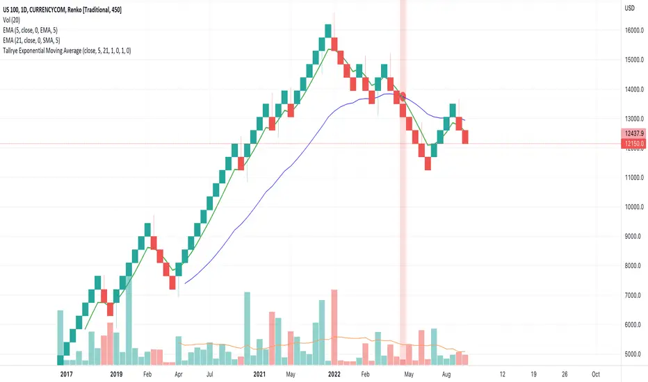
Tallrye AlertsThis is just a script to see the usage of volume from another source, i.e. US100 while using alerts in Renko chartview.
在脚本中搜索"renko"
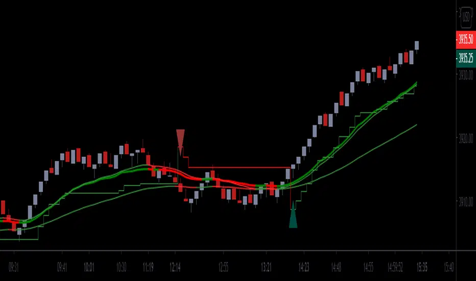
Chervolinos_Rob Hoffman_Inventory Retracement Bar_and_OverlayHere is something like a combo from the well known Rob Hoffman (Overlay) Indicator and the Inventory Retracement Bar without any ballast
This really smart strategy with a low risk and a quick profit. I combine this two Indicators to save space.
The first condition is that the orange line and the lime line must be parallel and there is no other line between them because this condition is moving under 45 angle.
The second condition is that the target candles must be below the orange line in the case of the downtrend as we see.
As we see it here in the case of an uptrend should be candles above the orange line and this is logical as we see here.
Sometimes we noticed the appearance of the signal onto the candle but the conditions were not applicable because there is an orange line between the green line and the orange line and this means that the signal is fake.
This candle is also good for entry and we can place a buy order above it but is it beginner, so you must respect the conditions in order to be able to master it very well.
Enter with Confidence all conditions are present a red arrow above the candle and the candle is above the orange line and there are no lines between the lime and
orange line. Yes this is our target the entry-point will be a little above the wicked the candle, that is you will not buy now but it's a price exceeds the weight limit
even slightly, we will buy directly it is hoffman's method. Expected if the price in which resistance occurred which is the resistance represented
by the candlewick will be broken the price for rise up and strongly and if it does not happen you will not lose anything anyway to stop loss and take profit. Try the ratio by 1,5.
This part of this strategy is one of the best trading strategies with a low risk rate and can be used as an initial guide to know the market movement and to enter successful trades.
Let's start correctly. This strategy can be used on any time frame from one minute to one day or even more, but I recommend using it on a 10-minute frame one hour or 30 minutes frame. Here I use the 30-Minute frame.
This strategy is based on two things: Tramp Direction and the inventory retracement bar. Don't worry and don't think about it because all this will be automatic but let's understand some simple terms.
There many arrows in green and red. Please read the discription above.
Please read the following tipps:
To avoid the trend Reversal, try to add one one of the Divergence indicators to your chart.
To avoid entering in a pullback movement as much as possible.
--> Combine it with other indicators <--
Best Regards Chervolino
if there were any typographical errors, please forgive me
Note: Buy/Sell signals using non-standard chart types (Heikin Ashi, Renko, Kagi, Point & Figure, and Range) are not allowed, as they produce unrealistic results

[blackcat] L2 SVE Volatility BandsLevel 2
Background
Sylvain Vervoort’s articles in the July issues on 2018,“The V-Trade, Part 5: Technical Analysis—Moving Average Support & Resistance And Volatility Bands”
Function
In “The V-Trade, Part 5: Technical Analysis—Moving Average Support & Resistance And Volatility Bands” in the July 2018 STOCKS & COMMODITIES, author Sylvain Vervoort introduced a new type of price band that he calls the SVEVolatilityBand. He created this new type of band to better highlight volatility changes when using non-time-related charts. According to the author, when using charts such as renko, traditional bands may fail to effectively highlight these changes.
Remarks
Feedbacks are appreciated.

volume oscillator nestPrice encountered resistance at Point A where it had earlier witnessed support. Later, it also witnessed resistance at points B and C, where earlier there had been demand — the previous support acting as resistance as per the principle of polarity. Renko brick reversal formations can help us in seeking confirmation and trading them.
ABCD 4-point uptrend chart pattern indicatorABCD 4-point chart pattern is a very popular and well known pattern in chart technical analysis, it consists of 4 points and 3 legs.
It exhibits three continued lines in a specific trend. The concept is to compare the retracement level between legs. For example, when leg BC makes a 0.382 or 38.2% Fibonacci retracement of the BA leg or AB, it means that the price difference from point C to B is equal to 38.2% of the price difference from point B to A.
Please note that this indicator is only for ABCD 4-point chart pattern in uptrend, in particular, it must be an uptrend from point A to point B.
There are many ways to define its formation, our unique algorithm is based on the following definition:
The point A, B and C are swing points and D does not have to be a swing point, but it must reach a given ratio of AB:CD.
The ratio of AB:CD is determined by comparing the price difference between C to D and A to B.
Here is the formula to calculate it: |Price of C - Price of D| / |Price of A - Price of B|.
Also, the price difference between B to C and A to B must reach a given ratio, BC:AB calculation is the same as AB:CD.
Point B must be higher than point A in a given percentage.
How it works?
The indicator will automatically detect the ABCD 4-point chart pattern based on the input values we use. It will draw three lines to connect point A, B, C and D once all four points satisfy the condition. It will also display the letter of A, B, C and D above or below in each corresponding bar. The indicator draws seven extension lines from point D as the support and resistance levels. The default levels are based on the Golden Ratio. You can change the ratios from input. The indicator will start to plot the lines as soon as the pattern is confirmed, the trend may continue to go up after the event.
It shows the Fibonacci retracement support and resistance levels for a given range and displays the corresponding ratio on the right side of the levels. The price range and levels are adjustable by user, you can easily identify the major and minor support/resistance levels from the chart with your desired inputs.
Features and Inputs:
No repaint, all drawing objects show up immediately right after the point D is detected.
Able to show patterns found in history data.
There is a Built-in alert function to easily set up an alert.
Works on all timeframes, including second, minute, hour, day, week, month.
Works on Renko, Heikin Ashi, Range, bar, candle chart types.
Strength, this input is used to define the minimum number of bars to the left and right side of the swing point.
B:A Ratio Min in %, this is the minimum price difference in percentage between point B and point A. If we enter 0.3 for this input, the indicator will check if B(swing high) was 0.3% higher than A(swing low).
B:A Ratio Max in %, this is the maximum price difference in percentage between point B and point A. If we enter 2.5 for this input, the indicator will check if the price difference between point B and point A was less than 2.5%.
BC:AB Ratio Min in %, this is the minimum ratio in percentage between section BC and AB. Here is the formula to calculate it: |Price of C - Price of B| / |Price of A - Price of B|.
BC:AB Ratio Max in %, this is the maximum ratio in percentage between section BC and AB. Here is the formula to calculate it: |Price of C - Price of B| / |Price of A - Price of B|.
CD:AB Ratio Min in %, this is the minimum ratio in percentage between section CD and AB. Here is the formula to calculate it: |Price of C - Price of D| / |Price of A - Price of B|.
CD:AB Ratio Max in %, this is the maximum ratio in percentage between section CD and AB. Here is the formula to calculate it: |Price of C - Price of D| / |Price of A - Price of B|.
Extension Range, this is the number of bars extend to the right side of the support and resistance lines, set it to 0 if you want to disable it.
ABCD letter COLOR, the color of the letter for point A, B, C and D. It's very useful when we use more than one instance of this indicator on the same chart with different input sets. We can easily distinguish them by different letter color.
ABCD Line COLOR, the color of the lines that connect point A, B, C and D. Similar functionality as the letter color.
Show Fibo Level labels, enable this input will show up the "0%" and "100%" as label on corresponding Fibonacci levels.
Level 1 to 5, are the support and resistance levels in percentage, please use negative value if you need a level below 0%, such as -61.8 means 61.8% below level 0%. The level 0% is the price level at Point A, and the level 100% is the price level at Point D, these two levels are fixed once the pattern formed.
You can change the color of each level line from the following colors: silver, gray, white, maroon, red, purple, fuchsia, green, lime, olive, yellow, navy, blue, teal, aqua and orange.
Line style: you can choose from: Solid, Dotted and Dashed.
1 is Solid like this: ______________________
2 is Dashed - - - - - - - - - - - - - - - - - - -
3 is dotted ............................................
Sometimes, we may need to focus on a particular pattern, which may require strict ratio parameters.
If we only want to detect an ABCD pattern, which qualify the following rules:
There must be at least 10 bars on both left and right sides of point A, B and C.
The price must raise around 0.8% from point A to point B
The ratio BC:AB must be around 70%
CD must have similar price difference of AB, in other words, price difference between point C and D should be similar to price difference between point A and B.
Then we can use the following inputs to detect such a pattern:
We need to enter 10 for the strength input value.
The price must raise around 0.8% from point A. We can use 0.75 for the min ratio of B:A and 0.85 for the max ratio of B:A, since 0.8 is between of 0.75 and 0.85. The value is in percentage, so 0.05 is only 0.05%, which is a very small amount of price change.
We should not simply use 100% for CD:AB ratio. The best way is to give a range from the min to the max percentage, since in real life we can hardly find any pattern has exact 100% as the CD:AB ratio.
Most of the time, the CD:AB ratio could be near 100%, such as 96%, 99% or 102%, so using 95% to 105% is a relatively reasonable range.
Please note that, only the latest found pattern will show the Fibonacci levels. The patterns found in history will only show the lines that connect the A, B, C and D points and the letters.
For more screenshots, videos and details about this indicator, please visit our website.

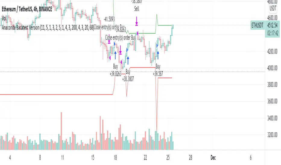
Anaconda Backtest VersionThis is the Anaconda strategy backtest version, no alerts. It will execute orders up to current_date - 2 days.
This is a LONG only strategy.
Anaconda waits for some thresholds to enter long. Once it enters long, it will setup profit and stoploss targets. These targets are updated if some conditions are met. The position is closed when the price hits profit or stoploss targets or when a certain bearish threshold is met.
No portfolio management is integrated. Positions are supposed to be entered with 100% equity and closed at 100%.
The strategy works better for large timeframes : 1h, 2h, 3h, 4h, 1D ...
You can apply the strategy to any symbol supported by TardingView and fine-tune the settings for the selected market/timeframe.
The strategy is supposed to be used on regular candles.
security() function has not been used. No special candles have been used (heikin ashi, renko etc.). Trailing stop (trail_* variables) have not been used.
==================
EXAMPLE SETTINGS
==================
These are the example settings for some assets that make the strategy perform well in the backtest mode.
Settings are listed in order of appearance in the strategy settings dialog in TradingView.
Please note that exaggerated profits for some symbols may come from the fact that the minimum ticker size of that symbol has been increased (from 0.0001 to 0.001 for example) between the start date and end date of the backtest. So you will see some trades closing outside the candle's ohlc range. Unfortunately, this is a limitation in TV and can't do much about it.
BNB/USDT (4h) : 11,5,1,3,10,4,1,4,5,200,6,2,19 (rsi threshold = 50)
FTM/USDT (1h) : 11,8,3,4,5,5,1,5,7,400,5,3,20 (rsi threshold=50)
ETH/USDT (4h) : 11,5,1,3,2,5,1,4,3,200,4,3,20 (rsi threshold = 68)
MATIC/USDT (1h) : 9,10,3,4,6,7,1,6,7,200,2,5,18 (rsi threshold = 70)
DASH/USDT (4h) : 8,8,3,3,4,4,1,7,5,200,3,2,21 (no rsi)
BAT/USDT (4h) : 8,8,3,3,7,7,1,8,6,200,3,2,21 (rsi threshold = 40)
BAT/USDT (1h) : 9,9,3,6,6,7,1,7,7,300,6,4,21 (no rsi)
DOGE/USDT (1h) : 11,8,3,4,4,9,1,4,6,200,3,2,18 (rsi thresold = 70)
NKN/USDT (1h) : 6,7,3,4,2,8,3,5,8,200,6,3,15 (rsi threshold = 50)
BTC/USDT (4h) : 6,5,3,4,7,6,5,5,6,200,2,3,15 (no rsi)
BTC/USDT (3h) : 6,5,3,4,7,5,1,6,4,300,2,2,17 (no rsi)
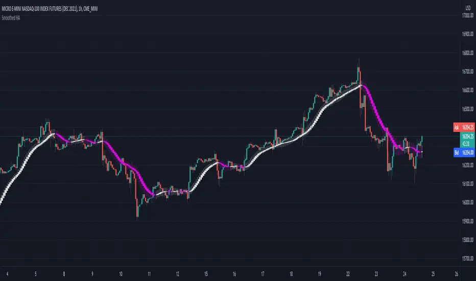
Smoothed Heiken Ashi - SamXThis is my version of the Smoothed Heiken Ashi indicator. While there are a few versions of these out there (most notably "Modified Smoothed Heiken Ashi" by badshah_e_alam and "Smoothed Heiken Ashi Candles v1" by jackvmk), none matched what I was looking for.
1. All had hard-coded the smoothing to use the EMA calculation - in this indicator, these are user-configurable
2. Both applied the double-smoothing principle (Take a moving-average of price, apply the Heiken Ashi conversion, then apply a second moving average to the smoothed Heiken Ashi candles to calculate new candles). While this is the most common approach, I had a few issues with this:
Even if setting both moving average lengths to 1, the indicator did not correctly calculate what should be the actual corresponding Heiken Ashi candle values (as compared to the built-in Heiken Ashi chart on Tradingview)
They were inconsistent in operating on different chart types - indicator values for the same candle can differ between using a base Heiken Ashi or Renko chart vs a standard Candle or Bar chart.
I wanted the ability to easily enable/disable the second smoothing (which is now a configuration option)
I wanted the ability to configure different moving-average calculations for each smoothing iteration (e.g. EMA for the initial smoothing, and Smoothed Moving Average for the second smoothing)
3. Many of the inputs were not clearly or properly defined in the settings window - this script has far more refined user input settings, put in logical groupings, and with relevant help text.
4. Enhanced some visual styling (and added to the Settings) to make it easier for the user to enable/disable printing candle wicks, as well as customizing the bullish / bearish bar colors
5. Added alerts for bar color change to help users catch potential trend reversals
Reference paper on the original Smoothed HA formulas: www.researchgate.net
Reference on the more common implementation formulas (using double-smoothing): www.sierrachart.com
Smoothed Waddah ATR~~~All Credit to LAZY BEAR for posting the original Script which is an old MT4 indicator.~~~~
No this system does not repaint... if it does let me know. Either the code is wrong or you are using a repainting chart such as renko candles.
*PURPOSE*
This Is an "Enhanced or Smoothed" version of the script that captures the heiken-ashi closing price as its main calculation variable. While using normal bar or line charts. Enhancements integrate trade filters to reduce false signals.
*WHAT TYPE OF TRADING STRATEGY IS THIS?*
This is a Long Only, Trend Trading System. Is intended to be applied to Charts/Timeframes that produce sustainable trends for which ever asset you are trading.
*NOTE OF ADVICE REGARDING SETTINGS*
Settings can be tweaked but I have found that best results come with the given settings. If a chart is too choppy to trade this indicator successfully, it is advised not to change the settings but either find a different timeframe or different asset to apply this strategy to.
TLDR
Indicator measures the change of the MacD (difference between MAC D of given EMA's) and compares it to the difference between the Upper and Lower Bollinger bands. Green bar over trigger line= entry. Red bar over trigger line = close.
*SETTINGS AND INPUTS*
-MacD of HeikenAshi chart (will always be of the Heikenashi chart even when applied to different chart type)
sensitivity = input(150, title='Sensitivity') =range should be (125-175)multiplier so that MacD can be compared to BB
fastLength = input(20, title='MacD FastEMA Length')
slowLength = input(40, title='MacD SlowEMA Length')
-Bollinger Band of currently used price chart type
channelLength = input(20, title='BB Channel Length')
mult = input(1.5, title='BB Stdev Multiplier')
-14 Period RSI Trade Filter (set to 0 to Disable)
RSI14filter = input(40, title='RSI Value trade filter') =only gives entry when RSI is higher than given value
*ABSTRACT & CONCEPT*
TLDR - Indicator measures the change of the MacD (difference between MAC D of given EMA's) and compares it to the difference between the Upper and Lower Bollinger bands. Green bar over trigger line= entry. Red bar over trigger line = close.
Indicator plots -
Bars are the change in the MAC D and the indicator line is the difference in the BB.
When Bars are higher than the indicator line then it is considered a trend "Explosion"
Green Bars are Trend Explosion to the upside, Red Bars are Trend explosion to the downside.
GENERAL DETAIL-
the core calculation is measuring the change in MacD of current candle compared to the MacD of two previous candles.
This value is multiplied by the sensitivy so it can be compared to the change in Bollinger Band Width.
if the MACD change is positive then you get a green/lime bar for that value. If the MacDchange is negative you get a red/orange bar for that value.
and are determined by whether the actual change is increasing in that direction or decreasing. (bars getting taller or bars getting shorter)
Entry signal for long is A positive change in MACD difference (Green bar) that is greater than the change of the bollinger band (orange signal line) AND if the RSI value is above your filter.
Close signal or Trend Stop Warning Signal is given when a Negative MacD Difference (red bar) is greater than the change of the bollinger band (orange Line)
*CONSIDERATIONS AND THOUGHTS*
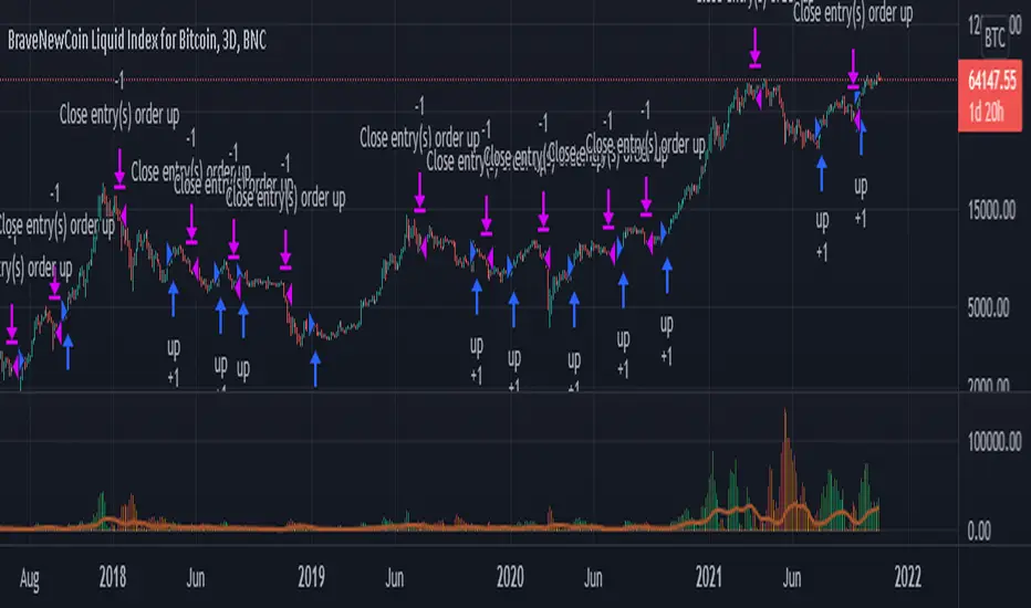
I have over 150 iterations of this indicator and this is the most consistent and best version of settings and filters I was able to generate. I built this indicator specifically for 3 charts. SPY monthly, QQQ monthly, BTC 3 Day. However this indicator works well on any long term bullish chart. (tech stocks are great) .
Trend trading systems are intended to be homerun hitting, plunge protecting indicators that allow for long legs and expanding volatility. This indicator does this as the trigger line is Dynamic with the expansion and contraction of the bollinger band.
I do not take every signal specifically not the close signals. Instead they more like warnings in ultra bullish environments.
If i had to pair this indicator with any other filter than the RSI, it would be a long term moving average i.e. the 50 week or equivalent for your chart. signals above rising moving averages means that you are trading with an upward trending market.
Hope this helps. Happy trades.
-SnarkyPuppy
st_renkoThe indicator has two parameters: the period and the number of splits. For the selected period, the maximum and minimum are calculated, and the scope of the market is determined by the difference between the maximum and minimum. The scope is divided by the number of partitions, thereby determining the step of the levels. If the average price (ohlc4) falls within the range between levels, this range is drawn. A simpler analogy: we have a local minimum. and the local maximum for the selected period, we build a ladder between them, the number of steps of which is equal to the number of splits, and if the price is on some step of this ladder, then this step is drawn, so we can see how many steps separate us from the maximum and minimum.

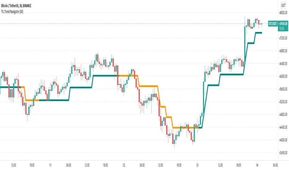
TIL Trend NavigatorTrading Indicator Lab’s Trend Navigator for TradingView is an indicator that can help you reveal the underlying trends in any chart on any timeframe.
Determining Trends
It only takes a minute or two to analyze the indicator with its simple yet insightful methods of representing bullish, bearish and ranging price action across the chart. It forms a single line that runs in 3 directions:
- Upward direction – represents a significant bullish price action
- Horizontal direction – represents ranging price action or consolidation
- Downward direction – represents a significant bearish price action
The indicator borrows the concept of Renko charts where upward and downward price action are shown to move at a single identical angle. This makes the indicator more intuitive and easier to read.
Support and Resistance
That’s not all. The Trend Navigator can also serve as a support or resistance line at any given point in the bar history. This is distinguished with the dual colors of the lines which alternates at each segment:
- Support segment (green) – the segment acts as support where price moves above the line
- Resistance segment (orange) – the segment acts as resistance where price moves below the line
Breakouts occur when the bar crosses above or below the Trend Navigator, at which point, its line changes color to signal the change of its role as a support or resistance level.
Available Alert Conditions
- Cross – triggers when price crosses the Trend Navigator
- Soar – triggers when majority of the bar’s body crosses above the Trend Navigator
- Plummet – triggers when majority of the bar’s body crosses below the Trend Navigator
- Uptrend – triggers when a new uptrend is detected
- Downtrend – triggers when a new downtrend is detected
- Ranging – triggers when a new ranging price action is detected
- Trend Reversal – triggers when either an uptrend or downtrend is detected
Inputs
- Length – sets the number of bars the indicator analyzes at each execution
- Support Segment Color – allows the user to change the color of the support segments. Its default color is green
- Resistance Segment Color – allows the user to change the color of the resistance segments. Its default color is orange
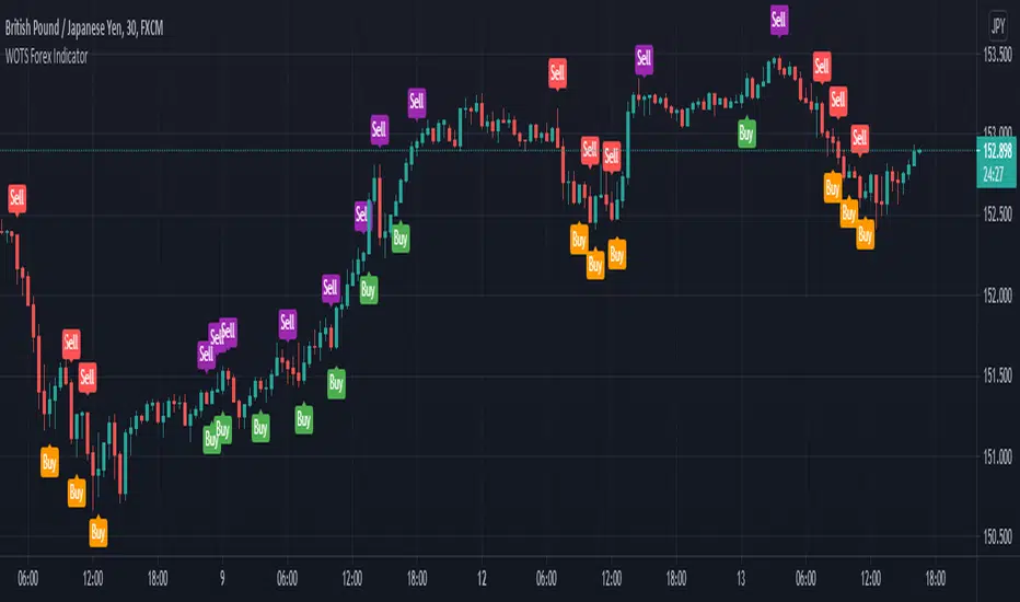
WOTS Forex IndicatorThe WOTS Forex Indicator gives you a true picture of the market entry points, after a scan it performs every period (after every candlestick closes) . It is pretty straightforward in its use with clear visual representation of the entry and exit points provided by the indicator.
This allows you to make improved entry and exit points either you're going long or short on any Forex pair you like, and accommodates many trading styles, systems, and strategies.
It will work along most TradingView indicators and the timeframes we recommend you using it are the 30M, 1H and sometimes the 4H chart.
The specific components of the indicator are:
Methodology:
The indicator uses a MACD oscillator to determine the local trend direction and to give buy & sell signals when its conditions are met.
An optional build-in indicator, exponential moving average cross (EMA cross), can be used to filter out 'false' signals.
The calculation of the entry points are drawn from universal prices that fit every pair in the Forex market you may choose.
Persistent variables are used for buy and sell prices, enabling color-coding of the signals (profitable or not).
Features:
Color coded labels - Buy & Sell
Four types of entries - Bull Buy = orange, Scalp Buy = green & Bear Sell = purple, Scalp Sell = red
Universal prices fitting all Forex pairs
Four Buy and Sell signal alerts
Remarks:
In our experience and recommendation, the values used work best on the 30-minute & 1-Hour timeframes. We encourage everyone to experiment the best results we had, were on this specific timeframe, higher or even lower.
Using the indicator on non-standard charts (Heikin Ashi, Renko etc.) can produce unrealistic results.
- Thanks to John Aslanis and Alexandros Temelkou the idealists and creators of this indicator.
Use the link below to watch a tutorial video, request a trial, or purchase for access
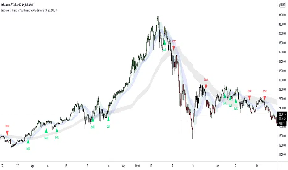
[astropark] Trend Is Your Friend SERIES [alarms]Dear Followers,
today I'm glad to present you an indicator which is a mix of three indicators of mine: Trend Is Your Friend Series !
As you may easily understand from the name, this indicator incorporates all 3 Trend is You Friend indicators I made in past.
This way you can control all of them just with one indicator.
Of course this comes with some useful integration features:
a bull green triangle appears when all trends are bullish (you can set an alert for this)
a bear purple triangle appears when all trends are bearish (you can set an alert for this)
bar coloring reflects the bullish/bearish integration too
you have an option to enable/disable all trends buy/sell signals
you have an option to hide trend clouds borders (chart will be way cleaner this way)
you can still customize each trend indicator settings and set alerts on each trend individually
you can enable/disable heikin ashi analysis
As per Trend is Your Friend V1/V2/V3, this indicator is for higher timeframe trading, from 4h and above is suggested.
This indicator is pretty good for both Swing and Scalping , you can run it over a bot or use it on Renko chart!
If you are a scalper, you will love suggested entries for fast profit. You can run it on 1h timeframe in this case (below is not suggested, there is "no-trend" below 1h!). If you are used to scalp trading, be sure to close each trade whenever you feel happy (a proper trailing stop strategy is suggested for example).
As I always say, all tools are great if you use them correctly: this is not the "Holy Grail", so always use proper money and risk management strategies.
For your reference, here you can see original basic indicators that were integrated here:
V1 backtesting strategy
V2 backtesting strategy
V3 backtesting strategy
This is a premium indicator , so send me a private message in order to get access to this script.
MTF CandleLevelsIn the spirit of freedom from oppression on this day of July 4th, 2021 in the United States, I hereby release this flagship indicator "MTF CandleLevels" into the wild for any subscribing TV member on the planet to utilize. It's now one my few great gifts to the souls of humankind within the realm of trading on TV. TradingView continues to bless Pine Script by releasing supplemental upgrades, enough for me to develop this indicator beyond it's experimental phase to full potential, as I had always wished to design it from theory. Educationally while using it, you will witness how OHLC/HA candles are actually formed for charts. I like to think of it as a candle formation microscope anyone can learn from.
It is intended for any style of trading or skill level from newcomer to advanced. There are no requirements/prerequisites for you use it. Which means you don't have to wear a mouth muzzle, get multiple doses of the life endangering FrankenJabs, subserviently bow down to authoritarian demands of obedience, or learn the ancient mystical art of deception "Fau Chi" in order to employ it's inherent power. A little sprinkle of satire helps with a dry technical read :). You have the absolute freedom to utilize it any way you see fit! That's right, it's even your choice whether you use it or not. The unshackled empowerment of choice always equates to FREEDOM. I can't program these precious gems without it...
One thing you will have noticed is it's specifically published on a Heikin Ashi(HA) chart, while having immunity to the Heikin Ashi candle charts unique open/close behavior. This has been believed to be an impossibility until now. For members who don't know, HA candle charts have a different `open` and `close` from the `open` and `close` of the other ordinary OHLC candle charts. Regardless of "CandleLevels Mode" chosen in Settings, the indicator will display identical on either bar chart type, excluding Renko, Line Break, Kagi, Point&Figure, and Range candle charts of course. It's abilities supersede the simpler "Multi-Time Period Charts" built-in TV indicator with a completely different architecture. For those of you extremely curious about how I accomplished this indicators level of code complexity, it was immensely difficult taking over a year of effort for this one functional unit, and I will leave it at that...
This novel MTF technology displays OHLC/HA support and resistance levels that mimic the functionality of larger duration candle formations in real time. Basically explained, while charting on a shorter duration timeframe candle chart, you can see open, high, low, and close levels fluctuate in the larger duration timeframe. This reduces the need to jump back and forth to view price action on different chart sampling intervals. You may even use multiple sets of CandleLevels indicators over a wide variety of chosen timeframe options, along with everything else in between.
The CandleLevels behavior is chosen within the indicator "Settings" using a selection mode of either the standard OHLC candlestick formations or Heikin Ashi candlestick formations. Each mode has a multitude of uses depending on the users trading style or timeframe.
Visbility of CandleLevels will ONLY occur when it is set to a larger duration timeframe interval than the current chart sampling rate. For example, you may be using the 5 minute interval sampling rate on the chart, yet you can easily see the open, high, low, close ranges with a chosen 120 minute timeframe setting. The multiple time frame(MTF) settings are highly adjustable having intervals of seconds, minutes, days, a multiple of the chart interval, or the common input(type=input.resolution) function provided by Pine.
CandleLevels come with multiple color schemes to reduce color interference with other indicators in the overlay pane, including the intended use of multiple sets of CandleLevels. My basic color scheme selections can be overridden to choose any imaginable color you desire for your visual acuity. Also, there are additional controls available to fine tune a visually pleasing appearance depending on your preferences and viewable area. One last new hidden fine tune capability, not only for this indicator but all TV indicators, is the agility to use up/down arrow keys on the keyboard when an indicator setting is in focus after mouse selection. For example, when choosing line thickness, you can modify values/options by key stroke. Try it out, I'm sure you will find this useful for any indictor for eternity.
NOTICE: There is only 500 line drawings available, in total to display, at this current release. This equates to 83 sets of CandleLevels maximum.
Features List Includes:
Candle type selection
MTF controls for seconds, minutes, days, multiple-of, and TV input
Multiple color schemes with color overrides
Color opacity selector
Line thickness control
Enable/disable capable MTF interval display with positioning
When available time provides itself, I will consider your inquiries, thoughts, and concepts presented below in the comments section, should you have any questions or comments regarding this indicator. When my indicators achieve more prevalent use by TV members, I may implement more ideas when they present themselves as worthy additions. Have a profitable future everyone!
RISK DISCLAIMER:
My scripts, indicators, and studies are specifically intended for informational and educational use only. These use historical data points to perform calculations to derive real-time calculations. They do not infer, indicate, or guarantee future results or performance.
By utilizing this script/indicator/study or any portion of it, you agree to accept 100% responsibly and liability for your investment or financial decisions, and I will not be held liable for your subjective analytic interpretations incurring sustained monetary losses. The opinions and information visual or otherwise provided by this script/indicator is not investment advice, nor does it constitute recommendation.

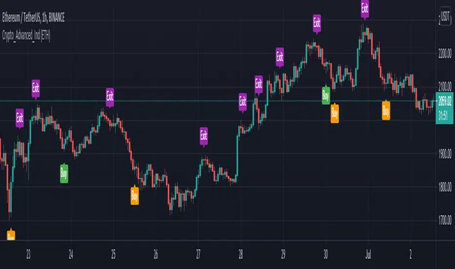
Crypto Advanced Trading IndicatorThe Crypto Indicator gives you a true picture of the market entry points, after a scan it does every period (after every candlestick closes) . It is pretty straightforward in its use with clear visual representation of the entry and exit points provided by the indicator.
This allows you to make improved entry and exit points and accommodates many trading styles, systems, and strategies.
It will work along most TradingView indicators and the timeframes we recommend you using it in are the 1H and sometimes the 4H chart.
The specific components of the indicator are:
Methodology:
The indicator uses a MACD oscillator to determine the local trend direction and to give buy & exit signals when its conditions are met.
An optional TradingView indicator, exponential moving average cross (EMA cross), can be used to filter out 'false' signals.
The calculation of the entry points are drawn from specific different prices for every one of the coins hardcoded in the script, and the filter function in the indicator settings, allows the user to change those prices based on the coin he is currently watching, based on the specific coin it is chosen in the filter.
Persistent variables are used for buy and exit prices, enabling color-coding of the signals (profitable or not).
Features:
Color coded labels - Buy, Exit = purple
Two types of entries - Bull Buy = green, Bear Buy = orange
Coin filter
Buy signal alerts
Remarks:
In our experience and therefore recommendation, the values used for each crypto coin work best on the 1-Hour timeframe. We encourage everyone to experiment, but the best results we had, were on this specific timeframe or higher.
Using the indicator on non-standard charts (Heikin Ashi, Renko etc.) can produce unrealistic results.
- Thanks to John Aslanis and Alexandros Temelkou the idealists and creators of this indicator.
Use the link below to watch a tutorial video, request a trial, or purchase for access:
[JL] ATR LabelsJust need to see ATR values when I made Renko script. So I make this script.
I like number 5 so I use 5 to timeframe.
Calculate ATR for the following:
- Monthly
- Weekly
- Daily
- 5-Hour
- 1-Hour
- 12-Min
Label default displayed on right side and middle of 50 bars.

Volume BricksVolume Bricks - As if a Renko made new bricks on volume.
Set a percentage of the previous day's volume and this will post new levels when accumulated volume meets that percentage.
It will also plot shapes (and labels for recent bars) when price movement is accompanied by more than one times the volume level specified.

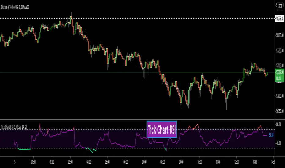
Tick Chart RSIHello All,
This is Tick Chart RSI script and it calculates & shows RSI for Tick Chart. What is Tick chart? Tick Chart is created using ticks and each candlestick in Tick Chart shows the price variation of X consecutive ticks (X : Number of Ticks Per Candle). For example if you set "Number of Ticks Per Candle" = 100 then each candlestick is created using 100 ticks. so, Tick Charts are NOT time-based charts (like Renko or Point & Figure Charts). Tick is the price change in minimum time interval defined in the platform. There are several advantages of Tick Charts. You can find many articles about Tick Charts on the net.
Tick Chart and Tick Chart RSI only work on realtime bars.
You can set " Number of Ticks Per Candle " and the colors. You can also set any of the candles OHLC values as source for RSI.
While using Tick Chart RSI I recommend you to add Tick Chart as well.
P.S. Tick Chart RSI script can be developed using different methods. in this script, all RSI values are calculated on each tick because RSI is calculated for only real-time bars, and also calculated for limited number of bars
Tick Chart and Tick Chart RSI:
Tick Chart RSI:
Enjoy!
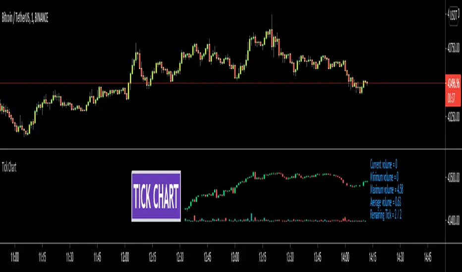
Tick ChartHello All,
Tick Chart is created using ticks and each candlestick in Tick Chart shows the price variation of X consecutive ticks ( X : Number of Ticks Per Candle ). for example if you set Number of Ticks Per Candle = 100 then each candlestick is created using 100 ticks. so, Tick Charts are NOT time-based charts (like Renko or Point & Figure Charts). Tick is the price change in minimum time interval defined in the platform. There are several advantages of Tick Charts. You can find many articles about Tick Charts on the net.
Tick Chart only works on realtime bars.
You can set " Number of Ticks Per Candle " and " Number of Candles" using options. You can change color of body, wicks abd volume bars as well.
The script shows current, minimum, maximum and average volumes. it also shows OHLC values on the last candle.
Tick Chart using different number of ticks
Volume info:
Enjoy!
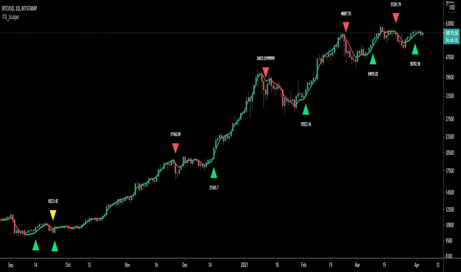
ITG ScalperITG Scalper by Complector.
Inspired by Juboal-Rabaroansa Perosteck Alseyn Balveda dam T'seif
Methology:
- I am using a TEMA (triple EMA) to determine the local trend direction and to give buy & sell signals when the trend changes.
- An optional filter, using moving average convergence divergence (MACD), can be switched on to filter out 'false' signals.
- The calculation of the TEMA does not request data from a resolution higher or lower than the resolution of the main charts symbol,
However, the filter function does, if another resolution is chosen for the filter.
- Persistent variables are used for buy and sell prices, enabling color-coding of the sell-signal (profitable or not).
Features:
- Color coded TEMA - bullish=green , bearish=red
- Buy/Sell indicator - Sell indicator: green=profit, yellow=loss
- Optional noise filter
- Optional variable time-frame for noise filter
Remarks:
In my experience, the default values works best on the daily time frame. I encourage everyone to experiment with the values for best results.
Using the script on non-standard charts (Heikin Ashi, Renko etc.) can produce unrealistic results.
Using a resolution higher or lower than the main charts symbol for the filter can possibly lead to repainting.
Thanks to Iain M. Banks for making my life richer :-)
Viper Futures Range Bar CandlesThe Range Bars used in more Professional trading platforms to keep smoothness on the charts and help make custom range price candles based on the range size chosen for the market being traded. Example an 8 Range bar on the ES or MES Futures is 8 ticks = 2 points. Another Example on NQ a 22 Range bar popularly traded by trading professionals is a total of 22 ticks = 5 1/2 points on the Nasdaq or Micro NQ futures. Simple add to charge, set the range bar setting with a particular range setting in mind and then for clarity uncheck the original price chart on top left corner, same way you would disable an indicator temporarily. Works very clear and nice. A good accommodation for trading View as trading view does not offer historical tick data to use Renko bars very well at the moment.
Basically plots a candle rather then a OHLC bar for Range Bars on TV!
Default color was set to my Viper Futures Chart, you can change back to green/red, etc.
Enjoy!
COTBase iCOT (Scores)COTBase iCOT indicator is based on reverse-engineering the Commitments of Traders data and creating a proprietary algo, which mimics real COT data on any time-frame and chart type.
We advise to use it mainly on time-based charts, on smaller than 4 hr per bar time-frames. A multi-time-frame analysis is recommended where the smaller time-frame signals are confirmed by the higher time-frames.
This indicator is the Scores part of the COTBase iCOT package. If you apply it to your chart, you will see the pseudo-Commercials (red line), pseudo-Speculators (green line) and the Balance line (white line). To use in practice you may not need to add this indicator to your chart after you added the Signals indicator, since that already shows the most important signals when these lines are at important extremes and confluences. The Signal indicator does NOT require to add the Scores indicator to the chart to work properly.
Features:
Versatile
You can use the COTBase iCOT indicator on any chart type (eg. candlesticks , bar charts, renko, range bars, etc.) and time-frames (eg. 1-min, 5-min , 1-hr, 4-hr, etc.).
Proprietary algo
We used AI and various other methods to create a truly unique indicator that - we believe - descibes market forces the most efficient way.
We have found that this is possibly the closest we could get to a realistic estimation of the fundamental forces driving the market.
Data does not come from CFTC
The COTBase iCOT indicator does not source any of its data from the Commodity Futures Trading Commission.
Accurate signal logic
We mark "pseudo-Commercial" buy/sell setups with a yellow diamond below/above the price. We mark "pseudo-Speculator" buy/sell signals with blue bars.
The statistically best "3-fold confluence" setups are marked with green/red stripes (and/or other markers).
Key features:
Allow plotting pseudo-Commercials and Change, pseudo-Speculators and Change, Balance Line and Change.
Allow highlighting any of the above series if they cross above/below a user defined threshold
Allow configuring the strength and markings of "All Signal" confluences
Allow setting the logic for Change calculations and markings
Sound alerts
Compatibility:
Instruments: futures , cryptocurrencies, forex, stocks, CFDs, indices, options
Interval types: time and non-time-based, standard or custom
Chart styles: any
You can obtain this indicator by visiting the link below.

COTBase iCOT (Signals)COTBase iCOT indicator is based on reverse-engineering the Commitments of Traders data and creating a proprietary algo, which mimics real COT data on any time-frame and chart type.
We advise to use it mainly on time-based charts, on smaller than 4 hr per bar time-frames. A multi-time-frame analysis is recommended where the smaller time-frame signals are confirmed by the higher time-frames.
This indicator is the Signal part of the COTBase iCOT package. Please apply it to the price chart to see the yellow markers (Commercials extremes), blue bars (Speculators extremes) and 3-fold confluences (green and black background stripes).
Features:
Versatile
You can use the COTBase iCOT indicator on any chart type (eg. candlesticks , bar charts, renko, range bars, etc.) and time-frames (eg. 1-min, 5-min , 1-hr, 4-hr, etc.).
Proprietary algo
We used AI and various other methods to create a truly unique indicator that - we believe - descibes market forces the most efficient way.
We have found that this is possibly the closest we could get to a realistic estimation of the fundamental forces driving the market.
Data does not come from CFTC
The COTBase iCOT indicator does not source any of its data from the Commodity Futures Trading Commission.
Accurate signal logic
We mark "pseudo-Commercial" buy/sell setups with a yellow diamond below/above the price. We mark "pseudo-Speculator" buy/sell signals with blue bars.
The statistically best "3-fold confluence" setups are marked with green/red stripes (and/or other markers).
Key features:
Allow plotting pseudo-Commercials and Change, pseudo-Speculators and Change, Balance Line and Change.
Allow highlighting any of the above series if they cross above/below a user defined threshold
Allow configuring the strength and markings of "All Signal" confluences
Allow setting the logic for Change calculations and markings
Sound alerts
Compatibility:
Instruments: futures , cryptocurrencies, forex, stocks, CFDs, indices, options
Interval types: time and non-time-based, standard or custom
Chart styles: any
You can obtain this indicator by visiting the link below.

Pivot point with CPR, historical, high low and openThis script generates pivot points up to 10 level with CPR levels for Daily, Weekly, Monthly & Yearly
along with resolution for Daily, Weekly, Monthly & Yearly
along with High, low and close for that resolution
can check historical levels for the resolution as well.
the pivot auto adjusts even when you change the chart pattern to heikin ashi, renko or any other.. unlike system pivot.
change the time frame & resolution to required setting like
"Daily" & "D"
"Weekly" & "W"
"Monthly" & "M"
"Yearly" & "12M"
