MarkovChainLibrary "MarkovChain"
Generic Markov Chain type functions.
---
A Markov chain or Markov process is a stochastic model describing a sequence of possible events in which the
probability of each event depends only on the state attained in the previous event.
---
reference:
Understanding Markov Chains, Examples and Applications. Second Edition. Book by Nicolas Privault.
en.wikipedia.org
www.geeksforgeeks.org
towardsdatascience.com
github.com
stats.stackexchange.com
timeseriesreasoning.com
www.ris-ai.com
github.com
gist.github.com
github.com
gist.github.com
writings.stephenwolfram.com
kevingal.com
towardsdatascience.com
spedygiorgio.github.io
github.com
www.projectrhea.org
method to_string(this)
Translate a Markov Chain object to a string format.
Namespace types: MC
Parameters:
this (MC) : `MC` . Markov Chain object.
Returns: string
method to_table(this, position, text_color, text_size)
Namespace types: MC
Parameters:
this (MC)
position (string)
text_color (color)
text_size (string)
method create_transition_matrix(this)
Namespace types: MC
Parameters:
this (MC)
method generate_transition_matrix(this)
Namespace types: MC
Parameters:
this (MC)
new_chain(states, name)
Parameters:
states (state )
name (string)
from_data(data, name)
Parameters:
data (string )
name (string)
method probability_at_step(this, target_step)
Namespace types: MC
Parameters:
this (MC)
target_step (int)
method state_at_step(this, start_state, target_state, target_step)
Namespace types: MC
Parameters:
this (MC)
start_state (int)
target_state (int)
target_step (int)
method forward(this, obs)
Namespace types: HMC
Parameters:
this (HMC)
obs (int )
method backward(this, obs)
Namespace types: HMC
Parameters:
this (HMC)
obs (int )
method viterbi(this, observations)
Namespace types: HMC
Parameters:
this (HMC)
observations (int )
method baumwelch(this, observations)
Namespace types: HMC
Parameters:
this (HMC)
observations (int )
Node
Target node.
Fields:
index (series int) : . Key index of the node.
probability (series float) : . Probability rate of activation.
state
State reference.
Fields:
name (series string) : . Name of the state.
index (series int) : . Key index of the state.
target_nodes (Node ) : . List of index references and probabilities to target states.
MC
Markov Chain reference object.
Fields:
name (series string) : . Name of the chain.
states (state ) : . List of state nodes and its name, index, targets and transition probabilities.
size (series int) : . Number of unique states
transitions (matrix) : . Transition matrix
HMC
Hidden Markov Chain reference object.
Fields:
name (series string) : . Name of thehidden chain.
states_hidden (state ) : . List of state nodes and its name, index, targets and transition probabilities.
states_obs (state ) : . List of state nodes and its name, index, targets and transition probabilities.
transitions (matrix) : . Transition matrix
emissions (matrix) : . Emission matrix
initial_distribution (float )
在脚本中搜索"text"

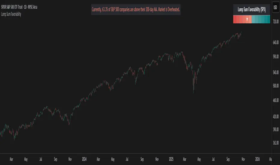
Lump Sum Favorability (SPX & NDX)This indicator provides a visual dashboard to gauge the statistical favorability of deploying a "Lump Sum" investment into the SPX (S&P 500) or NDX (Nasdaq 100).
The primary goal is not to time the exact market bottom, but to identify zones of significant pessimism or euphoria. Historically, periods of indiscriminate selling have represented high-probability entry points for long-term investors.
The dashboard consists of two parts:
1. The Favorability Gauge: A 12-segment gauge that moves from Red (Unfavorable) to Teal (Favorable).
2. The Summary Text: An optional text box (enabled in settings) that provides a plain-English summary of the current market breadth.
---
The Method: Market Breadth
This indicator is not based on the price of the index itself. Price-based indicators (like an RSI on the SPX) can be misleading. In a market-cap-weighted index, a few mega-cap stocks can hold the index price up while the vast majority of "average" stocks are already in a deep bear market.
This tool uses Market Breadth to measure the true, underlying health and participation of the entire market.
How It Works
1. Data Source: The indicator pulls the daily percentage of companies within the selected index (SPX or NDX) that are trading above their 200-day moving average. (Data tickers: S5TH for SPX, NDTH for NDX).
2. Smoothing: This raw data is volatile. To filter out daily noise and confirm a persistent trend, the indicator calculates a 5-day Simple Moving Average (SMA) of this percentage. This is the value used by the indicator.
3. Interpretation:
High Value (>= 50%): More than half of the stocks are above their long-term average. This signifies the market is "Overheated" or in a risk-on phase. The favorability for a new lump sum investment is considered Low.
Low Value (< 50%): Less than half of the stocks are above their long-term average. This signifies "Oversold" conditions or capitulation. These moments historically offer the best favorability for starting a new long-term investment.
---
How to Use the Indicator
1. The Favorability Gauge
The gauge is designed to be intuitive: Red means "Stop/Caution," and Teal means "Go/Opportunity."
Note: The gauge's logic is inverted from the data value to achieve this simplicity.
Red Zone (Left): UNFAVORABLE
This corresponds to a high percentage of stocks being above their 200d MA (>= 50%). The market is considered Overheated, and the favorability for a new lump sum investment is low.
Teal Zone (Right): FAVORABLE
This corresponds to a low percentage of stocks being above their 200d MA (< 50%). The market is considered Oversold, and the favorability for a new lump sum investment is high.
2. The Summary Text
When "Show Summary Text" is enabled in the settings, a box will appear at the top-center of your chart. This box provides a clear, data-driven summary, such as:
"Currently, only 22% of S&P 500 companies are above their 200-day MA. Market is Oversold."
The color of this text will automatically change to match the market state (Red for Overheated, Teal for Oversold), providing instant confirmation of the gauge's reading.
---
Settings
Market: Choose the index to analyze: SPX (S&P 500) or NDX (Nasdaq 100).
Gauge Position: Select where the gauge dashboard should appear on your chart (default is Bottom Right).
Show Summary Text: Toggle the descriptive text box on or off (default is On).
---
This indicator is a statistical and historical guide, not a financial advice or timing signal. It is designed to measure favorability based on past market behavior, not to provide certainty.
Extreme oversold conditions can persist, and markets can always go lower. This tool should be used as one component of a broader investment and risk-management framework. Past performance is not a guarantee of future results.
ApicodeLibrary "Apicode"
percentToTicks(percent, from)
Converts a percentage of the average entry price or a specified price to ticks when the
strategy has an open position.
Parameters:
percent (float) : (series int/float) The percentage of the `from` price to express in ticks, e.g.,
a value of 50 represents 50% (half) of the price.
from (float) : (series int/float) Optional. The price from which to calculate a percentage and convert
to ticks. The default is `strategy.position_avg_price`.
Returns: (float) The number of ticks within the specified percentage of the `from` price if
the strategy has an open position. Otherwise, it returns `na`.
percentToPrice(percent, from)
Calculates the price value that is a specific percentage distance away from the average
entry price or a specified price when the strategy has an open position.
Parameters:
percent (float) : (series int/float) The percentage of the `from` price to use as the distance. If the value
is positive, the calculated price is above the `from` price. If negative, the result is
below the `from` price. For example, a value of 10 calculates the price 10% higher than
the `from` price.
from (float) : (series int/float) Optional. The price from which to calculate a percentage distance.
The default is `strategy.position_avg_price`.
Returns: (float) The price value at the specified `percentage` distance away from the `from` price
if the strategy has an open position. Otherwise, it returns `na`.
percentToCurrency(price, percent)
Parameters:
price (float) : (series int/float) The price from which to calculate the percentage.
percent (float) : (series int/float) The percentage of the `price` to calculate.
Returns: (float) The amount of the symbol's currency represented by the percentage of the specified
`price`.
percentProfit(exitPrice)
Calculates the expected profit/loss of the open position if it were to close at the
specified `exitPrice`, expressed as a percentage of the average entry price.
NOTE: This function may not return precise values for positions with multiple open trades
because it only uses the average entry price.
Parameters:
exitPrice (float) : (series int/float) The position's hypothetical closing price.
Returns: (float) The expected profit percentage from exiting the position at the `exitPrice`. If
there is no open position, it returns `na`.
priceToTicks(price)
Converts a price value to ticks.
Parameters:
price (float) : (series int/float) The price to convert.
Returns: (float) The value of the `price`, expressed in ticks.
ticksToPrice(ticks, from)
Calculates the price value at the specified number of ticks away from the average entry
price or a specified price when the strategy has an open position.
Parameters:
ticks (float) : (series int/float) The number of ticks away from the `from` price. If the value is positive,
the calculated price is above the `from` price. If negative, the result is below the `from`
price.
from (float) : (series int/float) Optional. The price to evaluate the tick distance from. The default is
`strategy.position_avg_price`.
Returns: (float) The price value at the specified number of ticks away from the `from` price if
the strategy has an open position. Otherwise, it returns `na`.
ticksToCurrency(ticks)
Converts a specified number of ticks to an amount of the symbol's currency.
Parameters:
ticks (float) : (series int/float) The number of ticks to convert.
Returns: (float) The amount of the symbol's currency represented by the tick distance.
ticksToStopLevel(ticks)
Calculates a stop-loss level using a specified tick distance from the position's average
entry price. A script can plot the returned value and use it as the `stop` argument in a
`strategy.exit()` call.
Parameters:
ticks (float) : (series int/float) The number of ticks from the position's average entry price to the
stop-loss level. If the position is long, the value represents the number of ticks *below*
the average entry price. If short, it represents the number of ticks *above* the price.
Returns: (float) The calculated stop-loss value for the open position. If there is no open position,
it returns `na`.
ticksToTpLevel(ticks)
Calculates a take-profit level using a specified tick distance from the position's average
entry price. A script can plot the returned value and use it as the `limit` argument in a
`strategy.exit()` call.
Parameters:
ticks (float) : (series int/float) The number of ticks from the position's average entry price to the
take-profit level. If the position is long, the value represents the number of ticks *above*
the average entry price. If short, it represents the number of ticks *below* the price.
Returns: (float) The calculated take-profit value for the open position. If there is no open
position, it returns `na`.
calcPositionSizeByStopLossTicks(stopLossTicks, riskPercent)
Calculates the entry quantity required to risk a specified percentage of the strategy's
current equity at a tick-based stop-loss level.
Parameters:
stopLossTicks (float) : (series int/float) The number of ticks in the stop-loss distance.
riskPercent (float) : (series int/float) The percentage of the strategy's equity to risk if a trade moves
`stopLossTicks` away from the entry price in the unfavorable direction.
Returns: (int) The number of contracts/shares/lots/units to use as the entry quantity to risk the
specified percentage of equity at the stop-loss level.
calcPositionSizeByStopLossPercent(stopLossPercent, riskPercent, entryPrice)
Calculates the entry quantity required to risk a specified percentage of the strategy's
current equity at a percent-based stop-loss level.
Parameters:
stopLossPercent (float) : (series int/float) The percentage of the `entryPrice` to use as the stop-loss distance.
riskPercent (float) : (series int/float) The percentage of the strategy's equity to risk if a trade moves
`stopLossPercent` of the `entryPrice` in the unfavorable direction.
entryPrice (float) : (series int/float) Optional. The entry price to use in the calculation. The default is
`close`.
Returns: (int) The number of contracts/shares/lots/units to use as the entry quantity to risk the
specified percentage of equity at the stop-loss level.
exitPercent(id, lossPercent, profitPercent, qty, qtyPercent, comment, alertMessage)
A wrapper for the `strategy.exit()` function designed for creating stop-loss and
take-profit orders at percentage distances away from the position's average entry price.
NOTE: This function calls `strategy.exit()` without a `from_entry` ID, so it creates exit
orders for *every* entry in an open position until the position closes. Therefore, using
this function when the strategy has a pyramiding value greater than 1 can lead to
unexpected results. See the "Exits for multiple entries" section of our User Manual's
"Strategies" page to learn more about this behavior.
Parameters:
id (string) : (series string) Optional. The identifier of the stop-loss/take-profit orders, which
corresponds to an exit ID in the strategy's trades after an order fills. The default is
`"Exit"`.
lossPercent (float) : (series int/float) The percentage of the position's average entry price to use as the
stop-loss distance. The function does not create a stop-loss order if the value is `na`.
profitPercent (float) : (series int/float) The percentage of the position's average entry price to use as the
take-profit distance. The function does not create a take-profit order if the value is `na`.
qty (float) : (series int/float) Optional. The number of contracts/lots/shares/units to close when an
exit order fills. If specified, the call uses this value instead of `qtyPercent` to
determine the order size. The exit orders reserve this quantity from the position, meaning
other orders from `strategy.exit()` cannot close this portion until the strategy fills or
cancels those orders. The default is `na`, which means the order size depends on the
`qtyPercent` value.
qtyPercent (float) : (series int/float) Optional. A value between 0 and 100 representing the percentage of the
open trade quantity to close when an exit order fills. The exit orders reserve this
percentage from the open trades, meaning other calls to this command cannot close this
portion until the strategy fills or cancels those orders. The percentage calculation
depends on the total size of the applicable open trades without considering the reserved
amount from other `strategy.exit()` calls. The call ignores this parameter if the `qty`
value is not `na`. The default is 100.
comment (string) : (series string) Optional. Additional notes on the filled order. If the value is specified
and not an empty "string", the Strategy Tester and the chart show this text for the order
instead of the specified `id`. The default is `na`.
alertMessage (string) : (series string) Optional. Custom text for the alert that fires when an order fills. If the
value is specified and not an empty "string", and the "Message" field of the "Create Alert"
dialog box contains the `{{strategy.order.alert_message}}` placeholder, the alert message
replaces the placeholder with this text. The default is `na`.
Returns: (void) The function does not return a usable value.
closeAllAtEndOfSession(comment, alertMessage)
A wrapper for the `strategy.close_all()` function designed to close all open trades with a
market order when the last bar in the current day's session closes. It uses the command's
`immediately` parameter to exit all trades at the last bar's `close` instead of the `open`
of the next session's first bar.
Parameters:
comment (string) : (series string) Optional. Additional notes on the filled order. If the value is specified
and not an empty "string", the Strategy Tester and the chart show this text for the order
instead of the automatically generated exit identifier. The default is `na`.
alertMessage (string) : (series string) Optional. Custom text for the alert that fires when an order fills. If the
value is specified and not an empty "string", and the "Message" field of the "Create Alert"
dialog box contains the `{{strategy.order.alert_message}}` placeholder, the alert message
replaces the placeholder with this text. The default is `na`.
Returns: (void) The function does not return a usable value.
closeAtEndOfSession(entryId, comment, alertMessage)
A wrapper for the `strategy.close()` function designed to close specific open trades with a
market order when the last bar in the current day's session closes. It uses the command's
`immediately` parameter to exit the trades at the last bar's `close` instead of the `open`
of the next session's first bar.
Parameters:
entryId (string)
comment (string) : (series string) Optional. Additional notes on the filled order. If the value is specified
and not an empty "string", the Strategy Tester and the chart show this text for the order
instead of the automatically generated exit identifier. The default is `na`.
alertMessage (string) : (series string) Optional. Custom text for the alert that fires when an order fills. If the
value is specified and not an empty "string", and the "Message" field of the "Create Alert"
dialog box contains the `{{strategy.order.alert_message}}` placeholder, the alert message
replaces the placeholder with this text. The default is `na`.
Returns: (void) The function does not return a usable value.
sortinoRatio(interestRate, forceCalc)
Calculates the Sortino ratio of the strategy based on realized monthly returns.
Parameters:
interestRate (simple float) : (simple int/float) Optional. The *annual* "risk-free" return percentage to compare against
strategy returns. The default is 2, meaning it uses an annual benchmark of 2%.
forceCalc (bool) : (series bool) Optional. A value of `true` forces the function to calculate the ratio on the
current bar. If the value is `false`, the function calculates the ratio only on the latest
available bar for efficiency. The default is `false`.
Returns: (float) The Sortino ratio, which estimates the strategy's excess return per unit of
downside volatility.
sharpeRatio(interestRate, forceCalc)
Calculates the Sharpe ratio of the strategy based on realized monthly returns.
Parameters:
interestRate (simple float) : (simple int/float) Optional. The *annual* "risk-free" return percentage to compare against
strategy returns. The default is 2, meaning it uses an annual benchmark of 2%.
forceCalc (bool) : (series bool) Optional. A value of `true` forces the function to calculate the ratio on the
current bar. If the value is `false`, the function calculates the ratio only on the latest
available bar for efficiency. The default is `false`.
Returns: (float) The Sortino ratio, which estimates the strategy's excess return per unit of
total volatility.

FvgPanel█ OVERVIEW
This library provides functionalities for creating and managing a display panel within a Pine Script™ indicator. Its primary purpose is to offer a structured way to present Fair Value Gap (FVG) information, specifically the nearest bullish and bearish FVG levels across different timeframes (Current, MTF, HTF), directly on the chart. The library handles the table's structure, header initialization, and dynamic cell content updates.
█ CONCEPTS
The core of this library revolves around presenting summarized FVG data in a clear, tabular format. Key concepts include:
FVG Data Aggregation and Display
The panel is designed to show at-a-glance information about the closest active FVG mitigation levels. It doesn't calculate these FVGs itself but relies on the main script to provide this data. The panel is structured with columns for timeframes (TF), Bullish FVGs, and Bearish FVGs, and rows for "Current" (LTF), "MTF" (Medium Timeframe), and "HTF" (High Timeframe).
The `panelData` User-Defined Type (UDT)
To facilitate the transfer of information to be displayed, the library defines a UDT named `panelData`. This structure is central to the library's operation and is designed to hold all necessary values for populating the panel's data cells for each relevant FVG. Its fields include:
Price levels for the nearest bullish and bearish FVGs for LTF, MTF, and HTF (e.g., `nearestBullMitLvl`, `nearestMtfBearMitLvl`).
Boolean flags to indicate if these FVGs are classified as "Large Volume" (LV) (e.g., `isNearestBullLV`, `isNearestMtfBearLV`).
Color information for the background and text of each data cell, allowing for conditional styling based on the FVG's status or proximity (e.g., `ltfBullBgColor`, `mtfBearTextColor`).
The design of `panelData` allows the main script to prepare all display-related data and styling cues in one object, which is then passed to the `updatePanel` function for rendering. This separation of data preparation and display logic keeps the library focused on its presentation task.
Visual Cues and Formatting
Price Formatting: Price levels are formatted to match the instrument's minimum tick size using an internal `formatPrice` helper function, ensuring consistent and accurate display.
Large FVG Icon: If an FVG is marked as a "Large Volume" FVG in the `panelData` object, a user-specified icon (e.g., an emoji) is prepended to its price level in the panel, providing an immediate visual distinction.
Conditional Styling: The background and text colors for each FVG level displayed in the panel can be individually controlled via the `panelData` object, enabling the main script to implement custom styling rules (e.g., highlighting the overall nearest FVG across all timeframes).
Handling Missing Data: If no FVG data is available for a particular cell (i.e., the corresponding level in `panelData` is `na`), the panel displays "---" and uses a specified background color for "Not Available" cells.
█ CALCULATIONS AND USE
Using the `FvgPanel` typically involves a two-stage process: initialization and dynamic updates.
Step 1: Panel Creation
First, an instance of the panel table is created once, usually during the script's initial setup. This is done using the `createPanel` function.
Call `createPanel()` with parameters defining its position on the chart, border color, border width, header background color, header text color, and header text size.
This function initializes the table with three columns ("TF", "Bull FVG", "Bear FVG") and three data rows labeled "Current", "MTF", and "HTF", plus a header row.
Store the returned `table` object in a `var` variable to persist it across bars.
// Example:
var table infoPanel = na
if barstate.isfirst
infoPanel := panel.createPanel(
position.top_right,
color.gray,
1,
color.new(color.gray, 50),
color.white,
size.small
)
Step 2: Panel Updates
On each bar, or whenever the FVG data changes (typically on `barstate.islast` or `barstate.isrealtime` for efficiency), the panel's content needs to be refreshed. This is done using the `updatePanel` function.
Populate an instance of the `panelData` UDT with the latest FVG information. This includes setting the nearest bullish/bearish mitigation levels for LTF, MTF, and HTF, their LV status, and their desired background and text colors.
Call `updatePanel()`, passing the persistent `table` object (from Step 1), the populated `panelData` object, the icon string for LV FVGs, the default text color for FVG levels, the background color for "N/A" cells, and the general text size for the data cells.
The `updatePanel` function will then clear previous data and fill the table cells with the new values and styles provided in the `panelData` object.
// Example (inside a conditional block like 'if barstate.islast'):
var panelData fvgDisplayData = panelData.new()
// ... (logic to populate fvgDisplayData fields) ...
// fvgDisplayData.nearestBullMitLvl = ...
// fvgDisplayData.ltfBullBgColor = ...
// ... etc.
if not na(infoPanel)
panel.updatePanel(
infoPanel,
fvgDisplayData,
"🔥", // LV FVG Icon
color.white,
color.new(color.gray, 70), // NA Cell Color
size.small
)
This workflow ensures that the panel is drawn only once and its cells are efficiently updated as new data becomes available.
█ NOTES
Data Source: This library is solely responsible for the visual presentation of FVG data in a table. It does not perform any FVG detection or calculation. The calling script must compute or retrieve the FVG levels, LV status, and desired styling to populate the `panelData` object.
Styling Responsibility: While `updatePanel` applies colors passed via the `panelData` object, the logic for *determining* those colors (e.g., highlighting the closest FVG to the current price) resides in the calling script.
Performance: The library uses `table.cell()` to update individual cells, which is generally more efficient than deleting and recreating the table on each update. However, the frequency of `updatePanel` calls should be managed by the main script (e.g., using `barstate.islast` or `barstate.isrealtime`) to avoid excessive processing on historical bars.
`series float` Handling: The price level fields within the `panelData` UDT (e.g., `nearestBullMitLvl`) can accept `series float` values, as these are typically derived from price data. The internal `formatPrice` function correctly handles `series float` for display.
Dependencies: The `FvgPanel` itself is self-contained and does not import other user libraries. It uses standard Pine Script™ table and string functionalities.
█ EXPORTED TYPES
panelData
Represents the data structure for populating the FVG information panel.
Fields:
nearestBullMitLvl (series float) : The price level of the nearest bullish FVG's mitigation point (bottom for bull) on the LTF.
isNearestBullLV (series bool) : True if the nearest bullish FVG on the LTF is a Large Volume FVG.
ltfBullBgColor (series color) : Background color for the LTF bullish FVG cell in the panel.
ltfBullTextColor (series color) : Text color for the LTF bullish FVG cell in the panel.
nearestBearMitLvl (series float) : The price level of the nearest bearish FVG's mitigation point (top for bear) on the LTF.
isNearestBearLV (series bool) : True if the nearest bearish FVG on the LTF is a Large Volume FVG.
ltfBearBgColor (series color) : Background color for the LTF bearish FVG cell in the panel.
ltfBearTextColor (series color) : Text color for the LTF bearish FVG cell in the panel.
nearestMtfBullMitLvl (series float) : The price level of the nearest bullish FVG's mitigation point on the MTF.
isNearestMtfBullLV (series bool) : True if the nearest bullish FVG on the MTF is a Large Volume FVG.
mtfBullBgColor (series color) : Background color for the MTF bullish FVG cell.
mtfBullTextColor (series color) : Text color for the MTF bullish FVG cell.
nearestMtfBearMitLvl (series float) : The price level of the nearest bearish FVG's mitigation point on the MTF.
isNearestMtfBearLV (series bool) : True if the nearest bearish FVG on the MTF is a Large Volume FVG.
mtfBearBgColor (series color) : Background color for the MTF bearish FVG cell.
mtfBearTextColor (series color) : Text color for the MTF bearish FVG cell.
nearestHtfBullMitLvl (series float) : The price level of the nearest bullish FVG's mitigation point on the HTF.
isNearestHtfBullLV (series bool) : True if the nearest bullish FVG on the HTF is a Large Volume FVG.
htfBullBgColor (series color) : Background color for the HTF bullish FVG cell.
htfBullTextColor (series color) : Text color for the HTF bullish FVG cell.
nearestHtfBearMitLvl (series float) : The price level of the nearest bearish FVG's mitigation point on the HTF.
isNearestHtfBearLV (series bool) : True if the nearest bearish FVG on the HTF is a Large Volume FVG.
htfBearBgColor (series color) : Background color for the HTF bearish FVG cell.
htfBearTextColor (series color) : Text color for the HTF bearish FVG cell.
█ EXPORTED FUNCTIONS
createPanel(position, borderColor, borderWidth, headerBgColor, headerTextColor, headerTextSize)
Creates and initializes the FVG information panel (table). Sets up the header rows and timeframe labels.
Parameters:
position (simple string) : The position of the panel on the chart (e.g., position.top_right). Uses position.* constants.
borderColor (simple color) : The color of the panel's border.
borderWidth (simple int) : The width of the panel's border.
headerBgColor (simple color) : The background color for the header cells.
headerTextColor (simple color) : The text color for the header cells.
headerTextSize (simple string) : The text size for the header cells (e.g., size.small). Uses size.* constants.
Returns: The newly created table object representing the panel.
updatePanel(panelTable, data, lvIcon, defaultTextColor, naCellColor, textSize)
Updates the content of the FVG information panel with the latest FVG data.
Parameters:
panelTable (table) : The table object representing the panel to be updated.
data (panelData) : An object containing the FVG data to display.
lvIcon (simple string) : The icon (e.g., emoji) to display next to Large Volume FVGs.
defaultTextColor (simple color) : The default text color for FVG levels if not highlighted.
naCellColor (simple color) : The background color for cells where no FVG data is available ("---").
textSize (simple string) : The text size for the FVG level data (e.g., size.small).
Returns: _void

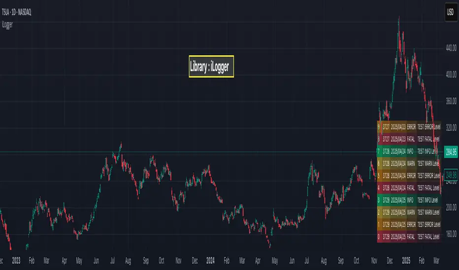
iLoggerLibrary "iLogger"
Logger Library based on types and methods.
method init(this)
init will initialize logger table and log stream array
Namespace types: Logger
Parameters:
this (Logger) : Logger object
Returns: void
method getLogger(level)
Namespace types: series LogLevel
Parameters:
level (series LogLevel)
method setPage(this, pageNumber)
setPage will set current page number of logs to display
Namespace types: Logger
Parameters:
this (Logger) : Logger object
pageNumber (int) : - Page number of logs to display
Returns: void
method nextPage(this)
nextPage will incremement page number to display on screen
Namespace types: Logger
Parameters:
this (Logger) : Logger object
Returns: void
method previousPage(this)
previousPage will decrement page number to display on screen
Namespace types: Logger
Parameters:
this (Logger) : Logger object
Returns: void
method log(this, level, message)
log will record message to be logged and repopulate logs displayed
Namespace types: Logger
Parameters:
this (Logger) : Logger object
level (series LogLevel) : logging level. Can be `TRACE`, `DEBUG`, `INFO`, `WARN`, `ERROR`, `FATAL`, `CRITICAL`. Logs only if log level is higher than Loggers minimul log level set
message (string) : log message to be recorded
Returns: void
method trace(this, message)
trace will record message to be logged with level 'TRACE'
Namespace types: Logger
Parameters:
this (Logger) : Logger object
message (string) : log message to be recorded
Returns: void
method debug(this, message)
debug will record message to be logged with level 'DEBUG'
Namespace types: Logger
Parameters:
this (Logger) : Logger object
message (string) : log message to be recorded
Returns: void
method info(this, message)
info will record message to be logged with level 'INFO'
Namespace types: Logger
Parameters:
this (Logger) : Logger object
message (string) : log message to be recorded
Returns: void
method warn(this, message)
warn will record message to be logged with level 'WARN'
Namespace types: Logger
Parameters:
this (Logger) : Logger object
message (string) : log message to be recorded
Returns: void
method error(this, message)
error will record message to be logged with level 'ERROR'
Namespace types: Logger
Parameters:
this (Logger) : Logger object
message (string) : log message to be recorded
Returns: void
method fatal(this, message)
fatal will record message to be logged with level 'FATAL'
Namespace types: Logger
Parameters:
this (Logger) : Logger object
message (string) : log message to be recorded
Returns: void
Log
Log Object holding log entry
Fields:
level (series LogLevel) : Logging level
message (series string) : Logging message
bartime (series int) : bar time at which log is recorded
bar (series int) : bar index at which log is recorded
Logger
Logger object which can be used for logging purposes
Fields:
position (series string) : position on chart where logs can be shown. Valid values are table position values. Make sure that the script does not have any other table at this position
pageSize (series int) : size of each page of logs which can be shown on UI. Default is 10
maxEntries (series int) : max size logs to be stored
pageNumber (series int) : current page number of logs to display on chart
textSize (series string) : size of text on debug table to be shown. default is size.small. Other options - size.tiny, size.normal, size.large, size.huge, size.auto
textColor (series color) : text color of debug messages. Default is color.white
showOnlyLast (series bool) : If set, shows the logs derived only from last bar. Default is true
minimumLevel (series LogLevel) : Minimum level of logs to be considered for logging.
realTime (series bool) : Print logs based on real time bar. This should be set to true for debugging indicators and false for debugging strategies.
debugTable (series table) : table containing debug messages. It will be set in init method. Hence no need to pass this in constructor
logs (array) : Array of Log containing logging messages. It will be set in init method. Hence no need to pass this in constructor
ICT Killzones Toolkit [LuxAlgo]The ICT Killzones Toolkit is a comprehensive set of tools designed to assist traders in identifying key trading zones and patterns within the market.
The ICT Killzones Toolkit includes the following Price Action components:
ICT Killzones with Pivot Highs/Lows
Order Blocks
Breaker Blocks
Fair Value Gaps
Market Structure Shifts
By combining these components, the ICT Killzones Toolkit provides traders with a comprehensive framework for analyzing the market and identifying setups of interest. Leveraging these tools effectively can enhance traders' decision-making process and improve killzones interpretability.
🔶 USAGE
In forex/futures trading, timing is crucial. ICT Killzone are specific periods when there's a higher chance of finding setups of interest. Mastering these time intervals can offer significant advantages to traders who know how to use them effectively.
The image above highlights a potential setup of interest when using the ICT Killzones Toolkit.
As another example for utilizing the ICT Killzones Toolkit, we can see in the image above when price retests setups generated from killzones such as Order Blocks or Fair Value Gaps, a potential strategy could be to look for entries on those & take profits as the next killzone appears.
🔹 Order Blocks
Order Blocks are sections on a price chart where notable buying or selling activity has occured, often signaling interest zones for institutional traders. This toolkit's Order Blocks component pinpoints these areas within the Killzone, which may act as potential support or resistance levels.
🔹 Breaker Blocks
Breaker Blocks are zones built from mitigated order blocks, and highlight zones on the chart where price has previously stalled or reversed. These areas may act as significant barriers to price movement in the future, and the Breaker Blocks component helps traders identify them for potential trading opportunities.
🔹 Fair Value Gaps
Fair value gaps are especially favored by price action traders and arise from market inefficiencies or imbalances, typically when buying and selling are unequal. These gaps often attract price movement before resuming in the same direction. the Fair Value Gaps component of the toolkit helps traders identify and analyze them.
🔹 Market Structure Shifts
Market Structure Shifts refer to significant changes in the overall structure of the market, such as shifts in trend direction, volatility, or trading activity. These shifts can provide valuable insights into market sentiment and potential trading opportunities, and the Market Structure Shifts component helps traders identify and interpret them.
Overall, the ICT Killzone Toolkit combines these components to provide traders with a comprehensive framework for analyzing the markets and identifying high-probability trading setups.
🔶 SETTINGS
🔹 ICT Killzones
Asian, London Open, New York, and London Close: toggles the visibility of specific Killzones, allowing users to customize time periods and Killzone colors.
Killzone Lines : Top/Bottom, Mean and Extend Top/Bottom: toggles the visibility of the Killzone's pivot high and low lines, mean (average) line, and allows users to extend the pivot lines.
Killzone Labels: Toggles the visibility of the Killzone labels.
Display Killzones within Timeframes Up To: Toggles the visibility of the Killzones up to selected Timeframes.
Open Price, Separator, Label, and Color: toggles the visibility of the open price of the Killzones or for the day, week, or month. If the day, week, or month is selected, a separator will be displayed to highlight the beginning of each respective period. Additionally, users can customize the color and toggle the label as needed.
🔹 Order Blocks & Breaker Blocks
Order Blocks | Breaker Blocks: toggles the visibility of the order blocks & breaker blocks.
Swing Detection Length: lookback period used for the detection of the swing points used to create order blocks & breaker blocks.
Mitigation Price: allows users to select between closing price or wick of the candle.
Use Candle Body in Detection: allows users to use candle bodies as order block areas instead of the full candle range.
Remove Mitigated Order Blocks & Breaker Blocks: toggles the visibility of the mitigated order blocks & breaker blocks.
Extend Order Blocks & Breaker Blocks: enables processing of the order blocks & breaker blocks beyond the boundaries of the killzones.
Display Order Blocks & Breaker Blocks: enables the display of the first, last, or all occurrences of the order blocks & breaker blocks.
Order Blocks : Bullish, Bearish Color: color customization option for order blocks.
Breaker Blocks : Bullish, Bearish Color: color customization option for breaker blocks.
Show Order Blocks & Breaker Blocks Text: toggles the visibility of the order blocks & breaker blocks labels.
🔹 Market Structure Shifts
Market Structure Shifts: toggles the visibility of the market structure shifts.
Detection Length: market structure shift detection length.
Display Market Structure Shifts: enables the display of the first, last, or all occurrences of the market structure shifts.
Market Structure Shifts : Bullish, Bearish Color: color custumization option for market structure shifts.
Show Market Structure Shifts Text: toggles the visibility of the market structure shifts labels.
🔹 Fair Value Gaps
Fair Value Gaps: toggles the visibility of the fair value gaps.
Fair Value Gap Width Filter: filtering threshold wile detecting fair value gaps.
Remove Mitigated Fair Value Gaps: removes mitigated fair value gaps.
Extend Fair Value Gaps: enables processing of the fair value gaps beyond the boundaries of the killzones.
Display Fair Value Gaps: enables the display of the first, last, or all occurrences of the fair value gaps.
Bullish Imbalance Color: color customization option.
Bearish Imbalance Color: color customization option.
Show Fair Value Gaps Text: toggles the visibility of the fair value gaps labels.
🔶 RELATED SCRIPTS
Smart-Money-Concepts
Order-Blocks-Breaker-Blocks
Thanks to our community for recommending this script. For more conceptual scripts and related content, we welcome you to explore by visiting >>> LuxAlgo-Scripts .

Markdown: The Pine Editor's Hidden Gem💬 Markdown, a markup language
Markdown is a portable, lightweight markup language that can be used for everything whether you're building a website, documentation, or even presentations.
Platforms like Discord, Reddit, and GitHub support Markdown and is the widely go-to option for text formatting due to its simplicity. Pine Script is a language that also utilizes Markdown, specifically in the Pine Editor where it can really be used to some extent.
Since the release of libraries, user-defined types, and methods, Pine Script is entering an age where developers will be highly dependent on libraries due to the capabilities Pine has inherited recently. It would be no surprise if a few people got together and took their time to thoroughly develop an entire project/library centered around improving Pine Script's built-in functions and providing developers with easier ways of achieving things than they thought they could.
As you're all aware, hovering over functions (and more) in the editor pops up a prompt that specifies the parameters, types, and what the function returns. Pine Script uses Markdown for that, so I figured we could go ahead and push that feature to its limits and see what we can do.
Today we'll go over how we can utilize Markdown in Pine Script, and how you can make your library's built-in functions stand out more than they did previously.
For more information, visit www.markdownguide.org
📕 General Notes
Markdown syntax only works on functions and methods.
Using arrays as parameters as of 2/21/2023 breaks the Markdown system.
The prompt window holds a max of 166 characters on one line before overflowing.
There is no limit on how long the prompt window can be.
🔽 Getting Started 🔽
▶️ Headings
If you have experience in HTML, Markdown, or even Microsoft Word then you already have a grasp of how headings work and look.
To simplify it, headings make the given text either massive or tiny depending on how many number symbols are provided.
When defining headings, you must have a space between the number (#) symbol, and the text. This is typical syntax throughout the language.
Pine Script uses bold text by applying (**) for their titles on their built-ins (e.g. @returns) but you could also use heading level 4 (####) and have it look the same.
▶️ Paragraphs & Line Breaks
You may want to provide extensive details and examples relating to one function, in this case, you could create line breaks. Creating line breaks skips to the next line so you can keep things organized as a result.
To achieve a valid line break and create a new paragraph, you must end the line with two or more spaces.
If you want to have an empty line in between, apply a backslash (\).
Backslashes (\) are generally not recommended for every line break. In this case, I only recommend using them for empty lines.
▶️ Text Formatting
Markdown provides text formatting such as bold, italics, and strikethrough.
For bolding text, you can apply open and close (**) or (__).
For italicizing text, you can apply open and close (*) or (_).
For bolding and italicizing text, you can apply open and close (***) or (___).
For s̶t̶r̶i̶k̶e̶t̶h̶r̶o̶u̶g̶h̶, you need to apply open and close (~~).
This was mentioned in the Headers section, but Pine Script's main titles (e.g. @returns or @syntax) use bold (**) by default.
▶️ Blockquotes
Blockquotes in Pine Script can be visualized as a built-in indentation system.
They are declared using greater than (>) and everything will be auto-aligned and indented until closed.
By convention you generally want to include the greater than (>) on every line that's included in the block quote. Even when not needed.
If you would like to indent even more (nested blockquotes), you can apply multiple greater than symbols (>). For example, (>>)
Blockquotes can be closed by ending the next line with only one greater than (>) symbol, or by using a horizontal rule.
▶️ Horizontal Rules
Horizontal rules in Pine Script are what you see at the very top of the prompt in built-ins.
When hovering, you can see the top of the prompt provides a line, and we can actually reproduce these lines.
These are extremely useful for separating information into their own parts and are accessed by applying 3 underscores (___), or 3 asterisks (***).
Horizontal rules were mentioned above, when we were discussing block quotes. These can also be used to close blockquotes as well.
Horizontal rules require a minimum of 3 underscores (___) or 3 asterisks (***).
▶️ Lists
Lists give us a way to structure data in a somewhat neat way. There are multiple ways to start a list, such as
1. First Item (number followed by a period)
- First Item (dash)
+ First Item (plus sign)
* First Item (asterisk)
Using number-based lists provide an ordered list, whereas using (-), (+), or (*) will provide an unordered list (bullet points).
If you want to begin an unordered list with a number that ends with a period, you must use an escape sequence (\) after the number.
Standard indentation (tab-width) list detection isn't supported, so to nest lists you have to use blockquotes (>) which may not look as appealing.
▶️ Code Blocks
Using code blocks allows you to write actual Pine Script code inside the prompt.
It's a game changer that can potentially help people understand how to execute functions quickly.
To use code blocks, apply three 3 open and close backquotes (```). Built-in's use (```pine) but there's no difference when we apply it.
Considering that tab-width indentation isn't detected properly, we can make use of the blockquotes mentioned above.
▶️ Denotation
Denoting can also be seen as highlighting a background layer behind text. They're basically code blocks, but without the "block".
Similar to how code blocks work, we apply one backquote open and close (`).
Make sure to only use this on important keywords. There really isn't a conventional way of applying this.
It's up to you to decide what people should have their eyes tracked onto when they hover over your functions.
If needed, look at how Pine Script's built-in variables and functions utilize this.
▶️ Tables
Tables are possible in Markdown, although they may look a bit different in the Pine Editor.
They are made by separating text with vertical bars (|).
The headers are detected when there is a minimum of one hyphen (-) below them.
You can align text by using a colon as I do in the photo. Hyphens must be connected to the colon in order to display correctly.
Tables aren't ideal to use in the editor but are there if anyone wants to give it a go.
▶️ Links & Images
Markdown supports images and hyperlinks, which means we can also do that here in the Pine Editor. Cool right?
If you want to create a hyperlink, surround the displayed text in open and close brackets .
If you want to load a photo into your prompt, it's the same syntax as the hyperlink, except it uses a (!)
See syntax list below.
Here are realistic usage examples. (Snippets from code below)
These follow the same syntax as the built-ins.
I'm not using horizontal rules here, but it's entirely up to you.
▶️ Syntax List
Headings
Level 1: #
Level 2: ##
Level 3: ###
Level 4: ####
Level 5: #####
Level 6: ######
Line Breaks
Text (two spaces)
Text\ (backslash)
Text Formatting
Bold (**)
Italic (**)
Strikethrough (~~)
Blockquotes
Indent (>)
Double Indent (>>)
Triple Indent (>>>) and so on.
Horizontal Rules
(___) or (***)
Lists
Ordered List (1.)
Unordered List (-) or (+) or (*)
Code Blocks
(```) or (```pine)
Denotation
(`)
Tables
(|) and (-) and (:)
Hyperlinks
(URL)
Images
! (URL)
Hope this helps. 👍

2 MACD VISUEL — 4H / 1H / 15M + CONFIRMATION 5M//@version=6
indicator("MTF MACD VISUEL — 4H / 1H / 15M + CONFIRMATION 5M", overlay=true, max_labels_count=500)
// ─────────────────────────────
// Fonction MACD Histogram
// ─────────────────────────────
f_macd(src) =>
fast = ta.ema(src, 12)
slow = ta.ema(src, 26)
macd = fast - slow
signal = ta.ema(macd, 9)
hist = macd - signal
hist
// ─────────────────────────────
// MTF MACD HISTOGRAM
// ─────────────────────────────
h4 = request.security(syminfo.tickerid, "240", f_macd(close))
h1 = request.security(syminfo.tickerid, "60", f_macd(close))
h15 = request.security(syminfo.tickerid, "15", f_macd(close))
h5 = request.security(syminfo.tickerid, "5", f_macd(close))
// Signes
s4 = h4 > 0 ? 1 : h4 < 0 ? -1 : 0
s1 = h1 > 0 ? 1 : h1 < 0 ? -1 : 0
s15 = h15 > 0 ? 1 : h15 < 0 ? -1 : 0
s5 = h5 > 0 ? 1 : h5 < 0 ? -1 : 0
// Conditions
three_same = (s4 == s1) and (s1 == s15) and (s4 != 0)
five_same = three_same and (s5 == s4)
// BUY / SELL logiques
isBUY = five_same and s4 == 1
isSELL = five_same and s4 == -1
// ─────────────────────────────
// DASHBOARD VISUEL (en haut du graphique)
// ─────────────────────────────
var table dash = table.new(position.top_right, 4, 2, border_color=color.black)
table.cell(dash, 0, 0, "4H", bgcolor = s4 == 1 ? color.green : s4 == -1 ? color.red : color.gray)
table.cell(dash, 1, 0, "1H", bgcolor = s1 == 1 ? color.green : s1 == -1 ? color.red : color.gray)
table.cell(dash, 2, 0, "15M", bgcolor = s15 == 1 ? color.green : s15 == -1 ? color.red : color.gray)
table.cell(dash, 3, 0, "5M", bgcolor = s5 == 1 ? color.green : s5 == -1 ? color.red : color.gray)
table.cell(dash, 0, 1, s4 == 1 ? "↑" : s4 == -1 ? "↓" : "·", bgcolor=color.new(color.black, 0), text_color=color.white)
table.cell(dash, 1, 1, s1 == 1 ? "↑" : s1 == -1 ? "↓" : "·", bgcolor=color.new(color.black, 0), text_color=color.white)
table.cell(dash, 2, 1, s15 == 1 ? "↑" : s15 == -1 ? "↓" : "·", bgcolor=color.new(color.black, 0), text_color=color.white)
table.cell(dash, 3, 1, s5 == 1 ? "↑" : s5 == -1 ? "↓" : "·", bgcolor=color.new(color.black, 0), text_color=color.white)
// ─────────────────────────────
// SIGNES VISUELS SUR LE GRAPHIQUE
// ─────────────────────────────
plotshape(isBUY, title="BUY", style=shape.triangleup, location=location.belowbar, color=color.green, size=size.large, text="BUY")
plotshape(isSELL, title="SELL", style=shape.triangledown, location=location.abovebar, color=color.red, size=size.large, text="SELL")
// Histogramme du MACD 5M en couleur tendance
plot(h5, title="MACD Hist 5M", color = h5 >= 0 ? color.green : color.red, style=plot.style_columns)
// ─────────────────────────────
// Alerte Webhook (message constant OBLIGATOIRE)
// ─────────────────────────────
alertcondition(isBUY, title="Signal BUY Confirmé", message="MTF_MACD_BUY")
alertcondition(isSELL, title="Signal SELL Confirmé", message="MTF_MACD_SELL")

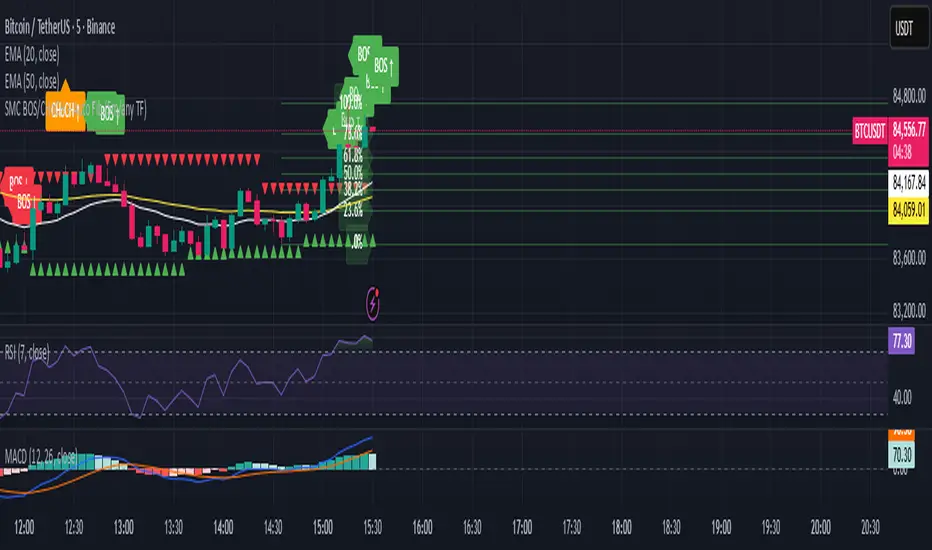
SMC BOS/CHoCH + Auto Fib (5m/any TF) durane//@version=6
indicator('SMC BOS/CHoCH + Auto Fib (5m/any TF)', overlay = true, max_lines_count = 200, max_labels_count = 200)
// --------- Inputs ----------
left = input.int(3, 'Pivot Left', minval = 1)
right = input.int(3, 'Pivot Right', minval = 1)
minSwingSize = input.float(0.0, 'Min swing size (price units, 0 = disabled)', step = 0.1)
fib_levels = input.string('0.0,0.236,0.382,0.5,0.618,0.786,1.0', 'Fibonacci levels (comma separated)')
show_labels = input.bool(true, 'Show BOS/CHoCH labels')
lookbackHighLow = input.int(200, 'Lookback for structure (bars)')
// Parse fib levels
strs = str.split(fib_levels, ',')
var array fibs = array.new_float()
if barstate.isfirst
for s in strs
array.push(fibs, str.tonumber(str.trim(s)))
// --------- Find pivot highs / lows ----------
pHigh = ta.pivothigh(high, left, right)
pLow = ta.pivotlow(low, left, right)
// store last confirmed swings
var float lastSwingHighPrice = na
var int lastSwingHighBar = na
var float lastSwingLowPrice = na
var int lastSwingLowBar = na
if not na(pHigh)
// check min size
if minSwingSize == 0 or pHigh - nz(lastSwingLowPrice, pHigh) >= minSwingSize
lastSwingHighPrice := pHigh
lastSwingHighBar := bar_index - right
lastSwingHighBar
if not na(pLow)
if minSwingSize == 0 or nz(lastSwingHighPrice, pLow) - pLow >= minSwingSize
lastSwingLowPrice := pLow
lastSwingLowBar := bar_index - right
lastSwingLowBar
// --------- Detect BOS & CHoCH (simple robust logic) ----------
var int lastBOSdir = 0 // 1 = bullish BOS (price broke above), -1 = bearish BOS
var int lastBOSbar = na
var float lastBOSprice = na
// Look for price closes beyond last structural swings within lookback
// Bullish BOS: close > recent swing high
condBullBOS = not na(lastSwingHighPrice) and close > lastSwingHighPrice and bar_index - lastSwingHighBar <= lookbackHighLow
// Bearish BOS: close < recent swing low
condBearBOS = not na(lastSwingLowPrice) and close < lastSwingLowPrice and bar_index - lastSwingLowBar <= lookbackHighLow
bosTriggered = false
chochTriggered = false
if condBullBOS
bosTriggered := true
if lastBOSdir != 1
// if previous BOS direction was -1, this is CHoCH (change of character)
chochTriggered := lastBOSdir == -1
chochTriggered
lastBOSdir := 1
lastBOSbar := bar_index
lastBOSprice := close
lastBOSprice
if condBearBOS
bosTriggered := true
if lastBOSdir != -1
chochTriggered := lastBOSdir == 1
chochTriggered
lastBOSdir := -1
lastBOSbar := bar_index
lastBOSprice := close
lastBOSprice
// --------- Plot labels for BOS / CHoCH ----------
if bosTriggered and show_labels
if chochTriggered
label.new(bar_index, high, text = lastBOSdir == 1 ? 'CHoCH ↑' : 'CHoCH ↓', style = label.style_label_up, color = color.new(color.orange, 0), textcolor = color.white, yloc = yloc.abovebar)
else
label.new(bar_index, high, text = lastBOSdir == 1 ? 'BOS ↑' : 'BOS ↓', style = label.style_label_left, color = lastBOSdir == 1 ? color.green : color.red, textcolor = color.white, yloc = yloc.abovebar)
// --------- Auto Fibonacci drawing ----------
var array fib_lines = array.new_line()
var array fib_labels = array.new_label()
var int lastFibId = na
// Function to clear previous fibs
f_clear() =>
if array.size(fib_lines) > 0
for i = 0 to array.size(fib_lines) - 1
line.delete(array.get(fib_lines, i))
if array.size(fib_labels) > 0
for i = 0 to array.size(fib_labels) - 1
label.delete(array.get(fib_labels, i))
array.clear(fib_lines)
array.clear(fib_labels)
// Decide anchors for fib: if lastBOSdir==1 (bullish) anchor from lastSwingLow -> lastSwingHigh
// if lastBOSdir==-1 (bearish) anchor from lastSwingHigh -> lastSwingLow
if lastBOSdir == 1 and not na(lastSwingLowPrice) and not na(lastSwingHighPrice)
// bullish fib: low -> high
startPrice = lastSwingLowPrice
endPrice = lastSwingHighPrice
// draw
f_clear()
for i = 0 to array.size(fibs) - 1 by 1
lvl = array.get(fibs, i)
priceLevel = startPrice + (endPrice - startPrice) * lvl
ln = line.new(x1 = lastSwingLowBar, y1 = priceLevel, x2 = bar_index, y2 = priceLevel, xloc = xloc.bar_index, extend = extend.right, color = color.new(color.green, 60), width = 1, style = line.style_solid)
array.push(fib_lines, ln)
lab = label.new(bar_index, priceLevel, text = str.tostring(lvl * 100, '#.0') + '%', style = label.style_label_right, color = color.new(color.green, 80), textcolor = color.white, yloc = yloc.price)
array.push(fib_labels, lab)
if lastBOSdir == -1 and not na(lastSwingHighPrice) and not na(lastSwingLowPrice)
// bearish fib: high -> low
startPrice = lastSwingHighPrice
endPrice = lastSwingLowPrice
f_clear()
for i = 0 to array.size(fibs) - 1 by 1
lvl = array.get(fibs, i)
priceLevel = startPrice + (endPrice - startPrice) * lvl
ln = line.new(x1 = lastSwingHighBar, y1 = priceLevel, x2 = bar_index, y2 = priceLevel, xloc = xloc.bar_index, extend = extend.right, color = color.new(color.red, 60), width = 1, style = line.style_solid)
array.push(fib_lines, ln)
lab = label.new(bar_index, priceLevel, text = str.tostring(lvl * 100, '#.0') + '%', style = label.style_label_right, color = color.new(color.red, 80), textcolor = color.white, yloc = yloc.price)
array.push(fib_labels, lab)
// --------- Optional: plot lastSwing points ----------
plotshape(not na(lastSwingHighPrice) ? lastSwingHighPrice : na, title = 'LastSwingHigh', location = location.absolute, style = shape.triangledown, size = size.tiny, color = color.red, offset = 0)
plotshape(not na(lastSwingLowPrice) ? lastSwingLowPrice : na, title = 'LastSwingLow', location = location.absolute, style = shape.triangleup, size = size.tiny, color = color.green, offset = 0)
// --------- Alerts ----------
alertcondition(bosTriggered and lastBOSdir == 1, title = 'Bullish BOS', message = 'Bullish BOS detected on {{ticker}} @ {{close}}')
alertcondition(bosTriggered and lastBOSdir == -1, title = 'Bearish BOS', message = 'Bearish BOS detected on {{ticker}} @ {{close}}')
alertcondition(chochTriggered, title = 'CHoCH Detected', message = 'CHoCH detected on {{ticker}} @ {{close}}')
// End
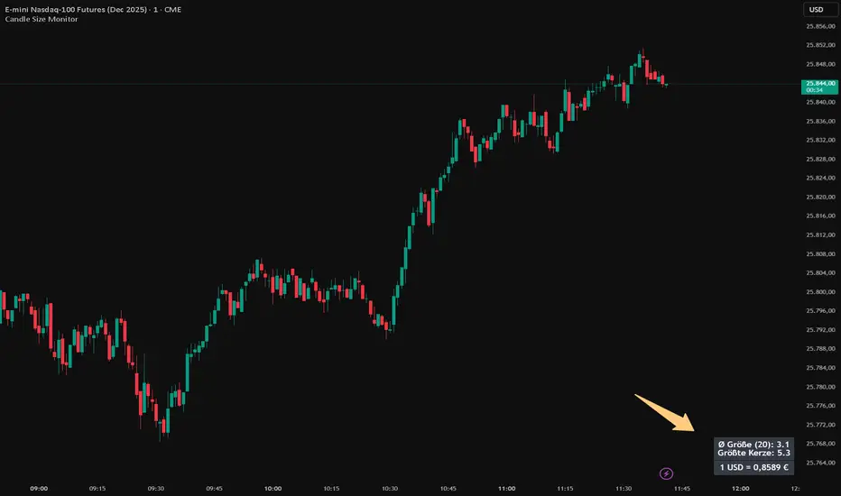
Candle Size MonitorCandle Size Monitor – Description
Update 27.10.25
Objective Volatility Assessment
The Candle Size Monitor helps traders assess actual market movement—regardless of whether candles appear visually large or small on the chart. It supports evaluating whether your planned trade structure (e.g., stop-loss, take-profit) aligns with current volatility.
Key Features
Volatility Analysis:
Calculates the average candle size (difference between high and low) over a user-defined number of candles.
Identifies the largest candle in the selected period.
Displays results in a compact table on the chart.
Exchange Rate Integration (optional):
Shows the current USD-EUR exchange rate (formatted with German-style comma and four decimal places).
Useful for traders in USD-denominated markets who apply EUR-based risk management rules.
Customizable Display:
Text Size: Small, medium, or large.
Colors: Customizable text and background colors.
Table Position: Top/bottom left/right.
Number of Candles: User-defined (default: 20).
Dynamic Updates:
The table updates with each new bar.
The exchange rate is fetched in real-time from OANDA:EURUSD.
Settings and Translations
Settings
Anzahl Kerzen → Number of Candles (Number of candles for calculation, default: 20).
Textgröße → Text Size (Text size in the table: small, medium, large).
Textfarbe → Text Color (Text color, default: white).
Hintergrundfarbe → Background Color (Background color of the table, default: black).
Position → Position (Table position: Top Left, Top Right, Bottom Left, Bottom Right).
Wechselkurs anzeigen (USD → EUR) → Show Exchange Rate (USD → EUR) (Option to display the exchange rate).
Table Contents and Translations
The table displays the following information (with German formatting):
Ø Größe (N):
English: "Avg Size (N): " (Average candle size over the last N candles).
Example: "Ø Größe (20): 15,3" → "Avg Size (20): 15.3".
Größte Kerze:
English: "Largest Candle: " (Largest candle size in the selected period).
Example: "Größte Kerze: 42,7" → "Largest Candle: 42.7".
1 USD = € (only if enabled)
English: "1 USD = EUR" (Current USD-EUR exchange rate, formatted with a comma).
Example: "1 USD = 0,9234 €" → "1 USD = 0.9234 EUR".
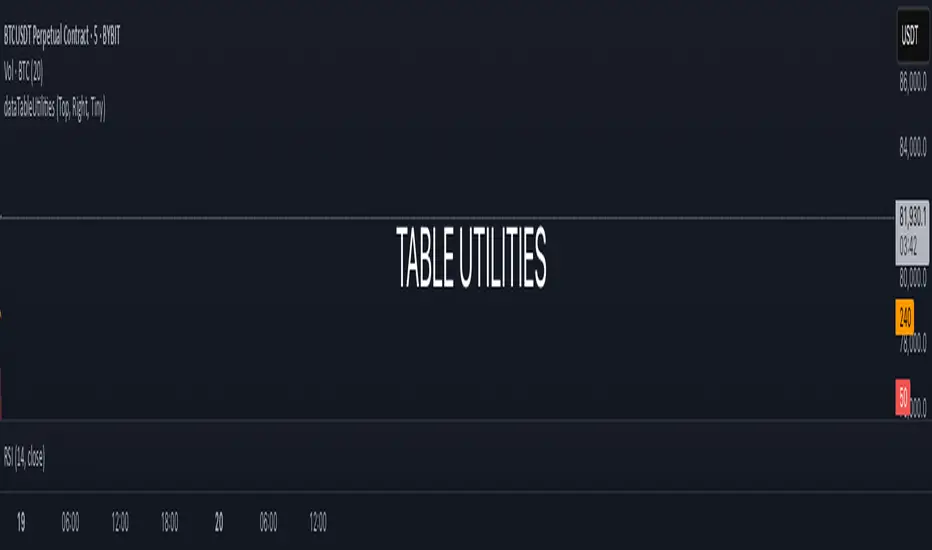
dataTableUtilitiesLibrary "dataTableUtilities"
generate_dataTable(dataTable_map, title, tableYpos, tableXpos, textSize, includes_multiple_maps, include_comments)
: Generates and shows a data table.
Parameters:
dataTable_map (map)
title (string) : (string): Title of the table
tableYpos (string) : (string): Vertical position of the table
tableXpos (string) : (string): Horizontal position of the table
textSize (string) : (string): Text size
includes_multiple_maps (bool)
include_comments (bool)
Returns: : None
generate_dataTable_multiple_columns(dataTable_map, title, tableYpos, tableXpos, textSize, includes_multiple_maps, total_columns)
: Generates and shows a data table.
Parameters:
dataTable_map (map)
title (string) : (string): Title of the table
tableYpos (string) : (string): Vertical position of the table
tableXpos (string) : (string): Horizontal position of the table
textSize (string) : (string): Text size
includes_multiple_maps (bool)
total_columns (int)
Returns: : None
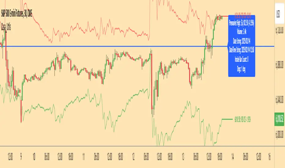
Casa_UtilsLibrary "Casa_Utils"
A collection of convenience and helper functions for indicator and library authors on TradingView
formatNumber(num)
My version of format number that doesn't have so many decimal places...
Parameters:
num (float) : The number to be formatted
Returns: The formatted number
getDateString(timestamp)
Convenience function returns timestamp in yyyy/MM/dd format.
Parameters:
timestamp (int) : The timestamp to stringify
Returns: The date string
getDateTimeString(timestamp)
Convenience function returns timestamp in yyyy/MM/dd hh:mm format.
Parameters:
timestamp (int) : The timestamp to stringify
Returns: The date string
getInsideBarCount()
Gets the number of inside bars for the current chart. Can also be passed to request.security to get the same for different timeframes.
Returns: The # of inside bars on the chart right now.
getLabelStyleFromString(styleString, acceptGivenIfNoMatch)
Tradingview doesn't give you a nice way to put the label styles into a dropdown for configuration settings. So, I specify them in the following format: "Center", "Left", "Lower Left", "Lower Right", "Right", "Up", "Upper Left", "Upper Right", "Plain Text", "No Labels". This function takes care of converting those custom strings back to the ones expected by tradingview scripts.
Parameters:
styleString (string)
acceptGivenIfNoMatch (bool) : If no match for styleString is found and this is true, the function will return styleString, otherwise it will return tradingview's preferred default
Returns: The string expected by tradingview functions
getTime(hourNumber, minuteNumber)
Given an hour number and minute number, adds them together and returns the sum. To be used by getLevelBetweenTimes when fetching specific price levels during a time window on the day.
Parameters:
hourNumber (int) : The hour number
minuteNumber (int) : The minute number
Returns: The sum of all the minutes
getHighAndLowBetweenTimes(start, end)
Given a start and end time, returns the high or low price during that time window.
Parameters:
start (int) : The timestamp to start with (# of seconds)
end (int) : The timestamp to end with (# of seconds)
Returns: The high or low value
getPremarketHighsAndLows()
Returns an expression that can be used by request.security to fetch the premarket high & low levels in a tuple.
Returns: (tuple)
getAfterHoursHighsAndLows()
Returns an expression that can be used by request.security to fetch the after hours high & low levels in a tuple.
Returns: (tuple)
getOvernightHighsAndLows()
Returns an expression that can be used by request.security to fetch the overnight high & low levels in a tuple.
Returns: (tuple)
getNonRthHighsAndLows()
Returns an expression that can be used by request.security to fetch the high & low levels for premarket, after hours and overnight in a tuple.
Returns: (tuple)
getLineStyleFromString(styleString, acceptGivenIfNoMatch)
Tradingview doesn't give you a nice way to put the line styles into a dropdown for configuration settings. So, I specify them in the following format: "Solid", "Dashed", "Dotted", "None/Hidden". This function takes care of converting those custom strings back to the ones expected by tradingview scripts.
Parameters:
styleString (string) : Plain english (or TV Standard) version of the style string
acceptGivenIfNoMatch (bool) : If no match for styleString is found and this is true, the function will return styleString, otherwise it will return tradingview's preferred default
Returns: The string expected by tradingview functions
getPercentFromPrice(price)
Get the % the current price is away from the given price.
Parameters:
price (float)
Returns: The % the current price is away from the given price.
getPositionFromString(position)
Tradingview doesn't give you a nice way to put the positions into a dropdown for configuration settings. So, I specify them in the following format: "Top Left", "Top Center", "Top Right", "Middle Left", "Middle Center", "Middle Right", "Bottom Left", "Bottom Center", "Bottom Right". This function takes care of converting those custom strings back to the ones expected by tradingview scripts.
Parameters:
position (string) : Plain english position string
Returns: The string expected by tradingview functions
getRsiAvgsExpression(rsiLength)
Call request.security with this as the expression to get the average up/down values that can be used with getRsiPrice (below) to calculate the price level where the supplied RSI level would be reached.
Parameters:
rsiLength (simple int) : The length of the RSI requested.
Returns: A tuple containing the avgUp and avgDown values required by the getRsiPrice function.
getRsiPrice(rsiLevel, rsiLength, avgUp, avgDown)
use the values returned by getRsiAvgsExpression() to calculate the price level when the provided RSI level would be reached.
Parameters:
rsiLevel (float) : The RSI level to find price at.
rsiLength (int) : The length of the RSI to calculate.
avgUp (float) : The average move up of RSI.
avgDown (float) : The average move down of RSI.
Returns: The price level where the provided RSI level would be met.
getSizeFromString(sizeString)
Tradingview doesn't give you a nice way to put the sizes into a dropdown for configuration settings. So, I specify them in the following format: "Auto", "Huge", "Large", "Normal", "Small", "Tiny". This function takes care of converting those custom strings back to the ones expected by tradingview scripts.
Parameters:
sizeString (string) : Plain english size string
Returns: The string expected by tradingview functions
getTimeframeOfChart()
Get the timeframe of the current chart for display
Returns: The string of the current chart timeframe
getTimeNowPlusOffset(candleOffset)
Helper function for drawings that use xloc.bar_time to help you know the time offset if you want to place the end of the drawing out into the future. This determines the time-size of one candle and then returns a time n candleOffsets into the future.
Parameters:
candleOffset (int) : The number of items to find singular/plural for.
Returns: The future time
getVolumeBetweenTimes(start, end)
Given a start and end time, returns the sum of all volume across bars during that time window.
Parameters:
start (int) : The timestamp to start with (# of seconds)
end (int) : The timestamp to end with (# of seconds)
Returns: The volume
isToday()
Returns true if the current bar occurs on today's date.
Returns: True if current bar is today
padLabelString(labelText, labelStyle)
Pads a label string so that it appears properly in or not in a label. When label.style_none is used, this will make sure it is left-aligned instead of center-aligned. When any other type is used, it adds a single space to the right so there is padding against the right end of the label.
Parameters:
labelText (string) : The string to be padded
labelStyle (string) : The style of the label being padded for.
Returns: The padded string
plural(num, singular, plural)
Helps format a string for plural/singular. By default, if you only provide num, it will just return "s" for plural and nothing for singular (eg. plural(numberOfCats)). But you can optionally specify the full singular/plural words for more complicated nomenclature (eg. plural(numberOfBenches, 'bench', 'benches'))
Parameters:
num (int) : The number of items to find singular/plural for.
singular (string) : The string to return if num is singular. Defaults to an empty string.
plural (string) : The string to return if num is plural. Defaults to 's' so you can just add 's' to the end of a word.
Returns: The singular or plural provided strings depending on the num provided.
timeframeInSeconds(timeframe)
Get the # of seconds in a given timeframe. Tradingview's timeframe.in_seconds() expects a simple string, and we often need to use series string, so this is an alternative to get you the value you need.
Parameters:
timeframe (string)
Returns: The number of secondsof that timeframe
timeframeOfChart()
Convert a timeframe string to a consistent standard.
Returns: The standard format for the string, or the unchanged value if it is unknown.
timeframeToString(timeframe)
Convert a timeframe string to a consistent standard.
Parameters:
timeframe (string)
Returns: (string) The standard format for the string, or the unchanged value if it is unknown.
stringToTimeframe(strTimeframe)
Convert an english-friendly timeframe string to a value that can be used by request.security. Specifically, this corrects hour strings (eg. 4h) to their numeric "minute" equivalent (eg. 240)
Parameters:
strTimeframe (string)
Returns: (string) The standard format for the string, or the unchanged value if it is unknown.
getPriceLabel(price, labelOffset, labelStyle, labelSize, labelColor, textColor)
Defines a label for the end of a price level line.
Parameters:
price (float) : The price level to render the label at.
labelOffset (int) : The number of candles to place the label to the right of price.
labelStyle (string) : A plain english string as defined in getLabelStyleFromString.
labelSize (string) : The size of the label.
labelColor (color) : The color of the label.
textColor (color) : The color of the label text (defaults to #ffffff)
Returns: The label that was created.
setPriceLabel(label, labelName, price, labelOffset, labelTemplate, labelStyle, labelColor, textColor)
Updates the label position & text based on price changes.
Parameters:
label (label) : The label to update.
labelName (string) : The name of the price level to be placed on the label.
price (float) : The price level to render the label at.
labelOffset (int) : The number of candles to place the label to the right of price.
labelTemplate (string) : The str.format template to use for the label. Defaults to: '{0}: {1} {2}{3,number,#.##}%' which means '{price}: {labelName} {+/-}{percentFromPrice}%'
labelStyle (string)
labelColor (color)
textColor (color)
getPriceLabelLine(price, labelOffset, labelColor, lineWidth)
Defines a line that will stretch from the plot line to the label.
Parameters:
price (float) : The price level to render the label at.
labelOffset (int) : The number of candles to place the label to the right of price.
labelColor (color)
lineWidth (int) : The width of the line. Defaults to 1.
setPriceLabelLine(line, price, labelOffset, lastTime, lineColor)
Updates the price label line based on price changes.
Parameters:
line (line) : The line to update.
price (float) : The price level to render the label at.
labelOffset (int) : The number of candles to place the label to the right of price.
lastTime (int) : The last time that the line should stretch from. Defaults to time.
lineColor (color)
Alerts█ OVERVIEW
This library is a Pine Script™ programmers tool that provides functions to simplify the creation of compound conditions and alert messages. With these functions, scripts can use comma-separated "string" lists to specify condition groups from arbitrarily large "bool" arrays , offering a convenient way to provide highly flexible alert creation to script users without requiring numerous inputs in the "Settings/Inputs" menu.
█ CONCEPTS
Compound conditions
Compound conditions are essentially groups of two or more conditions, where each required condition must occur to produce a `true` result. Traders often combine conditions, including signals from various indicators, to drive and reinforce trade decisions. Similarly, programmers use compound conditions in logical operations to create scripts that respond dynamically to groups of events.
Condition conundrum
Providing flexible condition combinations to script users for signals and alerts often poses a significant challenge: input complexity . Conventionally, such flexibility comes at the cost of an extensive list of separate inputs for toggling individual conditions and customizing their properties, often resulting in complicated input menus that are difficult for users to navigate effectively. Furthermore, managing all those inputs usually entails tediously handling many extra variables and logical expressions, making such projects more complex for programmers.
Condensing complexity
This library introduces a technique using parsed strings to reference groups of elements from "bool" arrays , helping to simplify and streamline the construction of compound conditions and alert messages. With this approach, programmers can provide one or more "string" inputs in their scripts where users can list numbers corresponding to the conditions they want to combine.
For example, suppose you have a script that creates alert triggers based on a combination of up to 20 individual conditions, and you want to make inputs for users to choose which conditions to combine. Instead of creating 20 separate checkboxes in the "Settings/Inputs" tab and manually adding associated logic for each one, you can store the conditional values in arrays, make one or more "string" inputs that accept values listing the array item locations (e.g., "1,4,8,11"), and then pass the inputs to these functions to determine the compound conditions formed by the specified groups.
This approach condenses the input space, improving navigability and utility. Additionally, it helps provide high-level simplicity to complex conditional code, making it easier to maintain and expand over time.
█ CALCULATIONS AND USE
This library contains three functions for evaluating compound conditions: `getCompoundConditon()`, `getCompoundConditionsArray()`, and `compoundAlertMessage()`. Each function has two overloads that evaluate compound conditions based on groups of items from one or two "bool" arrays . The sections below explain the functions' calculations and how to use them.
Referencing conditions using "string" index lists
Each function processes "string" values containing comma-separated lists of numerals representing the indices of the "bool" array items to use in its calculations (e.g., "4, 8, 12"). The functions split each supplied "string" list by its commas, then iterate over those specified indices in the "bool" arrays to determine each group's combined `true` or `false` state.
For convenience, the numbers in the "string" lists can represent zero-based indices (where the first item is at index 0) or one-based indices (where the first item is at index 1), depending on the function's `zeroIndex` parameter. For example, an index list of "0, 2, 4" with a `zeroIndex` value of `true` specifies that the condition group uses the first , third , and fifth "bool" values in the array, ignoring all others. If the `zeroIndex` value is `false`, the list "1, 3, 5" also refers to those same elements.
Zero-based indexing is convenient for programmers because Pine arrays always use this index format. However, one-based indexing is often more convenient and familiar for script users, especially non-programmers.
Evaluating one or many condition groups
The `getCompoundCondition()` function evaluates singular condition groups determined by its `indexList` parameter, returning `true` values whenever the specified array elements are `true`. This function is helpful when a script has to evaluate specific groups of conditions and does not require many combinations.
In contrast, the `getCompoundConditionsArray()` function can evaluate numerous condition groups, one for each "string" included in its `indexLists` argument. It returns arrays containing `true` or `false` states for each listed group. This function is helpful when a script requires multiple condition combinations in additional calculations or logic.
The `compoundAlertMessage()` function is similar to the `getCompoundConditionsArray()` function. It also evaluates a separate compound condition group for each "string" in its `indexLists` array, but it returns "string" values containing the marker (name) of each group with a `true` result. You can use these returned values as the `message` argument in alert() calls, display them in labels and other drawing objects, or even use them in additional calculations and logic.
Directional condition pairs
The first overload of each function operates on a single `conditions` array, returning values representing one or more compound conditions from groups in that array. These functions are ideal for general-purpose condition groups that may or may not represent direction information.
The second overloads accept two arrays representing upward and downward conditions separately: `upConditions` and `downConditions`. These overloads evaluate opposing directional conditions in pairs (e.g., RSI is above/below a level) and return upward and downward condition information separately in a tuple .
When using the directional overloads, ensure the `upConditions` and `downConditions` arrays are the same size, with the intended condition pairs at the same indices . For instance, if you have a specific upward RSI condition's value at the first index in the `upConditions` array, include the opposing downward RSI condition's value at that same index in the `downConditions` array. If a condition can apply to both directions (e.g., rising volume), include its value at the same index in both arrays.
Group markers
To simplify the generation of informative alert messages, the `compoundAlertMessage()` function assigns "string" markers to each condition group, where "marker" refers to the group's name. The `groupMarkers` parameter allows you to assign custom markers to each listed group. If not specified, the function generates default group markers in the format "M", where "M" is short for "Marker" and "" represents the group number starting from 1. For example, the default marker for the first group specified in the `indexLists` array is "M1".
The function's returned "string" values contain a comma-separated list with markers for each activated condition group (e.g., "M1, M4"). The function's second overload, which processes directional pairs of conditions, also appends extra characters to the markers to signify the direction. The default for upward groups is "▲" (e.g., "M1▲") and the default for downward ones is "▼" (e.g., "M1▼"). You can customize these appended characters with the `upChar` and `downChar` parameters.
Designing customizable alerts
We recommend following these primary steps when using this library to design flexible alerts for script users:
1. Create text inputs for users to specify comma-separated lists of conditions with the input.string() or input.text_area() functions, and then collect all the input values in a "string" array . Note that each separate "string" in the array will represent a distinct condition group.
2. Create arrays of "bool" values representing the possible conditions to choose from. If your script will process pairs of upward and downward conditions, ensure the related elements in the arrays align at the same indices.
3. Call `compoundAlertMessage()` using the arrays from steps 1 and 2 as arguments to get the alert message text. If your script will use the text for alerts only, not historical display or calculation purposes, the call is necessary only on realtime bars .
4. Pass the calculated "string" values as the `message` argument in alert() calls. We recommend calling the function only when the "string" is not empty (i.e., `messageText != ""`). To avoid repainting alerts on open bars, use barstate.isconfirmed in the condition to allow alert triggers only on each bar's close .
5. Test the alerts. Open the "Create Alert" dialog box and select "Any alert() function call" in the "Condition" field. It is also helpful to inspect the strings with Pine Logs .
NOTE: Because the techniques in this library use lists of numbers to specify conditions, we recommend including a tooltip for the "string" inputs that lists the available numbers and the conditions they represent. This tooltip provides a legend for script users, making it simple to understand and utilize. To create the tooltip, declare a "const string" listing the options and pass it to the `input.*()` call's `tooltip` parameter. See the library's example code for a simple demonstration.
█ EXAMPLE CODE
This library's example code demonstrates one possible way to offer a selection of compound conditions with "string" inputs and these functions. It uses three input.string() calls, each accepting a comma-separated list representing a distinct condition group. The title of each input represents the default group marker that appears in the label and alert text. The code collects these three input values in a `conditionGroups` array for use with the `compoundAlertMessage()` function.
In this code, we created two "bool" arrays to store six arbitrary condition pairs for demonstration:
1. Bar up/down: The bar's close price must be above the open price for upward conditions, and vice versa for downward conditions.
2. Fast EMA above/below slow EMA : The 9-period Exponential Moving Average of close prices must be above the 21-period EMA for upward conditions, and vice versa for downward conditions.
3. Volume above average : The bar's volume must exceed its 20-bar average to activate an upward or downward condition.
4. Volume rising : The volume must exceed that of the previous bar to activate an upward or downward condition.
5. RSI trending up/down : The 14-period Relative Strength Index of close prices must be between 50 and 70 for upward conditions, and between 30 and 50 for downward conditions.
6. High volatility : The 7-period Average True Range (ATR) must be above the 40-period ATR to activate an upward or downward condition.
We included a `tooltip` argument for the third input.string() call that displays the condition numbers and titles, where 1 is the first condition number.
The `bullConditions` array contains the `true` or `false` states of all individual upward conditions, and the `bearConditions` array contains all downward condition states. For the conditions that filter either direction because they are non-directional, such as "High volatility", both arrays contain the condition's `true` or `false` value at the same index. If you use these conditions alone, they activate upward and downward alert conditions simultaneously.
The example code calls `compoundAlertMessage()` using the `bullConditions`, `bearConditions`, and `conditionGroups` arrays to create a tuple of strings containing the directional markers for each activated group. On confirmed bars, it displays non-empty strings in labels and uses them in alert() calls. For the text shown in the labels, we used str.replace_all() to replace commas with newline characters, aligning the markers vertically in the display.
Look first. Then leap.
█ FUNCTIONS
This library exports the following functions:
getCompoundCondition(conditions, indexList, minRequired, zeroIndex)
(Overload 1 of 2) Determines a compound condition based on selected elements from a `conditions` array.
Parameters:
conditions (array) : (array) An array containing the possible "bool" values to use in the compound condition.
indexList (string) : (series string) A "string" containing a comma-separated list of whole numbers representing the group of `conditions` elements to use in the compound condition. For example, if the value is `"0, 2, 4"`, and `minRequired` is `na`, the function returns `true` only if the `conditions` elements at index 0, 2, and 4 are all `true`. If the value is an empty "string", the function returns `false`.
minRequired (int) : (series int) Optional. Determines the minimum number of selected conditions required to activate the compound condition. For example, if the value is 2, the function returns `true` if at least two of the specified `conditions` elements are `true`. If the value is `na`, the function returns `true` only if all specified elements are `true`. The default is `na`.
zeroIndex (bool) : (series bool) Optional. Specifies whether the `indexList` represents zero-based array indices. If `true`, a value of "0" in the list represents the first array index. If `false`, a `value` of "1" represents the first index. The default is `true`.
Returns: (bool) `true` if `conditions` elements in the group specified by the `indexList` are `true`, `false` otherwise.
getCompoundCondition(upConditions, downConditions, indexList, minRequired, allowUp, allowDown, zeroIndex)
(Overload 2 of 2) Determines upward and downward compound conditions based on selected elements from `upConditions` and `downConditions` arrays.
Parameters:
upConditions (array) : (array) An array containing the possible "bool" values to use in the upward compound condition.
downConditions (array) : (array) An array containing the possible "bool" values to use in the downward compound condition.
indexList (string) : (series string) A "string" containing a comma-separated list of whole numbers representing the `upConditions` and `downConditions` elements to use in the compound conditions. For example, if the value is `"0, 2, 4"` and `minRequired` is `na`, the function returns `true` for the first value only if the `upConditions` elements at index 0, 2, and 4 are all `true`. If the value is an empty "string", the function returns ` `.
minRequired (int) : (series int) Optional. Determines the minimum number of selected conditions required to activate either compound condition. For example, if the value is 2, the function returns `true` for its first value if at least two of the specified `upConditions` elements are `true`. If the value is `na`, the function returns `true` only if all specified elements are `true`. The default is `na`.
allowUp (bool) : (series bool) Optional. Controls whether the function considers upward compound conditions. If `false`, the function ignores the `upConditions` array, and the first item in the returned tuple is `false`. The default is `true`.
allowDown (bool) : (series bool) Optional. Controls whether the function considers downward compound conditions. If `false`, the function ignores the `downConditions` array, and the second item in the returned tuple is `false`. The default is `true`.
zeroIndex (bool) : (series bool) Optional. Specifies whether the `indexList` represents zero-based array indices. If `true`, a value of "0" in the list represents the first array index. If `false`, a value of "1" represents the first index. The default is `true`.
Returns: ( ) A tuple containing two "bool" values representing the upward and downward compound condition states, respectively.
getCompoundConditionsArray(conditions, indexLists, zeroIndex)
(Overload 1 of 2) Creates an array of "bool" values representing compound conditions formed by selected elements from a `conditions` array.
Parameters:
conditions (array) : (array) An array containing the possible "bool" values to use in each compound condition.
indexLists (array) : (array) An array of strings containing comma-separated lists of whole numbers representing the `conditions` elements to use in each compound condition. For example, if an item is `"0, 2, 4"`, the corresponding item in the returned array is `true` only if the `conditions` elements at index 0, 2, and 4 are all `true`. If an item is an empty "string", the item in the returned array is `false`.
zeroIndex (bool) : (series bool) Optional. Specifies whether the "string" lists in the `indexLists` represent zero-based array indices. If `true`, a value of "0" in a list represents the first array index. If `false`, a value of "1" represents the first index. The default is `true`.
Returns: (array) An array of "bool" values representing compound condition states for each condition group. An item in the array is `true` only if all the `conditions` elements specified by the corresponding `indexLists` item are `true`. Otherwise, the item is `false`.
getCompoundConditionsArray(upConditions, downConditions, indexLists, allowUp, allowDown, zeroIndex)
(Overload 2 of 2) Creates two arrays of "bool" values representing compound upward and
downward conditions formed by selected elements from `upConditions` and `downConditions` arrays.
Parameters:
upConditions (array) : (array) An array containing the possible "bool" values to use in each upward compound condition.
downConditions (array) : (array) An array containing the possible "bool" values to use in each downward compound condition.
indexLists (array) : (array) An array of strings containing comma-separated lists of whole numbers representing the `upConditions` and `downConditions` elements to use in each compound condition. For example, if an item is `"0, 2, 4"`, the corresponding item in the first returned array is `true` only if the `upConditions` elements at index 0, 2, and 4 are all `true`. If an item is an empty "string", the items in both returned arrays are `false`.
allowUp (bool) : (series bool) Optional. Controls whether the function considers upward compound conditions. If `false`, the function ignores the `upConditions` array, and all elements in the first returned array are `false`. The default is `true`.
allowDown (bool) : (series bool) Optional. Controls whether the function considers downward compound conditions. If `false`, the function ignores the `downConditions` array, and all elements in the second returned array are `false`. The default is `true`.
zeroIndex (bool) : (series bool) Optional. Specifies whether the "string" lists in the `indexLists` represent zero-based array indices. If `true`, a value of "0" in a list represents the first array index. If `false`, a value of "1" represents the first index. The default is `true`.
Returns: ( ) A tuple containing two "bool" arrays:
- The first array contains values representing upward compound condition states determined using the `upConditions`.
- The second array contains values representing downward compound condition states determined using the `downConditions`.
compoundAlertMessage(conditions, indexLists, zeroIndex, groupMarkers)
(Overload 1 of 2) Creates a "string" message containing a comma-separated list of markers representing active compound conditions formed by specified element groups from a `conditions` array.
Parameters:
conditions (array) : (array) An array containing the possible "bool" values to use in each compound condition.
indexLists (array) : (array) An array of strings containing comma-separated lists of whole numbers representing the `conditions` elements to use in each compound condition. For example, if an item is `"0, 2, 4"`, the corresponding marker for that item appears in the returned "string" only if the `conditions` elements at index 0, 2, and 4 are all `true`.
zeroIndex (bool) : (series bool) Optional. Specifies whether the "string" lists in the `indexLists` represent zero-based array indices. If `true`, a value of "0" in a list represents the first array index. If `false`, a value of "1" represents the first index. The default is `true`.
groupMarkers (array) : (array) Optional. If specified, sets the marker (name) for each condition group specified in the `indexLists` array. If `na`, the function uses the format `"M"` for each group, where "M" is short for "Marker" and `` represents the one-based index for the group (e.g., the marker for the first listed group is "M1"). The default is `na`.
Returns: (string) A "string" containing a list of markers corresponding to each active compound condition.
compoundAlertMessage(upConditions, downConditions, indexLists, allowUp, allowDown, zeroIndex, groupMarkers, upChar, downChar)
(Overload 2 of 2) Creates two "string" messages containing comma-separated lists of markers representing active upward and downward compound conditions formed by specified element groups from `upConditions` and `downConditions` arrays.
Parameters:
upConditions (array) An array containing the possible "bool" values to use in each upward compound condition.
downConditions (array) An array containing the possible "bool" values to use in each downward compound condition.
indexLists (array) An array of strings containing comma-separated lists of whole numbers representing the `upConditions` and `downConditions` element groups to use in each compound condition. For example, if an item is `"0, 2, 4"`, the corresponding group marker for that item appears in the first returned "string" only if the `upConditions` elements at index 0, 2, and 4 are all `true`.
allowUp (bool) Optional. Controls whether the function considers upward compound conditions. If `false`, the function ignores the `upConditions` array and returns an empty "string" for the first tuple element. The default is `true`.
allowDown (bool) Optional. Controls whether the function considers downward compound conditions. If `false`, the function ignores the `downConditions` array and returns an empty "string" for the second tuple element. The default is `true`.
zeroIndex (bool) Optional. Specifies whether the "string" lists in the `indexLists` represent zero-based array indices. If `true`, a value of "0" in a list represents the first array index. If `false`, a value of "1" represents the first index. The default is `true`.
groupMarkers (array) Optional. If specified, sets the name (marker) of each condition group specified in the `indexLists` array. If `na`, the function uses the format `"M"` for each group, where "M" is short for "Marker" and `` represents the one-based index for the group (e.g., the marker for the first listed group is "M1"). The default is `na`.
upChar (string) Optional. A "string" appended to all group markers for upward conditions to signify direction. The default is "▲".
downChar (string) Optional. A "string" appended to all group markers for downward conditions to signify direction. The default is "▼".
Returns: ( ): A tuple of "string" values containing lists of markers corresponding to active upward and downward compound conditions, respectively.

Volume TableDisplays a table of volume and short volume.
When chart timeframe is intraday or daily, table will show daily values. If chart is on weekly, table will show weekly values. If chart is on monthly, table will show monthly values.
If a ticker doesn’t have short volume, uncheck “Show Short Volume” in settings for table to work.
Table rows:
Date row (Day/Week/Month) text:
Green when close > open
Red when close < open
White when close equals open
Volume (Vol) row text:
Default: Black
If “Check for inside candles” is checked, when the high and low (or open and close if “Use H/L not O/C” is unchecked) is within the previous time period (day/week/month), text will be white
Volume (Vol) row background:
Default: Gray
Colored based on values and colors set in settings:
>= Very High Volume
>= High Volume
<= Low Volume
<= Very Low Volume
Short Volume (SV) row cell background color:
SV < “Lower Threshold”: Black
“Lower Threshold” <= SV < “Low Threshold”: Gray
“Low Threshold” < SV < First “Short Volume Color Increment”: Silver
“Short Volume Color Increment's (5 million increments by default): purple, blue, teal, green, lime, yellow, orange, red, maroon, white
Short Volume text color is just colored to be visible based on SV cell background.
There are labels that can be displayed to look back at data further back than the table goes (recommend being on the daily timeframe).

Reversal and Breakout Signals [AlgoAlpha]🚀🌟 Introducing the Reversal and Breakout Signals by AlgoAlpha 🌟🚀
This innovative tool is crafted to enhance your chart analysis by identifying potential reversal and breakout opportunities directly on your charts. It's designed with both novice and experienced traders in mind, providing intuitive visual cues for better decision-making. Let's dive into the key features and how it operates:
### Key Features:
🔶 Dynamic Period Settings: Customize the sensitivity of the indicator with user-defined periods for both the indicator and volume strength.
📊 Volume Threshold: Set a threshold to define what constitutes strong volume, enabling the identification of significant market movements.
💡 Trend Coloring: Option to color candles during trends, making it easier to visualize bullish and bearish market conditions.
🌈 Customizable Visuals: Choose your preferred colors for bullish, bearish, and breakout signals, personalizing the chart to your liking.
🚨 Advanced Alert System: Configure alerts for reversal and breakout signals, ensuring you never miss a potential trading opportunity.
### How to Use:
To maximize the effectiveness of the Reversal and Breakout Signals tool, follow these steps:
1. 🔧 Set Up Your Preferences:
- Adjust the Indicator Period and Volume Strength Period to match the timeframe of your trading strategy. This fine-tuning allows the indicator to better align with your specific market analysis needs.
- Define the Strong Volume Threshold to distinguish between ordinary and significant volume movements. This helps in identifying breakout or reversal signals with higher confidence.
2. 🎨 Customize Visuals:
- Choose colors for Bullish , Bearish , and Breakout Signals to visually differentiate between different types of market activities. This customization facilitates quicker decision-making while scanning charts.
3. 🔍 Reversal Signals:
- Bullish Reversal : Look for a triangle below the bar indicating a potential upward movement. It's identified when the price dips below the lower level but closes above it, suggesting a rejection of lower prices.
- Bearish Reversal : A triangle above the bar signals a potential downward movement. This occurs when the price spikes above the upper level but closes below, indicating a rejection of higher prices.
4. 📈 Trend and Breakout Signals:
- Diamonds represent breakout signals. A bullish breakout is marked below the bar when the price closes above the upper level, suggesting strong buying pressure. Conversely, a bearish breakout above the bar indicates strong selling pressure as the price closes below the lower level.
- The tool also features a Trend Tracker that highlights the current market trend using the Hull Moving Average (HMA). This can help you stay aligned with the overall market direction for your trades.
By integrating these steps into your trading strategy, the Reversal and Breakout Signals tool can provide actionable insights to help identify potential entry and exit points, enhancing your trading decisions with visual cues and alerts for market reversals and breakouts.
### How It Works:
The core logic revolves around calculating weighted moving averages of high and low prices over a user-defined period, identifying the highest and lowest points within this period to establish potential breakout or breakdown levels while reducing the amount of noise, hence the use of moving averages.
1. Weighted Moving Averages Calculation:
sh = ta.wma(high, len)
sl = ta.wma(low, len)
h = ta.highest(sh, len)
l = ta.lowest(sl, len)
2. Breakout and Reversal Detection:
The script then employs logic to detect bullish and bearish breakouts and reversals based on the closing price's position relative to these levels, combined with volume analysis to confirm the strength of the move.
if not (h < h or h > h )
hstore := h
if not (l < l or l > l )
lstore := l
bullishbreakout := (breakout or ((breakout or breakout or breakout or breakout ) and candledir == 1)) and strongvol and not (bullishbreakout or bullishbreakout or bullishbreakout )
bearishbreakout := (breakdown or ((breakdown or breakdown or breakdown or breakdown ) and candledir == -1)) and strongvol and not (bearishbreakout or bearishbreakout or bearishbreakout )
3. Visual Indicators and Alerts:
Visual cues such as triangle shapes for reversals and diamonds for breakouts, along with colored bars, make it easy to spot these opportunities. Additionally, alerts can be set up for these events, ensuring traders can react promptly to potential trading setups.
plotshape(bullishrej and not (state ==- 1) ? low * 0.9995 : na, " Bullish Reversal ", shape.triangleup, location.belowbar, color.new(green, 0), size = size.tiny, text = "𝓡", textcolor = color.gray)
plotshape(bearishrej and not (state == 1) ? high * 1.0005 : na, " Bearish Reversal ", shape.triangledown, location.abovebar, color.new(red, 0), size = size.tiny, text = "𝓡", textcolor = color.gray)
plotshape(bullishbreakout ? low * 0.999 : na, " Bullish Breakout ", shape.diamond, location.belowbar, color.new(yellow, 0), size = size.tiny, text = "𝓑", textcolor = color.gray)
plotshape(bearishbreakout ? high * 1.001 : na, " Bearish Breakout ", shape.diamond, location.abovebar, color.new(yellow, 0), size = size.tiny, text = "𝓑", textcolor = color.gray)
This script is a versatile tool designed to aid in the identification of key reversal and breakout points, helping traders to make informed decisions based on technical analysis. Its customization options allow for a tailored analysis experience, fitting the unique needs and strategies of each trader.
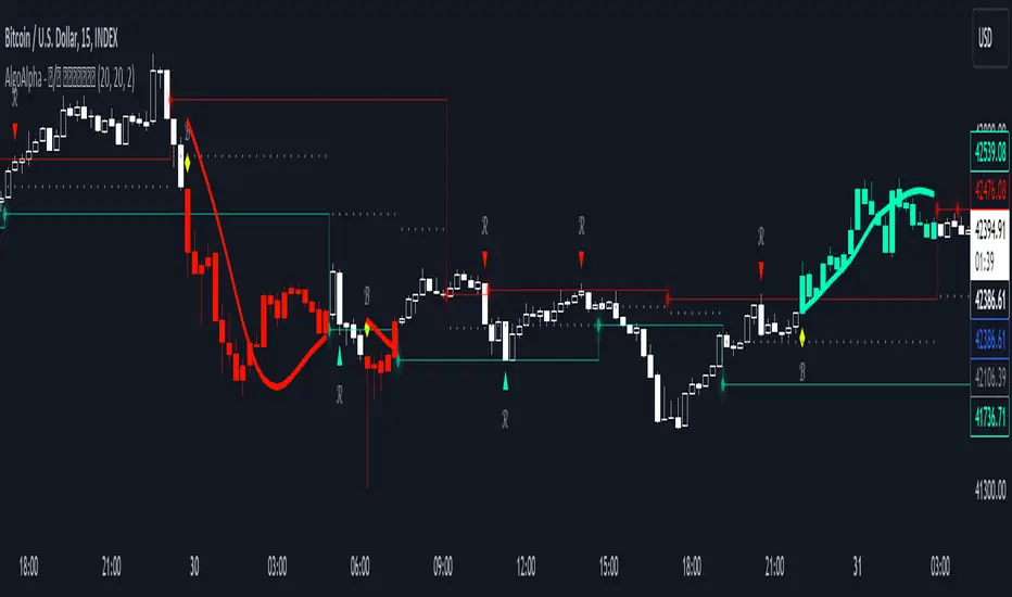
Pinescript - Common String Functions Library by RRBCommon String Functions Library by RagingRocketBull 2021
Version 1.0
Pinescript now has strong support for arrays with many powerful functions, but still lacks built-in string functions. Luckily you can easily process and manipulate strings using arrays.
This script provides a library of common string functions for everyday use, such as: indexOf, substr, replace, ascii_code, str_to_int etc. There are 100+ unique functions (130 including all implementations)
It should serve as building blocks to speed up the development of your custom scripts. You should also be able to learn how Pinescript arrays works and how you can process strings.
Similar libraries for Array and Statistical Functions are in the works. You can find the full list of functions below.
Features:
- 100+ unique string functions (130 including all implementations) in categories: lookup, testing, conversion, modification, extraction, type conversion, date and time, console output
- Live Output for all/selected functions based on User Input. Test any function before using in script.
- Live Unit Test Output for several functions based on pre-defined inputs.
- Output filters: show unique functions/all implementations, grouping
- Console customization options: set custom text size, color, page length
- Support for Pages - auto splits output into pages with fixed length, use pages in your scripts
- Several easy to use console output functions to speed up debugging/output.
WARNING:
- Compilation Time: 1 min
Notes:
- uses Pinescript v3 Compatibility Framework
- this script is packed to the max and sets a new record in testing of Pinescript's limits: 500 local scopes, 4000+ lines, 180kb+ source size. It's not possible to add more ifs/fors/functions without reducing functionality
- to fit the max limit of local scopes = 500 all ifs were replaced with ?: where possible, the number of function calls was reduced, some calls replaced with inline function code
- ifs are faster (especially when lots of them are used in a for cycle), more readable, but ifs/fors/functions increase local scopes (+1) and compiled file size, have max nesting limit = 10.
- ?: are slower (especially in for cycles), hard to read when nested, don't affect local scopes, reduce compiled file size, can't contain plots, for statements (break/continue) and sets of statements
- for most array functions to work (except push), an array must be defined with at least 1 pre-existing dummy element 0.
- if you see "String too long" error - enable Show Pages, reduce Max Chars Per Page < Max String Length limit = 4096.
- if you see "Loop too long" error - hide/unhide or reattach the script
- some functions have several implementations that can be faster/slower, use internal code/ext functions
- 1 is manual string processing using for cycles (array.get) and ext functions - provided in case you want to implement your own logic, may sometimes be slower
- 2 is a 2nd alternate implementation mostly done using built-in functions (array.indexof, array.slice, array.insert, array.remove, str.replace_all),
attempts to minimize local scopes and dependency on ext functions, should generally be faster
- 3 is a 3rd alternate (array.includes, array.fill) or a more advanced implementation (datetime3_str) with lots of params, giving you the most control over output
- most functions have dependencies, such as const names, global arrays, inputs, other functions.
P.S. Strings of Time may be closed unto themselves or have loose ends; they can vibrate, stretch, join or split.
Function Groups:
1. Char Functions
- repeat(str, num)
- ascii_char(code)
- ascii_code(char)
- is_digit(char)
- is_letter(char)
- digit_to_int(char)
- is_space_char(char)
2. Char Test and Lookup Functions
- char_at(str, pos)
- char_code_at(str, pos)
- indexOf_char(str, char)
- lastIndexOf_char(str, char)
- nth_indexOf_char(str, char, num)
- includes_char(str, char)
3. String Lookup Functions
- indexOf(str, target)
- lastIndexOf(str, target)
- nth_indexOf(str, target, num)
- indexesOf(str, target)
- numIndexesOf(str, target)
4. String Conversion Functions
- lowercase(str)
- uppercase(str)
5. String Modification and Extraction Functions
- split(str, separator)
- insert(str, pos, new_str)
- remove(str, pos, length)
- insert_char(str, pos, char)
- remove_char(str, pos)
- reverse(str)
- fill_char(str, char, start_pos, end_pos)
- replace(str, target, new_str)
- replace_first(str, target, new_str)
- replace_last(str, target, new_str)
- replace_nth(str, target, new_str, num)
- replace_left(str, new_str)
- replace_right(str, new_str)
- replace_middle(str, pos, new_str)
- left(str, num)
- right(str, num)
- first_char(str)
- last_char(str)
- truncate(str, max_len)
- truncate_middle2(str, trunc_str, pos, max_len)
- truncate_from2(str, trunc_str, pos, max_len, side)
- concat(str1, str2, trunc_str, max_len, mode)
- concat_from(str1, str2, trunc_str, max_len, side, mode)
- trim(str)
- substr(str, pos, length)
- substring(str, start_pos, end_pos)
- strip(str, mask, target, is_allowed)
- extract_groups(str)
- extract_numbers(str, d1, d2, mode)
- str_to_float(str, d1, d2)
- str_to_int(str)
- extract_ranges(str, d1, d2, d3, type)
6. String Test Functions
- includes(str, target)
- starts_with(str, target)
- ends_with(str, target)
- str_compare(str1, str2)
7. Type Conversion Functions
- tf_check2(tf)
- tf_to_mins()
- convert_tf(tf)
- period_to_mins(tf)
- convert_tf2(tf)
- convert_tf3(tf)
- bool_to_str(flag)
- get_src(src_str)
- get_size(size_str)
- get_style(style)
- get_bool(bool_str)
- get_int(str)
- get_float(str, d1, d2)
- get_color(str, def_color)
- color_tr2(col_str, transp)
- get_month(str)
- month_name(num, format)
- weekday_name(num, format)
- dayofweek_name(t)
8. Date and Time Functions
- date_str(t, d)
- time_str(t, d)
- datetime_str(t, d1, d2)
- date2_str(t, d, type)
- time2_str(t, d, type)
- datetime2_str(t, d1, d2, format1, format2)
- date3_str(t, template)
- time3_str(t, template)
- datetime3_str(t, template)
9. Console Output & Helper Functions
- echo1(con, str)
- echo2(x, y, con, str)
- echo3(v_shift, con, str, msg_color, text_size)
- echo4(x, y, con, str, msg_style, msg_color, text_size, text_align, msg_xloc)
- echo5(x, y, con, str, msg_style, msg_color, text_size, text_align, msg_xloc)
- echo6(x, y, con, str)
- echo7(v_shift, con, str, msg_color, text_size)
- echo8(x, y, con, str, msg_style, msg_color, text_size, text_align, msg_xloc)
- echo9(x, y, con, str, msg_style, msg_color, text_size, text_align, msg_xloc)
- new_page(str, line_str, trunc_str, header_str, footer_str, length, page_count, page, mode)

VWAP + EMA9/21/50 + Ichimoku + RSI (M5) - Strict + TPSL//@version=5
indicator("VWAP + EMA9/21/50 + Ichimoku + RSI (M5) - Strict + TPSL", overlay=true, shorttitle="VWAP_EMA_ICH_RSI_TPSL")
// === Inputs ===
emaFastLen = input.int(9, "EMA Fast (9)")
emaMidLen = input.int(21, "EMA Mid (21)")
emaSlowLen = input.int(50, "EMA Slow (50)")
// Ichimoku inputs
tenkanLen = input.int(9, "Tenkan Sen Length")
kijunLen = input.int(26, "Kijun Sen Length")
senkouBLen = input.int(52, "Senkou B Length")
displacement = input.int(26, "Displacement")
// RSI
rsiLen = input.int(14, "RSI Length")
rsiThreshold = input.int(50, "RSI Threshold")
// VWAP option
useSessionVWAP = input.bool(true, "Use Session VWAP (true) / Daily VWAP (false)")
// Volume filter
useVolumeFilter = input.bool(true, "Enable Volume Filter")
volAvgLen = input.int(20, "Volume Avg Length")
volMultiplier = input.float(1.2, "Min Volume > avg *", step=0.1)
// Higher timeframe trend check
useHTF = input.bool(true, "Enable Higher-Timeframe Trend Check")
htfTF = input.string("60", "HTF timeframe (e.g. 60, 240, D)")
// Alerts / webhook
alertOn = input.bool(true, "Enable Alerts")
useWebhook = input.bool(true, "Send webhook on alerts")
webhookURL = input.string("", "Webhook URL (leave blank to set in alert)")
// TP/SL & Trailing inputs
useTP = input.bool(true, "Enable Take Profit (TP)")
tpTypeRR = input.bool(true, "TP as Risk-Reward ratio (true) / Fixed points (false)")
tpRR = input.float(1.5, "TP RR (e.g. 1.5)", step=0.1)
fixedTPpts = input.float(40.0, "Fixed TP (ticks/pips) if not RR")
useSL = input.bool(true, "Enable Stop Loss (SL)")
slTypeATR = input.bool(true, "SL as ATR-based (true) / Fixed points (false)")
atrLen = input.int(14, "ATR Length")
atrMult = input.float(1.5, "ATR Multiplier for SL", step=0.1)
fixedSLpts = input.float(20.0, "Fixed SL (ticks/pips) if not ATR")
useTrailing = input.bool(true, "Enable Trailing Stop")
trailType = input.string("ATR", "Trailing type: ATR or EMA", options= ) // "ATR" or "EMA"
trailATRmult = input.float(1.0, "Trailing ATR Multiplier", step=0.1)
trailEMAlen = input.int(9, "Trailing EMA Length (if EMA chosen)")
trailLockInPts = input.float(5.0, "Trail lock-in (min profit before trail active, pts)")
// Other
showArrows = input.bool(true, "Show Entry Arrows")
// === Calculations ===
ema9 = ta.ema(close, emaFastLen)
ema21 = ta.ema(close, emaMidLen)
ema50 = ta.ema(close, emaSlowLen)
// VWAP
vwapVal = ta.vwap
// Ichimoku
highestHighTenkan = ta.highest(high, tenkanLen)
lowestLowTenkan = ta.lowest(low, tenkanLen)
tenkan = (highestHighTenkan + lowestLowTenkan) / 2
highestHighKijun = ta.highest(high, kijunLen)
lowestLowKijun = ta.lowest(low, kijunLen)
kijun = (highestHighKijun + lowestLowKijun) / 2
highestHighSenkouB = ta.highest(high, senkouBLen)
lowestLowSenkouB = ta.lowest(low, senkouBLen)
senkouB = (highestHighSenkouB + lowestLowSenkouB) / 2
senkouA = (tenkan + kijun) / 2
// RSI
rsi = ta.rsi(close, rsiLen)
// Volume
volAvg = ta.sma(volume, volAvgLen)
volOk = not useVolumeFilter or (volume > volAvg * volMultiplier)
// Higher timeframe trend values
htf_close = request.security(syminfo.tickerid, htfTF, close)
htf_ema50 = request.security(syminfo.tickerid, htfTF, ta.ema(close, emaSlowLen))
htf_rsi = request.security(syminfo.tickerid, htfTF, ta.rsi(close, rsiLen))
htf_bull = htf_close > htf_ema50
htf_bear = htf_close < htf_ema50
htf_ok = not useHTF or (htf_bull and close > ema50) or (htf_bear and close < ema50)
// Trend filters (on current timeframe)
priceAboveVWAP = close > vwapVal
priceAboveEMA50 = close > ema50
priceAboveCloud = close > senkouA and close > senkouB
bullTrend = priceAboveVWAP and priceAboveEMA50 and priceAboveCloud
bearTrend = not priceAboveVWAP and not priceAboveEMA50 and not priceAboveCloud
// Pullback detection (price near EMA21 within tolerance)
tolPerc = input.float(0.35, "Pullback tolerance (%)", step=0.05) / 100.0
nearEMA21 = math.abs(close - ema21) <= ema21 * tolPerc
// Entry conditions
emaCrossUp = ta.crossover(ema9, ema21)
emaCrossDown = ta.crossunder(ema9, ema21)
longConditionBasic = bullTrend and (nearEMA21 or close >= vwapVal) and emaCrossUp and rsi > rsiThreshold
shortConditionBasic = bearTrend and (nearEMA21 or close <= vwapVal) and emaCrossDown and rsi < rsiThreshold
longCondition = longConditionBasic and volOk and htf_ok and (not useHTF or htf_bull) and (rsi > rsiThreshold)
shortCondition = shortConditionBasic and volOk and htf_ok and (not useHTF or htf_bear) and (rsi < rsiThreshold)
// More strict: require Tenkan > Kijun for bull and Tenkan < Kijun for bear
ichimokuAlign = (tenkan > kijun) ? 1 : (tenkan < kijun ? -1 : 0)
longCondition := longCondition and (ichimokuAlign == 1)
shortCondition := shortCondition and (ichimokuAlign == -1)
// ATR for SL / trailing
atr = ta.atr(atrLen)
// --- Trade management state variables ---
var float activeLongEntry = na
var float activeShortEntry = na
var float activeLongSL = na
var float activeShortSL = na
var float activeLongTP = na
var float activeShortTP = na
var float activeLongTrail = na
var float activeShortTrail = na
// Function to convert fixed points to price (assumes chart in points as price units)
fixedToPriceLong(p) => p
fixedToPriceShort(p) => p
// On signal, set entry, SL and TP
if longCondition
activeLongEntry := close
// SL
if useSL
if slTypeATR
activeLongSL := close - atr * atrMult
else
activeLongSL := close - fixedToPriceLong(fixedSLpts)
else
activeLongSL := na
// TP
if useTP
if tpTypeRR and useSL and not na(activeLongSL)
risk = activeLongEntry - activeLongSL
activeLongTP := activeLongEntry + risk * tpRR
else
activeLongTP := activeLongEntry + fixedToPriceLong(fixedTPpts)
else
activeLongTP := na
// reset short
activeShortEntry := na
activeShortSL := na
activeShortTP := na
// init trailing
activeLongTrail := activeLongSL
if shortCondition
activeShortEntry := close
if useSL
if slTypeATR
activeShortSL := close + atr * atrMult
else
activeShortSL := close + fixedToPriceShort(fixedSLpts)
else
activeShortSL := na
if useTP
if tpTypeRR and useSL and not na(activeShortSL)
riskS = activeShortSL - activeShortEntry
activeShortTP := activeShortEntry - riskS * tpRR
else
activeShortTP := activeShortEntry - fixedToPriceShort(fixedTPpts)
else
activeShortTP := na
// reset long
activeLongEntry := na
activeLongSL := na
activeLongTP := na
// init trailing
activeShortTrail := activeShortSL
// Trailing logic (update only when in profit beyond 'lock-in')
if not na(activeLongEntry) and useTrailing
// current unrealized profit in points
currProfitPts = close - activeLongEntry
if currProfitPts >= trailLockInPts
// declare candidate before use to avoid undeclared identifier errors
float candidate = na
if trailType == "ATR"
candidate := close - atr * trailATRmult
else
candidate := close - ta.ema(close, trailEMAlen)
// move trail stop up but never below initial SL
activeLongTrail := math.max(nz(activeLongTrail, activeLongSL), candidate)
// ensure trail never goes below initial SL if SL exists
if useSL and not na(activeLongSL)
activeLongTrail := math.max(activeLongTrail, activeLongSL)
// update SL to trailing
activeLongSL := activeLongTrail
if not na(activeShortEntry) and useTrailing
currProfitPtsS = activeShortEntry - close
if currProfitPtsS >= trailLockInPts
// declare candidateS before use
float candidateS = na
if trailType == "ATR"
candidateS := close + atr * trailATRmult
else
candidateS := close + ta.ema(close, trailEMAlen)
activeShortTrail := math.min(nz(activeShortTrail, activeShortSL), candidateS)
if useSL and not na(activeShortSL)
activeShortTrail := math.min(activeShortTrail, activeShortSL)
activeShortSL := activeShortTrail
// Detect TP/SL hits (for plotting & alerts)
longTPHit = not na(activeLongTP) and close >= activeLongTP
longSLHit = not na(activeLongSL) and close <= activeLongSL
shortTPHit = not na(activeShortTP) and close <= activeShortTP
shortSLHit = not na(activeShortSL) and close >= activeShortSL
if longTPHit or longSLHit
// reset long state after hit
activeLongEntry := na
activeLongSL := na
activeLongTP := na
activeLongTrail := na
if shortTPHit or shortSLHit
activeShortEntry := na
activeShortSL := na
activeShortTP := na
activeShortTrail := na
// Plot EMAs
p_ema9 = plot(ema9, title="EMA9", linewidth=1)
plot(ema21, title="EMA21", linewidth=1)
plot(ema50, title="EMA50", linewidth=2)
// Plot VWAP
plot(vwapVal, title="VWAP", linewidth=2, style=plot.style_line)
// Plot Ichimoku lines (Tenkan & Kijun)
plot(tenkan, title="Tenkan", linewidth=1)
plot(kijun, title="Kijun", linewidth=1)
// Plot cloud (senkouA & senkouB shifted forward)
plot(senkouA, title="Senkou A", offset=displacement, transp=60)
plot(senkouB, title="Senkou B", offset=displacement, transp=60)
fill(plot(senkouA, offset=displacement), plot(senkouB, offset=displacement), color = senkouA > senkouB ? color.new(color.green, 80) : color.new(color.red, 80))
// Plot active trade lines
plotshape(not na(activeLongEntry), title="Active Long", location=location.belowbar, color=color.new(color.green, 0), style=shape.circle, size=size.tiny)
plotshape(not na(activeShortEntry), title="Active Short", location=location.abovebar, color=color.new(color.red, 0), style=shape.circle, size=size.tiny)
plot(activeLongSL, title="Long SL", color=color.red, linewidth=2)
plot(activeLongTP, title="Long TP", color=color.green, linewidth=2)
plot(activeShortSL, title="Short SL", color=color.red, linewidth=2)
plot(activeShortTP, title="Short TP", color=color.green, linewidth=2)
// Arrows / labels
if showArrows
if longCondition
label.new(bar_index, low, "BUY", style=label.style_label_up, color=color.green, textcolor=color.white, size=size.small)
if shortCondition
label.new(bar_index, high, "SELL", style=label.style_label_down, color=color.red, textcolor=color.white, size=size.small)
// Alerts
// alertcondition must be declared in global scope so TradingView can create alerts from them
alertcondition(longCondition, "VWAP+EMA+Ichimoku+RSI — BUY (STRICT)", "BUY signal from VWAP+EMA+Ichimoku+RSI (STRICT)")
alertcondition(shortCondition, "VWAP+EMA+Ichimoku+RSI — SELL (STRICT)", "SELL signal from VWAP+EMA+Ichimoku+RSI (STRICT)")
// Runtime alerts (still use alert() to trigger immediate alerts; webhook is added in TradingView Alert dialog)
if alertOn
if longCondition
alert("VWAP+EMA+Ichimoku+RSI — BUY (STRICT)", alert.freq_once_per_bar_close)
if shortCondition
alert("VWAP+EMA+Ichimoku+RSI — SELL (STRICT)", alert.freq_once_per_bar_close)
// Alerts for TP/SL hits
if longTPHit
alert("LONG TP HIT", alert.freq_once_per_bar_close)
if longSLHit
alert("LONG SL HIT", alert.freq_once_per_bar_close)
if shortTPHit
alert("SHORT TP HIT", alert.freq_once_per_bar_close)
if shortSLHit
alert("SHORT SL HIT", alert.freq_once_per_bar_close)
// Info table
var table info = table.new(position.top_right, 1, 8)
if barstate.islast
table.cell(info, 0, 0, text = 'Trend: ' + (bullTrend ? 'Bull' : bearTrend ? 'Bear' : 'Neutral'))
table.cell(info, 0, 1, text = 'EMA9/21/50: ' + str.tostring(ema9, format.mintick) + ' / ' + str.tostring(ema21, format.mintick) + ' / ' + str.tostring(ema50, format.mintick))
table.cell(info, 0, 2, text = 'VWAP: ' + str.tostring(vwapVal, format.mintick))
table.cell(info, 0, 3, text = 'RSI: ' + str.tostring(rsi, format.mintick))
table.cell(info, 0, 4, text = 'Vol OK: ' + (volOk ? 'Yes' : 'No'))
table.cell(info, 0, 5, text = 'HTF: ' + htfTF + ' ' + (htf_bull ? 'Bull' : htf_bear ? 'Bear' : 'Neutral'))
table.cell(info, 0, 6, text = 'ActiveLong: ' + (not na(activeLongEntry) ? 'Yes' : 'No'))
table.cell(info, 0, 7, text = 'ActiveShort: ' + (not na(activeShortEntry) ? 'Yes' : 'No'))
// End of script

Kịch bản của tôi//@version=6
indicator(title="Relative Strength Index", shorttitle="Gấu Trọc RSI", format=format.price, precision=2, timeframe="", timeframe_gaps=true)
rsiLengthInput = input.int(14, minval=1, title="RSI Length", group="RSI Settings")
rsiSourceInput = input.source(close, "Source", group="RSI Settings")
calculateDivergence = input.bool(false, title="Calculate Divergence", group="RSI Settings", display = display.data_window, tooltip = "Calculating divergences is needed in order for divergence alerts to fire.")
change = ta.change(rsiSourceInput)
up = ta.rma(math.max(change, 0), rsiLengthInput)
down = ta.rma(-math.min(change, 0), rsiLengthInput)
rsi = down == 0 ? 100 : up == 0 ? 0 : 100 - (100 / (1 + up / down))
rsiPlot = plot(rsi, "RSI", color=#7E57C2)
rsiUpperBand1 = hline(98, "RSI Upper Band1", color=#787B86)
rsiUpperBand = hline(70, "RSI Upper Band", color=#787B86)
midline = hline(50, "RSI Middle Band", color=color.new(#787B86, 50))
rsiLowerBand = hline(30, "RSI Lower Band", color=#787B86)
rsiLowerBand2 = hline(14, "RSI Lower Band2", color=#787B86)
fill(rsiUpperBand, rsiLowerBand, color=color.rgb(126, 87, 194, 90), title="RSI Background Fill")
midLinePlot = plot(50, color = na, editable = false, display = display.none)
fill(rsiPlot, midLinePlot, 100, 70, top_color = color.new(color.green, 0), bottom_color = color.new(color.green, 100), title = "Overbought Gradient Fill")
fill(rsiPlot, midLinePlot, 30, 0, top_color = color.new(color.red, 100), bottom_color = color.new(color.red, 0), title = "Oversold Gradient Fill")
// Smoothing MA inputs
GRP = "Smoothing"
TT_BB = "Only applies when 'SMA + Bollinger Bands' is selected. Determines the distance between the SMA and the bands."
maTypeInput = input.string("SMA", "Type", options = , group = GRP, display = display.data_window)
var isBB = maTypeInput == "SMA + Bollinger Bands"
maLengthInput = input.int(14, "Length", group = GRP, display = display.data_window, active = maTypeInput != "None")
bbMultInput = input.float(2.0, "BB StdDev", minval = 0.001, maxval = 50, step = 0.5, tooltip = TT_BB, group = GRP, display = display.data_window, active = isBB)
var enableMA = maTypeInput != "None"
// Smoothing MA Calculation
ma(source, length, MAtype) =>
switch MAtype
"SMA" => ta.sma(source, length)
"SMA + Bollinger Bands" => ta.sma(source, length)
"EMA" => ta.ema(source, length)
"SMMA (RMA)" => ta.rma(source, length)
"WMA" => ta.wma(source, length)
"VWMA" => ta.vwma(source, length)
// Smoothing MA plots
smoothingMA = enableMA ? ma(rsi, maLengthInput, maTypeInput) : na
smoothingStDev = isBB ? ta.stdev(rsi, maLengthInput) * bbMultInput : na
plot(smoothingMA, "RSI-based MA", color=color.yellow, display = enableMA ? display.all : display.none, editable = enableMA)
bbUpperBand = plot(smoothingMA + smoothingStDev, title = "Upper Bollinger Band", color=color.green, display = isBB ? display.all : display.none, editable = isBB)
bbLowerBand = plot(smoothingMA - smoothingStDev, title = "Lower Bollinger Band", color=color.green, display = isBB ? display.all : display.none, editable = isBB)
fill(bbUpperBand, bbLowerBand, color= isBB ? color.new(color.green, 90) : na, title="Bollinger Bands Background Fill", display = isBB ? display.all : display.none, editable = isBB)
// Divergence
lookbackRight = 5
lookbackLeft = 5
rangeUpper = 60
rangeLower = 5
bearColor = color.red
bullColor = color.green
textColor = color.white
noneColor = color.new(color.white, 100)
_inRange(bool cond) =>
bars = ta.barssince(cond)
rangeLower <= bars and bars <= rangeUpper
plFound = false
phFound = false
bullCond = false
bearCond = false
rsiLBR = rsi
if calculateDivergence
//------------------------------------------------------------------------------
// Regular Bullish
// rsi: Higher Low
plFound := not na(ta.pivotlow(rsi, lookbackLeft, lookbackRight))
rsiHL = rsiLBR > ta.valuewhen(plFound, rsiLBR, 1) and _inRange(plFound )
// Price: Lower Low
lowLBR = low
priceLL = lowLBR < ta.valuewhen(plFound, lowLBR, 1)
bullCond := priceLL and rsiHL and plFound
//------------------------------------------------------------------------------
// Regular Bearish
// rsi: Lower High
phFound := not na(ta.pivothigh(rsi, lookbackLeft, lookbackRight))
rsiLH = rsiLBR < ta.valuewhen(phFound, rsiLBR, 1) and _inRange(phFound )
// Price: Higher High
highLBR = high
priceHH = highLBR > ta.valuewhen(phFound, highLBR, 1)
bearCond := priceHH and rsiLH and phFound
plot(
plFound ? rsiLBR : na,
offset = -lookbackRight,
title = "Regular Bullish",
linewidth = 2,
color = (bullCond ? bullColor : noneColor),
display = display.pane,
editable = calculateDivergence)
plotshape(
bullCond ? rsiLBR : na,
offset = -lookbackRight,
title = "Regular Bullish Label",
text = " Bull ",
style = shape.labelup,
location = location.absolute,
color = bullColor,
textcolor = textColor,
display = display.pane,
editable = calculateDivergence)
plot(
phFound ? rsiLBR : na,
offset = -lookbackRight,
title = "Regular Bearish",
linewidth = 2,
color = (bearCond ? bearColor : noneColor),
display = display.pane,
editable = calculateDivergence)
plotshape(
bearCond ? rsiLBR : na,
offset = -lookbackRight,
title = "Regular Bearish Label",
text = " Bear ",
style = shape.labeldown,
location = location.absolute,
color = bearColor,
textcolor = textColor,
display = display.pane,
editable = calculateDivergence)
alertcondition(bullCond, title='Regular Bullish Divergence', message="Found a new Regular Bullish Divergence, `Pivot Lookback Right` number of bars to the left of the current bar.")
alertcondition(bearCond, title='Regular Bearish Divergence', message='Found a new Regular Bearish Divergence, `Pivot Lookback Right` number of bars to the left of the current bar.')
Up/Down Volume with Table (High Contrast)Up/Down Volume with Table (High Contrast) — Script Summary & User Guide
Purpose of the Script
This TradingView indicator, Up/Down Volume with Table (High Contrast), visually separates and quantifies up-volume and down-volume for each bar, providing both a color-coded histogram and a dynamic table summarizing the last five bars. The indicator helps traders quickly assess buying and selling pressure, recent volume shifts, and their relationship to price changes, all in a highly readable format.
Key Features
Up/Down Volume Columns:
Green columns represent volume on bars where price closed higher than the previous bar (up volume).
Red columns represent volume on bars where price closed lower than the previous bar (down volume).
Delta Line:
Plots the net difference between up and down volume for each bar.
Green when up-volume exceeds down-volume; red when down-volume dominates.
Interactive Table:
Displays the last five bars, showing up-volume, down-volume, delta, and close price.
Color-coding for quick interpretation.
Table position, decimal places, and timeframe are all user-configurable.
Custom Timeframe Support:
Calculate all values on the chart’s timeframe or a custom timeframe of your choice (e.g., daily, hourly).
High-Contrast Design:
Table and plot colors are chosen for maximum clarity and accessibility.
User Inputs & Configuration
Use custom timeframe:
Toggle between the chart’s timeframe and a user-specified timeframe.
Custom timeframe:
Set the timeframe for calculations if custom mode is enabled (e.g., "D" for daily, "60" for 60 minutes).
Decimal Places:
Choose how many decimal places to display in the table.
Table Location:
Select where the table appears on your chart (e.g., Bottom Right, Top Left, etc.).
How to Use
Add the Script to Your Chart:
Copy and paste the code into a new Pine Script indicator on TradingView.
Add the indicator to your chart.
Configure Inputs:
Open the indicator settings.
Adjust the timeframe, decimal places, and table location as desired.
Read the Table:
The table appears on your chart (location is user-selectable) and displays the following for the last five bars:
Bar: "Now" for the current bar, then "Bar -1", "Bar -2", etc. for previous bars.
Up Vol: Volume on bars where price closed higher than previous bar, shown in black text.
Down Vol: Volume on bars where price closed lower than previous bar, shown in black text.
Delta: Up Vol minus Down Vol, colored green for positive, red for negative, black for zero.
Close: Closing price for each bar, colored green if price increased from previous bar, red if decreased, black if unchanged.
Interpret the Histogram and Lines:
Green Columns:
Represent up-volume. Tall columns indicate strong buying volume.
Red Columns:
Represent down-volume. Tall columns indicate strong selling volume.
Delta Line:
Plotted as a line (not a column), colored green for positive values (more up-volume), red for negative (more down-volume).
Large positive or negative spikes may indicate strong buying or selling pressure, respectively.
How to Interpret the Table
Column Meaning Color Coding
Bar "Now" (current bar), "Bar -1" (previous bar), etc. Black text
Up Vol Volume for bars with higher closes than previous bar Black text
Down Vol Volume for bars with lower closes than previous bar Black text
Delta Up Vol - Down Vol. Green if positive, red if negative, black if zero Green/Red/Black
Close Closing price for the bar. Green if price increased, red if decreased, black if unchanged Green/Red/Black
Green Delta: Indicates net buying pressure for that bar.
Red Delta: Indicates net selling pressure for that bar.
Close Price Color:
Green: Price increased from previous bar.
Red: Price decreased.
Black: No change.
Practical Trading Insights
Consistently Green Delta (Histogram & Table):
Sustained buying pressure; may indicate bullish sentiment or accumulation.
Consistently Red Delta:
Sustained selling pressure; may indicate bearish sentiment or distribution.
Large Up/Down Volume Spikes:
Big green or red columns can signal strong market activity or potential reversals if they occur at trend extremes.
Delta Flipping Colors:
Rapid alternation between green and red deltas may indicate a choppy or indecisive market.
Close Price Color in Table:
Use as a quick confirmation of whether volume surges are pushing price in the expected direction.
Troubleshooting & Notes
No Volume Data Error:
If your symbol doesn’t provide volume data (e.g., some indices or synthetic assets), the script will display an error.
Custom Timeframe:
If using a custom timeframe, ensure your chart supports it and that there is enough data for meaningful calculations.
High-Contrast Table:
Designed for clarity and accessibility, but you can adjust colors in the code if needed for your personal preferences.
Summary Table Legend
Bar Up Vol Down Vol Delta Close
Now ... ... ... ...
Bar-1 ... ... ... ...
... ... ... ... ...
Colors reflect the meaning as described above.
In Summary
This indicator visually and numerically breaks down buying and selling volume, helping you spot shifts in market sentiment, volume surges, and price/volume divergences at a glance.
Use the table for precise recent data, the histogram for overall flow, and the color cues for instant market context.

ToS█ OVERVIEW
Contains methods for conversion to string of simple types int/float/bool/string/line/label/box .
- toS() - For bool/int/float works much the same as str.tostring() with some shorthand formatting options for int/float. For line/label/box displays their text and coordinates automatically formatting x coordinate as time or bar index.
- toShortString() - Converts a number to a short form using "k", "m", "bn" and "T" nominators. (e.g. `12,350` --> `12.4k`).
Supports some shorthand formatting options for int/float and time.
█ HOW TO USE
All toS() methods have the same parameters:
Parameters:
val (int) : A float to be converted to string
format (string) : Format string, which depends on the value type
nz (string) : (string) A string used to represent na (na values are substituted with this string).
For toS(bool/int/float) format parameter works in the same way as `str.format()` (i.e. you can use same format strings as with `str.format()` with `{0}` as a placeholder for the value)
Some shorthand "format" options available:
--- number ---
- "" => "{0}"
- "number" => "{0}"
- "0" => "{0, number, 0 }"
- "0.0" => "{0, number, 0.0 }"
- "0.00" => "{0, number, 0.00 }"
- "0.000" => "{0, number, 0.000 }"
- "0.0000" => "{0, number, 0.0000 }"
- "0.00000" => "{0, number, 0.00000 }"
- "0.000000" => "{0, number, 0.000000 }"
- "0.0000000" => "{0, number, 0.0000000}"
--- date ---
- "... ... " in any place is substituted with "{0, date, dd.MM.YY}"
- "date" => "{0, date, dd.MM.YY}"
- "date : time" => "{0, date, dd.MM.YY} : {0, time, HH.mm.ss}"
- "dd.MM" => "{0, date, dd:MM}"
- "dd" => "{0, date, dd}"
--- time ---
- "... ... " in any place is substituted with "{0, time, HH.mm.ss}"
- "time" => "{0, time, HH:mm:ss}"
- "HH:mm" => "{0, time, HH:mm}"
- "mm:ss" => "{0, time, mm:ss}"
- "date time" => "{0, date, dd.MM.YY\} {0, time, HH.mm.ss}"
- "date, time" => "{0, date, dd.MM.YY\}, {0, time, HH.mm.ss}"
- "date,time" => "{0, date, dd.MM.YY\},{0, time, HH.mm.ss}"
- "date\ntime" => "{0, date, dd.MM.YY\}\n{0, time, HH.mm.ss}"
For toS(line) :
format (string) : (string) (Optional) Use `x1` as placeholder for `x1` and so on. E.g. default format is `"(x1, y1) - (x2, y2)"`.
For toS(label) :
format (string) : (string) (Optional) Use `x1` as placeholder for `x`, `y1 - for `y` and `txt` for label's text. E.g. default format is `(x1, y1): "txt"` if ptint_text is true and `(x1, y1)` if false.
For toS(box) :
format (string) : (string) (Optional) Use `x1` as placeholder for `x`, `y1 - for `y` etc. E.g. default format is "(x1, y1) - (x2, y2)".
For toS(color) :
format (string) : (string) (Optional) Options are "HEX" (e.g. "#FFFFFF33") or "RGB" (e.g. "rgb(122,122,122,23)"). Default is "HEX".
█ LIST OF FUNCTIONS AND PARAMETERS
method toS(val, format, nz)
Formats the `int/float` in the same way as `str.format()` (i.e. you can use same format strings as with
`str.format()` with `{0}` arg) with some shorthand "format" options:
```
--- number ---
- "" => "{0}"
- "number" => "{0}"
- "0" => "{0, number, 0 }"
- "0.0" => "{0, number, 0.0 }"
- "0.00" => "{0, number, 0.00 }"
- "0.000" => "{0, number, 0.000 }"
- "0.0000" => "{0, number, 0.0000 }"
- "0.00000" => "{0, number, 0.00000 }"
- "0.000000" => "{0, number, 0.000000 }"
- "0.0000000" => "{0, number, 0.0000000}"
--- date ---
- "......" in angular brackets in any place is substituted with "{0, date, dd.MM.YY}"
- "date" => "{0, date, dd.MM.YY}"
- "date : time" => "{0, date, dd.MM.YY} : {0, time, HH.mm.ss}"
- "dd.MM" => "{0, date, dd:MM}"
- "dd" => "{0, date, dd}"
--- time ---
- "......" in angular brackets in any place is substituted with "{0, time, HH.mm.ss}"
- "time" => "{0, time, HH:mm:ss}"
- "HH:mm" => "{0, time, HH:mm}"
- "mm:ss" => "{0, time, mm:ss}"
- "date time" => "{0, date, dd.MM.YY\} {0, time, HH.mm.ss}"
- "date, time" => "{0, date, dd.MM.YY\}, {0, time, HH.mm.ss}"
- "date,time" => "{0, date, dd.MM.YY\},{0, time, HH.mm.ss}"
- "date\ntime" => "{0, date, dd.MM.YY\}\n{0, time, HH.mm.ss}"
```
Namespace types: series int, simple int, input int, const int
Parameters:
val (int) : A float to be converted to string
format (string) : Format string (e.g. "0.000" or "date : time" or "HH:mm")
nz (string) : (string) A string used to represent na (na values are substituted with this string).
method toS(val, format, nz)
Formats the `int/float` in the same way as `str.format()` (i.e. you can use same format strings as with
`str.format()` with `{0}` arg) with some shorthand "format" options:
```
--- number ---
- "" => "{0}"
- "number" => "{0}"
- "0" => "{0, number, 0 }"
- "0.0" => "{0, number, 0.0 }"
- "0.00" => "{0, number, 0.00 }"
- "0.000" => "{0, number, 0.000 }"
- "0.0000" => "{0, number, 0.0000 }"
- "0.00000" => "{0, number, 0.00000 }"
- "0.000000" => "{0, number, 0.000000 }"
- "0.0000000" => "{0, number, 0.0000000}"
--- date ---
- "......" in angular brackets in any place is substituted with "{0, date, dd.MM.YY}"
- "date" => "{0, date, dd.MM.YY}"
- "date : time" => "{0, date, dd.MM.YY} : {0, time, HH.mm.ss}"
- "dd.MM" => "{0, date, dd:MM}"
- "dd" => "{0, date, dd}"
--- time ---
- "......" in angular brackets in any place is substituted with "{0, time, HH.mm.ss}"
- "time" => "{0, time, HH:mm:ss}"
- "HH:mm" => "{0, time, HH:mm}"
- "mm:ss" => "{0, time, mm:ss}"
- "date time" => "{0, date, dd.MM.YY\} {0, time, HH.mm.ss}"
- "date, time" => "{0, date, dd.MM.YY\}, {0, time, HH.mm.ss}"
- "date,time" => "{0, date, dd.MM.YY\},{0, time, HH.mm.ss}"
- "date\ntime" => "{0, date, dd.MM.YY\}\n{0, time, HH.mm.ss}"
```
Namespace types: series float, simple float, input float, const float
Parameters:
val (float) : A float to be converted to string
format (string) : Format string (e.g. "0.000" or "date : time" or "HH:mm")
nz (string) : (string) A string used to represent na (na values are substituted with this string).
method toS(val, format, nz)
Formats `bool val` in the same way as `str.format()` (i.e. you can use same format strings as with
`str.format()` with `{0}` placeholder for the `val` argument).
Namespace types: series bool, simple bool, input bool, const bool
Parameters:
val (bool) : (bool) Value to be formatted
format (string)
nz (string) : (string) A string used to represent na (na values are substituted with this string).
method toS(val, format, nz)
Formats `string val` in the same way as `str.format()` (i.e. you can use same format strings as with
`str.format()` with `{0}` placeholder for the `val` argument).
Namespace types: series color, simple color, input color, const color
Parameters:
val (color)
format (string) : (string) "HEX" or "RGB"
nz (string) : (string) A string used to represent na (na values are substituted with this string).
method toS(val, format, nz)
Formats `string val` in the same way as `str.format()` (i.e. you can use same format strings as with
`str.format()` with `{0}` placeholder for the `val` argument).
Namespace types: series string, simple string, input string, const string
Parameters:
val (string)
format (string)
nz (string) : (string) A string used to represent na (na values are substituted with this string).
method toS(ln, format, nz)
Returns line's coordinates as a string (by default in "(x1, y1) - (x2, y2)" format, use `x1`, `y1`, `x2`,`y2` as placeholders in `format` string)). Automatically detects
whether the coordinates are in `xloc.bar_index` or `xloc.bar_time` and displays
accordingly (in _dd.MM.yy HH:mm:ss_ format)
Namespace types: series line
Parameters:
ln (line)
format (string) : (string) (Optional) Use `x1` as placeholder for `x1` and so on. E.g. default format is `"(x1, y1) - (x2, y2)"`.
nz (string) : (string) (Optional) If `val` is `na` and `nz` is not `na` the value of `nz` param is returned instead.
method toS(lbl, format, nz, print_text)
Returns label's coordinates and text as a string (by default in "(x, y): text = ...)" format; use `x1`, `y1`, `txt` as placeholders in `format` string))).
Automatically detects whether the coordinates are in `xloc.bar_index` or `xloc.bar_time` and displays.
accordingly (in _dd.MM.yy HH:mm:ss_ format)
Namespace types: series label
Parameters:
lbl (label)
format (string) : (string) (Optional) Use `x1` as placeholder for `x`, `y1 - for `y` and `txt` for label's text. E.g. default format is `(x1, y1): "txt"`.
nz (string) : (string) A string used to represent na (na values are substituted with this string).
print_text (bool)
method toS(bx, format, nz)
Returns box's coordinates as a string (by default in "(x1, y1) - (x2, y2)" format)
Namespace types: series box
Parameters:
bx (box)
format (string) : (string) (Optional) Use `x1` as placeholder for `x`, `y1 - for `y` etc. E.g. default format is "(x1, y1) - (x2, y2)".
nz (string) : (string) A string used to represent na (na values are substituted with this string).
method toShortString(this, decimals)
Converts number to a short form using "k", "m", "bn" and "T" nominators. (e.g. `12,350` --> `12.4k`).
@this (series float) Number to be converted to short format.
@decimals (series int) Optional argument. Decimal places to which number will be rounded. When no argument
is supplied, rounding is to the nearest integer.
Namespace types: series float, simple float, input float, const float
Parameters:
this (float)
decimals (int)

ICT Killzones and Sessions W/ Silver Bullet + MacrosForex and Equity Session Tracker with Killzones, Silver Bullet, and Macro Times
This Pine Script indicator is a comprehensive timekeeping tool designed specifically for ICT traders using any time-based strategy. It helps you visualize and keep track of forex and equity session times, kill zones, macro times, and silver bullet hours.
Features:
Session and Killzone Lines:
Green: London Open (LO)
White: New York (NY)
Orange: Australian (AU)
Purple: Asian (AS)
Includes AM and PM session markers.
Dotted/Striped Lines indicate overlapping kill zones within the session timeline.
Customization Options:
Display sessions and killzones in collapsed or full view.
Hide specific sessions or killzones based on your preferences.
Customize colors, texts, and sizes.
Option to hide drawings older than the current day.
Automatic Updates:
The indicator draws all lines and boxes at the start of a new day.
Automatically adjusts time-based boxes according to the New York timezone.
Killzone Time Windows (for indices):
London KZ: 02:00 - 05:00
New York AM KZ: 07:00 - 10:00
New York PM KZ: 13:30 - 16:00
Silver Bullet Times:
03:00 - 04:00
10:00 - 11:00
14:00 - 15:00
Macro Times:
02:33 - 03:00
04:03 - 04:30
08:50 - 09:10
09:50 - 10:10
10:50 - 11:10
11:50 - 12:50
Latest Update:
January 15:
Added option to automatically change text coloring based on the chart.
Included additional optional macro times per user request:
12:50 - 13:10
13:50 - 14:15
14:50 - 15:10
15:50 - 16:15
Usage:
To maximize your experience, minimize the pane where the script is drawn. This minimizes distractions while keeping the essential time markers visible. The script is designed to help traders by clearly annotating key trading periods without overwhelming their charts.
Originality and Justification:
This indicator uniquely integrates various time-based strategies essential for ICT traders. Unlike other indicators, it consolidates session times, kill zones, macro times, and silver bullet hours into one comprehensive tool. This allows traders to have a clear and organized view of critical trading periods, facilitating better decision-making.
Credits:
This script incorporates open-source elements with significant improvements to enhance functionality and user experience.
Forex and Equity Session Tracker with Killzones, Silver Bullet, and Macro Times
This Pine Script indicator is a comprehensive timekeeping tool designed specifically for ICT traders using any time-based strategy. It helps you visualize and keep track of forex and equity session times, kill zones, macro times, and silver bullet hours.
Features:
Session and Killzone Lines:
Green: London Open (LO)
White: New York (NY)
Orange: Australian (AU)
Purple: Asian (AS)
Includes AM and PM session markers.
Dotted/Striped Lines indicate overlapping kill zones within the session timeline.
Customization Options:
Display sessions and killzones in collapsed or full view.
Hide specific sessions or killzones based on your preferences.
Customize colors, texts, and sizes.
Option to hide drawings older than the current day.
Automatic Updates:
The indicator draws all lines and boxes at the start of a new day.
Automatically adjusts time-based boxes according to the New York timezone.
Killzone Time Windows (for indices):
London KZ: 02:00 - 05:00
New York AM KZ: 07:00 - 10:00
New York PM KZ: 13:30 - 16:00
Silver Bullet Times:
03:00 - 04:00
10:00 - 11:00
14:00 - 15:00
Macro Times:
02:33 - 03:00
04:03 - 04:30
08:50 - 09:10
09:50 - 10:10
10:50 - 11:10
11:50 - 12:50
Latest Update:
January 15:
Added option to automatically change text coloring based on the chart.
Included additional optional macro times per user request:
12:50 - 13:10
13:50 - 14:15
14:50 - 15:10
15:50 - 16:15
ICT Sessions and Kill Zones
What They Are:
ICT Sessions: These are specific times during the trading day when market activity is expected to be higher, such as the London Open, New York Open, and the Asian session.
Kill Zones: These are specific time windows within these sessions where the probability of significant price movements is higher. For example, the New York AM Kill Zone is typically from 8:30 AM to 11:00 AM EST.
How to Use Them:
Identify the Session: Determine which trading session you are in (London, New York, or Asian).
Focus on Kill Zones: Within that session, focus on the kill zones for potential trade setups. For instance, during the New York session, look for setups between 8:30 AM and 11:00 AM EST.
Silver Bullets
What They Are:
Silver Bullets: These are specific, high-probability trade setups that occur within the kill zones. They are designed to be "one shot, one kill" trades, meaning they aim for precise and effective entries and exits.
How to Use Them:
Time-Based Setup: Look for these setups within the designated kill zones. For example, between 10:00 AM and 11:00 AM for the New York AM session .
Chart Analysis: Start with higher time frames like the 15-minute chart and then refine down to 5-minute and 1-minute charts to identify imbalances or specific patterns .
Macros
What They Are:
Macros: These are broader market conditions and trends that influence your trading decisions. They include understanding the overall market direction, seasonal tendencies, and the Commitment of Traders (COT) reports.
How to Use Them:
Understand Market Conditions: Be aware of the macroeconomic factors and market conditions that could affect price movements.
Seasonal Tendencies: Know the seasonal patterns that might influence the market direction.
COT Reports: Use the Commitment of Traders reports to understand the positioning of large traders and commercial hedgers .
Putting It All Together
Preparation: Understand the macro conditions and review the COT reports.
Session and Kill Zone: Identify the trading session and focus on the kill zones.
Silver Bullet Setup: Look for high-probability setups within the kill zones using refined chart analysis.
Execution: Execute the trade with precision, aiming for a "one shot, one kill" outcome.
By following these steps, you can effectively use ICT sessions, kill zones, silver bullets, and macros to enhance your trading strategy.
Usage:
To maximize your experience, shrink the pane where the script is drawn. This minimizes distractions while keeping the essential time markers visible. The script is designed to help traders by clearly annotating key trading periods without overwhelming their charts.
Originality and Justification:
This indicator uniquely integrates various time-based strategies essential for ICT traders. Unlike other indicators, it consolidates session times, kill zones, macro times, and silver bullet hours into one comprehensive tool. This allows traders to have a clear and organized view of critical trading periods, facilitating better decision-making.
Credits:
This script incorporates open-source elements with significant improvements to enhance functionality and user experience. All credit goes to itradesize for the SB + Macro boxes

Bull Market Drawdowns V1.0 [ADRIDEM]Bull Market Drawdowns V1.0
Overview
The Bull Market Drawdowns V1.0 script is designed to help visualize and analyze drawdowns during a bull market. This script calculates the highest high price from a specified start date, identifies drawdown periods, and plots the drawdown areas on the chart. It also highlights the maximum drawdowns and marks the start of the bull market, providing a clear visual representation of market performance and potential risk periods.
Unique Features of the New Script
Default Timeframe Configuration: Allows users to set a default timeframe for analysis, providing flexibility in adapting the script to different trading strategies and market conditions.
Customizable Bull Market Start Date: Users can define the start date of the bull market, ensuring the script calculates drawdowns from a specific point in time that aligns with their analysis.
Drawdown Calculation and Visualization: Calculates drawdowns from the highest high since the bull market start date and plots the drawdown areas on the chart with distinct color fills for easy identification.
Maximum Drawdown Tracking and Labeling: Tracks the maximum drawdown for each period and places labels on the chart to indicate significant drawdowns, helping traders identify and assess periods of higher risk.
Bull Market Start Marker: Marks the start of the bull market on the chart with a label, providing a clear reference point for the beginning of the analysis period.
Originality and Usefulness
This script provides a unique and valuable tool by combining drawdown analysis with visual markers and customizable settings. By calculating and plotting drawdowns from a user-defined start date, traders can better understand the performance and risks associated with a bull market. The script’s ability to track and label maximum drawdowns adds further depth to the analysis, making it easier to identify critical periods of market retracement.
Signal Description
The script includes several key visual elements that enhance its usefulness for traders:
Drawdown Area : Plots the upper and lower boundaries of the drawdown area, filling the space between with a semi-transparent color. This helps traders easily identify periods of market retracement.
Maximum Drawdown Labels : Labels are placed on the chart to indicate the maximum drawdown for each period, providing clear markers for significant drawdowns.
Bull Market Start Marker : A label is placed at the start of the bull market, marking the beginning of the analysis period and helping traders contextualize the drawdown data.
These visual elements help quickly assess the extent and impact of drawdowns within a bull market, aiding in risk management and decision-making.
Detailed Description
Input Variables
Default Timeframe (`default_timeframe`) : Defines the timeframe for the analysis. Default is 720 minutes
Bull Market Start Date (`start_date_input`) : The starting date for the bull market analysis. Default is January 1, 2023
Functionality
Highest High Calculation : The script calculates the highest high price on the specified timeframe from the user-defined start date.
```pine
var float highest_high = na
if (time >= start_date)
highest_high := na(highest_high ) ? high : math.max(highest_high , high)
```
Drawdown Calculation : Determines the drawdown starting point and calculates the drawdown percentage from the highest high.
```pine
var float drawdown_start = na
if (time >= start_date)
drawdown_start := na(drawdown_start ) or high >= highest_high ? high : drawdown_start
drawdown = (drawdown_start - low) / drawdown_start * 100
```
Maximum Drawdown Tracking : Tracks the maximum drawdown for each period and places labels above the highest high when a new high is reached.
```pine
var float max_drawdown = na
var int max_drawdown_bar_index = na
if (time >= start_date)
if na(max_drawdown ) or high >= highest_high
if not na(max_drawdown ) and not na(max_drawdown_bar_index) and max_drawdown > 10
label.new(x=max_drawdown_bar_index, y=drawdown_start , text="Max -" + str.tostring(max_drawdown , "#") + "%",
color=color.red, style=label.style_label_down, textcolor=color.white, size=size.normal)
max_drawdown := 0
max_drawdown_bar_index := na
else
if na(max_drawdown ) or drawdown > max_drawdown
max_drawdown := drawdown
max_drawdown_bar_index := bar_index
```
Drawdown Area Plotting : Plots the drawdown area with upper and lower boundaries and fills the area with a semi-transparent color.
```pine
drawdown_area_upper = time >= start_date ? drawdown_start : na
drawdown_area_lower = time >= start_date ? low : na
p1 = plot(drawdown_area_upper, title="Drawdown Area Upper", color=color.rgb(255, 82, 82, 60), linewidth=1)
p2 = plot(drawdown_area_lower, title="Drawdown Area Lower", color=color.rgb(255, 82, 82, 100), linewidth=1)
fill(p1, p2, color=color.new(color.red, 90), title="Drawdown Fill")
```
Current Maximum Drawdown Label : Places a label on the chart to indicate the current maximum drawdown if it exceeds 10%.
```pine
var label current_max_drawdown_label = na
if (not na(max_drawdown) and max_drawdown > 10)
current_max_drawdown_label := label.new(x=bar_index, y=drawdown_start, text="Max -" + str.tostring(max_drawdown, "#") + "%",
color=color.red, style=label.style_label_down, textcolor=color.white, size=size.normal)
if (not na(current_max_drawdown_label))
label.delete(current_max_drawdown_label )
```
Bull Market Start Marker : Places a label at the start of the bull market to mark the beginning of the analysis period.
```pine
var label bull_market_start_label = na
if (time >= start_date and na(bull_market_start_label))
bull_market_start_label := label.new(x=bar_index, y=high, text="Bull Market Start", color=color.blue, style=label.style_label_up, textcolor=color.white, size=size.normal)
```
How to Use
Configuring Inputs : Adjust the default timeframe and start date for the bull market as needed. This allows the script to be tailored to different market conditions and trading strategies.
Interpreting the Indicator : Use the drawdown areas and labels to identify periods of significant market retracement. Pay attention to the maximum drawdown labels to assess the risk during these periods.
Signal Confirmation : Use the bull market start marker to contextualize drawdown data within the overall market trend. The combination of drawdown visualization and maximum drawdown labels helps in making informed trading decisions.
This script provides a detailed view of drawdowns during a bull market, helping traders make more informed decisions by understanding the extent and impact of market retracements. By combining customizable settings with visual markers and drawdown analysis, traders can better align their strategies with the underlying market conditions, thus improving their risk management and decision-making processes.
@tk · fractal rsi levels█ OVERVIEW
This script is an indicator that helps traders to identify the RSI Levels for multiple fractals wherever the current timeframe is. This script was based on RSI Levels, 20-30 & 70-80 by abdomi indicator, that calculates the Relative Strenght Index levels based on the asset's price and plots it into the chart, creating a "wave" style indicator. The core feature of this indicator is the fractal rays, so trader can visualize each of the oversold and overbought levels of multiple timeframe on the current timeframe that he is on. The indicator will plots multiple rays after the chart bars. indicating where is the oversold and overbought levels for others fractals.
█ MOTIVATION
Since the RSI Levels, 20-30 & 70-80 by abdomi indicator helps a lot to identify the possible price levels when the asset is oversold or overbought, I saw myself drawing multiple horizontal lines on these levels in lower timeframes so, in an uptrend or downtrend, I can try to get a pullback of these trends when the asset reaches oversold or overboght levels. So, I get the idea to make those lines visible in multiple timeframes so I don't need to draw it myself manually anymore.
█ CONCEPT
The trading concept to use this indicator is the concept to make entries on uptrend or downtrend pullbacks when the asset price reaches oversold or overbought levels. But this strategy don't works alone. It needs to be aligned together with others indicators like Exponential Moving Averages, Chart Patterns, Support and Resistance, and so on... Even more confluences that you have, bigger are your chances to increase the probability for a successful trade. So, don't use this indicator alone. Compose a trading strategy and use it to improve your analysis.
█ CUSTOMIZATION
This indicator allows the trader to customize the following settings:
GENERAL
Text size
Changes the font size of the labels to improve accessibility.
Type: string
Options: `tiny`, `small`, `normal`, `large`.
Default: `small`
RSI LEVELS · SETTINGS
Pre-oversold Level
Changes the RSI Level to calculate the "pre-oversold" price level on the chart.
Type: int
Min: 1
Max: 49
Default: 33
Pre-overbought Level
Changes the RSI Level to calculate the "pre-overbought" price level on the chart.
Type: int
Min: 51
Max: 100
Default: 67
Show "Pre-over" Levels
Enables / Disables the pre-oversold and pre-overbought levels on the chart.
Type: bool
Default: true
FRACTAL RAYS · SETTINGS
Length
Changes the base length for the RSI calculation.
Type: int
Min: 1
Default: 14
Source
Changes the base source for the RSI calculation.
Type: float
Default: close
FRACTAL RAYS · STYLE
Ray Color
Changes the color of all fractal rays and its label.
Type: color
Default: color.rgb(187, 74, 207)
Ray Style
Changes the style of all fractal rays.
Type: string
Options: `line.style_solid`, `line.style_dashed`, `line.style_dotted`
Default: line.style_dotted
Ray Length
Changes the length of all fractal rays.
Type: int
Default: 15
FRACTAL RAYS · OVERSOLD
Oversold Level
Changes the base RSI Level for fractal rays calculation.
Type: int
Min: 1
Default: 30
Oversold Prefix
Customizes the fractal ray label with a prefix text.
Type: string
Default: 🚀
Oversold Suffix
Customizes the fractal ray label with a suffix text.
Type: string
Default: (empty)
FRACTAL RAYS · OVERBOUGHT
Overbought Level
Changes the base RSI Level for fractal rays calculation.
Type: int
Min: 1
Default: 70
Overbought Prefix
Customizes the fractal ray label with a prefix text.
Type: string
Default: 🐻
Overbought Suffix
Customizes the fractal ray label with a suffix text.
Type: string
Default: (empty)
FRACTAL RAYS · VISIBILITY RULES
These rules are applied for each of fractal rays so, the traders can choose what timeframes they wants to show the fractal rays for each of it. The rule will be applied as the following condition: `if timeframe != CURRENT_TIMEFRAME and timeframe <= CHOSEN_OPTION`. Actually, the fractal rays are on the chart but, isn't visible because it was applied a transparent color, so it is visually not on the chart to prevent chart's over polution.
LABELS
Show Labels on Price Scale
Shows labels on price scale.
Type: bool
Default: false
Show Price on Fractal Rays
Shows the RSI Level price on each of fractal rays respectively.
Type: bool
Default: false
█ EXTERNAL LIBRARIES
This script uses the `tk` library to calculate RSI Levels. It is a library that contains various functions that helps pine script developers to calculate RSI Levels.
█ FUNCTIONS
The library contains the following functions:
fn_fractalVisibilityRule(string visibilityRule)
Converts the fractal rays timeframe visibility rule label to timestamp int.
Parameters:
visibilityRule: (string) Fractal ray visibility rule label.
Returns: (int) Fractal ray visibility rule timestamp.
fn_requestFractal(string period, expression)
Converts the fractal rays timeframe visibility rule label to timestamp int.
Parameters:
period: (string) Timeframe period for the desired fractal.
expression: (mixed) Security expression that will be applied for calculation.
Returns: (mixed) A result determined by expression.
fn_plotRay(float y, string label, color color, int length)
Plots ray after chart bars for the current time.
Parameters:
period: (string) Timeframe period for the desired fractal.
expression: (mixed) Security expression that will be applied for calculation.
Returns: (void) This function only plots the elements into the chart
fn_plotRsiLevelRay(simple string period, simple int level, color color)
Plots RSI Levels ray after chart bars for the current time.
Parameters:
period: (simple string) Timeframe period.
level: (simple int) Relative Strength Index level.
color: (color) The color of both, ray and label text.
Returns: (void) This function only plots the elements into the chart
