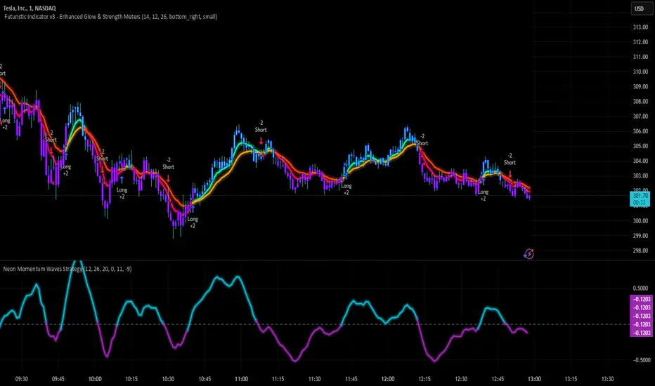
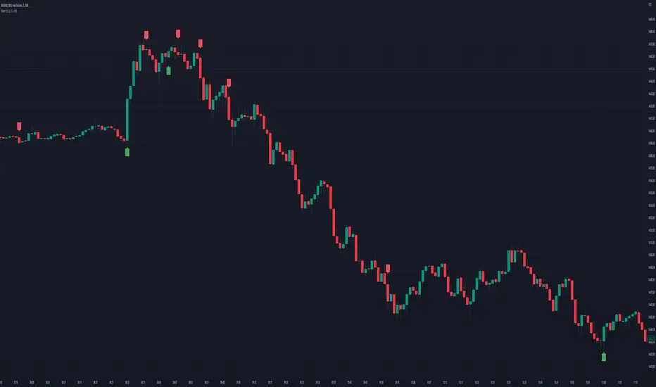
Neon Momentum Waves StrategyIntroduction
The Neon Momentum Waves Strategy is a momentum-based indicator designed to help traders visualize potential shifts in market direction. It builds upon a MACD-style calculation while incorporating an enhanced visual representation of momentum waves. This approach may assist traders in identifying areas of increasing or decreasing momentum, potentially aligning with market trends or reversals.
How It Works
This strategy is based on a modified MACD (Moving Average Convergence Divergence) method, calculating the difference between two Exponential Moving Averages (EMAs). The momentum wave represents this difference, while an additional smoothing line (signal line) helps highlight potential momentum shifts.
Key Components:
Momentum Calculation:
Uses a fast EMA (12-period) and a slow EMA (26-period) to measure short-term and long-term momentum.
A signal line (20-period EMA of the MACD difference) smooths fluctuations.
The histogram (momentum wave) represents the divergence between the MACD value and the signal line.
Interpreting Momentum Changes:
Momentum Increasing: When the histogram rises above the zero line, it may indicate strengthening upward movement.
Momentum Decreasing: When the histogram moves below the zero line, it may signal a weakening trend or downward momentum.
Potential Exhaustion Points: Users can define custom threshold levels (default: ±10) to highlight when momentum is significantly strong or weak.
Visual Enhancements:
The neon glow effect is created by layering multiple plots with decreasing opacity, enhancing the clarity of momentum shifts.
Aqua-colored waves highlight upward momentum, while purple waves represent downward momentum.
Horizontal reference lines mark the zero line and user-defined thresholds to improve interpretability.
How It Differs from Traditional Indicators
Improved Visualization: Unlike standard MACD histograms, this approach provides clearer visual cues using a neon-style wave format.
Customizable Thresholds: Rather than relying solely on MACD crossovers, users can adjust sensitivity settings to better suit their trading style.
Momentum-Based Approach: The strategy is focused on visualizing shifts in momentum strength, rather than predicting price movements.
Potential Use Cases
Momentum Trend Awareness: Helps traders identify periods where momentum appears to be strengthening or fading.
Market Structure Analysis: May complement other indicators to assess whether price action aligns with momentum changes.
Flexible Timeframe Application: Can be used across different timeframes, depending on the trader’s strategy.
Important Considerations
This strategy is purely momentum-based and does not incorporate volume, fundamental factors, or price action confirmation.
Momentum shifts do not guarantee price direction changes—they should be considered alongside broader market context.
The strategy may perform differently in trending vs. ranging markets, so adjustments in sensitivity may be needed.
Risk management is essential—traders should apply proper stop-losses and position sizing techniques in line with their risk tolerance.
Conclusion
The Neon Momentum Waves Strategy provides a visually enhanced method of tracking momentum, allowing traders to observe potential changes in market strength. While not a predictive tool, it serves as a complementary indicator that may help traders in momentum-based decision-making. As with any technical tool, it should be used as part of a broader strategy that considers multiple factors in market analysis.
在脚本中搜索"wave"
Smoothed Candle Averages- NovaTheMachineThis script utilizes a series of moving averages that the user is able to change as they see fit for their own use.
The averages plotted for the first 2 waves are the High-Low rays of the selected period of time with the chosen moving average style.
The Bias is the Heikin Ashi High-Low ray plotted over the chosen time period, while the Secondary Bias is a higher Timeframe Bias for the same period of time on a selected higher timeframe.
The visuals for each ray are able to be changed to either; lines, solid wave, or dynamic wave.
The Dynamic waves will change color according to the total dissection and utilize the Min-Max range selected as a weight for the strength of the trend. Thus providing an at-a-glance overview of the price relative to trend.
The key objective with this script is to gauge the longer term trend with the current price action, to establish patterns and determine strength of moves both away from and towards the moving average/bias.
When both waves are trending with the Bias, it can be reasoned that there is a strong trend established, when waves and Bias are mixed or trending sideways it can be reasoned there is a range forming or potential for a direction change. When price has broken the waves and biases we can reasonably assume that a new trend has been formed, using the waves and biases again to determine the strength and length of the trend.
The Table will display whether the current price is above or below each wave, and whether the price is continuing or retracing. The Signals plotted are used to help identify when price has broken a wave more swiftly.
Dow waveform analyzerDow Waveform Analyzer
1. Overview and Features of the Indicator
This indicator is a tool designed to analyze chart waveforms based on Dow Theory, identifying swing lows (support) and swing highs (resistance). It allows users to quickly and consistently determine trend direction. Compared to manual analysis, it provides more efficient and accurate results.
By using swing lows and swing highs, the indicator offers a more detailed understanding of trends than simple updates to highs and lows, aiding in the creation of effective trading strategies.
2. Identifying Wave Lows and Highs
Stock prices do not move in straight lines; instead, they rise and fall in waves. This indicator starts by identifying the wave lows and wave highs.
- Wave Low: The lowest point during a temporary price decline.
- Wave High: The highest point during a temporary price increase.
These are automatically identified using Pine Script’s built-in functions `pivotlow` and `pivothigh`.
3. Drawing the Waveform
The identified wave lows and highs are alternately connected to draw the waveform. However, there are cases where wave lows or highs occur consecutively:
- Consecutive Wave Lows: The lower low is used for drawing the waveform.
- Consecutive Wave Highs: The higher high is used for drawing the waveform.
4. Tracking Swing Lows/Highs and Trend Determination
Swing lows and swing highs are crucial markers that indicate the state of wave progression:
- Swing Low: The starting point of a wave (wave low) when the closing price exceeds the previous wave high.
- Swing High: The starting point of a wave (wave high) when the closing price falls below the previous wave low.
The changes in swing lows and swing highs as the waves progress allow for trend state determination.
5. Examples of Trend States
During an Uptrend:
- When the price surpasses a wave high, the swing low is updated, confirming the continuation of the uptrend.
End of an Uptrend:
- When the price falls below the swing low, the swing low disappears, and a swing high appears, signaling the end of the uptrend.
Sideways Movement:
- Swing lows and swing highs alternately appear, indicating a sideways trend.
Start of a Downtrend:
- When the price breaks below a wave low for the first time, the swing high is updated, confirming the start of the downtrend.
During a Downtrend:
- When the price breaks below a wave low, the swing high is updated, confirming the continuation of the downtrend.
End of a Downtrend:
- When the price surpasses a wave high, the swing high disappears, and a swing low reappears, signaling the end of the downtrend.
Restart of an Uptrend:
- When the swing low is updated, the uptrend resumes. The uptrend begins when the price surpasses a wave high, and the swing low is updated for the first time.
6. Applications
Trade Entries and Exits:
- Set stop orders for entry at the price level where a trend starts.
- Set stop orders for exit at the price level where a trend ends.
Trend Filtering:
- Use the indicator to confirm whether market conditions are suitable for entry based on the trend state. Analyze waveforms to aid trading strategies.
Guide for Drawing Trendlines:
- Utilize wave lows and highs as starting and ending points when drawing trendlines with drawing tools.
7. Parameters and Display Items
Pivot Points:
- Wave lows are marked with circles below the candlestick’s low, and wave highs are marked with circles above the candlestick’s high.
Number of Bars for Pivot Calculation:
- Specify the number of bars on either side used to identify highs (default: 2).
Waveform:
- Specify the color (default: blue) or toggle its visibility (default: visible).
Swing Lows/Highs:
- Displayed as large circles. The rightmost large circle on the chart indicates the current swing low or swing high. Historical swing points are also displayed to show the progression of state changes. Specify the color (default: green) or toggle visibility (default: visible).
1. インジケーターの概要と特徴
このインジケーターは、ダウ理論を基にチャートの波形を分析し、押し安値や戻り高値を特定するツールです。これにより、トレンドの方向を迅速かつ一貫して判断できます。手動での分析と比較して、効率的かつ精度の高い結果が得られる点が特徴です。
押し安値や戻り高値を利用することで、単純な高値・安値の更新よりも詳細にトレンドの状況を把握し、効果的な取引戦略の構築に役立ちます。
2. 波の谷と波の頂の特定
株価は直線的に動くのではなく、波を描きながら上昇や下落を繰り返します。このインジケーターは、まず波の谷と波の頂を特定するところから始まります。
波の谷: 一時的な下落の最安値
波の頂: 一時的な上昇の最高値
これらを Pine Script の内蔵関数(ピボットローとピボットハイ)を用いて自動的に特定しています。
3. 波形の描画方法
特定した波の谷と波の頂を交互に結んで波形を描画します。ただし、波の谷や頂が連続する場合があります。
波の谷が連続する場合: より低い谷を採用して波形を描く
波の頂が連続する場合: より高い頂を採用して波形を描く
4. 押し安値・戻り高値の追跡とトレンド判断
押し安値と戻り高値は、波の進行状況を示す重要な指標です。
押し安値: 終値が前回の高値を超えた際の波の谷
戻り高値: 終値が前回の安値を割り込んだ際の波の頂
波の進行に伴う押し安値・戻り高値の変化から、トレンドの状態を判断します。
5. トレンド状態の具体例
上昇トレンド中:
波の頂を株価が上抜け押し安値が更新され続けることで上昇トレンドを継続。
上昇トレンドの終了:
株価が押し安値を割ると、押し安値が消え、戻り高値が新たに出現して、上昇トレンドを終了。
横ばい状態:
押し安値と戻り高値が交互に切り替わる。
下降トレンドの開始:
波の谷を株価が下抜け戻り高値がはじめて更新されることで下降トレンド開始を確認。
下降トレンド中:
波の谷を株価が下抜け戻り高値が更新され続けることで下降トレンドを継続。
下降トレンドの終了:
株価が波の頂を超えると、戻り高値が消え、押し安値が再び出現して、下降トレンドを終了。
横ばい状態:
押し安値と戻り高値が交互に切り替わる。
上昇トレンドの再開:
押し安値が更新されることで上昇トレンドを確認。
波の頂を株価が上抜け押し安値がはじめて更新されることで上昇トレンド開始を確認。
6. 応用例
トレードのエントリーとエグジット:
トレンド発生の価格に逆指値を設定してエントリー。
トレンド終了の価格に逆指値を設定してエグジット。
トレンドフィルターとして活用:
エントリーに適したトレンド状況かを確認。波形を分析してトレード戦略の参考に。
トレンドラインを描く時の参考として活用:
波の谷と頂を描画ツールを使ってトレンドラインを描く時の起点や終点として活用。
7. パラメーターと表示項目
ピボット: 波の谷はローソク足の安値にサークルを表示、波の頂はローソク足の高値にサークルを表示。
ピボット計算用のバーの数: 高値を特定するために左右何本のローソク足を使用するかを設定(初期値: 2)。
波形: 色(初期値: 青)や表示(初期値: 表示)の指定。
押し安値・戻り高値: 大きなサークルで表示。チャートの一番右の大きなサークルが現在のもの。過去のものも状態変化の経緯を示すために表示。色(初期値: 緑)や表示(初期値: 表示)の指定。

Quarterly Sine Wave with Moving Averages - AYNETDescription
Sine Wave:
The sine wave oscillates with a frequency determined by frequency.
Its amplitude (amplitude) and vertical offset (offset) are adjustable.
Moving Averages:
Includes options for different types of moving averages:
SMA (Simple Moving Average).
EMA (Exponential Moving Average).
WMA (Weighted Moving Average).
HMA (Hull Moving Average).
The user can choose the type (ma_type) and the length (ma_length) via inputs.
Horizontal Lines:
highest_hype and lowest_hype are horizontal levels drawn at the user-specified values.
Quarter Markers:
Vertical lines and labels (Q1, Q2, etc.) are drawn at the start of each quarter.
Customization Options
Moving Average Type:
Switch between SMA, EMA, WMA, and HMA using the dropdown menu.
Sine Wave Frequency:
Adjust the number of oscillations per year.
Amplitude and Offset:
Control the height and center position of the sine wave.
Moving Average Length:
Change the length for any selected moving average.
Output
This indicator plots:
A sine wave that oscillates smoothly over the year, divided into quarters.
A customizable moving average calculated based on the chosen price (e.g., close).
Horizontal lines for the highest and lowest hype levels.
Vertical lines and labels marking the start of each quarter.
Let me know if you need additional features! 😊

WPO Modified [BackQuant]The Wave Period Oscillator (WPO), developed by Akram El Sherbini, is a sophisticated technical analysis tool that offers traders a dynamic way to interpret market cycles. Its design is inspired by the natural ebb and flow of markets, which often follow cyclical patterns driven by underlying economic, political, and psychological factors. The oscillator's unique contribution to market analysis lies in its ability to smooth out the "noise" inherent in daily price movements, thus providing a clearer view of the market's rhythmic fluctuations over time.
-----> Time Cycle Oscillators' in the IFTA Journal 2018 (page 66 - 77), as found below:
ifta.org
El Sherbini's WPO is grounded in the concept of wave period analysis, which suggests that financial markets move in waves or cycles. The oscillator translates these movements into a visual tool that oscillates above and below a central zero line. Peaks and troughs on the oscillator correspond to the crests and troughs of market price waves, providing a visual representation of the market's heartbeat.
The WPO is not merely a tool for identifying trends but also for detecting shifts in market momentum. It does this through a mathematical model that measures divergence—when the direction of the oscillator deviates from the direction of price movement. Such divergences can be precursors to potential reversals or continuations in the market, offering traders advance notice of significant changes in price direction.
Further refining its utility, the WPO incorporates methods for calculating divergence that are sensitive to the unique conditions of different markets and securities. This includes adjusting for volatility and market velocity, allowing the oscillator to provide relevant signals regardless of the market environment.
In practical terms, traders use the WPO to time their entries and exits with greater precision. When the oscillator shows a high peak or a deep trough, it can signal that a market is potentially overbought or oversold, respectively. The WPO's smoothing property ensures that these signals are not just reactionary to short-term price spikes or drops, but indicative of more substantial, sustained movements.
By providing a more measured and smoothed analysis of market cycles, the WPO helps to filter out insignificant price movements and focus on the ones that matter—those that indicate a significant wave of buying or selling pressure. This can be particularly valuable in the cryptocurrency markets, where volatility is high, and traditional indicators may struggle to provide clear signals.
For traders and analysts alike, the Wave Period Oscillator represents a convergence of technical precision and market psychology. By focusing on the periodic nature of market movements, it aligns traders with the rhythm of the markets, potentially leading to more harmonious trading decisions that are in step with the market's natural waves.
Please see the backtest here:
For more simple terms:
You can use this indicator as a the oscillator
Above 0 for long
Below 0 for short
OR
WPO MA
Above 0 for long
Below 0 for short

ABC on Recursive Zigzag [Trendoscope]There are several implementations of ABC pattern in tradingview and pine script. However, we have made this indicator to provide users additional quantifiable information along with flexibility to experiment and develop their own strategy based on the patterns.
🎲 Highlights of this indicator over other ABC implementations are:
Implementation is based on recursive multi level zigzag allows bigger as well as smaller patterns to be identified
Allows users to set their trading rules with respect to entry, target and stop ratios, experiment and build their own strategy based on the ABC pattern.
Back test summary including win ratio and risk reward will help users understand the profitability based on different settings being used.
🎲 Concept of ABC Pattern
The ABC pattern, also known as the "Corrective Wave" or "Zigzag Pattern," is a fundamental concept in Elliott Wave Theory, which is widely used in technical analysis to identify and predict price movements in financial markets.
The ABC pattern is a three-wave corrective pattern that typically occurs within the context of a larger impulse or trending wave. It consists of two smaller waves in the opposite direction (A and C) separated by a corrective wave (B). These waves are labeled alphabetically and represent price movements.
Wave A (Impulse Wave): Wave A is the first leg of the ABC pattern and is characterized by a strong price move in the opposite direction of the prevailing trend. It is often driven by a fundamental or sentiment-driven event that temporarily disrupts the trend.
Wave B (Corrective Wave): Wave B is the corrective wave that follows Wave A. It represents a partial retracement of Wave A's price movement. Wave B can take various forms, such as a simple correction or a complex correction (e.g., a triangle or a flat correction). It typically doesn't retrace the entire length of Wave A.
Wave C (Impulse Wave): Wave C is the final leg of the ABC pattern and is characterized by a strong price move in the same direction as the prevailing trend. It often surpasses the starting point of Wave A and confirms the resumption of the larger trend.
🎲 Indicator Components
Upon loading the indicator on the chart, we can observe the following components on the chart.
Pattern Drawings is the graphical representation of present patterns. Please note that it is not necessary for patterns to be there on the chart all the time. Patterns will appear on the chart when price makes the patterns.
Trade Box is the box representing trade signals of the pattern. These trade levels are generated based on the user settings.
Summary Table is the back test summary containing details of historical pattern performance including Win Ratio and Risk Reward.
🎲 Indicator Settings
Details of each user settings are provided in the tooltips. Below is the snapshot of it.
🎲 Alerts
Basic level of alerts are built in the script using alert function to highlight the following conditions:
New ABC Pattern
Updates to existing Pattern
Both conditions will alert simple text messages. There is not much customization provided as part of this indicator. We will consider providing more options in future versions based on the interest and demand shown by users.

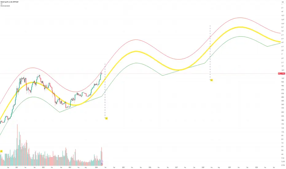
Bitcoin Market Cap wave model weeklyThis Bitcoin Market Cap wave model indicator is rooted in the foundation of my previously developed tool, the : Bitcoin wave model
To derive the Total Market Cap from the Bitcoin wave price model, I employed a straightforward estimation for the Total Market Supply (TMS). This estimation relies on the formula:
TMS <= (1 - 2^(-h)) for any h.This equation holds true for any value of h, which will be elaborated upon shortly. It is important to note that this inequality becomes the equality at the dates of halvings, diverging only slightly during other periods.
Bitcoin wave model is based on the logarithmic regression model and the sinusoidal waves, induced by the halving events.
This chart presents the outcome of an in-depth analysis of the complete set of Bitcoin price data available from October 2009 to August 2023.
The central concept is that the logarithm of the Bitcoin price closely adheres to the logarithmic regression model. If we plot the logarithm of the price against the logarithm of time, it forms a nearly straight line.
The parameters of this model are provided in the script as follows: log(BTCUSD) = 1.48 + 5.44log(h).
The secondary concept involves employing the inherent time unit of Bitcoin instead of days:
'h' denotes a slightly adjusted time measurement intrinsic to the Bitcoin blockchain. It can be approximated as (days since the genesis block) * 0.0007. Precisely, 'h' is defined as follows: h = 0 at the genesis block, h = 1 at the first halving block, and so forth. In general, h = block height / 210,000.
Adjustments are made to account for variations in block creation time.
The third concept revolves around investigating halving waves triggered by supply shock events resulting from the halvings. These halvings occur at regular intervals in Bitcoin's native time 'h'. All halvings transpire when 'h' is an integer. These events induce waves with intervals denoted as h = 1.
Consequently, we can model these waves using a sin(2pih - a) function. The parameter determining the time shift is assessed as 'a = 0.4', aligning with earlier expectations for halving events and their subsequent outcomes.
The fourth concept introduces the notion that the waves gradually diminish in amplitude over the progression of "time h," diminishing at a rate of 0.7^h.
Lastly, we can create bands around the modeled sinusoidal waves. The upper band is derived by multiplying the sine wave by a factor of 3.1*(1-0.16)^h, while the lower band is obtained by dividing the sine wave by the same factor, 3.1*(1-0.16)^h.
The current bandwidth is 2.5x. That means that the upper band is 2.5 times the lower band. These bands are forming an exceptionally narrow predictive channel for Bitcoin. Consequently, a highly accurate estimation of the peak of the next cycle can be derived.
The prediction indicates that the zenith past the fourth halving, expected around the summer of 2025, could result in Total Bitcoin Market Cap ranging between 4B and 5B USD.
The projections to the future works well only for weekly timeframe.
Enjoy the mathematical insights!
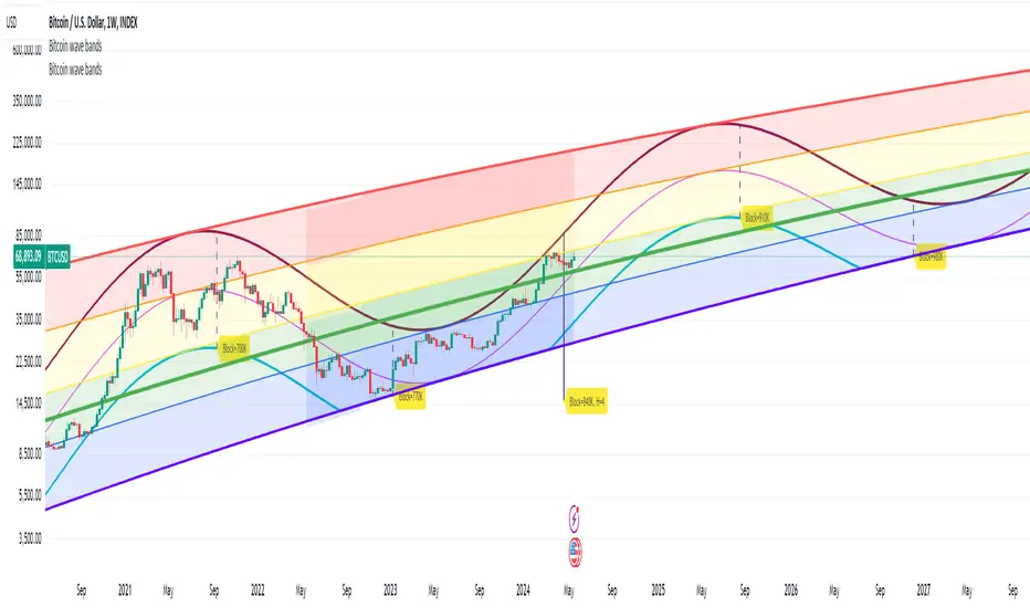
Bitcoin wave modelBitcoin wave model is based on the logarithmic regression model and the sinusoidal waves, induced by the halving events.
This chart presents the outcome of an in-depth analysis of the complete set of Bitcoin price data available from October 2009 to August 2023.
The central concept is that the logarithm of the Bitcoin price closely adheres to the logarithmic regression model. If we plot the logarithm of the price against the logarithm of time, it forms a nearly straight line.
The parameters of this model are provided in the script as follows: log (BTCUSD) = 1.48 + 5.44log(h).
The secondary concept involves employing the inherent time unit of Bitcoin instead of days:
'h' denotes a slightly adjusted time measurement intrinsic to the Bitcoin blockchain. It can be approximated as (days since the genesis block) * 0.0007. Precisely, 'h' is defined as follows: h = 0 at the genesis block, h = 1 at the first halving block, and so forth. In general, h = block height / 210,000.
Adjustments are made to account for variations in block creation time.
The third concept revolves around investigating halving waves triggered by supply shock events resulting from the halvings. These halvings occur at regular intervals in Bitcoin's native time 'h'. All halvings transpire when 'h' is an integer. These events induce waves with intervals denoted as h = 1.
Consequently, we can model these waves using a sin(2pih - a) function. The parameter determining the time shift is assessed as 'a = 0.4', aligning with earlier expectations for halving events and their subsequent outcomes.
The fourth concept introduces the notion that the waves gradually diminish in amplitude over the progression of "time h," diminishing at a rate of 0.7^h.
Lastly, we can create bands around the modeled sinusoidal waves. The upper band is derived by multiplying the sine wave by a factor of 3.1*(1-0.16)^h, while the lower band is obtained by dividing the sine wave by the same factor, 3.1*(1-0.16)^h.
The current bandwidth is 2.5x. That means that the upper band is 2.5 times the lower band. These bands are forming an exceptionally narrow predictive channel for Bitcoin. Consequently, a highly accurate estimation of the peak of the next cycle can be derived.
The prediction indicates that the zenith past the fourth halving, expected around the summer of 2025, could result in prices ranging between 200,000 and 240,000 USD.
Enjoy the mathematical insights!
Market SniperThis Pine Script is a simplified trading algorithm designed to detect and signal potential buying and selling points based on the WaveTrend Oscillator and the volume traded.
Inputs and Setup:
The script initiates by defining key parameters: 'Wave Channel Length' (n1) set at 9 and 'Wave Average Length' (n2) set at 12. It also establishes a 'Volume Multiplier' (set at 2), and a 'Lookback Period' for volume calculation (set at 60 minutes). These values can be customized according to user preferences.
WaveTrend Oscillator Calculation:
It then calculates the WaveTrend Oscillator. The WaveTrend Oscillator is a momentum-based indicator that determines trend direction and potential reversal points. This is accomplished by applying an exponential moving average (EMA) and a simple moving average (SMA) to the average price data.
Volume Average Calculation:
Simultaneously, the script calculates the simple moving average of the volume over the defined 'Lookback Period'.
Buy and Sell Signals Definition:
The core of the trading signals lies in the crossing of the two lines of the WaveTrend Oscillator (wt1 and wt2) and whether the volume is higher than a certain threshold (defined by the 'Volume Multiplier' times the average volume). Specifically:
A 'Buy' signal is defined when the wt1 line crosses up the wt2 line and the volume is greater than the 'Volume Multiplier' times the average volume.
Conversely, a 'Sell' signal is defined when the wt1 line crosses down the wt2 line and the volume is greater than the 'Volume Multiplier' times the average volume.
Signal Plotting and Alert Creation:
Each time a 'Buy' or 'Sell' condition is met, the script plots a corresponding label directly on the price chart: a 'Buy' label below the bars for buy signals, and a 'Sell' label above the bars for sell signals. Additionally, it sets alerts based on these 'Buy' and 'Sell' signals with corresponding messages.
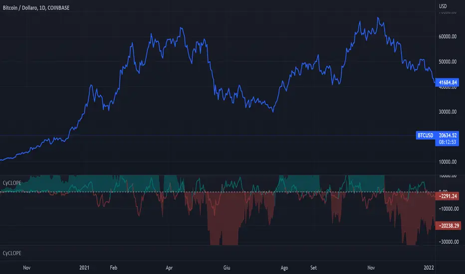
CyCLOPECyCLOPE - CYCLe OPErator
by Antonio Pace 2022
All right reserved
The script uses time series decomposition tecniques for decompose the price signal into 10 harmonics waves of increasing
period and wavelength, the sum of which is the signal itself, to eliminate background noise and show a cleaner signal.
Also divides the high frequencies (secondary, short period trend) from the primary trend (long period trend),
which is composed of low frequencies, and show both separately.
Find highs and lows and indicate possible trend reversals, and favorable entry or exit points.
T0 is the basic harmonic with period 8 Time Unit (TU) of the current timeframe.
T1 has a double period compared to T0, T2 has a double period compared to T1 and so on.
The script composes the primary trend by adding the First 5 harmonics of the longer period (T7 + T6 + T5 + T4 + T3), therefore of low frequency.
This eliminates the noise (short-term retracements) from the main trend.
Similarly, it reconstructs the secondary trend (a possible retracement of a primary trend) by adding the two harmonics with the high frequency (T2 + T1)
T0 the harmonic with highest frequency it is too noisy for this TimeFrame and is left out.
The script then identifies the maximums and minimums of the primary trend and the secondary trend, indicating possible trend reversal points or favorable entry points in a continuing trend.
The script finds the maxima and minima of the reconstructed signal so as to have as little noise as possible.
The reconstructed signal is shown on the screen. The blue line for the long term trend and the orange line for the short time trend.
If the cloud changes from red to green, it means that a local minimum has formed on the main tred, we are in the presence of a possible bullish inversion.
If the cloud turns from green to red then a local high has formed, a bearish trend reversal may have started.
The line on the cloud represents the subtrend instead.
If the line goes from green to red it has formed a maximum and if it goes from red to green it has formed a minimum.
For instance:
If the line is red and the cloud becomes red we are in the presence of a possible inversion and the beginning of a bearish trend.
I exit the long position and into the short position.
Similarly If the cloud is red and the line is green it means that I have a rising subtrend in a bearish dominate trend.
If the line turns red I have a bearish entry point.
If the cloud turns green the low of the subtrend has also become a low of the main trend, a bullish trend has started.
The script is designed to run on a daily timeframe, but it should work on any timeframe provided there are enough Time Units (1024 TU) in the past.
Minimum usable timeframe: 8h, at shorter timeframes the signal becomes indistinguishable from noise.
when the main trend and the sub-trend have the same magnitude, that is, the line and the cloud have the same size, but different color the noise prevails,
there is no valid information.
Wait for them to become the same color to enter the market again.
Once you have chosen the timeframe and asset on which to operate, select the harmonics to compose the main trend and those to compose the secondary trend
so that the indicator matches as much as possible with the real results.
Looking for the right balance between signal and noise and then continuing to use these settings, for this specific timeframe.
if you don't want have both Long Term and Short Trend trend on screen you can hide the short therm and add is harmonic to LongTime trend
in these case gren cloud indicate long and red color indicate short.
VERY IMPORTANT!
THE LONG TERM TREND DOMINATE OVER THE SHORT TERM TREND EXCEPT WHERE BOTH HAVE SAME MAGNITUDE.
The short term trend describe price retracemet over long term trend,
enter to market only when both have the same color.
Use short therm trend to find maximum or minimum of retracement.
FIND AND USE THE MINIMUM NUMBER OF WAVE PER TREND, THE RISK IS OVER FITTING THE PRICE LINE AND CREATE CONFUSION.
THE SCRIPT WORK BEST FOR DAILY TIMEFRAME AND COME CONFIGURED FOR THIS.
Spread DifferentialThe Spread Differential tries to measure the speed of the market in any given direction. The histogram plots levels above or below zero in a sequence of Humps and Waves. Humps are repetitions of the previous trend before dropping to or near 0 whilst Waves are similar to Humps but the histogram must drop to or near 0 prior to forming another wave. You might notice that in no trend does the indicator ever form more than 2 waves. The indicator should be used in conjunction with the MA's selected in the panel to identify possible points of failure.

WaveTecs StrategyWelcome to the Backtesting version of "WaveTecs Strategy", the indicator itself is an invite-only script called "WaveTecs Indicator" on TradingView.
WaveTecs Strategy
WaveTecs is a Strategy that combines Wave Trend Oscillator and verifies wave momentum by using RSI and Stochastic Oscillator Values.
What is Wave Trend?
One of the most effective indicators in identifying swings is the Wave Trend indicator. Wave Trend plots waves using highs and lows between an upper band and a lower band. It looks for the opening and closing of a new wave trend movement as well as overbought and oversold areas.
How does this modified strategy work?
By using RSI and Stochastic values we are able to verify Wave inflection points to determine if there is a suitable amount of momentum to ride the swing and make profitable trades. Positions are taken or closed based on the rising or falling momentum.
Each value input can be adjusted to best suit the type of market you are trading in. By using the strategy we can optimize these value inputs to yield greater net profits. I have found the RSI and Stochastic values hugely impact entries and exits regarding trades.
For Long conditions:
- RSI & Stochastic needs to be increasing and moving out of oversold conditions to show positive momentum.
- Falling momentum results in a sell signal. I have found RSI less than 65 to be sufficient in most markets however this can be adjusted at any time to yield different results depending on your comfort level.
For Short conditions:
- RSI & Stochastic needs to be decreasing and moving out of overbought conditions to show negative momentum.
Generally, Wave Trend Strategies only take trades that are outside of the bands. This strategy allows trades inside and outside of the bands, which can be selected under the input section title "Aggressive Trading". Trading in this mode is more frequent as signals are often. Due to volatility in crypto markets, I have defaulted the source for Wave Trend waves to be Open/High/Low/Close Average which yielded great results. High/Low/Close average works very well for all other securities, and can easily be adjusted through the drop-down menu inside the inputs.
Works for all types of markets. Parameters can be adjusted but not required as indicator values are standard in the industry.
The default parameters are set to those typically used in the markets currently. However, I have found that if you adjust you to adjust the parameters based on your asset and time frame desired you will yield different results.
----------------
For example:
----------------
ETHUSDT - 4 HR, results are shown below
Wave Trend Parameters:
Aggressive Trading: Yes
Channel Length: 12
Average Length: 24
Overbought Top: 90
Overbought Bottom: 75
Oversold Bottom: -90
Oversold Top: -55
Source: hlc3
Strategy Type:
Trade Direction: Long Only
Stochastic Inputs:
Stoch Length: 18
Smoother %K: 5
Moving Average %K: 4
%K Lower Limit: 21
%K Upper Limit: 80
%K Crossunder Sell: 80
Relative Strength Index Inputs:
RSI Lower Limit: 30
RSI Upper Limit: 70
RSI Sell Value: 68
==================
WaveTecs Features
==================
Profitable Trading Strategy;
Aggressive Trading feature for more trades, with earlier entries and exits;
Customizable inputs to fine-tune your trades;
Buy & Sell Alerts (Indicator Only);
Overlay indicator only to show alerts, WaveTecs Strategy needed to see Wave Trend;
Bot Integration through webhooks;
Two different strategy modes: Long Trades Only or Long & Short Trades
Adding new features & updates whenever possible.
Add both WaveTecs Indicator and WaveTecs Strategy to your chart. WaveTecs Indicator only plots Buy & Sell Alerts, whereas WaveTecs Strategy lets you see what the strategy is doing.

ProProfits LongStrategy made ready for automated trading based on Wavetrend/VWAP/RSI.
Whenever a 18 minute timeframe wave reaches below -60 is followed by a 3 minute timeframe VWAP cross up, a long signal will be given.
Once an RSI cross on the 10 minute timeframe above 60 is followed by a red dot on the momentum waves on the 1 minute timeframe, a Take Profit signal will be given.
The timeframes are adjustable in the settings interface, so this automated strategy can be used with any timeframe combination for the Wavetrend/VWAP/RSI.
Always make sure to view the chart from the lowest timeframe you're using.

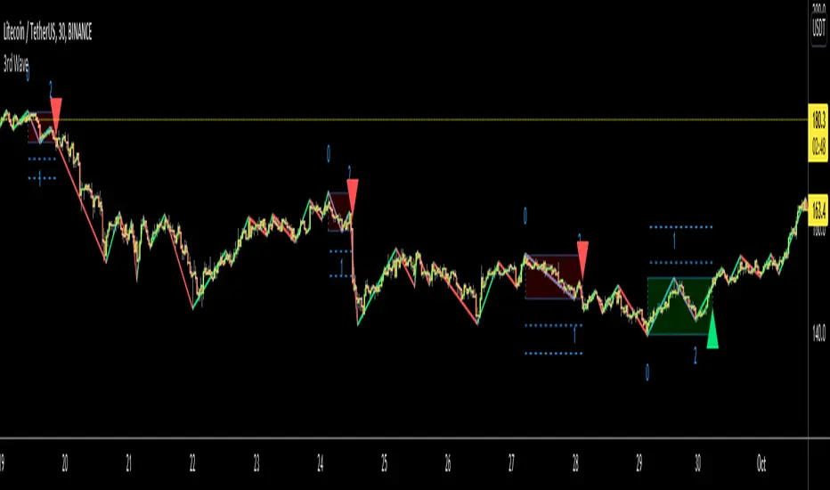
3rd WaveHello All,
In Elliott Wave Theory, 3rd wave is not the shortest one in the waves 1/3/5 and it's usually longest one. so if we can catch it then we may get good opportunities to trade. This script finds 3rd wave experimentally. it can be also the 3rd waves in the waves 1, 3, 5, A and C. the 3rd wave should have greater volume than other waves, the script can check its volume and compare with the volumes of the waves 1 and 2 optionally.
Pine Team released Pine version 5! This script was developed in v5 and it uses Library feature of Pine v5 for the zigzag functions. This script is also an example for the Pine developers who learn Pine v5 and Libraries.
Options:
Zigzag Period: is the length that is used to calculate highest/lowest and the zigzag waves
Min/Max Retracements: is the retracement rates to check the wave 2 according to wave 1. for example; if min/max values are 0.500-0.618 then wave 2 must be minimum 0.500 of wave 1 and maximum 0.618 of wave 1.
Check Volume Support: is an option to compare the volumes of1. 2. and . waves. if you enable this option then the script checks their volume and 3rd wave volume must be greater then 1 and 2
there are 4 options for the targets. you can enable/disable and change their levels. targets are calculated using length of wave 1.
Options to show breakout zone, zigzag, wave 1 and 2.
and some options for the colors.
The Library that is used in this script:
P.S. This is an experimental work and can be improved. So do not hesitate to drop your comments under the script ;)
Enjoy!
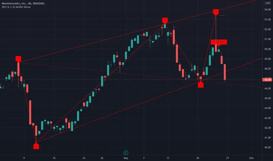
[BETA] Wolfe WaveThis script will automatically plot Wolfe Waves. Entry candles are labeled "Entry." This script is in beta, so there are some limitations as follows:
- Currently only plots BULLISH Wolfe Waves (bearish to come in a future update)
- Only shows Wolfe Waves that are within the last 100-150 bars
- Only shows one Wolfe Wave at a time
- Will delete the Wolfe Wave once wave 1 is more than 100-150 bars ago. You can use the drawing tools to draw over the wave to save it forever.
MTF Wave Stochastic RSI [Cryptoheat]MTF Wave Stochastic RSI is a multiple time frame Stochastic RSI, based on 3 different timeframes, layered on top of each other. This is a very useful tool when used to confirm and identify Elliott Waves and sub-waves at once.
Each of the three curves is based on a different time frame. While the blue (K2) curve is the current time frame, the gray (K1) is of a faster time frame which is roughly around a third of the time and the green (K3) is of a slower time frame, roughly around 3 times the current time frame. The gray and green curves are based on specific settings that were back-tested and proved more efficient.
Reasoning behind this indicator is that although the normal Stochastic RSI can show divergences more sensitively and faster than the normal RSI indicator, it cannot do so while showing a larger duration backwards in an accurate way for comparisons. It can also not show wave structures and substructures, but rather a top or bottom reversal regardless of the wave structure hierarchy and wave strength. However when several time frames are combined in one indicator, they can reveal much more information about the chart as they can show larger durations next to smaller ones. Therefore they can be used as a confirmation and helper tool to identify Waves and Sub-waves.
This can be done, by looking first at the green curve (slowest RSI) and identifying full moves. A full move is a move from being oversold to overbought and back to being oversold again. A move can be the opposite as well. By identifying the beginning and end of a move of the larger time frame stochastic RSI this can help you see the two waves in each move. One wave up and one wave down. The peak of that wave can be seen either at the highest point of the in-between peak of the green curve or by one of the smaller time frame stochastic RSI tops when the green one is diverging. A look at the price action and application of Elliott Wave knowledge is mandatory, as this indicator is mainly a confirmation tool.
By back-testing it you can see that the larger time frame Stochastic RSI can show you full impulse and corrective waves most of the times, while the lower time frame stochastic RSI should be viewed as potential sub-waves of that main wave structure. Also noticeable are the divergences that can be seen often on the larger time frame Stochastic RSI..
Please note that this tool is not recommended to be used alone as like many indicators, this is a confirmation tool that can help in identifying rather than predicting…
Also for best results Elliot Wave knowledge is recommended…
I prefer to use this indicator along with a normal Stochastic RSI on top of it so I can always see which of the three curves is of the current time frame, making it easier to understand the chart. I also prefer using the normal RSI and MACD with it…

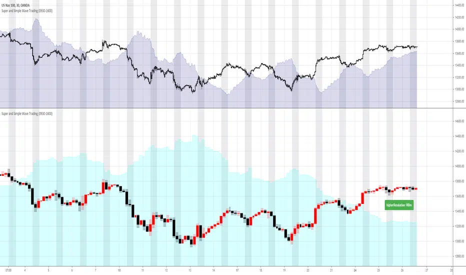
Super and Simple Wave Trading
According to Dow theory, market has three movements, main movement, medium swing and short swing.
Dow theory is very easy to understand with multiple time frame, and probably we can say real market has more than three movements. For example, every time frame, whether it’s 1min, 5 min 30min or Day, Week, Month, has its own ups and downs, like waves in the ocean.
“Super and Simple Wave Trading” presents underlying reverse “price waves” in each time frame. With easy and simple plot, one can intuitively see when the price is above the ocean or under the water. This advanced algorithm is purely rely on price movement and it targets to filter out most noises with super fast response to the price movement.
Besides plotting current resolution wave, “Super and Simple Wave Trading” also plots higher resolution bar and higher resolution wave under current resolution. For example, if current chart resolution is 1min, this indicator can plot 1min wave and 5min bar and wave.
When use this indicator, recommend plotting 2 panes on your screen, upper pane is current resolution candles with current resolution wave, the below pane is higher resolution bar and wave. So one can always get a very clear picture that how price is moving under different time frame. Recommend time frame chain in this indicator is 1m-5m-30m-180m-D-W.
The wave(shaded color area) is plotted under light(white) background, black background won’t show clearly
Some trading suggestions:
While having a whole picture of higher or even higher resolution price wave, always focus on your comfortable current time frame, surf on it. Whether it’s stop loss or taking profit, it’s happening on current wave.
Do not over trading is still a golden rule. Especially in a ranging market, like after hours stock market, the range is so tight that trading is not profitable. Although with this indicator, the loss is always minimal, however, remember the saying: “death by a thousand paper cuts”
Stop loss is always strongly recommended. “Super and Simple Wave Trading” will directly show you the entry and when to exit, however, stop loss is always the last line of defense to protect you.
Elliott Wave PivotsThis script is designed to catch high timeframe Elliott Wave Pivots. It will label in hindsight and is therefore NOT intended for any entries of any kind. Both labels and lines are drawn once confirmation comes that a wave has completed. You can set alerts to be informed of the completion of that wave.
There are are four degrees of waves recognized. The wave degrees are named minute, minor, major and primary. These do not necessarily reflect an exact timeframe based on the name, rather it reflects the degree of the waves compared to the next. Minute being the lowest degree shown and primary being the highest.
In essence, a minute wave on the indicator will reflect a daily pivot. Each degree higher reflects a higher timeframe pivot that can be used to form an Elliott Wave count. The minute waves can be a bit noisy. View the higher timeframe waves to see structures before narrowing down to the lower timeframes.
To my knowledge, this indicator is unique in it's mission and execution. With that in mind, there can definitely be bugs. Feel free to reach out to me with feedback.

Market Waves Omega All-In-One IndicatorMarket Waves Omega Indicator consists of 5 separate indicators wrapped into one display area, which makes it easy to see all the information in one go.
Momentum waves
The main area of Market Waves Omega Indicator are the momentum waves, this shows bear and bull divergence as shown on the diagram below:
The idea here is that you are looking for a big momentum wave, followed by a smaller trigger wave. At that point, the price will move accordingly. Note the lighter blue peaks, when these light blue peaks cut in, it’s the end of that trend and the actual trigger point. The wave is not complete until the close of that candle.
The best way to use Market Waves Omega Indicator is to work on the higher time frames first, to get a bigger picture of where the market is moving. So on the daily, if it looks bullish, then you should be looking for bull triggers on the smaller time frames to trade.
VWAP
The next indicator that needs to be considered is the VWAP, shown on the diagram above in yellow. VWAP is volume-weighted average price and shows where the volume is on a positive or negative position. This is typically used by traders on the smaller time frames but gives the user an idea of where the main buyers or sellers are at that point.
RSI
Another indicator within Market Waves Omega Indicator is the RSI, which every trader uses to get an idea of whether the price is overbought or oversold:
Money Flow
The Money Flow Index (MFI) is a technical oscillator that uses price and volume for identifying overbought or oversold conditions in an asset. It can also be used to spot divergences which warn of a trend change in price:
Stoch RSI
Stochastic RSI oscillator was developed to take advantage of both momentum indicators in order to create a more sensitive indicator that is attuned to a specific security's historical performance rather than a generalized analysis of price change.
Green Dots
One of the biggest indicators use to trade off the Market Waves Omega Indicator are green dots :
The green dots are showing when the RSI is super low and therefore should spark some buying pressure due to market being oversold.
One great thing about Market Waves Omega Indicator is that all the data is in one place, and you can see a lot of information, making it easier to scroll through the different time frames at speed and understand the general market position.

Hashem Helper -TwoHashem Helper Two
This Indicator contains many indicators and mixture of them.
RSI+MFI = Green and Red Cloud (Above 0 is Green, Below 0 is Red)
StochRSI (K = Aqua, D = Purple)
WaveTrend (Not shown directly but used in the bigger Aqua and Purple Cloud Waves)
VWAP (Volume-Weighted Average Price) = Yellow Cloud Around 0 Line.
The Blue WaveCloud ( which is a Fast Momentum ) and the Purple WaveCloud ( which is Slow Momentum ) is the result of the mixture.
Basically when Fast Wave crosses the Slow Wave, It's a setup and the price momentum is probably going to follow the wave as a "Probable Signal". (when cross happen, a Red or Green Circle is plotted on the 60 or -60 Line)
The idea here is that you are looking for a big momentum wave( Purple Cloud ), followed by a smaller trigger wave ( Blue Cloud ).
In addition the Divergences on StochRSI and RSI and WaveCloud are analyzed. This indicator shows Normal Divergences (R) and Hidden Divergences (H) on itself. But the point is YOU with your TA should must that. So it's NOT an "Absolute Signal". Human eye is needed to interpret the false and true signals.
Divergences on StochRSI and WaveClouds are shown with actual Green/Red Lines (R/H) and on RSI are shown with Shapes on the its line.
Bullish Divergence = Aqua Triangle
Hidden Bullish Divergence = Aqua Circle
Bearish Divergence = Purple Triangle
Hidden Bearish Divergence = Purple Circle
When you see these shapes on the RSI , it tells you: Hey, Watch the RSI and Price, A Divergence could be there but it's not confirmed. you need to confirm it with your own TA.
Note that this is a Helper Indicator, NOT a Short/Long Signal Indicator. This should be used alongside with your TA.

MarCipher | Buy/sell signals including VWAP, RSI and Stoch RSI.//Based on many different scripts
The script can be used on every timeframe.
How to use it?
- First check whether the bar (below the waves) is green (which means there is a lot of buying recently), in that case we are looking for a long option. If it is red (ofcourse) we are looking for a short option.
- The green dots below the blue waves represent a buy signal and if the blue wave is oversold (below 60) the green dot is considered a BIG buy signal (more probability of a good trade). The big buy signals are also plotted on the horizontal bar. So a green dot on the bar while the bar is also green represents a buy signal. You can exit the long when a red dot appears in the blue wave above the zero line.
- Another way to use it is to look for divergence of the blue waves. When a blue wave below the zero line appears and then a new wave (some time later) appears which is smaller than the previous, this is considered a good entry point for a long.
- The yellow represents the VWAP (which can be used as a confirmation (crossing up means buying, crossing down means selling)
The RSI is also added (yellow line) oscillating between 100 and 200 (is moved up by 100).
The Stoch RSI is also added (blue and red lines) on the same interval as the RSI.
For improvements, ideas or questions, please don't hesitate to leave a message.
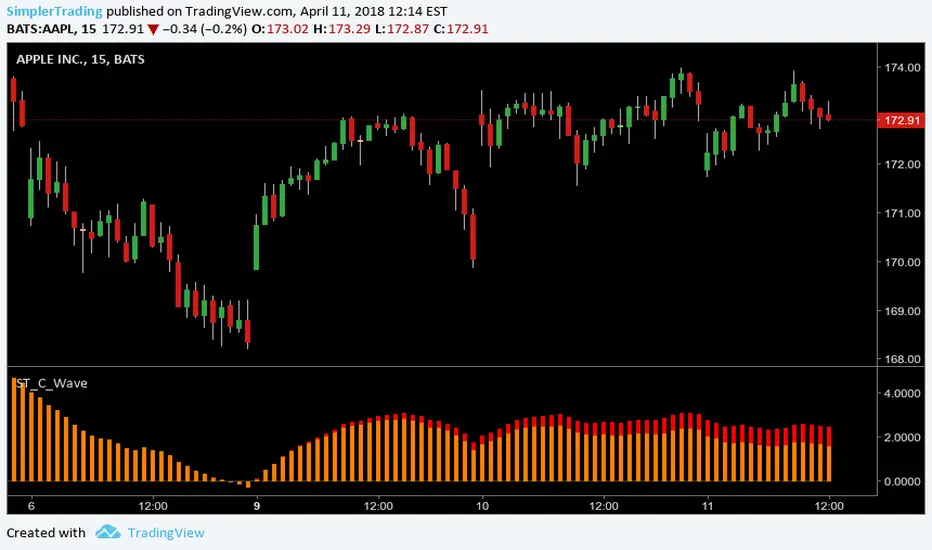
Simpler Trading C WaveABC Waves Indicator
The ABC Waves were built by a third party developer from an algorithm comprised of various moving averages and oscillators. The idea behind the waves is to visualize the overall strength and direction of a given market across multiple time frames.
There are 3 separate waves that make up the ABC Waves. The “A Wave” measures short term relative strength and direction of a market, the “C Wave” measures longer term strength and the “B Wave” plots the same for a medium time period.
www.simplertrading.com
Simpler Trading B WaveABC Waves Indicator
The ABC Waves were built by a third party developer from an algorithm comprised of various moving averages and oscillators. The idea behind the waves is to visualize the overall strength and direction of a given market across multiple time frames.
There are 3 separate waves that make up the ABC Waves. The “A Wave” measures short term relative strength and direction of a market, the “C Wave” measures longer term strength and the “B Wave” plots the same for a medium time period.
www.simplertrading.com
