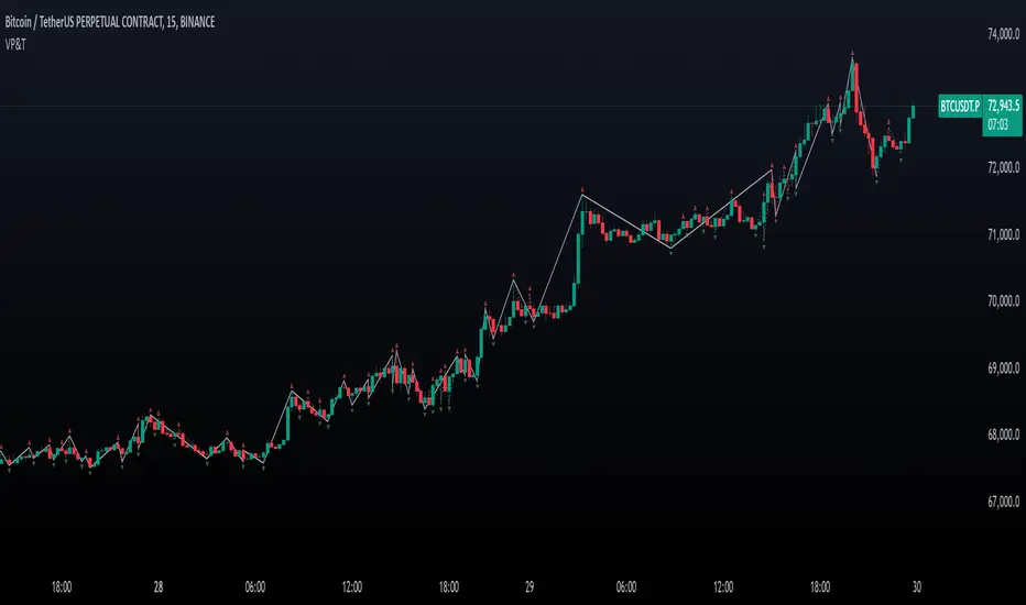
Valid Pullbacks and Trend by kpt. GonzoThis script helps identify valid pullbacks. Based on the marked pullbacks, it can draw both internal and external structure trendlines.
A pullback is marked with a small triangle above or below the candle that created the local high or low.
A new local high is marked with a red triangle above the candle if at least one subsequent candle has a low lower than the low of the candle that created the new local high.
A new local low is marked with a green triangle below the candle if at least one subsequent candle has a high higher than the high of the candle that created the new local low.
Based on the marked local highs and lows, the internal structure trendline is created by simply connecting all highs and lows with a line.
The external structure is drawn in a similar way, but only highs and lows that have broken the previous structure are connected. This helps focus on important pivots and better understand the market structure.
在脚本中搜索"TRENDLINES"
Farley's Accumulation-Distribution Accelerator (ADA)Farley's ADA (From The Master Swing Trader)
What it is :
ADA is designed to track volume oscillations in the market and reduce the impact of shock events.
It observes the supply-demand dynamics within the market, which can trigger natural levels of price reversals.
How It Works
Volume and Price Relationship: ADA measures the lag between price and volume movements. It highlights when volume leads or lags behind price changes, helping traders identify potential reversals or trends.
Signal Generation: ADA can generate faster and cleaner signals compared to traditional indicators like On-Balance Volume (OBV).
Usage
Support and Resistance: ADA formations can help identify support and resistance levels and trendlines.
detect natural levels where price reversals might occur.
Trend Identification: Look for significant divergences between ADA and price action to identify potential trend reversals.
Volume Analysis: Use ADA to anticipate pauses in price movements when volume leads, and expect dynamic trends when ADA significantly moves ahead of price action.

[DarkTrader] Intersection Level & PredictionLinear Regression Function Reference by @RicardoSantos :
The Intersection Level Calculation process identifies critical price levels where significant market reactions are expected. It starts by analyzing historical price action and technical indicators to pinpoint key support and resistance levels.
Price Forecast Min represents the predicted lowest price level that the asset might reach, while Price Forecast Max indicates the anticipated highest price level. These projections are calculated using statistical methods and historical price patterns, allowing traders to anticipate potential support and resistance zones. By providing these forecasts, traders can better manage their risk and set more informed entry and exit points based on projected price movements.
Example Of Prediction (Before & After)
Predicting Future Price Movements :
Once the intersection levels are identified, the indicator uses various predictive models to forecast what price might do next when it approaches these levels. Here’s a breakdown of how it achieves this :
Price Reaction Analysis: The indicator assesses how price has historically reacted to similar intersection levels. For instance, if price has reversed from a certain support level multiple times, the indicator can predict a potential reversal or bounce when price approaches that level again.
Trend Continuation or Reversal: It examines the strength of the current trend by analyzing momentum indicators, volume, and the angle or direction of trendlines. Based on this, it can predict whether price is likely to break through an intersection level, signaling trend continuation, or bounce off it, indicating a potential reversal.
Confluence of Factors: The prediction mechanism becomes more accurate when multiple factors converge at the same intersection level. For example, if a trendline, moving average, and support zone all intersect at the same price point, the indicator predicts a stronger likelihood of significant price movement.
Market Volatility and Momentum: The indicator also considers current market volatility and momentum in its prediction. For example, if price approaches an intersection level with high momentum, it might predict a breakout, whereas low momentum might suggest consolidation or a weaker price reaction.
In this indicator, I utilize Linear Regression to forecast price movements by analyzing historical data trends. Linear Regression involves fitting a straight line to past price data, enabling me to model and project future price levels based on identified trends. This method calculates a trend line that best represents the historical price behavior, providing a foundation for predicting future price points. By extending this trend line, I can estimate where prices might move, incorporating a range to account for potential deviations. This approach helps in identifying both minimum and maximum forecasted prices, offering valuable insights into potential market directions.

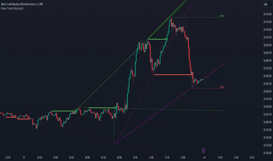
Power Trends [UkutaLabs]█ OVERVIEW
The Power Trends Indicator is a versatile trading toolkit that offers unique insight into key price levels in the market. This script uses currently relevant price-action information to automatically detect pivot levels and use them to create powerful trendlines.
The aim of this script is to improve the trading experience of users by offering a versatile toolkit that can be used in a wide variety of trading strategies to help simplify the complexities of the market.
█ USAGE
The Power Trends Indicator will automatically identify pivot points in real-time using recent price-action information to ensure that all points being identified are relevant. Using these pivot points, the script then draws powerful trend lines that can be used as levels of resistance and support.
To ensure that only the most relevant information is being presented, only the most recent trend lines will be displayed on the user’s charts. As new trend lines are being drawn, older trend lines will become thinner so that traders can identify the most relevant lines at a glance.
The price of the most recent high and low pivot points will also be displayed on the chart and can be used as further levels of resistance and support.
When a recent pivot level is broken, it will be identified as a Break of Structure. This signifies that there may have been a change in market strength.
The Power Trends Indicator also supports multiple time frame mapping, allowing you to mirror the trend lines that would be drawn on higher time frame charts onto lower time frame charts. This feature allows traders to be aware of the market structure of multiple charts at a glance from a single chart.
When mirroring some higher time frame trend lines, lines may appear to not align properly with current time frame bars. This is done intentionally to ensure lines are being drawn accurately to their position on the higher time frame charts.
█ SETTINGS
Current Time Frame
• Display (On/Off): Determines whether or not trend lines are drawn from the current time frame.
• High Color: Determines the color of trend lines drawn on high pivots.
• Low Color: Determines the color of trend lines drawn on low pivots.
5 Minute (Higher Time Frame)
• Display (On/Off): Determines whether or not trend lines are drawn from the 5 minute higher time frame.
• High Color: Determines the color of trend lines drawn on high pivots from the 5 minute higher time frame.
• Low Color: Determines the color of trend lines drawn on low pivots from the 5 minute higher time frame.
15 Minute (Higher Time Frame)
• Display (On/Off): Determines whether or not trend lines are drawn from the 15 minute higher time frame.
• High Color: Determines the color of trend lines drawn on high pivots from the 15 minute higher time frame.
• Low Color: Determines the color of trend lines drawn on low pivots from the 15 minute higher time frame.
30 Minute (Higher Time Frame)
• Display (On/Off): Determines whether or not trend lines are drawn from the 30 minute higher time frame.
• High Color: Determines the color of trend lines drawn on high pivots from the 30 minute higher time frame.
• Low Color: Determines the color of trend lines drawn on low pivots from the 30 minute higher time frame.
60 Minute (Higher Time Frame)
• Display (On/Off): Determines whether or not trend lines are drawn from the 60 minute higher time frame.
• High Color: Determines the color of trend lines drawn on high pivots from the 60 minute higher time frame.
• Low Color: Determines the color of trend lines drawn on low pivots from the 60 minute higher time frame.
240 Minute (Higher Time Frame)
• Display (On/Off): Determines whether or not trend lines are drawn from the 240 minute higher time frame.
• High Color: Determines the color of trend lines drawn on high pivots from the 240 minute higher time frame.
• Low Color: Determines the color of trend lines drawn on low pivots from the 240 minute higher time frame.
Daily (Higher Time Frame)
• Display (On/Off): Determines whether or not trend lines are drawn from the daily time frame.
• High Color: Determines the color of trend lines drawn on high pivots from the daily higher time frame.
• Low Color: Determines the color of trend lines drawn on low pivots from the daily higher time frame.
Universal RPPI Equities [SS Premium]Introducing the RPPI for Equities indicator.
Like its companion the RPPI for futures and indices, the RPPI for Equities is a compendium indicator of sorts, containing multiple different math based models for various equities tickers.
However, unlike the RPPI for futures and indices, the RPI for equities also has the ability to autogenerate a model that is tailored to the volatility of equities, if a base model does not exist within its compendium.
How Does it work and what does it do?
The RPPI contains multiple models that have been developed and corrected by myself, an example of which can be visualized in the above chart for the NYSE:DIS ticker. These models aim to forecast intraday, weekly and monthly price movements and help you to ascertain target prices that are realistic and achievable within your desired timeframe.
Which timeframes are availabe?
The indicator supports the following timeframes:
1. Daily
2. Weekly
3. Monthly
4. 3 Hour
5. 3 Month
What are some of the features?
So in addition to forecasting on the various timeframes, there are some innate functionalities and capabilities that have been programmed into the RPPI, in the same way they have been programmed into the futures version. These include:
1. Displaying Range Accumulation Zones & Standard Deviation
2. Performing autoregression assessments to help ascertain likely trajectory
3. Running Probability assessments on all timeframes
4. Displaying model performance via the demographic function.
While these features may not be new to you, I will go over them briefly below.
Displaying Range Accumulation Zones:
In the above example, you can see NVDA on the daily timeframe. The accumulation zones are displayed in blue and as a percentage value. We can see that the majority of the accumulation rested to the upside.
The prevailing theory with price accumulation is a ticker will frequently retrace and revisit areas of high accumulation, as these represent areas of demand and high volume.
Performing Autoregression Assessment
When you toggle on the autoregression assessment, you will get 3, trendlines. These represent the projected trajectory of the high, low and close. You can set your forecast length out as long or as short as you want.
The indicator will auto-select the best length and plot out the hypothesized trajectory based on the strongest identified trend.
Running Probabilities
To run probabilities, it is important to remember to be on the timeframe you wish to run the probabilities for. So, if you wish to run them on the daily timeframe, make sure your chart is on the daily and the indicator is set to "Daily" timeframe.
Once toggled on, you will get an assessment that looks like this:
This will display a breakdown of all previous instances of similar setups, and it will show you how many times each target were hit and give you an overall assessment of the likely sentiment, as well as the backtest results.
There are two types of probability options, "Momentum" and "Z-Score". The momentum is based on the underlying technicals, such as RSI and Stochastics; whereas, z-score is an assessment of standard deviation. If you want to know which one is "Best", you simply need look at the backtest results.
Displaying Model Performance:
To display model performance, go into the settings menu and select "Demographic Data".
As with the probabilities, please make sure you are set to the appropriate chart timeframe. If you are not, you will get an error message telling you to modify your timeframe.
This will break down how many times a ticker closes above or below its range, how many times the retracement target (GT) is hit and how many times, on average, a ticker hits the second high or second low target. This gives you some very useful stats to help you with your assessment (i.e. the TSLA example shows that, on the weekly timeframe, closing the week outside of the range only happens 11% of the time, so if we make a run outside of the range on a Monday or Tuesday, you know a good setup could be to short it and vice versa to the downside).
Warnings and Messages
This is not so much a feature of the indicator but just a reference to be aware of. In the settings menu, there is an option to "Show Warnings". This will prompt you with any warnings that exist on any ticker model. For example, if we look at the warnings for TSLA:
And AAPL:
Not all tickers have warnings, but the ones that you need to be aware of are programmed into the indicator for your reference.
Which models does this contain?
This contains over 30 different stock models, from LMT, BA, CSCO and GE to TSLA, NVDA, AAPL, GOOG, PCAR, META, ADBE and the list goes on.
As stated previously, it does have the ability to autofit.
WARNING
As a general warning, do not use this indicator to autofit to indices or futures. The parameters are set to what I find works best for equities and heightened volatility, it will not work great for indices. Please refer to other resources, such as the Universal Forecaster for such things as the equities RPPI will provide unreliable results if you are trying to cross use between different types of unintended equities (i.e. CFDs, Futures or Indicies)! I
As always, leave your questions and comments below.
Please be sure to read the instructions above the adding to favorites regarding how to access the indicator.
Thanks for reading and safe trades as always!

Fibonacci internal Break of Range PinescriptlabsThe uniqueness of this script lies in the synergy and dynamic interaction resulting from the advanced combination of key elements of technical analysis in the way it strategically merges Fibonacci Levels with the Linear Regression Channel and the internal price structure, creating a highly synergistic market analysis system.
The Linear Regression Channel, drawn from price regression and its standard deviation over a defined number of bars, offers a graphical representation of the prevailing market trend. The combination of this channel with Fibonacci Levels is deliberate and critical: the levels serve as additional filters to validate range breakouts within the channel, and vice versa, channel breakouts enhance the importance of Fibonacci levels by adjusting to the market context, represented by the specific length and displacement within the chart.
Fibonacci levels are updated with each new bar, and the detection of Break of Range (BoR) is integrated with the Fibonacci level plot to highlight significant breakout points. A unique aspect of this script is the way breakouts are identified not only by the price crossing certain Fibonacci levels but also by volume context and candlestick patterns, such as Engulfing patterns, which signal potential changes in market trends.
This interaction between the Linear Regression Channel and Fibonacci Levels, for example, a bullish price breakout above the upper channel boundary simultaneously crossing a significant Fibonacci level, suggests not only a possible continuation of the uptrend but also a strong support level established. Similarly, a bearish price breakout below the lower channel boundary, coinciding with a Fibonacci level, may signal a trend reversal confirmation and a new resistance level.
This script delves further into signal convergence, where the interaction between Break of Range and Fibonacci levels marks bullish and bearish breakouts, respectively, and when these signals coincide with breakouts of any Fibonacci level, they provide cross-confirmation that increases confidence in the generated signal. "BoR+Fib🔼" and "BoR+Fib🔽."
Additionally, the script introduces an innovative implementation of the Linear Regression Channel, which uses a customizable period and standard deviation to plot upper and lower trendlines. This approach allows traders to anticipate potential re-entry points after a breakout, as prices often retest the channel edges, providing low and high entry confirmation opportunities.
A differentiating technical aspect is the conditional logic implemented for bullish and bearish trend signal confirmation. For example, the script calibrates signals based on the intersection of price action with critical Fibonacci levels and confirmed candlestick patterns, enhancing signal reliability compared to using these indicators in isolation.
Key Features:
1. Dynamic calculation of Fibonacci levels.
2. Detection of internal price range breakouts (Break of Range).
3. Linear Regression Channel.
4. Detection of candlestick patterns (Engulfing Patterns).
Dynamic Fibonacci Level Calculation and Internal Range Breakout Detection (Break of Range):
The fusion of Fibonacci levels with the detection of internal range breakouts is crucial because it allows for precise identification of market turning points. Fibonacci levels act as initial filters, indicating potential support and resistance zones. When the price crosses a key Fibonacci level, especially in conjunction with an internal range breakout, the resulting signal is stronger and more reliable. This confluence significantly increases the probability of sustainable price movement.
Broken:
Function: The code identifies breakouts when the price crosses a key Fibonacci level (0%, 100%). A breakout is significant if the price crosses and holds beyond these levels.
Interaction: Breakouts validate Fibonacci levels. For example, a breakout above the 0% Fibonacci level can confirm an uptrend.
Structure Change:
Function: In the code, Structure Change can be interpreted through the detection of pivot patterns and price structure change signals, which we identify as Break of Range.
Interaction: This component acts as confirmation for range breakouts and Fibonacci levels. For example, if a range breakout is followed by a change in price structure (such as the formation of a new higher high), it strengthens the validity of the range breakout signal.
"BoR+Fib🔽": Indicates a bearish range breakout that has also crossed a Fibonacci level downward. This can be interpreted as a sell signal or a bearish trend indication.
"BoR+Fib🔼": Represents a bullish range breakout that has also crossed a Fibonacci level upward. It can be interpreted as a buy signal or a bullish trend indication.
Linear Regression Channel:
Function: The Linear Regression Channel is calculated and drawn using a defined number of bars to establish the overall market trend. Calculations involve summing and averaging closing prices and their products with the time index to calculate the regression line and its standard deviation. The script uses this channel to contextualize Fibonacci signals and range breakouts, with breakouts occurring in the direction of the channel's trend.
Interaction: Provides context to Fibonacci signals and range breakouts. For example, if a range breakout occurs in the same direction as indicated by the Linear Regression Channel, this adds credibility to the signal.
Integration Benefit: The Linear Regression Channel provides an overall trend context. When a range breakout signal and a Fibonacci level coincide within the direction indicated by the channel, the signal's validity is strengthened.
Signal Convergence: An ideal scenario occurs when all elements converge. For example, a good entry point could be when the price experiences a range breakout from a significant Fibonacci level, there is a change in price structure in the same direction, and all of this aligns with the trend indicated by the Linear Regression Channel.
Dynamic Volatility Visualization: Adjusts the width of the Linear Regression Channel based on market volatility.
Validation and Entry Confirmation after Linear Regression Channel Breakout:
Breakout Validation: The Linear Regression Channel breakout is validated not only by price crossing but also by an increase in volume, suggesting a significant breakout rather than a temporary fluctuation.
Entry Confirmation ('Low and High Entry Confirmation'):
Confirmation Bars: A specific number of bars (configurable entry) closing outside the channel are required to confirm an entry. This reduces the risk of false signals.
Channel Re-Test: After the breakout, the price often retests the channel's edge. An entry is confirmed if the price bounces from this area, validating the initial breakout.
Auxiliary Indicators: Oscillators or momentum indicators are used to confirm trend strength after the breakout.
Candlestick Pattern Detection (Engulfing Patterns):
Engulfing Pattern Identification: bullishEngulfing is activated in a bullish pattern with a previous bearish trend and a specific bullish candle. bearishEngulfing is activated in a bearish pattern with a previous bullish trend and a specific bearish candle.
Special Trend Signals:
Bullish signals are displayed as blue circles with "⬆️," while bearish signals are displayed as red circles with "⬇️."
Bullish Signals: Indicate that the price has crossed above certain Fibonacci levels, and the current trend is considered bullish, as the most recent closing price is higher than the closing price of a specific bar in the past.
Bearish Signals: Indicate that the price has crossed below certain Fibonacci levels, and the current trend is considered bearish, as the most recent closing price is lower than the closing price of a specific bar in the past.
Integration with 3Commas for Automation:
Signal Automation: The ability to integrate with platforms like 3Commas allows for the automatic execution of
strategies based on the script's signals, where a bot could execute trades based on the chart-generated signals, facilitating more efficient trading, reducing reaction time, and as an automated script, we only need to input our short Bot Id or our Long Bot ID into the previously loaded message alert.
Español:
La singularidad de este script radica en la sinergia y la interacción dinámica que resulta de la combinación avanzada de elementos clave del análisis técnico en la forma en que fusiona estratégicamente los Niveles de Fibonacci con el Canal de Regresión Lineal y la estructura interna del precio creando un sistema de análisis de mercado altamente sinérgico.
El Canal de Regresión Lineal, dibujado a partir de la regresión de precios y su desviación estándar sobre un número definido de barras, ofrece una representación gráfica de la tendencia predominante del mercado. La combinación de este canal con los Niveles de Fibonacci es deliberada y crítica: los niveles sirven como filtros adicionales para validar las rupturas de rango dentro del canal, y viceversa, las rupturas del canal potencian la importancia de los niveles de Fibonacci ajustándose al contexto del mercado, representado por la longitud y desplazamiento específicos dentro del gráfico.
Los niveles de Fibonacci se actualizan con cada nueva barra, La detección de rupturas de rango (Break of Range) se integra con la trama de niveles de Fibonacci para destacar los puntos de ruptura significativos. Un enfoque único de este script es la manera en que las rupturas no solo se identifican por el cruce de precios de ciertos niveles de Fibonacci sino también por el contexto de volumen y patrones de velas, como los patrones Engulfing, que señalan cambios potenciales en la tendencia del mercado.
Esta interacción entre el Canal de Regresión Lineal y los Niveles de Fibonacci Por ejemplo: una ruptura alcista del precio a través del límite superior del canal al mismo tiempo que cruza un nivel de Fibonacci significativo sugiere no solo una posible continuación de la tendencia alcista sino también un fuerte nivel de soporte establecido. Similarmente, una ruptura bajista del precio a través del límite inferior del canal, coincidiendo con un nivel de Fibonacci, puede señalar una confirmación de cambio de tendencia y un nuevo nivel de resistencia.
Este script profundiza aún más en la confluencia de señales, donde la interacción entre Break of Range y los niveles de Fibonacci marcan rupturas alcistas y bajistas respectivamente, y cuando estas señales coinciden con rupturas del de cualquier nivel de Fibonacci, proporcionan una confirmación cruzada que aumenta la confianza en la señal generada. "BoR+Fib🔼" y "BoR+Fib🔽"
Además, el script presenta una innovadora implementación de Canal de Regresión Lineal, que utiliza un periodo personalizable y una desviación estándar para trazar las líneas de tendencia superior e inferior. Este enfoque permite a los traders anticipar posibles puntos de reentrada después de una ruptura, con el precio a menudo retestando los bordes del canal, proporcionando así oportunidades de confirmación de entrada baja y alta.
Un aspecto técnico diferenciador es la lógica condicional implementada para la confirmación de señales de tendencia alcista y bajista. Por ejemplo, el script calibra señales basadas en la intersección de la acción del precio con los niveles críticos de Fibonacci y los patrones de velas confirmados, mejorando la confiabilidad de las señales en comparación con el uso de estos indicadores de forma aislada.
Características Principales:
1. Cálculo dinámico de niveles de Fibonacci.
2. Detección de rupturas internas del rango de precios (Break of Range).
3. Canal de regresión lineal.
4. Detección de patrones de velas (Patrones Engulfing).
Cálculo Dinámico de Niveles de Fibonacci y Detección de Rupturas Internas (Break of Range):
La fusión de los niveles de Fibonacci con la detección de rupturas internas del rango es crucial porque permite identificar con precisión los puntos de inflexión del mercado. Los niveles de Fibonacci funcionan como filtros iniciales, indicando potenciales zonas de soporte y resistencia. Cuando el precio cruza un nivel clave de Fibonacci, especialmente en conjunto con una ruptura interna del rango, la señal resultante es más robusta y fiable. Esta confluencia incrementa significativamente la probabilidad de que el movimiento del precio sea sostenible
Broken:
Función: El código identifica las rupturas cuando el precio cruza un nivel de Fibonacci clave (0%, 100%). Una ruptura es significativa si el precio cruza y se mantiene más allá de estos niveles.
Interacción: Las rupturas validan los niveles de Fibonacci. Por ejemplo, una ruptura por encima del nivel de Fibonacci del 0% puede confirmar una tendencia alcista.
Cambio de Estructura:
Función: En el código, el Cambio de Estructura se puede interpretar a través de la detección de patrones de pivote y señales de cambio en la estructura de precios, que identificamos como Break of Range.
Interacción: Este componente actúa como una confirmación de las rupturas de rango y los niveles de Fibonacci. Por ejemplo, si una ruptura de rango es seguida por un cambio en la estructura de precios (como la formación de un nuevo máximo más alto), esto refuerza la validez de la señal de ruptura de rango.
"BoR+Fib🔽": Indica una ruptura bajista del rango que también ha cruzado un nivel de Fibonacci hacia abajo. Esto puede interpretarse como una señal de venta o una indicación de tendencia bajista.
"BoR+Fib🔼": Representa una ruptura alcista del rango que también ha cruzado un nivel de Fibonacci hacia arriba. Puede interpretarse como una señal de compra o una indicación de tendencia alcista.
Canal de Regresión Lineal:
Función: El Canal de Regresión Lineal se calcula y dibuja utilizando un número definido de barras para establecer la tendencia general del mercado. Los cálculos involucran la suma y el promedio de los precios de cierre y sus productos con el índice de tiempo, para calcular la línea de regresión y su desviación estándar, el script utiliza este canal para contextualizar las señales de Fibonacci y las rupturas de rango, con rupturas que ocurren en la dirección de la tendencia del canal.
Interacción: Proporciona contexto a las señales de Fibonacci y rupturas de rango. Por ejemplo, si una ruptura de rango ocurre en la misma dirección que la tendencia indicada por el Canal de Regresión Lineal, esto añade credibilidad a la señal.
Beneficio de la Integración:El Canal de Regresión Lineal proporciona un contexto de tendencia general. Cuando una señal de ruptura de rango y un nivel de Fibonacci coinciden dentro de la dirección de la tendencia indicada por el canal, se fortalece la validez de la señal.
Convergencia de Señales: Un escenario ideal ocurre cuando todos los elementos convergen. Por ejemplo, un buen punto de entrada podría ser cuando el precio experimenta una ruptura de rango desde un nivel de Fibonacci importante, hay un cambio de estructura en la misma dirección, y todo esto ocurre en línea con la tendencia indicada por el Canal de Regresión Lineal.
Visualización de Volatilidad Dinámica: Ajusta el ancho del canal de regresión lineal en función de la volatilidad del mercado.
Validación y Confirmación de la Entrada después de la Ruptura del Canal de Regresión:
Confirmación de Ruptura: La ruptura del canal de regresión se valida no solo por el cruce del precio, sino también por un aumento en el volumen, lo que sugiere una ruptura significativa en lugar de una fluctuación temporal.
Confirmación de Entrada ('Confirmación de Entrada Baja y Alta'):
Barras de Confirmación: Se requiere un número específico de barras (entrada configurable) que cierren fuera del canal para confirmar una entrada. Esto reduce el riesgo de señales falsas.
Re-Test del Canal: Después de la ruptura, el precio a menudo vuelve a probar el borde del canal. Una entrada se confirma si el precio rebota desde esta área, validando la ruptura inicial.
Indicadores Auxiliares: Se utilizan osciladores o indicadores de impulso para confirmar la fuerza de la tendencia después de la ruptura.
Detección de Patrones de Velas (Patrones Engulfing):
Identificación de Patrones Engulfing: bullishEngulfing se activa en un patrón alcista con una tendencia bajista previa y una vela alcista específica. bearishEngulfing se activa en un patrón bajista con una tendencia alcista previa y una vela bajista específica.
Señales Especiales de Tendencia:
Las señales alcistas se muestran como círculos azules con "⬆️", mientras que las señales bajistas se muestran como círculos rojos "⬇️".
Señales Alcistas: Indican que el precio ha cruzado por encima de ciertos niveles de Fibonacci y la tendencia actual se considera alcista, ya que el precio de cierre más reciente es mayor que el precio de cierre de una barra específica en el pasado.
Señales Bajistas: Indican que el precio ha cruzado por debajo de ciertos niveles de Fibonacci y la tendencia actual se considera bajista, ya que el precio de cierre más reciente es menor que el precio de cierre de una barra específica en el pasado.
Integración con 3Commas para Automatización:
Automatización de Señales: La capacidad de integrar con plataformas como 3Commas permite la ejecución automática de estrategias basadas en las señales del script donde un bot podría ejecutar operaciones basadas en las señales generadas por el gráfico., facilitando un trading más eficiente y reduciendo el tiempo de reacción y como un script automatizado solo necesitamos poner en la alerta del mensaje previamente cargado nuestro short Bot Id o nuestro Long Bot ID.

RSI 11 IndicatorThis script explains how RSI can be used to catch market moves in trend, reversal or sideways market.
What is RSI indicator:-
RSI is a momentum oscillator which measures the speed and change of price movements. RSI moves up and down (oscillates) between ZERO and 100. Generally RSI above 70 is considered overbought and below 30 is considered oversold. Some traders may use a setting of 20 and 80 for oversold and overbought conditions respectively. However this may reduce the number of signals. You can also use RSI to identify divergences, strength, reversals, general trend etc.
Calculation:-
There are three basic components in the RSI - Avg Gain, Avg Loss & RS.
Avg Gain = Average of Upward Price Change
Avg Loss = Average of Downward Price Change
RS = (Avg Gain)/(Avg Loss)
RSI = 100 – (100 / (1 +RS ))
First Calculation:-
RSI calculation is based on default 14 periods.
Average gain and Average loss are simple 14 period averages.
Average Loss equals the sum of the losses divided by 14 for the first calculation.
Average Gain equals the sum of the Gains divided by 14 for the first calculation.
First Average Gain = Sum of Gains over the past 14 periods / 14.
First Average Loss = Sum of Losses over the past 14 periods / 14.
The formula uses a positive value for the average loss.
RS values are smoothed after the first calculation.
Second Calculation:-
Subsequent calculations multiply the prior value by 13, add the most recent value, and divide the total by 14.
Average Gain = / 14.
Average Loss = / 14.
if
Average Loss = 0, RSI = 100 (means there were no losses to measure).
Average Gain = 0, RSI = 0 (means there were no gains to measure).
Logic of this indicator:-
RSI is an oscillator that fluctuates between zero and 100 which makes it easy to use for many traders.
Its easy to identify extremes because RSI is range-bound.
But remember that RSI works best in range bound market and is less trustworthy in trending markets.
A new trader need to be cautious because during strong trends in the market/security, RSI may remain in overbought or oversold for extended periods.
Chart Timeframe:-
RSI indicator works well on all timeframes.
Timeframe depends on which strategy or settings are you using.
Generally a lower timeframe like 1 min, 3 min, 5 min, 15 min, 30 min, 1 Hr etc is used for intraday trades or short duration trades
and higher timeframes like 1 day, 1 week, 1 month are used for positional or long term trades.
Please Read the Idea "Mastering RSI with 11 Strategies" to understand this indicator better.
Indicator 1
Basis Strategy of Overbought and Oversold
Usually an asset with RSI reading of 70 or above indicates a bullish and an overbought situation.
overbought can be seen as trading at a higher price than it should.
traders may expect a price correction or trend reversal and sell the security.
but RSI indicator can stay in the overbought for a long time when the stock is in uptrend - This may trap an immature trader.
an Immature trader will enter a sell position when RSI become overbought (70), whereas a mature trader will enter sell position when RSI line crosses below the overbought line (70).
An asset with RSI reading of 30 or below indicates a bearish and an oversold condition.
oversold can be seen as trading at a lower price than it should.
traders may expect a price correction or trend reversal and buy the security.
but RSI indicator can stay in the oversold for a long time when the stock is in downtrend - This may trap an immature trader.
an Immature trader will enter a buy position when RSI become oversold (30), whereas a mature trader will enter buy position when RSI line crosses above the oversold line (30).
Center dotted Mid line is RSI 50.
Chart RSI is shown in yellow colour.
Red shaded area above the red horizontal line shows the stock or security has entered overbought condition. "R" signal in red shows a likely downside reversal, means it may be a likely Selling opportunity.
Green shaded area below the green horizontal line shows the stock or security has entered oversold condition. "R" signal in green shows a likely upside reversal, means it may be a likely Buying opportunity.
Note:-
so its better to wait for reversal signal.
traders may use 20 instead of 30 as oversold level and 80 instead of 70 as overbought level.
new traders may learn to use the indicator as per the prevailing trend to get better results.
false signals may be avoided by using bullish signals in bullish trend and bearish signals in bearish trend.
Indicator 2
RSI Strength Crossing 50
RSI crossing centreline 50 in the below chart showing strength and buy/sell signal.
Centre line is at RSI 50.
if RSI is above 50 its considered bullish trend. (increasing strength)
if RSI is below 50 its considered bearish trend. (decreasing strength)
RSI crossing centre line (50) upside may be a buy signal.
RSI crossing centre line (50) downside may be a sell signal.
"B" signal in green colour shows that RSI is crossing above Mid 50 horizontal line, which may be a likely Buy signal.
"S" signal in red colour shows that RSI is crossing below Mid 50 horizontal line, which may be a likely Sell signal.
Indicator 3
RSI 40 and RSI 60 Support and Resistance
RSI 40 acting as support in the below chart
In an uptrend RSI tends to remain in the 40 to 90 range with 40 as support (buying opportunity at support).
RSI 60 acting as resistance in the below chart
In a downtrend RSI tends to remain in 10 to 60 range with 60 as resistance (selling opportunity at resistance).
"40" signal in green colour shows that RSI is crossing above 40 horizontal line, which may be a likely Support in making and a Buy signal.
"60" signal in red colour shows that RSI is crossing below 60 horizontal line, which may be a likely Resistance in making and a Sell signal.
Note:-
These ranges may change depending on RSI settings and change in the market trend.
Indicator 4
RSI Divergence
Below chart shows a simple example of Bullish Divergence and Bearish Divergence.
An RSI divergence occurs when price moves in the opposite direction of the RSI.
A bullish divergence is when price is falling but RSI is rising. which means RSI making higher lows and price making lower lows (buy signal).
A bearish divergence is when price is rising but RSI is falling. which means RSI making lower high and price making higher highs (sell signal).
Divergences are more strong when appear in an overbought or oversold condition.
There may be many false signals during a strong uptrend or strong downtrend.
In a strong uptrend, RSI may show many false bearish divergences before finally reversing down.
same way in a strong downtrend, RSI may show many false bullish divergences before finally reversing up.
"Bull Div" signal along with divergence line in green colour shows Bullish Divergence, which may be a likely Buy signal.
"Bear Div" signal along with divergence line in red colour shows Bearish Divergence, which may be a likely Sell signal.
Indicator 5
Double Top & Double Bottom
Double Bottom = RSI goes below oversold (30). RSI comes back above 30. RSI falls back again towards 30 and again rise making a Double bottom. its a signal of buying and likely upside reversal.
Double Top = RSI goes above overbought (70). RSI comes back below 70. RSI rises back again towards 70 and again fall making a Double top. its a signal of selling and likely downside reversal.
Double Bottom is shown with Green Dashed line joining two low's of RSI indicating a likely Buy Signal.
Double Top is shown with Red Dashed line joining two High's of RSI indicating a likely Sell Signal.
Indicator 6
Trendline Support and Resistance
Below chart shows RSI Trendline Resistance and Support
RSI resistance trendline = Connect three or more points on the RSI line as it falls to draw a RSI downtrend line (RSI resistance trendline).
Everytime it takes resistance from a RSI downtrend line its a selling opportunity.
RSI support trendline = Connect three or more points on the RSI line as it rises to draw a RSI uptrend line (RSI support trendline).
Everytime it takes support on a RSI uptrend line its a buying opportunity.
RSI Resistance trendline shown in Red colour indicating a likely fall again after rejection from this Red trendline till the time RSI breaks above it to change the trend from Bearsih to Bullish.
RSI support trendline shown in Green colour indicating a likely Rise again after support from this Green trendline till the time RSI breaks below it to change the trend from Bullish to Bearish.
Indicator 7
Trendline Breakout and Breakdown
Below chart shows RSI Trendline Breakout and Breakdown
RSI resistance trendline Breakout = Connect three or more points on the RSI line as it falls to draw a RSI downtrend line (RSI resistance trendline).
Whenever it breakout above RSI resistance trendline its a buying opportunity.
RSI support trendline Breakdown = Connect three or more points on the RSI line as it rises to draw a RSI uptrend line (RSI support trendline).
Whenever it breakdown below RSI support trendline its a selling opportunity.
Note:-
Correlate both the RSI and the closing price to ensure proper breakout or breakdown.
Challenge is to correctly identify if a breakout or breakdown is sustainable or its a false signal.
Indicator 8
RSI Crossover same timeframe
RSI with two different RSI length crossing each other on same timeframe.
when lower RSI length crossing above higher RSI length its a buy signal.
when lower RSI length crossing below higher RSI length its a sell signal.
for example RSI with length 7 & length 14 on 15 Minutes timeframe.
Green Cross shows that Fast RSI is crossing above Slow RSI on the same timeframe with different RSI length Settings, which means it may be a likely Buy Signal.
Red Cross shows that Fast RSI is crossing below Slow RSI on the same timeframe with different RSI length Settings, which means it may be a likely Sell Signal.
Indicator 9
RSI Crossover Multi timeframe
RSI with same RSI length but on two different timeframes crossing each.
when lower timeframe RSI crossing above higher timeframe RSI its a buy signal.
when lower timeframe RSI crossing below higher timeframe RSI its a sell signal.
for example RSI with length 14 on 5 Minutes and 1 Hr timeframes.
Green Cross shows that Lower Timeframe RSI is crossing above Higher Timeframe RSI with same RSI length Settings, which means it may be a likely Buy Signal.
Red Cross shows that Lower Timeframe RSI is crossing below Higher Timeframe RSI with same RSI length Settings, which means it may be a likely Sell Signal.
Indicator 10
RSI EMA/WMA/SMA Crossover
when RSI crossing above EMA/WMA/SMA its a buy signal.
when RSI crossing below EMA/WMA/SMA its a sell signal.
Green Circle shows that RSI is crossing above EMA/WMA/SMA etc, which means it may be a likely Buy Signal.
Red Circle shows that RSI is crossing below EMA/WMA/SMA etc, which means it may be a likely Sell Signal.
Indicator 11
RSI with Bollinger bands
Bollinger bands and RSI complimenting each other and giving a Buy and Sell signal in below chart
if a security price reaches upper band of a Bollinger Band channel and also the RSI is above 70 (overbought), a trader can look for selling opportunities (reversal) (sell).
but in case price reaches upper band of a Bollinger Band channel but RSI is not above 70 (overbought), there may be chance that security remains in an uptrend, so a trader may wait before entering a sell position.
if a security price reaches lower band of a Bollinger Band channel and also the RSI is below 30 (oversold), a trader can look for buying opportunities (reversal) (buy).
but in case price reaches lower band of a Bollinger Band channel but RSI is not below 30 (oversold), there may be chance that security remains in an downtrend, so a trader may wait before entering a buy position.
so bollinger band with RSI can give a double confirmation on a reversal.
Buy Signal = If the RSI is below Green Horizontal line (Oversold zone) and also below Lower Bollinger Band it indicates that an upside reversal may come, which means that it may be a likely Buy Signal.
Sell Signal = If the RSI is above Red Horizontal line (Overbought zone) and also above Upper Bollinger Band it indicates that an Downside reversal may come, which means that it may be a likely Sell Signal.
Special Thanks to //© HoanGhetti for RSI Trendlines.
Limitations of the RSI:-
RSI works best in range bound market and is less trustworthy in trending markets.
So new traders may get trapped in an uptrend or a downtrend if they forget to see the overall long term trend of that security.
Traders should set stop loss and take profit levels as per risk reward ratio.
Note:
Don't confuse RSI and relative strength. RSI is changes in the price momentum of a security.
whereas relative strength compares the price performance of two or more securities.
Like other technical indicators, RSI also is not a holy grail. It can only assist you in building a good strategy. You can only succeed with proper position sizing, risk management and following correct trading Psychology (No overtrade, No greed, No revenge trade etc).
THIS INDICATOR OF RSI IS FOR EDUCATIONAL PURPOSE AND PAPER TRADING ONLY. YOU MAY PAPER TRADE TO GAIN CONFIDENCE AND BUILD FURTHER ON THESE. PLEASE CONSULT YOUR FINANCIAL ADVISOR BEFORE INVESTING. WE ARE NOT SEBI REGISTERED.
Hope you all like it
happy learning.

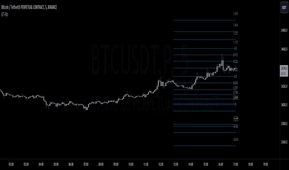
GT-FibThis code is declaring the script as an indicator named "GT-Fib" to be plotted on the main chart. The maximum number of lines it can create is limited to 500.
The indicator calculates Fibo using trend breaks. If the trend is not broken and the old trend continues, Fibo continues. However, sometimes you will witness that it does not draw Fibo. Indicates that there is no trend break yet. If current Fibo levels are behind us, it may be wise to wait for a trend change. For trend breaks, I partially benefited from the Lux team's trend lines with break indicator. For your information...
Settings:
A set of user inputs is defined to allow customization. These include lookback period, coefficient, calculation method, and an option to enable/disable backpainting. These inputs help the trader to adapt the script to different market conditions or trading strategies.
Style:
Colors and visual styles for the indicator are defined here, such as the colors for uptrends and downtrends.
Variables Initialization:
Various variables are initialized here. This section prepares the script for further calculations. Key concepts include the initialization of upper and lower boundaries, pivot highs (ph), pivot lows (pl), and a few other variables to track peaks and troughs for trendlines.
Trendline Peaks and Troughs:
The script identifies pivot highs and lows. Whenever a pivot high/low is found, it updates the trendline_top and trendline_bottom respectively.
Calculation Method:
Based on the user's choice, the script calculates a "cycle" value using one of three methods: ATR, Stdev, or Linreg.
Extended Lines:
These are dashed lines that get drawn when a pivot high or pivot low is identified. These lines can be used to visualize potential support or resistance areas.
plotFibRetracement Function:
This function is designed to draw Fibonacci retracement levels between the identified trendline top and bottom. The Fibonacci levels provide potential support and resistance levels that traders often use to make trading decisions.
Plotting Fibonacci using Trendline Peaks and Troughs:
If both trendline_top and trendline_bottom are not 'na' (not available), the script will draw the Fibonacci retracement using the defined function.
How to Use:
The script identifies and displays potential support and resistance zones using Fibonacci retracement levels based on the trendline peaks and troughs. Here's a suggested way to use it:
Adjust Settings: Depending on the instrument you're trading and the timeframe, you might want to adjust the lookback period, coefficient, and calculation method to fine-tune the script to your needs.
Identify Trends: Observe where the pivot highs and lows are formed. The presence of consecutive pivot highs or pivot lows can indicate a prevailing trend.
Use Fibonacci Levels: The Fibonacci retracement levels can act as potential support and resistance. For instance:
During an uptrend, if prices retract and approach a Fibonacci level, it might act as a support level where price could bounce back.
During a downtrend, Fibonacci levels might act as resistance where price could reverse downwards.
Combine with Other Indicators: For a more comprehensive analysis and to increase the reliability of trading signals, you can use this script in conjunction with other technical indicators.
Remember, like all trading tools and techniques, this script should be used in conjunction with proper risk management. It's also a good idea to test any strategy or tool in a demo environment before applying it to a live account.
TrendGuard Flag Finder - Strategy [presentTrading]
Introduction and How It Is Different
In the vast world of trading strategies, the TrendGuard Flag Finder stands out as a unique blend of traditional flag pattern detection and the renowned SuperTrend indicator.
- A significant portion of the Flag Pattern detection is inspired by the "Flag Finder" code by @Amphibiantrading, which serves as one of foundational element of this strategy.
- While many strategies focus on either trend-following or pattern recognition, this strategy harmoniously combines both, offering traders a more holistic view of the market.
- The integration of the SuperTrend indicator not only provides a clear direction of the prevailing trend but also offers potential stop-loss levels, enhancing the strategy's risk management capabilities.
AAPL 1D chart
ETHBTC 6hr chart
Strategy: How It Works
The TrendGuard Flag Finder is primarily built on two pillars:
1. Flag Pattern Detection : At its core, the strategy identifies flag patterns, which are continuation patterns suggesting that the prevailing trend will resume after a brief consolidation. The strategy meticulously detects both bullish and bearish flags, ensuring traders can capitalize on opportunities in both rising and falling markets.
What is a Flag Pattern? A flag pattern consists of two main components:
1.1 The Pole : This is the initial strong price move, which can be either upwards (for bullish flags) or downwards (for bearish flags). The pole represents a strong surge in price in a particular direction, driven by significant buying or selling momentum.
1.2 The Flag : Following the pole, the price starts consolidating, moving against the initial trend. This consolidation forms a rectangular shape and is characterized by parallel trendlines. In a bullish flag, the consolidation will have a slight downward tilt, while in a bearish flag, it will have a slight upward tilt.
How the Strategy Detects Flags:
Identifying the Pole: The strategy first identifies a strong price movement over a user-defined number of bars. This movement should meet a certain percentage change to qualify as a pole.
Spotting the Flag: After the pole is identified, the strategy looks for a consolidation phase. The consolidation should be counter to the prevailing trend and should be contained within parallel lines. The depth (for bullish flags) or rally (for bearish flags) of this consolidation is calculated to ensure it meets user-defined criteria.
2. SuperTrend Integration : The SuperTrend indicator, known for its simplicity and effectiveness, is integrated into the strategy. It provides a dynamic line on the chart, signaling the prevailing trend. When prices are above the SuperTrend line, it's an indication of an uptrend, and vice versa. This not only confirms the flag pattern's direction but also offers a potential stop-loss level for trades.
When combined, these components allow traders to identify potential breakout (for bullish flags) or breakdown (for bearish flags) scenarios, backed by the momentum indicated by the SuperTrend.
Usage
To use the SuperTrend Enhanced Flag Finder:
- Inputs : Begin by setting the desired parameters. The strategy offers a range of user-controlled settings, allowing for customization based on individual trading preferences and risk tolerance.
- Visualization : Once the parameters are set, the strategy will identify and visually represent flag patterns on the chart. Bullish flags are represented in green, while bearish flags are in red.
- Trade Execution : When a breakout or breakdown is identified, the strategy provides entry signals. It also offers exit signals based on the SuperTrend, ensuring that traders can capitalize on the momentum while managing risk.
Default Settings
The strategy comes with a set of default settings optimized for general use:
- SuperTrend Parameters: Length set to 10 and Factor set to 5.0.
- Bull Flag Criteria: Max Flag Depth at 7, Max Flag Length at 10 bars, Min Flag Length at 3 bars, Prior Uptrend Minimum at 9%, and Flag Pole Length between 7 to 13 bars.
- Bear Flag Criteria: Similar settings adjusted for bearish patterns.
- Display Options: By default, both bullish and bearish flags are displayed, with breakout and breakdown points highlighted.
GKD-C Adaptive-Lookback Stochastic [Loxx]Giga Kaleidoscope GKD-C Adaptive-Lookback Stochastic is a Metamorphosis module included in Loxx's "Giga Kaleidoscope Modularized Trading System".
█ GKD-C Adaptive-Lookback Stochastic
The Adaptive-Lookback Stochastic uses a swing pivot lookback algorithm to adjust the periiod input bar-bar-bar thereby converting the regular Stochasitc oscillator into an adaptive Stochatic oscillator.
What is the Adaptive Lookback Period?
The adaptive lookback period is a technique used in technical analysis to adjust the period of an indicator based on changes in market conditions. This technique is particularly useful in volatile or rapidly changing markets where a fixed period may not be optimal for detecting trends or signals.
The concept of the adaptive lookback period is relatively simple. By adjusting the lookback period based on changes in market conditions, traders can more accurately identify trends and signals. This can help traders to enter and exit trades at the right time and improve the profitability of their trading strategies.
The adaptive lookback period works by identifying potential swing points in the market. Once these points are identified, the lookback period is calculated based on the number of swings and a speed parameter. The swing count parameter determines the number of swings that must occur before the lookback period is adjusted. The speed parameter controls the rate at which the lookback period is adjusted, with higher values indicating a more rapid adjustment.
The adaptive lookback period can be applied to a wide range of technical indicators, including moving averages, oscillators, and trendlines. By adjusting the period of these indicators based on changes in market conditions, traders can reduce the impact of noise and false signals, leading to more profitable trades.
The adaptive lookback period is a powerful technique for traders and analysts looking to optimize their technical indicators. By adjusting the period based on changes in market conditions, traders can more accurately identify trends and signals, leading to more profitable trades. While there are various ways to implement the adaptive lookback period, the basic concept remains the same, and traders can adapt and customize the technique to suit their individual needs and trading styles.
What is the Stochastic Oscillator?
The Stochastic Oscillator is a popular technical analysis indicator developed by George Lane in the 1950s. It is a momentum indicator that compares a security's closing price to its price range over a specified period. The main idea behind the Stochastic Oscillator is that, in an upward trending market, prices tend to close near their high, while in a downward trending market, prices tend to close near their low. The Stochastic Oscillator ranges from 0 to 100 and is primarily used to identify overbought and oversold conditions or potential trend reversals.
The Stochastic Oscillator is calculated using the following formula:
%K = ((C - L14) / (H14 - L14)) * 100
Where:
%K: The Stochastic Oscillator value.
C: The most recent closing price.
L14: The lowest price of the last 14 periods (or any other chosen period).
H14: The highest price of the last 14 periods (or any other chosen period).
Additionally, a moving average of %K, called %D, is calculated to provide a signal line:
%D = Simple Moving Average of %K over 'n' periods
The Stochastic Oscillator generates signals based on the following conditions:
1. Overbought and Oversold Levels: The Stochastic Oscillator typically uses 80 and 20 as overbought and oversold levels, respectively. When the oscillator is above 80, it is considered overbought, indicating that the market may be overvalued and a price decline is possible. When the oscillator is below 20, it is considered oversold, indicating that the market may be undervalued and a price rise is possible.
2. Bullish and Bearish Divergences: A bullish divergence occurs when the price makes a lower low, but the Stochastic Oscillator makes a higher low, suggesting a potential trend reversal to the upside. A bearish divergence occurs when the price makes a higher high, but the Stochastic Oscillator makes a lower high, suggesting a potential trend reversal to the downside.
3. Crosses: Buy signals are generated when %K crosses above %D, indicating upward momentum. Sell signals are generated when %K crosses below %D, indicating downward momentum.
The Stochastic Oscillator is commonly used in combination with other technical analysis tools to confirm signals and improve the accuracy of predictions.
When using the Stochastic Oscillator, it's important to consider a few best practices and additional insights:
1. Confirmation with other indicators: While the Stochastic Oscillator can provide valuable insights into potential trend reversals and overbought/oversold conditions, it is generally more effective when used in conjunction with other technical indicators, such as moving averages, RSI (Relative Strength Index), or MACD (Moving Average Convergence Divergence). This can help confirm signals and reduce the chances of false signals or whipsaws.
2. Timeframes: The Stochastic Oscillator can be applied to various timeframes, such as daily, weekly, or intraday charts. Adjusting the lookback period for the calculation can also alter the sensitivity of the indicator. A shorter lookback period will make the oscillator more sensitive to price movements, while a longer lookback period will make it less sensitive. Traders should choose a timeframe and lookback period that aligns with their trading strategy and risk tolerance.
3. Variations: There are two primary variations of the Stochastic Oscillator: Fast Stochastic and Slow Stochastic. The Fast Stochastic uses the original %K and %D calculations, while the Slow Stochastic smooths %K with an additional moving average and uses this smoothed %K as the new %D. The Slow Stochastic is generally considered to generate fewer false signals due to the additional smoothing.
4. Overbought and Oversold: It's important to remember that overbought and oversold conditions can persist for an extended period, especially during strong trends. This means that the Stochastic Oscillator alone should not be relied upon as a definitive buy or sell signal. Instead, traders should wait for additional confirmation from other indicators or price action before entering or exiting a trade.
The Stochastic Oscillator is a valuable momentum indicator that helps traders identify potential trend reversals and overbought/oversold conditions in the market. However, it is most effective when used in combination with other technical analysis tools and should be adapted to suit the specific needs of the individual trader's strategy and risk tolerance.
█ Giga Kaleidoscope Modularized Trading System
Core components of an NNFX algorithmic trading strategy
The NNFX algorithm is built on the principles of trend, momentum, and volatility. There are six core components in the NNFX trading algorithm:
1. Volatility - price volatility; e.g., Average True Range, True Range Double, Close-to-Close, etc.
2. Baseline - a moving average to identify price trend
3. Confirmation 1 - a technical indicator used to identify trends
4. Confirmation 2 - a technical indicator used to identify trends
5. Continuation - a technical indicator used to identify trends
6. Volatility/Volume - a technical indicator used to identify volatility/volume breakouts/breakdown
7. Exit - a technical indicator used to determine when a trend is exhausted
8. Metamorphosis - a technical indicator that produces a compound signal from the combination of other GKD indicators*
*(not part of the NNFX algorithm)
What is Volatility in the NNFX trading system?
In the NNFX (No Nonsense Forex) trading system, ATR (Average True Range) is typically used to measure the volatility of an asset. It is used as a part of the system to help determine the appropriate stop loss and take profit levels for a trade. ATR is calculated by taking the average of the true range values over a specified period.
True range is calculated as the maximum of the following values:
-Current high minus the current low
-Absolute value of the current high minus the previous close
-Absolute value of the current low minus the previous close
ATR is a dynamic indicator that changes with changes in volatility. As volatility increases, the value of ATR increases, and as volatility decreases, the value of ATR decreases. By using ATR in NNFX system, traders can adjust their stop loss and take profit levels according to the volatility of the asset being traded. This helps to ensure that the trade is given enough room to move, while also minimizing potential losses.
Other types of volatility include True Range Double (TRD), Close-to-Close, and Garman-Klass
What is a Baseline indicator?
The baseline is essentially a moving average, and is used to determine the overall direction of the market.
The baseline in the NNFX system is used to filter out trades that are not in line with the long-term trend of the market. The baseline is plotted on the chart along with other indicators, such as the Moving Average (MA), the Relative Strength Index (RSI), and the Average True Range (ATR).
Trades are only taken when the price is in the same direction as the baseline. For example, if the baseline is sloping upwards, only long trades are taken, and if the baseline is sloping downwards, only short trades are taken. This approach helps to ensure that trades are in line with the overall trend of the market, and reduces the risk of entering trades that are likely to fail.
By using a baseline in the NNFX system, traders can have a clear reference point for determining the overall trend of the market, and can make more informed trading decisions. The baseline helps to filter out noise and false signals, and ensures that trades are taken in the direction of the long-term trend.
What is a Confirmation indicator?
Confirmation indicators are technical indicators that are used to confirm the signals generated by primary indicators. Primary indicators are the core indicators used in the NNFX system, such as the Average True Range (ATR), the Moving Average (MA), and the Relative Strength Index (RSI).
The purpose of the confirmation indicators is to reduce false signals and improve the accuracy of the trading system. They are designed to confirm the signals generated by the primary indicators by providing additional information about the strength and direction of the trend.
Some examples of confirmation indicators that may be used in the NNFX system include the Bollinger Bands, the MACD (Moving Average Convergence Divergence), and the MACD Oscillator. These indicators can provide information about the volatility, momentum, and trend strength of the market, and can be used to confirm the signals generated by the primary indicators.
In the NNFX system, confirmation indicators are used in combination with primary indicators and other filters to create a trading system that is robust and reliable. By using multiple indicators to confirm trading signals, the system aims to reduce the risk of false signals and improve the overall profitability of the trades.
What is a Continuation indicator?
In the NNFX (No Nonsense Forex) trading system, a continuation indicator is a technical indicator that is used to confirm a current trend and predict that the trend is likely to continue in the same direction. A continuation indicator is typically used in conjunction with other indicators in the system, such as a baseline indicator, to provide a comprehensive trading strategy.
What is a Volatility/Volume indicator?
Volume indicators, such as the On Balance Volume (OBV), the Chaikin Money Flow (CMF), or the Volume Price Trend (VPT), are used to measure the amount of buying and selling activity in a market. They are based on the trading volume of the market, and can provide information about the strength of the trend. In the NNFX system, volume indicators are used to confirm trading signals generated by the Moving Average and the Relative Strength Index. Volatility indicators include Average Direction Index, Waddah Attar, and Volatility Ratio. In the NNFX trading system, volatility is a proxy for volume and vice versa.
By using volume indicators as confirmation tools, the NNFX trading system aims to reduce the risk of false signals and improve the overall profitability of trades. These indicators can provide additional information about the market that is not captured by the primary indicators, and can help traders to make more informed trading decisions. In addition, volume indicators can be used to identify potential changes in market trends and to confirm the strength of price movements.
What is an Exit indicator?
The exit indicator is used in conjunction with other indicators in the system, such as the Moving Average (MA), the Relative Strength Index (RSI), and the Average True Range (ATR), to provide a comprehensive trading strategy.
The exit indicator in the NNFX system can be any technical indicator that is deemed effective at identifying optimal exit points. Examples of exit indicators that are commonly used include the Parabolic SAR, the Average Directional Index (ADX), and the Chandelier Exit.
The purpose of the exit indicator is to identify when a trend is likely to reverse or when the market conditions have changed, signaling the need to exit a trade. By using an exit indicator, traders can manage their risk and prevent significant losses.
In the NNFX system, the exit indicator is used in conjunction with a stop loss and a take profit order to maximize profits and minimize losses. The stop loss order is used to limit the amount of loss that can be incurred if the trade goes against the trader, while the take profit order is used to lock in profits when the trade is moving in the trader's favor.
Overall, the use of an exit indicator in the NNFX trading system is an important component of a comprehensive trading strategy. It allows traders to manage their risk effectively and improve the profitability of their trades by exiting at the right time.
What is an Metamorphosis indicator?
The concept of a metamorphosis indicator involves the integration of two or more GKD indicators to generate a compound signal. This is achieved by evaluating the accuracy of each indicator and selecting the signal from the indicator with the highest accuracy. As an illustration, let's consider a scenario where we calculate the accuracy of 10 indicators and choose the signal from the indicator that demonstrates the highest accuracy.
The resulting output from the metamorphosis indicator can then be utilized in a GKD-BT backtest by occupying a slot that aligns with the purpose of the metamorphosis indicator. The slot can be a GKD-B, GKD-C, or GKD-E slot, depending on the specific requirements and objectives of the indicator. This allows for seamless integration and utilization of the compound signal within the GKD-BT framework.
How does Loxx's GKD (Giga Kaleidoscope Modularized Trading System) implement the NNFX algorithm outlined above?
Loxx's GKD v2.0 system has five types of modules (indicators/strategies). These modules are:
1. GKD-BT - Backtesting module (Volatility, Number 1 in the NNFX algorithm)
2. GKD-B - Baseline module (Baseline and Volatility/Volume, Numbers 1 and 2 in the NNFX algorithm)
3. GKD-C - Confirmation 1/2 and Continuation module (Confirmation 1/2 and Continuation, Numbers 3, 4, and 5 in the NNFX algorithm)
4. GKD-V - Volatility/Volume module (Confirmation 1/2, Number 6 in the NNFX algorithm)
5. GKD-E - Exit module (Exit, Number 7 in the NNFX algorithm)
6. GKD-M - Metamorphosis module (Metamorphosis, Number 8 in the NNFX algorithm, but not part of the NNFX algorithm)
(additional module types will added in future releases)
Each module interacts with every module by passing data to A backtest module wherein the various components of the GKD system are combined to create a trading signal.
That is, the Baseline indicator passes its data to Volatility/Volume. The Volatility/Volume indicator passes its values to the Confirmation 1 indicator. The Confirmation 1 indicator passes its values to the Confirmation 2 indicator. The Confirmation 2 indicator passes its values to the Continuation indicator. The Continuation indicator passes its values to the Exit indicator, and finally, the Exit indicator passes its values to the Backtest strategy.
This chaining of indicators requires that each module conform to Loxx's GKD protocol, therefore allowing for the testing of every possible combination of technical indicators that make up the six components of the NNFX algorithm.
What does the application of the GKD trading system look like?
Example trading system:
Backtest: Full GKD Backtest
Baseline: Hull Moving Average
Volatility/Volume: Hurst Exponent
Confirmation 1: Composite RSI
Confirmation 2: uf2018
Continuation: Vortex
Exit: Rex Oscillator
Metamorphosis: Fisher Transform, Universal Oscillator, Aroon, Vortex .. combined
Each GKD indicator is denoted with a module identifier of either: GKD-BT, GKD-B, GKD-C, GKD-V, GKD-M, or GKD-E. This allows traders to understand to which module each indicator belongs and where each indicator fits into the GKD system.
█ Giga Kaleidoscope Modularized Trading System Signals
Standard Entry
1. GKD-C Confirmation gives signal
2. Baseline agrees
3. Price inside Goldie Locks Zone Minimum
4. Price inside Goldie Locks Zone Maximum
5. Confirmation 2 agrees
6. Volatility/Volume agrees
1-Candle Standard Entry
1a. GKD-C Confirmation gives signal
2a. Baseline agrees
3a. Price inside Goldie Locks Zone Minimum
4a. Price inside Goldie Locks Zone Maximum
Next Candle
1b. Price retraced
2b. Baseline agrees
3b. Confirmation 1 agrees
4b. Confirmation 2 agrees
5b. Volatility/Volume agrees
Baseline Entry
1. GKD-B Basline gives signal
2. Confirmation 1 agrees
3. Price inside Goldie Locks Zone Minimum
4. Price inside Goldie Locks Zone Maximum
5. Confirmation 2 agrees
6. Volatility/Volume agrees
7. Confirmation 1 signal was less than 'Maximum Allowable PSBC Bars Back' prior
1-Candle Baseline Entry
1a. GKD-B Baseline gives signal
2a. Confirmation 1 agrees
3a. Price inside Goldie Locks Zone Minimum
4a. Price inside Goldie Locks Zone Maximum
5a. Confirmation 1 signal was less than 'Maximum Allowable PSBC Bars Back' prior
Next Candle
1b. Price retraced
2b. Baseline agrees
3b. Confirmation 1 agrees
4b. Confirmation 2 agrees
5b. Volatility/Volume agrees
Volatility/Volume Entry
1. GKD-V Volatility/Volume gives signal
2. Confirmation 1 agrees
3. Price inside Goldie Locks Zone Minimum
4. Price inside Goldie Locks Zone Maximum
5. Confirmation 2 agrees
6. Baseline agrees
7. Confirmation 1 signal was less than 7 candles prior
1-Candle Volatility/Volume Entry
1a. GKD-V Volatility/Volume gives signal
2a. Confirmation 1 agrees
3a. Price inside Goldie Locks Zone Minimum
4a. Price inside Goldie Locks Zone Maximum
5a. Confirmation 1 signal was less than 'Maximum Allowable PSVVC Bars Back' prior
Next Candle
1b. Price retraced
2b. Volatility/Volume agrees
3b. Confirmation 1 agrees
4b. Confirmation 2 agrees
5b. Baseline agrees
Confirmation 2 Entry
1. GKD-C Confirmation 2 gives signal
2. Confirmation 1 agrees
3. Price inside Goldie Locks Zone Minimum
4. Price inside Goldie Locks Zone Maximum
5. Volatility/Volume agrees
6. Baseline agrees
7. Confirmation 1 signal was less than 7 candles prior
1-Candle Confirmation 2 Entry
1a. GKD-C Confirmation 2 gives signal
2a. Confirmation 1 agrees
3a. Price inside Goldie Locks Zone Minimum
4a. Price inside Goldie Locks Zone Maximum
5a. Confirmation 1 signal was less than 'Maximum Allowable PSC2C Bars Back' prior
Next Candle
1b. Price retraced
2b. Confirmation 2 agrees
3b. Confirmation 1 agrees
4b. Volatility/Volume agrees
5b. Baseline agrees
PullBack Entry
1a. GKD-B Baseline gives signal
2a. Confirmation 1 agrees
3a. Price is beyond 1.0x Volatility of Baseline
Next Candle
1b. Price inside Goldie Locks Zone Minimum
2b. Price inside Goldie Locks Zone Maximum
3b. Confirmation 1 agrees
4b. Confirmation 2 agrees
5b. Volatility/Volume agrees
Continuation Entry
1. Standard Entry, 1-Candle Standard Entry, Baseline Entry, 1-Candle Baseline Entry, Volatility/Volume Entry, 1-Candle Volatility/Volume Entry, Confirmation 2 Entry, 1-Candle Confirmation 2 Entry, or Pullback entry triggered previously
2. Baseline hasn't crossed since entry signal trigger
4. Confirmation 1 agrees
5. Baseline agrees
6. Confirmation 2 agrees
█ Connecting to Backtests
All GKD indicators are chained indicators meaning you export the value of the indicators to specialized backtest to creat your GKD trading system. Each indicator contains a proprietary signal generation algo that will only work with GKD backtests. You can find these backtests using the links below.
GKD-BT Giga Confirmation Stack Backtest:
GKD-BT Giga Stacks Backtest:
GKD-BT Full Giga Kaleidoscope Backtest:
GKD-BT Solo Confirmation Super Complex Backtest:
GKD-BT Solo Confirmation Complex Backtest:
GKD-BT Solo Confirmation Simple Backtest:

GKD-C Adaptive-Lookback Variety RSI [Loxx]Giga Kaleidoscope GKD-C Adaptive-Lookback Variety RSI is a Confirmation module included in Loxx's "Giga Kaleidoscope Modularized Trading System".
█ GKD-C Adaptive-Lookback Variety RSI
What is the Adaptive Lookback Period?
The adaptive lookback period is a technique used in technical analysis to adjust the period of an indicator based on changes in market conditions. This technique is particularly useful in volatile or rapidly changing markets where a fixed period may not be optimal for detecting trends or signals.
The concept of the adaptive lookback period is relatively simple. By adjusting the lookback period based on changes in market conditions, traders can more accurately identify trends and signals. This can help traders to enter and exit trades at the right time and improve the profitability of their trading strategies.
The adaptive lookback period works by identifying potential swing points in the market. Once these points are identified, the lookback period is calculated based on the number of swings and a speed parameter. The swing count parameter determines the number of swings that must occur before the lookback period is adjusted. The speed parameter controls the rate at which the lookback period is adjusted, with higher values indicating a more rapid adjustment.
The adaptive lookback period can be applied to a wide range of technical indicators, including moving averages, oscillators, and trendlines. By adjusting the period of these indicators based on changes in market conditions, traders can reduce the impact of noise and false signals, leading to more profitable trades.
In summary, the adaptive lookback period is a powerful technique for traders and analysts looking to optimize their technical indicators. By adjusting the period based on changes in market conditions, traders can more accurately identify trends and signals, leading to more profitable trades. While there are various ways to implement the adaptive lookback period, the basic concept remains the same, and traders can adapt and customize the technique to suit their individual needs and trading styles.
This indicator includes 10 types of RSI
1. Regular RSI
2. Slow RSI
3. Ehlers Smoothed RSI
4. Cutler's RSI
5. Rapid RSI
6. Harris' RSI
7. RSI DEMA
8. RSI TEMA
9. RSI T3
10. Jurik RSX
Regular RSI
The Relative Strength Index (RSI) is a widely used technical indicator in the field of financial market analysis. Developed by J. Welles Wilder Jr. in 1978, the RSI is a momentum oscillator that measures the speed and change of price movements. It helps traders identify potential trend reversals, overbought, and oversold conditions in a market.
The RSI is calculated based on the average gains and losses of an asset over a specified period, typically 14 days. The formula for calculating the RSI is as follows:
RSI = 100 - (100 / (1 + RS))
Where:
RS (Relative Strength) = Average gain over the specified period / Average loss over the specified period
The RSI ranges from 0 to 100, with values above 70 generally considered overbought (potentially indicating that the asset is overvalued and may experience a price decline) and values below 30 considered oversold (potentially indicating that the asset is undervalued and may experience a price increase).
Slow RSI
Slow RSI is a modified version of the Relative Strength Index (RSI) indicator that aims to provide a smoother, more consistent signal than the traditional RSI. The Slow RSI is designed to be less sensitive to sudden price movements, which can cause false signals.
To calculate Slow RSI, we first calculate the up and down values, just like in traditional RSI and Ehlers RSI. The up and down values are calculated by comparing the current price to the previous price, and then adding up the positive and negative differences.
Next, we calculate the Slow RSI value using the formula:
SlowRSI = 100 * up / (up + dn)
where "up" and "dn" are the total positive and negative differences, respectively.
This formula is similar to the one used in traditional RSI, but the dynamic lookback period based on the average of the up and down values is used to smooth out the signal.
Finally, we apply smoothing to the Slow RSI value by taking an exponential moving average (EMA) of the Slow RSI values over a specified period. This EMA helps to reduce the impact of sudden price movements and provide a smoother, more consistent signal over time.
Ehler's Smoothed RSI
Ehlers RSI is a modified version of the Relative Strength Index (RSI) indicator created by John Ehlers, a well-known technical analyst and author. The purpose of Ehlers RSI is to reduce lag and improve the responsiveness of the traditional RSI indicator.
To calculate Ehlers RSI, we first smooth the prices by taking a weighted average of the current price and the two previous prices. This smoothing helps to reduce noise in the data and produce a more accurate signal.
Next, we calculate the up and down values differently than in traditional RSI. In traditional RSI, the up and down values are based on the difference between the current price and the previous price. In Ehlers RSI, the up and down values are based on the difference between the current price and the price two bars ago. This approach helps to reduce lag and produce a more responsive indicator.
Finally, we calculate Ehlers RSI using the formula:
EhlersRSI = 50 * (up - down) / (up + down) + 50
The result is a more timely signal that can help traders identify potential trends and reversals in the market. However, as with any technical indicator, Ehlers RSI should be used in conjunction with other analysis tools and should not be relied on as the sole basis for trading decisions.
Cutler's RSI
Cutler's RSI (Relative Strength Index) is a variation of the traditional RSI, a popular technical analysis indicator used to measure the speed and change of price movements. The main difference between Cutler's RSI and the traditional RSI is the calculation method used to smooth the data. While the traditional RSI uses an exponential moving average (EMA) to smooth the data, Cutler's RSI uses a simple moving average (SMA).
Here's the formula for Cutler's RSI:
1. Calculate the price change: Price Change = Current Price - Previous Price
2. Calculate the average gain and average loss over a specified period (usually 14 days):
If Price Change > 0, add it to the total gains.
If Price Change < 0, add the absolute value to the total losses.
3. Calculate the average gain and average loss by dividing the totals by the specified period: Average Gain = Total Gains / Period, Average Loss = Total Losses / Period
4. Calculate the Relative Strength (RS): RS = Average Gain / Average Loss
5. Calculate Cutler's RSI: Cutler's RSI = 100 - (100 / (1 + RS))
Cutler's RSI is not necessarily better than the regular RSI; it's just a different variation of the traditional RSI that uses a simple moving average (SMA) instead of an exponential moving average (EMA) quantifiedstrategies.com. The main advantage of Cutler's RSI is that it is not data length dependent, meaning it returns consistent results regardless of the length of the period, or the starting point within a data file quantifiedstrategies.com.
However, it's worth noting that Cutler's RSI does not necessarily outperform the traditional RSI. In fact, backtests reveal that Cutler's RSI is no improvement compared to Wilder's RSI quantifiedstrategies.com. Additionally, using an SMA instead of an EMA in Cutler's RSI may result in the loss of the "believed" advantage of weighting the most recent price action aaii.com.
Both Cutler's RSI and the traditional RSI can be used to identify overbought/oversold levels, support and resistance, spot divergences for possible reversals, and confirm the signals from other indicators investopedia.com. Ultimately, the choice between Cutler's RSI and the traditional RSI depends on personal preference and the specific trading strategy being employed.
Rapid RSI
Rapid RSI is a technical analysis indicator that is a modified version of the Relative Strength Index (RSI). It was developed by Andrew Cardwell and was first introduced in the October 2006 issue of Technical Analysis of Stocks & Commodities magazine.
The Rapid RSI improves upon the regular RSI by modifying the way the average gains and losses are calculated. Here's a general breakdown of the Rapid RSI calculation:
1. Calculate the upward change (when the price has increased) and the downward change (when the price has decreased) for each period.
2. Calculate the simple moving average (SMA) of the upward changes and the SMA of the downward changes over the specified period.
3. Divide the SMA of the upward changes by the SMA of the downward changes to get the relative strength (RS).
4. Calculate the Rapid RSI by transforming the relative strength (RS) into a value ranging from 0 to 100.
By using the simple moving average (SMA) instead of the slow exponential moving average (RMA) as in the regular RSI, the Rapid RSI tends to be more responsive to recent price changes. This can help traders identify overbought and oversold conditions more quickly, potentially leading to earlier entry and exit points. However, it is important to note that a faster indicator may also produce more false signals.
Harris' RSI
Harris RSI (Relative Strength Index) is a technical indicator used in financial analysis to measure the strength or weakness of a security over time. It was developed by Larry Harris in 1986 as an alternative to the traditional RSI, which measures the price change of a security over a given period.
The Harris RSI uses a slightly different formula from the traditional RSI, but it is based on the same principles. It calculates the ratio of the average gain to the average loss over a specified period, typically 14 days. The result is then plotted on a scale of 0 to 100, with high values indicating overbought conditions and low values indicating oversold conditions.
The Harris RSI is believed to be more responsive to short-term price movements than the traditional RSI, making it useful for traders who are looking for quick trading opportunities. However, like any technical indicator, it should be used in conjunction with other forms of analysis to make informed trading decisions.
The calculation of the Harris RSI involves several steps:
1. Calculate the price change over the specified period (usually 14 days) using the following formula:
Price Change = Close Price - Prior Close Price
2. Calculate the average gain and average loss over the same period, using separate formulas for each:
Average Gain = (Sum of Gains over the Period) / Period
Average Loss = (Sum of Losses over the Period) / Period
Gains are calculated as the sum of all positive price changes over the period, while losses are calculated as the sum of all negative price changes over the period.
3. Calculate the Relative Strength (RS) as the ratio of the Average Gain to the Average Loss:
RS = Average Gain / Average Loss
4. Calculate the Harris RSI using the following formula:
Harris RSI = 100 - (100 / (1 + RS))
The resulting Harris RSI value is a number between 0 and 100, which is plotted on a chart to identify overbought or oversold conditions in the security. A value above 70 is generally considered overbought, while a value below 30 is generally considered oversold.
DEMA RSI
DEMA RSI is a variation of the Relative Strength Index (RSI) technical indicator that incorporates the Double Exponential Moving Average (DEMA) for smoothing. Like the regular RSI, the DEMA RSI is a momentum oscillator used to measure the speed and change of price movements, and it ranges from 0 to 100. Readings below 30 typically indicate oversold conditions, while readings above 70 indicate overbought conditions.
The DEMA RSI aims to improve upon the regular RSI by addressing its limitations, such as lag and false signals. By using the DEMA, a more responsive and faster RSI can be achieved. Here's a general breakdown of the DEMA RSI calculation:
1. Calculate the price change for each period, as well as the absolute value of the change.
2. Apply the DEMA smoothing technique to both the price change and its absolute value, separately. This involves calculating two sets of exponential moving averages and combining them to create a double-weighted moving average with reduced lag.
3. Divide the smoothed price change by the smoothed absolute value of the price change.
4. Transform the result into a value ranging from 0 to 100 to obtain the DEMA RSI.
The DEMA RSI is considered an improvement over the regular RSI because it provides faster and more responsive signals. This can help traders identify overbought and oversold conditions more accurately and potentially avoid false signals.
In summary, the main advantages of these RSI variations over the regular RSI are their ability to reduce noise, provide smoother lines, and be more responsive to price changes. This can lead to more accurate signals and fewer false positives in different market conditions.
TEMA RSI
TEMA RSI is a variation of the Relative Strength Index (RSI) technical indicator that incorporates the Triple Exponential Moving Average (TEMA) for smoothing. Like the regular RSI, the TEMA RSI is a momentum oscillator used to measure the speed and change of price movements, and it ranges from 0 to 100. Readings below 30 typically indicate oversold conditions, while readings above 70 indicate overbought conditions.
The TEMA RSI aims to improve upon the regular RSI by addressing its limitations, such as lag and false signals. By using the TEMA, a more responsive and faster RSI can be achieved. Here's a general breakdown of the TEMA RSI calculation:
1. Calculate the price change for each period, as well as the absolute value of the change.
2. Apply the TEMA smoothing technique to both the price change and its absolute value, separately. This involves calculating two sets of exponential moving averages and combining them to create a double-weighted moving average with reduced lag.
3. Divide the smoothed price change by the smoothed absolute value of the price change.
4. Transform the result into a value ranging from 0 to 100 to obtain the TEMA RSI.
The TEMA RSI is considered an improvement over the regular RSI because it provides faster and more responsive signals. This can help traders identify overbought and oversold conditions more accurately and potentially avoid false signals.
T3 RSI
T3 RSI is a variation of the Relative Strength Index (RSI) technical indicator that incorporates the Tilson T3 for smoothing. Like the regular RSI, the T3 RSI is a momentum oscillator used to measure the speed and change of price movements, and it ranges from 0 to 100. Readings below 30 typically indicate oversold conditions, while readings above 70 indicate overbought conditions.
The T3 RSI aims to improve upon the regular RSI by addressing its limitations, such as lag and false signals. By using the T3, a more responsive and faster RSI can be achieved. Here's a general breakdown of the T3 RSI calculation:
1. Calculate the price change for each period, as well as the absolute value of the change.
2. Apply the T3 smoothing technique to both the price change and its absolute value, separately. This involves calculating two sets of exponential moving averages and combining them to create a double-weighted moving average with reduced lag.
3. Divide the smoothed price change by the smoothed absolute value of the price change.
4. Transform the result into a value ranging from 0 to 100 to obtain the T3 RSI.
The T3 RSI is considered an improvement over the regular RSI because it provides faster and more responsive signals. This can help traders identify overbought and oversold conditions more accurately and potentially avoid false signals.
Jurik RSX
The Jurik RSX is a technical indicator developed by Mark Jurik to measure the momentum and strength of price movements in financial markets, such as stocks, commodities, and currencies. It is an advanced version of the traditional Relative Strength Index (RSI), designed to offer smoother and less lagging signals compared to the standard RSI.
The main advantage of the Jurik RSX is that it provides more accurate and timely signals for traders and analysts, thanks to its improved calculation methods that reduce noise and lag in the indicator's output. This enables better decision-making when analyzing market trends and potential trading opportunities.
What is Adaptive-Lookback Variety RSI
This indicator allows the user to select from 9 different RSI types and 33 source types. The various RSI types is enhanced by injecting an adaptive lookback period into the caculation making the RSI able to adaptive to differing market conditions.
Additional Features
This indicator allows you to select from 33 source types. They are as follows:
Close
Open
High
Low
Median
Typical
Weighted
Average
Average Median Body
Trend Biased
Trend Biased (Extreme)
HA Close
HA Open
HA High
HA Low
HA Median
HA Typical
HA Weighted
HA Average
HA Average Median Body
HA Trend Biased
HA Trend Biased (Extreme)
HAB Close
HAB Open
HAB High
HAB Low
HAB Median
HAB Typical
HAB Weighted
HAB Average
HAB Average Median Body
HAB Trend Biased
HAB Trend Biased (Extreme)
What are Heiken Ashi "better" candles?
Heiken Ashi "better" candles are a modified version of the standard Heiken Ashi candles, which are a popular charting technique used in technical analysis. Heiken Ashi candles help traders identify trends and potential reversal points by smoothing out price data and reducing market noise. The "better formula" was proposed by Sebastian Schmidt in an article published by BNP Paribas in Warrants & Zertifikate, a German magazine, in August 2004. The aim of this formula is to further improve the smoothing of the Heiken Ashi chart and enhance its effectiveness in identifying trends and reversals.
Standard Heiken Ashi candles are calculated using the following formulas:
Heiken Ashi Close = (Open + High + Low + Close) / 4
Heiken Ashi Open = (Previous Heiken Ashi Open + Previous Heiken Ashi Close) / 2
Heiken Ashi High = Max (High, Heiken Ashi Open, Heiken Ashi Close)
Heiken Ashi Low = Min (Low, Heiken Ashi Open, Heiken Ashi Close)
The "better formula" modifies the standard Heiken Ashi calculation by incorporating additional smoothing, which can help reduce noise and make it easier to identify trends and reversals. The modified formulas for Heiken Ashi "better" candles are as follows:
Better Heiken Ashi Close = (Open + High + Low + Close) / 4
Better Heiken Ashi Open = (Previous Better Heiken Ashi Open + Previous Better Heiken Ashi Close) / 2
Better Heiken Ashi High = Max (High, Better Heiken Ashi Open, Better Heiken Ashi Close)
Better Heiken Ashi Low = Min (Low, Better Heiken Ashi Open, Better Heiken Ashi Close)
Smoothing Factor = 2 / (N + 1), where N is the chosen period for smoothing
Smoothed Better Heiken Ashi Open = (Better Heiken Ashi Open * Smoothing Factor) + (Previous Smoothed Better Heiken Ashi Open * (1 - Smoothing Factor))
Smoothed Better Heiken Ashi Close = (Better Heiken Ashi Close * Smoothing Factor) + (Previous Smoothed Better Heiken Ashi Close * (1 - Smoothing Factor))
The smoothed Better Heiken Ashi Open and Close values are then used to calculate the smoothed Better Heiken Ashi High and Low values, resulting in "better" candles that provide a clearer representation of the market trend and potential reversal points.
It's important to note that, like any other technical analysis tool, Heiken Ashi "better" candles are not foolproof and should be used in conjunction with other indicators and analysis techniques to make well-informed trading decisions.
Heiken Ashi "better" candles, as mentioned previously, provide a clearer representation of market trends and potential reversal points by reducing noise and smoothing out price data. When using these candles in conjunction with other technical analysis tools and indicators, traders can gain valuable insights into market behavior and make more informed decisions.
To effectively use Heiken Ashi "better" candles in your trading strategy, consider the following tips:
Trend Identification: Heiken Ashi "better" candles can help you identify the prevailing trend in the market. When the majority of the candles are green (or another color, depending on your chart settings) and there are no or few lower wicks, it may indicate a strong uptrend. Conversely, when the majority of the candles are red (or another color) and there are no or few upper wicks, it may signal a strong downtrend.
Trend Reversals: Look for potential trend reversals when a change in the color of the candles occurs, especially when accompanied by longer wicks. For example, if a green candle with a long lower wick is followed by a red candle, it could indicate a bearish reversal. Similarly, a red candle with a long upper wick followed by a green candle may suggest a bullish reversal.
Support and Resistance: You can use Heiken Ashi "better" candles to identify potential support and resistance levels. When the candles are consistently moving in one direction and then suddenly change color with longer wicks, it could indicate the presence of a support or resistance level.
Stop-Loss and Take-Profit: Using Heiken Ashi "better" candles can help you manage risk by determining optimal stop-loss and take-profit levels. For instance, you can place your stop-loss below the low of the most recent green candle in an uptrend or above the high of the most recent red candle in a downtrend.
Confirming Signals: Heiken Ashi "better" candles should be used in conjunction with other technical indicators, such as moving averages, oscillators, or chart patterns, to confirm signals and improve the accuracy of your analysis.
In this implementation, you have the choice of AMA, KAMA, or T3 smoothing. These are as follows:
Kaufman Adaptive Moving Average (KAMA)
The Kaufman Adaptive Moving Average (KAMA) is a type of adaptive moving average used in technical analysis to smooth out price fluctuations and identify trends. The KAMA adjusts its smoothing factor based on the market's volatility, making it more responsive in volatile markets and smoother in calm markets. The KAMA is calculated using three different efficiency ratios that determine the appropriate smoothing factor for the current market conditions. These ratios are based on the noise level of the market, the speed at which the market is moving, and the length of the moving average. The KAMA is a popular choice among traders who prefer to use adaptive indicators to identify trends and potential reversals.
Adaptive Moving Average
The Adaptive Moving Average (AMA) is a type of moving average that adjusts its sensitivity to price movements based on market conditions. It uses a ratio between the current price and the highest and lowest prices over a certain lookback period to determine its level of smoothing. The AMA can help reduce lag and increase responsiveness to changes in trend direction, making it useful for traders who want to follow trends while avoiding false signals. The AMA is calculated by multiplying a smoothing constant with the difference between the current price and the previous AMA value, then adding the result to the previous AMA value.
T3
The T3 moving average is a type of technical indicator used in financial analysis to identify trends in price movements. It is similar to the Exponential Moving Average (EMA) and the Double Exponential Moving Average (DEMA), but uses a different smoothing algorithm.
The T3 moving average is calculated using a series of exponential moving averages that are designed to filter out noise and smooth the data. The resulting smoothed data is then weighted with a non-linear function to produce a final output that is more responsive to changes in trend direction.
The T3 moving average can be customized by adjusting the length of the moving average, as well as the weighting function used to smooth the data. It is commonly used in conjunction with other technical indicators as part of a larger trading strategy.
█ Giga Kaleidoscope Modularized Trading System
Core components of an NNFX algorithmic trading strategy
The NNFX algorithm is built on the principles of trend, momentum, and volatility. There are six core components in the NNFX trading algorithm:
1. Volatility - price volatility; e.g., Average True Range, True Range Double, Close-to-Close, etc.
2. Baseline - a moving average to identify price trend
3. Confirmation 1 - a technical indicator used to identify trends
4. Confirmation 2 - a technical indicator used to identify trends
5. Continuation - a technical indicator used to identify trends
6. Volatility/Volume - a technical indicator used to identify volatility/volume breakouts/breakdown
7. Exit - a technical indicator used to determine when a trend is exhausted
What is Volatility in the NNFX trading system?
In the NNFX (No Nonsense Forex) trading system, ATR (Average True Range) is typically used to measure the volatility of an asset. It is used as a part of the system to help determine the appropriate stop loss and take profit levels for a trade. ATR is calculated by taking the average of the true range values over a specified period.
True range is calculated as the maximum of the following values:
-Current high minus the current low
-Absolute value of the current high minus the previous close
-Absolute value of the current low minus the previous close
ATR is a dynamic indicator that changes with changes in volatility. As volatility increases, the value of ATR increases, and as volatility decreases, the value of ATR decreases. By using ATR in NNFX system, traders can adjust their stop loss and take profit levels according to the volatility of the asset being traded. This helps to ensure that the trade is given enough room to move, while also minimizing potential losses.
Other types of volatility include True Range Double (TRD), Close-to-Close, and Garman-Klass
What is a Baseline indicator?
The baseline is essentially a moving average, and is used to determine the overall direction of the market.
The baseline in the NNFX system is used to filter out trades that are not in line with the long-term trend of the market. The baseline is plotted on the chart along with other indicators, such as the Moving Average (MA), the Relative Strength Index (RSI), and the Average True Range (ATR).
Trades are only taken when the price is in the same direction as the baseline. For example, if the baseline is sloping upwards, only long trades are taken, and if the baseline is sloping downwards, only short trades are taken. This approach helps to ensure that trades are in line with the overall trend of the market, and reduces the risk of entering trades that are likely to fail.
By using a baseline in the NNFX system, traders can have a clear reference point for determining the overall trend of the market, and can make more informed trading decisions. The baseline helps to filter out noise and false signals, and ensures that trades are taken in the direction of the long-term trend.
What is a Confirmation indicator?
Confirmation indicators are technical indicators that are used to confirm the signals generated by primary indicators. Primary indicators are the core indicators used in the NNFX system, such as the Average True Range (ATR), the Moving Average (MA), and the Relative Strength Index (RSI).
The purpose of the confirmation indicators is to reduce false signals and improve the accuracy of the trading system. They are designed to confirm the signals generated by the primary indicators by providing additional information about the strength and direction of the trend.
Some examples of confirmation indicators that may be used in the NNFX system include the Bollinger Bands, the MACD (Moving Average Convergence Divergence), and the MACD Oscillator. These indicators can provide information about the volatility, momentum, and trend strength of the market, and can be used to confirm the signals generated by the primary indicators.
In the NNFX system, confirmation indicators are used in combination with primary indicators and other filters to create a trading system that is robust and reliable. By using multiple indicators to confirm trading signals, the system aims to reduce the risk of false signals and improve the overall profitability of the trades.
What is a Continuation indicator?
In the NNFX (No Nonsense Forex) trading system, a continuation indicator is a technical indicator that is used to confirm a current trend and predict that the trend is likely to continue in the same direction. A continuation indicator is typically used in conjunction with other indicators in the system, such as a baseline indicator, to provide a comprehensive trading strategy.
What is a Volatility/Volume indicator?
Volume indicators, such as the On Balance Volume (OBV), the Chaikin Money Flow (CMF), or the Volume Price Trend (VPT), are used to measure the amount of buying and selling activity in a market. They are based on the trading volume of the market, and can provide information about the strength of the trend. In the NNFX system, volume indicators are used to confirm trading signals generated by the Moving Average and the Relative Strength Index. Volatility indicators include Average Direction Index, Waddah Attar, and Volatility Ratio. In the NNFX trading system, volatility is a proxy for volume and vice versa.
By using volume indicators as confirmation tools, the NNFX trading system aims to reduce the risk of false signals and improve the overall profitability of trades. These indicators can provide additional information about the market that is not captured by the primary indicators, and can help traders to make more informed trading decisions. In addition, volume indicators can be used to identify potential changes in market trends and to confirm the strength of price movements.
What is an Exit indicator?
The exit indicator is used in conjunction with other indicators in the system, such as the Moving Average (MA), the Relative Strength Index (RSI), and the Average True Range (ATR), to provide a comprehensive trading strategy.
The exit indicator in the NNFX system can be any technical indicator that is deemed effective at identifying optimal exit points. Examples of exit indicators that are commonly used include the Parabolic SAR, the Average Directional Index (ADX), and the Chandelier Exit.
The purpose of the exit indicator is to identify when a trend is likely to reverse or when the market conditions have changed, signaling the need to exit a trade. By using an exit indicator, traders can manage their risk and prevent significant losses.
In the NNFX system, the exit indicator is used in conjunction with a stop loss and a take profit order to maximize profits and minimize losses. The stop loss order is used to limit the amount of loss that can be incurred if the trade goes against the trader, while the take profit order is used to lock in profits when the trade is moving in the trader's favor.
Overall, the use of an exit indicator in the NNFX trading system is an important component of a comprehensive trading strategy. It allows traders to manage their risk effectively and improve the profitability of their trades by exiting at the right time.
How does Loxx's GKD (Giga Kaleidoscope Modularized Trading System) implement the NNFX algorithm outlined above?
Loxx's GKD v1.0 system has five types of modules (indicators/strategies). These modules are:
1. GKD-BT - Backtesting module (Volatility, Number 1 in the NNFX algorithm)
2. GKD-B - Baseline module (Baseline and Volatility/Volume, Numbers 1 and 2 in the NNFX algorithm)
3. GKD-C - Confirmation 1/2 and Continuation module (Confirmation 1/2 and Continuation, Numbers 3, 4, and 5 in the NNFX algorithm)
4. GKD-V - Volatility/Volume module (Confirmation 1/2, Number 6 in the NNFX algorithm)
5. GKD-E - Exit module (Exit, Number 7 in the NNFX algorithm)
(additional module types will added in future releases)
Each module interacts with every module by passing data between modules. Data is passed between each module as described below:
GKD-B => GKD-V => GKD-C(1) => GKD-C(2) => GKD-C(Continuation) => GKD-E => GKD-BT
That is, the Baseline indicator passes its data to Volatility/Volume. The Volatility/Volume indicator passes its values to the Confirmation 1 indicator. The Confirmation 1 indicator passes its values to the Confirmation 2 indicator. The Confirmation 2 indicator passes its values to the Continuation indicator. The Continuation indicator passes its values to the Exit indicator, and finally, the Exit indicator passes its values to the Backtest strategy.
This chaining of indicators requires that each module conform to Loxx's GKD protocol, therefore allowing for the testing of every possible combination of technical indicators that make up the six components of the NNFX algorithm.
What does the application of the GKD trading system look like?
Example trading system:
Backtest: Strategy with 1-3 take profits, trailing stop loss, multiple types of PnL volatility, and 2 backtesting styles
Baseline: Hull Moving Average
Volatility/Volume: Hurst Exponent
Confirmation 1: Adaptive-Lookback Variety RSI as shown on the chart above
Confirmation 2: Williams Percent Range
Continuation: Adaptive-Lookback Variety RSI
Exit: Rex Oscillator
Each GKD indicator is denoted with a module identifier of either: GKD-BT, GKD-B, GKD-C, GKD-V, or GKD-E. This allows traders to understand to which module each indicator belongs and where each indicator fits into the GKD protocol chain.
Giga Kaleidoscope Modularized Trading System Signals (based on the NNFX algorithm)
Standard Entry
1. GKD-C Confirmation 1 Signal
2. GKD-B Baseline agrees
3. Price is within a range of 0.2x Volatility and 1.0x Volatility of the Goldie Locks Mean
4. GKD-C Confirmation 2 agrees
5. GKD-V Volatility/Volume agrees
Baseline Entry
1. GKD-B Baseline signal
2. GKD-C Confirmation 1 agrees
3. Price is within a range of 0.2x Volatility and 1.0x Volatility of the Goldie Locks Mean
4. GKD-C Confirmation 2 agrees
5. GKD-V Volatility/Volume agrees
6. GKD-C Confirmation 1 signal was less than 7 candles prior
Volatility/Volume Entry
1. GKD-V Volatility/Volume signal
2. GKD-C Confirmation 1 agrees
3. Price is within a range of 0.2x Volatility and 1.0x Volatility of the Goldie Locks Mean
4. GKD-C Confirmation 2 agrees
5. GKD-B Baseline agrees
6. GKD-C Confirmation 1 signal was less than 7 candles prior
Continuation Entry
1. Standard Entry, Baseline Entry, or Pullback; entry triggered previously
2. GKD-B Baseline hasn't crossed since entry signal trigger
3. GKD-C Confirmation Continuation Indicator signals
4. GKD-C Confirmation 1 agrees
5. GKD-B Baseline agrees
6. GKD-C Confirmation 2 agrees
1-Candle Rule Standard Entry
1. GKD-C Confirmation 1 signal
2. GKD-B Baseline agrees
3. Price is within a range of 0.2x Volatility and 1.0x Volatility of the Goldie Locks Mean
Next Candle:
1. Price retraced (Long: close < close or Short: close > close )
2. GKD-B Baseline agrees
3. GKD-C Confirmation 1 agrees
4. GKD-C Confirmation 2 agrees
5. GKD-V Volatility/Volume agrees
1-Candle Rule Baseline Entry
1. GKD-B Baseline signal
2. GKD-C Confirmation 1 agrees
3. Price is within a range of 0.2x Volatility and 1.0x Volatility of the Goldie Locks Mean
4. GKD-C Confirmation 1 signal was less than 7 candles prior
Next Candle:
1. Price retraced (Long: close < close or Short: close > close )
2. GKD-B Baseline agrees
3. GKD-C Confirmation 1 agrees
4. GKD-C Confirmation 2 agrees
5. GKD-V Volatility/Volume Agrees
1-Candle Rule Volatility/Volume Entry
1. GKD-V Volatility/Volume signal
2. GKD-C Confirmation 1 agrees
3. Price is within a range of 0.2x Volatility and 1.0x Volatility of the Goldie Locks Mean
4. GKD-C Confirmation 1 signal was less than 7 candles prior
Next Candle:
1. Price retraced (Long: close < close or Short: close > close)
2. GKD-B Volatility/Volume agrees
3. GKD-C Confirmation 1 agrees
4. GKD-C Confirmation 2 agrees
5. GKD-B Baseline agrees
PullBack Entry
1. GKD-B Baseline signal
2. GKD-C Confirmation 1 agrees
3. Price is beyond 1.0x Volatility of Baseline
Next Candle:
1. Price is within a range of 0.2x Volatility and 1.0x Volatility of the Goldie Locks Mean
2. GKD-C Confirmation 1 agrees
3. GKD-C Confirmation 2 agrees
4. GKD-V Volatility/Volume Agrees
]█ Setting up the GKD
The GKD system involves chaining indicators together. These are the steps to set this up.
Use a GKD-C indicator alone on a chart
1. Inside the GKD-C indicator, change the "Confirmation Type" setting to "Solo Confirmation Simple"
Use a GKD-V indicator alone on a chart
**nothing, it's already useable on the chart without any settings changes
Use a GKD-B indicator alone on a chart
**nothing, it's already useable on the chart without any settings changes
Baseline (Baseline, Backtest)
1. Import the GKD-B Baseline into the GKD-BT Backtest: "Input into Volatility/Volume or Backtest (Baseline testing)"
2. Inside the GKD-BT Backtest, change the setting "Backtest Special" to "Baseline"
Volatility/Volume (Volatility/Volume, Backte st)
1. Inside the GKD-V indicator, change the "Testing Type" setting to "Solo"
2. Inside the GKD-V indicator, change the "Signal Type" setting to "Crossing" (neither traditional nor both can be backtested)
3. Import the GKD-V indicator into the GKD-BT Backtest: "Input into C1 or Backtest"
4. Inside the GKD-BT Backtest, change the setting "Backtest Special" to "Volatility/Volume"
5. Inside the GKD-BT Backtest, a) change the setting "Backtest Type" to "Trading" if using a directional GKD-V indicator; or, b) change the setting "Backtest Type" to "Full" if using a directional or non-directional GKD-V indicator (non-directional GKD-V can only test Longs and Shorts separately)
6. If "Backtest Type" is set to "Full": Inside the GKD-BT Backtest, change the setting "Backtest Side" to "Long" or "Short
7. If "Backtest Type" is set to "Full": To allow the system to open multiple orders at one time so you test all Longs or Shorts, open the GKD-BT Backtest, click the tab "Properties" and then insert a value of something like 10 orders into the "Pyramiding" settings. This will allow 10 orders to be opened at one time which should be enough to catch all possible Longs or Shorts.
Solo Confirmation Simple (Confirmation, Backtest)
1. Inside the GKD-C indicator, change the "Confirmation Type" setting to "Solo Confirmation Simple"
1. Import the GKD-C indicator into the GKD-BT Backtest: "Input into Backtest"
2. Inside the GKD-BT Backtest, change the setting "Backtest Special" to "Solo Confirmation Simple"
Solo Confirmation Complex without Exits (Baseline, Volatility/Volume, Confirmation, Backtest)
1. Inside the GKD-V indicator, change the "Testing Type" setting to "Chained"
2. Import the GKD-B Baseline into the GKD-V indicator: "Input into Volatility/Volume or Backtest (Baseline testing)"
3. Inside the GKD-C indicator, change the "Confirmation Type" setting to "Solo Confirmation Complex"
4. Import the GKD-V indicator into the GKD-C indicator: "Input into C1 or Backtest"
5. Inside the GKD-BT Backtest, change the setting "Backtest Special" to "GKD Full wo/ Exits"
6. Import the GKD-C into the GKD-BT Backtest: "Input into Exit or Backtest"
Solo Confirmation Complex with Exits (Baseline, Volatility/Volume, Confirmation, Exit, Backtest)
1. Inside the GKD-V indicator, change the "Testing Type" setting to "Chained"
2. Import the GKD-B Baseline into the GKD-V indicator: "Input into Volatility/Volume or Backtest (Baseline testing)"
3. Inside the GKD-C indicator, change the "Confirmation Type" setting to "Solo Confirmation Complex"
4. Import the GKD-V indicator into the GKD-C indicator: "Input into C1 or Backtest"
5. Import the GKD-C indicator into the GKD-E indicator: "Input into Exit"
6. Inside the GKD-BT Backtest, change the setting "Backtest Special" to "GKD Full w/ Exits"
7. Import the GKD-E into the GKD-BT Backtest: "Input into Backtest"
Full GKD without Exits (Baseline, Volatility/Volume, Confirmation 1, Confirmation 2, Continuation, Backtest)
1. Inside the GKD-V indicator, change the "Testing Type" setting to "Chained"
2. Import the GKD-B Baseline into the GKD-V indicator: "Input into Volatility/Volume or Backtest (Baseline testing)"
3. Inside the GKD-C 1 indicator, change the "Confirmation Type" setting to "Confirmation 1"
4. Import the GKD-V indicator into the GKD-C 1 indicator: "Input into C1 or Backtest"
5. Inside the GKD-C 2 indicator, change the "Confirmation Type" setting to "Confirmation 2"
6. Import the GKD-C 1 indicator into the GKD-C 2 indicator: "Input into C2"
7. Inside the GKD-C Continuation indicator, change the "Confirmation Type" setting to "Continuation"
8. Inside the GKD-BT Backtest, change the setting "Backtest Special" to "GKD Full wo/ Exits"
9. Import the GKD-E into the GKD-BT Backtest: "Input into Exit or Backtest"
Full GKD with Exits (Baseline, Volatility/Volume, Confirmation 1, Confirmation 2, Continuation, Exit, Backtest)
1. Inside the GKD-V indicator, change the "Testing Type" setting to "Chained"
2. Import the GKD-B Baseline into the GKD-V indicator: "Input into Volatility/Volume or Backtest (Baseline testing)"
3. Inside the GKD-C 1 indicator, change the "Confirmation Type" setting to "Confirmation 1"
4. Import the GKD-V indicator into the GKD-C 1 indicator: "Input into C1 or Backtest"
5. Inside the GKD-C 2 indicator, change the "Confirmation Type" setting to "Confirmation 2"
6. Import the GKD-C 1 indicator into the GKD-C 2 indicator: "Input into C2"
7. Inside the GKD-C Continuation indicator, change the "Confirmation Type" setting to "Continuation"
8. Import the GKD-C Continuation indicator into the GKD-E indicator: "Input into Exit"
9. Inside the GKD-BT Backtest, change the setting "Backtest Special" to "GKD Full w/ Exits"
10. Import the GKD-E into the GKD-BT Backtest: "Input into Backtest"
Baseline + Volatility/Volume (Baseline, Volatility/Volume, Backtest)
1. Inside the GKD-V indicator, change the "Testing Type" setting to "Baseline + Volatility/Volume"
2. Inside the GKD-V indicator, make sure the "Signal Type" setting is set to "Traditional"
3. Import the GKD-B Baseline into the GKD-V indicator: "Input into Volatility/Volume or Backtest (Baseline testing)"
4. Inside the GKD-BT Backtest, change the setting "Backtest Special" to "Baseline + Volatility/Volume"
5. Import the GKD-V into the GKD-BT Backtest: "Input into C1 or Backtest"
6. Inside the GKD-BT Backtest, change the setting "Backtest Type" to "Full". For this backtest, you must test Longs and Shorts separately
7. To allow the system to open multiple orders at one time so you can test all Longs or Shorts, open the GKD-BT Backtest, click the tab "Properties" and then insert a value of something like 10 orders into the "Pyramiding" settings. This will allow 10 orders to be opened at one time which should be enough to catch all possible Longs or Shorts.
Requirements
Inputs
Confirmation 1: GKD-V Volatility / Volume indicator
Confirmation 2: GKD-C Confirmation indicator
Continuation: GKD-C Confirmation indicator
Solo Confirmation Simple: GKD-B Baseline
Solo Confirmation Complex: GKD-V Volatility / Volume indicator
Solo Confirmation Super Complex: GKD-V Volatility / Volume indicator
Stacked 1: None
Stacked 2+: GKD-C, GKD-V, or GKD-B Stacked 1
Outputs
Confirmation 1: GKD-C Confirmation 2 indicator
Confirmation 2: GKD-C Continuation indicator
Continuation: GKD-E Exit indicator
Solo Confirmation Simple: GKD-BT Backtest
Solo Confirmation Complex: GKD-BT Backtest or GKD-E Exit indicator
Solo Confirmation Super Complex: GKD-C Continuation indicator
Stacked 1: GKD-C, GKD-V, or GKD-B Stacked 2+
Stacked 2+: GKD-C, GKD-V, or GKD-B Stacked 2+ or GKD-BT Backtest
Additional features will be added in future releases.
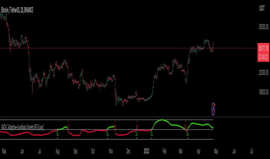
RSI based support resistance levelsThis indicator draws support line and resistance lines in the price chart.
How ?
For drawing the support/resistance line we need to first determine the demand and supply.
We are using too-familiar indicator RSI to determine when the script is oversold and overbought.
Now oversold (in RSI) is not a point, it’s a zone. The RSI indicator comes below 30, stays there and goes up above 30. Similarly for overbought.
Now if you carefully look at the oversold region – the lowest point of the oversold region is the place where the demand came (for surety) and push the indicator (and price) up.
Similarly: the highest point of overbought is the place where (for surety) the supply came and push the indicator (and price) down.
So that’ the supply / demand line (for surety).
In this indicator, based on the RSI we are just drawing support and resistance lines in the chat. That’s all.
What is unique ?
Trendline concept is not new. RSI is not new. RSI overbought/oversold is not new.
There are indicators exist to draw trendlines. Some of them works beautifully.
However, none of these, we are aware of, uses RSI to determine it. And, we believe, the most logical way to determine support/resistance is RSI.
Note: We are not responsible for any trading/investment decision you are taking out of the outcome of this indicator.
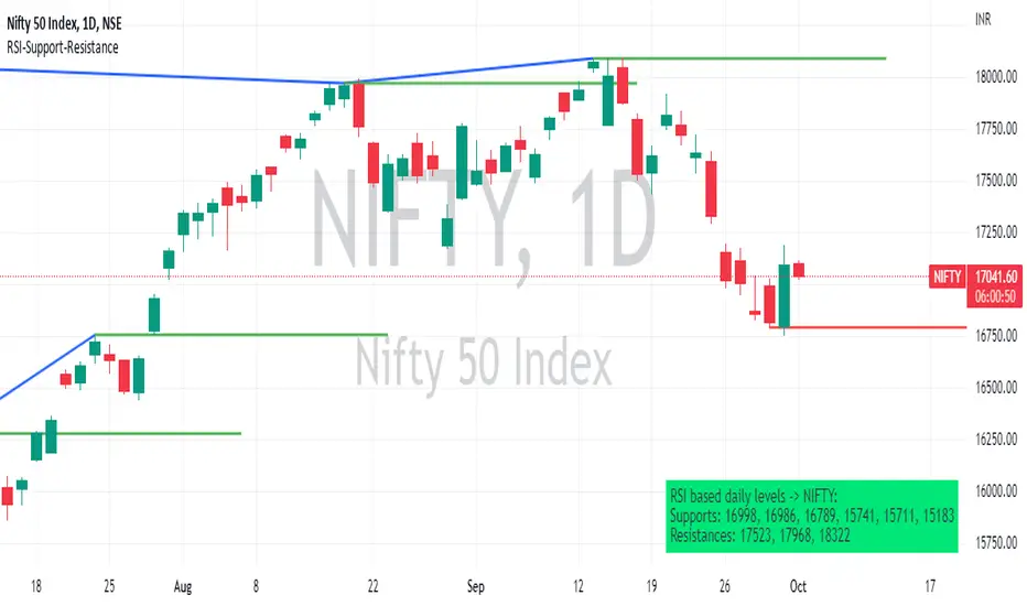
Pivot TrendLineThe simplest version of the indicator automatically draws trendLine on your charts, with build-in functions only.
You can change the looking back length settings to get more proper lines you want.
There is also a switch to turn off the historical trendlines.
You can use this to build more advanced indicators or strategies.
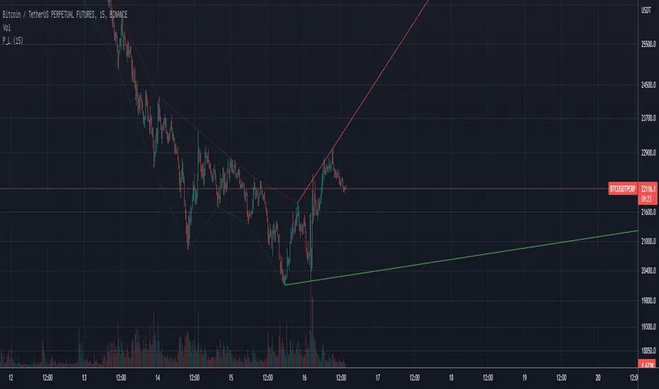
Prophit Ninja: Katana DojoMaster the art of trend reading with “Prophit Ninja: Katana Dojo”.
Our dojo will set up sparring matches for you to improve your in-battle techniques without you having to track down the fight yourself. Find the strike, dodge and parry you are best at, or keep yourself well rounded to handle any environment by selecting any or all of the possible signal/alert outputs.
═════════════════════════════════════════════════════════════════════════
█ INTERPRETATION
Quickly and easily find/spot chart setups with custom pre-built signals and alerts. Sit back and allow the market to find the set-ups for you.
═════════════════════════════════════════════════════════════════════════
█ OVERVIEW
Fully adaptable multi time frame signals and alerts based on your Katana settings for:
1 — Three customizable MA lengths with 12 formula variations and an average MA of the three; each one with the ability to toggle on or off not only itself- but an adaptive glow to filter out volatility, as well as a no lag feature that removes inherit lag that exists in all moving averages.
2 — A toggle-able fibonacci adapted formula based on ichimoku cloud.
3 — A toggle-able fibonacci adapted formula based on ssl channel.
4 — A toggle-able auto fibonacci retracement with a customizable golden pocket level.
5 — A fibonacci adapted formula based on bollinger bands.
6 — A fibonacci adapted formula based on keltner channels.
7 — Adaptive Pivot Point Labels.
8 — A fibonacci adapted formula based on chandelier stops.
9 — A fibonacci adapted formula based on parabolic stop and reverses.
10 — Fibonacci based auto support and resistance levels.
11 — Fibonacci based adaptive auto trendlines.
( Included free with “ Prophit Ninja: Katana ”.)
═════════════════════════════════════════════════════════════════════════
█ EASY CUSTOMIZATION
i.imgur.com
With a fully customizable and easy-to-use input menu, this indicator gives you the ability to tailor your trading experience to your needs and see as much (or as little) information as you want to; presented in the manner you deem most viable with the following options in just a few clicks:
Color Theme- There are four color themes available which include original, colorful, monochrome and solid. These not only allow you a quick and easy way to change the colors to suit your style; they also make it so you can challenge your bias in an instant by viewing the data in a completely different way.
Attack Mode- Whether you’re a scalper, day trader, swing trader, or investor; this option allows you to see the chart based on four different risk tolerance/time expectancy mentalities in just two clicks. Investors can see what the scalpers are thinking and vice/versa to broaden their decision making and/or hone in when optimal.
Sharpness Level- This algorithm allows the user to display the data on five different smoothness levels without suffering the inherent lag that accompanies most other indicators. Whether you like to see every tick of a choppy movement, or filter out the false signals into smooth readings, you can do so at any moment.
═════════════════════════════════════════════════════════════════════════
█ PRE-BUILT ALERTS
With Prophit Ninja: Katana Dojo’s built-in alerts you can enable alerts for any piece of the Katana in just a few clicks. These alerts are way more specific and optimized than you can possibly achieve with the custom alert settings. Each checking for multiple possible activation triggers instead of one and populating the message field automatically so you can just click create.
═════════════════════════════════════════════════════════════════════════
As you can see; this dojo has the ability to adapt to any ninja and give those in control of its power the upper hand. Any mode of battle, any opponent, any circumstance- "Prophit Ninja: Katana Dojo" was built by our finest architects to improve any trainee and make sure they know when to attack, defend or simply allow the fight to play out by its easy-to-read coloring system. As long as you show up for the matches you'll have a much better chance of finding sparring matches than when you didn't.
This state-of-the-art add-on is great for experienced traders, those who just started learning to trade, or anyone in between- truly made to suit the needs of any trader, in any moment, with any mindset (along with the other indicators in our Prophit Ninja bundle) you'll notice an immediate improvement in your Prophit Ninja: Katana skill after acquiring it.
═════════════════════════════════════════════════════════════════════════
*everything displayed is part of the Prophit Ninja indicator bundle; this is an otherwise blank chart*
Pivot Point SupertrendHello All,
There are many types of SuperTrend around. Recently I thought about a Supertrend based on Pivot Points then I wrote "Pivot Point SuperTrend" script. It looks it has better performance on keeping you in the trend more.
The idea is behind this script is finding pivot point, calculating average of them and like in supertrend creating higher/lower bands by ATR. As you can see in the algorithm the script gives weigth to past pivot points, this is done for smoothing it a bit.
As I wrote above it may keep you in the trend more, lets see an example:
As an option the script can show main center line and I realized that when you are in a position, this line can be used as early exit points. (maybe half of the position size)
While using Pivot Points, I added support resistance lines by using Pivot Point, as an option the script can show S/R lines:
And also it can show Pivot Points:
When you changed Pivot Point Period you can see its reaction, in following example PP period is 4 (default value is 2). Smaller PP periods more sensitive trendlines.
Alerts added for Buy/Sell entries and Trend Reversals. (when you set alerts use the option " Once Per Bar Close ")
ENJOY!

Trend signal with AlertHello traders,
I updated the Trend signal indicator from @riffster21 () and added alerts to it.
Nothing fancy but still extremely useful
How to use the Trend signal with alerts indicator
In this screenshot, I didn't select the most optimal timeframe, neither the most optimal input for the indicator. I just wanted to explain with a very simple example, how it works and how to use it
Basically, it's being used to simulate obliques trendlines. I draw that one in pink to highligh what is the trendline simulated by the indicator
For Which timeframe ?
It's working for all timeframes.
Recommended input for the indicator ?
The greater the timeframe, the lesser the input should be. Which makes sense because setting a high value period on a weekly chart will give entry/exit signals way too late
On the contrary, on a m5 chart, setting a low value period will give too many fake signals and you'll get angry. I don't want that to happen :)
For crypto intraday trading (meaning m5 to H4), I feel the sweet spot is between 7 and 14 for the indicator input.
For crypto Swing trading (meaning H8 to weekly), an input between 3 and 5 is best
I can only strongly encourage you to apply it on a newly created chart without any other indicator and try to find the best input for the asset. Please note the ideal input might change between assets (example: BTC/USD vs ETH/BTC)
Drawing the corresponding oblique is very important the first time setting them on a chart to find the best setup
Please let me know in the comments section if you have any question
Good luck folks
Dave

trendline function - JD!EXPERIMENTAL!
As TV doesn't provide a function to draw lines between points, I wrote a function to do this in one my own indicators.
The function itself however can be applied/modified for different use cases, eg. drawing trendlines.
In this (proof of concept) example I used it to draw lines based on past high/low pivot points.
The inputs required:
* an INPUT FUNCTION (in this form, its designed to work with functions that have occasional values and na-values between them, it then connects the non-zero values to form a line)
* a BOOL (to indicate if you want to draw only the rising or falling lines)
* a DELAY (in this case this is the lookback period for the pivot-points function, this is to compensate the calculation of the past and realtime points)
The function returns:
* the function to draw the extension from the BASE-LINE to the current time (here this is the connection of the last pivot-point to the current point to bridge the gap of the lookback period, this is NOT REALTIME!)
* the function to draw the extension for the current time (here this is the continuation of the line until a new pivot-point is valid, this is DRAWN IN REALTIME!!)
* the color of the lines (in this case the lines are only colored (lime or fuchsia) if they either go up or down, else they are invisible, this is to clean up the invalid lines)
these output functions can then simply be plotted using the 'plot' function.
JD.
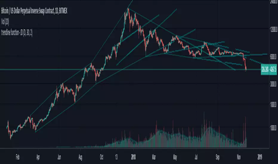
[LAVA] Relative Price DifferenceThis script shows the relative price difference based off the last high and low, so many bars ago. Bollinger bands are also included by default for closer inspection on the intensity of the movement or the lack thereof. Bollinger bands will follow the smoothed line which will allow the reactionary line to cross the boundary during an intense movement. With the colors selected, a gray color will appear after the color to the zero line to announce a deep correction is possible. Buy/Sell indicators show up as crosses to indicate when the price is moving in a certain direction. Sideways stagnation will have several crosses due to the close proximity to the zero line.
I use 21 in the demo here without the bollinger bands or buy/sell indicators to show the power of the script to identify bottoms and tops using the tips and hand drawn trendlines.
(This script is actually the same script as before, but listed here as the final version. Hopefully this will be my last update with this script.)
If you use and enjoy this script, please like it!

Intermarket Swing Projection [LuxAlgo]The Intermarket Swing Projection allows traders to plot price movement swings from any user-selected asset directly onto the chart in the form of zigzags and/or horizontal support and resistance levels.
This tool rescale the external asset price on the user chart, enabling traders to make direct comparisons.
It answers the question of how different the price behavior is between two assets, accounting for each asset's volatility.
🔶 USAGE
This tool is based on swing detection of two different assets: the chart and a user-selected asset. It allows traders to compare two assets on an equal footing while accounting for volatility and price behavior.
Traders can customize the detection by selecting a custom ticker, timeframe, the number of swings and length for swing detection. This makes the tool a Swiss army knife for asset comparison.
As we can see in the image below, the Show Last, Pivot Length, and Spread parameters are key to defining the final output of the tool.
"Show Last" defines how many pivots are displayed. "Pivot Length" is used for pivot detection; a larger value will detect larger market structures. "Spread" defines how far apart the horizontal levels will be from their original location in terms of volatility.
🔹 Comparing different assets
This image shows the Nasdaq 100 futures contract compared to four other futures contracts: S&P 500, gold, bitcoin, and euro/U.S. dollar.
Plotting all of these assets in Nasdaq 100 terms makes it easy to compare and analyze price behaviors and identify key levels.
In the top left chart, we have NQ vs. ES. It's no surprise that they are practically an exact match; a large portion of the S&P 500 is technology.
In the top right chart, NQ vs. GC, we see totally different behaviors. We can clearly see the summer consolidation in gold and the resumption of the uptrend, which took gold above 29,200 NQ points, up from 21,200.
In the bottom right chart, we see bitcoin making new highs, way above the Nasdaq in May, July, and October. However, the last high was way below the Nasdaq prices on October 27—the first lower high in a while. Sellers are pushing down.
Finally, the bottom left chart is NQ vs. 6E. We can see large volatility in the uptrend since February, with NQ unable to catch up until now. The last swing low was almost a match, and 6E is in a range.
As we can see, this tool allows us to perform intermarket analysis properly by accounting for each asset's volatility and price behavior. Then, we plot them on the same scale on equal terms, which makes performing this kind of analysis easy.
As we can see in the chart above, the assets are the same as in the previous image, but the timeframe is 1H with different settings.
Note the horizontal levels acting as support and resistance, as well as how NQ prices react to the zones marked with white circles. These levels are derived from custom assets selected by the user.
🔹 Displaying Elements
Zig-zag allows traders to clearly see the path that the selected asset's price took, as well as its turning points.
Horizontal levels are displayed from those turning points to the present and can be used as support or resistance. Traders can adjust the spread parameter in the settings panel to expand or contract those levels' volatility.
There are two color modes for the levels: average and pivots. In the first mode, green is used for levels below the average and red for levels above the average. The second uses green for swing lows and red for swing highs.
The backpaint feature is enabled by default and allows the swings to be displayed in the correct location. With this feature disabled, the swings will be displayed in the current location when a new swing is detected.
🔶 DETAILS
On a more technical note, the rescaling is formed by calculating three main elements from all the swings detected on the custom and chart assets:
The chart asset's average of all swing points
The chart asset's standard deviation of all swing points
The custom asset's z-score for each swing point
Then, the re-scaled swing point is calculated as the average plus the z-score multiplied by the standard deviation. This makes it possible to plot AAPL swings on an NQ chart, for example.
Thanks to re-scaling, we can directly compare the price behavior of two assets with different price ranges and volatility on the same chart.
🔶 SETTINGS
🔹 Trendlines
Ticker: Select the custom ticker.
Timeframe: Select a custom timeframe.
Show Last: Select how many swing points to display.
Pivot Length: Select the size for swing point detection.
Spread: Volatility multiplier for horizontal levels. Larger values mean the levels are farther apart.
Backpaint: Enable or disable the backpaint feature. When enabled, the drawings will be displayed where they were detected. When disabled, the drawings will be displayed at the moment of detection.
🔹 Style
Show ZigZag: Enable or disable the ZigZag display and choose a line style.
Show Levels: Enable or disable the levels display and choose a line style.
Color Mode: Choose between Average Mode, which colors all levels below the average bullish and all levels above bearish, and Pivot Mode, which colors swing highs bearish and swing lows bullish.
Bullish: Select a bullish color.
Bearish: Select a bearish color.
ZigZag: Select the ZigZag color.

TRADE ORBIT:-TOP BOTTOM INDICATOR🔵 BUY TRADE (Bottom Reversal Entry)
Enter when the green triangle appears.
Stop Loss (SL)
Below the low of the signal candle
Or below the swing low (safer)
Target (TP)
Choose ANY:
3%–5% move
Next resistance level (red line)
Risk:Reward = 1:2 or 1:3
Position Size
Risk 2% of your capital per trade (written in rules box).
🔴 SELL TRADE (Top Reversal Entry)
Enter on the red triangle.
Stop Loss (SL)
Above the high of the signal candle
Or above swing high (safer)
Target (TP)
Choose any:
3%–5% downward move
Next support level (green line)
RR = 1:2 or 1:3
📊 BEST WAY TO USE
1. Use on 15m / 30m / 1h for intraday
2. Use on Daily for swing trading
3. Always trade WITH weekly trend (if enabled)
4. Combine with trendlines or EMA200 for extra accuracy

Smart Money OB + Limit Orders + PriorityDetects breaks of structure (BOS) using swing highs/lows and an ATR-filtered impulse bar.
Builds simple order-block based levels and plots theoretical limit orders:
Buy limits are always placed below current price.
Sell limits are always placed above current price.
Shows a higher-timeframe bias using EMAs on two selectable timeframes (for example H4 + H1).
Draws “HTF-style” trendlines on the current timeframe using wider swing points.
Calculates RSI and highlights overbought/oversold regions for context.
Draws an optional “accumulation zone” box around the nearest limit level.
Optional counter-trend status: when trend is not extremely strong and price/RSI are stretched, the script can visually suggest a possible counter-trend move towards the zone (dotted arrow).
Info panel in the top-right corner summarises:
Direction priority (long / short / none)
Limit side (BUY / SELL / none)
RSI value
Trend regime (no trend / weak / strong)
Counter-trend status
“Now” line – a short text description of the current situation.
Usage notes
This script is designed to make chart reading easier: it organises structure, bias and potential areas on the chart, so you can build your own trading plans.
It does not guarantee results and should not be considered financial advice.
Always confirm ideas with your own analysis and risk management before taking any trades.
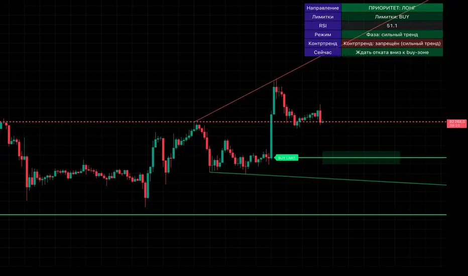
Advanced Trend Break TargetsIntroduction
The Advanced Trend Break Targets (ATBT) is a semi-automated technical analysis system designed to validate trendline trading strategies with algorithmic precision. While standard trendlines are subjective drawings, the ATBT converts user-defined price structures into a mathematical model. It projects a trajectory based on two specific "Anchor Points" and monitors price action for valid breakouts, applying a strict "Confluence Filter" before generating signals or projecting targets.
Originality & Utility
Most trendline indicators rely on automatic detection, which often draws lines across irrelevant swing points. The ATBT respects the trader's discretion by allowing manual placement of the trendline (via timestamps) while automating the tedious tasks of monitoring for breaks, checking momentum conditions, and calculating Fibonacci risk-to-reward levels. This "Hybrid" approach combines human pattern recognition with machine discipline, ensuring trades are only signaled when specific quantitative conditions are met.
Detailed Methodology
1. The Advanced Projection Logic
The core of the script calculates a linear trajectory between two points in time (Start Date and End Date). Unlike standard drawings, this script calculates the exact slope (m) using the bar index difference
The script automatically detects the "Price Source" at your chosen timestamps. If a Pivot High exists at the start date, it defaults to a Resistance Line (Highs). If a Pivot Low exists, it defaults to a Support Line (Lows). This slope is then projected forward indefinitely:
2. The Confluence Filter (Multi-Condition Validation)
A raw price crossover is often a "fake-out." To combat this, the script includes a Mandatory Conditions engine. A breakout is only confirmed if the user-selected conditions are TRUE at the moment of the cross:
Volume Confirmation: Verifies if the breakout bar's volume is greater than its 20-period SMA.
CHOCH (Change of Character): Checks if the price has broken the most recent Swing High (for bullish setups) or Swing Low (for bearish setups) prior to the trendline break.
Swing Break: A strict check requiring the close to be beyond the last swing point.
Momentum (MACD & RSI): Ensures the MACD line is crossing the Signal line or that RSI is on the correct side of the 50 threshold.
Trend Filter (SMA): Verifies that price is above the 20 SMA (bullish) or below it (bearish).
3. Dynamic Target & Risk Calculation
Upon a validated breakout, the script scans the chart history for the most recent Pivot High or Low (within the lookback period) to define the "Structure Width" or Risk distance (D).
Stop Loss (SL): Placed at the recent Pivot Price.
Target 1: Projected at $1.0 \times D from the breakout point.
Target 2: Projected at $1.618 \times D (Golden Ratio).
Target 3: Projected at $2.618 \times D.
How to Use
1. Identify the Structure: visually identify a trendline on your chart (e.g., the upper resistance of a Wedge or Flag).
2. Set Anchors: Go to the script settings (Inputs tab) and enter the exact timestamp for Point 1 (Start of trendline) and Point 2 (End of trendline).
Tip: Ensure these dates align with the specific high/low candle you want to anchor to.
3. Configure Filters: Toggle the checkboxes in the "Mandatory Conditions" group.
Example: If you want to trade pure price action, enable "Require CHOCH" but leave "Require MACD" unchecked.
4. Interpret Signals:
Blue Labels (1 & 2): Indicate where the script has Advanced the trendline.
"Breakout" / "Breakdown" Label: Appears when price crosses the projected line AND all selected conditions are met.
Green/Red Dotted Lines: represent your Take Profit targets based on the structure width.
Inputs & Settings
TBT Group:
Start/End Date: The timestamps defining the line.
Pivot Left/Right: Controls the sensitivity of the pivot detection used for Stop Loss placement.
Extend Target Line: How far into the future the target lines are drawn.
Mandatory Conditions Group:
Require Volume / CHOCH / MACD / SMA / RSI: Individual toggles to build your specific trade strategy.
Thresholds: Adjust the lengths for SMA and RSI to match your preferred timeframe.
Example:
XAUUSD 4-hour timeframe
We had an uptrend. We added the indicator and set the point at the penultimate low (HL) and then the second point at the last low (HL), as shown in the following image.
You can choose the conditions you prefer to be met to trigger the breakout from the user settings.
Based on the conditions you set, if they are met, the indicator displays all the data, as seen in the following image. A stop-loss point was set, the breakout candle was identified, and the first target was set (you can choose to display the second and third targets from the user settings, noting that they are less likely to be achieved).
As we can see in the last image, the price reached the first target, then continued its path and achieved the second target as well. Afterward, it shifted to a short sideways trend and then reversed.
TBT vs. ATBT: Key Technical & Functional Enhancements
The ATBT (Advanced Trend Break Target) script introduces significant upgrades over the Free TBT, transforming it from a pure geometric breakout tool into a comprehensive strategy scanner with multi-factor confluence capabilities. Below are the primary differences:
1. Integration of Confluence Filters ("Mandatory Conditions")
The most substantial change is the addition of a robust filtering engine. While TBT relied solely on price crossing the trendline to trigger a signal, ATBT introduces a "Mandatory Conditions" input group. Traders can now require specific criteria to be met before a breakout is validated:
Volume Confirmation: Requires volume to exceed its SMA.
Market Structure (CHOCH): Can require a Change of Character to have occurred prior to the entry.
Momentum & Trend Filters: Options to enforce confirmation from MACD (crossovers), RSI (thresholds), and SMA (price location relative to the moving average).
2. Automated Risk Management (Stop-Loss)
ATBT adds a built-in Stop-Loss mechanism, addressing a missing feature in TBT.
TBT: Only projected Profit Targets (T1, T2, T3).
ATBT: Automatically calculates and plots a Stop-Loss (SL) level based on the pivot price used for the setup. This provides an immediate Risk/Reward visualization upon signal generation.
3. Smart Source Detection
ATBT improves user experience with an automation feature regarding the "Price Source" (High vs. Low).
TBT: The user must manually select whether they are anchoring to "High" or "Low" via the settings.
ATBT: The script attempts to automatically detect the correct source at the "Start Date" by checking if a pivot high or low exists at that timestamp, reducing manual configuration errors.
4. Enhanced Visuals & Swing Point Tracking
Visual clarity has been upgraded in the new version.
Swing Points: ATBT includes a `showSwingPoints` toggle that plots visual markers (circles) on Swing Highs and Swing Lows, helping traders visualize the market structure used for CHOCH and pivot calculations , Helping the trader identify the locations of the first and second points .
Signal State Tracking: ATBT uses "latched" logic (e.g., `chochMet`, `swingBrkMet`) to track if conditions were met anytime between Point 2 and the breakout, whereas TBT treated CHOCH largely as a separate visual component unrelated to the main trigger.
5. Refined Signal Logic
TBT: Triggers immediately upon a close across the trendline.
ATBT: Triggers only if the trendline cross occurs AND all enabled "Mandatory Conditions" return true. This significantly reduces noise by filtering out low-quality breakouts that lack structural or momentum support
Disclaimer
This script is a tool for visualizing market structure and calculating potential geometries. It does not guarantee future performance. Breakouts can fail, and "Mandatory Conditions" are lagging indicators that confirm past data. Always manage risk responsibly.

Smart Money Concepts [Kodexius]Smart Money Concepts is a comprehensive price action framework designed to visually organize many of the core ideas behind “smart money” and price action trading concepts. It brings together market structure, order blocks, imbalances, liquidity, premium/discount zones, swing failures and higher timeframe context into a single, coherent overlay on your chart. Instead of jumping between multiple tools, the script aims to give you a structured map of where price has been interacting with liquidity and value, and how that structure is evolving in real time.
All major components are modular and highly configurable, so you can keep only what you care about: from a minimal market structure view to a fully loaded institutional style dashboard. The focus of the script is visual clarity and context highlighting reaction zones, swept levels and structural transitions while letting you decide how to interpret and use that information in your own workflow.
🔹 Features
🔸 Market Structure Engine (CHoCH & BoS)
Change of Character (CHoCH) and Break of Structure (BoS) are complementary smart money market structure concepts that describe two different phases in how a trend evolves.
CHoCH refers to the first meaningful shift in structure that suggests the prevailing trend may be weakening and a new directional bias could be emerging (for example, a market that has been making higher highs and higher lows starts to form lower highs and lower lows).
BoS , on the other hand, is typically used as a confirmation of trend continuation: price extends beyond a key swing high in an uptrend or a key swing low in a downtrend, reinforcing that the existing directional structure remains intact.
Put simply, CHoCH is associated with a potential reversal in market character, while BoS underscores the continuation and extension of the current trend.
Script automatically detects and labels market structure shifts using swing based logic (Change of Character / CHoCH and Break of Structure / BoS).
Bullish Change of Character :
Bearish Change of Character :
Bullish Break of Structure :
Bearish Break of Structure :
Differentiates between first structural flips and continuation breaks, helping you see when the dominant direction is potentially shifting or being reinforced.
Draws structure reference lines at key swing levels so you can visually anchor where those events occurred on the chart.
🔸 Order Blocks with Volumetric Insight
Identifies bullish and bearish order blocks from the most relevant impulsive moves after structure breaks.
Bullish Order Block :
Bearish Order Block :
Each order block is drawn as a zone, with an internal split between “bullish” and “bearish” pressure, based on recent price/volume behavior inside that move.
Displays relative volume and simple volume percentages for the most recent blocks, giving an at a glance sense of which zones carried more activity.
Fully configurable display depth so you can limit the chart to only the last few highest priority blocks.
🔸 Breaker Blocks & Mitigation Tracking
Tracks when previously identified order blocks fail and converts them into breaker blocks, visually marking a change in how price is interacting with that zone.
Bullish Breaker Block :
Bearish Breaker Block :
Separate handling of bullish and bearish breakers with clear color differentiation.
Includes optional “mitigation” logic using either wick or close to determine when a block is considered broken or mitigated.
Breaker blocks are updated and removed dynamically as price trades through them, keeping the chart focused on current, active zones.
🔸 Fair Value Gaps (FVGs), Volume Imbalances & Opening Gaps
Detects imbalances in multiple modes: classic Fair Value Gaps (FVG), volume style imbalances (VI), and opening gaps (OG), with separate options for bullish and bearish sides.
Each imbalance is drawn as a zone, with a mid line reference to quickly locate the “mean” of the gap.
Optional sentiment overlay inside the gap, visually splitting the zone into bullish and bearish “gauge” segments based on recent bar behavior on a chosen timeframe.
Configurable mitigation method (wick or close) and maximum number of visible gaps, so the chart remains readable even on very active instruments.
For both order blocks and FVGs, internal sentiment boxes indicate how bullish or bearish the underlying move or gap has been, using proportional visual splits rather than raw numbers.
This gives an immediate visual cue as to whether a zone was driven more by upward or downward pressure.
🔸 Liquidity Sweeps, EQH/EQL and Volume Filter
Automatically detects areas where liquidity may be resting via swing based pivot highs and lows.
Sellside Liquidity Sweep :
Buyside Liquidity Sweep :
Highlights equal highs (EQH) and equal lows (EQL) when sweeps occur, marking where price probed above/below prior liquidity and then rejected.
Optional volume filter to ignore low volume swings and focus on more meaningful liquidity zones.
Maintains compact arrays of recent liquidity points, clearing them as price decisively trades through or sweeps them.
🔸 Premium / Discount Zones & Equilibrium
Projects premium and discount bands based on a dynamically measured range, offering a simple view of where price is trading relative to that range.
Draws separate Premium and Discount boxes with optional price labels for quick orientation.
Optional mid line (equilibrium) to visualize the “50%” of the current range, often used as a reference for balanced versus extended price.
Zones auto update as the underlying range evolves, with logic to prevent stale levels from cluttering the chart.
In addition script can also project previous session key levels such as open, high, low and equilibrium for a selected timeframe, with optional daily, weekly and monthly references. These levels are extended forward and automatically refreshed as new periods unfold, so you always have clear structural anchors from recent sessions without manually redrawing prior session lines.
🔸 Trend Line/Channel Framework
Detects swing based trendline pivots (uptrends and downtrends) with configurable sensitivity and choice of high/low or close as the source.
Draws trendline “channels” around the detected pivots, shading the area between upper and lower bounds to visualize directional bias zones.
Dynamically updates and deletes prior lines to keep the most recent structure visible, rather than leaving outdated lines on the chart.
Includes basic trendline break detection to highlight when price closes beyond a key diagonal boundary.
🔸 Swing Failure Pattern (SFP) Detector
Scans a chosen timeframe for Swing Failure Patterns (SFPs) using a defined lookback window and minimum separation between events.
Differentiates bullish and bearish SFPs, drawing labels and horizontal reference lines at the swept high or low.
Includes a “lock” period option to pause new SFP detection for a set number of bars after an event, helping to avoid clustering multiple signals in the same area.
🔸 HTF Candle Projection Panel
Projects higher timeframe candles to the right of current price as a compact visual panel, giving you context of higher timeframe structure without switching charts.
Supports both classic candles and Heikin Ashi style, with configurable size, spacing and number of projected candles.
Optionally uses higher timeframe OHLC or blends current timeframe behavior into the projection, depending on how strictly you want to reference HTF data.
Can display projected HTF open/high/low lines and price labels, helping you see where current price is trading within or relative to the larger candle.
🔸 Alert Framework
Built-in alerts for key structural events:
- Market structure changes (BoS, CHoCH) in both directions.
- New order blocks and breaker blocks forming, breaking or being approached.
- New FVGs forming and price moving into or near the latest imbalance zones.
- Liquidity sweeps (highs/lows), EQH/EQL touches and simple liquidity events.
- Price entering premium or discount bands.
- Trendline detection and basic trendline break events.
- Swing Failure Patterns and movements toward previous key levels.
Designed so that you can selectively enable only the conditions you care about and convert them into alerts that match your personal workflow.
Smart Money Concepts is built to function as a unified “map” of structure, liquidity and imbalance on the chart. Each module can be toggled and tuned, allowing you to build anything from a minimal structure only overlay to a fully featured institutional style view of how price interacts with key zones over time.
🔸 Originality & Usefulness
This script is built around a shared price action state, so market structure, order blocks, imbalances and liquidity are not drawn as independent overlays but as parts of the same engine.
At the core is a custom market structure module for CHoCH and BoS. Instead of only comparing the last swing high/low, it maintains an internal directional state and swing history so it can:
treat the first structural flip after an established leg as a Change of Character (CHoCH), and
treat subsequent breaks in the same direction as continuation Breaks of Structure (BoS).
Each event is anchored on the actual swing that defined it, and each swing can only trigger once, reducing repeated labels on minor fluctuations and making structural transitions easier to follow.
Order blocks are implemented with a volumetric profile, not just static rectangles. After a relevant structure event, the script identifies the impulsive move and:
draws the order block as a zone, internally split into “bullish” and “bearish” segments based on how price and volume behaved inside that move,
assigns each block its own traded volume and a relative percentage weight compared to other recent blocks.
The result is an at a glance view of which blocks carried more participation and whether the internal push was dominated by buying or selling, while older or lower priority blocks are automatically pruned to keep the chart clean.
Imbalance handling supports multiple gap types (Fair Value Gaps, volume style imbalances and opening gaps). Each gap is drawn as a zone with a midline, and can optionally be filled with a sentiment gauge: the gap is divided into bullish and bearish portions using recent bar behavior on a chosen timeframe, then updated as new data comes in. This makes it easy to see whether a gap remains one sided or is gradually being balanced out.
Liquidity and Swing Failure Patterns are treated as filtered events. Liquidity pools are detected from swing highs/lows and can pass through a dedicated volume filter: candidate levels are compared to a dynamic volume baseline, and low participation spikes are discarded. Only swings that traded with meaningful activity are tracked as potential liquidity, which are then monitored for sweeps, EQH/EQL tags and subsequent rejection. Once a level is decisively traded through or swept, its internal state is updated so the display does not accumulate stale points.
The SFP module operates on a user defined higher timeframe with a configurable lookback and lock period, so each Swing Failure Pattern is separated in time from the previous one. Combined with the liquidity volume filter, this produces a smaller set of structurally significant SFPs instead of dense clusters around the same area.
Higher timeframe context is further supported by the HTF candle projection panel, which projects compact candles to the right of price. These synthetic candles can reference strict HTF OHLC or blend current lower timeframe behavior into their bodies and wicks, so you can see where current action sits inside the larger structure without switching charts.
All major modules feed into a structured alert layer: market structure events (CHoCH/BoS), new and broken order blocks and breaker blocks, new and approached FVGs, liquidity sweeps, SFPs, moves into premium/discount, trendline events and movements toward key levels. Each alert corresponds to a well defined structural or liquidity update on the chart, rather than a black box trade call.
🔹 How to Use
You can adapt the script to very different workflows, but a common way to use it is:
1. Start from higher timeframe bias
Use the Market Structure Engine (CHoCH & BoS) and the HTF Candle Projection Panel to understand the dominant direction on your reference timeframe (e.g. H4 / Daily).
Combine this with the Premium/Discount Zones and previous session levels (daily/weekly/monthly open, high, low, equilibrium) to see whether price is trading in a relatively extended (premium) or discounted area of the current range.
2. Map your key reaction zones
Turn on Order Blocks with Volumetric Insight and Breaker Blocks to highlight the most relevant impulsive origin zones after structure breaks.
Focus primarily on the most recent blocks (configurable depth) and note their internal volume/sentiment split to prioritize which zones are likely to matter most.
Optionally add Fair Value Gaps / Volume Imbalances / Opening Gaps and, if desired, activate the internal sentiment gauge to see whether the imbalance was driven more by bullish or bearish pressure.
3. Watch how liquidity interacts with those zones
Enable Liquidity Sweeps & EQH/EQL to see where price has run resting liquidity above highs or below lows.
Combine this with the Swing Failure Pattern (SFP) detector to isolate moments where liquidity is taken and immediately rejected back into structure.
You can use the volume filter to ignore small, low volume swings and focus on more meaningful liquidity events.
4. Refine timing with local structure & trendlines
On your execution timeframe, use CHoCH/BoS labels, Trend Line/Channel Framework and SFPs inside or around your chosen OB/FVG zones.
Trendline channels give you diagonal context (where price is riding or breaking a local structure), while CHoCH/BoS marks when that micro structure starts to flip.
5. Use alerts as a monitoring layer, not as standalone signals
Set alerts for the events that matter to you:
– new or broken order blocks / breaker blocks,
– price approaching the latest OB/FVG or breaker zone,
– liquidity sweeps and SFPs,
– fresh CHoCH/BoS events in your key direction,
– entries into premium/discount bands or HTF projection levels.
Treat these alerts as prompts to look at the chart, not as automatic entry/exit rules. The script is designed as a decision support and mapping tool; trade execution, risk management and confirmation remain up to your own plan and discretion.
This tool is intended as a mapping and decision support aid, not as an automated trading system, and should be combined with your own analysis and risk management.
