Machine Learning Trendlines Cluster [LuxAlgo]The ML Trendlines Cluster indicator allows traders to automatically identify trendlines using a machine learning algorithm based on k-means clustering and linear regression, highlighting trendlines from clustered prices.
For trader's convenience, trendlines can be filtered based on their slope, allowing them to filter out trendlines that are too horizontal, or instead keep them depending on the user-selected settings.
🔶 USAGE
Traders only need to set the number of trendlines (clusters) they want the tool to detect and the algorithm will do the rest.
By default the tool is set to detect 4 clusters over the last 500 bars, in the image above it is set to detect 10 clusters over the same period.
This approach only focuses on drawing trendlines from prices that share a common trading range, offering a unique perspective to traditional trendlines. Trendlines with a significant slope can highlight higher dispersion within its cluster.
🔹 Trendline Slope Filtering
Traders can filter trendlines by their slope to display only steep or flat trendlines relative to a user-defined threshold.
The image above shows the three different configurations of this feature:
Filtering disabled
Filter slopes above threshold
Filter slopes below threshold
🔶 DETAILS
K-means clustering is a popular machine-learning algorithm that finds observations in a data set that are similar to each other and places them in a group.
The process starts by randomly assigning each data point to an initial group and calculating the centroid for each. A centroid is the center of the group. K-means clustering forms the groups in such a way that the variances between the data points and the centroid of the cluster are minimized.
The trendlines are displayed according to the linear regression function calculated for each cluster.
🔶 SETTINGS
Window Size: Maximum number of bars to get data from
Clusters: Maximum number of clusters (trendlines) to detect
🔹 Optimization
Maximum Iteration Steps: Maximum loop iterations for cluster computation
🔹 Slope Filter
Threshold Multiplier: Multiplier applied to a volatility measure, higher multiplier equals higher threshold
Filter Slopes: Enable/Disable Trendline Slope Filtering, select to filter trendlines with slopes ABOVE or BELOW the threshold
🔹 Style
Upper Zone: Color to display in the top zone
Lower Zone: Color to display in the bottom zone
Lines: Style for the lines
Size: Line size
在脚本中搜索"TRENDLINES"

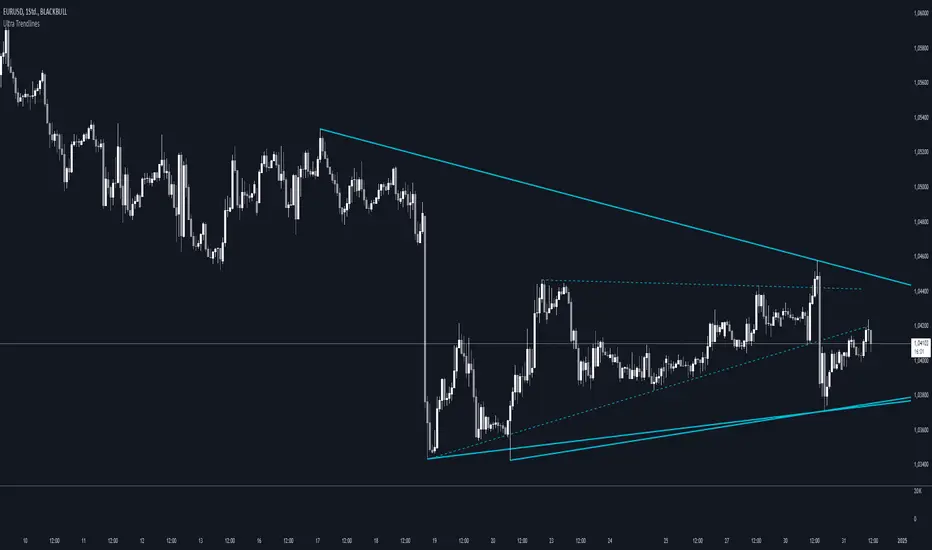
Ultra TrendlinesThis indicator automatically draws trendlines based on every pivot point, helping traders visualize key support and resistance levels. It dynamically adjusts as new pivots are detected and validates the trendlines against price movement.
Introduction
The Ultra Trendlines indicator is designed to help traders identify and track significant trendlines on their charts. By automatically detecting pivot points (both highs and lows), it draws trendlines that highlight key market movements. These trendlines are valuable for understanding the broader trend and for making informed trading decisions.
Detailed Description
The indicator analyzes price data to find pivot points highs and lows over a user-defined lookback period. Once a pivot is detected, it draws trendlines between the pivot points.
.........
Accuracy
To ensure accuracy, the indicator only keeps trendlines that are confirmed by price action. It checks if the price crosses the trendline and deletes invalid lines.
Additionally, it checks if the trendlines stay within predefined price thresholds, filtering out irrelevant lines that are too far from current price action.
The indicator also has an option to only show "rising lows" and "falling highs" trendlines, offering further precision in trend direction.
As new pivots are detected, older trendlines that fall outside the lookback period are removed, ensuring the chart remains clean.
.....
Style
The trendlines can extend forward (infinite and userdefined), backward, both or none. The lines are drawn with a customizable style (solid, dotted, or dashed), color, and width.
.........
Summary of Key Points
The indicator automatically detects pivot points (highs and lows) and draws trendlines based on them. It allows you to customize the style, color, and width of the trendlines. The indicator filters out invalid trendlines by checking if they are still relevant based on price action and price thresholds. Additionally, you can choose to only display rising lows and falling highs for more accurate trend analysis. It also removes outdated trendlines to keep the chart clean.
All Possible Trendlines W/AlertsCore Functionality:
Trendline Detection: The system uses a proprietary algorithm that goes beyond traditional pivot point connection methods. It analyzes price action patterns and market structure to identify potential trendlines that many traders might overlook. This includes not just obvious trendlines, but also subtle ones that could become significant in the future.
Significance Evaluation: Unlike conventional indicators that treat all trendlines equally, the system employs a unique scoring system to evaluate each trendline's importance. This system considers factors such as the number of touch points, the length of the trendline, and its historical reliability in predicting price movements. This allows traders to focus on the most relevant trendlines.
Dynamic Updating: The AITI continuously reassesses and adjusts trendlines as new price data becomes available. This dynamic approach ensures that the indicator adapts to changing market conditions, providing up-to-date and relevant information.
What Makes It Original:
The AITI's originality lies in its holistic approach to trendline analysis. While most indicators focus on identifying a few key trendlines, this system aims to present a complete picture of all possible trendlines in the market. This comprehensive view allows traders to:
- Gain deeper insights into market structure and potential price movements.
- Identify less obvious but potentially significant trendlines that other traders might miss.
- Understand the relative importance of different trendlines, rather than treating all trendlines as equally significant.
The indicator's ability to dynamically update and re-evaluate trendlines in real-time sets it apart from static trendline tools. This ensures that traders always have the most current and relevant information at their disposal.
By providing a more nuanced and complete view of trendlines, the AITI enables traders to make more informed decisions based on a deeper understanding of market structure. This approach to trendline analysis is not readily available in open-source alternatives, making the AITI a valuable tool for traders seeking a more comprehensive technical analysis solution.

Auto Trendlines [RG]Auto Trendlines
Overview
Auto Trendlines automatically identifies, draws, and manages dynamic support and resistance trendlines based on pivot points. It continuously monitors price action to validate and update trendlines.
Key Features
Automatically identifies support (green) and resistance (red) trendlines
Validates trendlines against historical price action
Configurable lookback period and maximum active lines
Clean visualization with customizable line widths
How It Works
The indicator detects pivot highs and lows using your specified lookback period
It connects consecutive pivots to create potential trendlines
Lines are extended to the right until a confirmed price break
Older lines are automatically removed when the maximum is reached
Customization Options
Lookback Period: Controls the sensitivity of pivot detection
Maximum Active Lines: Limits the number of trendlines displayed
Line Width: Separate width controls for support and resistance lines
Ideal For
Identifying dynamic support and resistance levels.
Spotting potential reversal zones.
This indicator will help you identify trendlines, which you can then sophisticate and redraw more accurately. Please use this indicator only to identify trendline scenarios. Keep in mind that this is not a buy and sell indicator. Trendline breaks and bounces are not always respected, as prices can turn around at any moment. Happy Trading :)

Scaling_mastery:Free TrendlinesScaling_mastery Trendlines is a clean, trading-ready smart trendline tool built for the Scaling_mastery community.
It automatically finds swing highs/lows and draws dynamic trendlines or channels that stay locked to price, on any symbol and any timeframe.
🔧 Modes
Trendline type
Wicks – classic trendlines anchored on candle wicks (high/low).
Bodies – trendlines anchored on candle bodies (open/close), great for closing structure.
Channel – 3-line channel:
outer lines form a band around price
middle line runs through the centre of the channel
thickness is adjustable (Small / Medium / Large).
Trend strength
Controls how strong the pivots must be to form a line.
Weak → more lines, reacts faster.
Medium → balanced, good for most pairs.
Strong → only the cleanest swings, higher-probability trendlines.
🎨 Visual controls
Max support / resistance lines – cap how many lines are kept on chart.
Show broken lines – hide broken trendlines or keep them for structure history.
Extend lines – None / Right / Both.
Support / Resistance colors – separate colors for active vs broken.
Channel thickness – Small / Medium / Large (0.5% / 1% / 2% of price).
Channel outer lines – color for channel edges.
Channel middle line – color + style (dotted / dashed / solid).
Broken lines are automatically faded + dotted, so you can instantly see what’s still respected and what’s already been taken out.
🧠 How to use
Add the indicator to any chart.
Start with:
Trendline type: Wicks
Trend strength: Strong
Max lines: 1–2 for both support & resistance
Once you like the behavior, experiment with:
Switching between Wicks / Bodies / Channel
Adjusting Channel thickness and Trend strength
Use the lines as a visual confluence tool with your own strategy:
HTF trend direction
LTF entries / retests
Liquidity grabs around broken lines
This script doesn’t generate entries or risk management – it’s designed to give you clean, reliable structure so you can execute your own edge.
⚠️ Disclaimer
This tool is for educational and visual purposes only and is not financial advice.
Always do your own research and manage risk.

Algo + Trendlines :: Medium PeriodThis indicator helps me to avoid overlooking Trendlines / Algolines. So far it doesn't search explicitly for Algolines (I don't consider volume at all), but it's definitely now already not horribly bad.
These are meant to be used on logarithmic charts btw! The lines would be displayed wrong on linear charts.
The biggest challenge is that there are some technical restrictions in TradingView, f. e. a script stops executing if a for-loop would take longer than 0.5 sec.
So in order to circumvent this and still be able to consider as many candles from the past as possible, I've created multiple versions for different purposes that I use like this:
Algo + Trendlines :: Medium Period : This script looks for "temporary highs / lows" (meaning the bar before and after has lower highs / lows) on the daily chart, connects them and shows the 5 ones that are the closest to the current price (=most relevant). This one is good to find trendlines more thoroughly, but only up to 4 years ago.
Algo + Trendlines :: Long Period : This version looks instead at the weekly charts for "temporary highs / lows" and finds out which days caused these highs / lows and connects them, Taking data from the weekly chart means fewer data points to check whether a trendline is broken, which allows to detect trendlines from up to 12 years ago! Therefore it misses some trendlines. Personally I prefer this one with "Only Confirmed" set to true to really show only the most relevant lines. This means at least 3 candle highs / lows touched the line. These are more likely stronger resistance / support lines compared to those that have been touched only twice.
Very important: sometimes you might see dotted lines that suddenly stop after a few months (after 100 bars to be precise). This indicates you need to zoom further out for TradingView to be able to load the full line. Unfortunately TradingView doesn't render lines if the starting point was too long ago, so this is my workaround. This is also the script's biggest advantage: showing you lines that you might have missed otherwise since the starting bars were outside of the screen, and required you to scroll f. e back to 2015..
One more thing to know:
Weak colored line = only 2 "collision" points with candle highs/lows (= not confirmed)
Usual colored line = 3+ "collision" points (= confirmed)
Make sure to move this indicator above the ticker in the Object Tree, so that it is drawn on top of the ticker's candles!
More infos: www.reddit.com
Algo + Trendlines :: Long PeriodThis indicator helps me to avoid overlooking Trendlines / Algolines. So far it doesn't search explicitly for Algolines (I don't consider volume at all), but it's definitely now already not horribly bad.
These are meant to be used on logarithmic charts btw! The lines would be displayed wrong on linear charts.
The biggest challenge is that there are some technical restrictions in TradingView, f. e. a script stops executing if a for-loop would take longer than 0.5 sec.
So in order to circumvent this and still be able to consider as many candles from the past as possible, I've created multiple versions for different purposes that I use like this:
Algo + Trendlines :: Medium Period : This script looks for "temporary highs / lows" (meaning the bar before and after has lower highs / lows) on the daily chart, connects them and shows the 5 ones that are the closest to the current price (=most relevant). This one is good to find trendlines more thoroughly, but only up to 4 years ago.
Algo + Trendlines :: Long Period : This version looks instead at the weekly charts for "temporary highs / lows" and finds out which days caused these highs / lows and connects them, Taking data from the weekly chart means fewer data points to check whether a trendline is broken, which allows to detect trendlines from up to 12 years ago! Therefore it misses some trendlines. Personally I prefer this one with "Only Confirmed" set to true to really show only the most relevant lines. This means at least 3 candle highs / lows touched the line. These are more likely stronger resistance / support lines compared to those that have been touched only twice.
Very important: sometimes you might see dotted lines that suddenly stop after a few months (after 100 bars to be precise). This indicates you need to zoom further out for TradingView to be able to load the full line. Unfortunately TradingView doesn't render lines if the starting point was too long ago, so this is my workaround. This is also the script's biggest advantage: showing you lines that you might have missed otherwise since the starting bars were outside of the screen, and required you to scroll f. e back to 2015..
One more thing to know:
Weak colored line = only 2 "collision" points with candle highs/lows (= not confirmed)
Usual colored line = 3+ "collision" points (= confirmed)
Make sure to move this indicator above the ticker in the Object Tree, so that it is drawn on top of the ticker's candles!
More infos: www.reddit.com

Zones + Trendlines (raphii7)Here you go — in English, simple and clear:
Designed for a clear read of worked zones and trend paths on any timeframe.
-Zones: rectangles where price has touched multiple times = support/resistance zones.
-Trendlines: lines that connect two highs (H–H) or two lows (B–B), with a dotted extension.
Settings
Zones
-Minimum candles between highs/lows (minSepBars): minimum spacing between pivots. Larger = cleaner pivots.
-Show highs/lows (showHBZones): shows small H/B labels on the chart.
-Max highs/lows used (maxPivotsUsed): cap on stored pivots.
-Minimum contacts in the zone (minContacts): minimum touches required to draw a zone.
-Zone size unit (sizeMode):
-Pips = fixed thickness.
-ATR = thickness adapts to volatility.
-Zone size (zoneSize): zone thickness (in Pips or ATR).
-Max candles back (lookbackBars): how far back to scan.
-Max zones to draw (maxZonesDraw): prevents too many rectangles.
-Border / fill color (borderCol / fillCol): zone styling.
Trendlines
-Pivot Length (pivotLen): “size” of the pivot. Higher = more reliable lines, fewer of them.
-Pivot Type (pivotType):
Normal = cleaner, slower.
Fast = very reactive, can move more.

Trendline Pivots [QuantVue]Trendline Pivots
The Trend Line Pivot Indicator works by automatically drawing and recognizing downward trendlines originating from and connecting pivot highs or upward trendlines originating from and connecting pivot lows.
These trendlines serve as reference points of potential resistance and support within the market.
Once identified, the trend line will continue to be drawn and progress with price until one of two conditions is met: either the price closes(default setting) above or below the trend line, or the line reaches a user-defined maximum length.
If the price closes(default setting) above a down trend line or below an up trend line, an "x" is displayed, indicating the resistance or support has been broken. At the same time, the trend line transforms into a dashed format, enabling clear differentiation from active non-breached trend lines.
This indicator is fully customizable from line colors, pivot length, the number lines you wish to see on your chart and works on any time frame and any market.
Don't hesitate to reach out with any questions or concerns.
We hope you enjoy!
Cheers.

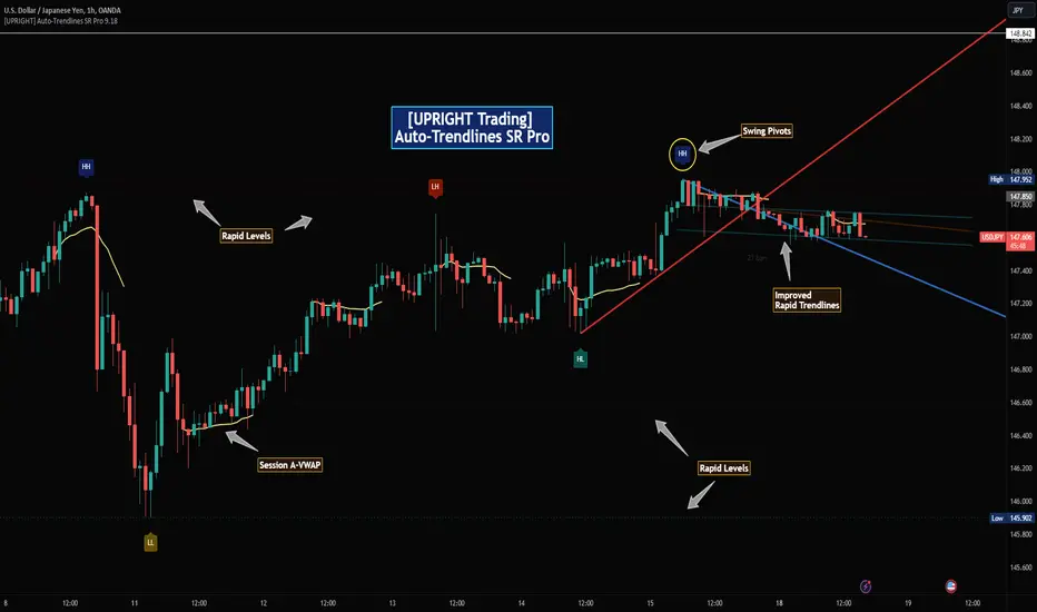
[UPRIGHT Trading] Auto-Trendlines Pro (cc)Hello Traders -
Today I am releasing a full-featured auto-trendline indicator.
This makes it easier for beginners and professionals alike to analyze a charts trending support and resistance.
What are Trendlines and why do we use them?
In short, a trendline is a diagonal line that connects to two or more price points on a chart to show the current direction of price. These are used to identify and confirm trend direction in technical analysis and show support and resistance points.
Utilizing pivot points and different calculations for sources we're able to create the trendlines; with adjustable slopes (or just use of proprietary calculations) we are able to make these lines to line up with the current trend.
How it's different:
Accurate auto-drawn calculated trendlines.
Fully customizable - the ability to adjust the trendlines easily to exact specifications with every type of trader in mind.
Can be used to spot long trend as well as short, by adjusting length or using extend both to see previous pivots it's touched.
Then retracted, for perfect long trend.
Can show old trendlines for analysis (click image to see).
Auto-labels Higher-Highs, Higher-Lows, Lower-Highs, Lower-Lows at pivots.
Lining up trendlines with Break signals can help provide more accurate trendlines (potentially teaching) beginners how to draw them better.
Signature double trendline set.
Also notice the additional sell/buy signals (shown above).
Squeeze / Low-float mode adjusts to fit big moves.
Adjust the opacity to hide or fade a line (as seen above).
Pre-filled alerts for breakouts / breakdowns.
Please see author instructions for access.
Cheers,
Mike
(UPRIGHT Trading)
Constant Auto Trendlines (Extended Right)📈 Constant Auto Trendlines (Extended Right)
This indicator automatically detects market structure by connecting swing highs and lows with permanent, forward-projecting trendlines.
Unlike standard trendline tools that stop at the last pivot, this version extends each trendline infinitely into the future — helping traders visualize where price may react next.
🔍 How It Works
The script identifies pivot highs and lows using user-defined left/right bar counts.
When a new lower high or higher low appears, the indicator draws a line between the two pivots and extends it forward using extend.right.
Each new confirmed trendline stays fixed, creating a historical map of structure that evolves naturally with market action.
Optional filters:
Min Slope – ignore nearly flat trendlines
Show Latest Only – focus on the most relevant trendline
Alerts – get notified when price crosses the most recent uptrend or downtrend line
🧩 Why It’s Useful
This tool helps traders:
Spot emerging trends early
Identify dynamic support/resistance diagonals
Avoid redrawing trendlines manually
Backtest structure breaks historically
⚙️ Inputs
Pivot Left / Right bars
Min slope threshold
Line color, width, and style
Show only latest line toggle
Alert options

VoluTrend | Auto Trendlines + VolumeVoluTrend is a trendline tool that combines pivot detection with volume validation to help traders see only meaningful market structures.
How it works:
Pivot Detection: The script scans for local swing highs and lows using a customizable number of left and right bars. This ensures that each pivot reflects a significant turning point in price action.
Volume Filter: Each pivot is checked against a simple volume filter: the pivot is only valid if its associated bar has higher volume than a user-defined multiple of the average volume over a configurable period. This prevents weak or irrelevant pivots from cluttering the chart.
Automatic Trendlines: Once a valid pivot is found, the script automatically draws a trendline from the previous pivot to the new one. It keeps only a limited number of lines to avoid overcrowding the chart. This creates a dynamic, real-time trendline system that updates as price action evolves.
Why combine these elements?
Many auto trendline tools draw lines for every swing, but not all swings are significant. By combining pivot detection with a volume filter, VoluTrend focuses on price levels where notable participation occurred, helping traders better interpret real support/resistance and trend continuation or reversal points.

{20}Dashboard RSI-trendlines_Pro[vn]👉 Here is a script of 20 trading pairs scanner with RSI trendline.
-On each chart of the trading pair, there is only 1 trendline pair that comes closest to the RSI: 1 uptrendline and 1 downtrend line.
-So when the statistics on the table also show the column of the uptrend and the column of the downtrend
-When the RSI approaches any trendline and the ratio is 10%, the trendline will be colored blue (downtrend) and red (uptrend).
-Column ✎ T.line-trendline above (✐ T.line-trendline below) is the value of the current trendline compared to RSI
-Column \n\𝖗𝖊𝖘𝖎𝖘𝖙𝖆𝖓(𝖘𝖚𝖕𝖕𝖔𝖗𝖙\n\══════) when RSI breaks trendline will show 1|1|1 ( first candle) and percentage value when breaking through the point of the trendline. This is a good signal for us to consider trading with the RSI line
-The parameter when breaking shows 10|10|10, it means that the price has broken 10 candles (RSI candles), and the first 10 candles are colored yellow, then it will be
hidden. (can be changed in settings) put)
-Also, when displaying the parameters and yellow color of the box as above, the column next to it (above/below T.line) will show the percentage from when RSI broke that
point to the current price of the candle.
-The RSI column is the current of the candle and the 20:2 parameter is the RSI trendline length and to combine the same parameters with the "RSI - trendlines - div "
indicator.
-The time can be changed in the Resolution indicator setting to show multiple time arcs.
-The up arrow symbols represent the price breaking upwards, the down arrow showing the price breaking downwards
Thank you everyone for your interest and trust
-----------------------------------------------------------------------------
Vietnamese
👉 Đây là script về máy quét 20 cặp giao dịch với đường trendline của RSI .
-Trên mỗi biểu đồ của cặp giao dịch chỉ tồn tại duy nhất 1 cặp trendline đi sát nhất với RSI là: 1 trendline tăng và 1 trendline giảm
-Vì vậy khi thống kê trên bảng cũng hiển thị cột của trend tăng và cột của trend giảm
-Khi RSI tiến gần đến 1 đường trendline bất kì mà tỉ lệ còn 10% thì đường trendline đó tô màu xanh(trend giảm) ,màu đỏ(trend tăng)
-Cột ✎ T.line-đường trendline bên trên(✐ T.line-đường trendline bên dưới) là giá trị của đường trendline hiện tại so với RSI
-Cột ══════\n\𝖗𝖊𝖘𝖎𝖘𝖙𝖆𝖓(𝖘𝖚𝖕𝖕𝖔𝖗𝖙\n\══════) khi RSI phá vỡ trendline sẽ thể thiện 1|1|1 (tức là cây nến đầu tiên) và giá trị phần trăm khi phá qua điểm của trendline.Đây là tín hiệu tốt để ta xem xét giao dịch với đường RSI
-Thông số khi phá vỡ hiển thị 10|10|10 thì hiểu là giá đã phá vỡ 10 nến(nến RSI), và 10 nến đầu tiên được tô màu vàng ,sau đó sẽ bị ẩn.(có thể thay đổi trong cài đặt)
-Ngoài ra khi hiện thông số và màu vàng của ô như trên thì cột bên cạnh (above/below T.line) sẽ hiển thị được số phần trăm tính từ khi RSI phá vỡ điểm đó đến giá hiện tại của cây nến.
-Cột RSI là hiện tại của nến và thông số 20:2 là độ dài đường trendline RSI và để kết hợp cùng thông số với chỉ báo "RSI - trendlines - div "
-Có thể thay đổi thời gian trong cài đặt chỉ báo Resolution để hiển thị nhiều cung thời gian.
-Các biểu tượng mũi tên lên 🡹 thể hiện giá phá vỡ lên trên, mũi tên xuống 🡻 thể hiện giá đã phá vỡ xuống dưới
Cảm ơn mọi người đã quan tâm và tin dùng

Auto Trendlines**Overview**
- Automatically draws uptrend and downtrend lines by connecting the latest two pivot highs and pivot lows within a symmetric window.
- Designed for clean, reactive trend visualization with minimal user configuration.
**Features**
- Auto-detection of swing pivots and dynamic line updates on new confirmations.
- Optional right extension for forward projection.
- Built-in line styles: `Solid`, `Dashed`, `Dotted`.
- Customizable colors and line width.
- Lightweight and fast for intraday or higher timeframes.
**Inputs**
- `Calculation Period (odd)`: Window size for pivot detection; must be odd to ensure a unique center bar.
- `Uptrend Line Color`: Color for lines drawn from pivot highs.
- `Downtrend Line Color`: Color for lines drawn from pivot lows.
- `Line Style`: `Solid`, `Dashed`, or `Dotted`.
- `Line Width`: Thickness of the trendlines.
- `Extend Right`: Toggle to extend lines into the future.
**How It Works**
- Uses `ta.pivothigh` and `ta.pivotlow` with symmetric left/right bars derived from the chosen period.
- An odd period guarantees a single center bar (`left = right`), aligning the pivot’s time anchor precisely.
- Once a pivot is confirmed (after the required right bars), the script updates or redraws the uptrend and downtrend lines to connect the last two pivots.
**Notes**
- Larger periods produce smoother, more reliable lines; smaller periods react faster but may be noisier.
- Pivot confirmation requires future bars; lines update when new pivots form, reflecting the most recent structure.
- This script focuses on visual analysis and does not include alerts.
**Compatibility**
- Pine Script v6
- Overlay on price chart (`overlay=true`)
- Optimized for TradingView publication with minimal performance overhead.
**Keywords**
- Trendlines, Auto Trendlines, Pivots, Swing High/Low, Technical Analysis, Pine Script v6
RSI - trendlines - div[vn]This is an indicator for traders of trendline analysis with RSI (the formula for calculating RSI I don't mention here anymore because every trader knows it)
-
The Pine Script strategy plots pivot points and trendlines on the RSI chart.
This strategy allows the user to specify the interval for calculating the pivot points and the number of pivot points used to generate the RSI trendlines.
As all traders know, the RSI line closely follows the actual price line, it is an indicator of momentum, the RSI often tells us the direction of the price line in advance, it often precedes and goes along with the price.
RSI is one of the indicators that predicts price trends very well when it crosses its trendline (except in case of divergence).
On the chart of the RSI indicator, I only show 2 trendlines closest to the RSI (1 increase, 1 decrease) and the trend lines far away from me are hidden so that traders can focus on observing better.
When an uptrend line of RSI (or a decrease of RSI) is drawn according to the settings in the settings of the indicator, then that line is support and resistance so that we can proceed to make a BUY or SELL point according to the indicator. RSI support and resistance strategy
When the RSI line breaks above the definitive uptrend line or breaks below the trendline definitively, the price signals a reversal to the nearest trendline.
When the RSI breaks the downtrend line of the RSI (definitively), it signals that the price has a high probability of reversing or approaching the nearest resistance area or possibly reversing from bearish to bullish.
When the RSI breaks the uptrend line of the RSI (definitively), it signals that the price is likely to reverse or reach the nearest resistance area or it may reverse from bullish to bearish.
In addition, I have integrated the normal divergence function of RSI for traders to use in case of divergence - combined with trendline to identify trend reversal more clearly.
-------------------------------------------------------------------------------------------------------
Vietnamese
-Đây là chỉ báo dành cho các trader thuộc trường phái phân tích đường xu hướng với RSI(công thức tính RSI tôi không nhắc ở đây nữa vì mọi trader đều biết)
-Chiến lược Pine Script vẽ các điểm trục và đường xu hướng trên biểu đồ RSI.
-Chiến lược này cho phép người dùng chỉ định khoảng thời gian tính toán các điểm xoay và số điểm xoay được sử dụng để tạo các đường xu hướng của RSI.
-Như các Trader đều biết đường RSI bám sát thực tế với đường giá, nó là chỉ báo về động lượng ,RSI nhiều khi cho chúng ta "biết trước" được hướng đi của đường giá, nó thường đi trước và đi cùng với giá
-RSI là một trong những chỉ báo dự đoán xu hướng giá rất tốt khi cắt đường xu hướng của nó (chỉ trừ trường hợp phân kì)
-Trên biểu đồ của chỉ báo RSI tôi chỉ đưa ra 2 đường trendline gần với đường RSI nhất (1 tăng , 1 giảm)còn các đường xu hướng cách xa tôi đều để ẩn để các Trader tập chung quan sát tốt hơn
-Khi đường xu hướng tăng của RSI (hoặc giảm của RSI) được vẽ ra theo các thiết lập trong cài đặt của chỉ báo,thì đường đó là hỗ trợ,kháng cự để ta có thể tiến hành thực hiện điểm BUY hoặc SELL theo chiến lược hỗ trợ và kháng cự của RSI
-Khi đường RSI mà phá vỡ lên trên đường xu hướng tăng dứt khoát hoặc phá xuống dưới đường xu hướng cách dứt khoát thì giá báo hiệu sắp đảo chiều ngược với đường xu hướng gần nhất
-Khi RSI phá vỡ đường xu hướng giảm của RSI (cách dứt khoát) thì báo hiệu sắp tới giá có khả năng cao sẽ đảo chiều hay tiến tới vùng kháng cự gần nhất hay có thể đảo chiều từ giảm thành tăng
-Khi RSI phá vỡ đường xu hướng tăng của RSI (cách dứt khoát) thì báo hiệu sắp tới giá có khả năng cao sẽ đảo chiều hay tiến tới vùng kháng cự gần nhất hay có thể đảo chiều từ tăng thành giảm
-ngoài ra tôi có tích hợp thêm vào công cụ chức năng phân kì thường của RSI để trader dùng trong trường hợp phân kì - kết hợp với đường trendline để xác định xu hướng đảo chiều rõ ràng hơn

Auto TrendlinesAuto Trendlines
-This indicador show automatically trendlines
- Allows you to select the amount and importance of the trendlines.
-Works in any timeframe or market like Forex, Crypto, Commodities even Stocks.
-Recommended manual trading.
Do you need an Script or an expert adviser for Forex, contact our coding service!
Get this indicator today! contact us.

TradeScope: MA Reversion • RVOL • Trendlines • GAPs • TableTradeScope is an all-in-one technical analysis suite that brings together price action, momentum, volume dynamics, and trend structure into one cohesive and fully customizable indicator.
An advanced, modular trading suite that combines moving averages, reversion signals, RSI/CCI momentum, relative volume, gap detection, trendline analysis, and dynamic tables — all within one powerful dashboard.
Perfect for swing traders, intraday traders, and analysts who want to read price strength, volume context, and market structure in real time.
⚙️ Core Components & Inputs
🧮 Moving Average Settings
Moving Average Type & Length:
Choose between SMA or EMA and set your preferred period for smoother or more reactive trend tracking.
Multi-MA Plotting:
Up to 8 customizable moving averages (each with independent type, color, and length).
Includes a “window filter” to show only the last X bars, reducing chart clutter.
MA Reversion Engine:
Detects when price has extended too far from its moving average.
Reversion Lookback: Number of bars analyzed to determine historical extremes.
Reversion Threshold: Sensitivity multiplier—lower = more frequent signals, higher = stricter triggers.
🔄 Trend Settings
Short-Term & Long-Term Trend Lookbacks:
Uses linear regression to detect the slope and direction of the short- and long-term trend.
Results are displayed in the live table with color-coded bias:
🟩 Bullish | 🟥 Bearish
📈 Momentum Indicators
RSI (Relative Strength Index):
Adjustable period; displays the current RSI value, overbought (>70) / oversold (<30) zones, and trending direction.
CCI (Commodity Channel Index):
Customizable length with color-coded bias:
🟩 Oversold (< -100), 🟥 Overbought (> 100).
Tooltip shows whether the CCI is trending up or down.
📊 Volume Analysis
Relative Volume (RVOL):
Estimates end-of-day projected volume using intraday progress and compares it against the 20-day average.
Displays whether today’s volume is expected to exceed yesterday’s, and highlights color by strength.
Volume Trend (Short & Long Lookbacks):
Visual cues for whether current volume is above or below short-term and long-term averages.
Estimated Full-Day Volume & Multiplier:
Converts raw volume into “X” multiples (e.g., 2.3X average) for quick interpretation.
🕳️ Gap Detection
Automatically identifies and plots bullish and bearish price gaps within a defined lookback period.
Gap Lookback: Defines how far back to search for gaps.
Gap Line Width / Visibility: Controls the thickness and display of gap lines on chart.
Displays the closest open gap in the live table, including its distance from current price (%).
🔍 ATR & Volatility
14-day ATR (% of price):
Automatically converts the Average True Range into a percent, providing quick volatility context:
🟩 Low (<3%) | 🟨 Moderate (3–5%) | 🟥 High (>5%)
💬 Candlestick Pattern Recognition
Auto-detects popular reversal and continuation patterns such as:
Bullish/Bearish Engulfing
Hammer / Hanging Man
Shooting Star / Inverted Hammer
Doji / Harami / Kicking / Marubozu / Morning Star
Each pattern is shown with contextual color coding in the table.
🧱 Pivot Points & Support/Resistance
Optional Pivot High / Pivot Low Labels
Adjustable left/right bar lengths for pivot detection
Theme-aware text and label color options
Automatically drawn diagonal trendlines for both support and resistance
Adjustable line style, color, and thickness
Detects and tracks touches for reliability
Includes breakout alerts (with optional volume confirmation)
🚨 Alerts
MA Cross Alerts:
Triggers when price crosses the fast or slow moving average within a tolerance band (default ±0.3%).
Diagonal Breakout Alerts:
Detects and alerts when price breaks diagonal trendlines.
Volume-Confirmed Alerts:
Filters breakouts where volume exceeds 1.5× the 20-bar average.
🧾 Live Market Table
A fully dynamic table displayed on-chart, customizable via input toggles:
Choose which rows to show (e.g., RSI, ATR, RVOL, Gaps, CCI, Trend, MA info, Diff, Low→Close%).
Choose table position (top-right, bottom-left, etc.) and text size.
Theme selection: Light or Dark
Conditional background colors for instant visual interpretation:
🟩 Bullish or Oversold
🟥 Bearish or Overbought
🟨 Neutral / Moderate
🎯 Practical Uses
✅ Identify confluence setups combining MA reversion, volume expansion, and RSI/CCI extremes.
✅ Track trend bias and gap proximity directly in your dashboard.
✅ Monitor relative volume behavior for intraday strength confirmation.
✅ Automate MA cross or breakout alerts to stay ahead of key price action.
🧠 Ideal For
Swing traders seeking confluence-based setups
Intraday traders monitoring multi-factor bias
Analysts looking for compact market health dashboards
💡 Summary
TradeScope is designed as a single-pane-of-glass market view — combining momentum, trend, volume, structure, and reversion into one clear visual system.
Fully customizable. Fully dynamic.
Use it to see what others miss — clarity, confluence, and confidence in every trade.

nNouSignnNouSign
☆
Welcome to a path to trading success in the world of trading, where fortunes are made and dreams come true.
But amidst the excitement and possibilities, there lies the challenge of deciphering the market's complexities.
Fear not, for we present to you the ultimate weapon in your trading arsenal: the nNouSign indicator.
Prepare to embark on a thrilling journey of trading mastery as we guide you through its optimal usage, enlightening you with its potential and empowering you with the ability to navigate the markets with confidence.
Embracing the nNouSign magic as you apply the nNouSign indicator to your TradingView chart, envision a realm where the convergence of art and science births incredible trading opportunities.
• The indicator's smooth moving average line, represented by a vibrant orange hue, acts as your guiding light. It captures the essence of market sentiment and unveils the hidden patterns that govern price movements.
Decoding the colors of success, possess a mystical power to evoke emotions and ignite motivation . The nNouSign indicator harnesses this power, allowing you to personalize your trading experience.
• Choose the color of prosperity for your buy signals, perhaps a vivid shade of green. Let it symbolize the life-giving force of profits flowing into your trading account.
• As for sell signals, embrace the passionate intensity of red, signifying your ability to seize opportunities and protect your gains.
Riding the trend waves is one of the nNouSign indicator's core strengths. It lies in its ability to identify trends.
Whether the market surges upwards like a fearless tide or recedes like a wise old ocean, the indicator whispers the secrets of trend direction.
• When the moving average is conquered by the closing price, rejoice, for it signals a bullish trend.
• Conversely, when the closing price descends beneath the moving average, it reveals a bearish trend.
Harmonizing with the trading signals which are the magical spells that teleport you to the forefront of profitable trades.
Watch as the nNouSign indicator casts its spells in the form of tiny triangles on your chart.
• When a bullish trend is confirmed, a mystical triangle points upwards, signaling a buy opportunity.
• On the contrary, when a bearish trend emerges, a bewitching triangle points downwards, beckoning you to sell.
Embrace these signals and let them guide your path to success.
Unleashing the power of alerts like the modern trader(s) whom thrives on speed and efficiency.
The nNouSign indicator empowers you with its alert system , ensuring you never miss a precious trading moment.
• Customize your alerts to receive notifications when the bullish or bearish trends are confirmed.
Imagine the thrill of being the first to seize an opportunity, swiftly executing trades with confidence, and reaping the rewards.
Dance with the trendline as you journey through the market's ebb and flow, through the nNouSign indicator its visual masterpiece.
Behold the trendline , gracefully drawn on your chart.
• In the presence of a bullish trend, it steps aside, allowing the moving average to shine brightly.
• Yet, in the depths of a bearish trend, it emerges, painted in shades of red, serving as a reminder to exercise caution.
Let this visual spectacle guide your decision-making process.
☆
Intrepid trader! ,may you now have unlocked the secrets of the nNouSign indicator and embark on a journey that will forever transform your trading experience.
Armed with its wisdom and most importantly YOUR OWN WISDOM, may you possess the ability to navigate the markets with confidence and precision.
Embrace its vibrant colors, heed its trading signals and dance with the trendline as you ride the waves of market trends. Let the indicator be your constant companion, guiding you through the ever-changing tides of the financial world.
Remember, trading is not just a science; it is an art. The nNouSign indicator provides you with the tools to create your masterpiece.
Embrace its colors, for they evoke the emotions and motivation necessary for success.
Let the green of buy signals ignite your passion for profit, and the red of sell signals fuel your determination to protect your gains.
But trading is more than just following signals; it requires discipline and adaptability.
Observe the trendlines and understand the market's rhythm.
Be patient when the trend favors the bulls, and exercise cautio n when the bears take control.
The nNouSign indicator, with its magical trendline, will be your compass in navigating these changing conditions.
In the fast-paced world of trading, timing is everything. The alerts generated by the nNouSign indicator will keep you informed, ensuring you never miss an opportunity.
Stay alert, for swift and decisive action can be the key to reaping substantial rewards.
☆
Finally, remember that trading is a journey of growth and learning.
Embrace the educational aspect of using the
nNouSign indicator.
Analyze your trades, study the outcomes, and fine-tune your strategies.
With each trade , you'll gain valuable insights and develop the skills necessary for long-term success .
☆
So, fellow trader, take this guide as your roadmap to trading mastery.
Let the nNouSign indicator be your guide, entertaining you with its vibrant colors, motivating you with its signals, and educating you through each trading experience.
Embrace the power it bestows upon you, and let it unleash your full potential in the exciting world of trading.
Success awaits those who dare to seize it!
-HappyTrading- J

zavaUnni- Trendlines Pro & fibonacci Zones zavaUnni- Trendlines Pro & fibonacci Zones is a momentum-based trading tool that automatically detects pivot points to visualize real-time trendlines, zigzag structures, and Fibonacci retracement zones.
Key Features
1. Divergence-Based Pivot Detection
Utilizes popular momentum indicators like RSI, CCI, MACD CCI, OBV, etc.
Automatically detects significant highs/lows based on divergence signals
These pivot points are used to construct trendlines and calculate retracement zones
2. Automatic Fibonacci Retracement Zones
Draws Fibonacci levels such as 0.382, 0.618, and 0.786 from detected pivot highs/lows
Supports both initial fixed levels and dynamic updated zones based on live price action
Recalculates zones automatically when specific price conditions are met
3. Supertrend-Based Zigzag and Trendlines
detect real-time trend direction changes
Plots zigzag lines between significant pivot highs/lows
Automatically generates trendlines only when slope conditions are met (e.g., below -3° or above +1°)
Invalidates and resets trendlines if broken or the slope becomes too flat/steep
Settings Overview
Index
Selects the indicator (RSI, CCI, MACDcci, OBV, etc.) used for pivot detection
zigzag Length
Supertrend sensitivity period for direction changes
Fibonacci_bg
Toggle background color fill for Fibonacci zones
Fibonacci_label
Show labels for each Fibonacci level (23.6%, 38.2%, etc.)
Bull Trend Line Color
Color of upward trendlines
Bear Trend Line Color
Color of downward trendlines
zigzag_color
Color of the zigzag lines

Dynamic Trendlines Multi-TimeframeThe Dynamic Trendlines indicator is a useful tool for traders to identify potential support and resistance levels in the market. By analyzing price volatility and drawing trendlines based on high volatility candles, it helps traders visualize key price levels that may influence future price action. This indicator uses the Average True Range (ATR) as a measure of price volatility to determine the threshold for high volatility candles. This indicator can be used on multiple time frames, so just choose which one works best for you!
The underlying concept of this indicator revolves around the calculation of the True Range and Average True Range. The True Range is the maximum value among the difference between the current high and low, the absolute value of the difference between the current high and previous close, and the absolute value of the difference between the current low and previous close. The ATR is then calculated as the simple moving average of the True Range over a user-defined period (default is 14). The threshold for high volatility candles is determined by multiplying the ATR by a user-defined multiplier (default is 1.5).
The indicator identifies high volatility candles when the closing price is greater than the previous closing price plus the threshold. Based on the price action, trendlines are drawn connecting the high or low of high volatility candles. The initial color and style of the trendline are determined by whether the price is moving up or down. Green solid lines represent upward price movement, while red solid lines represent downward price movement.
As the price crosses the trendlines, the indicator tracks the number of crosses and updates the line's style accordingly. If the price crosses a trendline twice, the line style is changed to dashed, indicating the potential weakening of the support or resistance level.
This indicator works best with trading methods that focus on capturing price breakouts or reversals. Traders can use the trendlines to identify potential entry or exit points, stop-loss levels, or take-profit targets. It's important to note that this indicator should be used in conjunction with other technical analysis tools and an understanding of the overall market context to make informed trading decisions.
When using the Dynamic Trendlines indicator on TradingView, users can customize the ATR length, threshold multiplier, and the number of recent trendlines displayed on the chart. Additionally, small triangles are plotted below high volatility candles, with their color based on the trendline it starts, providing a quick visual reference for traders.
In summary, the Dynamic Trendlines indicator is a valuable tool for identifying potential support and resistance levels in the market by analyzing price volatility and drawing trendlines based on high volatility candles. It is best suited for breakout and reversal trading strategies and should be used in conjunction with other technical analysis tools for optimal results.

[TC] -- DayTrader's Auto Ultra TrendlinesThe goal of this indicator is to provide day traders with more realistic and general support and resistance trendlines for the chart timeframe they are trading, without the need for excessive parameter adjustment or manual consideration of trendlines from higher timeframes. As we all know, when trading smaller timeframes, it is not only the trendlines from the current timeframe which are significant - we must also consider the position of trendlines from higher ones.
Auto Ultra Trendlines plots a set of multi-timeframe-based resistance and support trendlines that are dynamically calculated depending on the timeframe of the chart which the indicator is applied to.
The indicator calculates conglomerated support and resistance trendlines based on trendline values calculated from several timeframes higher than the chart's. The higher timeframes are logically selected and differ based on the chart timeframe.
This indicator is designed to be applied to charts with a timeframe up to and including the 8H, and cannot be applied to charts with a timeframe greater than 1D.
To increase or decrease the lookback period for the trendlines, use the 'Lookback Factor' parameter.

Auto TrendLines and Support Resistance - Ultimate [Trendoscope]Have been working on this script from sometime. Thought it would be right time to publish this now :)
This is enhanced and combined version of two open source scripts.
Auto-TrendLines-HeWhoMustNotBeNamed
Divergence-Support-Resistence
⬜ Major Enhancements to open source
▶ Concept of drawing trendlines remains same. But, logic has been altered to allow considering existing trendlines before scanning new one and also finding the strongest of all.
▶ Strength of trendlines now takes more factors into consideration such as weightage of each candles from two points with respect to a given trendline.
▶ Angle of the trendlines are calculated and considered for determination of overall trend.
▶ Trendlines come with invalidation point and trend definition also can be based on single trendline instead of multiple ones.
▶ Improved divergence and based support/resistance calculations which yield less but more significant levels.
⬜ Components
Below are the summary of indicator components
⚪ Trend Lines Summary Widget
This can have up-to 4 types of trend lines.
Uptrend Lower pivot based
Uptrend Higher pivot based
Downtrend Lower pivot based
Downtrend Higher pivot based
Direction of the lines dependent on slope of the trend as well. If angle is not steep, the trend lines are considered as neutral. Meanwhile, trend lines which are too steep are also ignored. Angle calculation depends on the ATR and Angle loopback input parameters which can be altered. Also TrendLines with negative Line strength or formed way too back are ignored based on the settings. Hence, it is perfectly normal to have less than 4 trend lines on charts at times.
⚪ S/R Summary Widget
This widget has been used in other indicators. Notations are same though there are logical improvements to derive only the high impact levels.
⬜ Settings
⚪ Trend Detection Settings
These are the settings used for scanning the trend lines. Summary of these settings are as below:
⚪ Pattern Detection Settings
The pattern detection settings help identify overall trend pattern and status based on the combination of higher and lower pivot trend lines.
Important bit here is the Sort Order which impacts the identification of overall trend. Available types are:
Distance : Sort based on distance from close price
LineStrength : Sort based on line strength of the trend line
Latest : Sort based on when the trend lines are formed.
⚪ Support/Resistance Settings
Base settings for calculating divergence based Support/Resistance.
⚪ Widgets
Widgets settings allow users to control display of Trend Lines and S/R summary widgets.
⚪ Alerts
Below are the settings for configuring alerts.
Alerts are formatted in Json for easier consumption via web-hook.
付费脚本

Mohammad - Auto Trendlines - Versión EstableMohammad - Auto Trendlines - Dynamic Support & Resistance
This indicator automatically identifies and draws trendlines by connecting pivot highs and pivot lows, similar to how a professional trader would manually draw them on a chart. Each pivot point is used only once to maintain clean, non-overlapping lines.
Key Features:
Automatically detects and connects pivot points to form trendlines
Distinguishes between resistance lines (connecting highs, drawn from top) and support lines (connecting lows, drawn from bottom)
Each pivot/wick is used for maximum one trendline, preventing messy overlapping
Color-coded: Black for resistance lines (bearish), Blue for support lines (bullish)
Support lines can be toggled on/off (hidden by default for cleaner charts)
Parameters:
Minimum/Maximum Length: Controls the range of bars to search for trendline connections (5-40 bars default)
Pivot Strength: Determines how prominent a high/low must be to qualify as a pivot point
Line Extension: Projects trendlines forward into the future
Tolerance: Flexibility for validating price touches on the trendline
Maximum Lines: Limits the number of visible trendlines to prevent chart clutter
How It Works:
The indicator scans historical price data to identify significant pivot points (local highs and lows). It then connects these pivots with trendlines following these rules:
Resistance lines connect pivot highs where the recent high is lower than the older high (descending)
Support lines connect pivot lows where the recent low is higher than the older low (ascending)
Lines must have intermediate price touches to be considered valid
Each pivot can only be used once, ensuring clean, logical trendline placement
Use Cases:
Identify key support and resistance levels automatically
Spot trend continuations and potential reversal points
Save time by eliminating manual trendline drawing
Maintain consistency in technical analysis
The indicator updates every 5 bars and on the last bar to ensure current relevance while maintaining performance.
